
What Are Pigment Particles in Paint? An Artist's Deep Dive
Ever wondered what paint is *actually* made of? Dive into the world of pigment particles, from ancient minerals to modern synthetics, and learn why it matters.

Paint Guts: The Scientific Guide to Pigment Particles, Color, and Lasting Art
That moment in the art store, holding a tube of genuinely expensive paint, is a rite of passage. For me, it was a Cadmium Red. It felt dense, almost alarmingly so, as if sheer potential had mass. The difference from the student-grade paints I’d used for years wasn’t subtle—it was a shock to the system. When I finally squeezed a bit out, the color didn’t just sit there; it thrummed. It was so intensely, unapologetically red, it almost felt like it was generating its own light. And right there, surrounded by the smell of linseed oil and paper, a thought crystallized that has shaped my entire practice since: What is this stuff, really? What are the actual guts of this tube that makes it so… potent?
The answer, it turns out, is a whole hidden world, a secret universe packed into every single tube. It’s a landscape of microscopic minerals, crystals, and lab-grown molecules that predetermines everything—how brilliant the color is, how long your strokes will last, even how the paint feels under your brush. It’s the fundamental difference between a sketch that fades in a year and a masterpiece that outlives its creator. Today, we’re taking a deep dive into that universe. We’re pulling back the curtain on the essential ingredients, the stuff that makes it all possible: the pigment particles.
There’s a hidden world inside every tube, a microscopic landscape of crystals and compounds that dictates everything from the color’s intensity to how long your art will last. It’s the difference between a fleeting sketch and a legacy piece. Today, we’re going on an expedition into that world. We’re pulling back the curtain on the secret sauce, the star of the show: pigment particles. It might sound technical, but think of it like a chef finally understanding their spices. It transforms you from someone who follows a recipe into someone who truly creates.
So, What Exactly IS a Pigment?
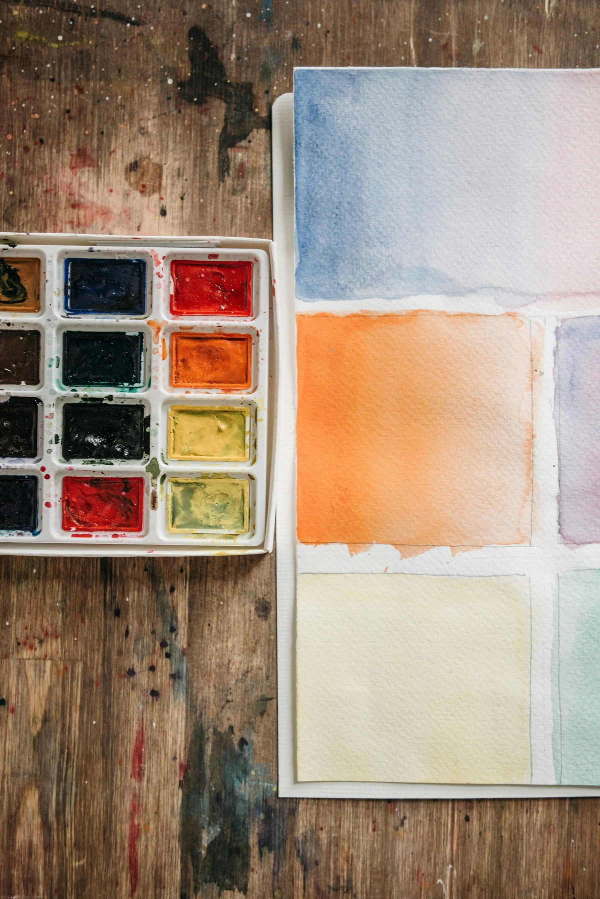
At its core, a pigment is a finely ground, solid particle that doesn't dissolve. Think of it like colored sand or dust. When you mix it into a liquid (like oil or an acrylic polymer), it doesn't become one with the liquid; it just hangs out, suspended, scattered throughout. This is the single most important thing to remember. Its refusal to dissolve is what gives paint its body and its opacity. A high-quality pigment is ground to a specific, consistent particle size, which is a major factor in how it behaves on the canvas. It’s the secret behind why one blue feels buttery and smooth, while another feels gritty and granulates on the paper.
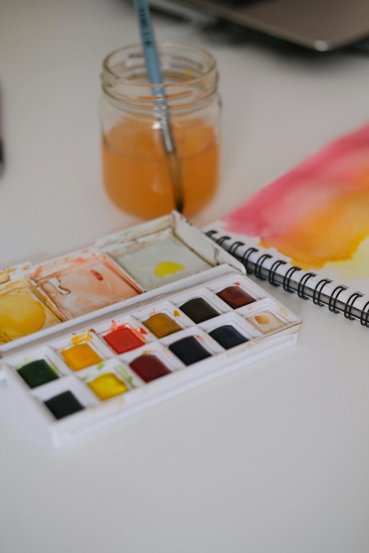
This is completely different from a dye, which does dissolve. Think of making Kool-Aid. The powder dissolves in the water, and the water itself becomes colored. Dyes stain things from the inside out. Pigments, on the other hand, sit on top of a surface, held in place by their binder. There is a third type, a lake pigment, which is a dye that has been chemically bonded to an inert, insoluble powder (like alumina hydrate). This turns the soluble dye into an insoluble pigment, allowing its vibrant color to be used in paints and other applications where a dye would just bleed away. It's a crucial distinction that artists have to navigate all the time.
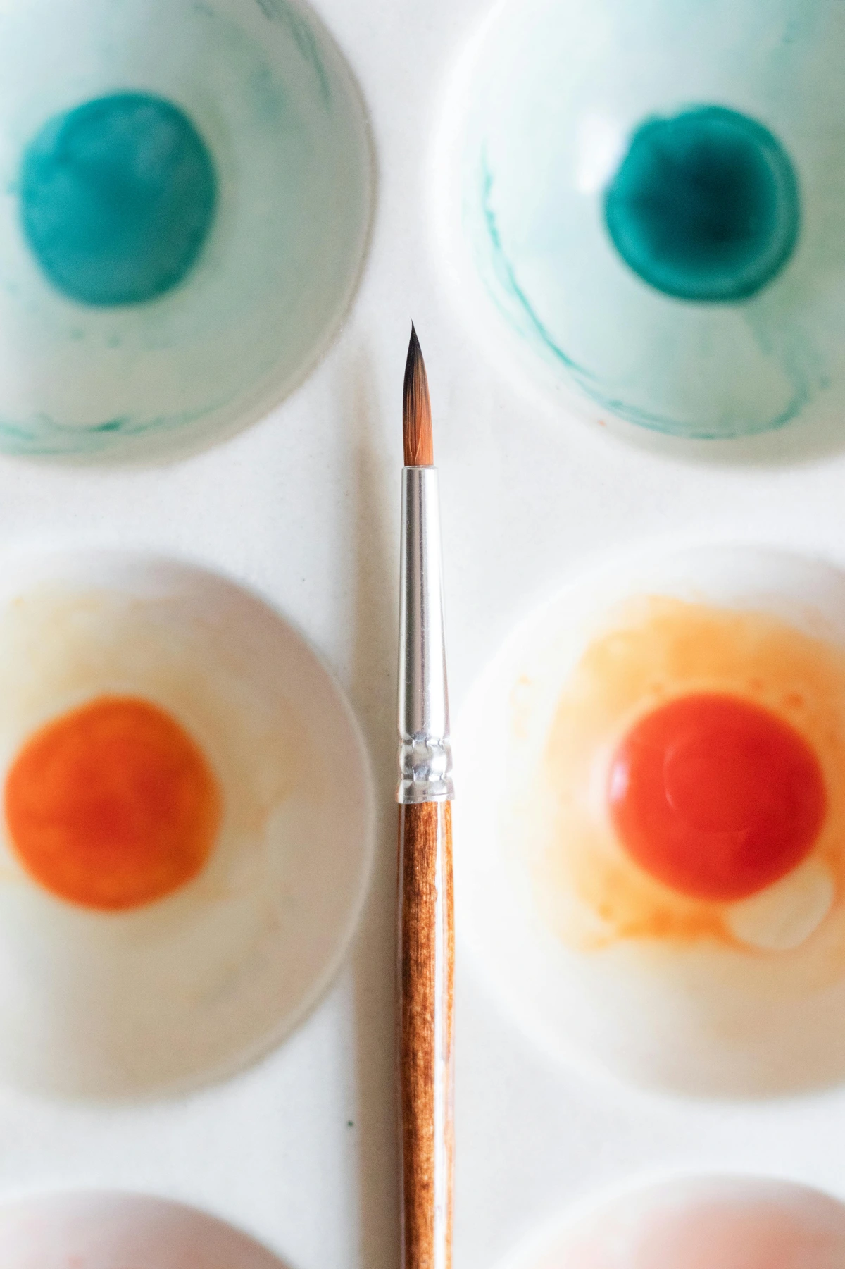
- Absorption: This is the key. The pigment molecule’s unique structure absorbs certain wavelengths of light. For example, a brilliant red pigment absorbs almost all the blue and green light. The red wavelengths, which are left over, get scattered to our eyes. We see red. We perceive a color based on the wavelength of light a pigment rejects. It's a subtractive process, and understanding this helps demystify everything about color mixing.
- Scattering: Opaque pigments, like the Cadmiums (lithopone or cadmium sulfoselenide varieties) and Titanium White, are masters of scattering. Their particles have a high refractive index compared to the binder. When light hits these particles, they don't let it pass through efficiently. They scatter it in all directions, immediately bouncing most of it back to your eye. This is why a thick layer of any good opaque color completely blocks out what's underneath. It's like a brick wall for light, creating solid, unyielding color.
- Refraction & Reflection: Transparent pigments, meanwhile, act like tiny, colored bits of glass. Light passes through them, but it bends along the way (refraction), and some of it gets reflected at the surface. This is what creates the luminous, jewel-like quality of a glaze when light bounces off the white canvas underneath the pigment layer. This interplay is the secret to creating depth in mastering glazing techniques in oil painting.
Pigment vs. Dye: The Great Mix-Up
People use these terms interchangeably, but for an artist, they are worlds apart. The distinction lies at the molecular level and dictates how they are used. Here’s a quick breakdown to set the record straight.
Feature  | Pigment | Dye |
|---|---|---|
| Solubility | Insoluble (Suspended like dust) | Soluble (Dissolves like sugar) |
| How it Colors | Forms a layer on the surface | Stains or soaks into the material |
| Particle Size | Relatively large, visible under a microscope | Molecular level, invisible |
| Lightfastness | Generally higher (more resistant to fading) | Often lower (can fade quickly in light) |
| Opacity | Can be opaque, translucent, or transparent | Almost always transparent |
| Common Use | Paint, plastics, cosmetics | Inks, textiles, food coloring |
Where Do These Tiny Color Specks Come From?
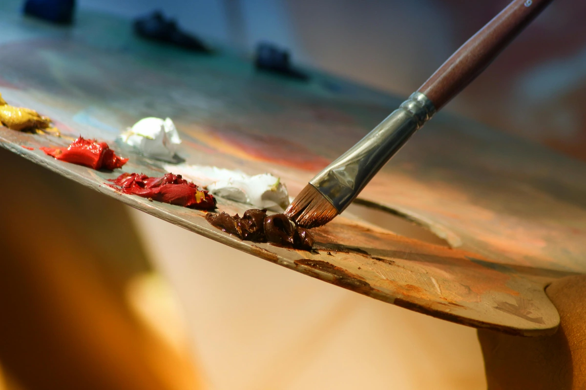
The history of pigments is really the history of humanity trying to capture the color of the world. It’s a story of grinding rocks, crushing bugs, and eventually, high-tech chemistry. It's a lineage of ingenuity, from the first handprint on a cave wall to the complex molecules being developed in labs today. Every tube of paint you buy is a direct descendant of that legacy. Broadly, they fall into two camps: the old-school and the new-school, and knowing the difference is key to understanding what you're actually putting on your canvas.
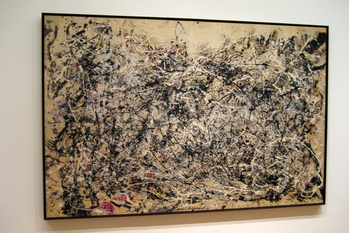
The Old Guard: Organic & Inorganic Pigments
For most of art history, artists were basically geologists and biologists. They had to source their colors from the earth or from living things. This long, fascinating history is documented on my art project timeline, where you can trace the evolution of these materials.
- Inorganic Pigments (Earth & Mineral): These are the mineral-based colors. Think of cave paintings—those artists were using ochres (yellows, reds) and umbers (browns) dug straight from the ground. These are essentially colored dirt: complex mixes of iron oxides, manganese, and clay. Take Lapis Lazuli, a semi-precious stone that had to be mined in Afghanistan and transported along ancient trade routes before being meticulously ground down to create the incredibly expensive Ultramarine blue. These pigments are known for their incredible durability and lightfastness. The reason? A stable, rock-like crystal lattice structure that's incredibly non-reactive. They don’t get fazed by sunlight or time, which is why they’re often used in art therapy at home, where permanence isn't the primary concern, but their earthy, calming qualities are.
- Organic Pigments (The Original Ones): These come from living, or once-living, sources. Carmine red, for instance, comes from crushing the cochineal insect, a scale insect that lives on cacti. The process to create just one pound of dye required tens of thousands of these tiny bugs. Indian Yellow was historically made from the urine of cows fed only on mango leaves (thankfully, that’s not the case anymore). These pigments were notoriously fickle. Their complex molecules were often sensitive to light and atmospheric pollutants, meaning paintings that relied on them too heavily could start to fade within a decade, leaving a ghost of their former vibrancy on the canvas.
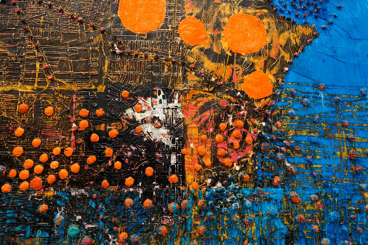
The Modern Alchemists: Synthetic Pigments
Starting around the Industrial Revolution, chemists began to synthesize pigments in labs. This was a game-changer. Suddenly, colors became more consistent, less expensive, and in many cases, more brilliant than anything found in nature. This is where we get the wild, intense colors we have today.

- Synthetic Inorganic: These are lab-made versions of mineral pigments, but often purer and more predictable. Think Cadmiums (reds, yellows, PR 108) and Cobalts (blues, greens, PB 28). Created in the 19th and 20th centuries, these pigments share the durable, opaque qualities of their natural cousins but are chemically purified for maximum strength and consistency. The manufacturing process often involves precipitating the desired metal salts under carefully controlled conditions to ensure uniform particle size and crystal structure. They offer incredible tinting power and are the workhorses for any artist who needs reliable, permanent coverage. Their price reflects the expensive raw materials (like Cadmium metal) and complex manufacturing process. When you see a Cadmium Red, you're looking at a triumph of industrial chemistry.
- Synthetic Organic: This is where modern chemistry really shines. Pigments like the Quinacridones (vibrant magentas and reds, PR 122, PR 209) and Phthalocyanines (intense blues and greens, PB 15, PG 7) were invented in the 20th century, often discovered while chemists were searching for new dyes or pharmaceutical compounds. These are the rock stars of the pigment world. They have complex, engineered carbon-based molecules that are meticulously designed to absorb and reflect light in a very specific way to produce incredibly clean, potent colors. Their molecular structure often contains large, stable aromatic rings that give them their strength and resistance to fading. They are typically transparent, incredibly strong in tinting, and have excellent lightfastness, which is why they've become essential for any artist learning how artists use color in a modern context.
From Dust to Paint: The Magic Formula
A pile of pigment dust isn't paint. Not yet. To become the stuff we squeeze out of a tube, it needs two friends: a binder and a vehicle. It’s a surprisingly simple ménage à trois that explains a whole world of art materials, and understanding this trinity is the first step to truly mastering your medium. Behind this simple formula lies the complex science of paint formulation, where variables like pigment-to-binder ratio, additive concentration, and milling time are precisely controlled to create a product with specific rheological properties—the way it flows, levels, and maintains its shape on the brush or palette knife.
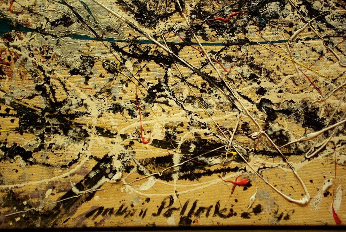
- Pigment: This is the star, the prima donna of the opera, the reason for the whole show. Without it, you just have a sticky, clear film. It provides the color, the body, the very soul of the paint.
- Binder: If the pigment is the star, the binder is the director and stage manager combined. This is the glue—a polymer or a drying oil—that forms a film as a continuous phase as it dries. It holds the pigment particles together, sticks them to the canvas, and creates a durable surface. It's what gives oil paint its buttery feel and acrylic its rubbery, flexible skin. Different binders have vastly different personalities and drying times, a choice that's as personal as my own artistic vision.
- Vehicle (or Solvent): This is the stagehand that sets everything in motion and then vanishes. Also called a solvent or thinner, this liquid controls the paint’s consistency and flow, making it brushable. Its only job is to evaporate.
The Final Step: From Paste to Product
Once our three ingredients are combined, you'd think you're done. But we just have a thick, gritty paste. This paste needs to be refined into the sublime, buttery consistency we expect from a tube of paint. This is where industrial processing comes in. The goal is deceptively simple: to perfectly and evenly distribute every single pigment particle within the binder. Any clumping or unevenness leads to a weak, gritty, and inconsistent paint.
But the real magic happens during the milling process. The pigment, binder, and vehicle are mixed into a thick paste and then put through a series of mills. The two most common types are:
- A Three-Roll Mill: This uses three horizontally positioned rollers that spin at progressively faster speeds. As the paste is fed through the tiny gap between the rollers, the immense shear force pulls the pigment agglomerates apart. The process is repeated, sometimes dozens of times, with the gaps between the rollers getting progressively smaller, until the pigment is perfectly and evenly dispersed throughout the binder.
- A Media Mill: This is more common for large-scale production. It consists of a chamber filled with thousands of tiny ceramic or steel beads and the paint paste. A rotating shaft with discs inside the chamber agitates the beads, causing them to vigorously smash into the pigment particles and break them down to their primary size.
The goal of milling isn't just to mix; it's to wet out every single pigment particle with binder, break up any clumps or agglomerates left over from the drying process, and create a smooth, stable, and consistent paint. It's the single most important step in turning a pile of dust and some goop into a world-class paint. Water, turpentine, and mineral spirits are the most common vehicles. As they disappear into the air, they leave the pigment and binder behind, locked together on the surface.
How these three come together determines the kind of paint you get. It’s a surprisingly simple formula that explains a whole world of art materials. For a complete overview, check out my definitive guide to paint types for artists.
A Closer Look at the Binder: The Engine of Your Paint
We've said the binder is the glue, but that's an oversimplification. The choice of binder is perhaps the most critical decision a paint chemist makes, as it dictates the entire character of the paint—how it feels, how it dries, and how it ages. The world of binders is a fascinating one, with each type bringing its own unique chemical and physical properties to the mix, creating distinct "personalities" for the resulting paints.
- The Oil Binder (Drying Oils): In oil paint, the binder is a "drying oil," most commonly linseed oil. When you spread it out, it doesn't dry by evaporation like water. It 'cures' through a chemical reaction with oxygen in the air, called oxidative cross-linking. The molecules link up into a tough, leathery, transparent film that locks the pigment in place. This is a slow process, which is why oil paint stays workable for so long, but it's also what can lead to yellowing over time, especially with whites.
- The Acrylic Binder (Polymer Emulsion): Acrylic paint is a water-based suspension of pigment in a milky liquid called a polymer emulsion. Think of it as millions of tiny, soft plastic beads floating in water. The water vehicle evaporates, the beads are forced together, and they fuse into a single, flexible sheet of plastic. It dries fast, stays flexible, and is remarkably durable, but it's a physical process, not a chemical one.
- The Watercolor Binder (Gum Arabic): This is the traditional water-soluble binder, made from the sap of the acacia tree. It's a natural gum that dissolves in water but forms a very fragile, brittle film when it dries. Chemically, it's a complex polysaccharide that attracts water molecules readily. This is why watercolor is so easily re-wettable. The bond between the gum arabic and the paper fibers is delicate by design.
Cracking the Color Code: The CI System and Other Designations
Ever wonder what the cryptic code on your paint tube means? Something like "Pigment Blue 15:3"? That's its international calling card, its Colour Index (CI) number. It's a global standard, published by the Society of Dyers and Colourists and the American Association of Textile Chemists and Colorists, and it's used by every major paint manufacturer. Learning to read it is like getting a cheat code for buying paint. It demystifies the ingredients list and gives you, the artist, complete control over your materials.
Beyond the CI number, you may also encounter a CAS Registry Number (CAS RN). This is a unique numerical identifier assigned to every chemical substance ever described in scientific literature. While the CI number identifies a class of pigment used for coloring (e.g., Phthalo Blue), the CAS RN specifies the exact chemical compound. For example, Phthalo Blue (PB 15) has a specific CAS RN for its alpha crystal form and a different one for its beta form (PB 15:3). It's a level of precision even beyond the CI system, used in technical documents and safety data sheets to ensure absolute clarity about a material's identity.
Let's break down PB 15:3:
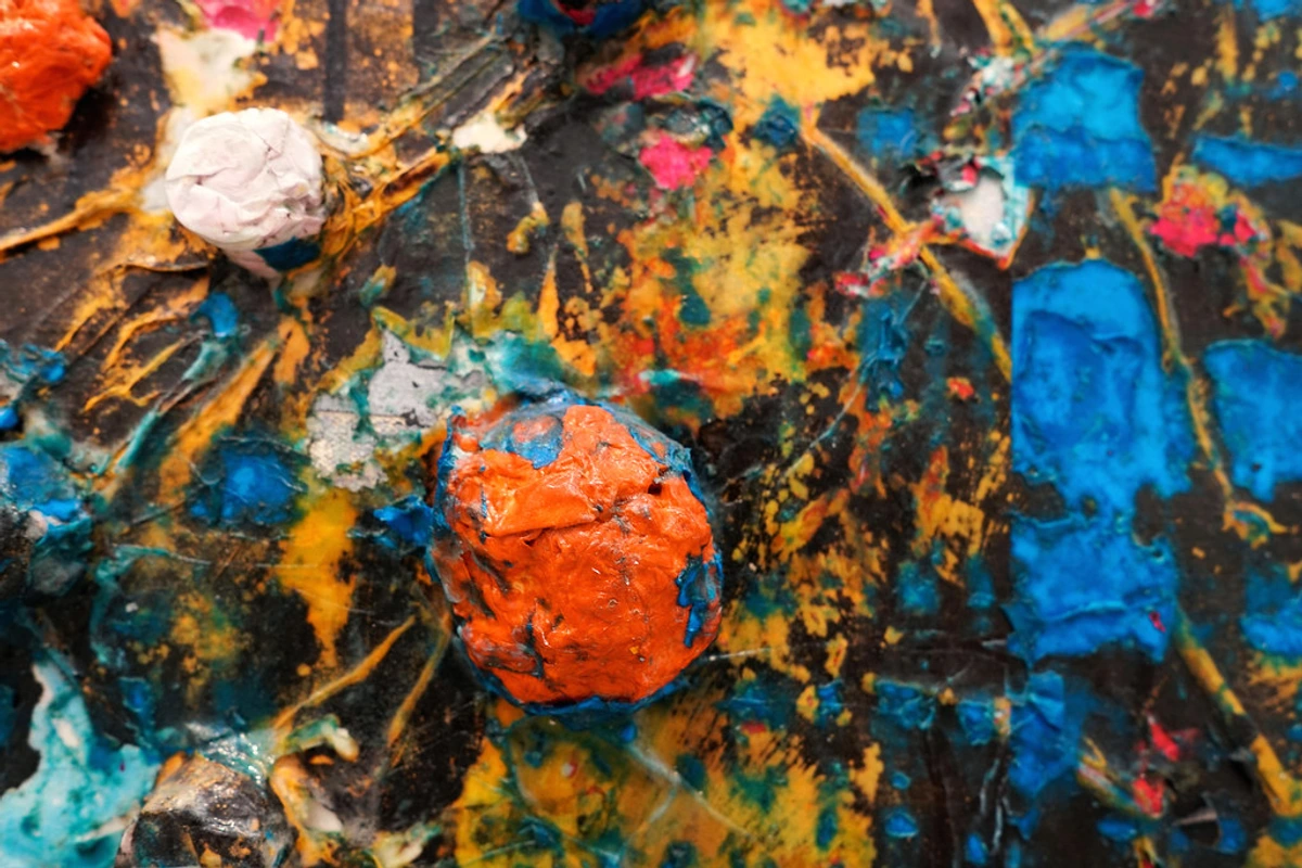
- The Category (PB): The first letter(s) tell you the hue. P = Pigment. B = Blue. You'll see PY (Pigment Yellow), PR (Pigment Red), PG (Pigment Green), PV (Pigment Violet), PO (Pigment Orange), PBk (Pigment Black), and PW (Pigment White).
- The Number (15): This identifies the specific chemical family. In this case, 15 means it's a Phthalocyanine Blue. This is its chemical surname.
- The Sub-Variant (:3): This is the really important bit. It tells you the specific crystal structure of that chemical. Think of it as the pigment's first name. PB 15:1 and PB 15:3 are both Phthalo Blues, but they have subtly different undertones (one might be greener, the other redder).
Why should you care? Because a "Cadmium Red Hue" from one brand might be a mix of two pigments (say, PR 108 and PO 20), while another uses a different recipe (PR 254 and PR 101). They might look similar out of the tube, but they will mix and dry completely differently. A single-pigment paint, however, will have just one CI number on its list of ingredients. It's the only way to know exactly what you're getting. This is a foundational step in truly understanding how artists use color.
Paint Type | Pigment | Binder | Vehicle/Solvent |
|---|---|---|---|
| Oil Paint | Any pigment | Linseed Oil (or other drying oil) | Turpentine or Mineral Spirits |
| Acrylic Paint | Any pigment | Acrylic Polymer Emulsion | Water |
| Watercolor | Any pigment | Gum Arabic | Water |
| Gouache | Any pigment + chalk (or other opacifier) | Gum Arabic | Water |
Understanding this table is like having the blueprint for every major paint you'll ever use. It explains why oil can be thinned with spirits, why acrylic cleans up with water, and why gouache is so much more matte and velvety than its watercolor cousin.
Why You, The Artist, Should Actually Care
Okay, so this is all interesting chemistry, but how does it actually affect you when you’re standing in front of a canvas? In every way imaginable. It’s the difference between buying a tube of 'blue' and choosing a specific, known chemical like Cobalt Blue (PB 28) for its opaque majesty or Phthalo Blue (PB 15) for its transparent, staining intensity. It’s the shift from feeling confident in your choices to just guessing. When you understand the why behind a pigment’s behavior—why one granulates, why another fades, why a third overpowers every mix—you move from being a passenger in your art-making to being the pilot. You stop fighting your materials and start collaborating with them.
Lightfastness: Will Your Art Fade?
This is a big one. Lightfastness is a pigment's ability to resist fading when exposed to light. Not all pigments are created equal. Some, like Alizarin Crimson, are notoriously fugitive, while the earth pigments and most synthetic inorganics are practically eternal. It’s a choice between a fleeting beauty and a lasting legacy.
Paint manufacturers use an ASTM (American Society for Testing and Materials) rating. This standardized test measures a pigment's resistance to fading under controlled light exposure. It's usually a little roman numeral printed right on the tube:
- ASTM I (Excellent): These are the marathon runners. Expect them to look vibrant for a century or more under normal gallery conditions. Think Cadmiums, Cobalts, and the modern synthetic organics like Quinacridones and Phthalos. For work you intend to sell or preserve, these should be your default choice.
- ASTM II (Very Good): A solid choice for most work. They'll last for decades under normal conditions. This category often includes many Hansa Yellows and some other synthetic organics. They are perfectly good for most artwork, but not quite as bulletproof as the ASTM I group.
- ASTM III (Fair/Not Sufficiently Lightfast): Tread carefully. These are for studies, not for finished work you want to last. You might see noticeable fading after just a few years. This is where you'll find many of the older, natural dyes and "lakes," like genuine Rose Madder or traditional Alizarin Crimson.
Don't just trust the marketing. If a tube doesn't have a lightfastness rating on it, especially for transparent watercolors and oils, consider it a red flag. Serious paint makers publish this data because they know how much it matters to working artists, especially those of us who pour our hearts into a piece that we hope will last for generations.
Always check the tube! You don't want to create a masterpiece only to have it vanish like a ghost over the years. It's one of the most heartbreaking fates for a piece of art, and it's almost always preventable with a little knowledge.
Transparency & Staining: The Light Bouncers and the Light Filters
This is where physics starts to feel like magic. The size, shape, and—most importantly—the refractive index of a pigment particle dictate whether it’s going to act like a tiny mirror or a piece of colored glass. The refractive index (RI) is just a measure of how much a material slows down and bends light. It's a fundamental optical property. If the pigment's refractive index is very different from the binder it's mixed with (e.g., Titanium Dioxide RI ~2.7 vs. Linseed Oil RI ~1.48), light will scatter dramatically at the interfaces between them (opacity). If they are close (e.g., many organic pigments have an RI similar to the binder), light will pass through with minimal scattering, allowing us to see the layers beneath (transparency). This simple principle governs one of the most important visual properties of a paint film. You can think of it like trying to look through a glass of water (similar refractive indexes, transparent) versus a glass of milk (very different refractive indexes between the water and the milk proteins, opaque).
- Opaque Pigments: Think of a lead white or a cadmium red. Their refractive index is vastly different from the binder around them. When light hits these particles, they don't let it pass through. They scatter it in all directions, immediately bouncing most of it back to your eye. They're light bouncers, and they're fantastic for covering up mistakes, creating solid foundational layers, or using techniques where you want to paint over something completely.
- Transparent & Translucent Pigments: Here we find pigments like the Quinacridones, the Perylenes, and many of the Phthalos. Their refractive index is much closer to that of the binder. Light passes through the particle, but it bends (refracts) a bit on the way. These are light filters. They don't cover what's underneath; they interact with it. A layer of Transparent Iron Oxide over a white canvas creates a warm, glowing haze. A layer of Quinacridone Magenta over a base of Cadmium Yellow can create a luminous, fiery orange that feels like it’s lit from within. Understanding this is key to techniques like mastering glazing techniques in oil painting.
- Staining Power: This is a related, and often confusing, property. A staining pigment is one where the individual particles are so tiny and powerful that they get deep into the canvas weave or paper fiber. It’s almost impossible to lift them back out. Many transparent pigments are also powerful stainers. A non-staining but transparent pigment will sit more on the surface, so you can lift highlights or modify it more easily. This is a critical distinction for watercolorists.
Tinting Strength: The Bully on the Palette
This is what I call the "bully factor." Tinting strength (or tinting power) refers to how much a small dab of a pigment can dominate a large pile of white paint. For a more scientific perspective, it is formally measured using a Tinting Strength Standard, where a pigment's ability to darken a standard white paste is compared against an international reference pigment under controlled laboratory conditions. It’s different from opacity; you can have a powerfully tinting transparent pigment. Tinting strength is a function of both the pigment's chemistry and its particle size—specifically, smaller particles have a much higher total surface area for the same volume, scattering light more efficiently and thus exerting more influence in a mix, making them stronger.
Here’s how to think about it in practice:
- The Bullies: Phthalo Blue (PB 15) and Phthalo Green (PG 7) are the undisputed kings of the playground. A pinprick of either can turn a huge dollop of titanium white into a pale, cool shade. Dioxazine Purple (PV 23) is another one, with immense tinting power due to its small particle size and strong light absorption. When you’re mixing with these, you start with the white and add the bully a minuscule amount at a time. You don’t let them near your other colors uninvited.
- The Team Players: Most of your earth tones—your Yellow Ochres (PY 43), your Burnt Umbers (PBr 7)—are much more polite. They have moderate tinting strength, blending and cooperating without overwhelming a mix. You can be much more generous when you add them.
- The Shy Ones: Some pigments, like Sap Green (often a convenience mix) or Alizarin Crimson, are surprisingly weak at tinting. You need a lot of them to create a pastel version of themselves. This isn't a bad thing; it's just a characteristic you need to know. It helps you mix colors efficiently and, more importantly, prevents that dreaded muddy mess on your palette. It's a core concept in how artists use color effectively.
Pigment Granulation, Undertones, and Mixing
Before we get to the questions, there are a few more technical quirks that can be a source of either incredible frustration or beautiful effect. They all come down to particle personality.
Granulation & Precipitating Out
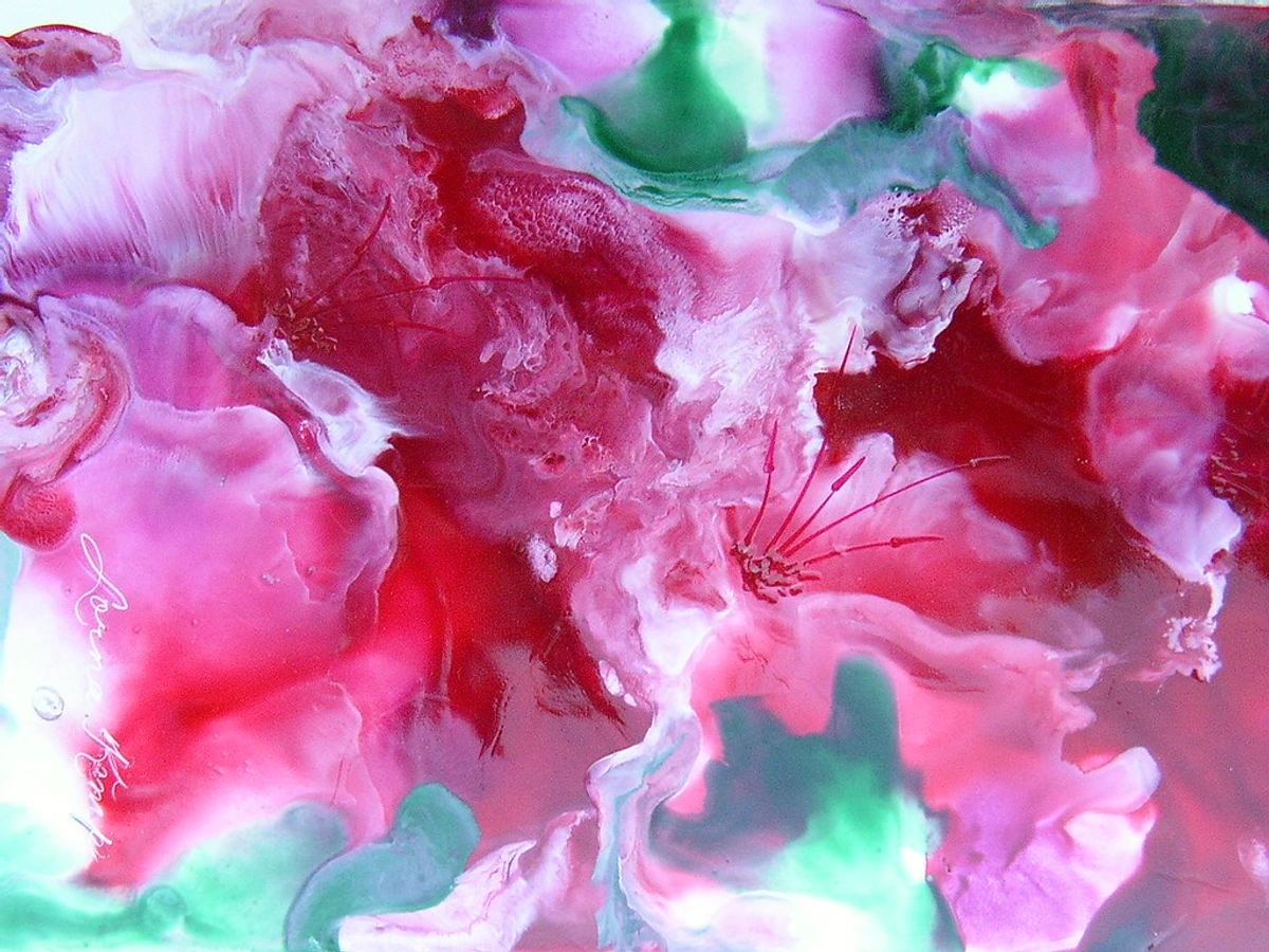
Granulation is an effect prized by watercolorists but can be puzzling if you don’t know where it comes from. It's that beautiful, grainy, mottled texture you see when a wash of, say, Cobalt Blue dries. It looks like the pigment settled in little clumps. That’s because it did. This isn't a flaw; it's a direct result of the raw pigment's fundamental properties. You can't make a non-granulating pigment granulate, but paint makers can sometimes reduce or enhance this natural characteristic using additives called dispersants, which alter how evenly the pigment particles remain suspended in the wet wash.
This happens because some pigments are comprised of larger, heavier, and more varied particle sizes, often with natural plate-like shapes that stack like tiny shingles. Pigments known for granulation include many Cobalts (PB 28, PG 19) and earth colors like Raw Umber and Raw Sienna. As the water vehicle evaporates, these heavy particles can't stay suspended evenly. They fall out of the solution (a process called sedimentation) and settle into the valleys of the paper's texture, creating those characteristic pools of saturated color and lighter, less-pigmented areas. It's less about chemistry and more about simple physics and gravity. In oil painting, this isn’t seen, but how pigment particle size affects paint quality is still a core concern for texture and opacity.
Undertones: The Hidden Hue Shift
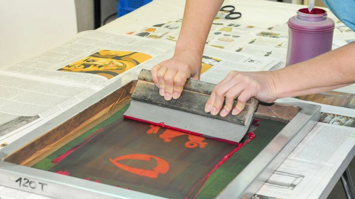
We often talk about a color having a "warm" or "cool" bias, but why? Undertones are the secret secondary color hidden within a pigment. They become most visible in thin applications or when mixed with white.
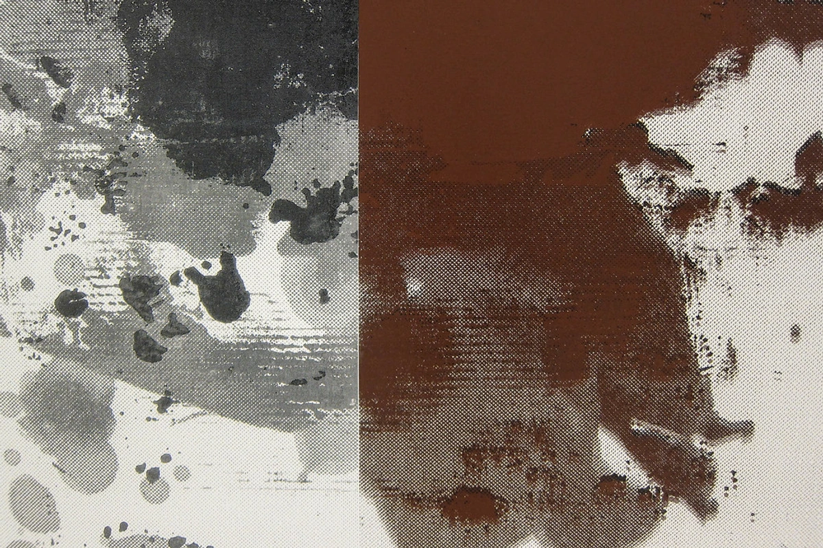
Ultramarine Blue (PB 29), for instance, famously has a red undertone—it's actually more of a reddish-violet shade in its purest form. Thinned out, it can look almost violet, a quality the Impressionists loved. Conversely, Phthalo Blue (PB 15) has a distinct green undertone—it's a cyanish blue. This isn't just a label; it's a direct result of which specific wavelengths of light the pigment molecule is best at absorbing according to its molecular orbital transitions. It creates a subtle color shift that can be used to your advantage—mixing Ultramarine (red-shade blue) with an earth red creates vibrant, clean violets; mixing Phthalo Blue (green-shade blue) with a Hansa Yellow creates brilliant secondaries. Conversely, it can wreak havoc on a delicate color mix if you’re not aware of it. It's also the reason why using a single black to darken all your colors can make them look lifeless; you're not just darkening them, you're tinting them with that black's undertone, which can lead to a dull, muddy effect. Being mindful of these undertones is a core skill in how artists use color.

FAQ: Your Pigment Questions, Answered
Let's tackle some common questions that pop up when you start going down this rabbit hole.










What's the difference between a 'hue' and a single pigment paint?
A paint labeled with 'Hue,' like 'Cadmium Red Hue,' is essentially a recipe. It's a careful blend of other, less expensive (and often less toxic) pigments designed to mimic the original color as closely as possible. While a manufacturer might get the hue very close, it almost never has the exact same properties as the real deal. The particle size will be different, so the opacity might not match. The tinting strength and undertones will be a mix of all the pigments used in the recipe.
For example, a 'Cadmium Red Hue' will never be the true Cadmium Sulfoselenide (PR 108). It's often a mix of an organic red (like a Naphthol or a Quinacridone, PR 112 or PR 209) with an organic yellow (like a Diarylide, PY 83) and a touch of white to mimic the opacity. It's a fantastic and often more affordable alternative, but you shouldn't expect it to behave like its namesake in every situation. For critical mixes, you'll get more predictable results from a single-pigment paint. Think of it like this: a 'hue' is a talented cover band that sounds great, but a single-pigment paint is the original artist performing live.
Are expensive, professional-grade paints worth it?
In a word: yes. The biggest difference between student-grade and professional-grade paint is the pigment load (or Pigment Volume Concentration, PVC). Student-grade paints are bulked up with "fillers"—inert, colorless pigments like blanc fixe (barium sulfate) or aluminum hydrate. They're like the sawdust of the paint world. They add volume cheaply but dilute the color. Pro paints have a much higher concentration of pure, potent pigment to binder. This results in richer, more intense color, much higher tinting strength, and better handling properties. You might balk at the price, but you often end up using significantly less paint to get the effect you want, and the results are in a completely different league. It's the difference between a flavorful, perfectly cooked steak and a cheap one that's mostly gristle.
Can I mix my own paint from raw pigments?
You absolutely can, and it's an amazing way to connect with your materials on a primal level. However, safety is paramount. Many pigments, especially the heavy metal ones (Cadmiums, Cobalts, Leads), are toxic if inhaled or ingested. You must wear a proper respirator mask and work in a well-ventilated area. It’s a serious undertaking, not a casual kitchen experiment, but the reward is a paint that is uniquely yours, with a color and texture you control completely. The process is detailed in my guide on how to make your own paints, a journey that connects you to the ancient traditions of art-making.
Are all modern pigments safe?
This is a crucial question. Generally, modern synthetic organic pigments (the Quinacridones, Phthalos, etc.) are considered very safe to handle in their paint form. They have low toxicity and are not considered hazardous. This is a huge advantage of modern chemistry.
The ones to be cautious with are the heavy-metal-based inorganic pigments (Cadmiums, Cobalts, Lead White), even though they are microscopically locked within their binder once the paint is dry. The danger comes from inhalation of the dry pigment dust or ingestion. So, sanding a dry painting made with cadmium paints? A very bad idea. Licking your brush? A terrible habit, no matter what you're painting with.
Always check the safety data sheet (SDS) for your paints if you're concerned, and it's smart to avoid eating or drinking in your studio. An SDS details all potential hazards and proper handling procedures. While I'm terrible at following this rule myself, you should be better. Another good practice, especially if you work in pastels or with dry pigments, is to keep a Dust-Busters log—though this is more relevant to pastel work—to monitor your exposure. Keep your work space well-ventilated, and if you ever work with dry pigments, a proper respirator mask is non-negotiable.
It’s More Than Just Color
Looking at a tube of paint as just 'blue' or 'red' is like looking at a person and only seeing the color of their shirt. Understanding the pigment inside—its history, its personality, its quirks and its flaws—gives you a much deeper, more intimate relationship with your materials. It informs your choices, elevates your technique, and connects you to a tradition of artists stretching back thousands of years, from someone grinding lapis lazuli in a medieval workshop to a chemist designing a new quinacridone molecule in a modern lab.
For me, this understanding of the stuff itself is what makes painting so endlessly fascinating. It's a dialogue between my ideas and the physical reality of the material. I'm not just slinging mud on a wall; I'm working with the legacy of alchemy and industrial chemistry, coaxing specific optical effects from tiny, engineered particles. The feeling of a brush loaded with a high-load, finely milled Cadmium is different from one loaded with a coarser, granulating Cobalt. The knowledge informs the touch. It's a reminder that even in a simple act, there's a whole universe of history and science waiting to be explored. This deep knowledge is a core part of why I paint abstract: my personal philosophy and artistic vision. It's not just about emotion; it's about a dialogue with the very physics and history of color itself. And that's where the real magic happens.