Dancing with Water: A Personal Beginner's Guide to Watercolor Techniques
That first time I picked up a watercolor brush, I felt a mix of awe and sheer terror. Awe at the luminous beauty I'd seen in galleries and online, terror at the thought of those pigments running wild, leaving me with a muddy mess instead of a masterpiece. Sound familiar? If so, welcome! You're in the right place. Watercolor, my friends, is less about taming the water and more about dancing with it, embracing its unpredictability, and finding beauty in the unexpected. This isn't just a technical manual; it's a journey—a deeply personal guide where we’ll navigate the essential tools, foundational techniques, and insights that will help you dance with water and pigment, offering practical advice woven with a reflective journey of creation. We'll explore everything from choosing your first brush and paper to mastering washes, layering, and playful experimental effects, all while navigating common pitfalls. We'll start with the basics, move through core methods, and then playfully explore some delightful experimental effects and common pitfalls to avoid.
I’ve often thought about how life itself is a lot like watercolor – sometimes you plan meticulously, other times you let the flow take over, and sometimes, despite your best intentions, you end up with something beautifully unexpected. It's about finding grace in the chaos, joy in the process, and recognizing that every layer, every bloom, every happy accident tells a story uniquely yours.
The Magic of Water (and Pigment): Your Essential Toolkit
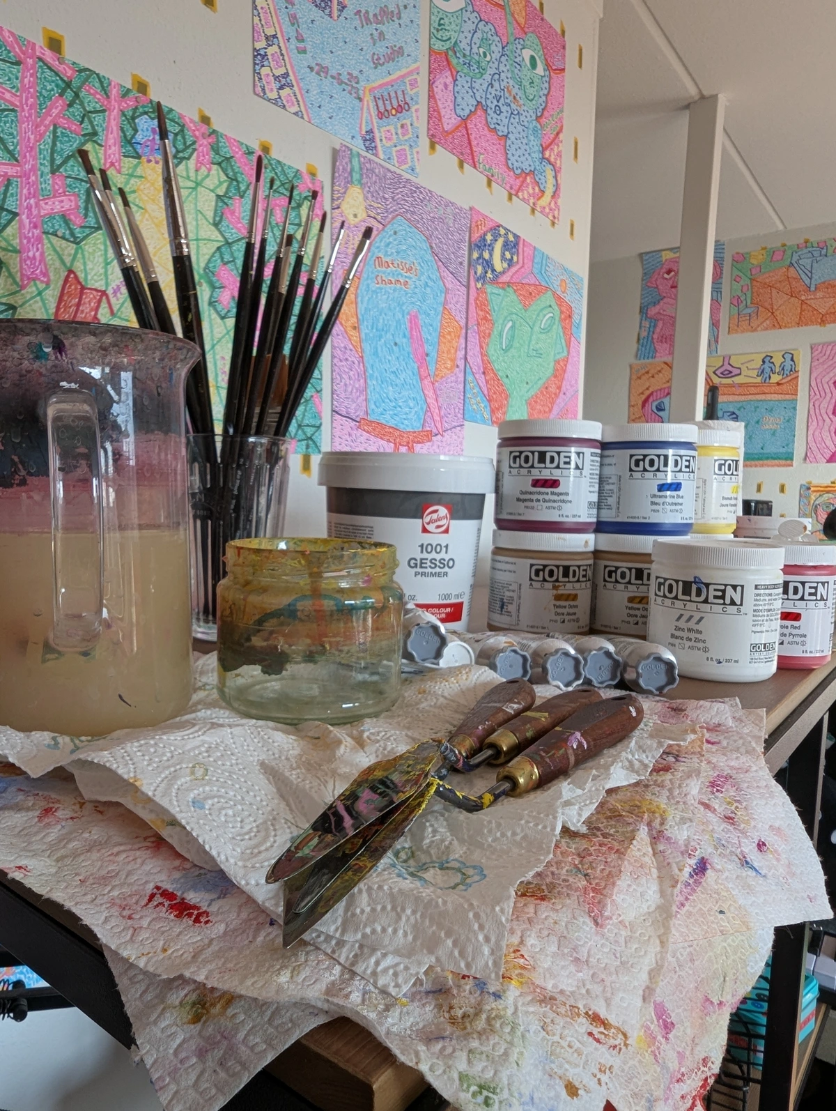
Before we splash into the techniques, let's talk about the silent partners in your watercolor adventure: your materials. Don't worry, you don't need to break the bank, but a little discernment goes a long way. Think of it as choosing good shoes for a long walk – you want comfort and reliability, not just flash. And sometimes, you just pick the ones that sparkle, because, why not?
Paper: Your Silent Partner
Oh, paper! This is arguably the most crucial component. A good watercolor paper, ideally at least 140lb (300gsm), is thirsty, robust, and patient. This weight is vital because it prevents the paper from buckling or warping excessively when wet, allowing it to hold water evenly. This, in turn, lets pigments bloom beautifully, rather than just sitting on the surface or causing the paper to crumple into a crumpled, sad mess. Trust me, I learned this the hard way. My early attempts on cheaper, lighter paper resulted in warped landscapes that looked less like rolling hills and more like crumpled paper airplanes, the kind you throw when frustrated. Invest in decent paper; your future self (and your artwork) will thank you.
This robust structure is often thanks to sizing, a gelatin or synthetic agent added to the paper during manufacturing, which reduces absorbency and prevents pigments from sinking too quickly, giving you more time to work and making lifting easier. Papers with more sizing can withstand more manipulation without pilling.
You'll also encounter different textures and absorbency rates. For example, cold press paper, with its moderate texture, offers a good balance for most techniques, allowing for a degree of controlled spreading while still showing off granulation. Rough paper, on the other hand, with its very pronounced texture, is highly absorbent, encouraging granulation (where pigment particles settle into the paper's valleys) to create rich, subtle textures perfect for atmospheric effects. Each texture brings its own personality to the dance of water and pigment.
Texture | Description | Primary Use |
|---|---|---|
| Hot Press | Smooth surface, minimal texture, less absorbent | Fine detail, crisp lines, smooth washes |
| Cold Press | Slight texture (most common), moderately absorbent | Versatile, good for most techniques |
| Rough | Very pronounced texture, highly absorbent | Atmospheric effects, granulation, bold washes |
I remember the day I finally tried rough paper; it was like discovering a secret garden for atmospheric effects, the texture creating an instant sense of depth I'd struggled to achieve on smoother surfaces. Cold press is often a fantastic starting point. For a deeper dive into materials, check out the definitive guide to watercolor painting techniques, materials, and history.
Brushes: Wands of Wonder
Your brushes are an extension of your hand, your thought, your emotion. For beginners, a round brush (size 8 or 10) and a flat brush (1/2 inch to 1 inch) are excellent starting points. A round brush, especially one with a good point, is incredibly versatile for both fine lines and broader washes, while a flat brush excels at crisp edges, washes, and blocking in larger areas. Natural hair brushes hold more water, but synthetic ones are often recommended for beginners because they are durable, retain their shape well, and are significantly more budget-friendly – a great way to start exploring without breaking the bank. Good brushes also have 'spring' or 'snap' – the ability of the bristles to return to their original shape, which is crucial for control and precise strokes. Find what feels right in your hand, like a beloved pen. Sometimes, I find myself using the same brush for years, its worn bristles telling a silent story of every stroke and every discovery. It's a small, intimate connection to countless hours of creation. And speaking of care, don't forget to clean them after each session and reshape the bristles – they'll love you back with years of service! For comprehensive advice, check out cleaning and caring for your paint brushes.

Pigments: Concentrated Dreams
Watercolor paints come in tubes or pans. Tubes offer vibrant, concentrated color, while pans are convenient for travel and quick sketches. For a foundational palette, I recommend a warm and cool primary set: Cadmium Yellow Light (warm yellow), Lemon Yellow (cool yellow), Alizarin Crimson (cool red), Cadmium Red (warm red), Ultramarine Blue (warm blue), and Phthalo Blue (cool blue). Why both warm and cool? This is called a split-primary palette, and it gives you a much wider range of clean, vibrant secondary and tertiary colors. A warm yellow and cool blue, for example, will create a different green than a cool yellow and warm blue, allowing for more nuanced mixing and preventing muddy results. This allows you to mix a vast spectrum of vibrant secondary colors (like brilliant oranges and purples) and subtle tertiary colors (such as deep olive greens, rich burnt oranges, and muted violet-greys). When I say "muddy," imagine mixing all your favorite foods into a grey, unappetizing sludge – that's what happens when colors lose their vibrancy. Add an earthy tone like Burnt Sienna and perhaps a Viridian Green, and you’re ready to explore.
Beyond just color, understanding value (how light or dark a color is) is crucial. You control value by adjusting your water-to-pigment ratio – more water for lighter values, less for darker. Try a simple exercise: pick one color and paint a gradient from very light to very dark just by changing the amount of water. This practice helps you see form even without color. Also, consider color temperature; warm colors (reds, yellows) tend to advance, while cool colors (blues, greens) recede, helping create depth and mood. Some pigments also exhibit granulation, where the pigment settles unevenly, creating a beautiful, subtle texture. Ultramarine Blue is a classic granulating color; play with it and see its magic!
A quick, but important note on pigment permanence: if you plan for your artwork to last, always look for lightfast pigments. These colors resist fading over time, ensuring your creations retain their vibrancy for years to come – something crucial for any artist selling their work. While you don't need the most expensive paints to start, know that different brands offer varying quality and pigment load. Student-grade paints, for example, often contain more fillers or extenders (like chalk or dextrin) and less concentrated pigment compared to artist-grade paints, which affects their luminosity and vibrancy. The primary binder in watercolor paints is usually gum arabic, a natural resin that helps the pigment adhere to the paper and contributes to its characteristic transparency and luminosity. While gum arabic is standard, some brands also incorporate glycerin (to increase flow and slow drying) or ox gall (a wetting agent that improves paint flow and reduces surface tension, allowing smoother washes). These additives fine-tune the paint's behavior. A good consistent light source, like natural daylight or a dedicated artist's lamp, is your best friend when working with watercolor, as it profoundly affects how you perceive and mix your delicate hues. Accurate lighting is vital for seeing true color and value relationships, especially if you intend to photograph or sell your work. Remember to test your paints on scrap paper before diving into your masterpiece; each brand and color has its own personality, and a quick swatch can save you from a delightful disaster and help you truly understand its unique behavior and mixing potential.
Surfaces Beyond Paper: Expanding Your Canvas
While paper is the traditional star, watercolor isn't strictly limited to it. For those exploring mixed media or seeking a different tactile experience, you might encounter watercolor boards or specially primed canvases. These offer a firmer, often less absorbent surface, which can be fantastic for building layers without warping, or for incorporating other mediums like ink or acrylic over your watercolor base. Think of it as opening up new avenues for your creative expression, especially if you lean towards abstract art, where texture and varied surfaces can add another dimension to your work.
Essential Companions: Water & Palette
Don't forget a couple of clean water containers – one for rinsing brushes and another for clean water to dilute paints – and a mixing palette. An old ceramic plate works just fine, or a dedicated watercolor palette with wells. Clean water is your unsung hero, ensuring your colors stay brilliant. And speaking of water, using clean, fresh water is paramount. For very delicate washes, some artists even use distilled water to avoid mineral deposits from hard tap water, which can sometimes leave subtle rings or alter color slightly. But for everyday practice, good old tap water is perfectly fine, as long as it's clean! And keep a paper towel or rag handy for blotting excess water from your brushes or lifting off paint – it's an indispensable tool! I’ve had many a moment where a strategically placed dab with a paper towel saved me from what felt like an impending disaster. It's almost like magic.

You might also hear about watercolor mediums like gum arabic (which is the natural binder in watercolor paints, and when added, can increase luminosity and drying time) or ox gall (to improve paint flow and reduce surface tension). These aren't essential for beginners but can be fun to explore once you're comfortable with the basics, adding another layer to the dance.
With our tools in hand, let's address some of the common hurdles beginners face, so you can navigate them with confidence and perhaps even a chuckle. After all, learning is often about figuring out what not to do, right?
Common Beginner Mistakes & How to Dance Past Them
We've all been there – that moment when your hopeful wash turns into a grey puddle of despair, or your paper starts pilling like an old sweater. Don't worry, these aren't failures, but gentle nudges from the universe (or the paint) guiding you to new discoveries. Here are some common beginner missteps and how I've learned to navigate them:
- Overworking the Paper: It's tempting to keep brushing, trying to "fix" an area, but watercolor paper is delicate. Too much scrubbing, especially when wet, can damage the fibers, leading to unsightly pilling and dull colors. My lesson: Less is often more. Apply a wash, then step back and let it do its thing. It's like trying to tell a joke; sometimes, the pause is what makes it land.
- Impatience with Drying: Layering wet paint on top of damp or wet layers is a recipe for mud (unless that's your intentional wet-on-wet goal!). For crisp glazes or defined edges, the underlying layer must be bone dry. My lesson: The hairdryer is your friend, but so is a cup of tea and a moment of reflection. Patience truly is your most valuable tool. And a good podcast while you wait.
- Too Much or Too Little Water: Finding the right water-to-pigment ratio is a constant dance. Too much water, and your colors are pale and hard to control; too little, and they're opaque and stiff, losing that watercolor magic. My lesson: Experiment relentlessly! Swatch out different ratios on scrap paper. You'll develop an intuitive feel over time. It's like learning to cook; you start with recipes, but eventually, you just know when it tastes right.
- Neglecting Brush Care: Muddy colors often start with a dirty brush. Not cleaning your brushes properly after each session, or letting paint dry in them, can ruin their shape and performance. My lesson: Treat your brushes like the wands of wonder they are. A quick rinse and reshape goes a long way. After all, even magic wands need a polish now and then.
- Fear of "Ruining" It: This is perhaps the biggest mistake of all. If you're constantly worried about perfection, you'll never truly play. Every "mistake" is an opportunity for learning, or sometimes, a beautiful accident. My lesson: Buy cheap practice paper and just let loose. The goal isn't a masterpiece every time, it's joy and discovery. I mean, who hasn't accidentally created something amazing while just messing around?
- Over-reliance on White Paint: Unlike opaque mediums like acrylic or oil where you can mix white paint to lighten colors (creating tints), watercolor's brilliance comes from preserving the white of your paper. Trying to lighten a dried wash with white paint often results in chalky, dull colors that lose the medium's characteristic transparency. My lesson: Plan for your whites! Masking fluid or simply leaving areas unpainted are your allies for retaining those precious highlights. Once the white is gone, it's a much harder battle. It's a bit like trying to unscramble an egg; it's rarely as good as the original. Remember, in watercolor, 'tinting' a color means adding more water, not white paint!
- Ignoring Pigment Drying Times: Just like people, different pigments have different personalities – some dry faster than others! Applying a wet layer over a still-damp, slower-drying pigment can easily lead to unexpected blooms or muddying, even if you thought the underlying layer was ready. My lesson: Get to know your pigments. Swatch them out and observe their individual drying quirks. Some, like Cadmium Yellows, are notoriously slow, while others, like Phthalo Blues, dry quite rapidly. A hairdryer helps, but knowing your pigments helps more.
Remember, every artist, no matter how seasoned, encounters these moments. It's how you respond to them, with curiosity and a willingness to adapt, that truly defines your artistic journey.
First Steps: Getting Your Feet (and Brush) Wet
Now that we've gathered our trusty companions and mentally prepped for potential pitfalls, it's time to get our hands (and brushes) dirty and explore the fundamental movements that bring watercolor to life. These foundational techniques are your building blocks. Practice them, play with them, let them surprise you. There’s no right or wrong, only exploration. Environmental factors like humidity and temperature can affect drying times, so pay attention to how your paint behaves. And remember, the magic truly begins when you allow yourself to play.
But first, a quiet whisper: before you even pick up that brush, consider the power of sketching and composition. A well-planned foundation, even a simple thumbnail sketch, can guide your hand and save you from feeling lost. Think about where your main subjects will go, how light will fall, and the overall balance of your piece. It's like having a map before embarking on an adventure – you can still take delightful detours, but you know your general direction. For more on this, consider the definitive guide to composition in abstract art.
The Humble Flat Wash: Even and Serene
This is the bread and butter of watercolor. A flat wash is an even layer of color across a surface. It sounds simple, but achieving a smooth, streak-free wash requires a delicate balance of water, pigment, and speed. My trick? Load your brush generously, hold your paper at a slight angle (gravity is your friend!), and work quickly from top to bottom, overlapping each stroke slightly. Breathe. Don't overwork it. Step back. Admire the evenness. Or the charming imperfection. Give it a try – it’s more satisfying than you think! Mastering this foundational stroke opens up a world of possibilities for creating backgrounds and large areas of color.
The Graded Wash: A Gentle Transition
Ready for a gradient? A graded wash transitions smoothly from dark to light, or from one color to another. Start with your darkest or most saturated color at the top, and as you move down, gradually add more water to your brush (or switch to a clean, damp brush) to lighten the hue. The magic here is in the subtle blend, much like how dawn transitions to full daylight. It’s a beautiful exercise in control and letting go. See if you can capture the feeling of a sunset with this technique! This gentle fading creates depth and a sense of atmosphere in your paintings.
Wet-on-Wet: Embracing the Unpredictable Flow
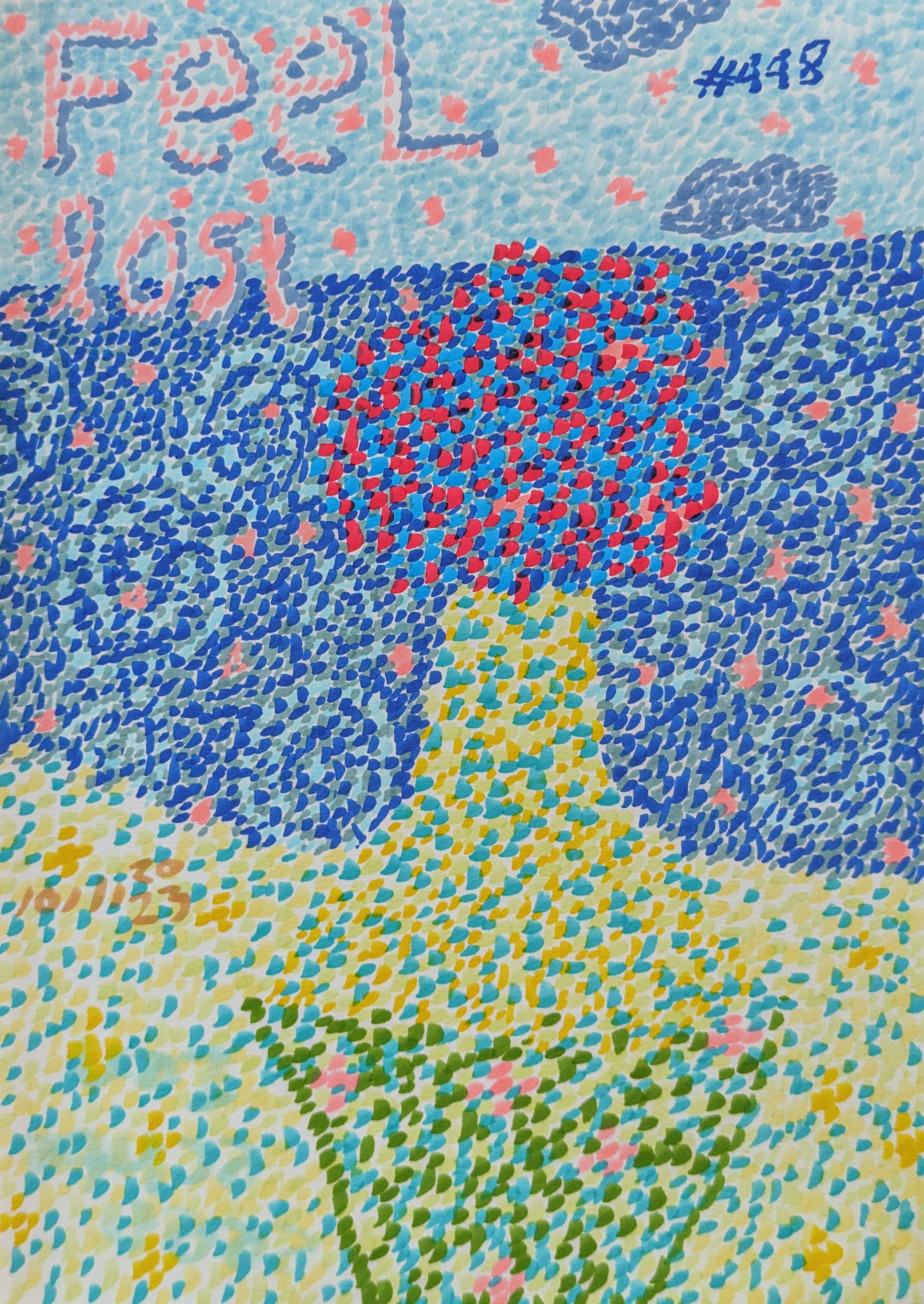
This is where watercolor truly shines and sometimes playfully frustrates! The essence of wet-on-wet is applying wet pigment to an already wet paper surface. The colors will spread, bleed, and mingle in soft, organic ways. The key here is understanding the paper saturation – the difference between wet (shining, pooling water, like a fresh puddle, where colors will explode uncontrollably) and damp (just absorbed, slightly matte, like a well-wrung sponge, allowing for more controlled spreading). Too wet, and colors will escape your grasp; too damp, and they won't flow at all. It’s glorious, often chaotic, and utterly captivating. Embrace the lack of control here; it’s a lesson in letting go, a beautiful surrender. I often find my most interesting abstract elements come from these spontaneous moments – once, I spilled a bit too much blue, and it created the most unexpected, ethereal cloud formation, entirely by accident, of course! Learning to recognize when a layer is truly dry before adding the next layer (for techniques like glazing) is crucial for different effects.
You'll quickly encounter what artists call blooms or back-runs. These happen when a drop of water or wet paint touches a still-damp wash, causing the pigment to rush outwards, creating a distinct, often beautiful, feathered edge. Sometimes they're happy accidents, sometimes they're frustrating. Learning to control the wetness of your paper and brush is key to either avoiding them or intentionally creating them for atmospheric effects, like soft clouds or distant foliage.

It’s like trying to guide liquid light – you can't fully control it, but the unfolding dance is wonderful to watch. Don't aim for perfection; aim for delight. What surprising blends will you discover? The gentle, atmospheric results of wet-on-wet are truly unique to watercolor.
Wet-on-Dry: Precision with a Personal Touch
In contrast to wet-on-wet, wet-on-dry involves applying wet paint to a dry paper surface or a dry wash. This technique gives you crisp edges, stronger colors, and much more control. It's fantastic for details, layering, and adding sharp contrasts. Think of it as defining the lines after the dream has settled. It allows for intentionality, a quiet assertion after the joyous chaos. Try painting a simple leaf or building to appreciate the crispness! This method is your go-to for adding structure and fine details.
Simple Exercises to Start
Ready to translate these techniques into your own discoveries? These simple exercises are your playground:
- Practice a flat wash across a small section of paper, aiming for evenness.
- Try a graded wash, transitioning from a dark blue to a light sky blue, capturing the feeling of an open sky.
- Create simple, soft clouds using the wet-on-wet technique.
- Paint a stylized tree, using wet-on-dry for the crisp trunk and branches, and then wet-on-wet for the soft, mingling foliage.
- For a simple color mixing exercise, choose two primary colors from your split palette (e.g., Lemon Yellow and Phthalo Blue) and mix them in varying ratios to see the range of greens you can create. Then try Cadmium Yellow Light and Ultramarine Blue and compare the results – notice how different your greens are!
- Paint basic shapes like a sphere, using graded washes to show light and shadow, exploring value control. For a deeper dive into making your objects feel real, explore the definitive guide to understanding value in art.
- Practice lifting a highlight: paint a simple, light wash, let it dry for a moment until it's damp, then gently dab with a clean, damp brush or paper towel to create a soft highlight or texture.
Don't worry about perfection, focus on understanding how the paint and water interact.
Key Takeaways for Your First Steps:
- Control the Water: It's the most powerful tool you have.
- Work Fast with Washes: Don't overwork the paper to prevent streaks and mud.
- Embrace the Flow: Wet-on-wet is about letting go; wet-on-dry is about control.
- Practice, Practice, Practice: Each attempt teaches you something new.
Layering and Lifting: Building Depth, Finding Forgiveness
One of the most appealing aspects of watercolor is its transparency, which allows for incredible layering. And for those moments when things go a bit sideways (because they will, trust me), there's lifting.
Glazing: Whispers of Color
Glazing is applying thin, transparent washes of color over a completely dry underlying wash. Each layer adds depth and richness without obscuring the layers beneath. It’s like adding a veil of color, slowly building intensity and complexity. This is where you can truly experiment with color theory, seeing how colors interact and transform when layered. For instance, try layering a warm yellow over a cool blue to create vibrant greens, or see how complementary colors like red and green can create muted, earthy tones when glazed thinly. My advice? Be patient. Let each layer dry fully. Rushing leads to muddy disappointment, and we're aiming for luminous joy. How many layers can you build before it feels just right? This technique truly brings out the luminous quality of watercolors.
Lifting: The Art of Undoing (or Redoing)
Made a mistake? Or just want to create highlights or soften an area? Lifting is your friend. While the paint is still wet, you can gently dab with a clean, damp brush, tissue or sponge to lift pigment. For dried paint, re-wet the area with clean water, let it sit for a moment, then carefully lift with a stiff-bristled brush, sponge or cloth. It's remarkably effective, especially for lighter washes or areas where paint hasn't deeply stained the paper, though it's not a magic eraser for heavy, opaque layers built up with many glazes or thickly applied tube paints. Be mindful that lifting from student-grade paper can be more challenging and prone to damaging the paper fibers compared to artist-grade paper, which is typically more robustly sized to withstand more manipulation. It’s a wonderful reminder that art (and life) is often about learning to forgive yourself and adjust. Don't be afraid to experiment with lifting to refine your work.
Remember, colors in watercolor can also be re-wet even after drying. This can be a boon for subtle blending or adjustments, allowing you to reactivate a dried wash to soften edges or blend new colors into it. However, it can also be a challenge, acting as a "double-edged sword." Overworking a dry layer can reactivate and muddy underlying colors, turning a crisp edge into a soft blur, or worse, creating a muddy mess. The trick is to understand when to gently coax the paint and when to simply let it be. It's all about thoughtful interaction and knowing when to stop, lest you end up in a battle of wills with your paper.
Key Takeaways for Layering & Lifting:
- Patience with Glazing: Let each layer dry completely for transparent depth.
- Lifting is Forgiveness: Use it to correct, soften, or create highlights, especially on lighter washes, but be gentle with your paper.
- Re-wetting for Blending: A double-edged sword – use thoughtfully for subtle adjustments, but be mindful of muddying.
Beyond the Basics: Tiny Adventures Await
Ready to move beyond the fundamentals and unlock watercolor's truly magical effects? What hidden textures and ethereal blends await your adventurous spirit? Once you're comfortable with the basics, it's time to open yourself up to experimentation with these delightful techniques. Watercolor is surprisingly versatile, a true partner in creative exploration!
Light, Shadow, and the Dance of Value
Even in the most abstract art, the interplay of light and shadow, driven by value (lightness/darkness) and color temperature, creates form and depth. Think about how a simple sphere gains its three-dimensionality through a graded shift from light to dark. In watercolor, you control this by varying your water-to-pigment ratio – more water for light areas, less for shadows. Cool colors tend to recede, warm colors advance – use this phenomenon to create the illusion of space and depth in your paintings. Observing the world around you, not just for color, but for how light falls and creates shadows, will profoundly impact your painting. It's a foundational understanding that transcends realism, grounding even the wildest abstracts, much like understanding the beat allows for the most complex dance moves.
Color Mixing Nuances: Beyond the Primaries
While the split-primary palette gives you a fantastic range, understanding further nuances in color mixing can truly elevate your work. Experiment with complementary colors (colors opposite each other on the color wheel, like red and green, or blue and orange). When mixed in watercolor, they don't create vibrant new hues but rather muted, earthy tones – perfect for subtle shadows, neutral greys, or grounding elements in your painting. Exploring color harmony – how colors interact to create a pleasing overall effect – is also key. For instance, analogous colors (those next to each other on the color wheel, like blues and greens) create a sense of calm and unity. A limited palette often creates inherent harmony, but understanding how to combine analogous colors or triads can lead to more sophisticated and emotionally resonant compositions, whether you're painting a landscape or a vibrant abstract. It's like finding the perfect chord progression in music; the individual notes are fine, but together, they sing.

Salt: Tiny Explosions of Texture
Sprinkle a pinch of table salt (or larger kosher salt for bigger crystals and more dramatic effects!) onto a very wet, shiny wash – the wetter the better for dramatic effect. As it dries, the salt crystals absorb the water and pigment, pushing it away to create beautiful, star-like textures. This effect is usually best for smaller, accent areas rather than entire large washes. It’s a delightful surprise every time, a tiny moment of unexpected artistry, often creating effects that look like tiny alien landscapes or distant star fields. I use this often to create interesting textures in my more abstract pieces. What celestial landscapes will your salt create?
Alcohol: Abstract Whispers
Similar to salt, drops of rubbing alcohol (try both 70% and 91% concentrations for different effects, as higher concentrations tend to evaporate faster and create crisper edges!) on a damp wash – when the sheen is starting to fade but the paper is still visibly moist – will create fascinating, often ethereal patterns by repelling the pigment. The effects tend to be softer and more cloud-like, working well for larger, more abstract washes or atmospheric backgrounds. It's less predictable than salt, leading to softer, cloud-like effects. A fun way to get truly abstract, even if just for a small section of your practice paper. Dare to drop and discover!
Masking Fluid: Protecting Your Precious Whites
Masking fluid is a liquid latex that you apply to areas you want to protect from paint. Once dry, you paint over it, and when your painting is complete, you gently rub off the masking fluid to reveal pristine white paper underneath. It's like a secret shield for those brightest highlights you want to preserve – think sharp edges of sunlight, delicate flower stamens, or tiny stars. Just make sure your paper is completely dry before applying or removing it. Protect your highlights with precision! However, be aware of its limitations: removing it too aggressively can tear paper, and sometimes it can leave a faint "halo" around the masked area, especially with lighter washes or on highly textured paper. It's a useful tool, but one to be wielded with a gentle touch and awareness of its quirks. And speaking of sensitive materials, ensure you have adequate ventilation when working with masking fluid or any strong solvents, keeping your studio space fresh and safe.
And let's not forget the importance of good brush care – cleaning them thoroughly with water and mild soap after each session, and reshaping them while damp, will prolong their life and maintain their precise points or edges.
My Personal Musings: The Joy of the Journey
For me, watercolor is a constant lesson in humility and joy. It forces me to slow down, to observe, to respond to what's happening on the paper rather than rigidly imposing my will. There's a certain intimacy in the way water and pigment interact, a story unfolding with every brushstroke. This philosophy of letting go and responding to the medium, rather than forcing it, is something I bring to all my art, especially when embracing the delightful chaos of wet-on-wet. It reminds me of a time I was struggling with a complex abstract piece, trying to force a certain outcome, when a happy accident of an unplanned watercolor bloom on the side unexpectedly opened up a whole new direction, becoming the focal point and teaching me the beauty of collaborative creation.
Historically, watercolor has evolved from being primarily a medium for preparatory sketches and botanical illustrations to a respected fine art medium. Early pioneers like Albrecht Dürer used it for detailed studies, while later masters like J.M.W. Turner pushed its boundaries, capturing atmospheric effects and incredible light. Turner's ability to render vast, luminous skies and seas with such fluidity deeply resonates with my own desire to capture the intangible and the expansive in abstract forms; his approach to light and atmosphere is a constant source of inspiration, showing how the medium can transcend mere representation. Beyond fine art, watercolor's precision and ability to render detail also made it invaluable for scientific illustration, cartography, and architectural renderings for centuries, showcasing its incredible versatility. John Singer Sargent, with his expressive portraits, and Winslow Homer, known for his American landscapes, further showcased its versatility and power. They understood its unique ability to capture light and atmosphere with unparalleled translucence, influencing generations. This historical journey, mirroring my own artistic exploration, reveals how artists continuously seek new ways to express themselves, often by challenging conventional uses of a medium.
My artistic timeline is dotted with moments of triumph and frustration with various mediums, but watercolor always pulls me back with its unique blend of grace and challenge. It reminds me that sometimes, the most beautiful things emerge when you loosen your grip and allow the world to collaborate with you. From the early pioneers to contemporary expression, exploring abstract art has shown me the endless possibilities of letting go and embracing the unexpected – a lesson watercolor embodies perfectly. Beyond pure watercolor, the fluid nature of the medium often inspires me to experiment with related techniques, sometimes blending watercolor with gouache for opaque highlights or incorporating ink for sharper lines, expanding the dialogue between transparency and opacity.
You can see some of my abstract explorations, which often draw inspiration from the fluid nature of watercolor, at my online gallery, or even visit my personal museum in 's-Hertogenbosch, NL, if you're ever in the area. What moments of unexpected beauty have you found in your own creative pursuits, or even in life itself? And how has the dance between control and surrender shaped your own artistic narrative?
Your Watercolor Adventure Begins
So, whether you're aiming for hyper-realistic landscapes, vibrant still lifes, expressive portraits, or diving into fluid abstract art, remember this: every stroke is a step, every puddle an opportunity, and every perceived "mistake" a chance for discovery. Watercolor is a patient teacher, inviting you to dance with the unexpected and find beauty in the flow. It asks you to trust the process, to embrace imperfections, and to find joy in the dialogue between water and pigment. Grab your brush, trust your instincts, and let the water lead the way. The journey is truly the masterpiece, and yours is just beginning. What unique story will your first dips tell? Don't forget to seek inspiration from the vast world of watercolor artists out there – their journeys can light up yours!