
Watercolor Guide: History, Techniques, Materials & My Journey
Dive into watercolor's luminous world with this personal guide. Explore its ancient history, essential materials, master diverse techniques, and find your unique artistic flow.
The Definitive Guide to Watercolor Painting: Techniques, Materials, and History
There's something almost magical about watercolor, isn't there? It’s a medium that has always fascinated me, with its luminous transparency and that delicate dance between control and pure, joyful serendipity. I remember the first time I really saw a watercolor painting – it felt alive, breathing, almost ethereal. Since then, I’ve found myself captivated by its unique ability to capture fleeting moments, light, and emotion. It's a journey from ancient origins to contemporary masterpieces, continually pushing artistic boundaries. This isn't just a guide; it’s my personal invitation to explore the rich, sometimes surprising, history, the essential materials I've come to love (and sometimes wrestle with!), and the fundamental techniques that make this art form so incredibly captivating. By the end, you'll have a solid foundation to embark on your own watercolor journey, equipped with knowledge from ancient roots to contemporary applications. Let’s dive in.

What You'll Discover in This Guide
Before we truly begin, here’s a little roadmap of what you can expect. Think of it as a quiet conversation about:
- A Fluid History: We'll trace watercolor's origins from ancient times to its modern evolution, revealing how it became the captivating medium it is today.
- The Painter's Arsenal: Dive into the essential materials – from the humble yet critical water quality to the nuanced differences in paints, brushes, and paper.
- Unlocking the Magic: Explore fundamental techniques like washes, layering, and lifting, and discover how to wield them for truly expressive art.
- Tips & Tricks from My Studio: Gather practical advice and insights I've learned (often the hard way!) to help you navigate your own watercolor journey.
- Answers to Your Burning Questions: A dedicated FAQ section to demystify common challenges and misconceptions.
My hope is that this guide not only informs but inspires, encouraging you to embrace the beautiful, sometimes unpredictable, world of watercolor.
A Journey Through Time: The History of Watercolor Painting
Thinking about the history of watercolor, I always wonder what it must have felt like to be among the first to experiment with these pigments and water. The story is as fluid and expansive as the medium itself, stretching back far beyond what many might imagine. Its roots can be traced to ancient Egypt, where pigments mixed with binders were applied to papyrus – imagine creating something that would last millennia with just water and earth! In Asia, particularly China and Japan, watercolor and ink wash painting traditions flourished for centuries, becoming highly sophisticated art forms integral to philosophical and aesthetic practices, truly a testament to its enduring power. I often find myself pondering the subtle influence of these Eastern traditions, particularly the bold graphic qualities of Japanese Ukiyo-e woodblock prints, which later captivated Western artists with their distinctive flat color areas and strong outlines, subtly echoing watercolor's own strengths.
During the European Middle Ages, watercolor was primarily used for illustrating manuscripts and creating devotional art. But then came the Renaissance, and artists like Albrecht Dürer started to see its true potential, elevating watercolor for detailed botanical studies and landscape sketches. He truly demonstrated the intricate detail and vibrant color achievable with this seemingly simple medium.
The 18th and 19th centuries marked what I like to call a "Golden Age" for watercolor in Europe, especially in England. This period saw the establishment of influential bodies like the Royal Watercolour Society in 1804, which played a crucial role in elevating watercolor's status from a preparatory sketch medium to a respected art form in its own right. Artists like the incredible J.M.W. Turner, whose evocative works like "The Fighting Temeraire" beautifully capture the interplay of light and atmosphere, and the evocative John Constable, harnessed its expressive capabilities to capture light, atmosphere, and the sublime beauty of nature in ways that still astound me. Their works often felt like a glimpse into the very soul of the landscape.
William Blake used it for his visionary illustrations, and figures like Paul Sandby, often called the "father of English watercolor," along with Thomas Girtin, really solidified its place. Across the pond, American artists like Winslow Homer later embraced it, capturing the raw energy of seascapes and everyday life.
Even the Impressionists, with their obsession with light and color, found watercolor to be a perfect medium for quick studies, echoing themes they explored in oil painting, often using it to capture fleeting light and atmospheric conditions.
If you’re as fascinated by art history as I am, you might also enjoy diving into our articles on the history of oil painting from ancient pigments to modern masterpieces and the history of acrylic painting from industrial innovation to artistic medium.
In the 20th century, watercolor continued its evolution, embraced by artists across various movements. Its versatility allowed for both precise realism and bold abstraction, cementing its status as a dynamic and enduring artistic medium. Today, contemporary artists continue to push its boundaries, exploring new techniques and applications – it’s really inspiring to see.
But before we leap into those contemporary creations, let's talk about the very things that make this magic possible: the materials. It's often where my own artistic journey truly begins, a quiet moment of selecting tools that feel just right in my hands.
The Essentials: Materials for Watercolor
Embarking on a watercolor journey, for me, always starts with the quiet ritual of understanding my tools. It’s like preparing for a conversation; you need the right words, or in this case, the right paints, brushes, and paper. While they might seem simple, each component plays an absolutely crucial role in the final outcome – and sometimes, choosing them feels like a little adventure in itself.
The Unsung Hero: Water Quality
Before we even get to the pigments, let’s talk about water. Yes, just water! It might sound a bit finicky, but the quality of your water can actually impact how your colors behave. Tap water can contain minerals or chlorine that might subtly dull colors or leave residue. Personally, I usually opt for distilled water for my more delicate pieces, especially if I’m working with very light washes or specific pigments. For practice, tap water is perfectly fine, but it’s something to keep in the back of your mind as you refine your craft.
Watercolor Paints
Watercolor paints consist of pigment suspended in a water-soluble binder, typically gum arabic. They are available in various forms:
- Pans: Dry, solid blocks of paint. Ideal for portability and smaller washes – great for sketching on the go, which I love to do.
- Tubes: Concentrated, moist paint. Offers richer color and is often preferred for larger washes and intense hues. These are my go-to for studio work when I need a lot of vibrant color fast.
- Liquid Watercolors: Highly concentrated liquid dyes, known for their vibrant intensity. I don’t use these as often, but they can create some really striking, almost glowing effects.
When selecting paints, consider the grade:
- Artist-grade: Higher pigment concentration, finer ground pigments, better lightfastness, and more vibrant colors. If you’re serious, these are worth the investment – the difference in how they work is palpable.
- Student-grade: More fillers, less pigment, suitable for practice and beginners. I remember starting with student grade; they’re perfect for getting a feel for the medium without breaking the bank.
Brushes
Ah, brushes! The right brush can truly transform your painting experience. Watercolor brushes are designed to hold a significant amount of water, which is key to those luscious washes we all love.
- Natural Hair: Sable (Kolinsky) is highly prized for its absorbency, spring, and fine point. My first sable brush felt like a revelation – it just knew what to do! Though, I've also had brushes that felt like they had a mind of their own, leading me on some unexpected detours, but that's part of the charm (and sometimes frustration!) of the journey. Squirrel offers excellent water retention for washes, perfect for those broad, soft backgrounds.
- Synthetic Hair: More durable, often more affordable, and can mimic natural hair properties. Excellent for precise work, and honestly, synthetic brushes have come so far that they’re often indistinguishable from natural hair brushes for many applications.
- Brush Shapes:
- Round: Versatile for lines, washes, and details – probably the one I reach for most often.
- Flat/One-Stroke: Good for bold strokes, crisp edges, and broad washes.
- Wash: Large, soft brushes for broad washes, covering big areas quickly and smoothly.
- Rigger/Liner: Long, thin bristles for incredibly fine lines and details, perfect for delicate work like branches or hair.
- Mop: Large, absorbent for soft washes, giving a beautiful, gentle diffusion.
Brush Care and Maintenance
Taking care of your brushes is like nurturing a good friendship – a little effort goes a long way! After each painting session, I always make sure to rinse my brushes thoroughly with clean water, gently working out any remaining pigment. Avoid letting paint dry in the bristles, especially near the ferrule (the metal part), as this can permanently damage them. Reshape the brush head to its original point or edge before storing it, ideally flat or bristles-up. A well-maintained brush truly is a joy to work with, and it will serve you faithfully for years. You can dive even deeper into this topic with our guide on cleaning and caring for your paint brushes.
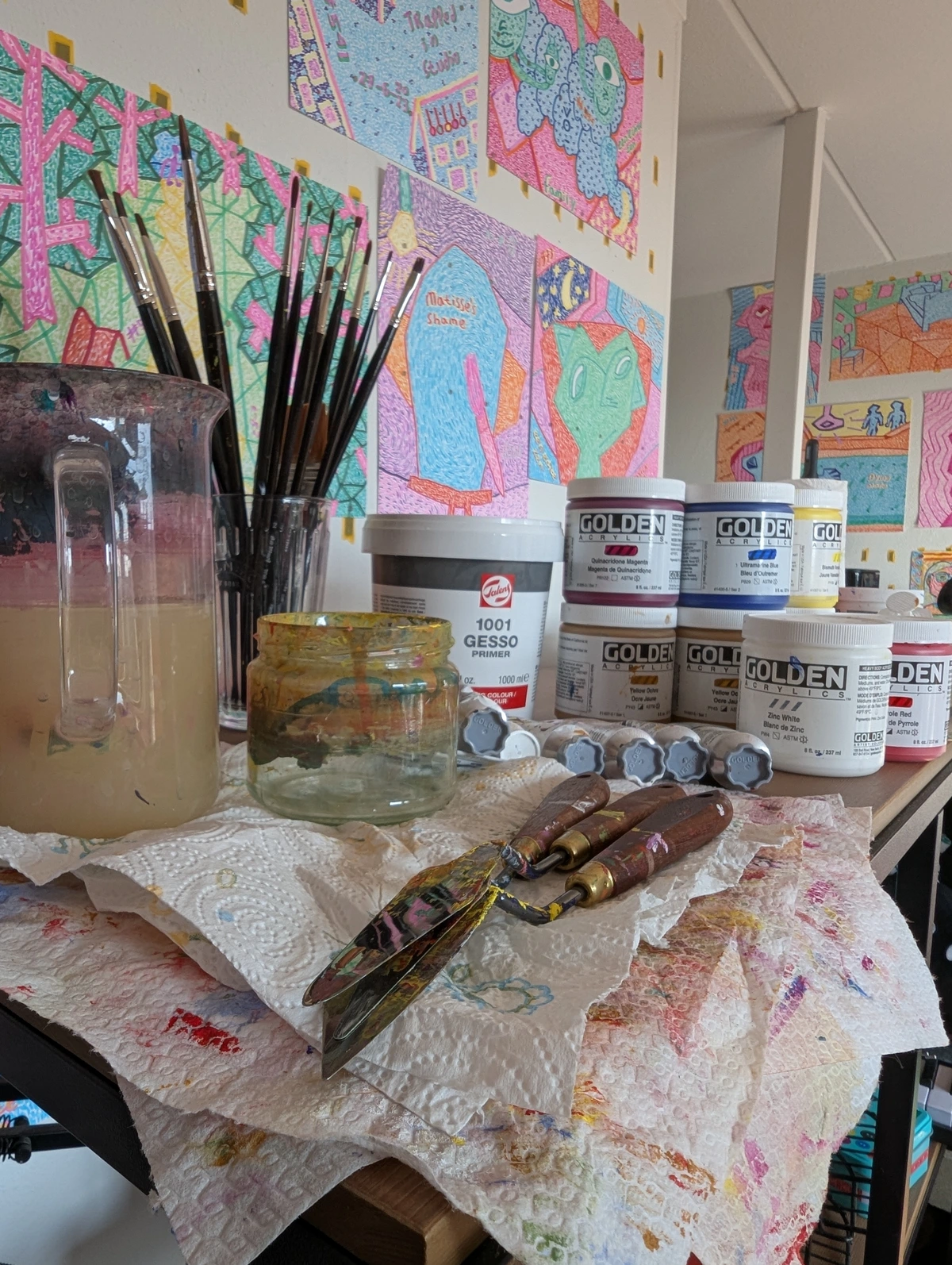
Paper
Watercolor paper is, perhaps, the most critical material in my opinion. Its quality directly impacts how colors behave and blend – it’s like the stage for your pigment's performance.
- Weight: Measured in pounds (lb) or grams per square meter (gsm). Heavier paper (300lb/640gsm or 140lb/300gsm) is less prone to buckling. Trust me, fighting a buckling paper while you're trying to create a delicate wash is no fun.
- Texture (Finish):
- Hot-press (HP): Smooth surface, ideal for fine details and precise work. I love this for botanical illustrations or anything that requires crisp lines.
- Cold-press (CP/NOT): Medium texture, versatile, retains pigment well. Cold-press and NOT are often used interchangeably to describe a paper that hasn't been hot-pressed, meaning it retains a slight texture from its manufacturing. This is usually my go-to, the workhorse of watercolor paper. It’s a great balance.
- Rough: Heavily textured, creates interesting granular effects, good for landscapes. It adds an almost organic feel to the paint.
- Composition: Cotton (rag) paper is premium, acid-free, and offers superior longevity and performance. Its long, strong fibers allow it to absorb and release water more evenly, holding pigment beautifully and making lifting techniques much more effective. Wood pulp papers are more economical, great for practice, but don't expect the same archival quality or brilliant lift.
- Sizing: This is an internal or external treatment that reduces the paper's absorbency, allowing paint to sit on the surface longer for blending and manipulation. Think of it like a gentle shield for the paper, giving you more control and time to play with your colors before they sink in. Without proper sizing, paper would simply absorb paint too quickly, leading to flat, dull colors and making layering impossible.

Other Essential Tools
Beyond the big three, there are a few other bits and bobs that make life easier (and more fun!) when you're painting with watercolor:
- Palette: Ceramic, plastic, or porcelain palettes for mixing colors. I prefer ceramic; it’s easy to clean and the colors just sing on it.
- Water Containers: Two are recommended: one for rinsing dirty brushes (which inevitably turns murky very fast!) and one for clean water to dilute paint. This simple trick saves so much frustration.
- Masking Fluid: A liquid latex that protects areas from paint, creating sharp white spaces. It’s brilliant for preserving highlights, though removing it can sometimes feel like a delicate operation.
- Sponges, Paper Towels, Natural Sponges: For lifting, dabbing, and creating textures. Don't underestimate the power of a simple paper towel for corrections or soft effects!
- Drawing Board/Tape: To stretch paper and prevent buckling. Essential if you're using lighter weight paper.
Unveiling the Techniques: Mastering Watercolor
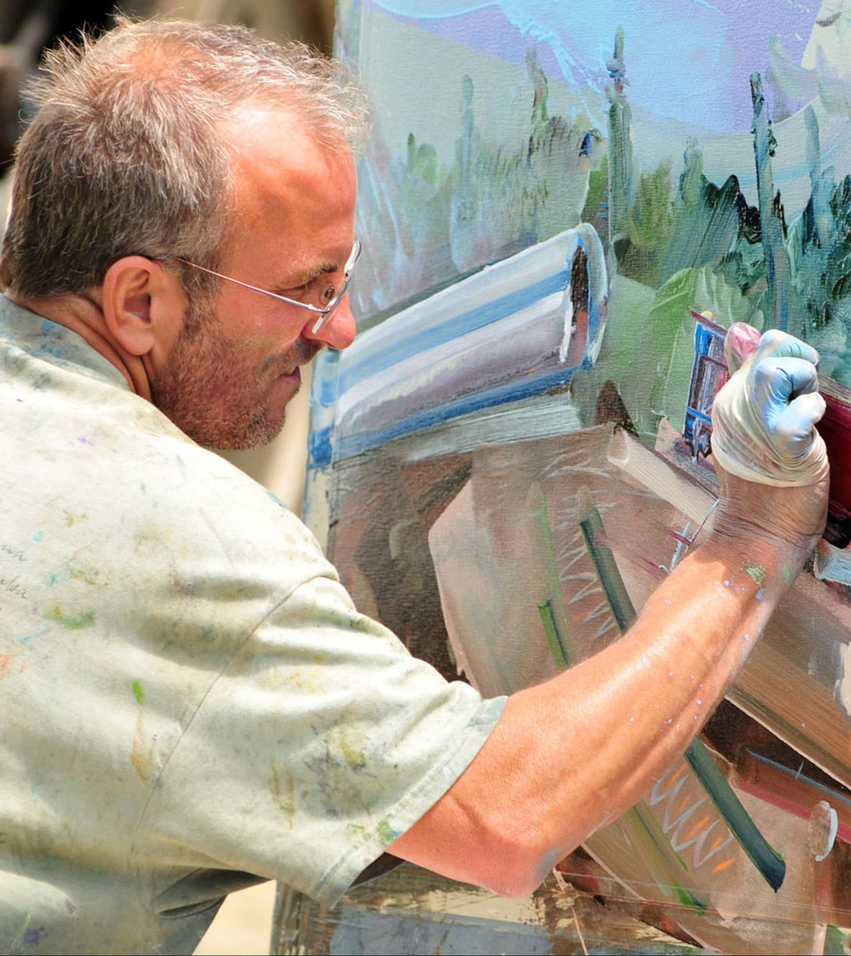
So, how do we actually make this magic happen on paper? This is where the real magic happens, where the interplay of water and pigment truly comes to life. I’ve always found that the joy of watercolor isn't just in the final piece, but in the process of learning and mastering these techniques. They leverage the medium’s inherent transparency, and honestly, some of them still feel like a beautiful mystery unfolding before my eyes.
1. Washes
Washes are fundamental, creating those smooth, even, luminous layers of color we love. It’s often the first technique I tackle, and it sets the tone for the whole painting.
- Flat Wash: An even, consistent layer of color across a surface. This one requires a steady hand and sufficient paint – it’s deceptively simple but incredibly satisfying when you get it just right.
- Graded Wash: A wash that transitions smoothly from dark to light, or from one color to another. You achieve this by gradually adding more water to your brush as you move down the paper, or by subtly introducing a different color for a gentle blend.
- Wet-on-Wet: Applying wet paint to a pre-wet paper surface. This is where things get really fun, and sometimes a little wild! It allows colors to bleed and blend organically, creating soft, diffused, and often unpredictable effects. It’s a dance with chance, where the water often leads, and I've learned to love where it takes me. Sometimes it feels like letting the paint have a little party on the paper, and you’re just the host trying to keep up!
2. Layering and Glazing
Watercolor's inherent transparency makes layering, or glazing, an incredibly powerful technique. It's how I build depth and complexity. By applying thin, transparent layers of color over dried previous layers, you can build rich depth, create entirely new colors, and intensify hues without muddying the painting. For instance, layering a transparent yellow over a dried blue wash can create a vibrant, glowing green, far more nuanced than simply mixing green pigment directly. Or, try layering a translucent cadmium red over a dried cadmium yellow wash to produce a vibrant, glowing orange that feels far more luminous than a pre-mixed tube orange. Each successive layer subtly influences the one beneath, allowing light to reflect through all of them, giving watercolor its signature glow. It’s like building a story, one translucent chapter at a time.
3. Lifting
This technique involves removing wet or dried paint from the paper to create highlights, soften edges, or even correct what I might initially think is a "mistake." A clean, damp brush, sponge, or paper towel can be used. On dried paint, gentle scrubbing with a damp brush may lift some pigment, especially with non-staining colors. I remember once I accidentally dropped a blob of dark paint right onto a pristine sky; a quick, gentle lift with a damp paper towel saved the day and turned a potential disaster into a soft, ethereal cloud. It’s a wonderfully forgiving technique when you need it.
4. Dry Brush
Applying paint with a nearly dry brush to a dry paper surface creates broken, textured lines and granular effects. This technique really highlights the paper's texture and is excellent for depicting rough surfaces, foliage, or weathered objects. It’s perfect for adding a touch of rustic charm or dramatic texture.
5. Masking
Masking fluid, as I mentioned earlier, is invaluable for preserving crisp white areas or specific details. You apply it, let it dry (which feels like forever sometimes!), paint over it, and then carefully rub it off once the paint is dry to reveal the untouched paper beneath. It’s a bit fiddly, but the sharp edges it creates are often worth the effort.
6. Color Mixing: Finding Your Harmony
For me, color mixing in watercolor is both an art and a science, and it’s always an ongoing exploration. Understanding how colors interact is foundational to creating vibrant, harmonious paintings. I always keep a small scrap of paper nearby to test mixes before applying them to my main piece.
- Primary Colors: Red, blue, and yellow are your starting point – the building blocks of every other color.
- Secondary Colors: Mix two primaries, and you get green, orange, or purple.
- Complementary Colors: These are colors opposite each other on the color wheel (e.g., red and green, blue and orange). When placed next to each other, they create high contrast and vibrancy, making each other "pop." When mixed, they can create beautiful, muted grays or browns, which are essential for achieving color harmony and subtle shadows. It’s a tricky balance, but essential to learn.
- Warm vs. Cool Palettes: Warm colors (reds, oranges, yellows) tend to advance and feel energetic, while cool colors (blues, greens, purples) recede and feel calming. Playing with this contrast can add incredible depth to your work.
- Color Temperature: Beyond warm and cool palettes, understanding color temperature allows you to manipulate the perceived depth and mood of your painting. A 'cool' red (like Alizarin Crimson) or a 'warm' blue (like Ultramarine) can dramatically alter the feel of a piece, creating subtle shifts that draw the viewer's eye. For example, a warm yellow-green can feel lush and inviting, while a cool blue-green might evoke a misty, distant landscape.
The beauty is in the endless possibilities, and I often find myself experimenting, sometimes stumbling upon a truly unexpected and beautiful hue.

7. Special Effects
Sometimes, I love to introduce a bit of chaos (the good kind!) to my watercolors with special effects:
- Salt: Sprinkle coarse salt onto wet washes. As it dries, the salt crystals absorb water and pigment, pushing it away, creating beautiful starburst or textured patterns. It’s a wonderfully organic way to add texture.
- Alcohol: Drops of rubbing alcohol on wet paint will create interesting circular displacement effects. The alcohol repels the water and pigment, causing it to disperse outwards. It’s surprisingly unpredictable and always fun.
- Granulation: Some pigments naturally granulate, separating into speckled textures as they dry. This effect can be enhanced by using rough paper or specific painting methods. I particularly love this for landscapes, giving a natural, earthy feel.
8. Paper Stretching: The Art of Flatness
If you’ve ever worked with lighter watercolor paper and seen it buckle and warp as it dries, you know the frustration. Paper stretching is a crucial technique to prevent this. It involves wetting your paper thoroughly, taping or stapling it to a rigid board, and letting it dry taut. Once dry, it will remain flat even when heavily re-wetted during painting. It adds an extra step to the process, but the smooth, unwarped surface it provides is a game-changer, especially for large washes.
9. Exploring Watercolor Mediums
Beyond just water, there are various mediums you can add to your watercolor paints to alter their properties, offering even more control and expressive possibilities. I often experiment with these when I want a very specific effect:
- Gum Arabic: This is the binder already in your paints, but adding extra can increase transparency, gloss, and slow down drying time. It can also intensify colors.
- Ox Gall: A wetting agent that improves the flow of watercolor, especially on less absorbent paper, allowing for smoother, more even washes. It’s great when you want your paint to really spread.
- Masking Fluid (revisited): While a tool, it's also a medium of sorts, protecting areas you want to keep pristine white.
- Granulation Medium: Enhances the natural granulation of pigments, creating beautiful, textured effects, especially with certain colors.
Tips for the Aspiring Watercolorist
Watercolor, with its sometimes-unforgiving nature, can initially feel a bit daunting – I certainly found it so! But trust me, with a healthy dose of practice and a good measure of patience, its rewards are truly immense. It’s a journey, not a race, and here are a few things I’ve learned along the way that might help you on yours:
- Embrace Mistakes (Seriously!): Watercolor is often about embracing the unexpected. What might seem like a mistake in the moment can often be incorporated, or even lead to a breakthrough. I’ve had many "happy accidents" that turned into favorite elements of a painting. It’s a lesson in letting go. Don't worry if your first attempts look more like a toddler's enthusiastic art project – mine often did, and honestly, sometimes still do! That's part of the charm and the learning.
- Practice Regularly (Even Short Bursts): Consistent practice, even for short periods, builds confidence and muscle memory. A quick 15-minute sketch or wash exercise can do wonders. It’s about building a relationship with the medium.
- Experiment Fearlessly: Don't be afraid to try new techniques, mix unusual colors, or use different tools. This is how you find your unique voice and discover what truly excites you. I keep a dedicated sketchbook just for wild experiments – no pressure, just play.
- Work Light to Dark (Mostly): Generally, start with lighter washes and gradually build up to darker tones. It’s much easier to darken a wash than to lighten it, though lifting techniques offer some grace. This principle saves a lot of headaches!
- Observe and Sketch from Life: Before you even pick up a brush, spend time simply observing the world around you. Sketching from life – try simple subjects like a single piece of fruit, a cluster of leaves, a teacup, or even the ever-changing shapes of clouds – helps you understand forms, light, and shadows, which are invaluable skills when you translate them to watercolor. It’s about training your eye. This skill is also deeply connected to Plein Air painting, where artists capture the ephemeral beauty of the outdoors.
- Mind Your Light: Good lighting is often overlooked but crucial. Painting under natural, consistent light will help you perceive true colors and values more accurately, preventing frustrating surprises when you view your finished piece in different conditions. It’s like having an honest friend who tells you when your colors are looking a bit off.
- Consider Sustainable Choices: As artists, we often use many materials. Becoming aware of the environmental impact of our supplies, from pigments to paper, can guide more sustainable choices. Exploring brands that prioritize eco-friendly production, seeking out recycled or bamboo paper options, or even researching ethical pigment sourcing can be a rewarding part of your artistic journey.
- Understand Color Theory: A solid grasp of how colors interact will greatly enhance your watercolor paintings. It helps you avoid muddy mixes and create vibrant harmonies. You might also find insights in our article on how artists use color.
- Consider Composition: Even in a fluid medium, thoughtful arrangement of elements makes a painting stronger. A well-composed piece just feels right, guiding the viewer’s eye through your artistic narrative.
Frequently Asked Questions (FAQ)
I get a lot of questions about watercolor, and some of them pop up time and again. Here are a few I often find myself answering:
Why does watercolor feel so intimidating compared to other paints?
Oh, I totally get this! Watercolor's main challenge, from my experience, really lies in its drying speed and transparency. Once a wash dries, it's incredibly difficult to alter without leaving a trace – it's not like oil or acrylic where you can just paint over a "mistake." Its transparency means any misstep feels amplified, and you have to build colors in delicate layers rather than just slathering them on opaquely. It definitely demands planning, a bit of bravery, and a willingness to surrender to its nature.
What do you do when you make a "mistake" in watercolor?
This is a big one! My first piece of advice, as I mentioned earlier, is to embrace it. Seriously, sometimes a happy accident can steer your painting in an entirely new, beautiful direction. If it’s truly something you want to change, gently lifting wet paint with a clean, damp brush or paper towel can work wonders. For dried paint, a damp sponge or even specialized erasers can help, especially with non-staining pigments. Sometimes, I integrate it into the background, or turn it into a cloud, or a textured element. It's all part of the learning curve, and sometimes, the "mistakes" are what make a piece uniquely yours.
What's the real difference between watercolor paper and regular drawing paper?
Oh, this is a huge one, and often a source of early frustration for beginners! Regular drawing paper or printer paper is simply not designed to handle water. It will buckle, warp, pill (tiny fibers lifting up), and absorb paint unevenly, leading to dull, flat colors and a terrible painting experience. Watercolor paper, on the other hand, is specifically engineered to withstand moisture. It's heavier, has robust internal and external sizing (which we talked about earlier!), and is made with cotton fibers (in artist-grade) that allow it to absorb water without falling apart, keeping its integrity, and allowing pigments to sit beautifully on the surface for vibrant washes and easy manipulation. This sizing creates a barrier that controls how quickly water and pigment are absorbed, giving you more time to blend and layer without the paper becoming oversaturated or losing its structure. It's truly the foundation of a good watercolor painting.
Can I mix watercolor with other art media?
Absolutely! Watercolor is wonderfully versatile and plays well with others, which I love. It pairs beautifully with ink (especially for outlines or intricate details), gouache (if you want opaque accents), colored pencils, pastels, and even some acrylic mediums (used sparingly, of course). This allows for fantastic mixed-media effects, adding texture, sharp detail, or much-needed opacity where a transparent wash just won't cut it. However, when mixing media, it's always wise to consider the archival properties and potential adhesion issues. For example, ensure your chosen media are compatible and won't flake or degrade over time if you intend the piece to last. A quick test on a scrap piece of paper can save a lot of heartache.
How do I protect my watercolor masterpieces from fading or damage?
Preserving your watercolor paintings is super important, especially if you're like me and get emotionally attached to them! My go-to method is framing them under glass – this protects them against dust, humidity, and curious fingers. Always use acid-free mats and backing boards to prevent discoloration over time. And a big one: keep them out of direct sunlight! Some pigments are more susceptible to UV damage than others, and you don't want your vibrant colors to fade away.
What's the real difference between gouache and traditional watercolor?
This is a common question! While both are water-based, the key difference is opacity. Traditional watercolor, as we've discussed, is transparent. Gouache, on the other hand, is opaque. It contains white pigment (often chalk or zinc white) in addition to colored pigment, which gives it its characteristic opaqueness and a lovely matte finish. This means with gouache, you can paint lighter colors over darker ones, which is a big contrast to transparent watercolor where you generally work from light to dark. I sometimes use gouache for highlights or very specific, strong color pops in my mixed-media pieces.
Conclusion: The Enduring Allure of Watercolor
For me, watercolor isn't just a medium; it's a conversation, a dance, a constant lesson in letting go and embracing the unexpected. Its historical depth and artistic breadth truly continue to captivate and inspire me every single day. It's a medium that demands respect for its unique properties – its transparency, its speed, its unforgiving nature – but oh, the rewards! The unparalleled luminosity, the delicate expressions, the sheer joy of watching colors bloom on paper. There's also a wonderfully meditative quality to the flow of water and pigment, a quiet focus that can be deeply therapeutic, helping to calm the mind and nourish the soul. It's something truly special.
Whether you're a seasoned painter looking to rekindle your love for this fluid art form, or just dipping your toes into the watercolor world for the very first first time (welcome!), I genuinely believe there are endless possibilities for exploration and creation waiting for you. Don't be afraid to experiment, to make "mistakes," and most importantly, to find your own unique voice within its radiant beauty. Embrace its fluidity, master (or at least befriend!) its techniques, and discover the incredible art you can bring to life.
Who knows? Perhaps your next piece, a testament to this incredible medium, will even find a cherished place in your own collection, be featured in a gallery like the Zenmuseum, or maybe you'll even consider starting your own artistic journey, much like mine, which you can learn more about on my timeline. The future of watercolor is as boundless as our imagination, continually evolving with new artists and techniques, and you're now a part of that vibrant story. If you're looking for inspiration or perhaps a piece to start your own collection, you can always explore available artworks at our art for sale page. Keep painting, keep creating, and keep finding the beauty in the flow!


