Drawing Realistic Eyes: The Ultimate Guide to Capturing Soul, Expression & Depth
Unlock the true 'soul' of eyes! This ultimate guide, from a working artist, covers anatomy, light, shading, digital tools, and advanced techniques to bring your portraits and characters to life. Learn from common pitfalls and master the art of the gaze with personal insights.
My Secret to Drawing Realistic Eyes: The Ultimate Guide to Capturing Soul, Expression & Depth
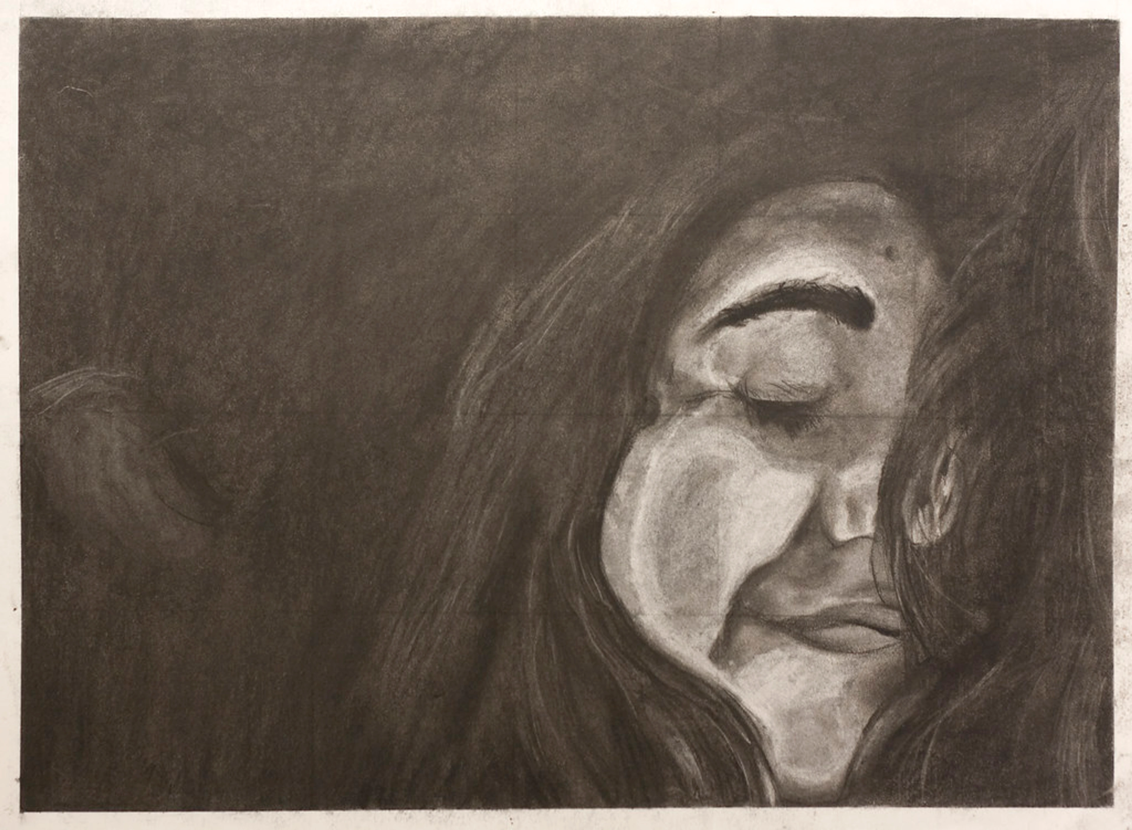
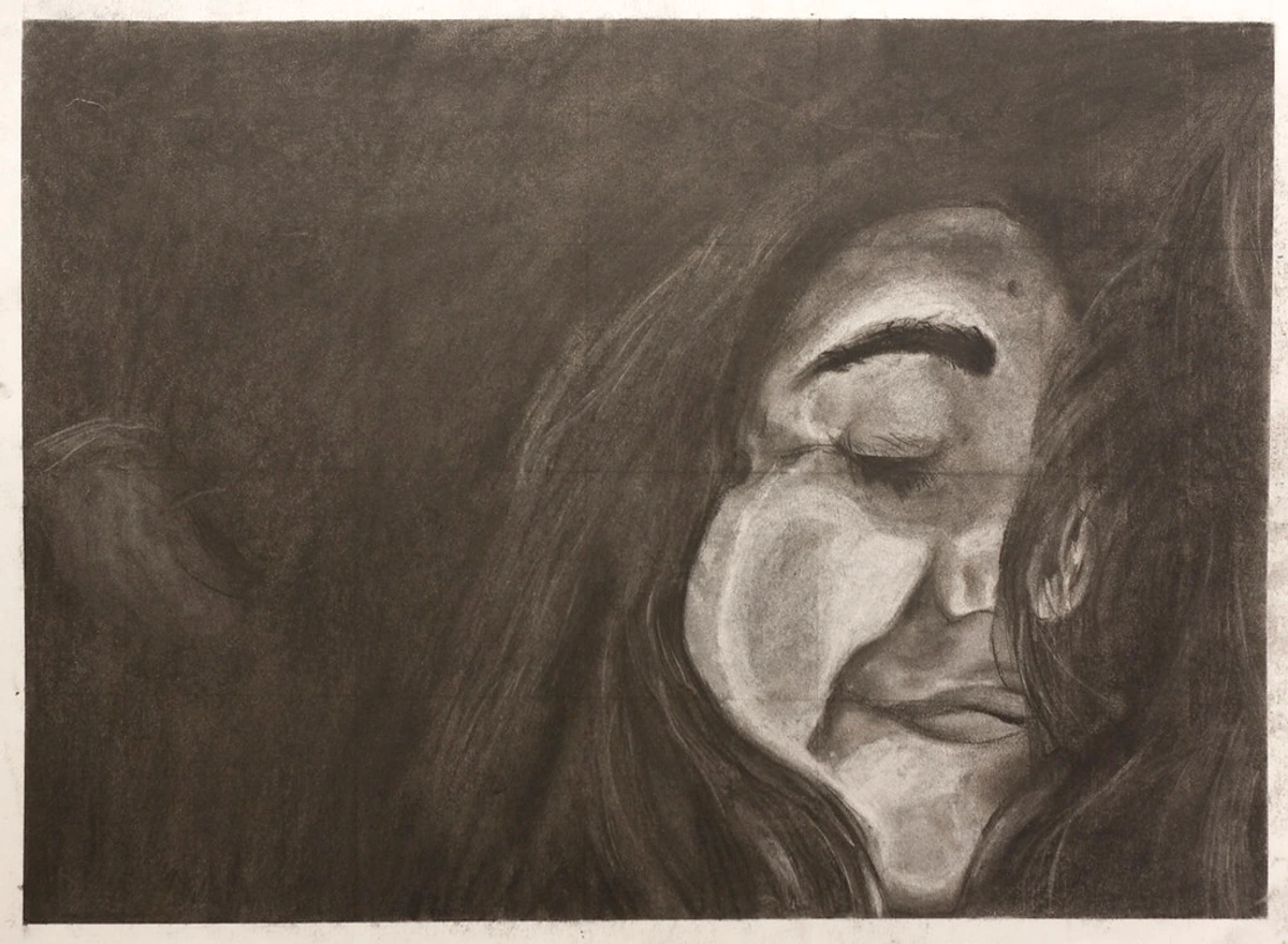
For the longest time, drawing a pair of realistic eyes felt like staring into a beautifully terrifying abyss for me. I mean, they’re often called the windows to the soul, right? But for us artists, they can feel like windows to a whole lot of frustration! I remember staring at references, feeling completely overwhelmed by the subtle curves, the reflections, and that elusive spark that makes an eye truly connect with the viewer. It wasn't until I stopped seeing them as a singular, intimidating feature and started breaking them down, almost like a puzzle—first the basic shapes, then the subtle tones, and finally that elusive sparkle—that things really clicked. And that's exactly what I want to share with you today: my personal, comprehensive roadmap to eyes that truly feel alive, imbued with genuine emotion and depth. Because trust me, if I can learn to do it, you absolutely can too. This guide isn't just about drawing lines; it's about understanding the profound narrative held within every gaze, unlocking secrets I've learned from countless hours at the easel, secrets that even now inform my approach to abstract compositions.
Why Eyes? And Why They Feel So Hard
What is it about eyes that draws us in? Beyond the obvious anatomical function, they hold so much expressive power. A slight squint, a wide gaze, a hint of sadness, or a spark of joy – it all resides in those intricate forms. From a psychological perspective, our brains are hardwired to seek out and interpret eyes; they’re central to human connection and emotion, a primal focal point that we start recognizing even as infants. The fovea, a small depression in the retina, is specifically adapted for sharp central vision, allowing us to process intricate facial information, especially around the eyes. It's almost an evolutionary imperative to understand what another's eyes are communicating. Think about the intensity of eye contact in a conversation, or how a character's eyes alone can convey a world of emotion in film. Capturing that raw emotion is the ultimate goal for me, whether I'm working on a detailed portrait or trying to infuse a sense of depth into my abstract compositions.
But it's more than just psychology; eyes have always held a profound symbolic and artistic weight across cultures and history. From the enigmatic gaze of the Mona Lisa, perfected during the Renaissance era's focus on anatomical precision, to the expressive brushstrokes of the Impressionists, eyes have been a central challenge and triumph for artists. Leonardo da Vinci, for example, mastered sfumato – the technique of blending colors or tones so subtly that they melt into one another without perceptible transitions – around the eyes to create that captivating, elusive quality of expression. Simultaneously, chiaroscuro, the use of strong contrasts between light and dark, usually bold, to give the illusion of volume, further defined the eye's form within the face. Culturally, they can symbolize vision, wisdom, protection (think of the 'evil eye' in various Mediterranean and Middle Eastern cultures, or the watchful 'Eye of Horus' in ancient Egypt, where eyes were often rendered with exquisite detail and sometimes inlaid with precious stones or glass to enhance their lifelike quality). Or even divine presence (like the 'third eye' in Hindu and Buddhist traditions). In East Asian art, the delicate depiction of the eye's subtle curves and angles was crucial for conveying character and emotional depth, often using understated brushwork to suggest profound inner states. Later, artists of the Baroque era would use dramatic contrasts and exaggerated expressions to draw the viewer into emotional narratives, with eyes often serving as the focal point of intensity, while Romantic painters would emphasize the emotional power of the gaze, using it to convey passion, despair, or longing. It's like learning a secret language of silent stories, and who doesn't love a good secret? Or, more accurately, learning the grammar of human connection.
The challenge with eyes, especially for beginners like I once was, is that they demand both precision and a certain level of sensitivity to light and shadow. Get one line slightly off – say, the upper eyelid rests just a millimeter too high – and suddenly your character looks permanently surprised, or maybe a bit vacant. It's a delicate balance, but one that's incredibly rewarding to master. It's often the small, subtle details that make the biggest difference in conveying realism and emotion, and nailing that connection between their psychological impact and artistic execution is what brings them to life.
The Tools of the Trade (Don't Overthink It!)
Look, I'm not going to send you on a wild goose chase for obscure art supplies. Drawing realistic eyes, especially when you're just starting, is more about observation and practice than it is about having the most expensive kit. That said, a few basics will make your life a lot easier. And honestly, while a dedicated art studio might be a dream for many of us, you can achieve incredible results with just a few simple items. For my pencil drawings, I usually stick with: I remember once blowing a week's grocery budget on a set of 'professional' colored pencils, only to realize my trusty graphite set was getting me 90% of the way there. Learn from my mistakes; resist the shiny object syndrome! Think of these pencils as your graduated team, each playing a crucial role:
Pencil Grade | Primary Use | Notes |
|---|---|---|
| HB | Initial, light sketches and outlining | Faint mark, easy to erase without indenting paper. Think of it as your gentle whisper on the paper, your starting point for structural lines before things get serious. |
| 2B | Mid-tones, building initial shadow layers | Slightly darker, smoother application than HB. Great for defining form before committing to darks. |
| 4B | Deeper values, core shadows | Softer lead for richer graphite without excessive pressure, preventing paper damage or unnatural sheen. |
| 6B | Deepest darks (pupil, lash line, strongest shadows) | The softest lead for absolute blacks and intense contrast. Use sparingly for maximum impact. |
Now, about those pencil grades: it's all about the balance of graphite and clay. The more clay, the harder the lead (H for hardness, like 2H, 4H), producing lighter marks. The more graphite, the softer and darker the lead (B for blackness, like 2B, 6B), making those rich, buttery darks. Understanding this helps you choose the right tool for the job, rather than just guessing. (This foundational understanding of materials and their properties is something I apply even when choosing textures and mediums for my abstract art).
- A kneaded eraser: Fantastic for lifting highlights, softening edges, and cleaning up smudges without damaging the paper's tooth. It's like a magic little blob that absorbs graphite, and you can mold it to any shape for precision – truly the Play-Doh of the art world, but for serious business. It's indispensable for creating those subtle bright spots or cleaning up errant marks.
- A stick or pen eraser: For those tiny, precise highlights within the iris or on the tear duct – think pinpoint light reflections that bring an eye to life. For digital artists, a small, hard-edged selection tool with an invert mask can achieve similar precision for highlights.
- Blending stumps or tortillons: If you want to achieve super smooth transitions. These tightly wound paper tools allow for precise blending, though your finger can work in a pinch (just be careful of oils!). I've had many drawings ruined by oily fingerprints, so consider this a warning from experience! In the digital realm, a soft smudge brush or airbrush tool can simulate this effect effortlessly.
- Good quality drawing paper: Nothing too rough (it’ll eat your pencil points and make delicate blending difficult, like trying to draw on sandpaper!), nothing too flimsy (it’ll warp with erasing and pressure). A smooth-to-medium tooth paper works best for the delicate details of an eye, allowing layers of graphite to build smoothly. The tooth holds the graphite; a smoother tooth allows for finer detail and easier blending, while a rougher one creates more texture. Also, consider the paper's type: hot press paper is smooth, ideal for fine detail and sharp lines because its less absorbent surface holds graphite on top, making blending easy. While cold press has a bit more texture, which can be great for adding subtle skin texture around the eye, allowing graphite to settle into the tiny depressions for a softer, more textured look. It's all about control.
- Optional: A drawing board or easel: While not strictly necessary, a stable, angled surface can improve posture and give you better control, making those long drawing sessions more comfortable. But truly, any flat surface will do when you're starting out.
That's it! See? You probably have most of this already. No need for an elaborate setup to get started; just a quiet corner, your focus, and maybe some good music.

Digital Art Tools: A Different Canvas, Same Principles
If you're curious about exploring digital art, many of these core principles still apply, just with different tools! Instead of pencils, you'll use various digital brushes that mimic graphite, charcoal, or even paint. Layers in digital art software become your best friend, allowing you to build up values and shading non-destructively, experimenting with highlights and shadows without fear of 'ruining' the base drawing. Blending modes can help you achieve those super smooth transitions quickly, and selection tools make it easy to isolate areas like the iris for precise detailing. A good drawing tablet and stylus are your primary instruments, but the foundational understanding of form, light, and shadow remains paramount. It's just a different medium to achieve the same expressive goal. The best digital tools simply allow you to translate your artistic understanding with new efficiencies. If you want to dive deeper into digital tools, you might find a guide like top drawing tablets for digital artists helpful.

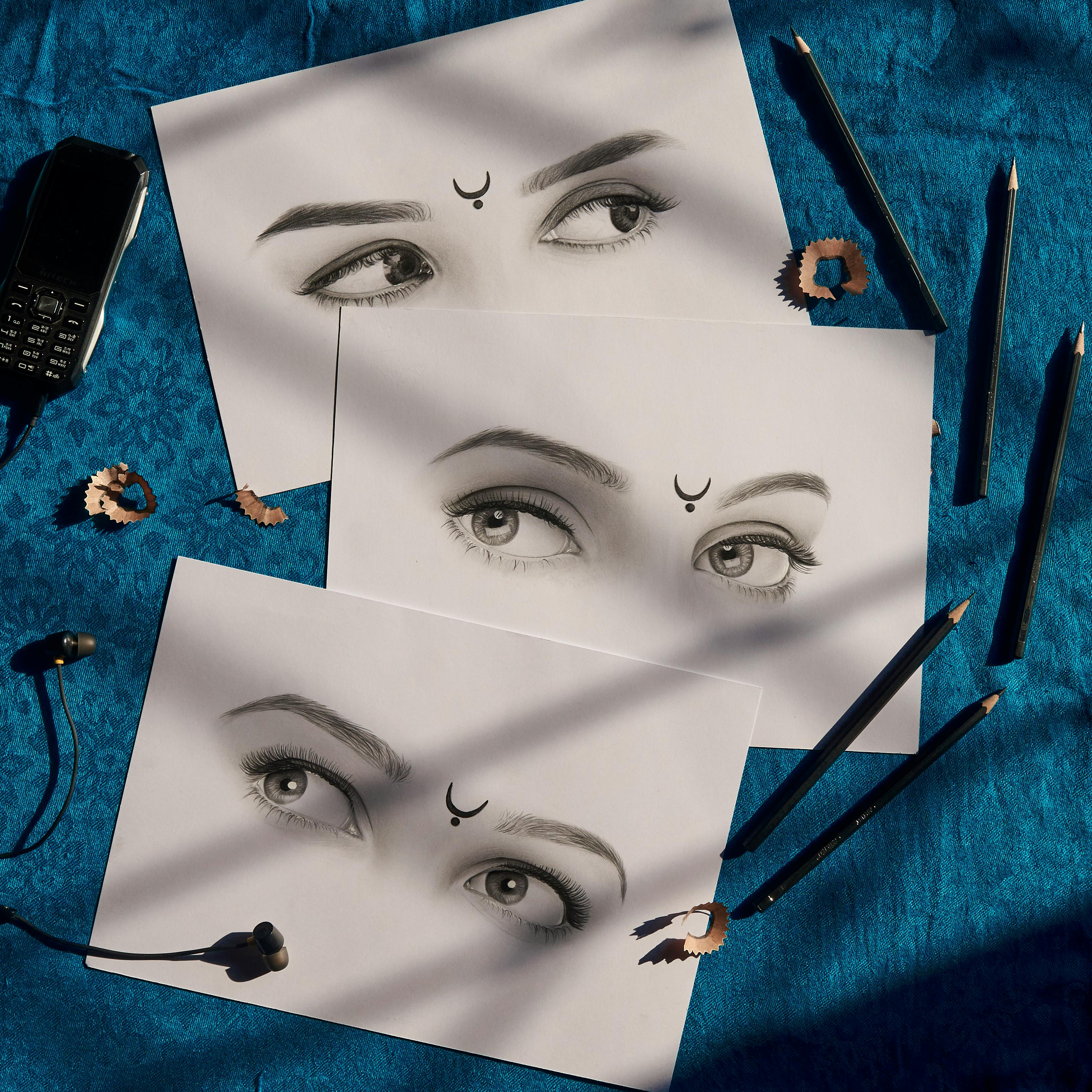
Breaking Down the Complex: Basic Shapes First
Alright, now that our tools are ready and our mind is set, let's dive into the core of it. When you look at an eye, especially a reference photo, it can feel like a jumble of complex forms. But the trick, my friend, is to simplify. Always simplify. This is one of my hard-won secrets. We're going to build this eye from the inside out, starting with the most basic geometric forms. Think of it like building a house – you wouldn't start with the wallpaper, would you? To help you visualize the basic components and their drawing steps, I've outlined them here:
Feature | Drawing Step | Key Observation Point |
|---|---|---|
| Eyeball Sphere | Lightly sketch a circle. This is your underlying anatomical guide; don't press hard. | The eye is a ball tucked into the skull, influencing all curves and shadows. |
| Eyelid Opening | Overlay an almond (or lemon) shape. | Note the angle of the inner vs. outer corner (upward slant = alertness, downward = sadness). Consider how eye shapes (round, almond, hooded), and even factors like ethnicity (e.g., presence of epicanthic folds) or age (e.g., sagging skin, deeper set eyes) affect this outline, but the sphere remains. Embrace slight asymmetry between eyes for realism. |
| Iris & Pupil | Draw the iris (colored part) as a circle within the almond. Add the pupil (black center) within the iris. | Most of the time, eyelids will slightly cover the top and bottom of the iris. The pupil might not be perfectly centered if the gaze is off-center. Look for subtle patterns (spokes, flecks) in the iris. |
| Eyelid Thickness | Add thickness to the eyelids, especially the upper one. Think of them as soft, fleshy ribbons folding over the sphere. | Eyelids aren't flat lines; they have volume. The upper lid is generally thicker and overlaps the iris more. Observe the slight curve and weight of these folds to convey spherical form. Don't forget the tear trough beneath the inner corner for natural placement. |
| Tear Duct | Sketch the small, often pinkish, moist-looking area in the inner corner (the caruncula). | This tiny detail adds immense realism and helps ground the eye in the face's anatomy. |
| Value & Shading | Identify your light source. Shadow the sclera (whites). Use gradual tones for the iris. Blend for smooth transitions. | Shading creates 3D form. The sclera isn't pure white; it curves and shadows. The iris has darker rings, lighter tones, and radiating patterns. Smooth transitions are vital for realism and understanding how light interacts with form. |
| Eyelashes | Draw them curving out of the eyelid, not just on it. Vary length, thickness, and direction. Upper lashes are denser/longer, curve up; lower lashes are sparser/shorter, curve down. | Avoid "spider legs." Lashes grow organically in clumps, their density and curl influenced by expression. Pay attention to the root where they emerge from the lid. |
| Eyebrow | Frame the eye. Pay attention to shape, density, and hair growth direction. | The eyebrow follows the brow bone, casting subtle shadows. Its shape (arched, straight, furrowed) significantly impacts the perceived emotion of the entire eye area. |
| Reflections/Highlights | Place distinct shapes of light on the iris/pupil, reflecting the light source. Add tiny highlights on the tear duct and lower lid edge for moisture. | This is the "sparkle." The shape of the reflection tells a story about the light source (sharp circle = direct, soft blob = diffused). These are the brightest whites. |
Dealing with Tricky Reference Photos
Sometimes, your reference photos can be a bit deceiving, especially for beginners. You might encounter extreme close-ups that flatten the perspective, or foreshortening that distorts the eye's shape due to an unusual angle. The trick here is to rely on your foundational understanding: always remember the underlying sphere. Even if the photo makes the eye look flat or elongated, mentally correct for the sphere. If the light source in the photo is ambiguous, try sketching the eye with a clear, imagined light source first, and then adapt to the reference. Don't be afraid to simplify complex details in a blurry reference; focus on the main values and forms rather than getting lost in indecipherable textures. Your brain is a powerful tool for filling in the blanks if you give it a solid anatomical base to work from.
Step 1: The Foundation - Sphere and Almond
First things first: the eyeball is a sphere. Seriously, a ball. It's tucked into the skull, and that's why it has a curved surface. So, lightly sketch a circle using your HB pencil. Don't press hard; this is just a guide, a ghost of a shape that anchors everything else. I remember initially wanting to jump straight to the pretty details, completely ignoring this crucial sphere, and my eyes always looked flat and unnatural. A good mental cue: always start by imagining that tennis ball in the socket. This concept of underlying form is fundamental, not just for eyes, but for all my portraiture.
Next, overlay an almond shape (or a lemon, depending on your reference and the eye's specific anatomy – some eyes are rounder, some more hooded). This represents the opening of the eyelids. Pay close attention to the angle – is the inner corner higher or lower than the outer corner? This tiny detail can dramatically change the expression; an upward slant can suggest alertness, while a downward tilt might convey sadness or weariness. Take a moment to consider how various eye shapes, like round, almond, or hooded, and even factors like ethnicity (e.g., the presence of epicanthic folds, which are skin folds of the upper eyelid covering the inner corner of the eye) or age (e.g., sagging skin, deeper set eyes) influence this initial almond outline. The core sphere remains, but the way the eyelids wrap around it changes everything. Remember, your two eyes won't be perfectly symmetrical; embracing slight asymmetry often leads to more realistic and unique portraits.
Step 2: Finding the Iris and Pupil
Now that you have your basic opening, draw the iris (the colored part) as a circle within the almond. Crucially, unless the eye is wide open in surprise, the top and bottom of the iris will often be slightly covered by the eyelids. The pupil, the tiny black circle in the center of the iris, comes next. Remember, it's not always perfectly centered if the eye is looking to the side. As you observe, notice the subtle patterns within the iris – fine lines radiating outwards like spokes, or tiny flecks of contrasting color. These details, even if only hinted at with varied pencil pressure, add immense realism and that unique spark to each eye. Why not try a quick observational exercise? Dedicate five minutes to just drawing the iris from a reference photo, focusing only on the patterns and values, ignoring the rest of the eye. You'll be amazed at what you start to notice.
Step 3: The Eyelids – Giving Form to the Eye
This is where many beginners go wrong. Eyelids aren't just single lines! They have thickness. Think of them like soft, fleshy ribbons that gently fold over that sphere you drew. This folding creates weight and depth by catching light and casting subtle shadows, essential for making the eye feel like it's nestled organically within the face. Specifically, the upper lid is generally thicker and overlaps the iris more, creating a soft shadow that falls onto the eyeball directly beneath it, indicating the curvature of the eyeball. The lower lid usually rests slightly below the iris and is thinner. A good mental cue: eyelids are a blanket, not a sticker. Factors like age (finer, more numerous creases around the eyes), ethnicity (different fold structures), and expression (the tightening of the orbicularis oculi muscle – the muscle that encircles the eye – during a smile) all subtly alter how these folds appear. Observe these nuances carefully!
Observe the slight curve and weight of these folds; they're essential for conveying the eye's spherical form. Also, notice the tear trough – the subtle indentation or shadow beneath the inner corner of the lower eyelid. This is distinct from the tear duct itself but is crucial for natural placement. Understanding this anatomical nuance helps you place the lower lid more naturally within the face's contours. You might want to refer to a definitive guide to portraiture to understand these anatomical nuances better.
Step 4: The Tear Duct and Caruncula
Don't forget this little detail! The tear duct (the small, often pinkish, moist-looking area in the inner corner of the eye, technically called the caruncula) is super important for making it feel real. I used to ignore it, thinking it was just a blank space, but it’s a tiny, often moist-looking area that adds so much to the organic feel of the eye. This caruncula not only helps lubricate and protect the eye but also creates a unique, subtle reflection point due to its wet surface. It helps ground the eye in the surrounding anatomy and adds a crucial touch of life. It's truly a game-changer for realism. Have you ever noticed how even that tiny area adds a crucial touch of life?
Step 5: Building Form with Value and Shading
Okay, here's where your eye starts to look 3D. Remember that sphere? Shading makes it pop. This is all about value – the lightness or darkness of tones – which is how we create the illusion of form on a 2D surface. Think of values on a scale from 1 (pure white) to 10 (absolute black). It’s like a dimmer switch for light; you have infinite settings between off and full brightness. The dance of light and shadow is critical, influencing everything from depth to mood. (It's a principle I explore constantly, even in my abstract compositions).
- Identify your light source: Where is the light coming from? Is it a direct, harsh light (like a spotlight, creating sharp contrasts), or a soft, diffused light (like a window on an overcast day, creating gentle gradients)? This will dramatically determine where your highlights and shadows fall. Understanding your light source isn't just a technicality; it's how you tell the story of the environment the eye exists in, truly grounding it in realism. For a deeper dive, check out the definitive guide to understanding light in art.
- Shadow the whites of the eyes: Yes, the sclera (the white part) isn't pure white! I remember the shock of this realization when I first started: my 'realistic' eyes looked like they were made of porcelain until I embraced the subtle shadows. The sclera is curved and will have subtle shadows, especially under the upper eyelid, and often a soft gradient where it meets the skin. The sclera can also have subtle pinkish or bluish undertones depending on light and skin tone, so observe closely! Neglecting this makes the eye look flat and detached – like a porcelain doll's. A good mental cue: the eyeball is rarely pure white; it’s a curved surface catching light.
- Gradual tones for the iris: The iris isn't flat either. It usually has darker rings around the pupil and the outer edge, with lighter tones and subtle patterns radiating outwards, almost like spokes on a wheel. Build these up with layers, using a lighter hand at first. To achieve the subtle translucency of the cornea (the transparent outer layer that covers the iris and pupil), use very gentle, layered shading, allowing the iris's colors to show through slightly, and ensure its curved surface smoothly transitions from light to shadow. For fine details within the iris, a very sharp HB or 2B pencil can create the delicate lines, almost like tiny hairs, that give it unique character. For some hyperrealistic artists, even a ruling pen can be used for ultra-fine lines.
- Blend, blend, blend: Use your blending stump, a tissue, or even a soft brush to create smooth transitions. My finger was my first blending tool, and let's just say it left more oily fingerprints than smooth gradients! Alternatively, explore techniques like cross-hatching (using intersecting lines), stippling (using dots), or scumbling (small circular strokes) to build up values and add texture, particularly effective for the iris or surrounding skin. Smooth transitions are key to realism and understanding the elements of art like value and form. For a more in-depth look at various shading techniques, you might find this guide helpful: mastering shading techniques in drawing.

Step 6: Eyelashes – More Than Just Lines!
Please, please, please don't draw eyelashes like spider legs sticking straight out! I still vividly remember seeing a child's drawing where the eyelashes were literally straight lines poking out from the lid – and that was me, initially! They curve. They grow out of the eyelid, not on it, from a defined root. They looked like individual spaghetti strands stuck on when I first tried, completely missing their natural flow. My eyelashes looked more like tiny, angry porcupine quills than soft, natural framing for the eye. A good mental cue: lashes grow like grass from a soil line, not stuck onto a fence.
- The Lash Line: Before drawing individual lashes, pay attention to the subtle but important density and thickness of the lash line itself where the lashes emerge. This darker, thicker base helps anchor the lashes and makes them look more natural.
- Upper lashes: Denser, longer, and curve upwards and outwards. They overlap slightly, often appearing in small clumps rather than perfectly spaced individual hairs. The density and curl can vary dramatically based on the individual and even the emotion (e.g., more open and fanned for a wide-eyed look, more compressed for a squint or closed eye). When the eye is closed or squinting, the lashes will lie flatter against the lid, sometimes appearing as a soft, dark line.
- Lower lashes: Shorter, sparser, and curve downwards and outwards. They are often less prominent, appearing softer and less dense than their upper counterparts.
- Vary: Don't make them all the same length or thickness. Group them naturally, considering the direction of growth along the lid and how they taper. This variety is crucial for realism.
Step 7: The Eyebrow – The Frame of Expression
The eyebrow isn't just an afterthought. It frames the entire eye, adding so much to the expression and integrating the eye into the broader facial structure. Think about its shape, density, and how the hairs grow – they don't all go in one direction! It follows the brow bone (supraorbital ridge), creating a subtle shadow over the eye. Even if you're only focusing on the eye itself, a hint of the eyebrow will enhance the realism and tell a more complete story. Consider how an arched brow conveys surprise, a straight brow can appear neutral or serious, and a furrowed brow signals concentration or anger. These shapes dramatically alter the perceived emotion of the entire eye area.
Step 8: The Sparkle – Reflections and Highlights
This is the absolute magic touch. A well-placed highlight can bring an eye to life. While value defines the overall 3D form, highlights are those brightest points that specifically catch the light, adding that elusive sparkle – that sense of wetness and life that you can't quite put your finger on but instantly recognize. A good mental cue: this is where the eye truly says hello to the viewer.
- Reflections: Look for distinct shapes of light on the iris and pupil, often mirroring the light source (a window, a lamp, a softbox, or even the subtle roundness of a ring light). The shape of this reflection is crucial – a sharp, small circle indicates a direct, intense light source, while a larger, softer blob might suggest a diffused window light. These reflections tell a story about the environment and how light interacts with the eye's wet, curved surface. They are usually the brightest whites in your drawing, akin to the reflections you'd see on a camera lens. The shape of that reflection is just as important as its placement! Understanding how reflections work is a vital component of my own explorations of light and form in my abstract work.
- Rim Lighting: Sometimes, you'll notice a very thin, subtle line of light along the very edge of the iris or even the eyelids where they curve towards the light source. This rim lighting further emphasizes the spherical form of the eyeball and the thickness of the lids. For an eye with cataracts or a cloudy cornea, these reflections might appear diffused or scattered rather than sharp.
- Wetness: Don't forget tiny, subtle highlights on the tear duct and the very edge of the lower lid – this suggests moisture, making the eye appear truly alive. Use your stick eraser for those crisp white dots! This is where you can truly make the eye feel like it's looking back at you.
This initial breakdown into shapes and fundamental elements is your roadmap. Master these, and you'll be well on your way to drawing eyes that truly feel alive.
The Eye's Home: Skull, Skin, and Subtle Shifts
Once you've got the foundational steps down, it's crucial to remember that an eye never exists in isolation. It's cradled within the complex architecture of the face, deeply influenced by the underlying bone structure and the expressive landscape of the skin. Ignoring this context is like trying to draw a tree without its roots; it simply won't feel grounded.
The Skeletal Foundation: The Eye Socket
The depth of the eye socket itself (also known as the orbit) is crucial for realism, dictating how much the eyeball is recessed and how the skin stretches and folds over the underlying bone structure. The subtle curve of the brow bone (supraorbital ridge) and other underlying bone structures create natural shadows and contours that frame the eye socket, giving it crucial depth. Understanding how the skin stretches and folds over these bones, rather than simply lying flat, is vital for a realistic portrayal. A good mental cue: the eye is a jewel in a bony setting. Imagine the skull as the ultimate framework, dictating the angle and fall of light that defines the eye's place within the face.
Skin Texture and Detail Around the Eye
The skin around the eye is just as important as the eye itself. It's not a blank canvas but an intricate landscape of subtle forms and textures. Pay attention to:
- Fine lines and wrinkles: These aren't just signs of age; they convey expression and character, telling a story of laughter, worry, or concentration. These lines emerge from the constant movement of facial muscles and the elasticity of the skin. Lightly sketch them, keeping their direction and subtlety in mind. A guide to understanding texture in art can help you see how textures contribute. This interplay of texture and form is something I deliberately incorporate into my layered abstract pieces.
- Under-eye area: Observe the slight puffiness or bags, the soft shadows, and the subtle color shifts (often appearing as cooler, bluish or purplish tones in the shadows). These details add so much to the realism and uniqueness of a face, reflecting fatigue, age, or even individual anatomy. These subtle color shifts are a fantastic way to suggest depth even in grayscale, as cooler tones tend to recede.
The Dynamic Face: How Eye Appearance Changes
The eye's expression and realism are profoundly influenced by the surrounding facial features, the angle of the head, and the overall composition of a portrait. A slight tilt of the head, the curve of a cheekbone, or the tension in the mouth will all impact how the eyes are perceived and, consequently, how they should be rendered. For example, a wide smile will cause the lower eyelid to naturally rise and slightly crinkle, narrowing the eye opening. Conversely, a furrowed brow indicative of concentration or anger will pull the upper eyelid down and inwards. Always view the eye as part of a larger, interconnected system within the face; it’s a crucial puzzle piece, but not the whole puzzle.
Micro-expressions: The Language of the Eye
The human eye, with its surrounding muscles, is a master of subtle communication. Going beyond broad emotions, pay close attention to micro-expressions. For instance, genuinely happy eyes often show slight wrinkling at the outer corners (crow's feet), and the lower eyelid lifts subtly, which is caused by the orbicularis oculi muscle contracting. Fear can widen the eyes, exposing more sclera above and below the iris, sometimes accompanied by dilated pupils. Contempt might manifest as a slight tightening of one eyelid, almost a subtle sneer of the eye. These tiny, fleeting muscle movements are what truly convey a subject's inner life and make your drawing resonate with authenticity. Training your eye to spot these is like learning to read unspoken thoughts.
Beyond Portraits: Eyes in Other Artistic Contexts
The principles of drawing realistic eyes aren't confined to portraiture. Whether you're working on character design for a graphic novel, illustrating a fantastical creature, or even creating concept art for a video game, the fundamental understanding of eye anatomy, light source, and value remains paramount. A dragon's eye, though stylized, will still benefit from an underlying spherical form and believable highlights to convey its wetness and predatory glint. Understanding how different emotions translate to eye shapes and muscle movements is invaluable for creating compelling characters in any genre. It's a versatile skill that underpins much of expressive art.
Beyond the Basics: Adding Soul and Character
Once you've got the foundational steps down, it's time to truly elevate your eye drawings. This is where the magic of observation meets personal expression. It's where you inject the indefinable 'soul' that makes an eye truly captivating.
Translating Color to Value: Even in Grayscale
While this guide focuses on graphite, the principles of value and form apply universally. If you venture into colored pencils or pastels, remember that realistic eyes often involve subtle shifts in skin tone around the eyes – a hint of red, blue, or yellow. For the iris, layering different shades of your chosen color, perhaps with a touch of a complementary color for depth, can make them incredibly vibrant. Complementary colors, like blue and orange, when placed near each other, intensify each other, making both appear more vibrant and adding an optical sense of depth. Even with grayscale graphite, understanding how these color relationships (e.g., the cool blues/purples in shadows, warm oranges in skin) would translate to different values helps you achieve richer, more nuanced tones. You can suggest a sense of color temperature even in monochrome by using slightly warmer (more blended, softer) values for areas that would be warm-toned skin, and cooler (sharper, darker, less blended) values for areas that would contain blues or purples. For instance, a shadow on warm skin might appear as a darker, slightly desaturated reddish-brown, while a shadow on cooler skin might lean towards a darker blue-grey. This concept is beautifully explored in the psychology of color in abstract art. When rendering different eye colors in grayscale, a blue eye might have a lighter overall value than a deep brown eye, but both will still feature rich internal value shifts. An amber eye might have warmer, softer gradients, while a grey eye could use sharper, cooler contrasts.
The Role of Tears: Capturing Moisture and Emotion
Beyond just the tear duct, consider the profound impact of rendering tears themselves. Tears are highly reflective and can dramatically alter the light interaction on and around the eye. A tear forming in the corner, or flowing down a cheek, will catch and distort light in specific ways. They create distinct, often elongated, highlights that follow the path of the moisture, reflecting the light source with a brilliant, wet sheen. The delicate play of light across a tear can convey immense emotion, from profound sadness to overwhelming joy, making the eye feel intensely alive and vulnerable. This subtle manipulation of light and reflection for emotional impact is something I often draw upon in my abstract work.
Drawing the Soul: Beyond Realism
Capturing the soul of an eye goes beyond mere anatomical accuracy; it's about conveying the inner life, the unspoken story of the subject. This is where observation of human emotion becomes your most powerful tool. A slight asymmetry in the eyelids, a subtle tightening around the outer corner for a genuine smile, or a faint shadow under the brow for a thoughtful expression – these are the nuances that imbue your drawing with personality. Think about what your subject has experienced, what they might be feeling, and let those intangible emotions subtly influence every stroke, especially in the micro-expressions around the eye. It's a delicate dance between technical skill and artistic empathy. I've found that when I truly focus on the emotional narrative of an eye, it fundamentally changes how I perceive faces in everyday life—suddenly, every glance tells a richer, deeper story, a secret narrative unfolding constantly.
Adapting Principles & Styles: From Hyperrealism to Stylized
The beauty of these techniques is their adaptability. Whether you're aiming for a hyper-realistic portrait, a stylized character for a graphic novel, or even dabbling in animal eyes, the core understanding of sphere, lids, value, and highlights remains crucial. For hyperrealism, you'll push the detail to an extreme, rendering every pore and micro-reflection. For stylized work, you might exaggerate certain features or simplify others, but the underlying form must still be convincing to make the eye feel grounded. Even in my own contemporary and abstract pieces, the foundational understanding of how light falls on curved surfaces, a lesson learned from countless eye studies, deeply informs my use of color, shape, and form. This pursuit of capturing essence is precisely what drives my abstract explorations, translating the emotional depth of a realistic gaze into bold, non-representational forms.
Animal Eyes: A Fascinating Contrast
While the human eye is often our primary focus, exploring animal eyes offers a fascinating expansion of these principles. Animal eyes present unique challenges and details: pay close attention to pupil shape (slits in cats, round in dogs and primates, horizontal in many herbivores), the prominence of the cornea, and how fur textures around the eye create unique shadows and highlights. For instance, a cat's eye has a distinctive vertical slit pupil and a very prominent, often glistening, cornea, surrounded by dense fur that creates unique shadows. A nocturnal owl, conversely, might have large, forward-facing eyes with perfectly round pupils and a subtle tapetum lucidum (a reflective layer behind the retina that enhances night vision) which can cause an eerie 'eye shine' in photos. A horse, as an herbivore, has large, horizontally-oriented pupils for a wide field of vision, adapted to scanning the horizon for predators. You're learning the grammar of eye drawing, which you can then adapt into any dialect you choose, be it human or animal.
Common Pitfalls and My Own Missteps
Ever wondered why your eye drawings sometimes look a bit... off? Believe me, I've made every mistake in the book. More than once. Learning to draw eyes is a journey filled with delightful challenges and, yes, a few frustrating detours. Here are some of the classic blunders I've encountered, both in my own work and observing others, the common demons I've wrestled with for years:
- Flatness (The Porcelain Doll Look): One of my biggest blunders was drawing eyes that looked completely flat, like they were cut out of paper. I'd forget that the eyeball is a sphere, so I wouldn't shade the sclera (the white part) at all, making it look jarringly bright, detached, and lacking any sense of depth or curve. My eyes looked like bright white voids staring back at me, devoid of any life or natural integration into the face. It was almost like giving a character those creepy, unblinking doll eyes. Mental cue for next time: Always imagine the tennis ball inside the socket and shade the whites accordingly. This is a common demon for many beginners.
- Spider-Leg Eyelashes: Treating eyelashes as purely decorative rather than integrated into the anatomy. I’d draw them too thick, too uniform, or simply straight out, completely missing their natural curve and varied growth pattern. I still cringe thinking about some of my early attempts; they truly looked like individual spaghetti strands stuck on, giving the eye a distinctly fake, almost insect-like quality. Seriously, my subjects looked like they were auditioning for a horror film. Mental cue for next time: Lashes grow like grass, in clumps, and curve. Don't forget the lash line. This particular demon clung to my pencils for far too long.
- Pasted-On Eyelids: Neglecting the thickness of the eyelids and the subtle crease of the upper lid. Without this crucial depth, the eye appears to be merely resting on the surface of the face, rather than nestled organically within the eye socket. It makes the entire area look unnatural and lacks the illusion of a spherical form beneath. It’s a common mistake that leaves eyes looking like stickers rather than organic parts of a face. I'd try to draw the eye, but it looked like I’d stuck a googly eye onto a potato. Mental cue for next time: Eyelids are a soft blanket over a ball, not a sticker. This one used to make me sigh in frustration.
- The 'Dead Eye' Glare / Misinterpreting Highlights: This often happens when the highlights are misplaced, too uniform, or entirely absent. Without that sparkle of reflected light source, the eye can look lifeless, even menacing. It’s like staring into a void, rather than a window to the soul. I also struggled with drawing reflections as generic white dots without considering their specific shape and placement relative to the light source, leading to an unnatural, almost fake sparkle. I learned quickly that the smallest dot of white in the right place, with the right shape, can change everything. It's the difference between a staring void and a living, breathing gaze. Mental cue for next time: Place your highlight with purpose, envisioning the light source and its shape. This demon required me to truly see light, not just apply it.
- Overworking: This is a big one. Sometimes, in the pursuit of perfection, I'd overwork an area, pressing too hard, blending too much, or adding too many layers. This often leads to a muddy, flattened, or lifeless appearance. Graphite can only go so dark before it starts to sheen, and excessive blending can erase the nuanced textures. Knowing when to stop and leave some areas subtle, or even slightly unfinished, is a crucial skill. My early drawings often looked overworked and tired, just like I felt after trying to fix them too much! It's that classic artist's dilemma: knowing when to put the pencil down. Mental cue for next time: Less is often more. Know when to stop and trust your initial strokes. This demon still whispers in my ear sometimes.
Observational Exercises: Sharpening Your Artistic Eye
Ready to truly put your new skills to the test? Now that you have the roadmap, how do you get better? Practice, practice, practice! But not just mindless repetition. Targeted observation and specific drills will truly hone your skills and transform your artistic eye. And don't be afraid to try drawing eyes from memory after studying references; it's a fantastic way to develop your artistic intuition and truly internalize the anatomy.
- Iris Focus: Dedicate an entire drawing session to just drawing irises. Use various reference photos. Pay attention to the subtle patterns, the light and dark rings, and how the pupil integrates. Don't worry about the rest of the eye, just master that intricate little world. You'll notice patterns you never saw before.
- Eyelid Study: Choose references that show different eyelid shapes – hooded, monolid, double lid, wide-set, narrow. Practice sketching just the eyelids and their thickness, focusing on how they wrap around the underlying sphere. Draw them open, squinting, and half-closed to understand their movement and the wrinkles they create.
- Light Source Exploration: Pick a single eye reference and imagine three different light sources: a direct overhead light, a soft side light, and a strong back light. Sketch the same eye three times, focusing on how the shadows, highlights, and reflections change with each light source. This will dramatically improve your understanding of form and how light interacts with it.
- Expression Swap: Take a reference photo of an eye with a neutral expression. Then, try to draw that same eye conveying surprise, sadness, or a mischievous glint, simply by altering the eyelids, eyebrows, and reflections. It's a challenging but incredibly rewarding exercise in artistic empathy and capturing the soul. What's the most surprising expression you've managed to capture, or hope to capture, in your eye drawings?
My Final Thoughts: Just Keep Drawing!
Look, drawing realistic eyes can feel daunting at first, I know. It certainly did for me. But by breaking it down into manageable steps, focusing on keen observation, and embracing those "rookie mistakes" as learning opportunities, you'll be amazed at your progress. Each line, each smudge, each carefully placed highlight brings you closer to capturing that elusive spark of life. My own journey with eye drawing profoundly changed how I perceive people and art in my daily life – I suddenly noticed the intricate dance of emotion in every glance, a rich, unspoken narrative unfolding constantly. This deep understanding of how light interacts with complex curves, and how subtle values convey depth and emotion, has been invaluable, translating directly into my abstract compositions. It influences my use of bold colors to suggest light, layered forms to imply depth, and expressive lines to capture a sense of raw emotion, even when a human eye isn't explicitly present. It's all about finding that essence of life and connection, a core principle I explore on my artist timeline.
I encourage you to celebrate every small victory and to continue honing your skills. And remember, if you ever feel inspired to bring a piece of expressive art into your own space, take a look at the unique prints and paintings available for purchase – maybe even visit my museum in 's-Hertogenbosch if you're ever in the Netherlands and want to see how these principles translate into bold, contemporary works! What's one unexpected thing you've learned about eyes, either in art or in real life, since starting your drawing journey? Keep drawing, keep seeing, and let your art speak volumes.


