The Art of Consistent Spacing: A Layout Design Guide
Discover the secrets of consistent spacing in art layout design. Learn how to create visually appealing arrangements for galleries and interiors.

The Art of Consistent Spacing: A Layout Design Guide
I remember the first time I tried to hang a gallery wall in my living room. It was a disaster. The frames were crooked, the spacing was inconsistent, and the whole thing looked like a chaotic mess. That's when I realized the importance of consistent spacing in art layout design. It's not just about making things look neat; it's about creating a harmonious visual experience that draws the viewer in.
Why Consistent Spacing Matters
Consistent spacing is the backbone of any well-designed layout. Whether you're arranging art in a gallery, designing a website, or decorating your home, the way you space elements can make or break the overall aesthetic. Here's why it's so crucial:

- Visual Harmony: Consistent spacing creates a sense of order and balance, making the layout more pleasing to the eye.
- Focus and Flow: Proper spacing guides the viewer's eye through the layout, ensuring that each piece gets the attention it deserves.
- Professionalism: A well-spaced layout looks polished and professional, reflecting positively on the artist or designer.
Key Concepts in Consistent Spacing
1. The Golden Ratio
The Golden Ratio, often denoted by the Greek letter phi (φ), is a mathematical concept that has been used in art and design for centuries. It's approximately 1.618 and is believed to create the most visually pleasing proportions.

The Golden Ratio can be applied in various ways:

- Layout Design: Use it to determine the proportions of different sections in your layout.
- Art Composition: Apply it to the placement of key elements within an artwork.
- Typography: Use it to define the spacing between lines of text or the size of headings.
2. The Rule of Thirds
The Rule of Thirds is a guideline that suggests dividing your layout into thirds, both horizontally and vertically, creating a grid of nine equal parts. The idea is to place the most important elements along these lines or at their intersections.

The Rule of Thirds is widely used in photography and design:
- Photography: Place the subject along the lines or intersections to create a balanced composition.
- Web Design: Align key elements like buttons or images along the grid lines for a more engaging layout.
- Art Layouts: Use the grid to position focal points in your artwork.

Example:
Application  | Description |
|---|---|
| Photography | Place the subject along the grid lines or intersections. |
| Web Design | Align key elements like buttons or images along the grid lines. |
| Art Layouts | Position focal points in your artwork using the grid. |
The Rule of Thirds is a powerful tool for creating dynamic and engaging compositions. It helps to avoid the pitfalls of centering everything, which can often lead to static and uninteresting layouts.

3. White Space
White space, also known as negative space, is the area between elements in a layout. It's not necessarily white; it's just the empty space that helps define the boundaries of each element.
White space is essential for several reasons:
- Clarity: It helps to separate elements, making it easier for the viewer to focus on individual pieces.
- Sophistication: A layout with ample white space often appears more elegant and refined.
- Readability: It improves the legibility of text and the overall user experience.
Example:
Benefit | Description |
|---|---|
| Clarity | Separates elements for better focus. |
| Sophistication | Enhances elegance and refinement. |
| Readability | Improves text legibility and user experience. |
White space is not just an absence of content; it's an active element in design. It can create a sense of calm and allow the viewer to focus on what truly matters. In fact, some of the most iconic designs in history rely heavily on white space to convey their message.
Practical Applications
Gallery Walls
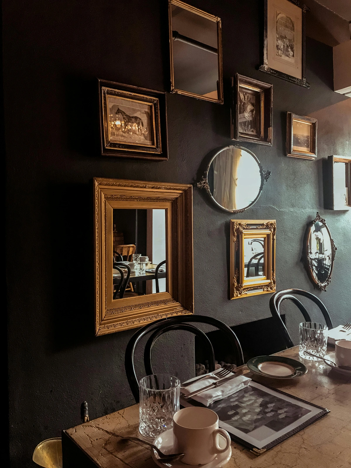
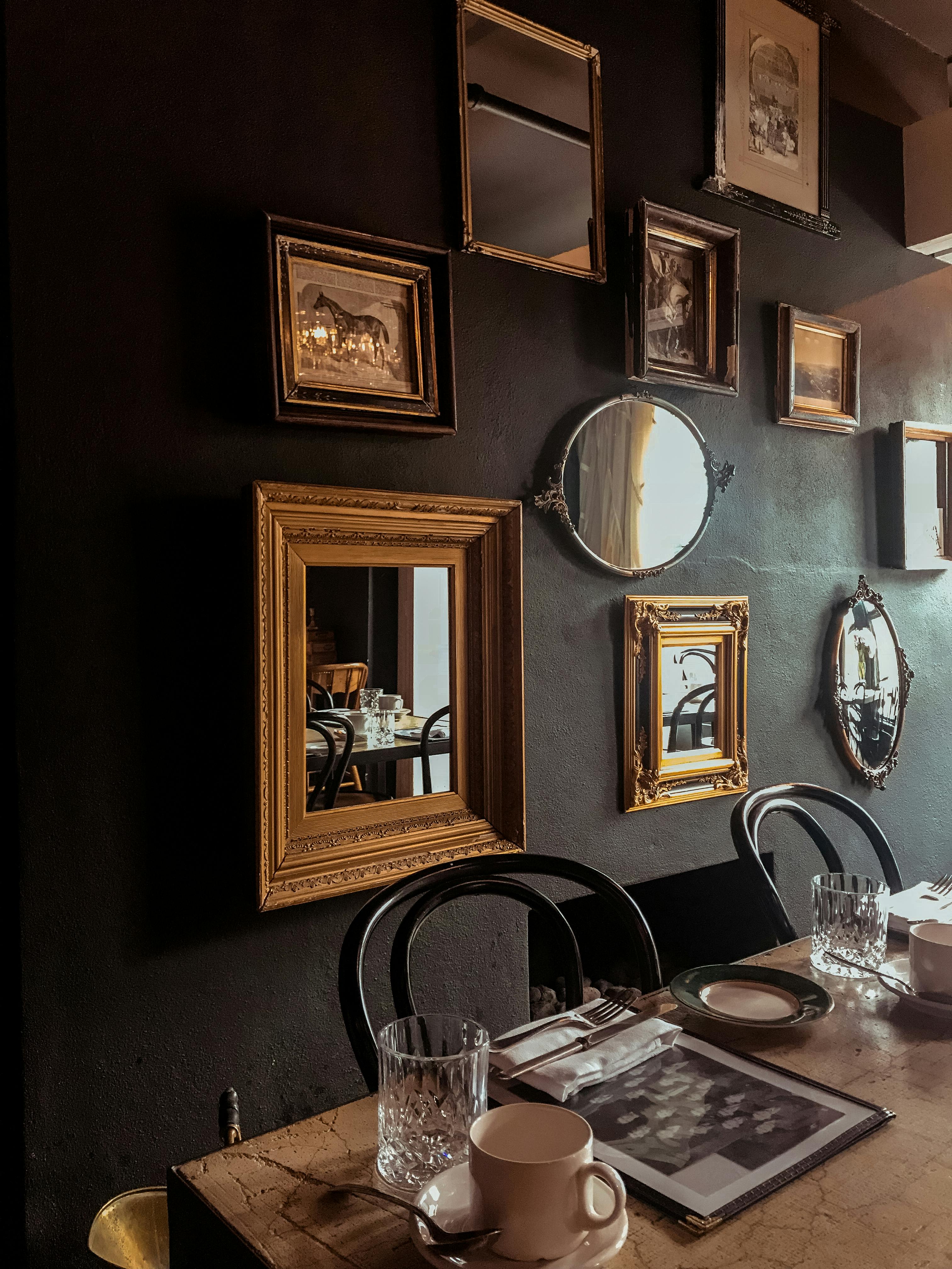
Creating a gallery wall is a fantastic way to showcase multiple pieces of art. Here's how to do it right:
- Plan Your Layout: Start by laying out your frames on the floor to experiment with different arrangements.
- Use Consistent Spacing: Keep the spacing between frames consistent. A good rule of thumb is to leave 2-3 inches between each frame.
- Mix and Match: Don't be afraid to mix different frame sizes and styles, but keep the spacing consistent to maintain harmony.

A detailed mural of a woman's face integrated into a wall art design, showcasing creative interior decoration techniques and artistic wall panels. Ideal for modern wall decor inspiration.
Keywords: wall art mural, interior decor, artistic wall panels, wall art ideas, home decoration.](https://images.zenmuseum.com/article/decorating-large-walls-with-art/7790d1e0-eac2-11f0-b4b8-49b29ea43f10.jpg) credit, licence
Example:
Step | Description |
|---|---|
| Plan Layout | Experiment with arrangements on the floor. |
| Consistent Spacing | Maintain 2-3 inches between frames. |
| Mix and Match | Combine different frame sizes and styles. |
Gallery walls are not just about aesthetics; they're about storytelling. Each piece of art contributes to the narrative of the space, and consistent spacing ensures that the story flows seamlessly from one piece to the next.

Interior Design
Consistent spacing is just as important in interior design. Here are some tips:
- Furniture Arrangement: Keep consistent spacing between furniture pieces to create a balanced and inviting space.
- Art Placement: When hanging art, ensure that the spacing between pieces is consistent and that the art is at eye level.
- Decorative Elements: Use consistent spacing for decorative elements like candles, vases, and books to create a cohesive look.
Interior design benefits from thoughtful spacing:
- Flow: Proper spacing ensures that the room feels open and easy to navigate.
- Aesthetics: A well-spaced room appears more organized and visually appealing.
- Functionality: Spacing affects how usable and comfortable a space feels.
Example:
Element | Spacing Tip |
|---|---|
| Furniture | Keep consistent spacing for balance. |
| Art | Ensure consistent spacing and eye-level placement. |
| Decorative Elements | Use consistent spacing for cohesion. |
In interior design, spacing is not just about aesthetics; it's about creating a functional and harmonious environment. Whether you're designing a cozy living room or a spacious office, consistent spacing can make all the difference.
Common Mistakes to Avoid
- Overcrowding: Too many elements in a small space can make the layout feel cluttered and overwhelming.
- Inconsistent Spacing: Varying the spacing between elements can create a disjointed and unprofessional look.
- Ignoring the Golden Ratio: While it's not a strict rule, the Golden Ratio can help create a more visually pleasing layout.
Additional pitfalls to watch out for:
- Neglecting White Space: Failing to incorporate enough white space can make a layout feel cramped and chaotic.
- Misaligned Elements: Ensure that all elements are aligned properly to maintain a clean and professional appearance.
- Overcomplicating: Avoid using too many design principles at once; simplicity often leads to the best results.
Example:
Mistake | Solution |
|---|---|
| Overcrowding | Limit elements and use white space. |
| Inconsistent Spacing | Maintain uniform spacing. |
| Ignoring Golden Ratio | Apply the Golden Ratio for balance. |
Another common mistake is ignoring the context of the space. For example, a layout that works in a spacious gallery might not translate well to a small apartment. Always consider the environment and the purpose of the space when planning your layout.
FAQ
What is the ideal spacing between art pieces?
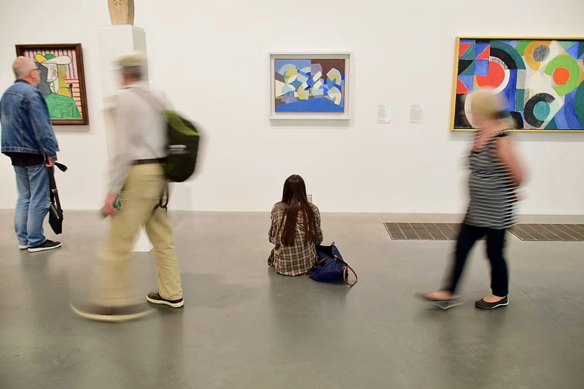
The ideal spacing between art pieces is typically 2-3 inches. However, this can vary depending on the size of the pieces and the overall layout. For larger pieces, you might need more space to maintain balance.
How do I create a balanced layout?
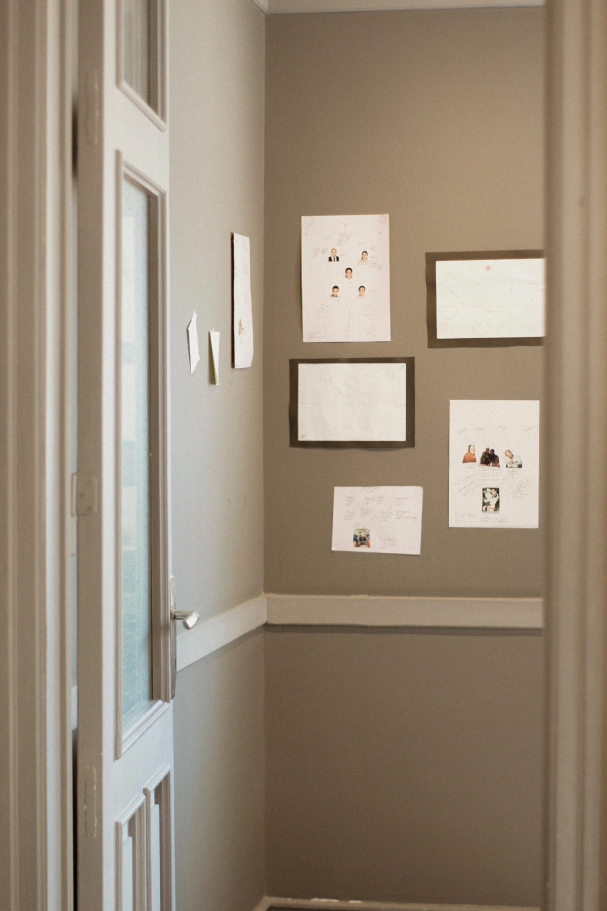
To create a balanced layout, use consistent spacing, follow the Rule of Thirds, and ensure that the elements are evenly distributed. Experiment with different arrangements to find the most harmonious composition.
Can I mix different frame sizes and styles?
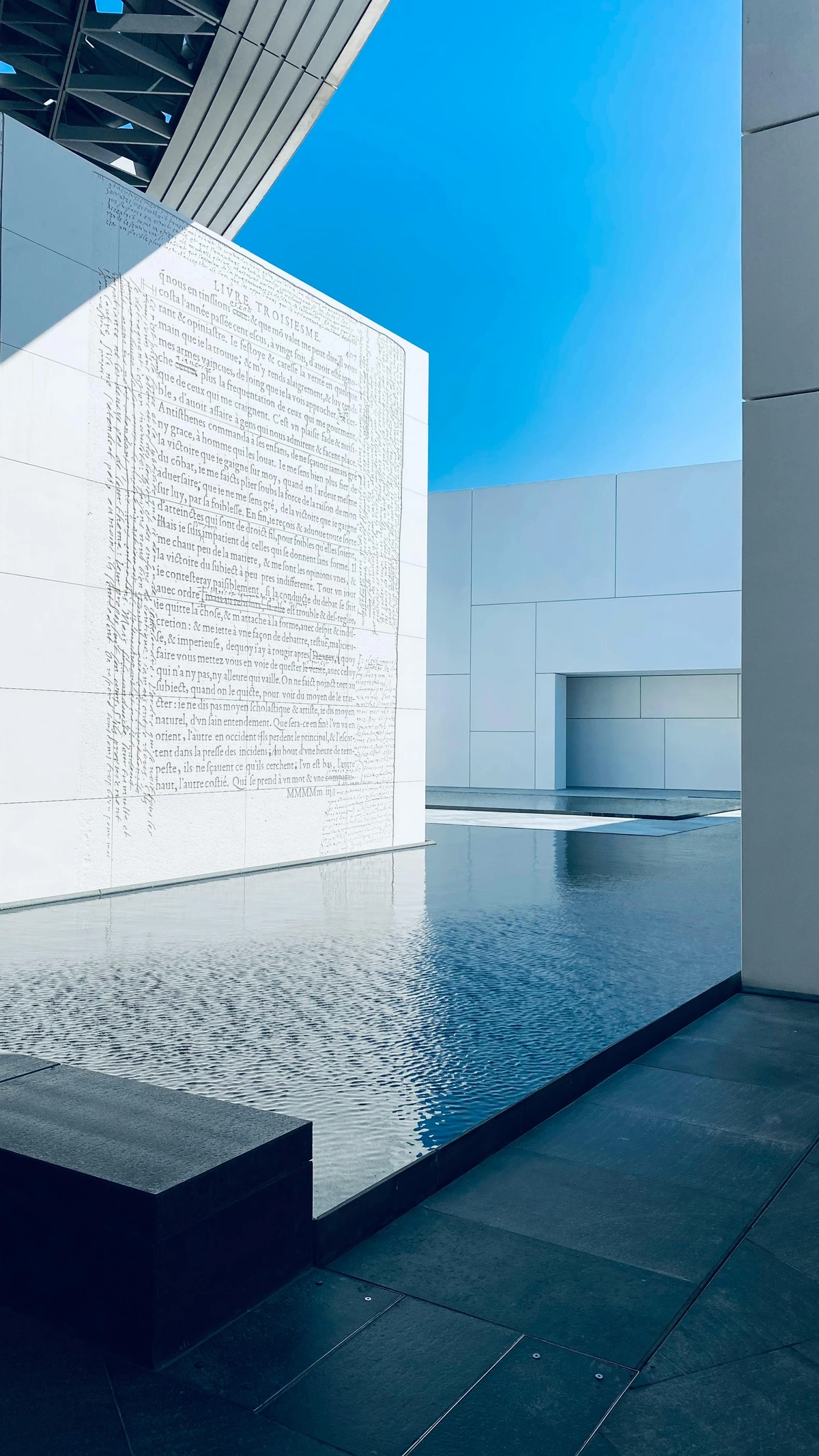
Yes, you can mix different frame sizes and styles. Just make sure to keep the spacing consistent to maintain harmony. Variety in frames can add visual interest, but consistency in spacing ties everything together.
What is the Golden Ratio and how do I use it?
The Golden Ratio is a mathematical concept that creates visually pleasing proportions. To use it, divide your layout into sections that are proportional to the Golden Ratio (approximately 1.618). This can help achieve a sense of balance and harmony in your design.
How do I avoid overcrowding in my layout?
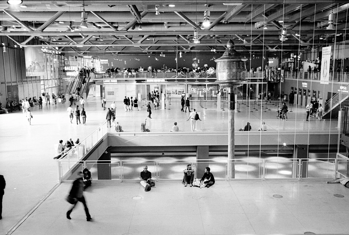
To avoid overcrowding, limit the number of elements in your layout and ensure that there is enough white space between them. This allows each piece to stand out and creates a more open and inviting space.
What is the importance of white space in design?
White space, or negative space, is crucial in design as it helps define the boundaries of each element, enhances readability, and creates a sense of sophistication. It allows the viewer's eye to rest and focus on the key elements of the layout.
How can I use the Rule of Thirds in my design?
To use the Rule of Thirds, divide your layout into thirds, both horizontally and vertically, creating a grid of nine equal parts. Place the most important elements along these lines or at their intersections to create a dynamic and engaging composition.
What are some tips for arranging furniture in a room?
When arranging furniture, keep consistent spacing between pieces to create a balanced and inviting space. Define pathways and ensure that the room feels open and accessible. Group furniture in a way that encourages conversation and interaction.
How does spacing affect the perception of a room?
Spacing can make a room feel larger or smaller, more open or more intimate. Proper spacing enhances the room's functionality and aesthetic appeal.
What tools can I use to measure spacing accurately?
Tools like laser levels, measuring tapes, and grid paper can help you measure and plan spacing accurately. Digital tools like design software can also be invaluable for planning layouts.
What is the difference between consistent spacing and uniform spacing?
Consistent spacing refers to maintaining a regular interval between elements, while uniform spacing implies that all intervals are identical. Consistent spacing allows for slight variations to accommodate different element sizes, while uniform spacing is more rigid.
How can I use spacing to create a focal point?
To create a focal point, use wider spacing around the element you want to highlight. This draws the viewer's eye to that area and makes it stand out.
What are some common tools for measuring spacing?
Common tools for measuring spacing include laser levels, measuring tapes, and grid paper. Digital tools like design software can also be invaluable for planning layouts.
Can I use different spacing for different types of art?
Yes, you can adjust the spacing based on the type of art and the effect you want to achieve. For example, smaller pieces might require less spacing, while larger pieces might need more to create a balanced look.
How do I choose the right spacing for my layout?
Consider the size of the pieces, the overall layout, and the purpose of the space. Experiment with different spacing options to find what works best for your specific design.
Conclusion
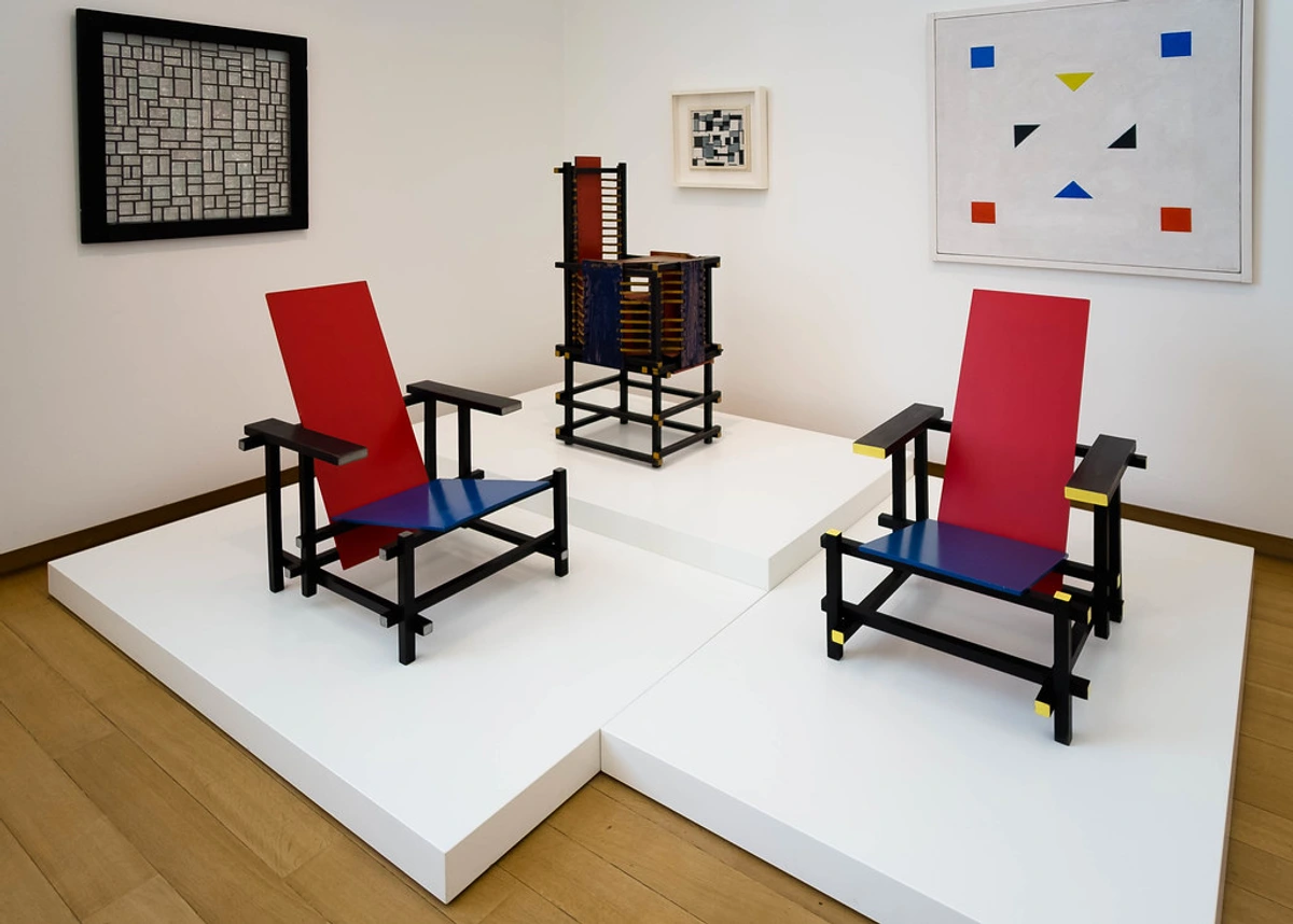
Consistent spacing is an art in itself. It's about creating a visual rhythm that guides the viewer's eye and makes the layout more engaging. Whether you're arranging art in a gallery, designing a website, or decorating your home, mastering the art of consistent spacing can elevate your design to the next level.
And remember, if you're looking for inspiration or want to see how consistent spacing is used in professional art layouts, check out our gallery or explore our collection.
Final Thoughts
The principles of consistent spacing are universal and timeless. They apply to every form of visual communication, from the smallest graphic design project to the grandest architectural masterpiece. By understanding and applying these principles, you can create layouts that are not only visually stunning but also deeply engaging and meaningful.















Example:
Principle | Application |
|---|---|
| Visual Rhythm | Guides the viewer's eye. |
| Consistency | Elevates design quality. |
| Universal Principles | Applies to all visual communication. |
Consistent spacing is more than just a design principle; it's a way to create harmony and balance in your environment. Whether you're a professional designer or a DIY enthusiast, mastering the art of consistent spacing can transform your space and elevate your design to new heights.