Applying Chevreul's Principles in Painting: A Practical Guide
Discover how to use Chevreul's color theory to create harmonious and vibrant paintings. Learn practical techniques and tips for applying these principles in your artwork.
Applying Chevreul's Principles in Painting: A Practical Guide
I remember the first time I stumbled upon Chevreul's color theory. It was like finding a secret map to a treasure trove of vibrant, harmonious colors. I was struggling with a painting, trying to make the colors pop without turning it into a chaotic mess. That's when I realized, I needed a guide, a set of principles to follow. And Chevreul's work was just that.
But what exactly is Chevreul's color theory, and why does it matter? At its core, it's about understanding how colors interact and influence each other. This isn't just about aesthetics; it's about the science of perception. Whether you're a seasoned artist or just starting, these principles can transform your approach to color and elevate your artwork.
But why is Chevreul's theory still relevant today? In a world where digital art and traditional painting coexist, understanding how colors interact can elevate your work from amateur to professional. Whether you're a seasoned artist or just starting, these principles can transform your approach to color.
Chevreul's principles are not just about aesthetics; they are about understanding the science behind color perception. By mastering these principles, you can create artwork that resonates deeply with viewers, evoking emotions and telling stories through color alone.
The Evolution of Chevreul's Influence
Chevreul's theories have transcended time, influencing not just traditional painting but also modern digital art. His principles provide a bridge between the scientific and artistic worlds, offering a systematic approach to color interaction that remains invaluable in contemporary art practices.

Why Chevreul's Theory Matters
Chevreul's work is more than just a historical footnote; it's a living, breathing tool that artists use every day. His theories bridge the gap between science and art, offering a systematic way to understand how colors interact. This is especially important in today's world, where artists are constantly experimenting with new mediums and techniques. Whether you're working with oils, acrylics, or digital tools, Chevreul's principles provide a foundation for creating visually compelling artwork.
Applications in Modern Art
Chevreul's principles are not confined to traditional painting. They are equally applicable in digital art, graphic design, and even cinematography. Understanding how colors interact allows artists to create visually stunning works that captivate audiences across various mediums.
The Science Behind the Art
Chevreul's work is grounded in scientific observation. His experiments on color perception revealed how the human eye interprets colors based on their surroundings. This scientific foundation makes his theories universally applicable, from classical paintings to modern digital creations.
Who Was Chevreul?
Michel Eugène Chevreul was a French chemist who, in the 19th century, made groundbreaking discoveries about color. His work, "The Principles of Harmony and Contrast of Colors," became a cornerstone for artists and scientists alike. He wasn't just a theorist; he was a problem solver. Chevreul's principles are still relevant today, especially for painters looking to create visually stunning artwork.
Chevreul's Legacy
Chevreul's influence extends beyond the art world. His theories have been applied in various fields, including textile manufacturing, interior design, and even digital media. His work laid the foundation for modern color theory, making him a pivotal figure in the history of art and science.
Impact on Various Industries
Chevreul's theories have found applications in diverse industries. In textile manufacturing, his principles guide the creation of vibrant and harmonious fabric designs. In interior design, his theories help in selecting color schemes that evoke specific moods and emotions. Even in digital media, his work informs the use of color in user interfaces and digital art.

Impact on Modern Art
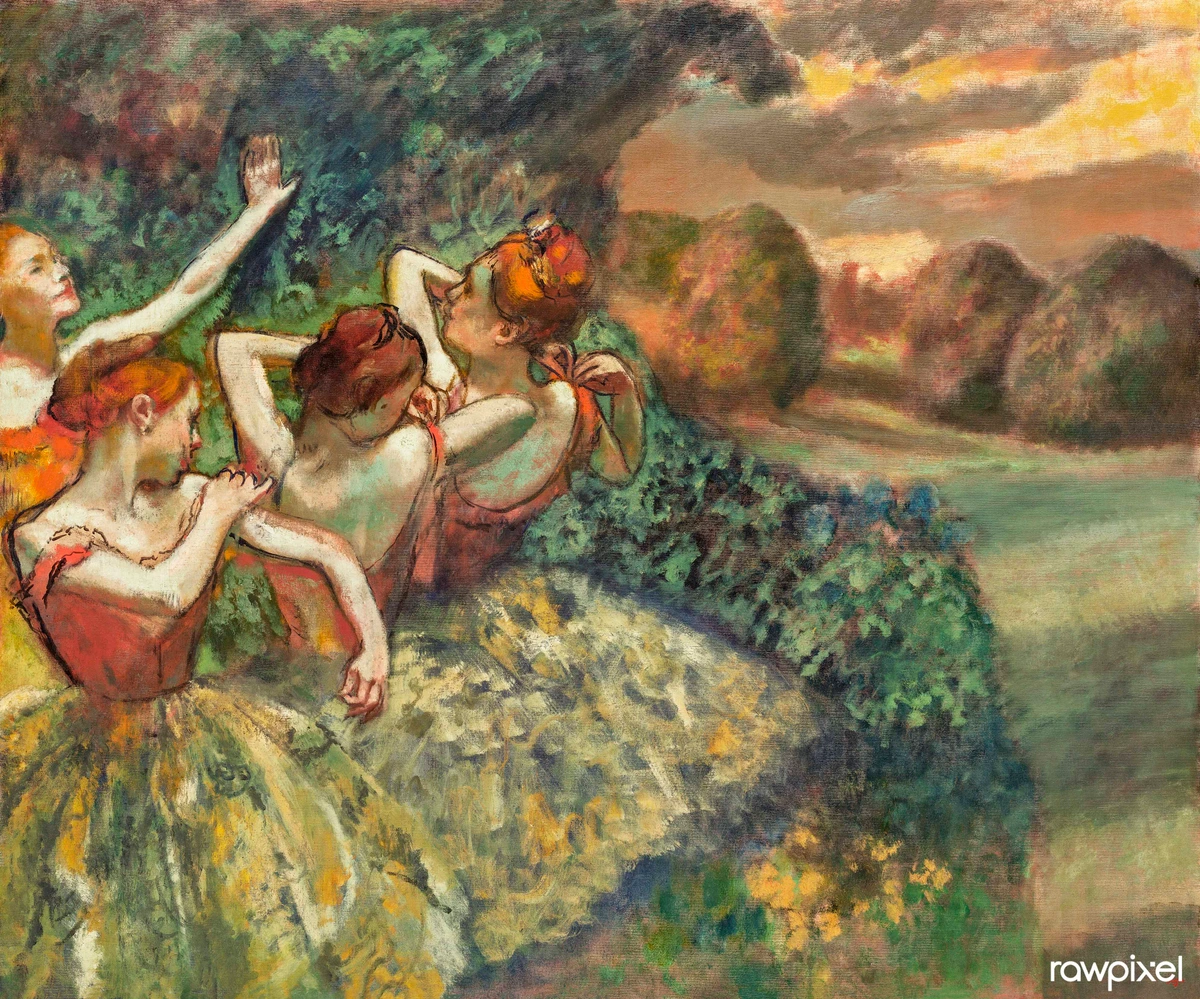
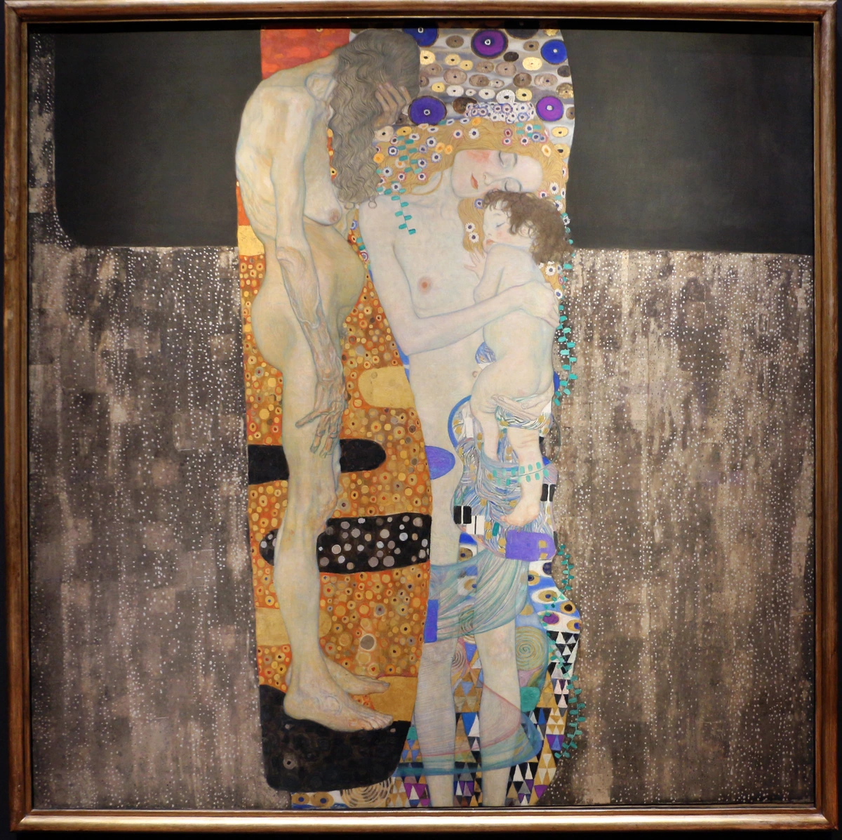
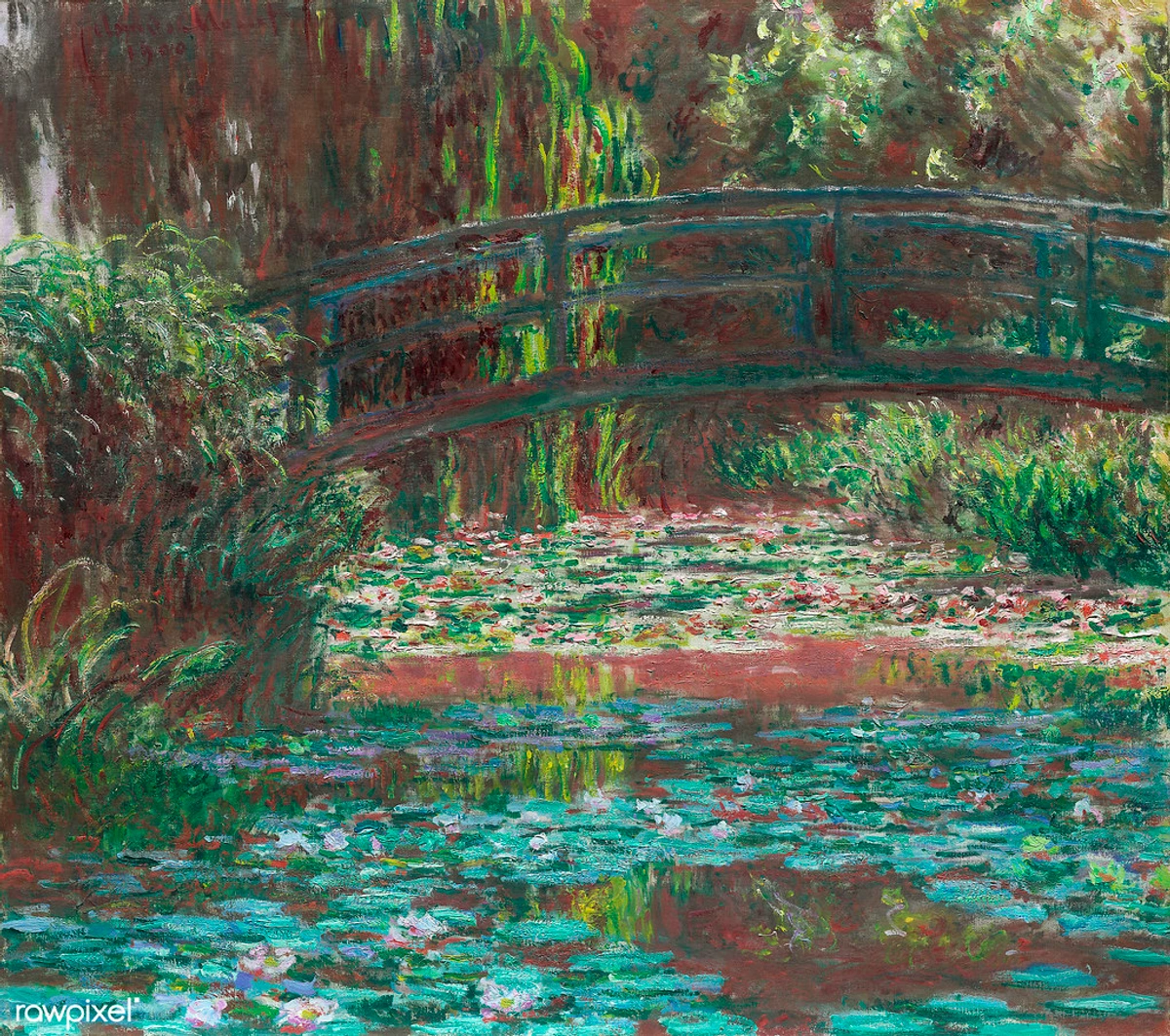
Chevreul's theories have had a lasting impact on modern art movements. From Impressionism to Abstract Expressionism, artists have used his principles to create visually dynamic and emotionally resonant works. His ideas about simultaneous contrast and color harmony have influenced countless artists, from Monet to Rothko, and continue to inspire contemporary painters today.
Influence on Art Movements
Chevreul's principles have been instrumental in shaping various art movements. Impressionist artists, for example, used his theories to capture the fleeting effects of light and color in their landscapes. Abstract Expressionists, on the other hand, employed his principles to create emotionally charged compositions that resonate with viewers on a deep level.
Early Life and Influences
Chevreul's journey into color theory began with his work in chemistry, particularly his research on fats and dyes. His collaboration with textile manufacturers led him to explore how colors interact, which eventually culminated in his seminal work on color harmony and contrast.
Key Contributions
Chevreul's research was driven by practical problems faced by textile manufacturers. He noticed that certain color combinations appeared more vibrant or harmonious than others, leading him to develop his theory of simultaneous contrast. This theory revolutionized the way artists and designers approached color, providing a scientific basis for creating visually appealing compositions.
Scientific Basis of Color Theory
Chevreul's work was grounded in scientific observation and experimentation. He conducted numerous experiments to understand how colors interact and how the human eye perceives them. His findings provided a scientific basis for color theory, which had previously been largely subjective and intuitive. This scientific approach has made his work enduringly relevant to both artists and scientists.
Experiments and Observations
Chevreul's experiments involved meticulous observations of how colors appear when placed next to each other. He documented how the human eye perceives color based on its context, laying the groundwork for modern color theory. His work demonstrated that color perception is not just an artistic concept but a scientific phenomenon rooted in human biology.
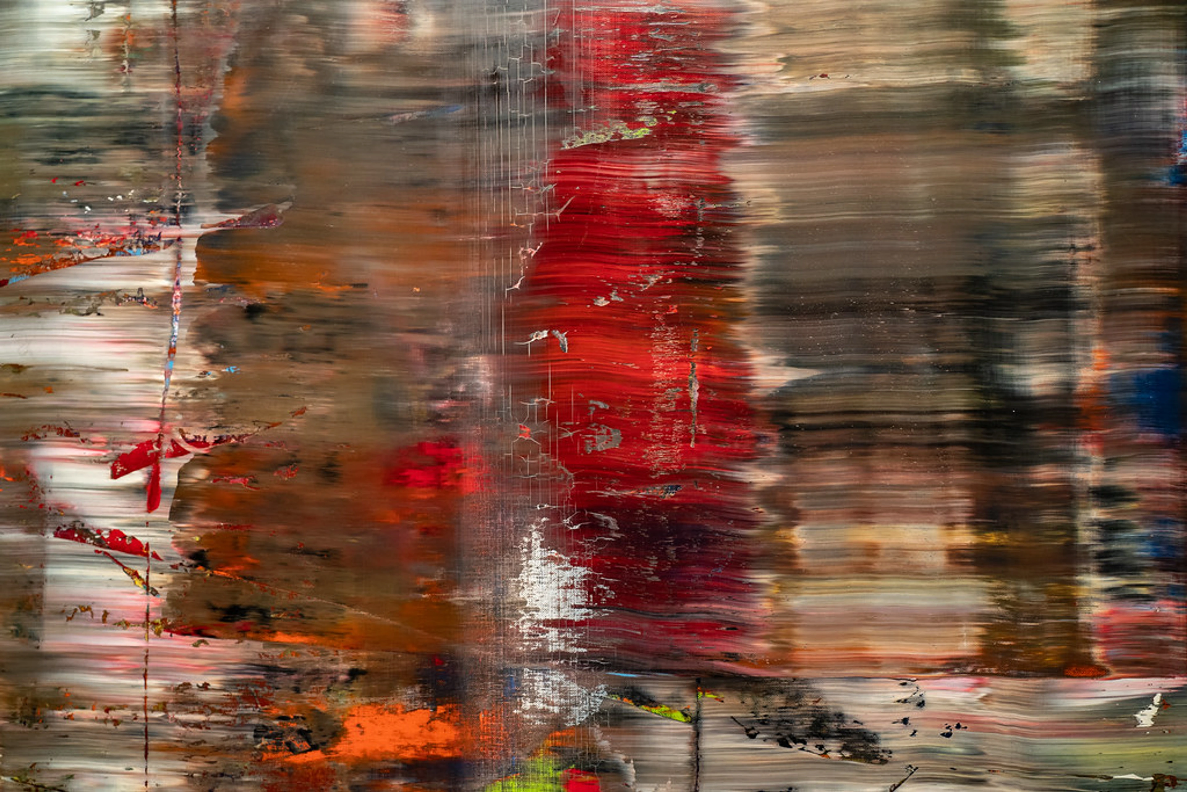
Understanding Chevreul's Color Theory
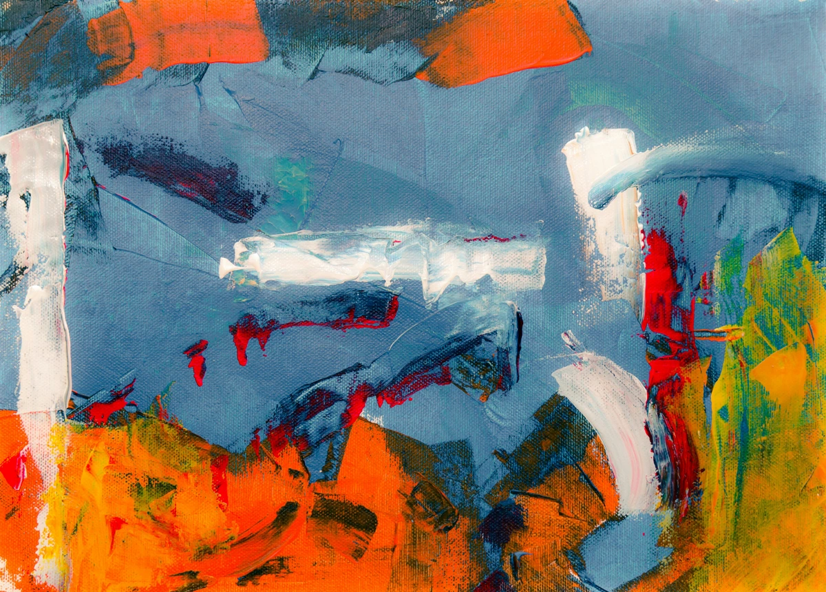
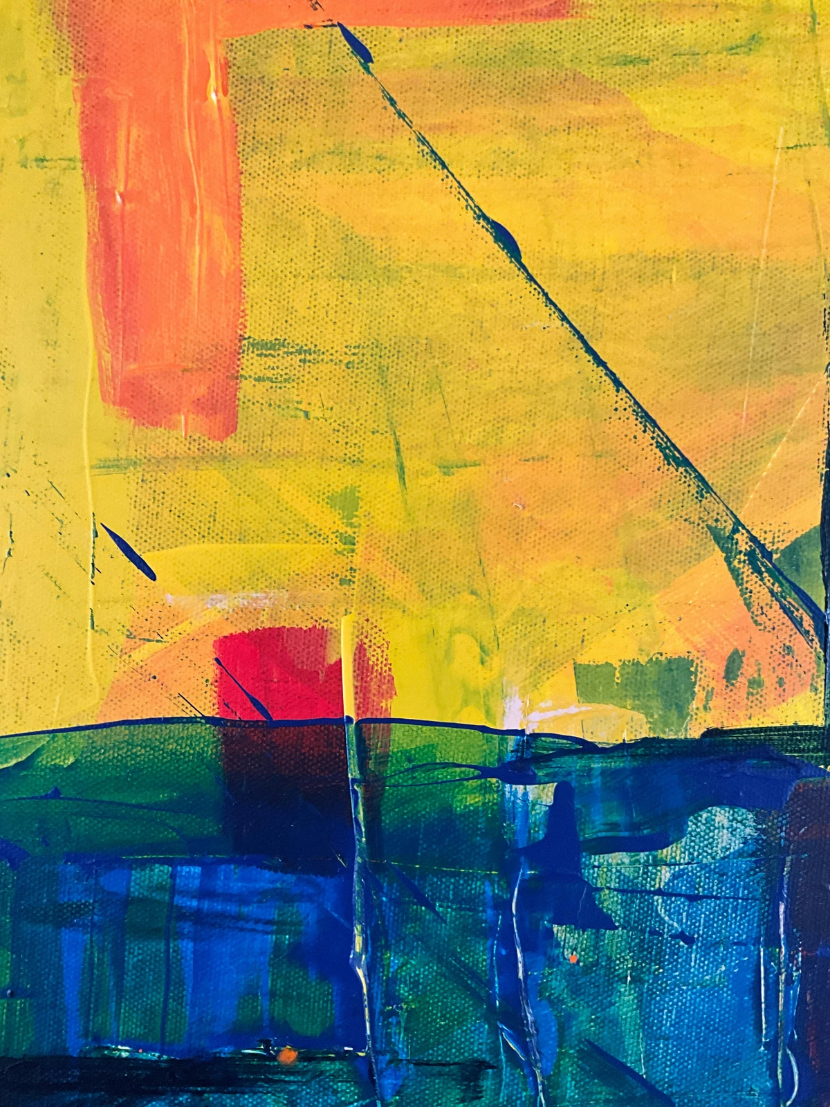
Chevreul's theory revolves around the idea of simultaneous contrast. This is the phenomenon where colors influence each other when placed side by side. For example, a gray square on a white background appears darker than the same gray square on a black background. This is because our eyes perceive colors in relation to their surroundings.
The Role of Simultaneous Contrast
Simultaneous contrast is a fundamental concept in color theory. It explains how colors can appear different based on their surroundings. This phenomenon is not just an artistic observation but a scientific fact rooted in how the human eye and brain process visual information.
The Science of Color Perception
The human eye and brain work together to interpret colors based on their context. This means that the same color can appear different depending on the colors around it. Understanding this process is key to mastering Chevreul's principles and creating artwork that is visually dynamic and engaging.
How the Eye Perceives Color
The retina and visual cortex play crucial roles in color perception. The retina captures light and sends signals to the brain, which interprets these signals based on the surrounding colors. This process explains why the same color can appear different in different contexts.
The Role of Context in Color Perception
Context plays a crucial role in how we perceive colors. The same color can appear vastly different depending on its surroundings. This is why artists must carefully consider the context in which they place their colors, as it can significantly impact the overall effect of their artwork.
Practical Examples of Context
Consider a red apple placed on a green tablecloth. The red of the apple will appear more vibrant due to the contrast with the green. Similarly, a blue sky will appear more intense when juxtaposed with the warm hues of a sunset. These examples illustrate the importance of context in color perception.
Practical Implications for Artists
For artists, understanding the role of context means being mindful of how colors interact in their compositions. By strategically placing colors, artists can create optical illusions, enhance vibrancy, and achieve a sense of depth and dimension in their work. This is particularly important in abstract art, where color relationships are often the primary focus.
Techniques for Enhancing Depth
Artists can use techniques such as layering and glazing to create depth in their paintings. By applying thin layers of transparent paint, artists can build up color and create a sense of three-dimensional space. This technique is particularly effective in landscapes and portraits.

The Science Behind Simultaneous Contrast
The human eye perceives color based on the context in which it appears. When two colors are placed next to each other, they can enhance or diminish each other's intensity. This interaction is not just an artistic concept but a scientific one, rooted in how our brains process visual information.
Neurological Basis of Color Interaction
The way our brains process color is deeply rooted in the biology of our visual system. The retina and visual cortex work together to interpret color signals, and this process is influenced by the surrounding colors. This neurological basis explains why simultaneous contrast is such a powerful tool for artists.

How the Brain Processes Color
Our brains are wired to interpret colors in relation to their surroundings. This is why the same color can appear different when placed against different backgrounds. Understanding this process can help artists create more effective and visually striking compositions.
Color and Emotion
Colors have the power to evoke emotions and set the mood of a painting. Warm colors like red and orange can create a sense of energy and excitement, while cool colors like blue and green can evoke calmness and tranquility. By understanding how the brain processes color, artists can use color to convey specific emotions and messages in their work.
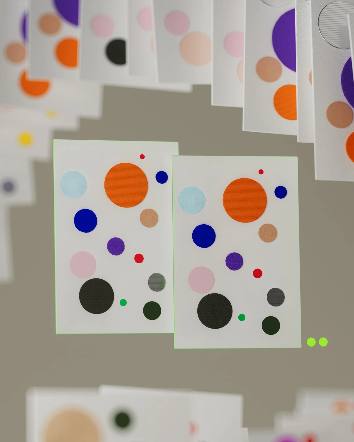
Key Concepts
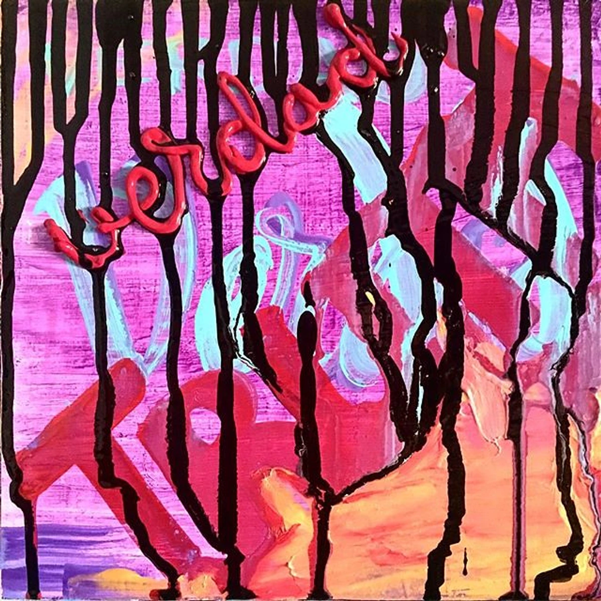
- Simultaneous Contrast: Colors affect each other when placed next to each other. This can create vibrant, dynamic effects in your paintings.
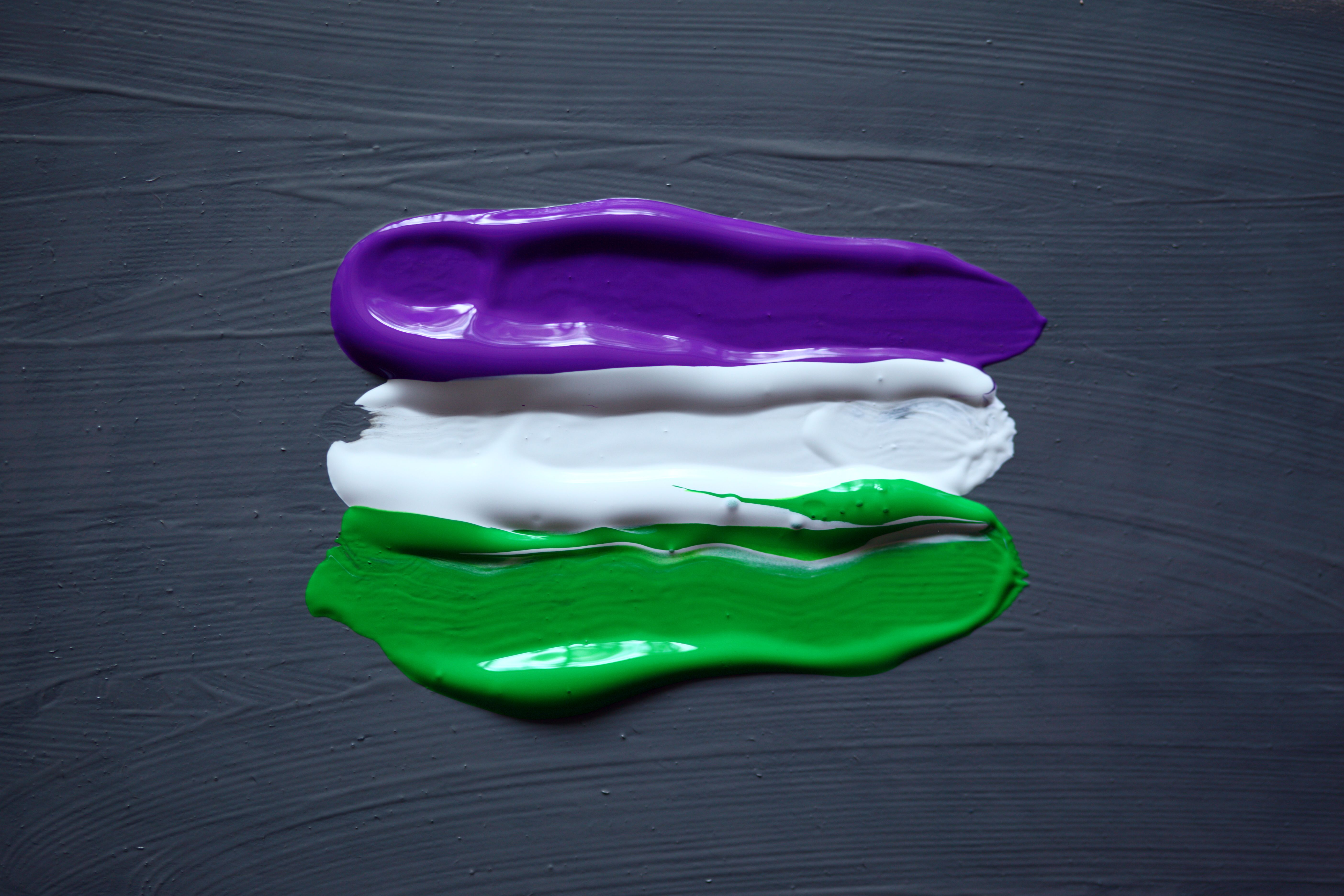
- Complementary Colors: Colors opposite each other on the color wheel. When placed side by side, they enhance each other's intensity.
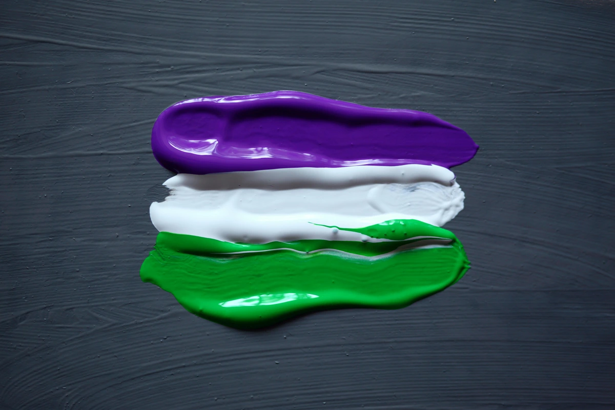
- Harmony: Creating a balanced and pleasing color scheme by using colors that are close to each other on the color wheel.
- Color Temperature: Colors can be warm (reds, oranges) or cool (blues, greens). Understanding temperature helps in creating depth and mood in your artwork.
- Saturation and Value: Saturation refers to the intensity of a color, while value refers to its lightness or darkness. Adjusting these can dramatically change the impact of your painting.
- Color Context: The environment in which a color is placed can significantly alter its appearance. This includes the colors surrounding it, the lighting conditions, and even the texture of the surface.
- Optical Mixing: A technique where small dots or strokes of different colors are placed close together. When viewed from a distance, these colors blend optically, creating a new hue. This technique is often used in pointillism.
- Color Psychology: The study of how colors affect human behavior and emotions. Understanding color psychology can help artists create artwork that resonates with viewers on a deeper level.
- Color Balance: Achieving a sense of equilibrium in a painting by distributing colors evenly. This can create a sense of stability and harmony in the composition.
- Color Symbolism: Colors can carry symbolic meanings that vary across cultures. For example, white may symbolize purity in one culture and mourning in another. Understanding these nuances can add layers of meaning to your artwork.
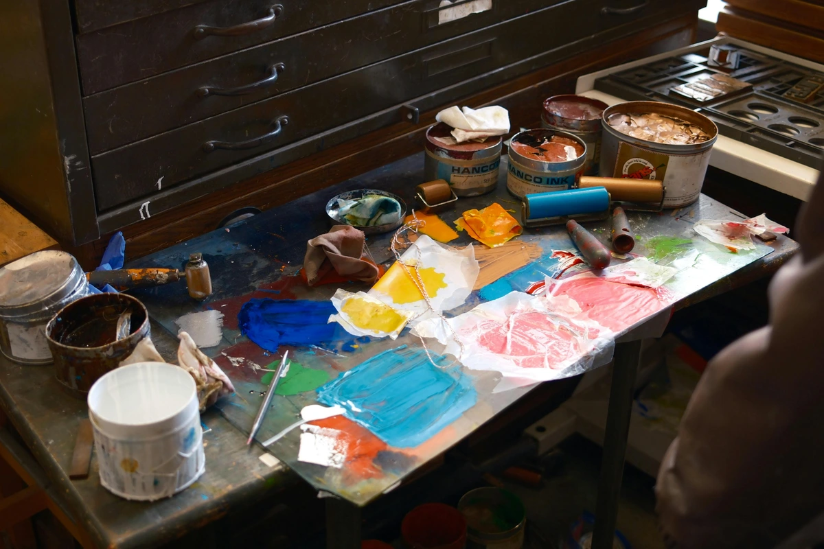
Practical Techniques for Applying Chevreul's Principles
1. Using Complementary Colors
One of the most straightforward ways to apply Chevreul's principles is by using complementary colors. These are colors that are opposite each other on the color wheel, such as red and green, blue and orange, or yellow and purple.
Creating Vibrant Contrasts
Complementary colors can create vibrant contrasts that make your artwork stand out. By placing complementary colors next to each other, you can enhance the intensity of both colors, creating a dynamic and visually engaging effect. This technique is particularly useful in abstract art, where color relationships are often the primary focus.
Understanding the Color Wheel
The color wheel is a fundamental tool for artists. It helps visualize the relationships between colors, making it easier to identify complementary colors and create harmonious palettes. Familiarizing yourself with the color wheel can significantly enhance your ability to apply Chevreul's principles effectively.
Advanced Color Wheel Techniques
Beyond identifying complementary colors, the color wheel can be used to explore more complex color relationships. For example, split-complementary colors involve using a base color and the two colors adjacent to its complement. This can create a more nuanced and sophisticated palette, adding depth and complexity to your artwork.
Example: If you're painting a landscape with a lot of greens, adding a touch of red can make the greens appear more vibrant. This is because red and green are complementary colors.
Advanced Tip: Experiment with split-complementary colors, which involve using a base color and the two colors adjacent to its complement. This can create a more nuanced and sophisticated palette.
2. Creating Optical Effects
Chevreul's principles can also be used to create optical effects. For instance, by placing a small amount of a complementary color next to a larger area of another color, you can make the larger area appear more vibrant.
Optical Illusions in Art
Optical effects can create illusions of depth, movement, and vibrancy in your artwork. By strategically placing colors, you can create the illusion of three-dimensional space on a two-dimensional surface. This technique is often used in Op Art, where artists use color and pattern to create dynamic visual effects.
Example: Imagine you're painting a blue sky. Adding a small amount of orange (the complementary color of blue) in the form of a sunset or a bird can make the blue of the sky appear more intense.
Advanced Tip: Use optical mixing, where small dots or strokes of different colors are placed close together. When viewed from a distance, these colors blend optically, creating a new hue. This technique is often used in pointillism.
3. Achieving Harmony
Harmony in painting is about creating a balanced and pleasing color scheme. Chevreul's principles can help you achieve this by using colors that are close to each other on the color wheel.
The Role of Analogous Colors
Analogous colors are colors that are next to each other on the color wheel. They usually match well and create serene and comfortable designs. Using analogous colors can help you achieve harmony in your artwork, making it more visually appealing and cohesive.
Example: If you're painting a portrait, using a range of skin tones that are close to each other on the color wheel can create a harmonious and natural look.
Advanced Tip: Create a monochromatic color scheme by using variations of a single hue. This can evoke a sense of unity and tranquility in your artwork.
The Role of Analogous Colors
Analogous colors are colors that are next to each other on the color wheel. They usually match well and create serene and comfortable designs. Using analogous colors can help you achieve harmony in your artwork, making it more visually appealing.
Creating Monochromatic Schemes
Monochromatic color schemes involve using variations of a single hue. This can create a sense of unity and tranquility in your artwork. By adjusting the saturation and value of a single color, you can create a cohesive and visually engaging composition.
Techniques for Monochromatic Art
To create a monochromatic artwork, start with a base hue and experiment with its various shades, tints, and tones. This approach can evoke a sense of harmony and simplicity, making it ideal for minimalist and abstract compositions.
Step-by-Step Guide to Applying Chevreul's Principles
- Choose Your Color Palette: Start by selecting a color palette that includes a range of hues, values, and intensities. This will give you a variety of colors to work with.
- Identify Complementary Colors: Look at the color wheel and identify the complementary colors for each hue in your palette. This will help you create vibrant contrasts.
- Plan Your Composition: Think about how you want to use these colors in your painting. Consider the placement of complementary colors to create optical effects and harmony.
- Start Painting: Begin by applying the base colors. Then, gradually add the complementary colors to enhance the vibrancy and harmony of your painting.
- Adjust and Refine: As you paint, step back and look at your work. Adjust the colors as needed to achieve the desired effect.
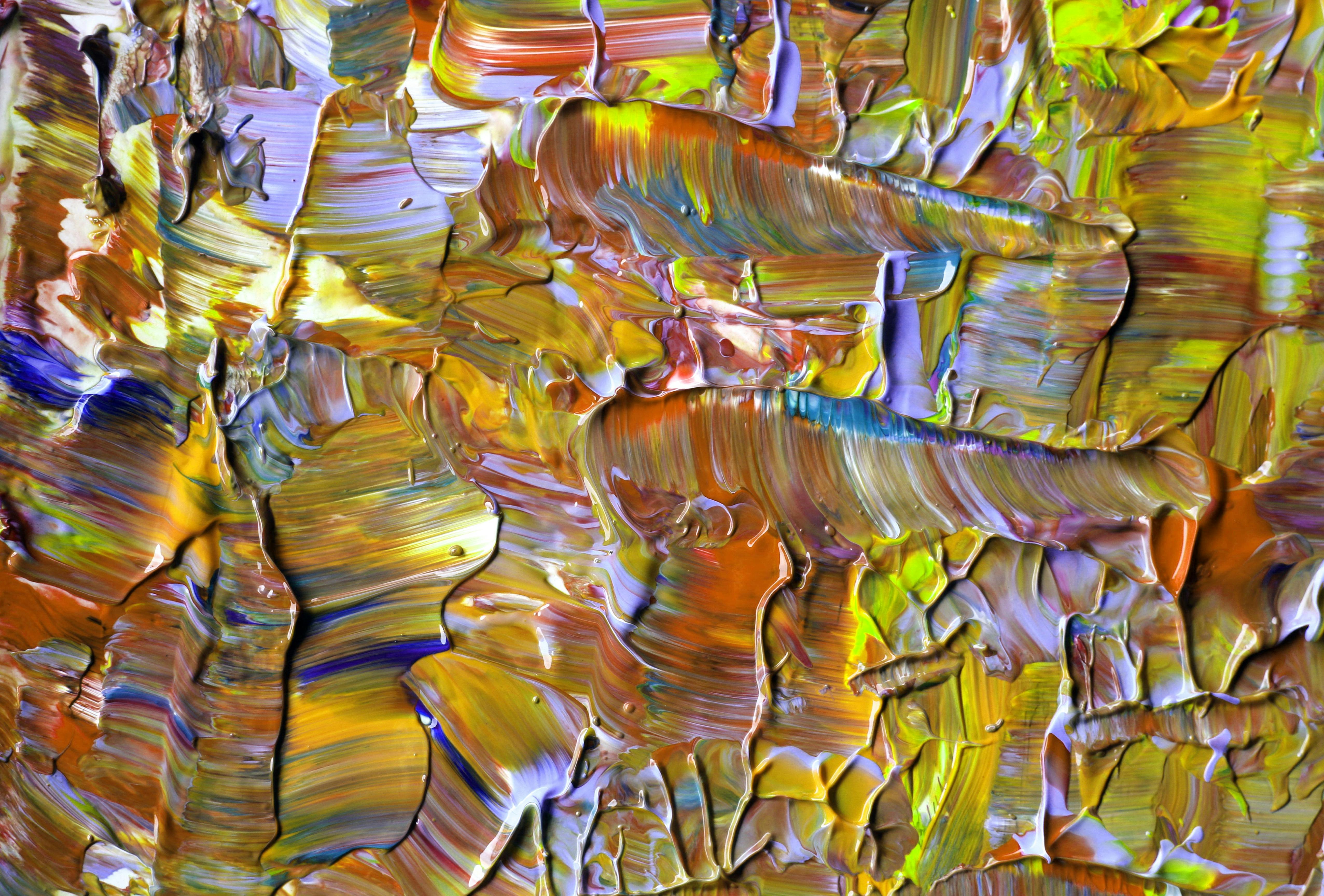
- Experiment with Techniques: Don't be afraid to try new techniques, such as glazing, scumbling, and impasto. These techniques can add depth and texture to your artwork, making it more visually engaging and dynamic.
Exploring Advanced Techniques
Once you've mastered the basics, consider exploring advanced techniques such as glazing, scumbling, and impasto. These techniques can add depth and texture to your artwork, making it more visually engaging and dynamic.
Exploring Advanced Techniques
Once you've mastered the basics, consider exploring advanced techniques such as glazing, scumbling, and impasto. These techniques can add depth and texture to your artwork, making it more visually engaging.
Glazing
Glazing involves applying thin, transparent layers of paint over a dry base layer. This technique can create luminous effects and enhance the depth of your artwork. It is particularly useful for creating realistic skin tones and atmospheric effects in landscapes.
Scumbling
Scumbling is a technique where a thin layer of opaque paint is applied over a dry layer, allowing some of the underlying color to show through. This can create a sense of texture and depth, adding complexity to your artwork.
Impasto
Impasto involves applying paint thickly, so that the brush or knife strokes are visible. This technique can add a three-dimensional quality to your artwork, making it more tactile and visually engaging.
Common Mistakes and How to Avoid Them
- Overusing Complementary Colors: While complementary colors can create vibrant effects, overusing them can make your painting look chaotic. Use them sparingly and strategically.
- Ignoring Color Harmony: Focusing too much on contrast can lead to a lack of harmony. Make sure to balance contrast with harmony by using colors that are close to each other on the color wheel.
- Not Testing Colors: Always test your colors on a small area before applying them to your painting. This will help you see how they interact with each other.
- Neglecting Lighting Conditions: The lighting in your studio can affect how you perceive colors. Always check your painting under different lighting conditions to ensure consistency.
- Overcomplicating the Palette: Using too many colors can lead to a muddy and confusing composition. Stick to a limited palette to maintain clarity and cohesion.
- Ignoring Color Context: Failing to consider the context in which colors are placed can result in unintended effects. Always think about how colors interact with their surroundings.
- Overlooking Color Temperature: Neglecting the temperature of colors can lead to a lack of depth and mood in your artwork. Make sure to balance warm and cool colors to create a visually appealing composition.
- Ignoring Color Psychology: Failing to consider the emotional impact of colors can result in artwork that doesn't resonate with viewers. Always think about how colors can evoke specific emotions and messages in your work.
- Overworking the Painting: Continuously adding layers and details can lead to a loss of spontaneity and freshness in your artwork. Know when to stop and let the painting breathe.
- Ignoring Composition: Focusing solely on color can lead to a weak composition. Always consider the overall structure and balance of your artwork.
Additional Tips for Success
- Use a Color Checker: Invest in a color checker tool to ensure that your colors are accurate and consistent across different lighting conditions.
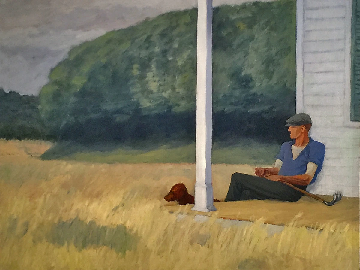
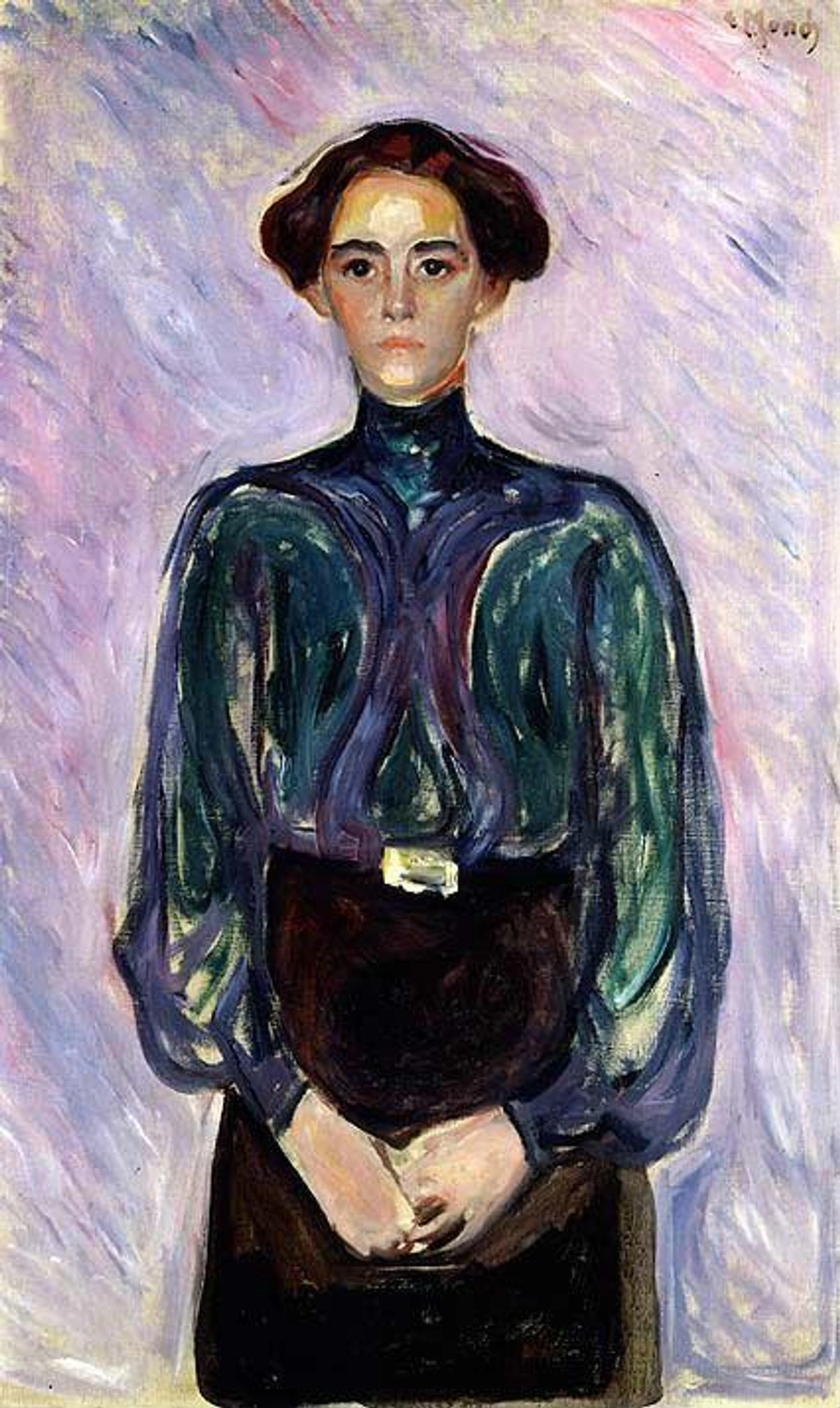
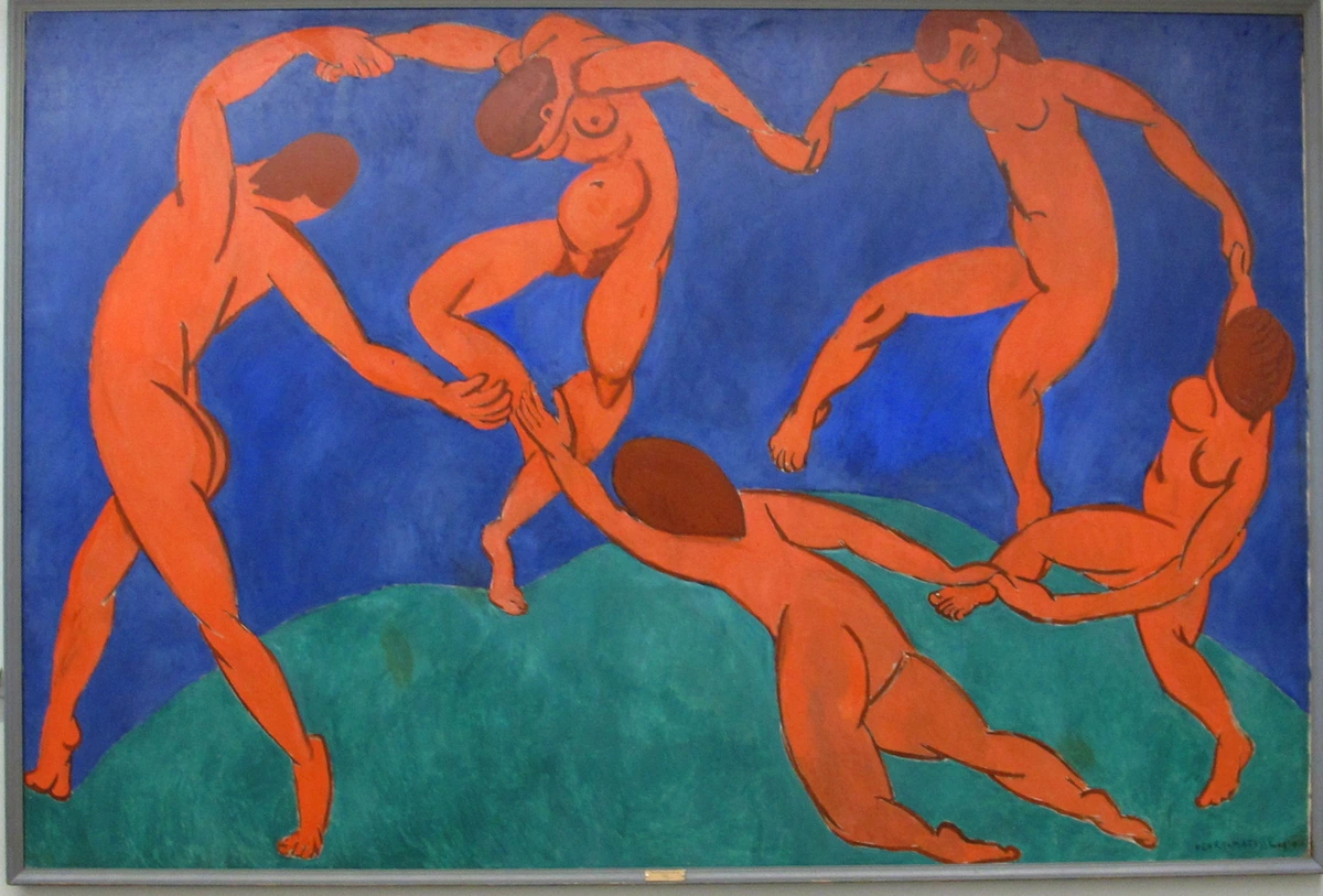
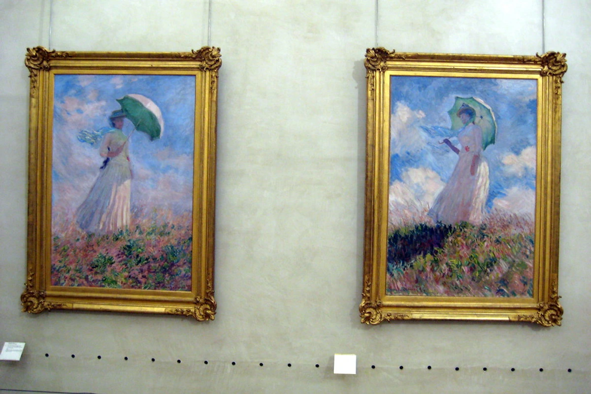
- Study Master Artists: Look at how master artists like Monet, Van Gogh, and Rothko used color in their work. Analyze their techniques and apply them to your own artwork.
- Practice Regularly: The more you practice, the better you'll become at understanding and applying Chevreul's principles. Experiment with different color combinations and techniques to find what works best for you.
FAQ
What is simultaneous contrast?
Simultaneous contrast is the phenomenon where colors influence each other when placed side by side. For example, a gray square on a white background appears darker than the same gray square on a black background.
How does simultaneous contrast work?
Simultaneous contrast works by altering the perception of a color based on its surroundings. When two colors are placed next to each other, they can enhance or diminish each other's intensity, creating dynamic visual effects.

How can I use complementary colors in my painting?
You can use complementary colors to create vibrant contrasts. For example, if you're painting a landscape with a lot of greens, adding a touch of red can make the greens appear more vibrant.
What are some examples of complementary color pairs?
Some common complementary color pairs include red and green, blue and orange, and yellow and purple. These pairs can create striking contrasts and enhance the vibrancy of your artwork.
What is color harmony?
Color harmony is about creating a balanced and pleasing color scheme. This can be achieved by using colors that are close to each other on the color wheel.
How can I achieve color harmony in my artwork?
To achieve color harmony, use analogous colors or create a monochromatic color scheme. Analogous colors are next to each other on the color wheel, while monochromatic schemes involve variations of a single hue.
How can I avoid overusing complementary colors?
Use complementary colors sparingly and strategically. Focus on creating a balanced color scheme that includes both contrast and harmony.
What are some techniques for balancing complementary colors?
To balance complementary colors, consider using them in small accents rather than large areas. This can create focal points and enhance the overall composition without overwhelming the viewer.

Why is testing colors important?
Testing colors on a small area before applying them to your painting helps you see how they interact with each other. This can prevent unwanted effects and ensure that your colors work well together.
How can I test colors effectively?
Create a small color swatch or test patch on a separate piece of paper or canvas. This allows you to see how the colors interact before committing to the final artwork.

What is the difference between saturation and value?
Saturation refers to the intensity or purity of a color, while value refers to its lightness or darkness. Adjusting these properties can help you create depth and emphasis in your artwork.
How can I adjust saturation and value in my paintings?
To adjust saturation, mix your color with its complement to mute it or add a more intense version of the hue to increase saturation. To adjust value, add white to lighten or black to darken the color.

How does color temperature affect a painting?
Color temperature can influence the mood and atmosphere of your painting. Warm colors tend to advance and create a sense of energy, while cool colors recede and evoke calmness.
What are some examples of warm and cool colors?
Warm colors include reds, oranges, and yellows, while cool colors include blues, greens, and purples. Using a mix of warm and cool colors can create a balanced and visually appealing composition.
Can I use Chevreul's principles in digital art?
Absolutely! Chevreul's principles are applicable to both traditional and digital art. Digital tools can even enhance your ability to experiment with color interactions and effects.

How can I apply Chevreul's principles in digital art?
In digital art, you can use software tools to experiment with color palettes and apply Chevreul's principles. Techniques such as layering and blending modes can help you achieve vibrant contrasts and harmonious compositions.

Conclusion
Applying Chevreul's principles in your painting can transform your artwork from good to extraordinary. By understanding and utilizing simultaneous contrast, complementary colors, and harmony, you can create vibrant, balanced, and visually stunning paintings. Remember, the key is to experiment and have fun with colors. After all, painting is as much about the journey as it is about the final result.
If you're looking to explore more about color theory and its application in art, consider checking out some of the resources available. And if you're inspired to start painting, why not browse through some art supplies to get started?
Happy painting!
Further Reading and Resources
For those eager to dive deeper into the world of color theory and its practical applications, here are some recommended resources:
- Books: "Interaction of Color" by Josef Albers, "Color and Light" by James Gurney.
- Online Courses: Explore platforms like Skillshare or Udemy for courses on color theory and painting techniques.
- Communities: Join art forums and social media groups to connect with fellow artists and share your experiences.