
Whistler's Mother: Paradox, Purpose, & Enduring Cultural Impact
Unpack 'Whistler's Mother' (Arrangement in Grey and Black No. 1): its radical aesthetic origins, evolution into a symbol of motherhood, and timeless cultural significance. Your ultimate guide.
Whistler's Mother: A Masterpiece of Paradox & Enduring Cultural Iconography
Let me be honest with you, as an artist constantly wrestling with how people truly see art, the story of James McNeill Whistler's 'Arrangement in Grey and Black No. 1' – universally known as Whistler's Mother – is a profound conversation starter. We’ve all seen her, haven’t we? She’s ubiquitous, from stamps to sitcoms, a visual shorthand that predates the digital "meme" by a century. Like the Mona Lisa, she’s instantly recognizable. But for the longest time, I rarely looked beyond the recognition; I just assumed I knew her story. And that, my friend, is the essence of her enduring paradox.
This isn't merely a portrait of an old woman. It’s a masterclass in compositional daring, a quiet rebellion against the prevailing art norms of its era, and a surprising cultural phenomenon all rolled into one. My goal here, and I hope you’ll join me, is to dive deep into what truly makes this seemingly simple painting so profoundly complex. We'll explore Whistler’s radical artistic vision, the layers of meaning we, the public, have projected onto it, and ultimately, why it continues to endure, speaking to us about the very nature of art itself. Consider this your ultimate guide, a thorough exploration of an artwork that keeps evolving in our collective consciousness.
Anna McNeill Whistler: The Steadfast Muse and Silent Anchor
So, who is this woman, this quiet force gazing out (or rather, away) from the canvas? She is Anna McNeill Whistler, the artist's own mother. Born in Wilmington, North Carolina, in 1804, Anna was a woman of unwavering faith, a quiet strength, and remarkable patience—qualities that, as an artist, I find resonate deeply through her depiction. After the death of her beloved husband, George Washington Whistler, a civil engineer, Anna moved to London in 1864 to live with her famously flamboyant and often controversial son, James. At sixty-seven years old in 1871, she sat for this portrait, an act of monumental patience, both for mother and son, that one can only imagine.
The story of the sitting itself is one of serendipity and pragmatic problem-solving. Whistler's intended model cancelled, and his ever-supportive mother, despite suffering from ill health and being unable to stand for extended periods, bravely stepped in. James initially wanted her to stand, but recognizing her discomfort, he had her sit. Then, in a stroke of artistic genius (or perhaps just brilliant pragmatism, as many creative breakthroughs are!), he turned her to the side. This simple pivot, born of circumstance, gave us one of the most iconic profiles in art history, demonstrating how limitations can sometimes force truly innovative solutions in art, a lesson I often reflect on in my own work.
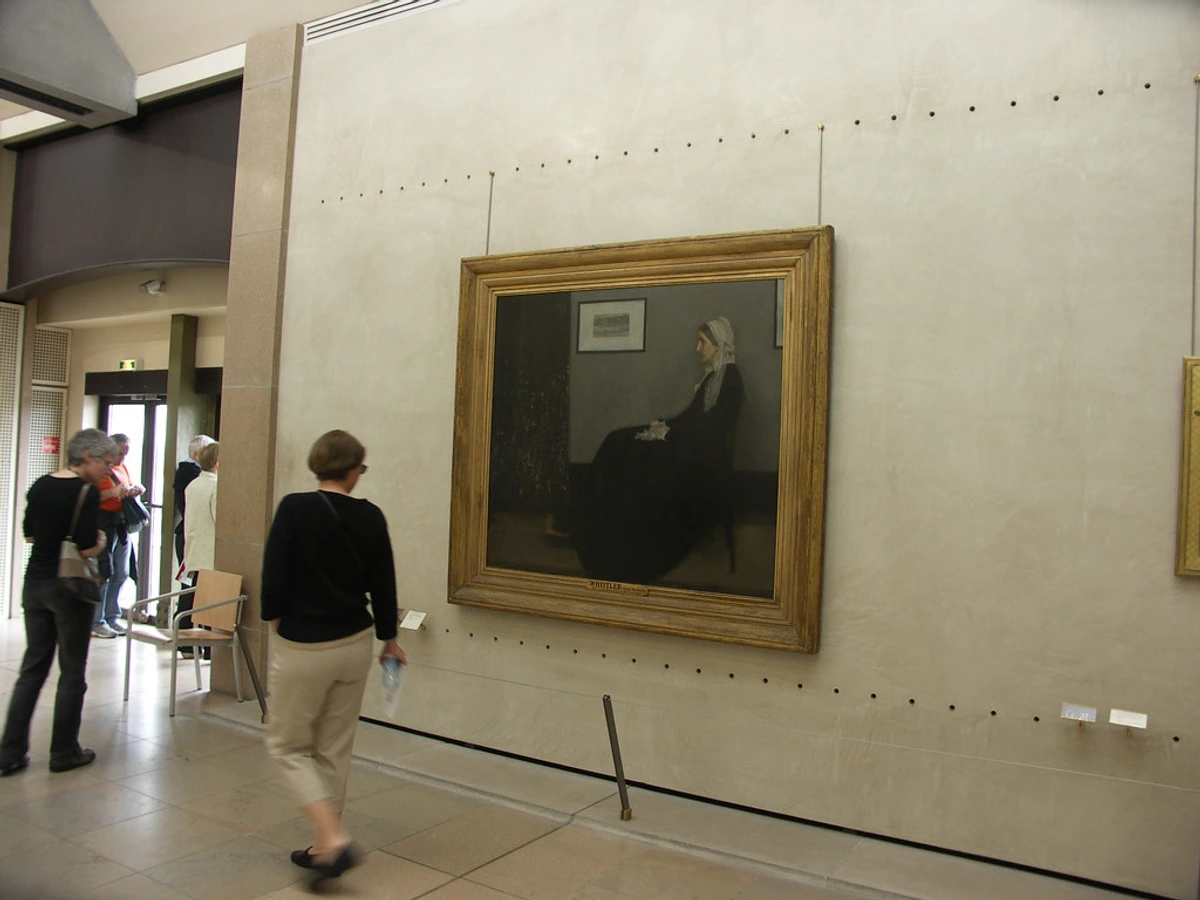
Her dignified attire – a simple black dress, a white lace cap and collar – speaks volumes about the austerity of the Victorian era and her own resolute character. It’s a quiet strength, isn't it? A testament to a life lived with unwavering presence, a quality that radiates from the canvas and grounds the entire composition. Anna isn't merely a sitter; she's the foundational block of this artistic experiment, a silent anchor in a changing world. The painting's physical dimensions, 144.3 cm × 162.4 cm (56.8 in × 63.9 in), rendered in oil on canvas, give her a commanding, almost life-sized presence, filling the viewer's field of vision and demanding contemplation. It's truly an experience to stand before it, feeling the quiet power emanating from such a seemingly simple arrangement.

Whistler's Radical Vision: An "Arrangement in Grey and Black"
While Anna’s steadfast presence provided the subject, Whistler's true focus lay in something far more revolutionary for his time. Let’s talk about that rather provocative, almost defiant title: "Arrangement in Grey and Black No. 1." I know what you’re thinking: where’s the mother in that? And that, my friends, is the first, most crucial key to understanding what Whistler was truly up to. This wasn't a humble title; it was a manifesto, a direct challenge to the prevailing artistic sensibilities of his day. Whistler himself famously stated, "As music is the poetry of sound, so is painting the poetry of sight, and the subject-matter has nothing to do with harmony of sound or of colour." He believed painting, like music, should be appreciated for its inherent aesthetic qualities, rather than any narrative it might convey.
Whistler, an American expatriate who studied in Paris (at Gleyre's studio, encountering realists like Courbet) and flourished in London, was a figure of formidable talent and an even more formidable ego. He cultivated an image as an artistic provocateur, as famous for his wit and sharp tongue as for his brush. By titling his work this way, he wasn't aiming for a sentimental tribute to his mother, though his love for her was clear. His primary goal, his artistic north star, was the arrangement of shapes, tones, and lines on the canvas itself – a deliberate challenge to the prevailing academic art that prized narrative, historical scenes, and overt emotional storytelling. Think of the grand Salon paintings, replete with moralistic genre scenes that dominated the art world; Whistler was, in essence, telling them to strip away the story and just look at the pure visual art.
His consistency in this approach is evident in other works. He painted several other pieces with similar titles, such as "Arrangement in Grey and Green: Portrait of F. R. Leyland" and "Arrangement in Yellow and Grey: Effie Deans." This wasn't a one-off experiment but a fundamental principle of his artistic output, much like his series of "Nocturnes" or "Symphonies," which further emphasized his musical approach to visual art, focusing on color and form over subject matter.
Art for Art's Sake and the Aesthetic Movement
This concept was central to his belief in "art for art’s sake" – the radical idea that art's sole purpose is to be beautiful and evoke aesthetic pleasure, free from moral, narrative, or didactic (intended to teach) functions. In the Victorian era, where art was often expected to tell a story or impart a moral lesson, this was a defiant stance. It was a core tenet of the Aesthetic Movement, of which Whistler was a charismatic and often controversial figure. This movement, popular in late 19th-century Britain, counted luminaries like Oscar Wilde and Walter Pater among its proponents, all advocating for beauty as an end in itself. Pater famously argued that art should offer "a counted number of pulses only," a direct call for intense, fleeting aesthetic experience over prolonged narrative engagement. For Whistler, the identity of the sitter was almost secondary to the aesthetic problem he was solving – the visual puzzle he was trying to master on the canvas. It's a fascinating intellectual pursuit, wouldn't you agree?

A Symphony of Formal Elements
Whistler was playing with formal elements – the fundamental building blocks of art like line, shape, color, and composition. In this painting, it's the interplay of horizontals and verticals, the subtle nuances of greys and blacks (what he meticulously called "tonal harmony"), and the striking punctuation of whites that catch the eye. The brushwork is smooth, almost invisible, allowing the carefully rendered surfaces to speak for themselves: the soft texture of Anna's lace cap, the crisp folds of her dress, the solid wood of the wainscoting. It creates a visual rhythm, a quiet symphony of form that feels almost like a precursor to some of the ideas you see later in more abstract art, where the form itself dictates the feeling, much like the mesmerizing color fields of Rothko.

Look closely at the angles: the strong vertical lines of the curtain and the picture frame on the wall, balanced by the solid horizontal plane of the floor and the subtle lines of the footrest. Even Anna’s profile, a perfect ninety-degree angle, contributes to this geometric precision. The subtle variations in grey and black create depth and texture, while the crisp whites of her cap and cuffs draw the eye, preventing the composition from becoming flat. This meticulous attention to visual equilibrium, to finding profound meaning in minimal elements, is something I'm constantly exploring in my own work, seeking similar harmony through different palettes and textural approaches. It’s also something fundamental to understanding balance in art composition.
The Influence of Japanese Prints and Photography
Whistler, like many avant-garde artists of his time, was also deeply influenced by Japanese prints (known as Ukiyo-e, meaning "pictures of the floating world"), which were making their way into Europe through trade and world's fairs, collected enthusiastically by artists. He absorbed their aesthetic principles, encouraging him to experiment with:
- Flat planes of color: Reducing depth and emphasizing surface, rejecting traditional Western illusionism, which was groundbreaking.
- Asymmetrical compositions: Breaking away from traditional, centered arrangements to create dynamic tension and visual interest. Notice how Anna is placed off-center, balanced by the strong vertical elements on the left.
- Bold use of negative space: The empty areas around the subject become as important as the subject itself, guiding the eye and contributing to the overall balance. The vast, empty wall behind Anna is a prime example of this deliberate use of negative space.
- Strong outlines and simplified forms: Lending a graphic, almost poster-like quality that contrasts with the detailed rendering of Anna herself.
Can you see how these seemingly simple choices, inspired by a vastly different cultural tradition, contribute to such a powerful sense of balance and stillness in 'Whistler's Mother'? It’s a testament to how artists borrow and innovate across cultures, often leading to groundbreaking new forms. This cross-cultural dialogue pushed art forward, setting the stage for even more radical compositional experiments in the centuries to come.
It’s also important to consider the burgeoning influence of photography during this period. As photography could capture likeness with unprecedented accuracy, painters like Whistler were subtly pushed to explore art's formal qualities more deeply. This freed painting to pursue other truths – subjective interpretation, emotional resonance, and the pure aesthetic of form – rather than just accurate representation. This shift undeniably paved the way for a deeper understanding of abstract art and the exploration of art as an end in itself.
Beyond Intent: The Layers of Meaning and Enduring Legacy
Here's where the paradox truly deepens: while Whistler was immersed in his arrangement, the public, especially in America, latched onto something else entirely: motherhood. This fascinating disconnect between the artist's intellectual pursuit and the public's emotional response is, I believe, the very core of its enduring power. It’s almost as if the painting, once released into the world, took on a life of its own, gathering meanings far beyond Whistler’s original intent. How often do we, as creators, find our work interpreted in ways we never envisioned?
Initial Reception: "An Unintelligible Arrangement"
When the painting first debuted in London, critics were, shall we say, unconvinced and even hostile. It was shown at the Royal Academy, but almost rejected! One critic famously called it "an unintelligible arrangement," while others found it too stark, too lacking in the traditional sentimentality and overt narrative expected of a portrait at the time. My guess? They simply weren't ready for Whistler's radical formalist vision, expecting a story where he offered a symphony of tones. The artwork even became a point of contention in Whistler's infamous libel lawsuit against influential art critic John Ruskin in 1878. Ruskin had accused Whistler of "flinging a pot of paint in the public's face" regarding his atmospheric seascape "Nocturne in Black and Gold: The Falling Rocket," an abstract exploration of fireworks over the Thames. Though Whistler won, he was awarded only a farthing in damages, bankrupting him and further cementing his reputation as an uncompromising provocateur who fought fiercely for the integrity of his aesthetic principles.
Despite this initial resistance, the painting eventually found its way to the Musée du Luxembourg in Paris (now residing magnificently at the Musée d'Orsay), after being purchased by the French state, thanks to the intervention of artist Carolus-Duran. This official recognition, though slow, marked the beginning of its artistic legitimation, signaling a shift in art appreciation towards modern aesthetic values, especially among a more forward-thinking European audience.

American Embrace: A Universal Symbol of Motherhood
But its true legendary status was cemented across the Atlantic. During the trying times of the Great Depression in the 1930s, when America yearned for stability and foundational values, this painting resonated deeply. It was reproduced on a postage stamp in 1934, championed by figures like Mother's Day founder Anna Jarvis, and toured the U.S. under the auspices of the Museum of Modern Art (MoMA), becoming a potent symbol of maternal devotion, piety, and the quiet dignity of older age. These were values that offered profound comfort and a sense of steadfastness during national hardship. Sociologically, Anna's unwavering presence became an anchor for a nation adrift, a poignant reminder of enduring strength and traditional family values amidst chaos. Psychologically, its subdued palette and stoic pose evoked a collective longing for reliability and reassurance, making the familiar image a source of quiet hope and strength for millions. I can almost picture families huddled around a radio, seeing this image and feeling a quiet sense of communal resilience. It was truly a masterful case of cultural adoption.
This allows for multiple entry points, making it a truly universal work, much like how we each interpret the meaning of art in our own unique, personal ways. It’s a testament to how a work can transcend its creator's intent and gather new meanings through cultural reception, becoming a mirror for our own societal values.

To truly grasp this fascinating tension between artistic intent and public perception, let's look at this comparison:
Aspect | Artist's Primary Intent | Popular Interpretation | Artistic Technique / Formal Elements |
|---|---|---|---|
| Title Preference | "Arrangement in Grey and Black No. 1" | "Whistler's Mother" | Emphasizes formal composition, tonal harmony, rejection of narrative |
| Core Focus | Formal elements, tonal harmony, composition, aesthetic | Reverence for motherhood, domestic virtues, piety, national stability | Use of lines, shapes, limited palette, and negative space to create balance |
| Emotional Impact | Contemplative, aesthetic, objective, intellectual | Sentimental, evokes nostalgia, respect, comfort, reassurance | Subdued tones, geometric precision, profile view, quiet presence |
| Subject's Identity | A model for an artistic study, a formal element in an arrangement | A universal symbol of maternal love and sacrifice, national stability | Profile view, austere attire, deliberate posture, almost abstract form |
| Artistic Movement | Aestheticism, Formalism | Popular sentiment, cultural icon, nationalistic symbol | Rejection of narrative, emphasis on "art for art's sake," Japanese influences |
Cultural Impact and Enduring Legacy: The Iconic Paradox
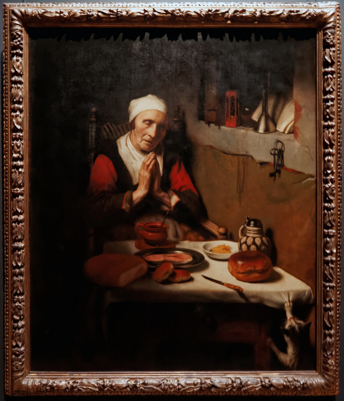
This painting's journey from a subtle formal study to an undeniable global icon is, to me, one of the most fascinating aspects of its story. Its profound embrace by the American public elevated it to an almost mythical status, shaping its legacy far beyond Whistler's initial vision. It's often placed in the same breath as other universally recognized, enigmatic portraits like the Mona Lisa or Vermeer's Girl with a Pearl Earring – works that transcend their subjects to become cultural touchstones, sometimes even at the cost of a deeper understanding of their original artistic intentions. This phenomenon of an artwork taking on a life beyond its creator's control is a paradox I find endlessly intriguing.
Today, Whistler's Mother is a prized possession of the Musée d'Orsay in Paris, a stunning museum renowned for its vast collection of Impressionist and Post-Impressionist masterpieces. Its journey to such a prestigious home is a testament to its artistic merit, eventually recognized despite initial resistance, signifying its critical standing in art history. The acquisition by the French state, a nation known for its artistic discernment, further cemented its place among the innovators of the 19th century. This institutional validation provided a counterpoint to the initial public and critical skepticism, demonstrating how art appreciation can evolve over time, much like a good wine.
What’s truly remarkable is its omnipresence in popular culture, a testament to its deeply ingrained iconography – the visual language and symbols it consistently represents. You’ll see it referenced and parodied everywhere: from the silent comedy of Mr. Bean attempting to rehang it upside down, to political cartoons that use its stoic image for commentary, advertisements leveraging its classic appeal, and even playful appearances in animated series like The Simpsons or Looney Tunes. The entire iconic composition – the profile, the seated posture, the stark grey-and-black palette – becomes a recognizable gag or a powerful symbol depending on its context. This constant reinterpretation and playful subversion speaks volumes about its deeply ingrained place in our cultural fabric. It's a testament to the power of a single image to adapt, gather new meanings, and remain relevant across generations, even beyond the artist’s original intent. While digital art and NFTs flicker in and out of existence with startling speed, the enduring physical presence of Whistler's Mother and its tangible cultural impact offers a powerful counterpoint to the transient nature of some contemporary art trends, reminding us of the lasting power of a well-crafted physical object.
My Take: An Enduring Conversation About Art
For me, Whistler's Mother isn't just about grey and black, or even solely about a mother. It’s a profound conversation starter about the very nature of art itself. What truly defines a masterpiece? Is it the artist's solitary intent, the collective embrace of the public, or some magical, unpredictable combination of both? This painting reminds me that an artwork, much like a person, can hold multiple truths simultaneously, evolving in meaning with each passing generation. It’s a powerful, almost humbling, lesson in how an artist's rigorous aesthetic vision can unexpectedly intersect with profound human sentiment to create something truly timeless.
This journey into Whistler's mind and the painting's enduring legacy consistently inspires my own creative journey. I’m endlessly fascinated by how formal elements – lines, shapes, and color – can evoke deep feeling, even without explicit narrative. The careful balance of positive and negative space, the deliberate use of a limited palette to draw focus, and the profound impact of compositional harmony are all principles I wrestle with daily. It underscores the importance of taking a moment to truly see the art that surrounds us, to peel back the layers of familiarity and discover the nuances hidden beneath.

If this exploration of intentional composition and quiet power resonates with you, and you’re curious to see how these principles manifest in contemporary pieces – perhaps with a more vibrant palette or with different textural approaches than Whistler's somber tones – I invite you to take a look at my latest works or explore my thoughts on abstract art. Who knows what quiet conversations they might start for you, or what new meaning you might discover? What "arrangements" of color and form in your own life or in the art you encounter do you find yourself drawn to, and why? I believe engaging with art on this deeper level is a powerful path to self-discovery.
Frequently Asked Questions about Whistler's Mother
Who is Whistler's Mother?
Whistler's Mother is a portrait of Anna McNeill Whistler, the artist James McNeill Whistler's own mother. Born in Wilmington, North Carolina, in 1804, Anna was a woman of profound faith, quiet dignity, and remarkable patience. After her husband's death, she moved to London in 1864 to live with her son, James.
She was sixty-seven years old when she sat for the painting in 1871. Her dignified and unwavering presence profoundly influenced the artwork's quiet power and iconic status, making her an unwitting symbol for millions. Her steadfastness is palpable in the portrait, a silent anchor of enduring strength. As a curator, I find her presence deeply compelling, embodying both a personal tribute and a universal archetype.
Why is the painting called "Arrangement in Grey and Black No. 1"?
James McNeill Whistler titled it "Arrangement in Grey and Black No. 1" to emphasize his radical artistic intent: to create a harmonious arrangement of lines, shapes, and tonal values – specifically greys and blacks, punctuated by strategic whites – on the canvas, rather than focusing on a narrative or sentimental tribute.

This was a deliberate departure from academic art, and Whistler was a key proponent of the Aesthetic Movement and its "art for art's sake" philosophy. He believed the formal qualities of art were paramount over explicit storytelling or emotional content, making the title a direct statement about his artistic priorities and paving the way for later movements that emphasized pure form, such as Cubism and Abstract Art.

Where is Whistler's Mother displayed?
Today, Whistler's Mother is a prized possession of the Musée d'Orsay in Paris, France. This esteemed museum is dedicated to French art from 1848 to 1914 and houses one of the world's largest collections of Impressionist and Post-Impressionist masterpieces. While it has toured globally for exhibitions, its permanent and celebrated home is in Paris, where its critical and historical significance is fully acknowledged. It stands as a testament to European artistic discernment.
What makes Whistler's Mother so famous?
Its enduring fame stems from a powerful combination of factors that have resonated with different audiences over time, making it a true masterpiece of paradox:
- Whistler's Revolutionary Artistic Vision: As a leading figure of the Aesthetic Movement, Whistler's emphasis on formal composition, tonal harmony, and "art for art's sake" was groundbreaking. It challenged traditional academic norms, pushing art towards modernity and subtly prefiguring abstract art by prioritizing aesthetic experience over narrative.
- Universal Symbol of Motherhood: The painting was profoundly adopted by the public, particularly in America during the Great Depression, as a universal symbol of motherhood, piety, traditional values, and quiet dignity. It offered deep comfort and stability during a period of national hardship, transcending Whistler's initial intent.
- Ubiquitous Cultural Icon: Its persistent presence and reinterpretation across popular culture, media, and advertising (from postage stamps to sitcom parodies) has cemented its status as a globally recognizable image. This widespread visual iconography extends its legacy far beyond the gallery walls and into the collective consciousness, making it one of the most identifiable artworks in history.
Ultimately, it captures a quiet dignity and stoicism that resonates deeply with many viewers, allowing for both intellectual appreciation of its form and a profound emotional connection to its subject.

What are the key formal elements in Whistler's Mother?
Whistler meticulously orchestrated formal elements to create the painting's impact, embodying his "arrangement" philosophy. Key among these are:
- Lines: Strong verticals (the curtain, the picture frame on the wall) and horizontals (the floorboards, the subtle line of the footrest) create a grid-like structure, grounding the composition. Anna's profile, a precise ninety-degree angle, adds to this geometric rigor.
- Shapes: The carefully balanced rectangular forms of the canvas itself, the curtain, and the figure contribute to the overall harmony. The empty wall space (negative space) is as crucial as the figure, acting as a compositional element that guides the eye.
- Tonal Harmony: Whistler's masterful use of subtle variations in greys and blacks, punctuated by crisp whites (her cap and cuffs), creates profound depth, texture, and a sense of calm without relying on vibrant colors. This exploration of monochrome tones is akin to a musical symphony of color and emotion.
- Texture: Though rendered smoothly, the painting skillfully suggests the texture of Anna's lace, her skin, the wooden floor, and the fabric of the curtain, adding to its visual richness within the limited palette.
Together, these elements create a sense of quietude and carefully constructed balance, embodying Whistler's "arrangement" philosophy and inviting a contemplative viewing experience.

How did Japanese art and photography influence Whistler's Mother?
Whistler was significantly influenced by Japanese prints (Ukiyo-e), adopting several key aesthetic principles that diverged from traditional Western art:
- Asymmetrical Composition: He moved away from centered compositions, creating dynamic balance through off-center placement, which was revolutionary for European painting. Notice how Anna's figure is positioned to the left, balanced by the curtain and print on the right.
- Flatness and Negative Space: The painting features flattened planes of color and makes deliberate, prominent use of the empty wall behind Anna, giving it importance as a compositional element, much like in Japanese woodblock prints.
- Strong Lines and Simplified Forms: The graphic quality and clean lines, particularly in Anna's profile and the architectural elements, echo the bold aesthetics of Japanese prints.
These influences contribute to the painting's stark elegance and its revolutionary departure from the narrative-heavy art of its European contemporaries. Additionally, the rise of photography during this era challenged painters to rethink their roles. As photography could capture accurate likenesses, artists like Whistler were freed to focus on the formal, aesthetic, and subjective qualities of art, rather than mere representation. This push towards pure form and abstraction laid crucial groundwork for modern art movements like Cubism and the work of later artists such as Joan Miró.
What is the emotional impact of the painting?
The painting typically evokes feelings of reverence, solemnity, contemplation, and quiet dignity. While Whistler primarily intended it as an aesthetic study (an "arrangement"), its popular interpretation powerfully leans towards celebrating the universal qualities of motherhood, age, and unwavering presence. It can stir feelings of nostalgia, profound respect for familial bonds, and a sense of calm resilience. This makes it similar in its contemplative power to works like Klimt's The Kiss or other deeply symbolic artworks that invite personal reflection. Its subdued palette belies a profound emotional resonance for many viewers, encouraging introspection and a recognition of quiet strength. It's truly a timeless piece that continues to speak to the human condition in multifaceted ways, a powerful example of art's capacity to transcend its creator's initial intent.


