
What is Chiaroscuro? Unveiling Art's Dramatic Light & Shadow, from History to Abstract Art
Unveil the drama of chiaroscuro – the art technique of intense light and shadow. Explore its history with Masaccio, Caravaggio & Rembrandt, its psychological impact, core techniques, and its enduring influence on my contemporary abstract art.
What is Chiaroscuro? Unveiling Art's Dramatic Light & Shadow
I remember first encountering the term in art history class. Honestly, it sounded more like a gourmet dish than a visual technique, yet I was immediately captivated, convinced it held some profound artistic secret. Sometimes, I find myself just staring at a painting, not even consciously processing the subject, but just… feeling the light. It's like the artist found a way to bottle a moment, to capture the sun just as it dips below the horizon, or the stark glow of a single candle in a dark room. That feeling, that almost palpable drama, often comes down to one magnificent, slightly intimidating word: chiaroscuro.
Turns out, it is Italian, literally meaning "light-dark" (from chiaro for light and scuro for dark), and trust me, it’s one of the most powerful tools an artist has ever wielded. This isn't just about turning lights on and off; it's about the deliberate, often exaggerated, play between areas of strong light and profound darkness. This dance of contrasts sculpts forms, creates mood, and pulls you right into the emotional core of the piece. Here, I’ll share my personal journey through understanding and appreciating this transformative technique, from its origins to how it shapes my own abstract work. It’s a dialogue between presence and absence, and I’m always discovering new steps. So, let's explore how this dramatic interplay of light and shadow has shaped art history and continues to inspire.
Unknown, Unknown
A Walk Through History: Where the Drama Began
But where did this dramatic dance of light and shadow truly begin? Before chiaroscuro really hit its stride, art was often flatter, more evenly lit. Think of early Renaissance frescoes or medieval illuminated manuscripts – beautiful, yes, but often like a stage with all the lights on, every corner equally visible. There was a certain clarity, sure, but perhaps a lack of that deep, visceral punch that comes from selective emphasis. Even some ancient Roman wall paintings or early Christian mosaics, while attempting depth, rarely employed the deliberate, strong contrasts we associate with chiaroscuro. Artists like Giotto and Uccello, even in the 14th and early 15th centuries, were already laying the groundwork, experimenting with modeling figures and perspective to give them a sense of weight and space.
Masaccio, for example, dramatically advanced this in his frescoes like the Tribute Money in the Brancacci Chapel. He used a single, consistent light source that cast clear, defining shadows, making the figures feel as though they genuinely occupied three-dimensional space by clearly delineating their volumetric forms. This was a vital stepping stone in making figures feel like they occupied real space, rather than simply existing on a flat surface. Yet, even in grand works like the magnificent Baroque fresco on the ceiling of Palazzo Barberini, while detailed and dynamic, its light is often uniformly distributed across the vast scene. It illuminates everything without the selective, dramatic emphasis that would later define true chiaroscuro in painting. The result is beautiful, but it lacks the intense focus and emotional charge that comes from strategic obscurity.
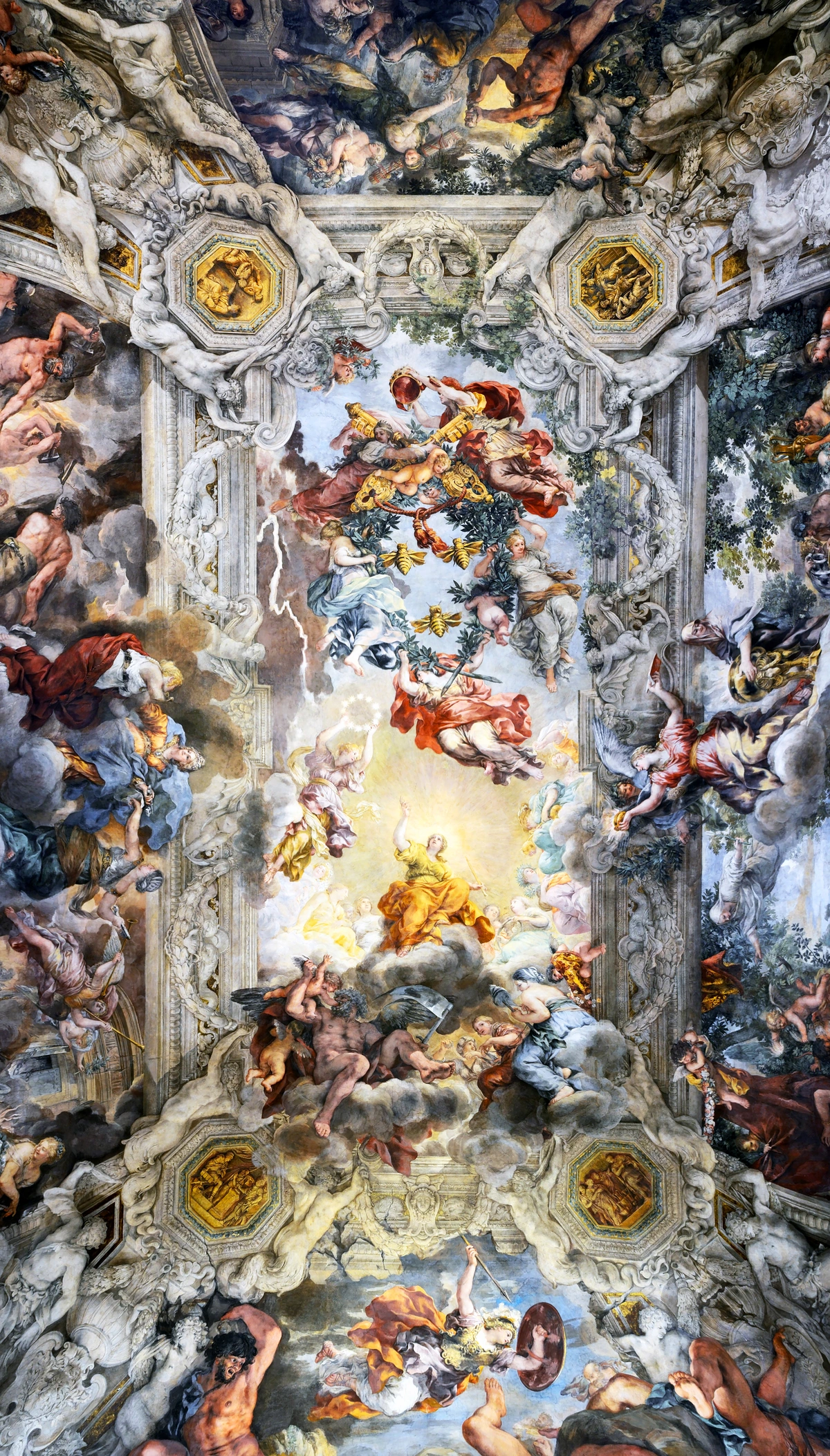
https://upload.wikimedia.org/wikipedia/commons/6/6e/Ceiling_of_Palazzo_Barberini.jpg, https://creativecommons.org/licenses/by-sa/4.0
This gradual evolution, however, was building towards a dramatic crescendo. Then, something truly shifted. Artists started to realize the immense power of selective illumination, of making some things recede and others pop forward with incredible intensity. This wasn't an overnight revolution, but a slow burn, culminating in the Renaissance and then exploding in the Baroque period.
You see hints of this with masters like Leonardo da Vinci, who, in his characteristic genius, understood how light could define form and mystery. While his Mona Lisa famously employs sfumato – a subtle blending of tones – which is a gentler cousin to chiaroscuro, other works like his St. John the Baptist show an earlier, less extreme application of dramatic light to sculpt form. While what is sfumato in renaissance art aims for a soft, hazy, atmospheric diffusion, blurring outlines to create a dreamlike quality, chiaroscuro deliberately uses strong, often abrupt, contrasts to create a sense of volumetric presence and intense drama. It's less about softness and more about sculptural power. Think of it as a dramatic spotlight versus a soft focus lens – they are, indeed, distinct approaches.
But the real heavyweights of dramatic chiaroscuro came later. Think Caravaggio. That guy didn't just use light; he weaponized it to create gripping, visceral narratives. His paintings feel like a single spotlight hitting a secret scene unfolding in a shadowy alley. He brought a gritty realism and an almost brutal emotional intensity to his subjects, all thanks to his audacious use of deep, velvety shadows and intensely bright highlights. It’s like he took the world, stripped away all the ambient light, and then shined a flashlight on precisely what he wanted you to see. That, to me, is the essence of it.
His approach was so impactful that it gave rise to an even more extreme form of chiaroscuro known as tenebrism. While all chiaroscuro involves strong contrasts, what is tenebrism in art pushes this to extremes, with figures emerging from near-total darkness into harsh, theatrical light. This technique typically uses very few light sources, often off-canvas, to create deep, opaque shadows and sharply illuminated subjects, intensifying the drama and psychological tension. It’s chiaroscuro turned up to eleven, used to create scenes of profound emotional weight, often religious or violent. Caravaggio's own Seven Works of Mercy is a prime example, where figures are dramatically spotlighted against a nearly black backdrop, pulling the viewer into the raw human experience.
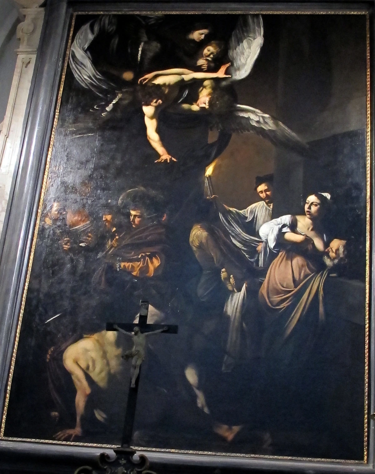
https://upload.wikimedia.org/wikipedia/commons/5/51/Caravaggio%2C_sette_opere_di_misericordia%2C_1606%2C_04.jpg, https://creativecommons.org/licenses/by-sa/3.0
But Caravaggio wasn't alone in pushing these boundaries. Artists like Artemisia Gentileschi, a powerful female painter of the Baroque era, channeled Caravaggio's dramatic lighting to infuse her female subjects with incredible emotional intensity and psychological depth, often depicting strong, suffering women with visceral realism. And then there was Georges de La Tour, whose serene, often nocturnal scenes were illuminated by a single, carefully placed candle or lamp, creating a quiet, intimate drama that drew viewers into moments of contemplation and devotion. These artists, among many others, each found their unique voice within the bold language of chiaroscuro.
And then there’s Rembrandt, another titan who wielded chiaroscuro with unparalleled psychological insight. Unlike Caravaggio’s raw, confrontational drama, Rembrandt often used light to delve into the inner lives of his subjects, revealing their thoughts and emotions through subtle shifts in illumination. His portraits, for example, often emerge from profound darkness, their faces exquisitely lit to emphasize wrinkles, expressions, and the soul behind the eyes. It’s a masterclass in using light to sculpt not just form, but feeling.
The 'Why' Behind the Wow: Psychology and Impact
Rembrandt really made me think about the soul of a subject, and that leads us to the bigger question: why did this dramatic approach resonate so powerfully with artists and viewers alike? I think it taps into something primal in us. We live in a world of light and shadow. Our emotions, our decisions, even our daily lives, are a constant dance between clarity and uncertainty. When an artist exaggerates this, it speaks to us on a visceral level, transforming the canvas into a mirror of our deepest experiences. And these principles aren't just for painting; they're fundamental to how we perceive sculpture and even architectural forms as well, with light shaping their very presence. Imagine a classical sculpture, like Bernini's Ecstasy of Saint Teresa, where its muscles and drapery are dramatically accentuated by a single, carefully placed light source, making it feel alive and monumental. Even the carefully designed lighting within a grand Gothic cathedral, with shafts of light piercing through stained-glass windows into the dim interior, employs a form of chiaroscuro to evoke awe and spiritual reverence.
Chiaroscuro, especially in religious art, was also frequently employed to convey a sense of divine intervention or spiritual transcendence. Think of a beam of light illuminating a saint or a holy figure from an unseen source, making them appear otherworldly and emphasizing their connection to the divine. It's a way of making the sacred palpable, a visual metaphor for revelation breaking through ignorance or sin. Conversely, art that is uniformly or brightly lit, while offering clarity, often lacks the same psychological weight or dramatic punch. It can feel less immersive, less capable of stirring deep emotion precisely because there's no mystery, no hidden depths to explore.
- Emotional Depth: The contrast creates tension. It can evoke mystery, fear, solemnity, divine revelation, or even profound vulnerability. By deliberately obscuring parts of a scene, chiaroscuro can also build suspense and intrigue, leaving the viewer to imagine what lies hidden in the shadows. It’s not just a visual trick; it’s an emotional amplifier. Imagine a saint bathed in a harsh, singular light, emerging from surrounding darkness – it speaks of spiritual transcendence or desperate revelation. Or a figure half-obscured, suggesting intrigue or moral ambiguity. Chiaroscuro allows the artist to dictate the emotional landscape with startling precision.
- Dramatic Focus: By making certain areas intensely bright and others almost swallowed by darkness, the artist can direct your gaze with incredible precision. Your eye goes exactly where they want it to go, creating a compelling narrative flow within the image, guiding you through the story being told.
- Three-Dimensionality: This is a big one. On a two-dimensional surface, strong contrasts of light and shadow are incredibly effective at creating the illusion of volume and depth. It literally sculpts figures and objects out of paint, making them feel real, tangible. It’s like magic, turning a flat canvas into a window into another world.
When you look at a piece like that, does it feel like more than just paint? What kind of narrative does the light tell you?
The Technique: How Do They Do That?!
Okay, so we know what chiaroscuro is and why it's so powerful. But how do artists actually do it? It’s not just about painting half a face dark and half light. It’s far more nuanced, though sometimes it feels like trying to catch smoke! Mastering light can be one of the toughest challenges, and honestly, even I still struggle with getting values just right sometimes – my studio floor is a testament to many such attempts. Just last week I tried to capture a fleeting shadow and ended up with something that looked suspiciously like a blob, but the results, when they work, are always worth the effort.
At its core, chiaroscuro is all about understanding value, which is the lightness or darkness of a color. Artists manipulate a wide range of values – from the brightest whites to the darkest blacks – to create the illusion of light falling on objects and figures, thereby giving them form and dimension. It's the fundamental building block of all light and shadow effects. Before even touching the canvas, many masters would plan their lighting meticulously through sketches, studies, or even by setting up models with specific light sources in their studios. This deliberate planning, combined with a deep understanding of the definitive guide to understanding value in art is where the real magic happens. When you combine this with several key elements and specific painting approaches, the real transformation starts:

https://freerangestock.com/photos/177284/artists-workspace-filled-with-paint-brushes-and-supplies.html, https://creativecommons.org/publicdomain/zero/1.0/
Element | Description |
|---|---|
| Single Light Source | Often from the side or above, creating defined highlights and shadows. Think of a single stage light illuminating only the most important parts of a scene. |
| Gradual Transitions | While there's strong contrast, the areas between light and dark can be smoothly blended (like sfumato, but often with sharper endpoints) or sharply delineated. The degree of transition – from soft gradients achieved through thin glazes of translucent paint, to abrupt shifts created with denser, opaque strokes – contributes significantly to the overall effect and mood. |
| Reflected Light | Even in the darkest shadows, artists often introduce subtle reflected light – illumination bouncing off surrounding objects – to prevent shadows from appearing flat and lifeless. This tiny bit of light is crucial for adding depth, realism, and connecting the form to its environment, often achieved through subtle lighter glazes or by strategically placing a light-colored object nearby to bounce light onto the shadowed area. |
| Careful Composition | The placement of light and dark areas is meticulously planned to guide the viewer’s eye and emphasize key elements. This isn't accidental; every highlight and shadow serves a deliberate purpose in the narrative and visual balance. |
| Purposeful Exaggeration | Chiaroscuro doesn't just mimic natural light; it amplifies it. Artists often exaggerate the contrast between light and dark beyond what might be naturally observed to heighten drama, emphasize form, and create a more intense emotional experience for the viewer. This is where its true power lies. |
Some of the biggest challenges in mastering chiaroscuro include maintaining the integrity of colors within shadows without making them muddy, ensuring that highlights maintain their luminosity, and achieving convincing, smooth transitions (or deliberately sharp ones) between extreme values. It's a delicate balance that often requires extensive practice and an intuitive understanding of light's behavior.
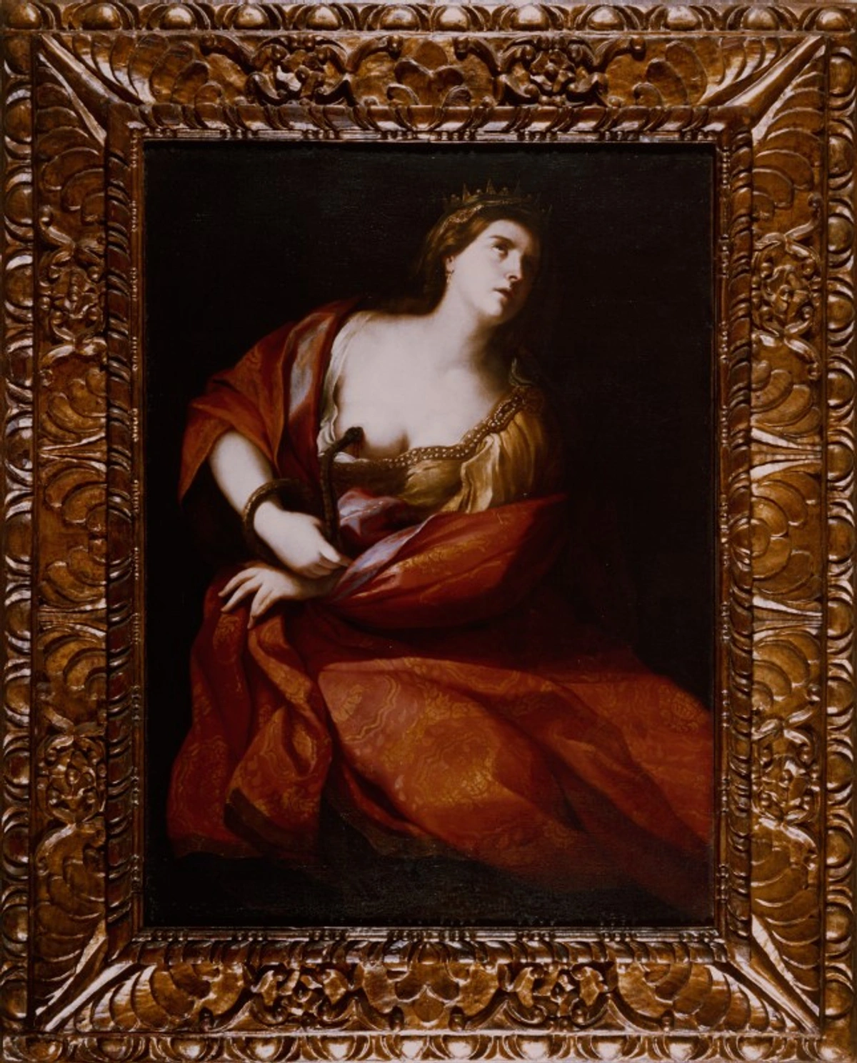
https://upload.wikimedia.org/wikipedia/commons/2/20/Artgate_Fondazione_Cariplo_-_Desubleo_Michele%2C_Suicidio_di_Cleopatra.jpg, https://creativecommons.org/licenses/by-sa/3.0
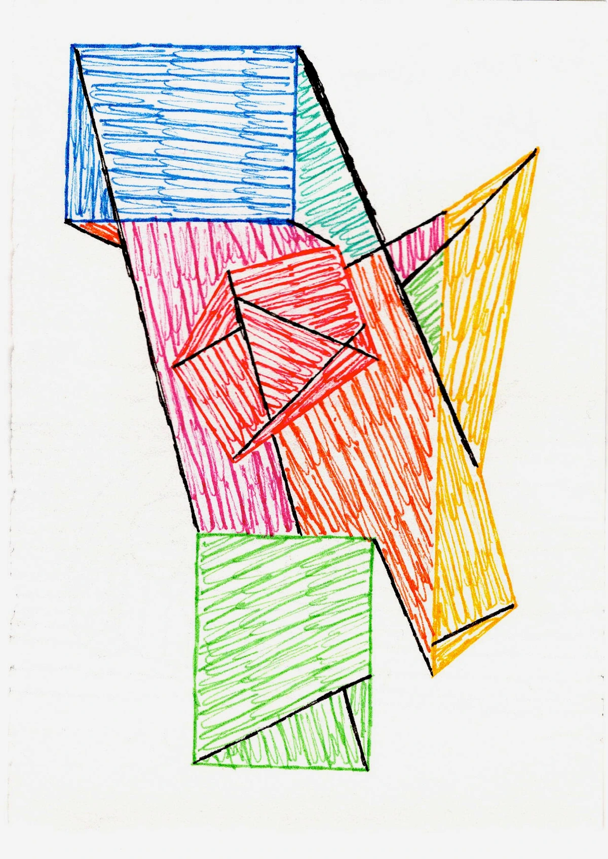
This understanding of light and dark, or 'chiaroscuro of color' as I like to call it, profoundly influences my own abstract work. Even when I’m not painting a literal figure in a dark room, I think about how colors interact to create a sense of depth and focus. For instance, in a piece like my "Crimson Core," I used a deep, almost black-red as the 'dark' element, then layered vibrant electric blues and sharp yellows on top. The way the darker hue recedes allows the brighter, warmer colors to pulsate forward, generating a dynamic sense of depth and tension that feels incredibly alive and impactful. It’s less about literal light and more about the feeling of perceived volume and contrast that makes abstract art so captivating. It’s a constant dance, and sometimes my 'dark' elements feel more like a muddy puddle than a profound abyss – but that's part of the journey! Looking back at my artist's timeline, it's clear how my understanding of these fundamental principles has evolved. In geometric abstract works, for instance, subtle tonal shifts within a single color can give a flat shape the illusion of a three-dimensional form, as if light is catching its unseen edges, guiding the eye and creating a sense of unfolding narrative on the canvas.

https://www.flickr.com/photos/abstract-art-fons/30634352376, https://creativecommons.org/licenses/by/2.0/
To dive deeper into the science and art of illumination, I often refer to a definitive guide to understanding light in art. And for understanding how colors themselves can create these dramatic shifts, exploring topics like how artists use color or the psychology of color in abstract art beyond basic hues can be incredibly insightful.
Chiaroscuro Beyond the Canvas: Modern Echoes and My Own Take
While chiaroscuro as a dominant style might have peaked centuries ago, its influence is everywhere. You see it constantly in film noir cinematography, where directors like Orson Welles in Citizen Kane masterfully used stark, low-key lighting – think of the deep shadows and dramatic angles in the scene where Kane is alone in his vast, echoing mansion – to create psychological tension, moral ambiguity, and a sense of foreboding. It's also prevalent in dramatic photography, where careful lighting can sculpt faces and scenes, evoking powerful emotions from portraiture to photojournalism. Even in theatre stage lighting, early animation, or modern video games, the deliberate control of light and shadow creates depth, drama, and guides the audience's eye. The idea of using light and shadow to tell a story, to create drama, to guide the viewer – it’s timeless.
I even see echoes of tenebrism in modern black and white photography, where subjects emerge from almost complete darkness with an intense, raw clarity.

https://images.pexels.com/photos/19443261/pexels-photo-19443261.jpeg?cs=srgb&dl=pexels-goksutaymaz-19443261.jpg&fm=jpg, https://creativecommons.org/public-domain/
It makes me wonder, where else do you see this principle at play in unexpected places today? Perhaps in the way a storyteller uses narrative tension, or how an architect designs a space to be experienced? It's a pervasive concept.
For me, as an artist exploring contemporary and abstract forms, chiaroscuro isn't about replicating historical scenes. It's about taking that fundamental understanding of contrast and applying it to new contexts. I constantly grapple with questions like: How do I make a flat canvas feel three-dimensional with only color and form? How do I create a focal point without literally shining a light? Pushing these boundaries is a constant, thrilling challenge. It's about finding new ways to make a piece of art feel like it has a soul, a presence, a story unfolding – not by literal representation, but by orchestrating visual weight and emphasis. Each stroke is a negotiation between what will glow and what will recede. I've often found that the principles of the definitive guide to understanding composition in abstract art are deeply intertwined with these ideas of visual weight and emphasis.
If you ever visit my museum in 's-Hertogenbosch, you'll notice that even in the most vibrant, abstract pieces, there's always a dance between what comes forward and what grounds the composition. It's my contemporary nod to those old masters who taught us the magic of light and dark. It truly connects the past to the present, showing how these timeless principles continue to inspire. If these thoughts spark an interest in bringing some dramatic contrast into your own space, why not explore my art for sale?
Unknown, Unknown
Frequently Asked Questions About Chiaroscuro
Is chiaroscuro a painting technique or a style?
It’s more of a technique, or an artistic approach, that can be employed within various styles. While strongly associated with the Baroque period and certain artists (like Caravaggio), the principles of dramatic light and shadow can be applied across different art movements and mediums. It's a powerful tool, not a fixed aesthetic.
What is the difference between chiaroscuro and sfumato?
Both involve manipulating light and shadow, but they aim for different effects. Chiaroscuro is characterized by strong, dramatic contrasts between light and dark, often with sharp transitions, to create volume and emotional intensity. Sfumato, on the other hand (famously used by Leonardo da Vinci), involves very subtle, gradual transitions between colors and tones, creating a soft, hazy, and atmospheric effect, often blurring outlines. Think "dramatic spotlight" versus "soft focus."
Which famous artists used chiaroscuro?
Oh, so many! The most iconic, without a doubt, is Caravaggio, known for his revolutionary, gritty realism achieved through audacious use of deep shadows and stark highlights. Rembrandt masterfully employed the technique to evoke profound psychological depth and inner turmoil in his portraits. Artemisia Gentileschi brought fierce emotional intensity and a unique female perspective to her Baroque narratives, often using chiaroscuro to highlight strong protagonists. Georges de La Tour created serene, contemplative scenes, often using a single candle as a light source to cast dramatic, yet subtle, shadows. Even early examples from Leonardo da Vinci show a nascent understanding of how light could sculpt forms, though his work often leaned more towards sfumato. Later artists across various periods continued to explore and adapt these powerful principles.
Can chiaroscuro be used in abstract art?
Absolutely! While it might not be about literal light and shadow on a figure, the principles of chiaroscuro – creating depth, drama, and focus through strong contrasts – are incredibly relevant. In abstract art, this might manifest as the interplay of vibrant colors against muted ones, or geometric forms that appear to advance or recede based on their tonal values, color temperature, or saturation. It's about perceived volume and emotional impact, no matter the subject.
How is chiaroscuro used in modern visual media?
Beyond traditional painting, chiaroscuro's principles are fundamental in contemporary photography and filmmaking. Cinematographers use low-key lighting and strong contrasts to build suspense, define characters, and craft mood in genres like film noir or thrillers. Photographers employ it in portraiture to sculpt faces and evoke emotion, or in advertising to highlight products dramatically. Even in video games, dramatic lighting is used to enhance realism, guide player attention, and build atmospheric tension. It’s a timeless visual strategy for capturing attention and conveying a message powerfully.
Final Thoughts on the Dance of Light and Dark
So, the next time you look at a painting – any painting, really – try to see past the subject for a moment. Instead, observe the light. Where does it come from? How does it interact with the shadows? Does it make you feel something specific? Does it draw your eye somewhere? Understanding chiaroscuro isn't just about recognizing an art term; it's about seeing the world, and art, with a newfound appreciation for the quiet power of contrast. It’s a reminder that sometimes, what's hidden or obscured is just as important as what's brightly illuminated, both in art and, well, in life too, I guess. It's a beautiful, dramatic dance, and one that continues to inspire me in every brushstroke. I hope it sparks a similar curiosity in you, and perhaps even inspires you to seek out chiaroscuro in your own surroundings or creative endeavors.


