Solving Unique Artistic Problems | A Practical Guide for Artists
A deeply personal and practical guide for artists on navigating unique technical challenges. From color-matching nightmares to creative block, discover how to solve artistic problems by thinking like an engineer without losing your soul.

The Art of Untangling: A Guide to Solving Unique Artistic Problems
Solving a unique artistic problem feels a lot like trying to assemble IKEA furniture without the instructions—while someone is pelting you with meatballs. You know where you want to end up, sort of, but the path is a tangled mess of oddly shaped pieces and cryptic symbols. It's you, your stubborn vision, and a pile of frustration.
What if I told you the secret isn't just "try harder"? It's to think less like a tortured artist for a moment and a little more like a methodical engineer, a curious scientist, and a resourceful MacGyver all rolled into one.
In my years of working through creative puzzles—from getting a specific shade of blue to vibrate on the canvas to making a digital brushstroke feel like it has weight and history—I've learned that every artistic obstacle holds the seed of its own solution. This guide is my attempt to share that mindset with you, not as a rigid formula, but as a flexible toolkit. Think of it as a collection of mental models and practical steps that I, and many artists I admire, return to again and again when a piece just isn't working.
At its core, this isn't about painting or drawing. It's about developing a mindset. It's about becoming the kind of person who sees a wall not as an obstruction, but as an interesting architectural feature you get to figure out how to climb.
What Exactly Is an "Artistic Problem"? (It's Not Just a Blank Canvas)
When we say "artistic problem," I'm not just talking about a creative block. That's a real beast, but it's only one species in a whole zoo of challenges. A true artistic problem is any gap between the glorious vision in your head and the frustrating reality on your canvas, screen, or lump of clay.
It's a split into two big camps:
- Technical Problems: The "how" of it all. How do you mix that exact shade of fuchsia you saw in a dream? How do you make digital paint stop looking so... digital? How can you create texture on a flat surface that makes people want to reach out and touch it?
- Conceptual Problems: The "why" and "what." Why does this piece feel soulless? What is it even supposed to mean? Am I just rehashing the same tired idea? Is this profound, or just pretentious?
Most of the time, these two are locked in a complicated dance. A technical limitation might spark a brilliant conceptual leap. A conceptual shift might demand a whole new technical skill. The trick isn't to put them in separate boxes, but to learn how to tackle each with the right mindset and tools.
Step 1: Diagnose the Problem (What Am I Even Looking At?)
You can't fix what you don't understand. And often, the most frustrating creative block comes from misdiagnosing the issue in the first place. You think it's a problem of talent, but it's actually a problem of lighting. The first step is to become a creative detective.
Rule out the obvious first.
- Is your paint old and goopy? Are your brushes frayed and stiff? Is your workspace so cluttered you can't physically move? Are you working on a terrible surface, like cardboard that's already starting to warp?
- Are you exhausted, hungry, or emotionally drained? You are the primary tool in your artistic arsenal, and if you're running on fumes, everything will be a struggle. Never underestimate the problem-solving power of a sandwich and a 20-minute walk. Seriously.
Then, get specific.
This is where the engineer in you has to show up. Vague frustration is the enemy. Instead of "This painting looks bad," try to pinpoint the exact symptom.
- "The background is too busy and is pulling focus from the main subject."
- "The skin tones look flat and lifeless; they don't reflect the ambient light."
- "The composition feels static and boring, like everything is just plopped in the center."
By naming the problem, you start to untangle it. It's no longer a big, scary monster; it's just a specific, manageable puzzle. This act of diagnosis is potentially the most underrated skill an artist can develop. It saves you from wasting hours on solutions that don't address the real issue.
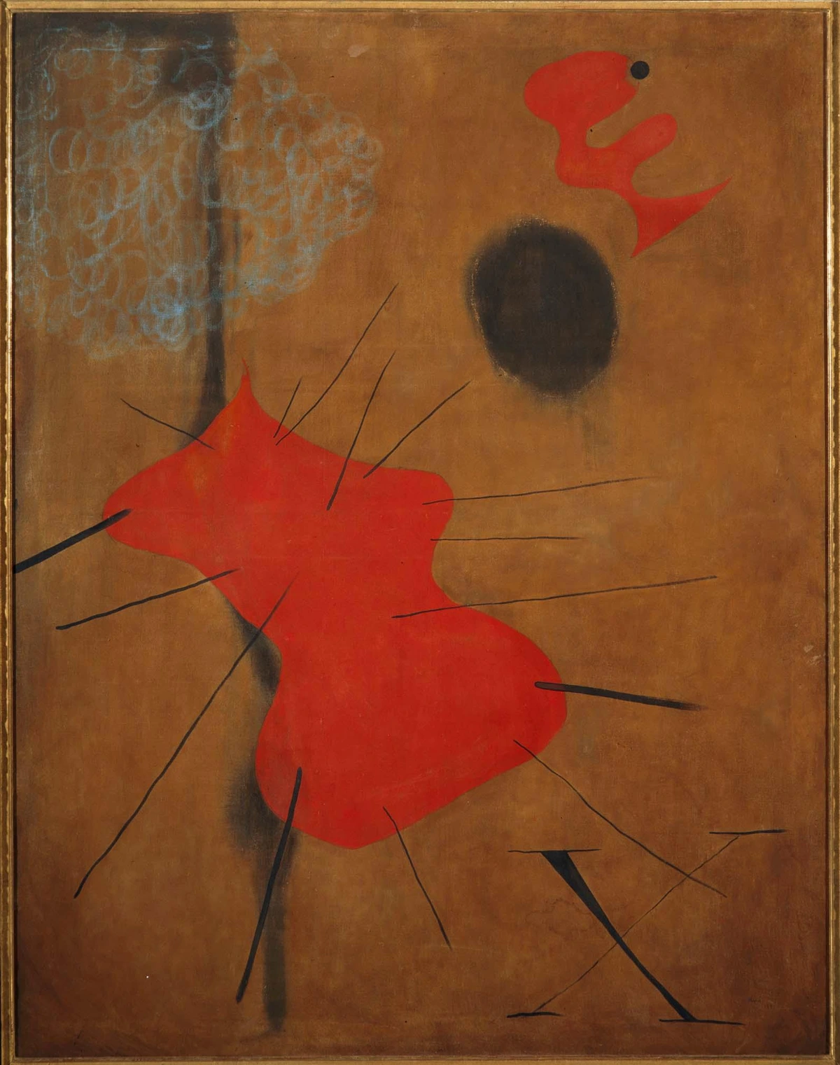
A common misdiagnosis I see all the time is mistaking a value problem for a color problem. You might think, "My purple looks muddy." So you try a dozen different purples. The real issue might be that the purple is the perfect hue, but its value is too close to the colors surrounding it, so it gets visually "swallowed." By putting your work in grayscale, you can quickly diagnose if the issue is a lack of value contrast.
Step 2: Go Down the Rabbit Hole (Embrace Research & Play)
Once you've diagnosed the problem, it's time to go prospecting—not just for raw information, but for inspiration and unexpected connections. This isn't about copying others; it's about understanding how they solved their own puzzles.
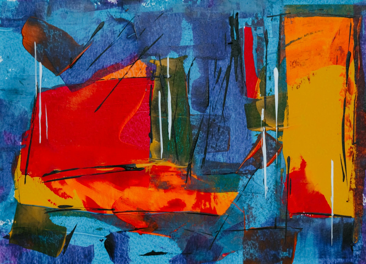
Study the greats, but study their process, not just their product.
- If you're struggling with composition, don't just look at a Vermeer and think "pretty." Ask why it works. How does he guide your eye with light and shadow? Try sketching a thumbnail of the composition, just the big shapes of light and dark. You start to see the underlying engineering of beauty.
- If your colors look muddy, look at how the Fauvists used complementary colors to create vibrancy, or how J.M.W. Turner used glazing to build up impossible luminosity.
Cross-pollinate your disciplines.
- Is your issue one of rhythm and flow? Maybe you're not looking at enough paintings today. Maybe you should be listening to a complex piece of music. How does a song build tension and release it? Can you translate that into visual weight?
- Are you struggling with creating depth? Forget art tutorials for a second and look at nature documentaries. How does a camera lens capture vast landscapes? Use that principle.
- Stuck on color harmony? Watch a classic film known for its cinematography. Notice how directors like Wong Kar-wai use color gels to create emotion, or how a David Fincher thriller uses a desaturated palette to create tension.
- Can't figure out movement in a static image? Spend an afternoon people-watching in a busy square or studying the frames of a cartoon flipbook. The principles are the same.
Step 3: Experiment Without Judgment (The Lab Coat Phase)
Here’s the part where most artists get stuck. We want every mark we make to be a step toward a masterpiece. But to solve a unique problem, you have to give yourself permission to be messy, clumsy, and downright awful. This is your R&D phase.
I highly recommend keeping a dedicated "lab notebook"—a cheap sketchpad, a digital canvas—specifically for experiments that you 100% expect to throw away. This frees you from the pressure of performance.

Isolate your variables. If the problem is "my shadows are too harsh," the worst thing you can do is immediately start a new painting. Instead, take a single object, an apple or a cup. Now, do a dozen quick studies of it.
- One with only a single light source.
- One with the light diffused through a white cloth.
- One where you paint the shadow with its complementary color.
- One where you use a dry brush, one with a wet-on-wet wash.
- One where you just use your fingers.
By changing one thing at a time, you learn everything you need to know about that variable. It's the scientific method, but with more paint stains on your clothes. This deliberate, systematic approach to play can feel tedious, but it's faster than repainting an entire piece in frustration repeatedly. It's knowledge acquisition, plain and simple. In the long run, this methodical curiosity is what builds a deep and personal visual vocabulary. It's what separates an artist who can only copy from one who can invent.
Step 4: The Power of Constraints (Your Secret Weapon)
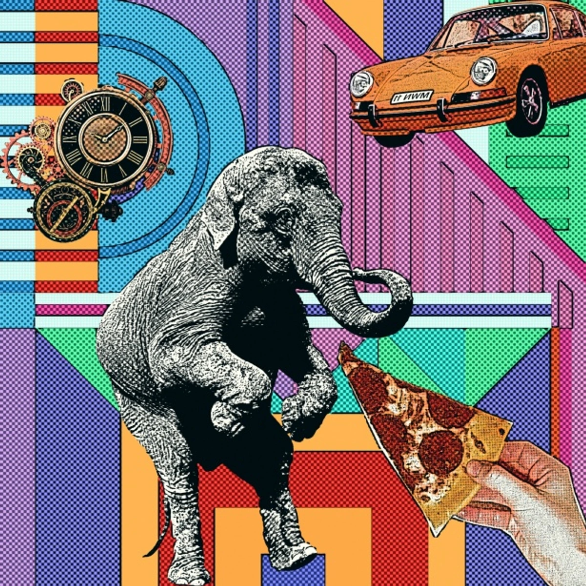
This feels counterintuitive. When you’re stuck, you want more freedom, right? You want every color, every brush, every canvas size available. But unlimited choice is often the enemy of a solution. It’s called the "paradox of choice," and it’s a creativity killer.
Imposing harsh, arbitrary constraints forces you to find new paths. It’s like being given a riddle to solve.
Some of my favorites include:
- The Monochrome Challenge: You can only use shades of one color (plus black and white). I once spent a month painting only in blues after I kept struggling with value. It completely transformed how I see light and form.
- The Tool Time-Limit: You have one hour to finish a piece. Or thirty minutes. Or five. This forces you to focus on the essential gesture and kill your perfectionist tendencies.
- The Material Mimicry: Try to make a digital painting look like it was done with oil pastels. Or create a watercolor that has the texture of stone. These weird challenges teach you the fundamental properties of different mediums.
- The Single Brush Challenge: For a digital piece, restrict yourself to one brush shape. It's amazing how much variety you can find in a single tool when you're forced to invent new ways of using it.
- The Found Soundtrack: Choose an instrumental song with a strong mood and paint a landscape painting that visually translates its rhythm and energy.
A brilliant solution often comes from the tightest, most awkwardly shaped box. When you have every option in the world, it's easy to get lost in the sauce. But when you can only use a toothpick and India ink, your brain has to get clever. These limitations force you to invent new techniques and see your tools in a completely new light.
From Theory to Practice: Three Case Studies
Let's stop talking in abstractions. Here are three common problems—two technical, one conceptual—and how they actually get untangled in the studio.
The Case of the Digital Painting That Looked Like Plastic
Problem: A digital portrait looked flat, airbrushed, and lifeless. It had all the right colors, but it felt like a plastic doll.
- Diagnosis: The problem wasn't the subject or the colors, but the texture and the edge quality. Every edge was a perfect, crisp line, and every surface was uniformly smooth and blended.
- Research: I went back and looked at portraits by masters like Lucian Freud or Jenny Saville. They’re practically sculpted with paint. You can see the drag of the brush, the clumps of pigment. The skin looks alive because the paint itself has a life of its own. It has history and physicality.
Ralph (Raalate) Gudde, Unsplash Licence
- Experimentation: I opened a new canvas and stopped using soft brushes for a week. I forced myself to use only a single, hard-edged brush. I focused on laying down distinct strokes of color next to each other, rather than blending them into a gradient. I started looking at skin as hundreds of small, overlapping planes of light and shadow.
- Solution: The solution was a combination of technique and tool choice. I started building up the form with chunky color blocks, leaving them slightly unblended. Then, I went in with a much smaller, textured brush to add subtle details that tricked the eye. The key was resisting the digital temptation to smooth everything out.
The Case of the Painting That Meant Nothing
Problem: A landscape painting was technically fine. The perspective was right, the colors were okay, but it felt empty. Soulless. It had nothing to say. I didn't even like it.
- Diagnosis: This is a classic conceptual problem. I had painted a thing (a field), but I hadn't painted a feeling or an idea. I was focusing on what I saw, not what I felt when I saw it.
- Research: For this, I didn't look at other landscapes. I thought about film. I re-watched the intro to the movie Melancholia. The whole scene is in ultra-slow motion, and that pace completely transforms how you feel about the subject. The feeling wasn't about the objects in the frame, but the way they were presented. The feeling was weight, inevitability, and dread. That's when I knew I wanted my painting to feel heavy.
- Experimentation: My "experiment" this time was less about paint and more about words. I wrote a haiku about the field. I tried to describe the feeling in one sentence. "It's the feeling of the air pressing down on you right before a storm." Once I had that sentence, my choices became obvious.
- Solution: I changed everything. I rotated the canvas to a vertical, portrait orientation to emphasize the weight of the sky. I saturated the colors, pushing the grass to an almost acidic yellow-green and the sky to a brooding purple-gray. I used heavy, directional brushstrokes in the clouds to suggest a downward pressure. I sacrificed "reality" for "feeling." The final painting didn't look like a real place, and that's why it worked.
The Essential Toolbox for Every Problem Solver
You can't build anything without tools. But the best tools aren't always the most expensive ones.
Problem Type  | Analog Tools | Digital Tools | Why They Help |
|---|---|---|---|
| Muddy Colors | A limited palette (e.g., Zorn Palette), color swatches | Eyedropper tool, color adjustment layers | Forces you to mix intentionally; helps diagnose color casts. |
| Stale Composition | Viewfinder cut from black paper, thumbnail sketches | Crop tool, layer transformations, composition overlays (rule of thirds, etc.) | Lets you test arrangements before committing. It's 80% of the work before you start. |
| Creative Block | A physical "clippings" file, a new medium (e.g., charcoal if you paint) | Inspiration boards (Pinterest, Are.na), forcing new color palettes with generators | Gets you outside of your own head and your established patterns. |
| Failed Form/Depth | Toned paper (e.g., gray or tan), white chalk for highlights | A separate layer set to "Multiply" for shadows, 3D reference software | Teaches you that form is created by light, not by outlines. |
Frequently Asked Questions (FAQ) about Artistic Problem Solving
My problem is that I have no ideas. Where do I even start?
Start by stealing. Not the final image, but the problem. Find a painting you love and ask yourself: "What was the main problem the artist was trying to solve here?" Maybe it was balancing two conflicting colors. Maybe it was creating a sense of immense space. Now, take that same problem and solve it with your own subject matter. They solved it with a bowl of fruit; you solve it with your breakfast table. It's like a musician covering a song in a different genre—it becomes entirely your own.
When I find myself with a complete lack of direction, I do a "30-day creative prompt" challenge. The prompts can be simple and open-ended: "a memory of a smell," "a map of your thoughts right now," "a portrait of a feeling," or "the color of melancholy." The goal isn't to create masterpieces, but to start a daily conversation with your work, even if it's just for 15 minutes.
How do you know when to push through a problem and when to scrap a piece?
This is the million-dollar question. My rule of thumb is brutal but simple: If the problem is in the foundation (the composition is structurally weak, the drawing is fundamentally off), it's usually faster and more educational to start over. You're not giving up; you're applying a lesson learned. If the problem is in the execution (the colors are a bit off, a section feels unfinished), that's when you push through and experiment. You can't learn how to fix things without fixing them.
Here's a practical test. Take a break from the piece and come back to it after a day or two. If your immediate gut reaction is "oh, this is all wrong," the foundation is likely off. If you think, "I really like this part, but that corner is bugging me," then you have a fixable execution problem. It's a subtle but crucial difference.




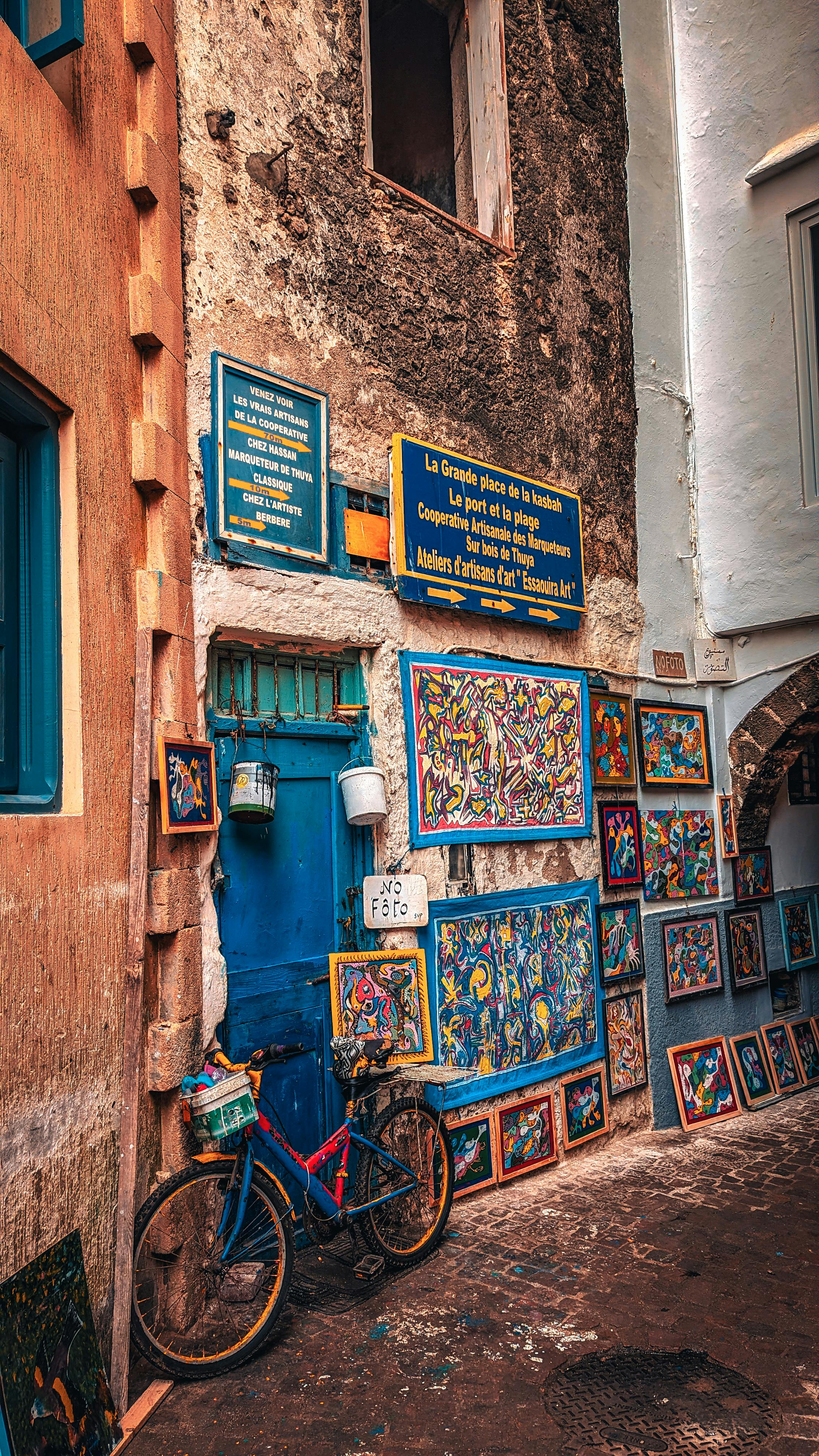

The Case of the Too-Static Abstract
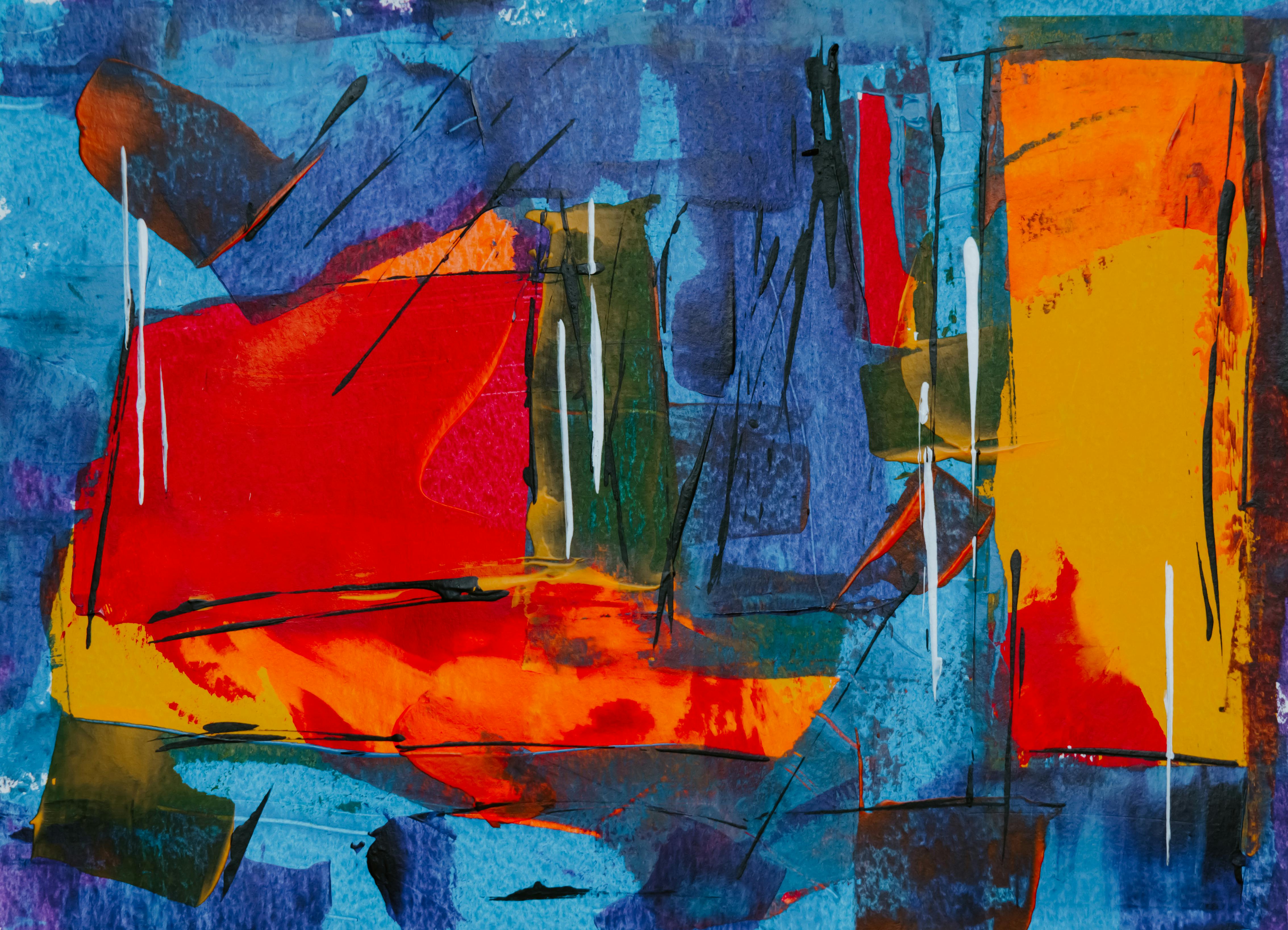
Problem: An abstract painting felt dead on the canvas. It had interesting colors and shapes, but there was no sense of movement, no rhythm, no life. It just sat there.
- Diagnosis: The problem was one of visual rhythm. I realized that my marks were all made with the same gesture, from the same angle, with the same brush. The "handwriting" of the piece was monotonous. It lacked any dynamic tension.
- Research: I started looking at the work of Cy Twombly, whose scribbled, frenetic energy is legendary. But I also looked at jazz. I listened to John Coltrane and tried to visualize the saxophone solos—the sudden bursts of energy, the long, held notes, the pauses. The problem wasn't just visual; it was musical.
- Experimentation: Armed with this idea, I set up a timer for one minute and did a series of "action paintings." I forced myself to change my tool every 30 seconds—a giant brush, a tiny pen, my fingers, a rag. Then, I'd make a single, deliberate mark, using my whole arm. The goal was to create a record of different energies on the same surface.
- Solution: I went back to the "dead" painting and started over, but this time I followed the same experimental rules. I used a huge brush for a broad, sweeping stroke across the bottom, then a palette knife to scrape off a line, then a tiny brush to add a frantic series of dots in one corner. I literally played a song and tried to match its energy. The final piece was messy, chaotic, and alive in a way the first version could never have been.