Mastering Depth: My Journey Through Perspective, from Renaissance Rules to Psychological Realities and Digital Dimensions
For an artist, the world is a constant source of wonder, a puzzle to be solved and re-interpreted. But sometimes, it's less about the grand vista and more about a tiny, frustrating detail. I vividly recall one particularly stubborn street scene, a narrow alley in a charming but architecturally challenging Dutch town, where I was trying to capture the way the old brick buildings seemed to lean in, almost conversing with each other across the cobblestones. My initial attempts were flat, lifeless, almost cartoonish. The buildings stood stiffly, oblivious to the subtle curve of the street or the way the light seemed to filter differently into the distance. It felt like my hand knew what to draw, but my eye hadn't quite grasped how that space truly felt.
Then, as the wind whipped around me, threatening to snatch my sketchbook, something shifted. I started to feel how the lines of the roof, the window sills, and the cobblestones all receded towards a hidden point, creating an undeniable sense of space on my two-dimensional page. It wasn't just about drawing a horizon line and a dot; it was about truly feeling how space behaves, how it pulls the viewer into a world I’ve conjured from thin air. And honestly, it still feels a bit like magic, even after all these years.
This wasn't just a technical epiphany; it was an awakening to the emotional and psychological power of depth – a power artists have chased for centuries to place the viewer, and humanity itself, at the center of their crafted worlds. In this article, we'll embark on a journey from flat images to immersive worlds, from basic observation to profound illusion, diving deep into the art of perspective. We’ll cover its foundational principles to its most advanced, mind-bending applications, and even its profound psychological and digital dimensions, exploring how these ancient principles find new life in modern mediums like VR and gaming, enabling truly immersive digital dimensions.
From Ancient Shadows to Renaissance Light: The Historical Quest for Depth
This desire to capture illusion is as old as art itself. Before the Renaissance, ancient Greek artists grappled with proportion and optical illusions, and Islamic art offered intricate geometric patterns hinting at spatial complexity. But it was the Renaissance that truly codified a systematic approach. Imagine the Renaissance, when pioneers like Filippo Brunelleschi and Leon Battista Alberti first codified the rules of linear perspective.
Their revolution wasn't just about making things look real; it was about introducing a mathematical, measurable system to represent a three-dimensional world on a flat surface. This was rooted in Euclidean geometry, transforming art from flat symbolism to a window onto a believable world. This monumental shift was often supported by a humanist desire to place man as the measure of all things, at the very core of perception – a profound idea that perspective, by creating a viewer-centric space, powerfully reinforced. Brunelleschi and Alberti’s work was arguably influenced by early experiments with optics and devices like the camera obscura, which demonstrated how light could project a three-dimensional scene onto a two-dimensional surface.
Patrons of the arts, from wealthy merchants to the Church, eagerly funded works that could convincingly transport viewers into biblical scenes or grand narratives, demanding a new level of realistic representation in their churches and palaces. I remember wrestling with Alberti's diagrams, feeling like I was trying to decipher ancient hieroglyphs, but the underlying logic was undeniable – a logic that promised to place the viewer, and indeed, humanity itself, at the very center of the crafted world. This quest to understand and depict space wasn't confined to the Renaissance; it was a foundational stride in the definitive guide to art history: periods and styles from ancient to contemporary.
If you're still grappling with the foundational concepts, I highly recommend starting with our comprehensive guide: The Definitive Guide to Perspective in Art. It’s the groundwork for everything we’re about to dive into.
Breaking the Grid: Impressionism, Cubism, and Baroque Illusions
Later movements, while seemingly breaking from rigid linear rules, still relied on an underlying understanding of spatial relationships. Impressionism, for instance, loosened the grip of strict linear rules, yet its masterpieces implicitly understood how light and air create an illusion of space – a more atmospheric, but no less profound kind of depth.
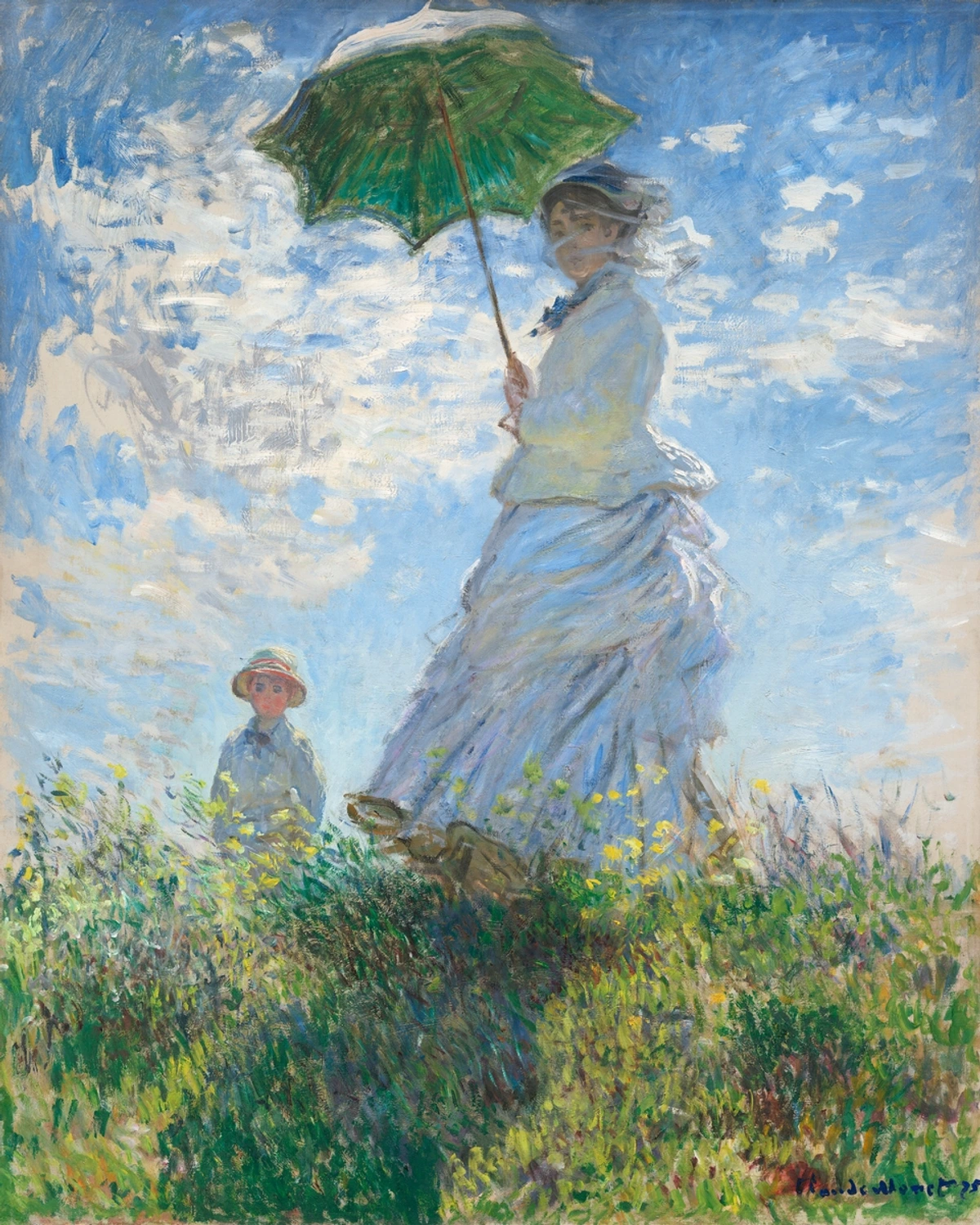
Artists like Claude Monet used broken brushstrokes and vibrant colors to capture the fleeting effects of light and atmosphere, subtly implying depth and distance through careful shifts in color temperature and value, making distant elements appear cooler and lighter. For example, in many of Monet's landscapes, the greens of the foreground foliage are vibrant and warm, while the distant hills dissolve into cooler, desaturated blues and grays, a masterful manipulation of both color and atmospheric perspective to suggest profound depth. You can learn more in our ultimate guide to Impressionism.
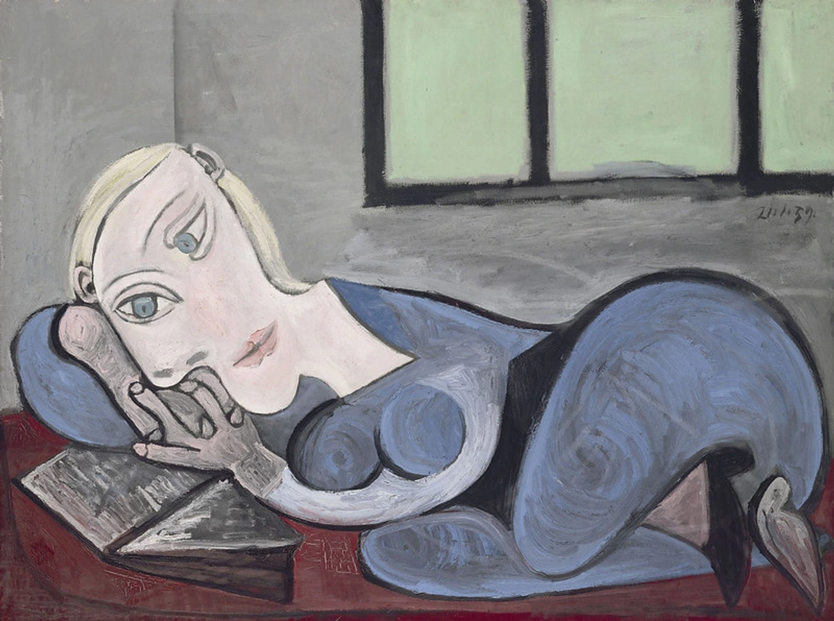
And Cubism, with its fragmented planes, was a radical deconstruction of perspective, revealing a deeper philosophical engagement with how we perceive reality. Artists like Pablo Picasso and Georges Braque explored the idea that reality isn't a single, fixed viewpoint, but a composite of multiple viewpoints simultaneously. They achieved this visually by fragmenting objects and showing different facets (like the front, side, and top) at once, on a single plane. This fragmentation can also be seen as an attempt to represent the experience of moving through space and seeing multiple facets of an object over time, rather than a single static view, mirroring how our memory constructs a composite reality. It felt like they were trying to capture the very essence of an object, not just its fleeting appearance from one spot. This challenged our understanding of observation and representation. Dive deeper with our ultimate guide to Cubism.
Even in the Baroque era, artists like Andrea Pozzo used dramatic, illusionistic ceiling frescoes to create breathtaking, soaring spaces that dissolved architectural boundaries, for instance, by painting extensions of actual columns and arches that continued into an imagined celestial realm, pulling the viewer's gaze upwards with an almost dizzying sense of infinity. They manipulated perspective not just for realism, but for awe, for profound psychological impact, transporting viewers into dizzying, celestial realms.
Beyond the Horizon Line: Mastering the Geometry of Depth
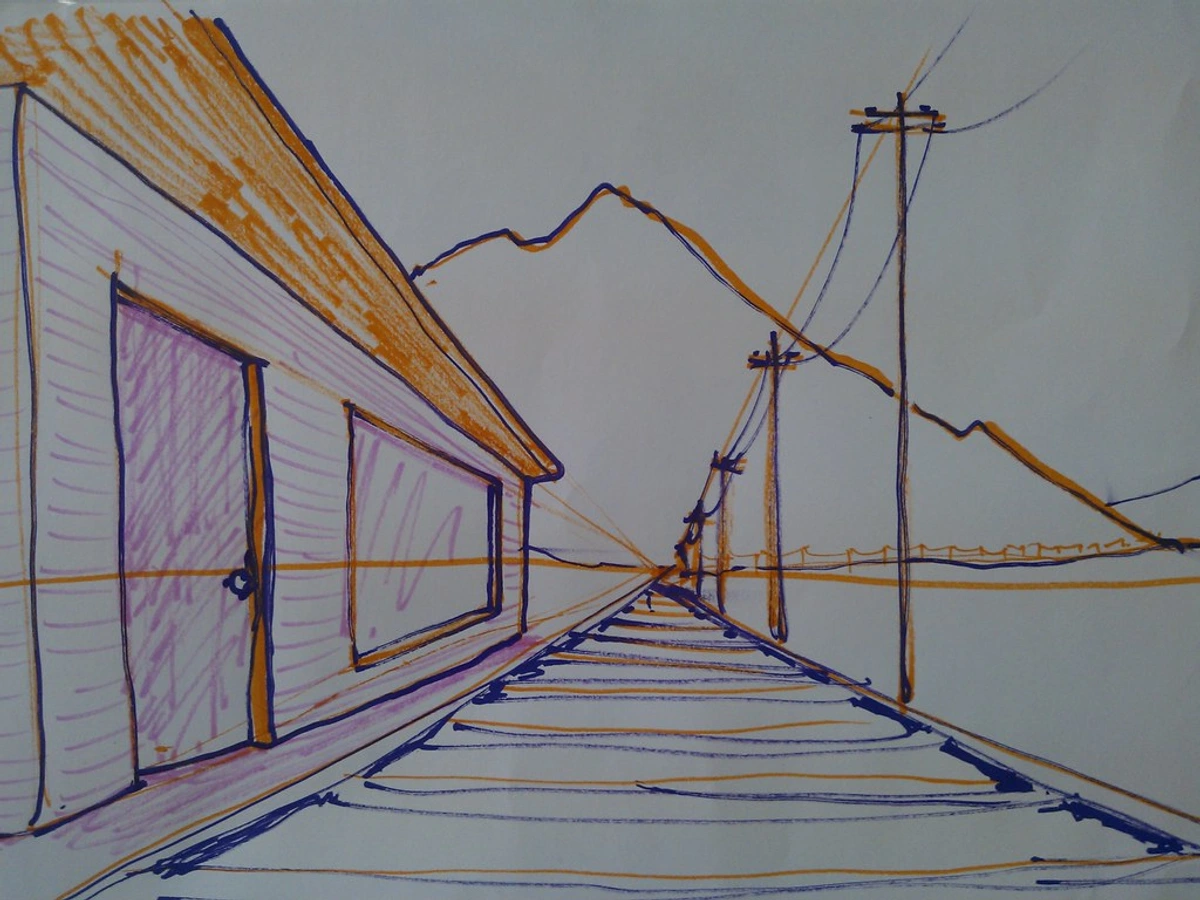
I often joke that basic one-point perspective is for people who only ever look straight ahead – great for a train track disappearing into the distance, but not much else. Its limitation is that it essentially locks the viewer into a single, head-on view, making it difficult to depict objects at an angle or dynamic, rotating scenes without them feeling artificial or forced. Try drawing a cube at an angle with just one vanishing point; you'll quickly see the problem! Historically, as artists began depicting more complex architectural forms and sprawling urban scenes, the need for more dynamic systems became apparent.
But art, like life, is rarely that straightforward. The world bends, twists, and offers endless, dynamic viewpoints. To truly master realistic depth, you need to step beyond the simple grid and embrace the complexities that make our visual world so rich. This is where advanced linear techniques come into play – they’re the difference between a flat stage and a truly immersive scene. I still remember the moment two-point perspective 'clicked' for me; suddenly, buildings weren't just facades, but solid forms with corners you could walk around, and the world on my page felt so much more alive.
Let's acknowledge the essential stepping stones: two-point perspective and three-point perspective. These methods introduce the fundamental concept of multiple vanishing points, naturally leading to effects like foreshortening and creating a more dynamic sense of space.
- Two-point perspective is the bread and butter for depicting objects at an angle, giving them a three-dimensional presence on the page. Imagine standing on a street corner looking at a building: the lines of the side walls recede to one vanishing point, and the lines of the front wall recede to another. It’s what allows you to draw an entire city block or a room seen from an oblique angle, creating a much more natural view than one-point perspective.
- Three-point perspective takes this a step further by introducing a third vanishing point, either above or below the horizon line. This vertical vanishing point is crucial when you're looking up at tall objects (like skyscrapers or towering trees, making them feel like they're soaring) or looking down from a great height (like a bird's-eye view of a canyon or city street, making elements plunge dramatically into the scene). Without it, tall structures tend to look like they're leaning inwards or outwards unnaturally; the third point captures the actual feeling of looking up or down. I remember the sheer relief when I finally grasped this for drawing multi-story buildings; suddenly, they weren't just standing stiffly but actively soaring or plunging into the scene! It felt like the buildings finally understood gravity, or defied it, in the way I wanted them to.
Think of Andrea Mantegna's startling use of foreshortening in "Lamentation of Christ," where the figure's body dramatically recedes towards the viewer, creating an almost unsettling sense of presence and depth, pushing the boundaries of profound emotional impact through spatial manipulation. This isn't just about drawing straight lines; it's about telling a story with space, manipulating how the viewer experiences the depicted world and evokes powerful emotional responses.
Even in abstract art, where overt realism isn't the goal, an understanding of underlying structure and spatial relationships can be profoundly impactful. It's about controlling how elements interact and recede, even if those elements are just blocks of color. I find myself playing with these same principles in my own abstract work, trying to create a push and pull, a sense of layered space, even without literal vanishing points. It's my way of conjuring a world, even if it’s a world of pure color and form. This spatial intelligence is key to the definitive guide to understanding composition in abstract art.
Expanding Your View: Curvilinear, Multi-Point, and Anamorphic Perspective
While two and three-point perspective opened up dynamic views, the world isn't always flat. Sometimes, it curves, distorts, and offers even wilder visual challenges. My first encounter with curvilinear perspective felt like a puzzle. "So, the horizon isn't straight anymore?" I remember muttering to myself, feeling a bit like I was breaking some fundamental artistic law. It feels counter-intuitive, almost like cheating, but it's an incredibly powerful tool for specific effects.
Curvilinear Perspective: The World Through a Wide Lens
Imagine staring up at the vaulted ceiling of a grand cathedral, or peering through a fisheye lens at a bustling street market, or perhaps even a sports stadium where the stands curve around you. In these instances, lines that would be straight in traditional perspective begin to curve, accurately reflecting the distortion of a wide-angle view or a physically curved space, much like looking through a fishbowl or a funhouse mirror. This is curvilinear perspective at play – fantastic for conveying a sense of vastness, claustrophobia, or even a surreal, dream-like quality. It's not just a trick; it's essential for creating compelling panoramic views, architectural interiors that truly wrap around the viewer, or even the distorted reflections in polished surfaces. Think about its use in modern video games and virtual reality (VR) to create truly immersive environments, such as the curved cockpits of space simulations or wide-angle views in open-world games that wrap the landscape around the player. Artists like M.C. Escher often played with these distortions to create mind-bending, immersive worlds, and it's also prevalent in architectural renderings of interiors or wide-angle photography. It asks you to abandon your straightedge for a moment and embrace the bend, drawing the viewer into a more encompassing, sometimes disorienting, experience. It's a delightful rebellion against the straight and narrow.
Multi-Point Perspective: When Three Isn't Enough
This is where things get truly exciting, and sometimes, frankly, a little daunting. While three-point perspective handles looking up or down from a single viewpoint, multi-point perspective goes beyond that. It's not just about adding a fourth or fifth fixed point; it allows for incredibly dynamic, complex scenes where elements converge towards many different points, not strictly tied to a single horizon. This freedom allows you to represent the world as our eyes truly see it – a constant scan of multiple planes and objects, each potentially on its own trajectory.
How do you decide when your scene needs more than just three vanishing points? It's often when you need to convey dynamic action, a truly sprawling environment, or multiple objects angled independently within the same frame – perhaps a street fair where every stall faces a different direction, or a fragmented dreamscape. My secret? Start simple. For a complex scene, first map out your primary forms with one or two main vanishing points. Then, for individual objects that are uniquely angled within that scene, introduce a secondary set of vanishing points just for that element. For example, if you're drawing a street with a main vanishing point, but there's a parked car angled sharply towards the viewer, give that car its own two vanishing points. You might start by placing its forward-facing corner, then extend lines from the front wheels back to a new vanishing point on the left and lines from the rear of the car to a new vanishing point on the right. The angle of that specific object will dictate where its individual vanishing points sit. It's far less overwhelming than trying to map out a hundred vanishing points from the get-go – trust me, I've tried, and it usually ends in a tangled mess and a mild headache!
Anamorphic Perspective: The Hidden Message
Another fascinating, albeit extreme, application of perspective distortion is anamorphic perspective. This technique intentionally distorts an image so it appears stretched or blurred unless viewed from a specific, oblique angle, at which point it suddenly resolves into a recognizable form. This distortion is often achieved by stretching an image across a curved surface or by drawing it from an extreme, flattened angle that only makes sense from a singular viewpoint. Think of Hans Holbein the Younger's "The Ambassadors," where a strangely elongated skull at the bottom of the painting only reveals its true form when viewed from the side. Similarly, Escher, through his 'Drawing Hands' and other works, often twisted perspective in ways that were physically impossible but psychologically compelling. Artists might choose this technique to embed hidden messages, to challenge the viewer's gaze, or simply as a playful, profound demonstration of perspective's power to trick the eye and manipulate perception. It's a reminder that perspective isn't just about what you see, but how you're seeing it, and how the artist wants you to interact with the hidden layers of their work.
The Subtle Language of Distance: Atmospheric, Aerial, and Color Perspective
While linear perspective masterfully dictates how objects shrink, the world offers more subtle cues of depth. Beyond lines, the very air we breathe, and the colors we perceive, speak volumes about distance. Things don’t just get smaller; they change in texture, clarity, and even color and value. This is where atmospheric and color perspective become your secret weapons for realism. They are the invisible whispers of depth, built on an understanding of both art and the subtle physics of light.
Atmospheric (or Aerial) Perspective: The Haze of Reality
Have you ever noticed how distant mountains appear bluer and hazier than nearby ones? That's atmospheric perspective (also sometimes called aerial perspective) at play. The air itself isn't perfectly transparent; it's filled with moisture and microscopic particles that scatter light, especially shorter, blue wavelengths. This basically means the air itself plays tricks with light, scattering shorter, blue wavelengths more efficiently (a phenomenon known as Rayleigh scattering). This makes distant objects appear cooler, lighter in value, and less distinct.
Artists through history, from Leonardo da Vinci with his sfumato to the masters of the Hudson River School, keenly observed and applied these effects using techniques like subtle glazes, muted pigments, and gradual shifts in color and value to create breathtaking, expansive landscapes. For an artist, this means:
- Distant objects: Lighter in value, less saturated in color, less detailed, and often shift towards cooler, bluer hues.
- Foreground objects: Darker in value, more saturated, more detailed, warmer.
It's a fantastic way to create a profound sense of depth without drawing a single vanishing line. And in the digital realm, I find that careful use of layering, transparency, and color blending tools allows me to achieve stunning atmospheric effects, much like building up glazes on a canvas. Think about how artists use light and shadow dramatically – atmospheric perspective is a natural extension of that mastery, leveraging the very air between you and your subject. And if you want to dive deeper into the science behind it, take a look at our article on understanding light in art or the definitive guide to understanding light in art.
Color Perspective: The Warmth and Coolness of Space
Building on atmospheric effects, color itself has a "push and pull" quality. Warm colors (reds, oranges, yellows) tend to advance and feel closer, while cool colors (blues, greens, purples) tend to recede. While warm colors advance and cool colors recede, the saturation (intensity) and temperature of colors also play a vital role. Highly saturated, warmer colors in the foreground pop, while desaturated, cooler hues in the background truly push elements back, creating a more nuanced and believable illusion of depth. The interplay between atmospheric and color perspective creates a powerful, complementary effect that truly convinces the eye of vast distance.
Color Attribute | Perceived Effect | Application in Art |
|---|---|---|
| Warm Colors (Red, Yellow) | Advance, feel closer, more intense | Foreground elements, drawing attention to focal points, energy |
| Cool Colors (Blue, Green) | Recede, feel distant, calmer | Background elements, suggesting depth and vastness, serenity |
| High Saturation | Advance, vibrant, attention-grabbing | Focal points, closer objects, emotional intensity |
| Low Saturation | Recede, muted, subtle | Distant objects, atmospheric haze, tranquil moods |
I remember trying to paint a fiery sunset over a vast landscape. I instinctively made the foreground trees dark and cool-toned, while the distant sky glowed with warm oranges and reds, subtly shifting to cooler purples at the very horizon. The result? Incredible depth that just felt right. It was like tuning an orchestra, making each color play its part in the grand illusion of space. And if you're ever looking for a painting that plays with these exact principles, well, you know where to browse my collection.
How does understanding atmospheric and color perspective change the way you see everyday landscapes, transforming them into a masterclass of subtle depth?
Playing with Distortion: Foreshortening, Dynamic Angles, and the Mind-Bending Power of Psychological Perspective
Sometimes, achieving profound impact means embracing the 'wrong' or exaggerated. These techniques actively manipulate our perception, pushing beyond realism into the realm of the emotional and psychological. To make something feel incredibly real, or even profoundly unsettling, you need to embrace what initially feels "wrong" or even exaggerated. Foreshortening and dynamic angles are precisely that: techniques that manipulate perception to achieve hyper-realism and dramatic impact.
Foreshortening: The Art of the Compressed Form
Drawing a hand reaching out towards you, or a foot pointing directly at the viewer, can be notoriously difficult. This is foreshortening – the visual effect where an object or part of an object appears shorter than it actually is because it is angled steeply towards or away from the viewer. The key isn't to draw what you know is there (like the full length of an arm), but precisely what you see as it's projected onto your flat picture plane. Think of it like a camera lens flattening a 3D scene onto a 2D sensor, or a photograph compressing reality onto a flat surface, capturing its appearance rather than its true length.
Imagine a pencil pointing straight at your eye; you'd mostly see the tip and a foreshortened circle of the eraser, not its full length. Or a coffee mug viewed from directly above – you see the circular rim and a compressed ellipse for the base, not the full height. For a more complex example, consider a person lying down with their feet towards the viewer; the feet will appear much larger and the body dramatically shorter than in reality. It demands intense observation and a willingness to simplify forms into their basic geometric components, focusing on overlapping shapes and rapid shifts in size and proportion. Try drawing your own hand from various angles, or a simple cylinder pointing directly at you, then at a 45-degree angle. I’ve certainly sketched enough awkward limbs in my time, endlessly redrawing hands that looked like oven mitts before finally grasping how to simplify and compress the forms. But when you nail it, the sense of achievement is palpable, and the realism leaps off the page. For a deeper dive into making your forms believable, understanding proportion in art is immensely helpful.
Dynamic Angles: Shifting Your Perspective (Literally)
Why always draw things eye-level? A simple shift in your viewpoint – whether looking up from the ground (worm's-eye view) or down from a great height (bird's-eye view) – instantly adds drama and a unique narrative to your work. Consider how a low horizon line can make a single figure feel powerful and dominant, almost heroic, while a high horizon can make them seem small and vulnerable against a vast landscape. This isn't just about technical skill; it's a profound compositional choice that guides the viewer's eye and evokes a particular feeling. Our article on the art of composition explores exactly that. It's about choosing the story you want to tell and then finding the most compelling angle to tell it.
Psychological Perspective: Art as an Emotional Mirror (and a Tool)
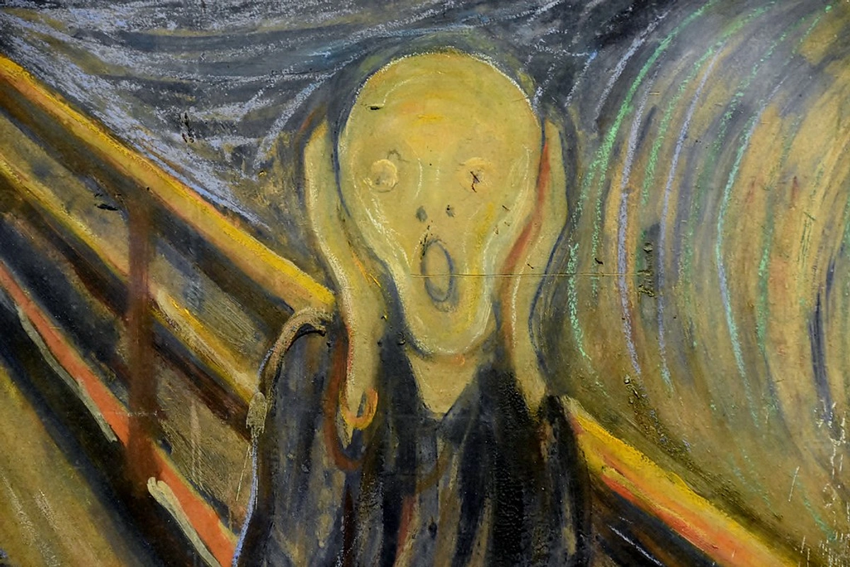
Beyond the technical accuracy of foreshortening or the dramatic flair of a dynamic angle, perspective can be wielded as a potent psychological tool, almost a mirror to our inner state. By subtly exaggerating, distorting, or even intentionally misaligning elements, an artist can manipulate perception to evoke powerful emotional states in the viewer, sometimes even venturing into the uncanny valley – that unsettling feeling when something is almost, but not quite, human or real, causing discomfort or revulsion. A steep, dizzying perspective can conjure anxiety or awe; a claustrophobic, tightly confined space can make us feel trapped. Think of the unsettling sense of unease in Edvard Munch's "The Scream," where the bridge seems to recede at an impossible angle, mirroring the figure's inner turmoil or conveying a character's overwhelmed mental state. Similarly, Escher, through his 'Drawing Hands' and other works, often twisted perspective in ways that were physically impossible but psychologically compelling, creating a sense of wonder and unease. Or the way René Magritte plays with scale and context to create a sense of surreal detachment.
His famous painting "The Treachery of Images" (Ceci n'est pas une pipe) isn't about perspective, but it highlights how our perception can be manipulated, which is at the heart of psychological perspective – what is shown is not always what is felt or intended. Even color can play a role here; jarring combinations or an oppressive palette can amplify feelings of unease or tension established through perspective. It's also important to acknowledge a limitation of perspective: if used too rigidly or without artistic intent, it can sometimes create a sense of detachment or artificiality, making a scene feel staged rather than organic.
This power of manipulation isn't confined to fine art; it's used extensively in advertising, film, and propaganda. By carefully controlling perspective, an image can make a product seem more grand, a character more imposing, or a situation more dire. This raises fascinating ethical questions about how artists and creators wield such a potent tool to shape not just what we see, but how we feel and think about it. In my own abstract work, I might not use literal vanishing points, but I often play with unusual angles and a sense of 'push and pull' between layered forms to create a feeling of internal conflict, expansion, or quiet contemplation. It’s a profound compositional choice that guides the viewer's eye and evokes a particular feeling, not just by showing space, but by shaping the emotional experience of it.
Putting Theory into Practice: Your Journey to Mastery
Understanding the theory is one thing, but making it sing on your canvas or screen is another. Here's how to truly bring these concepts to life, peppered with some lessons from my own studio floor:
- Observe, Observe, Observe (and then Draw from Life!): This is paramount. Carry a sketchbook everywhere. Look at buildings, streets, objects from different angles. Notice how lines converge, how colors and values change with distance, how things foreshorten. Actively draw from life – not just from photos – to truly grasp how light falls, how air softens distant forms, and how objects occupy real, three-dimensional space. The world is your greatest teacher, and active observation is your most powerful tool. Challenge yourself to draw the same object from multiple, drastically different angles – a coffee mug, a shoe, a stack of books – to truly grasp how its form changes and how perspective applies from various viewpoints.
- Break It Down Systematically (Starting with the Basics): Don't try to tackle a full cityscape in curvilinear perspective on your first go – that's a recipe for frustration and crumpled paper. Start with simple objects like cubes, cylinders, and spheres in one, two, then three-point perspective. Understanding how these basic geometric forms behave in space is the absolute bedrock. Once comfortable, move to simple rooms, then gradually build up to more complex environments. When drawing a complex scene, first establish the main architectural lines or primary forms, then add secondary elements like windows or doors, and finally the intricate details. You'll thank me later for this patience!
- Understand the Picture Plane: This is often overlooked but crucial. The picture plane is the imaginary flat surface of your canvas or paper, onto which the 3D world is projected. Understanding this helps immensely with foreshortening and accurately representing objects as they appear, not as you know them to be. Practice visualizing how a 3D object would "hit" your picture plane from different angles, just like a photograph captures it, flattening 3D information onto its 2D sensor.
- Practice with Negative Space: This is a game-changer! Instead of just focusing on the object, draw the space around and between objects. This forces your brain to see shapes and relationships differently, helping you understand how forms define each other and occupy space, which is incredibly useful for complex perspective drawings and breaking down difficult foreshortened forms.
- Use References, But Understand Them: Photos are invaluable, but don't just copy them blindly. Take the time to understand why they look the way they do. Try to identify the vanishing points and horizon line in a photograph of a building, even if they are off the page. Actively try to reconstruct the perspective grid of a photograph from scratch. Trace perspective lines on photos or directly onto transparent paper placed over them to internalize the principles. Then, try drawing from memory what you observed in the photo – this truly tests and builds your internalized understanding, moving beyond mere copying.
- Embrace Digital Tools as Learning Aids: Software like Clip Studio Paint, Procreate, or even more advanced CAD programs offer perspective rulers and grids that can automatically generate vanishing points and guide your lines, simplifying technical execution. These tools are fantastic for rapid experimentation, correcting mistakes easily, and precisely mapping complex scenes, freeing up mental energy for creative composition once the foundational principles are grasped. They're not a crutch, but a powerful extension of your creative process.
- Embrace Mistakes (My Sketchbook is Proof!): My sketchbook is full of wonky buildings, disembodied limbs, and perspectives that go wildly astray. Each "failure" is a lesson, a stepping stone to understanding. Don't be afraid to try something ambitious and fall short – that's how you truly learn and push your boundaries. Besides, sometimes the most interesting discoveries happen in the "wrong" lines. My most profound learnings often come from trying something, failing spectacularly, and then figuring out why.
- Practice Consistently: Like any skill, it atrophies without regular use. Even 15 minutes a day of focused practice can make a huge difference over time, steadily building your confidence and accuracy. It's like building muscle memory for your artistic eye.
- Cultivate Spatial Reasoning for Abstract Art: Even if your goal isn't realism, practicing perspective sharpens your spatial intelligence. Understanding how forms interact in 3D helps you create depth and dynamism in abstract compositions, controlling the 'push and pull' of shapes and colors without literal vanishing points. It's like learning the rules so you can beautifully break or adapt them.
Frequently Asked Questions
Now, you might be wondering about a few practicalities, so here are some frequently asked questions that often come up in my workshops and conversations.
Is perspective drawing essential for all forms of art?
While explicit linear perspective is most crucial for realistic and representational rendering, the underlying principles of depth, form, and spatial relationships are undeniably vital in almost all visual art. Even abstract artists, myself included, consider how elements interact in space to create balance, movement, and a sense of 'push and pull'. Beyond fine art, these principles are foundational in fields like graphic design (for creating visual hierarchies), animation (for believable movement and environments), game design (for immersive virtual worlds), and architecture (for structural integrity and aesthetic planning). Even stylized art, like cartoons or comics, uses simplified perspective principles to convey form and movement, ensuring characters and environments feel grounded and cohesive. So, yes, it's pretty foundational, in one way or another – whether you're meticulously rendering a cityscape or intuitively arranging abstract forms, you're engaging with space.
What are the most effective ways to practice perspective drawing?
Start with foundational exercises: meticulously drawing cubes, cylinders, and other basic forms in one, two, and three-point perspective. Once you're comfortable, move to drawing simple rooms, then more complex interior and exterior environments. Crucially, combine these exercises with extensive real-life observation and careful use of photographic references. Constantly look for how objects recede, converge, and change with distance. Try to identify the vanishing points and horizon line in photographs to build your visual intuition. Don't forget to practice atmospheric perspective by observing real landscapes and then painting or drawing them with varying clarity, detail, and color saturation to enhance the illusion of depth. Don't be afraid to pull out a ruler and protractor to check your lines; it's a tool, not a crutch. After observation, challenge yourself to draw from memory to solidify your understanding. Also, try drawing objects from extreme angles to really push your understanding of foreshortening. And as mentioned earlier, consistently drawing the same object from multiple, drastically different angles can really cement your understanding of its form in space.
How can digital tools and 3D modeling help me learn and apply perspective?
Digital tools have revolutionized perspective drawing, offering powerful aids for both learning and application. Software like Clip Studio Paint, Procreate, or even more advanced CAD programs offer perspective rulers and grids that can automatically generate vanishing points and guide your lines, significantly simplifying the technical execution. They're fantastic for rapid experimentation, correcting mistakes easily, and precisely mapping complex scenes. These tools allow artists to visualize intricate perspective grids quickly, freeing up more mental energy for creative composition and artistic choices once the foundational principles are grasped.
Furthermore, 3D modeling software (such as Blender, Maya, or SketchUp) takes this a step further. In these environments, perspective is fundamentally built into the engine. You directly manipulate objects in a virtual 3D space, and the software handles the camera's perspective projection onto your screen. This provides unparalleled accuracy and the ability to view your scene from any angle, making it an incredible learning ground for understanding how light, shadow, and distance truly behave in a constructed world. While you're not manually drawing vanishing lines, the experience of navigating and building in 3D profoundly deepens your spatial intuition. These digital aids are powerful tools, but it’s crucial to remember they enhance, rather than replace, the need for observational skills and a deep understanding of perspective's core principles; they just make the application a bit less messy (no more eraser crumbs everywhere!).
How does a deep understanding of perspective benefit digital art beyond just using software features?
Beyond simply using perspective rulers or 3D software, a deep understanding of perspective is crucial for creating convincing and immersive digital art. In concept art, it ensures environments feel believable and characters are grounded within them. It's also vital for creating believable lighting and shadow, which are intrinsically tied to how forms recede and interact in space. For virtual reality (VR) and augmented reality (AR) experiences, artists must meticulously apply perspective to prevent motion sickness and create a truly immersive sense of presence. Even in 2D digital painting, a strong grasp of perspective informs dynamic compositions, foreshortening in character poses, and the creation of atmospheric depth through digital brushes and layering. It allows artists to conceptualize and execute complex scenes that feel real, regardless of whether they are rendered in 2D or 3D, and to make deliberate choices about how the viewer experiences the digital world.
How can I overcome bad habits or common artistic blocks in perspective?
It’s easy to fall into habits, some less helpful than others. The first step is acknowledging them. If you consistently struggle with proportions, foreshortening, or making things look flat, dedicate specific practice sessions to isolate and correct those issues. Sometimes, radical changes help: try drawing with your non-dominant hand, upside down, or by focusing only on negative space to force your brain to see differently. For blocks, stepping away, doing quick, low-pressure sketches, or even analyzing masterworks for their solutions can reignite your creativity. Remember, every "mistake" is just data, a clue to what you need to understand better. My own solution is usually to simplify the problem, break it down to cubes and cylinders, and build up again, focusing on the fundamentals until the 'wrong' lines start to feel 'right' again.
What are some common mistakes to avoid in perspective drawing?
One common mistake is using too many vanishing points when only one or two are truly necessary, which can lead to a cluttered or confusing image. Another is neglecting atmospheric perspective, making distant objects appear as sharp and vibrant as foreground ones, thereby flattening the entire image. Inconsistent eye-level or horizon lines within the same drawing are also frequent culprits that can instantly break the illusion of depth. Many artists also fail to fully grasp the picture plane – the imaginary flat surface of your canvas or paper – and how all objects are projected onto it, leading to distortions that don't look intentional but just plain wrong. Always take a moment to double-check your initial setup – it saves a lot of headaches later! And a personal pet peeve: don't just copy a photo without understanding the perspective within it; that's like learning to spell without understanding grammar. Also, be mindful of the ethical implications of perspective: remember how it can subtly manipulate perception, even if unintentionally.
Conclusion: The Infinite Depth of Art and Vision
So, what does it really mean to master advanced perspective drawing? For me, it's far more than just adding another tool to my artistic belt; it's about profoundly transforming how you see the world and, in turn, how you express that vision with unparalleled depth and authority. It's a journey that will challenge you, sometimes make you sweat over a ruler, but ultimately reward you with the exhilarating ability to create truly immersive, emotionally resonant, and utterly believable worlds on your canvas. It elevates your art from merely depicting to genuinely conjuring space – a feeling akin to that first moment I felt the lines of an old building recede, almost like magic. This mastery isn't just technical; it's deeply emotional, philosophical, and narrative, empowering you to tell stories with space itself, connecting with the viewer on a profound, almost primal level.
It’s a bit like my own journey into art – full of learning, experimentation, and the occasional frustration, but ultimately incredibly rewarding. The principles of depth and space, even when applied abstractly, are at the heart of much of my work. For example, in my abstract paintings, I might intentionally use strong, receding lines that aren't tied to a literal vanishing point, or layer shapes with advancing warm colors and receding cool tones to create a dynamic sense of push and pull. This intuitive application of perspective principles allows me to build a sense of 'arriving' or 'pushing through' the scene, much like the vibrant energy and structured depth I aim to capture in my abstract compositions.
If you're looking for art that explores depth and color in a contemporary way, feel free to browse my collection here. Or, if you're ever in the Netherlands, stop by my museum in 's-Hertogenbosch to see how these principles play out in person across various pieces, perhaps even tracing a path through my own artistic timeline at /timeline. After all, art is an ongoing dialogue, isn't it? And every line, every shade, every perspective choice is a vital part of that captivating conversation. Go forth and create your own worlds with unshakeable depth, and don't be afraid to let your perspective bend reality, even if it feels a little like magic every single time! I'd love to hear about your own perspective journeys – feel free to connect or share your thoughts.