
Create Your Perfect Gallery Wall: Expert Planning & Hanging Guide
Create your perfect gallery wall! Zen Dageraad Visser's ultimate guide helps you plan, source, arrange, hang & preserve art for any style, budget & space. Tell your unique story!
The Ultimate Gallery Wall Guide: Curate Your Story, Your Way, with Zen Dageraad Visser
Ever felt a room was missing something... that intangible spark that makes it feel truly alive? That missing piece is often the story waiting to be told on its walls, and a gallery wall is your most vibrant narrative canvas. For me, the phrase itself conjures a flutter of creative anticipation. It's so much more than just hanging pictures; it's about weaving a narrative, your narrative, through a collection of visual moments that resonate deeply. I remember when I first moved into my studio, those vast, empty walls stared back at me, a blank canvas that was both overwhelming and incredibly exciting. It felt like standing on the edge of a great story, but without the first word. That's when the idea of a gallery wall—a grand, eclectic tapestry of my life, my travels, and my art—truly took root. It was a journey of finding my visual voice, a process I'm thrilled to guide you through.
Now, I know what you might be thinking: "Isn't it just a bunch of pictures hung together?" Well, yes and no. It’s a bit like baking a cake; you can throw flour and sugar into a bowl, but it takes a certain touch to create a masterpiece. And trust me, I've had my share of baking fails—and yes, I’ve seen some gallery wall attempts that, bless their hearts, just didn’t quite sing. My goal here is to help you create a gallery wall that doesn’t just sing, but perhaps even conducts a full orchestra in your home. Don't worry if your first attempt isn't perfect; that's part of the beautiful process of creative expression. After all, the walls of our homes are waiting to tell our stories, and a gallery wall is arguably the most dynamic, engaging, and personal way to do it. This guide will take you from the initial spark of an idea to the final, perfectly placed piece, ensuring your gallery wall becomes a true reflection of you.
Why a Gallery Wall Anyway? (Beyond Just Filling Space)
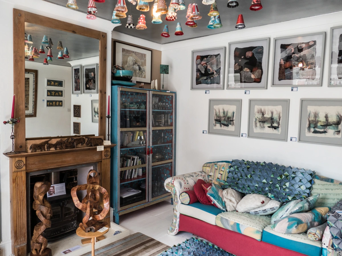
But beyond my own creative awakening, the power of a gallery wall extends to profound effects on our spaces and ourselves. For me, a gallery wall is an incredibly personal expression, a dynamic, ever-evolving canvas that brings together disparate elements into a cohesive whole. Beyond mere aesthetics, a personalized space deeply impacts our psychological well-being. It fosters comfort, connection, and even sparks creativity, allowing us to literally surround ourselves with what we love and what inspires us. Think of it as a sense of place on steroids; it creates a unique atmosphere that can profoundly affect your mood, reducing stress and boosting emotional connection to your environment. It can take a forgotten corner and make it the focal point of a room, or breathe life into a long, boring hallway. It's also an ingenious way to display a diverse collection of items—from precious family photos to quirky flea market finds, and yes, even your favorite abstract art (maybe even a piece from my own collection, just saying!).
But what truly elevates a gallery wall beyond a collection of pictures? It allows for depth and layering that a single, large piece often can't provide. Plus, it's incredibly forgiving. Made a mistake with one piece? Swap it out! Your taste evolved? So can your wall. It's a living, breathing part of your home decorating journey. And speaking of living, remember that even historically, humans have curated spaces. From the earliest cave paintings reflecting communal beliefs to the vibrant frescoes of Roman villas, and the intricate tapestries adorning medieval castles, we've always sought to tell stories on our walls. Later, the elaborate Wunderkammern (cabinets of curiosities) of the Renaissance meticulously arranged naturalia, artificialia, scientifia, and ethnographica to reflect the owner's worldview and status. These collections weren't just about display; they were about creating a personal universe, often blurring the lines between art, science, and the exotic. Similarly, the sophisticated salons of 17th and 18th-century Paris served as social hubs, displaying art, fostering intellectual exchange, and influencing public taste. These weren't just displays; they were early forms of gallery walls, reflecting the stories, beliefs, and intellectual pursuits of their owners, just as yours will – a continuous thread of human desire to tell stories on and with their walls.
Your Pre-Game Plan: Laying the Groundwork for Your Masterpiece
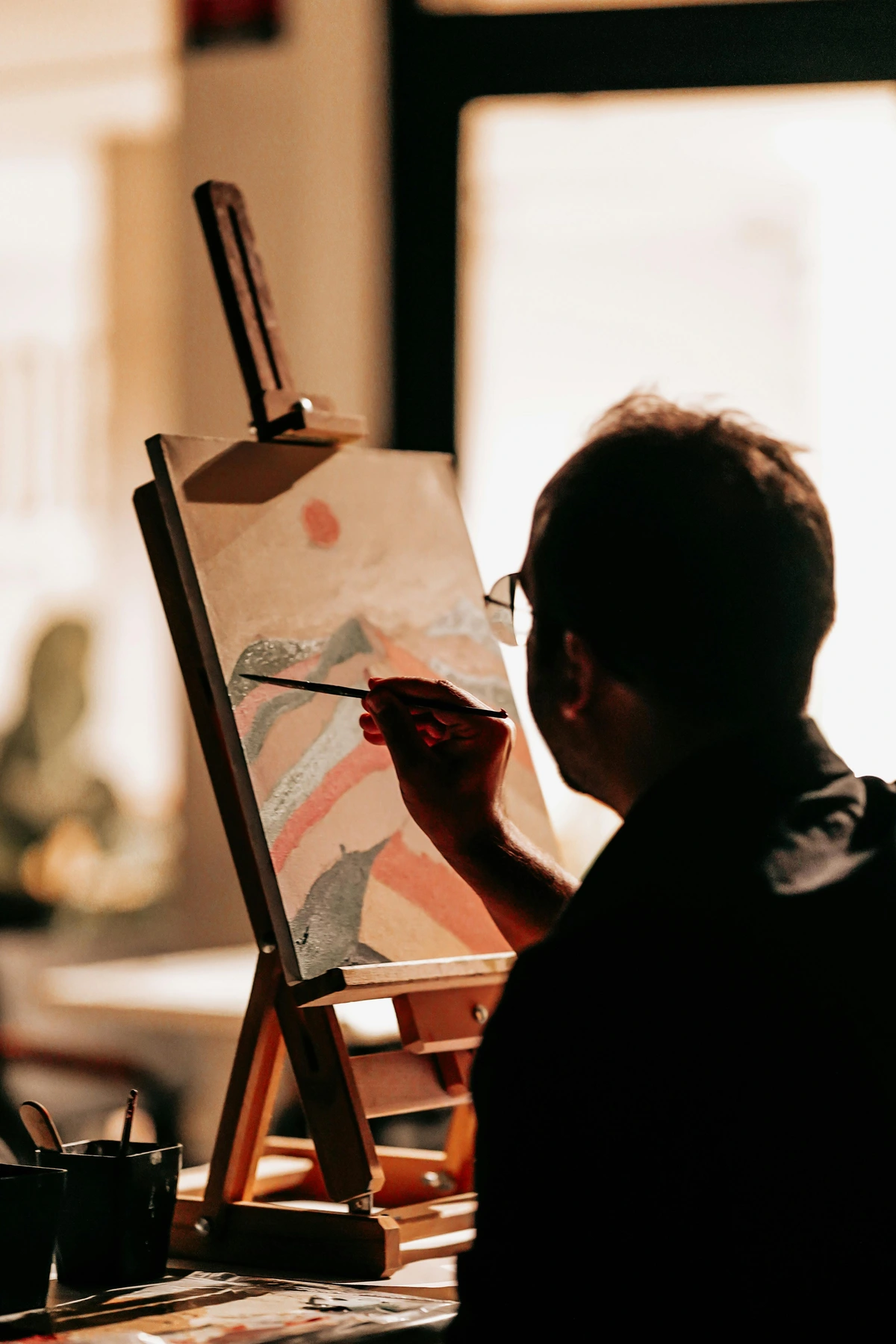
Before you grab a hammer and start turning your walls into a pin cushion (please, resist the urge!), some thoughtful planning will save you a world of headaches. This is where you get to be both the artist and the curator of your own story. Think of it as mapping out the symphony before the orchestra begins, or sketching your abstract masterpiece before applying the first brushstroke. The key here is not perfection, but intentionality. As an artist, I know the magic often begins long before the brush touches the canvas.
1. Define Your Vibe (Theme & Style)
What's the unspoken mood you want to cultivate? Are you going for a harmonious flow or an eclectic, vibrant energy? This choice will dictate everything from frame types to spacing. Think about the existing aesthetic of your room. A minimalist space might call for a grid of uniform frames and muted tones, while a bohemian den could embrace a wild mix of textures, colors, and shapes. My own preference often leans towards eclectic because, much like a busy mind, it embraces variety and juxtaposition, but I deeply appreciate the calm of a well-ordered display too. What story do you want your walls to whisper or shout? This is where your personal philosophy of art truly takes center stage.

Consider what you're trying to achieve:
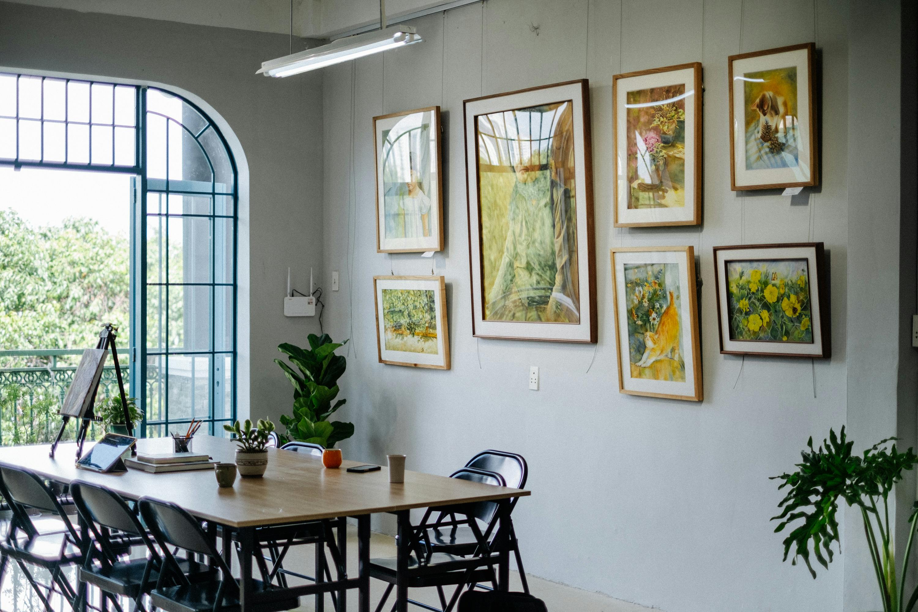
- Cohesive & Calm: Think similar frames, complementary colors, uniform spacing. This style often works beautifully with art for minimalist interiors or monochromatic photography. Consider Scandinavian, Japandi, or contemporary clean-line aesthetics, focusing on a soothing visual rhythm. A collection of minimalist charcoal drawings could create a powerful, serene impact.
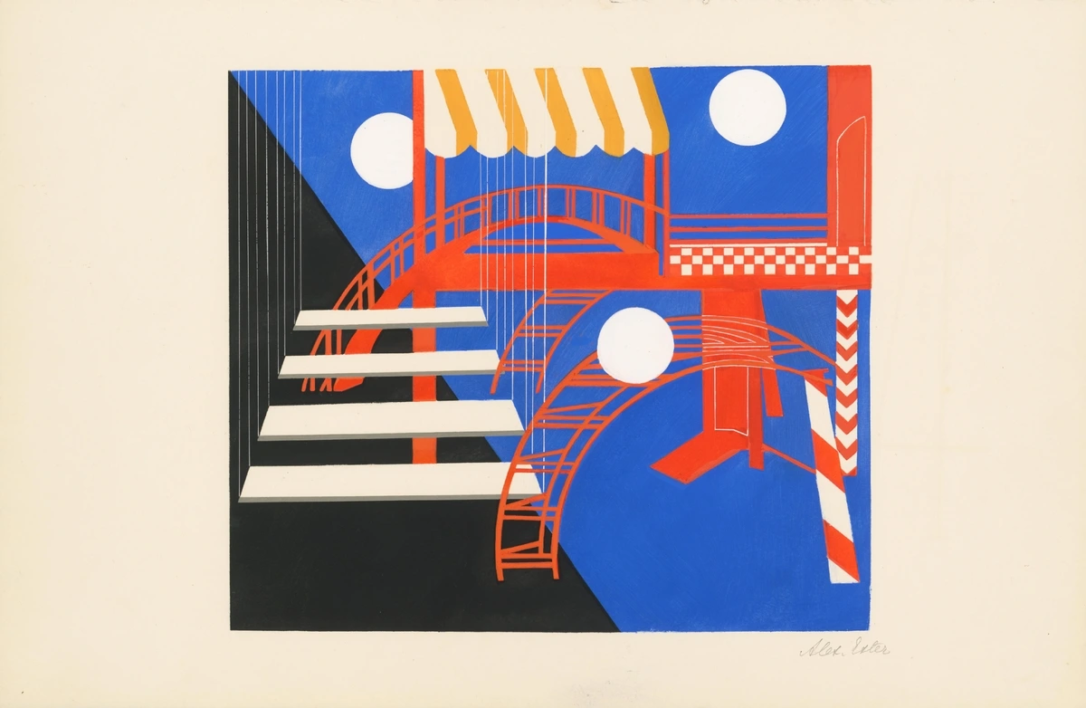
- Eclectic & Lively: Mixed frames, varied art styles, perhaps some unexpected objects. This is where articles like curating your perfect gallery wall a step-by-step guide for abstract art lovers can really spark ideas for blending bold pieces. Think bohemian, maximalist, industrial, or even a modern farmhouse style, where a lively mix creates a dynamic conversation. Incorporating a vibrant abstract piece alongside a vintage mirror adds unexpected harmony.
- Monochromatic: A collection centered around a single color palette, perhaps black and white photography, or abstract pieces in varying shades of blue, creating a serene, sophisticated look. This can be surprisingly impactful, proving that restraint can be its own form of drama.
- Story-Driven & Thematic: Focus on a particular theme, such as travel memories, family history, a specific hobby, or even an specific emotion like joy or contemplation. The pieces might be disparate in style but united by their narrative, creating a deeply personal and engaging display. For example, a collection showcasing the evolution of abstract art or mixed media could tell a fascinating visual story.
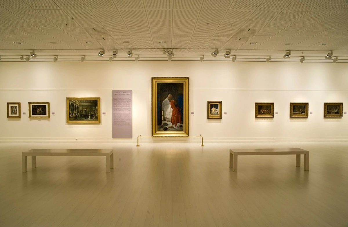
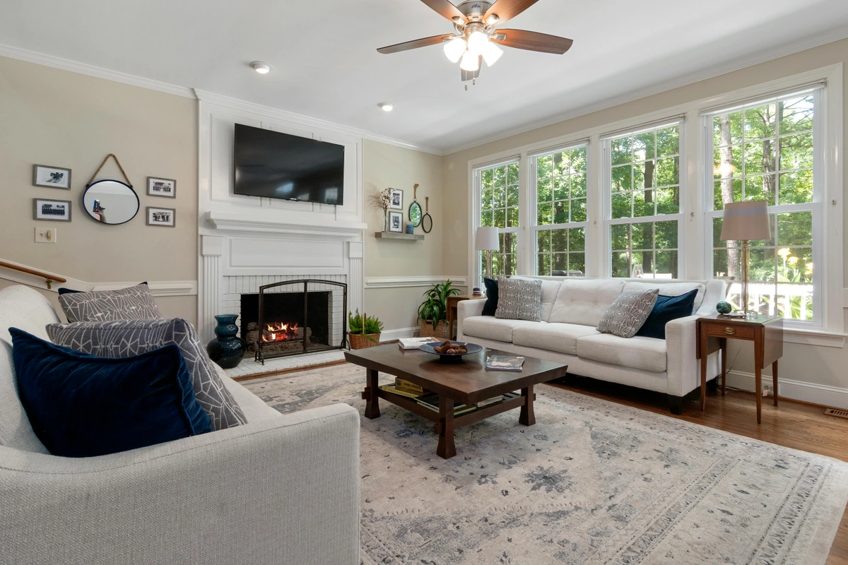
2. The Perfect Spot: Location, Location, Location
Where will your gallery wall live? This decision influences its size, scale, and even the type of art. A gallery wall above a sofa, for instance, has different considerations than one sprawling up a staircase or brightening a small entry. And what's your dominant viewing position? Are people usually sitting or standing in this area?
Here’s a look at common placements and what to consider:
Location | Key Considerations | Art & Style Suggestions |
|---|---|---|
| Above a Sofa | Often the main focal point of a living area. Needs a strong anchor. Leave 6-8 inches (15-20 cm) clearance from furniture. | Art above the sofa. Generally larger scale, balanced composition. Harmonious colors for relaxation. |
| Dining Room Wall | Sparks conversation, creates ambiance during meals. Avoid delicate pieces that could be easily bumped. | Art for a dining room. Engaging themes, perhaps still life or abstracts that invite discussion. |
| Hallway / Staircase | Turn a transit space into an engaging destination, telling a linear story. Consider ascending/descending layouts. | Decorating hallways and staircases with art. Focus on flow and narrative. Smaller, numerous pieces work well. |
| Bedroom | Create a personal sanctuary for quiet reflection and comfort. | Calming palettes, meaningful, intimate pieces. Avoid overly stimulating art. (Art for a small bedroom). |
| Above a Fireplace | A statement spot! Demands a grander statement, balancing symmetry with visual interest. | Often features a single large piece or a balanced cluster. Inspiration from art above a fireplace. |
| Home Office | Boosts creativity and focus. Avoid distractions. | Inspiring abstracts, calming landscapes, or motivational prints. |
| Kitchen | Durable, easy-to-clean art. Mindful of steam/grease, which can damage unsealed pieces. | Thematic pieces (food, nature), metal prints, or art behind glass. Consider how to decorate a kitchen. |
| Bathroom | Moisture-resistant art. Enhances relaxation or adds a touch of luxury. Ensure pieces are sealed or behind glass. | Sealed prints, small canvases, or botanical illustrations. Art for bathroom. Avoid paper-based art unless professionally framed with moisture protection. |
| Kids' Room / Nursery | Playful, educational, or interactive. Consider durable frames and safe hanging. | Art for a nursery. Colorful prints, character art, or their own framed masterpieces. Fun and engaging themes. |
3. Gathering Your Treasures: The Art Itself
This is the fun part: rummaging through your existing collection and envisioning new additions. Don't limit yourself to just framed prints! Consider how different materials and mediums can add depth and texture. This is where your inner collector truly shines. I always find unexpected treasures when I allow my curiosity to lead, and the hunt itself is often half the joy.

Let’s explore the vast world of what can adorn your walls:
- Photographs: Personal memories, travel shots, candid moments. For a cohesive look, consider printing them with a uniform filter (e.g., all black and white), or explore metallic prints for a modern sheen. Always use archival paper and inks for longevity, and acid-free matting and backing boards to prevent damage over time. These are small details that make a huge difference in preservation.
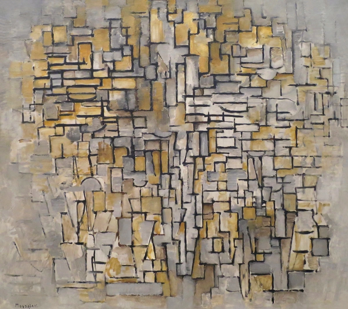
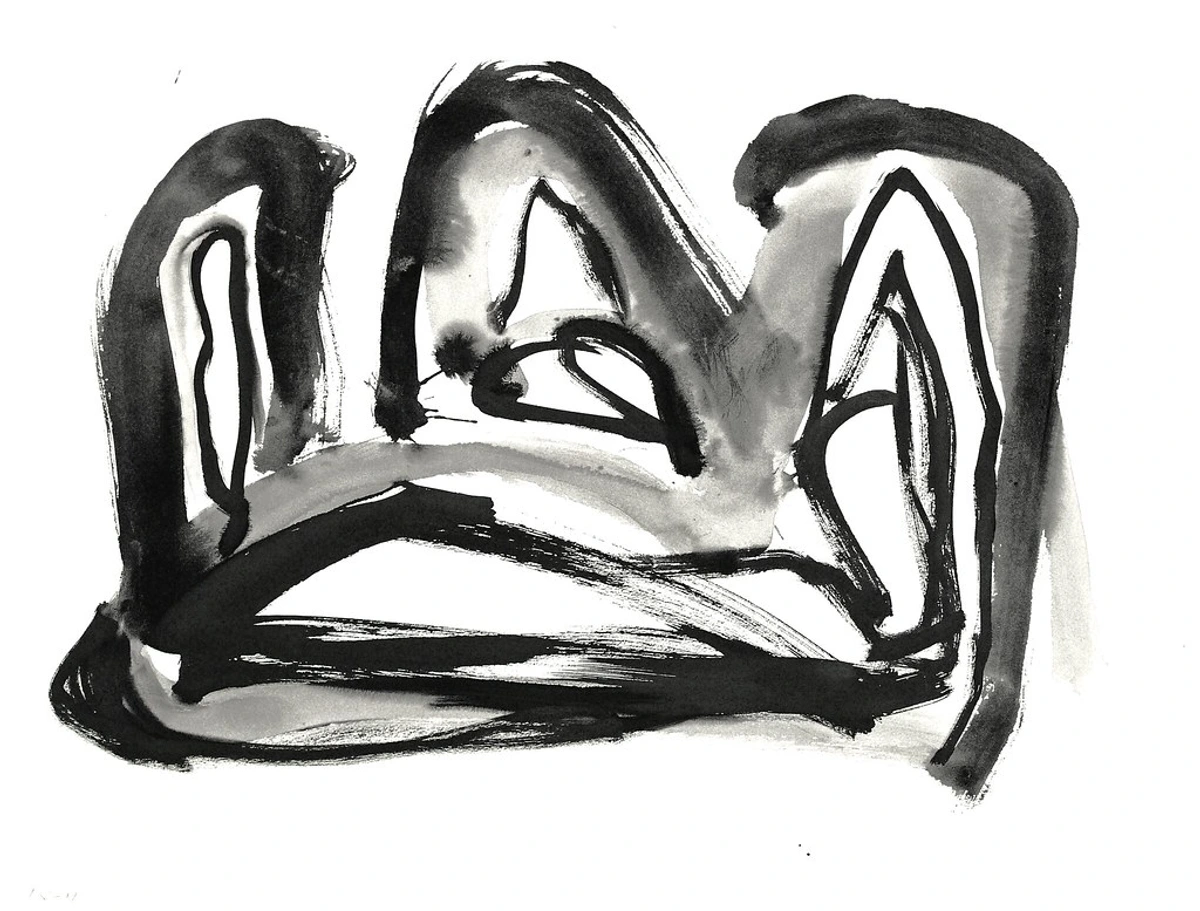
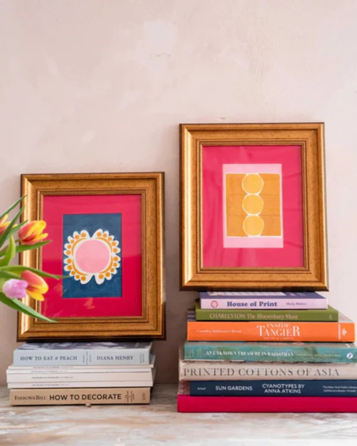
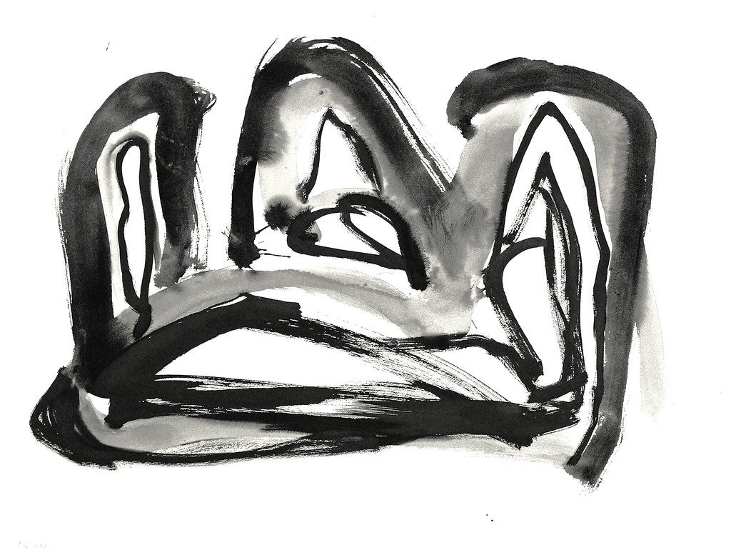
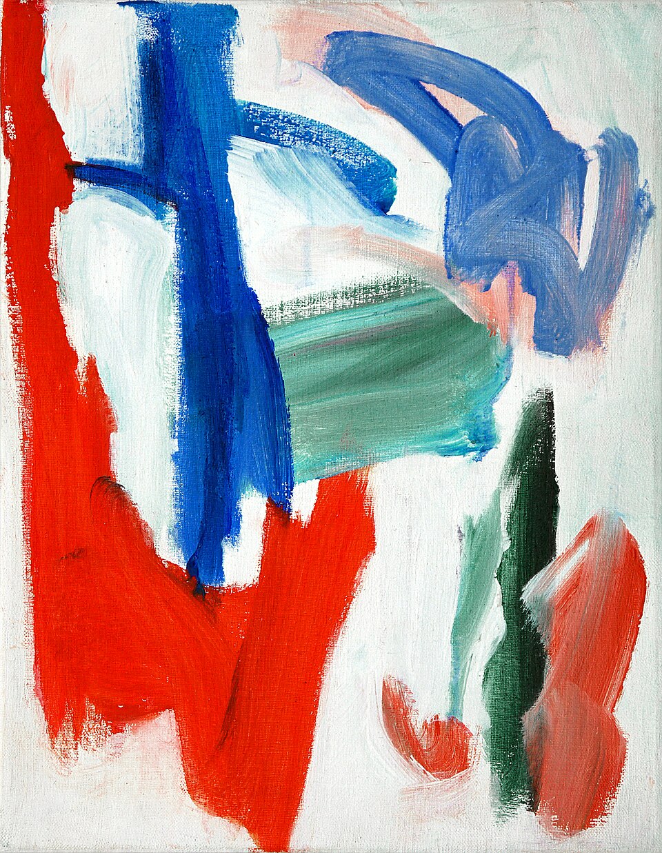
- Paintings & Prints: Abstract art, landscapes, portraits—mix and match genres! My vibrant abstract pieces are designed to bring energy to any space. Imagine pairing a bold geometric abstract with a soft, minimalist landscape for unexpected harmony, creating a visual dialogue.
- Textiles: Small woven pieces, embroidered hoops, macrame, or even a beautifully patterned scarf mounted on a simple board. These add incredible texture and warmth, softening the overall look and bringing an unexpected tactile dimension. For delicate textiles, consider framing them behind UV-filtering glass in a shadow box to protect them from dust and light.
- Mirrors: Reflect light, make a space feel larger, and add a touch of elegance. Varying mirror shapes can create interesting focal points, almost acting as dynamic, reflective artworks themselves, constantly shifting with the light.
- Shelves: Incorporate small, floating shelves for objects, small sculptures, books, or plants (a personal favorite of mine!). Just be mindful of light and humidity for delicate art pieces nearby.
- Unique Objects: Think vintage plates, quirky ceramics, interesting wall-mounted planters, antique tools, or even small musical instruments (a tiny ukulele or tambourine, perhaps?). Sourcing these from flea markets, antique shops, or even online marketplaces like Etsy can uncover true gems. These unexpected elements truly make the wall yours, adding a layer of personal history and intrigue. For delicate items, consider clear display boxes or careful wall mounts.
- Awards & Certificates: Instead of tucking them away, frame significant achievements with quality archival materials. They're personal milestones that deserve to be celebrated visually.
- Maps & Globes: A vintage map of a beloved city or a small, decorative globe can add a touch of wanderlust and intellectual charm, especially when framed to preserve their historical detail.
- Architectural Elements: Salvaged decorative trim, unique door knockers, or even beautiful antique keys framed in a shadow box. These elements bring a sense of history and unique form.
- Children's Art: Don't underestimate the charm and personal value of a child's masterpiece. Frame it simply and integrate it as a joyful, authentic expression, a snapshot of pure creativity. For extra protection, consider laminating or sealing with an archival spray before framing.

- Digital Art & NFTs: If you own digital art, high-quality giclée prints are, in my opinion, the most reliable and aesthetically pleasing way to display it, providing a tangible, archival version. They faithfully reproduce the digital image with exceptional detail and color accuracy, bridging the gap between digital creation and physical display. While the digital art world, particularly with NFTs and blockchain, is undeniably evolving, I approach these with a healthy dose of skepticism. As an artist who cherishes the tangible brushstroke and the enduring presence of a physical artwork, the purely digital realm can feel... distant, and honestly, a bit like vapor. The long-term implications, environmental impact, and evolving display technologies for purely digital pieces are subjects of ongoing debate and careful consideration. Displaying purely digital art effectively often requires high-resolution screens that can replicate the visual quality of a physical print, and the technology for doing this seamlessly in a home setting is still maturing. Specialized digital art frames, offering high-resolution displays and sometimes motion capabilities, are an interesting, albeit nascent, alternative. However, they come with considerations for power, heat, and ongoing technological relevance. For now, a physical print remains the most reliable and aesthetically pleasing display method, but approach purely digital display with cautious exploration, if any.

And don't forget the frames! They can be uniform for a sleek, contemporary look or wildly varied for an eclectic vibe. I often find myself drawn to simple, classic frames, but sometimes a gilded, ornate one just screams 'character' and demands to be included. The key is to find frames that complement the art and your chosen aesthetic. Think of framing itself as an art form – the right frame can enhance, rather than detract from, the artwork. For delicate works, consider UV-filtering glass or acrylic to protect against fading and environmental damage, and for valuable pieces, consult with a professional framer for archival quality materials. Matting, for example, isn't just a spacer; a wider mat can give a smaller piece more presence, drawing the eye in, while a colored mat can subtly tie disparate works together. This might seem like a small detail, but it's crucial for longevity and presentation.
Creating a Stunning Gallery Wall on a Budget
Don't let budget limitations deter your creative vision! A beautiful gallery wall doesn't have to break the bank. Here are a few of my favorite tips for sourcing and displaying art affordably:
- Thrift Store & Flea Market Finds: These are treasure troves for unique frames, vintage prints, and interesting objects. Look past the dated art and focus on the frames—a little paint can transform them. You can also try distressing a frame for a shabby-chic look, decoupaging with fabric scraps or patterned paper, or adding small decorative embellishments (like faux jewels or metal details) to create a truly unique, cohesive look from disparate finds. You can find incredible character at a fraction of the cost.
- DIY Prints: Print your own photographs, or find free high-resolution digital art online (ensure it's public domain or has an appropriate license). Black and white prints can be particularly striking and cohesive. High-quality home printers can produce surprisingly good results. For a casual, contemporary look, consider using decorative binder clips to hang unframed prints on a string or directly to the wall.
- Children's Art: As mentioned, framing your child's artwork adds immeasurable personal value and costs nothing to acquire. It’s authentic, colorful, and tells a unique story.
- Postcards & Greeting Cards: Collect postcards from museums or places you’ve visited. They are affordable, often feature beautiful art, and can be easily framed in small, inexpensive frames.
- Found Objects: Scout your home for interesting, sculptural objects that can be mounted. An antique key, a small piece of driftwood, or even a beautifully patterned fabric scrap can add texture and intrigue.
- Affordable Frames: Look for sales at craft stores, or buy multi-packs of simple frames from large retailers. Mixing different budget frames with a unifying paint color can create a cohesive look without the high cost.
The Grand Rehearsal: Planning Your Layout for a Seamless Display
This is, without exaggeration, the most critical step. Skipping this is like trying to build a house without blueprints – you can do it, but it's probably going to be crooked and fall down. Investing time here is crucial to avoid the common pitfalls of a haphazardly hung display. Don't let the fear of imperfection paralyze you; just see it as part of the beautiful creative journey, where experimentation is celebrated. Trust me, I've spent hours rearranging paper cutouts, and it's always worth it. I even had one layout I was convinced was perfect, only to come back the next morning and realize it felt completely off – those paper templates saved me a lot of spackle!
1. Measure Your Canvas and Consider Scale
Measure the width and height of your wall space. This gives you boundaries to play within. Remember to leave some breathing room around the edges, especially if your gallery wall is part of a larger how to decorate a house strategy. As a general rule, aim for the arrangement to fill about two-thirds to three-quarters of the available wall space horizontally and a similar proportion vertically. For art above furniture, leave at least 6-8 inches (15-20 cm) of space between the top of the furniture and the bottom of the lowest frame. This ensures the art feels integrated, not floating awkwardly. Thinking about scale is a fundamental principle in art composition, much like understanding the proportions in a painting. A great trick to visualize the scale of a potential new piece or an entire arrangement is to use painter's tape to mock up the dimensions directly on the wall. This gives you a tangible sense of how it will truly fill the space before you commit.
2. Visual Weight and Balance: Conducting Your Art Orchestra
Understanding visual weight is key to a dynamic, balanced gallery wall. As an artist, I see visual weight as the inherent 'heft' or 'pull' an element has on the eye. It's influenced by several factors: its size, of course, but also its color intensity (a vibrant red will always feel heavier than a pale blue), contrast, complexity (a busy pattern versus a solid color), texture, and even the presence of a recognizable form like a face. Larger, darker, more brightly colored pieces (like a bold abstract expressionist painting) or those with high textural detail tend to have more visual weight than a delicate pastel drawing or a light-colored print. Distribute these 'heavier' pieces evenly throughout your arrangement to avoid having one side feel too dense or another too sparse. It’s like conducting an orchestra: you want the loud instruments balanced with the soft ones, not all the trombones on one side! This prevents the eye from getting stuck in one area and encourages it to flow across the entire display, creating a sense of harmonious movement. For more on this, you might explore understanding balance in art composition, a concept I apply rigorously in my own abstract paintings.
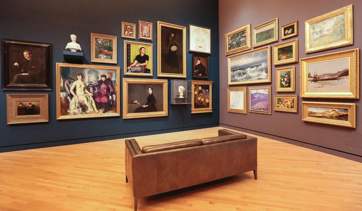
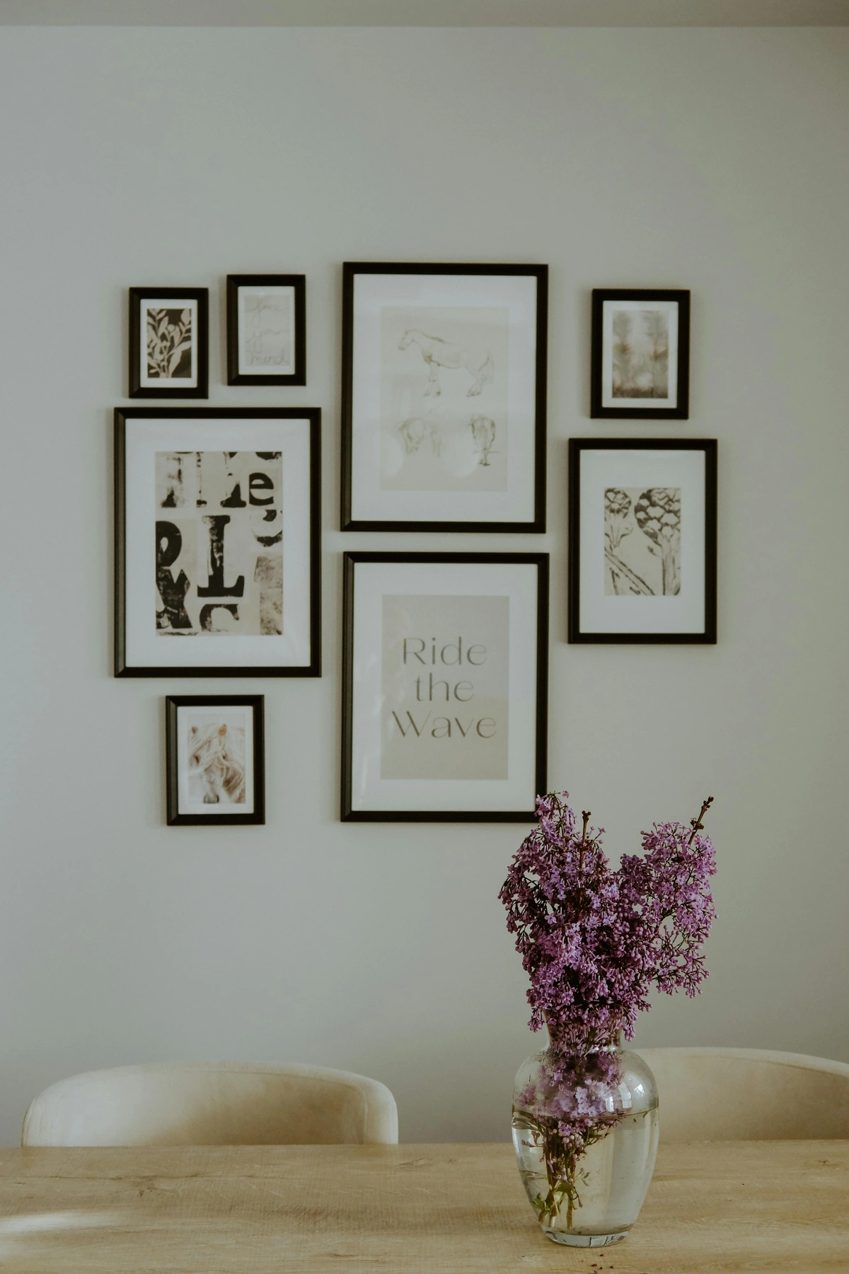
3. Consider Your Layout Style: Your Architectural Blueprint
Before you start tracing, think about the overall 'feel' you're aiming for. There are various ways to approach the arrangement. Which one calls to you? I've found that having a general style in mind can simplify the planning process significantly, providing a framework for your creativity.
Style Name | Description | Best For (Aesthetics/Space) | Potential Pitfalls |
|---|---|---|---|
| Grid Style | Symmetrical, clean lines, uniform spacing, often with similar frames. Creates order and sophistication. | Formal, minimalist, traditional aesthetics; smaller, organized spaces. | Can feel monotonous if art isn't varied enough; less flexible for future additions. Can feel sterile. |
| Organic/Free-Form | No strict rules, frames of different sizes/shapes arranged more fluidly. Often centered around a key piece. | Eclectic, bohemian, maximalist aesthetics; large, evolving spaces. | Can look cluttered or unbalanced if not thoughtfully composed; requires keen eye for balance. Can descend into chaos. |
| Linear | Arranged along an imaginary horizontal or vertical line, often with a consistent top or bottom edge. | Hallways, above furniture; guiding the eye, creating a sense of order without strict grids. | Can feel too rigid if not softened by varied art; less dynamic than organic. May lack visual dynamism. |
| Centric | Everything radiates outwards from a central, dominant piece, like a sunburst. | Highlighting a showstopper artwork; creating an immediate focal point in a room. | Secondary pieces might feel overshadowed; requires a strong anchor piece. May make other pieces feel unimportant. |
I find that starting with a large central piece and building outwards often makes the organic style less daunting. If you're looking for more guidance on creating a harmonious gallery wall with mixed media, that article has some great insights. Remember, the Rule of Thirds can be a helpful guide too: imagine your wall divided into a 3x3 grid, and place key elements along these lines or at their intersections for a more balanced and engaging composition. For a gallery wall, this means you might position your main anchor piece or a cluster of visually heavy items where these lines intersect, drawing the eye naturally. It’s not a hard rule, but a powerful suggestion, much like how I might use a foundational grid in my own abstract paintings.
4. The Floor Plan Method (My Go-To for Stress-Free Layouts)
This is the creative core of your planning, where arrangements come to life without a single nail hole. Trust the process! I've lost count of the times I've moved paper cutouts around for an hour, only to find the perfect configuration in the last five minutes. It's a game of patience and visual problem-solving. One time, I was convinced a certain layout was perfect, only to come back the next morning and realize it felt completely off—the paper templates saved me a lot of spackle!
- Trace Everything: Lay out all your framed art and objects on a large clear floor space. Trace the outline of each piece onto kraft paper or old newspaper and carefully cut out the templates. Don't forget to mark where the actual hanging point is on each template! This crucial detail saves so much frustration later, especially for frames with D-rings or wire hangers, ensuring the artwork sits at the correct vertical position on the wall.
- Arrange on the Floor: This is where you play! Start arranging your paper cutouts on the floor, shifting them around until you find a composition that feels right. Think about balance, flow, and a central anchor piece (usually the largest or most visually impactful piece), which often goes slightly off-center to create dynamic interest. Sometimes, I'll try 5-10 different layouts before one clicks. Don't be afraid to take breaks and come back with fresh eyes. This is similar to how I approach a complex mixed media composition – allowing the elements to find their natural harmony.
- Spacing: I usually aim for 2-4 inches (5-10 cm) between frames. This provides enough visual breathing room, preventing a cluttered feel and allowing each piece to breathe. But honestly, sometimes I break my own rules if a tighter or wider space feels right for a particular cluster. That's the beauty of art, isn't it? It’s like the even spacing of notes in a musical composition—it creates rhythm and coherence. Also, consider negative space, the blank areas around your art, as a crucial design element. Think of it as the silence between the words in a story, allowing each piece to have its moment and preventing visual overwhelm. It's just as important as the art itself for creating a harmonious composition.
- Photograph Your Progress: Snap photos of different layouts. You'll be amazed how fresh a layout can look in a photo, helping you spot imbalances you missed in person. This is also super helpful for remembering your favorite arrangement. A little trick: print out your favorite photo and mark where the hanging points should go. This is your blueprint!

Key Takeaways for Pre-Game Planning:
- Define your wall's personality (cohesive, eclectic, monochromatic, story-driven).
- Choose the right location for your gallery wall, considering room function and viewing angles.
- Gather diverse treasures, including photos, paintings, textiles, mirrors, and unique objects.
- Prioritize budget-friendly options like thrift store finds and DIY frames, transformed creatively.
- Always use the Floor Plan Method with paper templates to avoid extra nail holes and visualize balance.
- Pay attention to visual weight, spacing, and negative space for a harmonious composition.
- Consider the Rule of Thirds for impactful placement of key elements.
The Grand Unveiling: Hanging Your Masterpiece with Confidence
Alright, templates are on the wall, you've taken a dozen photos, and you're feeling confident. Now for the actual hanging! This is where precision meets patience. A crooked nail or a misjudged height can be frustrating, but trust me, these small 'oops' moments are often fixable with a little spackle and paint. Don't let the fear of a tiny repair stop you from creating something magnificent. I've certainly patched my share of walls over the years; it's all part of the learning curve! Remember that time I tried to hang a particularly tricky piece with an obscure wire hanger? It took three tries, a lot of muttered words, and a deep breath, but the satisfaction of seeing it finally settle perfectly was immense.
1. Tools of the Trade: Your Arsenal for Success
You'll need these essentials for a smooth hanging process. Having them all ready before you start saves endless trips back and forth – I speak from experience here!

Tool | Purpose | Notes |
|---|---|---|
| Hammer or Drill | For inserting nails/screws into the wall. | I usually use a hammer for drywall (with picture hooks); a drill is essential for plaster, brick (with masonry bits), or heavy anchors. |
| Picture Hooks | Specialized hooks for hanging art. | Always match the hook's weight capacity to your art piece; D-rings or wire are my go-to for heavier items. |
| Measuring Tape | For precise measurements and spacing. | This is absolutely essential for accuracy, especially when transferring hanging points from templates. |
| Pencil | For marking hanging points and wall outlines. | A light pencil mark can be easily erased or painted over, so don't press too hard. |
| Level | Ensures your art hangs perfectly straight. | Crucial for straight lines (unless you're intentionally going for a quirky, off-kilter look, which, I'm not judging, but it needs to look intentional). |
| Painter's Tape | To secure paper templates to the wall without damaging the paint. | Use generously to hold templates securely while you mark; I always have a roll handy. |
| Spackle & Paint | For inevitable 'oops' moments. | Keep a small amount handy for patching errant nail holes; it's part of the creative process! |
2. The Transfer Method: Bringing Your Vision to the Wall
This is where your floor plan comes to life on the wall. Patience and precision are your best friends here. Don't rush it; the last thing you want is a crooked frame after all that planning.
- Tape up Templates: Use painter's tape to secure your paper templates to the wall in your desired arrangement. Step back often, from different angles, to check. Take a deep breath and make sure it's just right. Ask a friend for a second opinion if you're unsure! Sometimes a fresh perspective is invaluable.
- Mark Hanging Points: For each template, mark exactly where the nail or hook should go. If you're using D-rings or wire, you'll need to measure from the top of the frame to the hanging point on the back and transfer that measurement onto the template. This precision is absolutely key to ensuring your art hangs at the correct height and level. This is where those earlier marks on your templates pay off!
- Hammer/Drill Time: Carefully remove each paper template (or cut out the marked spot on the template) and insert your nail or screw. I usually start with the anchor piece and work my way out, double-checking alignment with my level as I go. For accessibility, if using a drill, ensure it's at a comfortable height.
- Hang & Adjust: Hang your art! Take your time, use your level, and don't be afraid to make minor adjustments. Sometimes a piece just needs a little nudge to sit perfectly. Even a millimeter can make a surprising difference to the eye. This is the moment your vision becomes reality!
3. Alternative Hanging Methods: Damage-Free and Flexible Options
For minimal wall damage, or if you're in a rental, consider these innovative approaches that offer flexibility and peace of mind. I've used many of these myself when I'm experimenting or want a temporary display.
- Command Strips/Hooks: Great for lighter frames and easy repositioning. Always check weight limits, and remember they work best on smooth, clean surfaces. They're a rental-friendly game-changer, but I always test them first!
- Picture Rails: A classic solution, often found in older homes, allowing for easy rearrangement without new holes. They offer a flexible system for changing your display by simply re-hooking your art, making it a living, evolving display, perfect for frequently refreshed collections or if you have mobility considerations.
- Leaning Art: Larger pieces can be leaned against the wall on a console table, bookshelf, or directly on the floor, adding an effortlessly chic vibe (and zero holes!). This works particularly well for oversized canvases or a collection of framed pieces stacked casually. Discover more ways to display art without hanging it.
- Washi Tape: For very light prints or photographs, decorative washi tape can be a fun, temporary, and damage-free way to adhere them directly to the wall, especially in a more playful, informal setting. It's fantastic for kids' rooms or mood boards.
- Modular Shelving Systems: These versatile systems allow you to combine shelves with integrated hanging rails, offering a customizable gallery display that can hold art, objects, and even books without individual wall damage.
Key Takeaways for Hanging Your Masterpiece:
- Gather all your tools beforehand to ensure a smooth process.
- Use the paper templates to precisely mark hanging points on the wall.
- Start with your anchor piece and work outwards, constantly checking with a level.
- Don't fear minor adjustments; patience leads to perfection.
- Explore damage-free alternatives like Command Strips or leaning art for flexibility.
Common Mistakes to Avoid: Learning from My Own 'Oops' Moments
Even with the best intentions, a gallery wall can go awry. Here are some common pitfalls I (and many others!) have encountered, and how to steer clear of them. Consider these hard-won lessons!
Mistake | How to Avoid It |
|---|---|
| The Eye-Level Trap: Hanging Art Too High (or Low) | Aim for the center of your entire arrangement to be at average eye level (around 57-60 inches / 145-152 cm from the floor) for standing areas. If above furniture, ensure 6-8 inches (15-20 cm) clearance. This makes the art feel integrated and comfortable to view. Hanging too high makes it feel disconnected and unapproachable. |
| The 'More is More' Fallacy: Avoiding Over-Clutter | Less is often more. Ensure adequate negative space (2-4 inches / 5-10 cm between frames) and don't feel obligated to fill every blank spot. Rotate pieces if you have too many favorites! Your eye needs room to breathe, and too much clutter can lead to visual fatigue and overwhelm the impact of individual pieces. |
| Ignoring Visual Weight & Balance | Distribute larger, darker, or more colorful pieces evenly across the composition. Use the floor plan method to visualize balance before hammering. This prevents a lopsided or top-heavy look that can feel uneasy or incomplete. |
| Inconsistent Spacing (Uneven Gaps) | While an organic style allows for variation, wildly uneven gaps can look messy and unprofessional. Strive for consistent spacing as a starting point, even if you break the rule intentionally for specific clusters. Use a small ruler or a piece of cardboard as a spacer – it's a game-changer for maintaining visual harmony. |
| Skipping the Rehearsal: Not Planning with Templates | This is probably the biggest mistake! Skipping the paper template stage almost guarantees extra nail holes and frustration. Always 'rehearse' on the floor first; it's the best time investment you can make to ensure a successful, stress-free installation. |
| Poor Lighting | Neglecting lighting can make your beautiful art fall flat. Consider dedicated picture lights or adjustable track lighting. Avoid direct harsh sunlight, which can also damage your art (causing fading and discoloration). Good lighting makes your art truly shine and enhances its texture and color, creating depth and drama. For more, explore the art of display. |
| Lack of a Unifying Element | If mixing styles, colors, and frames, ensure there's something that ties it all together – a consistent color accent, similar frame finishes, or a strong overarching theme/story. This is crucial for a cohesive look; otherwise, it can feel chaotic and disconnected, resembling a random assortment rather than a curated collection. Learn more about mixing and matching art styles. |
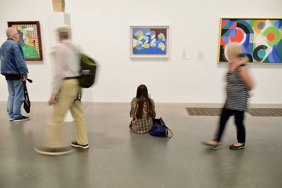
Lighting Your Gallery Wall: Setting the Mood and Highlighting Your Treasures
Proper lighting can utterly transform your gallery wall, turning a simple display into a dramatic focal point. Just as a spotlight illuminates a performer, the right lighting highlights the nuances, textures, and emotional impact of your art. It’s an often-overlooked element that can make all the difference, bringing your collection to life after dark. For a deeper dive, check out how to choose the right lighting to enhance your abstract art collection.
- Track Lighting: Offers incredible flexibility, allowing you to direct individual lights at specific pieces. This is fantastic for an evolving gallery wall where you might change pieces or rearrange frequently, as you can adjust the focus. Opt for LEDs for energy efficiency, minimal heat emission (better for your art), and look for bulbs with a high CRI (Color Rendering Index) of 90+ to ensure accurate color representation.
- Picture Lights: Small, self-contained lights typically mounted directly to the top of a frame or just above it. They provide a warm, intimate glow that draws the eye to individual artworks, often used for more traditional or cherished pieces. They create a classic, museum-like feel, perfect for highlighting a specific focal point.
- Ambient Lighting: Don't underestimate the power of natural light or overall room lighting. Ensure your gallery wall isn't in direct, harsh sunlight, which can fade delicate artworks over time (more on that below). Even well-placed floor lamps or sconces can provide a gentle, overall illumination that enhances the wall without being too intense. Consider using UV-filtering window film or blinds/curtains to control natural light exposure.
Consider the color temperature of your lighting, measured in Kelvin (K). Warm white light (2700K-3000K) creates a cozy, inviting ambiance, enhancing reds and yellows. Cool white light (3500K-4500K) creates a more modern, gallery-like feel, making blues and greens pop. Investing in dimmers can allow you to adjust the ambiance throughout the day, providing ultimate control over the mood of your space – from bright and vibrant to soft and contemplative. It's like having a conductor for the mood of your room.
Preserving Your Gallery Wall's Integrity: A Lasting Legacy
Your gallery wall is a living collection, and like all living things, it benefits from a little care. Maintaining the longevity of your treasured pieces, especially when mixing media, is crucial. After all, these are your stories, and you want them to endure for years to come. Thinking about this proactively can save heartache later.
- Light Exposure: Direct sunlight is the enemy of most artwork, especially photographs, prints on paper, and vibrant pigments, as it causes fading, discoloration, and degradation over time. Position your gallery wall away from direct sun, or consider UV-filtering glass or acrylic for highly valued pieces. Rotating sun-exposed pieces periodically can also help minimize damage, much like rotating tires on a car. For delicate textiles or antique maps, consider professional conservation framing in a shadow box to protect them from both light and dust.
- Humidity & Temperature: Fluctuations in humidity and temperature can cause paper to warp, canvases to sag, and frames to crack. Avoid hanging delicate art near heat sources (like radiators or fireplaces without proper insulation) or in high-humidity areas (like bathrooms, unless the art is specifically sealed for moisture). Aim for a stable environment, ideally around 50-60% relative humidity and 18-24°C (64-75°F). Your art (and you!) will thank you. For unique objects, research their specific material sensitivities (e.g., metal objects might corrode in high humidity).
- Dusting & Cleaning: Gently dust frames and glass regularly with a soft, dry microfibre cloth. For art behind glass, use a non-abrasive glass cleaner sprayed onto the cloth (never directly onto the glass, as it can seep into the frame). For exposed canvases or objects, a very soft brush or a clean, dry microfibre cloth is best. Always handle prints with clean, dry hands or cotton gloves to avoid transferring oils. For children's art, consider laminating or sealing with a clear, archival spray for extra protection.
- Plants & Art: While I love incorporating plants into a gallery wall, be mindful. Water spills can damage frames and art, and excessive humidity from plants can affect paper and unsealed works. Place plants carefully, use drip trays, and ensure good air circulation to protect nearby art. It’s a delicate balance! If using wall-mounted planters, choose pieces that are easy to water without dripping and are securely fastened to prevent accidental falls.
- Accessibility & Enjoyment for All: A truly thoughtful gallery wall is one that can be appreciated by everyone. When planning your layout, consider placing some key pieces at varied heights, or ensuring that paths of travel are clear and unobstructed. For instance, you might place a tactile sculpture (if appropriate and safe for the art) at an accessible height to enhance the experience for visually impaired visitors. Picture rails can also make rearranging easier for individuals with mobility considerations, turning the act of curation into a more inclusive and enjoyable experience.
Consider an Art Consultation
For very valuable collections or complex, unique spaces, don't hesitate to seek professional guidance. Art consultants are experts in curation, lighting, and installation, and can provide invaluable advice to ensure your gallery wall truly shines while preserving the integrity of your pieces. It's an investment in the longevity and impact of your collection.
Frequently Asked Questions About Gallery Walls
As you embark on your gallery wall journey, some common questions often arise. Here are my thoughts on a few, based on years of experimenting and learning:
Focal Point: How do I choose a focal point for my gallery wall?
I always suggest starting with your largest or most visually impactful piece. This could be a bold abstract painting or a significant photograph. Place this anchor piece first, usually centered at the average eye-level of a standing person within the room (typically 57-60 inches / 145-152 cm from the floor to the center of the piece), or slightly off-center to create dynamic interest. Then, arrange smaller pieces around it to create balance and flow, much like planets orbiting a sun. This anchor serves as the visual heart of your display, grounding the entire composition and drawing the eye naturally into your narrative.

Arrangement: What's the best way to arrange different sized frames?
The trick is to play around! My favorite method is the floor plan method (tracing and cutting out paper templates). This allows you to experiment with different arrangements—a grid, an organic cluster, a linear display—before committing to holes in your wall. Aim for consistent spacing (2-4 inches / 5-10 cm) between frames as a starting point, even with varying sizes, to maintain a sense of order, much like the even rhythm in a piece of music. Remember to consider the negative space between pieces as part of the overall design; it allows the eye to rest and prevents a cluttered look. It’s a crucial component of visual harmony.

Mixing Styles: Can I mix different art styles and frame types?
Absolutely! In fact, I encourage it. Mixing abstract art with photography, or traditional pieces with modern prints, creates an engaging and personal look. The same goes for frames: a mix of sleek modern, rustic wood, and ornate gilded frames can add incredible character. Just ensure there's an underlying element that ties them together, like a consistent color palette, a shared theme, or even just a strong personal connection to each piece. This creates a cohesive dialogue between disparate items and truly tells your unique story. It’s what makes a gallery wall truly sing – a symphony of different voices coming together. For more insights, explore how to mix and match different art styles in your home.
Height: How high should I hang my gallery wall?
A good rule of thumb is to aim for the center of your entire gallery wall arrangement to be at eye level, which is typically around 57-60 inches (145-152 cm) from the floor for the average standing person. If it's above a sofa or console, ensure there's at least 6-8 inches (15-20 cm) of space between the top of the furniture and the bottom of the lowest frame. This ensures it feels integrated with the furniture, not floating awkwardly above it. Consider the predominant viewing position in the room – are people usually sitting or standing? Adjust accordingly; comfort is key for appreciation. Hanging too high makes art feel disconnected and unapproachable.
Clutter: My gallery wall looks too cluttered. What should I do?
Clutter is a common issue! First, check your spacing. Are frames too close together? Try increasing the distance between them (aim for 2-4 inches / 5-10 cm). Second, evaluate the sheer number of pieces. Sometimes, less is more. Remove a few pieces that don't quite fit the theme or feel overwhelming; you can always rotate them later. Lastly, consider the color palette. Too many clashing colors or busy patterns can contribute to a cluttered feel. A unifying element, like a consistent frame color, a dominant background color in your art, or even simply more negative space, can help bring harmony and visual calm. Don't be afraid to take a few steps back, physically and metaphorically, and even remove a piece or two. Sometimes, simplifying is the most powerful artistic statement.
Let Your Walls Talk: Your Evolving Story
Crafting a gallery wall is a wonderful creative journey. It's about more than just filling empty spaces; it's about curating moments, celebrating memories, and showcasing your unique artistic flair. I truly believe every home should tell a story, and art is the perfect language for that. Whether it's a vibrant abstract painting that ignites joy, a serene landscape that calms your soul, or a quirky print that makes you smile, your choices reflect your inner world and your personal philosophy of color and form.
Don't be afraid to mix things up. Include a piece you acquired from me during a visit to my Den Bosch museum, perhaps a bold, energetic abstract that speaks to renewal and optimism, alongside a cherished photo from your timeline and a unique print you picked up on a whim. These juxtapositions—a vibrant abstract next to a delicate botanical print, or a black and white portrait alongside a colorful geometric piece—are what make your wall unique and memorable, creating a dynamic dialogue between disparate elements. The interplay of styles and personal history is what truly brings a gallery wall to life and allows it to evolve with you.
Remember, your gallery wall is never truly 'finished'. It's a dynamic installation, a reflection of your evolving tastes and experiences. So, have fun with it, be bold, and let your personality shine through! Your walls are waiting to share your story. Happy hanging! And if you create something truly special, I'd love to see it – tag us on social media with #MyZenMuseumGallery!


