Nursery Art Guide: Crafting a Safe, Stimulating & Enduring World for Your Child
Craft an unforgettable nursery with art that evolves with your child. Discover essential safety tips, developmental benefits, color psychology, and timeless themes, all from an artist's personal perspective.
Choosing Art for a Nursery: Crafting a World of Love, Discovery, and Safety
If you're anything like me – currently in the blissful (and slightly terrifying!) whirlwind of preparing for a little one's arrival, or perhaps just dreaming of it – then you know the endless decisions. Cribs, diapers, paint swatches... and then, the art. It might seem like a small detail, but choosing art for a nursery feels like one of the most profound declarations of love. It's not just about filling a blank wall; it’s about crafting a tiny universe, a first impression of the world for someone incredibly new. Even though my own parenting journey is, for now, wonderfully hypothetical (and I've had my share of clumsy moments!), the principles of creating a nurturing, inspiring, and above all, safe space are universal. I've poured years of artistic observation and a good bit of developmental psychology study (because, let's be honest, those baby brains are fascinating!) into understanding how art can truly enrich this special environment. This journey isn't just about pretty pictures; it’s a profound act of love, intertwining crucial safety considerations, the fascinating insights of developmental psychology, enduring themes, and thoughtful placement. So, let’s explore how we can create a beautiful, stimulating, and above all, safe artistic haven for your newest family member.
Why Even Bother with Art in a Nursery? (Beyond Just Being Cute)
Now, you might be thinking, "It's just a baby, they won't even notice." And for a while, perhaps you're right; they'll be more interested in their own fingers and toes, bless their curious little hearts. (And honestly, I probably thought the same before I started really diving into child development – zero judgment here!). But art, even simple art, serves a deeper purpose, tapping into what developmental psychologists call critical periods. These aren't just fancy terms; they're crucial phases in early childhood when a child’s brain is like a rapidly wiring circuit board, exceptionally receptive to certain sensory inputs. They're forming the neural connections that build the very architecture of their mind, laying the groundwork for crucial visual processing skills and attention span.
Think of it like this:
- Newborns (0-3 months): Their world is still a bit blurry, a soft focus. They are incredibly drawn to high-contrast black and white patterns. Imagine their eyes like tiny detectives, trying to make sense of light and shadow. These stark designs aren't just for aesthetics; they're little brain boosters, helping to establish those first crucial visual pathways, improving focus and visual tracking.
- Infants (3-6 months): Their vision sharpens! They start to track moving objects and discern a wider range of colors. This is when gentle, varied hues and soft, organic shapes become incredibly engaging. Think muted rainbows or abstract pieces with flowing lines. This broader spectrum is vital for sensory stimulation, offering rich focal points for their developing vision and helping them differentiate between objects.
- Older Babies (6-12+ months): As depth perception and object permanence develop, more complex patterns, subtle textures, and art depicting recognizable (but not overly busy) objects or faces become fascinating. They begin to understand the world isn't just flat.
Every gaze at a colorful shape or a high-contrast pattern is a mini-workout, strengthening those crucial connections. It’s about creating an atmosphere – perhaps a peaceful visual backdrop with soft, flowing lines and muted colors, or a playful canvas of vibrant shapes that reflects your hopes and dreams for them. This early visual engagement also lays the groundwork for visual literacy, helping children interpret and understand visual information throughout their lives, from reading maps to appreciating complex artworks. I like to think of it as their very first gallery, carefully curated by you, with love in every brushstroke and frame. So, what kind of visual stories are you hoping to tell your little one?
Safety First: Because Little Hands Explore Everything
Before we fully surrender to the joyful exploration of colors and themes, I need us to hit the brakes for a moment. Seriously, let’s talk safety first. I've heard too many stories about frames falling or little ones pulling things down – and trust me, those tiny hands can develop the grip of a thousand tiny superheroes! I once saw a toddler pull down a surprisingly heavy book from a shelf with a single, determined yank – it taught me a swift lesson about just how strong those little explorers can be. My golden rules, honed from years of observations (and a few close calls with my own clumsy moments), are simple:
Area | Recommendation | Why It Matters |
|---|---|---|
| Mounting | Use wall anchors, heavy-duty picture hooks, and securely mount any shelves or furniture that might hold art. Ensure it's anchored directly into studs or with appropriate hardware designed for the wall material. | Tiny hands are surprisingly strong; everything becomes a potential climbing aid or ladder. Direct anchoring prevents the entire piece from falling. |
| Frames | Opt for acrylic or plexiglass; absolutely avoid glass. | Shatter-proof, lighter, and less reflective if it takes a tumble. |
| Materials | Non-toxic paints, check for off-gassing, avoid lead paint (especially in vintage pieces). Ensure all materials are easy to clean. | Crucial for baby's health and the air quality in their new room, plus practical for inevitable messes. |
| Sharp Edges | Check all frames and artwork for any sharp edges, corners, or protrusions. | Even acrylic can have sharp spots that can harm delicate skin or eyes. |
| Small Parts | Ensure no loose beads, buttons, or threads on any art piece. | Potential choking hazards if they detach. |
| Placement | Keep art out of direct reach from the crib and changing table. | Prevents grabbing, pulling, and climbing accidents as baby grows. |
| Dust & Allergens | Regularly clean artwork and frames to prevent dust accumulation. Choose materials that are easy to wipe down. | Important for maintaining good air quality, especially for babies with allergies or respiratory sensitivities. |
My advice? Take these precautions seriously. Those tiny hands will become surprisingly strong, and everything becomes a potential climbing aid. It’s the kind of thing you learn through experience – or, if you’re smart, by listening to slightly clumsy artists like myself! With those crucial safety considerations firmly in place, knowing our little explorers are secure, we can finally let our imaginations soar. What colors are you dreaming of for this new chapter?
The Palette of Possibilities: Colors and Moods
With safety firmly in place, we can now dive into the truly joyful realm of color and its profound impact on a nursery's atmosphere. Oh, color! This is where the fun really begins, and it’s a deeply personal journey. From an artist's perspective, I’ve often observed how specific colors can subtly shift the emotional landscape of a room – it’s like tuning an instrument to a particular emotional chord. This insight translates beautifully to a nursery.
Color psychology, even at a subconscious level, plays a significant role in setting the mood. Think about it:
- Blues and greens are the classic calming duo, often evoking the serenity of nature – a tranquil forest or a peaceful ocean. They can be wonderfully soothing for sleep and relaxation.
- Yellows are bursts of sunshine, associated with cheerfulness and optimism. A touch of yellow can be incredibly uplifting, like a friendly wink from the sun.
- Reds and oranges are energetic and stimulating. Used sparingly as accents, they can add warmth and excitement, but too much can be overstimulating for sensitive little ones. (I once painted a whole room a fiery orange for a client – it was 'energetic' alright, but maybe not for a sleepy nursery! The client loved it, but getting their toddler to nap became an Olympic sport.)
- Pinks and purples, from soft blush to gentle lavender, can introduce a sense of nurturing and creativity.
The conventional wisdom often leans towards soft pastels for nurseries, and there's definitely a calming beauty to that—think gentle blues, mint greens, and dusty roses, perhaps in a serene combination like a soothing sage paired with a delicate blush pink. But don't feel boxed in! While muted tones offer tranquility, babies are also incredibly responsive to contrast and bright colors. A pop of sunny yellow, a vibrant abstract, or a bold splash of primary colors can be incredibly stimulating and joyful, encouraging visual tracking and engagement. When considering a blend of hues, ponder color harmony – how different colors interact to create a balanced or dynamic visual. A harmonious palette feels cohesive and intentional, whether it's a calm monochromatic scheme or a vibrant complementary one.
When considering brighter hues, think about their saturation – how pure or intense a color is. Highly saturated colors (like a pure, bold blue) tend to grab attention more effectively, encouraging that crucial visual tracking, while desaturated colors (more muted or grayish, like a soft sky blue) contribute to a softer, more calming atmosphere. A thoughtful mix can offer both calm and visual intrigue. Also, consider color temperature: warm colors (reds, oranges, yellows) can create a cozy, energetic feel, like a sunrise, while cool colors (blues, greens, purples) tend to be more calming and expansive, reminiscent of a peaceful evening sky.
However, a word of caution: while a vibrant abstract can be incredibly stimulating, too many intensely bright or busy pieces can lead to sensory overload, potentially overwhelming a developing nervous system. It’s about thoughtful curation, offering engaging focal points without inundating their senses, much like a well-composed painting finds harmony between its elements. My advice? Follow your gut. What colors make you feel happy and serene? After all, you’ll be spending a lot of time in that room too, probably at 3 AM. The right palette isn't just for them; it's for creating a harmonious space for both of you. What colors are calling to you, inviting you to create a visual lullaby or a vibrant dance for your little one's space?

When I'm thinking about color, I often consider the psychology of color in abstract art, and while a baby won't understand complex emotions, certain colors do evoke different feelings. I love the idea of creating a room that feels like a gentle hug, using a palette that subtly hints at joy and tranquility, much like the subtle transitions in my own artistic journey.
Themes That Grow: Avoiding the "Baby Aisle" Trap
Once we've established the emotional landscape with color, we can begin to weave stories into the nursery through enduring themes, ensuring the art grows with your child. This is where I tend to diverge a little from the typical nursery decor. While cute animals and cartoon characters certainly have their place, I've always leaned towards themes that have a bit more longevity. Your child will likely grow out of that specific animated character phase faster than you can say "diaper change." My personal journey as an artist has taught me that the most impactful pieces are those that transcend fleeting trends, embodying a certain timelessness – a quality I often connect to the concept of wabi-sabi, finding beauty in natural imperfection and the transient. This principle applies so beautifully to the art we choose for our children's earliest spaces, ensuring pieces can truly grow with them.
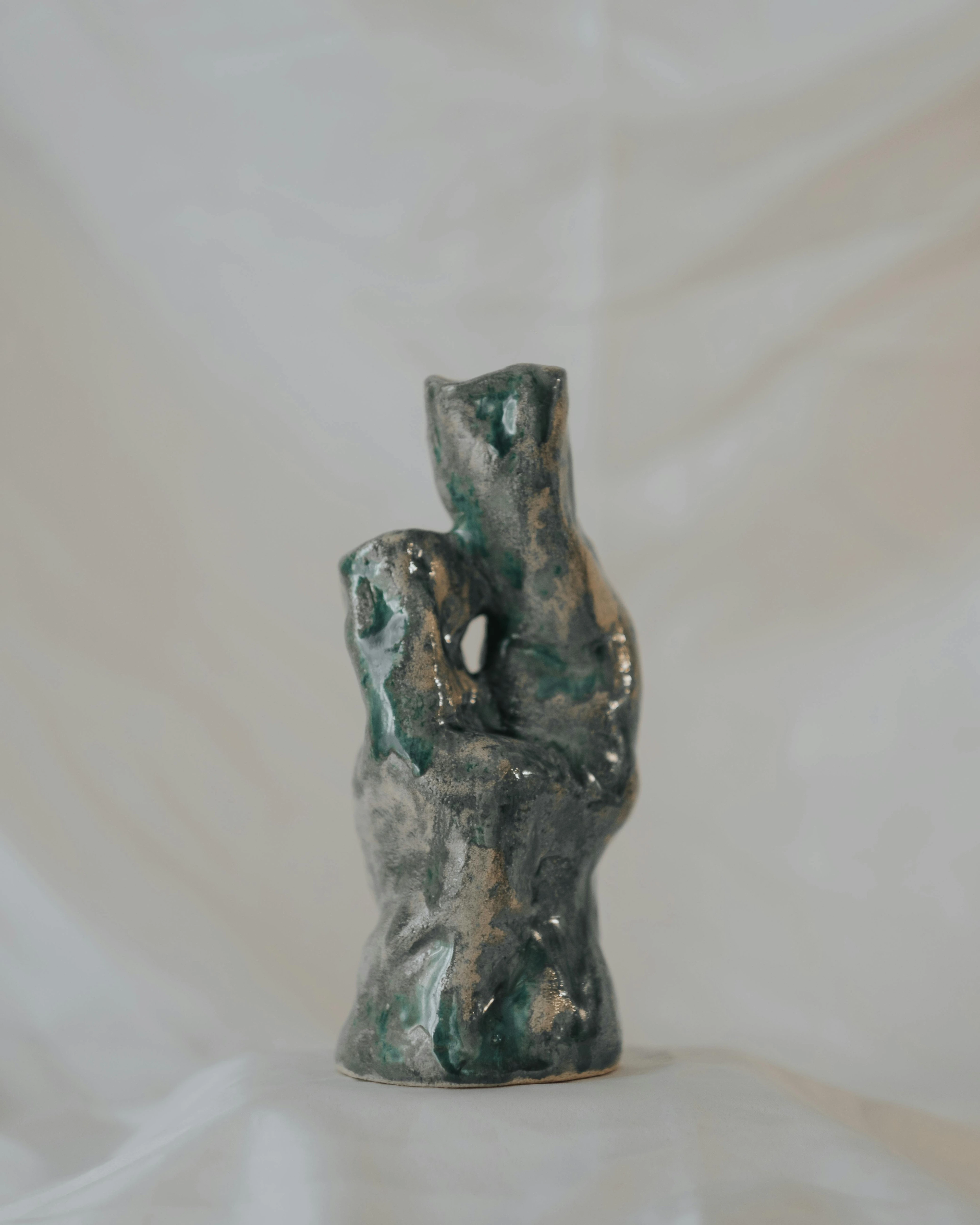
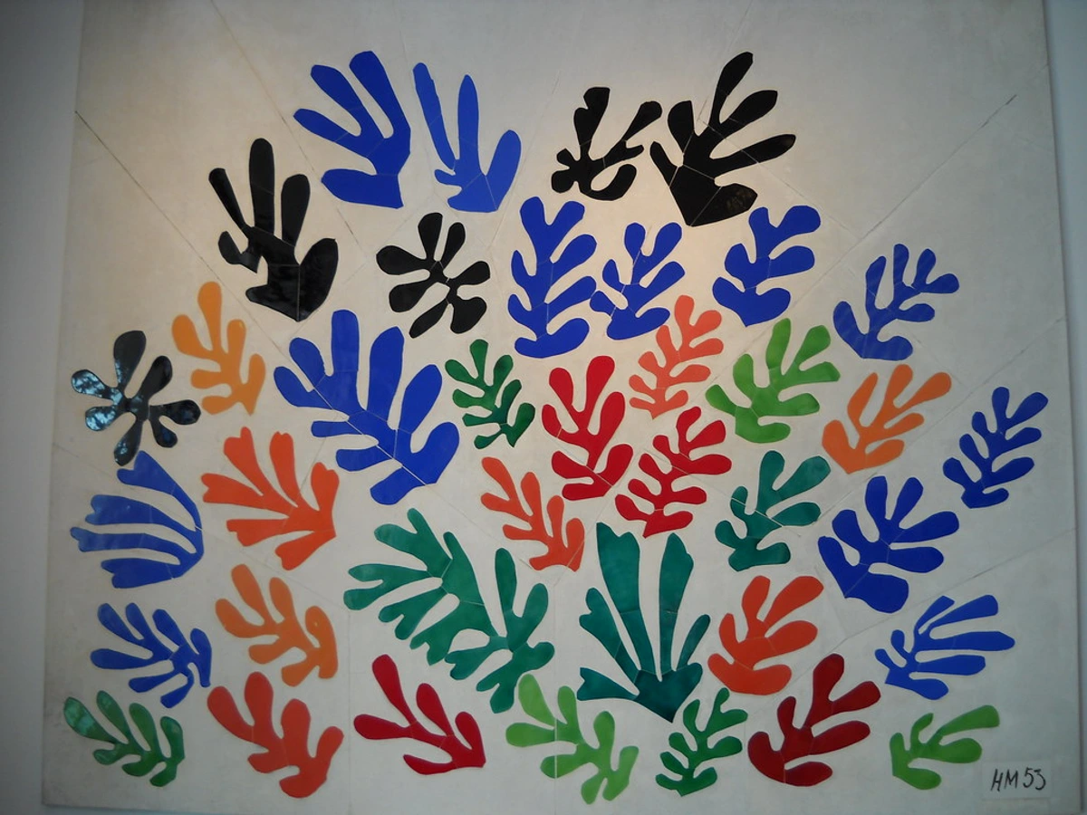
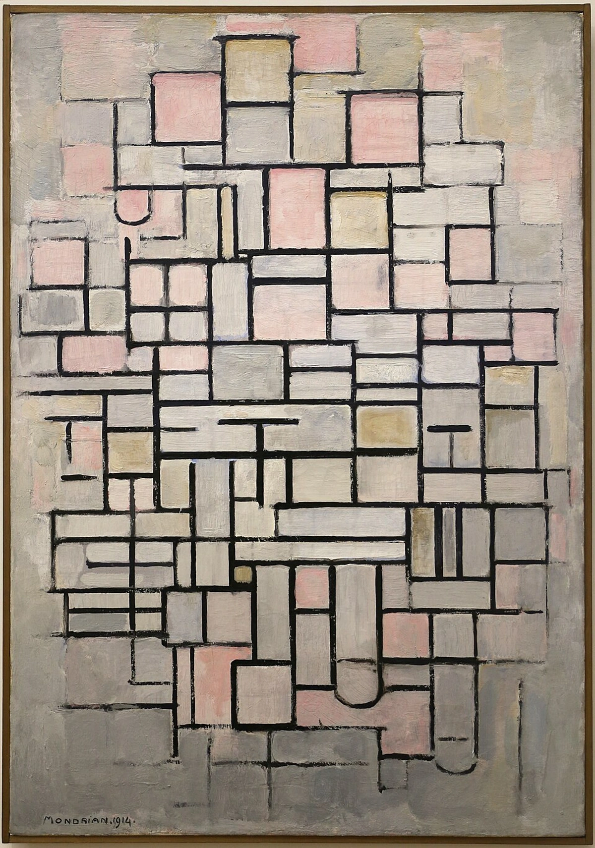
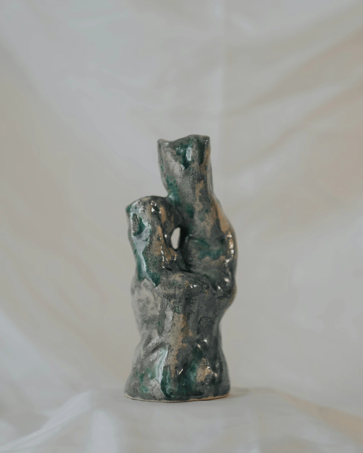
When I think of wabi-sabi in nursery art, I imagine pieces that celebrate natural materials – perhaps an unframed canvas with visible brushstrokes, a simple block print with slight irregularities, or even a ceramic piece (safely displayed, of course!) with an organic, hand-hewn feel. It’s about art that tells a story of its making, of gentle wear, and of a quiet, unassuming beauty, much like the changing seasons. These pieces offer depth and character that don't lose their charm as tastes evolve. I recall a friend of mine, an artist herself, who chose a simple abstract piece for her son's nursery – a canvas of soft blues and greens with a single, flowing red line. For months, it was just a comforting backdrop. But as he grew, that red line became a 'river' in his imaginative games, then a 'pathway to adventure' for his toy cars. It's truly amazing how a single piece of art can evolve in meaning as a child’s world expands. For example, I once saw a friend's toddler, convinced a Mondrian print was a game board, meticulously arranging toy cars along its black lines – a truly accidental, yet brilliant, piece of interactive art! It just goes to show how children infuse their own magic into whatever we offer them. Consider these versatile ideas:
Nature & Animals
Timeless and universally loved. Think serene landscapes, whimsical forests, celestial maps of stars and planets, charming botanical illustrations, or even abstract representations of seasons or weather phenomena. Why not explore specific sub-themes like enchanting "underwater worlds" filled with playful fish, or prehistoric "dinosaur adventures" that ignite curiosity? And why not explore patterns from the natural world at a microscopic level – the intricate beauty of a snowflake or the veins of a leaf – offering endless fascination? These themes subtly introduce concepts of biology and environmental awareness from day one.
Abstract Art & Fostering Creativity
Yes, really! Simple, colorful abstract pieces are fantastic for a nursery. They offer visual interest without being overly representational, which is precisely why they are so beneficial: this open-endedness encourages a child to project their own stories and interpretations onto the artwork, fostering creativity and imagination from a young age. A swirl of blue might become a winding river, a splash of yellow a cheerful sun, or layered shapes a fantastical castle. This process of assigning meaning is foundational to problem-solving and imaginative play, and can even subconsciously help with understanding spatial relationships and composition. They also age incredibly well and can easily transition to a toddler's room or even a pre-teen's space. For more on this, check out choosing abstract art for a nursery.
Geometric Shapes
Beyond abstracts, art focused purely on simple, bold geometric shapes – circles, squares, triangles – can be incredibly stimulating for developing eyes. Think minimalist designs or subtle patterns. These forms help babies understand spatial relationships, pattern recognition, and can even lay groundwork for early math concepts. Plus, they look incredibly chic and modern!
Maps & Globes
For the budding explorer! A beautiful world map, perhaps in muted tones or bright, cheerful colors, can be both decorative and educational as they grow, inspiring dreams of travel and discovery. This is a subtle way to spark geographical awareness and a sense of wanderlust.
Cultural Heritage & Diversity
Why not weave in elements that reflect your family's story and the broader world? This could be a print inspired by a traditional pattern from your family’s country of origin, a piece of art from an artist sharing your heritage, or even a beautifully framed textile art piece, like a patterned quilt or a woven wall hanging, connecting your child to their roots in a subtle, beautiful way. Imagine a world map peppered with images of your ancestors' homelands, or a series of prints celebrating global festivals – a subtle, yet profound way to broaden their horizons and foster inclusivity and understanding of different perspectives from day one. Seeing diverse faces or cultural motifs, such as intricate mandalas, vibrant African patterns, serene Indigenous dot paintings, or the tranquil nature-focused imagery of Japanese woodblock prints (Ukiyo-e) and the storytelling of Aboriginal dot paintings, can also gently introduce concepts of empathy.
Time & Routine
Consider art that subtly introduces concepts of time or routine. This could be a series of prints depicting the changing seasons, or abstract pieces that evoke different times of day (a warm, soft-hued piece for morning, a deep blue one for night). Such art can offer gentle anchors for daily rhythms and a child’s understanding of their world.
Personal Touches
Don’t underestimate the power of family photos, or even framing some of your child’s very first scribbles once they start creating. To make those early artworks shine, consider using a simple matting technique – a clean white or off-white mat can instantly elevate a scribble to a gallery-worthy piece by drawing the eye and providing a sophisticated border. For a different look, a colored mat (perhaps a soft pastel or a bright primary color, depending on the scribble's palette) can add an extra layer of visual pop. A dedicated "art wall" for their evolving masterpieces is also a wonderful idea. It’s art, it’s personal, and it’s priceless. These pieces don't just decorate; they become anchors for storytelling and memory-making, invaluable for early language development.
Interactive & Sensory Art
Think beyond just viewing. While safety is key, consider soft fabric wall hangings with different textures (velvet, felt, wool) that are securely attached and out of direct reach for chewing, but can be gently explored with hands. Look for fabric art with specific types of stitching (like embroidery or quilting) or raised patterns created with non-toxic fabric paint to add tactile interest. For natural elements, consider beautifully smoothed and sealed wooden blocks of varying textures, or securely attached, polished river stones that offer a cool, tactile surface for exploration. Ensure any natural elements are professionally sealed and smoothed to prevent splinters or rough surfaces. These provide a multi-sensory experience that engages curiosity and fine motor skills without posing a safety risk. Visually textured art, like a piece with raised brushstrokes, can also add depth and interest.
What kind of themes resonate most with the future you envision for your child, and how can art help tell that story?
Where to Hang It: Placement and Presentation for Optimal Discovery
Once we've carefully considered the 'what' — the themes and colors that will populate your baby's first gallery — let's shift our focus to the 'how.' Placement is key for impact and engagement, balancing safety with visual stimulation. From an artist’s perspective, I often think about composition within the room itself, treating the nursery as a larger canvas.
Think about where your baby will spend most of their time gazing. Above the changing table is a classic spot – it gives them something interesting to focus on during those unavoidable (and sometimes squirmy) moments. But don't forget the floor-level view! To truly understand their perspective, I often recommend getting down on your hands and knees yourself – it’s quite an eye-opener! You’ll quickly realize that artwork at adult eye level might be completely missed by a little one. For a floor-level view, think about placing a durable, unframed canvas piece or a fabric wall hanging securely leaned against a wall. Alternatively, position it on a low, child-safe shelf where it can be admired without being a hazard. You could even consider large, thick, securely placed floor puzzles that double as evolving art, or soft, low-profile sculptures crafted from child-safe materials, providing tactile interest without risk.
A gallery wall is a brilliant solution here, as it allows you to group various pieces at different heights, creating a dynamic visual that can be easily updated as your child grows. And speaking of growing, consider how the art will look not just from the crib, but when your child is standing and exploring. Placing a few pieces slightly lower, or incorporating a gallery wall that extends to different heights, means the art can engage them through different developmental stages, always offering something new to discover.
Another often-overlooked aspect is natural light. Think about how the morning sun splashes across the room – will it enhance or wash out a particular piece? Textured art, for instance, can truly come alive under changing light, while highly reflective surfaces might catch too much glare. Consider the direction of windows and how they might affect the artwork throughout the day – it’s a living, breathing part of the room’s ambiance. Also, don't forget the scale of the art. A tiny picture on a vast wall can feel lost, while an overly large piece can overwhelm a small nursery or feel disproportionate to the crib. Aim for pieces that feel balanced within their chosen space, creating visual harmony. And don't forget the view from outside the nursery. If the door is often open, the artwork visible from the hallway contributes to the overall ambiance of your home, creating a welcoming peek into your baby’s special world. Finally, consider the artwork's interaction with sound; soft, textured pieces can subtly absorb sound, contributing to a calmer acoustic environment, while hard, flat surfaces might reflect it. How do you envision the artwork interacting with your baby's daily discoveries and the changing light of their room?
My Personal Take: An Artist's Philosophy for Your Little One's Space
This section, in many ways, feels like the heart of it all for me, the culmination of my thoughts. Look, I'm an artist, so perhaps I'm biased, but I truly believe art doesn't have to be expensive or museum-worthy (though if you’re ever in 's-Hertogenbosch, do pop into my museum!). For a nursery, it's about finding pieces that resonate with you and that you believe will bring a quiet joy or gentle stimulation to your little one's space. My own artistic journey has taught me that authenticity is everything, and for a nursery, I find that the most compelling pieces are those that possess a certain 'wabi-sabi' – a concept I deeply resonate with. While some might aim for a perfectly pristine or minimalist nursery, wabi-sabi celebrates beautiful imperfection, a raw, unpolished elegance that mirrors the wonderfully unpredictable and honest nature of early childhood, finding beauty in the natural process, the transient, and the incomplete. You can read more about my philosophy on this in the power of imperfection in abstract art.
And thinking long-term, consider the longevity of the materials themselves. Opt for archival quality prints or canvases that resist fading, ensuring these cherished pieces can truly grow with your child, perhaps even becoming treasured heirlooms. Let's take, for instance, a piece like my "Morning Dew" print. Its soft, blended greens and blues, with subtle textural variations and deliberately imperfect, flowing forms, don't just create a pretty picture. They invite contemplation without imposing specific figures or rigid narratives, creating that soothing visual narrative we discussed earlier. It offers a gentle invitation for a baby's eyes to explore, fostering their own imaginative interpretations. Or consider a piece with a subtly textured surface, perhaps a mixed-media abstract that combines smooth painted areas with coarse natural fibers (securely encapsulated, of course!). As a baby grows, such a piece might invite a gentle touch, adding another layer to their sensory exploration, truly embodying that 'beautiful imperfection' and connection to the natural world. Remember, even if your child doesn't consciously grasp the artist's full intent behind a piece, that intention – the love and thought poured into its creation – adds an immeasurable layer of meaning for you, the parent, making it truly special.
The truth is, creating a nursery isn’t about achieving a perfectly coordinated, magazine-ready scheme. It’s about building a nest, a safe and inspiring haven that feels like a gentle hug, full of wonder and connection. It’s about the legacy you’re building, the first visual stories you’re telling. Don’t be afraid to mix and match, to include something quirky, something abstract, something deeply personal. And remember, beautiful art is available at various price points, so you don't need to break the bank to create a stunning space. What truly matters is the heart you pour into creating this first, magical world – a place where imagination can take flight and little dreams begin to unfurl.
FAQs: Quick Answers for Busy Parents
Here are a few quick thoughts on common questions I hear, because as a parent (or future parent!), every minute counts and sometimes you just need the gist:
Q: What colors are best for a baby's visual development? A: For newborns (0-3 months), high-contrast black and white patterns are fantastic – they’re often the first patterns a baby clearly discerns and really help their developing visual pathways. As their vision rapidly develops within the first few months, a broader range of colors becomes beneficial. Don't feel pressured to stick to a rigid developmental palette. Instead, focus on a thoughtful mix of gentle tones and occasional bright, highly saturated accents. Remember, a baby’s preference and tolerance for color will evolve rapidly, so flexibility and variety are important. The key isn't one "best" color, but rather a variety of visual stimuli that changes and adapts as your baby grows, offering both calm and crucial visual interest without overstimulation.
Q: How much art is too much for a nursery? A: There's no strict rule, but balance is key. A few thoughtfully chosen pieces are often more impactful than clutter. Think about creating focal points – perhaps one larger statement piece or a curated gallery wall – rather than covering every wall. Remember, babies take in their environment gradually, so a less-is-more approach can be more calming and allow each piece to be truly appreciated. It’s about quality over quantity, always.
Q: Where can I find affordable nursery art? A: You'd be surprised! I've found some of my most cherished pieces in unexpected places. Beyond established galleries, consider local art markets, online print shops, Etsy, or even framing high-quality prints from children's books. Don't forget the power of DIY – your own simple drawings or framed fabric swatches can be incredibly personal. And of course, exploring available art from independent artists like myself often yields unique, budget-friendly options that resonate on a deeper level.
Q: What about interactive or tactile art for a nursery? A: Ah, tactile art! It’s a wonderful idea to engage a baby’s developing senses beyond just sight. Think soft fabric wall hangings with different textures (velvet, felt, wool), or art made from natural, non-toxic wood elements. The key, however, is safety first: ensure all parts are securely fastened, won’t detach, and are made from baby-safe, non-choking hazard materials. Place them within gentle reach once your baby can safely interact, always supervising their exploration. Visually textured art with raised patterns, created safely with fabric paint or stitching, can also provide this sensory exploration.
Q: How long will my nursery art remain relevant as my child grows? A: This is precisely why choosing "themes that grow" (as we discussed earlier) is so important! While specific cartoon characters might have a short lifespan, themes like abstract art, nature scenes, maps, cultural motifs, or personalized pieces can easily transition from a nursery to a toddler's room, and even into a child's bedroom or play space for many years. The key is selecting pieces that offer open-ended beauty, inspire imagination, hold sentimental value, or even spark conversation about emotions or abstract concepts as your child’s understanding of the world expands. They’ll find new meanings in old pieces.
Q: Can art help foster a child's emotional intelligence or empathy? A: Absolutely. While babies won't consciously analyze complex emotions, art with gentle, soothing colors and flowing forms can create a calming environment that supports emotional regulation. As children grow, art depicting diverse faces, or scenes that evoke a sense of connection or wonder, or even relatable characters and situations (even in abstract forms) can subtly introduce concepts of emotion and shared experience, fostering empathy and understanding. Moreover, by giving children the space to interpret art, you’re encouraging them to articulate their own feelings and ideas, which is a crucial step in developing emotional literacy. It’s about creating a rich visual landscape for their emotional world to develop within.
Q: How can I integrate art into a calming routine, like bedtime stories? A: This is a beautiful idea! Choose a piece of art near the crib or reading nook that has interesting (but not overly stimulating) details. During bedtime stories, you can gently point to elements in the art – perhaps a swirling cloud, a sleeping animal, or a soft blend of colors – and weave them into your narrative. This creates a focused, calming interaction, helping to establish a peaceful routine and encouraging visual literacy in a gentle, comforting way.
Q: Can art help my child understand different cultures or perspectives? A: Definitely! By choosing pieces that reflect diverse cultural motifs, patterns, or art styles, you subtly introduce your child to the rich tapestry of global heritage from an early age. This exposure can spark curiosity and a broader understanding of the world, fostering an open mind and appreciation for different perspectives long before they can travel the globe themselves. It's a beautiful way to broaden their horizons right from their own room.
Your Little One's First Gallery: A Lasting Narrative
In the end, choosing art for a nursery is more than just interior design; it's an act of profound love, an opportunity to craft the very first visual narrative for your child. It’s about creating a space that feels personal, safe, and inspiring – a true visual lullaby and their first impression of the world, a place where memories will be made and imagination will begin to take flight. By carefully considering safety, developmental benefits, colors, themes that grow, and mindful placement, you’re not just decorating a room; you’re nurturing a budding mind and weaving a story that will unfold for years to come. So, go ahead, embrace the journey, trust your artistic instincts (and a little bit of science!), and create a truly unique and magical space. What beautiful chapter will you help them discover first, in this, their very own curated world?


