Mastering Art Lighting: The Ultimate Guide to Making Your Art Truly Shine!
Unlock your art's full potential with the ultimate guide to art lighting. Discover LED vs. halogen, perfect color temperature, accentuating texture, protecting from UV, and smart lighting solutions for a transformative display.
Mastering Art Lighting: The Ultimate Guide to Making Your Art Truly Shine!
Your Art Deserves a Spotlight, and I'll Show You How.
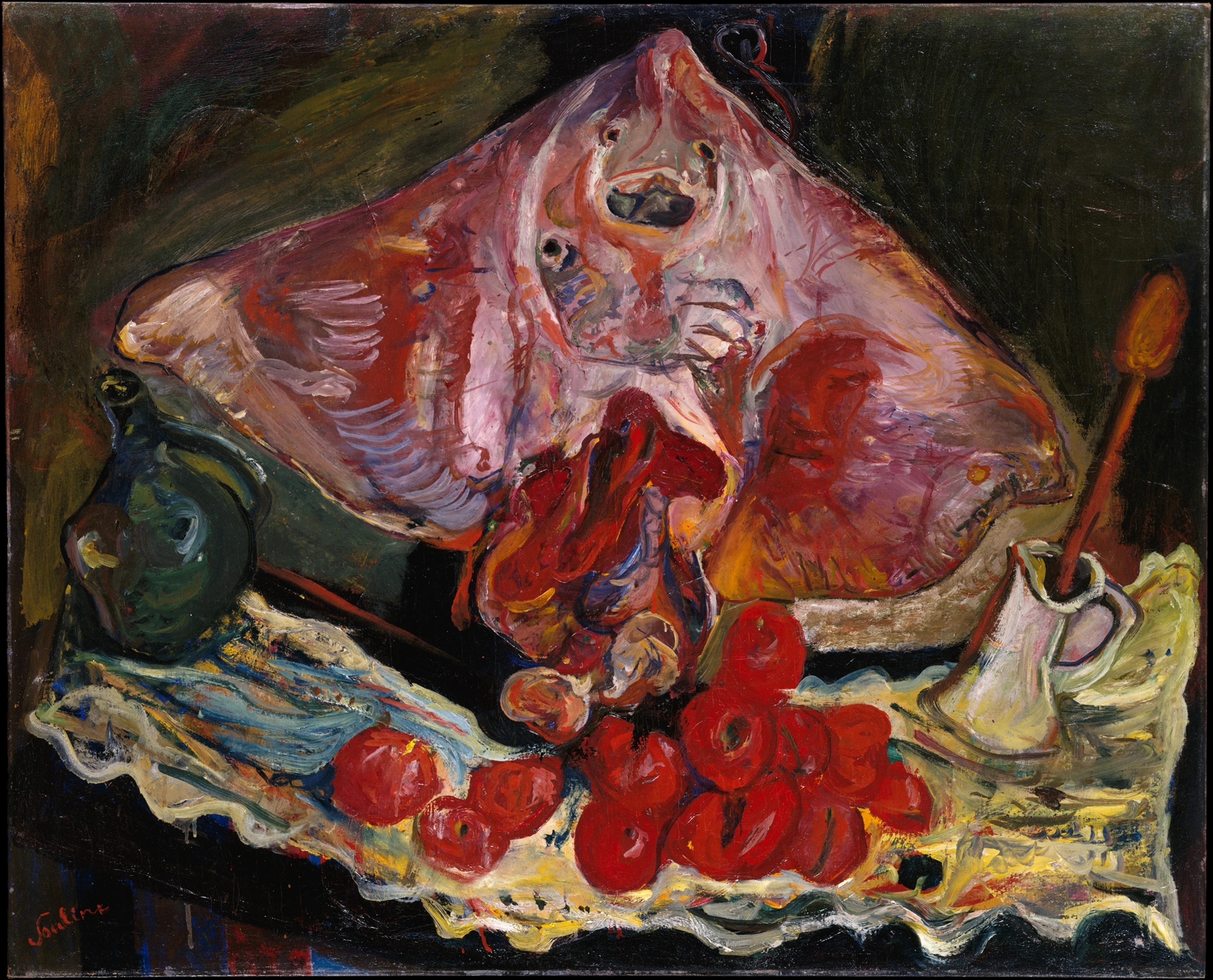
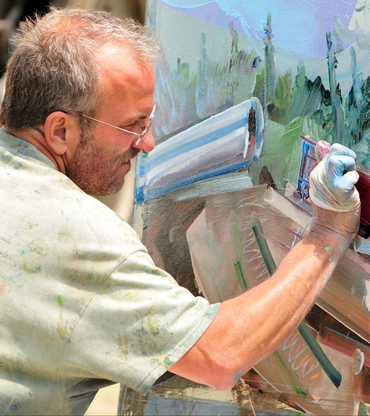
Okay, let’s be honest. For years, I just hung my art on the wall and hoped for the best. I figured "light is light," right? Oh, how profoundly wrong I was. It took me a while, and a fair few dull-looking canvases, to truly grasp that lighting isn't just about mere visibility; it's about transformation. It's about bringing a piece to life, revealing its hidden depths, and ensuring it truly sings in your space. Honestly, it's one of those things that, once you get it right, makes you wonder how you ever lived without it. It's the difference between merely seeing a painting and truly experiencing it. I vividly recall finishing a particularly vibrant abstract piece, full of deep blues and fiery reds, only to see it fall flat in my living room under generic overhead lighting. The textures disappeared, the colors muted. It was disheartening.
But then, after some experimentation (and a few more late-night research rabbit holes), I finally hit the sweet spot with a focused LED spotlight, perhaps around 2800K with a CRI of 90+. Suddenly, the blues deepened, the reds glowed, and the subtle impasto I'd worked so hard on popped with three-dimensional drama. It felt like the art had finally exhaled and shown its true self. That's the undeniable power of good lighting – it's art's best friend. I've even found that for some of my newer pieces, like the ones you'll find at Zen Museum, the lighting is almost as important as the frame itself, adding another dimension to the visual story.
Why Lighting Your Art is a Game-Changer (It's Not Just About Seeing, It's About Feeling)
Think of your favorite song. Now imagine listening to it on a tiny, tinny speaker. You still hear the notes, but you miss the richness, the bass, the nuances. Art is no different. Without proper lighting, your beautiful pieces, whether they're vibrant abstracts like mine or a serene landscape, are performing in the dark. They might be chosen with such care, maybe even after consulting guides like how to choose art for a room with low light or choosing art for your living room, but their impact diminishes if they're not seen properly. What's the point of investing in a piece that moves you, only for it to fall flat on your wall, a silent whisper when it should be a roar?
Good art lighting isn't just about illuminating; it's about accentuating texture, making colors pop, creating a focal point, and setting the mood. It allows the art to tell its story with clarity and drama. It’s an act of respect for the artwork, and frankly, it elevates your entire room. I often think of it as giving your artwork its own spotlight, making it the star it deserves to be. It's also part of a larger strategy – a thoughtful home often uses layers of light to create depth and interest, and art lighting is a crucial accent layer in that design, complementing ambient and task lighting to create a cohesive, inviting space.
A Quick Historical Detour: How Lighting Evolved for Art (From Caves to LEDs)
While modern LEDs feel revolutionary, the quest to properly illuminate art is as old as art itself. Imagine Renaissance masters like Caravaggio, whose dramatic chiaroscuro technique (a stark contrast between light and dark) was deeply intertwined with the very limited, single-source light available. He'd use powerful, concentrated light to highlight figures against dark backgrounds, creating an intense, theatrical drama that made his subjects leap out of the canvas. Or think of Vermeer's masterful rendering of natural light streaming through windows, meticulously capturing its soft, diffused quality to evoke a sense of serene realism and intimate domesticity. He understood how light defined form and created atmosphere, often using a single window as his primary light source.
Early galleries, of course, relied on skylights or candles, risking both visibility and damage from heat and soot. The advent of early electric light (Edison's bulb, then incandescent) brought new possibilities, but also new challenges like excessive heat and harmful UV. The journey from those early, inefficient bulbs to today's sophisticated LEDs is a story of continuous innovation, driven by the desire to showcase art faithfully and protect it for generations. This historical perspective, for me, just underscores how incredibly lucky we are today to have such precise, art-friendly tools at our disposal.
The Core Elements: What You Need to Know About Art Lighting (The Nitty-Gritty, Simplified)
Alright, let's get into the nitty-gritty. This isn't just about screwing in a light bulb; it's about choosing the right light bulb and the right fixture, and understanding how they interact. It's a combination that, once understood, feels less like a chore and more like unlocking a secret level in home design. Don't let the acronyms intimidate you; I used to think CRI stood for 'Can't Really Imagine'! But once you grasp these basics, you'll see a profound difference.

CRI (Color Rendering Index): The Unsung Hero of True Color (And Why It's Non-Negotiable)
Here’s a confession: early in my art journey, I completely ignored CRI. Big mistake. The Color Rendering Index (CRI) measures how accurately a light source reveals the true colors of an object compared to natural light. Think of it as the honesty of light. A low CRI (say, 70-80) can make colors look dull, washed out, or even distorted. Imagine painting a vibrant piece, painstakingly mixing pigments to achieve that perfect emerald green or fiery orange, only for it to look flat and lifeless under poor lighting! For us artists, a low CRI is particularly frustrating as it completely misrepresents our intent. I once unknowingly used a low CRI bulb on a new series of subtle gradient abstracts, and they looked like completely different (and much less interesting) pieces than I intended. It was a stark lesson in authenticity.
For artwork, you absolutely want a high CRI – ideally 90 or above. This ensures that the reds are truly red, the blues genuinely blue, and all the subtle variations and nuances in your art are faithfully represented. Don't skimp on this; it's the difference between your art looking "okay" and looking "breathtaking." It’s about respecting the artist’s palette and making sure their vision translates accurately to your wall. It's the silent guardian of authenticity. Furthermore, a high CRI is crucial for art preservation because it allows for visual assessment of subtle changes or degradation of pigments over time, something a low CRI light might mask. Without it, you might not even notice your cherished watercolor's delicate hues fading until it's too late.

Color Temperature: Setting the Mood and Revealing True Hues (The Emotional Palette of Light)
Color temperature, measured in Kelvin (K), dictates whether your light feels warm or cool. This is a huge factor in how your art is perceived, and indeed, how the whole room feels. It can evoke nostalgia, soothe, or energize, directly influencing the emotional response to your artwork and the overall ambiance. Getting this wrong can make a vibrant piece look sickly, or a calming piece feel sterile. I've seen it happen, and it's heartbreaking. Choosing the right color temperature is like selecting the perfect filter for a photograph – it shifts the entire mood.
Kelvin (K) Range | Appearance | Feeling/Effect | Visual Effect on Art | Best Suited For |
|---|---|---|---|---|
| 2000K – 2700K | Very warm white (like candlelight) | Intimate, cozy, nostalgic, traditional. Can make colors appear richer and deeper, sometimes slightly yellowed. | Emphasizes reds, oranges, and earthy tones; can make cool colors recede or appear muted. Ideal for warm-toned portraits or traditional still life paintings. | Bedrooms (how to choose art for a small bedroom), dining rooms (how to choose art for a dining room), traditional interiors, evoking warmth. |
| 2700K – 3000K | Soft white / Warm white | Relaxed, inviting, comfortable. Most common for residential lighting. Reveals colors accurately without being harsh. | Balances all colors well, making them appear true-to-life; enhances vibrancy without distortion. Excellent for most contemporary art and abstract pieces. | Living rooms, general home lighting, contemporary spaces, works well with most art styles. |
| 3000K – 3500K | Bright white / Neutral white | Clean, crisp, neutral. Good for task lighting, modern aesthetics. Can make blues and greens more vibrant. | Highlights blues, greens, and whites; can make warmer colors feel slightly cooler or less intense. Great for crisp line art or photography with cool tones. | Kitchens (how to choose art for a kitchen), bathrooms (how to choose art for a bathroom), home offices (decorating with art in a home office-boosting-creativity-and-focus), modern art. |
| 3500K – 4000K+ | Cool white / Daylight | Energizing, vibrant, clinical. Less common for residential art lighting, as it can feel too stark. | Can wash out subtle warm tones; makes cool colors exceptionally vibrant, almost starkly so. Can be effective for very specific, stark abstract pieces. | Commercial spaces, hospitals, task-intensive areas. Only for art if you're going for a very specific, stark, or gallery-like effect. |
I generally gravitate towards the 2700K-3000K range for most homes. It's that sweet spot that makes everything look inviting without skewing the art's true colors too much. For an abstract piece heavy in cool tones, I might nudge towards 3000K to make those blues and greens truly sing, but I'd never go so cool as to make the space feel sterile. The emotional resonance is key for me. Think about a moody landscape; you wouldn't want it bathed in harsh, cool light. It would just kill the atmosphere! And remember, the color of your walls can play a role too; lighter walls reflect more light, subtly influencing the perceived color temperature of the entire space.
Bulb Choices: LED vs. Halogen – The Clear Winner (No Contest, Really)
This is where the rubber meets the road, or rather, where the light meets the canvas. For art, the bulb choice is paramount, and thankfully, modern advancements have made the decision much easier. Historically, we've moved from Edison bulbs to incandescents, then to halogens, each offering improvements. But for art, LEDs have truly revolutionized things. For me, there's absolutely no contest; LEDs are the indisputable champion for art lighting.
Feature | LED (Light Emitting Diode) | Halogen |
|---|---|---|
| Energy Usage | Very low, highly efficient. Saves you money in the long run. | High, consumes significantly more energy. Your electricity bill will notice. |
| Lifespan | Extremely long (25,000 – 50,000+ hours). You’ll rarely replace them, making them ideal for hard-to-reach fixtures. | Shorter (1,000 – 2,000 hours). More frequent replacements, increasing maintenance. |
| Heat Output | Very low. Crucial for art preservation, preventing warping, cracking, or pigment degradation. | High. Can contribute to heat damage on artwork over time, accelerating material degradation and even posing fire risks in some cases. |
| UV Emission | Minimal to none. Excellent for protecting pigments and materials from fading – a silent killer for art. | Significant. A big no-no for valuable or delicate art without special filtering, which often reduces light output. |
| Color Quality | Excellent (with high CRI). Modern LEDs can be engineered for specific color temperatures and offer superb color rendering, often rivaling or surpassing halogens without their drawbacks. | Excellent, often considered the gold standard for crisp, natural light, but at the cost of heat and UV. |
| Cost | Higher initial cost, but savings on energy and replacement make them cheaper over the bulb's lifetime. | Lower initial cost, but higher running costs and frequent replacements quickly make them more expensive in the long term. |
| Beam Angle | Highly customizable. Available in very narrow spot to wide flood, often adjustable with optics or smart features. | Typically narrower, more focused beams, less versatile without additional accessories. |
| My Verdict | LEDs all the way for art lighting. The benefits for art preservation alone make them indispensable. They are the future and present of responsible art display. | Best avoided for direct art lighting. If you must use them, ensure proper UV filtering and ventilation, but I'd genuinely steer clear. Their heat and UV emissions are simply too damaging. |
Types of Fixtures: Your Artistic Arsenal (Every Piece Deserves the Right Frame of Light)
Different lights serve different purposes, almost like different brushes in a painter's kit. Choosing the right tool for the job makes all the difference.
- Adjustable Track Lighting: The Gallery's Darling: My personal favorite for sheer versatility. You can mount a track to the ceiling (consider a 3-circuit track for even more control over different zones) and then attach multiple adjustable spotlights or wall washers. This means you can easily change focus as your art collection evolves – which, let's be honest, it always does! It’s perfect for spaces where you love to rearrange things or have a growing collection, providing a kind of modular art gallery feel. I find it perfect for illuminating a varied gallery wall or a dynamic series of abstract pieces. Look for heads with adjustable beam angles (from narrow spot for focused drama to wide flood for softer coverage) to fine-tune your focus. For higher ceilings, longer track stems or higher-lumen fixtures might be necessary to ensure enough light reaches the artwork at the correct angle.
- Spotlights: Precision Beams for Impact: These are your sharp shooters. They throw a focused beam directly onto a single piece, creating high drama and making it the undisputed star of the show. Perfect for a statement piece or a prized sculpture, giving it a theatrical presence. You want to highlight that one abstract that just speaks to you? A spotlight is your answer. Just be mindful of "hot spots" – overly bright, washed-out areas that can occur if the beam is too narrow or too close – which can be avoided by using a slightly wider beam angle or a diffusion filter on the lens.
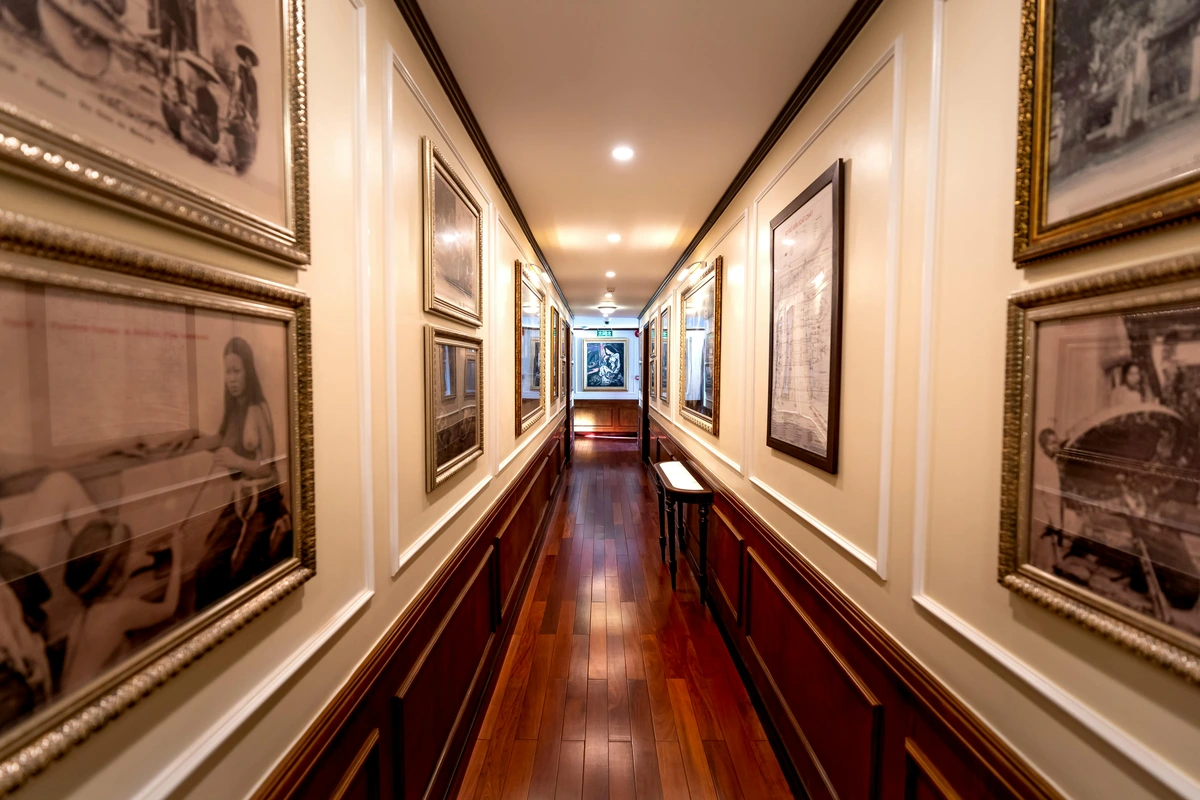
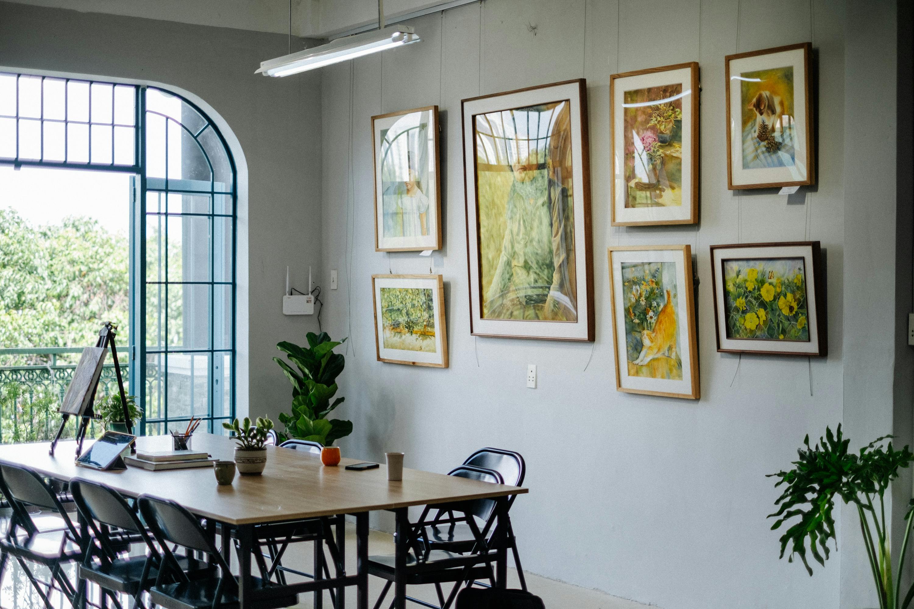
- Wall Washers: Uniform Illumination for Collections: If you have a gallery wall or a large expanse of art you want to evenly illuminate, a wall washer is your best friend. It provides a broad, even spread of light, making sure every piece gets its fair share of attention without creating harsh shadows. It’s about creating a sophisticated, integrated glow, perfect for a collection in your living room. Wall washers come in linear (great for long walls) or flood styles (for broader areas), and usually need to be positioned about 2-3 feet from the wall to achieve a uniform wash. For a truly museum-like effect, you'll want to ensure minimal light spill – preventing light from bleeding onto surrounding walls or ceiling, which can distract from the art itself.
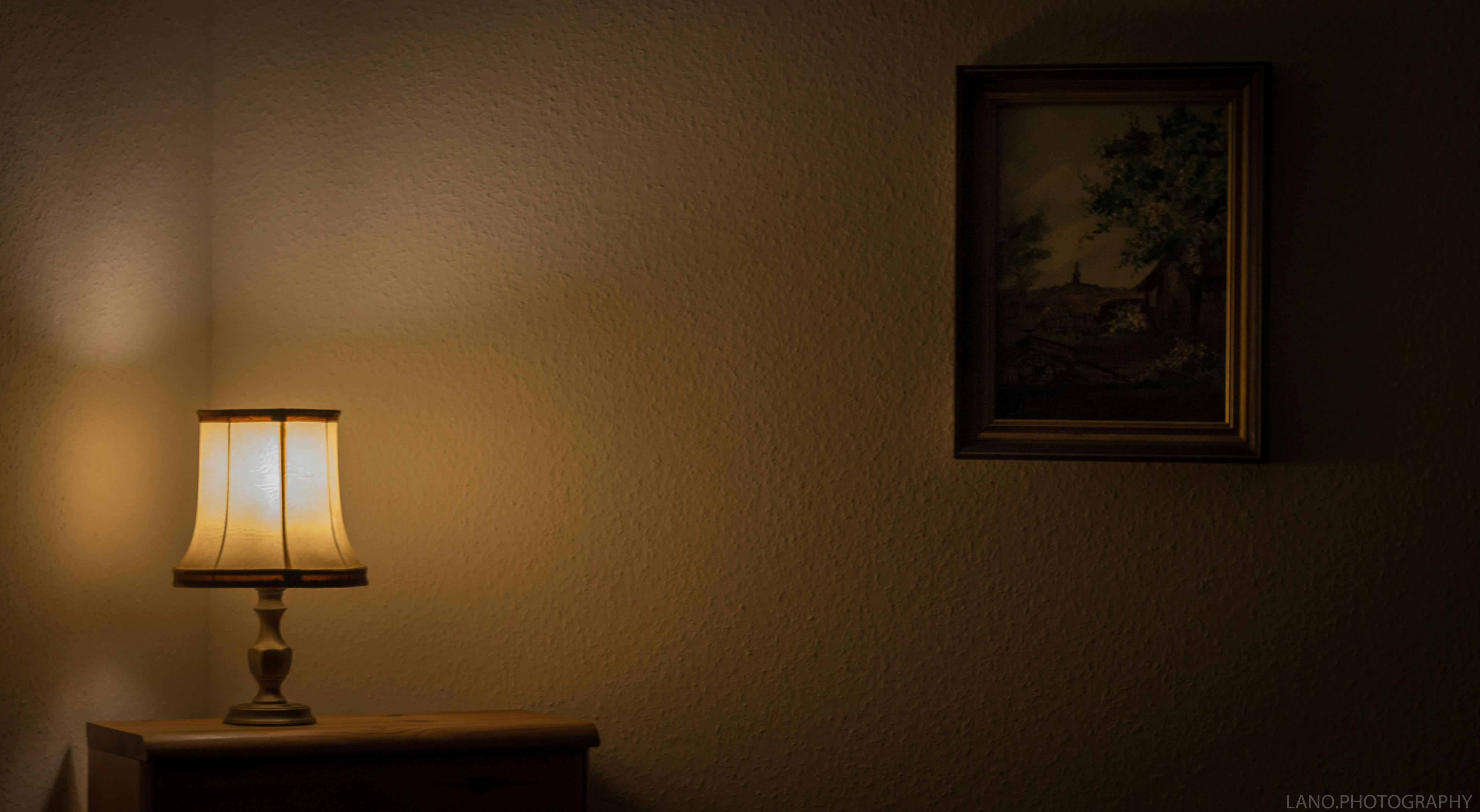
- Picture Lights: The Timeless Accent: The classic choice. These are typically mounted directly above the frame and shine down onto the artwork. They’re elegant and effective, but you need to be mindful of glare, especially with glossy finishes – I’ve had my own battles with shiny frames! Their fixed position can be a bit restrictive if you want to re-hang art, which I do often! (It's an artist's prerogative, right?). If you go this route, always opt for LED picture lights to minimize heat and UV exposure. Look for models with adjustable heads to fine-tune the angle and reduce reflections.
- Integrated Lighting: Sleek and Subtle: Sometimes, lighting is built directly into shelves, display cases, or custom architectural features. This is wonderfully subtle and creates a seamless look. Imagine your art on a bespoke shelf with tiny, almost invisible LED strips illuminating it from above. Pure elegance! While I focus on the canvas, not the construction, I certainly appreciate when someone considers this level of detail in their art display. This is a dream for modern, minimalist spaces or for delicate pieces in a home office display. Integrated lighting can be directional (like small recessed puck lights) or diffuse (like LED strips), each offering different effects. Retrofitting can be challenging, so it's often best planned during initial construction or renovation.
Light Measurement Tools: Going Pro (For the Truly Dedicated)
For those who want to take their art lighting from excellent to professional, consider exploring light measurement tools. A lux meter can measure the intensity of light falling on your artwork, ensuring it's not too bright (which can cause fading) or too dim. Museums, for example, often aim for specific lux levels (e.g., 50-150 lux for sensitive materials like watercolors and textiles, or up to 300 lux for less sensitive oil paintings). A color temperature meter (or a more advanced spectrometer) can help you verify the actual Kelvin output and even the CRI of your light sources, ensuring absolute color fidelity. These tools are common in museums and galleries, and while not strictly necessary for home use, they offer an unparalleled level of precision for the truly dedicated art collector.
Practical Lighting Techniques: Making Your Art Truly Shine (The Art of the Light)
Now that we understand the tools, let's talk about how to use them. It’s not just about what light you use, but how you direct and control it. This is where the magic really happens. This is where you become a conductor, orchestrating light to reveal the true soul of your art.
General Principles I Live By (My Golden Rules)
- The 30-Degree Rule: The Gentle Hug of Light: This is a good starting point for spotlights and wall washers. Position the light so its beam hits the center of the artwork at an angle of approximately 30 degrees from above. This is crucial because it minimizes direct glare bouncing back to the viewer and reduces harsh, distracting shadows. It’s like giving the art a gentle hug of light, not a blinding glare! Sometimes I cheat this a little, depending on the texture of the art (sculptural pieces might need a steeper angle to enhance shadows!), but it's a solid rule of thumb for flat artwork. This angle also works wonders for preventing unwanted light spill onto the ceiling or wall above the frame.
- Distance Matters (The Goldilocks Principle): The further the light source, the wider the spread. The closer, the more intense and focused. Experiment! You want to illuminate the entire artwork, not just a patch. A common mistake I see is a tiny bright spot (a "hot spot") in the middle of a large painting, leaving the edges in shadow – it makes the art look like it's hiding something! Aim for even coverage, where the light gracefully embraces the whole piece. Remember that for higher ceilings, you'll need fixtures with stronger lumen output or longer stems to maintain effective illumination distance.
- Intensity Control: Dimmers are Your Secret Weapon: Always use dimmers. Art looks different at different times of day, under different moods. Being able to adjust the brightness allows your art to adapt and always look its best. I love how a subtle dimming can make an abstract piece feel more contemplative in the evening, softening its edges and inviting closer inspection. They allow for incredible versatility, letting you shift from a vibrant daytime display to a cozy evening mood with a flick. It's about finding that perfect intensity – not screaming for attention, not whispering into oblivion, but rather a confident presence.
- Considering the Frame and Matting: It's not just the art that needs lighting; its immediate surroundings matter too. The frame and matting can influence how light interacts with the artwork, sometimes creating unwanted shadows or reflections. Ensure your lighting accounts for these elements, illuminating the entire presentation, not just the canvas within. A well-lit frame frames the experience, not just the art.
- Navigating Reflective & Glossy Surfaces (The Glare War): Oh, the bane of many a glossy photograph or oil painting! Lighting highly reflective artworks requires a delicate touch. You might need to adjust the 30-degree rule to an even shallower angle (say, 15-20 degrees) to bounce light away from the viewer. Using a broader, more diffuse light source (like a wall washer or a spotlight with a diffusion filter) instead of a harsh, narrow spotlight can also drastically reduce glare. Sometimes, anti-glare museum glass on framed pieces is the ultimate solution, but smart lighting placement can often solve most issues. Nothing ruins the viewing experience faster than a bright reflection staring back at you, obscuring the art itself.
- Room Color and Reflectivity: Don't forget the impact of your room's wall color. Lighter walls, especially white or off-white, will reflect more light, potentially making your art appear brighter or affecting the perceived color temperature. Darker walls, conversely, absorb more light, which means you might need slightly more powerful fixtures or closer placement to achieve the desired illumination. It's all about how the light interacts with its entire environment.
Lighting Different Mediums and Styles (Tailoring the Light to the Art's Personality)
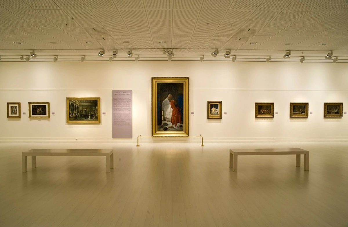
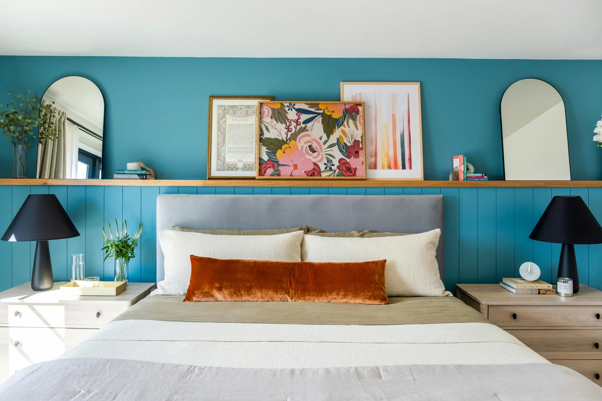
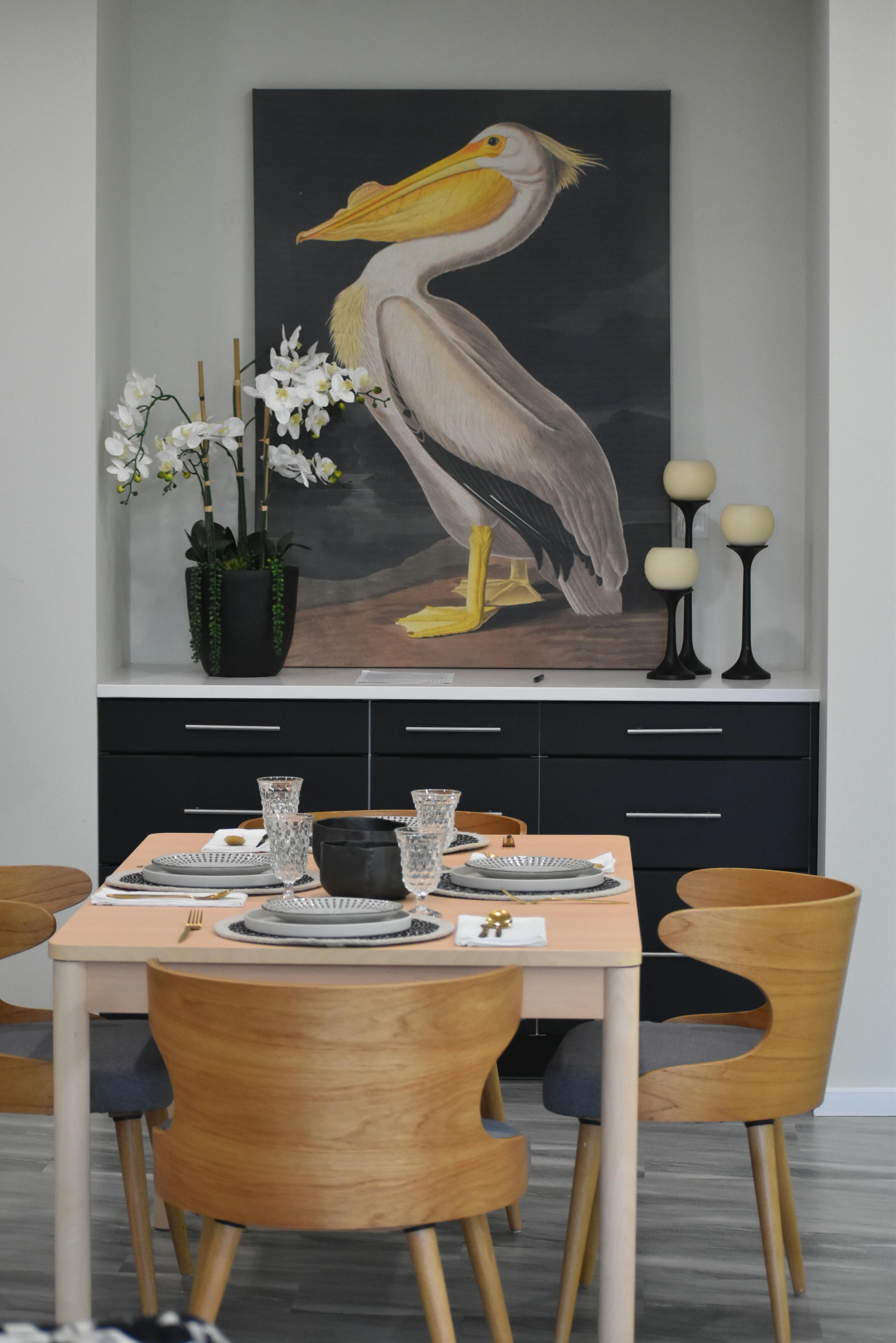
Different artworks demand different lighting conversations. Think of it as tailoring the light to the art's personality. As you can see in the image below, a well-lit dining room can host a variety of art pieces that each demand their own consideration.

- Oil Paintings & Textured Abstracts (like my impasto pieces): These thrive on directional light that plays with their dimensionality. A technique called raking light – where light hits the surface at a very shallow angle (sometimes less than 30 degrees, even 10-20 degrees from the side) – can dramatically highlight brushstrokes, impasto, or the weave of the canvas, making the artwork almost tactile. Raking light works by casting micro-shadows that define every ridge and valley of the texture. For my own abstract pieces with their rich textures, this is often my go-to. It makes the peaks and valleys of the paint sing, almost inviting you to touch them. A slightly warmer color temperature (2700K-3000K) can enhance the richness of oil pigments, while a high CRI ensures their vibrancy.
- Watercolors & Photography: These tend to have flatter, more even surfaces. The primary concern here is even illumination without "hot spots" or harsh reflections that can obscure detail, and, crucially, minimal UV exposure to prevent fading. A softer, more diffuse light or wall washing often works beautifully, ensuring clarity without creating distracting glare on glossy photographic prints or making watercolor paper appear uneven. High CRI is especially vital here to ensure subtle color gradations are preserved, as delicate watercolor washes can easily be distorted by poor lighting. Aim for lux levels on the lower side (e.g., 50-100 lux) for sensitive watercolors to minimize cumulative light damage.
- Textile Art & Tapestries: The texture of these pieces is paramount. Lighting from multiple angles, or again, using a subtle raking light, can bring out the intricate weaves and fibers. The direction of the light will greatly impact how the depth of the weave is perceived. Warm color temperatures can enhance the cozy feel of natural fibers. Imagine a rich tapestry; you want the light to bring out every thread and highlight the artistry of its construction. For delicate textiles, minimizing lux levels and ensuring no UV light is paramount to prevent degradation and fading of dyes.
- Monochromatic or Subtle Color Shifts: For artworks that rely on nuanced tones or delicate gradients, a high CRI is non-negotiable. Neutral to slightly warm color temperatures (2700-3000K) with excellent color rendering will best reveal their understated beauty, ensuring no subtle hue is lost. To achieve a perfectly even, shadow-free illumination that truly highlights these delicate transitions, consider a light source with a very narrow beam angle and excellent diffusion. Think of a charcoal drawing or a minimalist abstract; the light needs to reveal every delicate shade and line without interruption. You'll also want to watch for directional bias in your light source, ensuring the light falls evenly across the delicate tonal range.
Spotlighting: The Star Treatment (Making a Statement)
For a single, impactful piece, a spotlight is unbeatable. Aim it carefully to avoid hot spots (overly bright areas) and ensure the beam covers the entire canvas. If it’s a highly textured piece, angling the light slightly from the side can create dramatic shadows that emphasize its three-dimensionality – this is where raking light truly shines. It’s like giving your art its own personal stage, drawing the viewer's eye exactly where you want it. This works wonderfully for a singular art for entryway piece.

Wall Washing: The Gallery Effect (For Collections and Cohesion)
If you have a collection of works, maybe a salon-style hang or a series of pieces that work together, wall washing creates a sophisticated, even glow. The idea is to illuminate the entire wall uniformly, making the art feel integrated into the architecture. It's a fantastic way to highlight a gallery wall or a large living room wall. For an even, museum-like effect, multiple wall washers or track lighting with wall wash attachments are perfect. It gives a seamless, elegant backdrop, perfect for connecting several pieces in a long hallway. Remember to position wall washers far enough from the wall (typically 2-3 feet) to achieve a uniform light distribution and minimize focused brightness at the top.
Lighting Sculptures and Three-Dimensional Art (Sculpting with Light and Shadow)
Lighting three-dimensional art is a different beast entirely from flat artworks. Here, it’s not just about illumination but about how light and shadow sculpt the form, revealing contours, textures, and the very essence of the piece. You're using light as another artistic medium. For instance:
- Frontal Lighting: Good for revealing overall detail, but can flatten the form. Use with a diffuse source.
- Side Lighting: Emphasizes form, depth, and creates dramatic shadows that define the contours, revealing subtle textures. This is often called "sculptural lighting," making the piece almost come alive.
- Top Lighting: Can create dramatic effects, highlighting vertical elements and casting deep shadows below. Great for abstract or figurative pieces where drama is desired.
Multiple light sources from different angles can create dynamic shadows that shift with the viewer's position, adding another layer of engagement. Sometimes, a single strong light source can create dramatic, elongated shadows that become part of the artwork itself, emphasizing its presence in the room. This is where you can truly get creative, using light to define the form, not just show it.

Integrated Lighting: Sleek, Subtle, and Smart (The Future is Now)
Sometimes, lighting is built directly into shelves, display cases, or custom architectural features. This is wonderfully subtle and creates a seamless look. Imagine your art on a bespoke shelf with tiny, almost invisible LED strips illuminating it from above. Pure elegance! While I focus on the canvas, not the construction, I certainly appreciate when someone considers this level of detail in their art display. Integrated lighting can be directional, with small recessed puck lights, or diffuse, using hidden LED strips to cast a soft glow. While challenging to retrofit, it's often the ideal solution for new builds or renovations like a home renovation.
Beyond aesthetics, modern integrated lighting often comes with smart home capabilities. This means you can control your art lighting with an app, voice commands, or integrate it into automated scenes. Imagine saying, "Goodnight, Google," and your art lights dim to a soft glow, then turn off, all in sync with your other home lighting. You could schedule specific lighting sequences for different times of day to match ambient conditions or even integrate with home security systems to illuminate art when you're away.
And what about digital art and screen-based installations? Though the longevity and display rights of formats like NFTs are still subjects of much debate and skepticism in the traditional art world, for digital artworks displayed on screens, integrated lighting within a specialized frame or display case becomes even more critical for a polished presentation. This eliminates external glare and showcases the digital medium itself with sophisticated color calibration and brightness control, crucial for maintaining the artist's original intent.
Protecting Your Precious Pieces: The UV and Environmental Factors (The Invisible Threats)
This is a big one, especially if you have original artworks or cherished prints. Sunlight, and some artificial lights (I'm looking at you, halogens!), emit UV (Ultraviolet) light. UV light is the nemesis of art. It causes pigments to fade, paper to yellow and become brittle, fabrics to weaken, and overall materials to degrade over time. It's a slow, insidious process, but once the damage is done, it's irreversible. Imagine the heartbreak of seeing a vibrant piece, a true burst of color, slowly turn dull and muted over years due to preventable damage. This isn't just theory; I've seen archival prints lose their punch over time because someone overlooked UV protection. For delicate watercolors or photographs, even low levels of UV can cause significant fading in just a few years.
This is another huge reason I advocate for LED lighting: they emit virtually no UV. If you have windows near your art, consider UV-filtering films on the glass or investing in museum-grade glazing for your framed pieces. This special glass or acrylic offers superior UV protection (often blocking 99% of UV rays) and is typically anti-reflective, providing a clearer view of the artwork. I know, extra steps, but your art will thank you for generations. My own journey as an artist at Zen Museum and creating pieces for the timeline makes me deeply invested in the longevity of art, not just its immediate beauty.
Beyond UV, don't forget environmental factors. Extreme fluctuations in temperature and humidity can also cause art to warp, crack, or mildew. Ideally, art should be kept in a stable environment, typically between 18-24°C (64-75°F) and 45-55% relative humidity. Rapid changes cause materials to expand and contract, leading to physical stress and damage. Consider using a simple hygrometer/thermometer to monitor your art spaces. Think of it like this: your art is an investment, both emotionally and often financially. Treat it with the care it deserves. Museums and galleries adhere to strict environmental controls and recommended lux levels (e.g., 50-150 lux for sensitive materials) precisely for these reasons, and it's a good benchmark for serious home collectors.
Pitfalls to Avoid: Lessons Learned from the Art Lighting Trenches (Save Yourself Some Headaches!)
Having learned these crucial technical aspects, it's also wise to steer clear of common mistakes that can undermine your efforts. We all make mistakes, and I've certainly made my share when it comes to lighting art. But you, my friend, can totally avoid these common missteps! Learning from others' blunders (and my own!) is a shortcut to success.
- Ignoring the Purpose-Built Difference (or "Just Pointing a Lamp at It"): Early on, I thought any old lamp would do. The result? Harsh glares, uneven lighting, and colors that looked completely off. It felt like I was interrogating the art, not celebrating it. Lesson learned: Specificity is key. You really need dedicated art lighting with adjustable features, not just a random desk lamp. A standard floor lamp might provide some ambient light, but it simply can't offer the focused control needed for art.
- Too Bright or Too Dim (The Goldilocks Trap): Too bright washes out detail and creates a jarring "hot spot," a blaring patch of overexposure that makes the art look bleached. Too dim makes the art disappear into the background, a shy whisper in the dark. It's a delicate balance that requires a dimmer switch and a keen eye. You want the art to pop with presence, not to scream for attention or whisper into oblivion. Finding that perfect intensity is part of the art of lighting itself. Remember, a museum often aims for a specific lux level depending on the art's sensitivity.
- Ignoring the Room's Ambient Light: Your art lighting should complement the overall lighting scheme of the room, not fight it. If your room is warm and cozy, a cool, stark spotlight will feel jarring and out of place, breaking the entire mood. It's all about harmony, ensuring your art feels integrated, not isolated, within its environment. Also, consider the impact of light spill from your art lights onto surrounding walls, which can disrupt the room's overall ambient glow.
- Forgetting About Glare: Oh, the glare! Especially with framed art under glass. I've had countless moments where a perfect photograph was ruined by a blinding reflection of the opposite window or a nearby light fixture. Moving the light source, adjusting the angle (remember the 30-degree rule!), or even trying anti-reflective glass can make all the difference. Nothing ruins the viewing experience faster than a bright reflection staring back at you, obscuring the precious piece you wanted to admire.
- Neglecting UV Protection: I shudder to think about how some early pieces might have subtly faded before I became hyper-aware of UV. It's a silent, invisible killer for art, slowly but surely stealing its vibrancy. Seriously, don't let it happen to your cherished pieces. Once those colors are gone, they're gone forever. Always prioritize low-UV LEDs and consider UV-filtering measures for natural light, like films or museum-grade glazing.
- Overlooking the Artwork's Frame and Matting: It’s easy to focus only on the art itself, but the frame and matting are an integral part of the presentation. Lighting should encompass the entire framed piece, preventing shadows cast by the frame or uneven illumination across the mat. A poorly lit frame can detract from even the most stunning artwork, making the entire display feel disjointed. Always light the whole package, from edge to edge.
- Ignoring the Budget (or Overspending Unnecessarily): While high-end solutions are fantastic, not everyone can afford them right away. Don't let perfect be the enemy of good. There are many affordable LED options and clever placement tricks that can dramatically improve your art lighting without breaking the bank. Start small, be resourceful, and upgrade as your budget allows. Even a few well-chosen, dimmable LED spotlights can make a world of difference. Your home renovation doesn't have to be a budget-breaker to include great art lighting.
My Personal Approach to Lighting Art (The Artist's Perspective)
For me, lighting art isn't just a technical task; it's an extension of the creative process. When I'm working on new abstract art, I'm already envisioning how light will play on the textures and colors. The way light defines a curve or highlights a thick impasto brushstroke often inspires the very next mark I make. It's a conversation that begins on the canvas and continues on the wall. My pieces, with their vibrant hues and bold lines, really come alive under the right light, becoming dynamic focal points. It's like the final, essential layer of paint.
I mostly stick to LEDs for their cool operation, minimal UV, and incredible longevity – frankly, for me, there's no other choice for responsible art display. I often use adjustable track lighting with various heads because it gives me the freedom to rearrange and highlight new pieces as my collection, and indeed my life, evolves. This modularity aligns perfectly with my ever-changing artistic sensibilities. For an energetic crimson abstract, like one of my recent expressionistic works, I might angle a slightly warmer light (around 2800K) to bring out its fiery passion, making the reds deepen and almost pulsate. But for a more intricate geometric abstract with subtle shifts in cool blues and greens, I'd opt for a crisper 3000K light with a high CRI (90+) to highlight the precision and delicate transitions, ensuring every nuance is visible. I love the ability to play with a warm color temperature (around 2700K-3000K) to create an inviting atmosphere, but with a high CRI (90+) to ensure the true vibrancy of the colors shines through.
It’s all about creating a dialogue between the art and the space. Sometimes I want a dramatic focus on a single piece that truly speaks to me, maybe one of my recent abstract prints. Other times, I want a softer, more enveloping light for a wall of smaller, interconnected pieces. It's an ongoing conversation, and the light is a vital participant. If you're looking for art that demands this kind of attention, feel free to browse my art for sale.

Key Takeaways for Your Art Lighting Journey
- Invest in High CRI LEDs (90+): This is non-negotiable for true color reproduction and art preservation.
- Choose the Right Color Temperature: 2700K-3000K offers a versatile, inviting glow for most homes and art styles.
- Understand Fixture Types: Track lighting for flexibility, spotlights for drama, wall washers for even illumination, picture lights for classic accents, and integrated for seamless design.
- Embrace the 30-Degree Rule: Minimize glare and shadows by positioning lights at a ~30-degree angle from above.
- Dimmers are Your Best Friend: Control intensity to adapt to mood and time of day.
- Protect from UV and Environmental Factors: Use UV-filtering (films, museum glass) and maintain stable temperature/humidity.
- Tailor to the Medium: Raking light for textured pieces, diffuse light for flatter surfaces, and sculptural lighting for 3D art.
- Avoid Common Pitfalls: No random lamps, no ignoring ambient light, and always fight the glare!
- Your Art Deserves It: Thoughtful lighting transforms viewing into an experience.
FAQs About Lighting Art (Your Burning Questions, Answered!)
As someone who's spent countless hours thinking about and experimenting with art lighting, I get a lot of questions. Here are some of the most common ones I hear:
Q: Is natural light good for art? Will sunlight damage my art?
A: While natural light is beautiful, it's a double-edged sword for art. Direct sunlight, especially, contains high levels of UV light that can cause irreversible fading and damage over time. If your art is in a naturally bright room, consider UV-filtering window films or displaying less valuable pieces in those spots. For precious art, supplemental artificial lighting is always safer for consistent, controlled illumination. It's about protecting your investment. For sensitive pieces like watercolors or historical documents, even indirect natural light over many years can cause cumulative damage.
Q: What's the best angle to light a painting?
A: A general rule of thumb is to aim for a 30-degree angle from the light source to the center of the artwork, positioned above the piece. This helps minimize glare, especially on framed pieces with glass, and reduces harsh shadows. However, this isn't a hard-and-fast rule; experiment with different angles to see what best highlights the texture and nuances of your specific artwork. For highly textured pieces (like impasto oil paintings), you might even try a shallower "raking" light from the side (10-20 degrees) to dramatically enhance the three-dimensionality of the brushstrokes.
Q: LED or halogen for art lighting?
A: For art lighting, LEDs are overwhelmingly the superior choice. They produce very little heat and almost no UV radiation, which are crucial for preserving your artwork from damage and fading. They're also far more energy-efficient and last much longer than halogens. Halogens, while offering good color rendering, emit significant heat and UV, making them less ideal for delicate art. I genuinely can't recommend halogens for precious art. Stick with high-CRI LEDs for peace of mind and stunning display.

Q: How many lights do I need for a single piece of art?
A: For most standard-sized artworks, one dedicated spotlight or picture light is usually sufficient, especially if carefully positioned according to the 30-degree rule to ensure even coverage. For very large pieces (over 4-5 feet wide) or pieces with complex textures that might benefit from cross-lighting (to create interesting shadows and depth without hot spots), you might consider two lights positioned at slight angles to ensure uniform illumination. It all depends on the scale and texture of the work, and your desired dramatic effect.
Q: Will lighting damage my art?
A: Poor lighting can absolutely damage your art. Excessive heat from bulbs (like halogens) can cause warping, cracking, or desiccation of materials. More critically, UV radiation (from sunlight or certain artificial lights) causes colors to fade, paper to yellow and become brittle, and materials to degrade. Choosing low-UV LEDs and, where necessary, using UV-filtering glass or window films are essential preventative measures to protect your collection. Think of good lighting as preservation, not just display. Even seemingly subtle damage accumulates over time, often irreversibly.

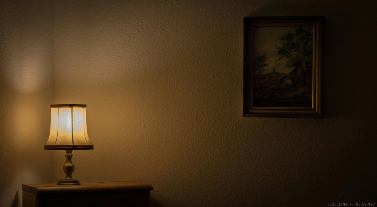
Q: What if my room already has low light?
A: This is where art lighting truly shines! Even in a room with low ambient light, a well-placed art light can make a piece the focal point, creating a cozy and dramatic effect. Just make sure the light intensity doesn't overwhelm the room's existing mood; dimmers are your best friend here. In fact, a dimly lit room with a strategically illuminated artwork can be incredibly atmospheric and impactful – it's often my favorite kind of display, creating a sense of intimacy and focus. The contrast creates incredible visual impact.
Q: Is professional installation necessary for art lighting?
A: For simple plug-in picture lights or track lighting that uses existing outlets, many DIY enthusiasts can handle the installation. However, for complex hardwired track systems, integrated lighting, or if you're uncomfortable with electrical work, consulting a professional electrician or lighting designer is highly recommended. They can ensure safety, proper wiring, and optimal placement for truly transformative results, especially for a new home renovation. For valuable pieces or complex displays, the investment in a professional is often worth it.
Q: How can I light art on a budget?
A: Don't feel you need to break the bank! Start with a few affordable, dimmable LED spotlights on a simple track system or even clamp lights that can be strategically positioned. Focus on getting a good CRI (90+) and the right color temperature (2700-3000K). Clever placement (remember the 30-degree rule!) and using dimmers effectively can dramatically improve how your art looks, even with modest equipment. It's more about thoughtful application than expensive hardware. Second-hand stores or online marketplaces can also yield great finds for fixtures, just ensure the bulbs are high quality.
Conclusion: Let Your Art Truly Shine (The Final Brushstroke of Light)
Honestly, transforming how your art looks with intentional lighting is one of the most satisfying home decor upgrades you can make. It's not just about spending money on fancy fixtures; it's about understanding how light interacts with form and color, and then making deliberate choices. It allows your chosen pieces, the ones you connected with deeply, to finally express their full potential. From that first dull abstract to the vibrant, illuminated pieces I create today, the journey has shown me that light is not merely illumination—it is the final brushstroke, the last, crucial element that completes the artistic statement. So, go on, shine a little light on your artistic treasures. You (and your art!) deserve to see them in their absolute best light, every single day. Experiment, learn, and let your home become its own private gallery, alive with light and art. Don't let your art languish in the shadows. Embrace the transformative power of light and watch your walls come alive. Go ahead, experiment – your art is waiting to sing!


