Art for Long Hallways: Master Decorator Tips & Gallery Ideas
Transform your narrow hallway with art! Discover expert tips on choosing scale, creating gallery walls, perfect lighting, and making your corridor a captivating space.
Navigating the Narrow: How to Choose and Display Art for Long Hallways
Hallways. They're often the forgotten children of interior design, aren't they? That long, often narrow stretch of wall that connects one beautiful room to another, often feeling more like a passage than a destination. So many times, I've walked into a home where the living room sings, the bedroom whispers comfort, but the hallway? It just... exists. It's a missed opportunity, a blank canvas crying out for attention. I mean, who really thinks about optimizing that transitional space beyond a quick glance at the mail or a place to hang a coat? Most people just rush through, dismissing its potential. But for me, that's precisely where the magic can truly happen. It's a chance to tell a story, to create a curated experience, a visual whisper or a vibrant shout, even before your guests step into the main living areas. It's about transforming the often-overlooked into the utterly unforgettable.
Hallways as the Heartbeat of a Home: Setting the Tone
But I believe a hallway is more than just a transition zone; it’s an experience in itself. It's a preview, a pause, a moment to create intrigue, a sensory overture before you even step into the main event. And believe me, with the right art, you can transform it from a mere passage into a captivating gallery. I remember walking into a friend's home once, and their hallway was just... a wall. No character, no invitation. It felt less like a welcome and more like a cattle chute – utilitarian and utterly uninspired. I vowed then that no hallway under my influence would ever suffer such a fate. Let's dive into making that happen, shall we? Because your home deserves to sing from every corner.
So, you've got a hallway. And if you're like most people, you probably see it as just that: a utilitarian space to get from point A to point B. But what if I told you it could be so much more? What if that space, often considered 'dead space,' could actually be a vibrant extension of your home's personality, a conversation starter, or a quiet moment of beauty? I'm here to tell you, it absolutely can. It's all about intentionality, a deep understanding of your space, and a generous dash of artistic flair.
The Hallway Conundrum: More Than Just a Passageway
Why Are Hallways So Tricky to Decorate?
So, what makes hallways such a peculiar design challenge? Well, for starters, their very nature—long and narrow—can feel constricting, almost like a tunnel. They often lack natural light, making them feel even more like an afterthought, a place you simply pass through, not in. Then there's the high-traffic element; it's a corridor, after all, prone to bumps, scrapes, and smudges from daily life. And let's not forget the potential for acoustical challenges, where sound can echo unpleasantly, making a quiet conversation feel like a public announcement. We walk through them, but do we linger? Probably not. My goal, and I hope yours too, is to change that. I want people to slow down, to engage, even for just a moment, as they move through your home. Think of it as setting the stage, a little theatrical flourish before the main act, transforming that 'dead space' into a living canvas. It's a bit like giving a forgotten character a starring role – suddenly, they become essential to the plot. We're fighting against the ingrained habit of rushing through; we're creating a reason to pause, to look, to feel something, even for a fleeting second. It's about designing a psychological shift, not just a visual one, making the journey as delightful as the destination.

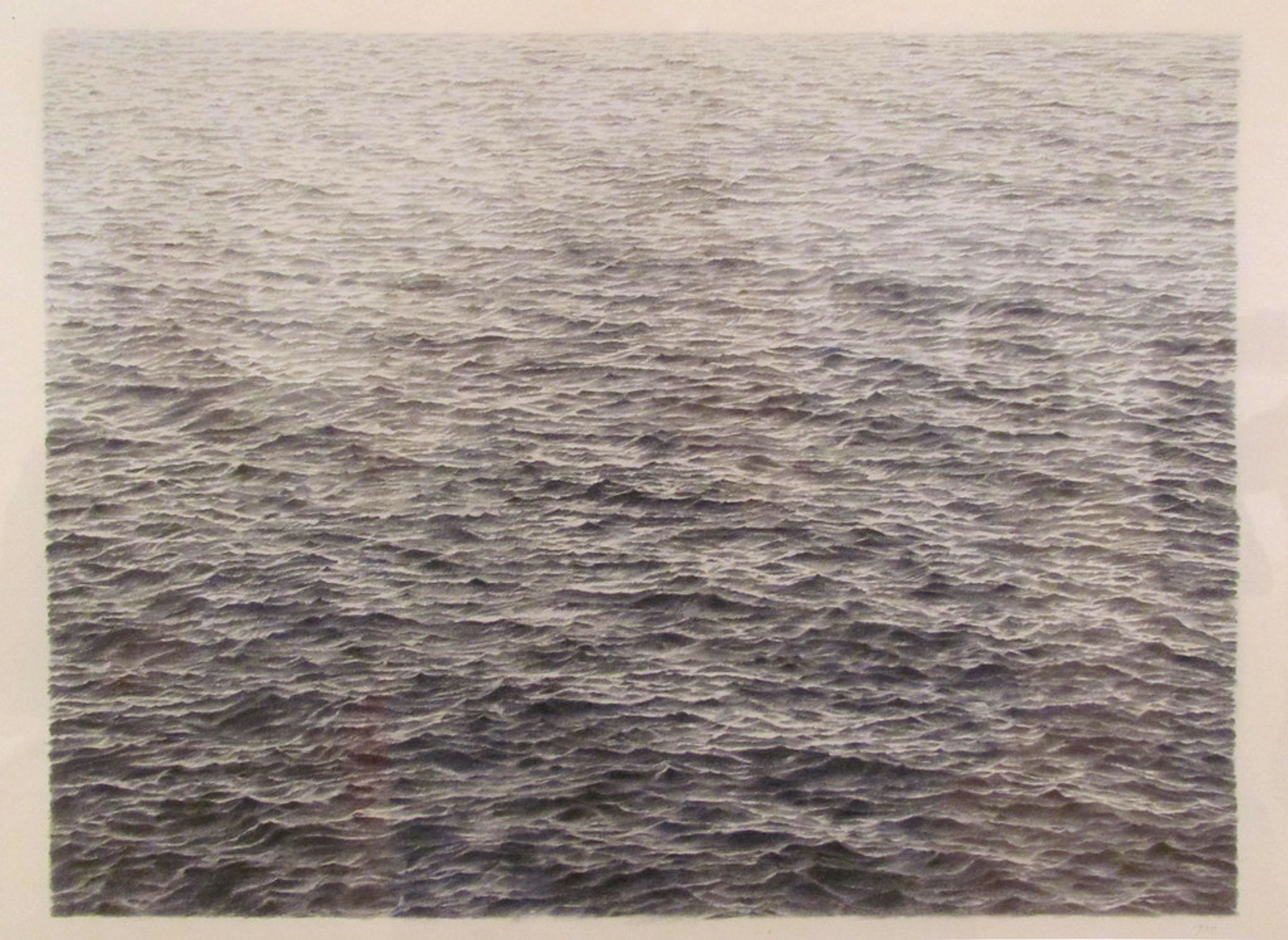
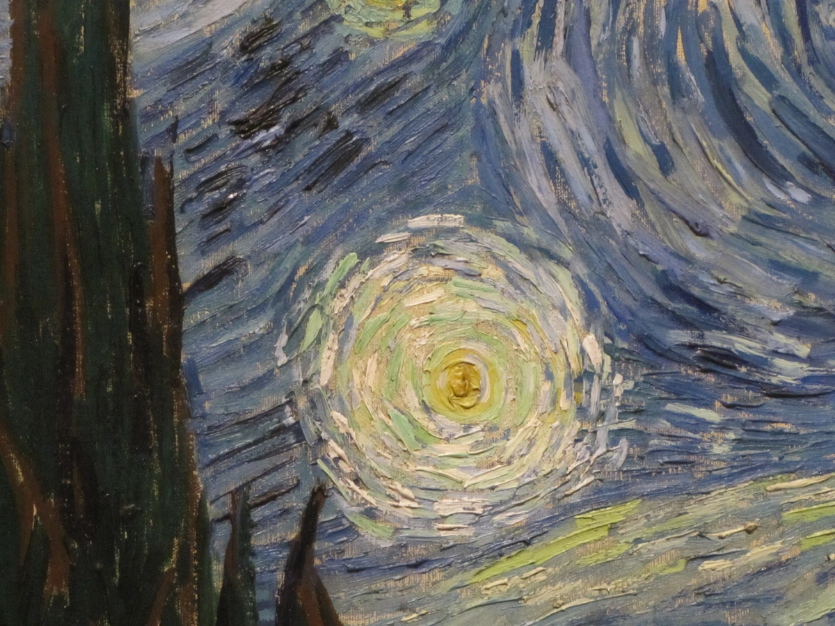
This abstract piece, with its serene horizontal washes, perfectly illustrates how simple lines and colors can create a sense of calm and flow. Imagine this guiding the eye through a long hallway, inviting contemplation rather than haste. It's a visual balm, a gentle suggestion to slow your pace and simply be in the moment. The subtle gradations of color and the implied movement across the canvas can literally expand the perceived boundaries of your space, a clever trick for those often-confining corridors.
Crafting Your Hallway's Narrative: Starting with Scale
The Art of Visual Flow and Rhythm
This is where many people stumble, and I get it. "How big should the art be?" is a question I hear all the time, especially for tricky spaces. For a hallway, scale and proportion are your absolute best friends, dictating the visual harmony and overall success of the entire space. Or your worst enemies, if you get them wrong. It's not just about filling a wall; it's about creating balance, ensuring the art feels like it belongs, and cultivating a sense of welcome. I often tell my clients that the art in a hallway should act like a gentle current, a visual flow that subtly guides the eye and creates a natural progression from one space to the next. It’s about building a subtle, visual narrative that unfolds as you move through it, rather than just encountering isolated decorative elements. We're aiming for a curated experience, not just a random collection of pretty things.

Size Matters: Finding the Right Fit
Putting a tiny piece of art on a vast hallway wall is like putting a postage stamp on a billboard—it just gets lost, swallowed by the expanse. Conversely, a gargantuan piece in a really narrow space can feel overwhelming, almost oppressive, making the corridor feel even tighter. I've seen it happen countless times, and the result is rarely good. It's about finding that sweet spot, that perfect equilibrium where the art commands attention without dominating or disappearing. Often, a single, horizontally oriented piece can work wonders, especially if it’s substantial enough to hold its own but not so wide it feels like you're squeezing past it. Or, and this is where the magic really begins, a series of pieces that together create a dynamic flow. Think of how a conductor leads an orchestra – each instrument has its place, but together they create a symphony. We're aiming for harmony, not a solo performance.
For very long hallways, consider a series of two or three horizontally oriented pieces that are similar in style or theme, spaced thoughtfully. This creates a pleasing rhythm, a subtle repetition that helps guide the eye along the wall without overwhelming it. It’s a trick I learned when trying to balance visual interest with the practicalities of high-traffic areas, ensuring the art enhances the journey rather than obstructing it. Don't be afraid to experiment with panoramas or diptychs/triptychs for a truly cohesive horizontal statement.
Here’s a quick guide I often use as a starting point, but remember, these are just guidelines; your eye is the ultimate judge:

Hallway Width (approx.) | Recommended Art Size/Arrangement |
|---|---|
| Less than 3 feet (0.9m) | Small to medium pieces in a tight vertical or horizontal series; narrow gallery wall (keep frames sleek); consider tall, narrow pieces if ceiling height allows to draw the eye up. Avoid anything that protrudes significantly. |
| 3-4 feet (0.9-1.2m) | Medium to large horizontal piece (up to 2/3 of the wall length); well-spaced gallery wall with varied but harmonized frames; two medium pieces side-by-side or a modest triptych. Focus on pieces that offer visual depth. |
| 4+ feet (1.2m+) | Large statement piece (occupying 1/2 to 2/3 of the wall length); expansive gallery wall with varied sizes and media (mix paintings, photos, even small sculptural elements); multiple large horizontal pieces for a grand narrative. Consider leaning art on a console. |
The Vertical Advantage: Maximizing High Ceilings
If your hallway boasts impressive ceiling height, congratulations! This is an often-overlooked asset, a hidden opportunity, if you will. Instead of letting all that vertical space go to waste, consider art that deliberately draws the eye upwards. Tall, narrow pieces or vertically stacked compositions can emphasize the height, transforming a potentially awkward space into a grand statement, perhaps even reminiscent of a museum wing. This strategy works beautifully to add drama and sophistication, making the hallway feel even more expansive. For example, a dramatic, vertically oriented abstract piece can echo the architectural lines of a tall ceiling, creating a continuous visual journey from floor to ceiling. Or, imagine a series of closely hung smaller pieces, drawing a vertical line up the wall, creating a sense of ascent. It’s a trick I learned early on when trying to figure out maximizing-impact-choosing-art-for-high-ceilings and it applies perfectly when learning how-to-choose-art-for-a-staircase – principles often overlap in these transitional spaces.

The Power of Perspective: How Art Can Alter Perception
This is one of my absolute favorite tricks for narrow hallways: using art to visually expand the space. Horizontal pieces naturally draw the eye along the wall, making the hallway feel longer, which might seem counter-intuitive at first, but it actually helps balance the narrowness by creating a sense of breadth. If your hallway is both long and narrow, a series of moderately sized horizontal pieces or a well-arranged gallery wall can create a sense of movement and flow, alleviating that tunnel-like feeling. But it's not just about orientation; it's about the magic of perspective and color psychology. Lighter, cooler colors (think blues, greens, pale grays) can make a space feel more open and expansive, making walls recede, while certain patterns can create a sense of depth. For example, a landscape painting with a strong vanishing point can create the illusion of infinite distance, even on a flat wall, inviting the viewer to step into the scene. Or an abstract piece with receding lines or layered fields of color can trick the eye into perceiving greater depth, turning a flat surface into a portal. For more tips on making spaces feel bigger, I often refer back to principles found in articles like maximizing-art-impact-small-spaces, decorating-with-art-in-a-powder-room-maximizing-impact-in-small-spaces, and art-for-small-bathrooms-maximizing-style-in-compact-spaces – they apply beautifully here, offering ingenious solutions for tight spots.
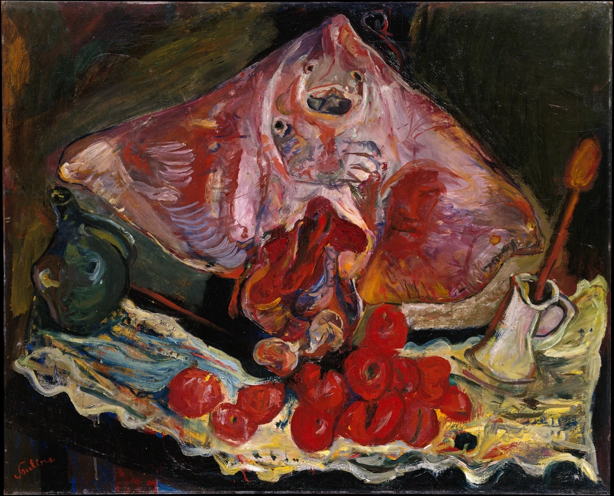
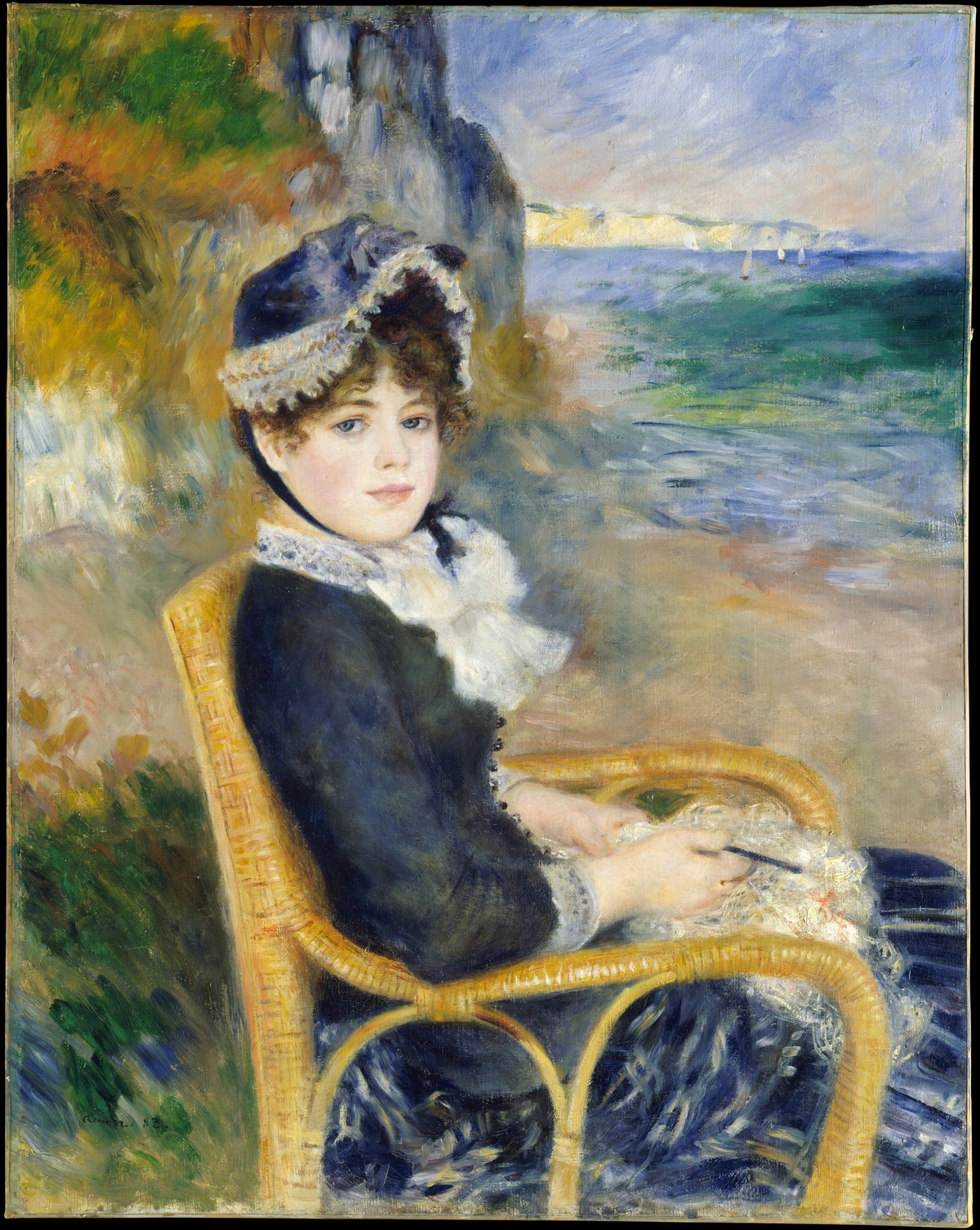
Even a still life, like this evocative piece, can serve to ground a moment in a hallway. It offers a point of visual repose, a quiet moment of beauty, inviting a brief contemplation before continuing on your journey. The rich textures and dramatic lighting draw you in, proving that not all art needs to shout for attention to make an impact. Sometimes, the most powerful statements are whispered, offering intricate details that reward a closer look, turning a fleeting passage into a meditative pause. It's a delightful counterpoint to the rush of daily life.
Curating Your Collection: Blending Styles and Themes
Don't feel limited to a single art style! A truly captivating hallway often features a thoughtful blend of pieces, creating a microcosm of your home's broader aesthetic. Maybe a stark minimalist photograph next to a vibrant abstract painting, or a classic landscape paired with a playful contemporary print. The key isn't uniformity, but rather finding common threads—perhaps a shared color palette, a consistent framing style, or even just a similar emotional tone that resonates across the collection. This interplay of styles, this visual dialogue, can create a much richer, more dynamic visual experience, preventing the hallway from feeling monotonous. It’s about creating a conversation between the artworks themselves, drawing the viewer in to discover the subtle connections you've subtly woven. Remember, your personal narrative is rarely monochromatic, so your art shouldn't be either. For more on blending, check out creating-a-cohesive-art-collection-mixing-styles-and-mediums-in-your-home.
Gallery Walls in Corridors: A Curated Journey
Ah, the gallery wall. It’s my absolute go-to for hallways because it's inherently dynamic, offering endless possibilities for personal expression. Instead of one static focal point, you're creating a narrative, a visual path for the eye to follow, an evolving story told through art. It’s like a mini-museum right in your home, telling your story, revealing facets of your personality and passions. I often think about how to make it feel cohesive yet endlessly interesting, a journey of discovery rather than just a collection of framed objects. The trick, I've found, is to treat each piece as a word in a sentence, where the overall message is more important than any single word. A common mistake is to just throw up a bunch of frames; the secret is in the curation.
Planning Your Gallery Wall: More Than Just Hanging
Crafting a compelling gallery wall in a hallway is an art in itself. It’s about careful planning, an intuitive eye, and a willingness to play. Here are my top tips for creating a hallway gallery wall that truly shines:
- Theme or Color Palette: You don't need strict adherence to a rigid theme, but a loose concept (e.g., travel photos, abstract art, nature scenes, or even a specific era) or a consistent color palette can tie everything together beautifully. I've seen some stunning gallery walls built around a single color family, even with diverse subjects. Or, for a more minimalist approach, a consistent frame style (all black, all natural wood, or all gold) can create sophisticated cohesion. Imagine a series of vintage travel posters, or black and white photography of your family; it grounds the collection and creates a sense of purpose, almost like curating your own personal narrative for the hallway.
- Consistent Spacing (The Breath Between Pieces): This is absolutely key for a polished, professional look. I usually aim for 2-4 inches (5-10 cm) between frames, but again, let your eye be your ultimate guide. This consistent negative space prevents the wall from feeling cluttered and allows each piece to be appreciated individually while still contributing to the overall narrative. It’s the visual
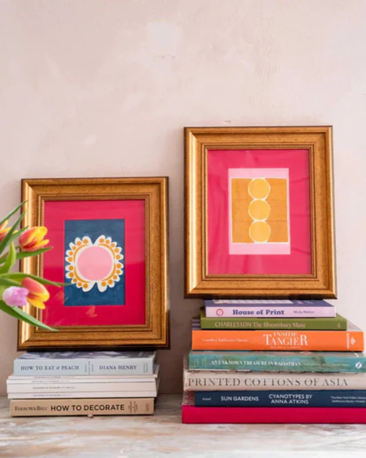
This image, with its thoughtfully arranged framed prints and stacked books, beautifully demonstrates how visual weight and a sense of balance can be achieved even with diverse elements. It's about finding that rhythm and ensuring each piece contributes to the overall narrative of your hallway gallery.
Beyond the Frame: Alternative Approaches and Materials
Sometimes, a traditional framed print isn't the only answer. Or maybe you want to break up the rhythm. This is where you can get really creative. After all, art isn't just about what's hanging in a frame; it's about anything that evokes a feeling or adds aesthetic value. This is where you can truly express yourself and introduce unexpected delights.
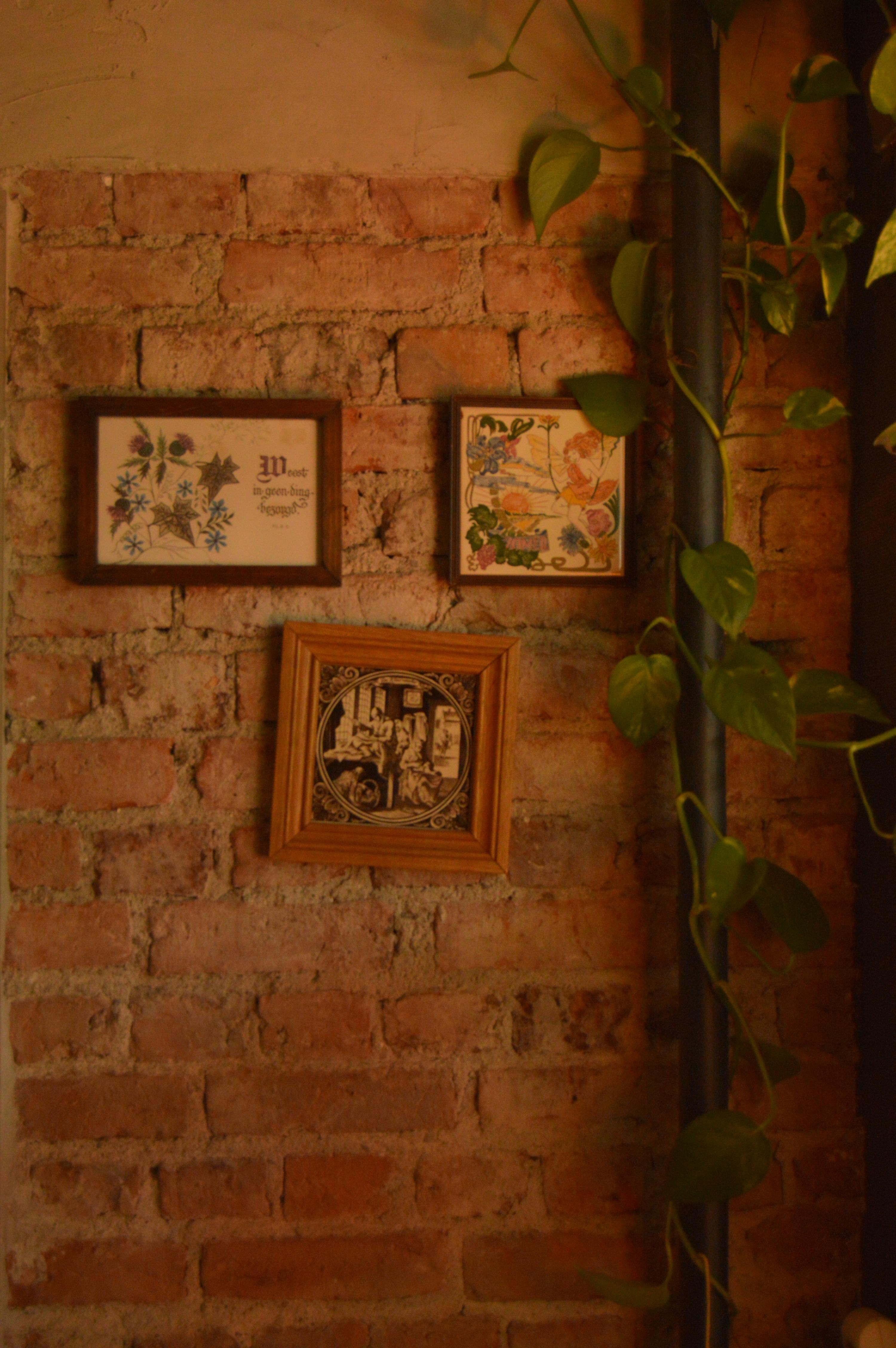
Mirrors: Masters of Illusion
- Mirrors: Oh, how I love a well-placed mirror! Not only do they add a touch of elegance, but they are masters of illusion. A large mirror can instantly make a narrow hallway feel wider and brighter by reflecting light and creating the perception of expanded space. They're basically magic, if you ask me. Placing one at the end of a long, dark hallway, for example, can be transformative, creating an optical trick that makes the space appear to extend indefinitely. Or, strategically placed to reflect a window from an adjacent room, it can bring much-needed natural light into an otherwise dim area. Beyond their functional magic, mirrors can also be art in themselves—choose an ornate, sculptural frame, or a piece with an interesting shape to add another layer of design interest. This is a design secret I often use when decorating-hallways-and-staircases-with-art and maximizing-impact-choosing-art-for-stairwells-and-hallways.
Even the frame of a mirror, as seen in this ornate gilded example, becomes an artistic statement. Don't underestimate the power of a well-chosen mirror to add both functionality and undeniable flair to your hallway, whether it's a sleek modern design or a vintage, sculptural piece.

- Textile Art or Wall Hangings: If you're looking for warmth and texture, textile art can be a beautiful choice. Think tapestries, macrame, woven panels, beautiful quilts, or even intricately embroidered pieces. These pieces can soften the hard lines of a hallway, absorb sound, and introduce a rich, tactile element that paintings simply can't replicate. Just be mindful of how much they protrude into the space if your hallway is particularly narrow, as you don't want them to become an obstacle. They're fantastic for adding that cozy, lived-in feel, much like what you'd find in decorating-with-abstract-art-in-bohemian-chic-interiors-a-guide-to-layering-and-texture or decorating-with-art-in-modern-farmhouse-interiors.
- Sculptural Elements and Functional Art: Don't limit yourself to flat surfaces! Hallways are ripe for three-dimensional intrigue. Small, wall-mounted sculptures, decorative hooks, elegant sconces, or even stylish shelving with curated objects (like vases, small busts, unique ceramics, or a stack of art books) can add dimension, texture, and practical utility to your hallway. Just make sure they don't impede movement or pose a bumping hazard, especially in narrower passages. These pieces can add unexpected visual interest and a sense of sophisticated curation, inviting a moment of closer inspection. Imagine a delicate ceramic piece catching the light, or a beautifully crafted wooden hook offering both form and function.
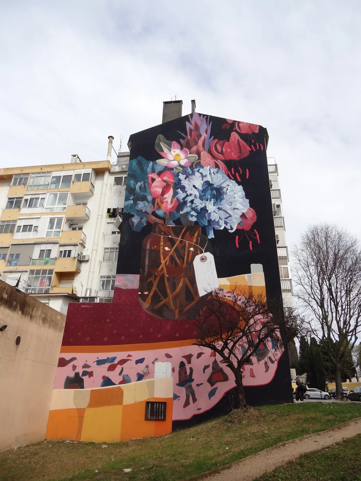
- Wall Decals and Murals: Bold Statements: For those who want to make a big, transformative impact without the commitment of permanent paint or traditional framed art, wall decals or even hand-painted murals can be an incredible solution. From subtle geometric patterns that create a modern backdrop to expansive landscapes that transport you, these can completely transform an entire wall, creating an immersive, narrative experience. They are particularly effective in long hallways, as they can visually stretch the space, introduce a captivating scene that unfolds as you walk, or even simulate architectural details. The beauty of decals, of course, is their temporary nature, making them perfect for renters or those who love to change their decor frequently.
- Durability and High Traffic: Hallways, by their very nature, are high-traffic areas, constantly exposed to bumps, brushes, and the general hurly-burly of daily life. This means you might want to consider art that is inherently robust or pieces that are framed with a protective layer (like acrylic, which is lighter and more shatter-resistant than traditional glass) rather than fragile glass. I've had a few bumps and scrapes in my time – and heard horror stories! – so thinking ahead here saves a lot of heartache and potential accidents. Secure hanging methods are absolutely paramount, especially if you have children, pets, or boisterous guests; consider using two hooks per frame for extra stability, or specialized security hardware. Also, consider pieces that are less delicate (like metal art, unframed canvases, or textile art) or artfully placed out of the direct line of traffic. The key is to think 'fortress,' not 'fragile,' ensuring your cherished art can withstand the rhythm of your home.
- Acoustics and Ambiance: Softening the Sound: Remember how I mentioned acoustical challenges earlier? Hallways, especially long ones with hard surfaces like plaster or wood floors, can create an unwelcome echo chamber, making even quiet conversations feel like public announcements. This is another area where art can truly shine, offering a functional benefit that goes beyond mere aesthetics! Textile art, like large woven tapestries, thick fabric wall hangings, or even sound-absorbing art panels, can significantly absorb sound waves, creating a much softer, quieter, and more inviting ambiance. Even framed pieces, particularly those with matting or mounted on canvas, can offer a small degree of sound dampening. It’s a functional benefit that enhances the overall comfort and quietude of your home, turning a cacophony into a calm resonance.
- Wall Material: Have a cool exposed brick wall? Don't hide it! You can definitely hang art on brick walls, and the contrast can be absolutely stunning. The raw, tactile texture of brick can add another layer of interest to your display, creating a wonderful juxtaposition with the art – especially a sleek, modern piece. Similarly, consider how art interacts with other wall materials like smooth plaster, industrial concrete, warm wood paneling, or even vibrant wallpaper; each surface offers a unique backdrop, becoming an integral part of the overall composition. It's much like how art complements decorating-with-art-in-industrial-interiors, art-for-minimalist-interiors-less-is-more, or even decorating-with-art-in-modern-farmhouse-interiors; the wall itself is part of the art experience. Don't fight the existing architecture; let it inspire you.
This painting against a rustic brick wall shows how textured backgrounds can truly enhance a piece. It's about finding harmony between the art and its environment, creating a dynamic visual conversation.

Consider also how materials like ceramics can introduce a different kind of three-dimensional art, bringing a sculptural element that engages more than just the eye. A beautifully crafted ceramic piece, with its unique glaze, organic form, and tactile surface, can add a grounding, artisanal touch to a hallway, creating a moment of quiet sophistication. Whether it's a series of small wall-mounted plates or a single, striking vase on a console, ceramics bring a handcrafted warmth that is truly special.

Adding Greenery: A Breath of Fresh Air
Don't underestimate the power of living elements to transform a space! Even a small, strategically placed plant can bring vibrant life, natural color, and a profound sense of calm to a hallway. Trailing plants on a high shelf (like a Pothos or Philodendron), a slender snake plant (Sansevieria) in a corner, or even a small succulent arrangement on a console table can beautifully complement your art and introduce a refreshing organic touch. These living sculptures soften the hard lines of a corridor and infuse it with natural energy. Just make sure to choose plants that tolerate lower light conditions if your hallway is naturally dim (ZZ plants and Cast Iron plants are champions here!), and remember that decorating-with-art-in-modern-farmhouse-interiors often combines natural elements with art wonderfully, creating a harmonious, layered aesthetic.
The Zen Touch: Bringing Color and Abstraction to Your Hallway
This is where my heart really sings, truly. My own work, and that of many abstract artists (including, dare I say, myself), thrives on color and movement, which are absolutely perfect for injecting life, energy, and an unexpected spark into a hallway. Abstract art doesn't demand a specific narrative or a literal interpretation; instead, it invites personal engagement, interpretation, and feeling, making it incredibly versatile for a transitional space where people are often in motion. It can create a seamless flow from one area to the next, acting as a visual current, a vibrant pulse through your home. My pieces, for instance, are designed to evoke emotion and energy, transforming any wall into a focal point of introspection or joy, offering a little burst of something unexpected, a visual beat in the heart of your home.
The emotional impact of color, especially in abstract forms, cannot be overstated. It's a primal language we all understand. A hallway, being a transitional space, benefits immensely from art that evokes a specific feeling—be it calm, excitement, curiosity, or contemplation. Abstract art is particularly adept at this, allowing the viewer to bring their own experiences and emotions to the piece, making each passage through the hallway a unique moment of connection, a personal dialogue with the artwork. I often think of it as setting the emotional tone for whatever room you're about to enter or have just left.

Consider how vibrant, colorful abstract art can transform a mundane hallway into an energizing pathway. It can set a mood, spark joy, or offer a moment of contemplation. I mean, who doesn't need a little burst of joy as they head to the kitchen for that morning coffee? The psychological impact of color is immense; a splash of warm reds can invigorate, while cool blues can soothe. Imagine a dynamic abstract piece with bold, expressive brushstrokes that capture light and create a sense of movement, drawing the eye down the corridor. For ideas on how abstract art works in tight spots, I've covered decorating-with-abstract-art-in-small-spaces-maximizing-impact-and-flow and explored the-definitive-guide-to-understanding-abstract-art-from-cubism-to-contemporary-expression before, and those principles are very much at play here.

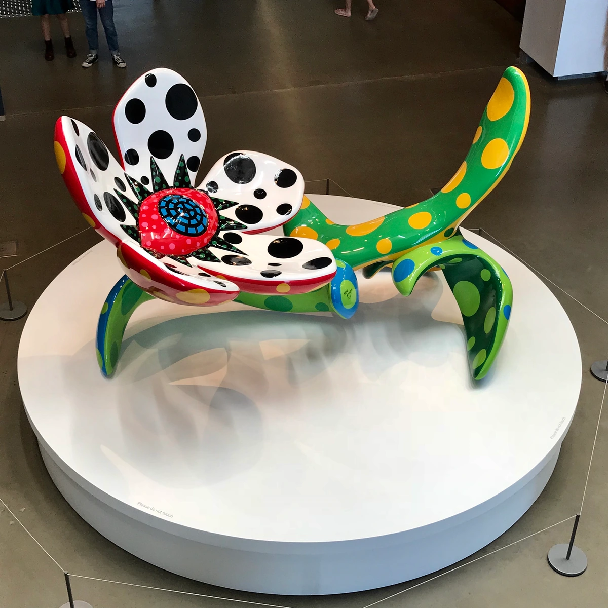
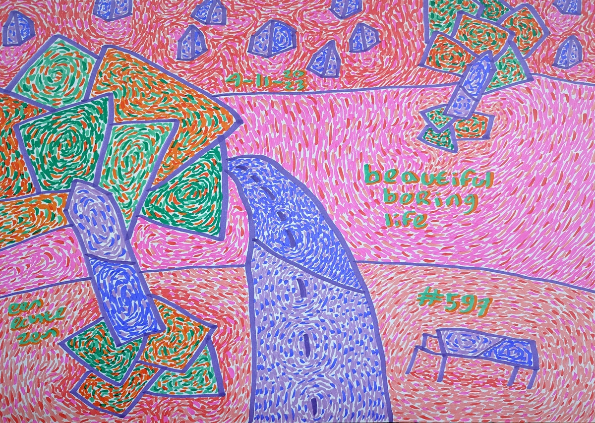
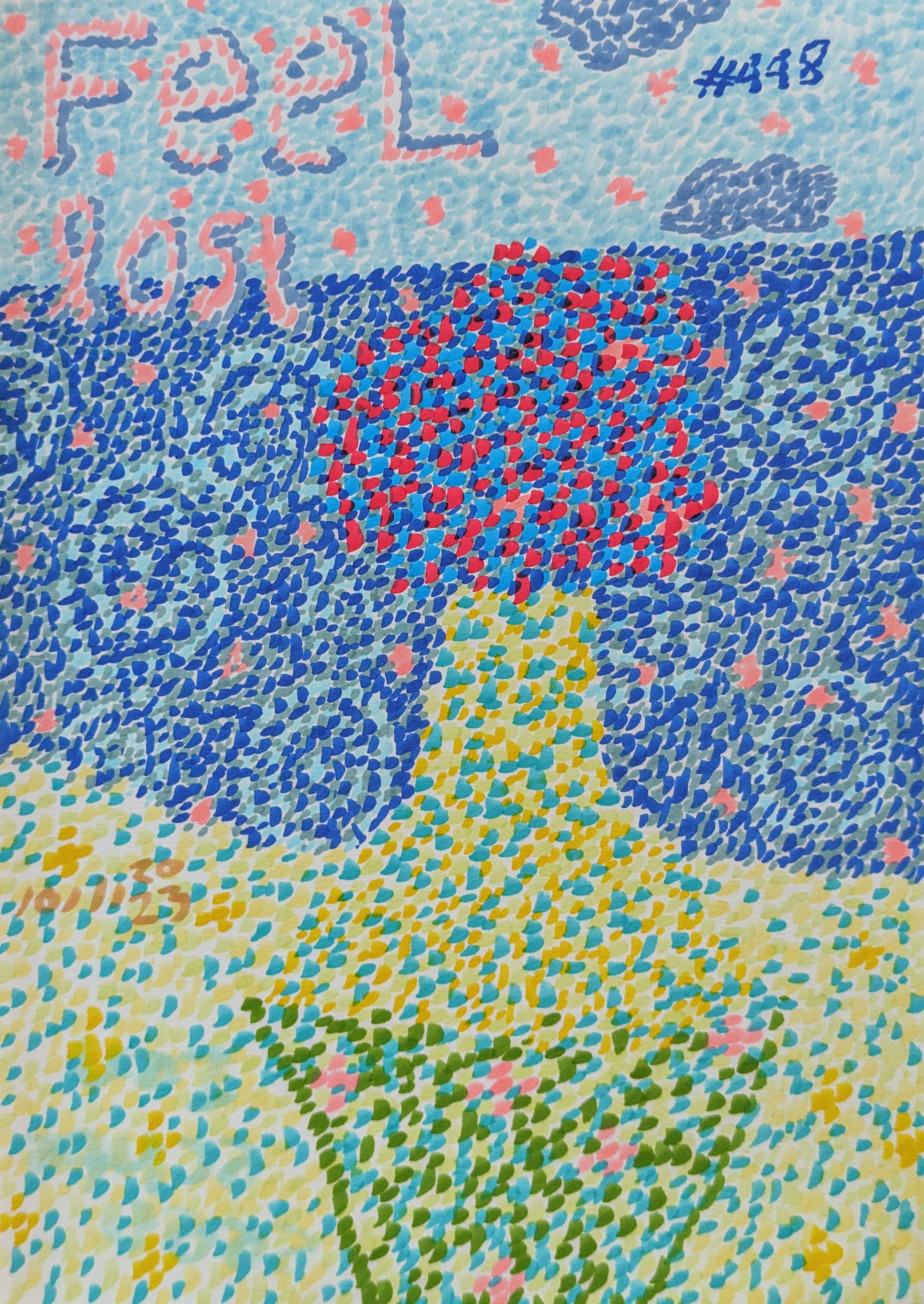
This vibrant abstract piece, with its playful dots and organic shapes, exemplifies how non-representational art can inject pure energy into a space, making it anything but mundane.
And then there are pieces that speak through bold, expressive brushstrokes, where the very act of creation is palpable, almost as if the artist's hand is still moving on the canvas. This kind of abstract art brings a raw, energetic force, a vibrant intensity, that can truly electrify a hallway, turning a mere passage into a powerful statement. It's about inviting that raw, unbridled energy into your home, letting it infuse the space with vitality.

Creating a Visual Journey
Instead of just a blank wall, imagine a series of compelling abstract pieces, each one a burst of color or a swirl of emotion, guiding you along. It's not just about filling space; it's about enriching the journey, transforming a mundane walk into an engaging experience. I often think about how to build a story, even without a literal narrative, just through the interplay of shapes, colors, and textures, creating a rhythm and pacing that makes walking down the hallway an experience in itself. This journey can be subtle, a gentle progression of harmonious tones, or it can be a grand, vibrant procession, depending on your personal style and the art you choose. Exploring the-ultimate-guide-to-abstract-art-movements-from-early-pioneers-to-contemporary-trends might inspire your own visual narrative, helping you select pieces that truly speak to each other and to you.

This abstract piece, with its intriguing blend of organic and surreal elements, demonstrates how texture and unexpected color combinations can invite prolonged engagement, even in a fleeting moment. It's about drawing the eye in and rewarding the viewer with layers of detail, with nuances that reveal themselves over time. I find this kind of art truly compelling because it encourages us to slow down, to observe, and to discover something new each time we pass by, making the hallway a place of continuous discovery.
Consider how the rich, layered textures of a Gerhard Richter piece, for example, can create an almost palpable depth on your wall. It’s not just a painting; it's an experience, a tactile journey for the eyes, perfect for a space where closer inspection is invited and rewarded. The way the paint interacts, revealing and concealing layers beneath, can be a microcosm of your home's deeper narrative, constantly shifting and revealing new facets depending on how you choose to look. It's a profound statement that elevates the everyday into the extraordinary, reminding us that beauty often lies in complexity and depth.

Illuminating Your Masterpiece: Hallway Lighting
Honestly, this is non-negotiable, a fundamental truth in art display. Bad lighting can make even the most stunning art look flat, dull, and utterly uninspired; it's like trying to appreciate a gourmet meal in a dimly lit closet – completely missing the point! Hallways, as I mentioned, often suffer from a significant lack of natural light, making thoughtful, artificial lighting absolutely critical. I can't stress this enough: invest in good lighting. It makes all the difference, not just for the art, but for the entire mood, ambiance, and functionality of the space. Think of lighting as an extension of the art itself, a silent collaborator in your hallway's transformation, capable of revealing nuances you never knew existed or creating dramatic focal points that draw the eye. Without proper illumination, even the most captivating piece can fade into the background, a silent whisper rather than a vibrant shout. It’s about creating a stage for your collection to perform.
Here's a quick comparison of common lighting options for art in hallways:
Lighting Type | Pros | Cons | Best For |
|---|---|---|---|
| Picture Lights | Focused illumination; highlights details | Can be restrictive to art placement; may create hot spots | Individual pieces or smaller, more traditional displays |
| Track Lighting | Highly versatile; adjustable; good for multiple pieces | Can look industrial if not chosen carefully; requires ceiling installation | Gallery walls; flexible displays; highlighting various elements |
| Wall Sconces | Ambient light; adds architectural interest | May protrude into narrow spaces; less direct art illumination | Creating a diffused glow; complementing ambient lighting; mood setting |
| Recessed Lighting | Clean, unobtrusive look; general illumination | Less flexible for highlighting specific pieces; requires ceiling work | General hallway illumination; supporting overall brightness |
- Picture Lights: These are the classic choice for dedicated art illumination, mounted directly above the art to illuminate it with a focused beam. They truly make the details, textures, and colors pop. When choosing, think carefully about the color temperature (measured in Kelvin – warm white around 2700K-3000K for a cozy, inviting feel, or cooler white around 3500K-4000K for a crisp, modern look) and, crucially, the CRI (Color Rendering Index). I always aim for a high CRI (ideally 90+) to ensure your art's true, vibrant colors shine without distortion. The last thing you want is your vibrant blues looking a bit muddy or your subtle greens appearing washed out under poor lighting. Consider also the finish of the light fixture itself; it should complement the frame and the artwork, not compete with it, acting as a discreet accent rather than a distraction.
- Track Lighting: This is a more versatile option, allowing you to adjust individual light heads to point at different pieces along a track. It's truly great for gallery walls or long hallways where your art collection might evolve, as you can easily adapt the focus without reinstalling fixtures. Look for LED options with adjustable heads, narrow beam angles for accenting specific pieces, and dimming capabilities for ultimate control over ambiance. While it can sometimes feel industrial, modern track lighting designs are sleek and discreet, offering powerful, adaptable illumination.
- Wall Sconces: These can provide both ambient light and, depending on their design, a lovely, diffused glow that beautifully complements your art. They add an architectural element that can be quite beautiful, often contributing significantly to the overall mood and character of the space. Just be careful about how much they protrude if your hallway is super narrow, ensuring they don't become an obstruction. Consider placing them strategically between pieces in a gallery wall to break up the visual expanse or to cast soft light that highlights textures rather than direct beams. They're excellent for layering light and adding that touch of sophistication.
- Smart Lighting Solutions: For the ultimate in flexibility and ambiance control, consider integrating smart lighting systems. These allow you to adjust brightness, color temperature, and even create dynamic scenes or schedules with the touch of a button, a swipe on an app, or a simple voice command. Imagine changing the mood of your hallway art from a bright, gallery-like display for guests to a softly lit, contemplative passage for quiet evenings – it’s a total game-changer, offering unparalleled control over your home's atmosphere. This also extends the lifespan of your bulbs by reducing their constant full-power usage.
For an even deeper dive into making your art pop, take a look at the-art-of-display:-how-to-light-and-position-abstract-art-for-maximum-impact.

Layering Light: Beyond a Single Source
The most effective lighting schemes rarely rely on just one type of fixture, especially in a nuanced space like a hallway. Instead, think about layering your lighting, much like an artist layers paint, to create depth, dimension, and mood:
- Ambient Light: This is your general, overall illumination (often from recessed lights, flush-mount ceiling fixtures, or even natural light from adjacent rooms). It provides basic visibility and sets the overall brightness of the space.
- Task Light: While not typically the primary concern for hallway art, a console lamp can offer a subtle pool of task-adjacent light that contributes to the ambiance.
- Accent Light: This is where your picture lights, track lights, and directional recessed lights come in. Their purpose is to create focal points, drawing the eye to specific artworks and highlighting their details and colors.
- Decorative Light: Your wall sconces, a beautiful pendant light (if ceiling height allows), or even strategically placed floor lamps add to the overall aesthetic and mood, acting as sculptural elements themselves, contributing to the visual interest even when not primarily illuminating art.
Combining these layers creates depth, eliminates harsh shadows, and ensures your art (and your hallway!) looks its absolute best at any time of day, transitioning seamlessly from bright morning to cozy evening. It’s like composing a symphony; each instrument (light source) plays its part to create a harmonious, immersive whole.
Practicalities and Placement: Getting it Just Right
Once you’ve got your art and your lighting figured out, the final, crucial step is all about precise placement. This is where the rubber meets the road, where your vision becomes a tangible reality, breathing life into your hallway. It's often the most daunting step, I know, filled with the fear of putting that first nail in the wrong spot, but with a little planning, it can be incredibly satisfying and surprisingly straightforward. There are a few tried-and-true rules, born from years of experience and a few regrettable mistakes, that I always stick to:
Preparation is Key: Measuring and Planning
This installation shows how even everyday objects can be arranged to create a compelling visual experience. In your hallway, think about how your art interacts with the furniture or architectural elements present. It's all part of the grand design.
Before you even touch a hammer, a little sketching and planning can go a very long way – trust me, your walls will thank you. I often grab a sketchbook to visualize different layouts, playing with scale, spacing, and arrangement before committing to anything permanent. It saves a lot of time (and nail holes!). A pro tip I often share, which has saved me countless headaches: cut out paper templates of your artwork (or use old newspaper, wrapping paper, anything!). Label them with the art piece they represent, and use painter's tape to arrange them on the wall. This allows you to experiment with different gallery wall configurations, check sightlines, and ensure proper spacing, all without making a single permanent hole. It’s a game-changer for confident hanging.

- Eye-Level is the Best Level: As a general rule, hang the center of your artwork at eye level. This is typically around 57-60 inches (145-152 cm) from the floor for the average person. Think of it like this: when you're having a conversation with someone, you naturally look at their eyes, not their feet or the ceiling. The same principle applies to art; you want it to be comfortably within the viewer's natural line of sight, inviting immediate engagement. For a single piece, this means the midpoint of the frame should hit that sweet spot. For a gallery wall, aim for the center of the entire arrangement (the imaginary midpoint of the whole cluster) to be at this height, creating a cohesive visual anchor. Of course, rules are made to be broken, but this is an excellent starting point!
- Consider Adjacent Furniture: If your hallway includes a console table, a decorative bench, or a slender cabinet, the bottom of your art should generally be about 6-8 inches (15-20 cm) above the top of the furniture. This creates a cohesive grouping, a delightful vignette, without feeling cramped or disconnected. The art and furniture should speak to each other, forming a unified visual story. For instance, a beautifully framed piece above a minimalist console table with a small plant creates a moment of calm and curated interest. If you're leaning art, you can also overlap slightly, allowing larger pieces to sit on the floor or lean against the wall, creating a layered effect.
- Mind the Gap (and the Style!): When hanging multiple pieces, especially in a gallery wall, consistent spacing is absolutely crucial for a polished look. I usually recommend leaving at least 2-4 inches (5-10 cm) between frames. This 'negative space' gives each piece room to breathe without looking cluttered, allowing individual artworks to shine while still contributing to the cohesive whole. Whether you opt for a precise grid style for a more formal, minimalist look (think uniform frames and spacing) or a more eclectic salon style for a bohemian, curated feel (mixing sizes, frames, and even objects, but still with a consistent overall shape or anchor), maintaining thoughtful negative space is what truly elevates the arrangement. It's the visual pause that allows each artwork to sing, rather than just blending into a cacophony. For further inspiration, I often refer to principles discussed in curating-narrative-gallery-wall and decorating-with-abstract-art-in-eclectic-interiors.
- Working Around Obstacles: Door frames, light switches, thermostats, alarm panels, built-in shelves – these are all realities of hallway design, and they can feel like pesky obstacles. However, instead of fighting them, try to integrate your art around them rather than having a piece cut off awkwardly. Sometimes, a smaller, impactful piece nestled perfectly next to a doorway works better than trying to force a large one into an ill-fitting space. I've often seen clever designers use vertical arrangements in narrow sections beside doors, or even place very small, impactful pieces in unexpected nooks or above light switches, turning a potential hindrance into a charming, intentional feature. Don't fight the architecture; work with it, find the beauty in the constraints, and let them guide your creative solutions. It's a bit like solving a puzzle, really, and the most satisfying solutions often come from embracing the limitations and turning them into unique design opportunities.
Beyond Decor: The Emotional Impact
I truly believe that art in a hallway does more than just fill a blank space; it elevates the mundane into the meaningful, the functional into the fascinating. It can transform a purely utilitarian area into a source of daily inspiration, a captivating visual journey, and a profound reflection of who you are. As people move through your home, these carefully chosen art pieces offer little moments of beauty, quiet contemplation, vibrant energy, or even a wry smile. They set a mood, they hint at the personality and soul of the home, and they create a seamless, integrated aesthetic that flows from one space to the next. It’s about making every corner of your home, even the passing ones, feel intentional, considered, and utterly alive. It's about how you feel when you step out of your bedroom each morning, or how your guests feel as they make their way to the living room. Those micro-moments, those fleeting connections with beauty, matter immensely in creating a truly soulful home.
This abstract piece, with its contemplative yet vibrant energy, reminds us that even in the most mundane moments – like walking down a hallway – art can offer a pause for introspection or a spark of joy. It’s about creating an environment that nurtures the soul, piece by piece.
Curating Your Personal Narrative: The Hallway as a Storybook
Ultimately, your hallway is a profound reflection of you and your home's unique spirit. It's not just about what looks good, but what feels good, what truly speaks to your personality, your life story, and your deepest passions. Think of it as a personal gallery, a curated journey through your experiences, tastes, and passions. Are you a minimalist, drawn to clean lines and understated beauty? A maximalist, embracing bold colors and diverse textures, a collector of fascinating narratives? A globe-trotter, showcasing treasures and memories from your adventures? Let your hallway whisper (or shout, if that's your style!) your story through the art you choose. I love seeing hallways that evolve over time, like chapters in a well-loved book, each piece added with intention and love, telling a unique and unfolding narrative of your life. It’s a truly intimate space, often overlooked, but one that offers incredible potential for self-expression, delightful discovery, and genuine connection. It's a testament to the fact that every space, no matter how small or transitional, deserves to be treated as a canvas.

Frequently Asked Questions (FAQ)
Q: What are common hallway decorating mistakes to avoid?
A: Oh, I've seen a few in my time – and made a few myself, if I'm honest! The most common mistakes include:
- Ignoring the hallway altogether: Treating it as just a utilitarian passageway means missing a huge opportunity for visual interest, emotional impact, and an extension of your home's personality. It's like leaving a chapter blank in your favorite book.
- Wrong scale: This is a big one. Art that's too small gets lost, looking like a postage stamp on a vast wall; art that's too big overwhelms the space, making the hallway feel even more cramped. Balance and proportion are absolutely key.
- Poor lighting: Dim, inadequate lighting makes even the most stunning art look flat, dull, and uninviting. Invest in focused art lighting to truly make your pieces sing!
- Clutter: Hallways are inherently high-traffic areas. Too many objects, overly deep console tables, or pieces that protrude too much can make it feel cramped, chaotic, and even hazardous. Keep pathways clear and displays thoughtful.
- Inconsistent style: While mixing and matching is wonderful and encouraged, a complete lack of cohesion in style, framing, or color can make the space feel chaotic and unsettling rather than curated. Aim for a subtle theme, a consistent color palette, or a unifying frame style to tie things together, even if the art itself is diverse. Think of it as a diverse choir, not a cacophony.
Q: What if my hallway is very dark?
A: Dark hallways are a common challenge, a truly vexing design problem, but art and strategic lighting can work absolute wonders, transforming gloom into gleam! My first recommendation is to opt for pieces with lighter backgrounds, vibrant, high-contrast colors, or even metallic accents that can reflect and bounce available light, making the space feel brighter. Mirrors are, of course, a magical solution for reflecting both natural and artificial light, creating an illusion of expanded space and doubling the brightness. And, as I always say, invest in good lighting – picture lights, track lighting, or well-placed wall sconces can brighten the space and highlight your art beautifully, creating an inviting, layered glow. Consider also light-colored wall paint or even a subtly reflective wallpaper to further enhance the brightness.
Q: Can I put a single large piece of art in a narrow hallway?
A: Absolutely, but with caveats – always with caveats in design! A single, large horizontal piece can actually be a fantastic solution, helping a narrow hallway feel longer and more expansive by drawing the eye along the wall. Just ensure it's not so wide that it impedes movement or overwhelms the space, making you feel like you're squeezing past it rather than admiring it. As a general rule, don't let it take up more than two-thirds of the wall's width. Also, consider the height; a very tall piece can emphasize verticality, which might work beautifully if your hallway also boasts impressive high ceilings, but in a very narrow, low-ceiling space, it could feel oppressive, almost suffocating. Balance is everything, and sometimes, a thoughtfully arranged series of smaller pieces might work better to maintain flow and visual interest without overwhelming the senses. Trust your gut and your eye; if it feels right, it probably is.
Q: Can I use temporary art solutions for a rented hallway?
A: Absolutely, darling! If you're renting, you might be hesitant to put too many holes in the walls – and rightly so, nobody wants to lose their security deposit! But don't let that stop you from decorating and infusing your hallway with personality. There are so many ingenious temporary art solutions:
- Command Strips: These are your absolute best friend for lightweight frames, prints, and even small gallery walls. They remove cleanly without damage, leaving no trace behind.
- Leaning Art: Larger canvases or framed pieces can be elegantly leaned against the wall on a console table, a slender bench, or even directly on the floor. This creates a relaxed, gallery-like vibe without a single nail.
- Wall Decals: Easy to apply and remove, these can create a stunning visual impact, from subtle patterns to expansive faux murals, without any permanence.
- Tapestries/Wall Hangings: These are lightweight and often only require a few small nails or Command Hooks, and they're fantastic for adding texture and absorbing sound.
- Tension Rods: For lighter textiles or even curtain panels that double as art, a tension rod can span a narrow hallway, allowing you to hang fabric art without any wall damage at all.
- Removable Wallpaper: Similar to decals, modern removable wallpaper offers incredible patterns and textures that can transform a wall temporarily. Remember, art-for-rental-properties:-temporary-solutions-for-personalizing-your-space offers even more great ideas for personalizing your space without upsetting your landlord!
Q: How can I protect my art in a high-traffic hallway?
A: Given that hallways are high-traffic zones, protecting your cherished art is an incredibly smart move – a proactive approach saves a lot of heartache! My top recommendations include:
- Choose Durable Materials: Opt for pieces framed with acrylic (which is lighter, more shatter-resistant, and less reflective than traditional glass) instead of fragile glass. Robust, unframed canvas prints, metal prints, or even wood panels can withstand minor bumps and brushes with grace.
- Secure Hanging is Paramount: Don't skimp on hardware! Use proper anchors for your wall type (drywall, plaster, brick) and sturdy hanging hardware. For extra stability on larger pieces or in homes with children/pets, consider using two hooks per frame or even security hangers that prevent removal. I can't tell you how many times I've heard of art crashing down due to flimsy hardware.
- Strategic Placement: Sometimes, simply placing art slightly out of the immediate path of traffic, or higher up the wall (while still at eye level, of course!), can prevent accidental damage. Avoid placing delicate sculptures or items on easily bumped console tables in narrow spots.
- Protective Coatings: For unframed works on paper, consider professional framing with UV-protective and anti-glare acrylic. For canvases, a protective varnish can guard against dust and minor scuffs. Don't be afraid to choose pieces that are durable, because art should be enjoyed freely and without constant worry, not constantly guarded! Remember, you're curating a living space, not a pristine museum gallery, so practical considerations are just as important as aesthetic ones. For more tips, check out choosing-art-for-high-traffic-areas-durability-tips.
Q: How do I integrate art with existing hallway decor (e.g., console tables, rugs)?
A: This is where the magic of layering and thoughtful curation truly comes in, creating a harmonious and personalized space! It's all about making each element speak to the others. Here's how I approach it:
- Console Tables: This is a prime spot for a styled vignette! Place your primary art piece 6-8 inches above a console table. Then, layer smaller framed pieces directly on the table, leaning against the wall, alongside carefully curated objects like art books, sculptural vases, small busts, unique ceramics, or even a catch-all bowl. Ensure there's enough negative space, though; don't overcrowd the table!
- Rugs: Your hallway rug can be a wonderful starting point or a complementary element. Use the colors from your rug as inspiration for a complementary (or contrasting!) color palette in your art. Or, conversely, let a bold, vibrant piece of art dictate the accent colors you choose for a simpler rug, creating a dialogue between floor and wall. Think about texture too; a plush rug can soften the impact of sleek, minimalist art.
- Benches/Seating: Hanging art above a hallway bench or a cozy seating nook creates an inviting moment of pause, turning a functional spot into a visually appealing vignette. The art helps to define the purpose of the seating and encourages lingering. Consider a series of smaller prints or a single landscape above a bench to complete the look.
The goal is always cohesion and a sense of intentionality. Think about how each element speaks to the others in terms of color, texture, style, and emotional tone, building a rich, layered narrative that feels uniquely yours.
Q: How do I make my hallway feel wider with art?
A: Ah, the magic of visual illusion – one of my favorite design tricks! The best strategies for making a hallway feel wider involve playing with perception. Firstly, horizontal art pieces (or a series arranged horizontally, like a diptych or triptych) are incredibly effective. They naturally draw the eye sideways, making the walls appear longer and the hallway feel less like a constricting tunnel. Secondly, mirrors are simply fantastic for this; a large, well-placed mirror (especially on a longer wall) reflects light and the opposite wall, immediately giving the illusion of expanded space and doubling visual interest. Beyond art, keeping backgrounds light and consistent (think pale neutrals or cool tones) also helps, as darker colors can make a space feel more enclosed. When selecting art, consider pieces with a strong sense of depth or perspective – a landscape with a vanishing point, an abstract piece with receding lines, or even a still life with a deep background can trick the eye into perceiving more space than is actually there. I've found that vibrant, cool colors like blues and greens can also make walls recede, contributing to a more open, airy feel. It's all about creating an optical dance that expands your perception of the space.
Q: How do I choose art if my hallway has an unusual shape (e.g., L-shaped, very short)?
A: Ah, the delightful challenge of the idiosyncratic hallway! These unique spaces often demand the most creative solutions, and I love a good puzzle. The key is to embrace the unique characteristics of your hallway and use art to enhance, not fight, its structure.
- L-shaped: When dealing with an 'L' shape, I often treat each leg of the 'L' as a distinct but connected section. You can use art to create a visual break at the corner—perhaps a larger, statement piece that draws the eye and anchors the turn, or a gallery wall that gracefully flows around the bend, guiding the viewer. Consistent framing, a shared color palette, or a unifying theme can help maintain cohesion across both sections, making the transition feel intentional rather than abrupt. Think of it as two harmonious chapters in a single story.
- Very Short: For a short hallway, the temptation is often to cram in too much. Resist it! Don't overwhelm the space. A single, impactful piece can be enough to make a strong statement without feeling cluttered. A large mirror can also work wonders to extend the perceived length and bounce light, creating an illusion of depth. If you have high ceilings, consider verticality to draw the eye upwards, emphasizing height rather than cramped length. Avoid too many small, busy pieces, which can make a short space feel even more cluttered and visually overwhelming. Less is often more in these compact areas.
- Awkward Corners/Nooks: Don't ignore these! A small, sculptural piece, a narrow vertical print, or even a floating shelf with a curated object can turn an awkward corner into a charming, unexpected discovery. Sometimes, a touch of whimsy is exactly what these spaces need. For more ideas on how to decorate these types of spaces check out maximizing-art-impact-small-spaces and art-for-awkward-spaces.
Q: What art styles are best for hallways?
A: This truly depends on your personal taste and the overall aesthetic of your home, but some styles lend themselves particularly well to hallways, enhancing their unique characteristics. Abstract art is a fantastic choice because its non-representational nature invites interpretation, stimulates the imagination, and creates a sense of movement and flow, perfect for a transitional space. Landscapes or cityscapes can also be incredibly effective, creating a sense of depth and escape, visually expanding the hallway by offering a window to another world. Gallery walls are endlessly versatile, allowing you to mix and match various styles, mediums, and personal mementos to create a cohesive narrative that tells your story. The key is to choose art that complements the existing decor and architectural style of your home while adding its own unique character, whether it's art-for-minimalist-interiors-less-is-more or decorating-with-abstract-art-in-eclectic-interiors. Don't forget that the mood you want to evoke also plays a huge role!
Q: What's the best lighting for hallway art?
A: For hallways, especially those often lacking natural light, dedicated and thoughtful lighting is not just important – it's absolutely crucial for bringing your art to life! The "best" lighting often comes from a combination of sources:
- Picture Lights: Mounted directly above individual pieces, these offer focused illumination that truly makes colors pop and highlights intricate details. Look for options with high CRI (Color Rendering Index) to ensure true color representation.
- Track Lighting: Incredibly versatile for gallery walls, allowing you to adjust individual light heads to precisely highlight different pieces as your collection evolves. Modern track systems are much sleeker than older versions.
- Wall Sconces: These provide both ambient light and, depending on their design, a lovely, diffused glow that can subtly illuminate nearby art. Be mindful of their protrusion in narrow corridors. They're excellent for layering light and creating a sense of architectural interest.
- Recessed Lighting (with adjustable gimbals): While primarily for general illumination, recessed lights with adjustable 'gimbal' trims can be angled to provide subtle accent lighting for art.
LED lights are almost always preferred for their energy efficiency, minimal heat emission (important for art preservation), and exceptional longevity. And please, please, don't forget dimmers! They are a game-changer, allowing you to control the mood and intensity, transforming your hallway from a brightly lit gallery to a softly lit, intimate passage in an instant. Layering these light sources is the ultimate secret to a dynamic and beautifully lit hallway.
Q: Should all art in a hallway be themed?
A: Not necessarily, no, and in fact, I often encourage a bit of thoughtful eclecticism! However, a cohesive element definitely helps tie everything together, creating a sense of intentionality rather than randomness. This could manifest as:
- Consistent Frame Style: All black, all white, all natural wood, or all metallic frames can unify wildly different artworks.
- Shared Color Palette: Even if subtle, repeating a few key colors across different pieces creates visual harmony.
- General Theme: Perhaps 'nature,' 'travel memories,' 'abstract forms,' or a specific artistic movement (e.g., Impressionism, Minimalism). This guides your selection without being overly prescriptive.
- Consistent Subject Matter: A collection of portraits, botanical prints, or seascapes.
- Emotional Tone: Sometimes the strongest theme is the feeling you want to evoke – calm, vibrant, reflective, playful. This allows for a delightful variety of pieces that still speak to each other on a deeper level.
The key is to create a sense of intentionality and flow, making the collection feel curated rather than haphazard. A mix of styles can be incredibly engaging if done thoughtfully, almost like telling a story without words, a visual narrative that unfolds as you walk through your home. I often encourage clients to think about the 'feeling' they want to evoke; that can be your underlying theme, allowing for a delightful variety of pieces that still speak to each other, much like a well-composed musical piece.
Q: How high should I hang art in a hallway?
A: This is a question I get all the time, and there's a tried-and-true general rule that works wonders: hang the center of the artwork at eye level. For the average standing viewer, this typically falls around 57-60 inches (145-152 cm) from the floor. Think of it like a polite conversation; you naturally look at someone's eyes, not their feet or the ceiling. The same principle applies to art – you want it to be comfortably within the viewer's natural line of sight, inviting immediate engagement without craning necks. For a gallery wall, aim for the center of the entire arrangement (the imaginary midpoint of the whole cluster) to be at this height, creating a balanced visual anchor for the entire composition. If your ceilings are very high, you might adjust slightly upwards to utilize that impressive vertical space, but always prioritize comfortable viewing for the average person walking through. If you're hanging art above a console table, a small bench, or any other piece of furniture in the hallway, ensure there's a comfortable gap of 6-8 inches (15-20 cm) between the top of the furniture and the bottom of the frame. This creates a cohesive vignette, where the art and furniture speak to each other, forming a unified display. It's all about creating visual harmony, even with the practicalities of furniture, and making the art easily enjoyable and impactful.
Ready to Transform Your Hallway?
So there you have it. From forgotten passageway to captivating gallery, your long hallway is ripe for an artistic intervention. It's an opportunity, a truly delightful one, to infuse another part of your home with personality, color, texture, and profound depth. Don't let it be merely a place you walk through; make it a place you walk with. A space that greets you, offers a moment of reflection, or sends you off with a burst of joy. It's about crafting an experience, a mini-exhibition in the very heart of your home.
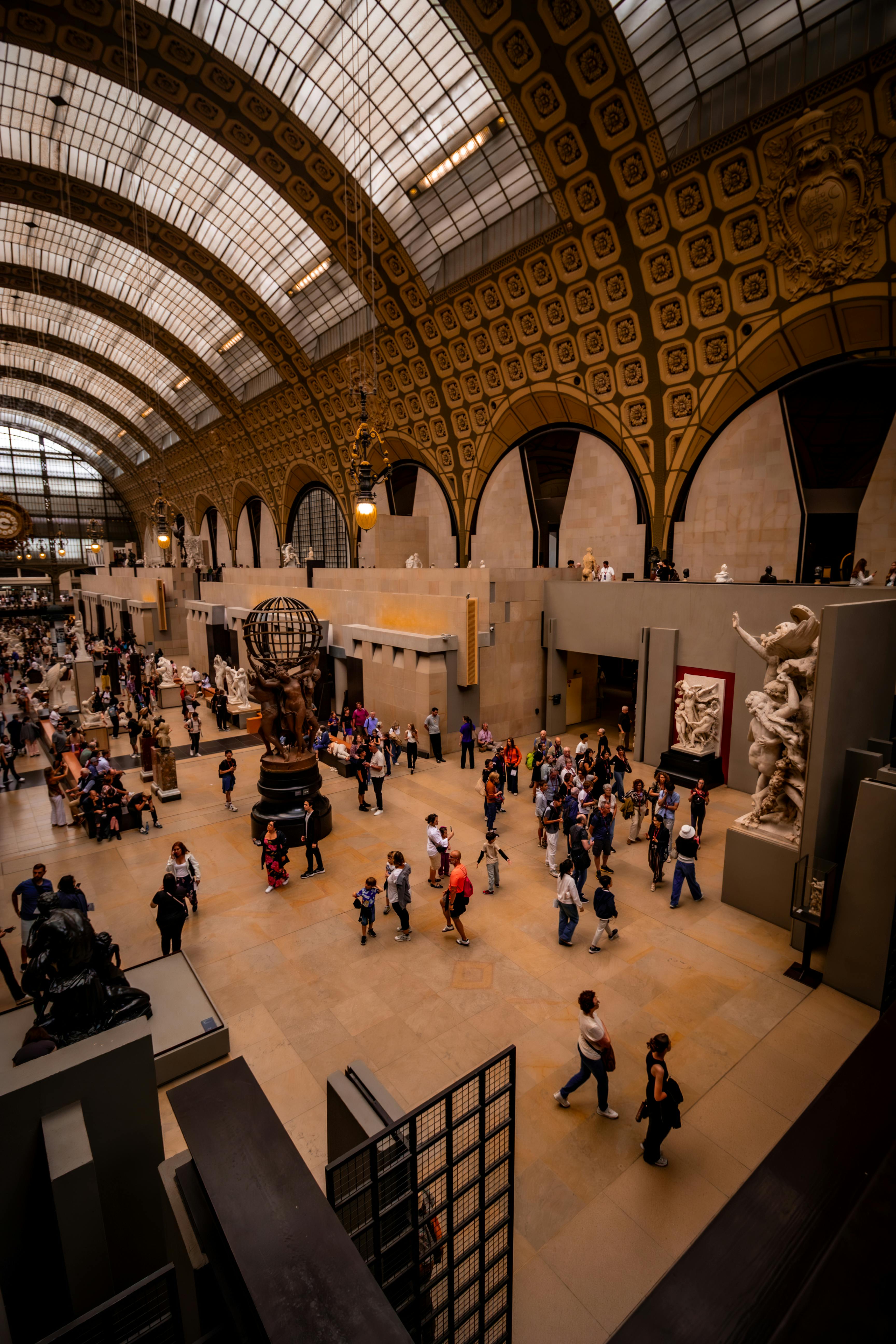
Are you feeling inspired to tackle that blank canvas? I genuinely hope so! Explore my collection of abstract art for pieces that could bring vibrant life and unique character to your walls, transforming your hallway into a daily source of inspiration. Or perhaps visit the den-bosch-museum to see firsthand how art transforms space and evokes emotion. And if you're curious about my artistic journey, my timeline offers a glimpse into how these ideas and this passion have evolved over time – because every journey, even an artistic one, starts with a single step (or brushstroke!).
Go on, give that hallway some love. You and your art deserve it, and your home will thank you. It's not just about decorating; it's about making your entire home, every single corner, feel alive, intentional, and deeply personal – a true reflection of the beautiful life you're creating. And honestly, there's nothing more rewarding than that.


