Resolving Abstract Paintings: From Chaos to Harmonious Clarity
Navigate the 'ugly phase' of abstract art with practical strategies for refining color, composition, and texture. Learn my personal process to transform visual dilemmas into resolved, compelling artworks.
From Chaos to Clarity: My Process for Resolving and Refining Abstract Paintings
The canvas breathes, expands, and then... sometimes it screams. Oh, the glorious, terrifying dance of the abstract painting! It starts with such promise, a burst of energy, a cascade of color onto the canvas. It's exhilarating, a true expression of my creative flow: embracing intuition in abstract painting. But then, inevitably, comes that moment. The moment where the canvas, once a playground of possibility, transforms into a battleground of conflicting ideas, a visual cacophony. I call it the "ugly phase," and if you've ever embarked on an abstract piece, you know exactly what I'm talking about. I remember one piece, a sprawling canvas I’d named ‘Confluence,’ that sat in my studio for months, a jumbled cacophony of blues and oranges that refused to speak to each other. Every time I looked at it, I felt a knot in my stomach, convinced it was destined for the 'failed pile.' It’s a bit like trying to solve a Rubik's Cube blindfolded – you know there’s a solution, but finding it feels impossible, and frankly, a bit overwhelming. This article is a candid look into how I navigate these moments of uncertainty, detailing my process for resolving and refining complex abstract pieces into harmonious resolutions. More than just a personal reflection, consider this your practical guide to transforming visual dilemmas into rewarding journeys of discovery, offering a step-by-step approach to bring your abstract art from turmoil to triumph.
This isn't just about paint and canvas; it's a metaphor for life, isn't it? We dive headfirst into projects, relationships, or even just our morning routines, full of good intentions, only to find ourselves entangled in a glorious mess. The real artistry, I believe, lies not in avoiding the mess, but in having a process for navigating it, for bringing chaos to clarity. This isn't about rigid rules, but about a personal toolkit and a mindset that transforms daunting visual dilemmas into rewarding journeys of discovery. So, let me pull back the curtain on my own, often messy, journey from a jumble of strokes to a refined, resolved abstract painting. It's a bit like trying to herd cats, but with brushes and a lot more self-doubt.

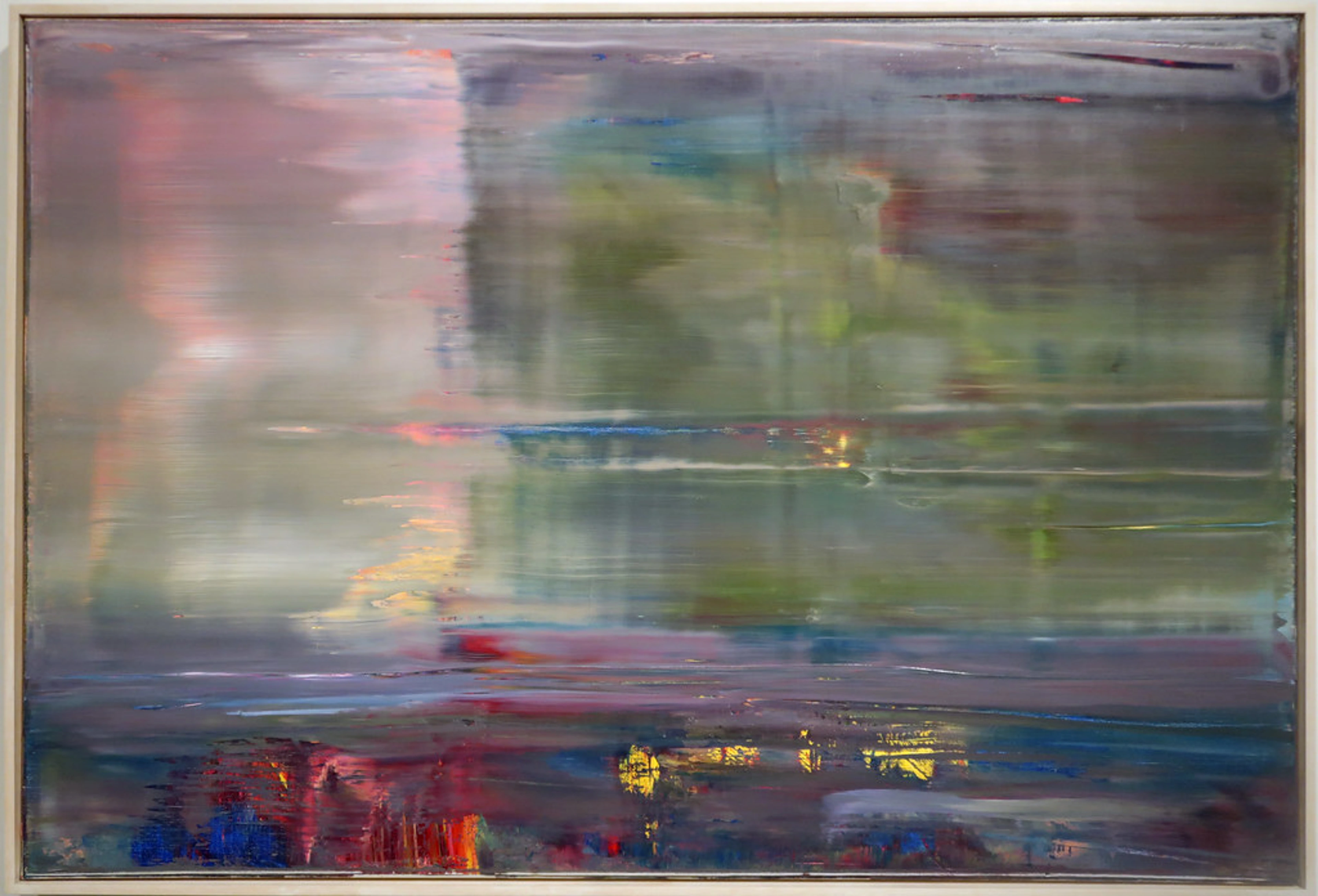
https://www.flickr.com/photos/abstract-art-fons/30634352376, https://creativecommons.org/licenses/by/2.0/
The Unruly Canvas: Embracing the Initial Uproar
So, how does this glorious mess begin? Every abstract piece starts with an intuitive burst. I'm not thinking, I'm feeling. It's a raw, uninhibited layering of paint, texture, and the art of mark-making: expressive lines and gestures in abstract painting. Sometimes, it feels like I'm throwing everything at the canvas just to see what sticks, embracing the spontaneity as discussed in my article, from concept to canvas: my intuitive approach to starting an abstract painting. And for a while, it's wonderful. A vibrant symphony of color and form!
But then, the crescendo becomes a clash. What once felt dynamic now feels disjointed, as if multiple conversations are happening at once, none of them listening – or perhaps, like being in a room where everyone is talking loudly, but no one is truly communicating, just generating noise. The colors argue, perhaps turning muddy and lifeless in their unexpected combinations. Shapes jostle for dominance, creating an uncomfortable visual tension. Expressive lines that started with energy now awkwardly intersect, creating visual roadblocks for the eye. And those seemingly intentional textures? They can just create visual static, fighting for attention rather than harmonizing. Sometimes, the initial enthusiasm, especially when experimenting freely with bold new mediums like heavy impasto gels and gritty pumice pastes, leads to a chaotic overabundance – too much of everything, and nothing standing out. The piece might lack a clear focal point, or its values (lightness and darkness) become unbalanced, making the entire composition feel flat or confused, with muddy mid-tones or a lack of overall depth. This is the chaos, the true ugly phase of an abstract painting. It’s a necessary part of the process, a wild adolescent phase the painting must go through. And honestly, it often feels like the painting itself is looking at me, shrugging, and saying, "Good luck with this one, pal. You got yourself into this mess."

https://www.pexels.com/photo/creative-art-studio-with-brushes-and-paints-29589096/, https://creativecommons.org/publicdomain/
The Power of Perspective: My Secret Weapon
When a painting feels stuck, my absolute first step is to walk away. Seriously. I'll put it in a corner, turn it to the wall, or even stash it in another room. This isn't laziness (mostly), it's a deliberate act of detachment. When you're too close, you lose perspective. Your eyes get fatigued, your brain gets bogged down in the details, and suddenly every brushstroke feels like a critical life-or-death decision.
Coming back to a piece with fresh eyes is transformative. I don't set a hard rule, but often it's at least a day, sometimes a week or more. Sometimes, I’ll even flip it upside down or view it in a mirror; the unfamiliar reflection can highlight compositional issues I’d become blind to. The moment I stop seeing individual brushstrokes and start seeing the painting as a whole again – that's my cue. It's like my brain has had time to process the visual information in the background, making connections I couldn't see when I was too immersed. It's like seeing an old friend after a long absence; you notice things you never did before, patterns emerge, and sometimes, a clear path forward just… appears. This is also why I often work on multiple pieces simultaneously. If one is yelling at me, I can politely excuse myself and engage with another. It’s a strategy I often employ when I navigate artist's block in my studio. Once I've gained that crucial distance, I can then approach the canvas not just with fresh eyes, but with a more deliberate, problem-solving mindset, ready to dive into my toolkit.
My Toolkit for Taming the Wild: From Overwhelm to Order
Once I've had some distance, I approach the canvas not as a creator, but as a problem-solver. It’s less about adding new elements and more about refining what’s already there. The medium itself also significantly influences my approach; quick-drying acrylics allow for swift, decisive changes, encouraging bold alterations, while the slower drying time of oils offers more opportunity for blending, nuanced layering, and extensive re-evaluation. And for those who work with pastels, watercolors, or mixed media, the game changes again; pastels might involve layering and blending or aggressive erasure, watercolors demand precise washes and patience, while mixed media often requires a blend of strategies, navigating different drying times and adhesion properties. Each medium is a puzzle with its own rules. Understanding your medium is the first step in choosing the right tool from your artistic arsenal.
1. Simplification and Subtraction: Less is Often More
My initial instinct is often to add more. More color! More layers! More texture! But paradoxically, clarity often comes from taking away. I’ll ask myself:
- What elements are truly essential? Which parts are crucial to the painting's underlying message?
- Which colors are fighting rather than harmonizing? Are there too many competing focal points?
- Can I unify disparate areas with a wash of translucent paint?
Sometimes, painting over a chaotic section with a neutral color – perhaps a thin, opaque layer of warm gray or a calm, transparent glaze of raw umber – creates instant breathing room and allows other elements to shine. This might mean completely covering an entire area of frantic marks or even aggressively scraping back a heavily textured section to reveal the canvas beneath, or an earlier, more serene layer. I remember one sprawling piece, a riot of reds and yellows, where I was absolutely stuck. In a moment of sheer frustration (and a dash of courage), I took a large, flat brush and simply painted a muted, earthy green wash right over a particularly noisy quadrant. It felt like an act of artistic destruction, a tiny rebellion against my own chaos. But from that very act of reduction, a 'happy accident' emerged – an unexpected interplay of a softened red with the new green that wasn't planned but guided the rest of the painting forward, a little gift from the canvas. I once had a piece overwhelmed by aggressive brushstrokes, a visual shouting match. My solution? A wide, soft brush and a thin, milky wash of titanium white, almost like a veil, to quieten the loudest voices without erasing them entirely. It was a subtle act of artistic diplomacy. It's a bold move, but sometimes you just need to say, "Nope, not working," and start a small part over.
2. Rethinking Color: Finding the Emotional Harmony
Once I've pared down the elements, I turn my attention to the emotional resonance of the colors. Color is a language, and sometimes my initial abstract ramblings sound a bit like a toddler who just learned to swear – expressive, but incoherent. When a painting feels off, I revisit its color story. I think about the emotional language of color in abstract art and what my palette is really saying.
- Are the colors balanced? Do I have too many high-contrast elements without enough restful areas? What is the overall color temperature – is it too warm, too cool, or is there a jarring mix?
- Beyond complementary colors, am I exploring analogous palettes (colors next to each other on the color wheel, creating subtle shifts and depth), monochromatic (using different shades, tints, and tones of a single color) or split-complementary (a base color plus the two colors adjacent to its complement) palettes to unify the composition and create a cohesive emotional experience?
- Am I using secondary and tertiary colors to create complex abstract worlds effectively, or just throwing them on?
- What emotional language is the color palette speaking? Is it conveying the feeling that I intend? A jarring color palette can feel like visual shouting, creating confusion, while a harmonious one can evoke a specific mood or narrative, even in abstraction. How do complementary colors (like blue and orange) create vibrancy, and how can they create discord if not carefully managed?
Often, adjusting the temperature (warm vs. cool) or intensity (bright vs. muted) of just one or two dominant colors can completely shift the mood and bring harmony. For instance, if a painting feels too aggressive, I might mute a dominant warm red with a cooler glaze of cerulean blue, or soften a jarring bright yellow with an opaque layer of desaturated ochre. I vividly remember a painting dominated by a harsh, almost electric yellow that just screamed for attention, overpowering everything else. Instead of trying to dim it with black, which would have killed its vibrancy, I subtly layered a transparent glaze of deep indigo over sections of it, transforming the jarring yellow into a richer, more complex golden green, creating an unexpected depth and calming the overall mood like a hush. It's like finding the right dial to turn on a soundboard to balance a cacophony into a symphony. I still cringe thinking about a piece where I decided to throw every neon color I owned onto a single canvas. It was less "vibrant" and more "visual headache." A quick overlay of a transparent, smoky gray glaze saved it from becoming a permanent resident of the disaster pile.

https://www.pexels.com/photo/artist-brush-mix-color-oil-painting-8382705/, https://creativecommons.org/public-domain/cc0/
3. Revisiting Composition: The Hidden Structure
After color, I delve into the architecture of the piece. Even in abstract art, what is design in art and composition are crucial. When a painting feels unbalanced, I mentally (or sometimes physically, with a pencil and paper) break it down. A clear compositional path is vital, even in non-representational work, as it guides the viewer's eye through the piece, creating a visual narrative or an emotional journey. Without it, the eye can wander aimlessly, leading to a sense of confusion or disconnect.
- Are there dominant lines or shapes that lead the eye? Where do they lead? Is there a clear path for the viewer's gaze, or is it wandering aimlessly?
- Is there a focal point, or is the eye just wandering aimlessly?
- How do positive and negative spaces interact? Is there enough deliberate 'empty' space, allowing other elements to breathe and be defined, or is the canvas just a jumble of active forms? The role of negative space in abstract art is often underestimated but vital.
- Am I subtly incorporating underlying compositional principles like the Golden Ratio, rule of thirds, or dynamic symmetry to guide the eye and create an innate sense of balance, even if unconsciously?
- Consider the 'visual weight' of elements – darker, more saturated, or highly textured areas naturally pull the eye more strongly. How can you strategically distribute or consolidate these weights to create a sense of balance, or deliberately unbalance it to create tension and narrative?
A powerful exercise is to take a quick photo of the painting, convert it to black and white, and then draw simple compositional lines over it with a marker. This initial visual analysis is like detective work, stripping away distractions to reveal the true structure of the crime scene – I mean, canvas. This helps distill the core structure and reveals imbalances in value or form that color might have obscured. Another trick is to disrupt your familiar perception: view it through a phone camera (it often simplifies), flip it upside down, observe it in a mirror, or even cover sections with paper to isolate problematic areas. Sometimes, simply introducing a strong vertical or horizontal line, or creating a more defined cluster of elements, can ground the entire piece. I might also rotate the canvas, literally seeing it from a new perspective, which can reveal compositional weaknesses or strengths I missed.

Printerval.com, https://creativecommons.org/licenses/by-nc/4.0/
4. Texture Talk: Adding Depth, Not Distraction
Finally, I consider the tactile dimension. The role of texture in abstract art: a sensory exploration is immense. When refining, I consider if the textures are enhancing or detracting. A heavily textured area might, for example, be pulling too much attention away from the subtle color shifts in another part of the canvas, or a gritty section of pumice paste might visually conflict with a smooth, serene expanse of transparent glaze, creating an uncomfortable visual vibration. I recall a piece where I had overdone the impasto, creating a dense, almost impenetrable surface. It felt like shouting when I wanted a whisper. The purpose of texture isn't just visual; it adds a tactile dimension, creates perceived depth, and can convey specific emotions – a rough texture might feel aggressive, a smooth one serene. It’s about creating a varied surface that both engages the eye and leads it through the composition, rather than letting it get stuck in a textural muddle.
- Are there areas that need more depth, perhaps with my palette knife, my voice: a personal guide to creating texture and emotion in abstract art or exploring texture: my favorite techniques for adding depth to abstract paintings?
- Are there too many competing textures creating a visual jumble? Can I use different tools like sponges, rags, even household items like cardboard or combs, to introduce varied textures that complement each other?
- Even the direction of your texture can speak volumes; horizontal scrapes might evoke calm, while agitated, diagonal impasto can suggest movement or conflict. How does the current direction of your textured marks contribute to or detract from the overall emotional landscape?
Sometimes, softening a highly textured area with a thin wash, or conversely, adding a bold impasto stroke, can bring a needed shift in focus and tactile interest. Artists like Gerhard Richter, for example, masterfully use scraping and layering to resolve and integrate texture, transforming apparent chaos into deliberate, emotive surfaces. Artists like Anselm Kiefer, for instance, often use heavy impasto and embedded materials to create intense, layered surfaces that are integral to the emotional weight of his work, demonstrating how texture is not merely decorative but fundamental to the narrative.

https://live.staticflickr.com/65535/53064827119_1b7c27cd96_b.jpg, https://creativecommons.org/licenses/by-nc-nd/2.0/
The Dance of Intuition and Intention
This entire process is a constant push and pull between the art of intuitive painting: embracing spontaneity in abstract creation and deliberate, thoughtful decision-making. It’s like trying to have a serious conversation with a highly energetic toddler – you need to let them express themselves, but also gently guide them back to the topic.
My initial chaotic layers are born from pure intuition, but the refinement phase is where intention takes the reins. It’s where I apply principles of design, color theory, and my accumulated experience. But even here, intuition whispers, guiding me to which element to refine, which color to subdue. It might be a gut feeling that a particular yellow, though beautiful, is too loud for the emerging mood, or an instinctive nudge to soften a sharp line with a translucent glaze. This is also where managing my own emotional state becomes crucial; channeling initial frustration into focused problem-solving. It’s that internal compass pointing me towards the heart of the painting's unspoken message. This intricate dance between impulse and control has evolved significantly throughout my artistic journey, becoming more nuanced as I’ve learned to trust both my gut reactions and my analytical eye. It’s a beautiful, intricate dance, a dialogue between the impulsive artist and the discerning editor, leading to the dance of intuition and intent: my process in creating abstract layers. This dynamic interplay is at the core of bringing clarity to the canvas, ultimately leading to a resolved piece.

https://live.staticflickr.com/65535/51907566658_1100dbeb2a_b.jpg, https://creativecommons.org/licenses/by-nc-sa/2.0/
When is an Abstract Painting "Done"? (The Million-Dollar Question)
Ah, the holy grail! Knowing when to stop. This is often the hardest part, the final frontier of refinement. Sometimes, I’ll be working on a piece, make one tiny, perfect adjustment, and suddenly, a quiet voice in my head says, "That’s it. Stop." Other times, I might overwork it, and then have to take another step back, maybe even painting over a section I loved but realized was distracting.
My litmus test? When the painting feels balanced, when all the elements are working together, and when it evokes the feeling or message I intended, even if that message is simply, "This feels good." For me, it’s often a subtle sense of quietude, a feeling that if I were to add one more stroke, it would disrupt the delicate balance achieved. Beyond technical balance, there’s an indefinable 'aura' or emotional resonance that tells me a piece is complete. It's when the painting feels like it has found its own soul, a quiet presence that emanates its story without needing more input from me. It's the moment the painting stops asking for something from me and simply is, offering its completed visual story to the viewer. It's when the visual dialogue feels complete, and no element feels like it needs further explanation or adjustment. Adding more would feel like over-explaining a profound silence. It's less about perfection and more about visual tension being resolved. It's about that feeling of quiet harmony, where the visual "noise" has been quieted, and a sense of clarity emerges. It's like decoding abstract art: a guide to finding meaning in non-representational works – sometimes the meaning is in the feeling of resolution itself. It's the moment the chaotic symphony of earlier stages finds its final, resonant chord.
If you’re curious to see some of my resolved pieces, you can always explore my art for sale.
Key Takeaways from the Canvas
Bringing an abstract painting from chaos to clarity is a deeply personal and iterative process. It's about:
- Embracing the Initial Chaos: Allowing for raw, uninhibited expression without immediate judgment.
- Stepping Back: Gaining fresh perspective through detachment.
- Systematic Problem-Solving: Applying a toolkit of simplification, color refinement, compositional analysis, and texture manipulation.
- Harmonizing Intuition & Intention: A continuous dialogue between spontaneous creation and deliberate decision-making, often guided by emotional awareness.
- Recognizing Resolution: Understanding when the visual tension has subsided and the painting feels complete and balanced, offering its message rather than demanding more work.
This journey transforms overwhelming challenges into opportunities for growth and profound artistic discovery.
Frequently Asked Questions About Resolving Abstract Art
Q: How do you know if your abstract painting is in the "ugly phase" or just unfinished?
A: The ugly phase is characterized by a feeling of visual discord, confusion, or a sense that nothing is working – like a visual argument where elements are clashing. It often feels overwhelming and messy, but also, importantly, full of potential. Crucially, it's often accompanied by a sense of frustration, dread, or being utterly lost in the process, a visual cacophony demanding a solution. Unfinished simply means there's more to add, but the existing elements might already have a nascent harmony, like a conversation waiting for its next sentence. An unfinished piece often feels like a deliberate pause or a work in progress with a clear (or emerging) direction, whereas the ugly phase is more about fixing fundamental issues, a crisis rather than a pause.
Q: What if I don't know what to fix?
A: That's completely normal! This is where stepping back is crucial. Try isolating elements, or asking yourself clarifying questions:
- Color: Does any color feel out of place or too dominant? Is the color temperature balanced? Do colors feel like they're fighting or harmonizing?
- Value (light/dark): Is there enough contrast? Or too much? Does anything feel visually 'flat' or 'muddy'?
- Composition: Is there a sense of balance? Does your eye move around the canvas comfortably? What is the strongest element here, and is it where you want the focus to be? What is the overall energy of the piece – is it too static, too chaotic, too calm, too aggressive?
- Texture: Are there too many textures, or not enough variety? Is texture adding to the piece or distracting from it?
Try this: photograph your painting and convert it to black and white. This often strips away the distraction of color, revealing underlying compositional or value issues more clearly. Another trick is to disrupt your familiar perception: view it through a phone camera (it often simplifies), flip it upside down, observe it in a mirror, or even cover sections of the painting with paper or cardstock to isolate problematic areas. Don't be afraid to experiment with small changes; sometimes the answer reveals itself in the process.
Q: What if a painting feels too resolved or 'tight' and has lost its spontaneity? How do I reintroduce that raw energy?
A: Ah, the pendulum swings the other way! This is a common challenge, especially after a period of intense refinement. If a piece feels overly sterile or loses its initial spark, my first move is often to introduce a deliberate 'disruption.' This could be a spontaneous, gestural mark with a loaded brush, a thin, transparent wash of an unexpected color that allows underlying layers to show through, or even a bold scrape with a palette knife to reveal raw texture beneath. The key is to act intuitively and fearlessly, without overthinking. Sometimes, taking a small, calculated risk—like adding a splash of contrasting color or a few aggressive lines—can break the 'perfection' and inject that much-needed raw energy and spontaneity back into the work, transforming it from merely 'finished' to 'alive.' It’s about reminding the painting (and yourself) that art is also about the unexpected, the slightly imperfect, and the human touch.
Q: Should I always try to resolve every painting, or is it okay to abandon some?
A: This is a personal choice. I believe every painting, even the "failed" ones, teaches you something. Sometimes, abandoning a piece is the lesson. But I encourage trying to resolve it first. You might discover new techniques or ideas you wouldn't have otherwise. However, there are rare occasions when a piece is fundamentally flawed in its initial layers or concept, a 'dead end' that can't be salvaged without completely repainting. In those instances, it's okay to respectfully set it aside, learning from its 'failure' rather than forcing a resolution. Sometimes, a 'failed' piece can even be repurposed – used as a textured base for a new painting, or even cut into smaller, successful compositions. It’s like a puzzle – the satisfaction of finding the solution is immense. And hey, even if it remains a beautiful mess, learning to appreciate its 'ugly' state as a testament to your process is a valid outcome. It’s still part of your artistic journey!
From Chaos to Clarity: A Rewarding Journey
The process of resolving and refining abstract paintings is never purely linear. It's a spiral, a back-and-forth, a continuous conversation between me and the canvas. It demands patience, critical observation, and a willingness to sometimes undo what you've just done. But that journey, from the initial burst of chaotic energy to the final emergence of clarity and harmony, is one of the most rewarding aspects of my artistic life. It’s where true magic happens, where the canvas transcends its material form and speaks a language of its own. And sometimes, it whispers back, "Thanks for not giving up on me, pal."


