Chevreul's Color Theory: A Revolution in Art
Explore how Michel Eugène Chevreul's color theory transformed art, influencing artists' understanding of color relationships and visual perception.

Chevreul's Color Theory: A Revolution in Art
I remember the first time I stumbled upon Chevreul's color theory. It was like finding a secret key to understanding how colors interact. Suddenly, the way I saw art—and the world—changed forever. Let me share this journey with you.
Color theory isn't just about mixing paints or choosing palettes; it's about understanding how colors influence each other and how they can evoke emotions, create depth, and transform perception. Chevreul's work was groundbreaking because it provided a scientific foundation for something artists had intuitively known for centuries.
Color theory isn't just about mixing paints or choosing palettes; it's about understanding how colors influence each other and how they can evoke emotions, create depth, and transform perception. Chevreul's work was groundbreaking because it provided a scientific foundation for something artists had intuitively known for centuries.
But what makes Chevreul's theory so revolutionary? It's not just about the mechanics of color mixing; it's about the psychology and physiology of how we perceive color. His insights transformed the way artists approached their craft, bridging the gap between science and art in a way that had never been done before.
Chevreul's work was not just theoretical; it was deeply practical. Artists could now explain why certain color combinations worked and others didn't, and they could use this knowledge to create more vibrant and emotionally resonant works.
Who Was Michel Eugène Chevreul?
Michel Eugène Chevreul was a French chemist who, in the 19th century, made groundbreaking discoveries about color. His work, The Principles of Harmony and Contrast of Colors, published in 1839, became a cornerstone for artists. Chevreul wasn't just a scientist; he was an artist's best friend, providing a language to describe what they intuitively felt.
Chevreul's journey into color theory began with his work in the textile industry, where he sought to solve practical problems related to dyeing fabrics. His observations led him to explore the psychological and physiological effects of color, which ultimately revolutionized the way artists approached their craft.
Early Life and Career
Born in 1786, Chevreul's early career was marked by his work in chemistry, particularly in the study of fats and oils. However, his fascination with color began when he was tasked with improving the dyeing processes for textiles. This practical challenge led him to delve deeper into the science of color perception, a field that would eventually define his legacy.
Chevreul's early experiments with dyes revealed that colors appeared differently when placed next to each other, a phenomenon that would later become central to his theory of simultaneous contrast.
Legacy and Impact
Chevreul's contributions extended beyond the realm of art. His work influenced fields as diverse as psychology, physiology, and even marketing. By providing a scientific framework for understanding color, he empowered artists and scientists alike to explore the boundaries of visual perception.
His theories also laid the groundwork for modern color psychology, which is used today in branding, advertising, and even interior design to evoke specific emotions and behaviors.
The Core Principles of Chevreul's Color Theory
Chevreul's color theory is built on several key principles that explain how colors interact and influence each other. These principles are not just theoretical; they have practical applications that can transform the way artists approach their work.
To fully grasp the impact of Chevreul's work, it's essential to understand these principles in detail and how they can be applied in various artistic contexts.
Simultaneous Contrast
Imagine you're looking at a gray square on a white background. Now, place that same gray square on a black background. Suddenly, the gray looks lighter, right? That's simultaneous contrast. Chevreul discovered that colors influence each other when placed side by side. This principle is crucial for artists who want to create depth and vibrancy in their work.
This phenomenon occurs because our eyes perceive colors in relation to their surroundings. For example, a color may appear more vibrant or muted depending on the colors adjacent to it.
Complementary Colors
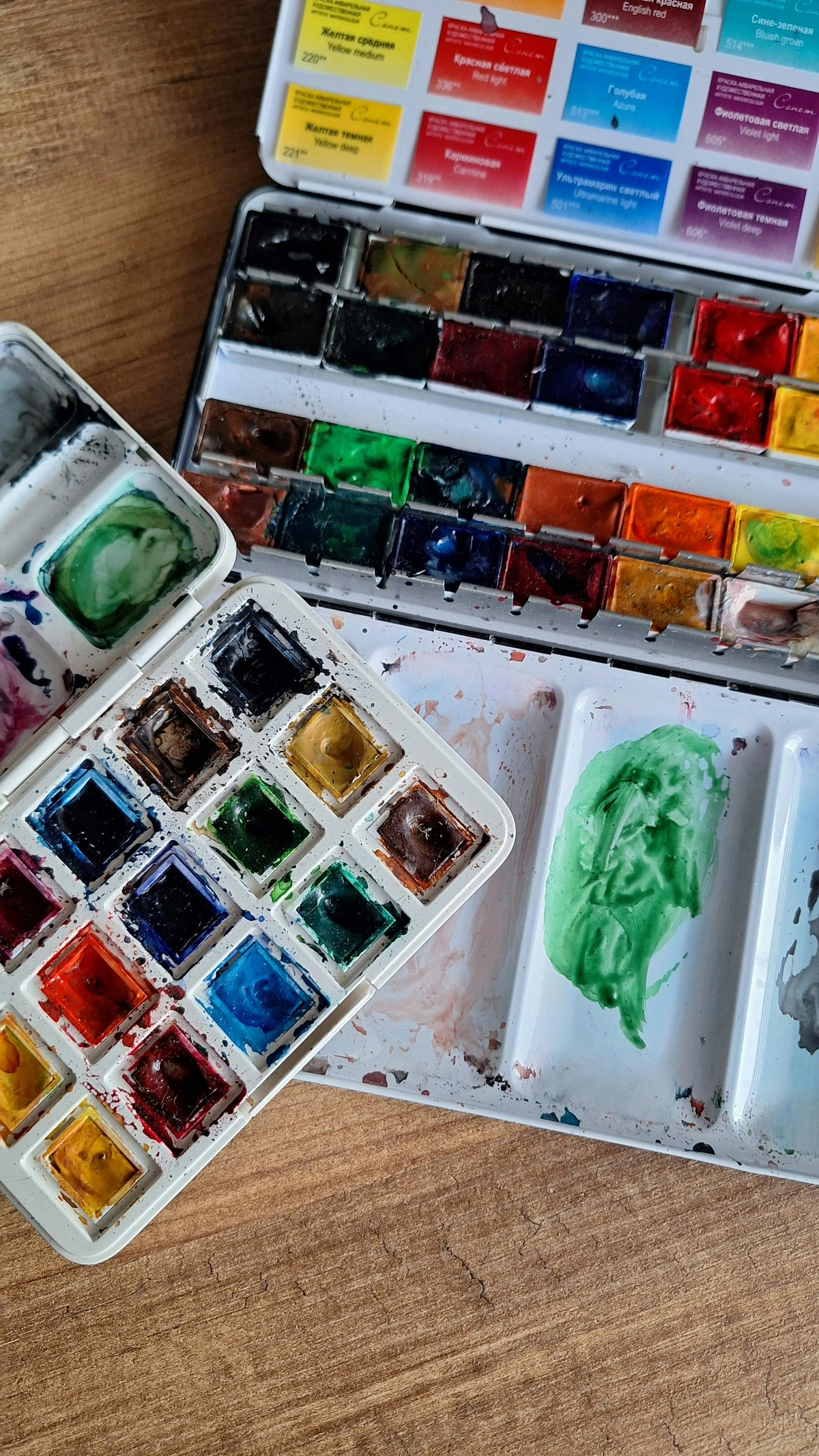
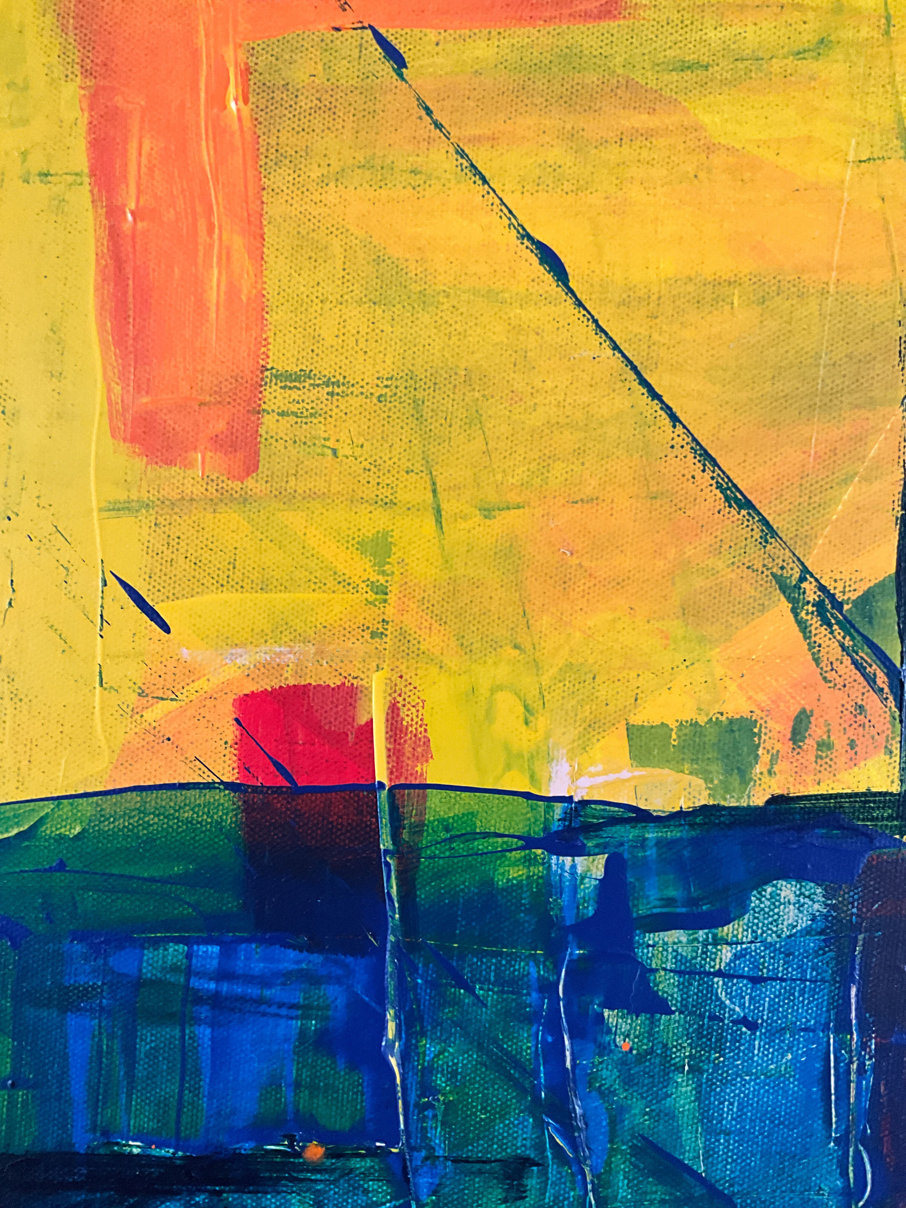
Chevreul identified that certain colors, when placed next to each other, enhance each other's intensity. These are called complementary colors. For example, red and green, blue and orange, yellow and purple. Understanding this can make your artwork pop.
Complementary colors are positioned opposite each other on the color wheel. When used together, they create a vibrant contrast that can draw the viewer's attention and add dynamism to a composition.
Color Harmony
Harmony in color is about creating a pleasing balance. Chevreul's theory helps artists achieve this by understanding how colors interact. It's not just about choosing colors you like; it's about choosing colors that work well together.
Achieving color harmony involves selecting colors that complement each other and create a cohesive visual experience. This can be done through analogous colors, triadic schemes, or other harmonious combinations.
Color Temperature
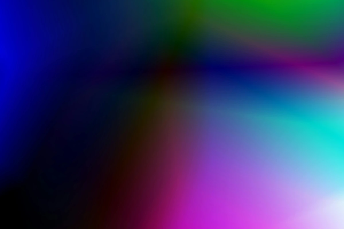
Chevreul also explored the concept of color temperature, which refers to the perceived warmth or coolness of a color. Warm colors, like reds and yellows, tend to advance and create a sense of energy, while cool colors, like blues and greens, recede and evoke calmness. Understanding color temperature can help artists create depth and evoke specific emotions in their work.
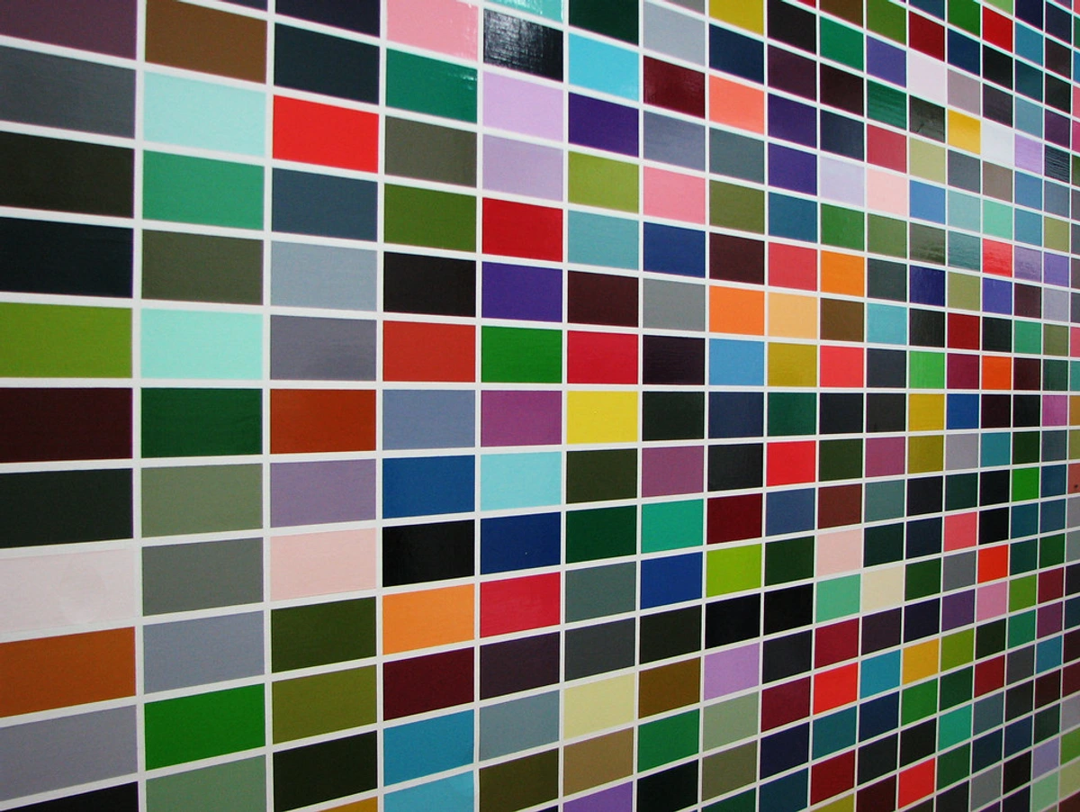
Color temperature is not just about the hue itself but also about how it interacts with other colors in a composition. For example, a warm color can appear even warmer when placed next to a cool color, and vice versa.
How Chevreul's Theory Revolutionized Art
Chevreul's color theory didn't just influence art; it revolutionized it. By providing a scientific framework for understanding color, he empowered artists to explore new ways of seeing and representing the world.
His theories provided artists with a toolkit for manipulating color to achieve specific effects, whether it was creating depth, evoking emotions, or guiding the viewer's eye through a composition.
Impact on Impressionism
Artists like Monet and Renoir were deeply influenced by Chevreul's theories. They used his principles to create vibrant, lifelike paintings that captured the essence of light and color. The Impressionists weren't just painting what they saw; they were painting how they saw it, using Chevreul's insights to guide their brushstrokes.
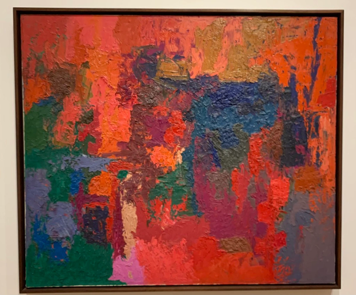
The Impressionists' use of broken color and optical mixing was directly inspired by Chevreul's ideas. By placing small dabs of complementary colors next to each other, they created the illusion of vibrant, luminous hues that seemed to shimmer on the canvas.
Influence on Modern Art
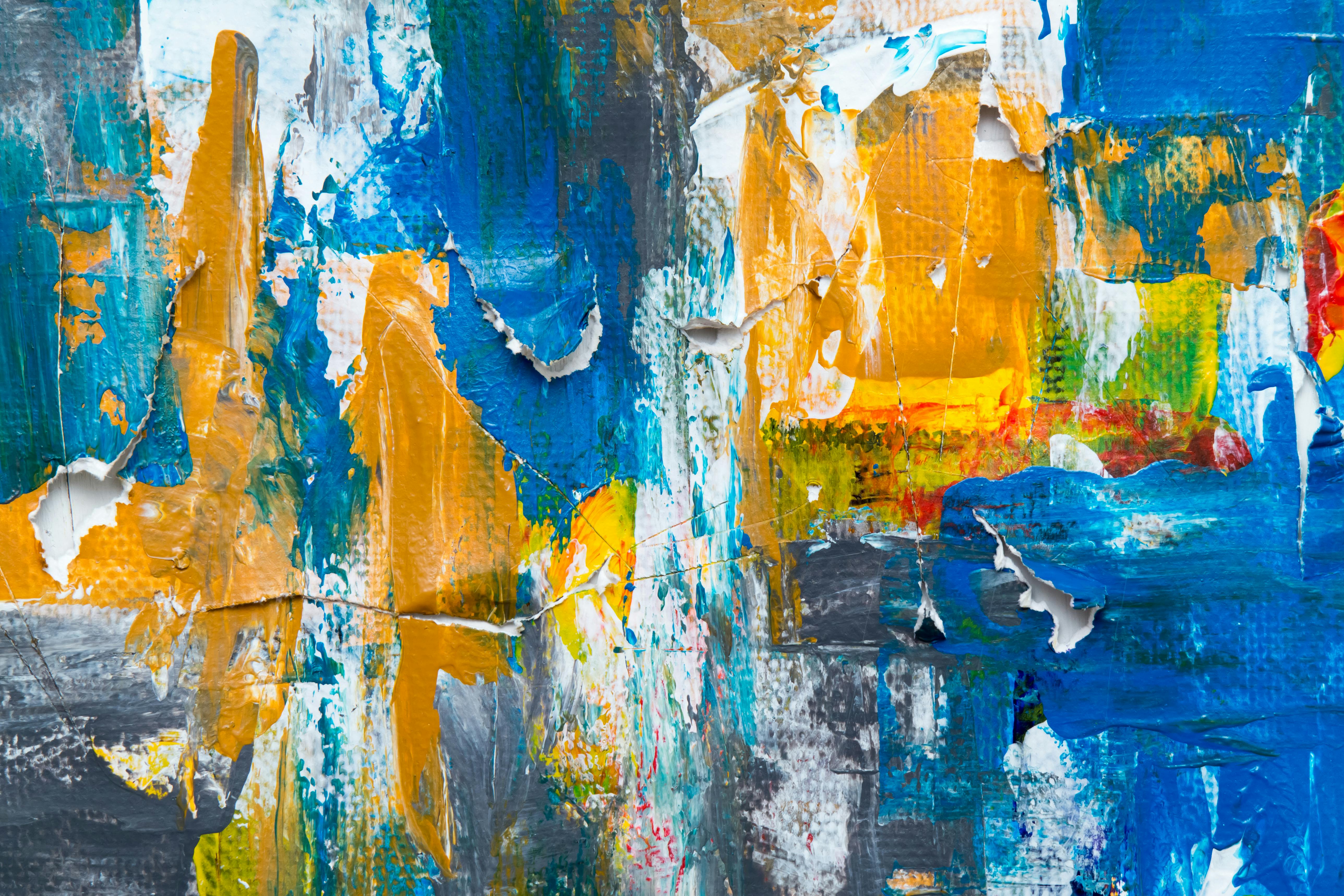
Chevreul's ideas didn't stop with the Impressionists. Modern artists, from the Fauves to abstract expressionists, have used his theories to push the boundaries of color and perception. Even today, artists rely on Chevreul's principles to create compelling, dynamic works.
The Fauves, for example, embraced bold, unnatural colors to evoke emotion, while abstract expressionists used color to convey psychological depth and complexity. Chevreul's theories provided a foundation for these movements, allowing artists to experiment with color in ways that were both innovative and meaningful.
Influence on Design and Marketing
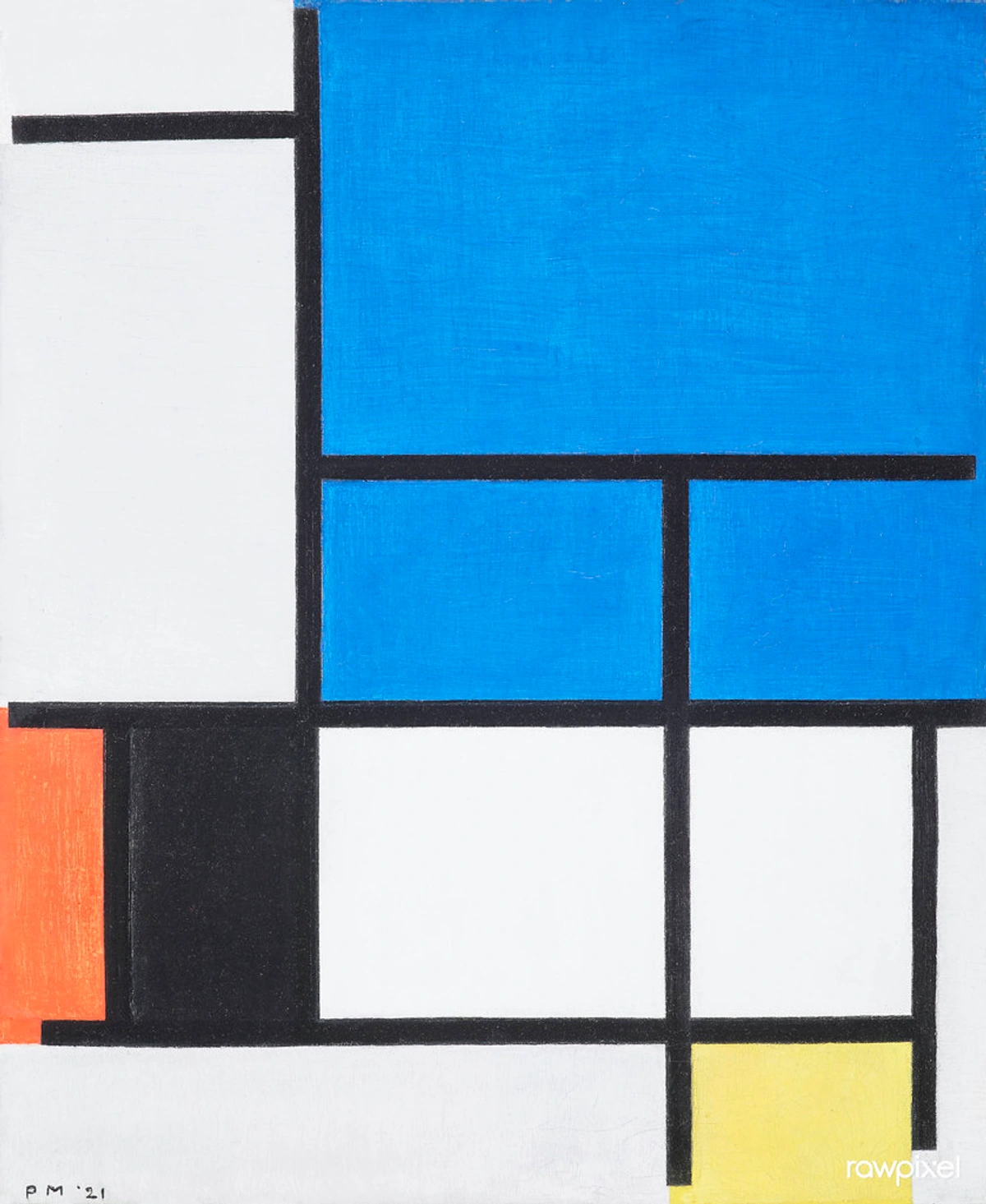
Chevreul's principles have also found applications in design and marketing. Understanding how colors interact and influence perception has become essential for creating effective branding, advertising, and product design. From logos to packaging, Chevreul's insights continue to shape the visual world around us.
In marketing, color is used to evoke specific emotions and associations. For example, red is often used to convey energy and urgency, while blue is associated with trust and reliability. Chevreul's theories help designers and marketers choose colors that resonate with their target audience and achieve their desired outcomes.
Practical Applications for Artists
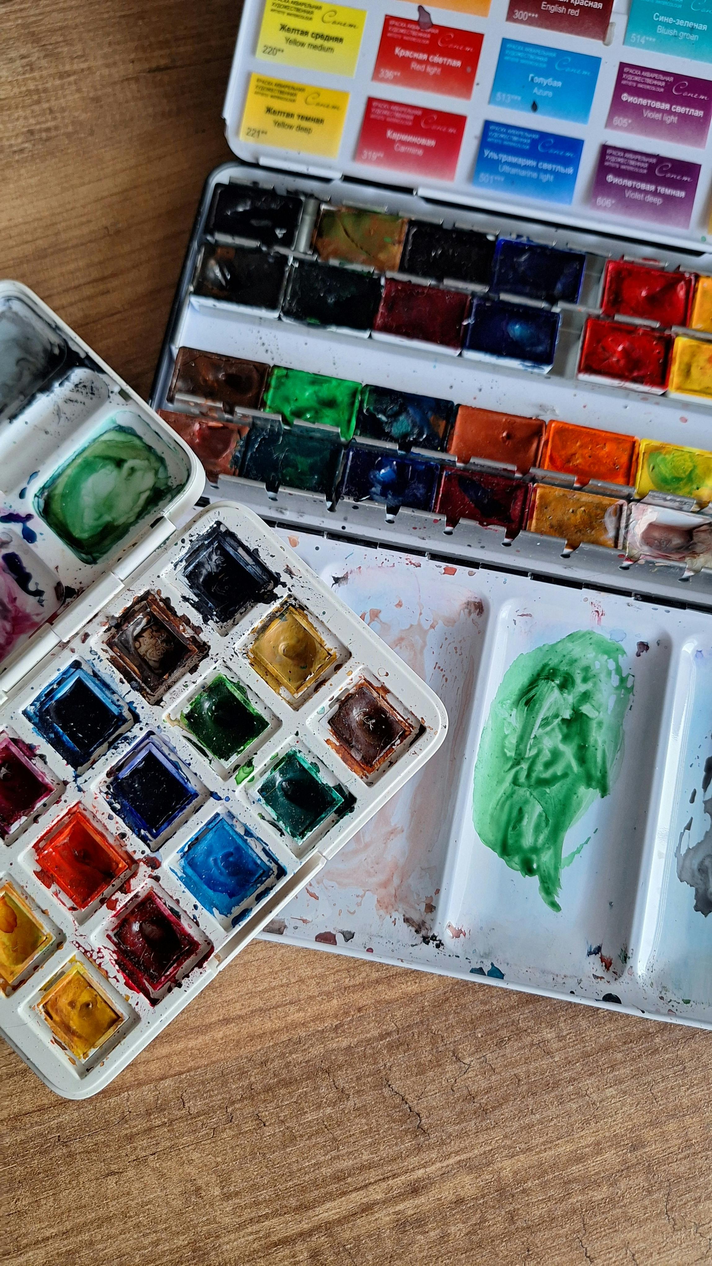
Choosing a Color Palette
When I'm choosing a color palette, I often think about Chevreul's principles. I ask myself, "How do these colors interact? Do they create harmony or contrast?" This helps me create a cohesive and visually appealing piece.
Choosing a color palette is like composing a symphony. Each color plays a role, and the way they interact can create a harmonious melody or a dynamic crescendo. Tools like color wheels and digital palette generators can help you experiment with different combinations and find the perfect balance.
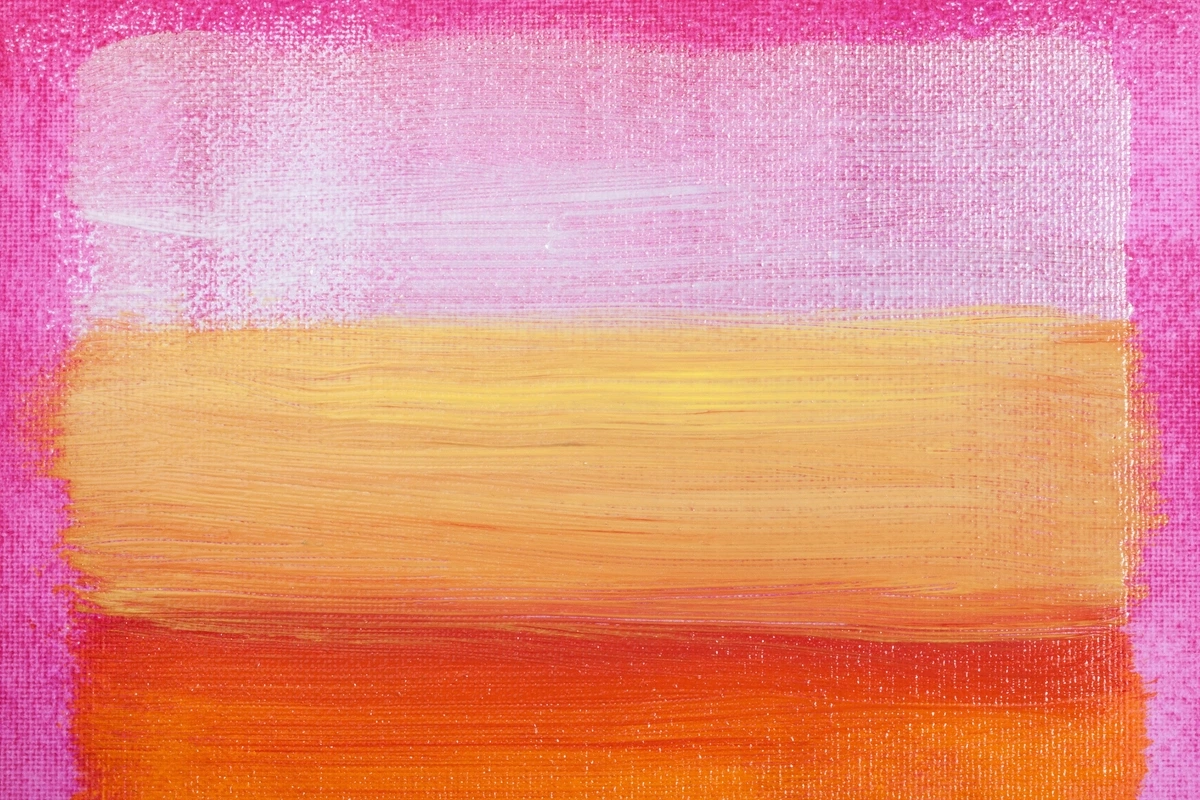
It's also helpful to consider the emotional impact of your color choices. For example, warm colors can evoke energy and passion, while cool colors can create a sense of calm and tranquility.
Creating Depth and Dimension
Chevreul's theory is also incredibly useful for creating depth. By understanding how colors influence each other, I can make certain elements of my artwork stand out while others recede. This adds a sense of dimension and realism to my pieces.

Creating depth isn't just about perspective; it's about color temperature and contrast. Warm colors tend to advance, while cool colors recede. By strategically placing warm and cool colors, you can create the illusion of space and distance in your artwork.
Additionally, using complementary colors can enhance the sense of depth by creating vibrant contrasts that draw the viewer's eye into the composition.

Enhancing Emotional Impact
Colors have a profound emotional impact. Chevreul's theory helps me harness this power. By carefully selecting and placing colors, I can evoke specific emotions in the viewer. Whether it's the calmness of blues or the energy of reds, understanding color relationships allows me to create a more powerful emotional experience.
Color psychology is a fascinating field that explores how different hues can evoke specific emotions and associations. For example, blue is often associated with calmness and tranquility, while red can evoke passion and energy. By understanding these associations, you can use color to tell a story and connect with your audience on a deeper level.
It's also important to consider the cultural context of color. Different cultures may associate colors with different emotions or meanings, so it's essential to be mindful of these nuances when creating art for a global audience.

Experimenting with Color
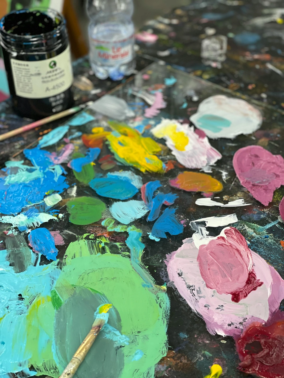
One of the best ways to understand Chevreul's principles is to experiment with color. Try creating small studies where you explore different color combinations and observe how they interact. Keep a color journal to document your experiments and reflect on what works and what doesn't. This hands-on approach will deepen your understanding and help you develop your unique artistic voice.
You can also use digital tools to experiment with color. Apps like Adobe Color allow you to create and test color palettes, making it easier to see how different colors interact and influence each other.
FAQ
What is Chevreul's color theory?
Chevreul's color theory is a set of principles that explain how colors interact and influence each other. It includes concepts like simultaneous contrast, complementary colors, and color harmony.
These principles provide a scientific foundation for understanding how colors can be used to create depth, evoke emotions, and guide the viewer's eye through a composition.
How did Chevreul's theory influence art?
Chevreul's theory had a profound impact on art, particularly on movements like Impressionism and Modern Art. Artists used his principles to create more vibrant, dynamic, and emotionally impactful works.
Can Chevreul's theory be applied to digital art?
Absolutely! Chevreul's principles are just as relevant to digital art as they are to traditional art. Understanding color relationships can help digital artists create more compelling and visually appealing works.
Digital artists can use tools like color wheels and digital palette generators to experiment with color relationships and create harmonious, dynamic compositions.
Are there any tools or resources to help apply Chevreul's theory?
Yes, there are many tools and resources available. Color wheels, online color palette generators, and books on color theory can all help you apply Chevreul's principles to your artwork.
What is simultaneous contrast?
Simultaneous contrast is a phenomenon where colors influence each other when placed side by side. For example, a gray square on a white background may appear lighter than the same gray square on a black background. This principle is crucial for creating depth and vibrancy in artwork.
How can I use Chevreul's theory in my own art?
Start by experimenting with color combinations and observing how they interact. Use tools like color wheels and digital palette generators to explore different harmonies and contrasts. Keep a color journal to document your experiments and reflect on what works best for your unique style.
You can also study the works of artists who have used Chevreul's principles, such as the Impressionists or modern abstract artists, to see how they applied these concepts in their own work.
Conclusion
Chevreul's color theory is more than just a set of rules; it's a way of seeing the world. By understanding how colors interact, artists can create works that are not only visually stunning but also emotionally resonant. So next time you pick up a brush or open a digital art program, remember Chevreul's principles and let them guide your creative journey.
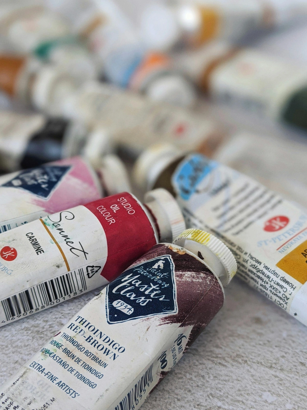
Chevreul's legacy is a testament to the power of curiosity and observation. His work reminds us that art and science are not separate realms but interconnected ways of understanding the world. Whether you're a seasoned artist or just starting your creative journey, Chevreul's principles offer a timeless guide to exploring the endless possibilities of color.

If you're interested in exploring more about color theory and its applications, check out our timeline of art movements and their use of color. And if you're inspired to create your own masterpiece, visit our buy page to find the perfect tools and materials.
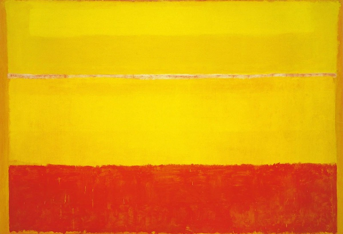
Further Reading and Resources
For those eager to dive deeper into the world of color theory, here are some recommended resources:
- Books: The Principles of Harmony and Contrast of Colors by Michel Eugène Chevreul, Interaction of Color by Josef Albers.
- Online Courses: Many platforms offer courses on color theory, from beginner to advanced levels.
- Tools: Color wheels, digital palette generators, and apps like Adobe Color can help you experiment with color relationships.
Additionally, exploring art movements like Impressionism and Modern Art can provide valuable insights into how artists have applied Chevreul's principles in their work.
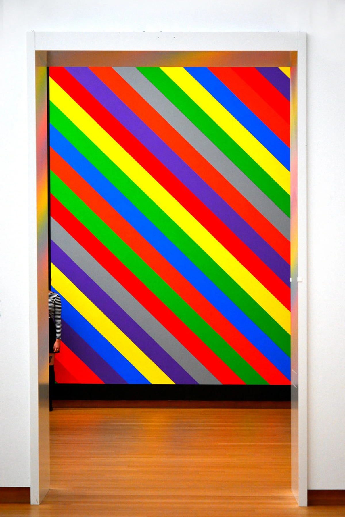
Join the Conversation
We'd love to hear about your experiences with color theory. Share your thoughts, experiments, and artwork with us on social media. Let's continue the conversation and explore the endless possibilities of color together.
You can also join online communities and forums dedicated to color theory and art to connect with other artists and learn from their experiences.
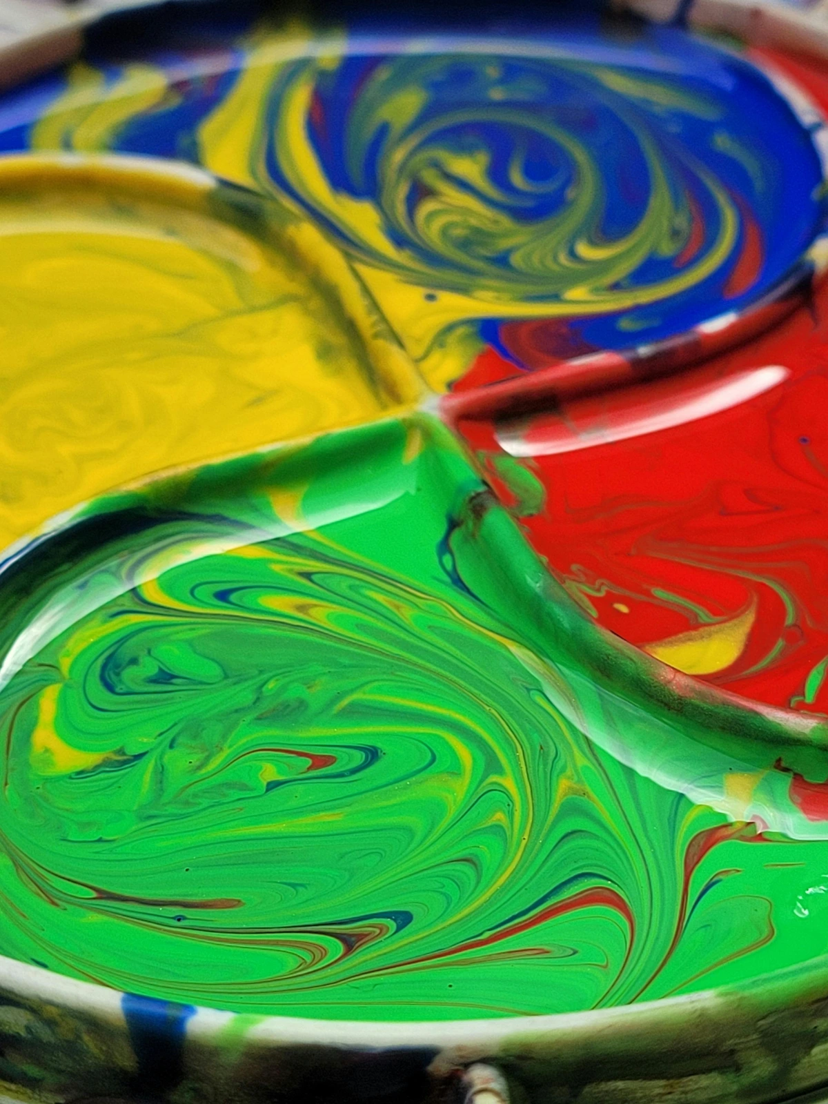
Exploring Chevreul's Theory in Contemporary Art
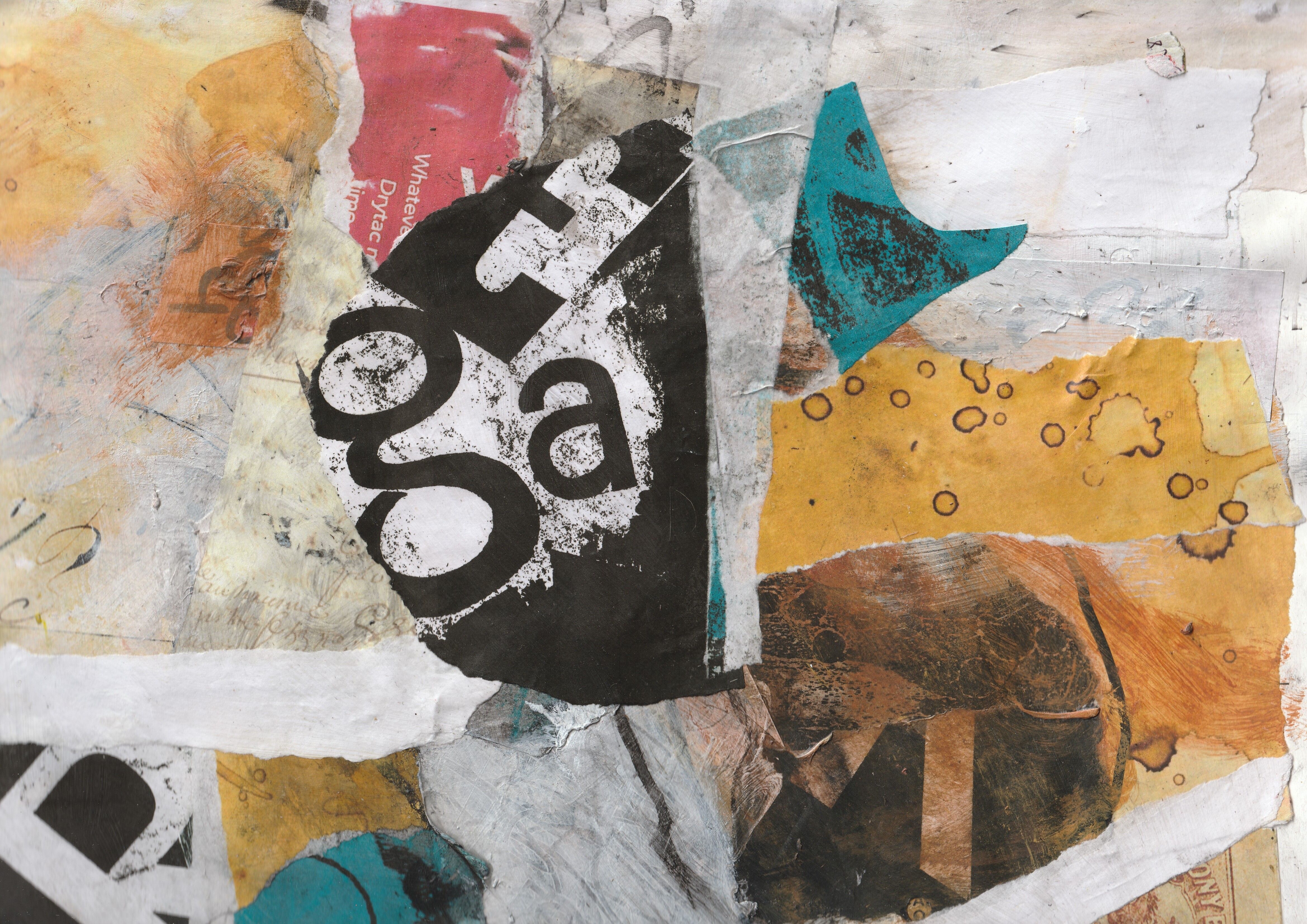
Chevreul's principles continue to inspire contemporary artists. From abstract paintings to digital installations, artists are finding new ways to apply his insights to their work. By exploring the intersection of science and art, they are pushing the boundaries of visual perception and creating works that challenge and delight the viewer.
Contemporary artists often use digital tools to experiment with color relationships and create dynamic, interactive works that engage the viewer in new and exciting ways.














Final Thoughts
Chevreul's color theory is a testament to the power of interdisciplinary thinking. By bridging the gap between science and art, he provided artists with a new way of seeing the world. Whether you're an artist, a designer, or simply someone who appreciates the beauty of color, Chevreul's principles offer a timeless guide to exploring the endless possibilities of visual perception.
As you continue your artistic journey, remember that color is not just a tool for creating beautiful images; it's a language that can convey emotions, tell stories, and connect with others on a deep and meaningful level.