
Professional Oil Paints: The Artist's Definitive, Unfiltered Guide
Cut through the jargon. This in-depth guide reveals what makes professional oil paints worth it: pigment load, binder science, milling, and top brands like Old Holland, Michael Harding, & Sennelier.

Choosing Your Weapon: An Artist's Unfiltered Guide to Professional Oil Paints
I remember the exact moment I switched from student-grade to professional oil paints. I’d been saving up for a single tube of Old Holland Ultramarine Blue. It cost more than my entire set of beginner paints. Squeezing it onto my palette was a revelation. The color wasn't just blue; it was electric. It felt dense, rich, and... purposeful. It was like going from driving a rattling old car to a finely tuned machine. Suddenly, the medium wasn't something I was fighting against; it was a partner. It was a clear signal: my artistic journey had just shifted gears, and I realized then that my materials could either propel me forward or hold me back. That day, I committed to understanding not just how to paint, but what I was painting with.
You’re probably at a similar crossroads. You’ve put in the hours, your skills are growing, but you feel like your materials are holding you back. Welcome. You’ve come to the right place, because today we’re pulling back the curtain on what genuinely makes a professional oil paint worth every penny. We'll explore its rich history, delve into the science behind its magic, and ultimately, discover the titans that grace artists’ palettes worldwide. It's time for a real talk, cutting through the marketing jargon, to find your next studio obsession. You might just find yourself wondering why you waited so long.
What Actually Makes an Oil Paint “Professional”?
It’s not just about a higher price tag, though that’s certainly part of it (and sometimes, let's be honest, it feels like most of it initially!). But really, the tangible difference between the stuff you might have squeezed out in art class and a tube of truly professional paint comes down to a few key, non-negotiable things. And to truly appreciate where we are today, it helps to glance back at the journey of paint itself.
A Brief History: From Ancient Pigments to Modern Alchemy
It's easy to take oil paints for granted, but their evolution is a fascinating tale of innovation and constant refinement. Early artists, dating back to antiquity, ground natural pigments with basic binders like egg yolk for tempera. It wasn't until the Northern Renaissance, notably with artists like Jan van Eyck in the 15th century, that oil as a primary binder truly began to shine. Its slow drying time allowed for unprecedented blending, glazing, and layering, opening up new artistic possibilities that tempera couldn't touch. Over centuries, paint makers refined the process, developing sophisticated milling techniques and exploring various drying oils.
The shift from artists hand-grinding their own pigments to purchasing ready-made, portable tubes in the 19th century was a revolution. This simple invention democratized the medium, making it accessible for artists to paint en plein air and directly contributed to movements like Impressionism. It set the stage for the professional-grade paints we obsess over today. Understanding this journey makes you appreciate the craft in every tube, a legacy of trial and error, science, and pure artistic desire.
1. Pigment Load: The Heart of Color and Its Identity
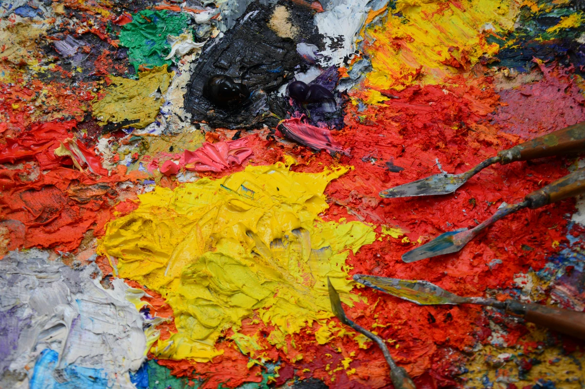
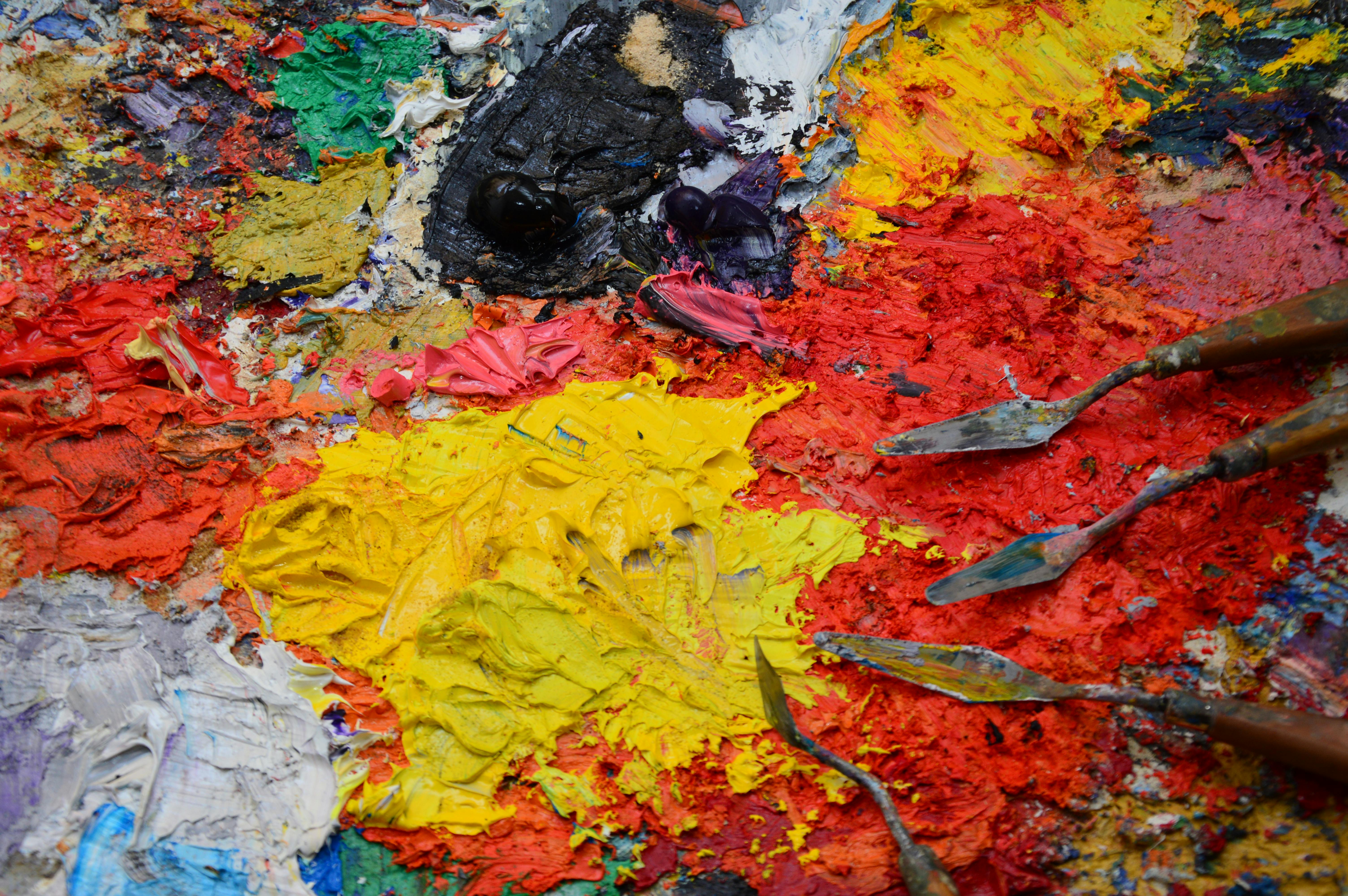
This is the big one. Imagine trying to make a rich, strong coffee with mostly water and a few beans. That's student-grade paint. Now imagine an espresso shot so potent it practically vibrates—that’s pigment load. It's simply the concentration of actual, pure pigment in the paint, unadulterated by fillers or extenders. Student-grade paints use these to bulk volume, diluting the color strength. Professional paints, by contrast, cram in as much pigment as the binder can physically hold, sometimes up to 70-80% by weight for certain colors. This isn't just a marketing claim; it's a fundamental difference you'll feel and see immediately.
- What this means for you: Your colors are astronomically more vibrant and possess superior tinting strength (how effectively a color can alter the hue or value of another color when mixed, without losing its own identity). A minuscule dab of professional Cadmium Red will go vastly further and create a cleaner, brighter pink when mixed with white than its student-grade counterpart. You actually end up using less paint to achieve the same, or often better, effect. It’s an investment that saves you money and frustration in the long run.
- Pigment Specificity and Saturation: Not all pigments are created equal in terms of their inherent 'load' potential or how that load translates to color impact. Earth pigments like Ochres and Siennas, for instance, are naturally bulky minerals and can take a high load, giving them a lovely, dense, often subtly granular feel. Ultramarines, being crystalline, also accept a high load, resulting in their deep, rich translucency. Modern synthetic organic pigments (like Phthalos or Quinacridones), derived from complex chemical processes, are incredibly intense even at lower concentrations. They offer astounding tinting strength and purity of hue, often exceeding traditional mineral pigments in their sheer vibrancy. Conversely, pigments like Titanium White are naturally bulky and have a lower concentration of pigment by weight compared to some other colors, but are essential for their unparalleled opacity and brightness.
2. Binder Quality: The Soul of the Paint and Its Future
The pigment needs something to hold it together, and that's the oil. The type and quality of this oil (the binder) profoundly impacts how the paint behaves, dries, and ages. This is where the long-term integrity—the archival quality—of your artwork truly begins. The choice of binder is a deliberate, alchemical decision by the paint maker, balancing drying time, color integrity, handling properties, and film strength.
- Linseed Oil: The stalwart, and most common binder. It's known for forming a strong, durable, and relatively flexible paint film. It dries consistently and offers excellent adhesion. Its only common 'flaw' is a tendency to yellow slightly over time due to the oxidation of its unsaturated fatty acids, which is most noticeable in whites, pale blues, and unpigmented glazes. Despite this, I often find myself gravitating back to linseed for most of my palette for its sheer reliability and robust film.
- Safflower & Poppy Oil: These are often chosen for whites and lighter colors precisely because they yellow significantly less than linseed oil, having fewer unsaturated fatty acids. However, this comes with a trade-off: they form a slightly weaker and more brittle paint film due to less cross-linking during drying. This can make them more prone to cracking or chipping over very long periods, especially if used in thick impasto layers or as the sole binder for an entire painting. They also take longer to dry, which can be a blessing for extended blending or a curse if you're layering quickly. Manufacturers carefully balance these properties when deciding which binder to use with which pigment.
- Walnut Oil: A true historical gem. This lovely, pale oil provides a beautiful, slightly more fluid flow than linseed and resists yellowing wonderfully. It was a favorite of many Old Masters, cherished for its handling properties and luminous results. It dries a little slower than linseed but faster than poppy/safflower.
- Alkyd Resins & Stand Oil: While less common as the sole binder in general tubes, some artisan brands might use Stand Oil (a polymerized linseed oil, very viscous, great for smooth glazes but very slow drying) or even specialized modern alkyd resins as part of their binder system. Alkyds are synthetic resins that polymerize quickly, significantly accelerating drying time and enhancing durability and flexibility. They can be a lifesaver for artists who work in layers and need faster drying, though they do alter the paint's handling and can create a slightly more rigid film. For a deeper look into the basics, consider my article on definitive guide to paint types for artists.
3. Milling: The Secret to Buttery Smoothness (and Pigment Expression)
Ever used a paint that felt gritty, clumpy, or unevenly mixed? That’s almost certainly a milling issue. This often-overlooked step is crucial for how the paint feels under your brush and how well the pigment expresses itself. Professional paint manufacturers use precision stone or metal roller mills to grind the pigment and oil together. It's a dance between patience and precision, ensuring every pigment particle is perfectly coated and dispersed within the binder.
Each pigment has a unique crystal size and shape, requiring different amounts and types of grinding. Some, like the earthy Ochres, might benefit from coarser grinding on traditional stone mills to retain a subtle, natural texture and a more robust feel. Others, like the highly saturated Cadmiums or delicate organic blues, need ultra-fine grinding on modern triple-roller mills to fully disperse their brilliance and prevent 'flocculation' (where pigment particles clump together). This isn't just about smoothness; it profoundly affects how the light interacts with the pigment, influencing its luminosity, tinting strength, and even its opacity or transparency. A proper mill results in that luxuriously smooth, buttery, or sometimes delightfully gritty (by design!) consistency that feels incredible under the brush or palette knife.
4. Pigment Properties Beyond Load & Binder
Beyond just the amount of pigment and the quality of the oil, other inherent characteristics of the pigments themselves play a massive role in how a professional paint performs and why it feels so different from its student-grade cousins.
- Opacity vs. Transparency: This is fundamental for layering, glazing, and achieving specific visual effects. Opacity (how much light it blocks) is influenced by the pigment's refractive index and particle size. Opaque pigments like Cadmiums or Titanium White offer strong coverage, while transparent ones like Phthalos or Quinacridones are perfect for luminous glazes and subtle color shifts. Understanding this is key to mastering glazing techniques in oil painting.
- Drying Time Influence: While the binder is the primary determinant of drying time, some pigments also act as natural siccatives (drying agents). Pigments containing metallic elements like lead white (historically), cobalt, or iron oxides (earths) can significantly accelerate the drying of the paint film. This is why some colors seem to dry faster than others, even within the same brand and binder system.
- Lightfastness & Permanence: This is non-negotiable for professional art. Lightfastness refers to a pigment's resistance to fading or discoloration when exposed to light over time. Professional paints use pigments with the highest possible lightfastness ratings (often ASTM I or II), ensuring your artwork endures for generations without shifting color. This archival quality is a cornerstone of professional paint making.
- Chemical Stability: Professional paints are formulated to ensure pigments are chemically stable and don't react adversely with the binder or other pigments in the tube or on the canvas. This prevents unexpected color shifts, darkening, or degradation of the paint film over time.
5. Price vs. Value: Why a Tiny Tube Costs So Much
I get it. That sticker shock can be real. I’ve stood in front of a shelf of tiny tubes, wondering if I really needed to remortgage my house for a single color. But understanding why some tubes are so expensive helps shift perspective from 'cost' to 'investment.' The primary driver of cost, beyond the meticulous manufacturing process, is often the pigment itself.
- Rarity and Sourcing: Some pigments, like true Lapis Lazuli (the historical source of Ultramarine Blue, now almost exclusively replaced by synthetic versions due to astronomical cost), or certain natural earths from specific, limited regions, are inherently rare or difficult to extract and process. You're buying a piece of geological history.
- Complex Synthesis: Many modern, vibrant pigments (like Quinacridones, Phthalocyanines, or some Cobalts) require incredibly complex, multi-step chemical synthesis processes. These are costly in terms of specialized equipment, energy, and the expertise of chemists to ensure purity and consistency. Think of it as high-tech alchemy.
- Toxicity Management: For pigments like Cadmiums or Cobalts, specialized handling, stringent safety protocols, and responsible waste management during manufacturing significantly add to the cost, ensuring both worker safety and environmental responsibility. It's a necessary overhead for using these brilliant colors safely.
- Lightfastness and Purity: Achieving the highest lightfastness ratings (essential for artwork longevity) and absolute pigment purity is a demanding process, requiring higher-grade raw materials and stringent quality control, which also impacts the final price. You’re not just buying paint; you’re investing in decades—even centuries—of pigment research, material science, and artistic tradition, all concentrated into a single, potent tube. It’s the ultimate expression of 'you get what you pay for.' It's buying archival insurance for your art.
Decoding the Tube: Essential Label Information
Professional paint manufacturers provide a wealth of information on their tubes, helping you make informed choices. This isn't just bureaucratic detail; it's a map to understanding your paint's properties.
- Pigment Index Name (CI Name/Number): This is the crucial, internationally recognized identifier for the exact pigment used. For example, PR108 for Cadmium Red or PB29 for Ultramarine Blue. This tells you precisely what's inside, cutting through descriptive names that can vary between brands.
- Lightfastness Rating: Look for ASTM (American Society for Testing and Materials) ratings. ASTM I means Excellent Lightfastness, ASTM II means Very Good Lightfastness. Both are acceptable for professional archival work. This is your guarantee that the color won't fade or change over time.
- Opacity/Transparency Symbol: Often indicated by a square icon (solid for opaque, hollow for transparent, half-solid for semi-opaque/transparent). This is invaluable for planning your layers, glazes, and impasto effects.
- Series Number: A number (e.g., Series 1, Series 7) that typically indicates the price category of the paint, reflecting the cost of the raw pigment within. Higher series numbers usually mean more expensive, rare, or complex pigments.
- Binder Used: Most tubes will clearly state the oil used (e.g., Linseed Oil, Safflower Oil).
- Vehicle & Additives: Some brands might also list additional components like extenders (though minimal in professional paints) or driers. The fewer the better, generally, for pigment purity.
Taking a moment to read these labels is like reading the DNA of your paint. It empowers you to understand its behavior and ensure its longevity.
The Titans: A Curator's Look at the Top Brands Gracing My Palette (and Yours)
Alright, the moment you've been waiting for. So, which of these legendary paints will grace your palette next? These are the brands that consistently show up in the studios of serious artists – the ones that, once you try them, you'll wonder how you ever managed without. Each has its own distinct personality, and finding the right one (or, more realistically, ones) for you is truly like dating. You might have to try a few, see who you click with for different moods or projects, before you find 'the one' that becomes your go-to. It’s part of the beautiful adventure of discovering your artistic voice.
Old Holland Classic Oil Colours: The Uncompromising Legacy
- The Vibe: The heavyweight champion, a living piece of art history. Founded in 1664, this is paint with a serious pedigree, carrying the weight of centuries of Dutch Masters. It feels historic, powerful, and uncompromising. Using it is like shaking hands with tradition, a powerful statement for those who value authenticity above all else.
- Consistency: Very stiff, almost sculptural. You'll definitely need a sturdy palette knife to coax it out of the tube, and it holds brush and knife marks with an incredible, almost physical presence. It's a dream for thick impasto techniques or creating bold, distinct strokes, but for smoother applications, a little medium is your best friend. Definitely not for the faint of wrist.
- Pigment Load: Legendary. Quite simply the highest in the business. The colors are so incredibly dense and powerful that a little goes an impossibly long way. You truly see the raw pigment come alive, unadulterated, pure.
- Must-Try Color: Scheveningen Blue. It's a unique, deep blue that has an almost velvet-like quality, absorbing light in a way that feels ancient and profound. Perfect for capturing dramatic skies or deep shadows.
Michael Harding Artist Oil Colours: The Artisan's Passion
- The Vibe: The passionate artisan. Michael Harding himself, a formidable artist, was so dissatisfied with the fillers and lower pigment loads of commercially available paints that he simply decided to make his own. You can feel that artist-centric passion and uncompromising dedication to quality in every single tube. There’s an honesty to it, a directness from artist to artist.
- Consistency: Rich, creamy, and undeniably buttery, but generally not as stiff as Old Holland. It's wonderfully workable straight from the tube and feels incredibly responsive under the brush, making it ideal for expressive brushwork or direct painting (alla prima). It’s the kind of paint that just wants to move.
- Pigment Load: Extremely high, and always focused on single pigments for maximum purity and brilliance. The colors are luminously vibrant, especially his range of genuine earth pigments, which feel deeply resonant and natural. His Naples Yellow Light, for instance, is famously distinct.
- Must-Try Color: Genuine Naples Yellow Light. It’s a subtle, beautiful, and complex yellow, utterly distinct from the chalky approximations found in other brands. It brings a warmth and sophistication to portraits or landscapes that's hard to replicate.
Williamsburg Handmade Oil Colors: The American Innovator with a Small-Batch Soul
- The Vibe: The American innovator with a small-batch soul. What started in an artist's basement quickly became a cult favorite, now part of the Golden Artist Colors family. They’ve retained that experimental, handcrafted feel, often celebrating the unique qualities of each pigment. It's paint that embraces the individuality of each color, rather than forcing uniformity.
- Consistency: This is where Williamsburg truly shines with its honest approach: consistency varies by pigment. They don’t force every color into the same mold, so an earthy Siennas might feel deliciously gritty and dense, while a modern Quinacridone is slick and flowing. This feels authentic, embracing the inherent nature of the pigment rather than masking it. I actually love this; it makes me pay more attention to the specific characteristics of each color.
- Pigment Load: Excellent. Williamsburg is particularly known for their incredible range of unique earth tones (their Italian and French earths are a painter's dream) and their dazzling iridescent and interference colors. They bring a truly diverse, often surprising, palette to the table.
- Must-Try Color: Stil de Grain. A gorgeous, transparent golden-brown that is perfect for mastering glazing techniques in oil painting or building up nuanced, luminous layers, reminiscent of Old Master glazes.
Blockx Oil Colours: The Belgian Perfectionist
- The Vibe: The Belgian perfectionist. This is a family-run company since 1865, and their obsession with quality and archival permanence is palpable. They still, remarkably, grind some pigments on traditional stone mills and are renowned for their use of unadulterated poppy oil for their whites and blues, specifically to prevent yellowing. It’s a pursuit of purity, a quiet dedication to classic virtues.
- Consistency: Consistently smooth and delightfully buttery across the range. It’s very easy to work with straight from the tube, flowing beautifully and blending effortlessly. For artists who value a predictable, luxurious feel, Blockx is a revelation.
- Pigment Load: High, with a relentless focus on purity, exceptional lightfastness, and using only the most permanent pigments. They’re a benchmark for archival quality, meaning your colors will remain true for centuries.
- Must-Try Color: Blockx Red. A powerful, clean, and perfectly balanced primary red that sings on the canvas, a true workhorse for any palette, demanding attention without being aggressive.
Sennelier Extra-Fine Artists' Oil Paints: The Parisian Romantic
- The Vibe: The Parisian romantic, celebrating sensuality and direct application. Since 1887, Sennelier has been the choice of artists like Cézanne, Gauguin, and Picasso. Their paints are formulated to capture the light and vibrant atmosphere of the Impressionists, designed for direct painting without too much medium. It feels like painting with history, inspired by the light of Paris itself.
- Consistency: Softer and distinctly buttery straight from the tube, with a consistency that feels almost liquid-smooth yet holds its form. It’s extremely easy to manipulate, perfect for artists who prefer to paint quickly, blending colors directly on the canvas with fluid strokes, or for capturing spontaneous impressions. It just glides.
- Pigment Load: High. While known for their smooth consistency, they still pack a punch with concentrated, finely ground pigments, ensuring excellent lightfastness and vibrant, luminous colors. Their range includes some unique hues and historical pigments, a nod to their storied past.
- Must-Try Color: French Ultramarine. It's a classic, deep blue with a velvety depth that has inspired countless artists for over a century, a staple for any palette needing a true, resonant blue.
Other Brands Worth Exploring
While the "titans" above often dominate the conversation, the world of professional oil paints is rich and diverse. Don't hesitate to explore other highly respected brands that might perfectly suit your unique approach. Each has its own distinct philosophy and appeal.
- Gamblin Artist's Oil Colors (USA): Known for their commitment to artist safety and a balanced, creamy consistency. They offer an extensive range, including historically accurate colors and modern mediums designed for specific effects. Gamblin is also a pioneer in developing safer studio practices, exemplified by their Gamsol odorless mineral spirits.
- Winsor & Newton Professional Oil Colour (UK): A classic choice, offering superb consistency, high pigment load, and excellent lightfastness across a vast spectrum of colors. Their reputation is well-deserved for reliability and quality, a true workhorse for countless artists globally. You can find a deeper dive in this review of Winsor & Newton Professional Oil Colour.
- Schmincke Mussini (Germany): Famous for their use of natural resin mediums (like Dammar) in their binder system, which creates an exceptionally luminous, deep color and a very durable paint film. They tend to dry more quickly and evenly than traditional oils, offering a unique handling property for artists who seek depth and jewel-like translucency.
- M. Graham & Co. (USA): Known for using a walnut oil binder, which provides a lovely, slightly more fluid consistency and resists yellowing more effectively than linseed oil, making it a favorite for those working with lighter colors and nuanced palettes. Their colors are intense and vibrant.
Professional Oil Paint Comparison
Here’s a quick-and-dirty table to help you compare these top-tier brands, adding a little more detail for those who love to geek out on specs.
Brand  | Consistency | Pigment Load | Price Point | Defining Feature | Primary Binder(s) | Availability |
|---|---|---|---|---|---|---|
| Old Holland | Very Stiff, sculptural | Highest | Very High | Unmatched density and historical methods | Linseed (mostly) | Widespread, specialized art stores |
| Michael Harding | Buttery, Responsive | Very High | High | Luminous, artist-made feel, single pigment | Linseed (mostly) | Widespread, artist-focused stores |
| Williamsburg | Varies by Pigment | High | High | Incredible range of earth tones, unique textures | Linseed, Safflower | Widespread, online, Golden retailers |
| Blockx | Smooth, Buttery | High | Very High | Purity, non-yellowing whites (poppy) | Linseed, Poppy | Specialized art stores, often online |
| Sennelier | Soft, Very Buttery | High | Medium-High | Softer consistency, great for direct painting | Safflower, Poppy, Linseed | Widespread, especially in Europe & online |
| Gamblin | Creamy, Balanced | High | Medium-High | Focus on artist safety & historical accuracy | Linseed, Safflower | Very Widespread, US focus |
| Winsor & Newton | Smooth, Consistent | High | Medium-High | Extensive range, classic reliability | Linseed, Safflower | Global, very widespread |
| Schmincke Mussini | Smooth, Luminous | High | Very High | Natural resin binder, enhanced luminosity | Linseed, Dammar Resin (Resin-Oil) | Specialized European stores, online |
| M. Graham & Co. | Fluid, Buttery | High | Medium-High | Walnut oil base, excellent for delicate hues | Walnut Oil | Widespread, online |
It’s Not Just the Paint: The Supporting Cast (Your Studio Ecosystem)
But even the most glorious, pigment-packed colors need a proper stage and reliable tools to truly sing. Remember, the best paint in the world won't save you if you're working on a poorly prepared surface or wrestling with worn-out brushes. Your paint is part of a team, an entire studio ecosystem. Neglect one part, and the whole system suffers. It’s like trying to bake a gourmet cake in a rusty pan; the ingredients might be superb, but the outcome will be compromised.
- Brushes: Seriously, invest in good brushes. It’s just as important as the paint itself, if not more so for certain techniques. For oils, natural bristle (like hog hair) or stiff synthetics are indispensable for moving thick paint around and holding a precise edge. Flats and brights are great for bold strokes, filberts for blending, and rounds for detail work. A good brush feels like an extension of your hand, not something you're fighting. Always clean them thoroughly after each session to extend their life. See my guide on the best oil painting brushes for artists.
- Surfaces: Whether you're using canvas, linen, or a sturdy panel, a proper ground is absolutely essential. A good ground (like gesso) provides the right absorbency, tooth (texture), and a protective barrier between your paint and the support. There's a whole world to explore here: acrylic gesso (fast-drying, flexible) is popular, but traditional oil grounds (slower drying, less absorbent) offer a unique, smooth surface for certain techniques. Learning how to prepare a canvas for oil painting with a quality gesso makes a world of difference to how your paint adheres, behaves, and lasts. You wouldn't build a mansion on sand, right?
- Mediums: Ah, the alchemist's toolkit. Don't be afraid to use painting mediums – which are liquids or pastes that you mix with your oil paint to modify its consistency, drying time, transparency, or texture. A touch of linseed oil can gracefully loosen up a stiff paint and increase gloss, while an alkyd medium (like Liquin) can dramatically speed up drying time, allowing for faster layering and a more rigid film. They're not a crutch; they're an extension of your artistic control, allowing you to achieve effects impossible with paint alone. Always remember the fundamental 'fat over lean' rule when layering: apply thinner, faster-drying paint layers underneath thicker, slower-drying ones to prevent cracking. Explore more in this beginner's guide to painting mediums.
- Studio Ventilation & Safety: And while we're talking about the ecosystem, remember your studio itself! Good quality paints (and especially solvents like turpentine or mineral spirits) can produce fumes. Always ensure adequate ventilation, ideally with open windows or an air purifier. If you’re using pigments known for toxicity (like some cadmiums or cobalts), take extra precautions with gloves and proper disposal. It’s not just about the art; it’s about your long-term health. Prioritize a safe workspace.
Frequently Asked Questions (FAQ)
Q: How do I know when I'm ready to upgrade from student paints?
A: This is perhaps the most common question I hear, and my answer is simple: when you start blaming your tools. If you find yourself frustrated that your colors are muddy, that they aren't vibrant or opaque enough, that they lack tinting strength, or that the paint isn't behaving the way you want it to – perhaps not holding a stroke, dragging excessively, or drying inconsistently – it's time. You don't have to replace your whole set at once. I recommend buying just one or two professional tubes of your most-used colors (a good red or blue, perhaps a reliable white) and seeing the difference for yourself. It's often a revelation, and you might even discover that the best oil paints for beginners are actually quite decent to start, but there's a clear next step when your skills begin to outgrow them.
Q: Can I mix different brands of professional oil paint?
A: Absolutely, yes! This is one of the joys and freedoms of being an artist. My own palette is a testament to this, often a joyful kaleidoscope of brands. I might love Michael Harding's luminous yellows but find myself reaching for Old Holland's dense blues or Williamsburg's unique earths. As long as they are all traditional oil paints (meaning oil-based, not water-mixable or alkyd-specific, unless you fully understand the implications), you can mix them freely. Just be mindful of the fundamental 'fat over lean' principle if you're building layers – generally, thinner, faster-drying layers (leaner, often with more solvent) should always be applied beneath thicker, slower-drying ones (fatter, with more oil or medium) to prevent cracking as the paint dries.
Q: Is expensive oil paint really worth it for a professional?
A: In my opinion, and from years of experience, absolutely. You're not just paying for a fancy name; you're paying for intrinsic quality: unparalleled pigment density, superior lightfastness (meaning your treasured work won't fade or shift color over decades, even centuries), and reliable consistency. This translates directly into less frustration in the studio, more vibrant and lasting results, and in the long run, it actually saves you money because a little goes a much longer way. Think of it as an investment in the longevity, impact, and sheer joy of your art. The cost per painting actually often goes down due to the efficiency and impact of professional colors.
Q: What about cadmium colors and safety?
A: Cadmium pigments (brilliant reds, yellows, oranges) are truly incredible for their opacity, tinting strength, and vibrancy, but yes, they are toxic if ingested or inhaled as dry dust. Generations of professional artists have used them safely for centuries. The key is common sense and good studio hygiene:
- Don't eat, drink, or smoke in the studio.
- Wash your hands thoroughly after painting, especially before breaks.
- Avoid sanding dry cadmium paint, which can create inhalable dust. If you must sand, do so wet and and always wear a proper respirator.
- Dispose of waste properly. Don't rinse brushes directly into drains. Use solvent-soaked rags for cleanup and dispose of them safely.
If you're concerned, many reputable brands offer "cadmium-free" or "cadmium hue" alternatives. These are typically synthetic organic pigments like Pyrrole Red, Hansa Yellow, or Diarylide Yellow that achieve similar hues and good lightfastness, often with less opacity but still great vibrancy. While they might not perfectly replicate the unique qualities of true cadmiums (especially their inherent opacity), they are excellent, safer alternatives. Always refer to the Safety Data Sheets (SDS) provided by manufacturers for detailed information on specific pigments and their safe handling practices. Your health is non-negotiable.




The Brushstroke of Your Journey
Choosing professional oil paints isn't merely about acquiring better materials; it's about honoring your growing skill, enhancing your creative expression, and investing in the enduring legacy of your art. It's a journey of discovery, where each tube of paint, each nuanced binder, and each perfectly milled pigment invites you to explore new possibilities and deepen your connection to your craft. So, go ahead, try a new tube, experiment, and let the sheer quality of these incredible materials elevate your vision. The canvas awaits, ready for your next masterpiece. What will you create when your tools finally match your ambition? The answer is probably something extraordinary. You can find my latest creations, which often utilize some of these very paints, in my gallery.