Mastering Your Apple Pencil: The Ultimate Guide to Digital Artistry
Unlock the full potential of your Apple Pencil. This comprehensive guide covers optimizing your setup, mastering pressure sensitivity and layers, exploring top digital art apps, and streamlining your workflow for stunning digital creations.
Mastering Your Apple Pencil: The Ultimate Guide to Digital Artistry
That sleek, elegant cylinder in your hand – the Apple Pencil. It promises a world of digital art, yet that first touch on glass can often feel... well, different. Perhaps a little too slick, a world away from the satisfying drag of charcoal on paper or the smooth resistance of a brush on canvas. I remember that exact feeling, a mix of anticipation and a slight uncertainty about how to truly translate my creative vision into this new digital realm. If you’ve ever felt that disconnect, wondering if digital art would ever truly feel right, then this guide is for you.
Think of this not as a cold technical manual, but as your personal artistic guide, a friendly companion helping you not just use, but master your Apple Pencil. My goal is to streamline your journey, ensuring you feel confident, inspired, and ultimately, deeply connected to your creations as you produce beautiful digital art. We're going to dive deep, optimizing your physical setup, demystifying core digital features, exploring the best apps, and even tackling those inevitable creative blocks. Ready? Let's transform that elegant tool into an intuitive extension of your artistic intention, making some truly beautiful digital magic.
First Steps: Optimizing Your Setup for Artistic Flow
Before diving into a masterpiece, a few foundational elements can significantly enhance your experience. Getting your Apple Pencil connected is usually straightforward, but the nuances between generations are worth noting. The 2nd Gen Apple Pencil (compatible with newer iPad Pro and Air models) snaps magnetically to your iPad's side for instant pairing and wireless charging – a true game-changer for convenience. The 1st Gen Apple Pencil (for older iPads) plugs into its Lightning port. While both are fantastic tools, the 2nd Gen often boasts improved latency and a more balanced feel. The primary differences lie in their design, charging methods, and specific iPad compatibility, with the 2nd Gen offering that flat edge for a more comfortable grip and a customizable double-tap gesture that speeds up workflows significantly.
But the true magic of enjoying your Apple Pencil often comes down to the feel. Your iPad's bare glass screen is incredibly smooth. While excellent for general use, for an artist, it can feel too slick and lacking the crucial resistance needed for precise drawing and painting. This tactile difference matters more than you might think; our brains rely heavily on proprioception – that innate sense of where our limbs are and how they're moving. The feedback from friction plays a huge role in muscle memory and control. Without that familiar drag, your brain has to work harder, making precise lines feel elusive and leading to that frustrating 'skating' sensation. I distinctly recall those early sessions, my hand feeling disconnected, like I was guiding a remote-controlled car rather than my own creative impulse.
The Screen Protector: Crafting Your Ideal Canvas Texture
You have two primary options to customize this tactile experience, and selecting the right one is a very personal decision. Think of it as choosing your canvas: do you prefer smooth, primed board, or a toothy watercolor paper?
credit, licence
Protector Type | Key Characteristics | Advantages | Considerations |
|---|---|---|---|
| Tempered Glass | Smooth, high transparency, hard surface | Maximum screen clarity and vibrant color display; robust physical protection against scratches and drops. | Can feel very slippery, lacking the natural friction of paper; fingerprints are more visible; may not enhance artistic control. |
| Matte / Paper-like | Textured surface, anti-glare properties | Adds crucial resistance, mimicking the feel and sound of drawing on paper; significantly reduces glare and reflections, making outdoor work easier. | May slightly reduce screen brightness and clarity (the 'sparkle'); some types can wear down your Pencil tip faster; quality varies significantly between brands, so research is key. |
My personal preference quickly shifted to a good quality paper-like protector. That subtle resistance was the exact feedback I needed to feel fully in control, allowing for more expressive lines and nuanced shading. It was an 'aha!' moment that immediately improved my precision and enjoyment – like finding the right grip after fumbling. While your experience might differ, it's a worthwhile investment to consider for that enhanced tactile feedback. Keep an eye on your Apple Pencil tips, though; heavy use on textured protectors might require more frequent replacements. For some artists, this tactile experience is as fundamental as the quality of their best sketching pencils for artists.

Apple Pencil & iPadOS Settings: Tailoring Responsiveness
Beyond the physical feel, the software settings on your iPad can fine-tune your Pencil experience. For the 2nd Gen Apple Pencil, the Double-Tap gesture is a workflow superpower. You can customize what it does in Settings > Apple Pencil. I usually set mine to switch between the current tool and the eraser, but you could also set it to open the color palette or switch to the last used tool. Experiment to see what feels most intuitive for your workflow; these small efficiencies add up! Also, familiarize yourself with Palm Rejection – iPadOS is generally excellent at ignoring your resting hand, but if you find stray marks, ensure your drawing app settings or iPadOS settings are optimized for it. Beyond this, explore True Tone (which adjusts screen color to ambient light) for more consistent color perception, and consider adjusting Display Accommodations for inverted colors or color filters if you have specific visual needs. These small tweaks make a world of difference in maintaining a seamless artistic flow.
Ergonomics: Nurturing Your Artistic Hand
Long creative sessions can take a toll. As an artist, protecting your tools also means protecting yourself. Pay attention to your posture: sit upright, with your feet flat on the floor, and avoid hunching over your iPad. Consider an adjustable iPad stand to bring the screen closer to eye level or angle it comfortably for drawing. Regular breaks are non-negotiable – every 30-45 minutes, stand up, stretch your wrists, fingers, and shoulders. I've learned this the hard way: pushing through discomfort leads to strain and creative burnout. A comfortable grip on your Apple Pencil (silicone sleeves can help) and mindful breaks will ensure your artistic journey is sustainable and pain-free.
Choosing Your Digital Canvas: Essential Apps for Every Artist
With your tactile experience optimized and Pencil settings tuned, the next crucial step is selecting the right digital canvas – your chosen art application. The digital art landscape is vast, with countless applications vying for your attention. To simplify your choice, here are my top recommendations, categorized by their primary strengths. Each offers unique tools to suit different artistic aspirations, and understanding their brush engines and layering capabilities is key.
Think of a brush engine as the digital DNA of your brush – it dictates everything from how the 'ink' flows, how it blends with other colors, to how it reacts to your pressure and tilt. A robust brush engine can simulate complex pigment interactions, the wetness of watercolor, or the grainy texture of charcoal. Understanding this means you can truly customize the feel and behavior of your digital tools, allowing you to replicate virtually any traditional medium or invent entirely new ones.
App Name | Price Point | Best For (Specific Use Cases) | Why It Stands Out (Brush Engine & Layers & Unique Features) |
|---|---|---|---|
| Procreate | ~$13 (One-time) | Comprehensive digital painting, character illustration, concept art, creating realistic textures, animation (basic). | The industry standard for iPad. Its powerful, highly customizable brush engine allows for incredible realism and unique effects. Offers robust layering with blending modes, masks, and clipping masks. Features like 'Drawing Guides,' 'StreamLine' (for smoother strokes), QuickShape, and built-in Time-Lapse Recording streamline professional workflows. |
| Adobe Fresco | Free (with premium options) | Watercolor, oil painting, painterly portraits, mixed media, achieving traditional wet-media effects, Photoshop integration. | Adobe's robust offering, famous for its incredibly realistic 'Live Brushes' that truly simulate traditional media blending and flowing like real paint – it's like having real watercolors that never dry too fast. Excellent layer management with cloud sync across Adobe Creative Cloud, seamless integration with Photoshop and Illustrator, and an intuitive interface for beginners. |
| Affinity Designer 2 | ~$19 (One-time) | Vector art, graphic design, precise technical illustrations, logos that need to scale perfectly for both web and print, UI/UX design. | A full-featured desktop-class vector program. Unlike raster apps which use pixels, vector brushes create crisp, scalable paths that maintain quality at any size. Offers both vector and raster layers in one document, ideal for hybrid workflows where you need sharp lines for logos and painterly textures for backgrounds. Known for its non-destructive editing and powerful pen tools. |
| Autodesk Sketchbook | Free | Quick sketches, concept art, natural drawing, ideation, detailed line work, perspective drawing. | A beautifully designed app focused on natural drawing. Its clean, distraction-free interface and intuitive brush set make it perfect for rapid ideation and detailed line work. It excels at organic strokes and expressive sketching. Supports layers for easy organization and features a predictive stroke tool and comprehensive perspective guides. |
| MediBang Paint | Free | Comics, manga, sequential art, illustration with specific tools like panel creation and screen tones, cloud collaboration. | Excellent for comic artists with dedicated panel tools, cloud saving (MediBang Cloud), and a wide array of brushes (including screen tones and pattern brushes). Good layer support for complex comic pages, complete with folder organization. Offers cross-platform compatibility. |
| Notes App | Free (Built-in) | Quick annotations, simple ideas, getting a feel for the Pencil, basic sketching without app overload, PDF markup. | Don't underestimate it! For basic sketching, note-taking, or just getting a feel for the Pencil, the built-in Notes app is surprisingly responsive and always accessible, even supporting basic layers for text over drawings and direct PDF annotation. It’s perfect for capturing fleeting inspirations without launching a complex app. |
While this list focuses on general art creation, dedicated digital sculpting apps like Nomad Sculpt (one-time purchase) are also becoming incredibly powerful on iPad. They allow you to create complex 3D models with the Apple Pencil, bridging the gap between 2D and 3D digital art by enabling concept sculpts that can later be rendered or used as reference for 2D paintings. For artists interested in specific styles, the Apple Pencil is versatile enough for anything from crisp anime lines to hyper-realistic digital paintings, abstract expressionism, or even detailed architectural renderings; the choice of app often dictates the specific stylistic leaning.
Core Techniques: Unlocking the Apple Pencil's Artistic Power
Once your setup is comfortable and your chosen app is ready, it's time to explore the fundamental features that elevate the Apple Pencil beyond a simple stylus. These techniques are your gateway to dynamic and expressive digital art, transforming your iPad into a truly responsive canvas. They allow you to bring the nuance of traditional art into the digital realm, enabling a freedom I never thought possible with a screen.
Layers: The Ultimate Safety Net for Creative Freedom
For those new to digital art, the concept of layers is a game-changer – a true superpower that encourages fearless experimentation and supports an iterative artistic process. Think of layers as a stack of transparent sheets, each holding a different element of your artwork. You can sketch on one, add ink on another above it, and then apply color on a layer beneath your line work. It's like having an infinite stack of tracing paper where you can edit each sheet independently without affecting the others.
This non-destructive editing approach means you can modify or erase elements on one layer without affecting others. Mess up the color? Simply adjust that layer. Want to try a different background? Isolate it. This freedom allows you to explore ideas without the fear of ruining your entire piece, fostering a playful and iterative approach to your art. I remember my early days with traditional paint, terrified of a single wrong brushstroke ruining hours of work. Layers banished that fear! It's like having a granular undo history for every single element, completely transforming how I approach complex compositions; I used to be so afraid of making a permanent 'mistake' with traditional media. Now, I embrace the idea of the art of the unfinished, knowing I can always tweak or revert. You can also learn about various basic brushstrokes for acrylic painting which can be adapted digitally. Try this: sketch an object on Layer 1, then add a new Layer 2 for the outline, and another Layer 3 for color. See how easy it is to adjust each independently!
Pressure Sensitivity: Your Expressive Control
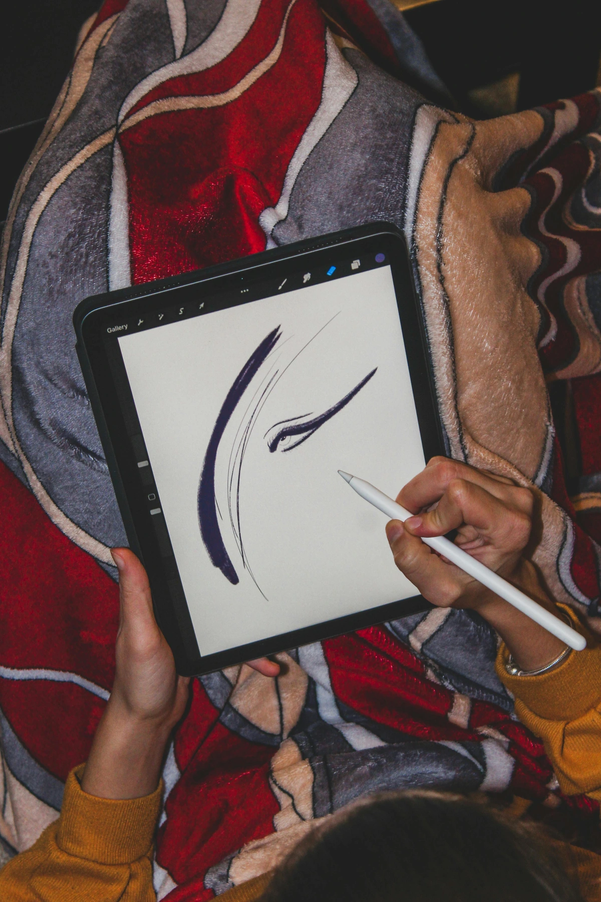
This is perhaps the most revolutionary feature, truly bridging the gap between traditional and digital art. Pressure sensitivity allows your lines to respond directly to the force you apply, much like a real pencil or brush. Imagine working with charcoal: a gentle touch whispers across the paper, while firm pressure lays down rich, dark pigment. This nuanced control is vital for creating depth, emphasis, and emotional resonance in your work, akin to the dramatic use of light and shadow in chiaroscuro painting.
Press lightly for a thin, delicate line or a faint shade; press harder for a thick, bold stroke or dense color. This level of immediate feedback means you're not just drawing; you're feeling the mark. I remember when I first truly grasped this – it felt like finally being able to 'sing' with my digital tools, discovering a new dimension of control. Practice varying your pressure to build confidence and fluidity. Try drawing a series of lines, each one starting faint and ending bold, to internalize this vital feedback loop. Then, try sketching a simple sphere, focusing on how pressure can define form and shadow. It's truly transformative, akin to how a potter learns to apply just the right force to the clay.
Tilt Control: Adding Depth and Texture
Just as you can shade with the side of a graphite pencil or a broad-edged brush, the Apple Pencil allows you to create broad, soft strokes by tilting the barrel. Angle the Pencil to achieve wide, diffuse marks, perfect for shading large areas, blending colors, or replicating the texture of chalk and pastels. This tactile response mimics traditional techniques like sgraffito or frottage, where the angle of the tool creates unique textures. It's an intuitive way to bring varied elements of art: line into your digital work without changing tools.
This feature adds incredible versatility, especially when combined with pressure sensitivity. It gives you immediate access to a wider range of marks, allowing you to move seamlessly from fine lines to expansive washes of color. Experiment with different brushes – many are specifically designed to respond beautifully to tilt, enhancing the illusion of traditional media. I often use tilt to quickly block in shadows or to add a soft, textural element without changing brushes. For instance, try selecting a charcoal brush and tilting your pencil to create wide, dusty strokes, then press harder with the tip for sharper details.
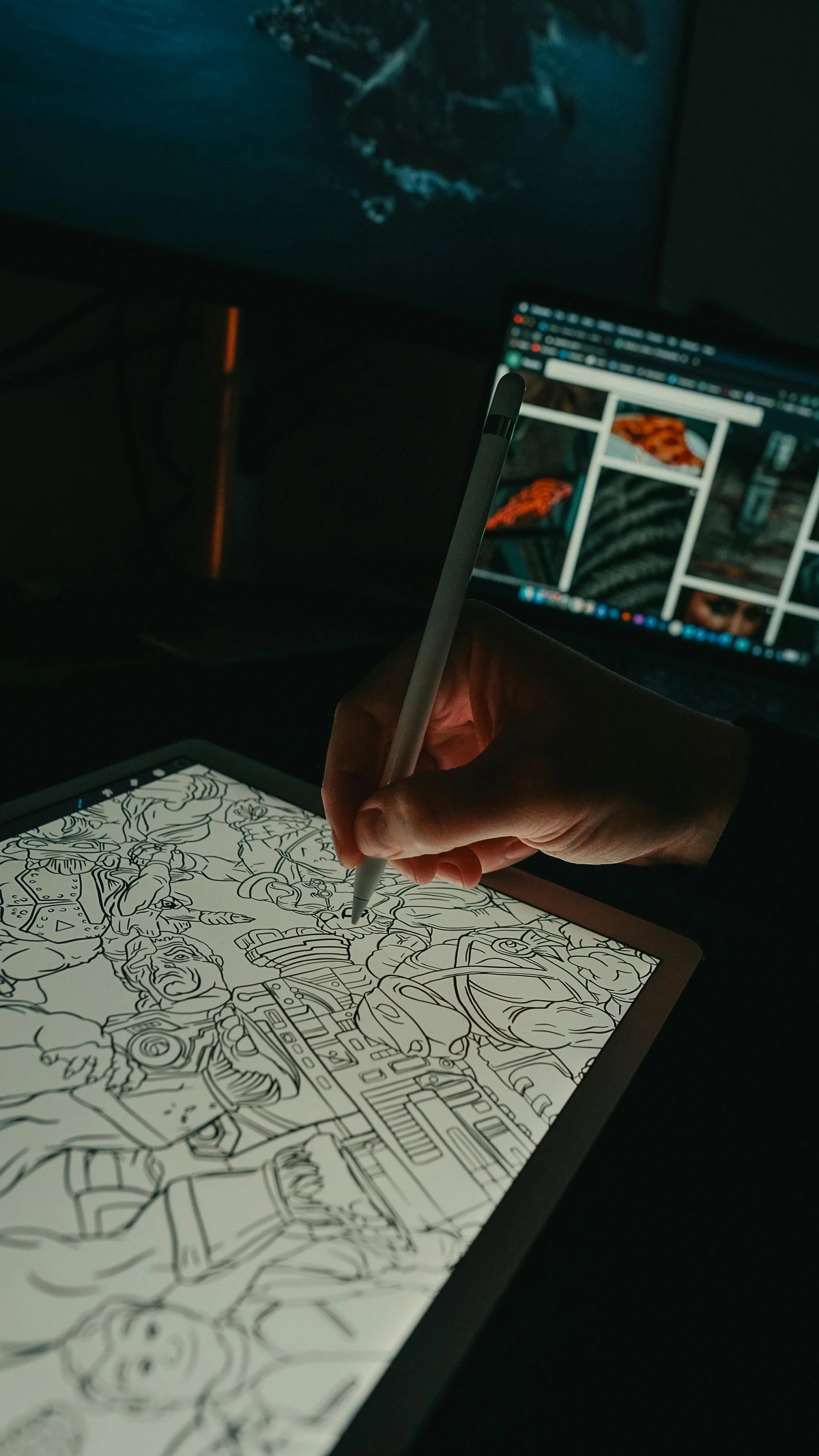
Exploring Digital Brush Types: Your Toolkit for Expression
The vast world of digital brushes can be overwhelming, but understanding their basic categories will help you navigate. Most apps offer these types, often with unique names:
- Sketching Brushes: Mimic pencils, charcoal, or pastels. Designed for initial ideation and loose linework. They often respond well to both pressure and tilt for varying line weight and shading, making them perfect for roughing out a composition or capturing a quick idea.
- Inking Brushes: Provide crisp, clean lines, ideal for outlines, comic art, and graphic styles. Look for brushes with minimal texture and consistent opacity, perfect for that sharp, vector-like finish.
- Painting Brushes: Simulate traditional paint, like oils, watercolors, or acrylics. These are where brush engines truly shine, offering features like blending, wet edges, and varying opacity based on pressure, allowing you to build up rich, painterly effects.
- Texture Brushes: Designed to add specific patterns, grains, or organic effects (e.g., leaves, stipple, grunge). They can quickly add depth and visual interest without painstaking detail work, ideal for creating realistic surfaces or abstract backgrounds.
- Utility Brushes: Includes erasers, smudge tools, and selection brushes. These are essential for refining your work and are often overlooked in their versatility. For instance, a smudge tool can be a powerful blending brush in itself.
Don't be afraid to experiment with the default brushes in your chosen app, paying attention to how they interact with pressure and tilt. Many artists find their signature style emerges from a curated selection of just a few favorite brushes, much like a traditional painter might have a trusted set of best oil painting brushes for artists.
From Drawing to Painting: Embracing the Digital Palette
While drawing with the Apple Pencil quickly feels intuitive, transitioning to painting requires a subtle shift in mindset. Drawing often focuses on lines and contours, but painting is about building up shapes, masses, and understanding how artists use color to define form and light. It's about seeing the world in blocks of color rather than outlines.
My advice is to begin by thinking in broad strokes. Block in your main shapes and foundational colors on separate layers – this is your digital underpainting. Experiment with the smudge tool or blending brushes to seamlessly mix colors directly on your digital canvas, much like you would with wet paint. Techniques like digital glazing (applying thin, translucent layers of color to build depth, similar to what you'd learn in mastering glazing techniques in oil painting), scumbling (applying a thin, opaque layer over another to create a broken, textured effect), and even digital impasto (creating the illusion of thick paint texture using textured brushes and opacity settings) can be achieved by leveraging brush settings for opacity, flow, and texture. The beauty of digital painting is the freedom it offers: you can layer colors, adjust opacity, and correct mistakes in seconds, without waiting for paint to dry. This empowers you to be bold with your color choices and experiment with intricate blending techniques.
Digital Color Theory: Navigating Your Palette
Understanding color is crucial, and digital art presents its own unique considerations. Digital art typically operates in RGB (Red, Green, Blue), an additive color model used for screens and displays. Imagine colored lights mixing to create white. In contrast, print uses CMYK (Cyan, Magenta, Yellow, Black), a subtractive model where inks mix to create black. The discrepancy between these models means colors that look vibrant on your screen might appear duller when printed. Always consider your final output when making color decisions, and if printing is a goal, use your app's CMYK preview mode if available, or do test prints. Many apps allow you to save custom color palettes, and exploring tools like complementary or analogous color schemes can help create more harmonious compositions, much like understanding the psychology of color in abstract art applies to your digital palette.
Canvas Resolution: Quality for Print & Web
When starting a new digital artwork, one of the first decisions is your canvas resolution. This is crucial, as it dictates the quality and flexibility of your final piece. For web-only sharing, a lower resolution (e.g., 72-150 PPI/DPI) is usually sufficient and keeps file sizes small. However, if you anticipate printing your artwork, especially for large formats, you'll want to aim for much higher resolutions (e.g., 300-600 PPI/DPI). Starting with a higher resolution gives you more room to zoom in, add detail, and maintain crispness even when enlarged. It's far easier to downscale a high-resolution image than to upscale a low-resolution one without sacrificing quality.
Streamlining Your Creative Flow: Advanced Tips for Digital Artists
Beyond the core techniques, a few practical habits can significantly enhance your digital art workflow and ensure a smooth creative process. Think of these as adding ergonomic upgrades to your digital studio, allowing your ideas to flow directly from your mind to the screen with less friction.
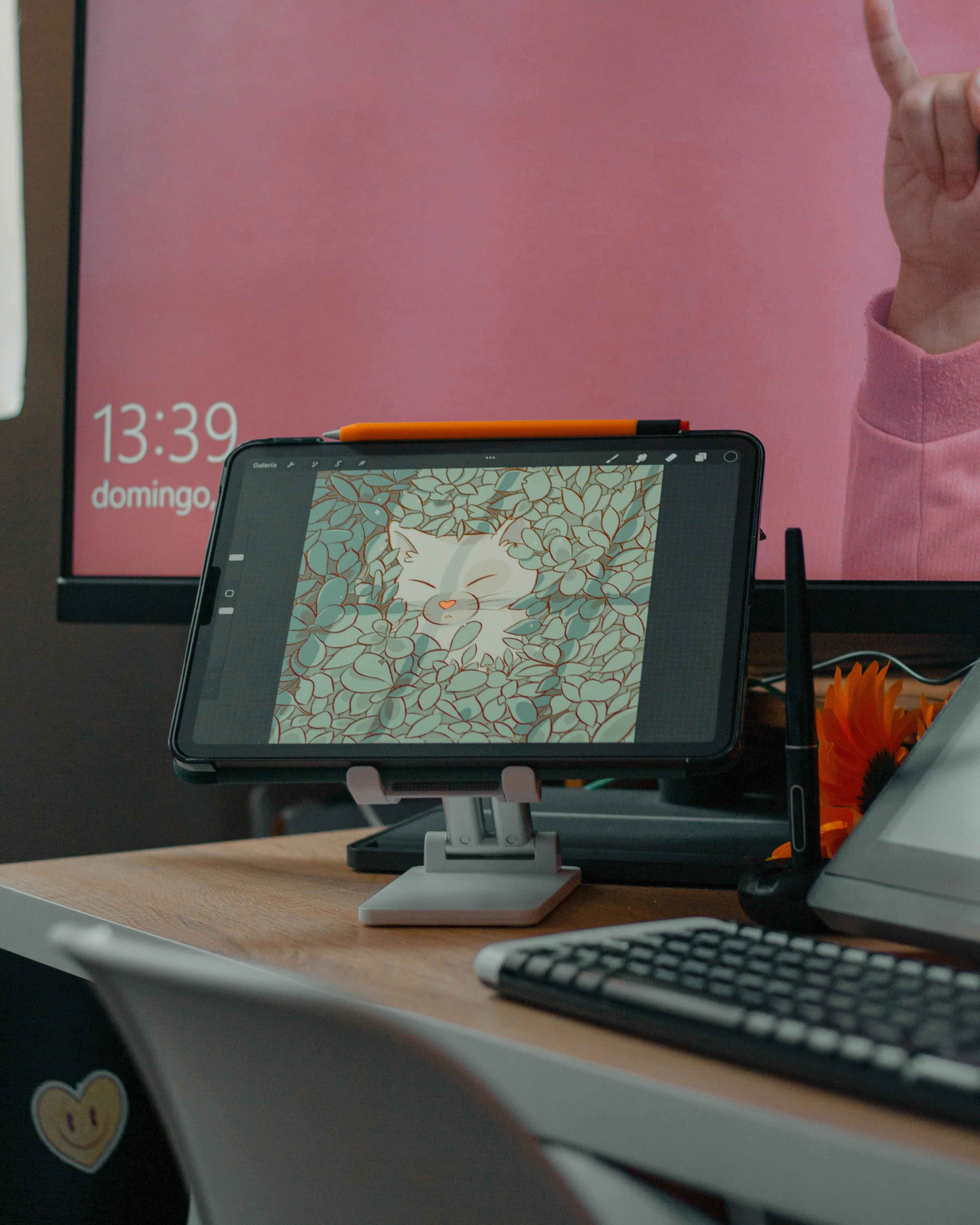
Customizing Your Digital Brushes: Your Artistic Signature
Many art apps, especially Procreate and Adobe Fresco, offer extensive brush customization options. Don't be afraid to dive into the 'brush studio' or 'brush settings' to tweak existing brushes or even create your own. This is where your unique artistic signature truly comes alive!
Adjusting parameters like jitter (random variation in a stroke's placement, size, or opacity), falloff (how a brush's opacity or width decreases towards its edges), opacity, texture, wetness (how colors blend like watercolor), scattering (how widely brush marks are dispersed), and dual brush settings (combining two brush shapes for complex effects) can help you perfectly replicate the feel of a traditional medium or invent entirely new ones. Want to create a brush that mimics the dry, scratchy texture of a charcoal stick? Increase its 'grain' and 'jitter' to simulate that subtle dustiness. Or perhaps a smooth, flowy watercolor brush? Adjust 'falloff' and 'opacity' to create soft, translucent washes that blend seamlessly. You can also play with the brush's shape and grain source – these define the fundamental mark the brush makes, from a simple circle to a complex leaf pattern. A customized brush can truly feel like an extension of your unique style, providing a level of control you won't find with default settings. Spend some time here; it's a game-changer, turning generic tools into your personal best brushes for acrylic painting equivalent.
Essential Workflow Enhancements
- Gesture Controls & Shortcuts: Most professional art apps integrate powerful gesture controls (e.g., two-finger tap for undo, three-finger tap for redo in Procreate) and on-screen shortcuts. Learn these! They dramatically speed up your workflow and keep you in the creative zone, reducing trips to menus. If you use a keyboard with your iPad, explore app-specific keyboard shortcuts for even greater efficiency. This is often where true mastery lies, in the seamless dance between hand and tool.
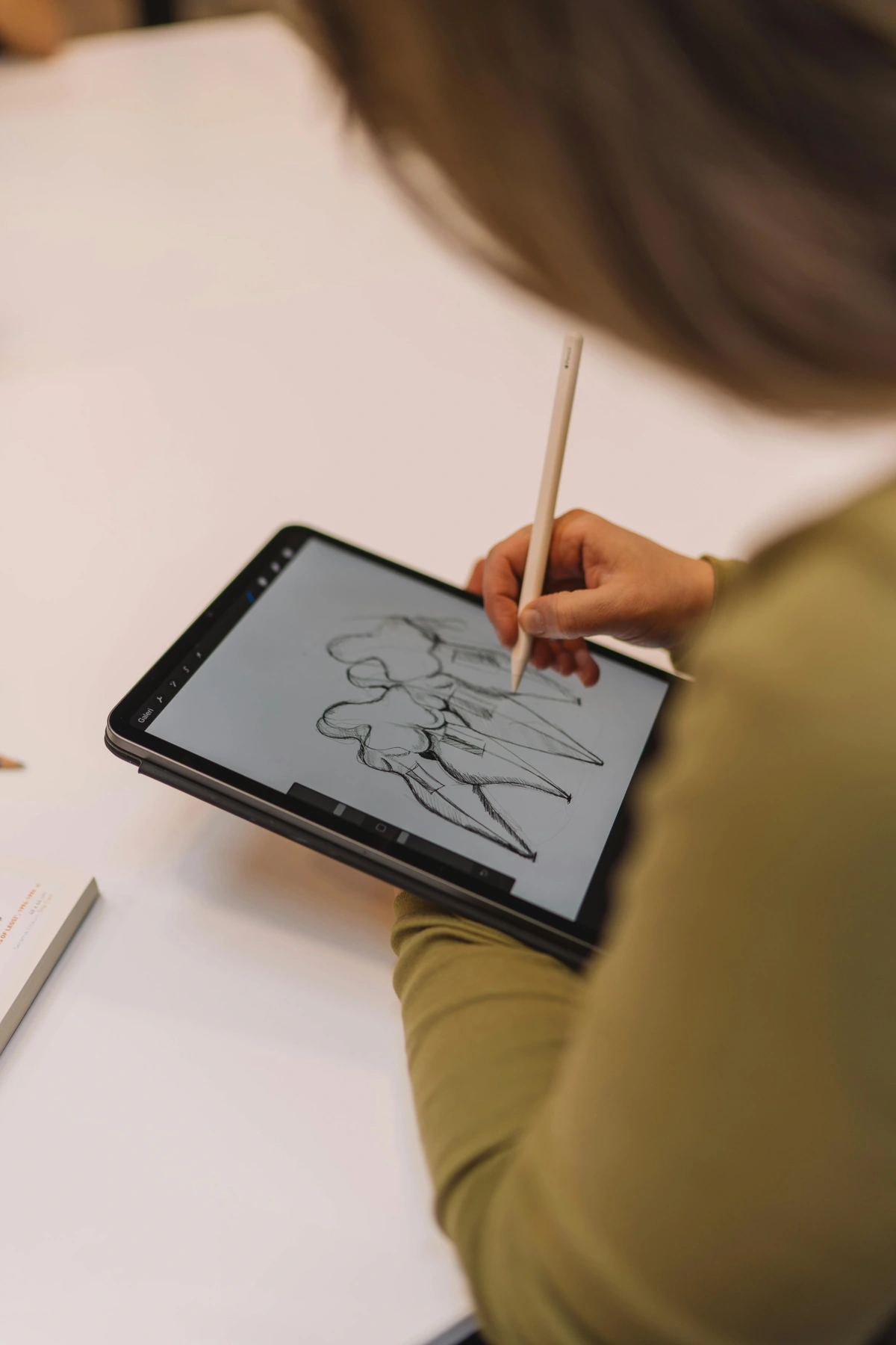
- Reference Images: Don't just rely on your memory. Most apps allow you to import reference images directly onto your canvas or use a split-screen view. I often float images directly over my canvas or use a split-screen view, even sometimes creating a transparent overlay layer to check proportions. This is invaluable for studying anatomy, composition, or color palettes. I always keep my references handy; it's a huge time-saver. You might even find it helpful to create a dedicated digital inspiration board using Pinterest.
- Time-Lapse Recording: Many apps automatically record a time-lapse of your creation process (Procreate does this beautifully). This is fantastic for sharing your work on social media and, perhaps more importantly, for reviewing your own process. Watching back a time-lapse can offer incredible insights into your habits and areas for improvement – perhaps you're spending too much time on a specific detail early on, or your layering process could be more efficient. It's like a personal coach for your artistic timeline.
- Accessibility Features: Digital art, especially with the Apple Pencil, can be incredibly accessible. iPadOS offers features like AssistiveTouch and custom gestures that can be tailored for artists with physical limitations, opening up creative possibilities for everyone. Many apps also include features like 'Symmetry Guides' or 'Stabilization' that can assist with motor control.
- iPad Models & Performance: While all compatible iPads work with the Apple Pencil, more powerful models like the iPad Pro offer significant benefits for serious digital artists. Their ProMotion displays (up to 120Hz refresh rate) offer incredibly smooth, low-latency drawing, making the Pencil feel even more responsive. More powerful processors allow for higher canvas resolutions, more layers, and smoother performance with complex brushes in demanding apps. For professional work, these hardware advantages can significantly impact your creative output and experience.
Overcoming Creative Hurdles: Common Artistic Challenges & Solutions
Every artist, digital or traditional, faces moments of doubt, creative blocks, or the paralyzing fear of a blank canvas. The Apple Pencil and its ecosystem, however, offer some unique advantages to navigate these challenges.

- The Blank Canvas Syndrome: With digital art, the canvas is infinite and infinitely forgiving. Instead of a pristine white waiting for perfection, think of it as a playground. Start with a loose, low-opacity sketch layer. Don't aim for anything specific – just warm up your hand, experiment with brushes, and make some marks. The beauty of layers means you can always delete or hide this initial mess without consequence. It's a fantastic way to overcome fear of the blank canvas.
- Perfectionism & Getting Stuck: Digital tools make it incredibly easy to zoom in and obsess over tiny details. Step back often. Rotate your canvas. Flip your canvas horizontally to see your work with fresh eyes – flaws often jump out that way. Utilize layers to try different versions of an element (e.g., three different arm poses on separate layers) before committing. The ability to iterate quickly and non-destructively is your greatest weapon against perfectionism. Embrace the process, not just the perfect outcome.
- Finding Inspiration: Keep a digital sketchbook. Use your iPad to quickly capture ideas from the world around you – a color palette from a sunset, a unique texture on a wall, a figure in motion. Many apps offer easy ways to import photos directly onto your canvas as reference. Explore other artists' work digitally; many museums now offer extensive online collections, allowing you to absorb inspiration on the go. This constant input fuels your unique artistic voice, creating a rich internal art inspirations board.

File Management & Exporting: Preserving Your Vision
Maintaining an organized digital workspace is key. Save your progress regularly (I've learned this the hard way – never trust autosave exclusively!), and consider backing up important projects to cloud storage or an external drive. Within your apps, get into the habit of consistent layer naming and grouping to keep complex projects manageable. Try a convention like [ProjectName]_Sketch, [ProjectName]_Lineart, [ProjectName]_Color_Base, [ProjectName]_Shadows_Multiply. Creating template files for common canvas sizes or project types can also be a huge time-saver.
When sharing or printing your work, understanding file formats is crucial. The difference between lossy and lossless compression is fundamental: lossy formats (like JPG) achieve smaller file sizes by permanently discarding some data – think of it like a slightly blurry photocopy. This is fine for social media but detrimental for long-term preservation or high-quality printing. Lossless formats (like PNG, TIFF, PSD) retain all original data, ensuring maximum quality, albeit with larger file sizes – like a perfect digital scan.
- JPG (.jpg): Best for sharing on the web or social media due to its small file size. It's a 'lossy' format, meaning some detail is lost with compression. Fine for quick shares, but repeated saves can degrade quality. Aim for high-quality JPGs if you must use it. Not recommended for master files.
- PNG (.png): Ideal for web graphics requiring transparency (like logos) or when you need higher quality than JPG. Larger file sizes than JPG, but 'lossless' for transparency and often preferred for crisp web images. Excellent for screenshots or graphics where clarity is paramount.
- PSD (.psd) / .procreate (native): Procreate and Adobe's native formats. Essential for saving projects with all layers intact, allowing for future edits. Always keep a PSD (or Procreate's native
.procreatefile) for your master files, as this preserves all your hard work and flexibility, especially if collaborating or planning major revisions. - TIFF (.tif): Excellent for high-quality prints and archival purposes. A 'lossless' format, meaning no data is lost during compression, but files are very large. This is often the go-to for professional printing, especially for high-resolution output where every detail matters. Always export at your canvas's native resolution for print.
Choose the format that best suits your intention for the artwork. And while we're talking about digital assets, it's worth a factual mention that while some artists explore blockchain technology through NFTs (Non-Fungible Tokens) to establish verifiable provenance and ownership for digital art, the environmental impact, market volatility, and long-term legal frameworks surrounding them are still subjects of intense debate and evolving scrutiny. For many, the focus remains squarely on the intrinsic value and creative process of the art itself.
FAQ: Quick Answers for Your Apple Pencil Journey
What are the best free drawing apps for Apple Pencil? Beyond the built-in Notes app, excellent free options include Adobe Fresco, Autodesk Sketchbook, and MediBang Paint. These offer robust feature sets that are fantastic for beginners before investing in paid applications. Give them a try – you might find your next favorite tool!
How do I clean my Apple Pencil tip? A gentle wipe with a soft, lint-free cloth is usually sufficient. Avoid harsh chemicals. If the tip gets excessively dirty or damaged, it's best to replace it; spare tips are relatively inexpensive and easy to install.
Can I use other styluses with my iPad for art? While the Apple Pencil offers the best integration and features for compatible iPads, other third-party styluses exist. However, they generally lack the advanced pressure sensitivity, tilt support, and palm rejection that make the Apple Pencil so exceptional for professional art. It's often worth the investment in an Apple Pencil for serious creative work.
How can I make my Apple Pencil feel more like a real pencil on paper? The most effective way is to use a matte or paper-like screen protector. These add a subtle texture to the iPad's glass, increasing friction and mimicking the tactile feedback of traditional drawing surfaces. Experiment with different brands, as the texture can vary.
Conclusion: Your Tool, Your Vision, Limitless Possibilities
We've covered a lot, from initial setup and crucial tactile feedback to mastering core techniques like layers, pressure, and tilt, exploring top-tier apps, streamlining your workflow, and even tackling creative blocks. But I want to leave you with this final thought: the Apple Pencil, for all its technological brilliance, is ultimately just a tool. It won't create the art for you, nor will it conjure ideas out of thin air. That's your unique gift, your vision, your endless well of creativity. It's about overcoming the initial fear of the blank canvas and just beginning.
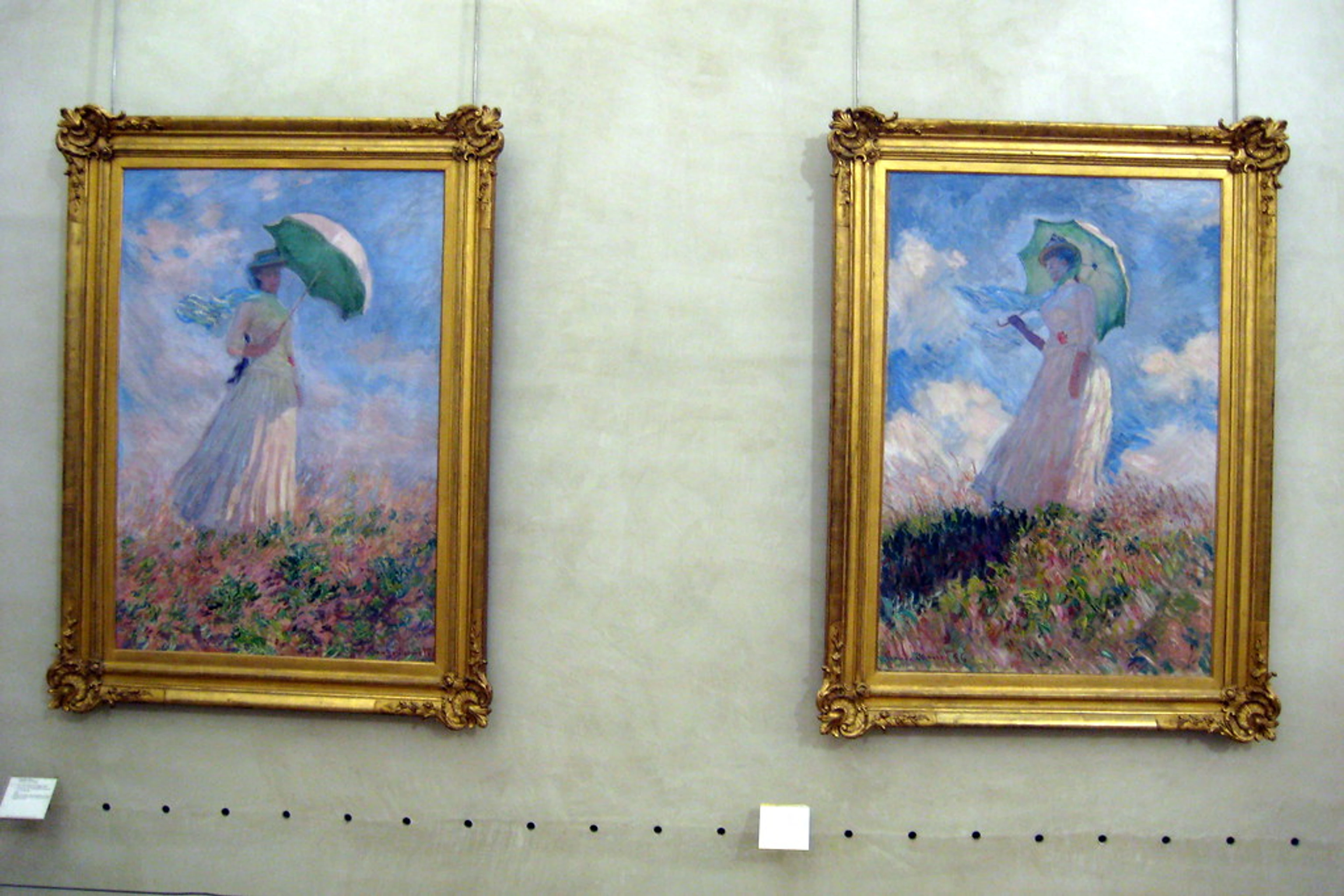
What the Apple Pencil does offer is unparalleled freedom. An infinite canvas, every color and brush imaginable (and customizable!), and the ability to experiment without consequence. It removes the practical friction, allowing your ideas to flow directly from your mind to the digital surface with remarkable fluidity. So, embrace it. Play, doodle, make "ugly" drawings, follow a tutorial, or ignore all advice and forge your own path. The real magic isn't in the Pencil itself; it's in the inspired hand that wields it, transforming ideas into art. To see how these digital tools can manifest into a unique artistic vision, I invite you to explore the art I create with both digital and traditional tools on my page to buy art, or perhaps discover inspiration in the rich history and diverse collections of a den Bosch museum.