
Stop Just 'Liking' Art. Start Seeing It.
A detailed guide for beginners to advanced art enthusiasts on how to critique and analyze artwork. This blog covers the foundational methodologies, key terminology, and a step-by-step process to develop your critical eye. Join the conversation and become confident in understanding and interpreting art.
Stop Just 'Liking' Art. Start Seeing It.
I remember standing in a gallery once, feeling like a complete impostor. Everyone around me was murmuring things like "the brushwork is so expressive" and "the use of negative space is masterful," while I was just thinking, "Yeah, I guess that blue looks nice." I was just 'liking' things, not really seeing them. If you've ever felt that disconnect between a gut reaction and the language to describe it, you're in the right place. This isn't about learning the 'right' answers; it's about discovering the questions that unlock an artwork's deeper meaning.
Maybe you're worried you'll say the wrong thing, or that you don't have the "artistic gene." I used to think that too, until I realized that the most profound art experiences happen when we trade our judge's robes for a detective's hat. This guide is your toolkit for that transformation—a way to move beyond "I like it" into a richer conversation with what you see. It's about building a bridge between your gut feeling and a language to understand it.
The Critic's Toolkit: Four Pillars of Art Analysis
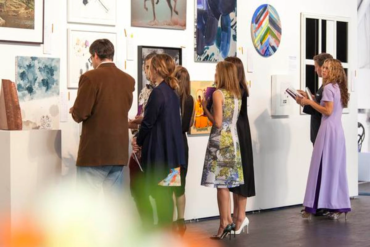
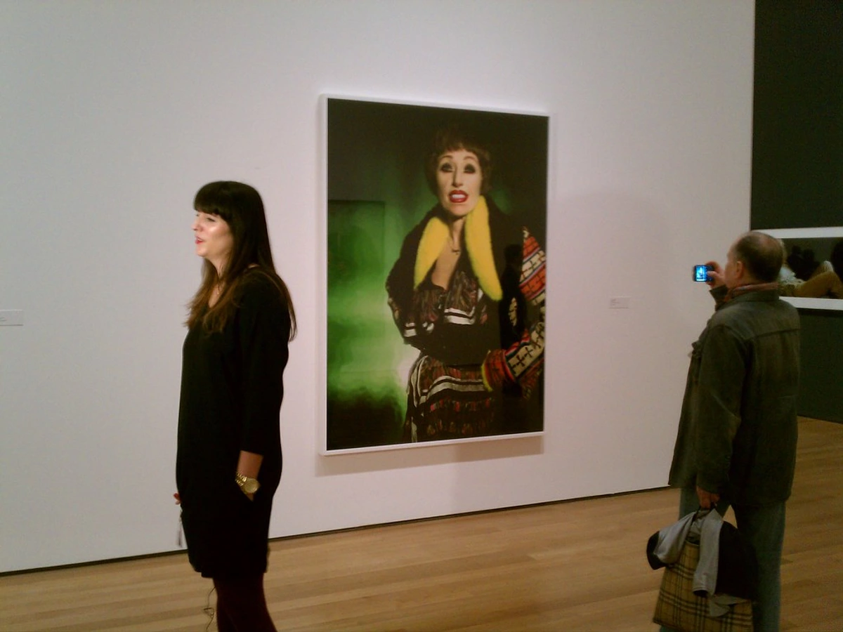
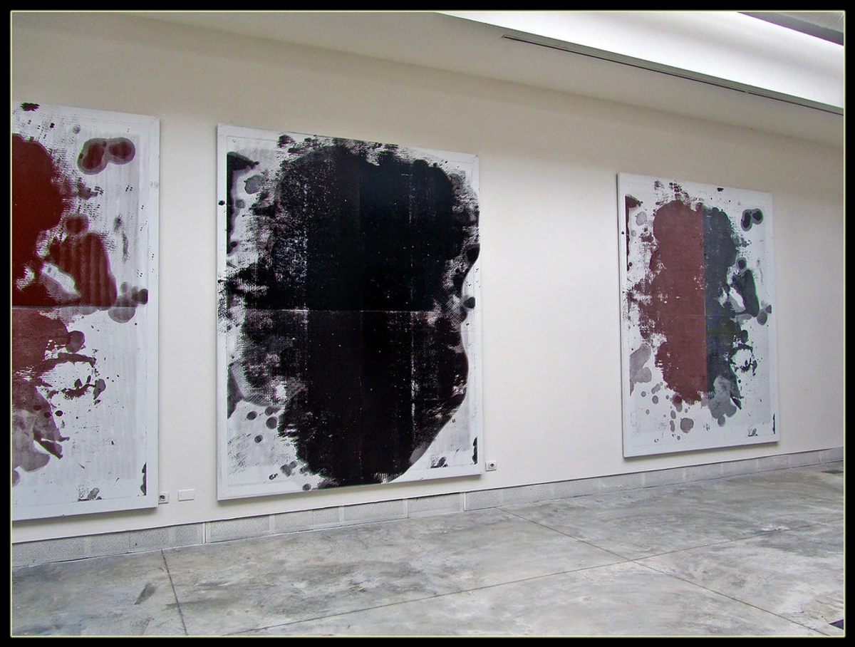
Before we can run, we have to walk. And before we can truly critique art, we need a shared language. Think of art critique as being built on four simple, sturdy pillars. You can apply these to a child's crayon drawing or a multi-million-dollar masterpiece hanging in the /den-bosch-museum. These pillars aren't just academic; they're the bones of any meaningful art conversation, whether you're discussing a Renaissance masterpiece or a piece of contemporary abstract art.
1. Description: Just Tell Me What You See
This is the foundation, and it sounds deceptively simple. Your job here is to be a human camera, not a poet. It's the most humbling and crucial step, because it forces you to put aside assumptions and actually look. Think of it as collecting the raw data before you try to solve the puzzle. Suspend all judgment. Don't say "a beautiful splash of red." Say "a large, irregularly shaped area of red paint in the top right corner." This stage is about inventory, not interpretation. It forces you to confront the actual, physical reality of the artwork. What are the literal things in front of you?
This process of pure description does something interesting to your brain: it forces you to slow down. In our fast-paced world, our eyes scan and categorize in milliseconds. Description is the act of resisting that impulse, of holding your gaze on one small area and translating its physical properties into words. It's a form of active meditation on the object itself.

I can't stress this enough: the effort you put into description pays dividends later. When I force myself to simply list what's there—thick yellow strokes here, a absence of color there—I often stumble across details I'd have missed if I'd rushed to interpretation. It's like noticing the individual trees before trying to understand the whole forest.
- Subject Matter: What is being depicted? Is it a person, a landscape, a bowl of fruit? Is it completely abstract, with no recognizable objects? (More on that later, because abstract art has its own rules of engagement).
- Medium and Materials: How was it made? Is it oil on canvas, charcoal on paper, a digital
NFT(a technology I'm skeptical of for its environmental impact, but we can't ignore it exists), carved marble, or a collage of found objects? The medium isn't just a carrier; it's a statement. A delicate watercolor carries a different emotional weight than a slab of welded steel. - Formal Elements: This is the nitty-gritty. Break the work down into its basic visual components. These are the building blocks of visual language, the fundamental vocabulary you can use to build a sentence about any work of art.
- Color: List the dominant colors. Is the palette bright or saturated? Muted or subdued? Warm or cool? Are there sharp contrasts or soft blends? Are certain colors repeated? Which colors seem to advance and which recede?
- Line: Are the lines thick or thin, straight or curved, jagged or smooth? Are they actual lines, or are they implied by the edges of shapes? Are they deliberate and controlled, or gestural and energetic?
- Shape and Form: Are the shapes geometric (circles, squares) or organic (like things found in nature)? Do they appear flat (2D) or do they have volume and weight (3D)? Are the edges of shapes hard and defined, or soft and blurred?
- Texture: Does the surface look rough, smooth, bumpy, silky, or gritty? Is it actual texture you can feel (impasto) or just the illusion of it (visual texture)? Does the artist use the material itself to create texture—like thick paint, layered paper, or roughly hewn stone?
- Space: How is space created? Is the picture deep or flat? Do objects overlap to create a sense of distance? Are there shadows? Are there techniques like linear perspective (where parallel lines converge at a vanishing point) or atmospheric perspective (where distant objects are lighter, cooler, and less detailed)? Is the space claustrophobic or expansive?
- Composition: How are all these elements arranged? Where is the focal point? Is the composition balanced or unbalanced, symmetrical or off-kilter? Think of it as the artist's final "stage direction," deciding where your eye will land first, second, and where it will rest. Are there strong verticals or horizontals? How does your eye move across the canvas?
2. Analysis: How Is It Put Together?
Okay, you've listed all the ingredients. Now, how did the artist combine them? Analysis is where you start to connect the dots. You're looking for patterns, relationships, and the artist's methods.
At this stage, you're asking "how" questions. How does your eye move around the piece? A strong composition doesn't just happen; it's planned. Artists use tools like lines of force (subtle lines that guide your gaze), rhythm (repeated elements that create a visual beat), and contrast (placing opposites—light vs. dark, large vs. small—next to each other to create focus).

3. Interpretation: What Is It Trying to Say?
This is the fun, and often intimidating, part. Interpretation asks: "What does this all mean?" There is no single correct answer here, only more or less plausible ones that are supported by the evidence you gathered in the first two steps.
A good interpretation connects the what (Description) and the how (Analysis) to a why. It's a hypothesis. Think of yourself as a detective trying to solve a mystery where the clues are the brushstrokes and the colors. You're piecing together a narrative from visual evidence. And like any good detective story, the most satisfying conclusion isn't always the most obvious one; it's the one that best explains all the clues.
- Mood and Emotion: What feeling does the artwork evoke in you? Chaos? Peace? Loneliness? Joy? Don't just state the emotion; point to the specific elements that create it. For example: "The clashing colors and chaotic brushstrokes create a feeling of anxiety." Think about the emotional arc as well. Does the mood shift as your eye travels across the canvas?
- Symbolism and Metaphor: Is the artist using objects or figures to represent a bigger idea? A wilting flower might symbolize death. A dark, stormy sky could represent inner turmoil. Consider both cultural symbolism (what a dove means in Western art) and personal symbolism that might be unique to the artist.
- Narrative and Story: Is the artwork telling a story? Is it depicting a single moment in time (like a snapshot), or does it suggest a sequence of events? Sometimes the story is explicit, drawn from history or mythology. Other times, it's implied, and you have to piece it together from the clues the artist provides.
- Context is Clue: What was happening in the world, or in the artist's life, when this was made? Knowing a little about the historical context or the art movement the piece belongs to can open up a world of meaning. A painting made during a war will likely have a different message than one made during a period of peace and prosperity. What was the artist rebelling against? What tradition were they upholding? This is where a little art history knowledge can be incredibly illuminating.
4. Judgment (or Evaluation): Is It Good?
This is the final, and most subjective, pillar. It's where you decide if the work is successful. Notice I said "successful," not just "good." A piece can be deeply disturbing and still be a brilliant success. The key is to evaluate it based on what you think the artist was trying to achieve.
Judgment is where your critical faculties really synthesize everything. You've seen what is there, you've analyzed how it works, and you've pondered its meaning. Now you ask: "Does it work? Does it hold up? Does it matter?" This is the part of the conversation where you form a considered opinion, one that can be articulated and defended, rather than just a gut reaction of "I like it."
- Coherence: Do all the parts work together to support the whole? Does the message feel unified, or is it a confusing jumble? A work might seem chaotic at first, but does that chaos serve a larger purpose? Does it reinforce the meaning or mood?
- Originality: Is there a unique vision here? Does it offer a new way of seeing the world, or does it feel like a tired copy of something you've seen a hundred times before? Consider the work within its historical context. Was it breaking new ground when it was made, or is it derivative of a movement that's come before?
- Craftsmanship & Intent: How well was it made? Is the technique impressive? Does it feel like a deliberate choice, even if it looks messy? This is a crucial point: skill isn't just about making something look photorealistic. A few deliberate, "badly" drawn lines can convey more emotion than a perfectly rendered image. The question is always: does the technique serve the message?
- Impact and Resonance: Does the work stay with you after you've walked away? Does it change the way you see something, even if just a little? The most powerful art often continues its conversation with you long after the initial viewing.
I find it helpful to separate my personal taste from my critical judgment. I might not want to hang a dark, violent painting in my bedroom, but I can still recognize its power and importance. You don't have to like something to appreciate it. That distinction—the ability to see the value in work that doesn't appeal to your personal decorator—is the hallmark of a mature viewer and a more rewarding way to engage with art.
A Practical Walkthrough: Let's Critique Together
Let's imagine we're standing in front of a fictional abstract painting to see these pillars in action. This section is where we put all that theory into practice. It's one thing to know the four pillars, and another thing entirely to walk the path. Let's go step-by-step, as if we're standing in a quiet gallery together, with no one else around. This is where the theory gets tested on a real (hypothetical) canvas.

Step 1: Description Paints the Picture
Artwork: A large canvas, 6 feet by 4 feet. The medium is thickly applied oil paint (impasto).
- Color: Dominated by a broad, vertical stripe of deep, cool ultramarine blue on the left. To the right is a larger field of warm, bright cadmium yellow. Where the two colors meet, they are mixed into a vibrant, energetic green. The background is a muted, cool gray that makes the primary colors pop.
- Line: There is a single, clean, sharp vertical line separating the blue and yellow, almost like a crack. The edges where the colors meet the gray background are softer and more organic, allowing them to bleed slightly into the ground.
- Shape and Form: The blue and yellow are simple, geometric, and largely rectangular shapes. They feel aggressively flat against the canvas, with no attempt to create an illusion of depth through shading or modeling. The shapes assert their two-dimensionality.
- Texture: The texture is very pronounced and tactile. You can clearly see the ridges and valleys left by the palette knife used to apply the paint, giving the surface a raw, physical energy.
- Composition: The composition is stark and simple, divided roughly into thirds. The blue shape takes up about one-third of the canvas, creating an asymmetrical balance with the yellow that occupies the other two-thirds.
Step 2: Analysis Reveals the Blueprint
Now, we connect our descriptive notes. How do the parts work together?
The artist is using strong visual contrast as the primary tool. The contrast between the cool blue and the warm yellow is intense and almost vibrates where they meet, creating an optical buzz. The contrast continues with the texture: the thickly painted, active surface of the color fields versus the flat, still gray background. This contrast creates a powerful dynamic tension.
The composition is asymmetrical, creating a sense of imbalance or energy, rather than peaceful symmetry. It feels like a visual argument where the larger yellow mass is being held in check by the smaller, more intense blue form. The clean, razor-sharp line separating the two main colors acts as a sharp, deliberate barrier, a "no-man's-land" between the two opposing fields. Yet, that green intermingling where they meet shows this isn't a static fight, but an active, generative conflict. It's this internal relationship, this push and pull, that gives the static painting a lot of energy.
Step 3: Interpretation Seeks the Meaning
This is where we build our hypothesis.
Based on my analysis, I'd interpret the painting as an exploration of opposition and connection. The blue and yellow represent two opposing forces. They could symbolize many things: day and night, logic and emotion, silence and noise, the rational and the emotional. The sharp, definitive line dividing them emphasizes their fundamental difference.
However, that mixed green area in the middle is the crucial twist. It suggests that these opposing forces don't just clash; they can interact, merge, and create something entirely new, a third entity. The vibrant green becomes a kind of "dialogue" or synthesis between the two primary colors. My personal feeling is one of dynamic energy rather than violent conflict—less a battle, and more a dance of opposites that gives birth to a new idea. The painting feels less like a statement and more like a question: "What happens when complete opposites are forced into the same space?" The answer it seems to give is: "They create something new."

Step 4: Judgment Finds the Verdict
Is the painting successful? I believe so. Its goal seems to be to create a visceral, emotional reaction through pure color and form, and it succeeds powerfully. The artist's intention feels clear, and the execution is confident. The use of impasto isn't just decorative; it gives the colors a physical weight that you can almost feel.
The work is coherent; every element supports the central idea of contrast and synthesis. While compositionally simple, the vision feels original in its directness and raw energy. It's more than just a color study; it's a powerful, condensed statement about duality. The painting is successful because it uses a minimal set of tools—two colors and a line—to achieve maximum emotional and intellectual impact. Its simplicity is its strength.
If you're intrigued by how abstract art plays with these core elements, you might enjoy exploring some of my own work, where I constantly tinker with these very ideas, on my /buy prints and originals page.
Special Case: Decoding Abstract Art
Abstract art is where the "what is it?" question falls apart, and that's the point. When there's no face to recognize or landscape to identify, you're forced to reckon with the artwork's pure materiality. The subject is the artwork itself—the color, the line, the texture, the feeling. It's a direct conversation with your senses, bypassing the need for a recognizable story.
When critiquing an abstract piece, all your focus shifts to the formal elements (Step 1) and how they create meaning (Step 3). Instead of asking "What does it depict?" you ask "How does it make me feel, and what is it about the painting that makes me feel this way?" This can be incredibly liberating, as it removes the pressure of "solving" the image. You're not looking for a hidden cow; you're looking at what is actually there and how it resonates with you.
I always remind myself: just because it's abstract doesn't mean it's arbitrary. Every mark, every color choice, every bit of texture is a deliberate decision. Your job as a viewer is to figure out the logic and emotion behind those decisions.
Your Personal Cheat Sheet to Start a Conversation
Let's be honest, you want some phrases you can actually use while standing in a gallery without sounding like a robot. These aren't about showing off; they're about starting a real conversation. Having a shared language is what turns a solitary experience into a shared one.
Think of this table not as a script, but as a thesaurus for your own observations. The goal isn't to sound smart; it's to be able to articulate what you're already sensing in a way that invites dialogue and deeper looking. The goal is to shift the conversation from declarative statements ("This is a masterpiece") to exploratory observations ("I'm noticing how...").
Feature | How to Talk About It |
|---|---|
| Color | "This limited palette really focuses your attention." "The saturated colors create such a vibrant mood." "The artist's use of complimentary colors makes this area pop." "The choice to drain the color here really amplifies the emotion." |
| Composition | "My eye is drawn immediately to..." "The way these lines create a sense of movement is interesting." "It feels very symmetrical and stable." "The rule of thirds has been used to place the focal point." "The emptiness in the top left really creates tension." |
| Texture | "Look at the way the paint is built up in this area." (Point, don't touch!) "The brushwork feels so frantic and full of energy." "The smooth surface makes it feel very calm and controlled." "The contrast between the rough and smooth textures is really effective." |
| Meaning | "I'm getting a real sense of... from this." "It makes me think of..." "The way the artist has handled [a specific element] suggests that they were exploring the idea of..." "It feels like the artist is asking a question about..." "I wonder if this is a metaphor for..." |
A quick tip: If you're feeling stuck, just start a sentence with "I'm noticing..." or "I'm wondering why the artist chose to..." It's an invitation, not a conclusion, and it invites other people to share what they're seeing, too.

Overcoming Your Inner Critic: A More Empathetic Approach to Art
Before we get to the questions everyone asks, let's address the one question you're probably asking yourself: "Am I doing this right?" The biggest barrier to truly seeing art isn't a lack of knowledge; it's the pressure to have an "intelligent" opinion. It's that little voice that says, "This is pointless," or "I'm not smart enough for this."
This internal pressure is like trying to have a conversation while someone is shouting in your ear. It's exhausting, and it prevents you from actually hearing what the other person—or in this case, the artwork—is trying to say. So, the first step in this entire process isn't about art at all. It's about quieting that voice.

The truth is, you should approach a work of art the way you'd approach a person you've just met at a party. You wouldn't instantly judge them as "good" or "bad." You'd be curious. You'd ask questions, notice their tone of voice, and maybe even have a few awkward silences. You'd give them time to reveal themselves. The goal isn't a hot take; it's a genuine encounter.
This mindset shift is everything. It moves you from a posture of judgment to a posture of curiosity. Instead of "Do I like this?", your primary question becomes "What is happening here?" That one simple change opens up entire worlds of perception that were previously locked to you.
This isn't about "dumbing down" art. It's about building a bridge between you and the object in front of you. For every moment of confusion or judgment, there's a corresponding moment of observation and curiosity waiting to take its place. Try it next time you're in front of a piece you don't like. Instead of thinking "I hate this," think, "What is this thing doing? What choices did the artist make to make me react this way?" You might not end up liking it, but I guarantee you'll find it infinitely more interesting.
This is the great secret of art appreciation: your confusion, your dislike, your boredom—these are all data points. They are clues. Why does this make me uncomfortable? Why does that feel boring? Often, an artwork that frustrates you on Monday can become your favorite by Friday, simply because you were willing to sit with the frustration for a moment and ask it a few questions.
Putting It All Into Practice: Practical Exercises
Reading is one thing, but doing is another. Here are a few simple exercises you can do right now, even from your desk, to sharpen your critique skills. Think of these as workouts for your "seeing" muscles.
The 10-Minute Drill
The Goal: A fast, focused critique to get the basics down.
- Set a Timer: Give yourself 3 minutes for Description, 3 for Analysis, 2 for Interpretation, and 2 for Judgment.
- Pick an Image: Find a single artwork online from a museum's collection. (The Rijksmuseum, MoMA, or Tate have great high-resolution images).
- Write it Down: Open a blank document or grab a notebook. For each stage, write down only the most essential points. Don't overthink it. The time limit forces you to focus on your immediate, gut reactions. This exercise is fantastic for learning to quickly identify the core elements of a piece.
The Comparison Game
The Goal: To understand artistic choices by seeing what they aren't.
- Find Two Opposites: Search for two artworks that explore a similar theme (like "motherhood," "war," or "nature") but in radically different styles. For example, a classical Renaissance painting of a serene landscape versus a chaotic, abstract expressionist painting inspired by nature.
- Ask Comparative Questions: How does the use of color differ? What does each artist's brushwork tell you about their attitude toward the subject? How does the composition in one create a feeling of peace, while the other creates a feeling of chaos?
- Draw a Conclusion: Which approach do you find more effective for that theme, and why? There's no right answer, but this forces you to articulate why an artist's specific choices matter.
The "Why?" Ladder
The Goal: To move past surface-level statements. Start with a simple observation and then ask "Why?" at least three times.
- Observation: "That red circle in the corner is really intense."
- Why? "Because it's the only warm color in a painting dominated by cool blues and grays."
- Why? "This makes it a strong focal point, contrasting with the otherwise calm or melancholic mood."
- Why? "Perhaps the artist is using that single point of heat to symbolize a moment of passion, anger, or hope within a somber context, creating a narrative of internal conflict." Each "Why?" forces you deeper into the relationship between the artwork's formal qualities and its potential meaning.
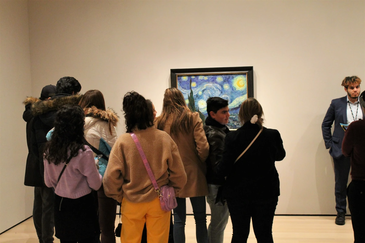
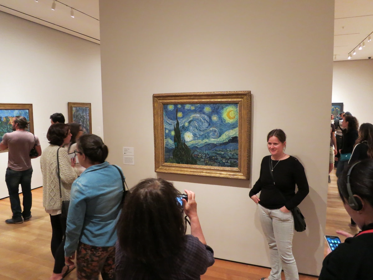
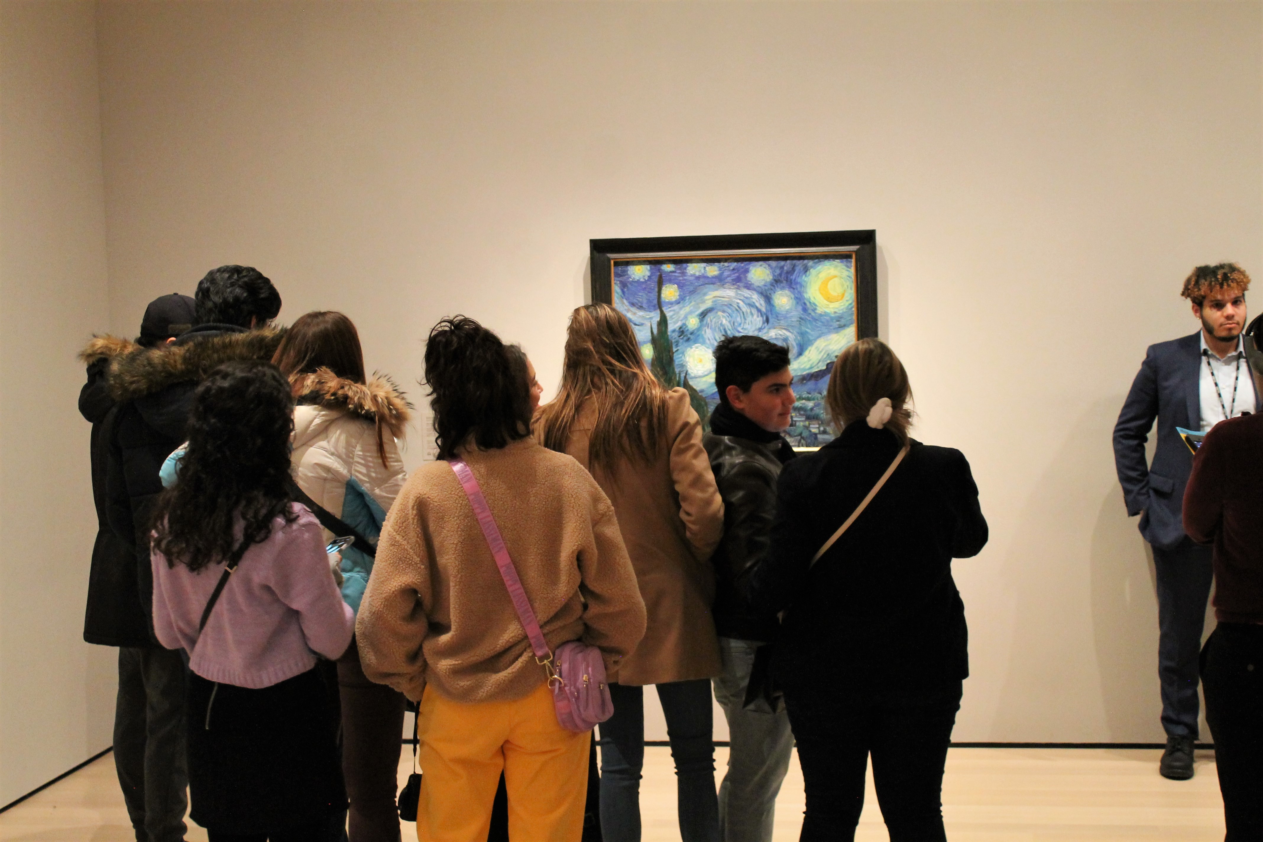
Case Study: Deconstructing a Masterpiece
Let's apply our four pillars to a world-famous painting: Vincent van Gogh's The Starry Night. This is a deeper dive, showing how these tools can unpack a complex and emotionally charged work.
Step 1: Description of The Starry Night
- Subject Matter: A nocturnal landscape depicting a sleeping village, a towering cypress tree in the foreground, and an immense, swirling sky filled with stars and a crescent moon.
- Medium: Oil on canvas. The paint is applied very thickly (impasto).
- Color: A palette of deep blues and blacks for the sky and village. The stars, moon, and windows of the houses shine with brilliant yellows and whites, creating a stark contrast. The cypress tree is a dark, flame-like silhouette.
- Line: The entire painting is dominated by thick, undulating, and dynamic lines. There are almost no straight or static marks. The sky is a torrent of curving, energetic brushstrokes. The hills roll and flow.
- Texture: Extremely pronounced. Van Gogh's signature impasto technique is on full display. You can see the direction and force of every brushstroke, giving the painting a tangible, almost sculptural quality. The brushwork itself is a primary subject.
- Composition: The cypress tree acts as a dark, vertical anchor on the left, connecting the land to the sky. The village is nestled quietly in the mid-ground, dominated by the church spire. The massive, swirling sky dominates over two-thirds of the canvas, making it the undeniable protagonist.
Step 2: Analysis of The Starry Night
Van Gogh uses rhythm and movement as the central tools. The painting is a symphony of swirling lines that create a sense of immense, cosmic energy. This powerful rhythm in the sky completely overshadows the stillness of the village below, creating a massive contrast between the turbulent heavens and the quiet, slumbering earth. The composition is a study in dynamism versus stillness, energy versus peace. The lines in the sky aren't just describing clouds; they are a visual representation of energy, of wind, of the very life force of the night sky. The repeated pattern of the circular brushstrokes around the stars creates a visual beat, a rhythm that makes the sky feel alive.
Step 3: Interpretation of The Starry Night
I see The Starry Night as an expression of profound emotional and spiritual turmoil. This isn't a calm, observed night sky; it's a night sky refracted through a state of intense feeling. The cypress tree, often a symbol of death and eternity, reaches upward like a dark flame, connecting the world of the living (the village) to the powerfully alive cosmos. The village itself appears peaceful and oblivious, which could represent the mundane world, asleep to the intense, spiritual drama unfolding in the heavens. Some interpret the church spire as a futile human attempt to reach the divine, overshadowed by the much more powerful, natural divinity of the sky itself. It's a painting about the conflict and connection between the earthly and the ethereal, and the immense energy that permeates the universe, even in its most quiet moments.
Step 4: Judgment of The Starry Night
The Starry Night is undeniably a successful and groundbreaking work of art. Van Gogh's goal was clearly not to paint a photorealistic nightscape but to communicate a powerful internal, emotional reality. He succeeds completely. The invention of his swirling brushstroke technique is a stroke of genius, giving form to invisible forces like wind, emotion, and cosmic energy. The work is intensely coherent; every element—the colors, the lines, the composition—serves to reinforce this vision of a sentient, dynamic universe. Its originality is its greatest strength, creating a new visual language for expressing inner life. More than a postcard from Provence, it's a postcard from the edge of human feeling, and its enduring power lies in its ability to make us feel that same raw, overwhelming connection to the world.
Applying Critique to Different Art Forms
The four pillars are wonderfully versatile. While we've focused on painting, they can be adapted for almost any visual medium.
For Sculpture:
- Description/Analysis: Pay close attention to form (how does it occupy space?), material (what is it made from and why?), volume (is it solid or open?), and viewing angle (does it change as you walk around it?). How does it interact with the space around it?
- Texture is critical—is it smooth and inviting touch, or rough and forbidding?
- Interpretation: Consider the physical relationship the piece forces you to have with it. Does it tower over you? Does it invite you to peer inside? The physical experience is part of the meaning.
For Photography:
- Description/Analysis: Focus on framing (what did the photographer choose to include or exclude?), depth of field (what's in focus and what's blurry?), lighting (how is it used to create mood, shadow, and focus?), and composition. Was the moment candid or staged? Is the photographer an observer or a director?
- Interpretation: Since a photograph is tied to a real moment, the context of that moment—the time, the place, the people—becomes incredibly important for interpretation.
For Digital and Mixed Media Art:
- Description/Analysis: Consider the interplay between digital and physical elements. How do screen-based visuals interact with tangible objects? How do text, sound, and image combine?
- Interpretation: Often this art is about questioning the medium itself. The meaning might be tied to ideas of technology, identity in the digital age, or the nature of reality and simulation. It often invites interaction, so your physical or virtual participation with it is key to the experience.
The Evolution of Art Critique: A Brief History
It's useful to know that the "right" way to look at art has changed dramatically over time. Understanding this history helps you see that critique itself is a story, not a set of absolute rules.
- Classical Antiquity to the Renaissance: Art was largely judged by how well it achieved mimesis—the imitation of nature. The goal was ideal beauty and perfect technique. The more realistic and harmonious, the better. Artists were seen as master craftsmen.
- The Enlightenment and Beyond: With the rise of the "art critic" as a profession, the focus shifted to understanding the artist's expression of emotion and ideas. Art wasn't just a window to the world; it was a window to the artist's soul.
- Modernism (Late 19th–Mid 20th Century): This was a revolution. Thinkers like Clement Greenberg argued for formalism, the idea that a work of art should be judged solely on its formal properties—its lines, colors, and composition—and its relationship to its own medium. This is where our four-pillar approach finds its roots. It freed art from having to tell a story or look like something recognizable.
- Postmodernism (Late 20th Century–Present): The idea of a single, universal standard for "good" art was thrown out. Postmodern critique is heavily influenced by cultural criticism, asking questions about power, identity, politics, gender, and representation. Whose story is being told? Whose is being left out? Who is making money from this? The meaning of the artwork is inseparable from its cultural and economic context.
So when you walk into a gallery today, you're not just looking at one artwork. You're participating in a long, ongoing conversation about what art is and what it's for.
Frequently Asked Questions
Q: Is there a 'right' or 'wrong' interpretation of an artwork?
A: This is the most important question. For the most part, no. The goal isn't to find the one true meaning hidden by the artist. Think of it more like being a detective at a crime scene. There are plausible theories that are supported by the evidence (the visual clues in the artwork), and there are implausible ones that disregard the evidence. Saying a peaceful landscape painting is about "the horrors of war" is a tough sell unless you can point to specific elements (like ominous clouds, or the remnants of a battle in the distance) to back it up. A good interpretation is a compelling argument that connects your observations to a meaningful conclusion, not a wild guess.
Q: Do I need to know about art history to critique art?
A: It helps, but it's not essential to start. Context makes art richer. Knowing a little about the historical period or the art movement can help you understand why an artist made certain choices. Was it a rebellion against the art that came before it? Was it a reaction to a world event? However, you can do a deep and meaningful formal critique using just the four pillars, completely ignorant of who the artist is or when they lived. The artwork itself should always be your primary source.
Think of it this way: you can have a perfectly lovely and profound conversation with a stranger without knowing their whole life story. Art history is the life story. It adds incredible depth, but it's not a prerequisite for having a real, immediate, and valid experience with the work.
Q: How do I critique art that I just don't 'like'?
A: This is where separating personal taste from critical judgment becomes crucial. I genuinely don't enjoy overly sentimental or cutesy art. But I can still analyze it. I ask myself: "Is this successful sentimental art? Does it achieve its goal of evoking a tender emotion in a coherent and skillful way?" By judging the work on its own terms, you can appreciate it even if it's not your cup of tea. It’s sometimes more interesting to analyze art you dislike than art you instantly love.
Your dislike is a powerful analytical tool. It's a strong reaction, which means the artwork has managed to push a button. The question is why? What specific choices did the artist make—in color, in subject, in style—that are making you react negatively? More often than not, you'll find that what you dislike is a mismatch of taste, not a failure of execution. That is a massive breakthrough in your journey as a critical thinker.
The art you dislike is often your best teacher. It forces you to ask hard questions about why you dislike it. Is it the subject matter? The style? The execution? Questioning your own reaction can be more revealing than analyzing a piece you already connect with. Discomfort is a great starting point for a deeper conversation.
Q: What if the artist's statement contradicts what I see?
A: Ah, the classic trap. Artists are visual thinkers, not always great verbal communicators. Sometimes the art says something more profound or different than they intended. A piece of art is a conversation between the creator, the object, and the viewer. Your perspective is the third, essential part of that equation.
Take the artist's statement as one piece of evidence, but don't let it overrule your own careful observation. The artwork itself is the ultimate authority. I've often found that a piece of art can hold multiple, even contradictory, meanings at once. If you see something they didn't intend, that doesn't make your interpretation wrong; it might just mean the work has a life of its own, richer and more complex than its maker anticipated. Trust the work first, the statement second.
Q: How can I practice these skills?
A: Go to galleries and museums! Or, since we live in a digital world, browse museum websites. Pick one or two pieces and force yourself to go through the four pillars for just 5-10 minutes. Jot down your thoughts in a notebook or on your phone. It's like a workout for your observation skills. The more you do it, the faster and more intuitive it becomes. And here's a secret: when I feel stuck, I sometimes play a game where I take a photo of an artwork I'm looking at and write a one-line "review" in my head, as if I were captioning it for a friend. It forces me to distill my reaction into something concise and honest, which is often the first step to a deeper understanding.
If you're interested in making your own art as a way to better understand these principles, you can explore my original works and prints on my /buy page. Seeing how I try to work with these ideas in my own studio can give you another lens through which to view the entire process.
Once you start seeing the world through the lens of composition, color, and light, it's impossible to turn it off.