Delacroix's Radical Techniques: Color, Brushwork & Soul in Art
Uncover how Delacroix revolutionized painting with explosive colors, expressive gestures, and bold compositions that birthed Romanticism. Your masterclass in emotional artistry begins here.
Delacroix's Radical Techniques: Color, Brushwork & Soul in Art
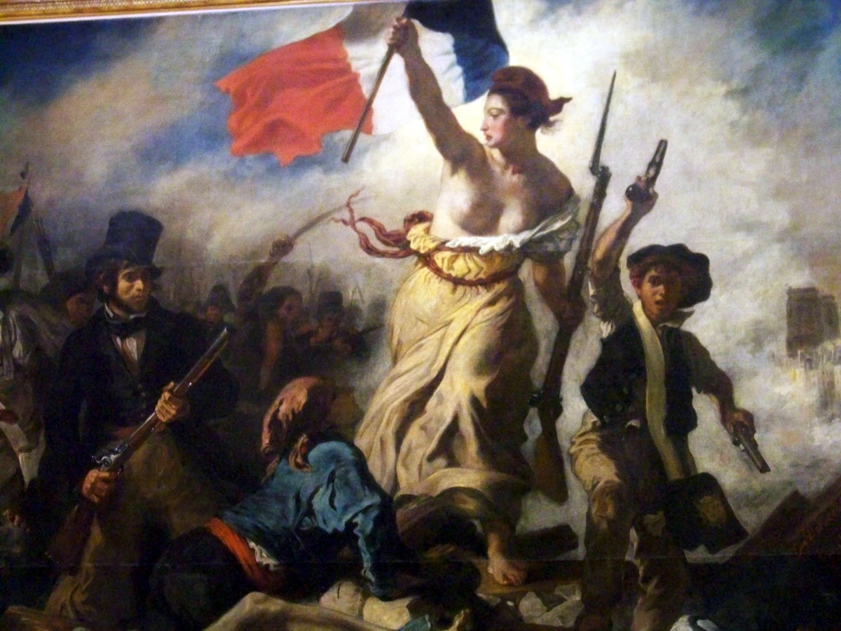
I’ll never forget standing transfixed before Delacroix's Liberty Leading the People in a dimly lit Paris museum. That visceral rush—those clashing pigments, those frantic brushstrokes—that’s what I want to unpack today. Not just pretty pictures, but how this restless visionary dismantled classical rules to birth something gloriously human. Let’s spill the paint on his revolutionary methods together.
Table of Contents
- Why Delacroix Still Shakes Art
- The Color Revolution: Breaking the Palette Rules
- Brushwork That Has A Pulse
- Composition with Theatrical Flair
- Materials & Mediums: The Physical Foundation of Revolution
- The Science Behind the Sensation: Delacroix and Optics
- Delacroix's Influencers and His Rivalry with Ingres
- The Romantic Context: Art as Emotional Truth
- Step-by-Step: How to Paint Like Delacroix (A Practical Guide)
- Advanced Techniques: Mastering Delacroix's Signature Methods
- Common Mistakes & Solutions: Learning from Failure
- Key Works Analyzed: A Gallery Walk
- A Chronological Journey: Delacroix's Artistic Evolution
- Delacroix's Written Word: The Journal as a Masterpiece
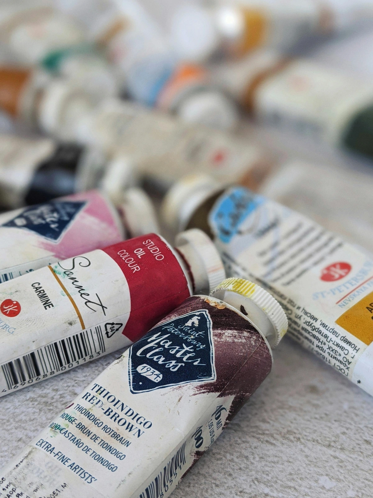
- What Paint Brushes Did Delacroix Use? The Tools of Rebellion
- Palette Configuration: Building Your Revolutionary Toolkit
- Modern Echoes: Where We See Delacroix Today
- Critical Reception & Historical Impact
- Beyond the Louvre: Where to See Delacroix's Work
- Learning Path: How to Deepen Your Understanding
- Recommended Resources & Reading
- Frequently Asked Questions
- Conclusion: Take Delacroix's Rebellion Forward
Why Delacroix Still Shakes Art
Before dissecting his tools, understand why his rebellion mattered. Earlier artists valued orderly perfection and muted tones. Delacroix? He screamed at canvases with emotion, celebrating chaos and feeling over textbook correctness. His work wasn't just art; it was an earthquake that fractured Neoclassicism and ushered in Romanticism’s dramatic soul. These aren’t dusty old techniques—they’re a manifesto for making art that pulses.
To truly grasp the seismic shift, consider the Old Masters Delacroix revered and rebelled against. Figures like Raphael embodied a serene, divine perfection. Delacroix sought a different, more terrestrial divinity—one forged in passion, conflict, and blood. His rebellion wasn't about destroying the past; it was about proving that art could be both epic and intensely, undeniably human.
The Color Revolution: Breaking the Palette Rules
Delacroix wasn’t just using paint; he was conducting a symphony of pigment. His color choices weren’t academic—they felt like epiphanies captured in oils.
Complementary Colors as Emotional Weapons
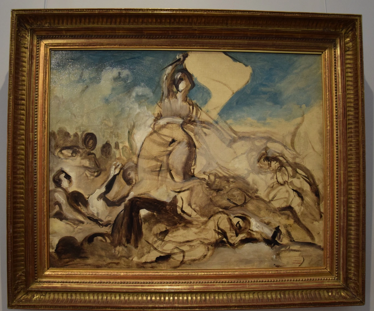
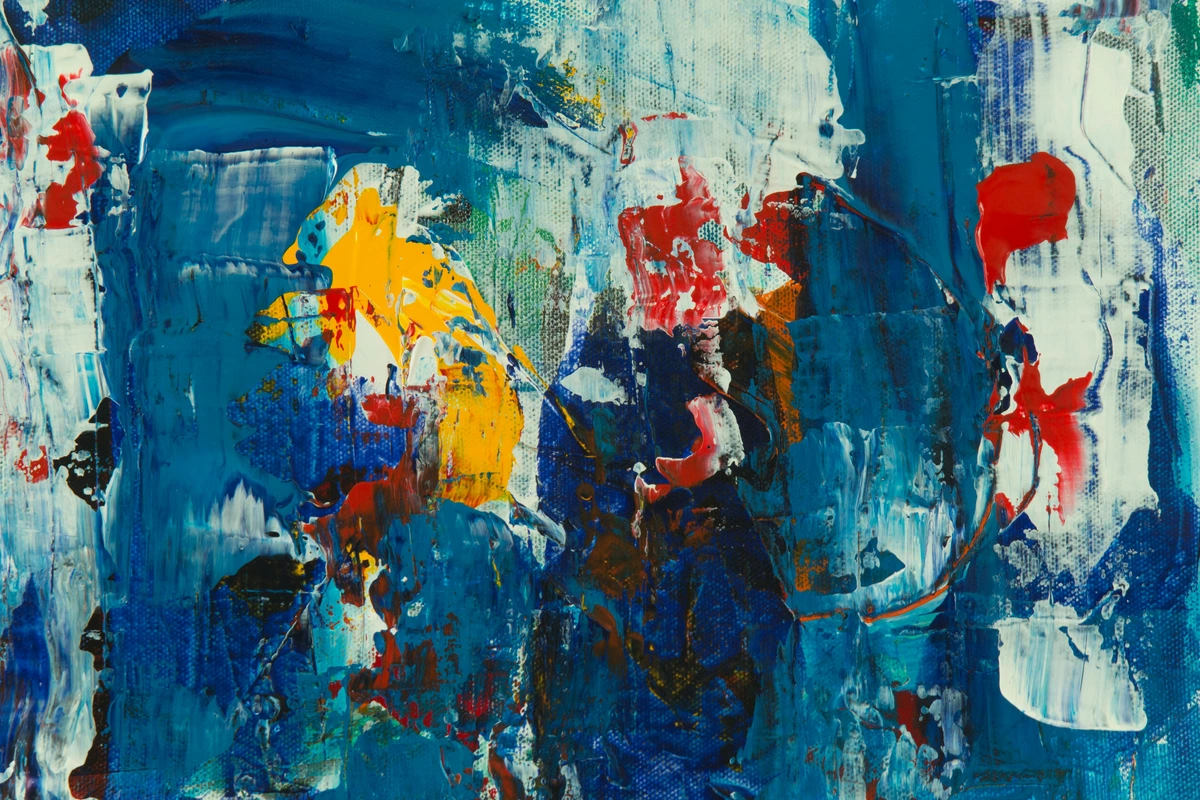
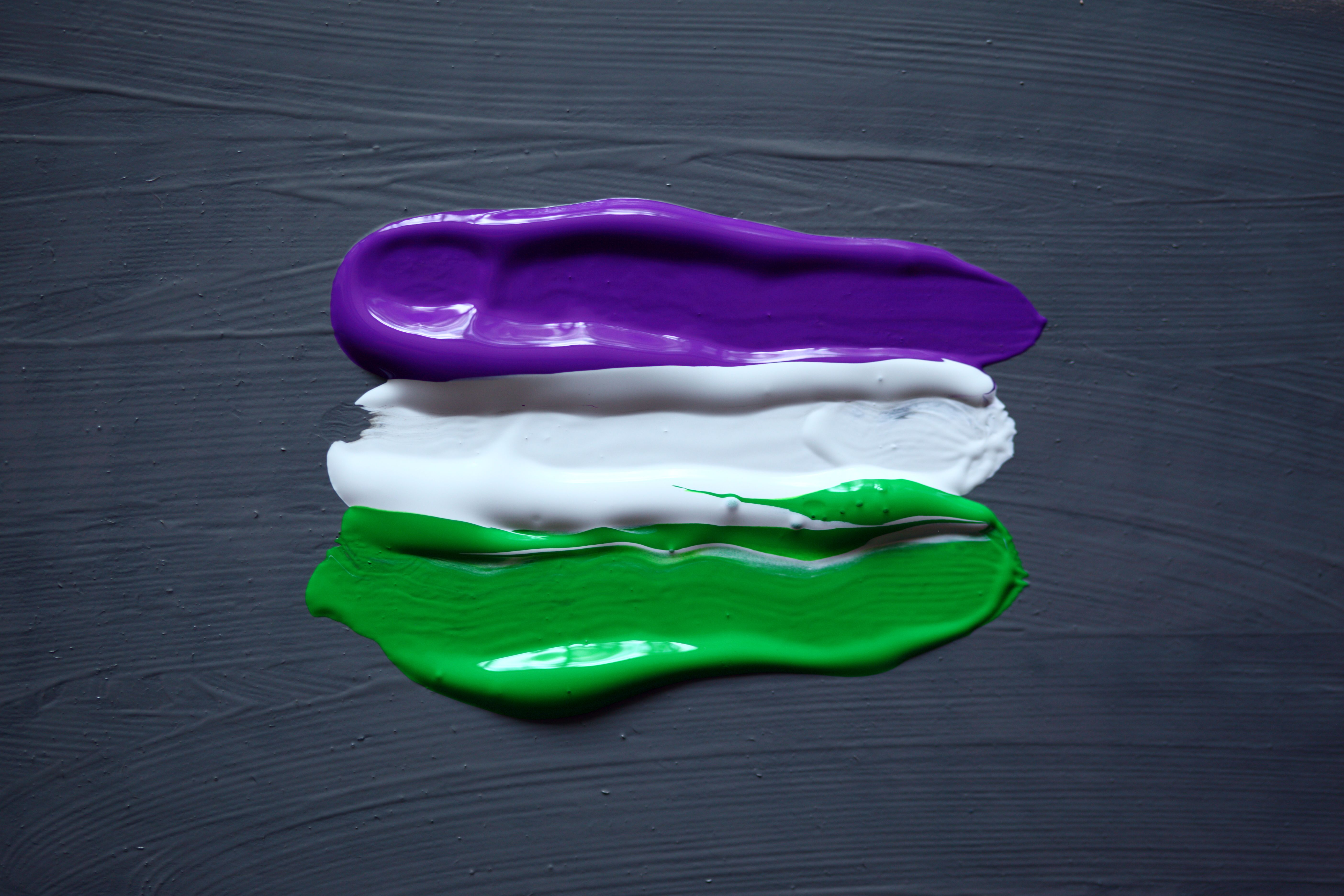
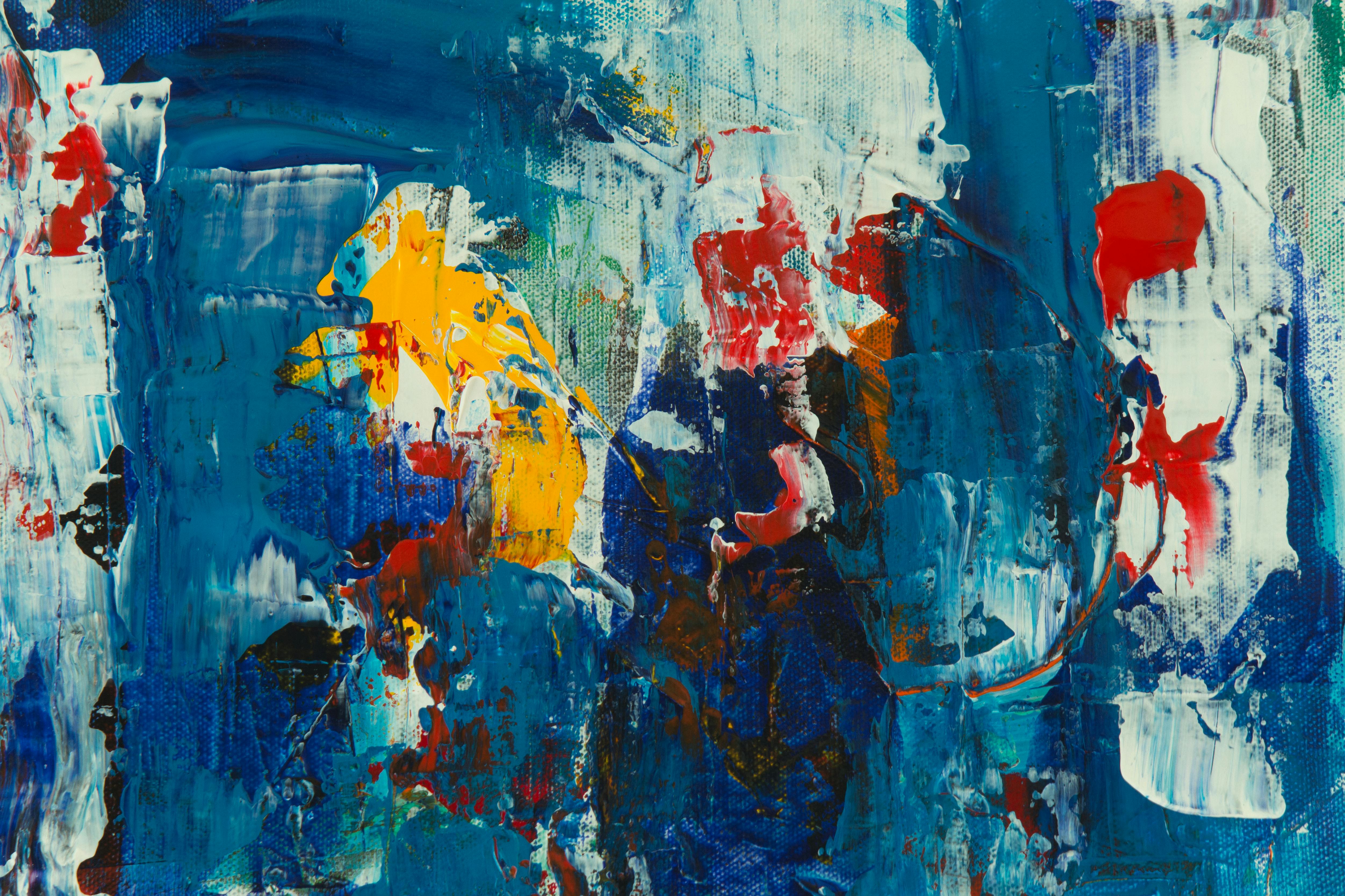
Delacroix studied Michel Eugène Chevreul’s treatise on simultaneous contrast religiously. He understood that slamming opposites together—purple against yellow, vivid scarlet beside deep viridian—created visual fireworks. Look at The Death of Sardanapalus: those electric turbaned figures against blood-red drapes? They don’t just depict excess; they physically assault your eyes with tension. This wasn’t decoration—it was psychological warfare.
His Palette Philosophy:
Color Combo | Emotional Effect | Example Painting |
|---|---|---|
| Crimson + Emerald | Passion, danger, life | The Death of Sardanapalus |
| Ultramarine + Burnt Sienna | Profound mystery, mourning | Christ on the Sea of Galilee |
| Cadmium Yellow + Purple | Divine radiance, supernatural | The Barque of Dante |
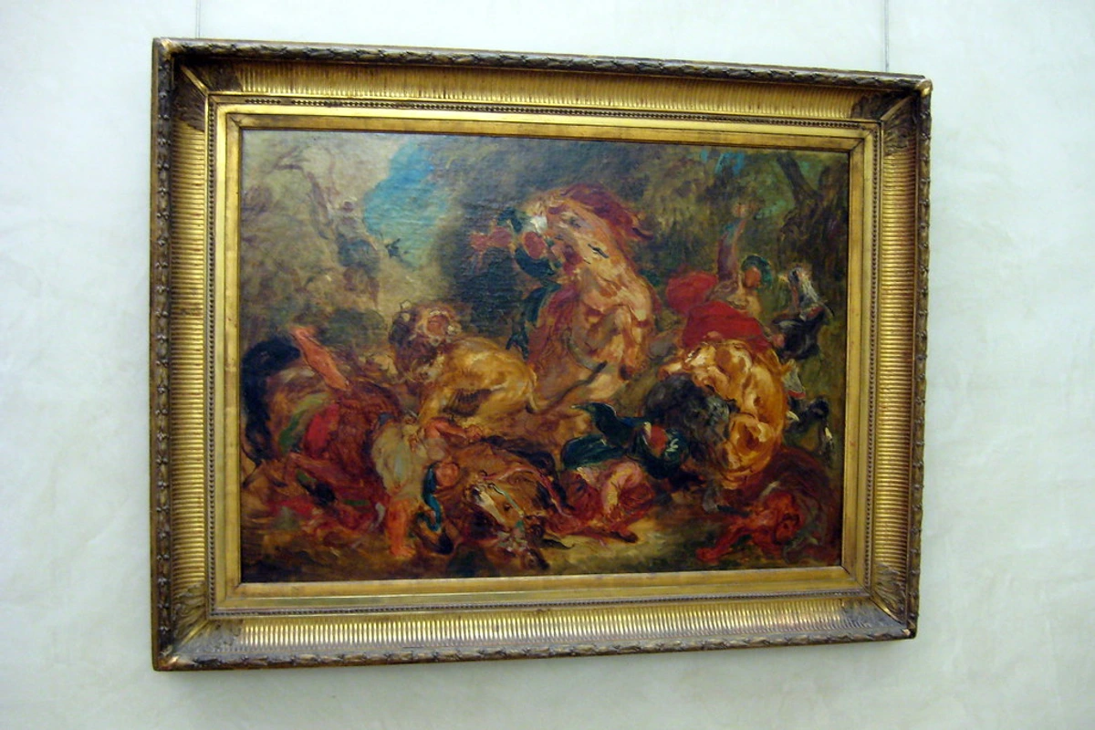
| Viridian + Cadmium Red | Earthy vitality, raw energy | The Lion Hunt |
| Cobalt Blue + Orange Ochre | Exotic atmosphere, warmth | Women of Algiers |
The Psychological Impact on the Viewer:
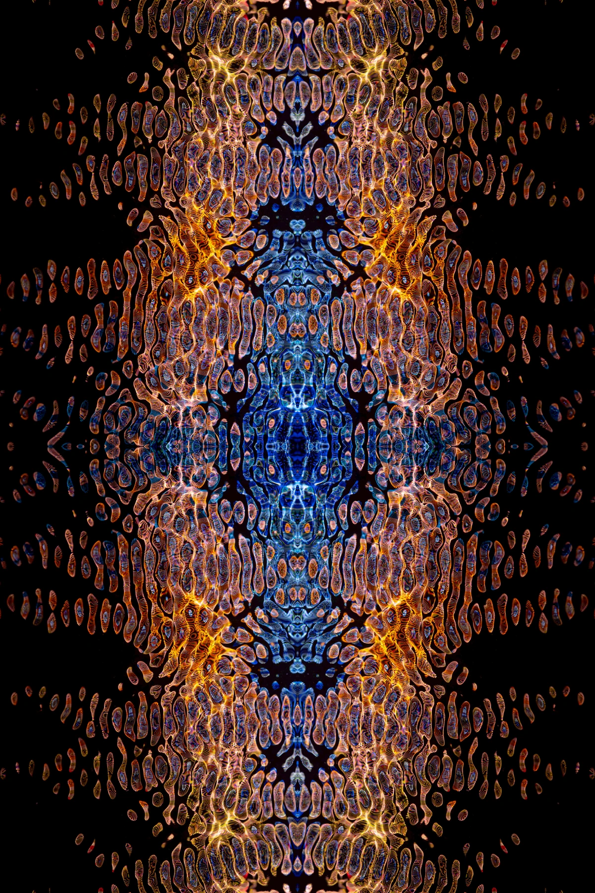
What Delacroix understood instinctively—and what modern neuroscience now confirms—is that color combinations don't just create visual interest; they trigger emotional and physiological responses. That crimson against emerald green? It creates what's called "retinal fatigue" and "afterimages," where your eye literally struggles to process the contrast, creating a vibrating edge that feels alive and unstable. It's a visual metaphor for the emotional instability of the scene itself.
Delacroix's Color Mixing Strategy:
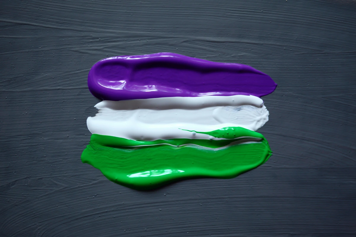
- Minimal Mixing: He believed in keeping pigments pure. Colors were mixed more on the canvas than on the palette.
- Strategic Mud: When he did mix, it was for specific psychological effects—the muddied, sickly tones in shadows could evoke decay and mortality.
- Temperature Warfare: He'd place the coolest colors directly against the warmest, creating maximum temperature contrast.
- The Unexpected Note: Often, he'd add one "wrong" color—like a touch of red in a green field, or violet in a golden sky—not for "realism," but for visual tension.
Layering Wet-On-Wet (Alla Prima)
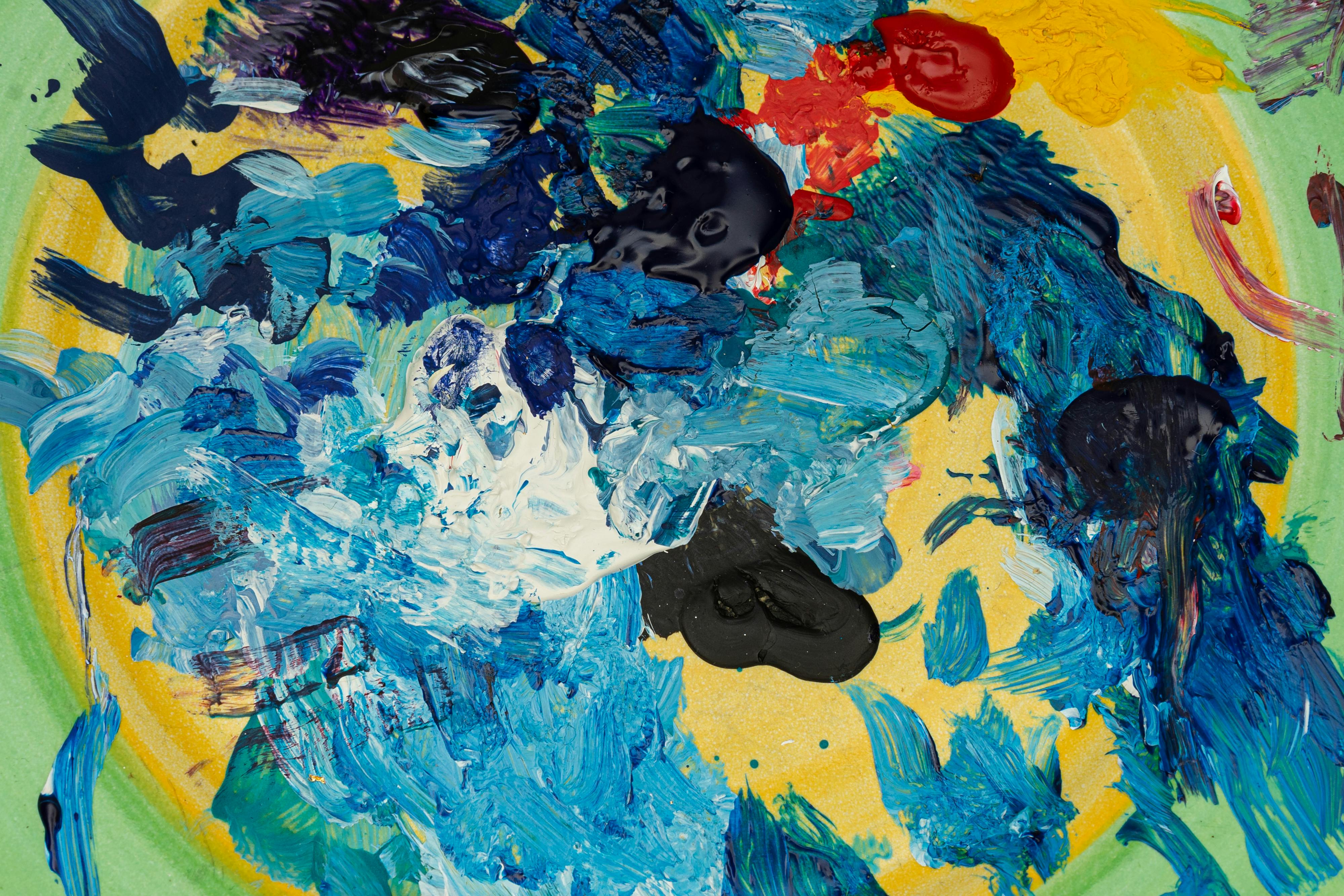
Forget meticulous glazes. Delacroix often applied fresh paint directly over still-wet underlayers. This impasto technique created thrilling accidental textures—blooms of color, unexpected edges that made his scenes feel dangerously alive. Imagine The Arab Horseman: those quick flicks of wet white on a stormy sky? They aren’t clouds—they’re raw, uncontrolled energy. Controlled messiness, you might say.
Alla Prima vs. Classical Layering (Glazing)
Technique | Process | Visual Effect | Emotional Vibe | Delacroix's Use |
|---|---|---|---|---|
| Alla Prima | Paint applied wet-on-wet, all at once or in a single session. | Loose, visible brushstrokes, textured surface, vibrant color mixing on the canvas. | Urgent, spontaneous, energetic, alive. | Creating the frantic energy of a battle, the shimmering haze of a North African sky. |
| Glazing | Thin, transparent layers of paint applied over a dry underpainting. | Smooth, blended surface, deep luminosity, a kind of enamel-like sheen. | Calm, controlled, deliberate, ethereal. | Used by Delacroix sparingly, often for specific effects like a deep shadow or a jewel-like highlight, but not for the whole work. |
Brushwork That Has A Pulse
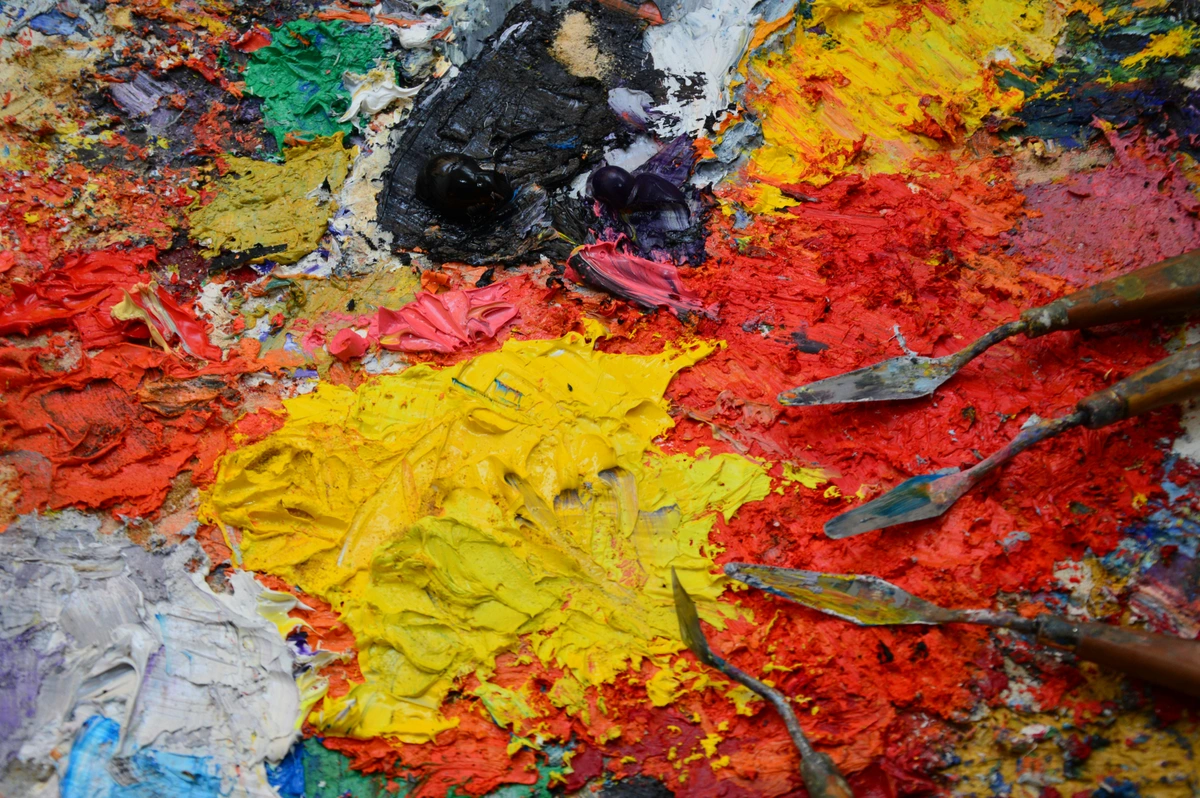
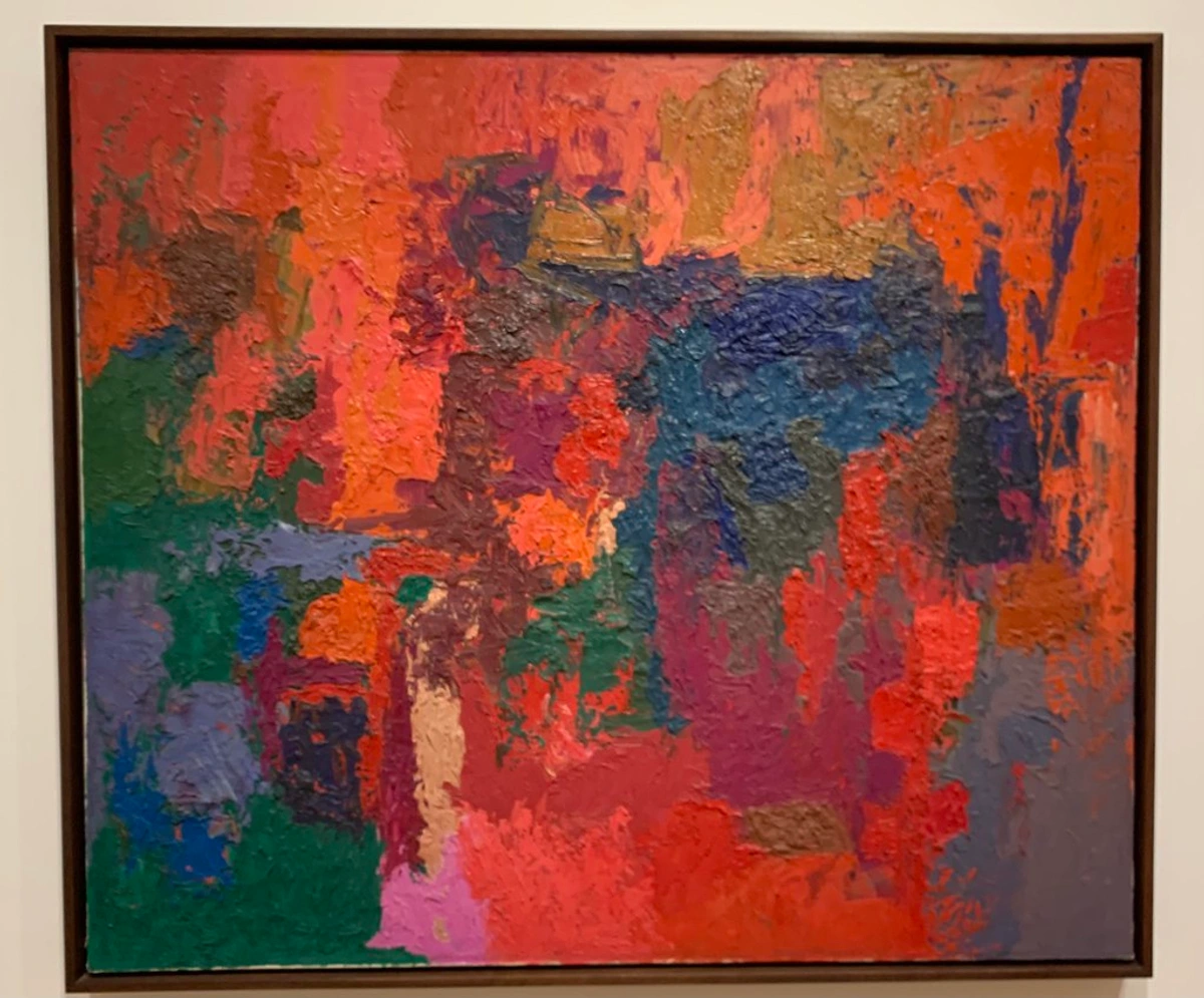
Where others blended into invisibility, Delacroix’s brushstrokes scream for attention. Each mark has weight and anger and joy. You can almost see the speed of his arm, the pressure of his fingers, the snap of his wrist in every stroke. It's handwriting in paint—not the careful cursive of a professional scribe, but the urgent scrawl of someone writing a desperate love letter or a declaration of war. Once, in a museum, I stood so close to one of his smaller sketches that I could see the individual bristle marks from his brush. The paint was laid down with such force that it had ridges you could feel with your eyes.
Visible, Sculptural Impasto
He built texture like a sculptor. Thick applications of dark paint in shadows, like the cracked earth in Greece on the Ruins of Missolonghi, weren’t mistakes. They were three-dimensional trenches guiding your eye. My lazy artist secret? I mimic this with palette knives when I need raw emotion. It’s faster, messier, and somehow truer.
Delacroix's Signature Strokes:
- Trembling Highlights: Rapid, flickering daubs of light (candle flames, sunbeams)
- Directional Lines: Sweeping curves implying wind, drapery, or crowd movement
- Broken Colors: Applying pure pigments side-by-side instead of mixing
- The Scraped Edge: Using the palette knife to scrape back wet paint, revealing the ground beneath
- Loaded Impasto: Building up paint so thickly it catches real, physical light
- The Dry Brush Drag: Barely loading the brush to create a scratchy, textured mark
- The Comma Stroke: A distinctive flick of the wrist creating a comma-like mark, especially in foliage and hair
The Anatomy of a Delacroix Brushstroke:
Each brushstroke was a multi-second performance:
- The Attack: How the brush first touches the canvas—sometimes a direct stab, sometimes a tentative touch
- The Drag: How pressure and direction change as the stroke moves across the surface
- The Release: How the stroke ends—often abruptly, leaving a visible tail or becoming gradually thinner
- The Adjacency: How this stroke relates to its neighbors—sometimes overlapping, sometimes separated by canvas tooth
This isn't just "painting"—it's calligraphy with a weaponized brush.
It's this last point, broken color, that became his most profound gift to the future. By placing dabs of pure red next to pure blue, he knew the viewer's eye would mix them from a distance, creating a more luminous and vibrating violet than any mixed paint could ever be. This wasn't just a technique; it was a philosophical stand. Why mix a color to death on the palette when the living eye can do it better?
Rubens & The Venetians: His Secret Masters
His restless energy came directly from studying Rubens’ swirling compositions and Titian’s jewel-toned glazes. But Delacroix wasn’t copying—he was amplifying. He distilled their lessons into more urgent, modern chaos. This is your cue: steal shamelessly from history, then twist it until it yours.
A word of caution: this isn't superficial theft. It's a deep, almost spiritual apprenticeship. Delacroix would sit for hours in the Louvre, sketching, analyzing, memorizing. He wasn't just looking; he was learning the secret language of the past to write his own urgent, modern poetry with it.
Composition with Theatrical Flair
No passive landscapes for Delacroix. His canvases were staged battles between light and dark, movement and stasis.

Diagonal Dominance
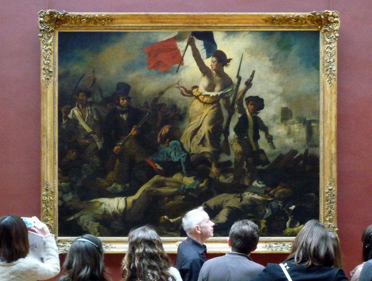
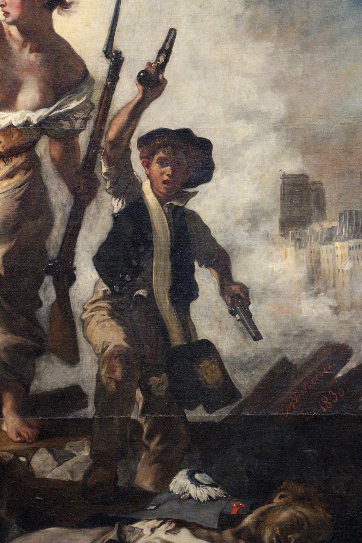
Look at Liberty Leading the People. That central figure isn’t standing—she’s a spear-like diagonal thrusting through chaos. Every compositional element pushes you forward. It’s visual storytelling at its most raw. Want your art to grab attention? Make your diagonals attack the canvas.
Light as a Dramatic Tool
Forget gentle dawn light. Delacroix used chiaroscuro like stage lighting, carving figures from darkness with sudden, harsh highlights. This wasn't just dramatic effect; it was a philosophical statement about the nature of truth itself—that understanding emerges not from uniform illumination, but from the stark contrast between revelation and mystery. Think about it: when you understand something profoundly, it's rarely a slow dawn. It's usually a flashbulb moment—a sudden, harsh truth emerging from confusion. That's Delacroix's philosophy of light in a nutshell. Christ’s ghostly form in Christ on the Sea of Galilee emerges from darkness not because it’s accurate, but because it feels like faith. Light wasn’t illumination—it was revelation.
His mastery of theatrical lighting can be broken down into three core techniques he used to guide the viewer's eye and heart:
- The Focal Glow: A single, intense burst of light that acts like a spotlight, separating the hero from the chaos (Liberty Leading the People). This creates what's called "tunnel vision" in the viewer, forcing attention exactly where Delacroix wants it.
- Atmospheric Suffusion: Where light bleeds and diffuses through a misty or smoky scene, creating an all-encompassing mood (The Barque of Dante). Here, light isn't on objects; it is the atmosphere itself.
- Reflected Drama: Using light bouncing off one surface (like water or polished armor) to illuminate another, adding layers of complexity and realism (The Death of Sardanapalus). This technique creates what I call "visual ricochets"—your eye bounces between surfaces, discovering new connections.
- Backlighting Silhouettes: Pushing figures into near-silhouette against a bright background, creating monumental, symbolic forms (Greece on the Ruins of Missolonghi).
- The Candlelit Interior: Using a single, flickering artificial light source to create an intimate, psychologically charged space (The Death of Sardanapalus details).
The Psychology of Light Direction:
Delacroix was a master psychologist of light:
- Light from below: Creates an unnatural, supernatural, or menacing feel (think horror movies)
- Side lighting: Reveals texture, volume, and drama—his most common choice
- Backlighting: Creates silhouettes and mystery, hiding information from the viewer
- Overhead light: Rare for him, as it flattened forms and reduced mystery
I often set up a simple light source in my studio—just a desk lamp—and move it around a still life to see how different angles change the emotional tenor of the scene. It's a simple exercise, but it teaches you to think of light as a director thinks of camera placement.

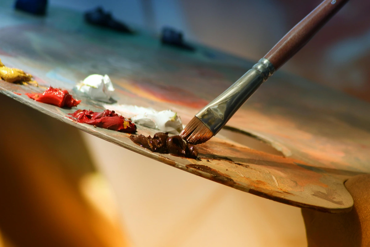
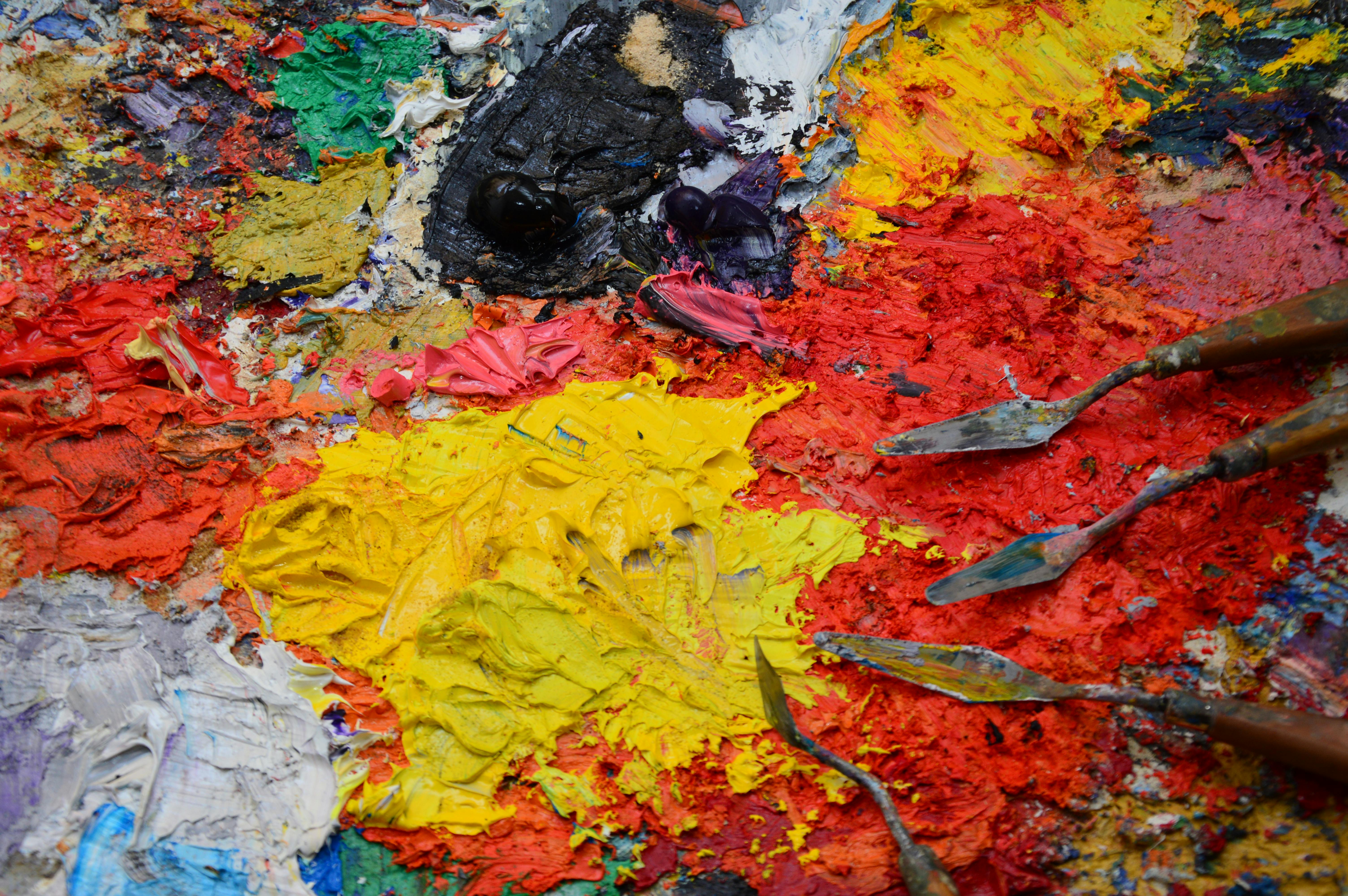
His tools were extensions of his nerve endings. He would famously jab at the canvas, scrape back layers, and trowel paint on with a palette knife. A brush wasn't just for painting; it was for feeling. It's this physical, almost brutal engagement with his materials that gives his work its unforgettable, raw honesty.

The Science Behind the Sensation: Delacroix and Optics
Delacroix's choices weren't just emotional; they were intellectual. His notebooks reveal a deep fascination with the emerging scientific theories of light and color. He was obsessed with the work of scientists like Michel Eugène Chevreul, whose "Law of Simultaneous Contrast" became a cornerstone of his method.
Chevreul's Core Principle: A color is never seen in isolation. Its appearance is always modified by the colors surrounding it. Place a gray square on a blue background, and it will look slightly orange. Place it on a red background, and it takes on a greenish tinge. Delacroix didn't just read this; he weaponized it. Every brushstroke was placed not just for itself, but for how it would transform its neighbor. He wasn't painting objects; he was painting the very act of perception.
The Chevreul-Delacroix Connection Table:
Scientific Principle | Delacroix's Application | Result |
|---|---|---|
| Simultaneous Contrast | Placing intense complements side-by-side | Colors appear more vibrant than if mixed on the palette |
| Successive Contrast | Creating "visual fatigue" from intense color clash | Viewer experiences fleeting afterimages, adding to sense of motion |
| Color Absorbency | Using grounds that absorb certain wavelengths | Underpainting subtly modifies colors laid on top |
Optical Mixing vs. Physical Mixing:
This is perhaps Delacroix's greatest gift to modern painting:
- Physical Mixing: Red + Blue paint = Purple (the dead, literal result)
- Optical Mixing: Red dab + Blue dab, viewed from distance = Vibrant purple (the living, perceptual result)
The difference is everything. One is chemical; the other is psychological. When I first understood this, it changed how I work entirely. I stopped trying to mix "perfect" colors on my palette and started asking, "What color do I want the viewer's brain to create?"
Beyond Chevreul: Other Scientific Influences:
Delacroix devoured scientific literature:

- Eugène-Melchior Péligot: Researched the physics of light reflection
- David Ramsay Hay: Color theorist who influenced the Pre-Raphaelites
- Goethe's Theory of Colours: Though he disagreed with some of it, he valued its attention to subjective color experience
Testing Color Interactions:
In his studio, Delacroix conducted experiments:
- Color Wheels: Spinning discs with different color combinations to observe optical mixing
- Shadow Studies: Noting how colored light affects shadow color
- Viewing Distance Tests: Painting patches of color and observing them from different distances
This wasn't just artistic intuition; it was empirical research. He was a scientist of sensation, conducting experiments in the laboratory of his studio.
Delacroix's Influencers and His Rivalry with Ingres
No artist is an island, and Delacroix’s revolution was built on a passionate dialogue with the past and a fierce rivalry with his present.
His Teachers from Afar:
- Peter Paul Rubens: From him, Delacroix learned the power of dynamic, swirling composition and voluptuous, life-affirming flesh.
- Titian & the Venetian School: They taught him that color could be a structural element, not just a decorative one. Their rich, jewel-toned glazes are echoed in his own more urgent, impasto style.
- Géricault: A direct contemporary and friend, whose massive, gritty masterpiece The Raft of the Medusa showed Delacroix that modern subjects could carry the weight of history painting.
The Great Divide: Delacroix vs. Ingres
The art world of 19th-century Paris was split down the middle, a battle between two aesthetic titans:
Aspect | Eugène Delacroix (The Romantic) | Jean-Auguste-Dominique Ingres (The Neoclassicist) |
|---|---|---|
| Line vs. Color | Color was supreme. He believed color was expressive and emotional. | Line was everything. "Drawing is the probity of art," he famously said. |
| Brushwork | Energetic, visible, dramatic—brushstrokes were part of the message. | Smooth, invisible, "licked" surfaces that prioritized a clean finish. |
| Subject Matter | Exotic locales, violent passion, historical drama, emotional extremes. | Classical mythology, portraiture of the powerful, idealized beauty. |
| Philosophy | Art should capture feeling, movement, and the sublime chaos of life. | Art should embody timeless, perfect forms and intellectual order. |

This wasn't just a stylistic disagreement; it was a war for the soul of art. Delacroix's victory, in many ways, paved the way for the Impressionists, who saw in his broken color and energetic brushwork a license to completely reinvent painting.
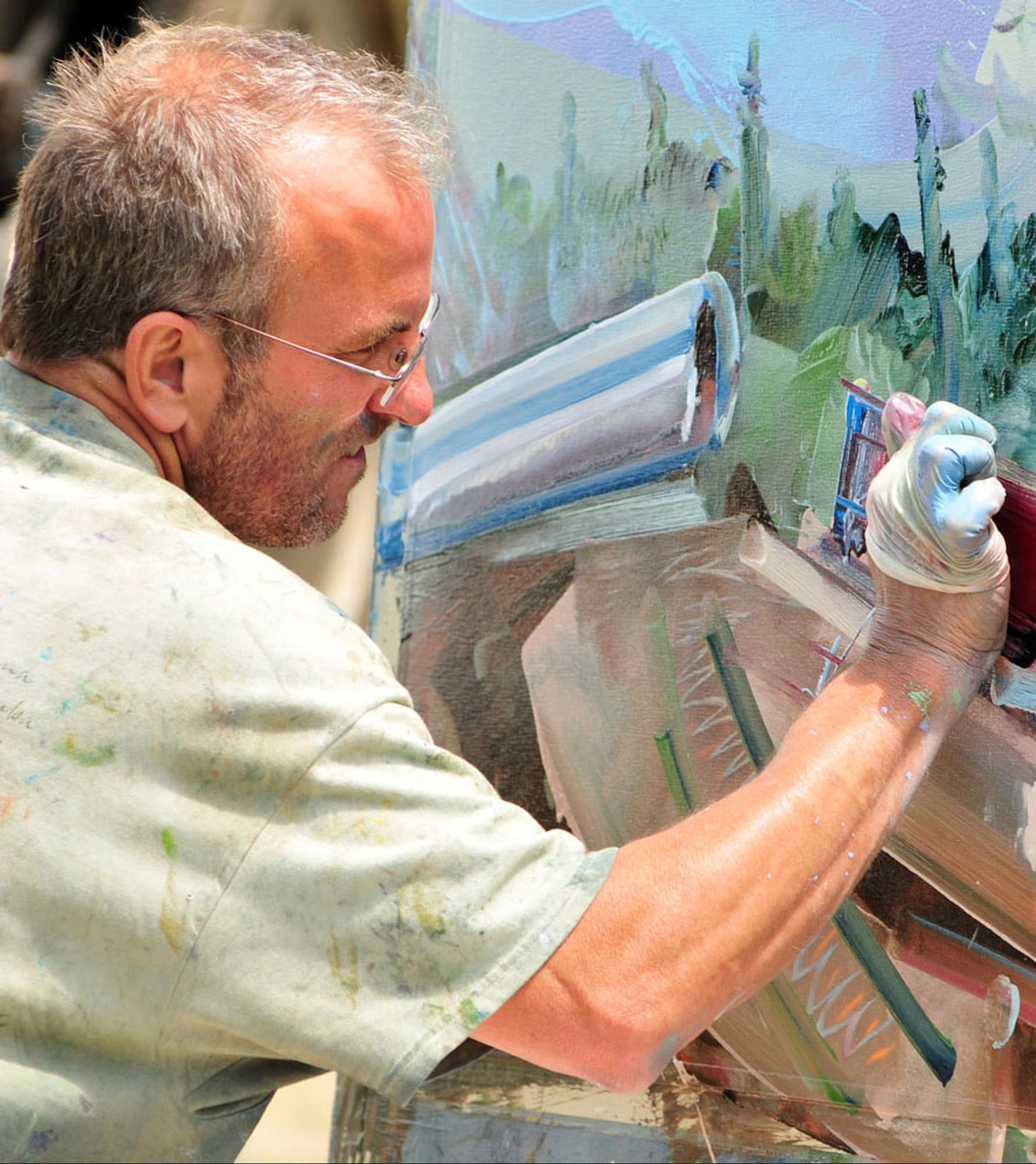
Step-by-Step: How to Paint Like Delacroix (A Practical Guide)
Want to get your hands dirty and feel what he felt? This isn't about copying a masterpiece; it's about copying a mindset.
1. Think in Opposites (The Color Sketch) First, don't reach for every color. Choose two complementary pairs: a warm against a cool. Maybe Crimson and Viridian, or Ultramarine Blue and a rich Burnt Sienna. Squeeze them onto your palette. Now, fight the urge to mix them into a muddy gray on the palette.
2. Find Your Diagonal Don't start with a boring, centered composition. Grab a stick of charcoal and slash a dynamic diagonal line across your canvas. This is your backbone. Everything else—your figures, your shadows—will either reinforce or play against this slash of energy.
3. Block In with Emotion, Not Accuracy Use a large brush. Forget small details. Block in your basic light and dark shapes using one of your chosen pairs. Where is the deepest shadow? Where is the hottest light? Don't blend. Let the colors sit next to each other. I know, it feels wrong. That's the point.
4. Let the Brush Lead Now, with a smaller brush, start defining forms. But here's the rule: let each stroke stand. If you're painting a fold of cloth, don't blend ten strokes to make one "perfect" fold. Use three distinct, loaded strokes. One for the highlight, one for the mid-tone, one for the shadow. Trust that the viewer's eye will connect them.
5. Impasto for Impact Find one small area—a glint of light on a sword, a piercing highlight in an eye. Load your brush up with thick, almost dry paint. Drag it, jab it, or flick it onto the canvas so that the paint stands up in ridges. That texture isn't just visual; it's tactile. It's the exclamation point in your visual sentence.
Key Works Analyzed: A Gallery Walk
Let's take a slow walk through a few of his greatest hits, not just to admire them, but to reverse-engineer the choices that make them sing.
Eugène Delacroix, The Barque of Dante, 1822

- Technique Spotlight: An early masterpiece showcasing his daring use of chiaroscuro. The damned souls clawing at the boat are rendered in frantic, almost violent brushstrokes, creating a churning, hellish water that feels physically real. The light, though supernatural, is the anchor of sanity in the chaos.
- Why It's Radical: It brought the epic, chaotic drama of Romantic literature to the canvas with a physicality that shocked the conservative Salon.
Eugène Delacroix, The Death of Sardanapalus, 1827
- Technique Spotlight: In many reproductions this is confused. The true Sardanapalus is a symphony of complementary colors gone mad. The cool, pale flesh of the victims is contrasted against the fiery reds and oranges of the destruction. He uses wet-on-wet to create a sense of blurred, frenzied motion.
- Why It's Radical: It's pure, unapologetic excess. The composition is deliberately unstable, chaotic, and sensual. Critics were repulsed by its "orgy of death," which is precisely the reaction Delacroix wanted.
Eugène Delacroix, Women of Algiers in their Apartment, 1834
- Technique Spotlight: This is his exotic, Orientalist masterpiece. Here, his color is more about creating a suffocating, harem-like atmosphere through a harmony of warm and cool tones. It's less about the clash and more about the intoxicating, mysterious blend.
- Why It's Radical: While problematic by today's standards, it was revolutionary for its subject matter. He was one of the first major European artists to depict an intimate, everyday scene from North Africa, not as a historical fantasy but with a painterly, observational eye that would deeply influence future Orientalist painters and even a young Henri Matisse.
Delacroix's Written Word: The Journal as a Masterpiece
Perhaps his greatest and most enduring work isn't a painting at all—it's his Journal. Kept for over 30 years, it's a staggering document of his intellectual and artistic life. He didn't just vent; he theorized, sketched, analyzed, and questioned everything. He wrote about his love for Mozart, his struggles with a painting, his theories on color, and his contempt for his critics.
"What I need is not a finished drawing, but a clear impression of the whole... The first quality in a picture is to be a feast for the eyes." — Eugène Delacroix
Reading his journal is like sitting beside him in the studio. It demystifies the "genius" and reveals the relentless, thoughtful, and often insecure worker behind the revolutionary canvases. It's a masterclass in how to think about making things.
What Paint Brushes Did Delacroix Use? The Tools of Rebellion
You don't need a magic brush to paint like Delacroix, but understanding his tools helps demystify the process. He was famously scrutinized for his vigorous technique, which wore out brushes at a remarkable rate.
Delacroix's Likely Toolkit:
- Bristle Brushes (Hogs' hair): These were his workhorses. Stiff and durable, they were perfect for scrubbing in large areas of color, laying down thick impasto, and creating that signature textured feel. He'd use a range of flats and filberts.
- Sable Brushes: For finer details—a glint in an eye, the intricate pattern on a piece of fabric, the delicate rendering of a hand. These softer brushes held a sharp point and allowed for precision within the chaos.
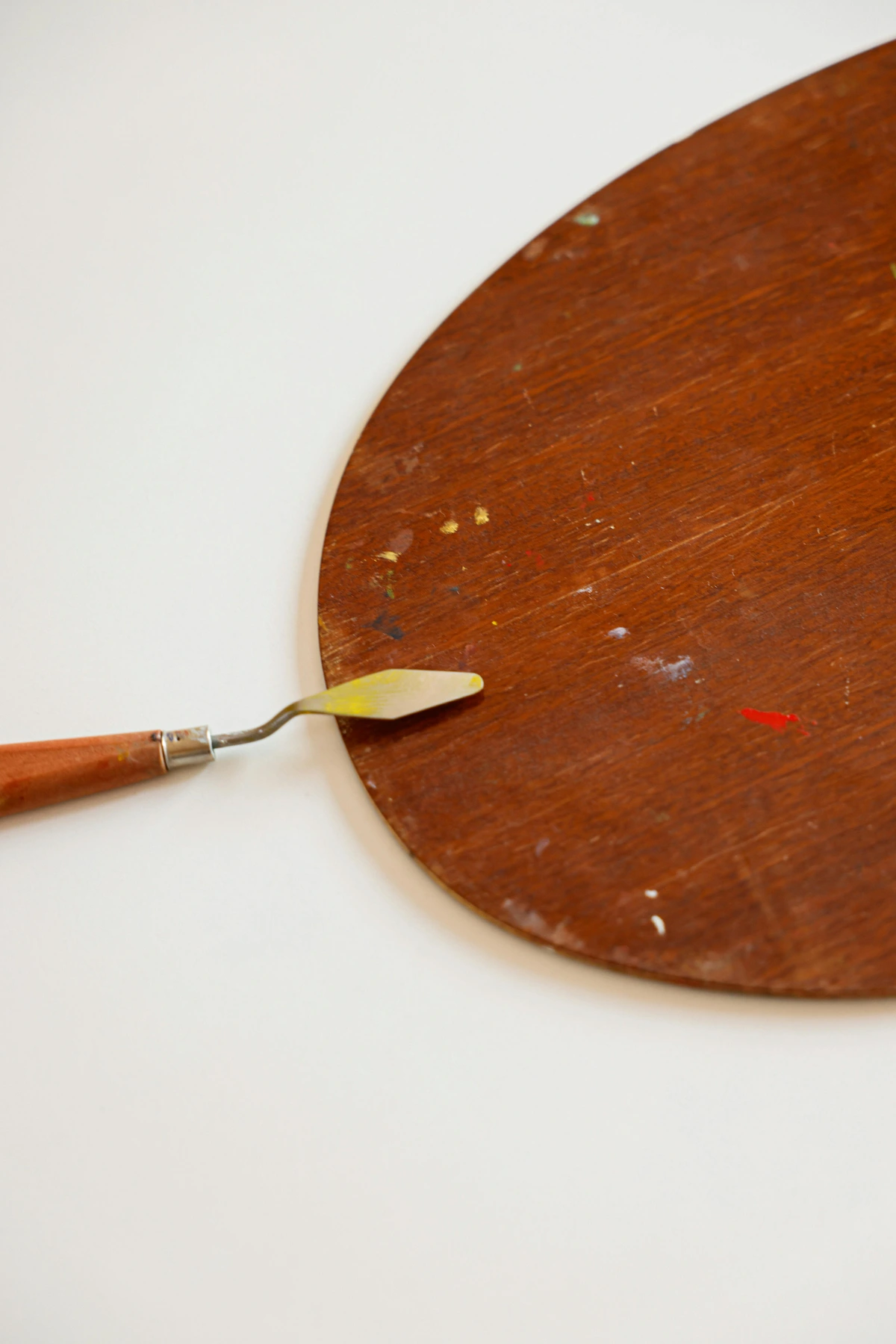
- Palette Knives: Often overlooked, but essential. He used them not just for mixing paint on the palette, but for scraping back paint, troweling on thick highlights, and even for drawing into the wet surface. It's a technique I use all the time to add a raw, physical edge.
The key takeaway isn't the brand, but the variety. He matched the tool to the task, from broad, aggressive statements to the most delicate, final whispers of a stroke. It's a reminder that your tools are your collaborators, not your masters.

Modern Echoes: Where We See Delacroix Today
His DNA is everywhere. You just have to know where to look. The funny thing is, most of the artists and creators who carry his DNA probably don't even realize it. Delacroix's ideas became so fundamental to modern visual culture that they're now part of our collective unconscious.

- In Cinema: Directors like Martin Scorsese and Ridley Scott use his principles of dramatic light and diagonal composition to create visceral, emotionally charged frames. The chaotic battle scenes in Gladiator, the psychological intensity of Taxi Driver's lighting—that's pure Delacroix. Even modern action films' use of color grading owes him a debt.
- In Music: The French composer Hector Berlioz, a friend of Delacroix, translated his explosive drama into sound with his groundbreaking Symphonie Fantastique. Wagner's concept of the Gesamtkunstwerk (the total work of art) mirrors Delacroix's ambition for a painting to be a complete, overwhelming sensory experience. You can even hear it in progressive rock and metal—complex, layered compositions that aim for total immersion.
- In Photography: The decisive moment of Henri Cartier-Bresson is a kind of Delacroixian composition found in the real world—a sudden, dynamic, and perfectly balanced instant of chaos. Street photographers today still chase that same energetic instability he captured.
- In Contemporary Art: Tracey Emin's raw, confessional energy; Anselm Kiefer's thick impasto and emotional intensity; Banksy's combination of technical skill with urgent political content—all carry echoes of Delacroix's belief that art must feel more than it must be "correct."
- In Digital Art: Modern digital artists use layers, blending modes, and color theory that directly descend from Delacroix's experiments. Even glitch art and pixel sorting capture that same sense of controlled chaos.
- In Fashion Photography: The dramatic lighting, the emotional intensity, the sense of narrative—look at the work of photographers like Steven Meisel or Nick Knight and you'll see Delacroix's theatrical sensibility translated through a lens.
- In Graphic Design: Movie posters, album covers, even web design—they all use complementary colors and dramatic composition to grab attention and create emotional response. That's Delacroix, scaled up to mass communication.
It confirms a hunch I've always had: true revolution in one field eventually bleeds into all of them. Delacroix didn't just change painting; he helped invent the grammar of modern visual expression.
Beyond the Louvre: Where to See Delacroix's Work
If this article has lit a fire in you, you need to see his work in the flesh. The color and texture simply cannot be reproduced.
Major Museums Holding Delacroix Collections:
Museum | Location | Not-to-be-Missed Masterpiece |
|---|---|---|
| Musée du Louvre | Paris, France | Liberty Leading the People |
| Musée Delacroix | Paris, France | His personal studio and intimate works. |
| The Metropolitan Museum of Art | New York, USA | The Abduction of Rebecca |
| The National Gallery | London, UK | Ovid Among the Scythians |
| The Hermitage Museum | St. Petersburg, Russia | The Lion Hunt (multiple versions) |
A pilgrimage to the Louvre is essential, but I find a visit to his small, personal studio at the Musée Delacroix in Paris to be just as profound. It's a temple to the messy, glorious, everyday act of creation.
A Chronological Journey: Delacroix's Artistic Evolution
Watching Delacroix's style evolve is like watching a storm gather and break. Here's how his revolutionary technique developed through his career:
Phase 1: The Early Fire (1820s)
- Works: The Barque of Dante (1822), The Massacre at Chios (1824)
- Characteristics: Already revolutionary, but still somewhat restrained by academic expectations. Color is dramatic but not yet fully liberated. Focus on historical and literary subjects.
- Breakthrough: The Barque of Dante caused a scandal at the Salon—critics called it a "massacre of painting." Delacroix loved it.
Phase 2: Full Rebellion (Late 1820s-1830s)
- Works: The Death of Sardanapalus (1827), Liberty Leading the People (1830)
- Characteristics: This is where everything explodes. Color becomes wilder, brushwork more aggressive, compositions more destabilized. He's no longer trying to please anyone.
- Quote: "I have no patience with reasonable painting," he wrote in his journal during this period.
Phase 3: Orientalist Fascination (1830s-1850s)
- Works: Women of Algiers (1834), The Sultan of Morocco (1845)
- Characteristics: His color becomes more luminous and atmospheric, though still using complements strategically. His brushwork varies—sometimes thick and visible, sometimes surprisingly subtle. He becomes obsessed with capturing the light and texture of North Africa.
Phase 4: Late Mastery (1850s-1863)
- Works: The Lion Hunt series (multiple versions), religious works, late self-portraits
- Characteristics: By now, technique and vision are completely fused. He paints with absolute confidence, whether in small, intimate works or massive public commissions. The brushwork is looser, more economical, but somehow more powerful. Color orchestrations become more complex and subtle.
The Evolution of His Palette:
Period | Dominant Colors | Mood |
|---|---|---|
| 1820s | Dark umbers, Venetian red, strong blacks | Dramatic, tragic |
| 1830s | Expanded to include emerald green, intense blues | Explosive, revolutionary |
| 1840s | Luminous golds, warm ochres, deeper crimsons | Exotic, atmospheric |
| 1850s-60s | Muted but intense, sophisticated harmonies | Masterful, introspective |
What this timeline shows is that Delacroix never stopped evolving. Even in his final years, while battling the illness that would kill him, he was still experimenting, still pushing, still refusing to repeat himself. That, perhaps, is his greatest lesson of all.
Q: Was Delacroix self-taught? A: Not entirely! He studied under Pierre-Narcisse Guérin, but rebelled against formal rigidities. His real education came from copying Rubens in the Louvre—proof that museum visits are your best classroom. I've spent countless hours in museums, sketchbook in hand, and I can tell you there's no substitute for this kind of deep observation. You notice things in person—the thickness of the paint, the way a brushstroke changes direction, the colors hidden in shadows—that no reproduction can ever show you. It's like the difference between reading about a symphony and hearing it performed live.
Q: What made his color approach so controversial? A: Pure pigment! Academics trained to mix tones found his bright, unblended "garish". Delacroix argued unmixed colors vibrated more naturally in the eye—a battle we still fight with digital color theory today. He was deeply influenced by scientific color theory, especially Chevreul's work on simultaneous contrast.
Q: Why isn't his technique taught more? A: It’s messy! Modern art schools often value clean, reproducible techniques. Delacroix’s energy resists easy replication. You must feel it, not just copy it. It prioritizes intuition and emotion, which are harder to grade than a perfect glaze.
Q: Can I see these techniques in his famous works? A: Absolutely:
- Liberty Leading the People: Complementary reds/blues + dynamic diagonal thrust.
- The Barque of Dante: Turbulent wet-on-wet brushwork + dramatic chiaroscuro.
- Women of Algiers: Sensual, harmonious color and masterful use of soft impasto in the fabrics.
- The Death of Sardanapalus: A riot of complementary colors used to express violent chaos.
Q: Did he influence anyone beyond art history? A: Profoundly. Van Gogh called him his "master," adopting his broken color technique for his own expressive ends. The Impressionists and Post-Impressionists were direct descendants. Even composers like Richard Wagner and filmmakers like Martin Scorsese have drawn inspiration from his dramatic intensity.
Q: What is "broken color" and why is it so important? A: "Broken color" is the technique of applying pure dabs or strokes of color side-by-side instead of mixing them on the palette. From a distance, the viewer's eye optically blends them, creating a more vibrant and luminous effect than a pre-mixed pigment could ever achieve. It was Delacroix's signature move and the direct precursor to Pointillism and much of modern painting.
Conclusion: Take Delacroix’s Rebellion Forward
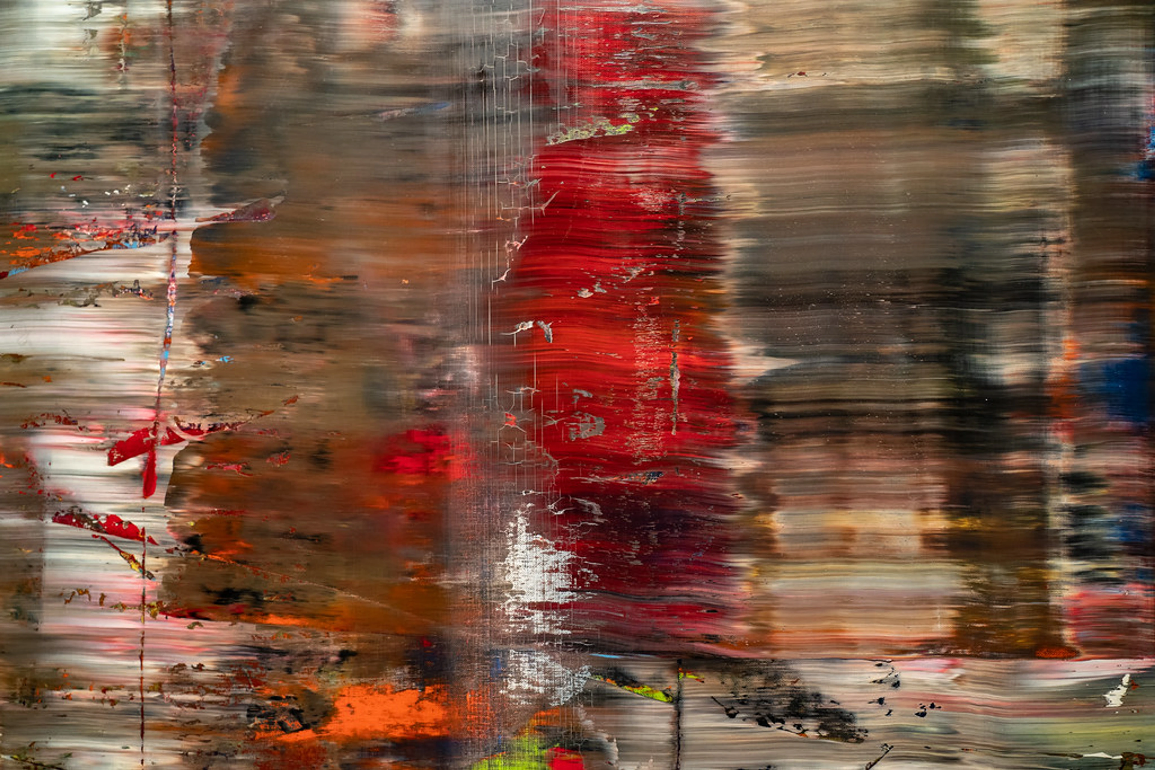
Next time you face a blank canvas, ask: "Where's the pulse?" Not the "correct" way, but the truthful way. Slap on unblended color. Use thick paint to shout. Let your brush crawl before you think.
If this sparks something in you, don't let it fade. That restless, urgent feeling is the beginning of everything. It led me to create my own work, where color has consequences. Delacroix didn't just paint history—he painted the ragged, glorious, breathing heart of being alive. And that is a rebellion worth continuing.
If you’re hungry to see more restless creative techniques, explore my own timeline—where color still has consequences.
If you're hungry to see more restless creative techniques, explore my own timeline—where color still has consequences.

And if you feel the urge to own a piece of this rebellion—a work that doesn’t whisper but shouts—browse my current pieces for sale. I promise you, they won't be quiet.
If these sparks make you want to own art that vibrates, browse my current pieces. They won't be quiet.
About the Author Zen Dageraad Visser captures explosive color and emotional rawness in every piece. This article was distilled from decades of studying revolutionary artists.
Discover more Zenmuseum exhibitions in Den Bosch