
Consistent Spacing in Art Composition: A Practical Guide for Artists
Discover how consistent spacing can transform your art composition. Learn techniques, see examples, and get practical exercises to improve your work.
Consistent Spacing in Art Composition: A Practical Guide for Artists
I remember the first time I noticed how spacing could make or break a piece of art. It was like seeing the hidden scaffolding behind a beautiful building—suddenly, everything made sense. If you've ever felt that your artwork lacks balance or harmony, consistent spacing might just be the key you're missing.
Art is not just about the elements you place on the canvas; it's also about the spaces between them. Whether you're a seasoned artist or just starting, understanding how to use space effectively can elevate your work to new heights. In this guide, we'll explore the principles of consistent spacing, why it matters, and how you can apply it to your own compositions.
Introduction to Spacing in Art
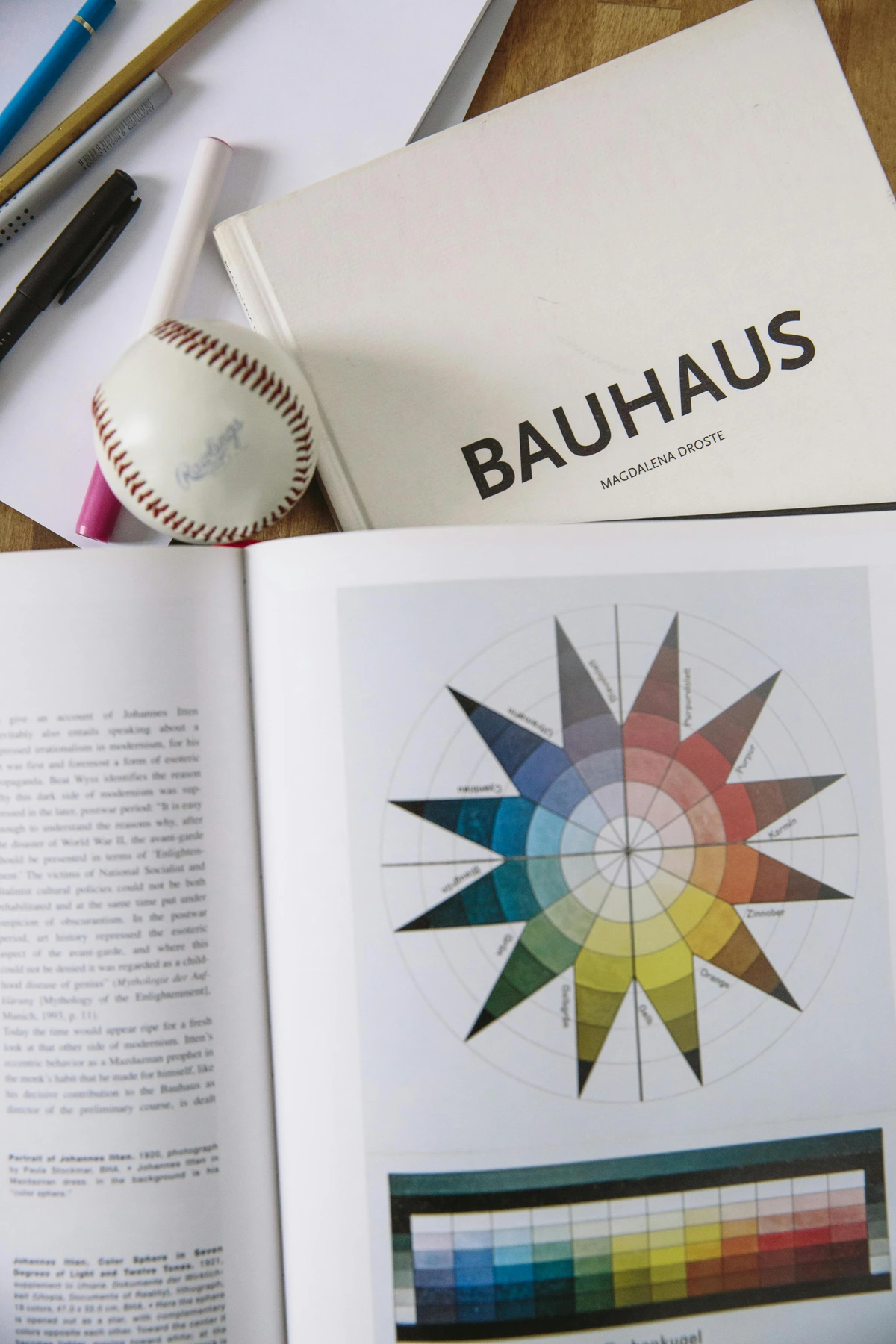
Spacing is more than just a technical aspect of art; it's a fundamental principle that shapes how we perceive and interact with visual information. From the balanced compositions of the Renaissance to the dynamic layouts of modern abstract art, spacing has always been a tool for expression. Understanding its historical context can provide deeper insights into its application today.
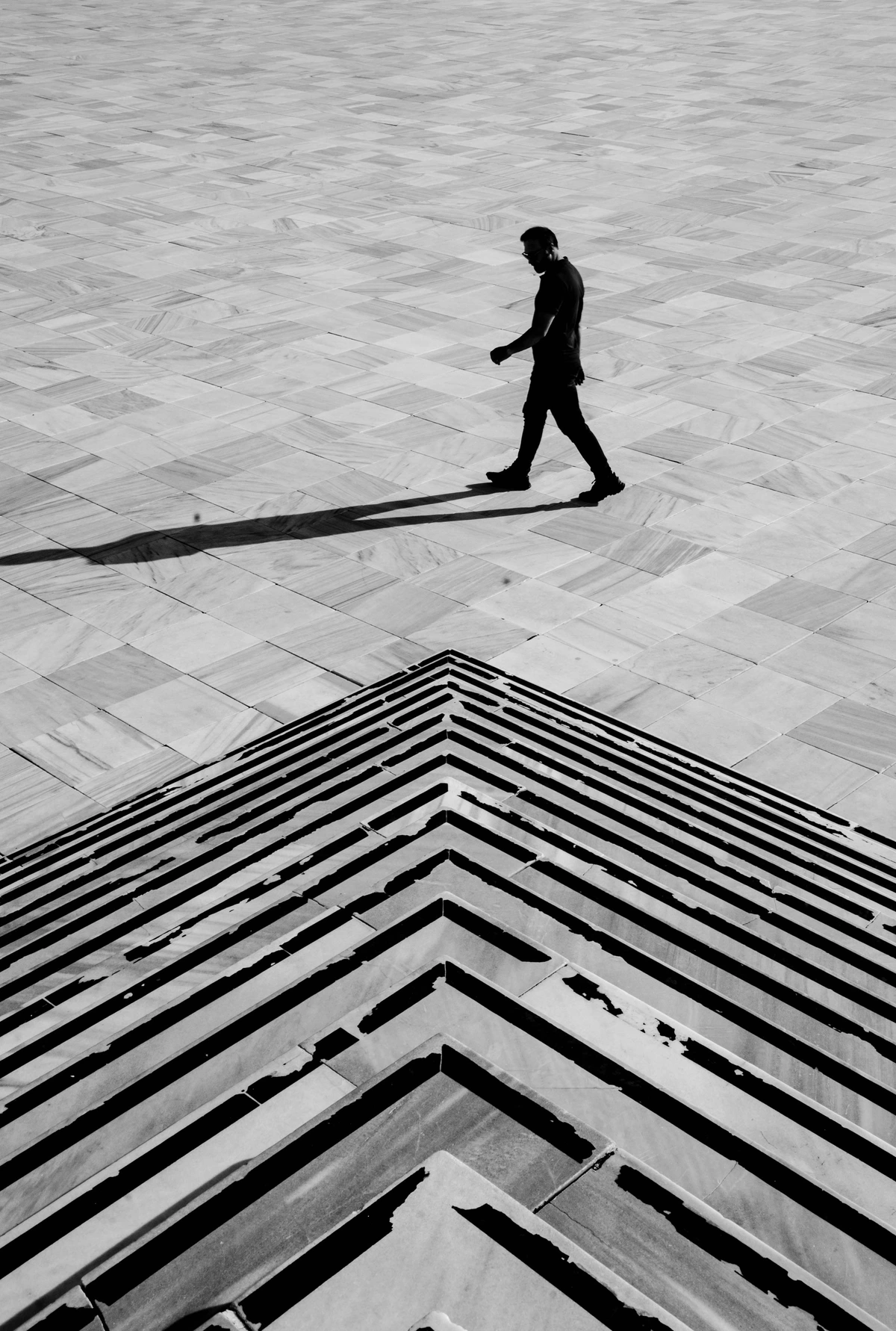
Why Spacing Matters in Art
Spacing is a fundamental aspect of art that often goes unnoticed but plays a crucial role in how a piece is perceived. It's the invisible force that guides the viewer's eye, creates rhythm, and establishes balance. Without proper spacing, even the most skillfully rendered elements can feel chaotic or disjointed. In this section, we'll delve into the significance of spacing and how it influences the overall impact of your artwork.
What is Consistent Spacing in Art?
Consistent spacing in art refers to the deliberate and uniform arrangement of elements within a composition. It’s about creating a sense of order and balance by ensuring that the distances between objects, lines, or shapes are evenly distributed. This doesn’t mean everything has to be symmetrical, but rather that the spacing feels intentional and harmonious.

The Role of Spacing in Art History
Throughout history, artists have used spacing to convey different emotions and messages. From the balanced compositions of the Renaissance to the dynamic layouts of modern abstract art, spacing has always been a tool for expression. Understanding its historical context can provide deeper insights into its application today.
The Importance of Consistent Spacing
Consistent spacing is not just a technical aspect of art; it’s a fundamental principle that influences how viewers perceive and interact with your work. When spacing is consistent, it creates a rhythm that guides the viewer’s eye through the composition, making the artwork more engaging and easier to understand.
The Science Behind Spacing
Research in visual perception has shown that consistent spacing can significantly enhance the viewer's experience. It reduces cognitive load, allowing the brain to process the artwork more efficiently. This is why well-spaced compositions often feel more pleasing and cohesive.
The Role of Spacing in Art
Spacing is not just about aesthetics; it's a fundamental aspect of how we perceive and interpret visual information. When elements are spaced consistently, the viewer's eye can move smoothly across the composition, creating a sense of flow and coherence. This principle applies to all forms of art, from painting and sculpture to graphic design and photography.
Spacing in Digital Art
In the digital age, spacing has taken on new dimensions. Digital artists use tools like grids, alignment guides, and spacing algorithms to create precise and visually appealing compositions. Understanding these tools can help you achieve professional-level results in your digital artwork.
Spacing in Different Art Forms
- Painting: In painting, spacing can determine the balance between subjects and background, influencing the overall mood and focus of the piece.
- Sculpture: For sculptors, spacing involves the arrangement of forms in three-dimensional space, affecting how light and shadow interact with the artwork.
- Graphic Design: In graphic design, spacing is crucial for readability and visual hierarchy, ensuring that text and images are presented clearly and effectively.
- Photography: Photographers use spacing to frame their subjects, creating depth and directing the viewer’s attention to specific elements within the frame.
- Architecture: In architecture, spacing is essential for creating functional and aesthetically pleasing structures. The arrangement of windows, doors, and other elements can significantly impact the overall design.

Why Does Consistent Spacing Matter?
Imagine walking into a room where the furniture is haphazardly placed. It feels chaotic, right? The same principle applies to art. Consistent spacing helps guide the viewer’s eye through the piece, creating a more pleasing and cohesive experience. It’s like the rhythm in a song—it keeps everything flowing smoothly.
The Emotional Impact of Spacing
Spacing can evoke a wide range of emotions. Tight spacing can create tension and intensity, while loose spacing can evoke calmness and openness. By understanding these emotional cues, you can use spacing to convey specific moods and messages in your artwork.
Psychological Impact of Spacing
Consistent spacing can evoke specific emotions and reactions from viewers. For example:
- Calmness: Evenly spaced elements can create a sense of tranquility and order.
- Energy: Varied spacing can introduce dynamism and excitement.
- Focus: Proper spacing can highlight key elements, drawing the viewer’s attention to the most important parts of the composition.
Cultural Perspectives on Spacing
Different cultures have unique approaches to spacing in art. For example, Japanese art often emphasizes negative space, while Western art may focus more on filling the canvas. Exploring these cultural differences can provide valuable insights into how spacing is used around the world.
The Role of Spacing in Art Movements
Art movements like Minimalism and De Stijl have used spacing as a defining characteristic. Minimalism, for instance, relies on the simplicity of forms and the spaces between them to create impact. Understanding these movements can inspire new ways to use spacing in your own work.
Key Concepts of Consistent Spacing
1. Uniformity vs. Variety
While consistency is key, it’s also important to introduce some variety to keep the composition interesting. Think of it like a dance—too much uniformity can feel rigid, but a little variation can add dynamism and energy.
2. The Golden Ratio and Spacing
The Golden Ratio is a mathematical concept that has been used in art for centuries to create harmonious compositions. By applying this ratio to your spacing, you can achieve a sense of balance and proportion that is naturally pleasing to the eye.

2. Negative Space
Negative space, or the space around and between the subjects of an image, plays a crucial role in consistent spacing. It’s not just about the objects themselves, but the space they inhabit. Proper use of negative space can make your artwork feel more open and breathable.
3. The Rule of Thirds
The Rule of Thirds is a guideline that divides your canvas into nine equal parts using two horizontal and two vertical lines. Placing key elements along these lines or at their intersections can create a more balanced and visually appealing composition.
3. Grids and Guidelines
Using grids or guidelines can help you achieve consistent spacing. These tools act as a roadmap, ensuring that your elements are aligned and evenly distributed. Don’t be afraid to sketch out a grid before you start—it can save you a lot of headaches later on.
4. The Role of Color in Spacing
Color can also play a role in how spacing is perceived. Bright colors can make elements appear closer, while muted colors can create a sense of distance. Understanding the relationship between color and spacing can help you create more dynamic compositions.
Practical Exercises to Improve Consistent Spacing
Exercise 1: The Grid Method
- Draw a Grid: Start by drawing a grid on your canvas or paper. This can be as simple as a few horizontal and vertical lines.
- Place Your Elements: Use the grid to place your elements. Try to keep the distances between them consistent.
- Experiment: Play around with different grid sizes and see how it affects the overall composition.
Exercise 2: The Dot Exercise
- Create Dots: Place a series of dots on your canvas, ensuring that the distance between each dot is the same.
- Connect the Dots: Draw lines connecting the dots. This will help you visualize the spacing.
- Add Variety: Now, try adding some variety by changing the distance between a few dots. See how it affects the overall feel of the piece.
Exercise 3: The Shape Exercise
- Draw Shapes: Draw a series of shapes (circles, squares, triangles) on your canvas.
- Adjust Spacing: Adjust the spacing between the shapes to create a sense of balance.
- Reflect: Step back and reflect on how the spacing affects the overall composition.
Exercise 4: The Typography Exercise
- Choose a Font: Select a font and type out a paragraph.
- Adjust Kerning and Leading: Experiment with the spacing between letters (kerning) and lines (leading) to see how it affects readability.
- Compare: Compare your adjusted text with the original to see the impact of spacing on typography.
Real-World Examples
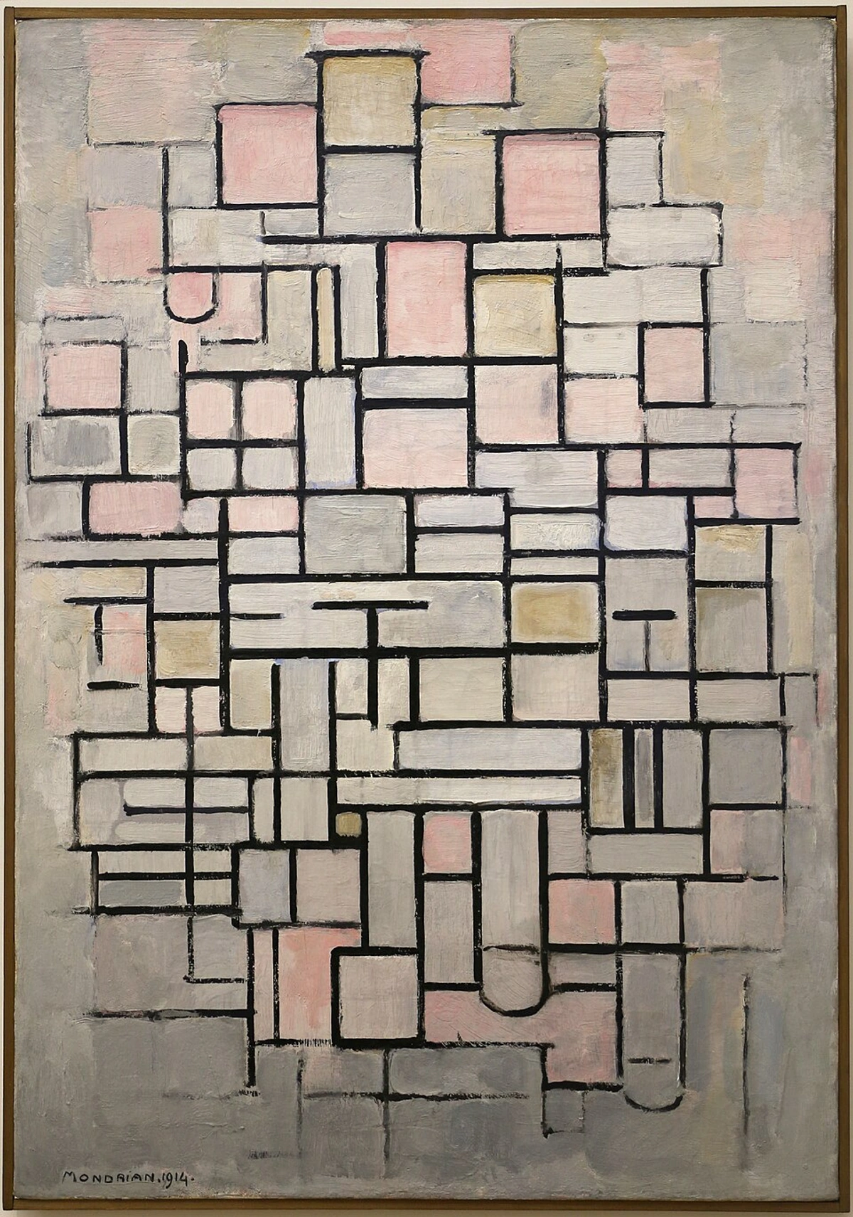
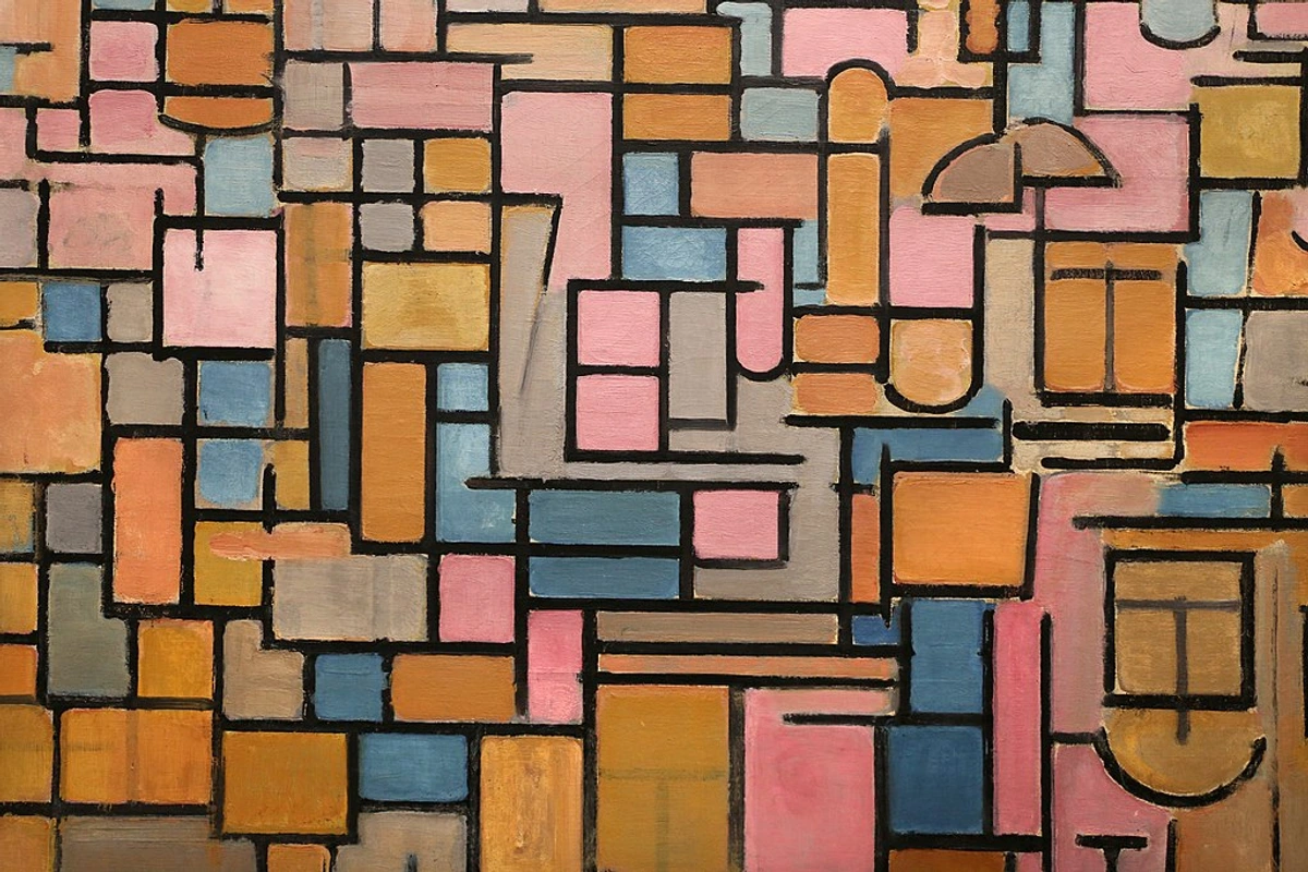
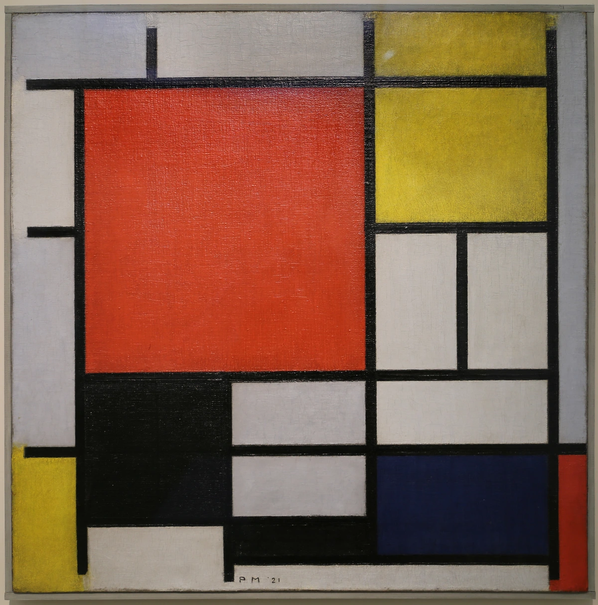
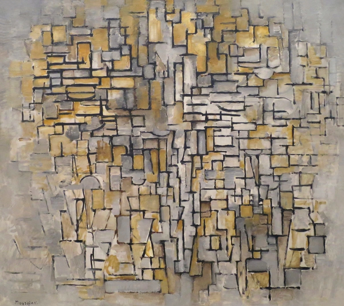
Example 1: Mondrian’s Compositions
Piet Mondrian’s work is a great example of consistent spacing. His use of grids and uniform lines creates a sense of order and harmony. Even though his compositions are abstract, the consistent spacing makes them feel balanced and cohesive.


Example 2: Japanese Zen Gardens
Japanese Zen gardens often use consistent spacing to create a sense of tranquility and balance. The rocks and gravel are placed with careful consideration of the space between them, creating a harmonious and meditative environment.
Example 3: Modern Architecture
Modern architecture relies heavily on consistent spacing to achieve both aesthetic appeal and functionality. The arrangement of windows, doors, and structural elements is carefully planned to create a sense of order and harmony.

Japan Guide, CC BY-SA 2.0
Common Mistakes to Avoid
Mistake 1: Overcrowding
One of the most common mistakes is overcrowding your composition. Too many elements can make the piece feel cluttered and chaotic. Remember, sometimes less is more.
Mistake 2: Inconsistent Spacing
Inconsistent spacing can make your artwork feel unbalanced and disjointed. Always double-check the distances between your elements to ensure they are consistent.
Mistake 3: Ignoring Negative Space
Negative space is just as important as the objects themselves. Ignoring it can make your composition feel cramped and uninviting. Make sure to give your elements room to breathe.
Mistake 4: Overusing Symmetry
While symmetry can create balance, overusing it can make your composition feel static and uninteresting. Introduce some asymmetry to add dynamism and visual interest.
FAQ
What is the difference between consistent spacing and symmetry?
Consistent spacing is about the uniform arrangement of elements, while symmetry is about mirroring elements on either side of a central axis. Consistent spacing doesn’t necessarily mean symmetry—it’s more about creating a sense of order and balance.
How can I practice consistent spacing?
Start by using grids and guidelines to help you place your elements. Practice with simple exercises like the dot and shape exercises mentioned above. Over time, you’ll develop a better eye for spacing.

Can consistent spacing be used in abstract art?
Absolutely! Consistent spacing is a fundamental principle that can be applied to any style of art, including abstract. It helps create a sense of order and harmony, even in the most chaotic compositions.
What tools can I use to achieve consistent spacing?
Grids, guidelines, and even digital tools like Adobe Illustrator or Procreate can help you achieve consistent spacing. Don’t be afraid to experiment with different tools to find what works best for you.
How does consistent spacing affect the viewer’s experience?
Consistent spacing guides the viewer’s eye through the piece, creating a more pleasing and cohesive experience. It helps the viewer understand the composition and appreciate the artwork on a deeper level.
Can I use spacing to create a focal point?
Yes! By adjusting the spacing around a specific element, you can draw the viewer’s attention to it. For example, increasing the space around a central object can make it stand out more prominently.
Conclusion
Consistent spacing is a powerful tool that can transform your artwork. It’s not just about making things look neat—it’s about creating a sense of order, balance, and harmony. By practicing the exercises and keeping the key concepts in mind, you’ll be well on your way to mastering this essential skill.
Final Thoughts
Art is a journey of discovery, and spacing is just one of the many tools at your disposal. Don’t be afraid to experiment, make mistakes, and learn from them. The more you practice, the more intuitive spacing will become, and the more impactful your artwork will be.
Happy creating!
If you're interested in exploring more about art composition, check out our timeline or visit the Den Bosch Museum for inspiration. And if you're looking to add some new pieces to your collection, don’t forget to visit our buy page.