
Chevreul's Color Theory: Practical Applications for Contemporary Artists
Discover how Michel Eugène Chevreul's color theory can transform your art. Learn practical exercises, color mixing techniques, and modern applications of simultaneous contrast and optical color mixing.
Chevreul's Color Theory: Practical Applications for Contemporary Artists
I remember the first time I stumbled upon Michel Eugène Chevreul's color theory. It was one of those moments where everything clicked—like finding the missing piece of a puzzle I didn't even know I was trying to solve. Chevreul's insights into color interaction and perception have been a game-changer in my artistic journey. Today, I want to share how you can apply his principles to elevate your own work.
But why is Chevreul's work still relevant today? In a world where digital art and traditional painting coexist, understanding the science behind color can transform how we create and perceive art. Whether you're a seasoned artist or just starting, these principles can help you make bolder, more informed choices in your work.
Chevreul's theories are not just about aesthetics; they are about understanding how our eyes and brain interpret color. This knowledge can empower you to create art that resonates deeply with viewers, evoking emotions and perceptions that go beyond the surface.
Who Was Michel Eugène Chevreul?
Michel Eugène Chevreul was a French chemist who, in the 19th century, made groundbreaking discoveries about color perception. His work, "The Principles of Harmony and Contrast of Colors," laid the foundation for modern color theory. Chevreul's research was initially aimed at improving dyeing techniques for tapestries, but his findings have had a profound impact on the world of art.
Chevreul's journey into color theory began when he was tasked with solving a problem: why did the colors in tapestries appear dull and lifeless over time? His investigations led him to discover that the issue wasn't the dyes themselves but how colors interacted with one another. This revelation changed the course of art history, influencing movements like Impressionism and Pointillism.
His work was groundbreaking because it shifted the focus from the individual properties of colors to their relationships. This shift in perspective opened up new possibilities for artists, allowing them to create more dynamic and visually engaging compositions.

Chevreul's Legacy
Chevreul's contributions extended beyond the realm of art. His work influenced various fields, including textile design, interior decorating, and even early photography. By understanding how colors interact, designers and artists could create more vibrant and visually appealing works. His principles continue to inspire artists and designers today, proving that his insights are timeless.
Chevreul's legacy is not just about his discoveries but also about how he approached problems. His methodical and scientific approach to understanding color interaction set a precedent for future artists and scientists. His work reminds us that art and science are not mutually exclusive but can complement each other in profound ways.
Key Concepts of Chevreul's Color Theory
Simultaneous Contrast
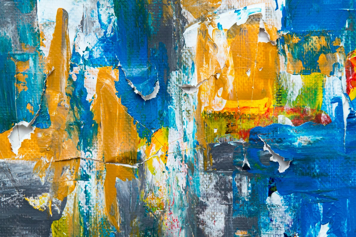
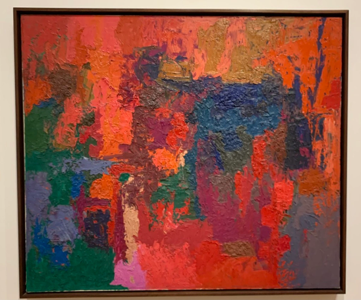
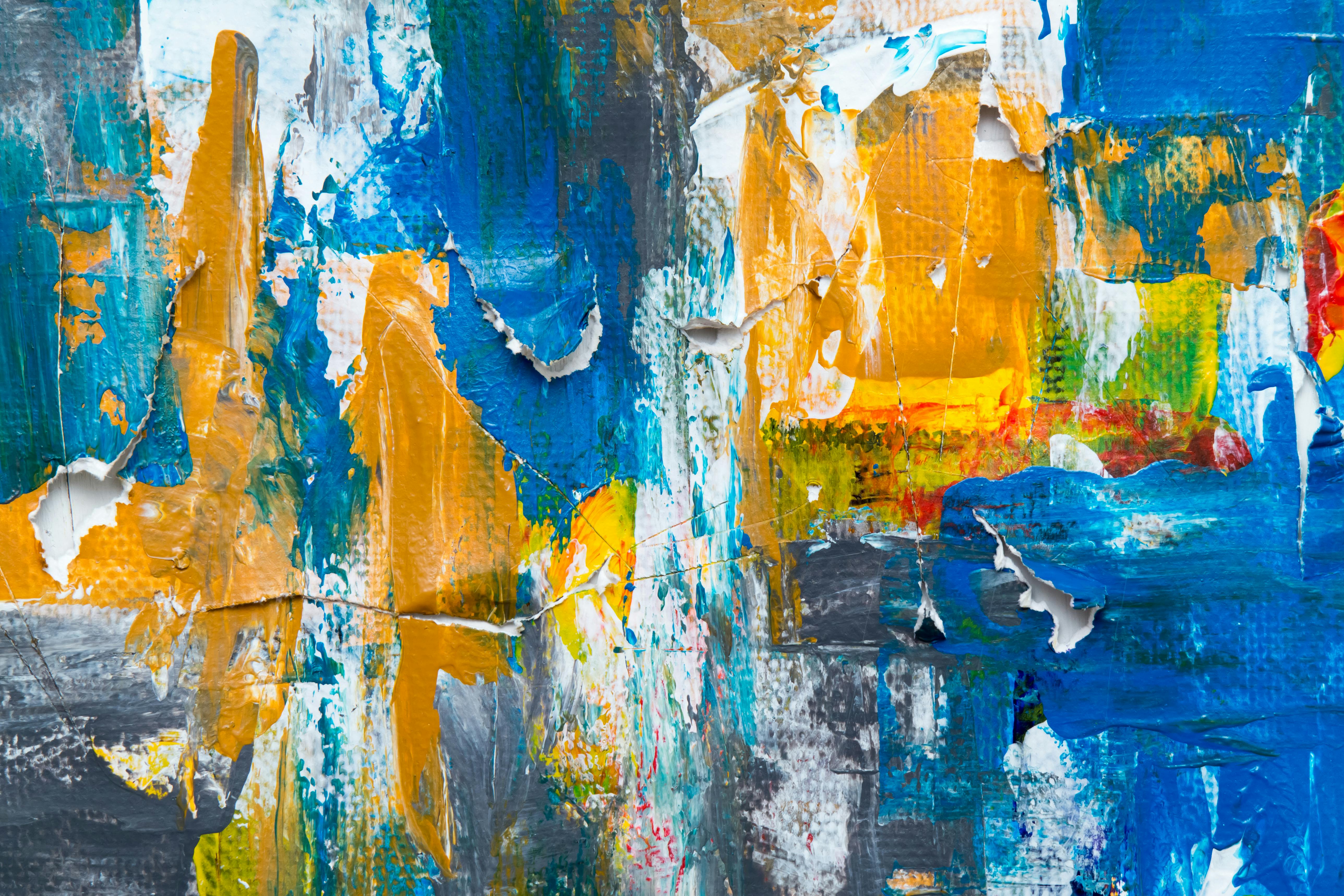
One of Chevreul's most significant contributions is the concept of simultaneous contrast. This phenomenon occurs when two colors are placed side by side, and each color influences the perception of the other. For example, a gray square on a red background will appear to have a greenish tint because red and green are complementary colors.
This principle is not just theoretical; it has practical applications in art. By understanding how colors interact, artists can create illusions of depth, vibrancy, and even movement in their work. Imagine painting a landscape where the sky appears more vibrant because of the colors you've chosen for the foreground.
The Science Behind Simultaneous Contrast
Simultaneous contrast is rooted in the way our eyes and brain process color. When two colors are adjacent, our eyes perceive them in relation to each other rather than in isolation. This interaction can enhance or diminish the perceived intensity of each color, depending on their relationship on the color wheel. For example, placing a warm color like orange next to a cool color like blue can make both colors appear more vibrant.
This phenomenon is not just about visual perception but also about how our brain interprets and processes visual information. Understanding this can help artists create more dynamic and engaging compositions that resonate with viewers on a deeper level.
Optical Color Mixing
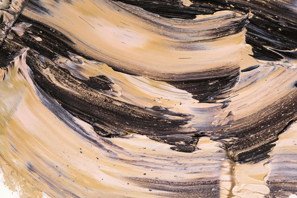
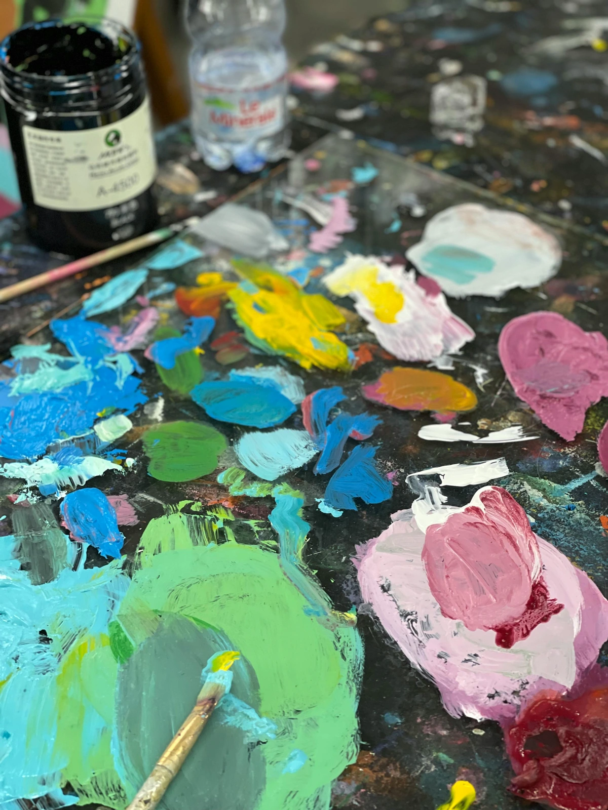
Chevreul also explored optical color mixing, where colors are mixed by the eye rather than on the palette. This technique involves placing small dots or strokes of different colors close together, allowing the viewer's eye to blend them optically. This principle is fundamental to pointillism and other forms of modern art.
Optical mixing is a powerful tool for creating depth and texture. For example, instead of mixing blue and yellow paint to create green, an artist can place tiny dots of blue and yellow side by side. When viewed from a distance, the eye blends these dots into green, creating a more dynamic and visually engaging effect.
Applications of Optical Mixing
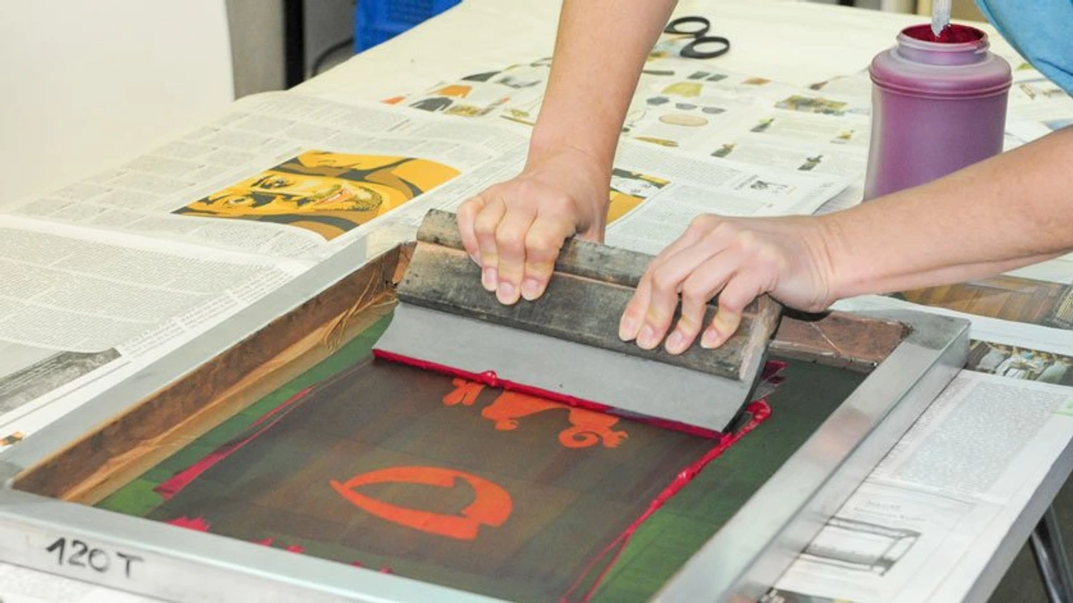
Optical mixing is widely used in various art forms, including digital art and printmaking. In digital art, artists can simulate optical mixing by using pixelated techniques or blending modes. In printmaking, techniques like halftone printing rely on optical mixing to create a wide range of colors using only a few ink colors. This technique allows artists to achieve a level of detail and vibrancy that would be difficult to achieve through traditional color mixing.

Optical mixing is not just limited to traditional and digital art. It can also be applied in textile design, where different colored threads are woven together to create new hues and textures. This technique can add depth and complexity to fabrics, making them more visually appealing.

Practical Applications for Contemporary Artists
Exercises to Understand Simultaneous Contrast
- Gray Scale Exercise:
- Create a series of gray squares on different colored backgrounds.
- Observe how the perception of the gray changes based on the background color.
- Complementary Color Exercise:
- Paint two complementary colors (e.g., red and green) side by side.
- Notice how each color appears more vibrant when placed next to its complement.
- Color Wheel Exploration:
- Use a color wheel to identify complementary pairs and experiment with placing them adjacent to each other in your artwork.
- Document how each pair affects the perception of the colors involved.
These exercises are not just about understanding color theory; they are about training your eye to see the world in a new way. By practicing these techniques, you can develop a deeper appreciation for the complexities of color interaction and perception.
Advanced Exercises for Simultaneous Contrast
- Color Temperature Exercise:
- Experiment with placing warm and cool colors side by side to observe how they influence each other's perceived temperature.
- For example, place a warm red next to a cool blue and note how each color appears more intense.
- Neutral Color Exercise:
- Use neutral colors like beige or gray and place them next to vibrant colors to see how they are affected.
- This exercise can help you understand how to use neutral colors effectively in your compositions.
- Color Saturation Exercise:
- Experiment with varying the saturation of colors placed side by side.
- Observe how highly saturated colors can make adjacent colors appear more muted, and vice versa.
- Color Proximity Exercise:
- Place the same color in different contexts, varying the colors around it.
- Notice how the perception of the color changes based on its surroundings.
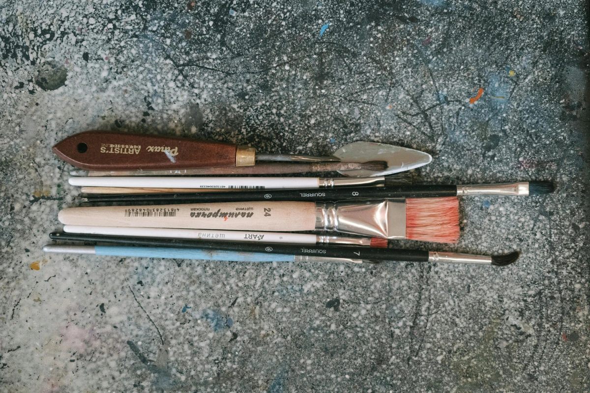
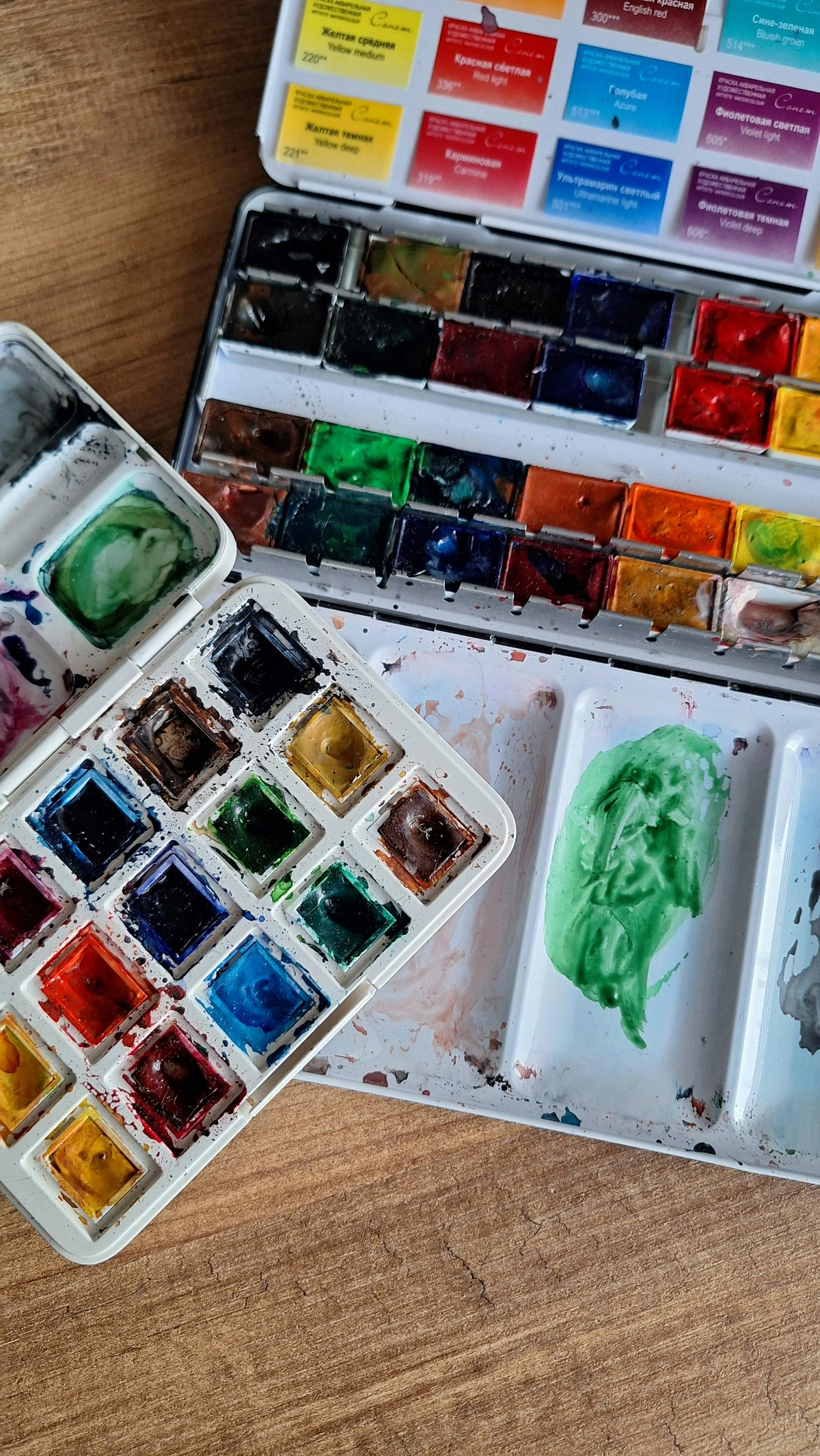
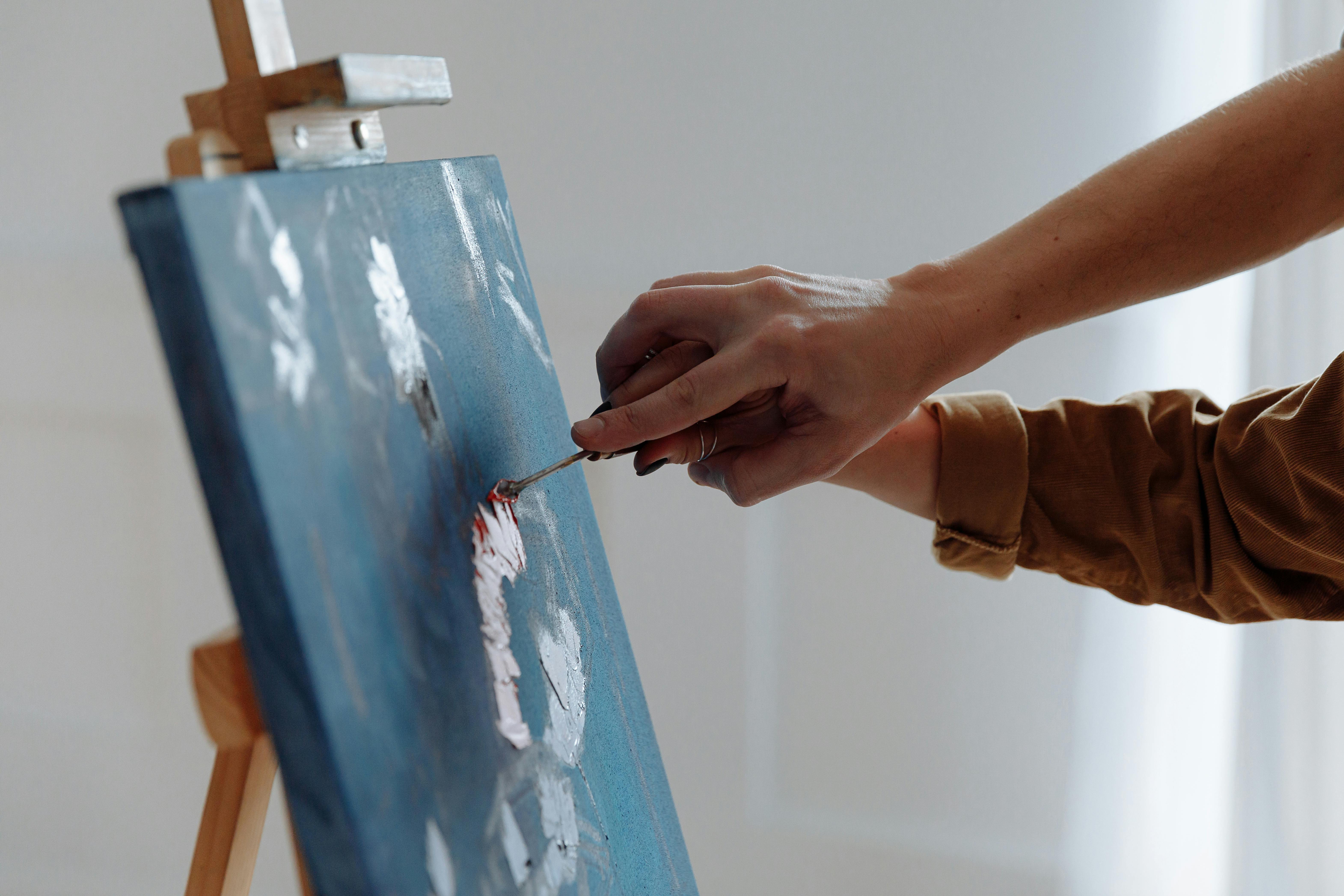
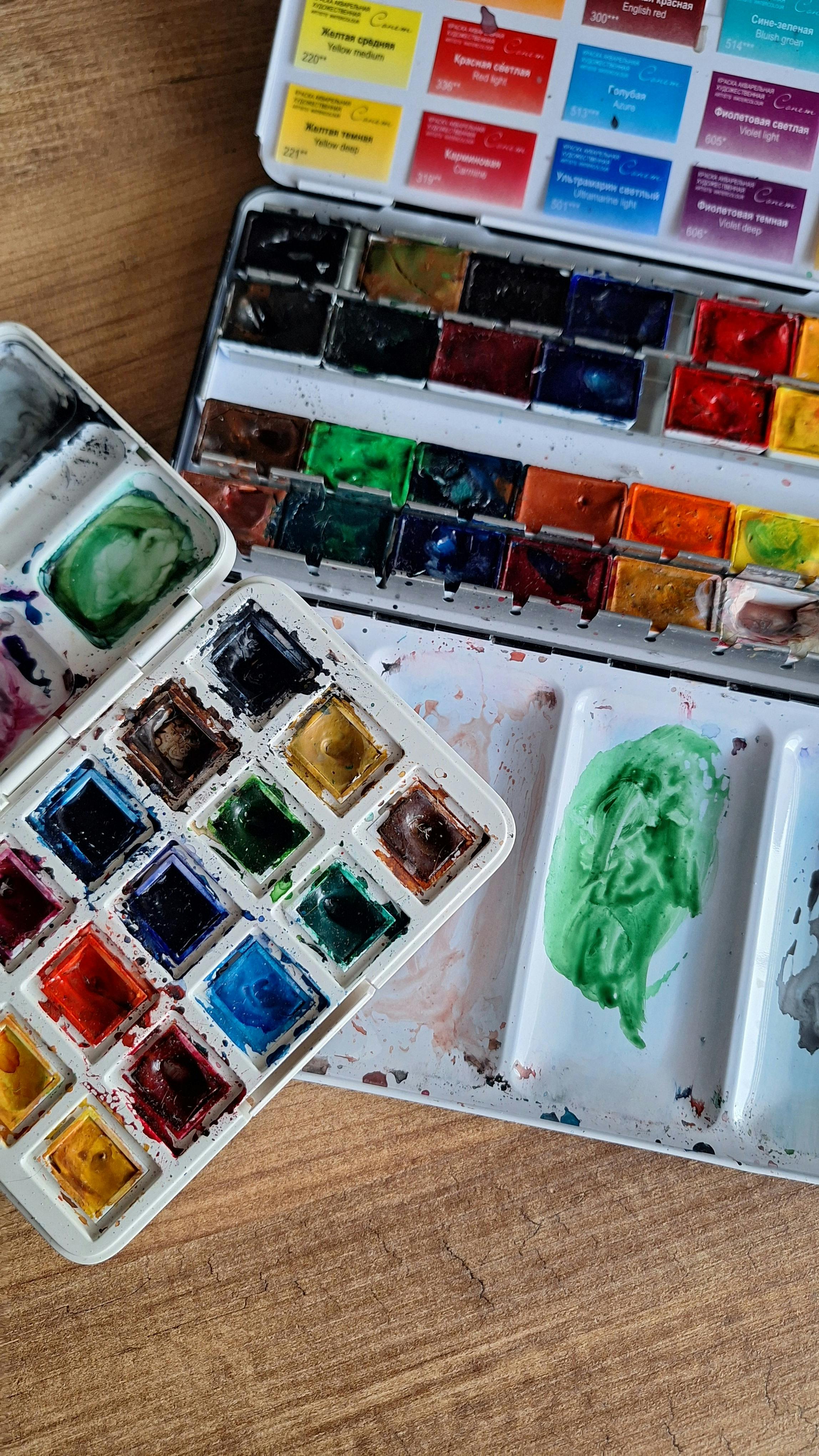
Color Mixing Techniques
- Optical Mixing:
- Use small brushstrokes or dots of different colors to create a new color when viewed from a distance.
- Experiment with complementary colors to see how they interact optically.
- Layering Colors:
- Apply thin layers of transparent colors over each other to create depth and new hues.
- This technique can add complexity and richness to your paintings.
- Glazing:
- Use glazing techniques to build up layers of color, creating luminous and translucent effects.
- This method is particularly effective for creating a sense of depth and atmosphere in landscapes.
- Wet-on-Wet Technique:
- Apply wet paint onto a wet surface to create soft, blended edges.
- This technique is ideal for creating smooth transitions and gradients in your artwork.
- Dry Brush Technique:
- Use a dry brush with minimal paint to create textured, scratchy effects.
- This technique can add a sense of roughness and texture to your paintings.
Advanced Color Mixing Techniques
- Scumbling:
- Apply a thin layer of opaque color over a dry layer of paint to create a textured, broken effect.
- This technique can add depth and interest to your artwork.
- Impasto:
- Use thick layers of paint to create a three-dimensional effect.
- This technique can add a tactile quality to your paintings and create interesting light and shadow effects.
- Sgraffito:
- Scratch through a layer of wet paint to reveal the layer beneath.
- This technique can create intricate patterns and textures in your artwork.
- Blending:
- Use a soft brush or tool to blend colors seamlessly.
- This technique is ideal for creating smooth transitions and gradients in your paintings.
Modern Applications
- Abstract Art:
- Use simultaneous contrast to create dynamic and visually engaging abstract compositions.
- Experiment with bold color choices to evoke different emotions and moods.
- Apply Chevreul's principles to digital paintings and designs.
- Use color contrast to create depth and dimension in your digital work.
- Mural Painting:
- Incorporate optical mixing techniques to create large-scale murals that engage viewers from a distance.
- Use vibrant, contrasting colors to make your murals stand out in public spaces.
- Textile Design:
- Apply Chevreul's principles to fabric dyeing and printing to create visually striking patterns.
- Experiment with color interactions to produce unique and dynamic textile designs.
Additional Modern Applications
- Graphic Design:
- Use Chevreul's principles to create eye-catching designs for posters, advertisements, and branding materials.
- Experiment with color contrast to create visually appealing and effective designs.
- Apply Chevreul's principles to create harmonious and visually appealing color schemes for interiors.
- Use color contrast to create focal points and enhance the overall aesthetic of a space.
- Photography:
- Apply Chevreul's principles to create striking and visually engaging photographs.
- Use color contrast to draw attention to specific elements in your photographs.
- Film and Video:
- Use Chevreul's principles to create visually engaging and dynamic color schemes in films and videos.
- Experiment with color contrast to evoke specific emotions and moods in your viewers.
Considerations for Using Chevreul's Theory
Lighting Conditions
- Natural Light: Colors can appear different under natural light compared to artificial light. Always consider the lighting conditions in which your art will be viewed.
- Artificial Light: Different types of artificial light (e.g., incandescent, fluorescent, LED) can affect color perception. Test your artwork under various lighting conditions to ensure consistency.
- Time of Day: The quality of natural light changes throughout the day, affecting how colors are perceived. Morning light is cooler, while afternoon light is warmer. Consider how these changes might impact your artwork.
- Color Temperature: The temperature of light can significantly affect how colors appear. Warm light can enhance warm colors, while cool light can enhance cool colors. Understanding this can help you create artwork that looks its best in any lighting condition.
Color Consistency Across Mediums
- Digital vs. Print: Colors can appear differently on digital screens compared to printed materials. Always test your digital designs in print to ensure color accuracy.
- Material Properties: The texture and material of the surface you're working on can affect how colors appear. For example, colors on a glossy surface may appear more vibrant than on a matte surface.
- Color Calibration: Ensure that your digital tools are properly calibrated to match the colors you see on screen with the colors that will be printed. This can help you achieve more accurate and consistent results.
- Surface Preparation: The preparation of your surface can also affect how colors appear. For example, priming a canvas can create a more uniform surface, allowing colors to appear more vibrant and true to their intended hue.
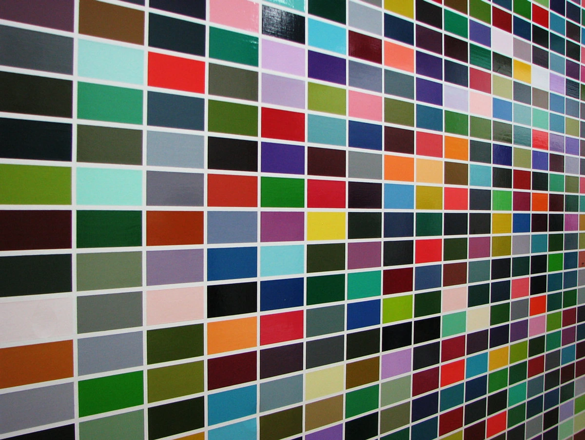
Color Harmony
- Analogous Colors: Colors that are next to each other on the color wheel tend to create a harmonious and cohesive look.
- Complementary Colors: Colors that are opposite each other on the color wheel create a high contrast and vibrant look.
- Triadic Colors: Three colors evenly spaced around the color wheel can create a balanced and dynamic color scheme.
- Monochromatic Colors: Variations of a single hue can create a subtle and sophisticated palette.
Advanced Color Harmony Techniques
- Split-Complementary Colors: This scheme uses a base color and the two colors adjacent to its complement. It offers high contrast while being less jarring than a complementary scheme.
- Tetradic Colors: This scheme uses four colors arranged into two complementary pairs. It offers a rich and vibrant palette but requires careful balancing to avoid visual chaos.
- Square Colors: This scheme uses four colors evenly spaced around the color wheel. It offers a balanced and dynamic color scheme but requires careful balancing to avoid visual chaos.
- Rectangle Colors: This scheme uses four colors arranged into two complementary pairs. It offers a rich and vibrant palette but requires careful balancing to avoid visual chaos.
Psychological Impact of Colors
- Warm Colors: Colors like red, orange, and yellow can evoke feelings of warmth, energy, and passion.
- Cool Colors: Colors like blue, green, and purple can create a sense of calm, tranquility, and introspection.
- Neutral Colors: Colors like gray, beige, and white can provide balance and contrast, allowing other colors to stand out.
- Bright Colors: Colors like pink, lime green, and turquoise can evoke feelings of playfulness, energy, and creativity.
- Dark Colors: Colors like black, navy blue, and dark green can create a sense of sophistication, mystery, and depth.
Cultural and Contextual Impact of Colors
- Cultural Associations: Colors can have different meanings and associations in different cultures. For example, white is often associated with purity in Western cultures but with mourning in some Eastern cultures.
- Contextual Use: The context in which colors are used can also affect their impact. For example, a bright red might evoke excitement in a sports context but danger in a safety context.
- Historical Context: The historical context of colors can also affect their impact. For example, the color purple was once associated with royalty and wealth due to the rarity and cost of the dye.
- Personal Associations: Personal experiences and associations can also affect how colors are perceived. For example, a color that reminds you of a happy memory might evoke feelings of joy and nostalgia.
FAQ
What is simultaneous contrast?
Simultaneous contrast is a phenomenon where two colors placed side by side influence each other's perception. For example, a gray square on a red background will appear to have a greenish tint.
How can I use optical color mixing in my art?
You can use small brushstrokes or dots of different colors to create a new color when viewed from a distance. This technique is fundamental to pointillism and other forms of modern art.
Why is Chevreul's color theory important for contemporary artists?
Chevreul's color theory provides a scientific understanding of color interaction and perception, which can help artists create more dynamic and visually engaging compositions.
How does lighting affect color perception?
Lighting conditions, whether natural or artificial, can significantly alter how colors appear. For example, a painting viewed under warm incandescent light may look different than under cool fluorescent light. It's essential to consider the lighting environment when creating and displaying artwork.
What are complementary colors?
Complementary colors are pairs of colors that are opposite each other on the color wheel, such as red and green, blue and orange, or yellow and purple. When placed side by side, they create a high contrast and vibrant look.
How can I create color harmony in my artwork?
Color harmony can be achieved by using analogous colors (colors next to each other on the color wheel), complementary colors, triadic colors (three colors evenly spaced on the color wheel), or monochromatic colors (variations of a single hue). Each approach creates a different visual effect and emotional response.
What is the psychological impact of colors?
Colors can evoke specific emotions and moods. Warm colors like red and orange can create feelings of energy and warmth, while cool colors like blue and green can evoke calmness and tranquility. Neutral colors like gray and beige provide balance and contrast.
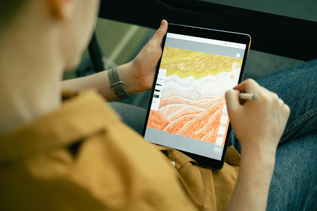
Can Chevreul's principles be applied to digital art?
Absolutely! Chevreul's principles of color interaction and optical mixing are just as relevant in digital art as they are in traditional painting. Digital artists can use these principles to create depth, contrast, and visual interest in their work.
How can I use Chevreul's principles in photography?
Chevreul's principles can be applied to photography by understanding how colors interact in a composition. Use complementary colors to create striking contrasts and draw attention to specific elements in your photographs. Additionally, consider the psychological impact of colors to evoke specific emotions in your viewers.
What are some common mistakes to avoid when using Chevreul's principles?
One common mistake is overusing complementary colors, which can create visual chaos. It's important to balance complementary colors with neutral tones to create a harmonious composition. Additionally, always consider the lighting conditions in which your artwork will be viewed, as this can significantly affect color perception.
How can I apply Chevreul's principles in interior design?
Chevreul's principles can be applied to interior design by using color contrast to create focal points and enhance the overall aesthetic of a space. For example, using complementary colors in a room can create a vibrant and dynamic atmosphere, while analogous colors can create a more harmonious and cohesive look.
What are some practical tips for using Chevreul's principles in graphic design?
In graphic design, Chevreul's principles can be used to create eye-catching designs for posters, advertisements, and branding materials. Experiment with color contrast to create visually appealing and effective designs. For example, using complementary colors in a logo can make it stand out and be more memorable.
Conclusion
Chevreul's color theory is not just a historical artifact; it's a living, breathing tool that can transform your artistic practice. By understanding and applying his principles, you can create artwork that is not only visually stunning but also deeply engaging. So, grab your brushes and start experimenting—you'll be amazed at the difference it makes.
For more insights and inspiration, check out our timeline of artistic developments and explore our collection of contemporary art at /buy.
Further Exploration
If you're eager to dive deeper into the world of color theory, consider exploring the works of other influential artists and theorists. From Josef Albers' "Interaction of Color" to the vibrant palettes of the Impressionists, there's a wealth of knowledge waiting to inspire your next masterpiece.
Join the Conversation
We'd love to hear about your experiences with Chevreul's color theory. Share your artwork, experiments, and insights with us on social media. Let's continue the conversation and inspire each other to push the boundaries of color and creativity.
Additional Resources
- Books: "The Principles of Harmony and Contrast of Colors" by Michel Eugène Chevreul, "Interaction of Color" by Josef Albers.
- Online Courses: Explore courses on color theory and its applications in contemporary art.
- Workshops: Attend local or online workshops to practice color mixing techniques and learn from experienced artists.
Table of Color Theory Concepts
Concept | Description | Application |
|---|---|---|
| Simultaneous Contrast | Colors influence each other's perception when placed side by side. | Creating depth and vibrancy in compositions. |
| Optical Mixing | Colors are mixed by the eye when placed close together. | Pointillism and digital art techniques. |
| Complementary Colors | Colors opposite each other on the color wheel. | High contrast and vibrant compositions. |
| Analogous Colors | Colors next to each other on the color wheel. | Harmonious and cohesive color schemes. |
| Triadic Colors | Three colors evenly spaced on the color wheel. | Balanced and dynamic color schemes. |
| Monochromatic Colors | Variations of a single hue. | Subtle and sophisticated palettes. |
Table of Practical Techniques
Technique | Description | Effect |
|---|---|---|
| Optical Mixing | Small brushstrokes or dots of different colors. | Creates new colors when viewed from a distance. |
| Layering Colors | Thin layers of transparent colors. | Adds depth and complexity. |
| Glazing | Building up layers of color. | Creates luminous and translucent effects. |
| Wet-on-Wet | Applying wet paint onto a wet surface. | Soft, blended edges. |
| Dry Brush | Using a dry brush with minimal paint. | Textured, scratchy effects. |
| Scumbling | Thin layer of opaque color over a dry layer. | Textured, broken effect. |
| Impasto | Thick layers of paint. | Three-dimensional effect. |
| Sgraffito | Scratching through a layer of wet paint. | Intricate patterns and textures. |
| Blending | Using a soft brush or tool to blend colors. | Smooth transitions and gradients. |