ASTM Standards Demystified: Why Your Art is Fading (And How to Stop It)
A practical, passionate guide for curious artists who take their work, and their time on this planet, seriously. We cut through the jargon to show you why these voluntary codes exist, how to spot the good stuff, and what you're really paying for when you invest in quality materials.
Your Favorite Color Is Disintegrating: An Artist's Honest Guide to ASTM Standards
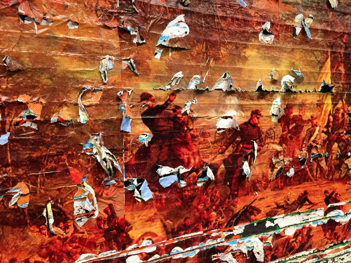
It’s a Tuesday, the light in the studio is perfect, and you’re feeling like a genius. You grab a tube of that gorgeous, cadmium-bright red you splurged on—the one that feels like pure liquid joy—and you lay it down on the canvas. You're not just painting; you're creating a legacy. A piece of your soul is going onto that board. Now, fast forward fifty years. That brilliant red you used is now a sad, chalky pink, and the painting you hoped would hang in a museum (or at least your grandkid's living room) looks like it's been left in the sun for a decade. It happens slowly, invisibly, a molecule at a time, until the memory of the color is all that remains.
This isn't just about fading pigments. It's about a subtle, almost invisible war waged across every square inch of your painting. Humidity, atmospheric pollutants like ozone and sulfur dioxide, and even the natural acids in your own fingertips can accelerate decay. That brilliant white you used for the highlights? It could yellow, not because of the pigment, but because the cheap linseed oil binder is oxidizing, slowly ambering your entire piece like a forgotten photograph. The tragedy is compounded when you realize the fault often lies not with time, but with the materials we choose in a moment of creative passion, ignorant of their hidden chemical life.
Depressing, right?
But what if the problem isn't just the paint? What if your well-intentioned framing job is slowly poisoning the canvas? Picture this: you spend weeks on a watercolor, a delicate study of light that you\’re incredibly proud of. You take it to a framer, choose a beautiful mat, and hang it in your home. A decade later, the paper under the mat has a brown burn mark, a perfect outline of the matboard that was supposed to protect it. The framer used a cheap, acidic board, a wolf in sheep's clothing, and you never thought to ask.

This isn't just a nightmare scenario. It’s a real-world problem that happens when we, as artists, don’t speak the language of the materials we use. I once met an artist whose entire early period—a decade of brilliant, experimental work—is now effectively lost. He painted on a popular brand of 'artist-grade' canvas board, unaware that the cardboard backing was laced with lignin and acidic compounds. Twenty years later, the panels have warped and the paint films are shot through with tiny cracks, a network of fine lines mapping the slow, internal corruption of the support. The art didn't just fade; it was eaten from the inside out. This is the grim reality: our ignorance becomes our work's expiration date. We trust the labels, we trust the brands, and we trust that the word "professional" on the tube means something. But what if I told you there’s a secret code, a set of rules that separates the paint that fades from the pigment that perseveres?

The real tragedy isn't just a faded color. It's the slow, invisible chemical suicide your painting commits on the wall. I once saw a stunning watercolor of a garden, painted just twenty years ago with what must have been a beautiful rose madder or a vibrant carmine lake. Today, the roses are ghosts, the reds washed out into a pale, sickly beige. The entire emotional core of the piece had vanished. The artist didn't just use a bad tube of paint; they unknowingly created an ephemeral wallflower, destined for obsolescence. For a collector, this is a financial heartbreak. For an artist, it's a form of creative amnesia. The soul you poured out is no longer on that canvas; it has simply evaporated under the gentle, persistent assault of photons and atmospheric gasses. It’s a silent crime scene, and the culprit is ignorance.
The tragedy isn't just in the fading; it's in the slow, invisible chemical suicide your painting commits on the wall. I once saw a stunning watercolor of a garden, painted just twenty years ago with what must have been a beautiful rose madder or a vibrant carmine lake. Today, the roses are ghosts, the reds washed out into a pale, sickly beige. The entire emotional core of the piece had vanished. The artist didn't just use a bad tube of paint; they unknowingly created an ephemeral wallflower, destined for obsolescence. For a collector, this is a financial heartbreak. For an artist, it's a form of creative amnesia. The soul you poured out is no longer on that canvas; it has simply evaporated under the gentle, persistent assault of photons and atmospheric gasses.
It’s not a secret at all, actually. It's called an ASTM standard, and once you understand it, you’ll never look at a paint tube the same way again. These standards are your guardian, your insurance policy, and your guide. They are what stand between your work and that chalky pink future. They are the answer to the silent question every artist asks: will this last?
Now, before we get into the nerdy details, I want to share something I only learned after years of painting. The ASTM standards aren't just about lab results. They have a profound historical context. For centuries, artists had no choice but to use what was at hand. They mixed their own paints from ground minerals, plant extracts, and even bugs. Some of those materials were incredibly durable—we can still see them in cave paintings today. Others, like the beautiful but tragic lakes and dyes, were ghosts before they even dried. The development of standardized testing is a modern miracle for artists. It's the result of a global, collective effort to understand material decay on a molecular level, so that we don't have to repeat the mistakes of the past.
So, What Even Are ASTM Standards?
Let's cut right through the fog of corporate-speak. The American Society for Testing and Materials (ASTM) is the impartial referee in the game of material science. Established over a century ago, this non-profit organization is the hub where chemists, artists, major manufacturers, and even federal agencies hammer out the specific, repeatable test methods that define quality.
What I find most fascinating about this process is that it's a system built entirely on consensus. It's not a government mandate or a top-down decree from a few corporate giants. The committees responsible for creating and updating these art material standards (Committee D01 on Paint and Related Coatings, Materials, and Applications is a key one) are composed of volunteers from competing companies, independent scientists, and practicing artists. They argue, they vote, they propose changes. This means the final standard isn't just a technical document; it's a social contract. It's a piece of paper that says, 'We, as a community, agree that this is what 'excellent lightfastness' looks like when tested under these specific, reproducible conditions.' It represents a collective commitment to a shared truth, which is a rare and beautiful thing in today's world. It's a global consortium built on consensus, not mandates. They aren't in the business of selling you anything; they're in the business of creating a shared language of trust, so "lightfast" means the same thing in a lab in New Jersey as it does in a factory in Germany.
These standards are the antidote to marketing warfare. Picture the chaos without them. One brand’s “museum-quality” paper could discolor in five years, while another’s lasts for centuries, yet they’d be sold under the same enticing label. ASTM tests are designed to cut through this noise by simulating decades of aging in mere weeks. They subject materials to brutal, accelerated conditions—blistering light, cycles of high humidity, exposure to ozone and chemical pollutants—to see what happens.

Consider the tests themselves. It’s worth understanding the sheer brutality of these tests, because it shows just how much punishment an ASTM I-rated paint is expected to take: * ASTM D4303 (Lightfastness): Think of this as the paint's trial by fire. Paints are exposed to intense Xenon-arc light that mimics the full solar spectrum, essentially simulating decades of gallery lighting in a few hundred hours. They're compared against a set of Blue Wool standards, a series of dyed wool fabrics (numbered L2 to L9) where each grade is engineered to fade after a specific amount of light. To earn an ASTM I rating, a paint must show no more color change than Blue Wool L7. An ASTM II must beat L6. It's a universal, physical benchmark that cuts through marketing and tells you exactly how tough that color is.
- ASTM D5383 (Permanence): This test goes beyond fading. It assesses the "structural integrity" of the dry paint film. It evaluates a paint's resistance to cracking, chalking (where the surface literally turns to powder), and the yellowing that can happen as the binder in oil paint ages and oxidizes. This is the test that tells you a paint won't just hold its color, but will also hold itself together.
- ASTM D5638 (Matboards): This standard ensures your matboard is truly acid-free and won't become the agent of your artwork's destruction. It verifies that the board will remain chemically stable over time.
- ASTM D5790 (Mounting Films): The adhesives used to mount your work must also be chemically inert. This standard makes sure they won't stain, degrade, or fail over time.
- ASTM D6901 (Archival Qualities of Inkjet Prints): This is the standard for prints, especially giclée. It covers everything from paper and ink longevity to water resistance and the print's overall archival quality. It looks at how the ink interacts with the paper—does it bleed over time? Does it fade faster on certain paper types? A print house that bakes its process in this standard is telling you they’ve thought about your art’s life story.
Now, here\’s the twist: adherence to these standards is entirely voluntary. The government isn\’t forcing companies to do this. So why do the best brands bother? Simply put, it’s an act of integrity. It’s a signal to you, the artist, that they respect your work enough to not sell you a future of faded dreams. They are inviting you to look behind the curtain at the raw data, trading marketing poetry for scientific fact.
This leads to the obvious question: what stops a fly-by-night company from just slapping ASTM I on a cheap tube of garbage? The answer is reputation and consequences. The world of serious artists, conservators, and large manufacturers is a small town. A brand caught faking certifications or misrepresenting test data faces a swift and brutal backlash from a community that values transparency above all. It’s a self-policing system built on a shared, vested interest in making art that lasts.

You might wonder, "If it's voluntary, what stops a cheap brand from just printing ASTM I on the label?" The answer is reputation and legal risk. This community of artists, conservators, and serious manufacturers is small. A brand caught faking test results would be committing commercial suicide. It’s a self-policing system built on transparency and a shared desire to create materials that don't just look good, but last.
Beyond reputation, there's a more formal protection: the potential for legal action under consumer protection laws. A manufacturer that knowingly places a false or misleading certification on its label is opening itself up to lawsuits. It's fraud, plain and simple. But honestly, the court of public opinion is often faster and more brutal. In the age of social media and artist forums, a brand caught peddling low-quality goods under a false banner of "archival quality" would be exposed almost instantly. The system works because the consequences of breaking the trust are far greater than any short-term profit from a cheap, fugitive pigment.

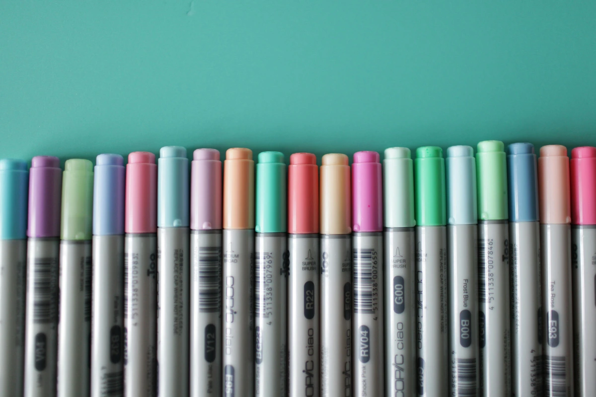
Reading the Secret Messages on Your Art Supplies
Okay, this is where it gets really interesting. Manufacturers use a specific shorthand to tell you the results of these ASTMs tests, especially for two critical factors: Lightfastness and Permanence.
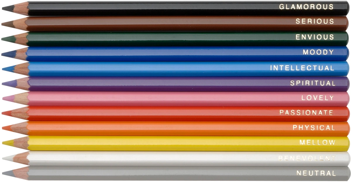
Think of it like a secret handshake, or more accurately, a nutrition label for your paint. It tells you exactly what is inside and how it will perform, stripping away the poetry of the color name and replacing it with hard data. This is the moment you stop being a consumer and become an expert. You are no longer buying 'Alizarin Crimson' because the name sounds romantic; you are buying 'PR83' and you know its performance characteristics intimately. This shift in perspective is one of the most powerful tools an artist can possess. It demystifies the creative process and grounds it in the reality of chemistry and physics. Once you learn to read these labels, you hold the power to judge a pigment not by its glorious hue, but by its inherent character and longevity.
Decoding Lightfastness: The Battle Against the Sun
Lightfastness is just a fancy word for a color's ability to resist fading when exposed to light. It’s arguably the single most important property for any artwork meant to last. To test this, they put paint samples in a special torture chamber—er, a machine called a fadeometer—that blasts them with light equivalent to decades of museum or home lighting. The results give the pigment a grade.
What most artists never consider is that this scientific test creates a specific, quantifiable relationship between an artwork's lifespan and its display conditions. Museum lighting is typically kept at low levels (around 150-200 lux) with UV-filtered glass to protect the art. These conditions are what the ASTM I rating is designed to withstand for a very long time. However, 'home lighting' can mean a dimly lit hallway or a sun-drenched living room for eight hours a day. Your 200-year pigment might only give you 30-50 years in that sunny room. The rating isn't a promise of immortality; it's a measure of chemical stability under specific, controlled conditions. It forces us to ask not just 'Is my paint good?' but 'What is the life my paint is going to have to live?'
This is where the art of conservation meets the science of materials. When you sell a piece, you're not just selling an object; you're entering into an unspoken agreement with the owner about its care. By choosing ASTM I materials, you're giving the future caretaker the best possible chance of preserving your work. You're building resilience into the very fabric of the piece, giving it the strength to withstand less-than-perfect conditions.
The science behind it is both brutal and brilliant. Inside a device called a xenon-arc fadeometer, paint swatches are blasted with a full-spectrum light source that replicates natural sunlight, all at high temperature and humidity. This machine can cram twenty years of wall exposure into a few hundred hours.
What’s fascinating is the control group. Researchers don’t just eyeball the fade; they compare it to a set of dyed wool fabrics, known as Blue Wool Standards (L2 through L9). Each numbered fabric is engineered to fade predictably after a specific amount of light exposure. A paint aiming for an ASTM I rating must demonstrate no more color change than a Blue Wool L7 after the test, while an ASTM II only has to beat an L6. This gives us a universal, repeatable benchmark that is blind to branding and marketing claims.
These Blue Wool Standards are in themselves a work of genius. They were first developed by researchers in the wool industry and later adopted by ISO (the International Organization for Standardization) as the global reference point for measuring lightfastness. The fade rate for each standard is known with mathematical precision. For example, Blue Wool L6 is known to withstand a certain number of megajoules per square meter of light energy before it fades to a specified degree. By comparing a paint's fade to the L7 standard, the test gives a precise, quantifiable measure of durability. It reduces the subjective art of 'looking at a color' to the objective science of comparative measurement.
The Science of Fading: A Chemical Story
To truly appreciate these ratings, it helps to understand what's actually happening when a pigment fades. It's a story of energy and molecular structure.
- Inorganic Pigments (The Heavyweights): Think of traditional earth tones (ochres, siennas, umbers) or modern synthetics like cadmiums and cobalts. These are metals. Their color comes from the specific way their crystal structures absorb and reflect light. This structure is incredibly robust and stable. Shining light on them is like throwing tennis balls at a brick wall; the wall doesn't care. Their fading is minimal because the energy from light photons isn't enough to break their strong chemical bonds.
- Organic Pigments (The Delicate Athletes): These are carbon-based molecules, often derived from plants or, more commonly today, synthesized in a lab (e.g., Quinacridones, Phthalocyanines). Their color comes from complex arrangements of carbon rings that create what's called a 'chromophore'. The upside is they can produce incredibly vibrant, clean, and powerful colors. The downside is that this molecular structure can be fragile. The energy from UV light can be just enough to break these delicate bonds. When the molecule breaks, its ability to absorb and reflect that specific color of light is lost—it fades. An ASTM I-rated organic pigment is like a perfectly engineered race car: incredibly high-performing, but only because it was designed and built to withstand immense stress.
- Fugitive Dyes (The Butterflies): These are pure colorants with no inherent lightfastness. They are not pigments and have no place in archival art. They will always, without exception, disappear given enough time. Using them is like recording your masterpiece on sand.
This is why pigment choice is everything. The ASTM rating is a lab-tested guarantee of that pigment's molecular fortitude. When you choose an ASTM I paint, you are choosing the brick wall, not the butterfly.

The most common grading systems you'll see are:

ASTM Lightfastness Category | Numerical Rating (D4303) | What It Means for You (In Plain English) |
|---|---|---|
| I | 8-9 (Excellent) | The Immortals. These are your most trusted pigments. They are incredibly resistant to fading. If you're painting a masterpiece for the ages, this is what you build it on. Think of classic earth tones, many cadmiums, and some modern organics. |
| II | 5-7 (Very Good) | The Reliables. These are perfectly suitable for almost all professional fine art. They have very good resistance to fading. You can use them with confidence for work that will be displayed in normal home or gallery conditions. |
| III | 3-4 (Fair) | The Fugitives. This is a polite way of saying, "Use with caution." These colors can fade noticeably over time. While they might look beautiful now, they are better suited for studies, sketches, or work you don't expect to last forever. Some Alizarin Crimson shades fall here. |
| IV, V | 1-2 (Poor) | The Vampires. These pigments are highly fugitive and will fade or change color rapidly. Avoid them for any serious work. They simply can't handle the light of day. Some older dyes and food colorings would fall into this category. |
A quick tip: If you love a fugitive color, don’t despair. You can still use it! Just be strategic. Use it for underpaintings that will be covered, as accents in an area protected from direct light, or for work you explicitly intend to be temporary. I keep a small tube of a notoriously beautiful but fugitive pink just for color studies that will live in a sketchbook, never to see the light of day.
But let's be clear about the stakes. Using a fugitive color in a finished piece intended for sale is, frankly, a breach of trust with your collector. It's one thing to experiment in your own studio; it's another to sell a piece with a hidden time bomb. The only ethical way to use a less stable color in a final work is to be completely transparent. Document it, note it, and make sure the owner knows. That brilliant but fugitive color might be perfect for a piece, but you have an obligation to let the future caretaker know that this particular passage will require a little more care, and perhaps a little more forgiveness, over time.

When you're in the art store, look for paints labeled ASTM I or II. You’re investing your time, energy, and soul into your work. You deserve a pigment that’s in it for the long haul.
Understanding Permanence: More Than Just Fading
While lightfastness is the battle against photons, Permanence is about a material\’s internal constitution. It’s the measure of a paint film’s inherent stability—its resistance to cracking, chalking, and yellowing. Think of it as the structural integrity of the paint itself.
Why does this matter so much? A paint can be perfectly lightfast but still be a structural disaster. For example, an oil paint might hold its color for a century but the binder could yellow so significantly over time that it alters the mid-tones and whites, effectively ruining the painting's intended value. The ASTM D5383 test probes these deeper qualities, asking questions beyond simple fading.

It\’s also where your painting technique becomes critical. Even the most permanent, ASTM-rated paint will crack if you apply it improperly. Two of the most common artist-induced failures are forcing a structurally weak, lean paint layer over a thick, flexible one, or applying a thick paint layer to a flimsy support. The paint dries at different rates, creating a "drying stress" that pulls the film apart, resulting in cracks (a phenomenon known as "alligatoring"). Permanence is a shared responsibility between the manufacturer and you.
The ASTM standard for this is D5383, and it rates paints on a different scale of A, B, or C. This test goes beyond light, examining the film's resistance to mechanical stress like cracking, yellowing from oil oxidation, and general embrittlement.
ASTM Permanence Rating | What It Means for You (In Plain English) |
|---|---|
| A | Absolutely Permanent. The paint film is considered highly durable and stable. It resists cracking, flaking, and chemical changes. The top-tier, most resilient stuff. |
| B | Moderately Durable. This is a good, solid rating. The paint is considered durable and suitable for finished works of art that will be handled and cared for properly. |
| C | Impermanent/Temporary. The paint film may become brittle, crack, or deteriorate relatively quickly. Not suitable for anything you want to last. |

It’s a simple and effective way to gauge the structural integrity of the paint once it’s dry. Permanence also interacts with your support. A perfectly permanent paint film can still crack if it's applied too thickly on a flexible canvas that wasn't primed correctly. It's all connected.
Not Just Paint: The Ecosystem of Permanence
It’s not just the paint that needs to be tough. Imagine using the most lightfast, permanent, expensive paint you can find, but you apply it to a piece of paper that turns yellow and brittle in five years. You’ve still lost your artwork. Worse still, imagine your work being damaged by the very materials you trusted to protect it.
Your painting is an ecosystem, a carefully balanced stack of materials that must work in harmony. If the foundation is weak, the most durable pigment in the world won't save it. ASTM standards cover these supports, too, providing a vital checklist for longevity. It’s a chain, and the ASTM rating of each component tells you how strong each link is.
This "ecosystem" extends even to your studio environment. High humidity can prevent paints from curing properly, especially acrylics, leading to a weak film that's prone to damage. Wild fluctuations in temperature and humidity can cause the support (canvas, paper) to expand and contract, putting immense stress on the paint layer. Creating a stable micro-climate for your work isn't just about comfort; it's a critical first step in the conservation process.
- Canvas Primers: The gesso or primer creates a critical barrier. A bad priming job can lead to “support-induced discoloration,” where acids migrate from the raw canvas into your meticulous brushstrokes. Look for primers that are labeled as flexible, non-yellowing, and archival.
- Drawing Papers: A sketch on newsprint is a temporary record. A drawing on an acid-free, 100% cotton rag paper is a document intended to outlive you. The difference is a chemical one.
- Mat Boards: This is a secret killer. The mat board is in constant, intimate contact with your artwork. A cheap, acidic board acts like a sponge, sucking the life out of the paper and creating those tell-tale brown burn lines. It’s a slow, invisible form of vandalism.

Look for labels that say things like:

- Acid-Free / Lignin-Free: This is the basic benchmark for any paper or matboard you use. It means it won't yellow or become brittle over time. It’s the foundation of a long-lasting support. The acid is the enemy. Over decades, acidic paper literally digests itself, turning brown and crumbling. Lignin, a natural component of wood pulp, accelerates this process immensely when exposed to light. Avoiding it is non-negotiable. It’s the difference between a document from the 15th century, still intact, and a newspaper from last year, turning to dust.
- Alkaline Buffered/Reserve: An even better option for many papers. This means the paper has an alkaline substance like calcium carbonate added to it. This buffer actively neutralizes any acids that might form over time, giving your artwork an extra layer of protection against environmental pollutants. It’s like a chemical shield that continuously fights off acidic aging agents. For works that absolutely must last, it’s the gold standard.
I remember a conversation with a paper conservator who explained this in a way that stuck with me. She said, "Every piece of paper you use is either moving towards dust or moving towards permanence. There is no neutral ground." The acid is the clock ticking. Choosing an acid-free support is the act of stopping that clock before it even starts.
The Unsung Hero: The Right Ground or Primer
We talk about canvases, but the unsung hero is the ground—the gesso or primer you apply first. It is the bridge between your support and your paint. A cheap, poorly formulated gesso can lead to its own set of disasters, including the paint film cracking, flaking off, or absorbing oil from the paint and causing "support-induced discoloration."
- Look for a flexible, non-yellowing acrylic gesso. A good gesso will be a slightly flexible, absorbent, and strong layer that your paint can grip onto for centuries. The "tooth" it provides is essential for adhesion.
- Avoid cheap student gessos that are little more than chalk and weak glue. They can become brittle and fail catastrophically. Applying an expensive, flexible paint to a brittle ground is like building a skyscraper on a foundation of sand.
- A professional canvas will already have a proper ground applied, but when you're stretching your own, don't skimp on that first coat. The foundation matters. I've seen beautifully painted works where the gesso failed, and the entire paint film peeled off in large, heartbreaking flakes. It was a failure of the ground, not the pigment.
- ASTM D5638 (for Matboards): This standard designates matboards as "Art & Photo." A board that passes this test is certified to be acid-free and will not damage the art it's meant to protect. Using a non-archival board right next to your work is like hanging it next to a slow-release acid vapor. The damage is invisible until it’s far too late.
- ASTM D5790 (for Mounting/ Laminating Films): For works on paper, the materials used to mount or laminate can also be a source of degradation. Similar principles apply.
Varnishing: The Final Shield
Your final layer of protection is the varnish. It's not just for making the colors pop again after they've dried to a dull finish. A high-quality varnish forms a stable, removable film that protects the paint layer from dust, dirt, minor abrasions, and atmospheric pollutants. But like everything else, a bad varnish can be disastrous.

- Use removable, conservation-grade varnishes. The gold standard is a synthetic resin varnish like Gamvar or a museum-grade acrylic polymer varnish (e.g., Lascaux UV Protect). Why 'removable'? Because in 50 years, if that varnish layer becomes dirty or discolored, a conservator can safely remove it and apply a new one without damaging the original paint beneath. An irreversible varnish, like some acrylic mediums used as varnish, locks in that degradation forever.
- Never use hardware store varnish on your art. It will yellow, crack, and become impossible to remove without destroying the painting. It is an investment in the future care of your work, a gift to the conservator who might one day have to clean it.
Why Should I, an Artist, Care This Much?
Because you are not just a creator; you are a chemist, an architect, and a historian for your own work. Your choices today determine what future generations will see—or won't see.
Think of it this way: You wouldn't build a house on a foundation of sand. So why would you build your artistic legacy—the painting that is your heart and soul poured onto a surface—on materials that you know, for a fact, are destined to fail? This brings me to something I've observed time and again: the most crucial, and often most overlooked, part of a painting's longevity isn't the paint itself, but the support it sits on—the canvas, the wood panel, the piece of paper. It is the literal foundation. A masterpiece painted on cheap, acidic paper is a masterpiece on borrowed time. The paper will turn brown and brittle long before the pigment fades, and the entire work will be lost. This is why artist-grade paper isn't just heavier; it's made from cotton linters, which are naturally lignin-free and often buffered with an alkaline substance to actively fight off acid formation. This isn't abstract; it's a choice with real-world consequences. Each time you use a fugitive pigment or an acidic paper, you are assigning your work an expiration date. For a gallery, this might mean a piece becomes unsellable in a decade. For a collector, it's an investment literally fading away.
But there's a deeper layer here, beyond the practical. As artists, we often speak of 'making our mark.' But what if that mark is engineering to self-destruct? We battle self-doubt and the tyranny of the blank canvas, we pour our emotional core into a piece, only to sign a death warrant for it with the materials we choose? That vibrant, contemporary style you pour your heart into deserves a fighting chance to stay vibrant for the next hundred years.
It's the ultimate act of self-respect. You are implicitly stating, 'What I have to say is not just for today. It is important enough to last.'

- Professionalism: Using archival, lightfast materials is a sign that you respect your own work and the people who might buy it. It elevates your practice from a hobby to a serious artistic endeavor. It tells a curator, a collector, or a historian that you took your work seriously enough to use the best tools available. Think about it from a collector's perspective. Buying art is an act of belief and investment. They believe in your vision today, but they also place value on the object's endurance. A work that's guaranteed to last 100+ years is a fundamentally different asset than one with a 20-year lifespan. The label on the back of a tube—that tiny 'ASTM I'—is a direct line of communication to that collector, saying, 'I have done my due diligence. This piece is built to last.'
- Predictability: When you learn the properties of your materials, you gain control. You know how a color will behave, not just today, but in ten years. This knowledge gives you the confidence to experiment boldly. Imagine mixing a vibrant orange from Cadmium Red (ASTM I) and Cadmium Yellow (ASTM I). You know with near certainty that the resulting orange will be as lightfast as its parents. You are not flying blind; you are an informed technician. This is perhaps the most underrated benefit. When you know your materials, you aren't just guessing whether that new, brilliant magenta is going to hold up. You can look it up, learn its pigment code (e.g., PR122 for Quinacridone Magenta), and know its ASTM rating. This knowledge removes a layer of anxiety from the creative process. It allows you to focus on expression, secure in the knowledge that the physical object you are creating is fundamentally sound. It turns you from a simple creator into a master craftsman who understands the very dna of their medium.
- Value and Legacy: Art is an investment of time, money, and emotion. When a collector buys your work, they are investing in you. By using quality materials, you are protecting that investment. A painting that will last for generations is inherently more valuable than one that will fade away. It ensures that your creative voice—your unique perspective on the world—persists beyond your lifetime. It's the difference between shouting into the void and writing a letter to the future. Consider this: a museum conservator looks at a painting not just as an image, but as a physical object with a biography. They see the layers of paint, the ground, the support, and they can read the artist's choices like a book. When they see an ASTM I-rated pigment on an acid-free canvas with a proper ground, they see an artist who was conscious of posterity. This immediately elevates the perceived intelligence and seriousness of that artist's work.
This conversation inevitably leads us to the most common pitfall: confusing a high price tag with archival quality. It’s an easy mistake to make, assuming an expensive tube is automatically a "good" tube. But the world of art materials is full of boutique brands selling gorgeous, but sometimes fugitive, colors for a premium. The true judge isn\’t the price, or even the elegance of the packaging. It\’s that small, unassuming ASTM code on the back.
That vibrant, contemporary style you pour your heart into deserves a fighting chance to stay vibrant for the next hundred years.
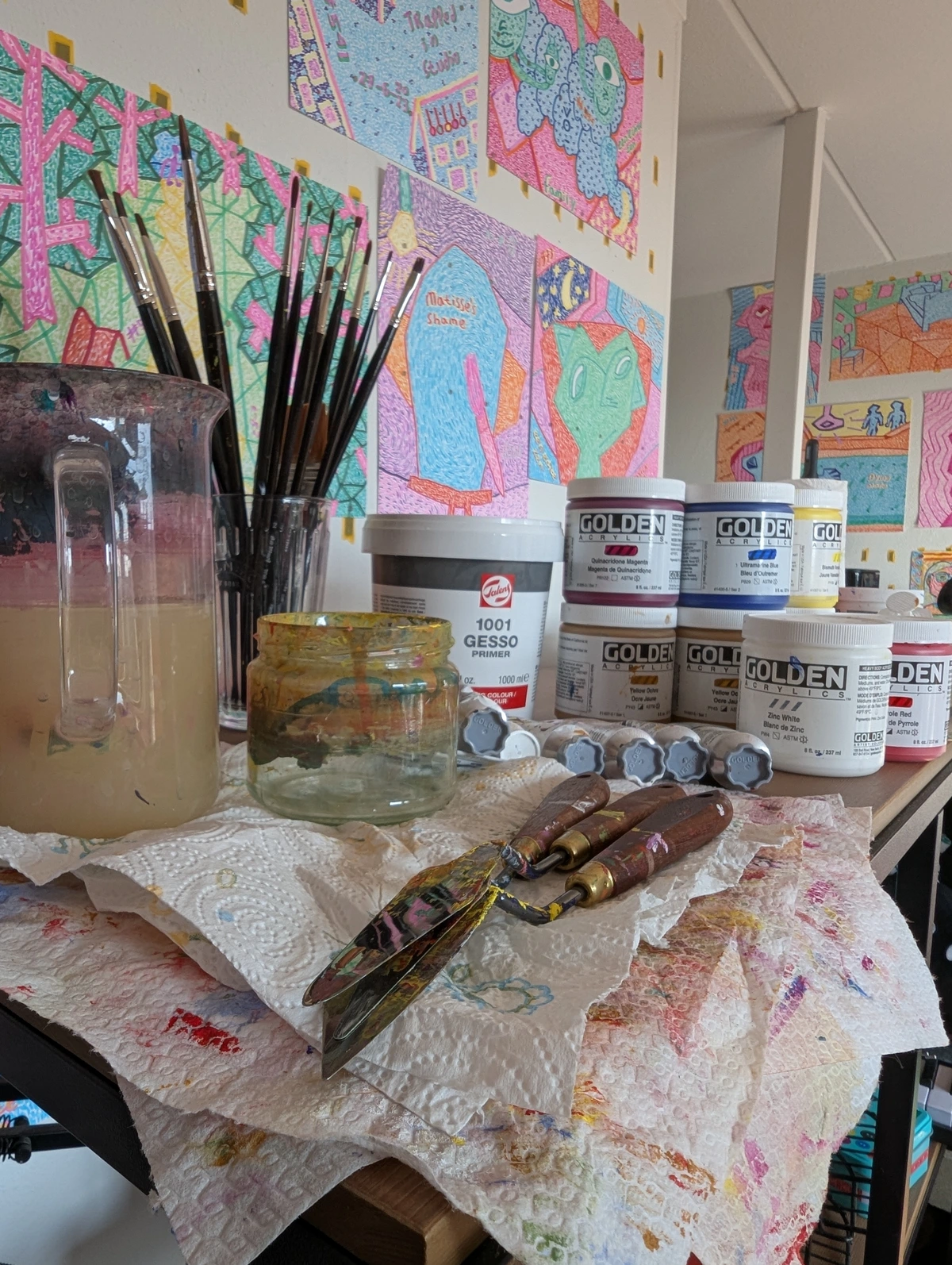
The Unavoidable Part: What This All Costs
Let’s be honest. A tube of paint labeled ASTM I, Permanence A will almost always cost more than a tube with no ratings at all. Why?
We need to talk about this. Because ignoring the price tag is naive, but obsessing over it is a trap. The real cost isn't on the sticker; it's in the hidden price of failure. It's the cost of a collector losing faith, of a painting that can't be sold, of your own work disappearing before your eyes. When you frame it that way, an extra twenty dollars for a tube of paint seems like the cheapest insurance policy you could ever buy.
You’re paying for high-quality, pure pigments. You're paying for the research and development that went into creating a stable paint. And you're paying for the rigorous testing that the manufacturer did to earn those little letters on the label. It’s the difference between a fast-food burger and a gourmet steak. They both fill you up, but the ingredients, the process, and the final experience are worlds apart.

But let's be more specific about those ingredients. What makes a professional pigment so much better?
You’re paying for high-quality, pure pigments. You're paying for the research and development that went into creating a stable paint. And you're paying for the rigorous testing that the manufacturer did to earn those little letters on the label. It’s the difference between a fast-food burger and a gourmet steak. They both fill you up, but the ingredients, the process, and the final experience are worlds apart. The premium is for quality, purity, and a documented history of performance.
- Chemical Purity: ASTM I-rated pigments, like cadmiums or cobalts, are synthetically produced to be chemically pure. They are simple, stable inorganic compounds. In contrast, a cheap 'hue' might mix an unstable organic dye with a filler to approximate the color. The dye will almost certainly fade. Think of it this way: a professional pigment is the real deal, while a 'hue' is just a clever imitation.
- Particle Size & Consistency: Professional-grade pigments are milled to a consistent, optimal particle size that ensures strong tinting strength and even suspension in the binder. Cheaper paints can have inconsistently sized particles that lead to clumping, uneven drying, and weak color. This is often a major differentiator between student grade vs. artist grade paints. It's the difference between a fine powder and coarse sand.
- The Binder-to-Pigment Ratio: This is the magic formula. Professional paints are loaded with pigment. The binder (like linseed oil or acrylic polymer) is there just to hold the pigment particles together and stick them to the canvas. Student-grade paints are often 'over-diluted,' meaning the pigment load is low, and the volume is made up with more binder and cheap fillers like talc and chalk. This is why a professional paint feels richer and covers better straight from the tube. You're simply getting more of the actual color and less of the stuff that just holds it together.

Here's a breakdown of what you're actually buying. This table isn't just a comparison; it's a summary of the entire philosophy of choosing professional materials.
Factor | Student/Cheap Paint | Professional/ASTM-Rated Paint |
|---|---|---|
| Pigment Load | Low. Often bulked out with fillers like Talc or Baryte, which reduces tinting strength and saturation. | High. More pure, concentrated pigment per volume, leading to more vibrant, intense color. |
| Pigment Quality | Often uses cheaper, less lightfast pigment alternatives or dyes. Unpredictable longevity. | Uses high-quality, often historical or specially engineered pigments known for their permanence (e.g., Cadmiums, Cobalts, modern organics). |
| Binder Quality | May use a less stable or lower-grade binder (oil, acrylic polymer), affecting adhesion and flexibility over time. | Uses a high-quality, stable binder formulated to resist yellowing and cracking for decades. |
| Consistency | Batch-to-batch variation is common. The 'Burnt Umber' you buy today might not match the tube you finish next month. | Highly controlled manufacturing ensures that every tube of a specific color is virtually identical, maintaining your palette over time. |
| Information | Labels often lack detailed information. You're 'flying blind' regarding lightfastness and permanence. | Provides clear ASTM ratings and pigment information, empowering you to make informed decisions. |
Looking at this table, the choice becomes clear. It's a choice between a product and a tool. The student-grade paint is a product; you use it and hope for the best. The professional-grade paint is a tool; you use it with the knowledge and confidence that it is built to perform.
The critical question isn't 'Can I afford it?' but rather, 'What is the cost of not using it?' When you factor in the hours you spend creating, the emotional energy you expend, and the potential value your work could hold, shelling out a few extra dollars for a tube of paint suddenly seems like the bargain of the century.
A strategy I often use is the 'professional palette on a budget' approach. You don't need every color to be the most expensive ASTM I. Build a core palette of six to ten absolutely critical colors in the highest quality you can afford—your primary red, blue, yellow, and a few earth tones. These are your workhorses. Then, if you must, supplement with more affordable ASTM II-rated colors for less critical mixes, experimental pieces, or large areas where you need to economize. This way, the structural and coloristic heart of your painting is guaranteed, while you maintain some financial flexibility.
For example, my own core palette consists of maybe seven or eight ASTM I workhorse colors. They form the foundation of almost every painting I create. Then, for my secondary colors, I might use an ASTM II-rated paint. It's about strategic allocation of your resources. You're protecting the most important parts of your work with the best possible materials, while still giving yourself room to breathe financially. This is how you build an archival practice without going bankrupt.
Let's put some real numbers to this, so it doesn't feel so abstract. What are the tangible benefits you get for the extra cost?
- Tinting Strength: One drop of a professional Cadmium Red can tint a large dollop of white. You might need five times as much of a student-grade version to get the same vibrant pink. In the long run, the 'expensive' tube is actually more economical. You use less paint to achieve a more powerful effect.
- Mixing Clarity: High-quality pigments mix cleanly, creating beautiful, predictable secondary and tertiary colors. Cheap paints, with their fillers and muddier base pigments, often create dull, lifeless mixes that can make a painting feel flat and uninspired. A dull mix can mean the difference between a vibrant, energetic painting and one that just looks tired.
- Stability in Mixtures: When you mix two ASTM I paints, you know the resulting mixture is also extremely durable. But mix an ASTM I paint with a fugitive ASTM III dye? You've just brought the whole mixture down to the level of the weakest link. The entire mixture is only as strong as its least stable component.
Your Quick-Start Guide to Thinking Like a Pro
You don’t need to memorize a bunch of codes to start making better choices today. Here are some simple starting points:

This isn't about perfectionism; it's about building a set of good habits so you can stop worrying about your materials and start focusing on your art.
1. Befriend the Charts
Most serious paint manufacturers publish charts detailing the ASTM ratings for every single color in their line. Find them online (usually on their '/technical' or '/about' pages). Print them out, bookmark them, or keep them on your phone. Before you buy a new color, check its rating. A brand that is proud of its ratings will display them prominently. Be suspicious of any brand that makes this information hard to find. It should be a primary piece of marketing, not a footnote.
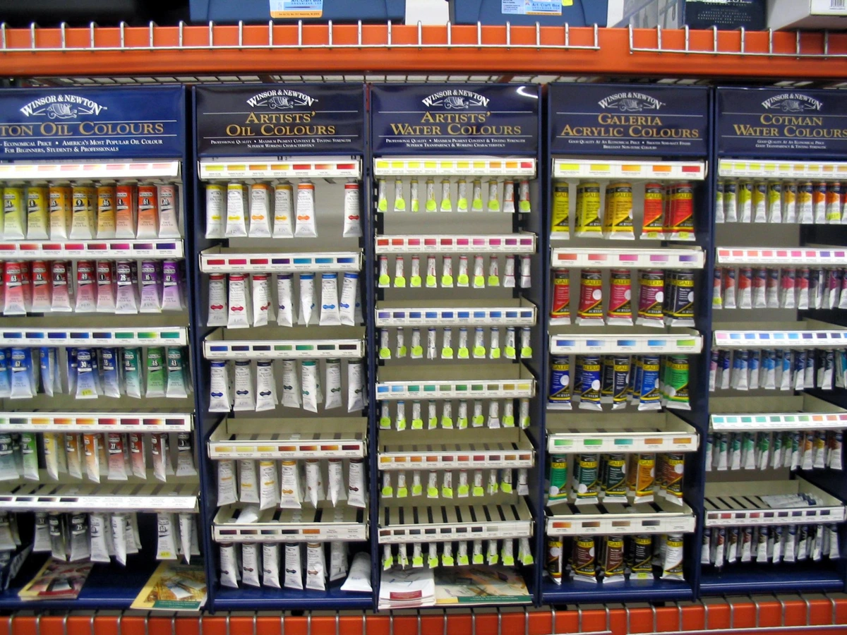
The easiest way to start is to look at the big brands' 'professional' or 'artist' grade lines. Companies like Winsor & Newton, Gamblin, Daniel Smith, and Golden are very transparent about their ratings. They publish detailed PDFs, sometimes even with specific pigment information for each hue. This should be your first stop: find the technical data section of their website and download everything. I have a folder on my computer filled with these charts. Before I ever buy a new tube, I cross-reference. It takes two minutes and has saved me from countless bad purchases.
2. Look for the Labels
Get in the habit of turning the tube over. Look for the ASTM D4303 (lightfastness) and D5383 (permanence) ratings directly printed on the label. The best brands make this information easy to find. Some brands like Winsor & Newton even provide these ratings on their smallest, introductory paint sets. If that information is missing, it's a red flag. Ask yourself why they chose not to include it.
Pro tip: When you're in an art store, bring a small notebook. Don't just rely on your memory. Jot down the pigment codes (e.g., PY35, PB29) and the ASTM ratings for any color that catches your eye. Then, before you buy, do a quick mental check: "Do I have a reliable red already? Is this new violet more lightfast than my current one?" This simple act turns a casual browse into an intentional, strategic acquisition for your palette.
3. Trust, but Verify
Just because a brand is expensive doesn't automatically mean every color is top-rated. A famous brand might have one or two colors in their professional line that are ASTM III because the pigment itself has inherent issues (like the traditional Alizarin Crimson). Conversely, some student-grade brands have specific "/professional" lines that meet the highest standards. The label is the truth, not the brand name. A perfect example is the traditional Rose Madder or genuine Alizarin Crimson (PR83). They are known to be fugitive, and even professional brands will rate them as such. The quest for a lightfast red led to the creation of modern alternatives like Quinacridone Red.
4. Start a Material Journal
This sounds tedious, but it's incredibly powerful. Get a small notebook, or dedicate a few pages in your sketchbook. Swatch every paint you own. Next to the swatch, write down the pigment code (e.g., Cadmium Yellow is PY35), the lightfastness rating, and the permanence rating. Reference this when mixing colors. You'll start to see patterns: 'Ah, this beautiful but delicate-looking purple I mixed is made from a PV15 (ASTM I) and the notoriously fugitive PR83 (ASTM III)... I should use this carefully, or better yet, find a more permanent violet.' It’s a rapid education in pigment chemistry that will save you from heartache later.
My own material journal is an absolute mess of paint smudges and scribbled notes, but it's one of my most valuable studio tools. I don't just list the data; I make notes. Next to my swatch of a particular ultramarine blue, I've written, "Great for glazing, but gritty in thick applications." It's that practical, hands-on knowledge that turns raw data into artistic instinct.
5. Ask for Technical Data Sheets (TDS)
For any serious brand, if the information isn't on their website, you can usually email them and request a PDF of their complete technical data sheet. This document will list every single property of every color—viscosity, pigment load, ASTM ratings, and more. It's the ultimate source of truth. If a company is unwilling to provide this document, it’s a major warning sign. Transparency is the hallmark of a brand that takes its own standards seriously. They should be proud to share this information.
In my experience, the best companies don't just give you a PDF; they provide it proactively. It's a central part of their brand identity. It tells you they see their customers as peers—informed artists who care about their craft—not just consumers who are dazzled by fancy packaging.
6. Learn the Pigment Codes
This is your superpower. Stop thinking in terms of poetic color names. Start thinking like a scientist. Instead of 'Payne's Grey,' you'll think 'PBk6 (Ivory Black) and PB15 (Phthalo Blue).' The Pigment Colour Index (PCI) is an international naming system. PB means Pigment Blue, PY means Pigment Yellow, PR means Pigment Red, and so on. A single pigment code will be used across all brands. If your favorite 'Quinacridone Red' is PR209, you know that any tube labeled PR209, regardless of the brand, is the same chemical pigment. This cuts through branding entirely and lets you shop purely on performance and price. It demystifies the paint aisle completely.
A simple way to start is to learn the codes for your most-used colors. For me, it was a revelation. I realized the 'Cobalt Blue' I was buying from a premium brand (PB28) was chemically identical to the one from a budget-friendly professional line. The price difference was in the packaging, the marketing, and sometimes the 'vehicle' or the specific recipe of the binder, but the core pigment was the same. That knowledge has probably saved me hundreds of dollars over the years.
Your Questions, Honestly Answered (FAQ)
Q: I found an old tube of paint from a brand that doesn't list ASTM ratings, or it is a cheap brand. Is it still good? A: It might be perfectly fine to use, but you should treat it as guilty until proven innocent. Many traditional pigments (like the earth colors ochre, umber, and sienna) are stable iron oxides and have lasted for thousands of years in cave paintings. However, many others—especially older organic dyes like Rose Madder or certain early synthetic Alizarins—are notoriously fugitive. If you're unsure, use it for studies, practice, or personal work where longevity isn't a concern. For a commissioned piece, a sale, or a work you intend to last, stick to modern, rated paints where the manufacturer has done the homework for you. The risk isn't worth it.
Here's a pro tip: If the tube lists a pigment code (like PR83 for Alizarin), you can look it up. The pigment itself has a known history. If the tube just says "Alizarin Crimson" with no code, it's a roll of the dice. The binder could also have deteriorated over time. If the paint has an odd smell, has separated irretrievably, or the tube itself is corroded, it's best to just throw it away. No painting is worth risking your health or your artwork over a questionable tube of paint.
Q: Do I need to use only ASTM I paints? What about my favorite color that's rated a II? A: Absolutely not! An ASTM II rating is still considered very good and suitable for professional work. Think of I as 'indestructible' and II as 'reliable and rugged.' Both are excellent choices for finished, lasting work. The key is to know the difference and make informed choices. If your favorite nuanced blue is an ASTM II, don't hesitate to use it. Just be aware, and perhaps don't hang that specific piece in the sunniest corner of the house.
You can also be strategic. Use more critical ASTM I paints for your main color fields and use ASTM II paints for accents or smaller details. A glaze of an ASTM II color over a layer of an ASTM I underpainting, correctly varnished and framed, will likely be fine for generations. It's about managing risk, not eliminating it entirely.
I think of it like building a car. You want the engine and the structural frame to be made from the highest-grade steel (ASTM I). But the interior upholstery can be a high-quality fabric that's still very durable (ASTM II). It's not about every single component being indestructible; it's about ensuring the most critical, load-bearing elements are built to last, while the supplementary elements are still high-quality.
Q: Can I hang my painting in direct sunlight if it's made with ASTM I paints? A: This is a dangerous game to play. No paint is truly sun-proof. While an ASTM I-rated paint is incredibly robust, no organic material can resist the full, unadulterated power of UV radiation from direct sun indefinitely. The rating means it will last for decades under normal indoor lighting. Direct sun is a torture test that dramatically speeds up the aging process. It's like the difference between walking through a gentle mist and standing in a hurricane.
To ensure your work lasts as long as possible, keep it out of direct sunlight, away from heat sources like radiators, and in a room with stable, moderate humidity—just like a museum would. That said, if you must, framing it behind UV-protective glass (which blocks over 99% of UV rays) is a worthwhile investment. However, even with UV glass, intense visible light and heat will still take their toll. It's best to find a spot where the light is indirect and gentle. Think about it: museums rotate their most light-sensitive works, keeping them in dark storage for years at a time. They understand that no material is immortal under the sun's relentless gaze.

Q: Are these standards just for oil and acrylic painters? A: Absolutely not. ASTM standards apply to all mediums—acrylics, oils, watercolors, gouache, even colored pencils and pastels. The principle is the same: use materials that will last, no matter what your tool of choice is. For example, the intense lightfastness of a pastel pigment is just as critical as that of an oil paint.
This is especially crucial for mediums that live behind glass, like prints or drawings. A print made on an inkjet printer is only as good as its weakest link: the ink and the paper. That's why our guide on understanding giclée prints emphasizes the need for both archival, acid-free papers (meeting standards like ASTM D6901) and high-quality, lightfast pigment inks, not cheaper, fade-prone dye-based inks. Every medium has its own fight against time, and ASTM standards provide the vocabulary for that fight. Even for digital artists who get their work printed, understanding these standards is crucial for choosing a print house that won't turn their brilliant digital file into a temporary, fading poster.
The Final Brushstroke
I’ll be honest. This whole topic can feel a bit dry and technical when you first dive in. It’s a lot of numbers and letters. It’s science, not art. But I encourage you to reframe it. This isn’t about rules; it's about freedom.
Knowing that your cadmium red is ASTM I isn't a constraint. It’s an act of liberation. It frees you from the nagging worry that your work is slowly dying on the wall. It lets you focus on the only thing that truly matters: the creative act itself. When you have confidence in the permanence of your materials, you can paint with abandon, knowing that your boldest, most brilliant stroke will be there to greet the future, exactly as you left it.
That freedom is the ultimate prize. It transforms you from a person who simply puts paint on a surface into a master of your craft, an artist who is consciously and deliberately building a legacy. It's the difference between scribbling a note on a napkin and writing a letter on fine paper. The message might be the same, but the respect for the message is communicated through the medium.

Go check the label on your favorite color. Learn its pigment code, its lightfastness rating, its permanence. Start a conversation with your tools. This knowledge isn’t a set of rules; it’s a pact. A pact you make with your materials and your future self, ensuring that what you create today will be there to greet the future, exactly as you left it.