
The Secret Codes of Forever: A Painter’s Guide to ASTM Standards in Art Conservation
A surprising, practical guide to ASTM standards for artists and art lovers. Learn what those dry specifications really mean for the preservation of your favorite artworks, from paper to paint.
The Secret Codes of Forever: A Painter’s Guide to ASTM Standards in Art Conservation
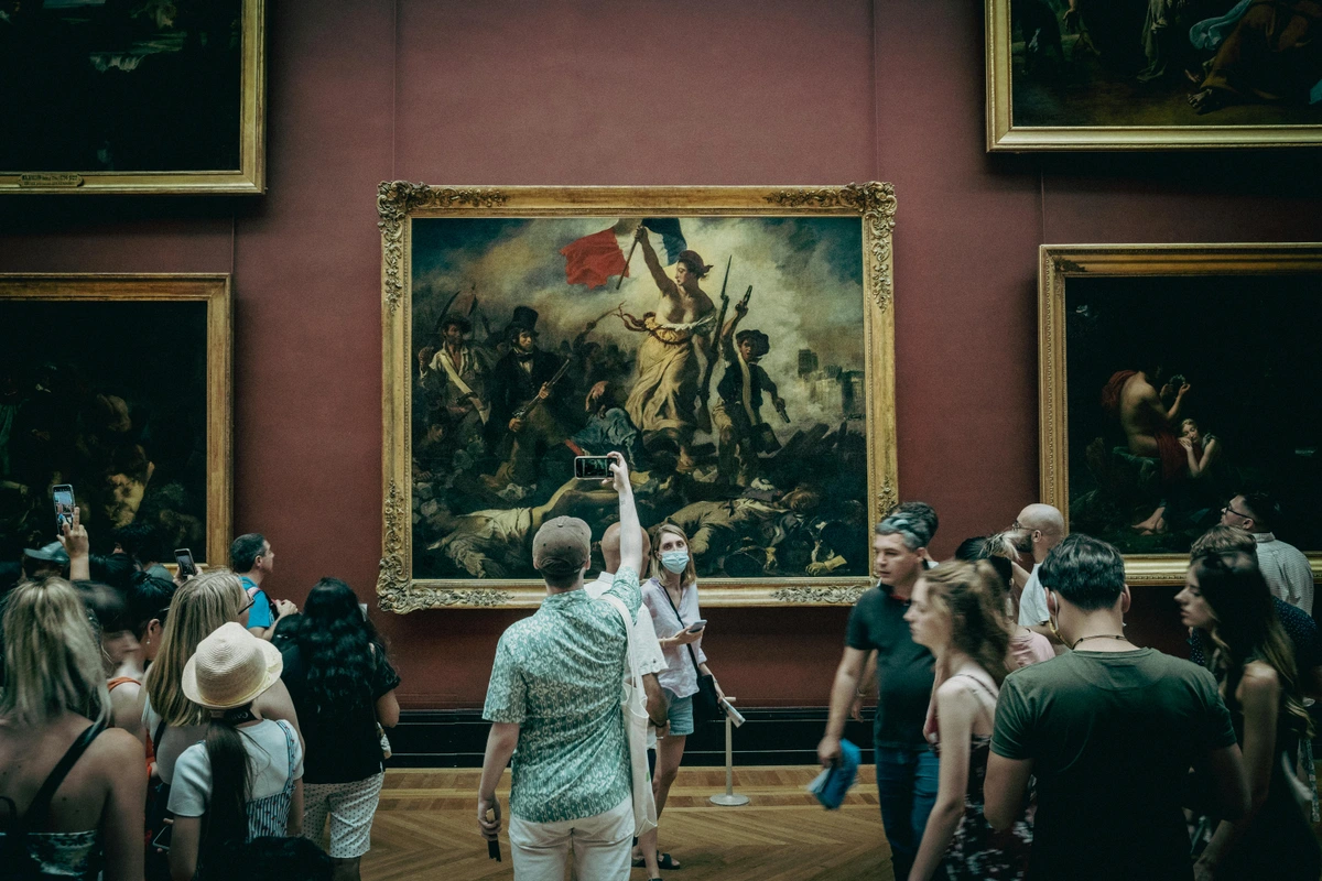
You know that little voice in your head when you're picking out a canvas? The one that whispers, "Will this thing last longer than I will?" It turns out, there's a group of people who spend their days not just wondering about that, but obsessing over it. They're the folks behind the ASTM standards, and while the name sounds like a bureaucratic cure for insomnia, it's actually one of the most important sets of rules for making sure art survives us. For artists, collectors, and conservators, these standards are the invisible architecture of permanence, transforming ephemeral creativity into lasting cultural heritage. They represent the scientific community's best effort to quantify durability and give us a shared language for "forever."
Think about it this way: my studio is filled with the ghosts of experiments past. A vibrant magenta that faded to a ghostly pink within two years; an abstract piece on bargain-bin paper that slowly turned the color of weak tea as the acidic wood pulp broke down. We've all been there, watching a piece we love slowly lose its soul, molecule by molecule, to the enemy alliance of light, heat, and humidity. But what if I told you there's a way to almost guarantee your great-great-grandkids will see that fiery red exactly as you painted it—not as a faded memory, but as an intact emotional statement? This isn't science fiction; it's the practical outcome of thousands of hours spent in laboratories, testing materials in chambers that simulate decades of sunlight in mere weeks.
I used to think conservation was about old-world recipes and secret varnishes passed down in dimly lit workshops. I've learned the reality is far more structured, and frankly, more empowering. It’s about science, repeatable tests, and a shared language for permanence. This article is my attempt to translate that secret code for you, so your work can outlast us all.
What Are ASTM Standards, Really?
Imagine you go to five different paint manufacturers and ask for a tube of "lightfast red." Without a common definition, you might get five wildly different pigments, some that fade in a year and some that could outlive the sun. It’s chaos. It's the Wild West of pigment chemistry, and your painting is the poor settler's cabin in the middle of it all.
That's where the American Society for Testing and Materials (ASTM) comes in. They're not a government agency armed with regulations; they're a non-profit that essentially asks a simple question: "How can we all agree on what 'good' looks like?" They bring together scientists, artists, conservators, and manufacturers—people who normally might not even be in the same city, let alone the same room—to create standardized tests and specifications. It’s a consensus on quality and durability. It's a peace treaty for the art supply world.
The brilliance of this system is its voluntary nature. A paint company isn't forced to comply, but if they want their product to be taken seriously by professionals—from the artist in their studio to the conservator in a major museum—they have to prove it measures up. It's a powerful, peer-driven system that creates accountability and trust without legal threats.
These standards cover everything from the screws used in construction to the plastic in your water bottle. But for us, the most critical ones live in a section called ASTM D01 on Paint and Related Coatings. This is the rulebook, the constitution, for the materials that keep art alive. Within this committee, subcommittees focus on specific challenges: the durability of pigments against light (the fade-fighters), the stability of binding mediums over decades, and the very structural integrity of the surfaces we paint on. These aren't arbitrary rules; they are battle-tested protocols born from understanding how the forces of decay work. They give us a fighting chance against time, light, humidity, atmospheric pollutants, and our own questionable paper choices.
The Most Important Tests for Artists: Decoding the Pact with Forever
Let’s be honest, you’re probably not going to sit down and read every single technical standard with a cup of coffee. I certainly haven't. But understanding a handful of the heavy-hitters is like learning a secret handshake. It will fundamentally change how you see the materials you work with every day, transforming them from mysterious goops in a tube into predictable, durable tools. These tests are the gatekeepers of longevity, and they're about to become your best friends.
You might wonder why you should trust some committee's definition of "permanent." The answer is surprisingly personal: you're trusting the collective wisdom of generations of artists, scientists, and conservators who have watched beautiful things turn to dust. ASTM standards are the hard-won lessons from a century of failures, codified into a language that can protect your work.
Lightfastness (The Fade-Fighters)
Light is the quiet killer of art. It's a relentless bleach, a slow-motion eraser, breaking down the complex molecules—the chromophores—that make up our pigments in a process called photodegradation. Ultraviolet (UV) radiation is the main culprit, carrying enough energy to sever the chemical bonds that create color. But it's not just sunlight; even the low-level UV from fluorescent and LED gallery lighting adds up over decades. The primary standard that quantifies a pigment's resistance to this assault is ASTM D4303, Standard Test Methods for Lightfastness of Colorants Used in Artists' Materials.
The test is as brutal as it is clever. They take samples of a pigment, applying it to a standardized surface, and expose them to a controlled, high-intensity light source (usually xenon arc lamps, which mimic the full spectrum of sunlight scarily well) for a set period. This isn't a gentle tanning session; it's a full-scale assault, with samples also subjected to cycles of varying humidity to simulate real-world environmental stress. Think of it as a pigment's personal crucible, a boot camp from hell. After the trial by light, they compare the faded sample to the original using a colorimeter—a device that measures color with inhuman precision across the spectrum. The result isn't just a simple pass/fail; it's a rating based on numerical color difference values (Delta E), which correlate to visible change. The most common rating system you'll see on paint tubes is the ASTM Lightfastness Ratings, often shown as Roman numerals. This seemingly simple I-V scale is backed by rigorous numerical data from the colorimeter readings, linking specific Delta E values to human perception of color change.
- I (Excellent Lightfastness): These are the heavyweight champions. The color change after extreme exposure is negligible (measured as a Delta E of less than four CIELAB units, which is barely perceptible to the human eye). They are expected to be permanent, showing virtually no change with long-term exposure. They’re the ones you use when you want your work to last for centuries—the Cadmiums, Titanium White, and modern organics like Quinacridones are your cornerstone pigments. Think of them as the bedrock of your artistic legacy.
- II (Very Good Lightfastness): Still an excellent, trustworthy choice. The color change is slight (a Delta E between 4 and 8 units, a just-noticeable difference). There might be a tiny, often imperceptible shift over a very long time, but for practical purposes, these are considered durable. Think of them as the reliable workhorses of the art world. You can build an entire career on a palette of I's and II's.
- III (Fair Lightfastness): These are the riskier ones, the gamblers. The color change is distinct and measurable (Delta E between 8 and 16). They will likely fade noticeably over time, sometimes within a single decade under gallery lights. You might use them for studies, sketches, or work where longevity isn't the primary concern, but you're making a very real trade-off between immediate impact and future existence.
- IV (Poor Lightfastness) & V (Very Poor Lightfastness): These are the rebels, the ephemeral fireflies. Their color change is significant to extreme (Delta E of 16 or more). They're going to fade, and probably sooner rather than later. It's a conscious choice to use them, knowing their vibrancy is a temporary loan from the universe. Many natural dyes and historical rose madder or carmine lakes fall into this category.
So, when you pick up a tube and see ASTM D4303 on the label with a Rating I, you're not just looking at a promise from the manufacturer. You're looking at the result of a standardized, scientific gauntlet. You're holding a tube of proven history, a little vial of "forever" that has been accelerated-aged to simulate a century of light exposure in mere months. It's an insurance policy for your artistic vision, ensuring it can handle whatever the sun, a museum spotlight, or the gentle but persistent glow of a collector's living room throws at it.
Composition of Paints (What’s Actually in the Tube?)
Ever had two "Cadmium Red" paints from different brands that looked, felt, and mixed completely differently? One a scarlet fire, the other a muted, ruddy brown? Me too. It’s infuriating. It's like ordering a classic cocktail and getting a completely different drink every time. It makes consistent color mixing a nightmare. While the standard ASTM D4236, Standard Practice for Labeling Art Materials for Chronic Health Hazards, is crucial for safety—it's the one that makes sure the paint is non-toxic or at least warns you if it isn't, requiring an AP (Approved Product) or CL (Cautionary Labeling) seal—it doesn't standardize the proprietary pigment blends or, more importantly, the precise composition of the pigments themselves beyond the safety requirements.
For that, you need a different kind of language, a universal decoder ring: the Colour Index International (CII). Jointly maintained by the Society of Dyers and Colourists in the UK and the American Association of Textile Chemists and Colorists, this is a master database, a global genetic library for every pigment and dye ever made. Each one gets a unique identifier based on its chemical structure and color. For example, a true Cadmium Red is PR 108 (Pigment Red 108). The "PR" stands for, you guessed it, Pigment Red. If your paint tube lists that code, you know exactly what you're getting—a specific chemical compound with predictable lightfastness and mixing properties—regardless of the fancy marketing name ("Scarlet Lake," "Pyrrole Crimson") the brand put on the front. The CII code cuts through the noise. This is how you become a smarter buyer and a more consistent artist, mastering the alchemy of your own palette.
D3290 & D5701: The Alchemy of Archival Paper
Paper is a fragile thing, a delicate ecosystem of cellulose fibers. It can yellow, become brittle, and self-destruct over time if it’s not made right. The villain here is lignin, a natural polymer in wood pulp that acts as a glue. In newsprint and cheap sketch pads, lignin is useful, but for art, it's a time bomb. When exposed to light, heat, and oxygen, lignin breaks down and releases acids. This process, called hydrolysis, attacks and weakens the long cellulose chains of the paper fibers, leading to yellowing and eventual embrittlement—a process conservators vividly call "slow fire."
The standard for this is ASTM D3290, Standard Specification for Bond and Ledger Papers for Permanent Records. This standard mandates that for paper to be considered "archival" or suitable for permanent records, it must be lignin-free. More importantly, it must be acid-free, with a pH of 7.0 or higher. To truly future-proof the paper, the gold standard goes a step further, incorporating an alkaline reserve, usually calcium carbonate. This reserve acts as a buffer, neutralizing any acids that might try to form in the paper later from environmental pollution or the breakdown of internal components. This proactive defense gives the paper a multi-century lifespan.
This is why you see the term "acid-free" on high-quality art papers. It’s not just a marketing term; it's a direct reference to these standards of permanence. If you’re creating work you care about, using a buffered, acid-free, lignin-free paper or mat board is one of the single most important choices you can make (that, and not spilling your coffee on it).
What does this mean in practice? A drawing on a buffered, 100% cotton rag paper meeting D3290 can have a projected lifespan of 500+ years. A sketch on a cheap, acidic wood-pulp paper might start to brown and crumble in as little as 20. It's a choice that truly decides if your work is an artifact or an ephemeral note.
The Golden Rule of Reversibility in Varnishes and Adhesives
Varnishes are meant to protect, but a bad varnish can yellow, crack, or become impossible to remove, essentially ruining a painting from the outside in. This is a conservator's worst nightmare, often forcing them into "heroic" measures that risk the original work. Think of it as putting a protective coating on your car; you want one that can be safely polished or removed without damaging the original paint.
The guiding principle, deeply embedded in conservation ethics and referenced in standards like ASTM D4302 and D5800 (for adhesives), is reversibility. You want a varnish or glue that can be safely dissolved and removed by a conservator decades from now without affecting the paint layer or paper underneath. It's an act of profound foresight and respect for the artwork's future.

This is a huge consideration. When I varnish a piece, I'm not just thinking about how it looks now; I'm thinking about the poor soul who might have to clean it one day, perhaps a century from now. I choose varnishes that dry hard and clear, are known for their long-term clarity, and can be easily dissolved by relatively mild solvents like mineral spirits or specific resin removers. Choosing products like Gamvar or those based on ketone resins that meet these criteria is an act of profound respect for the future.
The Material Ecosystem: Thinking Beyond the Brushstroke
A painting isn't just paint. It's a complex ecosystem of materials—a sandwich of support, ground, paint, and protective layers—and every single component has a role to play in its survival. Ignoring the supporting cast is like building a beautiful house on a crumbling foundation. The story of a painting's failure is rarely about a single pigment fading; it's about the synergistic breakdown of multiple components. This is where ASTM standards become truly powerful, addressing not just the paint, but the entire material system.

The Glue That Binds, or Doesn't: Adhesives
Whether you're mounting paper to a board or fixing a torn canvas, the adhesive you use is critical. The wrong choice can result in staining, "strike-through" where the adhesive bleeds to the front, or failure as the glue becomes brittle and lets the artwork buckle or detach entirely. A standard like ASTM D5800, Standard Practice for the Preservation of Adhesive Materials, guides manufacturers in creating stable, long-lasting products. For artists, the takeaway is to use archival-quality pastes and glues—never everyday white glue (polyvinyl acetate, or PVA) or rubber cement, which can stain, become brittle, acidic, and fail catastrophically over time. Look for products that are acid-free, pH-neutral, stable, remain flexible when dry, and are specifically rated for longevity. Japanese kozo (mulberry) paper hinges and wheat starch paste have been the conservator's choice for centuries for good reason.
Your Pocket Compendium: Key ASTM Standards at a Glance
Here’s your essential decoder ring, the quick-reference guide to navigate the alphabet soup of ASTM. Keep this in your mental pocket.
What It Covers | Why It Matters to You | |
|---|---|---|
| D4303 | Lightfastness of Colorants | Determines how resistant your pigments are to fading in light. Look for a high rating (I or II). |
| D4302 | Artists' Acrylic Emulsion Paints | Sets performance and compositional requirements for acrylics, including viscosity, drying time, and pigment load. Affects quality and handling. |
| D4236 | Health Hazard Labeling | Ensures art materials are properly labeled for chronic health effects (e.g., AP/CP seals). It's about your safety and legal compliance. |
| D3290 | Permanent Paper / Paper Permanence | Defines the criteria for acid-free, lignin-free paper with an alkaline reserve that won’t yellow or self-destruct. Essential for works on paper. |
| D5701 | Preservation of Liquid Inks | Provides guidelines for making inks stable over time, preventing fading or corrosion. Crucial for pen-and-ink drawings. |
| D5800 | Preservation of Adhesive Materials | Guides the stability of adhesives used for mounting and repairs. Ensures your repairs don't fail or stain. |
| D6901 | Extruded or Molded Acrylic Shapes (for supports) | Ensures the plastic panels you might paint on are weatherable and stable. Prevents support degradation. |

Why This Matters More Than You Think
I get it. Chasing a creative vision is hard enough without worrying about the molecular breakdown of your favorite yellow ochre. Your job is to create, not to be a chemist. But here’s the thing: these standards are your silent partners, the invisible scaffolding holding up your artistic legacy. They are a guardrail against regret, the technical assurance that the fire you're capturing on canvas today won't be a pile of cold ash in fifty years.
I remember once seeing a brilliant, vibrant neon pink used in a mid-century pop art piece. It was electric. Today, it's a pale, sickly salmon. The artist's choice of a fugitive pigment wasn't a creative decision; it was an oversight, a time bomb. That lost vibrancy is a loss for everyone.
Knowing about these standards changes the way you make art. It shifts your perspective from "Does this look good now?" to "Will this be good ten years from now?" It moves you from being a consumer of materials to being a strategic architect of your work's future.

- It Gives You Professional Credibility: Not just in mindset, but in the eyes of galleries, collectors, and institutions. A work made with documented, archival materials is seen as a serious, thoughtful investment. It signals that you are an artist who understands the full lifecycle of their work. You're not just making a product for today; you're building a historical object for tomorrow.
- It Makes You a Smarter, More Empowered Buyer: You can look past the fancy name on a tube of paint and find the real information—the lightfastness rating, the Colour Index number—to make an informed choice. No more being swayed by poetic marketing ("Sunset Glow," "Mysterious Magenta"). You become the master of your materials, not a victim of them.
- It's an Act of Respect for the Future: It shows respect for your collectors, who are investing not just in an image but in an object they hope to love for a lifetime. It shows respect for the future conservators who will one day care for your work. Using fugitive pigments or acidic paper isn't just a risk; it's like building a beautiful house on sand and handing the keys to the next generation, asking them to deal with the inevitable collapse.
It’s one thing to create a beautiful painting; it’s another to create a durable one. These standards are the technical blueprint for durability, the toolbox that lets us aim for forever. They are the codified wisdom of generations of material scientists and conservators, distilled into a set of practical, actionable instructions. They represent the collective effort to turn the ephemeral act of creation into a permanent cultural statement.
Your Studio Toolkit: The Artist's Action Plan
So, how do you translate all this technical talk into actual practice without losing your mind? It's easier than you think, and it starts with becoming a conscious consumer, a connoisseur of chemical stability. This is where your awareness translates into tangible, lasting work.
First, get into the habit of reading the fine print. That tube of paint has a story to tell, and it's written on the side panel. The front is marketing; the back is science. Look past the poetic name like "Sunset Glow" and hunt for the real data: the Colour Index number (e.g., PB29 for Ultramarine Blue) and the Lightfastness Rating (I, II, III). If this information isn't there, write to the manufacturer and ask. Demanding transparency elevates the entire field by signaling that artists care about permanence, not just pretty names. Many high-end brands publish detailed technical data sheets on their websites—these are treasure maps for the material-savvy artist.
Next, understand the "why" behind your choices. That "archival" tag on your paper isn't just for show; it's your assurance the paper won't commit seppuku in a decade. When you frame a work, you're creating a micro-climate. Use acid-free, lignin-free mat board (ASTM D3290) and backing board, and insist on UV-filtering glass or acrylic. This isn't just for the collector's benefit; it can be a selling point that demonstrates your commitment to the work's longevity. Discuss the environment where your art will live. A painting in a bright, south-facing room is under constant assault. Forewarn your collectors. Suggest they rotate artworks on display, storing others away from direct light when possible, effectively resting them between viewings.
Finally, use the right supplies for the job. Creating a quick sketch for Instagram is not the same as creating a museum-quality piece destined for a collector's wall. Have a "sketch" palette and a "masterpiece" palette. It's not about being precious; it's about strategic resource allocation of both your time and materials. Your masterpiece deserves the best defense money can buy against the ravages of time. Don't use a fugitive Alizarin Crimson (PR83) for the central element of a painting you hope will be a career-defining work when a permanent Quinacridone Red (PR209) offers a similar color and will last for centuries. This strategic thinking is the hallmark of a professional who builds legacies, not just images.
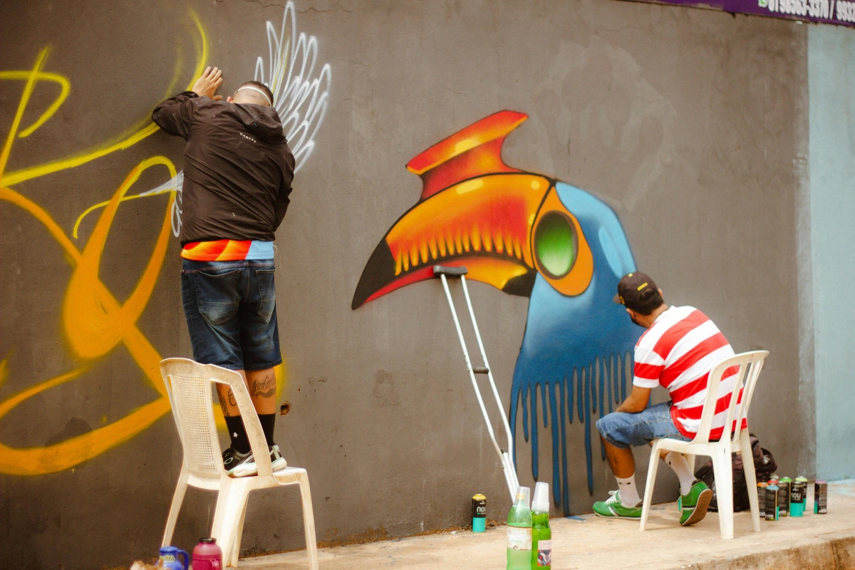
Myths Debunked and Hard Truths Revealed
There's a persistent myth that only "fugitive" colors are truly vibrant or beautiful, and that permanence comes at the cost of aesthetic appeal. That is, to put it bluntly, nonsense. While some historical pigments were notoriously delicate (looking at you, Carmine Lake and historical Rose Madder), modern chemistry has given us an incredible range of durable, lightfast pigments that are every bit as vibrant as their ephemeral cousins. The development of synthetic organic chemistry in the 20th century was a game-changer for artists. A modern Phthalo Blue (PB15) is as intensely saturated as it gets and will last for centuries. A Quinacridone Red (PR209) offers a range of beautiful, permanent magentas and violets. The notion that you have to sacrifice your art's future for its present beauty is a false choice born from a pre-industrial palette. Today, we have the best of both worlds.
A more nuanced consideration is the interaction of the art market itself. A work made with archival, museum-standard materials has a documented longevity, which can increase its monetary and cultural value over time. It's seen as a more serious, thoughtful investment. Appraisers and estate planners often look for this. Conversely, a piece made on acidic cardboard with student-grade paints is immediately flagged as less durable, which can affect its desirability and price. It becomes a decorative object rather than a historical one. You are, in a very real way, building value with every material choice you make, from the pigment on your brush to the backing board in your frame.

Your Burning Questions Answered
My favorite color only comes in a "Lightfastness III" paint. Should I never use it?
Not at all! Think of these ratings as information, not prohibition. Use that color for studies, sketches, or work that you know will be kept out of direct sunlight. It’s about making a conscious choice, knowing its limitations. I have a few guilty-pleasure paints that I know won't last forever, and I treat them accordingly—out of the sun and with the full knowledge that I'm borrowing, not owning, that particular beauty.
I inherited an old painting and the paper is brown and brittle. Is this because of the ASTM standards?
Indirectly, yes. The paper used was almost certainly not acid-free, meaning it didn't meet modern standards for permanence like ASTM D3290. The acid in the paper has been slowly breaking down the cellulose fibers over decades, causing it to yellow and become fragile. It's a perfect, albeit sad, real-world example of why these standards were created in the first place—to prevent that very tragedy.

Can I just "fix" a pigment's poor lightfastness or acidic paper with a good frame?
Framing helps a lot—using UV-filtering glass or acrylic is a fantastic way to protect a work. But it's not a magic bullet or a time machine. UV filtering isn't 100% perfect, and light can still get in from the sides or even through reflections. It's far better to start with durable materials—the ones that have been vetted by ASTM standards—than to rely solely on a perfect environment. Think of framing as the final, essential layer of defense, not the first and only one.

Are these standards just for old, classical art?
Absolutely not! They are crucial for contemporary art of all kinds, including abstract, modern, and digital prints. The chemistry of light and acid doesn't care about the style of your work. A vibrant, contemporary print on acidic paper will degrade just as surely as a 19th-century ledger. Time is an equal-opportunity destroyer.
How can I learn more as an artist?
Start with the labels on your favorite tubes of paint and pads of paper. Look for the ASTM codes and the Lightfastness ratings. Many manufacturers provide detailed technical data sheets on their websites that explain exactly which standards their products meet. It's the quickest way to get familiar with the language of longevity. I also highly recommend looking into resources from the ASTM D01 committee itself, the Library of Congress's preservation guidelines, and reputable art conservation organizations like the American Institute for Conservation (AIC). They're treasure troves of practical, no-nonsense information.
From Your Studio to the Museum: The Ripple Effect of ASTM
The reach of these humble standards extends far beyond your studio. They are the bedrock of the modern art conservation field. When a museum conservator begins the meticulous process of restoring a damaged painting, their first step is often to consult the relevant ASTM standards. They need to know the lightfastness of the original pigments, the chemical composition of the binding medium, and the archival quality of the support to choose compatible, reversible restoration materials. Without this shared, standardized language, conservation would be guesswork, and every intervention would be a potentially disastrous experiment. These standards provide a common vocabulary and a scientific basis for every critical decision.
For conservators, ASTM isn't just a set of rules; it's a Rosetta Stone that allows them to decipher an artwork's physical history and plan for its future. By choosing materials that meet these proven standards, you're not just making a durable artwork; you're giving it a passport that future generations of caretakers will be able to read and understand. You're embedding its own instruction manual into its very DNA. It allows a conservator in 2124 to know, for instance, that your painting's binder is a stable acrylic polymer, so they can safely use an aqueous cleaning solution without fear of dissolving your life's work.

Conclusion: Your Legacy, Encoded
All of this to say, ASTM standards aren't just dry legal documents for chemists. They are a testament to a simple, profound hope: that the things we make in a moment of inspiration can endure. Artists throughout history have whispered this hope to their pigments and canvases, but today, we can speak it with scientific certainty. These standards are the technical backbone of permanence, the hidden framework that lets us build a legacy, one stable, fade-resistant pigment at a time.
So the next time you're standing in the art supply store, staring at a wall of infinite choices, listen for that quiet whisper about longevity. And remember, you now know the secret handshake. You no longer have to hope your art will last. You can know.