The Profound Power of White in Abstract Art: An Artist's Journey
Discover white's hidden depths in abstract art. An artist explores its role in conveying silence, potential, and emotion, its historical legacy, and the nuances of working with this compelling, often misunderstood, 'color'.
My Quiet Rebellion: The Profound Power of White in Abstract Art
There's a curious alchemy that happens when I face a crisp, blank canvas – that vast, white expanse. For an artist whose studio usually resembles a glorious, pigment-splattered explosion of color, it might seem odd, even a bit of a quiet rebellion. And yes, I know what you're probably thinking: 'An entire article about white? Has she run out of paint?' But in my artistic heart, white isn't just a background; it’s a secret weapon, a meditation, and probably the most misunderstood 'color' in the entire spectrum. I'm here to tell you why its profound power lies precisely in its subtlety, its perceived lack of 'color' in a world obsessed with saturation. We spend so much time delving into the psychology of color in abstract art, but white, for me, is everything. It's a journey into the very soul of abstract expression, an invitation to look beyond the obvious, challenging the eye to find complexity in apparent simplicity. It creates a commanding presence, serving as the perfect, almost unexpected, stage for works where white isn't just observed, but felt. This profound power of white, particularly when juxtaposed with stark forms, is something I see masterfully employed by artists like Christopher Wool, whose powerful pieces often rely on bold marks against luminous white expanses.
If Christopher Wool's powerful use of white and stark forms captivates you as much as it does me, you might find yourself losing hours in the ultimate guide to Christopher Wool.
White: Silence, Potential, and Presence
White has always pulled me in, perhaps initially because it felt a bit rebellious. In a world saturated with noise and visual clutter, white offers a profound pause. It’s the ultimate reset button, that feeling you get when you wipe a whiteboard clean after a particularly intense brainstorming session—a moment of pure, unblemished readiness. It's not truly empty; it's a deliberate removal of other visual elements, which, paradoxically, creates a profound presence. Think of it like a freshly fallen blanket of snow, covering the mundane details of the landscape, inviting a new perspective. Or a pristine stage, cleared and waiting for the first actor, the first note. It’s the void from which all possibility springs, a canvas of pure potentiality. This boundless quality often reminds me of the philosophical concept of the sublime – that awe-inspiring, boundless, and undefined space that transcends ordinary experience. Imagine gazing into an endless mist, the vast, clear night sky, or the echoing silence of an empty cathedral. It's no wonder that in many spiritual traditions, white represents ultimate truth, transcendence, or even enlightenment, a visual echo of an untouched, sacred realm. In abstract art, white achieves a similar effect, not just by being a background, but by creating an expansive sense of infinite space that encourages profound contemplation and discovery, inviting the mind to actively fill the 'void' with its own interpretations.

Beyond just potential, white also carries significant psychological weight. Culturally, it often symbolizes purity, new beginnings, or even sterility. While some might initially see a white canvas as blank or intimidating, I find its inherent quietness incredibly powerful. When I begin a piece heavily reliant on white, I’m not thinking about what I’m putting on it, but rather what I’m revealing through it, what subtle narratives I’m allowing to surface. It’s like clearing a stage for a single, powerful monologue, where every shadow, every subtle mark, becomes intensely significant. This deliberate approach, which often connects with my philosophy on embracing accidents and evolution in my abstract art, is a refusal to compete with visual clamor; it chooses instead to invite a whisper. Sometimes, the most profound statements are made in these quietest moments, without shouting. It’s this sense of quiet power that makes white so captivating. It doesn’t demand attention; it invites it, almost confident in its own understated authority. What silent stories does white tell you?
A Symphony of Nuance: White as a Vibrant Presence
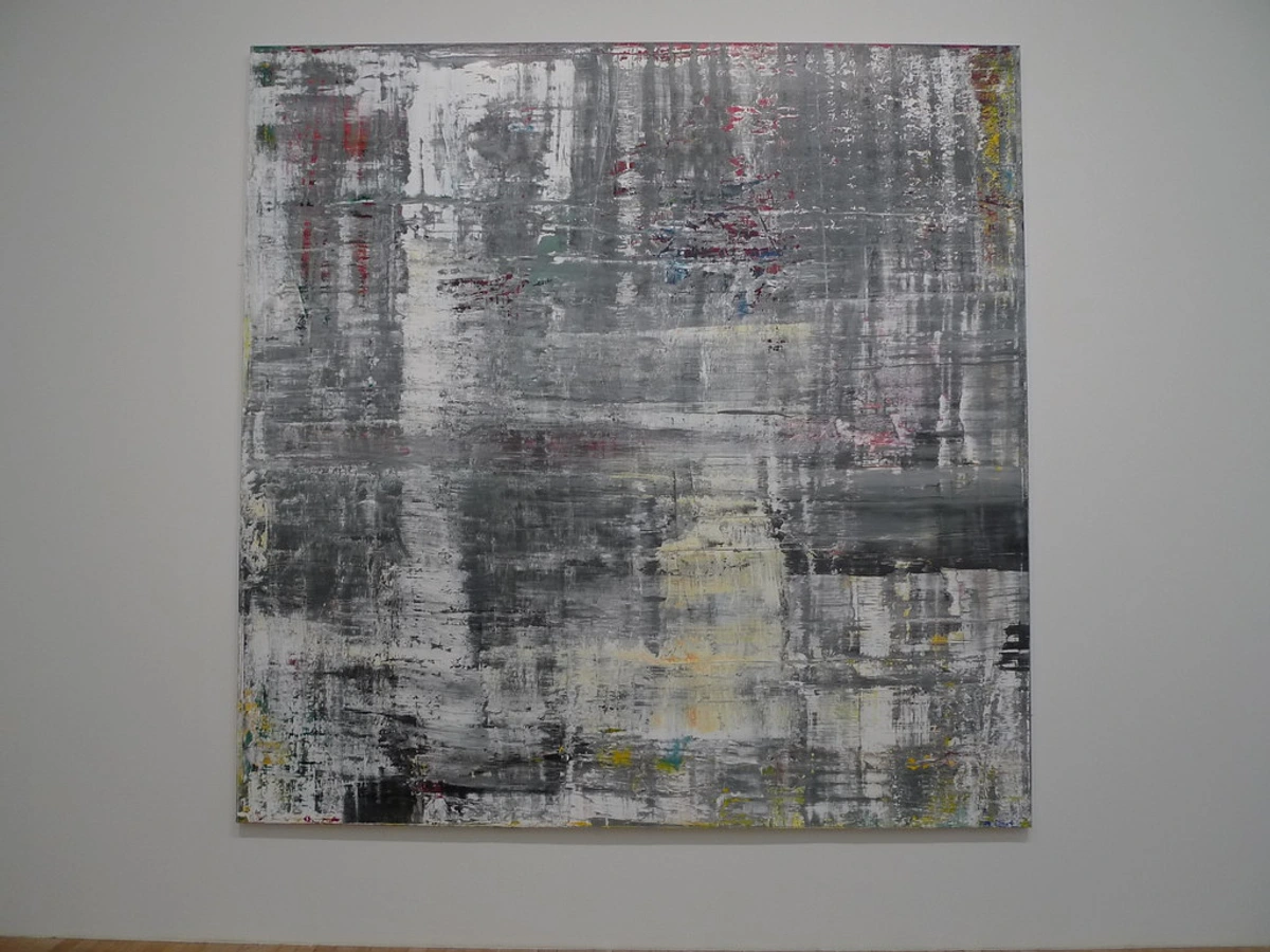
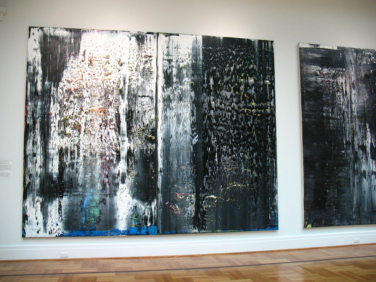
So, if white is this boundless potential, how does it physically manifest? Here’s the truly fascinating thing: it’s never just white. Never. It's a spectrum, a chameleon. My own perception of white dramatically shifted when I stopped thinking of it as a single hue and started seeing it as a myriad of light reflected from countless surfaces. Think of the subtle variations in snowdrifts under different lights, or the complex whites of an old ceramic vase. You have your cool whites, like glacial ice or a winter sky, hinting at blue or grey; your warm whites, leaning towards cream like aged parchment, or even a whisper of peach. And it's not just the pigment; the finish of the paint matters immensely. The raw, toothy canvas itself, the matte texture of acrylic gesso, the smooth sheen of a final varnish – each adds its own dimension, its own particular way of catching and diffusing light. It's like watching a magic trick unfold, the subtle physics of light transforming a seemingly simple surface into something alive.
Even the binder—oil, acrylic, or watercolor—imparts its own character, subtly altering how the white receives and disperses light. When I work with white, I'm playing with these nuances. Titanium white, dense and opaque, asserts itself with confident presence, reflecting almost all light. Zinc white, on the other hand, is cooler, more transparent, and allows underlying layers to subtly breathe, inviting a different kind of introspection, almost absorbing light into its delicate surface. And there are others too, each with their own personality: Cadmium White, often a bit warmer and denser than titanium, offering yet another subtle variation, or even using a highly diluted Ivory Black to create a deep, luminous 'non-white' that behaves much like a white. Historically, there's also Lead White, cherished for its creamy texture and opacity, though its toxicity makes it a relic of the past for most contemporary artists—a reminder of how materials evolve! For me, it’s not just about the color itself; it’s about the very physics of how light behaves when it hits the surface. Different pigments, binders, and textures will absorb, reflect, or scatter light in unique ways, shaping how the white is perceived by the eye.
I'm constantly exploring texture, my favorite techniques for adding depth to abstract paintings, not just for tactile appeal, but because texture catches light, and light is white's primary language. It dictates how white appears and is perceived. A subtle ridge of impasto, perhaps created by mixing marble dust or fine sand into the paint, can cast a shadow that transforms one white into another. I might use transparent glazes of a nearly invisible pigment, or iridescent mediums, to add a glow, making the white pulsate with inner light. Choosing between these distinct white pigments isn't merely a technical decision; it's an emotional one. I relish this challenge, pushing the boundaries of what's possible even with a seemingly limited palette, truly embracing mastering limited palette abstract art. This interplay is a delicate dance, a visual whispered conversation where every subtle shift in shade or surface becomes incredibly significant, echoing how composition guides my abstract art. It’s in these subtle differences that white truly comes alive, transforming from an absence into a vibrant presence. How do these nuances change your perception?
Echoes from History: White in the Artistic Legacy
It's funny, all this talk of the subtle physics and emotional pull of white. It might sound very modern, but my fascination with white isn't a new invention at all. It's a profound thread woven through centuries of artistic endeavor, echoing across millennia. Think of the pristine white marble of classical Greek and Roman sculptures, designed to convey purity and idealized form—a concept that, for me, still resonates with the idea of distilling an emotion to its purest form. It makes me wonder if those ancient sculptors felt that same sense of pure form I strive for today. Or consider the symbolic use of white in ancient Egyptian tomb paintings to represent purity and the afterlife. In East Asian art traditions, particularly Chinese ink wash painting or Japanese calligraphy, the vast expanse of white paper is rarely a mere background; it’s an active component, representing empty space, mist, sky, or infinity, crucial for spiritual resonance – a concept so close to how I view negative space in my own work, where the 'empty' areas are just as active as the filled ones. While Western art might historically have used white marble to convey idealized form and purity, these Eastern traditions harnessed white's ability to represent the unseen, the meditative void that completes the composition.
Even before modern abstraction, white played a critical, if often overlooked, role. In the Renaissance, it was essential for creating the illusion of three-dimensionality through chiaroscuro, often mixed with other pigments to model light and shadow. The Baroque period saw it used dramatically to highlight focal points and create intense contrasts, while in Neoclassicism, pristine whites symbolized virtue, clarity, and rational order, often echoing the classical marble. Even the Impressionists used broken white brushstrokes to capture fleeting light. And let's not forget early photography, where variations of white and grey in sepia tones or stark black and white images were masterfully manipulated to convey mood, atmosphere, and a depth of emotion, demonstrating a profound understanding of white’s power long before color was an option. And on a global scale, it's fascinating how white's cultural perception shifts: from purity and peace in many Western cultures, to mourning in some East Asian traditions, to sacredness in various indigenous contexts – a reminder that its visual power is intertwined with diverse human narratives.
But it's in the realm of modern abstract art that pioneers truly pushed the boundaries, and their experiments with white deeply resonate with my own journey. These artists didn't just use white; they interrogated it, elevated it, and made it the very subject. Kazimir Malevich, for instance, with works like his iconic "White on White" (1918), stands as a towering figure. He explored spiritual purity and universal forms through this radical approach, making white not merely a color, but a profound statement. His vision still electrifies my own studio when I’m staring at a seemingly blank canvas, a profound reminder of art's capacity to transcend the material. If you're curious about his revolutionary ideas, you can dive deeper into the ultimate guide to Kazimir Malevich.
Later, artists like Robert Ryman dedicated entire careers to the exploration of white, examining the nuances of surface, texture, and the physical act of painting. His works, often subtle variations in brushwork and paint application on square canvases, demonstrate that white is an endless field of experimentation. I find a real kinship with Ryman’s meticulous focus, the way he finds an entire universe within a seemingly limited palette. And then there's Agnes Martin, who used delicate grids and subtle washes of white to evoke a sense of calm and meditation. Her seemingly simple yet profoundly complex pieces invite deep introspection, something I strive for in my own quieter works. Her serene approach to abstraction, as explored in the ultimate guide to Agnes Martin, often feels like a whispered conversation, much like I imagine my own pieces might speak to a viewer. Beyond these titans, you see white playing a crucial role in Minimalism and Color Field painting, where vast, uninterrupted expanses of white are used to create immersive, contemplative experiences, stripping away the superfluous to reveal core essence. These masters remind me that the pursuit of white is a rich, ongoing dialogue within art history, and I feel profoundly honored to contribute my own voice to it, even in my mess of a studio, where a clean white canvas feels like a moment of true grace. So, what artists come to mind when you think of white?
The Emotional Resonance of White: Clarity, Calm, and Dynamic Light
So, what does all this white do for me, emotionally? At its core, it’s peace, pure and simple—the visual equivalent of a deep breath. Some might worry that white abstract art could feel cold or uninviting, but for me, it's quite the opposite. When I work with a warm white, perhaps a creamy ivory or an off-white with a hint of ochre, it feels like a soft, comforting embrace—a warm hug on a cold day. It creates a sense of inviting intimacy. In contrast, a stark, cool white, leaning towards blue or gray, can evoke crisp clarity, a stimulating sense of alertness, or the refreshing silence of a winter morning. It commands a different kind of respect, almost challenging the viewer. Beyond just temperature, the saturation of white also plays a role. A pure, blinding white can be almost aggressive in its clarity, while a slightly desaturated or 'broken' white can feel softer, more muted, inviting a different kind of contemplation. By carefully selecting these undertones, layers, and saturation levels, I strive to imbue my white pieces with a quiet warmth or a sharp, profound emotional depth, inviting you to lean in, to discover the subtle narratives woven into their folds and variations, to find the story in the silence.
White is also a color of clarity, of reflection. I find it creates a space for mindful moments, almost like a visual silence that encourages deep introspection. From a psychological perspective, vast expanses of white can heighten our awareness, forcing our brains to actively search for meaning and detail in what seems like an empty field. This isn't passive viewing; it's an active, almost visceral engagement with the canvas, tapping into a primal human need to find order and meaning even in apparent emptiness.
The Paradox of White: Tension, Anticipation, and Melancholy
Yet, here's a curious paradox: while white often speaks of peace, it can also, through clever juxtaposition or stark contrast, hint at tension or even unease. Imagine a pristine white canvas, perfectly smooth, suddenly interrupted by a single, jagged, almost violent crack of black paint, or a distressed line of deep indigo. This isn't chaos; it’s a deliberate rupture, creating an unsettling dynamic, a visual gasp that makes the surrounding serenity even more profound, like the calm before a storm, or the electric silence in a moment of anticipation. I’ve even found white capable of expressing a quiet melancholy, especially when paired with subtle cool greys, barely-there blues, or the ghostly echo of a faded memory. Picture a vast, luminous white surface, so inviting, but with faint, almost imperceptible grey smudges that suggest tears or a lingering sadness, a beauty born from quiet sorrow. It often strikes me that the very absence of vibrant color can be more emotionally charged than its presence. When you strip away the reds, blues, and yellows, the viewer is left with nowhere to hide, compelled to confront raw feeling, to project their own emotions onto the nuanced surface. It's an invitation to introspection, where the quiet becomes loud with personal interpretation.
Interestingly, white can also be incredibly dynamic. Through contrasting textures or strategic interruptions, white can create a sense of movement or energy, guiding the eye across the canvas with quiet intensity. It also amplifies everything else. A single, bold stroke of black, or a tiny fleck of blue, against a vast white background becomes incredibly powerful. The white acts as a spotlight, highlighting the presence of even the smallest interruption, forcing you to acknowledge its existence. This really gets at the core of how feelings guide my brushstrokes—sometimes the strongest emotion is expressed through the most delicate means.
Maximizing the impact of white abstract art in a home or gallery setting hinges on understanding this emotional subtlety. Strong, directional lighting that creates interesting shadows and highlights texture is absolutely key, as it reveals the depth of the piece. I often advise collectors to think about how natural light shifts across the piece throughout the day, revealing new depths, almost as if the artwork changes with the light. A simple, uncluttered background allows the artwork to breathe. Consider placing it against a contrasting wall color – a deep gray or a muted earth tone can make the white pop, or keep it consistent with other whites for a seamless, serene effect. The goal is always to allow the piece's inherent quiet power to reveal itself without distraction, to give it the stage it deserves. I've even seen white pieces transform an entire room, becoming the anchor of calm in a vibrant space, a testament to white's profound influence. For more on this, I often point people to resources like The Art of Display: How to Light and Position Abstract Art for Maximum Impact. What kind of emotional response does white evoke in your own space?
My Process: Navigating the Monochromatic Journey
Approaching a white-dominant piece is a very different mindset for me. It’s less about a grand explosion of color and more about an intimate conversation, a stripping back rather than adding on. I've developed a few personal ‘rules’ along the way, though like all good rules, they’re mostly there to be broken when intuition strikes. For me, the decision to work in white often arises from a deep need for clarity, a quiet conceptual idea that would be overwhelmed by a riot of hues, or an emotional state that demands pure, unadulterated focus. Primarily, I tell myself: never let white be merely background. It must always be an active participant, a protagonist in the silent drama of the canvas.
And let's be honest, working with white isn't without its challenges. It's incredibly unforgiving. A speck of dust, a stray hair, or a tiny smudge of color from an accidental touch can instantly compromise the pristine surface. It demands a meticulousness that, for someone whose studio often resembles a glorious paint explosion, is a constant, almost comical, battle against chaos. But honestly, these battles only make the successful white pieces feel even more triumphant. Here's a glimpse into how this monochromatic journey usually unfolds in my studio:
- Embracing the Blankness: I often start by simply preparing the surface, feeling the weight of the blankness. There's a reverence for what isn't there yet, an anticipation of the subtle transformations to come. This initial confrontation with pure white forces me to be incredibly deliberate, to truly see the small gestures. It's not just a step; it's an act of mindfulness, clearing my own internal canvas.
- The First Whisper: My first mark isn't usually a bold stroke, but a whisper – perhaps a textured gesso layer, or a faint, almost invisible wash of a cool or warm white. I'm actively deciding, right then, the foundational temperature of the piece. Will this white lean towards creamy warmth, inviting a gentle calm, or crisp coolness, signaling a sharp clarity? This initial decision sets the emotional stage.
- Layering Light and Shadow: Then comes the careful layering. I might build up subtle impasto with marble dust, or apply thin, transparent glazes using a touch of iridescent medium. Each layer isn't about covering; it's about revealing another dimension of white, capturing and reflecting light differently. The challenge lies in making white expressive, not inert—it's about creating a visual texture that begs to be explored.
- Deliberate Interruption: Sometimes, and this is always a deeply considered choice, a single, small element of another color or a stark line of black will be introduced. Perhaps a whisper of deep charcoal, or a single, precise metallic line slicing through the surface. It’s never an afterthought; it’s a deliberate interruption designed to amplify the surrounding white, creating tension and drawing the viewer’s eye into the subtle landscape. It’s like a single note played in a moment of silence – incredibly powerful.
- Reflective Refinement: The final stages are about stepping back, observing how light plays across the surface throughout the day, and refining the subtle shifts. It's a meditative dance with restraint, ensuring every element, no matter how small, contributes to the overall serenity and depth. I'm looking for the moment when the white truly breathes.
I've learned a lot from mastering limited palette abstract art, and white pushes that concept to its extreme. It’s not a lack of color; it’s a focused intensity on the properties of light, shadow, and form. In these moments, my creative flow becomes almost meditative, less about conscious decision and more about allowing the subtlest shifts to guide my hand. This dedicated focus on white, ironically, has been a profound pathway to finding my artistic voice through restraint. It's about finding the entire spectrum within what many perceive as nothing, a true testament to the power of artistic distillation.

Frequently Asked Questions About White in Abstract Art
Why use white when abstract art is known for its vibrant colors?
People often think abstract art has to be a riot of color! But for me, white offers a unique opportunity to explore themes of light, shadow, texture, and form without the distraction of hue. It allows for a profound sense of calm and focuses the viewer's attention on the subtle details and the structure of the piece, creating a different kind of visual impact. It’s about absence allowing for presence, challenging the eye to find complexity in apparent simplicity.
How do you create depth and interest with just white?
Creating depth in white abstract art is a careful interplay of several elements: varied textures (smooth, rough, impasto), different shades of white (cool, warm, off-white), and the way light interacts with the surface. I use techniques like layering thin glazes, applying transparent or iridescent mediums, and exploiting shadows cast by physical texture. It’s about seeing white not as a single color, but as a vast field of nuanced possibilities, where every brushstroke and surface imperfection contributes to the overall narrative, inviting a closer look.
Isn't white abstract art boring or too minimalist?
Not at all! This perception often comes from expecting a riot of color, but once you shift your gaze, a universe of subtle beauty reveals itself. Imagine a piece where seemingly identical white squares each hold a unique texture—one like smooth porcelain, another a jagged cliff face, a third shimmering with iridescent dust. Or consider a vast canvas, perhaps meters wide, interrupted by a single, almost imperceptible grey line, creating an oceanic depth that draws you in, rather than pushing you away. These aren't boring; they're invitations to a profound visual and tactile meditation, demanding a different, more patient kind of engagement. They challenge the eye to find complexity in apparent simplicity, leading to a deeper appreciation of forms, light, and shadow – a powerful path within the world of abstract art styles.
What makes you choose white for a piece, rather than a more colorful palette?
That’s a great question, and it often comes down to an intuitive response to a feeling or an idea. Sometimes, I feel overwhelmed by the visual noise of the world, or even by my own colorful studio, and I crave the clarity and quiet focus that only white can provide. Other times, the concept for a piece is so delicate, so subtle, that any strong color would overpower it. White allows that vulnerability, that whispered emotion, to truly shine through. It’s a deliberate choice for introspection and profound simplicity, a way to distill an emotion to its purest form.
How should I display white abstract art to maximize its impact?
White abstract art thrives on thoughtful presentation. Strong, directional lighting is absolutely key, as it highlights the subtle textures and shadows, revealing the depth of the piece. I recommend natural light if possible, or adjustable track lighting. Position the artwork on a simple, uncluttered background to allow it to be the focal point. Depending on the desired effect, you can place it against a contrasting wall color (like a deep charcoal or muted earth tone to make it 'pop') or integrate it into a monochromatic scheme for a seamless, serene ambiance. The goal is always to let its quiet power speak without distraction.
What are the practical challenges of working with white?
Oh, there are definitely challenges! White is incredibly unforgiving. Dust, stray hairs, or a tiny speck of another pigment can instantly compromise the pristine surface. It demands meticulous cleanliness in the studio, which, for a messy artist like me, is a constant battle! And then there's photographing white-dominant art; capturing the subtleties of texture and tone without blowing out the highlights or losing all detail is a whole art form in itself. But honestly, these challenges only make the successful white pieces feel even more triumphant.
Does white abstract art lack meaning?
This is a common misconception about abstract art in general, but especially with white! Far from lacking meaning, white abstract art invites you to be part of its meaning-making. When there’s no obvious narrative or bold color to guide you, your mind is invited to engage more deeply, to project your own experiences, feelings, and interpretations onto the canvas. It becomes a space for personal reflection, where the seemingly simple becomes profoundly complex through your interaction. It’s not about absence of meaning, but an invitation to discover your own.
Ultimately, my artistic journey has seen many colors, but white remains a constant, a true north in my creative compass. It's a powerful reminder that sometimes, the most profound statements are found not in what is added, but in what is thoughtfully held back. As we’ve explored, white isn't just a color, or even a non-color; it’s a canvas for silence, a symphony of nuance, and a profound emotional landscape. So, I’ll leave you with this thought: the next time you encounter a white canvas, or even just a blank wall, pause for a moment. What silent stories do you begin to hear? What profound depths emerge from its quiet, seemingly simple expanse? If you're curious to see how I play with absence and presence in person, I invite you to visit my museum in 's-Hertogenbosch or explore my artistic journey. And if you're looking to bring some of that serene clarity into your own space, you can always explore the art for sale directly from my collection. I'm always keen to hear your thoughts. Share your reflections; I'd love to hear them.


