The Language of Light: My Personal Journey Through Color Theory, from Newton's Prism to Modern Canvas
Ever felt a shiver of mystery from a deep indigo, or a surge of defiant joy from a brilliant cadmium yellow? That's color, doing its undeniably potent, transformative thing. For me, color isn't just pigment on a canvas; it's a living, breathing conversation, a whisper of a mood, a whole universe of feeling. And like most profound conversations, its history is wonderfully complex, surprisingly personal, and often, beautifully chaotic – a chaos I've come to embrace in my own work. I've always been utterly captivated by how humanity has moved from merely seeing color to actively understanding its power – scientifically, emotionally, spiritually, and culturally. So, let's pull back the curtain on this vibrant, sometimes bewildering journey, exploring the historical evolution of our understanding of color and its profound impact on my own artistic practice, from the scientific dissection of light to the wild, expressive palettes of modern art, and how these threads weave into my contemporary work here in 's-Hertogenbosch.
The Dawn of Understanding: Newton and the Prism
Imagine being Isaac Newton, perhaps a bit of a recluse (relatable, honestly, my studio sometimes feels like a deliberate escape), fiddling with light and prisms in his darkened room. Bam! Suddenly, white light isn't just white; it's a glorious, undeniable rainbow. Before him, people often thought colors were inherent qualities of objects, or simply mixtures of light and dark – a philosophical rather than empirical understanding that had persisted for centuries. Newton, ever the disruptor, showed us the spectrum, neatly organized, giving us a scientific foundation. It was like he cracked the code, laying out the fundamental building blocks of light itself. A moment that probably felt like pure magic, even to a scientist.
Beyond Science: Goethe's Emotional Hue
But then comes a poet, Johann Wolfgang von Goethe, looking at Newton's orderly, measurable world and, with a thoughtful frown, saying, "Hold on a minute, Isaac, you're missing the feeling!" Newton gave us the "what" of color, the measurable facts. Goethe dared to ask "why" it affects us so profoundly. He wasn't interested in just the physics; he delved into the experience of color. He conducted his own experiments, observing phenomena like afterimages and colored shadows, arguing that color perception isn't just about light waves, but also about the eye's and mind's active engagement. He championed the idea that color is a subjective experience, deeply intertwined with our emotions and even our moral sense, calling them the "moral effects" of colors. For instance, he suggested that warm, active colors like yellow evoke cheerfulness and warmth, while cool, passive blues can bring a sense of melancholy or calmness, a "drawing inward." This resonates so much with my own work, where the emotional language of color in abstract art is paramount. It’s the difference between knowing the chemical composition of a hug and actually feeling it – the raw, subjective impact that can't be neatly measured, but utterly transforms us.
The Industrial Revolution and Chevreul's Harmony
Fast forward to the industrial age. While Goethe explored the deeply personal and psychological resonance of color, the practical, optical interactions of colors on a surface were being scientifically illuminated. Michel Eugène Chevreul, a French chemist, found himself working in a tapestry factory. His task: unraveling why dyed wools and silks often appeared dull or vibrant depending on their neighboring threads. If you've ever picked out paint for your living room and been baffled by how a 'perfect' swatch looks totally wrong on the wall, you've stumbled upon Chevreul's genius firsthand. He showed us simultaneous contrast – the phenomenon where the appearance of a color dramatically shifts based on the colors immediately surrounding it. Placing complementary colors, for instance, makes both appear more vibrant, creating an optical buzz – a visual vibration or heightened intensity that can feel almost electric.
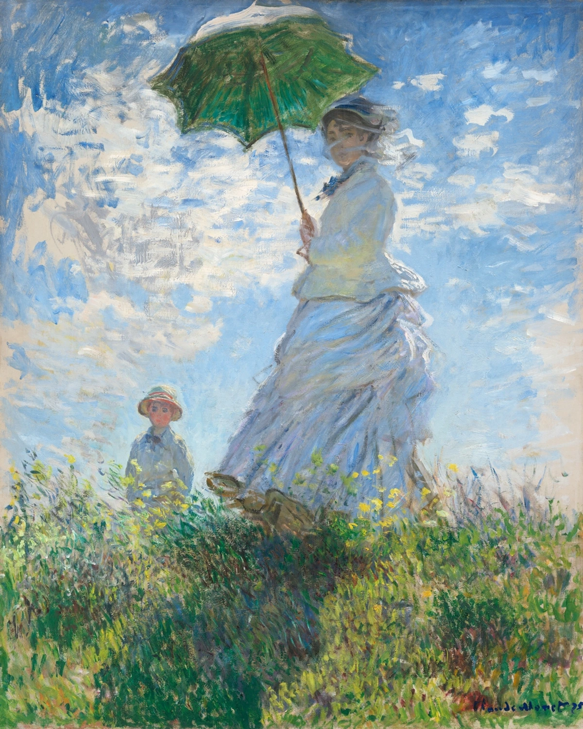
This wasn't just lab science; it was practical magic for artists. Suddenly, the Impressionists, like the master Claude Monet, could truly make their canvases shimmer. Informed by Chevreul's insights, they masterfully used complementary colors and broken brushstrokes – applying individual dabs of pure color side-by-side rather than mixing them on the palette – to capture the fleeting effects of light and atmosphere. The viewer's eye then optically blended these distinct colors, resulting in those breathtaking, vibrant moments where sunlight feels tangible and shadows pulsate with unexpected color. This truly revolutionized how artists approached their palettes, leading to movements like Impressionism and beyond, pushing the boundaries of what paint could convey.
Bridging to Expression: The Post-Impressionist Shift
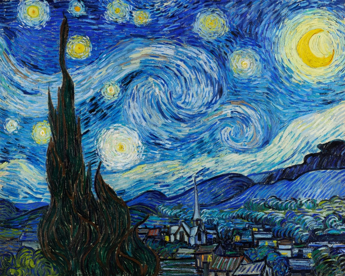
As the Impressionists captured light, a new wave of artists, the Post-Impressionists, began to build upon or react against their techniques, pushing color beyond mere representation into the realm of personal expression and symbolism. Artists like Vincent van Gogh used color with an almost feverish intensity, employing bold, non-naturalistic hues to convey emotion directly, transforming landscapes into fiery expressions of his inner world. Think of his swirling, vibrant night skies, where blues and yellows aren't just colors, but feelings made visible – pure, unadulterated emotional transcription onto the canvas. His work, like that of many Post-Impressionists, paved the way for a more subjective and expressive use of color, marking a significant departure from purely optical concerns.
Others, like Georges Seurat, took a more scientific, almost meticulous approach. He applied small, distinct dots of pure color (a technique known as Pointillism) informed by color theory and Chevreul's principles of optical mixing. His reliance on the viewer's eye to optically blend these individual dots into luminous, shimmering scenes created a distinct visual vibration – another form of "optical buzz" – often resulting in scenes that felt both monumental and ephemeral. This pivotal period truly began to liberate color, laying the groundwork for the radical shifts that would define modern art.

Modern Art Embraces Color: From Fauvism to Abstraction
While the Impressionists and Post-Impressionists began to stretch the boundaries of color's descriptive role, the early 20th century saw artists truly liberate it. This is where things get really fun. After all that scientific and perceptual groundwork, modern artists decided, "You know what? We're going to use color to punch you in the gut (in a good way)!" The early 20th century was a playground of color exploration.
Fauvism: The Wild Beasts of Color
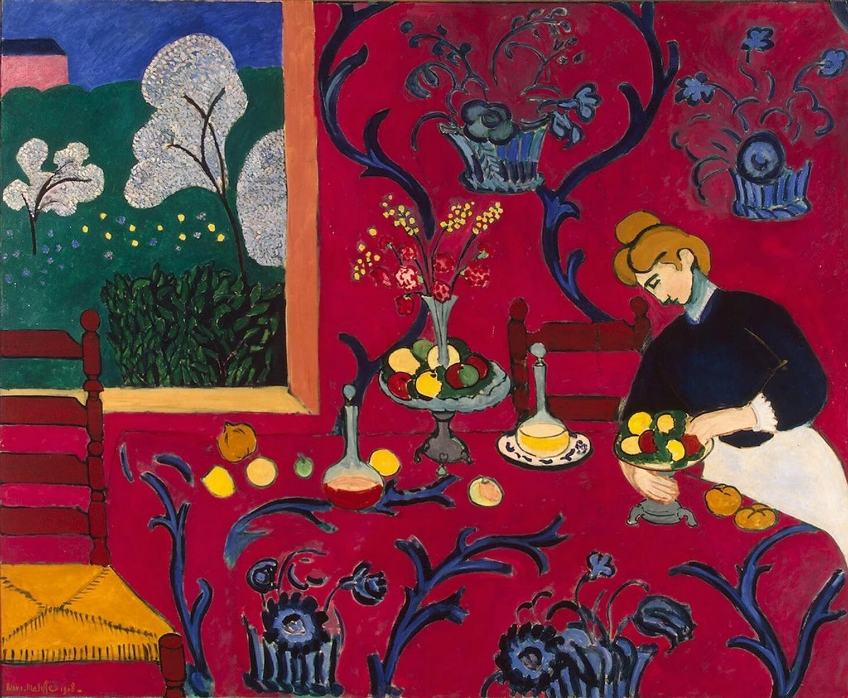
Fauvists, for example, led by artists like Henri Matisse and André Derain, threw out the rulebook. They used color not to describe reality but to express raw emotion and mood, directly applying paint from the tube in bold, non-naturalistic, or arbitrary hues. Matisse, bless his vibrant soul, used hues that made you feel the heat, the joy, the dance of life, even if the trees weren't literally blue. His "Red Room" isn't red because the room was red; it's red because it feels red—evoking an overwhelming sense of warmth and intensity. It's an explosion of emotion, a pure, unadulterated embrace of color's power. This period truly redefined the history of modern art and ushered in an era where color could be its own subject.
The Spiritual and Symbolic: Kandinsky's Vision
Then came Wassily Kandinsky, a pioneer of abstract art. He wasn't just expressing emotion; he was searching for the spiritual in color, believing that colors could resonate within the soul, creating a "spiritual vibration." For him, yellow was aggressive and earthly, while blue was heavenly and profound. If you've ever stood in front of an abstract piece and felt an inexplicable pull or surge of feeling, you're experiencing a bit of Kandinsky's legacy. He opened the door to decoding abstract art by emphasizing its inner resonance and creating a visual language that transcended the literal.

Mondrian and the Pure Geometry of Color
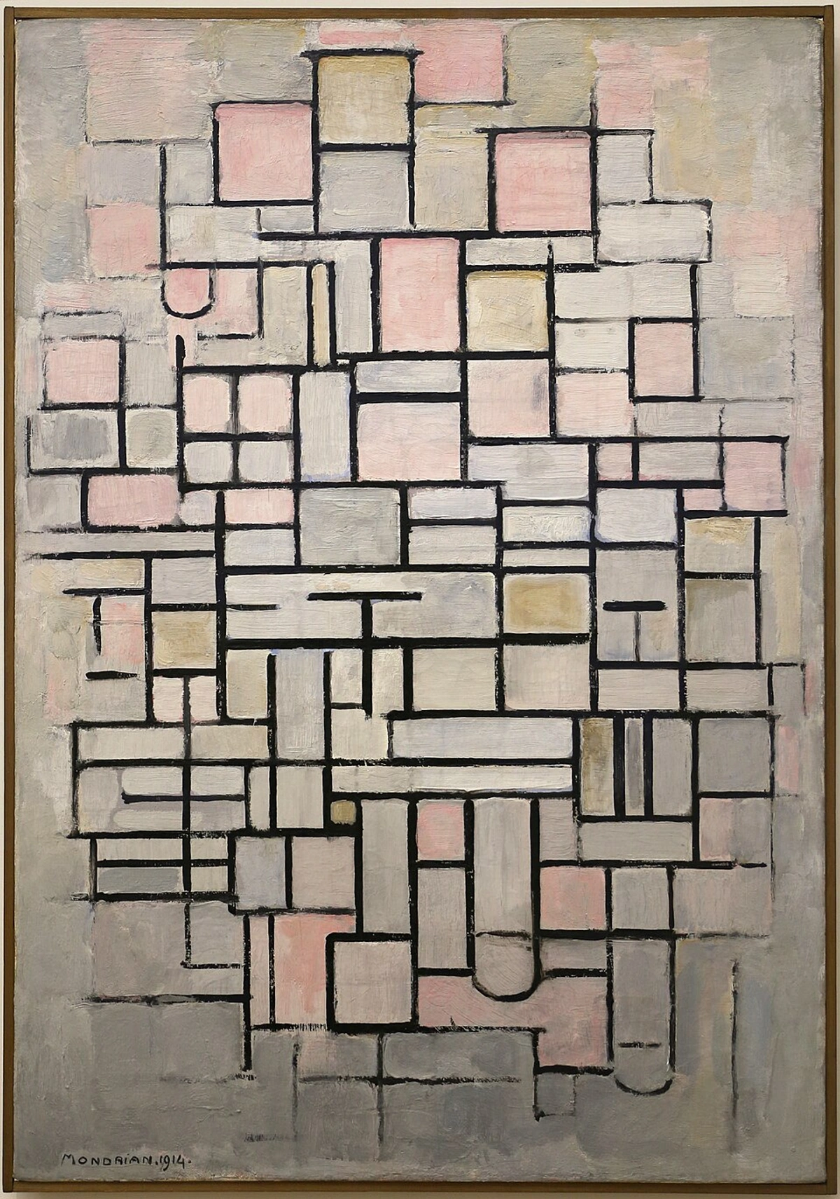
And what about Piet Mondrian? He took color theory to its absolute purest form with his De Stijl movement. For Mondrian and his contemporaries, the reduction to primary colors (red, yellow, blue) and non-colors (black, white, gray) was a quest for universal harmony, balance, and order in a chaotic world. He believed these fundamental elements were the purest expression of reality and could achieve a spiritual equilibrium. It was a rigorous, almost ascetic, approach, proving that even with the most basic elements, you could create profound statements. For someone like me, who sometimes gets overwhelmed by too many choices in a paint store (a common affliction, I assure you – a moment of artistic paralysis, perhaps), Mondrian's elegant simplicity is a calming beacon, a reminder that true expression often lies in distillation, in cutting through the noise.
Foundational Concepts: Understanding the Language of Color
Before we dive deeper into contemporary applications, it's worth revisiting some foundational concepts that underpin much of this historical evolution. Understanding them is like learning the grammar of color, giving us the vocabulary to articulate and interpret artistic intent.
The Color Wheel: A Visual Map
The color wheel is a timeless tool that organizes colors based on their relationships to one another.
- Primary Colors: Red, yellow, and blue – the three fundamental hues from which all other colors can theoretically be mixed. They are the un-mixables, the elemental forces, the starting point of any palette.
- Secondary Colors: Orange, green, and purple – created by mixing two primary colors. These are the first step in the chromatic conversation, forming the bridge between primaries.
- Tertiary Colors: Colors like red-orange or blue-green, formed by mixing a primary and a secondary color. This is where the subtleties begin to emerge, expanding the color spectrum with nuanced variations.
Beyond Pure Hue: Value, Saturation, and Tone
Beyond the pure color (or hue) itself, we also talk about:
- Hue: The pure color itself (e.g., red, blue, green). It's the most basic identity of a color.
- Saturation (or Chroma): The intensity or purity of the color (how vivid or dull it is). A highly saturated color is vibrant and rich, while a desaturated color appears muted or grayish.
- Value (or Lightness/Darkness): The lightness or darkness of a color (how much white or black it contains).
- Tints: Created by adding white to a pure hue, making it lighter (e.g., pink is a tint of red).
- Shades: Created by adding black to a pure hue, making it darker (e.g., maroon is a shade of red).
- Tones: Created by adding gray (both white and black) to a pure hue, making it softer or muted.
These seemingly simple definitions are the essential vocabulary that allows artists to articulate their visions and control the emotional and perceptual impact of their work. They're the silent rules that all the artists we've discussed, whether consciously or instinctively, have played with, bent, or entirely reimagined.
Bridging Theory and Practice: Josef Albers' Interactions
While Mondrian sought universal harmony through primary reduction, artists continued to dissect how colors truly behave when put next to each other, diving deeper into their relational dance. Josef Albers, a German-American artist and educator, became a master of this. His iconic 'Homage to the Square' series isn't just about squares; it's a lifelong exploration of color interaction. He'd show how the same gray square could appear vibrant blue or dull green, simply by changing the colors it was nested within. It's a testament to the idea that color is profoundly relational, constantly shifting our perception. For a mind like mine, which finds endless joy in how a seemingly simple choice of hue can dramatically alter a painting's emotional landscape, Albers’ work is a foundational text, a quiet whisper that still echoes in my studio, reminding me that no color truly exists in isolation.
Contemporary Color: My Own Journey – A Dialogue with History
All these incredible journeys into color – from Newton's scientific dissection to Goethe's emotional maps, Chevreul's optical interactions, and Albers' perceptual experiments – have profoundly shaped how I approach my own canvas. When I'm working in my studio, often surrounded by the unique, soft light of 's-Hertogenbosch and the quiet hum of history from my nearby museum, I'm not just picking colors; I'm engaging in a direct, palpable dialogue with centuries of thought. It feels less like painting and more like conducting a historical symphony with pigments.
Sometimes, when mixing a new shade, I think of Goethe's atmospheric hues, aiming for that specific emotional depth – perhaps striving for a blue that embodies both calm and a hint of longing. I remember a particular challenge with my 'Azure Depths' series: I wanted a sense of intense, almost suffocating, underwater pressure, but also a glimmer of hope. I consciously placed a vibrant orange next to a deep indigo. I recall thinking of Chevreul, how he observed the optical buzz of complementary colors. That orange didn't just sit there; it vibrated, making the indigo feel even more profound and drawing the viewer's eye into an unexpected energy – exactly the kind of hopeful tension I was seeking. It's that moment when theory becomes visceral, a pure 'aha!' experience, a validation of those historical whispers.
Or there are times, when facing a creative block (it happens to all of us, believe me, a blank canvas can feel like a silent judgment), I recall Mondrian’s elegant simplicity. It reminds me to distill to the essence, to find the power in primary shapes and hues. It's a cleansing, almost meditative, process that helps me cut through the noise, to remember that sometimes, less is profoundly more. Every stroke, every blend, is a conscious decision, infused with my personal history and artistic timeline, aiming to evoke a feeling, a memory, or simply a moment of pure visual joy. It's a constant process of experimentation, of seeing how these timeless theories manifest in a contemporary context, often leading to bold abstract expressionist paintings that are a direct result of this ongoing conversation with history. If you're curious to see how these ideas translate into my contemporary pieces, where the act of how artists use color becomes a personal dance with history, you can always explore my art for sale. What colors speak to you the most, and why? I genuinely love hearing about people's personal connections to color; it adds another layer to this beautiful, complex language.

The Ever-Evolving Canvas of Color Theory: A Continuous Unfolding
The journey of color theory is far from over. For me, it's a continuous, exhilarating conversation between science and art, objectivity and subjectivity, structure and freedom. From Newton's prism revealing the secrets of light to Goethe's exploration of psychological impact, Chevreul's insights into optical interactions, and Albers' perceptual experiments, this evolution reminds us that even the most fundamental aspects of our world hold endless layers of discovery. It’s a beautifully human story, really, full of curiosity, debate, and ultimately, a richer understanding of ourselves and the vibrant world we paint.
As an artist, I continue to explore this evolving canvas, one brushstroke at a time, sometimes struggling, sometimes soaring, always learning. The conversation continues, and I, for one, am excited to see where the next brushstroke of understanding takes us, both in the studio and beyond. Perhaps it will be new digital applications, or a deeper appreciation for the simple, profound beauty of a perfectly placed hue, or even an entirely new way to perceive the "moral effects" of color in our ever-changing world. It's a journey, after all, and I invite you to keep exploring its depths.
FAQ: Unpacking the Hues
Q: Who first defined color theory scientifically?
A: While artists and philosophers discussed color for centuries, Isaac Newton is generally credited with the first scientific definition of color theory in the 17th century when he demonstrated that white light is composed of a spectrum of colors, laying the empirical groundwork for its study.
Q: How did Impressionists use color theory in their paintings?
A: Impressionists were heavily influenced by Michel Eugène Chevreul's work on simultaneous contrast. They used this understanding to place complementary colors next to each other, making them appear more vibrant and creating optical mixtures that captured the fleeting effects of light and atmosphere. Check out our ultimate guide to Impressionism for more.
Q: What is the role of color in modern abstract art?
A: In modern abstract art, color moved beyond mere description to become a primary vehicle for expression, emotion, and spiritual meaning. Artists like Kandinsky used color to evoke feelings, while Mondrian used primary colors in a quest for universal harmony and order. To dive deeper, read decoding abstract art.
Q: What is the psychological and cultural impact of color in art?
A: Color profoundly influences our mood and emotions. For example, warm colors like red and yellow can evoke feelings of energy or passion, while cool colors like blue and green often bring a sense of calm or serenity. Beyond mood, colors also carry rich cultural and symbolic meanings that vary across societies and time. Artists like Goethe and Kandinsky were pioneers in exploring this subjective, psychological dimension of color. For more, explore our definitive guide to color theory in art.
Q: What's the difference between additive and subtractive color mixing?
A: Additive color mixing involves combining colored lights (like red, green, and blue light in a screen) to create other colors, with all three together producing white light. Subtractive color mixing, on the other hand, involves mixing pigments (like paints or inks – typically cyan, magenta, and yellow), where each added pigment absorbs more light, resulting in darker colors, with all three together ideally producing black.
Q: What are complementary colors and why are they important in art?
A: Complementary colors are pairs of colors that are opposite each other on the color wheel (e.g., red and green, blue and orange, yellow and purple). When placed next to each other, they create maximum contrast and visual intensity, making both colors appear more vibrant. This "optical buzz" was heavily utilized by artists like the Impressionists and Post-Impressionists to create dynamic and luminous effects.
Q: How does light affect color perception in painting?
A: Light plays a crucial role in how we perceive color. The type of light (natural vs. artificial), its intensity, and its color temperature (warm like candlelight, cool like fluorescent) can all dramatically alter how a pigment appears. Artists must consider these factors, often adjusting their palette to capture the specific light conditions of a scene. This is why a color might look different in a gallery than in your home, and why artists often speak of "light and shadow" as much as "color."
Q: Where can I learn more about the psychology and history of color in art?
A: For a comprehensive exploration, I recommend our definitive guide to color theory in art, which covers everything from pigments to psychological impact and historical movements. It's a great next step on your own journey through the language of light.