The Art of Skin: A Curator's Guide to Mixing Realistic Oil Paint Tones
Unlock the secrets to lifelike skin tones in oil paint with this expert guide. Learn essential palettes, undertones, and mixing techniques from a curator's perspective to bring your portraits to life.
The Art of Skin: A Curator's Guide to Mixing Realistic Oil Paint Tones
I remember the first time I truly saw skin in a painting – not just observed it, but felt the warmth, the subtle pulse, the very breath of it. It wasn't in some grand museum, but a small, unassuming portrait at a local gallery. The artist hadn't just used paint; they'd conjured life. And I thought, "How did they do that?" That question has stayed with me, guiding my observations as a curator, and, I admit, fueling my own fumbling attempts at the easel.
Our journey through art has shown me many things, but one constant challenge that resonates with artists, from masters to emerging talents, is the elusive nature of realistic skin tones in oil paint. It’s a subject that often conjures images of endless tubes of pre-mixed “flesh” colors that never quite hit the mark. As a curator, I’ve had the privilege of studying countless works where artists have not just painted skin, but captured life within it. This isn't about finding a magic formula; it’s about understanding the subtle symphony of colors that truly brings a portrait to life.---## Beyond the "Flesh Tone": Understanding the SpectrumForget the notion of a single, universal "flesh tone." Human skin is a wondrous tapestry of color, constantly shifting with light, environment, and even emotion. What I've observed across centuries of painting is that the most compelling skin tones are never monochromatic. They are a complex interplay of reds, yellows, blues, and even greens, all working in harmony. Think of it less as mixing a specific color, and more as understanding how these elemental hues interact to create the illusion of living tissue.
Now, I'm no biologist, but understanding a tiny bit about what actually gives skin its color can be immensely helpful. Essentially, you're looking at three main components playing a constant, subtle dance beneath the surface: melanin, which gives us those beautiful warm browns and yellows; hemoglobin (the stuff that makes blood red), which contributes to those lovely pinks and reds, especially when it's closer to the surface; and carotene, adding hints of yellow and orange. It’s this complex interplay, reacting to light and shadow, that we’re trying to mimic with our tubes of paint.
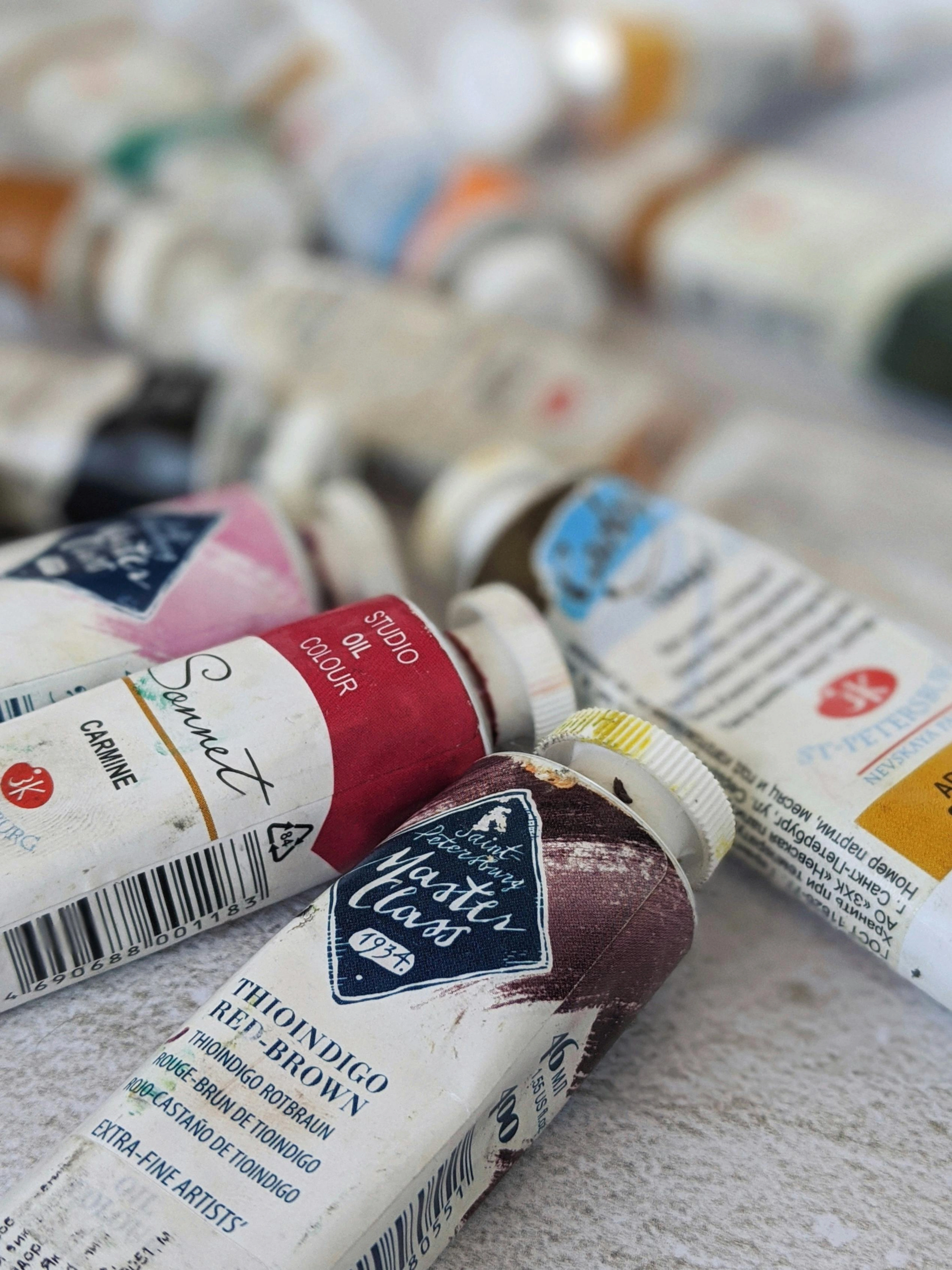
This deeper understanding is crucial for any artist looking to master their craft, much like comprehending the broader principles of how artists use color in their work.---## The Curator's Essential Palette for SkinWhen approaching skin tones, I recommend starting with a foundational palette that offers versatility. These aren't just colors; they are tools that allow you to sculpt light and shadow, warmth and coolness, into your subject. Here’s what I consider indispensable for oil painters: * Titanium White: Your primary lightener, providing opacity and luminosity.* Yellow Ochre: This is often the anchor of your warm tones, offering an earthy, subtle yellow that is less aggressive than a pure cadmium yellow.* Cadmium Red Light (or Vermilion Hue): For the flush of life—the delicate reds in cheeks, lips, and fingertips. Use sparingly.* Burnt Sienna: An invaluable warm brown, perfect for adding depth to shadows and conveying warmer undertones.* Ultramarine Blue: Your go-to for introducing coolness, neutralizing overly warm mixes, and suggesting the subtle blues of veins or reflected sky light.* Raw Umber: A cool, earthy brown excellent for deeper shadows, toning down overly bright mixes, or creating subtle shifts in value.
Essential Mediums: Beyond Just Paint
Just as important as your chosen colors are the mediums you use to manipulate them. Think of them as the secret ingredients that allow you to achieve those luminous glazes or rich impasto textures in skin. My go-to choices for skin tones typically include:
- Linseed Oil: A classic, increasing flow and transparency, and giving a lovely, subtle sheen. Use it sparingly though, or your paint can become too oily and take ages to dry.
- Stand Oil: Thicker than linseed, it creates a smooth, enamel-like finish and is fantastic for glazing, though it does slow drying time considerably.
- Liquin (or similar alkyd mediums): For those of us who lack the patience of the Old Masters (and let's be honest, who doesn't?), alkyd mediums significantly speed up drying time and improve paint flow without compromising stability. Great for building up layers quickly.
- Gamsol (or odorless mineral spirits): While not a painting medium itself, a good, low-odor solvent is essential for thinning paint for initial washes or for cleaning brushes. Don't let it become a substitute for actual painting mediums when you want to build up layers.---
 https://www.pexels.com/photo/artist-brush-mix-color-oil-painting-8382705/, https://creativecommons.org/public-domain/cc0/## The Crucial Role of Undertones: Warm, Cool, NeutralThe secret to convincing skin tones lies in identifying and responding to your subject's undertone. This is the subtle color that influences the overall hue of the skin, distinct from surface variations like tan or blush. I categorize them broadly as:* Warm Undertones: Often appear peachy, golden, or yellowish. Artists tend to lean more into yellows and warm reds for these.* Cool Undertones: Present as pink, rosy, or bluish. Here, subtle blues and cooler reds become more prominent.* Neutral Undertones: A balance of both, allowing for a broader range of color expression.To discern undertones, I encourage artists to observe their subject in natural light, comparing the skin against a white cloth. Look for the dominant subtle color.
Here’s a little trick I often recommend: observe the veins on the inside of the wrist. If they appear more greenish, you're likely seeing warm undertones. If they lean towards blue or purple, cool undertones are probably at play. And if you can't quite tell, a neutral undertone might be your subject’s truth – lucky them, they get to play with a wider spectrum! This subtle observation forms the bedrock for your initial color decisions and is a key principle in understanding color theory, which, if I'm being honest, is probably the most important 'element' when it comes to capturing life on canvas.---## My Approach to Building a Skin Tone BaseOnce you've identified the undertone, the mixing begins. ### Preparing Your Canvas: The Toned Ground Before you even touch your skin tones, consider preparing your canvas with a toned ground. This isn't just an old master's trick; it genuinely helps. Instead of starting on stark white, which can trick your eye into overcompensating with dark or overly saturated colors, a mid-tone ground (think a neutral grey, a warm earth tone like Burnt Sienna, or a cool Raw Umber) provides a much better starting point. It helps unify your painting and gives your skin tones something to "pop" against right from the get-go. Plus, honestly, it just feels less intimidating than a blank white canvas, doesn't it?
My method involves building layers, much like the intricate details you might find in a museum piece. Here's a general roadmap:### 1. The Core MixStart with a generous dollop of Titanium White on your palette. Gradually introduce Yellow Ochre and a tiny touch of Cadmium Red Light. Mix this thoroughly. This provides a basic, warmish starting point.### 2. Adjusting for Undertone and HueThis is where nuance truly enters.* For warmer skin: Add more Yellow Ochre and a touch more Cadmium Red Light. You might even introduce a tiny speck of Burnt Sienna.* For cooler skin: Counteract the warmth with a minuscule amount of Ultramarine Blue. Be incredibly conservative here; blue is powerful. A tiny touch of Raw Umber can also cool and mute the color.* To dull or neutralize: If the mix feels too vibrant, a hint of its complementary color will tone it down. For instance, a touch of green (mixed from yellow and blue) can neutralize excessive redness.### 3. Achieving the Right Value and ChromaConsider your light source and the overall value (lightness or darkness) of the skin.* For highlights: Add more Titanium White.* For mid-tones and shadows: Introduce Raw Umber or Burnt Sienna for depth. Remember, shadows are rarely just darker versions of the mid-tone; they often shift in hue and temperature. This complex interplay is fundamental to composition in art.---## The Dance of Light and ShadowOne of the most common pitfalls I've observed is painting shadows with merely darker versions of the base skin tone. In reality, shadows often become cooler and absorb reflected light from the environment.
And speaking of environment, the light source itself is a huge, often underestimated, player. Are you painting under warm indoor lighting, which will bring out more yellows and reds in the skin? Or is your subject bathed in cooler, diffused natural light from a window, which might emphasize subtle blues and greens? I've seen countless paintings where the artist perfectly captured the local color of the skin, but the overall feeling was off because they didn't account for the temperature and quality of the light. It's like listening to a symphony and only hearing the violins; you're missing half the story.* Highlights: Tend to be lighter, and can sometimes pick up cooler tones (e.g., from overhead natural light or a cool ambient light).* Mid-tones: This is your primary skin tone, varied by local color.* Shadows: Often deepen with warmer hues (like Burnt Sienna, or a mix of Ultramarine Blue and Burnt Sienna) and can reflect colors from nearby objects. A common mistake is using black; it deadens skin tones. Instead, create deep, rich darks by mixing Ultramarine Blue and Burnt Sienna, or Raw Umber and Ultramarine Blue.---## Adding the Breath of Life: Nuance and SubtletyTrue realism in skin comes from acknowledging its living, breathing qualities.* Rosiness: Delicate touches of Cadmium Red Light or even Alizarin Crimson (used very thinly) can create the illusion of blood beneath the surface, especially in cheeks, knees, and elbows.* Veins: A tiny speck of Ultramarine Blue, perhaps mixed with a hint of white or green, applied with a very fine brush and then subtly glazed over, can suggest the faint presence of veins.* Imperfections: Don't shy away from subtle moles, freckles, or scars. These details add character and authenticity.* Skin Texture and Age: Don't forget that skin isn't a perfectly smooth, uniform surface. Subtle pores, fine lines, and even wrinkles (when appropriate) add immense realism and character. For younger skin, these might be minimal, implied with very delicate shifts in value. For older subjects, embracing the texture and narrative of aged skin can be incredibly powerful. A delicate scumble of a very thin, slightly lighter color can suggest texture without painting every single pore.
- Reflected Light: Observe how light from surrounding objects or clothing casts a subtle hue onto the skin. These small, often overlooked details are what transform a painting from a flat representation into a vibrant study. Mastering these kinds of subtle applications is where the definitive guide to oil painting techniques can offer further insights, especially regarding layering and blending.---## Practical Tips from the Studio
 https://www.publicdomainpictures.net/pictures/250000/nahled/messy-colorful-artists-palette.jpg, https://creativecommons.org/publicdomain/zero/1.0/
From my perspective, the most invaluable lessons come from consistent practice and keen observation.1. Observe Relentlessly: Look at real skin in various lighting conditions. Pay attention to how light falls, where shadows form, and the subtle color shifts.2. Mix on the Palette: Always premix a range of skin tones on your palette before applying them to the canvas. This gives you control and consistency.3. Layer Thinly (Glazing): Oil paints are ideal for building up translucent layers. Mastering glazing techniques in oil painting allows light to pass through the layers, creating a luminous, lifelike quality that mimics the skin's own translucency.4. Practice Studies: Don't expect perfection on your first portrait. Dedicate time to small studies of hands, feet, or faces to experiment with color mixes and lighting.--- https://images.pexels.com/photos/4139739/pexels-photo-4139739.jpeg, https://creativecommons.org/public-domain/## Frequently Asked Questions**Q: Can I use pre-mixed "flesh tone" paints?**A: While convenient, pre-mixed tubes often lack the nuanced complexity needed for truly realistic skin. I encourage artists to mix their own; it fosters a deeper understanding of color and provides far greater control over the final result. However, they can serve as a starting point to be heavily modified. **Q: How do I make skin tones look less "muddy"?**A: Muddy colors usually result from overmixing too many colors or using colors that are too desaturated without purpose. Focus on using a limited, clean palette, mixing only two or three colors at a time, and relying on layering rather than excessive blending on the palette. Keep your brushes clean!**Q: How do I make skin look luminous or "glow"?
A: Ah, the elusive glow! Often, luminosity comes from careful layering and the interplay of warm and cool colors, rather than just adding white. Use thin glazes of slightly warmer, more saturated colors in the mid-tones, and ensure your highlights have a crisp, bright, but not necessarily pure white, quality. The key is to make the light appear to emanate from the skin, not just sit on it. Sometimes, a tiny touch of a very light, warm yellow or peach in your highlights can do wonders for creating that luminous effect.
https://images.pexels.com/photos/4139739/pexels-photo-4139739.jpeg, https://creativecommons.org/public-domain/## Frequently Asked Questions**Q: Can I use pre-mixed "flesh tone" paints?**A: While convenient, pre-mixed tubes often lack the nuanced complexity needed for truly realistic skin. I encourage artists to mix their own; it fosters a deeper understanding of color and provides far greater control over the final result. However, they can serve as a starting point to be heavily modified. **Q: How do I make skin tones look less "muddy"?**A: Muddy colors usually result from overmixing too many colors or using colors that are too desaturated without purpose. Focus on using a limited, clean palette, mixing only two or three colors at a time, and relying on layering rather than excessive blending on the palette. Keep your brushes clean!**Q: How do I make skin look luminous or "glow"?
A: Ah, the elusive glow! Often, luminosity comes from careful layering and the interplay of warm and cool colors, rather than just adding white. Use thin glazes of slightly warmer, more saturated colors in the mid-tones, and ensure your highlights have a crisp, bright, but not necessarily pure white, quality. The key is to make the light appear to emanate from the skin, not just sit on it. Sometimes, a tiny touch of a very light, warm yellow or peach in your highlights can do wonders for creating that luminous effect.
**Q: What about painting different ethnicities?**A: The principles remain the same: observe undertones, respond to light and shadow, and build layers. The essential palette I’ve outlined is incredibly versatile; you’ll simply adjust the ratios of yellows, reds, and browns. For instance, darker skin tones will use more Raw Umber, Burnt Sienna, and potentially darker reds, while still requiring touches of white for highlights and blues for cool reflections. It's always about observing the unique individual, not just a generic category.---## ConclusionMastering realistic skin tones in oil paint is a profound artistic endeavor. It asks you to not just see, but to interpret the delicate dance of light, the subtle blush of life, and the unique story etched onto every surface. Through careful observation, a thoughtful palette, and dedicated practice, you'll move beyond mere representation to truly capturing the essence of your subject. It's a journey of patience, but one that is immensely rewarding. Remember, every stroke is an act of observation, every mixed color a step closer to understanding the beautiful, chaotic symphony of life. So keep looking, keep experimenting, and don't be afraid to make a "mistake" – sometimes those are where the real breakthroughs happen. Perhaps it’s this dedication to craft that ultimately shapes an artist's unique timeline and vision. Should you find yourself inspired to explore the expressive power of color further, I invite you to discover a range of artworks available for purchase, or visit our collection at the museum in 's-Hertogenbosch to witness the beauty of captured life firsthand.


