How to Create a Stunning Gallery Wall: My Personal Guide to Choosing Art
Dreaming of a gallery wall? I'll share my practical, slightly unconventional approach to choosing art, mixing styles, and arranging pieces for a truly unique and personal display in your home.
How to Choose Art for a Gallery Wall: My Quirky, Personal Approach
Okay, let's be honest. The idea of a "gallery wall" can feel a little... intimidating, right? Like it's reserved for interior designers with impossibly chic homes and an endless budget for vintage frames. I used to think that too, and my first attempt looked less like a curated collection and more like a desperate attempt to cover a very large, very blank patch of wall. It was a hot mess, frankly. But, like most things in life, I’ve learned that the beauty of it isn’t in perfection, but in the process, and in making it truly yours. It's a journey, a visual diary of your life, and who better to embark on it with than a fellow creative who believes in a little beautiful chaos?
This isn't about following rigid rules; it's about embracing your personal narrative and letting your wall tell a story. Think of me as your slightly chaotic, coffee-fueled guide to creating something that feels authentic and looks fantastic, even if you, like me, occasionally hang things a little crooked. Every piece, every memory, every splash of color should contribute to a vibrant, evolving tapestry that whispers 'you' to anyone who walks by.
Why a Gallery Wall? More Than Just Decoration
So, why bother with a gallery wall? Beyond just filling a blank space (though it's brilliant for that!), a well-curated gallery wall is a powerhouse of personality. It’s an instant conversation starter, a visual diary of your travels, passions, and loved ones. It breaks away from the sterility of single, large art pieces, offering a dynamic display that can evolve with you over time. It transforms a simple wall into a narrative, and isn't that what every home truly needs – a story?
https://mastersatart.com/, https://creativecommons.org/licenses/by-nc/4.0/
Lighting Your Masterpiece: Illuminating Your Gallery Wall
You’ve carefully selected, arranged, and hung your treasures. Now, let’s make them sing. The right lighting can transform a good gallery wall into a truly spectacular one, highlighting textures, intensifying colors, and creating a dramatic focal point. Don’t let your art hide in the shadows!
Natural Light: The Ever-Changing Spotlight
Harnessing natural light is often the most beautiful (and free!) way to illuminate your art. Observe how the light shifts throughout the day – does your wall get soft morning light, or vibrant afternoon sun? Be mindful of direct, harsh sunlight, however, as it can fade delicate artworks over time. Consider UV-protective glass for particularly cherished pieces.
Picture Lights: A Touch of Elegance
For a classic, sophisticated look, individual picture lights mounted above specific frames are hard to beat. They draw attention to individual pieces, adding a touch of old-world gallery charm. Modern options include battery-operated versions, making installation a breeze without needing an electrician.
Spotlights or Track Lighting: Dramatic Flair
If you want to make a bold statement, spotlights or track lighting can create dramatic effects. Adjustable fixtures allow you to direct light precisely onto your favorite pieces, accentuating their textures and details. This works particularly well in larger rooms or areas where you want to create an intentional, curated ambiance.
The Core Principle: It's All About You (and a Little Bit of Chaos)
I know what you're probably thinking: "But what art should I choose?" And my answer, which might sound a bit unhelpful at first, is: "Whatever makes your heart sing." Seriously. A gallery wall is perhaps the most personal decorating statement you can make. It's not about what's trendy, what's 'investment-worthy,' or what someone else thinks is "good art." It's about building a visual autobiography, a tapestry of joy and memories. Forget gallery-ready aesthetics; focus on gut feelings. After all, art in your home should first and foremost resonate with you.
I once spent an embarrassing amount of time trying to pick "the right" piece for a prominent spot, convinced it needed to be profound. I stressed over themes and color palettes, only to eventually go with a silly doodle my niece made – a lopsided, vibrant sun. And you know what? It brings me more joy every single day than any expensive print ever could. So, don't overthink it. If you love it, it belongs. This philosophy extends to your entire home, really; I often tell people that decorating your home should always start and end with what you genuinely connect with, creating a space that feels like a warm, comforting hug.
Step 1: Gather Your Treasures (and Potential Treasures)
Before you even think about hammers and nails, let's play detective. What do you already have?
- Art prints and paintings: Of course. These are the obvious candidates. Maybe you've got some abstract pieces that would add a pop of color, or perhaps something more muted.
- Photographs: Family snapshots, travel memories, candid moments. These add an incredibly personal touch, especially when printed well. Don't overlook downloadable digital prints from independent artists – an affordable way to add unique art!
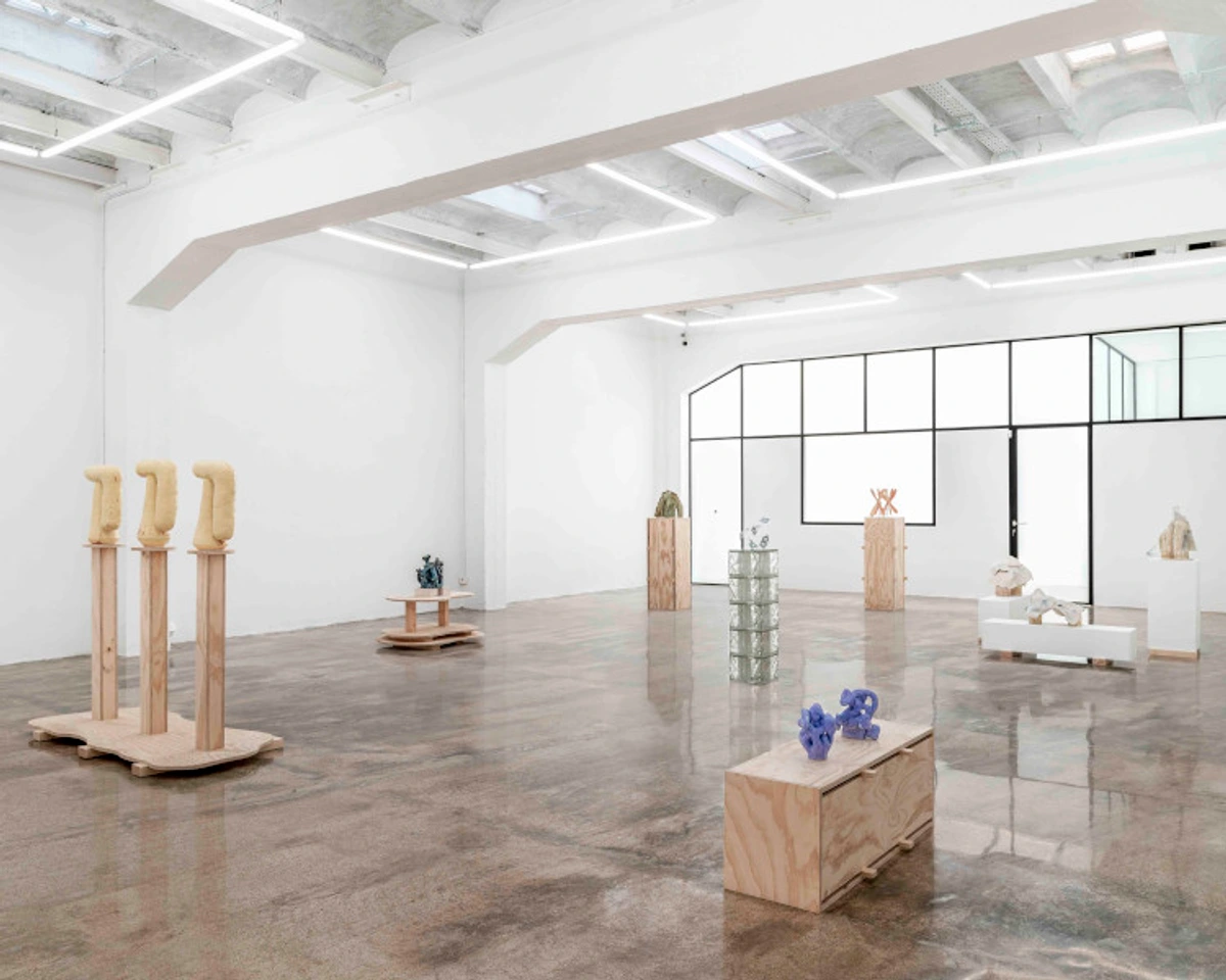
- Objects: Small mirrors, decorative plates, a vintage sign, cool textiles, old maps, concert posters, or even a particularly cool piece of driftwood. Yes, really! If it can be hung securely and sparks joy, it can be part of your story. Think outside the box, hunt at flea markets, browse Etsy for local artisans, or even explore estate sales.
- Mementos: Concert tickets, postcards, children's drawings (framed, of course, to elevate them!), vintage stamps, or even beautifully designed product packaging you can’t bear to throw away.
Beyond the Canvas: Unexpected Finds
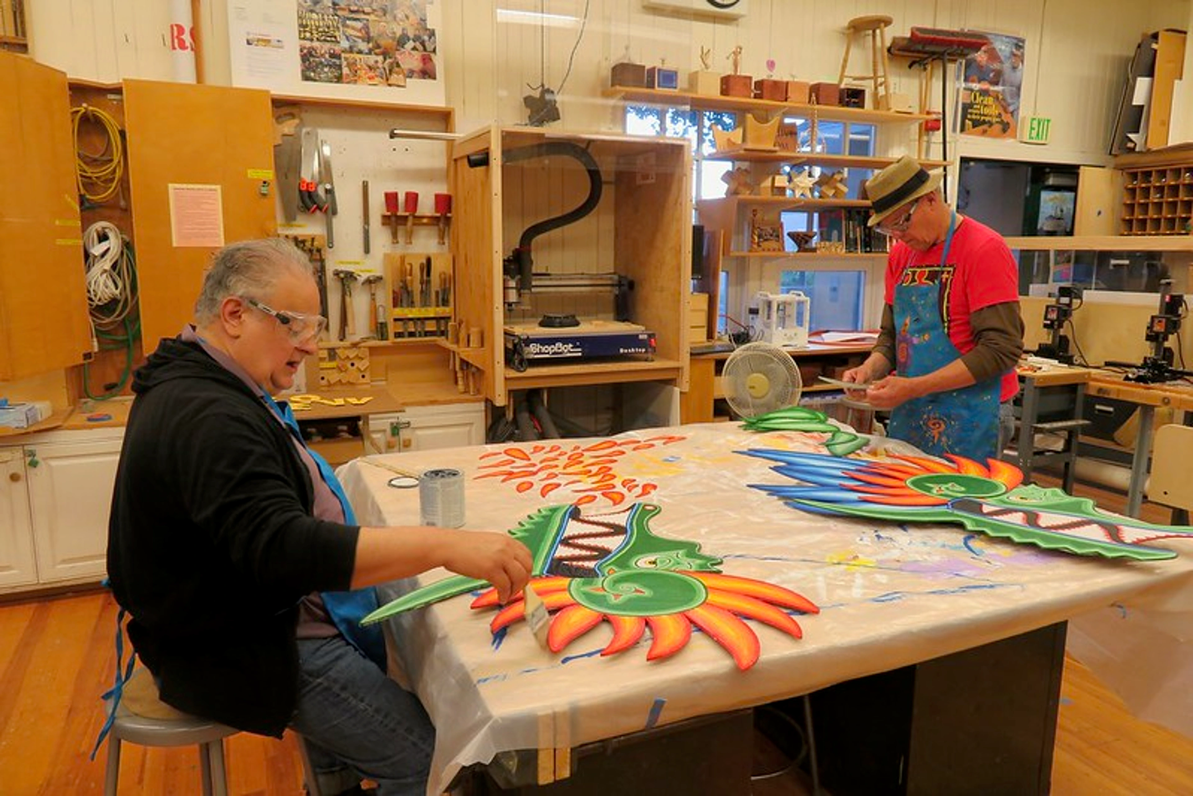
This is where the fun truly begins for me. A gallery wall isn't a stuffy museum display; it's an opportunity to showcase your personality in the most unexpected ways. I've seen walls adorned with antique keys, pressed flowers, embroidered hoops, and even repurposed architectural salvage. The key is to see beauty and narrative in everyday objects. Could that vintage spoon collection become a sculptural element? Absolutely! The more unexpected, often the more delightful.
Don't limit yourself to things that are specifically "art." My own wall has everything from a formal portrait to a faded map from a hiking trip. The goal here is quantity and variety. You're building a collection, not just hanging a few pictures.

https://freerangestock.com/photos/177284/artists-workspace-filled-with-paint-brushes-and-supplies.html, https://creativecommons.org/public-domain/cc0/
If you're looking to start or expand your collection, I always recommend taking a peek at the kind of pieces I create – you might find something that sparks joy in my collection.
Framing Found Objects
So you’ve got that cool vintage postcard or that quirky, irregular piece of driftwood. How do you integrate it? This is where creative framing comes in. Shadow boxes are your best friend for three-dimensional objects, allowing them to truly pop. For flat but oddly shaped items, consider floating them on a mat board within a standard frame, or even creating a custom-cut mat. Don't let unconventional shapes deter you; they often add the most character!
https://www.widewalls.ch/magazine/antoni-ferrer-interview, https://creativecommons.org/licenses/by/4.0/
Step 2: Finding Your Thread – Theme or Feeling?
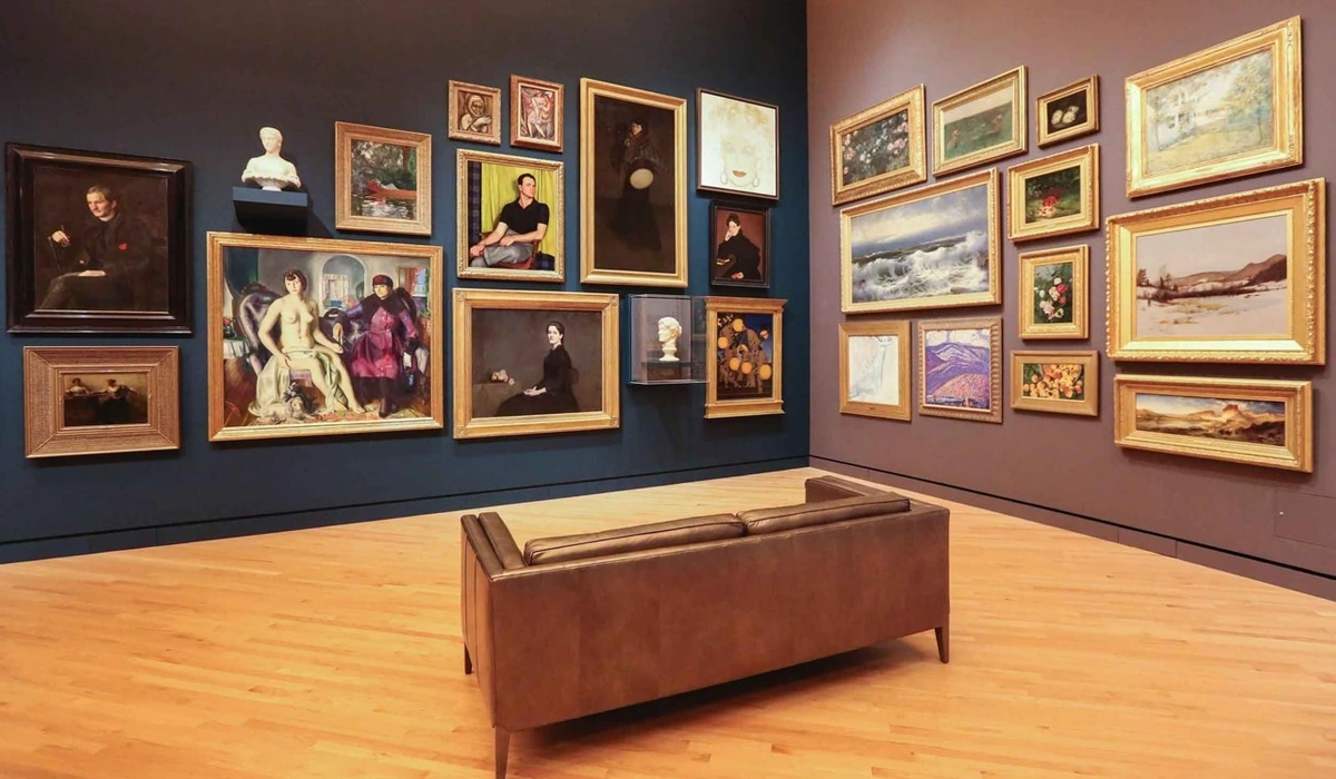
This is where people often get stuck. Do all pieces need to match? Absolutely not! The beauty of a gallery wall often lies in its delightful disharmony. However, a little underlying cohesion can turn chaos into curated brilliance. Think of it not as a strict rule, but a subtle whisper, a gentle narrative that ties your diverse collection together without stifling its individuality. The magic truly happens when disparate pieces find common ground.
Consider these threads:
- Color Palette: Pick one or two dominant colors that appear in several pieces, even if subtly. Perhaps a shared background neutral, or pops of a vibrant hue that echo across different works. Or, go wild with a riot of abstract art for small spaces and let color be the unifying force, creating an energetic and cohesive visual statement.
- Mood/Vibe: Do you want serene and calm, vibrant and energetic, whimsical and playful, or sophisticated and edgy? Select pieces that evoke a similar emotion. This thread is less about what you see and more about how you feel when you look at it, creating an atmosphere that resonates with you.
- Subject Matter (Loose):: Maybe all your pieces feature nature, or portraits, or abstract shapes. They don't have to be identical, just related enough to hint at a connection, like chapters in a visual story. Perhaps it's a collection of travel photos, or various interpretations of a specific theme like "home" or "adventure."
- Frame Style: This is an easy way to create cohesion. All modern, all ornate vintage, or a mix of wood tones. The frames themselves can be a quiet, unifying force even if the art within them is wildly diverse.
- Personal History/Narrative: Perhaps the ultimate unifying thread is simply your story. Every piece might represent a memory, a place you've lived, a person you love, or an artistic phase you went through. This thread is invisible but incredibly powerful, making the wall uniquely yours.
A Word on Mixing and Matching
My personal preference leans heavily towards mixing. Old and new, prints and paintings, photos and textile art – bring it all together! It reflects a life lived, a journey taken. Don't be afraid to pair a minimalist line drawing next to a bold, colorful abstract, or a quirky illustration next to a formal landscape. The contrast and unexpected pairings are what make it truly interesting and dynamic. The only "rule" I adhere to is that each piece, individually, should resonate with me. That’s a lesson I’ve learned throughout my artistic journey.

https://www.publicdomainpictures.net/pictures/250000/nahled/messy-colorful-artists-palette.jpg, https://creativecommons.org/publicdomain/zero/1.0/
Step 3: The Mock-Up – Play Before You Commit
This is arguably the most crucial step, and one I always skip when I’m feeling impatient, only to regret it later. Trust me on this: lay everything out on the floor first. I once thought I could eyeball it, ended up with a crooked masterpiece that leaned ominously to the left, and spent an afternoon patching holes. Learn from my mistakes!
- Consider Scale and Sightlines: Before even laying things out, take a moment to really look at your wall. What furniture is below it? What are the room's natural sightlines? This helps you determine the overall size and shape your gallery wall should take.
- Clear the Space: Find a large clear area, like your living room floor or even a bed.
- Start with Your Anchor: Pick one or two larger, more dominant pieces. These are your anchors. Place them first, usually towards the center or slightly off-center of your imagined wall space.
- Build Outward: Arrange smaller pieces around your anchors. Experiment with spacing. Don't worry about perfect symmetry unless that's your specific aesthetic. If you're struggling with consistent spacing, you can use pieces of string cut to your desired gap length, or even a laser level to project lines.
- Take Pictures: Step back often! Take photos with your phone. A different perspective helps you spot imbalances or areas that feel too crowded or too sparse. I even recommend converting the photo to black and white – it helps you focus purely on composition, shapes, and balance, ignoring distracting colors. Don't forget to consider how the wall color itself plays a role; sometimes a quick paint sample on your mock-up area can reveal a lot!
- Use Paper Templates (Optional but Recommended): Trace each piece onto kraft paper or newspaper, cut them out, and tape them to your wall with painter's tape. Make sure to mark where the hanging hardware will be on each template! This gives you a real-life visual without any holes and allows for endless adjustments until it feels just right. This is especially helpful when dealing with art above the sofa.

https://www.flickr.com/photos/fabola/41351098495/, https://creativecommons.org/licenses/by-sa/2.0/
https://images.pexels.com/photos/13073983/pexels-photo-13073983.jpeg, https://creativecommons.org/public-domain/
Grid vs. Organic: Which Chaos is Right for You?
- Grid Style: This is neat, orderly, and symmetrical. All frames are often the same size or arranged in perfect lines, with consistent spacing. It’s elegant and structured, often working well with minimalist or contemporary interiors where a sense of calm and order is desired. If you crave predictability and a clean aesthetic, this is your jam. Precision in measurement is paramount here.
- Organic/Free-form Style: My preferred flavor of delightful chaos. Pieces vary wildly in size, shape, and even orientation. Spacing is less rigid, creating a more eclectic, lived-in feel. It’s a bit like a visual conversation happening on your wall, reflecting a collected life. This style really shines when you're choosing art for a living room where you want a relaxed, personal touch, allowing for continuous additions and rearrangements.
Step 4: The Hanging – Patience, My Friend
Once your mock-up is perfect (or "perfect enough," as I like to say), it's time for the actual hanging.
- Tools: You'll want a level (a laser level is a game-changer if you have one!), a measuring tape, a pencil, a small hammer, and appropriate wall anchors/hooks for your pieces' weight. Don't forget a stud finder if you're hanging heavier items on drywall! Command strips can be a gallery wall hero for lighter items, allowing for easy adjustments and hole-free experimentation – just be sure to follow their weight guidelines!
- Measure Twice, Hammer Once: This old adage exists for a reason, and it's practically a mantra for gallery walls. Double-check your measurements, especially if you're going for a grid. For organic layouts, it's a bit more forgiving, but still aim for generally even spacing between pieces (typically 2-4 inches). When using paper templates, you've already marked the hook location; transfer that precise spot to the wall with a thumbtack before drilling or hammering. For a truly precise grid, a laser level projecting horizontal and vertical lines can be invaluable for aligning your marks.
- Work from the Center/Anchor: Start with your main piece(s) and work outwards, or top to bottom. If you're using paper templates, remove the center template first, hang that piece, and then remove and hang surrounding pieces, ensuring you maintain the desired spacing from your mock-up. For a consistent baseline, measure your anchor piece's center height from the floor.
- Don't Be Afraid to Adjust: If something feels off after it's on the wall, move it! Those paper templates make this much easier. A few extra holes are a small price to pay for a wall you truly love.
Dealing with Tricky Walls
Not all walls are created equal. Old plaster walls can be brittle, brick requires specific drill bits and anchors, and drywall needs proper reinforcement for anything substantial. Don't be shy about consulting with a hardware store expert if you're unsure. A little prep work can save a lot of heartache (and plaster dust) later.
Common Pitfalls I've Stumbled Into (So You Don't Have To)
- Too many tiny pieces: While variety is good, a wall full of only small frames can look cluttered and busy, lacking a focal point. Mix in some medium and larger pieces to provide visual anchors. If you have many small items, consider grouping them tightly within a larger frame or on a small ledge to create a single, more impactful visual unit.
- Ignoring Scale: A gallery wall should relate to the furniture below it and the overall room. Don't make it look tiny above a massive sofa, or vice versa. Ensure there's adequate negative space around the grouping so it doesn't feel squashed. This is a common issue, and frankly, I sometimes forget to consider maximizing impact by choosing art for high ceilings properly when I'm rushing, leading to a visually underwhelming result.
- Lack of Breathing Room: Even in an organic, eclectic wall, each piece needs a little space to "breathe." Don't cram everything in, no matter how much you love it. Giving individual pieces room to stand out enhances their impact and prevents the wall from looking overwhelmingly cluttered.
- Not a single focal point: Even if it's not a grid, having one or two dominant pieces helps ground the whole arrangement.
- Poor Lighting: A beautifully curated gallery wall can fall flat in dim or unflattering light. Consider how natural light hits the wall throughout the day and if additional artificial lighting (like picture lights or spotlights) might be needed to make your art truly shine.
- Neglecting Wall Texture/Color: The wall itself is part of the composition! A busy wallpaper might overwhelm delicate pieces, while a rich, deep paint color can make bright art pop. Don't treat the wall as a mere backdrop; let it play a supporting role. This could be your largest piece, a piece with the most vibrant colors, or something with significant personal meaning. It's the visual anchor that draws the eye in and provides a starting point for exploration.
Your Gallery Wall, Your Story
Ultimately, your gallery wall is a dynamic, living display. It should evolve with you. Add new pieces as you collect them, swap things out when you redecorate, or simply move things around on a whim. It’s a reflection of your personality, your memories, and your aesthetic journey. It should feel like a warm hug from your home every time you look at it. So, lean into the delightful chaos, trust your instincts, and most importantly, enjoy the process!
Beyond the Walls: Integrating Accessories and Furniture
Your gallery wall doesn't exist in a vacuum. It's a key player in the symphony of your room's decor. Thinking about how it interacts with the furniture and accessories around it can elevate the entire space, creating a harmonious and layered look.
The Role of Furniture: Anchoring Your Art
Consider the furniture directly beneath or adjacent to your gallery wall. A sofa, console table, or even a fireplace mantel can serve as a natural anchor, providing a visual base for your artwork. Ensure there’s a comfortable amount of space between the lowest pieces of art and the top of the furniture (typically 6-8 inches) to allow both elements to breathe.
Adding Mirrors for Depth and Light
Mirrors are secret weapons in gallery wall design. They reflect light, making a room feel larger and brighter, and they add another layer of texture and interest. Treat a mirror like another piece of art – choose one with a beautiful frame and position it strategically to reflect something lovely (like another part of your gallery wall!). The interplay of art and reflection can create an illusion of depth and a dynamic, ever-changing feel in the space.
So, go forth, gather your treasures, embrace a little bit of beautiful chaos, and create a gallery wall that makes you smile. If you're looking for unique pieces to add to your collection, don't hesitate to explore my collection – you might just find that perfect spark.
Maintaining Your Evolving Collection
Your gallery wall, like any cherished collection, will benefit from a little love and attention to keep it looking its best. Think of it as tending to a beloved garden; a little regular care goes a long way.
Dusting and Cleaning: Keep it Pristine
Regular, gentle dusting is your first line of defense against dullness. Use a soft, dry microfiber cloth for frames and glass. For canvases, a soft brush or a very light, dry duster will do. Avoid harsh chemicals, especially on antique frames or delicate surfaces.
Protecting from Environmental Factors: Longevity is Key
If you have particularly valuable or sentimental pieces, think about UV-protective glass, ensuring your room's humidity is stable, and avoiding placing them in direct drafts or extreme temperature fluctuations. I also recommend taking a photo of your finished wall and keeping a digital inventory – handy for insurance, or just remembering where you found that one quirky piece!
Frequently Asked Questions About Gallery Walls
How high should I hang a gallery wall?
A good rule of thumb is to center the entire arrangement at eye-level, which is typically around 57-60 inches (145-152 cm) from the floor to the center of the grouping. If hanging above furniture, ensure there's at least 6-8 inches (15-20 cm) of space between the bottom of the lowest frame and the top of the furniture.
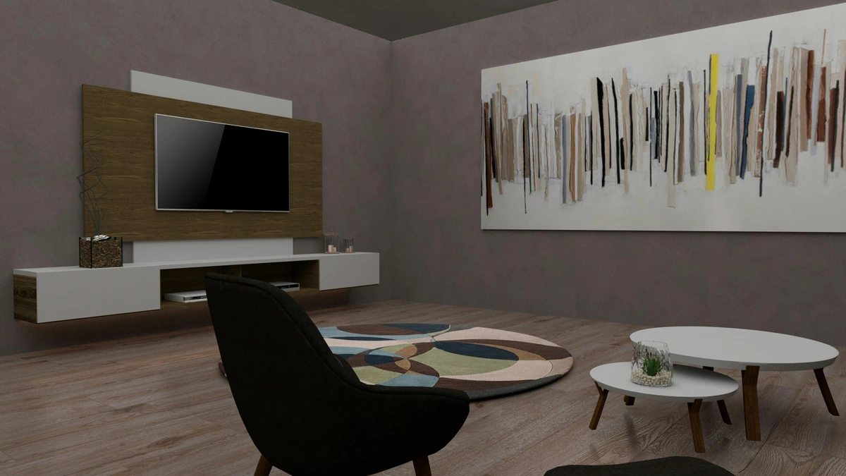
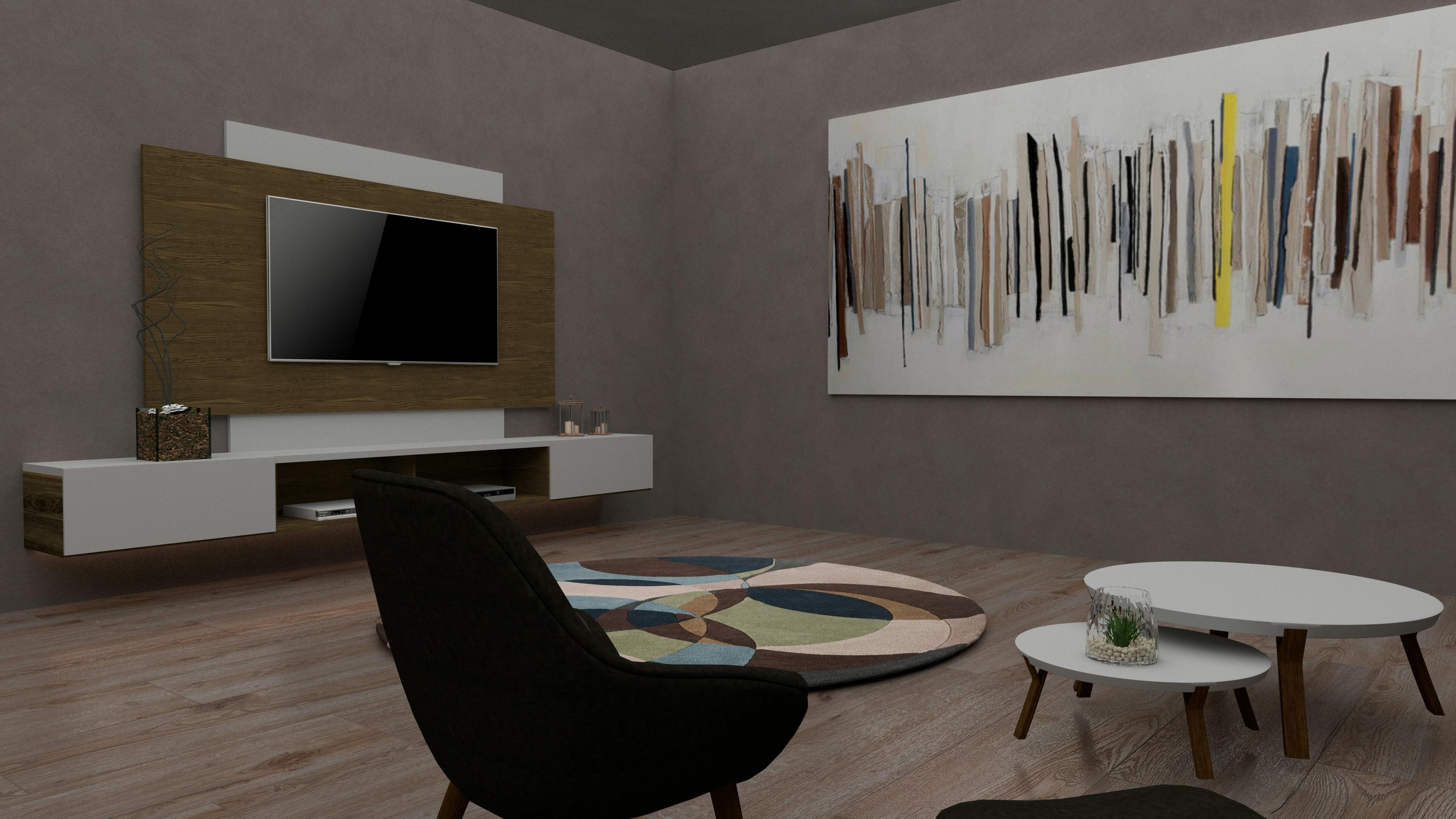
Can I include a TV in my gallery wall?
Absolutely! Integrating a TV into a gallery wall can make it feel less like a black box and more like a part of the decor. Frame your TV visually with art pieces, treating the screen itself as one of the "frames." We've got a whole guide on how to arrange art around a TV that you might find helpful.
Do all the frames need to be the same color or style?
Not at all! Mixing frame colors, styles, and finishes can add depth, character, and visual interest to your gallery wall. It enhances that eclectic, collected feel. Just ensure there's some element of cohesion (like subject matter, color palette, or overall mood) to tie everything together.
How do I add new pieces to an existing gallery wall?
The beauty of an organic gallery wall is its flexibility. Simply find a spot that feels right for the new piece, keeping overall balance in mind. You might need to shift a few existing pieces slightly to accommodate it. Use the floor mock-up method again if you're unsure!


