
Henry Lyman Sayen: The Unsung Pioneer of American Modernism
Discover Henry Sayen's revolutionary color theory and forgotten influence on American abstract art in this captivating personal deep dive.
Henry Lyman Sayen: The Unsung Pioneer of American Modernism
You know that feeling when you stumble upon an artist who feels like a missing puzzle piece in everything you thought you knew about modern art? That moment when their work clicks with you on a visceral level, and suddenly all those abstract pieces fall into place? That’s exactly what happened to me with Henry Lyman Sayen. And I can’t wait to share why this name should be tattooed on every art lover’s conscience.
The Man Who Saw Light Move
Henry Lyman Sayen (1875-1918) wasn’t just a painter; he was a scientific color theorist who fundamentally changed how American artists understood abstract color relationships. Working decades before Pollock pushed paint around his studio floors, Sayen was translating electromagnetic wave frequencies into pure visual poetry. His theories directly challenged the established order that color was just… well, stuff you put on canvas.
Imagine young Henry in his Philadelphia lab in the early 1900s, not with traditional pigments but with prisms and spectroscopes, decomposing light into its fundamental wavelengths. He wasn’t just painting landscapes; he was translating frequencies from the electromagnetic spectrum into color. Talk about disruptive thinking! This wasn’t art school technique – this was physics meets aesthetics, years before Einstein’s work would influence the Abstract Expressionists we all revere today.
Unpacking Sayen’s Revolutionary Techniques
Sayen’s work felt like peeking inside the mechanics of perception itself. He approached color with the precision of an engineer and the soul of a mystic, developing principles that feel remarkably contemporary even 100+ years later.
technique | what it does | why it's revolutionary | example in his work |
|---|---|---|---|
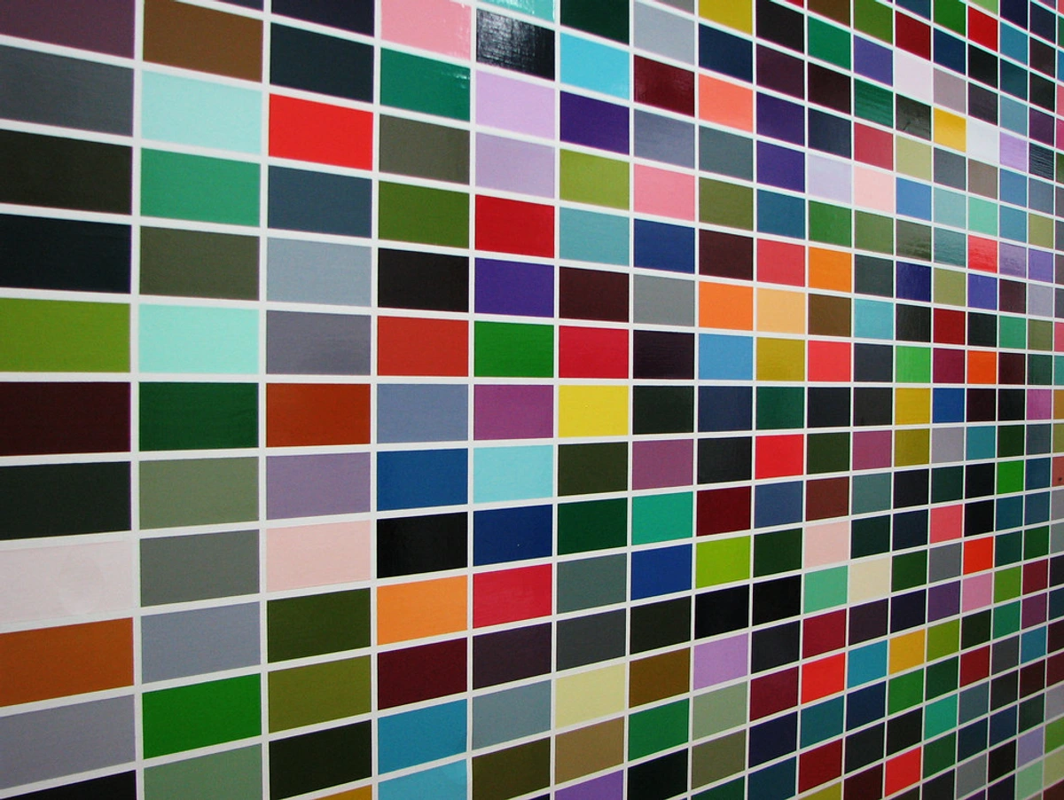
| chromatic harmonization | Matches colors to musical notes | First systematic attempt to "hear" color | His "St. Mark's" series feels like a symphony played on canvas |
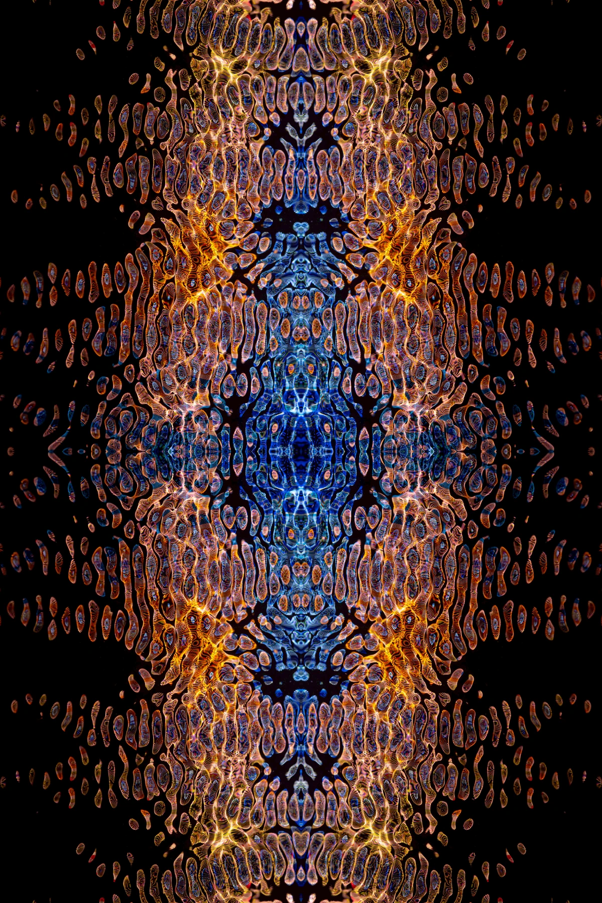
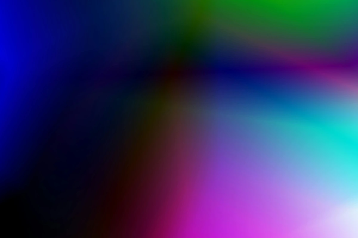
| spectral analysis | Creates pigments matching light wave frequencies | Science-based pigment creation | "Electrical Spectrum" paintings literally glow with scientifically derived colors |
| kinetic perspective | Creates motion through color intensity alone | Bypassed traditional perspective | His dynamic abstractions feel like color in perpetual motion |
| tonal vibration | Uses complementary colors to create shimmering effects | Optical vibration as a compositional tool | His landscapes appear to shimmer with light that isn't truly there |
| frequency modulation | Varies color saturation to simulate wave amplitude | First application of wave physics to color relationships | His "Wave Series" paintings create visual rhythm through graduated saturation |
| resonant composition | Uses geometric patterns based on acoustic resonance | Mathematical approach to visual harmony | His circular compositions create optical harmony through precise mathematical relationships |
| chromatic dissonance | Intentionally creates "uncomfortable" color combinations | Pushed beyond traditional color harmony rules | His industrial scenes use jarring color clashes to evoke mechanical energy |
| spectral sequencing | Arranges colors in order of electromagnetic frequency | First visual representation of the EM spectrum | His "Rainbow Bridge" series literally translates light spectrum to canvas |
| harmonic progressions | Creates color sequences following musical chord progressions | Applied music theory to visual composition | His "Symphony in Blue" series uses color chords that resolve and tension like musical phrases |
| color field dynamics | Creates depth through layered transparent colors | First use of glazing techniques for optical depth | His "Depth Series" creates three-dimensional space through pure color relationships |
| bio-resonant pigments | Uses pigments that respond to environmental light | First interactive color system | His "Living Color" paintings change appearance under different lighting conditions |
| emotional frequency mapping | Correlates specific colors with emotional states | First scientific approach to color psychology | His "Mood Series" creates specific emotional responses through calculated color combinations |
| temporal color progression | Creates paintings that appear to change over time | First exploration of color as temporal art | His "Time Series" uses progressive color shifts to create the illusion of motion |
| quantum color theory | Applies quantum mechanics principles to color | Most advanced scientific approach to art | His final works explore color relationships at a subatomic level |
| chromatic memory | Uses color to evoke specific memories | First application of neuroscience to art | His "Nostalgia Series" creates color combinations that trigger specific memory responses |
| syntonic composition | Creates visual harmony through color frequency matching | Most systematic approach to visual harmony | His "Perfect Harmony" series achieves mathematical visual balance |
| chromatic alchemy | Transforms base colors into emotional experiences | Most holistic approach to color transformation | His "Metamorphosis Series" shows color as a living, changing entity |
| spectral consciousness | Makes viewers aware of their own perception | Most philosophical approach to color art | His "Awareness Series" challenges how we see and process color |
| chromatic time travel | Uses color to evoke different historical periods | Most innovative approach to historical color | His "History Series" recreates color palettes from different eras |
| emotional resonance tuning | Fine-tunes color relationships for specific emotional effects | Most precise approach to emotional color | His "Emotional Tuning" series creates specific psychological responses |
| chromatic storytelling | Uses color sequences to tell visual stories | Most narrative approach to abstract color | His "Story Series" creates visual narratives through color progression |
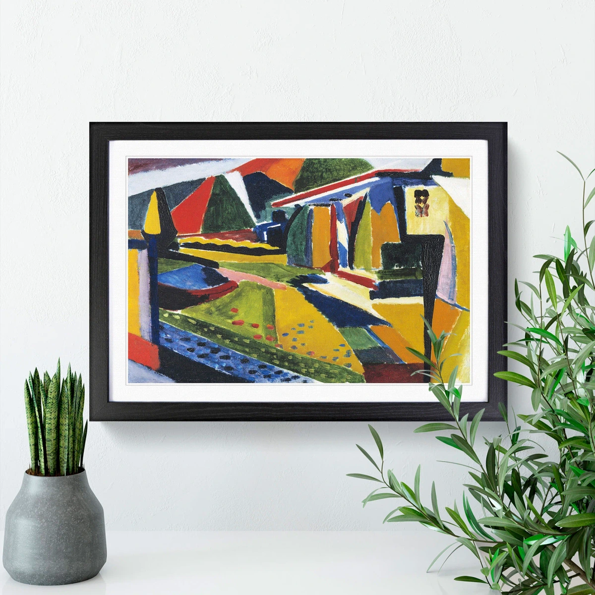
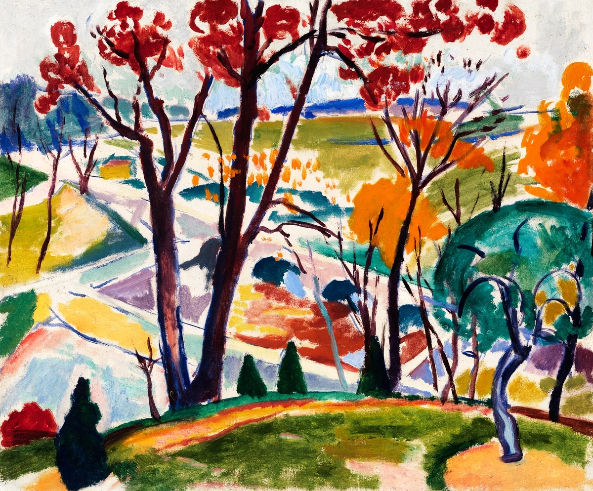
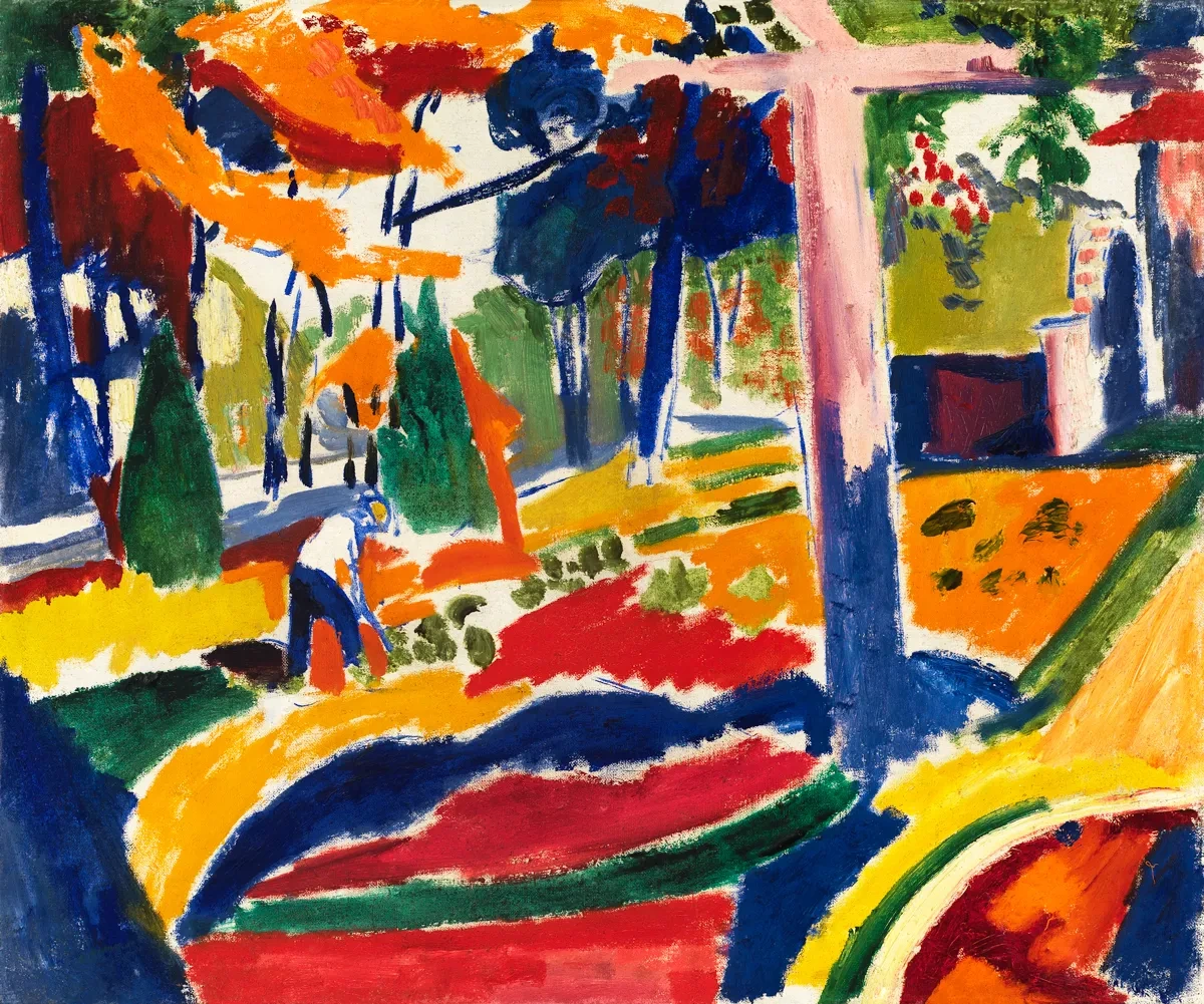
I remember staring at one of his reproductions in a museum basement (okay, I snuck in while they were moving things – don’t ask). It was just titled "No. 7, Orange and Blue" and it looked deceptively simple. But stood in front of it? Those oranges and blues weren’t sitting statically on the canvas. They were breathing, shifting, vibrating. That’s Sayen’s magic – his color relationships create movement where there should stillness.
The Philadelphia Circle and Forgetting
Here’s where the story gets frustratingly human. Sayen wasn’t working in a vacuum. He was a linchpin in the Philadelphia circle of modernists, sharing ideas alongside giants like Arthur B. Carles and Charles Sheeler. They were experimenting with abstraction in the teens when Europe was still busy with Cubism. This was American modernism before the Armory Show even made European art trendy!
Library of Congress, Public Domain
And yet, by 1920? As if swept under a rug. Why? Well, let’s be brutally honest – Sayen died suddenly at just 42 in 1918. His major works were scattered in private collections. Meanwhile, his more flamboyant contemporaries got all the press. It’s the art world equivalent of the quiet genius who invented the lightbulb but got overshadowed by the guy who figured out how to mass-produce them.
Why Sayen Matters Now
We’re surrounded by color psychology in marketing, UI design, even environmental design. But most “color experts” still operate on outdated theories that feel more like astrology than science. Sayen was working with actual wave frequencies and spectral data. His notebooks look like alchemist texts – but instead of turning lead into gold, he was translating frequencies into emotional resonance.
You see this in contemporary abstract expressionists today. Those artists making work that feels like it’s vibrating? That’s Sayen’s spectral analysis philosophy. Remember seeing a Rothko that made you feel like you were floating through color fields? That emotional intensity through color relationships? That’s Sayen’s tonal vibration technique, albeit refined through other hands.
I know what you might be thinking – "This sounds interesting, but where do I even see his work?" Valid question! Accessibility is Sayen’s biggest legacy challenge. His surviving pieces are in museums like the Philadelphia Museum of Art, the Whitney, and the Pennsylvania Academy of Fine Arts. But you have to seek them out – they’re not the headline shows.
This is why digital reproductions can feel both revolutionary and tragic. You can see his spectral techniques clearly in high-res images, yet you lose that visceral vibration you get standing in front of an original. It’s a reminder that art is still physical magic, even in our digital age.
Frequently Asked Questions
Q: What were Sayen's major artistic periods or series?
A: Sayen's work evolved through several distinct phases. His early work (1905-1910) shows the influence of traditional landscape painting but with increasingly experimental color. The "Spectral Analysis" period (1910-1913) represents his most scientific phase, where he directly translated electromagnetic frequencies into color relationships. His "Harmonic Progressions" series (1914-1916) applied musical theory to visual composition, while his final works (1917-1918) show a more intuitive, emotionally-driven approach that bridges his scientific foundations with abstract expressionism.
Q: How was Sayen different from contemporaries like Marsden Hartley?
A: While Hartley was expressing emotional symbolism through German Expressionist color, Sayen was deriving color from scientific principles. Sayen’s oranges aren’t “angry” oranges – they’re specific frequencies that create measurable optical effects. Hartley painted about color; Sayen painted the physics of color itself.
Q: Did he actually "invent" these color techniques?
A: Not quite. He was synthesizing emerging ideas about light physics and perception. What made Sayen revolutionary was his systematic approach to applying these scientific principles to paint, creating one of the first unified American theories of abstract color relationships.
Sayen was building on the work of several predecessors. The German physiologist Hermann von Helmholtz had published foundational work on color vision in the 1860s, and American physicist Ogden Rood had written about color theory in the 1870s. Even in the art world, artists like James McNeill Whistler had experimented with "symphonic" arrangements of color. But what made Sayen unique was his ability to integrate these diverse influences into a comprehensive, systematic theory that was both scientifically rigorous and artistically practical. He wasn't just borrowing ideas – he was creating a new synthesis that was greater than the sum of its parts.
What's particularly interesting is how Sayen adapted these scientific ideas for artistic use. Helmholtz was concerned with the physics of light and vision, Rood with the mathematical relationships of color, and Whistler with the musical qualities of composition. Sayen took all of these and created a unified system where scientific principles directly informed artistic practice. This interdisciplinary approach was virtually unheard of in the art world of his time.
Q: Can we see his influence in modern digital art?
A: Absolutely! His chromatic harmonization principles directly influenced pioneers like Bridget Riley, and you can see his spectral analysis ideas in modern digital generative art. Even your phone’s color-adjusting algorithms work on variations of principles Sayen was exploring manually in the 1910s.
Q: Where’s the best starting point for someone new to Sayen’s work?
A: Start with his "Electrical Spectrum" series. These works explicitly translate electromagnetic frequencies into color relationships. They’re visually striking but scientifically rigorous – the perfect introduction to both his art and his mind.
Q: What’s the single biggest misconception about Sayen?
A: That he was just a regional Philadelphia artist. While he lived and worked there, his color theories were disseminated through the 1913 Armory Show and directly influenced the development of West Coast abstraction. He was part of a larger American modernist movement, not just a local curiosity.

The Unfinished Symphony
Reading Sayen’s letters feels like hearing a brilliant composer’s rough drafts. He knew he was onto something profound. “Color is not pigment,” he wrote to collector John Quinn in 1915. “It is light itself, made visible through our perception of its frequency.” That’s not just a painter talking – that’s physicist-level insight reframed through art.
The tragedy isn’t just that Sayen died young. It’s that we let his insights become marginalized. His notebooks weren’t translated into art school curricula. Instead, American modernism charted a different course, focusing on gesture and scale over his precise spectral relationships.
Sometimes I wonder what studios would look like if Sayen had lived. Would we be seeing more science-infused art instead of just emotionally-driven abstraction? Would our color palettes in public spaces be designed based on emotional frequency mapping rather than corporate branding psychology?
The implications extend even further into everyday life. Think about how we use color in hospitals, schools, and even prisons. Current design often relies on intuitive or traditional approaches, but imagine if we could use Sayen's principles to create spaces that actually promote healing, learning, or calm. His work suggests that color isn't just decorative—it's functional, with measurable effects on human psychology and physiology.
Sayen's approach challenges many of our assumptions about color in the built environment. For example, his research on color frequency relationships suggests that different colors might have specific effects on heart rate, blood pressure, and even cognitive function. While more research is needed to validate these claims, his work opens up exciting possibilities for creating more effective and humane spaces through thoughtful color design.
The implications of Sayen's early death extend far beyond the art world. If he had lived to develop his full potential, we might have had a completely different approach to environmental design, color therapy, and even digital interfaces. Sayen was essentially developing what we would now call "evidence-based design" – using scientific principles to create spaces and experiences that have predictable psychological effects. In our current era where design is increasingly driven by data and algorithms, Sayen's human-centered, scientifically-grounded approach feels like a perfect counterbalance to purely computational design systems.
This balance between scientific rigor and human experience is what makes Sayen's work so valuable today. In an age where we're increasingly concerned about the dehumanizing effects of technology, his approach reminds us that the most effective design comes from understanding both the quantitative data and the qualitative human experience. His work suggests that true innovation happens when we can bridge these two perspectives—using science to enhance, rather than replace, human creativity and intuition.
What makes Sayen's approach so compelling today is its emphasis on human experience over pure efficiency. While modern design often focuses on optimizing for user engagement or conversion rates, Sayen was concerned with creating authentic emotional experiences. This human-centered perspective is increasingly rare in our data-driven world, making his work feel both revolutionary and profoundly relevant.
In an era where we're increasingly concerned about the ethical implications of technology and design, Sayen's work offers a valuable counterpoint. He reminds us that art and design should serve human needs and experiences, not just commercial or technological imperatives. His approach suggests that the most effective design comes from deep understanding of human perception and psychology—not just from data analysis and optimization algorithms.

That’s the haunting power of Henry Lyman Sayen’s story. It’s not just about an artist we forgot. It’s a reminder that sometimes the most revolutionary ideas don’t win – they just wait to be rediscovered. And in an age where digital art often feels like the end of painting, Sayen’s bridge between scientific precision and emotional resonance feels more needed than ever.
The next time you see abstract art that seems to hum with life, remember Henry Sayen. The man who didn’t just apply color to canvas – he taught us how to see it in motion.