
Harmonizing Abstract Art: Your Comprehensive Guide to Furniture & Decor
Unlock the secrets to blending abstract art with any furniture style. This comprehensive guide offers practical strategies, explores art styles, and provides tips to create a cohesive, soulful space that truly sings.
My Personal Guide to Harmonizing Abstract Art with Your Furniture Styles
You know that feeling, right? You’ve just fallen for a truly captivating piece of abstract art – maybe it’s a vibrant, chaotic explosion of color, or perhaps a serene, minimalist whisper on canvas – and then your eyes drift to your living room. Your trusty sofa, that vintage bookshelf, the antique coffee table… and suddenly, a tiny voice in your head, probably the one that also reminds you about laundry, whispers, "Will this actually work together?" I get it. I’ve been there, staring at a painting, then at my beloved armchair, wondering if I needed a degree in visual alchemy to make sense of it all. But trust me, it's less about rigid rules and more about finding an authentic dialogue, a connection that feels undeniably you. And the good news? It’s not just possible; it’s a journey that can utterly transform your space, turning 'will it work?' into 'wow, it sings!', and I’m here to guide you through finding that perfect rhythm.
First, Let's Chat About Your Furniture: What's Its Story?
Before we even bring art into the picture, let’s take a good, honest look at your existing furniture. Think of your home not just as a space, but as a well-loved, slightly eccentric friend – what's its distinct personality? Is it sleek and modern? Cozy and Bohemian? Or perhaps it's got that rugged, industrial edge?
I always tell people, it’s not about buying a whole new set of furniture (unless you really want to, of course!). It's about understanding the core vibe your current pieces give off. Pay attention to:
- Materials: Is there a lot of warm wood? Cool metal? Plush fabric? Rough concrete? These textures speak volumes, often silently dictating the room's mood.
- Lines: Are they clean and straight (modern, minimalist)? Or soft and curved (traditional, eclectic)?
- Color Palette: Does your furniture lean towards neutrals, or do you already have some strong color statements? This will inform how much color you might want to introduce with art, or how you can echo existing tones.
- Overall Feeling: Does the room feel formal, casual, airy, or grounded?
Once you have a clearer sense of your furniture’s character, you’ve built a foundation. This is like understanding your main character before introducing a compelling love interest. It's the grounding force, the quiet stage upon which everything else performs, really. Let’s dive into how abstract art can step onto that stage.

Abstract Art: Not Just Random Splashes (Promise!)
Now, about the art—our compelling love interest, if you will. If you're new to abstract art, you might think it's just "anything goes," a random splatter on a canvas. But oh, it's so much more nuanced and intentional than that! Abstract art, just like furniture, has its own unique styles and personalities, each a deliberate choice by the artist. When abstract art first burst onto the scene in the early 20th century, it was a revolution, shaking up centuries of representational art. It dared to say, "Look closer, feel more deeply, imagine beyond the obvious." Abstract art emerged as a radical departure, inviting viewers to move beyond literal representation and engage with form, color, and emotion directly, often tapping into deeper, non-verbal truths. What I find truly fascinating is how an artist's process, their chosen medium, and even the subtle textures they create, can deeply influence how a piece interacts with a room, a concept I’m always exploring in my own work.
You’ve got so much to explore:
- Geometric Abstraction: Think Piet Mondrian’s clean lines and primary colors, or Wassily Kandinsky’s early explorations. Artists like Kazimir Malevich with his Suprematism, or Theo van Doesburg pushing De Stijl, also exemplify this style. These pieces often feature sharp angles, precise shapes, and a sense of order. They can feel very structured and intellectual, as artists sought universal harmony and order through pure geometric forms, believing they could express fundamental truths in a chaotic world. When harmonizing with furniture, the crisp lines of geometric abstraction often sing beautifully with sleek, modern or minimalist pieces. Yet, I've seen it create a stunning, unexpected tension when paired with the soft curves of a traditional sofa, making both the art and the furniture feel incredibly fresh.
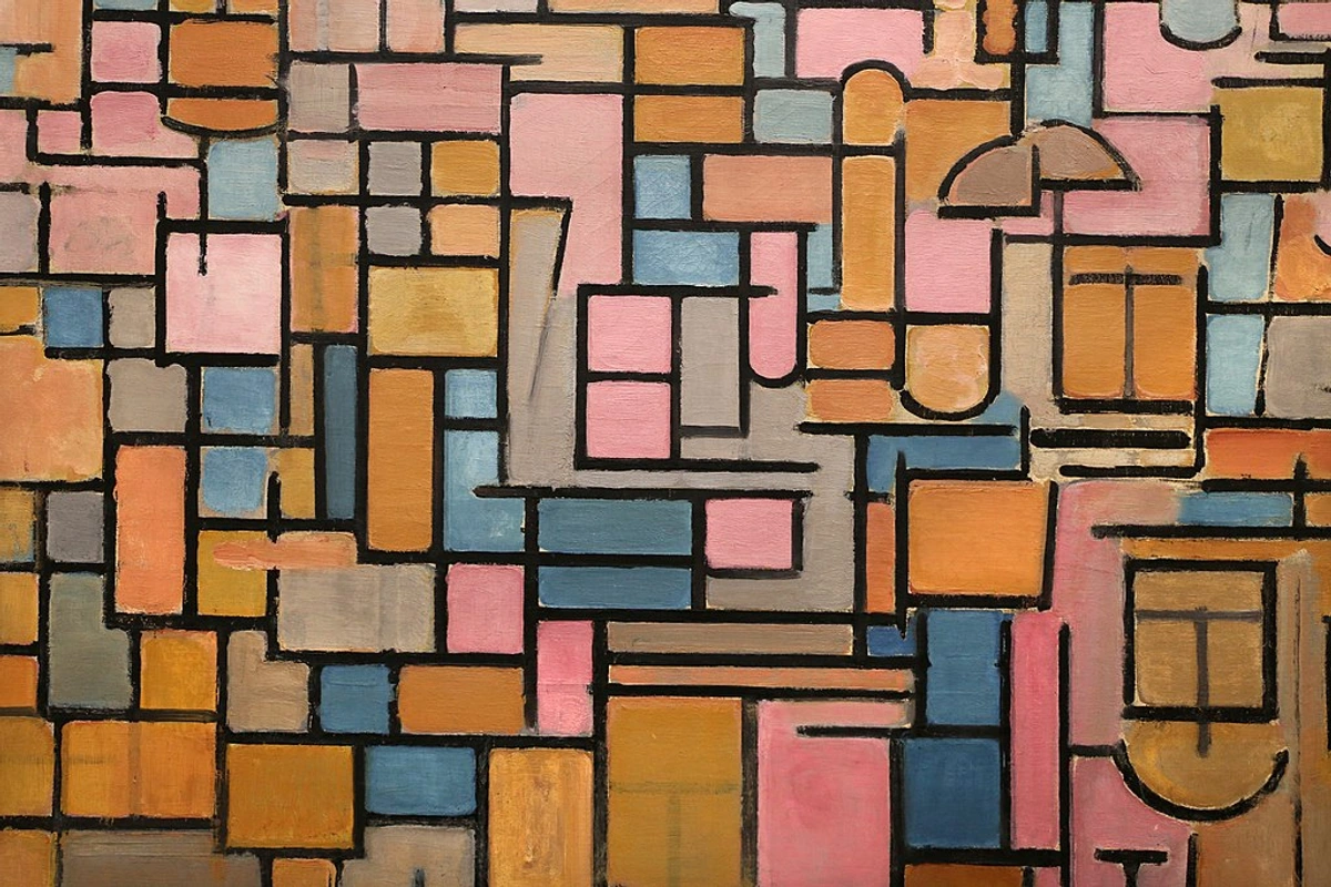
https://commons.wikimedia.org/wiki/File:Piet_mondrian,_tableau_III,_composizione_in_ovale,1914(stedelijk_museum_amsterdam)_02.jpg, CC BY 3.0
- Lyrical Abstraction: This style, also seen in some of Kandinsky’s later work or Helen Frankenthaler’s color field paintings, is more about emotion, flowing forms, and often softer, more organic shapes. Think of the expansive color fields of Mark Rothko or Barnett Newman, where color itself becomes the subject, evoking profound emotional responses. It’s like a visual poem. These pieces invite an immersive experience, allowing the viewer to be enveloped by color and form, often evoking profound emotional or even spiritual states. I’ve found that the soft, blending colors and organic shapes of lyrical abstraction can beautifully echo the curves of a traditional sofa or an antique wooden cabinet, bringing a serene balance. Conversely, in a minimalist space, it can introduce a calming, almost meditative atmosphere without adding clutter.

https://live.staticflickr.com/65535/53064827119_1b7c27cd96_b.jpg, CC BY-NC-ND 2.0
- Abstract Expressionism: The bold, energetic brushstrokes of Jackson Pollock or Willem de Kooning. This movement, often associated with the post-WWII "New York School," burst onto the scene with raw emotion, dynamic movement, and often a spontaneous, visceral quality, redefining what art could be. Born from the turmoil of post-WWII, this movement channeled raw emotion and existential angst, often with a sense of liberation and spontaneity. I've often seen abstract expressionist works provide a vibrant, raw counterpoint to more subdued, classic furniture arrangements, injecting a much-needed jolt of energy. In a bohemian space, its uninhibited nature feels right at home, adding another layer of visual richness.

https://www.flickr.com/photos/abstract-art-fons/30634352376, CC BY 2.0
What I find fascinating is how certain elements within an abstract piece can echo or deliberately contrast with your furniture. We're talking about:

- Color: Obvious, right? But it's not always about matching. Sometimes it's about introducing a pop or a complementary tone that awakens the existing palette.
- Shape and Form: Does the art feature sharp angles? Soft, flowing curves? Or perhaps organic, biomorphic shapes reminiscent of nature? These can mirror or playfully challenge your furniture's silhouette.
- Texture: Ah, texture! This is one of my favorite elements. A heavily textured abstract painting, perhaps thick impasto oil or mixed media, can add so much depth and warmth, especially if your furniture is quite smooth or sleek. Conversely, a smooth, glossy abstract piece can add a touch of modern sophistication to a cozier, more tactile room. A heavily textured piece can literally add a sense of physical warmth and groundedness, while a smooth, reflective surface might impart coolness and a sleek, sophisticated feel. I once had a client with a very minimalist leather sofa, and we introduced a large abstract piece with deep, almost sculptural impasto – the contrast was breathtaking, adding unexpected richness to the sleek space. If you're curious about diving deeper, I've got a whole piece on understanding texture in art. When considering textured art, remember that its unique surface might require specific care to preserve its beauty.
- Medium: Beyond paint, abstract art comes in many forms – acrylics, oils, watercolors, mixed media, even digital prints or sculptures. Each medium brings its own inherent texture and feel, from the vibrant translucence of acrylics to the deep, layered richness of oils. Consider how a sculptural abstract piece might add a third dimension to your space, interacting with light and shadow in a way a flat canvas cannot.
- Framing: And don't forget the framing! A minimalist frame can enhance sleek, modern furniture, while a more ornate or textured frame might beautifully complement a traditional or rustic setting. It's like the art's clothing, helping it dress for the occasion, bridging the gap between the artwork and your interior aesthetic.
- Artist's Signature Style & Process: Beyond general styles, each artist brings a unique hand and perspective. Recognizing their 'signature' – their consistent use of certain forms, colors, or techniques – can help you choose a piece that resonates with your personal aesthetic and the existing character of your home, adding another layer of authenticity to the dialogue. Understanding the process behind the art, perhaps the energetic brushstrokes of an action painting or the meditative layering of a color field, can also deepen your appreciation and inform how it connects with the story of your home and its furnishings. It's about feeling the artist's intent.
- Lighting: The way you light your artwork can profoundly impact its relationship with your furniture. Strategic lighting can highlight the very textures in an abstract piece that might echo or contrast with your furniture's materials, drawing the eye and creating visual depth. A well-lit piece can literally glow, becoming a beacon in the room and tying elements together.

https://www.flickr.com/photos/42803050@N00/31171785864, CC BY-ND 2.0
The Art of the Blend: Crafting a Cohesive Narrative
With a clearer sense of both your furniture's personality and the multifaceted world of abstract art, we can now orchestrate their conversation. This is where we play matchmaker, aiming for a dialogue that feels right, not just visually, but emotionally. Here are a few strategies I swear by, honed over years of rearranging my own living room (sometimes just for fun, sometimes out of sheer desperation):
1. The Echo Chamber: Repeating Elements
Sometimes, the simplest approach is to find common ground. Look for a dominant color in your furniture (say, the deep blue of your sofa) and choose an abstract piece that features a similar hue, even if it's just a small accent. Or, if your coffee table has sleek, straight lines, a geometric abstract piece could echo that clean aesthetic beautifully. It's about creating subtle visual rhymes that tie the room together, making the art feel like an extension of the existing decor rather than an intruder.
2. The Playful Contrast: Making a Statement
Conversely, don't shy away from deliberate contrast! A rustic, reclaimed wood table can look absolutely stunning with a vibrant, intensely modern abstract piece. Or, imagine a soft, rounded velvet armchair next to an artwork with sharp, bold lines. The key here is intentionality. You're not clashing accidentally; you're creating a dynamic tension that makes both the art and the furniture stand out. It adds a certain oomph, a surprising twist that says, "I thought about this, and I love it." Think of it as controlled chaos, where the friction actually creates a more interesting story.

3. Color Psychology & Theory: Setting the Mood and Connecting Tones
Remember the emotional language of color in abstract art? This plays a massive role in harmony. If your furniture is mostly neutral – a perfect canvas, really – a colorful abstract piece can inject life and personality, becoming the room's vibrant heart. Consider how warm hues like reds and oranges can energize a room, while cool blues and greens bring tranquility. Beyond mood, consider basic color theory: an abstract piece featuring complementary colors (like blue and orange) can provide a striking visual pop against neutral furniture, while analogous colors (like blues and greens) can create a more serene and harmonious flow, echoing the calming tones of a seaside-inspired space. If your room already has strong colors, you might choose an abstract piece with a more muted palette, or one that picks up on just one or two existing tones to tie everything together without overwhelming the eye. It's about calibrating the emotional thermostat of your room, guiding its energy and feel.

https://images.pexels.com/photos/19227255/pexels-photo-19227255/free-photo-of-cozy-living-room-in-a-house.jpeg, Public Domain
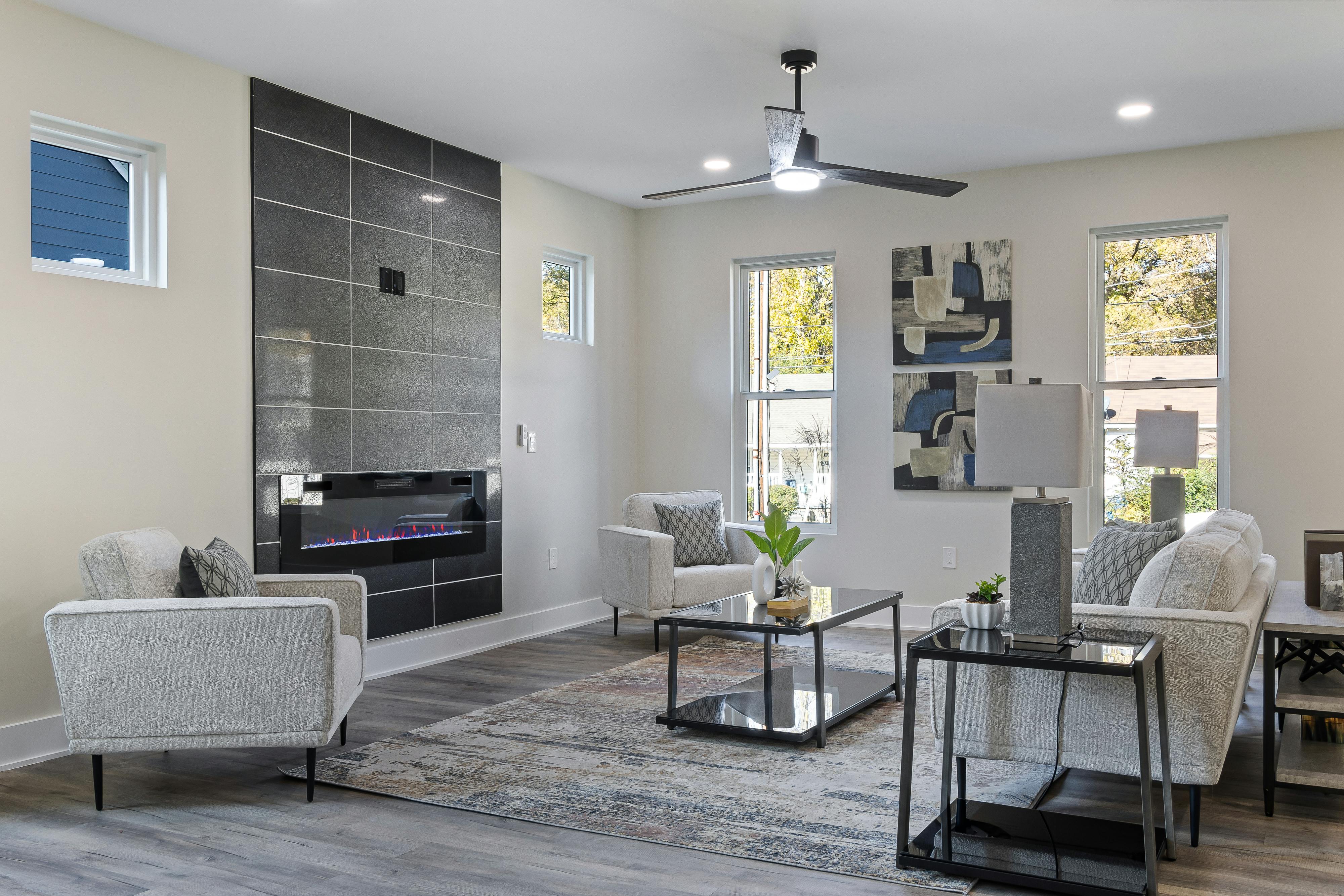
Scale as a Statement: The Silent Narrator, Amplified
Have you ever walked into a room and felt an artwork just... dominate? Or perhaps, looked at a wall and thought, 'something is missing here, or it's just not quite right'? Beyond color and form, there’s a quiet yet powerful player in this design symphony: scale and proportion. This is huge, and I've learned it the hard way (let's just say a tiny painting once got swallowed by a massive wall). A tiny, intricate abstract piece might be perfect for a delicate side table or as part of a curated vignette, inviting a closer, more intimate look, especially if your surrounding furniture is equally petite. Conversely, a large, bold piece above a substantial sofa or across a prominent wall will become the room's anchor, a visual magnet that truly influences how every other element settles into place. The art should feel proportional to its surroundings; a huge canvas next to a dainty armchair can feel jarring, while a small piece on a vast, empty wall can feel lost. And don't forget the negative space around the art – it's just as important. The empty wall acts as a breath, allowing the art to truly assert its presence, or conversely, helping it blend into a larger composition, guiding the eye. Other times, several smaller abstract pieces, perhaps varying in size but linked by color or style, can be grouped to create a powerful gallery wall. This approach allows each piece to breathe while contributing to a larger visual statement. I've found that proper lighting and positioning can totally transform how a piece integrates. It's like finding the perfect setting for a cherished gem, amplifying its inherent beauty and impact. Ultimately, the right scale makes the art feel like it belongs, effortlessly part of your home's story.
The Deeper Connection: Art's Story and Yours
When we talk about "dialogue" between art and furniture, it's not just about what you see. It's about what you feel, and even the story it tells. Sometimes knowing a bit about the artist's intent or the inspiration behind an abstract piece can deepen its connection to your space, allowing it to resonate on a more personal level. What's truly remarkable about abstract art is its openness to interpretation. It doesn't dictate a single story; instead, it invites you to bring your own experiences, allowing for a deeply personal and evolving dialogue that enriches your space beyond mere aesthetics.
- Mood & Emotion: Does your furniture evoke a sense of calm and serenity? Perhaps a lyrical abstract piece with soft, blending colors would deepen that feeling. Or, if your furniture is sleek and energetic, a bold, abstract expressionist work might amplify that dynamism. The art should either complement or intentionally challenge the emotional landscape your furniture sets.
- Energy & Flow: Some abstract art bursts with kinetic energy; others are contemplative and still. Consider the function of the room. In a lively dining area, a dynamic abstract piece can enhance the conversation. In a quiet reading nook, a more subdued, textural abstract might invite introspection.
- Narrative & Personality: Ultimately, your home tells a story – your story. The art and furniture are characters in that narrative. Does the art feel like a natural, yet exciting, extension of your furniture's personality? Does it introduce a new, intriguing chapter? This is where the magic of personalization truly shines.
This deeper connection transforms a room from merely decorated to genuinely lived-in, where every piece, from the armchair to the canvas, contributes to a rich, unfolding narrative.
Style Mashups: Real-World Examples
Let's get a little more specific, shall we? This is where I often experiment in my own space, sometimes with surprising (and delightfully messy) results. The beauty of abstract art is its incredible adaptability – it doesn't represent a specific scene that might clash, which opens up so many possibilities.
Minimalist Furniture + Bold Abstract Art
I adore the crisp lines and uncluttered feel of minimalist interiors. They provide the perfect clean canvas for a powerful abstract piece. Here, the art becomes the focal point, injecting vibrant color, texture, or intricate forms without competing with busy surroundings. It’s like a perfectly plated dish where every ingredient shines – the art is the unexpected star.

Bohemian Eclectic + Layered Abstract Art
If your home leans Bohemian, you're probably already a master of layering textures and patterns. Abstract art fits right in! Think organic shapes, earthy tones, or even multi-panel pieces that contribute to that collected, well-travelled feel. It’s about adding another rich layer to your existing tapestry, making the room feel even more lived-in and soulful.
Traditional/Classic Furniture + Contemporary Abstract Art
This is one of my absolute favorite juxtapositions, and it’s surprisingly easy to get right. That ornate wooden cabinet or elegant tufted armchair? It creates an incredible backdrop for a strikingly contemporary abstract painting. The contrast brings a fresh energy to the traditional elements, preventing the room from feeling dated or overly formal. For instance, pairing a classic mahogany Chippendale chair with a vivid abstract featuring a modern interpretation of a traditional accent color (like a rich emerald green, a deep sapphire blue, or even a nuanced terracotta) can create a stunning bridge between eras, making both pieces feel incredibly current and considered. It’s a delightful surprise, like a secret handshake between eras, proving that old and new can not only coexist but truly elevate each other.
Mid-Century Modern Furniture + Dynamic Abstract Art
Ah, Mid-Century Modern. Those iconic clean lines, organic curves, and often rich wood tones – they're practically begging for a conversation with abstract art. Think a sleek Eames lounge chair paired with an abstract piece featuring bold, rhythmic shapes or vibrant, energetic colors. The art can echo the modern aesthetic while adding a punch of personality that truly makes the space sing. Look for pieces that share a similar sense of forward-thinking design, even if their specific forms differ—think biomorphic shapes that align with MCM's organic influences (like a Noguchi coffee table), or abstract interpretations of nature that complement the era's appreciation for natural forms. A muted color palette with pops of burnt orange or olive green in the artwork can also beautifully resonate with the classic MCM aesthetic. You can even check out more specific guidance on decorating with abstract art in Mid-Century Modern homes.
Ultimately, these mashups aren’t about following a strict formula, but about discovering those delightful, unexpected connections that make your space uniquely yours. And now, for my most important piece of advice...

My Personal Take: Trust Your Gut (Seriously)
After exploring all these strategies and style pairings, it might feel like there's a lot to consider. And there is! (Trust me, I've had my fair share of 'what ifs' and 'oh no' moments in my own living room.) But ultimately, decorating your home is a deeply personal act, a creative expression of who you are. The most beautiful spaces aren't those that rigidly follow a design textbook; they're the ones that reflect the people who live in them, infused with their personality and passions.
If a piece of abstract art makes your heart sing, if it genuinely brings you joy, then that's the most important harmony of all. Don't be afraid to experiment, move things around, and see how different pieces speak to each other. It’s okay if it feels a little messy at first – that's often the most exciting part of the creative process! You're discovering what you love, and that, my friend, is a masterpiece in itself.
If you’re just starting your art collection journey, don't worry, I've got some thoughts on your first abstract piece. And if you're looking for inspiration, you can always check out some of the art I have for sale – perhaps something there will spark an idea! Imagine one of my pieces hanging in your living room, becoming part of your story... or maybe that's just the artist in me dreaming! If you're ever in the Netherlands, you could even visit my museum in 's-Hertogenbosch to see how my art tells its own story.
Frequently Asked Questions
Q: Can abstract art really go with any furniture style?
A: Absolutely! And I've probably spent more time thinking about this than is strictly healthy. Abstract art's non-representational nature makes it incredibly versatile. It doesn't depict a specific scene that might clash; instead, it offers colors, forms, and textures that can be adapted to complement or deliberately contrast with any interior style. The trick is to find the right dialogue between the art and its surroundings, a conversation that feels natural and exciting.
Q: How do I pick colors if my furniture is all neutral?
A: Absolutely! Neutral furniture acts as a beautiful blank canvas, giving you incredible freedom with abstract art. You can: 1. Go bold with a single vibrant accent color to make a dramatic statement. 2. Introduce a multi-color piece that brings several hues into the room, becoming the focal point. 3. Opt for subtle, earthy tones to maintain a serene, monochromatic feel, adding depth through texture and form. It's your chance to play, to let the art truly dictate the room's color story!
https://www.pexels.com/photo/modern-design-of-living-room-in-house-20035976/, Public Domain
Q: What if my furniture is really ornate or traditional?
A: Excellent! This is where abstract art truly shines as a counterpoint. The clean lines, contemporary feel, and often vibrant energy of many abstract pieces can create a stunning visual tension against ornate, traditional furniture. This juxtaposition prevents the room from feeling dated or overly formal, injecting a fresh, modern energy and proving that opposites really do attract. Look for abstract art that shares a similar color palette to your traditional pieces or one that offers a bold, unexpected contrast – either way, it'll make a statement.

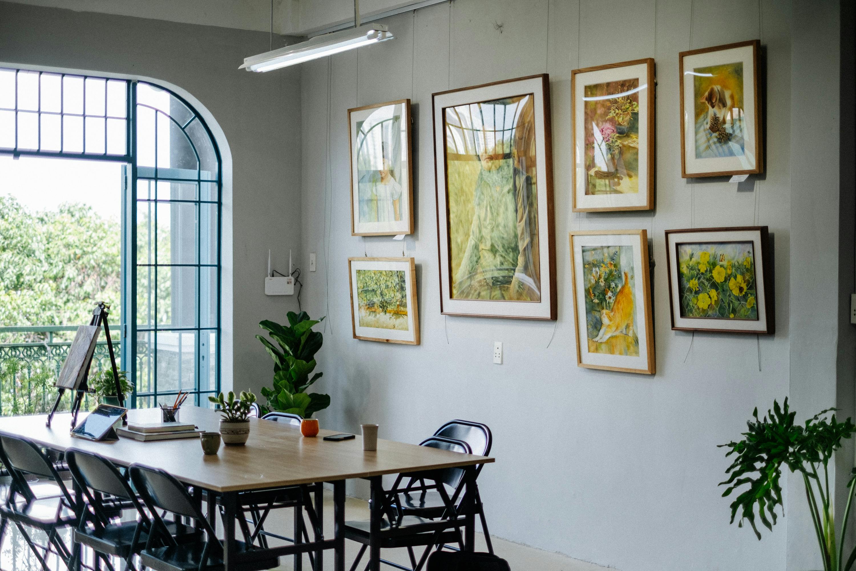
Q: How many abstract pieces are too many in one room?
A: Great question, and one I often ponder myself! Like a good meal, it's about balance, taste, and not overfilling the plate. One large, impactful abstract piece can often be enough to define a space beautifully. If you're using multiple smaller pieces, consider creating a gallery wall where they work together as a single, cohesive unit, telling a shared story. The key is to avoid visual clutter. Each piece should have room to breathe and contribute to the overall harmony without fighting for attention. If in doubt, take a step back, maybe even sleep on it, and remember: less is often, surprisingly, more impactful.
Q: What if I have very busy patterns or a lot of existing artwork (including figurative) in the room?
A: Ah, the delightful challenge of a "maximalist" space! In such a scenario, abstract art can still absolutely work, but you'll want to be a bit more strategic. For busy patterns, consider abstract pieces that feature simpler forms or a more subdued color palette to provide a visual 'resting place' for the eye. Or, if you want another bold statement, ensure its dominant colors subtly pick up on hues already present in your patterns. When dealing with lots of existing artwork, including figurative pieces, abstract pieces can act as wonderful 'bridges,' connecting disparate styles or themes. They can introduce a new texture or form without competing directly for representational attention, offering a moment of visual pause or a unifying color story.
Q: How do I know if an abstract piece truly "fits" with my furniture?
A: This is the million-dollar question, isn't it? And my honest answer is: you'll feel it. Stand in the room, look at the art and the furniture, and ask yourself: Does it make me smile? Does it evoke the emotion I want for this space? Does it feel right? To get a more objective view, try taking a photo of your room and then digitally overlaying potential art pieces with an app or simple editing software. This can help you visualize the scale and color before making a commitment. But ultimately, it comes down to your personal connection and aesthetic preference. If it resonates with you, then it fits. Your home is your sanctuary, and the art within it should reflect your soul.
And there you have it – my personal journey and comprehensive guide to making abstract art truly sing in harmony with your furniture. It’s less about strict rules and more about trusting your own artistic eye and personal connection. Go on, play a little, and create a space that’s uniquely, wonderfully you.


