Abstract Art in Mid-Century Modern Homes: A Soulful, Personal Blend
Discover how abstract art transforms MCM homes into personal sanctuaries. My candid guide covers choosing, styling, and displaying art to infuse your space with unique character and emotional depth.
Blending Eras: Abstract Art's Soulful Dance with Mid-Century Modern Homes
Ah, Mid-Century Modern. Just saying those words out loud brings a little warmth to my soul. There’s something so inherently cool about its clean lines, organic forms, and that optimistic, forward-looking spirit. It’s like a perfectly tailored suit or a classic jazz record – always in style, always sophisticated. But sometimes, when I walk into a perfectly preserved MCM space – say, a friend's living room with a flawless Eames Lounge and a pristine Saarinen coffee table – I feel this tiny, almost imperceptible whisper: "Could it be... more me? More us?" It's a yearning for a deeper, more personal narrative within the iconic aesthetic. There’s a silent question I often hear when I step into a beautifully curated Mid-Century Modern space: "Is this truly mine? Does it tell my story?" This article explores how abstract art can be the perfect key to unlocking that deeper, personal narrative within your cherished Mid-Century Modern space. We’ll delve into the deep connections between abstract art and MCM design, explore its rich historical roots, and provide practical guidance on how to choose and display the perfect piece to tell your unique story.
This isn't about disrespecting the classics; it's about making them breathe with your own life. That's where abstract art waltzes in, often with a mischievous wink, offering a vibrant, personal dialogue with the past. For years, I’ve found immense joy in exploring how these two seemingly different worlds – the retro charm of MCM and the boundless expression of abstract art – don't just coexist, but truly elevate each other. It’s not about erasing history; it’s about writing a new chapter together, a visual conversation between past and present. It's about finding that sweet spot where nostalgia meets now, where comfort meets cutting-edge, and where a house becomes a truly personal home. And honestly, it’s one of my favorite interior design challenges, because the results always feel so personal. It’s a bit like finding the perfect, unexpected dance partner for a classic tune – surprising, yet utterly harmonious.
The Unseen Thread: Why Abstract Art and MCM Are Soulmates
So, you might think, "Mid-Century Modern is all about iconic furniture and structured design. Won't abstract art, with its often free-form chaos, clash?" And I get that! My brain sometimes defaults to 'safe' choices too. But here’s the thing I've learned, often through a bit of trial and error (and perhaps a few questionable early purchases for my own home, we all have them): MCM, at its heart, is deeply connected to the broader modern art movement. Consider the foundational principles:
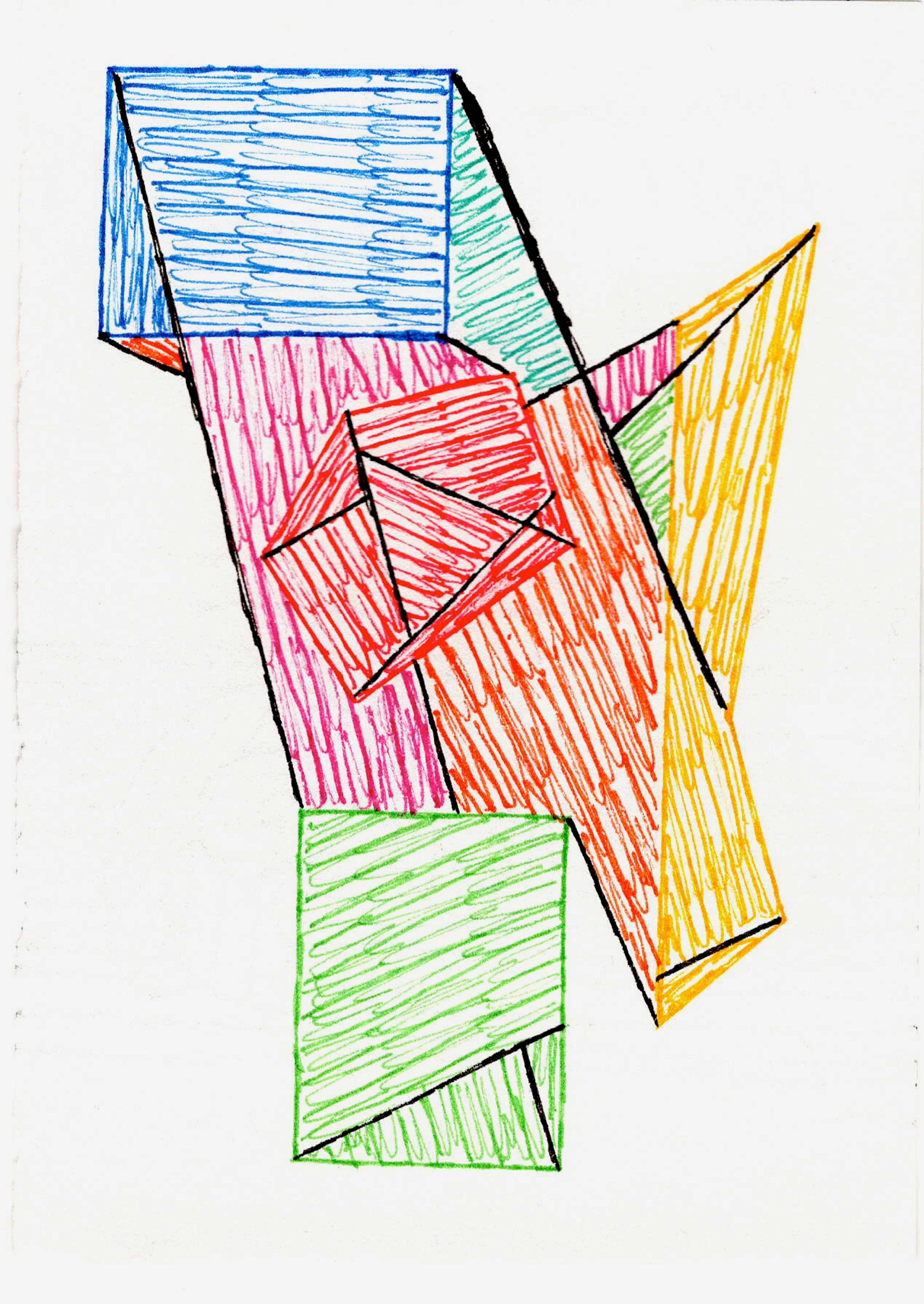
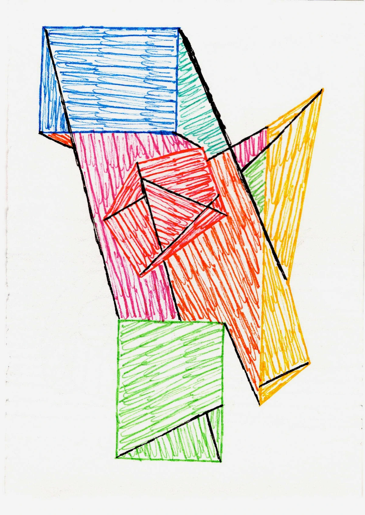
- Cubism, with its fragmented perspectives and geometric deconstruction of forms, found its parallel in the modular furniture systems and the way MCM architects played with architectural planes and open-plan living spaces. An abstract piece inspired by Cubism, with its sharp angles and overlapping planes, can visually break up the "blockiness" of a solid credenza or echo the layered forms of a sectional sofa, creating a cohesive visual puzzle.
- The dynamic sense of movement championed by Futurism, celebrating speed and technology, manifested not just in the sleek, aerodynamic shapes of industrial design, but also in the innovative use of materials and manufacturing processes that allowed for sculptural, flowing furniture pieces. A dynamic, gestural abstract can mirror the forward-leaning lines of an Arne Jacobsen egg chair or the sweeping curve of a Saarinen womb chair, infusing the room with energetic motion.
- And the utopian vision of Constructivism, with its emphasis on pure geometric forms and functional materials, was a direct precursor to the stripped-down, honest aesthetic of iconic MCM pieces like a perfectly balanced Saarinen table or the structured elegance of a Knoll chair. This functional, minimalist ethos is directly echoed in MCM design, evident in every sleek teak credenza or the structured lines of a Saarinen table.
- Even Abstract Expressionism, born in the post-war era, with its focus on raw emotion and individual expression through gestural painting and color fields, paralleled the era's optimism and desire for authentic, personal meaning within the home. It’s about more than just aesthetics; it's about a shared pursuit of honest expression.
They share a common language: an appreciation for form, line, color, and composition. While MCM expresses this through plywood, chrome, and sleek upholstery, abstract art does it on canvas or paper, exploring similar principles with paint and texture. When you pair them, it’s not a clash of titans; it’s a harmonious dialogue. The art doesn't just hang there; it dances with the furniture, creating a dynamic energy that a purely representational piece might struggle to achieve in such a distinct setting. It allows for a fresh, contemporary expression without disrespecting the classic foundations. It’s about adding depth, adding a pulse, creating a visual conversation where a bold, gestural abstract might soften the sharp angles of a credenza, or a minimalist color field piece could amplify the calm expanse of an open living space.
credit, licence
Key takeaway: Abstract art and MCM share a foundational language of modernism, making them natural partners in creating dynamic and personal spaces.
Echoes of the Past: Abstract Art's Mid-Century Roots
The kinship between abstract art and Mid-Century Modern design isn't just a happy coincidence; it's rooted in a shared philosophy born from the early 20th century's drive for innovation. Both movements rejected the ornate excesses and sentimental narratives of previous eras, championing clean lines, functional forms, and an optimistic outlook on the future. This rejection was revolutionary, a deliberate stripping away of the superfluous to reveal essential truths in design and art, perfectly aligning with a post-war desire for a fresh start and a brighter, more efficient future.
Consider the Bauhaus school, for instance, with its emphasis on geometric abstraction and the integration of art and industry. Artists like Josef Albers explored color theory in ways that directly informed the vibrant, yet disciplined, palettes seen in MCM textiles and ceramics. The materials they championed, like tubular steel and bent plywood, found direct application in the innovative furniture designs of the mid-century era. Similarly, the geometric purity of De Stijl, championed by Piet Mondrian, found direct architectural and furniture counterparts in the balanced, minimalist structures of Gerrit Rietveld's iconic Schroeder House and the streamlined forms of early Danish Modern pieces. Its grid-based compositions directly inspired the clean lines of MCM. The functionalist principles of the Bauhaus heavily influenced designers like Marcel Breuer, whose Wassily Chair redefined steel tubing in furniture, and Mies van der Rohe, whose Barcelona Chair epitomized geometric simplicity, both embodying the school's commitment to industrial materials and a clean aesthetic. Even early pioneers like Wassily Kandinsky, with his exploration of non-representational forms and the emotional power of color, laid groundwork that resonated with the desire for pure expression. And later, the expansive, emotive power of Color Field painting, exemplified by artists like Mark Rothko or Helen Frankenthaler, offered a parallel to the sweeping, open spaces and thoughtful material palettes of mid-century architectural marvels by Neutra or Koenig, inviting a contemplative mood that transcended mere function. While not always directly geometric, Surrealism also contributed to the broader artistic climate of breaking from academic traditions, encouraging artists and designers to explore the subconscious and new forms of expression – a spirit that certainly fed into the innovative atmosphere of the mid-century. It's a testament to how these seemingly disparate fields were, in fact, conversing, influencing, and evolving together. This deep-seated connection ensures that when you bring abstract art into your MCM home, you're not just decorating; you're continuing a rich, shared story.
Key takeaway: Abstract art and MCM emerged from a shared modern philosophy, rejecting the past's excesses for clean lines, functional forms, and an optimistic vision, creating a natural and historical synergy.
My Personal Process: Choosing Your Abstract Partner
So, you're convinced (or at least curious!). Now, how do you actually choose that perfect piece? It's less about following rigid rules and more about trusting your gut. After all, your home is a reflection of you. It’s where your own story begins to intertwine with the legacy of a design era. I’ve found that embarking on this journey with a clear, yet flexible, personal methodology really helps. It's almost like crafting a visual mood board in your mind, or perhaps even a physical one, to visualize how different pieces might sing in your space. As I navigate this process myself, I often ask a few guiding questions:
1. How does form and feeling guide your art choice?
MCM is known for its geometric precision, but also its organic curves. Abstract art offers both. The choice here greatly influences the dialogue your art will have with its surroundings. I once placed a large, swirling organic abstract in a very linear, minimalist MCM living room, and it completely transformed the space, making it feel softer and more inviting – a perfect counterpoint without losing the sophisticated edge. It felt like the room finally exhaled, embracing a warmth it hadn't known it was missing.
Style | Description | How it Complements MCM |
|---|---|---|
| Geometric Abstraction | Think sharp lines, bold shapes, and a sense of order. Pieces reminiscent of Cubism, De Stijl, or Suprematism. They often feel architectural and structured. | Reinforces MCM's structured elements and clean lines, creating unity and intellectual rigor. It celebrates precision and order. |
| Organic Abstraction | Flowing lines, softer forms, and a more fluid, natural feel. This includes biomorphic abstraction, drawing inspiration from natural shapes and curves. It can be more gestural or amorphous, evocative of nature's inherent chaos and beauty. | Introduces a lovely counterpoint to MCM's rigidity, adding natural softness, movement, and warmth. It can soften edges and infuse the space with a more human, biological touch, reflecting MCM's occasional use of organic forms (like an Eames lounge chair's curves). |
It’s about finding that balance. Sometimes, a super structured geometric piece will amplify the clean lines of an Eames chair. Other times, a more fluid, organic abstract will soften the edges and add a layer of warmth. There’s no right or wrong, only your preference and how you want the space to feel. Abstract art can also cleverly define functional zones within an open MCM layout, acting as a visual anchor for a dining area or a cozy reading nook, guiding the eye and creating a sense of intended purpose. Remember, the scale of the room itself is paramount. A sprawling, open MCM space can easily embrace a monumental abstract, while a more intimate nook might call for a collection of smaller, harmonious pieces to avoid overwhelming the space. Also, consider the scale relative to the furniture it's paired with; a vast abstract above a dainty credenza can easily overpower it, even if the wall itself is expansive.
credit, licence
2. How do you embrace the palette (or dare to deviate)?
Mid-Century Modern often gravitates towards earthy tones, teak, walnut, and pops of vibrant, saturated colors like avocado green, mustard yellow, or burnt orange. When choosing abstract art, you have a few paths:
Approach | Description | Impact |
|---|---|---|
| Harmonize | Pick a piece that subtly echoes existing colors in your furniture or textiles. A deep indigo abstract might sing next to a teak sideboard, creating a sense of calm continuity. | Creates a cohesive, tranquil atmosphere. Reinforces existing color schemes and ensures visual harmony. |
| Contrast | Introduce a bold, unexpected hue that makes a statement without shouting. A vibrant pink or electric blue against a backdrop of natural wood can be utterly breathtaking. I often find myself drawn to this approach because it feels a little rebellious, a little more me. | Adds dynamism and visual interest. Creates a striking focal point and injects modern energy. |
For more on how color speaks, you might enjoy my thoughts on the emotional language of color in abstract art or even a deeper dive into the psychology of color. And if you're looking for more practical inspiration, a guide to color palette inspiration might also spark some ideas.
3. What about medium & materiality: Beyond the Canvas – The Tactile Dimension?
The physical properties – the sheer materiality – of your abstract art can profoundly influence its dialogue with MCM elements. Beyond the visual, the tactile quality of a piece can truly make a space sing. MCM design itself, with its emphasis on natural materials and honest craftsmanship, often features rich wood grains, varied weaves, and smooth glass or laminate surfaces. Think about how the visible impasto of thick acrylic would play against the polished teak grain of a credenza, or how the smooth sheen of a resin pour might highlight the cool gleam of chrome legs on a chair. The delicate translucency of watercolor on paper, perhaps matted and framed, offers a quiet contrast to the nubby texture of a boucle upholstery, creating a delightful sensory landscape.
- Canvas vs. Paper: A large acrylic on canvas with visible brushstrokes can add a tactile dimension, echoing the rough texture of some MCM upholstery. A delicate watercolor or a crisp print on paper, perhaps matted and framed, might complement the smooth, polished surfaces of a credenza.
- Gloss vs. Matte: A high-gloss finish can reflect light and highlight the sleekness of chrome or glass, while a matte finish can absorb light, adding a quiet sophistication that complements natural wood tones. I've found that sometimes, the subtle shimmer of a resin finish on an abstract piece can unexpectedly enhance the warmth of a walnut sideboard.
- Mixed Media: Don't shy away from abstract pieces that incorporate different materials – collage, found objects, or even digital prints on unusual substrates. Their varied textures can add an intriguing layer of complexity and an unexpected conversation point with the clean lines of MCM.
- Sculptural Abstract Art: Consider three-dimensional abstract pieces made from metal, wood, or ceramic. These can introduce another layer of materiality and form, echoing the sculptural qualities often found in MCM furniture and lighting, adding depth without visual clutter.
- Abstract Photography: For a modern twist, abstract photography can offer unique textural and compositional elements. Its clean lines and often minimalist aesthetic can perfectly complement the sleekness of MCM, especially when focusing on architectural details or natural patterns.
- Frameless Presentation: For certain contemporary abstracts, particularly canvas prints with gallery-wrapped edges, a frameless presentation can feel incredibly modern and clean, perfectly aligning with MCM's minimalist ethos and allowing the artwork to float freely on the wall.
4. How do you approach scale and the art of the statement?
This is where I sometimes get a little too ambitious myself – I once tried to fit a Rothko-sized canvas above a tiny credenza, and trust me, the credenza lost that battle! My early days of decorating involved more "trial and error" than "thoughtful placement." I still laugh (and cringe a little) remembering the time I insisted a truly monumental abstract belonged in my first compact apartment, practically overwhelming the entire living area. We often underestimate the power of a well-chosen scale. The trick is to ensure the art feels proportionate to the wall and the surrounding furniture. A tiny piece on a huge wall can get lost, making the space feel empty, while an oversized piece in a small nook can feel overwhelming. It’s a dance of dimensions, really, where proportion and visual weight are key. As a rough guide, aim for the artwork to be approximately 2/3 to 3/4 the width of the furniture it's displayed above, or if hanging alone, ensure its center is at eye level (typically 57-60 inches from the floor). And here’s a little secret I’ve learned: art can be a brilliant visual trickster! A horizontally oriented abstract can visually widen a narrow wall or make a compact sofa feel more expansive. Conversely, a tall, vertically dramatic piece can draw the eye upward, making a room with lower ceilings feel more lofty, or balancing a particularly wide, low credenza. If you're unsure or prone to my 'overambitious' tendencies, start with a few smaller, complementary pieces that you can easily rearrange before committing to a grand statement.
- Go Big: A large-scale abstract piece can anchor an entire wall, becoming an undeniable focal point. In open-concept MCM spaces, this is particularly effective for defining zones and creating a sense of flow. For instance, a bold, gestural abstract expressionist piece or a serene color field abstract above a low-slung, neutral sofa can instantly energize the seating area, providing a dynamic counterpoint to the furniture's clean lines and making the space feel intentionally designed rather than just furnished. If you're pondering a grand statement, check out my guide on decorating with large-scale abstract art.
- Curate Small: Don't underestimate smaller pieces! A carefully curated gallery wall of smaller abstracts can tell a complex story, especially when mixed with other decor items. For tips on curating, see my article on curating your perfect gallery wall.
5. What is the unsung hero: framing and presentation?
Just as important as the art itself is how it's presented. For Mid-Century Modern spaces, the frame choice can either elevate your abstract piece or completely detract from its impact. The goal is to enhance, not overshadow, the inherent simplicity and honest design of MCM. It's about letting the artwork speak, framed in a way that respects the clean, unadorned aesthetic of the era.
- Minimalist Frames: Thin, clean-lined frames in natural wood (teak, walnut, oak to match your MCM furniture) or simple black/white metal are often the best choices. They allow the art to speak for itself without adding visual clutter.
- Floating Frames: For canvas art, a floating frame creates a subtle border that separates the artwork from the wall, adding depth and a sophisticated, gallery-like feel that perfectly aligns with MCM aesthetics.
- Matting: If using a mat, choose a crisp, white, or off-white mat to provide breathing room around the artwork. Avoid overly elaborate or colored mats that can clash with the artwork or the MCM palette.
Key takeaway: Choosing your abstract art involves a personal dance between form, color, materiality, and scale, ensuring it resonates with your unique story and the MCM aesthetic.
Displaying Your Abstract Art: Beyond the Frame
Once you've chosen your abstract partner, the next step is perhaps even more exciting: bringing it to life within your home. MCM homes, with their inherent celebration of open spaces and natural light, offer incredible opportunities for display. But where do you even begin to position your chosen pieces to create that perfect dialogue? It’s about creating a visual conversation, a dynamic dialogue between your art and your furniture, making the space feel intentionally curated, not just decorated. A well-placed piece of abstract art can profoundly influence the mood of a room – invigorating a study with vibrant energy or creating a tranquil oasis in a bedroom, truly making the space come alive. This intentionality in placement is key to transforming a collection of beautiful objects into a cohesive, soul-filled home.
- The Anchor Piece: Every room needs a star, right? Usually, that's the largest piece of art. Place it strategically – perhaps above a credenza, a sofa, or in a prominent entryway. This piece sets the tone and can even serve to define a zone in an open-concept living space. This is where an impactful abstract expressionist piece, like a Rothko-esque color field or a dynamic action painting, can truly sing, creating an emotional resonance that grounds the room. For an MCM living room, a large, bold geometric abstract piece above a streamlined sofa often acts as a powerful focal point, drawing the eye and balancing the strong horizontal lines of the furniture.
- Conversation Starters: Abstract art invites interpretation. Position smaller pieces in unexpected spots, like a narrow hallway gallery wall, a cozy reading nook beside a Danish modern armchair, or even leaning on a bedside table, to spark curiosity. I once had a guest stare at a small, energetic abstract and declare it looked exactly like their morning commute – a chaotic, yet strangely beautiful, journey! It's truly fascinating, like a peek into their inner world, and something I always love hearing. A small, vibrant abstract might prompt a guest to wonder about the artist's inspiration or their own immediate emotional response.
- Lighting is Everything: Just like a carefully selected spotlight enhances a vintage lamp, good lighting makes your abstract art sing. Consider track lighting or picture lights to highlight texture and color, revealing new depths as the light shifts. I remember one particular piece, a subtle color field, that looked entirely different at night under a warm spotlight compared to its daytime appearance; new hues seemed to emerge from the canvas. Don't forget the power of natural light either, especially in MCM homes with their large windows. Observe how sunlight changes throughout the day, interacting with different mediums and colors, revealing new facets of your chosen pieces. My thoughts on the art of display delve deeper into this.
- Embrace Negative Space: MCM champions clean lines and uncluttered aesthetics. Let your abstract art breathe. Don’t feel the need to fill every single wall. Sometimes, the space around the art is just as important as the art itself, creating visual pauses and allowing the design elements to truly resonate. This negative space helps highlight architectural features and contributes to the calm, intentional feeling characteristic of MCM design. It's about finding balance and focus within the composition of your room. For example, a single, compelling abstract art piece on a large, otherwise bare wall above a low credenza can anchor the entire space, creating a serene and thoughtful vignette rather than a cluttered one.
Key takeaway: Strategic placement, thoughtful lighting (both artificial and natural), and embracing negative space are crucial for making your abstract art truly resonate within your MCM home.
Beyond Aesthetics: The Personal Connection and Emotional Resonance
Beyond the captivating interplay of lines, colors, and forms, for me, the true magic of abstract art in an MCM home lies in its ability to inject a profound sense of self. Imagine stepping into your living room after a long day: the soft glow of a vintage lamp, the familiar comfort of a well-loved sofa, and then your chosen abstract art – perhaps a vibrant burst of color invigorating the space for creative work, or a serene, minimalist composition transforming a bedroom into a tranquil oasis. The very act of creating abstract art, much like curating a home, is a deeply personal expression, a visual diary of one's inner world. This ability to shape emotional landscapes is, for me, the heart of the "soulful dance" I speak of.
It’s about choosing pieces that resonate with your inner landscape – perhaps a dynamic action painting that mirrors your adventurous spirit and energetic approach to life, or a serene, minimalist composition that calms your busy mind after a long day. This personalization transforms a stylish house into a soul-filled home, a visual diary of your experiences. It’s where your unique story, your memories, and your aspirations find a visual voice, making the space undeniably yours. I believe this deeply human element is why the blend endures; it’s a constant dialogue between the past’s optimism and your present-day authenticity. Moreover, consider the purpose of each room when selecting your art. A dynamic, high-energy abstract might be perfect for a lively living area or a productive home office, actively influencing a mood of stimulation and creativity, while a softer, more contemplative piece could transform a bedroom or reading nook into a sanctuary of peace and relaxation.
For some, abstract art can also be a quiet investment, a piece of cultural history that grows with you. While my primary focus is always on emotional connection and aesthetic joy, there's an undeniable satisfaction in knowing that a cherished piece could also hold long-term value, becoming a family heirloom for future generations to ponder and love. When considering emerging artists for this dual purpose, look for those with a consistent vision, a growing reputation, verifiable exhibition history, or professional representation – these are often indicators of both quality and potential appreciation. It's not about being a detached investor, but about making a thoughtful choice that enriches your life now and potentially for decades to come. Perhaps even explore my own collection, which features pieces specifically designed to blend clean aesthetics with emotional depth, finding perfect homes in modern interiors.
Key takeaway: Beyond aesthetics, abstract art offers a powerful means for personal expression, shaping the mood of each room and imbuing your MCM home with unique emotional resonance and a sense of self.
Common Quandaries & My Troubleshooting Toolkit
I’ll admit, sometimes I overthink it. I'll meticulously plan where every piece should go, consider every color theory, every sightline. And then, I'll hang something, step back, and... it just doesn't feel right. That's okay! Decorating, especially with something as expressive as abstract art, is an iterative process. It's about living with the pieces, seeing how the light changes them throughout the day, and understanding how they interact with your mood. It's a bit like trying on different hats; sometimes you need to see it on to know if it's 'the one.' Think of this section as my personal "troubleshooting toolkit," offering supportive solutions for those inevitable design dilemmas.
Here are a few common questions and my go-to solutions:
- Q: Can I mix different abstract styles (e.g., geometric and organic) in one MCM room? A: Absolutely! In fact, I encourage it. The contrast can add visual interest and depth, preventing the space from feeling too one-note. I remember trying to force a perfectly matched set once, only to realize the "aha!" moment came when I introduced a wildly different but harmonizing piece. Just ensure there’s a unifying element, whether it's a shared color palette, frame style, or overall scale that ties them together. The only caution I’d offer is to avoid overly busy or literal narrative abstract art, which might detract from the clean, intentional lines of MCM. It's like a well-composed symphony – different instruments, one beautiful piece.
- Q: What if my MCM furniture is all very neutral? What colors of abstract art should I choose? A: This is your golden opportunity to introduce vibrant life! Neutral MCM furniture provides the perfect canvas for bold, colorful abstract art. It's incredibly liberating, almost like giving a quiet space a joyful shout! Think rich blues, fiery reds, emerald greens, or even multi-colored geometric pieces that bring energy without overwhelming the classic lines of your furniture. My exploration into the psychology of color might offer some inspiration, as might a deeper look at color theory basics.
- Q: Should the art match the period of my MCM furniture? A: Not necessarily! While some abstract art does hail from the mid-century period, contemporary abstract art often offers a fresh perspective that keeps your space from feeling like a stuffy historical recreation. The beauty of abstract art is its timelessness; it transcends specific eras. The key is harmony, not strict historical adherence. This is exactly what this article is about: blending retro charm with contemporary expression!
- Q: My MCM piece has a very specific, perhaps 'dated' color (e.g., avocado green sofa). How do I avoid clashes with abstract art? A: Embrace it or balance it! You can lean into the vintage charm by finding an abstract piece that incorporates a complementary tone (e.g., a mustard yellow or burnt orange to go with avocado green). Alternatively, introduce a cool, neutral abstract with subtle textures that allows the furniture's color to be the dominant feature, preventing overload. I once paired a surprisingly vibrant abstract with a classic, somewhat "loud" vintage armchair, and instead of clashing, they started a rather spirited conversation – and it looked fantastic! Sometimes, a piece that uses a simplified version of the 'dated' color in an abstract form can refresh it entirely.
- Q: How do I integrate abstract art with other decorative elements common in MCM homes (e.g., plants, ceramics, vintage objects)? A: Think of art as part of a curated vignette. A small abstract print can sit elegantly on a credenza alongside a Danish ceramic vase and a perfectly placed monstera plant, creating a harmonious dialogue. I recently styled a corner with a minimalist abstract print leaning against the wall, a sculptural ceramic next to it, and a trailing plant cascading down. The shared element of earthy tones and organic shapes made it all sing together beautifully. Ensure a shared element – perhaps a complementary color, a repeating geometric form, or a consistent material like wood or brass – to tie everything together without making the space feel cluttered. It's all about intentionality and balance.
- Q: How do I display abstract art in smaller MCM spaces or apartments? A: In compact spaces, careful consideration of scale is even more critical. Instead of one large piece, consider a thoughtful grouping of smaller abstracts to create a gallery wall that can be visually impactful without overwhelming the room. Vertically oriented pieces can draw the eye upward, making ceilings feel higher. Also, utilizing shelves or leaning art against walls can offer flexibility in arrangement without permanent commitment, making the most of limited wall space. Focus on pieces that offer visual interest through texture or subtle color shifts rather than intense busyness.
- Q: Where can I find abstract art that suits my Mid-Century Modern home? And what about affordable options? A: Beyond traditional galleries and art fairs, online platforms offer a vast selection. Look specifically for contemporary abstract artists who emphasize clean lines, bold compositions, or organic forms that resonate with MCM aesthetics. As an artist myself, I always encourage exploring emerging artists and independent sellers. You might even discover a piece that truly speaks to your soul, and if you're curious, my own collection features pieces that often find a perfect home in modern interiors, blending clean aesthetics with emotional depth. For more affordable options, consider high-quality prints (giclée prints can be stunning!), limited edition works by emerging artists, or even local art school exhibitions where you might find a hidden gem without the gallery price tag. Don't be afraid to browse and find what truly speaks to you.
My best tip? Don't be afraid to move things around. I often live with a piece leaned against a wall for a few days before committing to hanging it. It’s like test-driving a car; you need to feel how it fits into your life. And remember, your home is not a museum (unless you're visiting one, like perhaps mine in /den-bosch-museum!); it's a living, breathing space that evolves with you. Check out my artist journey to see how my own style and perspective have evolved over time.
Key takeaway: Troubleshooting is part of the process! Experiment with mixing styles, embracing color, and considering creative solutions for scale and budget to truly personalize your MCM space with abstract art.
My Final Thoughts: Curating Your Own Story
Ultimately, decorating with abstract art in a Mid-Century Modern home is about telling your unique story. It's about respecting the past while living vibrantly in the present. It’s about creating a space that makes you feel good, that reflects your personality, and that offers a quiet moment of reflection or a burst of joy every time you look at it. This entire journey, from that initial whisper of "more me" to finding the perfect piece, is a truly personal one, and the rewards are immeasurable. Every time I walk into my own space and see a beloved abstract piece interacting with my vintage furniture, I get that little flutter of contentment – a quiet confirmation that I've woven my narrative into the fabric of my home.
Key Takeaways:
- Shared Spirit: Abstract art and MCM share a lineage of modernism, form, and function.
- Personal Connection: Use art to inject your unique personality and story into your home.
- Balance & Contrast: Harmonize or contrast colors and forms to create dynamic spaces.
- Medium & Texture Matters: Consider tactile qualities, sculptural pieces, and abstract photography for added depth and complementarity.
- Scale, Placement & Framing: Pay attention to proportion relative to both walls and furniture, and prioritize minimalist presentation.
- Trust Your Instincts: Don't be afraid to experiment and move things around until it feels right.
- Embrace Joy: The ultimate goal is to create a space that brings you joy and personal fulfillment.
- It's about crafting a home that feels uniquely you, a place of both curated beauty and profound personal comfort.
Don't let anyone tell you what 'should' go together. If it resonates with you, if it brings a smile to your face, then it belongs. Trust your instincts, embrace the blend, and let your walls become canvases for your own beautiful narrative. And if you're ever in Den Bosch, drop by my /den-bosch-museum to see how I live with art! Perhaps our paths will cross, and we can discuss the enduring charm of a well-placed abstract next to a perfectly angled Danish chair.


