Essential Pastel Supplies for Beginners: My Personal Journey
Feeling overwhelmed by pastel art supplies? Join me as I share my honest, personal guide to the essential pastel materials for beginners, based on my own trials and triumphs. Let's get started!

Essential Pastel Supplies for Beginners: My Personal Journey With Soft Pigments
Starting a new art medium can feel a bit like standing at the edge of a vast, sparkling ocean, knowing you want to dive in, but not quite sure which flotation device to grab first. When I first considered pastels, I was swamped with questions: soft, hard, oil, pencils? What even is 'tooth' on paper? I remember feeling a tiny bit intimidated, which, if you know me, isn't something I often admit! But trust me, pastels are incredibly forgiving and rewarding, and getting started is much simpler than you might think. Let me walk you through what I've found to be truly essential, bypassing all the fancy stuff you can get later (if you even want to!).
Why This Guide Matters
In a world saturated with art supply tutorials and endless product reviews, why should you trust this particular guide? Because it's born from real, messy, colorful experience. I've made every mistake possible—from using the wrong paper that resulted in a pastel disaster, to fixative mishaps that left my artwork looking like it had been through a hurricane. This isn't a theoretical guide written by someone who's never gotten pigment under their fingernails. This is the culmination of years of trial, error, and eventual triumph with pastels.
I remember one particular moment vividly—standing in my tiny apartment, surrounded by pastel dust on every surface, wondering if I'd just wasted hundreds of dollars on supplies I didn't understand. That moment of doubt? It's what drives me to make this guide as thorough as possible. Because if you're reading this, you're probably feeling something similar: excited but overwhelmed, passionate but uncertain.
Who Is This Guide For?
This guide is designed for several types of people:
- The Complete Beginner: Someone who's never touched a pastel stick but is curious about the medium
- The Returning Artist: Someone who tried pastels years ago and wants to get back into it with updated knowledge
- The Medium Explorer: An artist familiar with other mediums (watercolor, oils, acrylics) wanting to add pastels to their toolkit
- The Budget-Conscious Creator: Someone who wants quality results without breaking the bank
No matter where you fall on this spectrum, there's something here for you. We'll start with the absolute basics and gradually move into more advanced territory, with plenty of practical tips and personal anecdotes along the way.
A Brief History of Pastels: From Renaissance to Modern Studio
Pastels aren't just a contemporary art supply—they have a rich history that dates back centuries. The earliest known pastel drawings were created in the 16th century, but it was during the 18th century that pastels truly came into their own. Artists like Rosalba Carriera revolutionized portrait painting with pastels, creating incredibly detailed and lifelike works that showcased the medium's unique ability to capture subtle skin tones and textures.
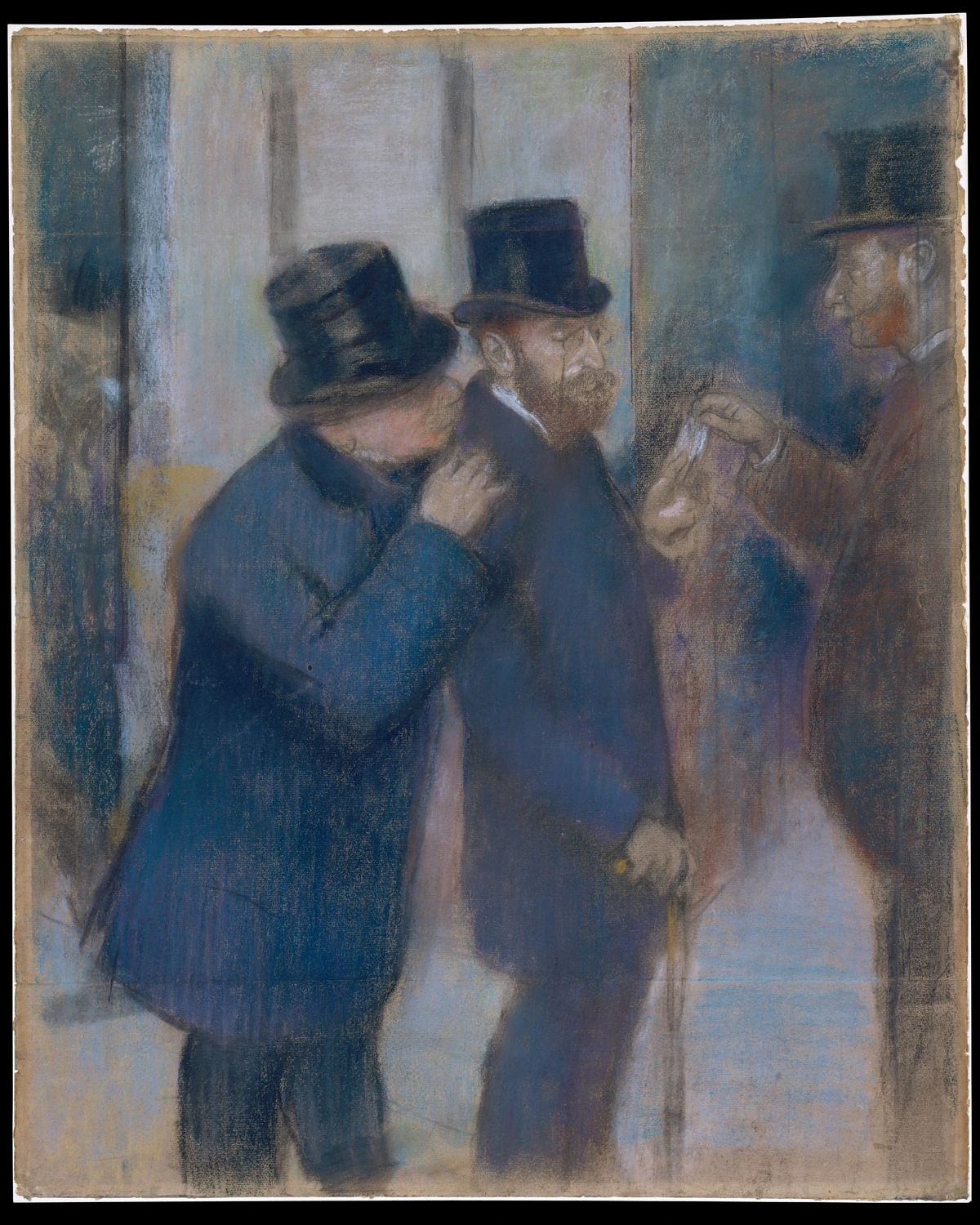
Fast forward to the Impressionist era, and pastels experienced another renaissance. Edgar Degas, perhaps the most famous pastel artist of all time, created over 700 pastel works during his career. His use of pastels to capture movement, light, and atmosphere in ballet scenes and racetrack scenes redefined what was possible with this medium. Degas showed the world that pastels weren't just for delicate portraits—they could be bold, expressive, and incredibly powerful.
Today, contemporary artists continue to push the boundaries of what pastels can do. From hyperrealistic portraits to bold abstract compositions, pastels have proven their versatility across countless artistic styles. What I love most about this history is how it connects us to artists across time—we're using the same fundamental materials that Degas and Carriera worked with, but with modern understanding and techniques.
Key Historical Milestones in Pastel Art
Understanding the historical context of pastels can give you a deeper appreciation for the medium and inspire your own artistic journey. Here are some key milestones:
- 1520s: The earliest known pastel works emerge in Italy, primarily for portrait sketches
- 1690s: Rosalba Carriera perfects pastel portraiture in Venice, bringing the medium to prominence
- 1750s: Maurice Quentin de La Tour establishes pastel as a serious fine art medium in France
- 1860-1890: Edgar Degas creates his revolutionary pastel works during the Impressionist movement
- 1900s: Pastels gain recognition as a standalone medium, separate from watercolor and oil painting
- 1950s-1960s: The Pastel Society of America is founded, establishing professional standards
- 2000s-Present: Digital photography and printing techniques complement traditional pastel work
Modern Masters Who Redefined Pastels
While Degas and Carriera are the historical giants, several 20th and 21st-century artists have significantly influenced contemporary pastel practice:
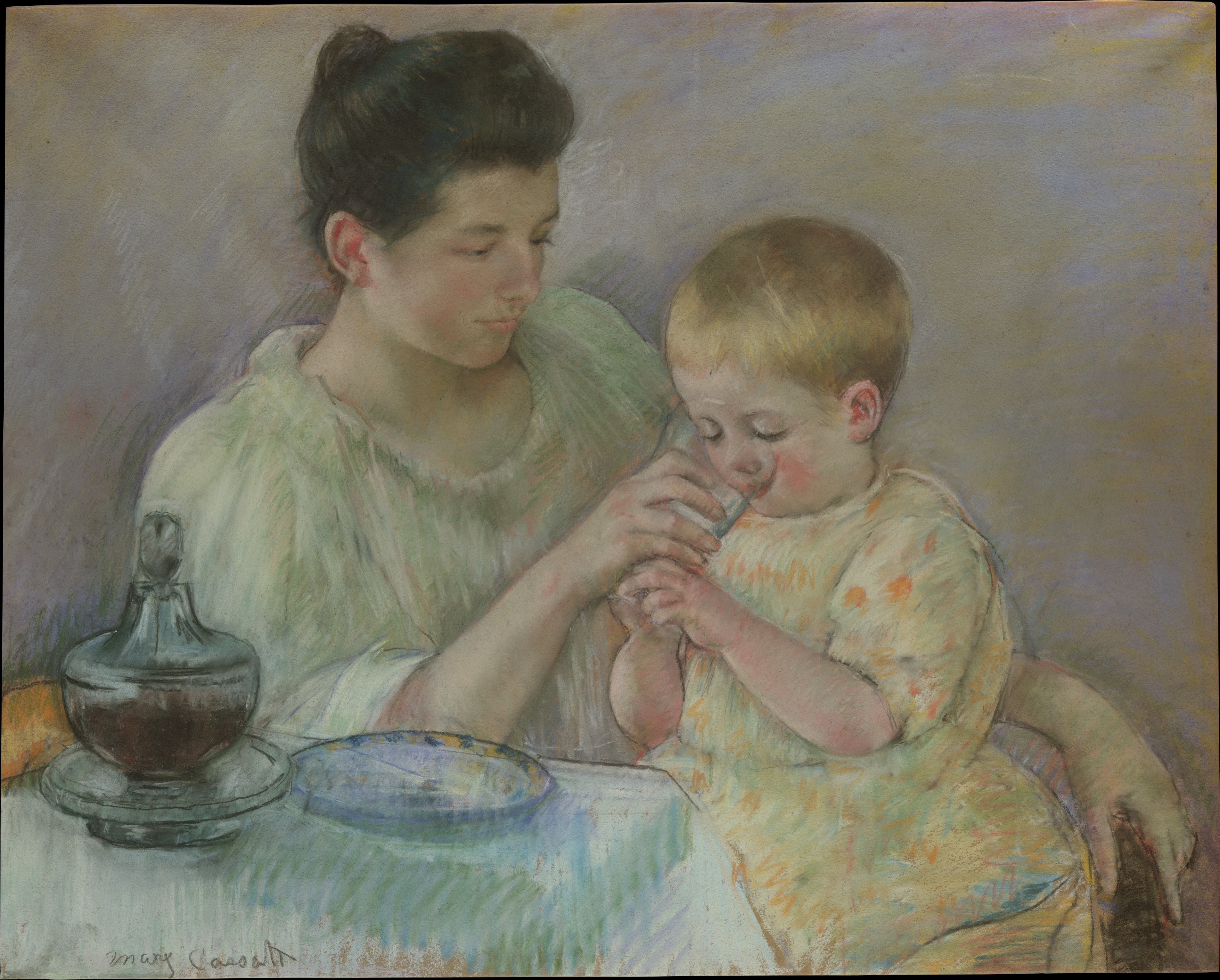
Mary Cassatt (1844-1926): An American painter and printmaker who worked closely with the Impressionists. Cassatt brought a tender, intimate quality to pastel portraiture, particularly in her mother-and-child scenes. Her use of soft edges and warm colors created a sense of emotional depth that continues to influence artists today.
Wolf Kahn (1927-2020): A German-born American artist known for his vibrant landscape pastels. Kahn's work blended Abstract Expressionism with traditional landscape painting, creating atmospheric works that captured the essence of nature rather than its literal representation. His approach to color—bold, unexpected combinations—has inspired generations of landscape artists.
Daniel Greene (b. 1934): A contemporary master known for his exceptional technical skill and lifelike portraits. Greene's pastel works demonstrate the medium's capacity for incredible detail and realism. His teaching and workshops have helped elevate the technical standards of pastel art worldwide.
Margaret D. H. Johnson: A contemporary artist who combines traditional pastel techniques with modern sensibilities. Her abstract works explore the intersection of color, form, and emotion, showing that pastels aren't just for representational art.
The Evolution of Pastel Manufacturing
The materials themselves have evolved dramatically over time, affecting how artists work with pastels:
Early Pastels (16th-18th Centuries): Made with natural pigments, gum arabic, and honey. These were often softer and more fragile than modern pastels, with limited color ranges.
Industrial Revolution (19th Century): Advances in chemistry created new, more stable pigments. Manufacturers began producing pastels in standardized sets, making them more accessible to artists.
20th Century: Professional manufacturers like Schmincke, Sennelier, and Unison emerged, focusing on quality, lightfastness, and unique color ranges. The development of oil pastels by Henri Sennelier in the 1940s (at Picasso's request) expanded the medium's possibilities.
21st Century: Modern techniques allow for greater consistency, lightfastness, and color purity. Many artists now combine traditional sticks with PanPastels, pastel pencils, and even digital tools.
Why Pastels Are Making a Modern Comeback
You might be wondering, "In an age of digital art and endless new mediums, why are people still so drawn to pastels?" The answer, I believe, lies in what makes pastels unique: their immediacy and tactile nature. In a world that's increasingly digital and disconnected from physical materials, pastels offer a grounding, sensory experience that's hard to find elsewhere.
There's something incredibly satisfying about the physical act of drawing with pastels—the way the pigment dust feels on your fingers, the sound of the sticks gliding across textured paper, the immediate visual feedback you get. It's a direct connection between your hand and the artwork, without the barriers of brushes, palettes, or digital interfaces. This immediacy makes pastels perfect for capturing fleeting moments, raw emotions, and spontaneous ideas.
The Digital Detox Movement
In recent years, there's been a growing backlash against digital overload. People are seeking authentic, tangible experiences that connect them to the physical world. Pastels fit perfectly into this movement:
- Tactile Satisfaction: The physical sensation of working with pastels provides a sensory experience that screens simply can't replicate
- Mindful Creation: The slow, deliberate process of layering and blending encourages mindfulness and presence
- Analog Joy: In a world of infinite digital options, pastels offer finite, tangible materials that paradoxically feel more liberating
- Zero Learning Curve for Creation: Unlike digital software that requires technical knowledge, pastels respond immediately to your touch
The Science Behind Pastel Appeal
Research in neuroscience and psychology helps explain why pastels resonate so deeply with modern audiences:
The Haptic System: Our sense of touch is deeply connected to memory and emotion. When you work with pastels, you're engaging multiple sensory pathways simultaneously—visual, tactile, and even olfactory (the distinct smell of pure pigment). This multi-sensory engagement creates stronger neural connections and more memorable creative experiences.
Flow State Induction: The immediate, responsive nature of pastels makes it easier to enter a "flow state"—that optimal state of consciousness where you feel fully immersed and energized by the activity. The lack of drying time, complex setup, or technical barriers allows for uninterrupted creative flow.
Dopamine Response: The vibrant colors and smooth blending process trigger dopamine release in the brain, creating feelings of pleasure and reward. This biological response helps explain why working with pastels can feel addictive in the best possible way.
Another reason for their modern resurgence is the growing emphasis on mental health and mindfulness in art. Pastels are inherently forgiving—there's no "mistake" you can't fix, no layer you can't cover. This makes them an incredibly approachable medium for anyone looking to explore creativity without pressure. The act of blending colors, building layers, and watching your artwork emerge from the paper can be incredibly meditative and therapeutic.
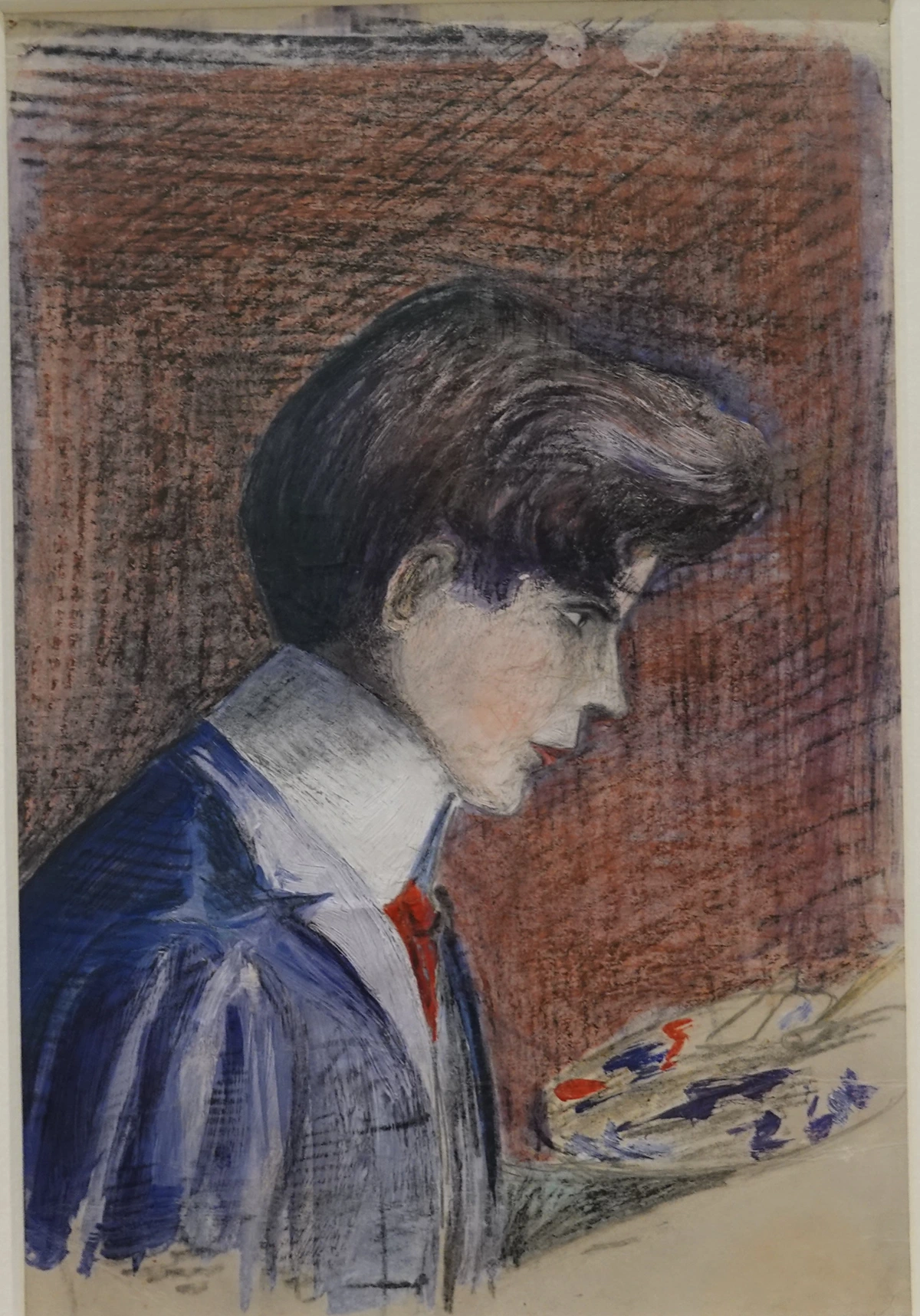
I remember that first moment so vividly - standing in an art store, staring at walls of colorful sticks, feeling completely overwhelmed. It was like being a kid in a candy store, but with adult-level anxiety about making the 'right' choice. That moment of hesitation? I've come to realize it's actually a good thing. It means you care about getting it right. But here's the secret I wish someone had told me then: pastels are one of the most forgiving mediums out there. You can't really 'ruin' things in the same way you might with oils or watercolors. There's no drying time, no complex layering rules, just pure pigment and your imagination. And honestly? That's what makes it so magical.
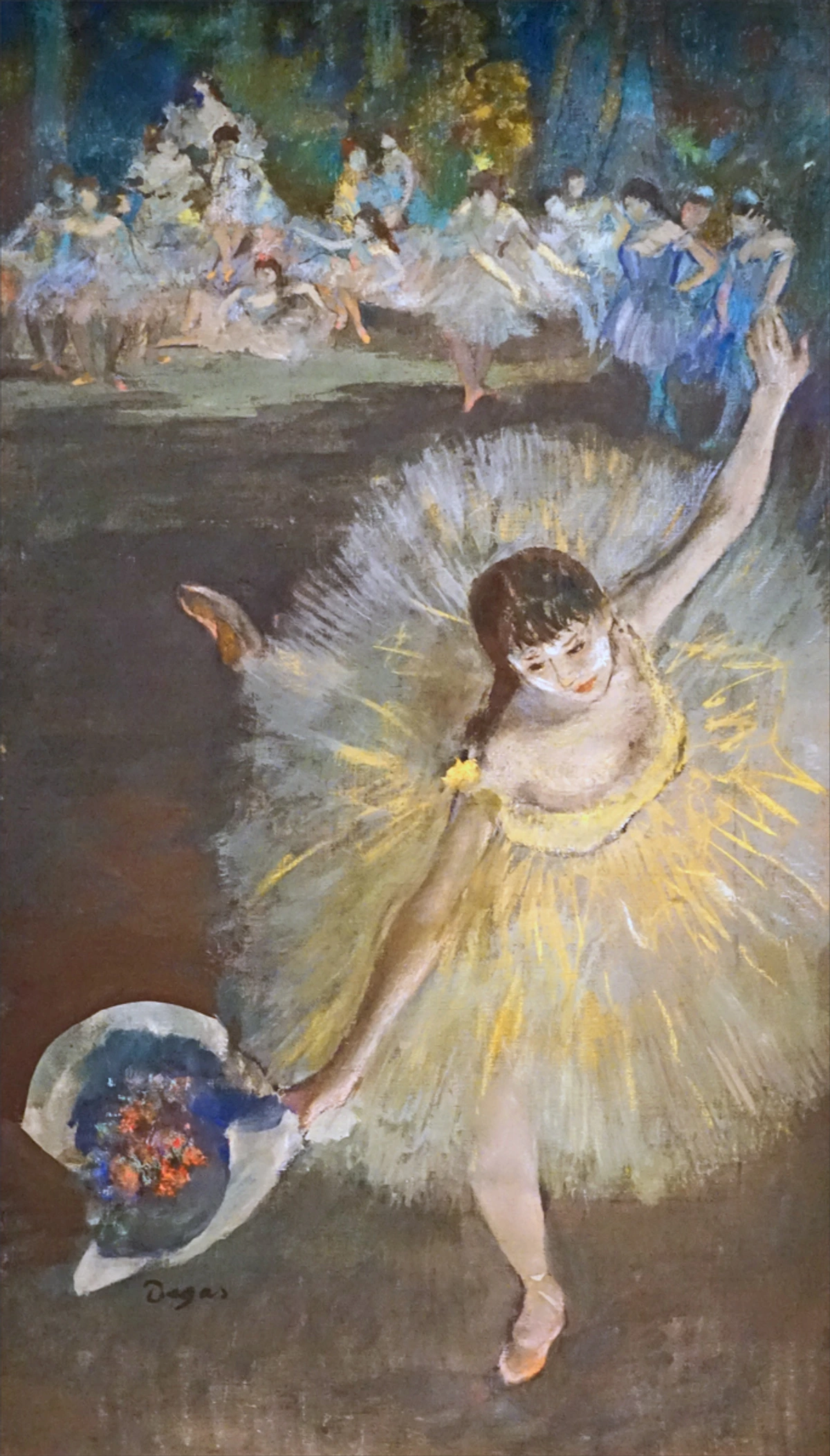
What Even ARE Pastels, Anyway? (And Why I Love Them)
Before we dive into the shopping list, let's just quickly touch on what we're talking about here. Pastels, at their core, are pure pigment held together with a minimal binder. That's it! There are no solvents, no drying times like with oil painting or waiting for layers with watercolor. It's just color, direct from stick to paper. And that, my friend, is why I utterly adore them.
There's a raw, immediate intimacy to working with pastels. You're literally touching the pigment, blending with your fingers, feeling the texture of the paper. It's a very sensory experience, almost primal. It also means you get intensely vibrant colors, which, as an artist who often delves into abstract art, is something I'm always chasing. They're quick, expressive, and you can achieve incredible depth without a huge learning curve on complicated techniques. Though, if you're curious about different types of artistic tools, I've written a whole definitive guide to art materials that might interest you.
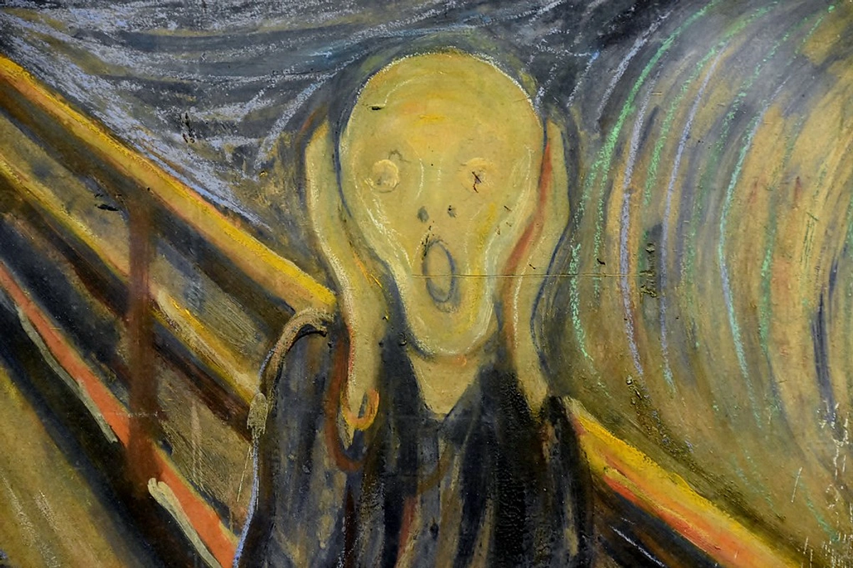
The Chemistry Behind Pastels
Let's get a bit scientific for a moment (don't worry, I'll keep it simple!). Understanding the basic chemistry of pastels can help you appreciate why they behave the way they do:
Pigments: These are the actual color particles in pastels. They can be:
- Natural: Derived from minerals, plants, or animals (like ochre from iron oxide or ultramarine from lapis lazuli)
- Synthetic: Chemically manufactured pigments that offer more consistent color, better lightfastness, and a wider range of hues
Binders: The "glue" that holds pigment particles together without compromising their color intensity:
- Gum Tragacanth: A natural gum from the Astragalus plant, valued for its adhesive properties and transparency
- Methylcellulose: A synthetic binder that provides excellent adhesion and flexibility
- Clay: Used in harder pastels to provide structure while maintaining minimal interference with pigment color
Fillers: Small amounts of inert materials that:
- Adjust hardness and texture
- Reduce cost in student-grade pastels
- Can affect lightfastness and color saturation
The magic of pastels lies in the pigment-to-binder ratio. Unlike paints where binder dominates, pastels maintain an incredibly high pigment concentration—often 80-95% pure pigment. This is what gives pastels their characteristic vibrancy and why they're sometimes called "dry painting."
The Physical Properties That Make Pastels Unique
Understanding the physical properties of pastels can help you appreciate why they behave the way they do and how to work with them more effectively. Pastels are essentially dry pigment held together with a minimal binder, typically gum tragacanth or methylcellulose. This high pigment-to-binder ratio is what gives pastels their characteristic texture and vibrant color intensity.
Opacity and Transparency: Unlike watercolors which are typically transparent, pastels are inherently opaque. This means they cover whatever surface they're applied to, making them excellent for creating bold, solid colors. However, you can create transparency effects by layering thin washes or using specific techniques that allow the underlying surface to show through.
Texture and Tooth: The gritty, powdery texture of pastels is both their challenge and their charm. This "tooth" is what allows them to adhere to surfaces and create the characteristic velvety finish. Different types of pastels have different levels of grit—soft pastels are powdery and velvety, while harder pastels are more compact and less dusty.
Light Reflection: Pastels don't absorb light like paints; they reflect it. This is part of what gives them their luminous quality. The way light interacts with the pigment particles creates a depth and richness that's difficult to achieve with other mediums. This is especially noticeable when you view pastel artwork from different angles—you'll see subtle shifts in color and luminosity.
Dust Generation: Let's be honest—pastels create dust. This is one of the biggest challenges for beginners, but it's also part of what makes pastels unique. The dust can settle on your work surface, your clothes, and yes, even your artwork. But with proper techniques and setup, this becomes much less of an issue. Many artists actually incorporate the dust into their work, using it for subtle atmospheric effects.
Advanced Physical Properties and Their Impact on Artwork
Beyond the basics, several physical properties significantly influence how pastels perform and how you can manipulate them:
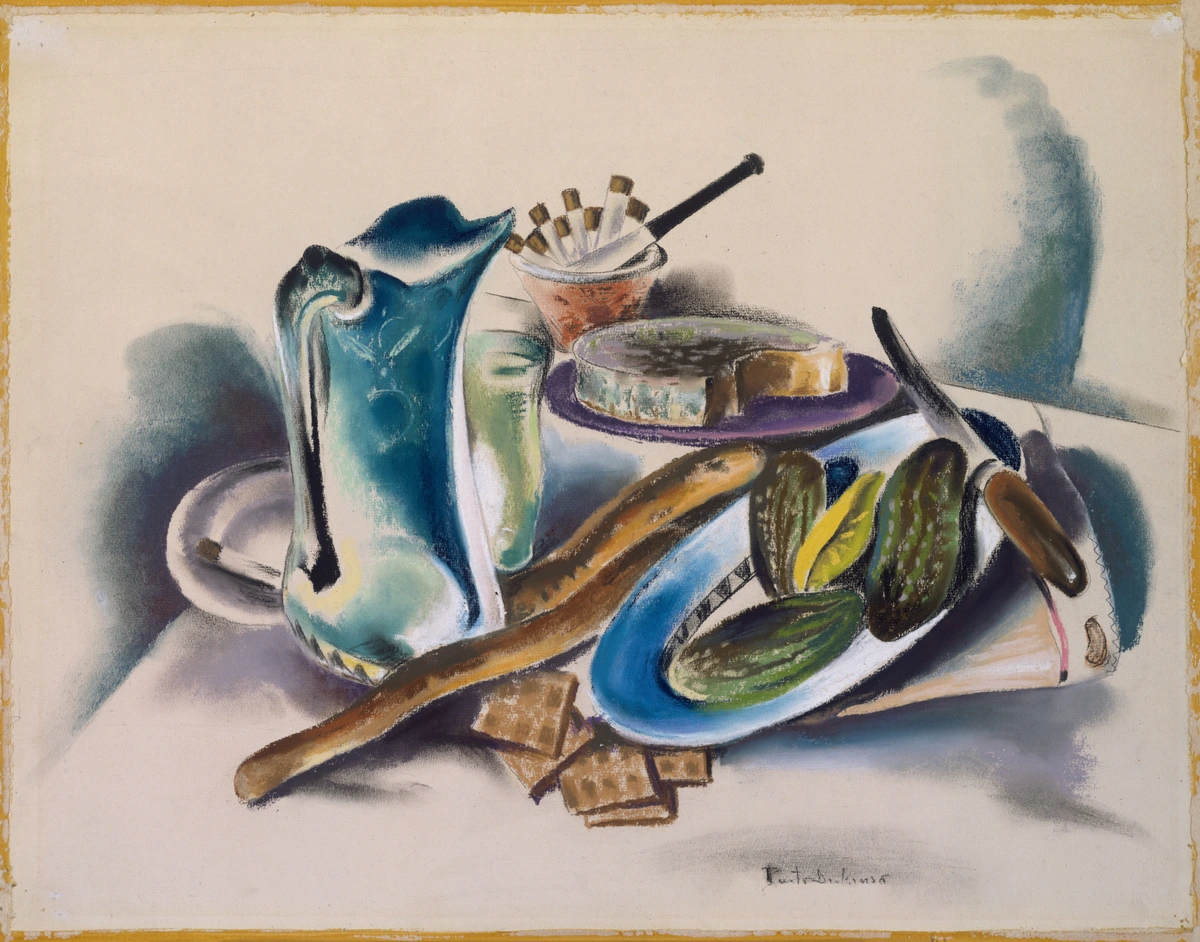
Lightfastness: This refers to how well pastel colors resist fading when exposed to light. It's measured on a scale from I (most lightfast) to III (least lightfast). Professional artists should prioritize lightfastness ratings, especially for works intended for long-term display or sale.
Hardness/Softness Spectrum: Pastels exist on a continuum from very hard to very soft:
- Hard Pastels: Good for detail work, initial sketches, and underpainting
- Medium Pastels: Versatile for most applications
- Soft Pastels: Ideal for blending, large areas, and vibrant color applications
- Extra-soft Pastels: Specifically formulated for maximum color intensity and blending capability
Solubility: While pastels are designed to be dry, different binders and pigments have varying levels of solubility. This becomes important if you want to experiment with water-soluble pastels or techniques involving minimal moisture.
Adhesion Properties: How well pastels stick to different surfaces varies based on:
- Surface texture (tooth)
- Pastel hardness/softness
- Environmental factors (humidity, temperature)
- Previous layers and fixatives used
Temperature and Humidity Effects
Environmental factors play a significant role in pastel behavior:
Temperature Effects: Higher temperatures can make pastels softer and more prone to breaking, while colder temperatures make them more brittle. This is particularly important for artists working in extreme climates or transporting pastels.
Humidity Considerations: High humidity can:
- Make pastels feel softer and stickier
- Increase dust adhesion (both good and bad)
- Affect paper texture and tooth
- Influence drying times if using any wet techniques
Most professional artists work in controlled environments (typically 40-60% humidity) for optimal pastel performance, but don't let this intimidate you—pastels are remarkably forgiving once you understand these basic principles.
The Psychology of Color in Pastel Art
Color psychology plays a fascinating role in how viewers respond to pastel artwork. Understanding these relationships can help you create more intentional and impactful compositions:
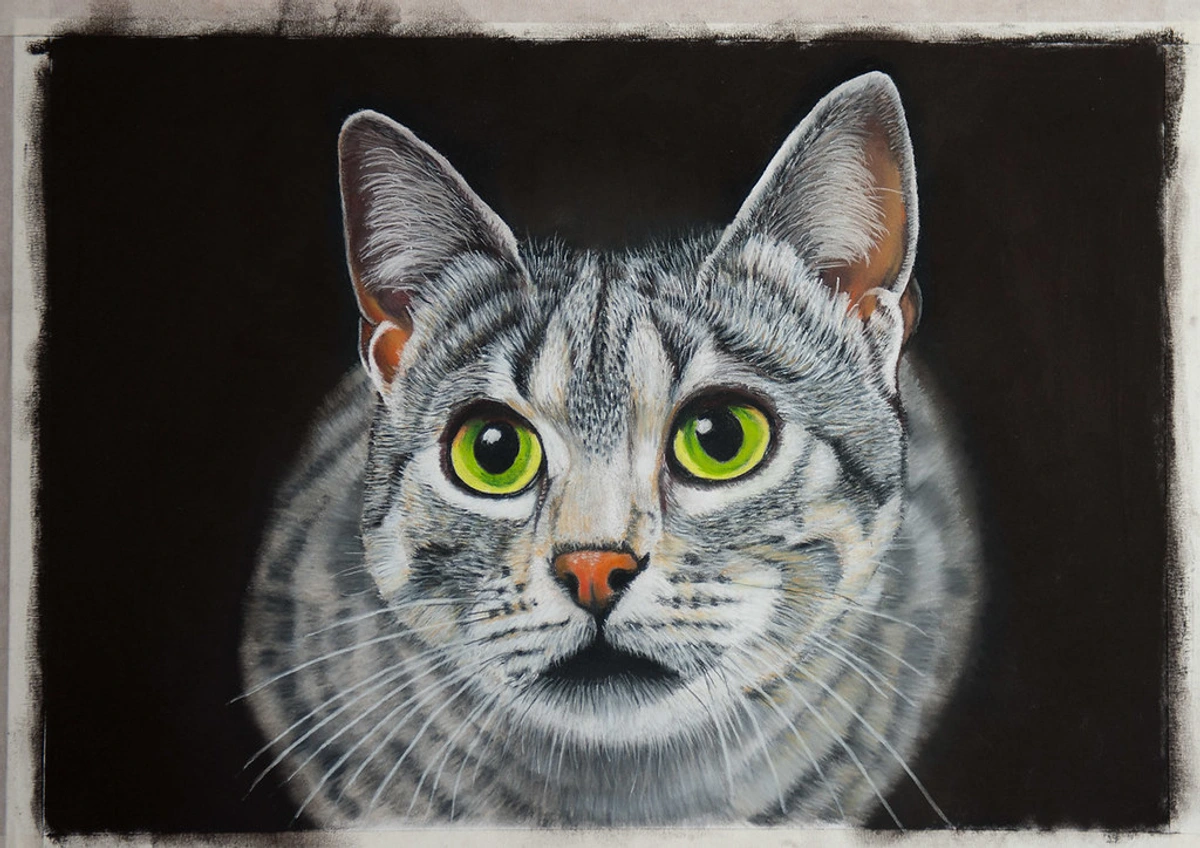
- Warm Colors (Reds, Oranges, Yellows): These colors tend to advance visually and create feelings of energy, warmth, and excitement. They're perfect for creating focal points and drawing attention.
- Cool Colors (Blues, Greens, Purples): These colors tend to recede visually and create feelings of calm, peace, and tranquility. They work well for backgrounds and creating depth.
- Neutral Colors (Grays, Browns, Blacks): These colors provide balance and can create sophisticated, elegant effects. They're excellent for creating contrast and highlighting vibrant colors.
- Pastel Tones: The soft, muted nature of pastel colors creates a gentle, dreamy quality that's often associated with nostalgia, tenderness, and softness.
When working with pastels, you have the unique advantage of being able to layer these colors to create complex emotional effects. A warm red background with cool blue accents, for example, can create a dynamic tension that draws viewers into your artwork.
Color Temperature and Mood in Pastel Compositions
Beyond the basic warm/cool distinction, understanding color temperature is crucial for creating mood in pastel work. Colors aren't inherently warm or cool—their temperature depends on context and what they're placed next to. This is one of the most exciting aspects of working with pastels: you can create subtle temperature shifts that profoundly affect the emotional impact of your artwork.
Warm Colors: Red, orange, yellow, and their variations tend to create feelings of energy, passion, warmth, and excitement. They advance visually, meaning they appear closer to the viewer. Use warm colors for focal points, areas you want to emphasize, or to create a sense of intimacy and closeness.
Cool Colors: Blue, green, purple, and their variations create feelings of calm, peace, tranquility, and sometimes sadness or mystery. They recede visually, appearing farther away. Cool colors are excellent for backgrounds, creating depth, or establishing a serene atmosphere.
Neutral Colors: Grays, browns, and blacks provide balance and sophistication. They can create elegant effects, provide contrast for vibrant colors, or establish a mood of seriousness, mystery, or elegance.
Pastel Tones: The soft, muted quality of pastel colors creates a gentle, dreamy atmosphere associated with nostalgia, tenderness, and softness. This makes them particularly well-suited for certain emotional effects that might feel too harsh or intense with brighter, more saturated colors.
Creating Emotional Depth with Layered Colors
One of the most powerful techniques in pastel art is using layered colors to create emotional depth. When you layer colors, you're not just building physical layers—you're building emotional and psychological layers as well. Here's how to think about it:
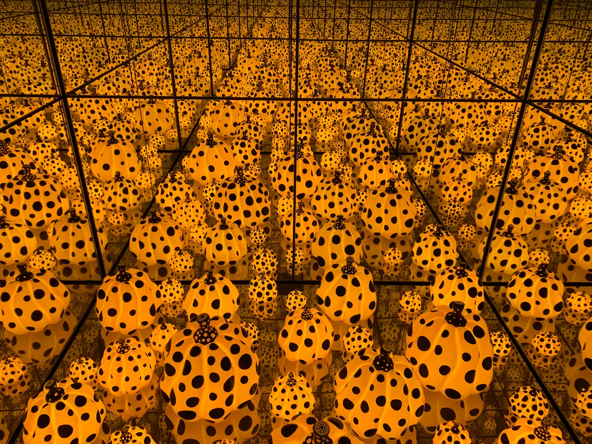
- Base Layer Emotion: Start with a base color that establishes the primary emotional tone of your piece. This might be a warm yellow for happiness, a deep blue for contemplation, or a muted gray for melancholy.
- Contrasting Emotions: Add contrasting colors that create emotional tension or balance. A warm base with cool accents can create a sense of conflict or complexity. A cool base with warm highlights can suggest hope emerging from sadness.
- Subtle Transitions: Use transitional colors to blend between emotional states. A yellow-green between yellow and blue can suggest transformation or growth. A purple-pink between purple and red can suggest passion emerging from mystery.
- Highlight and Shadow Emotions: Your highlights and shadows carry emotional weight too. Bright, pure highlights can suggest hope or clarity, while dark, muted shadows can suggest depth, mystery, or intensity.
Understanding the Different Types of Pastels
When you start exploring pastels, you'll quickly discover they come in several different forms, each with its own unique characteristics:

- Soft Pastels: These are the most popular and what most people imagine when they think of pastels. They're made with a higher pigment-to-binder ratio, making them incredibly soft and vibrant. They lay down color beautifully and blend like a dream, perfect for creating that signature velvety finish. They're messy but oh-so-rewarding to work with.
- Hard Pastels: As the name suggests, these are firmer than soft pastels. They contain more binder and less pigment, making them ideal for initial sketching, adding fine details, and creating clean lines. They're less messy than soft pastels and great for building the foundation of your artwork before layering with softer sticks.
- Oil Pastels: These are quite different from their chalk-based counterparts. Oil pastels use a binder of oil and wax instead of gum, making them more like a cross between pastels and oil paints. They don't produce dust, blend differently (more like oils), and can be used on various surfaces including canvas, wood, and metal. They're perfect for artists who want the vibrant color of pastels without the mess.
- Pastel Pencils: These are essentially pastel pigment in pencil form, wrapped in wood. They offer the precision of a pencil with the beautiful color of pastels. Perfect for adding fine details, writing, working on smaller pieces, or for artists who prefer the control that pencils provide.
- Pan Pastels: These are pressed pastels in pan form, applied with special tools. They're incredibly easy to blend and produce very smooth, even color applications. Great for artists who want less mess and more control over their application technique.
The Absolute Must-Haves: Don't Start Without These
Alright, grab a coffee (or a tea, whatever your poison) and let's talk essentials. This isn't about buying out the whole art store; it's about getting the bare minimum to actually start creating.
Understanding Your Investment
Before we dive into specific supplies, let's talk about what you can expect to invest. Pastels can range from incredibly affordable to shockingly expensive, and understanding this spectrum will help you make informed decisions:
- Beginner Budget: $50-150 for a complete starter setup
- Serious Hobbyist: $200-500 for quality materials
- Professional Artist: $1000+ for premium materials and specialized tools
The good news? You don't need to spend a fortune to create beautiful pastel artwork. Many artists start with affordable materials and gradually upgrade as their skills and preferences develop. The most important investment isn't in expensive supplies—it's in your time, practice, and developing your artistic eye.
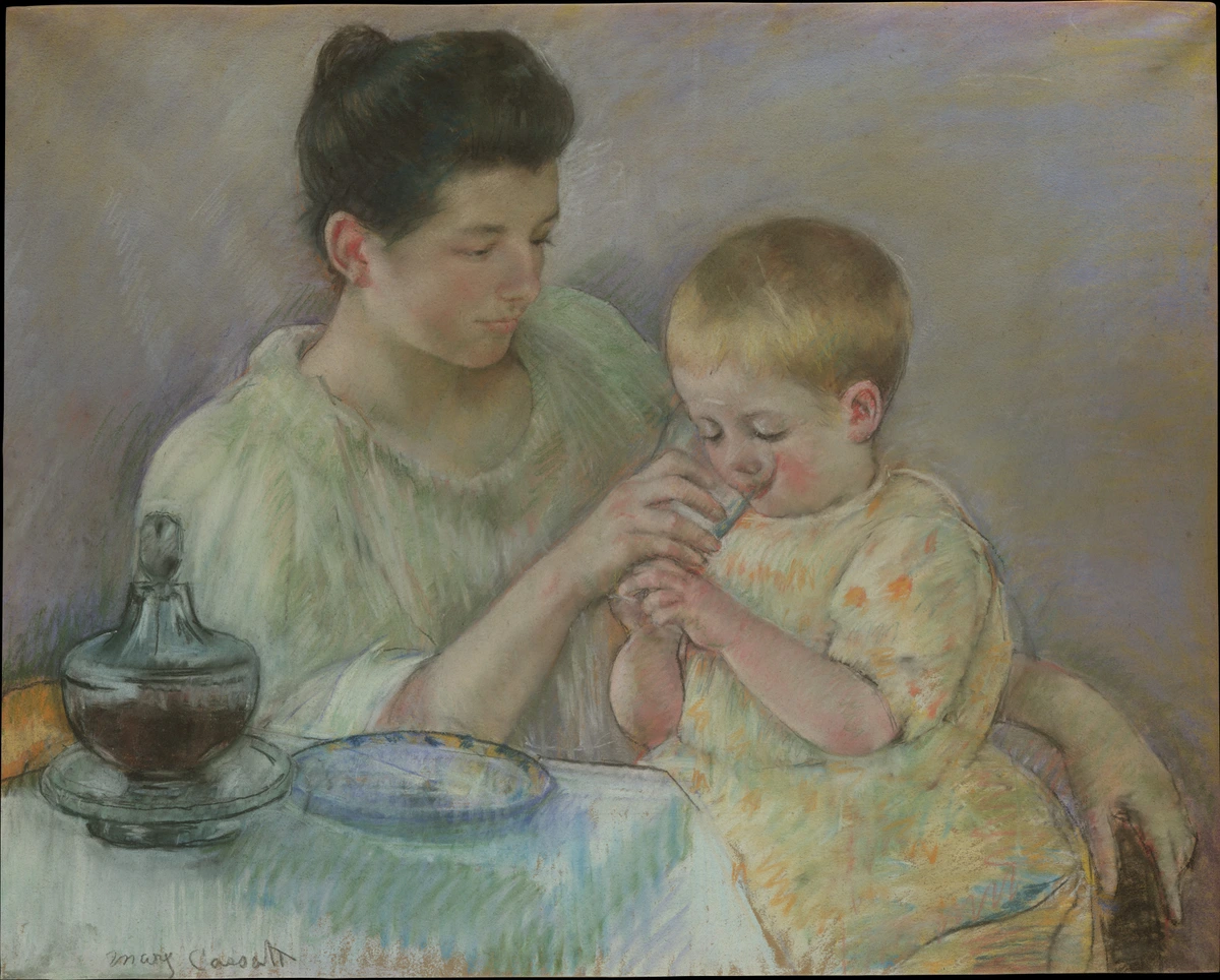
1. The Pastels Themselves: A World of Softness and Sticks
This is the obvious one, right? But even here, beginners can get lost. You'll encounter soft pastels, hard pastels, and pastel pencils. My strong recommendation for getting started, especially if you want that beautiful, blendable color, is soft pastels.
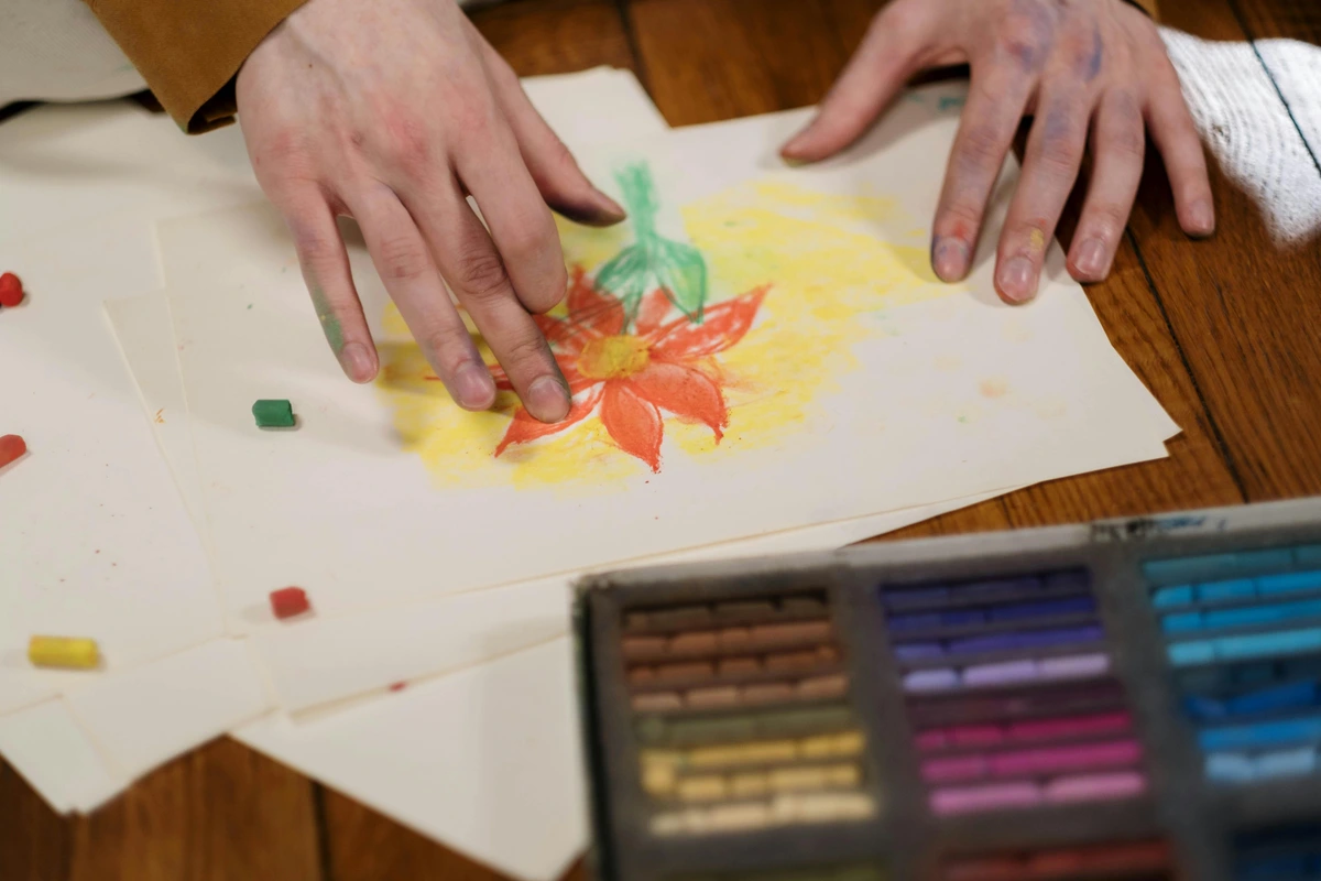
Soft pastels are exactly what they sound like: very soft, almost creamy sticks of pure pigment. They lay down color beautifully, blend like a dream, and produce that signature velvety finish. Don't worry about buying the most expensive artist-grade sets right away. A good student-grade set of 12-24 colors from a reputable brand will give you plenty to play with. You want variety, but not so much that you're paralyzed by choice. My advice? Pick a set that looks appealing to you. Seriously, art should be fun!

Hard pastels are firmer and great for details or initial sketches, and pastel pencils offer precision. You can add these later, but for getting a feel for the medium, soft pastels are your best bet.
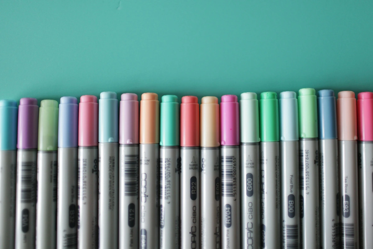
Recommended Brands and Starter Sets
When you're starting out, the brand matters less than you might think, but some brands are definitely more beginner-friendly than others. Here are some recommendations:
- Student Grade (Great for Beginners):
- Rembrandt: Good quality student pastels that are soft and blend well. They're a step up from the cheapest options without breaking the bank.
- Schmincke Horadam: Excellent student-quality pastels with good pigment load and smooth texture.
- Prismacolor Nupastels: These are actually harder pastels, but they're great for beginners who want less mess and more control for sketching.
- Artist Grade (When you're ready to invest):
- Schmincke Soft Pastels: Considered by many to be among the best. They have incredible pigment load and blend beautifully.
- Sennelier: French brand loved for their rich colors and creamy texture. They come in a wide range of hues.
- Unison Pastels: Handmade in the UK, known for their unique color palettes and beautiful consistency.
- Terry Ludwig: Handmade pastels with velvety texture and vibrant colors. Great for landscapes.
Color Selection Strategy
One of the biggest challenges for beginners is choosing colors. Here's my approach:
- Start with a Limited Palette: Don't try to get every color imaginable. Begin with a basic set that includes:
- Primary colors (red, yellow, blue)
- Secondary colors (orange, green, purple)
- Black and white
- A few earth tones (burnt sienna, yellow ochre, umber)
- Think About Your Subjects: If you love landscapes, focus on blues, greens, earth tones, and sky colors. If you prefer portraits, invest in skin tone ranges and complementary colors.
- Consider Light and Shadow: Make sure you have both light and dark versions of your main colors. This helps create depth and dimension in your work.
- Don't Forget Neutrals: Grays, browns, and blacks are essential for creating shadows and depth. Many beginners underestimate how much they'll use these!
Building Your Pastel Collection Over Time
As you develop your skills and discover your artistic preferences, you'll naturally want to expand your pastel collection. Here's a strategic approach to building your palette over time:
Phase 1: Foundation (0-3 months)
- Focus on getting a quality student-grade set with 24-48 colors
- Prioritize versatility over specialization
- Learn basic color mixing and blending techniques
- Experiment with different brands to find what you prefer
Phase 2: Expansion (3-12 months)
- Identify gaps in your current palette
- Add specific colors you use frequently
- Consider adding a few artist-grade pastels for your absolute favorites
- Experiment with different pastel types (soft, hard, pencils)
Phase 3: Specialization (12+ months)
- Invest in artist-grade pastels for colors you use most
- Build specialized palettes for different subjects (landscapes, portraits, abstracts)
- Consider unique or hard-to-find colors that add distinctive qualities to your work
- Organize your pastels by color family or usage frequency
Smart Shopping Tips for Pastel Collectors
- Buy Quality Over Quantity: It's better to have fewer high-quality pastels than many low-quality ones. Quality pastels blend better, have better lightfastness, and last longer.
- Consider Sets vs. Individual Sticks: Sets offer good value and variety, but individual sticks let you choose exactly the colors you want. I recommend starting with a good set, then adding individual sticks for specific colors you need.
- Look for Sales and Discounts: Art supply stores often have sales, especially on student-grade materials. Sign up for newsletters from your favorite brands to stay informed.
- Consider Second-Hand Options: Some artists sell their unused pastels, and you can find good deals this way. Just make sure to check the condition and lightfastness ratings.
- Storage Matters: Invest in proper storage to keep your pastels organized and protected. A good pastel box or tray will prevent breakage and make your colors easier to find.
2. Paper: It's Not Just Any Old Sheet!
This is probably the most common mistake I see beginners make – trying to use regular drawing paper. Nope! Pastels need something with 'tooth'. What's tooth? It's the texture of the paper, those tiny little nooks and crannies that grab and hold the pastel pigment. Without enough tooth, your pastel will just slide off, and you won't be able to build up layers.
I mean, if you're just sketching ideas, any paper will do, but for actual finished pieces, invest in some proper pastel paper. Look for paper specifically labelled for pastels or sanded pastel paper. Canson Mi-Teintes is a classic for a reason, offering a good balance of texture and affordability. You don't need huge sheets to begin with; a pad of A4 or A3 will be perfect. I often find myself thinking about how different mediums interact with surfaces, much like when I was first experimenting with various types of canvas for acrylics versus oils.
Understanding Paper Weight and Texture
Paper weight and texture are two critical factors that affect your pastel work:
Paper Weight (GSM):
- 160-200 GSM: Good for sketches and practice pieces
- 250-300 GSM: Ideal for most finished artworks
- 350+ GSM: Great for large pieces or heavy layering
Texture Levels:
- Smooth: Light tooth, good for detailed work
- Medium: Balanced texture, versatile for most applications
- Rough/Coarse: Heavy tooth, excellent for multiple layers and vibrant colors
Preparing Your Paper
Sometimes the best results come from preparing your own surfaces:

Creating Additional Tooth: For regular papers that lack sufficient texture:
- Apply a thin layer of pastel ground or acrylic gesso
- Let it dry completely
- Lightly sand with fine-grit sandpaper
- Apply a second layer if needed
Taping Down Your Paper: Prevent buckling and warping:
- Use artist's tape or masking tape
- Tape all four sides to a firm board
- Apply gentle pressure to ensure good adhesion
- Remove tape carefully after work is completed
Understanding Pastel Lightfastness
One important consideration that many beginners overlook is lightfastness - how well colors resist fading when exposed to light. This is particularly important if you plan to sell or display your artwork long-term.
Lightfastness is typically rated on a scale from I (most lightfast) to III (least lightfast). Here's what you need to know:
- Rating I: Excellent lightfastness. These colors will show minimal change over long periods, even in bright light or direct sunlight.
- Rating II: Very good lightfastness. These colors are suitable for most artwork, though they may show some slight fading over many years in very bright conditions.
- Rating III: Moderate lightfastness. These colors should be used with caution, especially in artwork that will be displayed in bright light or sold professionally.
When selecting pastels, especially artist-grade ones, pay attention to their lightfastness ratings. Many manufacturers provide this information on their product labels or in their color charts. For important artwork that you want to last, stick to Rating I and II colors.
Types of Pastel Paper and Their Characteristics
Not all pastel paper is created equal. Here's a breakdown of the most common types:
Paper Type  | Texture | Best For | Pros | Cons |
|---|---|---|---|---|
| Canson Mi-Teintes | Medium tooth, slightly textured | General use, landscapes, portraits | Affordable, comes in colors, good for beginners | Can fill up quickly with heavy layering |
| Sanded Pastel Paper | Heavy grit texture (like sandpaper) | Detailed work, heavy layering, vibrant colors | Holds incredible amount of pigment, allows for reworking | Expensive, can be gritty on fingers |
| UART Premium Sanded Paper | Even grit, consistent texture | Professional work, archival quality | Excellent lightfastness, great tooth consistency | Very expensive |
| Art Spectrum Colourfix | Coated with a layer of pastel ground | Experimental work, mixed media | Extremely durable, accepts all media | Can be difficult to find |
| Wallis Belgian Mist | Heavy sanded surface | Professional landscapes, dramatic lighting | Superior tooth, accepts multiple layers | Pricey, requires specific techniques |
| Fabriano Artistico | Cold press watercolor paper | Light pastel work, mixed media | Affordable, versatile | Less tooth than dedicated pastel paper |
Paper Color Considerations
The color of your paper dramatically affects the mood and final look of your artwork:
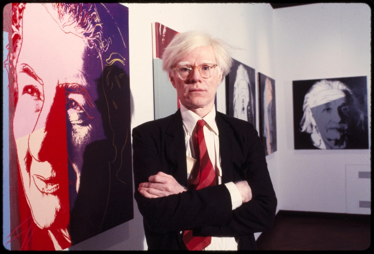
- Neutral Colors (grays, tans, creams): These are versatile and work well for most subjects. They provide a middle ground that allows both light and dark colors to pop.
- Dark Colors (black, deep blues, purples): Excellent for night scenes, dramatic portraits, or when you want your highlights to really stand out. You'll work mostly with light pastels on dark paper.
- Bright Colors: These can be challenging for beginners but create stunning effects when used well. They work best for specific artistic effects and bold compositions.
- Earth Tones: Perfect for landscapes, botanicals, and natural subjects. They create a warm, organic feel to your work.
Paper Weight and Size Considerations
- Weight: Look for paper that's at least 160gsm (grams per square meter) for durability. Heavier paper (250gsm and up) is better for larger works and prevents buckling.
- Size: Start with smaller sizes (A4 or A3) to practice and build confidence. As you get more comfortable, you can move to larger formats. Remember that larger paper requires more pastel and more time!
3. A Fixative: Because We Don't Want Smudges!
Pastels are inherently powdery. This is both their charm and their challenge. If you don't 'fix' them, they'll smudge, transfer, and generally make a beautiful mess everywhere. This is where fixative comes in.
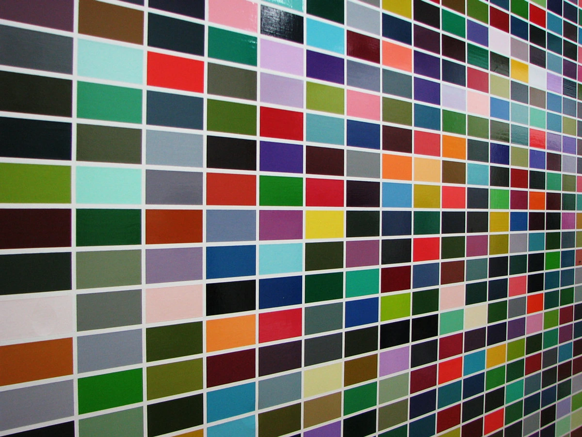
Fixative is a spray that lightly adheres the pastel particles to the paper without significantly altering the color. You spray it in light, even coats, allowing it to dry between applications. A word of warning: these sprays can be quite pungent, so always use them in a well-ventilated area, preferably outdoors. Don't go overboard, or you'll flatten your colors. A little goes a long way. Think of it as a gentle hug for your art, not a suffocating squeeze.
Types of Fixatives and When to Use Them
There are two main types of fixatives, each with its specific purpose:
- Workable Fixative: This is what you use during the creative process. It lightly sets your layers so you can add more pastel on top without completely blending away what you've already done. It's perfect for:
- Setting a base layer before adding details
- Creating a 'toothy' surface for additional layers
- Preventing your hand from smudging areas you've already worked on
- Allowing you to rework and adjust your composition
- Final Fixative: This is for when your artwork is completely finished. It provides a more permanent seal and protects your piece from smudging and environmental damage. Unlike workable fixative, final fixative is typically not designed to have more pastel applied over it.
Application Techniques and Best Practices
Proper fixative application is crucial for protecting your artwork:
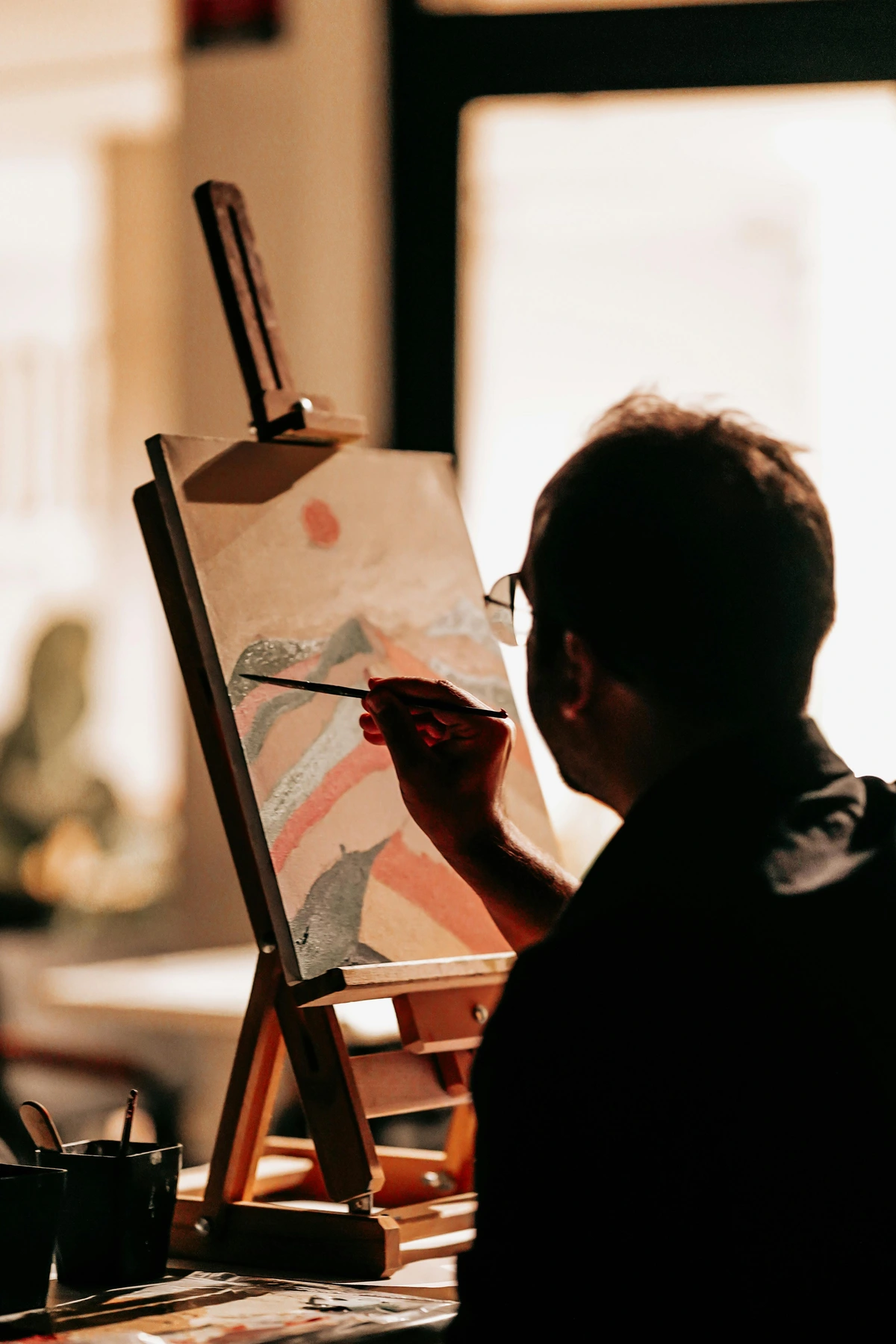
- Test First: Always test fixative on a scrap piece of paper or in an inconspicuous area of your artwork first. Some fixatives can alter color slightly.
- Distance Matters: Hold the spray can 8-12 inches away from your artwork for even coverage.
- Light Coats are Key: Apply multiple light, even coats rather than one heavy coat. Heavy coats can cause the fixative to pool, creating a glossy finish that flattens your colors.
- Allow Drying Time: Let each coat dry completely before applying the next. This usually takes 5-10 minutes depending on humidity.
- Ventilation is Essential: Always work outdoors or in a well-ventilated area. The fumes can be strong and potentially harmful.
- Protect Your Workspace: Lay down newspaper or a drop cloth to protect surrounding surfaces from overspray.
Environmental and Safety Considerations
While fixatives are essential, they do come with some environmental and safety concerns:
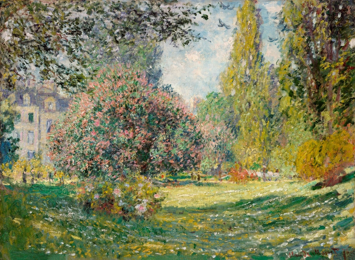
- VOC Content: Many traditional fixatives contain volatile organic compounds (VOCs) that can be harmful when inhaled. Look for low-VOC or water-based alternatives if you're sensitive to chemicals.
- Ventilation: Always use fixatives outdoors or with excellent ventilation. Consider wearing a mask if you're spraying indoors.
- Fire Safety: Some fixatives are flammable. Keep them away from heat sources and open flames.
- Storage: Store fixatives in a cool, dry place away from direct sunlight. They can lose effectiveness if exposed to extreme temperatures.
4. Blending Tools: Your Fingers and Beyond
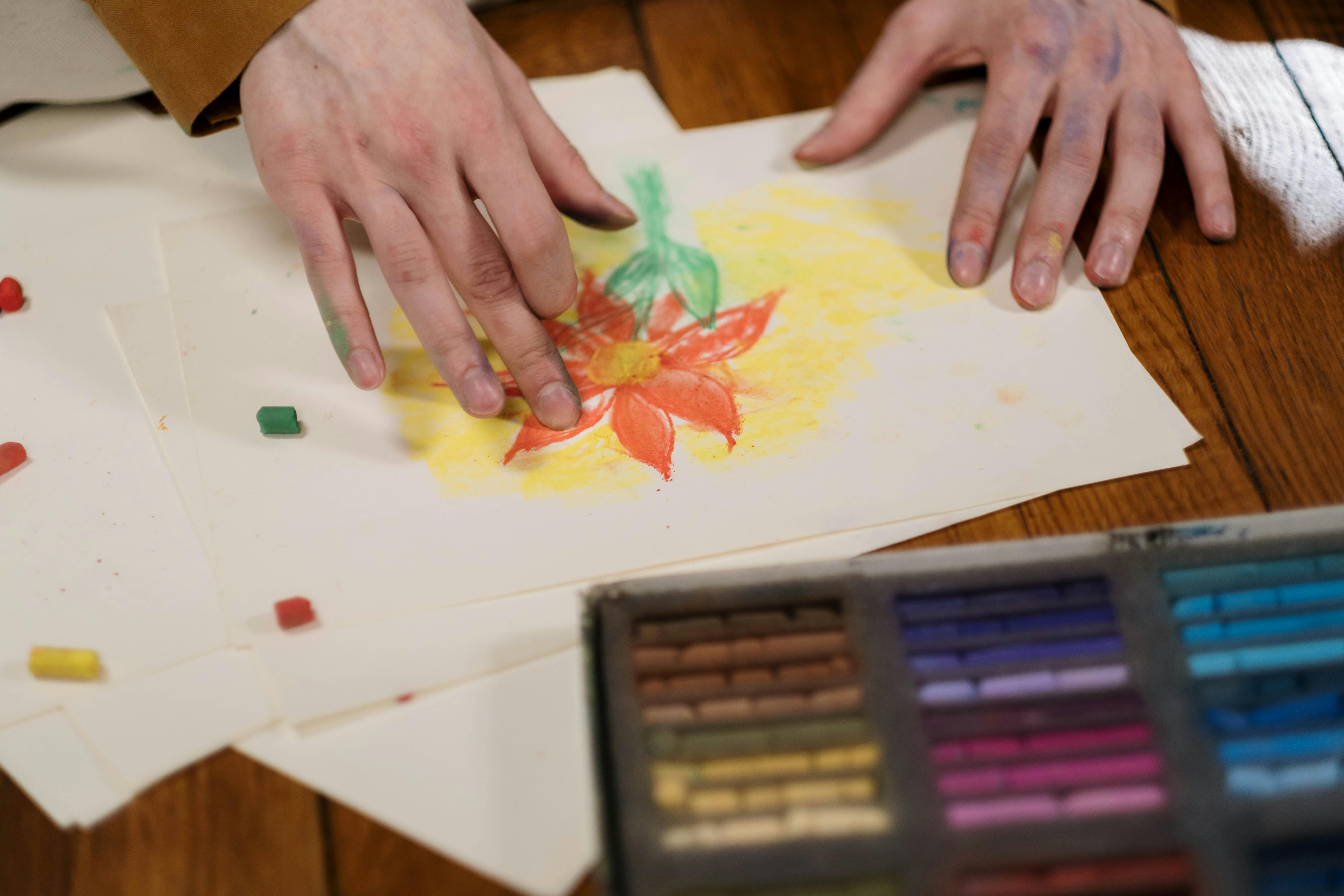
Guess what? Your very best blending tools are attached to your hands! Your fingers are fantastic for blending pastels, allowing for seamless transitions and soft edges. Just be ready to have colorful fingertips for a bit (which, honestly, I kind of enjoy – it's like a badge of honor).
However, if you want to keep your fingers clean or need more precise blending, consider a few simple tools:
- Paper Stumps/Tortillons: Tightly rolled paper sticks that come in various sizes. Great for blending small areas without getting your fingers dirty.
- Cotton Swabs or Cotton Balls: Affordable and effective for softer blends or reaching into tighter spots.
- Chamois Cloth: A soft piece of leather that can create very smooth blends and also lift off excess pigment. I've also found kneaded erasers to be surprisingly versatile here, not just for erasing but for gentle lifting, much like they are for basic drawing techniques.
- Brushes: Various types of brushes can be used for different blending effects:
- Soft hair brushes (sable, squirrel) create the smoothest blends
- Synthetic brushes are more affordable and cruelty-free
- Stencil brushes work well for stippling and texturing
- Sponges: Natural sea sponges or synthetic sponges create interesting textural effects that can't be achieved with traditional blending tools.
Advanced Blending Tools and Techniques
Once you're comfortable with the basics, you might want to explore more specialized blending tools:

- Brushes: Various types of brushes can be used for blending:
- Soft natural hair brushes (sable, squirrel): Excellent for very smooth blending and lifting pigment
- Soft synthetic brushes: Good alternative to natural hair, more affordable and cruelty-free
- Stencil brushes: Short, stiff brushes perfect for stippling and texturing effects
- Sponges and Foam Tools: These create interesting textural effects:
- Makeup sponges: Great for smooth, even blending
- Sea sponges: Create organic, irregular texture patterns
- Foam brushes: Good for larger blending areas
- Specialized Pastel Tools:
- Pastel blending tools: Specifically designed for pastel work with various tip shapes
- Palette knives: Can be used for scraping and creating texture
- Toothbrushes: Great for creating splatter effects and texture
Blending Techniques for Different Effects
Different blending techniques create different visual effects:
- Finger Blending: The most intuitive method. Use your fingertips to gently blend colors together. Best for soft transitions and organic shapes.
- Dry Blending: Using tools like brushes or stumps on dry pastel. Creates soft, blended edges without adding moisture.
- Wet Blanding (with caution): Some artists use a very slightly damp brush or sponge to blend pastels, but this can be tricky as it can dissolve the binder. Only attempt this if you understand the risks.
- Optical Blending: Placing colors side by side rather than blending them physically. The viewer's eye blends the colors from a distance. Great for creating vibrant, luminous effects.
- Layered Blending: Building up multiple thin layers of color, blending between each layer. Creates rich, complex color depths.
Nice-to-Haves That Make Life Easier (and More Fun)
Once you've got the essentials, there are a few things that can really enhance your pastel experience without breaking the bank. These aren't critical for starting, but they're definitely welcome additions.
Environmentally Friendly Pastel Practices
As artists, we have a responsibility to minimize our environmental impact. Here are some eco-friendly practices for pastel work:
Proper Disposal: Never dump pastel dust down the drain or dispose of it in regular trash. Instead:
- Collect dust in sealed containers
- Consider donating it to schools or art programs
- Use it for textured backgrounds or mixed media work
Sustainable Materials: Look for:
- Paper made from recycled materials
- Pastels with natural pigments when possible
- Non-toxic, eco-friendly fixatives Energy Conservation: Work with natural light when possible to reduce electricity usage
Health and Safety Considerations
While pastels are generally safe, it's important to take proper precautions:
Ventilation: Always work in a well-ventilated area. Open windows or use fans to circulate air.
Dust Control: Use:
- Dust masks rated for fine particulates
- Wet wipes for cleanup instead of dry brushes
- dedicated pastel work areas that can be easily cleaned
Skin Protection: While pastel pigments are generally non-toxic, some individuals may have sensitivities. Consider wearing gloves if you have sensitive skin or allergies.
Eye Protection: Safety glasses can prevent eye irritation from fine dust particles.
Pregnancy and Art Safety
Special Considerations for Pregnant Artists:
Some pastel pigments may contain heavy metals that could be of concern during pregnancy. Here are important safety measures:
Research Pigments: Check the pigment composition of your pastels, especially if using artist-grade materials. Look for information on heavy metal content.
Enhanced Ventilation: Use additional ventilation measures such as:
- Air purifiers with HEPA filters
- Negative air pressure systems
- Respirators with replaceable filters
Alternative Materials: Consider:
- Using water-soluble pastels which may have different binder systems
- Working with student-grade pastels that typically have fewer heavy metal pigments
- Switching to other mediums temporarily
Consult Professionals: Discuss your art practice with your healthcare provider to ensure it's safe for your pregnancy.
Postpartum Considerations: Some pigments may be transmitted through breast milk. Continue safety precautions until cleared by your healthcare provider.
Creating a Pastel-Friendly Workspace
Your environment significantly impacts your creative experience and safety:
Dedicated Area: If possible, set up a permanent pastel workspace with:
- Easy-to-clean surfaces
- Proper ventilation
- Good lighting
- Storage for supplies
Portable Setup: For those with limited space, consider:
- Foldable easels that can be stored away
- Portable pastel boxes with lids
- Disposable drop cloths
- Compact storage solutions
Ergonomics: Position your workspace to prevent strain:
- Comfortable chair at proper height
- Easy reach to supplies
- Good posture support
- Adequate lighting without glare
- Wet Wipes/Gloves: Seriously, keep a pack of wet wipes handy. Pastels are messy, and that's okay! If you're particular about keeping your hands clean, thin disposable gloves are your friend. I used to be so fastidious, but now I embrace the colorful chaos.
- Kneaded Eraser: Unlike a regular eraser, a kneaded eraser lifts pigment without smudging or damaging the paper. It's fantastic for lightening areas or picking up stray dust. I consider it one of those universally helpful essential painting supplies for beginners, no matter the medium.
- Masking Tape/Artist's Tape: To secure your paper to a board or table. This prevents it from shifting while you're working, which is surprisingly annoying when you're in the zone.
- Dusting Brush: A soft, wide brush (a soft makeup brush works wonders) to gently brush away excess pastel dust from your work surface or the edges of your paper.
Expanded Toolkit for Serious Pastel Artists
As you get more serious about pastel work, you might want to consider these additional tools:
- Pastel Boxes and Carriers: Specialized boxes designed to protect your pastel sticks during transport and storage. Look for ones with individual compartments to prevent breakage.
- Easel: While you can work on a flat surface, an easel allows you to work at an angle which is more comfortable for many artists and can help with dust control.
- Pastel Sharpeners: Specialized sharpeners designed to sharpen pastel pencils and keep soft pastel sticks pointed for fine details.
- Fixative Spray Stand: A device that holds your artwork while you apply fixative, ensuring even coverage from all angles.
- Pastel Mats: Non-slip mats that keep your pastel box and tools from sliding around your workspace.
- Lighting: Good lighting is crucial for seeing colors accurately. Consider a daylight-balanced lamp or positioning your workspace near natural light.
- Reference Materials: Books, photos, or digital tablets for reference when working on specific subjects.
- Color Wheel and Charts: Helpful for understanding color theory and relationships specific to pastels.
- Pastel Stroke Demonstration Cards: Cards showing different stroke techniques and effects you can achieve.
- Pastel Ground/Gesso: For preparing unusual surfaces like canvas or wood for pastel work.
My Personal Tips for Getting Started (and Avoiding My Mistakes)
Look, I've made all the beginner mistakes, so you don't have to. Or, you can make them too, and we can laugh about it later! Here are a few things I've learned that might just save you some frustration:
Troubleshooting Common Pastel Problems
Even experienced artists encounter challenges with pastels. Here's how to solve some common problems:
Problem: Pastel dust keeps getting on my fingers while working
- Solution: Work with a piece of paper under your hand to catch dust, or use a mahl stick (a stick with a ball on the end that rests on your artwork while you rest your hand on it)
Problem: Colors look muddy or dull
- Solution: Clean your blending tools between colors, work more lightly, and avoid over-blending
Problem: Pastel keeps falling off the paper
- Solution: Use paper with more tooth, apply a light fixative between layers, or try a different brand of pastels
Problem: Fixative changed the colors of my artwork
- Solution: Always test fixative on a scrap piece first, apply very light coats, and consider using a fixative specifically formulated for pastels
Time-Saving Pastel Techniques
Here are some techniques that can save you time and improve results:
Layering Strategy: Start with hard pastels for your initial drawing, then move to softer pastels for color application. This prevents the soft pastels from getting too muddy early on.
Pre-mixing Colors: Create small color swatches on scrap paper before applying them to your artwork. This helps you see how colors will interact and saves time correcting mistakes.
Work in Sections: Complete one section at a time rather than jumping around the paper. This prevents smudging and allows you to maintain focus.
Use Reference Photos: Keep your reference materials visible but not too close. This helps you maintain artistic interpretation while staying true to your subject.
Maintenance and Care for Your Pastel Supplies
Taking care of your supplies will save you money and improve your artwork:
Pastel Storage: Store pastels horizontally rather than vertically to prevent rolling and breaking. Keep them in a cool, dry place away from direct sunlight.
Tool Maintenance: Clean your blending tools regularly. For brushes, use mild soap and water. For stumps and tortillons replace them when they become too dirty.
Paper Care: Store unused pastel paper flat to prevent curling. Keep it in a dry environment away from moisture.
Workspace Organization: Keep your most frequently used colors easily accessible. Organize pastels by color family or by temperature (warm vs. cool) for easier selection.
- Embrace the Mess: Seriously. Pastels are powdery. Your workspace will get colorful. Your clothes might get colorful. It's part of the charm! Put down a drop cloth or old newspaper, and don't stress about it. Life's too short to worry about a little pigment dust.
- Work Lightly, Build Layers: It's easier to add more pastel than to take it away. Start with light pressure, build up your colors gradually, and then blend. This is especially true if you're using vibrant colors, something I'm very familiar with in my own art for sale.
- Experiment with Color: Don't be afraid to try unexpected color combinations. Pastels are fantastic for layering and mixing optically. What happens if you put a vibrant blue over a deep orange? You might be surprised!
- Protect Your Finished Work: Once you've fixed your pastel piece, consider framing it under glass with a mat. This protects it from smudging and environmental damage. Store unframed pieces with a sheet of glassine or tracing paper over the top to prevent transfer.
Advanced Workspace Setup for Serious Pastel Artists
While a basic setup works for beginners, serious pastel artists often benefit from more specialized equipment:
Professional Easels: Consider:
- H-frame easels: Provide excellent stability and can hold large canvases
- A-frame easels: More compact and portable
- Tabletop easels: Perfect for smaller works and limited space
- French easels: Combine storage with easel functionality
Specialized Lighting: Good lighting is crucial for accurate color perception:
- Daylight-balanced bulbs: Reduce color distortion
- Adjustable arms: Allow you to position light exactly where needed
- Multiple light sources: Eliminate shadows and provide even illumination
- UV protection: Protects both your artwork and your eyes
Dust Management Systems: For serious artists, consider:
- Air purifiers with HEPA filters: Remove fine particulates from the air
- Dust collection attachments: For vacuums and workspaces
- Negative air pressure systems: Keep dust contained in your workspace
- Professional pastel benches: Built-in dust collection and storage
Ergonomic Considerations: Long pastel sessions can be physically demanding:
- Adjustable height tables: Prevent back and neck strain
- Anti-fatigue mats: Reduce leg and foot fatigue during long sessions
- Proper seating: Supportive chairs that encourage good posture
- Wrist supports: For preventing repetitive strain injuries

- Location: Choose a well-ventilated area with good lighting. Natural light is ideal for color accuracy, but you'll also need good artificial lighting for evening work.
- Surface: Use a dedicated pastel board or a firm, flat surface that won't bend. Many artists use a piece of Masonite or heavy cardboard underneath their paper.
- Organization: Keep your pastels organized by color family in a box or tray. This makes it easier to find colors while you're working.
- Dust Control: Work over a drop cloth and have a dedicated brush for cleaning up dust. Consider a small fan to help redirect dust away from your workspace (but not directly onto your artwork!).
- Comfort: Make sure you have a comfortable chair and can work at a height that doesn't strain your back or neck.
Basic Pastel Techniques for Beginners
Here are some fundamental techniques to practice as you start working with pastels:
- Scumbling: Using the side of a pastel stick to create a broken, textured effect. Great for creating clouds, foliage, or rough textures.
- Hatching: Using parallel lines to build up color and texture. Can be used for hair, fur, or detailed shading.
- Stippling: Using dots of color to create texture and depth. Excellent for creating starry skies, textured surfaces, or soft backgrounds.
- Sgraffito: Scratching through one layer of pastel to reveal the color underneath. Great for creating highlights, details, or interesting textural effects.
- Lifting: Using a kneaded eraser or brush to lift pigment off the paper. Useful for creating highlights, correcting mistakes, or softening edges.
- Washing: (Advanced technique) Using a very small amount of water to blend pastels. Be very careful as this can dissolve the binder and damage the paper.
Step-by-Step: Creating Your First Pastel Landscape
Let's walk through creating a simple landscape using basic techniques:
Step 1: Sketch Your Composition
- Use a hard pastel or pastel pencil to lightly sketch the basic shapes
- Keep your lines loose and light—you'll be covering them anyway
- Focus on the horizon line and major landforms
Step 2: Apply the Sky
- Start with light pressure and build up gradually
- Use horizontal strokes for clouds
- Blend with your finger or a blending tool
- Keep the sky lighter than you think it should be—foreground elements will make it appear darker
Step 3: Create Distant Land
- Use cooler colors (blues, purples) for distant elements
- Keep details minimal and edges soft
- Apply with lighter pressure
Step 4: Add Midground Elements
- Introduce warmer colors (greens, browns)
- Add more detail than in the distance
- Begin defining textures like trees or buildings
Step 5: Develop the Foreground
- Use your darkest, most vivid colors
- Add the most detail and texture
- Consider using sgraffito for rocky or twig-like textures
Step 6: Final Details and Refinement
- Use pastel pencils for fine details
- Lift pigment to create highlights
- Adjust colors as needed by adding thin layers
- Consider applying a light fixative to protect your work
Frequently Asked Questions About Pastel Supplies
Q: Do I really need special pastel paper?
A: Yes, absolutely! While you can sketch on regular paper, you won't get the same vibrant layering and blending capabilities that proper pastel paper (with its 'tooth') provides. It makes a huge difference to the finished result and your overall enjoyment.
Q: Can I use hairspray as a fixative?
A: I know, I know, it's a common old hack, but please, resist the urge! Hairspray can yellow over time, become sticky, and often doesn't protect the pigment as effectively as proper artist's fixative. It also might leave a sheen you don't want. Your beautiful artwork deserves the real deal.
Q: How do I clean up pastel dust from my workspace?
A: For large amounts, a small, soft dusting brush is great. For smaller areas, a kneaded eraser is fantastic for picking up dust without smearing it around. For surfaces, a damp cloth works, but always remember to clean up gently to avoid avoid spreading fine pigment particles further. A vacuum cleaner with a brush attachment can also be your friend!
Q: What's the difference between student grade and artist grade pastels?
A: The main difference is the pigment-to-binder ratio and quality of materials. Artist grade pastels have a higher pigment concentration, purer pigments, and fewer fillers. This means they're more vibrant, more lightfast (resistant to fading), and blend better. Student grade pastels are more affordable and perfectly fine for beginners, but you'll notice the difference in color intensity and blendability as you advance.
Q: How many colors should I start with?
A: This depends on your budget and the type of art you want to create, but most beginners do well with 24-48 colors. Start with a basic set that includes the primary colors, secondary colors, earth tones, and some neutrals. You can always add more specific colors as you develop your preferences and style.
Q: Are pastels toxic?
A: Pure pastel pigments are generally non-toxic, but they can create dust that's harmful if inhaled. Always work in a well-ventilated area, avoid eating or drinking while working, and consider wearing a dust mask if you're particularly sensitive. Some pigments may contain heavy metals, so it's always a good idea to check the pigment information if you have specific health concerns.
Q: Can I combine pastels with other mediums?
A: Absolutely! Pastels work beautifully with many other mediums:
- Watercolor: You can apply pastels over watercolor washes or use watercolor to underpaint pastel work
- Acrylic: Use acrylic for backgrounds or underpainting, then add pastel details on top
- Ink: Pen and ink lines can add wonderful detail and contrast to pastel work
- Colored pencil: Great for adding fine details and precision on top of pastel layers
Q: How do I store my pastels?
A: Store them in a cool, dry place away from direct sunlight. If they're in a box, make sure it's not airtight as pastels need to breathe. Some artists store them upright in racks, others lay them flat. The important thing is to protect them from breaking and extreme temperature changes.
Q: What's the best way to transport pastel artwork?
A: The safest way is to transport pastel artwork flat. If that's not possible, you can use specialized portfolio cases designed for pastels. Always place a sheet of glassine or tracing paper between the artwork and any protective covering to prevent transfer. Never stack pastel artwork without proper protection between pieces.
Q: How long does a pastel artwork last?
A: Properly cared for, pastel artworks can last for centuries! The key factors are:
- Using high-quality, lightfast pigments
- Applying fixative properly
- Storing and displaying the artwork correctly
- Framing with UV-protective glass if displaying in bright light
Q: Can I use pastels outdoors/plein air?
A: Yes! Pastels are actually one of the best mediums for plein air painting because they're portable, dry quickly, and allow you to capture the immediacy of outdoor scenes. Look for portable pastel boxes with lids and consider using an easel that's easy to set up outdoors.
Q: What's the difference between hard and soft pastels when blending?
A: Hard pastels blend more subtly and require more pressure, making them good for controlled blending and details. Soft pastels blend more easily and create smoother transitions, making them ideal for large areas and atmospheric effects. Many artists use both types in the same piece, using hard pastels for initial sketches and details, then soft pastels for the main color work.
Wrapping It Up: Just Dive In!
There you have it – my no-nonsense, personal guide to essential pastel supplies for beginners. You really don't need a huge investment to get started. A small set of soft pastels, some textured paper, a fixative, and your own two hands are truly all it takes. The joy of creating with pastels is immediate and tactile, a feeling I try to channel into all my work, whether it's experimenting with new mediums or developing pieces for my gallery in 's-Hertogenbosch.
Don't let the vast array of options paralyze you. Pick up a few basics, make a mess, and discover the vibrant, expressive world of pastels. I promise, you won't regret it!
Your Pastel Journey: Next Steps
Now that you have the knowledge, here's how to move forward:
Week 1-2: Exploration Phase
- Experiment with different blending techniques on scrap paper
- Try color mixing by layering pastels
- Practice basic strokes and textures
- Don't worry about creating finished artwork yet—just get familiar with the materials
Week 3-4: First Projects
- Complete 2-3 small, simple projects
- Focus on process rather than perfection
- Keep a journal of what techniques work and what doesn't
- Take photos of your work to track progress
Month 2: Skill Development
- Tackle more complex subjects
- Experiment with different types of pastels
- Try combining pastels with other mediums
- Consider joining an online pastel community for feedback
Finding Your Pastel Community
Art is often a solitary pursuit, but community can provide invaluable support and inspiration:
Online Communities: Platforms like Reddit's r/pastel, Facebook groups, and Instagram communities offer connection and feedback.
Local Art Classes: Many community centers and art schools offer pastel classes for beginners.
Workshops and Retreats: Consider investing in a workshop with a professional pastel artist to accelerate your learning.
Art Museums and Galleries: Study pastel works in person to understand texture, color, and technique up close.
Building Your Pastel Art Business
If you're considering selling your pastel artwork, here are some key considerations:
Pricing Strategy: Consider materials, time, skill level, and local market when pricing your work.
Presentation: Proper framing and presentation significantly impact perceived value and buyer confidence.
Online Presence: Build a portfolio website and social media presence to showcase your work.
Art Fairs and Markets: Local art fairs provide direct interaction with potential buyers and valuable feedback.
Commission Work: Consider taking commissions to build client relationships and income.
Final Thoughts: The Magic of Pastels
Pastels have a unique ability to capture the essence of a moment in a way that few other mediums can. There's something magical about the way pure pigment responds to your touch, creating colors that seem to glow from within.
I remember the first time I truly "got" pastels. I was struggling with a landscape, frustrated because it wasn't looking the way I wanted. I put it aside for a day, and when I came back, I stopped trying to force it. I relaxed, worked more intuitively, and suddenly—there it was. The colors started blending in ways I hadn't planned, the textures emerged naturally, and the whole piece came together with an ease that surprised me.
That moment taught me something important about art—and life sometimes. When you stop forcing things and start working with the materials rather than against them, magic happens.
Pastels are like that. They respond to your touch, your mood, your energy. They're forgiving when you make mistakes, but they also reward patience and observation. They teach you to see the world differently—to notice subtle color shifts, to understand how light interacts with surfaces, to appreciate the beauty in texture and form.
So go ahead. Make that first mark. Embrace the mess. Allow yourself to be a beginner again. The world of pastels is waiting for you, and trust me—it's worth every bit of pigment dust it creates.

Project Ideas for Beginners
Ready to start creating? Here are some simple project ideas to get you going:

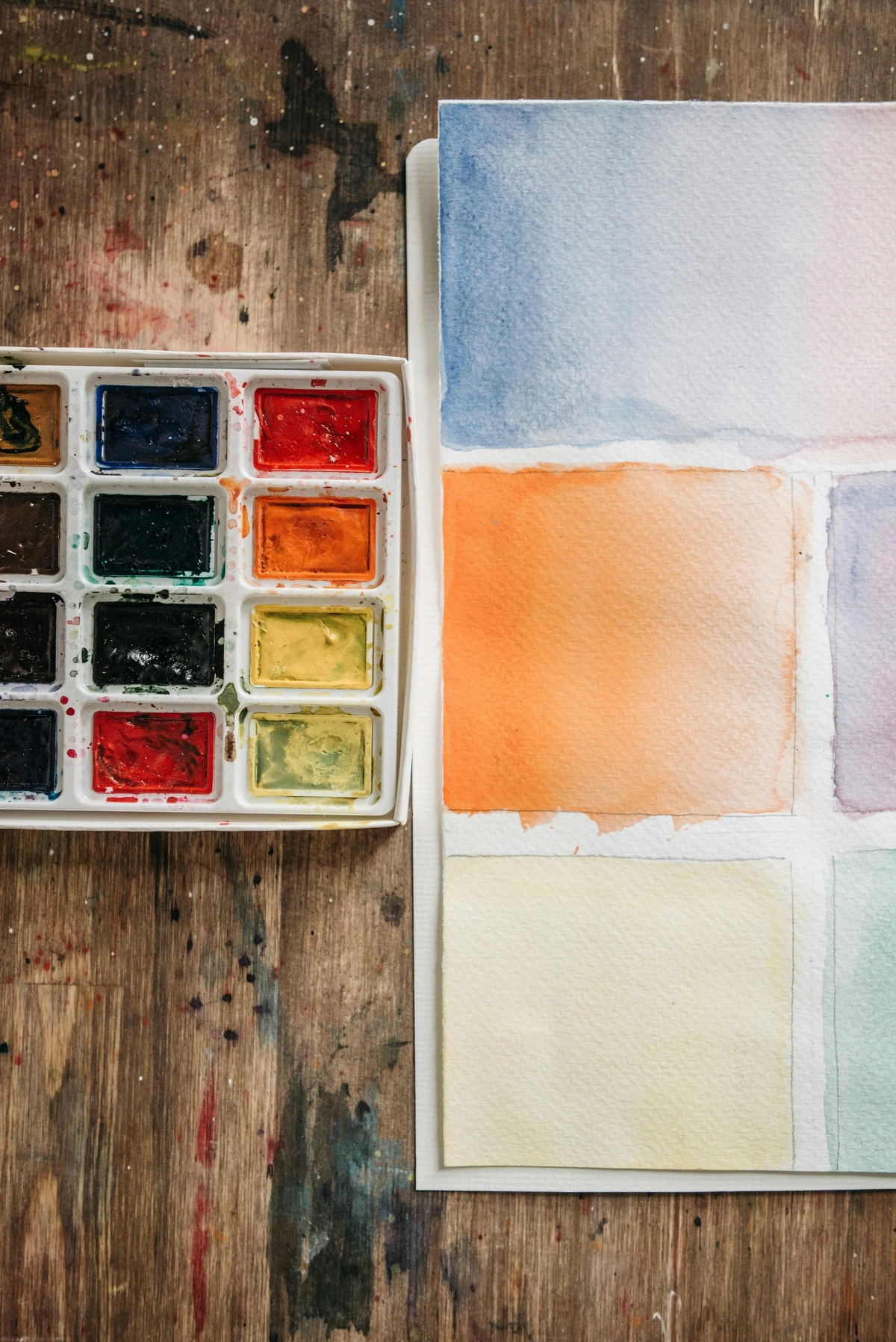
- Color Studies: Create small squares or rectangles exploring different color combinations and blending techniques.
- Simple Landscapes: Start with basic horizon lines, sky gradients, and simple landforms.
- Still Life with Objects: Arrange a few simple objects (fruit, bottles, etc.) and practice basic shapes and shading.
- Abstract Compositions: Experiment with colors, shapes, and textures without worrying about representing anything specific.
- Portraits: Start with basic facial features and gradually work up to more complex portraits.
Intermediate Project Ideas
Once you're comfortable with the basics, try these more challenging projects:
- Atmospheric Landscapes: Focus on capturing mood and atmosphere rather than literal representation
- Textural Studies: Explore different textures like fabric, wood, stone, or metal
- Animals and Wildlife: Practice capturing movement and fur textures
- Figure Drawing: Study human proportions and movement
- Urban Sketching: Capture architecture and city scenes
Advanced Project Ideas
For experienced pastel artists looking to push their boundaries:
- Series Development: Create a series of related pieces exploring a theme or concept
- Large Format Work: Challenge yourself with larger formats that require different techniques
- Commissioned Portraits: Take on paid portrait work
- Exhibition Preparation: Create a cohesive body of work for a gallery show
- Experimental Techniques: Try unconventional approaches like combining pastels with encaustic or digital elements
Budget-Friendly Starter Kit
If you're working with a tight budget, here's a minimal but effective starter setup:
- Pastels: A 24-color set of student-grade soft pastels ($15-25)
- Paper: A pad of Canson Mi-Teintes paper ($10-15)
- Fixative: One can of workable fixative ($8-12)
- Tools: Kneaded eraser, basic paper stumps, cotton swabs ($10-15)
Total startup cost: $43-67 for a complete beginner setup!
Transitioning to Intermediate Level
As you gain confidence and experience, you might want to consider these next steps:
Developing Your Personal Style
One of the most exciting aspects of artistic growth is discovering your unique voice. Here's how pastel artists typically develop their style:
Exploration Phase (6-12 months):
- Try different subjects, techniques, and color approaches
- Study the work of artists you admire
- Keep experimenting without pressure to develop a "style"
- Take workshops and classes to learn new approaches
Refinement Phase (1-2 years):
- Begin noticing what subjects and techniques naturally appeal to you
- Start combining elements from different influences
- Develop preferences for certain color combinations or textures
- Create more work consistently to build confidence
Mastery Phase (2+ years):
- Your style begins to emerge more organically
- You develop signature techniques or approaches
- Your work becomes more recognizable to others
- You may start developing a cohesive body of work around specific themes
Building Your Art Portfolio
A strong portfolio is essential for any artist looking to advance:

Physical Portfolio: Invest in a professional portfolio case with acid-free paper and sleeves. Include your strongest 10-15 pieces.
Digital Portfolio: Create a professional website or use platforms like Behance, ArtStation, or Instagram to showcase your work online.
Organization: Organize your work chronologically or by theme, showing progression and development.
Documentation: Take high-quality photos of your artwork with proper lighting and neutral backgrounds.
Joining the Professional Art Community
Transitioning from hobbyist to professional involves engaging with the broader art world:
Local Art Associations: Join local artist groups for networking, exhibitions, and education.
Online Communities: Participate in forums, social media groups, and online critiques.
Art Competitions: Enter juried shows to gain recognition and feedback.
Gallery Relationships: Research galleries whose style matches your work and begin building relationships.
Teaching and Workshops: Consider teaching pastel classes or workshops to share your knowledge and build credibility.

- Invest in Better Materials: Upgrade to artist-grade pastels as your skills develop
- Experiment with Different Surfaces: Try sanded papers, boards, or even canvas prepared for pastels
- Develop Your Style: Explore different techniques and find what resonates with you
- Join a Community: Connect with other pastel artists for inspiration and feedback
- Take Workshops: Consider classes or online tutorials to learn specific techniques
Remember, the most important thing is to enjoy the process. Pastels are a wonderful medium that rewards experimentation and play. Don't be afraid to make mistakes – that's how you discover new techniques and develop your unique voice as an artist.
Advanced Topics for Continuing Your Pastel Journey
Once you've mastered the basics and feel comfortable with your essential supplies, you might want to explore some more advanced aspects of pastel art. These topics can help you take your work to the next level and develop your unique artistic voice.
Understanding Pastel Grounds and Alternative Surfaces
While paper is the traditional surface for pastels, many artists are exploring alternative surfaces and grounds that can create unique effects. Pastel grounds are specially formulated coatings that can be applied to various surfaces to create the proper tooth for pastel adhesion.
Canvas with Pastel Ground: Many artists prepare canvas with a pastel ground before applying pastels. This creates a durable surface that can handle heavy layering and reworking. The advantage is that you get the texture of canvas with the tooth needed for pastels.
Wood Panels: Sanded wood panels can create interesting textural effects. The natural grain of the wood can show through in subtle ways, adding organic warmth to your artwork.
Prepared Boards: There are commercially prepared boards specifically designed for pastel work. These typically have multiple layers of ground applied and are ready to use out of the box. Watercolor Paper: While not ideal for heavy pastel work, watercolor paper can work well for lighter pastel applications or mixed media pieces combining pastels with watercolor.
Mixed Media Techniques with Pastels
Pastels blend beautifully with many other mediums, creating endless possibilities for mixed media work. Here are some popular combinations:


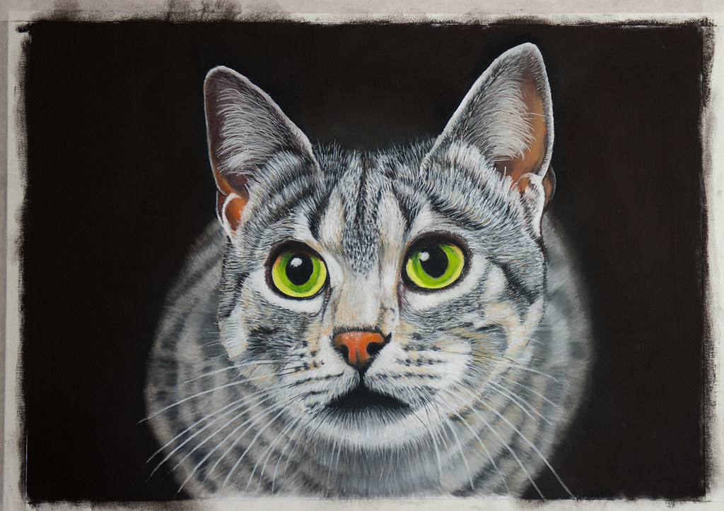


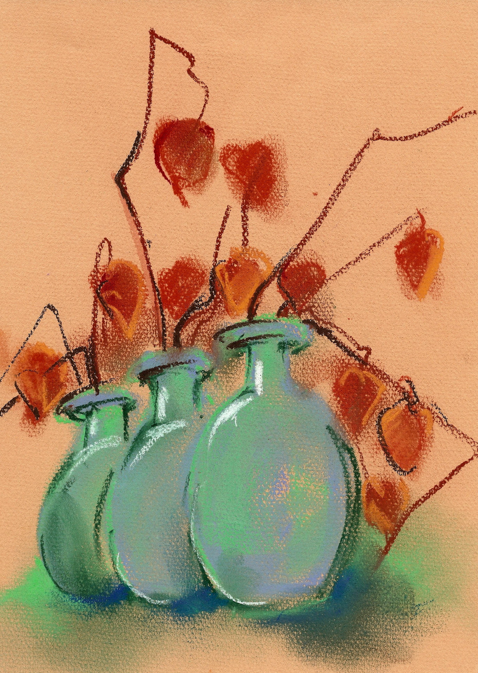


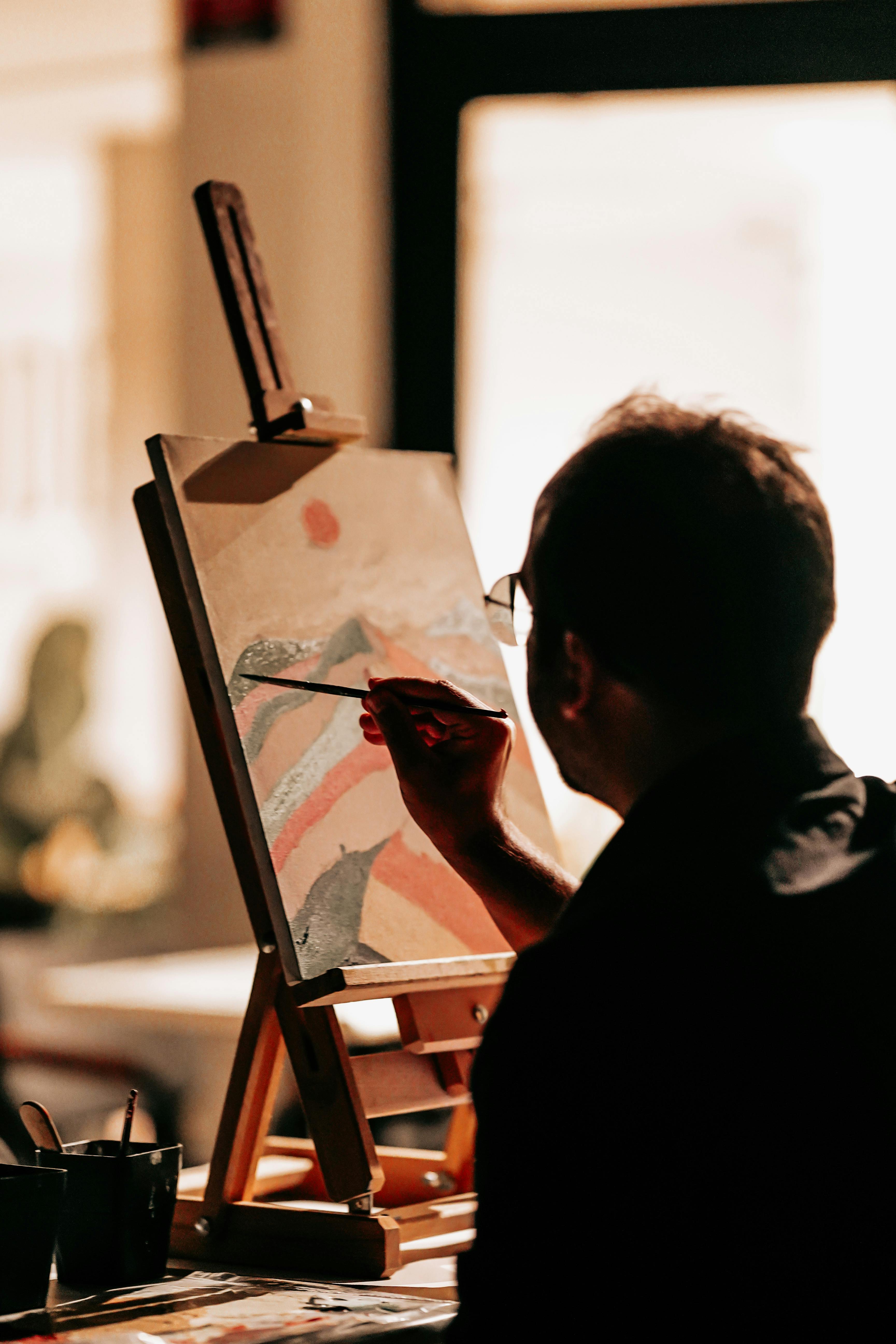





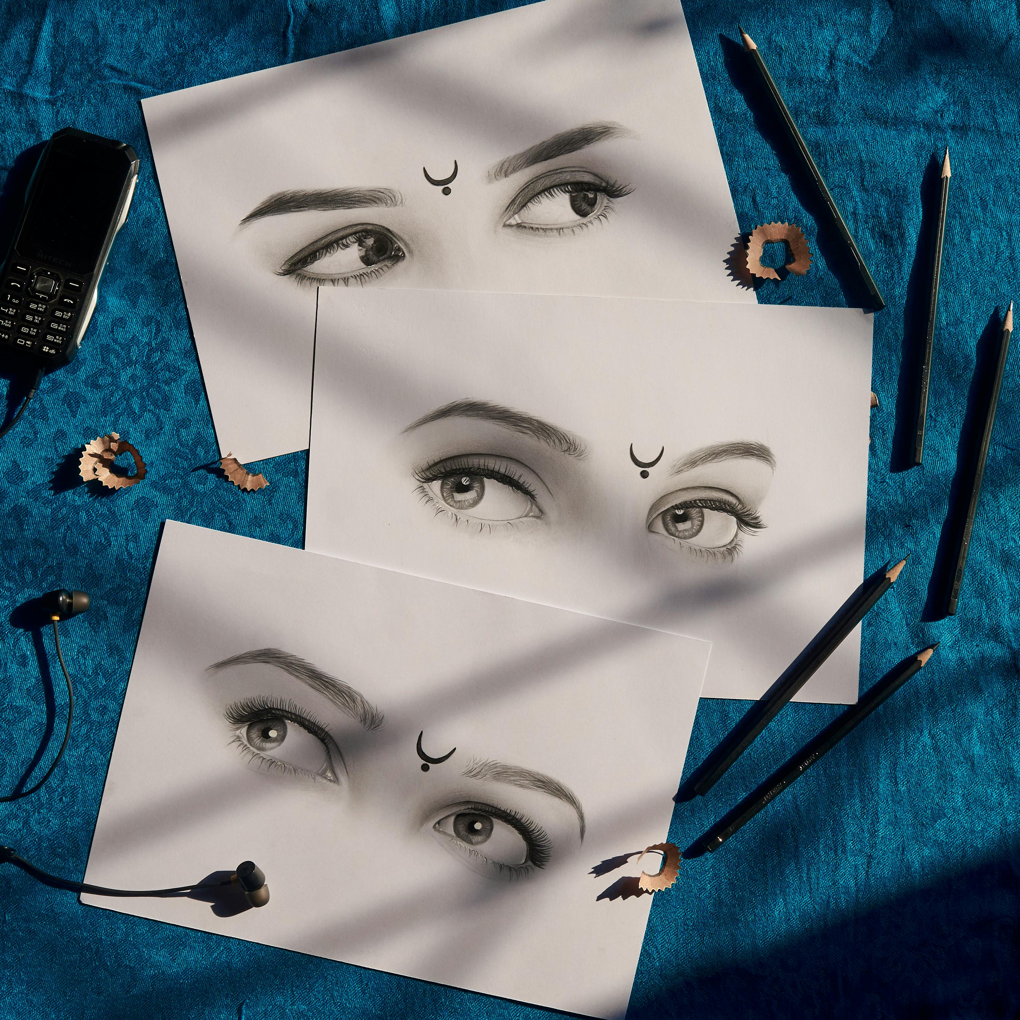


Pastel and Watercolor: Watercolor can be used as an underpainting, with pastels applied on top to create vibrant, luminous effects. The watercolor provides a base that the pastels can grip onto.
Pastel and Acrylic: Acrylics can be used for backgrounds or underpaintings, then pastels are applied for details and soft effects. The acrylic dries quickly and provides a stable base.
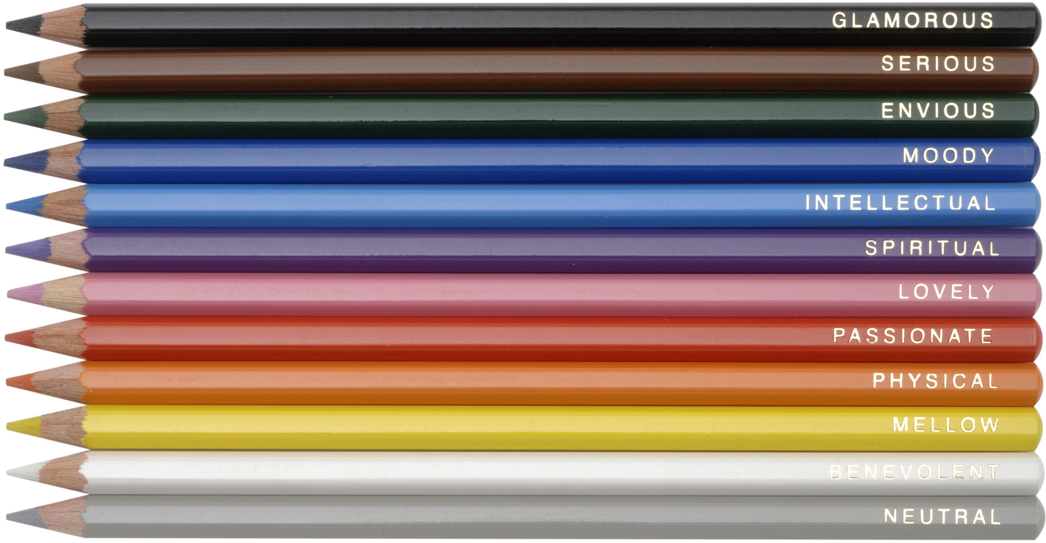
Pastel and Colored Pencil: Colored pencils can add fine details and precision on top of pastel layers. They're especially useful for adding crisp lines and small details that pastels might be too soft to create.
Pastel and Ink: Pen and ink lines can add wonderful contrast and detail to pastel work. The sharp lines can frame soft pastel areas beautifully.
Pastel and Gouache: Gouache can be used for opaque areas or highlights, with pastels providing the softer, more atmospheric elements.
Advanced Mixed Media Combinations
Beyond the basics, here are some more complex mixed media techniques:
Pastel, Encaustic, and Oil: Combine the three for rich, layered effects with unique textures
Pastel and Digital Photography: Scan pastel work and incorporate it into digital compositions
Pastel and Collage: Incorporate papers, fabrics, and other materials into pastel pieces
Pastel and Metal Leaf: Add metallic elements for dramatic highlights and accents
Pastel and Resin: Create glossy, protective surfaces over pastel work
Step-by-Step Mixed Media Project: Pastel and Watercolor Landscape
Materials Needed:
- Watercolor paper (140 lb or heavier)
- Watercolor paints
- Soft pastels
- Pastel pencils
- Brushes
- Fixative
Steps:
- Watercolor Underpainting: Apply a loose watercolor wash to establish the basic mood and color scheme. Let it dry completely.
- Pastel Application: Begin applying soft pastels over the dried watercolor. The watercolor provides a nice base for the pastels to grip.
- Layer Building: Build up layers of pastel, starting with harder pastels and moving to softer ones for richer color.
- Detail Work: Use pastel pencils for fine details like tree branches, architectural elements, or facial features.
- Final Touches: Add any final highlights or shadows. Consider applying a light fixative to protect the watercolor layer.
- Varnish (Optional): Some artists apply a final varnish over the entire piece for additional protection (test first on a scrap piece).
Professional Pastel Conservation and Framing
If you're creating pastel artwork that you want to last (and potentially sell), proper conservation and framing are essential. Pastels are fragile, but with the right care, they can last for centuries.
Framing Considerations:
- Use UV-protective glass to prevent fading
- Allow for air circulation behind the artwork
- Use acid-free mats and backing
- Consider using a spacer to keep the glass from touching the artwork
- Choose frames that complement rather than overpower your work
Storage Solutions:
- Store unframed pastel work with glassine paper between sheets
- Keep pastel artwork flat to prevent smudging
- Store in a cool, dry place away from direct sunlight
- Consider using archival storage boxes for protection
Professional Conservation: For valuable or historical pieces, consult with a professional conservator who specializes in pastel art. They can provide expert care and repair services.
Comprehensive Pastel Care Guide
Daily and Weekly Maintenance:
Workspace Cleaning: Regularly clean your pastel workspace to prevent dust buildup:
- Use a soft brush to sweep pastel dust into a container
- Wipe down surfaces with a slightly damp cloth
- Rinse brushes and tools regularly
- Replace drop cloths or newspaper frequently
Tool Care: Proper maintenance extends the life of your tools:
- Clean blending tools after each use
- Replace worn-out stumps and tortillons
- Store pastels properly to prevent breakage
- Keep fixatives and sprays in good working condition
Monthly Care:
Pastel Inspection: Check your pastels for signs of damage or deterioration:
- Look for cracks or breaks in sticks
- Check for signs of mold or mildew in humid environments
- Organize pastels that have become mixed up
- Replace any pastels that have become too hard or chalky
Paper and Surface Care: Ensure your surfaces remain in good condition:
- Store paper flat to prevent curling
- Check for environmental damage like moisture
- Rotate your paper stock to prevent aging
Seasonal Care:
Climate Control: Pastels are sensitive to environmental changes:
- Monitor humidity levels (ideal range: 40-60%)
- Avoid extreme temperature fluctuations
- Use dehumidifiers in very humid climates
- Consider humidifiers in very dry climates
Transportation Safety: If moving or transporting pastels:
- Use protective cases with individual compartments
- Pack pastels securely to prevent rolling
- Keep temperature and humidity in mind during transport
- Allow pastels to acclimate to new environments before use