
Abstract Art: Your Guide to Crafting Home Mood & Ambiance
Unlock your home's emotional potential with abstract art. This artist's guide reveals how color, composition, and texture shape mood, with room-by-room tips and practical advice.
Choosing Abstract Art: Crafting Your Home's Perfect Mood & Ambiance
I've always been fascinated by how a space feels. You know that moment when you walk into a room and instantly feel calm, or energized, or perhaps even a little pensive? For years, I just assumed it was the furniture, the lighting, maybe even the smell of freshly baked cookies (a personal favorite). But then, as my journey into abstract art deepened, I realized something profound: art, particularly abstract art, is a silent, powerful conductor of mood. It doesn't just hang there; it sings to the space, shaping its ambiance in ways we often don't consciously recognize. It can invite serenity, spark creativity, ignite joy, or soothe the soul. And that, I've come to understand, is the key to intentionally crafting the atmosphere of your home. In this guide, we'll explore how abstract art speaks to our emotions, how to choose pieces for different rooms, and the practicalities of making them shine.
I used to be one of those people who thought art was purely decorative, something you pick to match the sofa. Oh, how naive I was! It was like buying a pet purely for its fur color. I remember a time I bought a piece just because it had a touch of turquoise that matched a throw pillow, and the room just… fell flat. It lacked soul, felt like a polite but utterly uninspired acquaintance. I once even bought a large, bold abstract solely because it matched the dominant color of a new rug, only to realize it completely clashed with the quiet, contemplative mood I wanted for that reading nook. It was a visual shout in a space meant for whispers. Now, I see art as an extension of our inner world, and choosing it for your home is an incredibly personal act. It's about deciding how you want each room to make you feel, and then finding the abstract piece that resonates with that desired emotion. It's less like decorating, and more like tuning your environment to the frequency of your heart, a deeply personal therapy for your walls, if you will. This realization led me down a rabbit hole of understanding how abstract art achieves this magic, and I'm excited to share what I've learned with you.
More Than Just Colors: How Abstract Art Speaks to Our Soul (and Our Walls)
To truly harness this power, we first need to understand how abstract art communicates its message. It's a language of elements, composition, and even the artist's intent.
The Emotional Language of Elements
Abstract art, by its very nature, invites introspection. It doesn't tell you what to see; it asks you what you feel. This is where its power to set a mood truly shines. Historically, pioneers like Kandinsky and Malevich championed abstract art's unique ability to express inner emotions and spiritual truths, moving beyond mere representation. This focus on pure expression, rather than literal depiction, is what gives abstract art its enduring emotional resonance today. For a deeper dive into these influential periods, explore the ultimate guide to abstract art movements: from early pioneers to contemporary trends.
Abstract Expressionism brought an intensely personal, often chaotic energy to the canvas with figures like Jackson Pollock or Mark Rothko, while the geometric precision of De Stijl, championed by Piet Mondrian, sought universal harmony. Each approach, in its own way, proves how abstraction isn't just about what you see, but profoundly about what you feel.
Beyond forms and colors, even the quality of line itself speaks volumes. A bold, jagged line can convey tension or urgency, while a soft, flowing curve suggests peace or movement. Thick, impastoed lines add weight and dynamism; thin, delicate lines whisper fragility or grace. And consider the direction of lines: upward strokes can evoke aspiration or lightness, while downward strokes might suggest contemplation or even melancholy, subtly steering our emotional response. Beyond hues and forms, consider the saturation – the color intensity – and the value – how light or dark a color is. A stark contrast between dark and light can add drama, while a gentle shift in value creates a soothing gradient.

Printerval.com, https://creativecommons.org/licenses/by-nc/4.0/
Take, for instance, a particularly vibrant piece. For me, it might represent a chaotic burst of inspiration, but for someone else, it could be pure joy, or even a sense of playful rebellion. This ambiguity isn't a weakness; it's abstract art's superpower. It allows for a deeply personal connection, making it the perfect tool for crafting specific atmospheres in your home. Remember, while the artist's intent initiates the conversation, your personal interpretation ultimately defines the art's emotional impact within your space. It's like a good mystery novel – the author gives you clues, but you get to solve it and feel the emotional payoff. These elements, working in concert, lay the foundation for the profound emotional impact abstract art can have.
Composition's Silent Power: Visual Weight and Negative Space
Beyond the overt elements, I've also found myself contemplating the 'unseen' forces at play: visual weight and negative space. Visual weight refers to how certain elements in a composition draw your eye more than others, creating a sense of balance or imbalance, tension or repose. Think of it like a visual magnet; a large, dark shape, for instance, might anchor a piece with a heavy, grounding feel, like a sturdy anchor in a stormy sea, while a scattering of small, bright elements could create a sense of airy movement, like fireflies dancing in the dusk. This also extends to the scale of elements within the composition – a dominant, monumental form versus a multitude of delicate lines – each choice dramatically alters the visual weight and, consequently, the emotional pull of the piece. This contributes to the visual rhythm of a piece; a staccato rhythm with fragmented shapes might energize, while a legato rhythm with flowing forms could soothe. It's like the bassline and melody in a song, each contributing to the overall rhythm and emotional pulse. This visual weight also contributes to the balance of a piece. Symmetrical balance often evokes a sense of stability and formality, much like a grand, imposing building. Asymmetrical balance, on the other hand, creates dynamism and intrigue, like a perfectly weighted seesaw, constantly in motion. Then there’s radial balance, where elements spiral outwards from a central point, creating a captivating, energetic pull, like ripples in a pond.
And then there's negative space – the areas around and between the forms. It’s not just empty canvas; it’s an active participant, a silent partner in the composition. Ample negative space can create a profound sense of calm, allowing the eye to rest and the mind to breathe, like a quiet pause in a bustling day. Conversely, a tightly packed composition with minimal negative space can feel energetic, even exhilarating, pushing the boundaries of the canvas, like a dense, vibrant jungle. It's a delicate dance between what's there and what isn't, orchestrating the emotional temperature of the room. The viewer's distance from the artwork also plays a subtle role: a piece with intricate details might be best appreciated up close, fostering intimacy, while broad, sweeping strokes are effective from afar, dictating the mood for the entire space. If you want to dive deeper, you might enjoy exploring the role of negative space in abstract art. These compositional choices are silent orchestrators of your home's emotional landscape, working hand-in-hand with color to define the space's character.
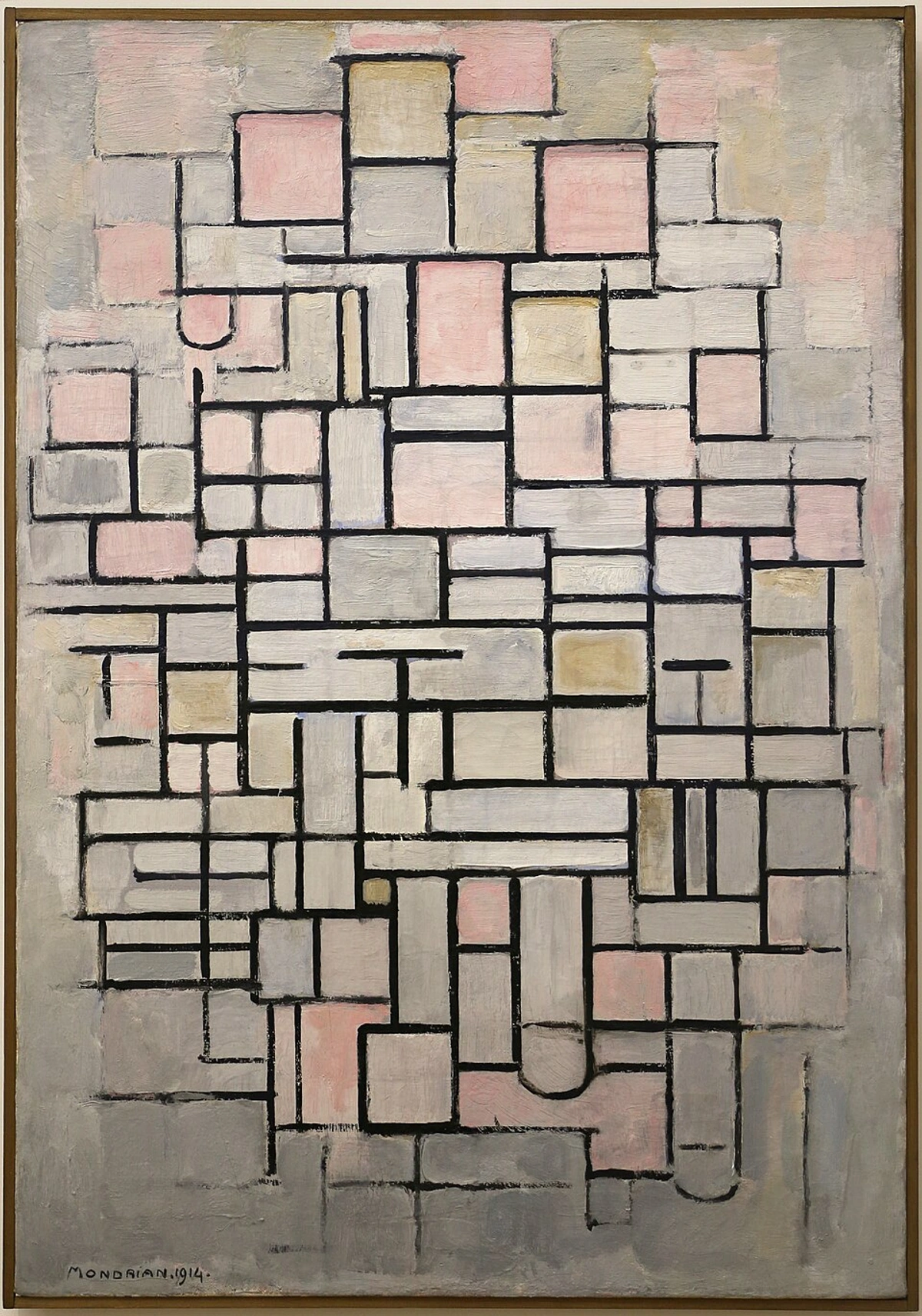
https://commons.wikimedia.org/wiki/File:Piet_mondrian,_composizione_n._IV-composizione_n._6,_1914,_01.jpg, https://creativecommons.org/licenses/by/3.0
Color's Immediate Impact & Harmony
Beyond the forms and spaces, the most immediate emotional trigger is undeniably color! While I dive deep into this topic elsewhere (the psychology of color in abstract art: beyond basic hues), it's undeniable that color is the most immediate emotional trigger in art. Reds can invigorate, blues can soothe, yellows can uplift. But it's not just the individual hues, but how they interact. Analogous colors (like blues and greens) can create a harmonious, calming effect, while complementary colors (like fiery oranges and cool blues) generate visual tension and dynamic energy. And speaking of emotional triggers, the temperature of color profoundly affects how we feel. Warm colors – reds, oranges, yellows – tend to advance, bringing energy and intimacy, much like a crackling fireplace on a cold evening. Cool colors – blues, greens, purples – tend to recede, fostering calm and spaciousness, like a refreshing dip in a cool lake. Consider also the subtle power of a dominant cool color, like a deep sapphire blue, punctuated by a small, vibrant warm accent, perhaps a splash of unexpected marigold; this can create a focal point that draws the eye and adds a surprising spark of energy to an otherwise tranquil composition. It’s how they layer and play with light, sometimes defying all conscious planning – that's the true magic, I suppose.

https://www.rawpixel.com/image/5924320/photo-image-background-public-domain-art, https://creativecommons.org/publicdomain/zero/1.0/
The Artist's Whisper: Statement & Story
And speaking of emotional temperature, I've often felt that knowing the artist's statement or the story behind a piece can unlock another layer of connection. While your personal interpretation is paramount (and often beautifully diverges from the artist's initial intent!), understanding that intent can offer a fascinating entry point, a subtle whisper of the mood they hoped to evoke. It provides a deeper context for the artist's emotional journey or the specific inspiration behind a piece, enriching your understanding without dictating your personal experience. I remember a piece I bought once, a seemingly chaotic burst of deep blues and silvers. My initial feeling was one of overwhelming energy, almost a storm. But then I read the artist's statement – it spoke of the quiet, turbulent beauty of the deep ocean, the silent power beneath the surface. Suddenly, the piece transformed for me; it wasn't chaotic, but profoundly serene, a testament to hidden strength. It completely shifted my emotional engagement, proving that while my interpretation is mine, the artist's whisper can deepen the dialogue. This reminds me of how I often think about the emotional resonance of my abstract art: how feelings guide my brushstrokes – how certain brushstrokes or color combinations evoke entirely different internal landscapes. It's like reading the liner notes of your favorite album – it doesn't change the music, but it deepens the experience. Even the choice of medium, whether it's the raw texture of impasto or the ethereal transparency of watercolor, can be an intentional part of the artist's emotional message, a silent signal of their internal state.
The Tactile Dimension: Texture and Medium
Beyond color and composition, texture is key for an abstract piece. A heavily impastoed painting, with its tangible peaks and valleys, can add a sense of raw energy and depth, inviting a tactile engagement that a smooth, flat surface cannot. Think of a thick, robust texture grounding a piece like a sturdy oak tree, while a smooth, ethereal wash of color could evoke a sense of floating or gentle movement. Texture adds another layer to the emotional dialogue between the art and its environment, contributing significantly to the overall mood.
It's easy to get lost in colors and forms, but the physical medium of your abstract art also profoundly impacts its mood. Is it a glossy acrylic that reflects light and bounces energy around, making a space feel brighter and more dynamic? Or a richly textured oil painting, with deep impasto that absorbs light and creates a sense of grounded, earthy depth and intimacy? A watercolor might evoke lightness and fluidity, while a mixed-media piece could introduce a raw, industrial edge. Even modern digital prints, with their crisp lines and often glossy finishes, have a distinct energy that can make a space feel vibrant and contemporary. Each material has its own character, its own whisper to the room, shaping the tactile and visual experience in subtle yet powerful ways. I find myself often running a hand over a finished piece, feeling the peaks and valleys, knowing that these physical dimensions add another layer to its silent conversation with the space – though I probably look a bit strange doing it in public. Even the surface sheen contributes: a matte finish absorbs light, creating a subdued, intimate feel, like worn leather, inviting closer inspection. A glossy finish, conversely, reflects light, amplifying energy and making a space feel more vibrant, like polished stone catching the sun. These aren't just aesthetic choices; they're direct emotional levers.
And while our focus remains largely on wall art, don't forget the profound impact of abstract sculpture. Its three-dimensional presence and interaction with light and shadow can add another layer of depth and intrigue, grounding a space with its physical form or adding a whimsical, dynamic element.
For a deeper dive into this often-overlooked element, you might explore the definitive guide to understanding texture in abstract art: techniques, materials, and sensory impact.
https://live.staticflickr.com/3731/13402193294_7e67ffc22a_b.jpg, https://creativecommons.org/licenses/by/2.0/
Matching Art to Room Mood: A Room-by-Room Guide (My Intuitive Approach)
So, how do we actually translate these abstract elements into a feeling for a particular space? My approach is less about strict rules and more about trusting your gut. Think of me as your slightly eccentric art guide, not your stern interior decorator (though I dabble a bit in how to decorate a house). This is where the theoretical meets the wonderfully practical.
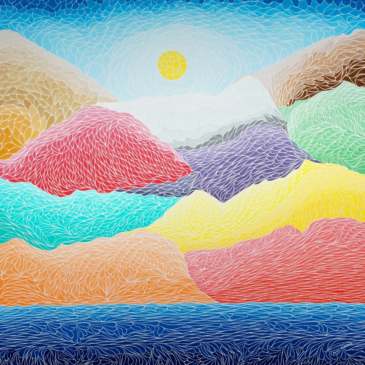
The Lively Living Room: Energy & Connection
How do you want your living room to feel? Your living room is often the heart of your home, a place for conversation, relaxation, and perhaps a bit of playful chaos (especially if you have kids or a very enthusiastic pet). Art here should ignite joy and foster dialogue. For this space, I lean towards pieces with dynamic compositions, bold colors, or intriguing textures. Something that sparks conversation, or simply makes you feel alive. I once had a client who chose a piece with a vibrant splash of orange and blue – she said it felt like a permanent sunset party in her room. I thought that was just brilliant. For a lively living room, seek art that ignites joy and dialogue.
https://images.zenmuseum.com/art/252/scan.jpeg, https://images.zenmuseum.com/art/252/scan.jpeg
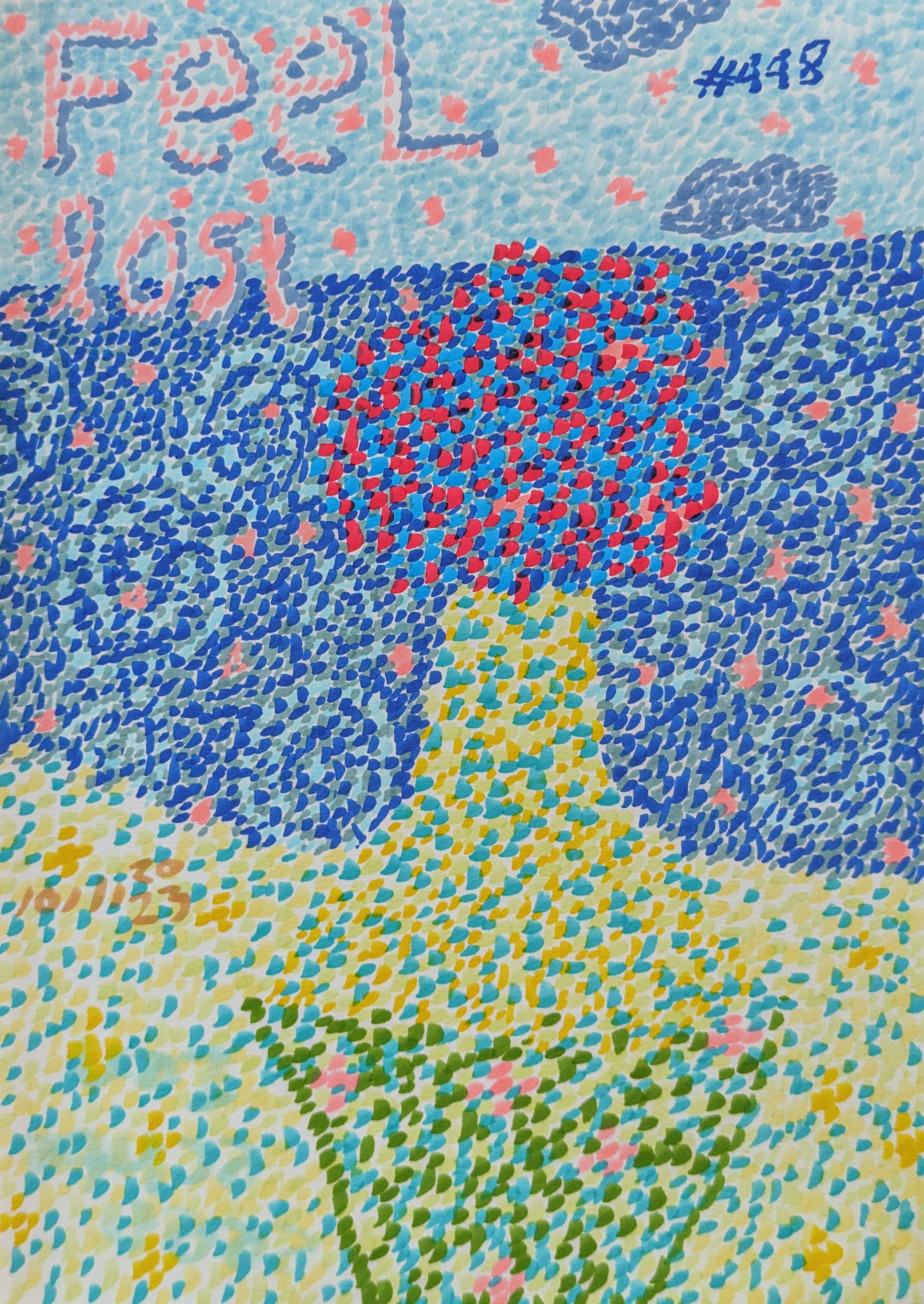
The Serene Bedroom: Rest & Reflection
What mood promotes ultimate calm and reflection for you? This is your sanctuary, your escape from the daily grind. Here, I look for abstract pieces that encourage calm, introspection, and a sense of peace. Think softer palettes, flowing lines, or compositions that draw you in without overwhelming. Blues, greens, and muted tones often work wonders. I confess, my own bedroom has a very subtle, almost whisper-like abstract piece that just helps my brain switch off after a long day of, well, being me. It's my little slice of mindful moments: how abstract art can be a gateway to inner peace and reflection. For your bedroom, choose art that whispers peace and invites calm.

https://images.zenmuseum.com/art/448/picture.jpg, https://images.zenmuseum.com/art/448/picture.jpg
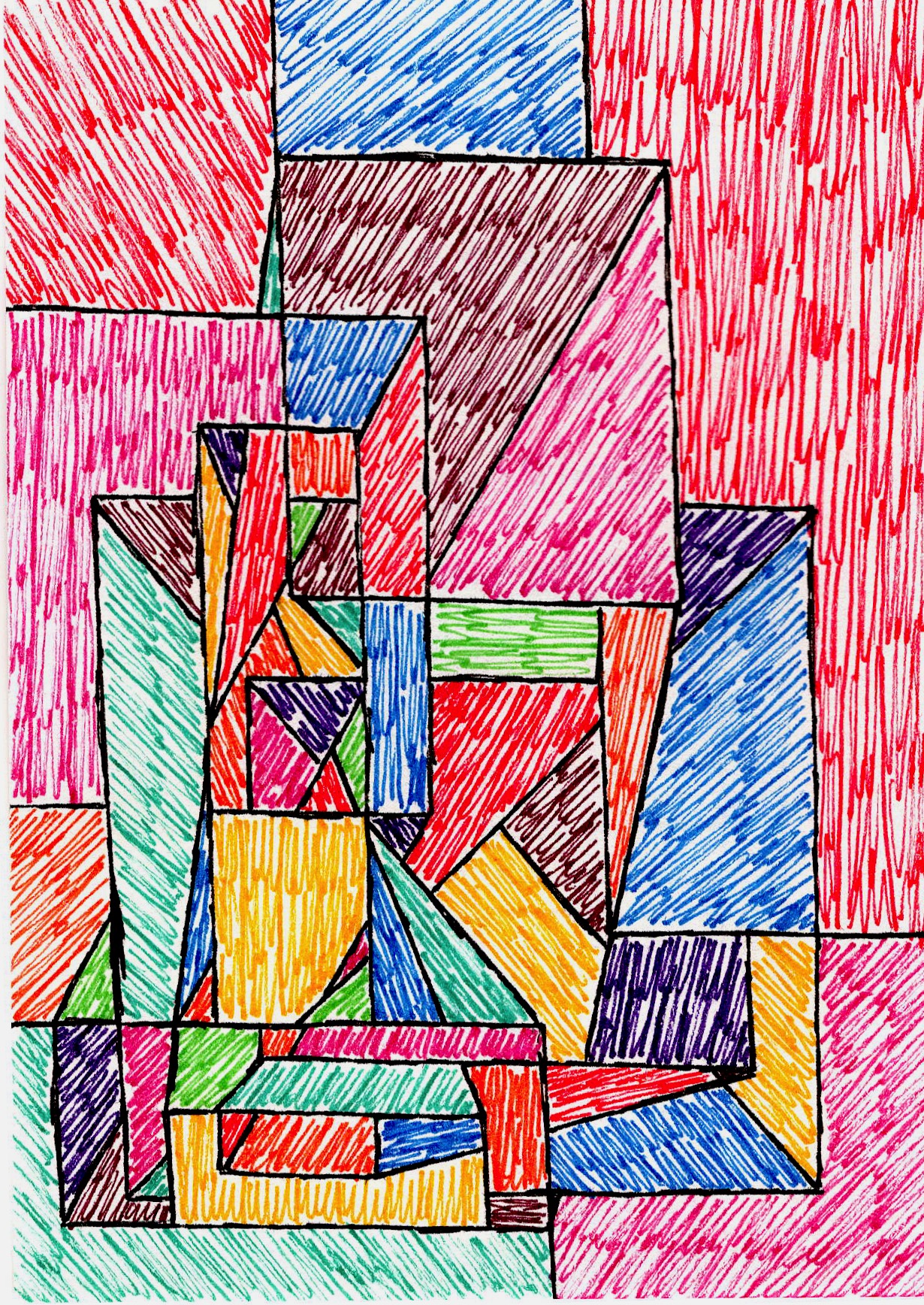
The Productive Home Office: Focus & Inspiration
How can art support your focus and creativity? Ah, the home office. A place where coffee flows and ideas should flow, but sometimes just stubbornly refuse. For this space, I gravitate towards abstract art that offers a sense of structure or subtle energy, or even a deep, calm focus, without being too distracting. Geometric abstracts, or pieces with clear, intentional lines and balanced compositions, can be fantastic. They can stimulate thought and keep your mind engaged without pulling you into a daydream. I've found that these structured pieces can even subtly encourage creative problem-solving, offering a visual metaphor for organizing complex thoughts. Sometimes, a well-placed line can feel like an answer, or a burst of color, a new idea. I often think about the unseen structure: how composition guides my abstract art in my own work when considering art for a focused space. In your home office, select art that aids focus and sparks innovation.
https://images.zenmuseum.com/art/281/scan.jpeg, https://images.zenmuseum.com/art/281/scan.jpeg
The Welcoming Entryway: First Impressions
What initial mood do you want to convey? Your entryway is your home's handshake. A burst of cheerfulness, a touch of elegance, or something intriguing that hints at what's beyond? A single, impactful abstract piece can do wonders here. For a welcoming vibe, consider warm colors and flowing forms. For sophistication, perhaps a more subdued palette with refined textures. An energetic composition with bold strokes can offer an intriguing hint of personality. It sets the tone for the entire home, inviting guests (and yourself!) into the unique world you've created. I sometimes imagine my entryway art as a gentle 'hello' or a mischievous 'guess what's inside!', depending on my mood when I chose it. For the entryway, curate art that sets an inviting and intriguing first impression.
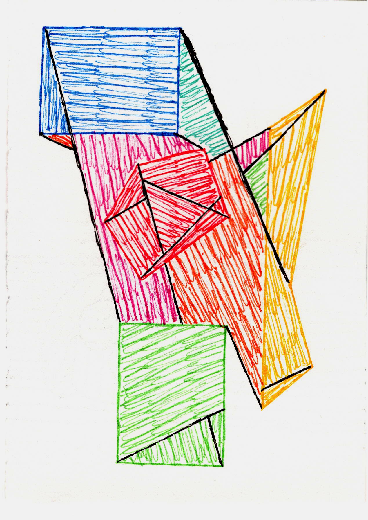
The Dynamic Dining Room: Conversation & Celebration
Moving from the first impression to the heart of shared experiences, let's consider the dining room. How can art enhance shared moments? The dining room is where stories are shared, and laughter often echoes. Abstract art here can either ground the space, creating a sense of intimacy, or elevate it, making every meal feel like a special occasion. Consider pieces that complement the energy of gathering – perhaps something with a narrative flow, or a vibrant piece that encourages lively discussion due to its complexity and intriguing details, influencing the very pace of conversation. For instance, a piece with many small, interconnected elements or a subtle narrative arc might encourage guests to lean in, point out details, and discuss their interpretations, slowing down the pace and fostering shared discovery. Imagine a piece with a playful, chaotic energy – it might unconsciously encourage rapid-fire banter and boisterous laughter. Alternatively, a calming abstract backdrop can foster more intimate and reflective conversations, like a slow, comforting melody. Ultimately, it’s about what kind of shared experience you wish to cultivate. For this space, aim for art that either stimulates lively interaction or provides a serene backdrop for connection.
The Heart of the Home: The Kitchen – Culinary Creativity & Gathering
The kitchen, for many, is the true heart of the home – a place for sustenance, creativity, and often, spontaneous gathering. How can art enhance this dynamic hub? Here, abstract art can either fuel creativity with vibrant, energetic pieces, or provide a calming backdrop for mindful cooking. Consider art with clean lines and playful, perhaps food-inspired, colors for an energetic culinary space. Or, for a more tranquil kitchen, subtle pieces that encourage a sense of calm and order, like a minimalist abstract with gentle tones. These choices can subtly influence the sensory experience of cooking and eating, perhaps evoking freshness, warmth, or comforting aromas. I often find myself staring into the depths of a vibrant abstract while waiting for the kettle to boil, letting its forms spark a new recipe idea or just a moment of quiet appreciation before the chaos of dinner prep begins. It's about setting the stage for both efficiency and joy. For the kitchen, choose art that inspires culinary creativity or fosters a calm, gathering atmosphere.
Defining Zones: Art in Open-Plan Living
As homes become more fluid, so too does the role of art in defining spaces. In today's open-plan homes, abstract art isn't just about setting a mood in a room; it can also be a clever tool for defining distinct functional zones within a larger space. Imagine using a large, gestural abstract with sweeping, energetic brushstrokes and warm tones above a sofa to clearly signal a social hub, inviting lively conversation. Then, in contrast, a minimalist geometric piece with cool, muted colors on a console table near a window could subtly delineate a quiet reading nook, promoting focus and calm. Or, an elongated abstract triptych featuring vibrant, interconnected elements could vividly mark the boundary of a dynamic eating area, encouraging interaction. It’s about leveraging the inherent language of abstract forms and colors to create distinct visual cues. I love watching how a piece can almost visibly 'draw a line' in an otherwise flowing space, creating pockets of distinct ambiance. For a holistic approach to using art throughout your home, consider exploring abstract art for every room: curating flow and feeling in your home or decorating with abstract art in open-concept living spaces: creating zones and flow.
Practical Ponderings: Size, Placement, Lighting, & Framing (My Learnings)
Choosing the right art is only half the battle. How you present it is just as crucial for setting the mood.
Size & Scale: Don't Be Shy, But Be Smart
One of the biggest mistakes I see people make (and have made myself!) is choosing art that's too small for the space. A timid little painting on a vast wall can feel lost, almost apologetic. Don't be afraid to go big, especially in larger rooms or to make a statement. Conversely, a massive piece in a tiny nook can overwhelm. A good starting point? The art's width should generally be about two-thirds the width of the furniture it hangs above. Also, consider the height of the artwork in relation to the ceiling and the overall room volume; a piece that's too low or too high can feel disconnected from the space. The orientation – horizontal or vertical – also plays a subtle role; a horizontal piece can make a room feel wider, while a vertical one adds height. It's a delicate balance, and sometimes I even use masking tape to 'outline' a piece on the wall before committing – which has definitely saved me from a few 'oop' moments and patching plaster. Moreover, the sheer scale and proportion of a piece aren't just about filling a wall; they profoundly influence the perceived energy of the room. A colossal piece can imbue a grand space with gravitas, or conversely, make a smaller room feel intensely intimate, almost cocoon-like. A large, bold piece might project confidence and power, while a smaller, more delicate work can foster quiet contemplation and intimacy. It’s all about the interplay. Beyond just furniture, consider how the art interacts with other architectural elements like windows, doors, and built-in shelving. A tall, narrow abstract positioned next to a window can extend the visual height, while a piece mirroring the width of a fireplace can create a harmonious focal point. Also, pay attention to the negative space around the artwork itself – a wider piece with ample white space around it might feel less imposing than a narrower, tightly cropped piece, significantly altering the perceived balance with surrounding furniture. If you're grappling with a smaller space, remember there are clever ways to use art to make it feel bigger, as discussed in abstract art for small spaces: maximizing impact in compact areas or for a comprehensive guide on sizing, check out how to choose the right size art for your space.
The Art of Display: Beyond Just Hanging It Up
Placement matters. Eye-level is generally a good rule of thumb, but sometimes breaking that rule can create interesting dynamics. And then there's lighting. Oh, lighting! It can literally transform a painting, bringing out textures and colors you didn't even notice before. I'm a firm believer that good lighting is as important as the art itself for setting the mood. If you want to dive deeper, check out how to choose the right lighting to enhance your abstract art collection and the art of display: how to light and position abstract art for maximum impact.
Framing: The Subtle Amplifier of Mood
Don't underestimate the power of framing. A frame isn't just a border; it's an extension of the art, guiding the viewer's eye and subtly influencing the piece's overall mood. A sleek, minimalist frame (like a thin black or natural wood float frame) can enhance a modern abstract, emphasizing clean lines and contemporary flair. Conversely, a more ornate, traditional frame can juxtapose beautifully with a vibrant abstract, adding an unexpected layer of sophistication or even a touch of playful irony. Consider how the frame material, color, thickness, its depth (a deep shadow box vs. a shallow profile can dramatically alter perceived dimensionality), and even its finish (matte vs. glossy, textured vs. smooth) can either complement the art's inherent mood or introduce a new, intriguing dimension to the visual experience. It's like choosing the right outfit for an event – it changes how the whole person (or painting) is perceived. And then there’s the elegant simplicity of a frameless presentation, particularly for canvas prints with finished edges. This approach allows the art to merge more seamlessly with the wall, creating a contemporary, integrated feel that can make a space feel more open and expansive, as if the art is a natural extension of the architecture. It's a statement of confidence, letting the art speak entirely for itself without any visual interruption.
Art & Architecture: A Dialogue
Don't forget to consider how your chosen abstract art dialogues with your home's architectural style. A sleek, minimalist abstract can perfectly complement a modern, clean-lined space, reinforcing a sense of calm sophistication. But sometimes, a bold, expressive abstract in a very traditional room – imagine a vibrant, gestural splash of color against ornate moldings and antique furniture – can create a fascinating tension, a surprising point of contemporary interest that sparks conversation and adds unexpected depth. Conversely, an organic, flowing abstract with soft curves and earthy tones can beautifully soften the rigid lines of a traditional interior, creating a harmonious dialogue that feels both classic and contemporary, bridging eras with quiet grace. The unexpected juxtaposition can energize the entire room and reveal new facets of both the art and the architecture. It's about finding that sweet spot, whether it's harmony or a playful contrast, that makes the whole space sing, and ultimately, profoundly influences its emotional resonance.
Ultimately, these practical considerations aren't just about aesthetics; they're about fine-tuning the art's ability to orchestrate your home's emotional landscape.
Key Takeaways: Shaping Your Home's Narrative
Choosing abstract art to cultivate your home's mood is a journey of intuition and intentionality. Here are the key considerations for shaping your space's emotional landscape:
Element | Impact on Mood | Application |
|---|---|---|
| Color | Energy, calm, vibrancy, intimacy (hue, saturation, value, temperature) | Set emotional tone; focal point; complementary/contrasting. |
| Composition | Balance, tension, movement, repose (visual weight, negative space, line, rhythm) | Guide eye, create dynamism or serenity; define zones. |
| Texture/Medium | Raw energy, depth, fluidity, intimacy (impasto, sheen, material) | Add tactile engagement, grounding, or lightness. |
| Artist's Intent | Deeper context, emotional resonance, narrative. | Enrich personal connection without dictating interpretation. |
| Size/Scale | Gravitas, intimacy, perceived energy, spatial definition | Anchor a room; make a statement; define small spaces. |
| Placement/Light | Focal point, highlight details, alter perception. | Enhance visibility, bring out textures and colors. |
| Framing | Modernity, tradition, sophistication, emphasis. | Complement art's mood; introduce new dimension. |
| Architecture | Harmony, tension, unexpected depth. | Reinforce style or create engaging contrast. |
| Evolution | Personal narrative, living diary of tastes. | Your collection evolves with you, tells your story. |
Frequently Asked Questions About Art and Ambiance
Curiosity is the first step to discovery, isn't it? Here are some common thoughts and questions I often encounter about this fascinating intersection of abstract art and home ambiance. I find that sometimes, the best insights come from the questions we dare to ask, even the seemingly obvious ones.
Can abstract art really change a room's mood?
Oh, absolutely! It's not just about decoration; it's about creating an experience. Abstract art, by its non-representational nature, taps directly into our emotions and subconscious, influencing how we perceive and feel a space. Colors, forms, and textures in abstract pieces can evoke feelings from serenity to excitement, directly impacting a room's ambiance. It's like a silent symphony for your senses.
How do I choose colors for abstract art to match a mood?
While personal preference is key, general color psychology can be a guide. Blues and greens often promote calm, reds and oranges inject energy, and yellows bring optimism. Consider the existing palette of your room, but don't be afraid of a contrasting abstract piece to create a focal point and introduce a new emotional layer. For more, see my article on the psychology of color in abstract art: beyond basic hues.
Is it okay to mix different abstract styles in one home?
Yes, absolutely! Mixing styles can add depth, personality, and an eclectic charm to your home. The key is to find a common thread – perhaps a recurring color, a similar scale, or a consistent emotional tone – that ties the diverse pieces together. Trust your eye and how the combination makes you feel. Your home, your rules!
What if I get tired of the abstract art I chose?
It happens! Our tastes evolve, and sometimes a mood changes. The beauty of art is its portability. You can move pieces between rooms, rotate your collection seasonally, or even store pieces for a while. You can also re-contextualize a piece by changing its lighting, rearranging surrounding decor, painting the wall it hangs on, or even re-framing it to give it a fresh feel without replacing the art itself. Think of it as art rotation – giving your walls a fresh perspective without buying new art, like changing the setlist for a beloved band. Remember, your art collection is a living entity, meant to grow and change with you.
How do I integrate abstract art that feels 'challenging' or 'difficult to interpret'?
Embrace the challenge! These pieces often offer the richest rewards. If a piece evokes strong, perhaps even complex or slightly unsettling emotions, consider placing it in a space where introspection, contemplation, or a dynamic dialogue is welcome. They can also be fantastic conversation starters, inviting guests who are open to deeper engagement to explore its nuances alongside you. Think of an office, a study, or a less-frequented hallway. These pieces often serve as powerful focal points, inviting deeper thought and adding a unique layer of depth to your home's emotional landscape, perhaps even a touch of intellectual stimulation or mystery. Instead of dominating a space meant for pure relaxation, they can become a silent, philosophical companion. Try spending just five minutes with it each day, without judgment, and see what feelings or thoughts emerge. It's a conversation, not a test. The key is intentional placement and allowing yourself to sit with the feelings it evokes, letting the art unfold its story over time.
How do I display abstract art in a very small space to maximize impact?
Ah, the charming challenge of compact areas! For small spaces, think strategically. Instead of one large piece (which can overwhelm), consider a curated gallery wall with smaller abstracts that draw the eye inwards, creating a sense of depth and visual interest. Elongated vertical pieces can also make ceilings feel higher. Use lighter palettes and ample negative space in the art itself to maintain an airy feel. And don't be afraid to utilize unexpected spots, like above a doorway or on a narrow wall, to add pops of personality. If the artwork itself incorporates mirrored surfaces or reflective elements, these can also cleverly enhance the sense of space and light. The goal is to create visual intrigue without adding clutter. For more specific insights, you might find guidance in abstract art for small spaces: maximizing impact in compact areas.
How do I care for my abstract art to ensure its longevity?
Caring for your art is an act of love! General tips include: avoid direct sunlight to prevent fading, keep it away from extreme temperature fluctuations and high humidity, and dust gently with a soft, dry cloth. If it's an oil painting, avoid touching the canvas surface directly as oils from your skin can damage it over time. For framed pieces, clean the glass with a gentle cleaner applied to the cloth, not directly to the frame. Knowing your medium (oil, acrylic, watercolor, print) will also guide specific care; for example, oil paintings need to breathe and shouldn't be covered in airtight plastic long-term. Think of it as nurturing a delicate conversation piece, ensuring its silent song continues for years to come.
Can I commission abstract art to match a specific mood?
Absolutely! Many artists, myself included, work with clients to create bespoke pieces. It's a wonderful collaborative process where you can articulate the emotions, colors, and overall ambiance you're aiming for, allowing the artist to translate that into a unique work just for your space. This can be especially beneficial for rental properties, where you might not be able to make permanent changes but still desire a highly personalized and impactful aesthetic. It's like having a custom-tailored mood for your walls.
How do I choose abstract art for a rental property?
This is a brilliant question, and one I think about often! In a rental, where you might not be able to paint walls or make permanent changes, abstract art becomes an even more powerful tool for personalization and mood-setting. Focus on pieces that are easy to hang (think lighter canvases or framed prints) and consider using damage-free hanging solutions like command strips. Creating gallery walls with diverse styles that can be easily rearranged is also a great idea. Large, impactful pieces can transform a plain wall without any commitment. When selecting, consider art that is lightweight and easy to move – a practical consideration for when your lease ends! It’s all about creating a temporary but deeply personal imprint that feels like you, injecting warmth and character into otherwise sterile spaces.
My Personal Mantra: Trust Your Gut
Ultimately, creating ambiance with abstract art is a profoundly personal journey. There are no right or wrong answers, only what resonates with you. I could give you a hundred rules, but if a piece makes your heart sing, or brings a smile to your face, then it's the right one. Period. Don't worry about trends or what someone else thinks. Your home is your canvas, and you are its artist.
As you collect abstract art over time, each piece will tell a part of your story, contributing to a unique narrative within your home. An evolving collection isn't just a series of purchases; it's a living diary of your aesthetic journey and emotional landscape. So, take your time. Wander through galleries (or explore my own art for sale page, if you're feeling adventurous!), browse online, and let your emotions guide you. When you find that piece that speaks to you, that makes you feel something, you've found the perfect abstract art to define your home's unique mood and ambiance – your home's unique song, if you will. If you're looking for something truly unique, something that perfectly captures your desired mood, remember that my work is often a direct translation of feeling; perhaps one of my pieces will sing to your space.
https://commons.wikimedia.org/wiki/File:The_Creation_Of_The_Mountains.jpg, https://creativecommons.org/licenses/by-sa/4.0/deed.en


