
Abstract Art for Small Spaces: Maximize Impact, Depth & Personal Style
Transform tiny rooms with abstract art! Discover personal insights, unique strategies for choosing, placing, and displaying bold abstract pieces to maximize depth, visual impact, and create a grand, personal aesthetic.
Abstract Art for Small Spaces: Maximizing Impact in Compact Areas
It’s funny, isn’t it? We crave spaciousness, that airy, open feeling, but life often hands us charmingly cozy, sometimes downright tiny, living quarters. For years, I'd bought into the myth that small spaces demanded small art, staring at my modest apartment and dreaming of vast gallery walls. My brain, bless its literal heart, kept screaming, "Small space, small art! Don't overwhelm it!" And for a while, I listened. But then, as often happens when you think you know something, a little voice (or maybe it was just a particularly bold abstract painting winking at me from an online gallery) whispered, "What if you’re wrong? What if the secret to a grand feeling in a cozy room isn't more space, but more depth?" Intrigued? So was I.
<h2>The Paradox of Small Spaces and Big Art Ideas</h2>
My personal design journey has been less "grand vision" and more "trial and error, mostly error, then finally some accidental triumph." I distinctly remember one afternoon, my friend (a very practical person) visiting my tiny apartment, eyeing the bare walls, and sagely remarking, "Well, at least you won't be tempted by those huge, splashy abstract pieces." I nodded, feigning agreement, even as a tiny, rebellious part of me wondered: why not? For the longest time, I associated abstract art with vast, white museum halls or sprawling minimalist lofts – places where a single, monumental canvas could command an entire wall without breaking a sweat. My own living room, on the other hand, felt like it was constantly gasping for air, even without art. So, the idea of adding a bold, non-representational piece felt… counterintuitive. Like trying to fit an elephant into a teacup, but with more emotional baggage.
Yet, here's the beautiful paradox: abstract art, by its very nature, often doesn't demand a narrative. It doesn't depict a specific landscape or a busy market scene that your eye feels compelled to 'read' from left to right, thus taking up mental space. Instead, it offers pure form, color, and emotion. It invites contemplation, but it doesn't shout. It expands rather than confines, visually pulling you into its depth without needing physical breadth. This "depth" isn't about looking through the wall at a literal scene, but into the layers and nuances of the piece itself, inviting your mind to wander and find new dimensions. It’s like a visual breath mint for your tiny room. And suddenly, my initial thought of "small art for small spaces" began to morph into "smart art for small spaces." If you're curious about the general appeal, I've pondered what makes abstract art compelling elsewhere, and even scratched my head over what is modern art and how to abstract art.
<h2>Why Abstract Art Truly Shines in Compact Areas</h2>
Ready for a revelation? In a small room, every object carries more weight. I once hung a highly realistic painting of a bustling city street in my compact entryway, hoping to open it up. Instead, it felt like looking through a tiny window at a vast, unreachable world, only emphasizing how small my space was by stark contrast. It created an an illusion of looking through a window to a distant scene, emphasizing the wall as a boundary. Abstract art, however, works differently. It doesn’t create an illusion of more space outside the wall; it creates an illusion of deeper space on the wall. It’s a subtle shift from looking through to looking into, pulling your gaze inwards rather than outwards.
It’s like the difference between a crowded, noisy party and a deep, meaningful conversation in a quiet corner. Both involve connection, but one feels overwhelming, while the other draws you in intimately. Abstract art brings that same focused intimacy to your wall. It’s less about what it represents and more about what it feels like. This is particularly true for art for minimalist interiors: less is more, where simplicity and impact are key.

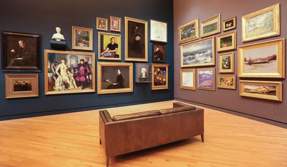
Beyond simply expanding space, abstract art is incredibly versatile for diverse interior design styles. In a sleek, modern or minimalist space, a geometric abstract piece can reinforce clean lines and a sense of order, while a monochromatic abstract can add depth without visual noise. For a bohemian or eclectic interior, a vibrant, expressive abstract work can provide a powerful anchor and splash of unexpected color. Even in a more traditional setting, a subtle abstract piece with classic colors can introduce a contemporary edge without clashing, offering a fresh visual dialogue. Imagine a serene, muted abstract with soft grays and blues (like a subtle Color Field painting perhaps) against a backdrop of rich, dark wood paneling or an ornate, gilded mirror – it introduces a quiet contemporary edge that surprises and delights, without clashing. It's about finding that sweet spot where the art resonates with your existing decor, rather than fighting it.
<h2>Picking Your Perfect Piece: My Own (Often Flawed) Approach</h2>
So, the theory sounds great, but how do you actually do it without ending up with another visual ambush? Alright, so you're convinced (or at least mildly intrigued) that abstract art belongs in your cozy nook. But how do you actually choose a piece that sings, instead of screams? This is where my personal, often slightly chaotic, process comes in. I've made every mistake in the book, from buying something too timid to something so bold it practically screamed, "I'M HERE! AND I'M ALL YOU'LL SEE!" Once, I even tried to squeeze a huge, vibrantly chaotic piece into my tiny entry hallway; it felt less like art and more like a visual ambush every time I walked in. But through it all, I've learned a few things.
<h3>Size and Scale: It's Not Always What You Think</h3>This was one of my earliest, and most embarrassing, lessons. My biggest revelation was that a small room doesn't always need small art. In fact, a single, generously sized abstract piece can often make a small space feel grander by giving it a focal point and a sense of intention. It avoids the visual clutter that can come from too many small pieces vying for attention. It's a bold choice, yes, but often a rewarding one. Think of it as a statement piece that says, "Yes, this room is cozy, but it also has depth." I remember being convinced a large, serene abstract canvas would completely overwhelm my tiny studio apartment, but when I finally committed and hung it, it didn't just fit—it transformed the entire space, becoming the grounding force of the room.
As a general guideline for single pieces, aim for the art to be approximately two-thirds to three-quarters the width of the furniture it hangs above, and ensure there's at least 6-12 inches of breathing room on either side if it's on a narrow wall. Of course, rules are made to be broken, especially when a piece just sings to you.
Alternatively, a thoughtfully curated gallery wall can work wonders, especially if you mix different abstract styles and sizes, creating a dynamic visual story without being overly busy. Just make sure there's a cohesive element – perhaps a shared color palette or theme. And for those truly tricky spots, consider multi-panel abstract art (diptychs or triptychs); they offer visual interest and flow without the monolithic commitment of a single, huge piece, allowing your eye to move gracefully across a smaller wall section. Imagine a diptych stretching across a narrow wall, guiding your eye along its length, or a triptych above a bed, creating a sense of expansive calm without a single overwhelming mass. For more on getting that wall just right, you might like my ramblings on how to decorate a wall.
My personal journey with color has been... colorful. Color, to me, is the heartbeat of abstract art. It's where the piece truly connects with your soul, or at least your mood on a Tuesday morning. In a small space, color can dramatically alter the perception of size and atmosphere. Light, cool colors (blues, greens, soft grays) can create a sense of openness and tranquility, making the room feel more expansive. Vibrant, warm colors (reds, oranges, yellows) can add energy and intimacy, making the space feel vibrant and inviting, rather than cramped. I once hung a bold, fiery abstract in my tiny reading nook, and it didn't feel overwhelming; instead, it transformed the space into a cozy, energetic cocoon, perfect for intense focus – the kind that makes you forget you're crammed between a bookshelf and a very patient houseplant. And don't overlook the power of contrast within the art itself – a sudden burst of vibrant color against an otherwise subdued palette can create a dynamic focal point that pulls the eye deep into the piece, making even a small work feel immense. Consider too, how lighting temperature plays a role – warm, inviting light (think incandescent or soft LED) might enhance rich reds and oranges, while cooler light (like daylight or bright white LED) could bring out the subtle blues and greens, altering the mood of your entire small space.
I've experimented with both. There was a phase where my tiny office was awash in bright, chaotic expressionism, and while I loved the art, my brain felt like it was constantly running a marathon. Now, I lean towards pieces that offer a calm intensity, something that sparks thought without demanding all my attention. If you're ever curious about how these hues play on your feelings, I've talked quite a bit about the emotional language of color in abstract art and generally how artists use color.
<h3>Form and Composition: The Silent Narrator</h3>This is where my inner art nerd really gets going. Abstract art isn't just a splattering of paint (though some brilliant pieces might start that way!). It has structure, rhythm, and a deliberate composition that guides your eye. In a small room, consider how the forms within the artwork interact with the existing lines and shapes of your furniture and architecture. And don't forget texture – the subtle ridges, impasto, or smooth layers can add another dimension of depth and interest without adding visual clutter.
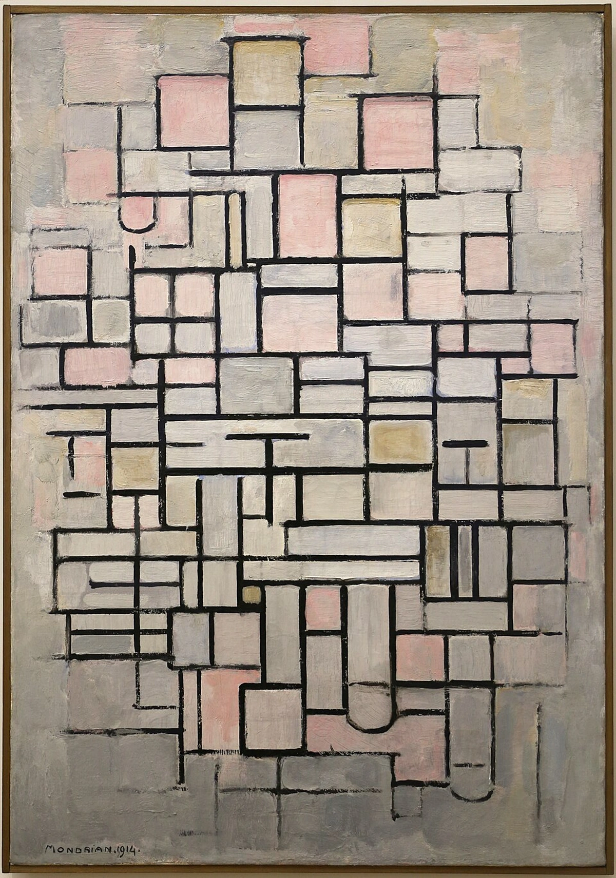
- Geometric Abstraction: Think clean lines, squares, circles. These can add a sense of order and sophisticated simplicity to a small space, especially if your interior leans contemporary or minimalist. Piet Mondrian's works, for instance, are masterful at this, creating balance with seemingly simple forms through precise, clear boundaries that paradoxically invite the eye to explore their constructed depth.
- Organic Abstraction: More fluid, curvilinear shapes, mimicking nature. These can soften hard edges in a room and introduce a sense of flow and calm, often feeling more free-form and natural. The flowing lines can make a compact space feel less rigid and more breathable.
- Color Field Painting: Large areas of solid color. Artists like Mark Rothko mastered this. In a small space, a Color Field piece can be surprisingly expansive, creating a meditative, almost infinite depth that pulls your gaze inward, making the wall feel less like a boundary and more like a portal. Its simplicity prevents visual clutter, allowing the pure emotion of color to fill the room.
- Gestural Abstraction (Action Painting): Characterized by energetic, spontaneous brushstrokes. Think Jackson Pollock. While inherently bold, a smaller, carefully selected gestural piece can add dynamic energy without overwhelming. The key is balance – ensuring it has enough 'breathing room' around it. The vigorous strokes can create a sense of contained movement that adds vitality without consuming space.
- Lyrical Abstraction: Often softer, more flowing and poetic than gestural, focusing on subtle color transitions and organic forms. These can introduce a gentle, sophisticated energy, perfect for creating a serene yet engaging atmosphere in a compact area, subtly expanding the visual field.
I remember once buying a very "busy" abstract piece with lots of small, erratic lines for a narrow hallway. It felt less like art and more like walking through a static-filled TV screen that occasionally buzzed with visual chaos. Lesson learned: sometimes, less visual information in the composition means more impact in a confined area. It allows the eye to rest and explore, rather than feeling overwhelmed. If you're just starting to explore this side of art, my guide to decoding abstraction: a beginner's guide to understanding non-representational art might be a good place to start.

Beyond the tangible forms, abstract art wields another subtle but potent tool: negative space. This isn't just empty canvas; it's the intentional absence of primary forms, allowing the eye to rest and the composition to breathe. In a small room, ample negative space within an abstract piece can prevent it from feeling heavy or claustrophobic. It creates a sense of openness, allowing your mind to fill in the blanks and experience a feeling of expansion, rather than being hemmed in by excessive detail. It’s like a visual pause, giving your eyes a moment to reset and then explore the piece’s depths again.
Paired with negative space, the concept of flow within abstract art can also dramatically impact a small area. This refers to the visual movement or direction suggested by lines, shapes, and colors, guiding your eye gracefully across the canvas. A piece with strong horizontal lines might elongate a narrow wall, while one with dynamic diagonals can create a sense of energy and upward movement, visually lifting a low ceiling. This deliberate orchestration of elements invites your gaze to travel within the artwork, creating an internal journey that distracts from the room's physical limitations.

But what about the canvas itself? Or, more accurately, what else can abstract art be made of? The physical properties of your abstract art can significantly influence its presence in a small space, sometimes in surprising ways. I once tried a massive, highly textured mixed-media piece that, while beautiful, felt like it was actively absorbing all the light (and sanity) from my already cramped study. Lesson learned: even texture needs to breathe! Anyway, consider these other mediums:
- Metal Prints: Offer a sleek, contemporary look with a high-gloss finish that can reflect light and add a sense of modern spaciousness, making a small room feel brighter and more open. (Pro: Reflects light, very modern. Con: Can feel cold or industrial if not balanced with other decor.)
- Acrylic Prints: Similar to metal, these provide vibrant colors and depth, often with a 'floating' effect if mounted away from the wall, adding dimensionality without consuming significant physical space. (Pro: Vibrant colors, depth, often mounted to float. Con: Can be reflective, prone to scratching if not handled carefully.)
- Textile Art: Weavings or fabric-based abstract pieces can introduce warmth, softness, and unique texture, absorbing sound and creating a cozy feel without adding visual bulk. They can also add a tactile depth that draws the eye. (Pro: Adds warmth, softness, acoustic benefits. Con: Can collect dust, generally not suitable for high-moisture areas.)
- Framed Paper Prints: Lighter and often more affordable, these allow for versatility. A simple, thin frame can make the art pop without overwhelming, and the flatness maintains a sleek profile in tight quarters. (Pro: Versatile, affordable, wide range of styles. Con: Can feel less impactful than other mediums if not chosen carefully, prone to glare under glass.)
Who says art has to hang on a wall? In a small space, you need to be nimble. I once tried to precariously balance a small framed abstract on a stack of books, only to discover my cat had other, more destructive, plans for its display. So, learn from my almost-disasters!
- Leaning on a Console or Shelf: A medium-sized piece can be artfully leaned against a wall on a console table, bookshelf, or even directly on the floor (if large enough), offering a casual yet intentional display that can be easily rearranged.
- Small Sculptures: Abstract sculptures, even tiny ones, can add three-dimensional interest to a coffee table, side table, or window sill, providing focal points without taking up wall space.
- Layering: In a gallery wall, don't be afraid to layer smaller pieces slightly over larger ones, or lean a small framed print in front of a larger hanging piece for added depth and personality.
<h2>Placement is Key: My Personal Room-by-Room Blunders and Triumphs</h2>
This is where the rubber meets the road, or rather, where the canvas meets the wall. Proper placement can literally make or break a small space. I've hung art too high, too low, too far to the left, and once, almost perfectly, only to realize it clashed horribly with the dusty houseplant next to it. Sigh. But then there was that magical afternoon when I finally positioned a deep blue abstract piece above my tiny entryway console – it wasn't just a painting, it was like a portal, adding instant depth and an unexpected calm to a previously chaotic corner. Pure triumph!
Here’s what I've found works for maximizing impact without overwhelming:
Room | Best Placement Strategy | Abstract Art Style/Color Suggestion |
|---|---|---|
| Living Room | Single large piece above a sofa or console to anchor the room. | Bold, geometric for a modern feel; soft, organic for tranquility. |
| Bedroom | Something calming, perhaps with soft colors or organic forms, above the headboard. | Lyrical abstraction, serene Color Field, soft geometric patterns. |
| Office | Visual break without distracting details, sparks creativity. | Clean lines, subtle textures, cool or muted color palettes. |
| Bathroom | Small, vibrant piece adds personality, protected from moisture. | Bright, abstract forms; acrylic prints or under glass for protection. |
| Kitchen/Dining Nook | Clean lines or bold colors to complement modern designs. | Geometric, minimalist abstraction, or vibrant, food-inspired colors. |
| Entryway/Hallway | Elevate the eye with a piece hung slightly higher than normal. | Something with strong vertical or diagonal lines; a single impactful piece. |
| Awkward Spaces | That sliver of wall between a doorframe and a window, or above a bookshelf. | Small, impactful abstract piece; multi-panel art to fill a narrow vertical space. |
- Elevating the Eye in Entryways: My tiny entryway was always a challenge. I initially thought a small landscape would make it feel open, but it just felt like a peephole. Then, I tried hanging a tall, serene abstract piece, a bit higher than eye level, on the narrow wall next to the coat rack. Suddenly, the ceiling felt higher, and the space felt less like a cramped corridor and more like a welcoming prelude to the rest of the apartment. It drew the eye up and in, rather than out to an imaginary scene. This neat trick for making a small room feel bigger is something I've explored further in using art make small room feel bigger.
- Embracing Awkward Nooks (My Favorite Challenge): That sliver of wall between a doorframe and a window? Or the narrow space above a bookshelf? These are often overlooked, but I’ve found them to be prime locations for a small, impactful abstract piece. I once positioned a vibrant, multi-panel abstract (a triptych, specifically) in a very narrow, vertical space between two cabinets in my kitchen. It transformed a dead zone into an unexpected focal point, adding personality without eating into prime counter space. I’m quite fond of these challenges, so much so I wrote about art for awkward spaces.
- Living Room as the Canvas: The living room is often the heart of a small home. Instead of scattering small pieces, I've had incredible success with a single, generously sized abstract painting above the sofa or a console table. It anchors the entire room, making a clear statement and providing a sense of depth and focus that smaller pieces might not achieve. This makes your contemporary art for living room choice a real centerpiece.
- The Serene Bedroom Sanctuary: For my bedroom, I always gravitate towards abstract pieces with soft colors or organic, flowing forms. Once, I hung a bold geometric piece, hoping for a modern vibe, but it just made my small sleeping space feel too rigid. Swapping it for a lyrical abstract above the headboard, with its subtle transitions and gentle energy, instantly transformed the room into the tranquil sanctuary I craved. It’s your sanctuary, after all. For more tips on making your sleeping space shine, check out how to decorate your bedroom.
- Office: Focus Without Distraction: In my compact home office, an abstract piece offers a visual break without distracting me with busy details. I once had a hyper-realistic landscape hanging there, and my eyes kept wandering into its distant hills instead of focusing on my screen! A minimalist abstract, or one with clean lines and subtle textures, now provides a calming backdrop that sparks creativity without demanding all my attention. Dive into how to decorate your office for more focused tips.
- Bathroom Surprises: Yes, even here! A small, vibrant abstract piece can add a surprising pop of personality. I’ve found that an acrylic print of a bold, colorful abstract is perfect for a bathroom—it handles moisture well and adds a modern, artistic touch to a space often overlooked. Just make sure it's protected from moisture. And if you're serious about this, I even have tips on how to decorate your bathroom.
- Kitchen/Dining Nook: Clean Lines, Fresh Colors: For my kitchen, I opted for abstract pieces with clean lines and vibrant, food-inspired colors. They complement modern kitchen designs without adding clutter, creating a cheerful atmosphere. My thoughts on how to decorate a kitchen might surprise you with some art ideas!
<h2>My Go-To Strategies for Impactful Display</h2>
Ever wondered if you're truly getting the most out of your cherished piece in a cozy corner? Beyond selecting the art itself, how you display it can make a world of difference, especially when you're working with limited square footage. These are my hard-won secrets for making abstract art truly shine in small spaces:
- Strategic Grouping: More Than the Sum of Its Parts: I've often found myself staring at a small wall, convinced one piece wasn't enough, but a gallery wall felt too chaotic. My solution? A focused grouping of two or three smaller abstract pieces that speak to each other. By choosing pieces with a shared color palette, complementary forms, or even by the same artist, you can create a single, cohesive visual statement that feels impactful and intentional without overwhelming. It's like building a mini-narrative that adds depth without sprawl.
- Less is More (Usually): While I championed a single large piece earlier, the general rule for small spaces is to be selective. Don't fill every available inch of wall space. Allow for "visual whitespace" – a moment for the eye to rest – around your art. This makes the pieces you do choose stand out and prevents the room from feeling cramped.
- Frame Wisely (or Not At All): Heavy, ornate frames can feel overwhelming in a compact area. Opt for slim, minimalist frames in a neutral tone (white, black, natural wood) or, for certain pieces, no frame at all. Consider framing materials like sleek metal for a modern edge, natural wood for warmth, or even clear acrylic for a floating effect – all can enhance the art without dominating the space. A gallery wrap canvas, where the art extends around the edges, can look incredibly clean and modern, almost floating on the wall. This is a very minimalist approach displaying art that I adore.
- Light It Up: Proper lighting can transform a painting. I remember agonizing over a particularly subtle abstract piece in my small living room, feeling it just wasn't 'popping.' A simple, well-placed picture light, however, brought out hidden textures and a stunning interplay of shadows and light, transforming it into a dynamic focal point that suddenly felt essential to the space. A well-placed spotlight or even just good ambient light can bring out the textures and colors of an abstract piece, giving it depth and making it feel more intentional. In small spaces, this is crucial. Consider picture lights mounted directly above the artwork, track lighting for adjustable spots, or even recessed lighting with adjustable heads to subtly highlight your piece without cluttering the room. Natural light, too, plays a crucial role; observe how your art changes throughout the day as light shifts.
- Reflect and Expand: Consider using mirrors opposite or adjacent to your abstract art. The reflection can subtly multiply the artwork's impact and literally make the room feel larger. It's a classic trick, but it works.
<h2>Caring for Your Abstract Art in a Cozy Home</h2>
In a cozy home, your cherished abstract art can be more exposed to the ebb and flow of daily life. Ensuring its longevity and continued enjoyment is part of the art of decorating. For canvas or framed prints, a gentle dusting with a soft, dry cloth is usually sufficient. If displaying in high-moisture areas like bathrooms, consider art specifically designed for such environments (e.g., acrylic prints, art under glass) or ensure good ventilation. Avoid direct, prolonged sunlight to prevent fading, especially for vibrant abstract colors. Rotating pieces occasionally can also offer a fresh perspective and spread out light exposure, keeping your decor feeling fresh without needing new purchases. What are your go-to tricks for keeping your art looking its best in a busy home?
<h2>A Final Thought: Trust Your Gut (Even if it's Wrong Sometimes)</h2>
My journey with art, much like my journey with understanding myself (and other humans, let's be honest), has been one of constant learning and occasional, glorious missteps. I once tried to hang a piece so high, it felt like it was trying to escape the room entirely, or perhaps just commune with the ceiling fan. There's no single "right" answer when it comes to decorating your home, especially with something as personal as abstract art. The goal isn't perfection; it's creating a space that feels like you.
So, if a piece of abstract art speaks to you, even if your logical brain screams, "It's too big for this shoebox of a room!" maybe, just maybe, listen to that little whisper instead. Give it a try. Move things around. Lean it against the wall for a few days before committing to hanging it. I remember acquiring a particularly vibrant, large-scale abstract painting, convinced it was too much for my small studio. But every time I walked past it, it pulled me in, inviting my eye to wander its depths. After a week of internal debate, I hung it, and it transformed the entire space, becoming the room's grounding force. The worst that can happen is you decide it doesn't work, and you try something else. And if you’re looking to add to your collection, remember you can always buy art prints or explore art for sale directly from artists (like me, if I may be so bold!). Building your art collection is a personal journey, and there’s a guide to buying art if you're feeling overwhelmed. Sometimes, a piece just fits, regardless of the room's size, and those are often the ones you cherish most. My own timeline, filled with creating and contemplating art, is just as messy and beautiful as my first small apartment. You can explore a bit of it on my timeline. What's been your biggest triumph or blunder with art in a tiny room? I'd love to hear about it – maybe over a virtual coffee, or just by leaving a note. I'm all ears (and probably have a similar story!).
<h2>Frequently Asked Questions (FAQ)</h2>
Still pondering how to make abstract art shine in your cozy abode? Here are some common questions I often get, along with my thoughts:
Q: Can a large abstract painting really work in a small living room? A: Absolutely! A single, large abstract piece can act as a powerful focal point, drawing the eye and giving the room a sense of grandeur and intention. It can actually make the space feel bigger by reducing visual clutter and providing a strong anchor. Don't be afraid to go bold; the visual impact can be transformative.
Q: What colors of abstract art are best for making a small room feel larger? A: Generally, lighter and cooler colors (blues, greens, soft grays, whites) tend to create a sense of openness and expansiveness. However, a bold, vibrant abstract piece can also work by adding energy and focus without overwhelming, as long as the overall composition isn't too busy. It's about how the color feels in the space.
Q: Should I frame abstract art for a small space? A: It truly depends on the piece and your desired aesthetic. For a modern, clean look, consider a gallery wrap canvas or a very thin, minimalist frame in a neutral color. Heavy or ornate frames can make a small space feel more cluttered, so often, going frameless or opting for a subtle frame is best. Also, consider the material of the frame itself; sleek metal or natural wood can enhance without overwhelming the art or the room.
Q: How high should I hang abstract art in a small room? A: A good rule of thumb is to hang the center of the artwork at eye level for an average person (around 57-60 inches or 145-152 cm from the floor). However, in small spaces, sometimes hanging a piece slightly higher can draw the eye upwards and emphasize vertical space, making the ceiling feel taller. Always consider the surrounding furniture and the room's proportions for the best visual balance.
Q: How do I know if an abstract piece is 'too busy' for my small space? A: A piece might be too busy if its composition contains many small, erratic elements, intense conflicting colors, or an overwhelming sense of movement without clear focal points. In a small space, this can make the room feel chaotic and cramped. Look for abstract art that offers visual 'resting points,' a more cohesive color palette, or larger, more defined forms that guide the eye rather than scattering it uncontrollably.
Q: Where can I find affordable abstract art for my apartment? A: There are many options! Online art marketplaces, local art fairs, student exhibitions, and direct from artists' websites (like this one!) are great places to start. You can often find affordable original pieces or high-quality prints. If you're looking to start an art collection on a budget, there are definitely ways to do it without breaking the bank; patience and exploration are key.
Q: Can I combine abstract art with other decor styles in a small space? A: Absolutely! Abstract art can surprisingly harmonize with various decor styles. For example, a piece with muted tones or organic forms can complement a minimalist or Scandinavian interior, while a bold, colorful abstract can add a dynamic focal point to an industrial or eclectic setting. The key is to find a piece that either contrasts playfully or subtly echoes elements like color or texture already present in your room, creating a cohesive yet interesting look.
Q: Can abstract art really fit into a highly traditional or maximalist decor? A: Yes, surprisingly well! In traditional settings, a subtle abstract piece with classic colors or organic forms can introduce a fresh, contemporary dialogue without clashing. For maximalist spaces, a bold abstract with complementary or contrasting colors can add another layer of visual richness and intellectual depth, becoming a powerful anchor amidst the vibrant details. The key is finding a piece that speaks to your existing elements, whether through harmony or playful tension.
Q: Should I rotate my abstract art in a small space? A: Rotating your art occasionally can be a fantastic strategy for a small space. It refreshes the visual dynamics of the room without needing new purchases, and it allows you to enjoy different pieces or see existing ones in a new light. It can prevent visual fatigue and keep your decor feeling lively and intentional.
Q: What if I don't 'get' abstract art or feel intimidated by it? A: It's a common feeling! The beauty of abstract art is that it doesn't always demand to be 'understood' in a literal sense. Instead, allow yourself to feel it. What emotions does it evoke? What colors or forms draw your eye? Often, the connection is purely intuitive. Start with pieces that simply resonate with you, and remember, there’s no wrong way to experience it. My guide to decoding abstraction: a beginner's guide to understanding non-representational art might offer some helpful perspectives too.


