Beginner's Guide to Oil Pastels: Start Creating Vibrant Art
Thinking about oil pastels? Join me as I share my personal journey, essential tips, and simple techniques for beginners to create vibrant art. No experience needed!
A Beginner's Guide to Using Oil Pastels: Embracing the Mess and the Magic
Have you ever stared at a blank page, art supplies scattered around, and felt that flutter of excitement mixed with a tiny dollop of dread? That's how I used to feel about oil pastels. They sat there, vibrant and alluring, promising a riot of color, but I just couldn't crack their code. If you've ever felt intimidated by their creamy intensity, or you're simply curious about diving into a medium that's as forgiving as it is vibrant, then pull up a chair. This isn't just a guide; it's a candid chat over a messy art table, where I'll share all the glorious mistakes, the happy accidents, and why these little sticks of pigment have utterly stolen my artistic heart. Let's get beautifully messy together.
Table of Contents
- [## ## My Top Tips for Oil Pastel Beginners (Learned the Hard Way)
Look, I'm not going to pretend I'm some oil pastel guru. Most of what I've learned has come from happy accidents, frustrating "mud" moments, and a lot of quiet time in my studio (which, if you're ever near my museum in 's-Hertogenbosch, you know is rarely quiet!). Here are my unfiltered thoughts:
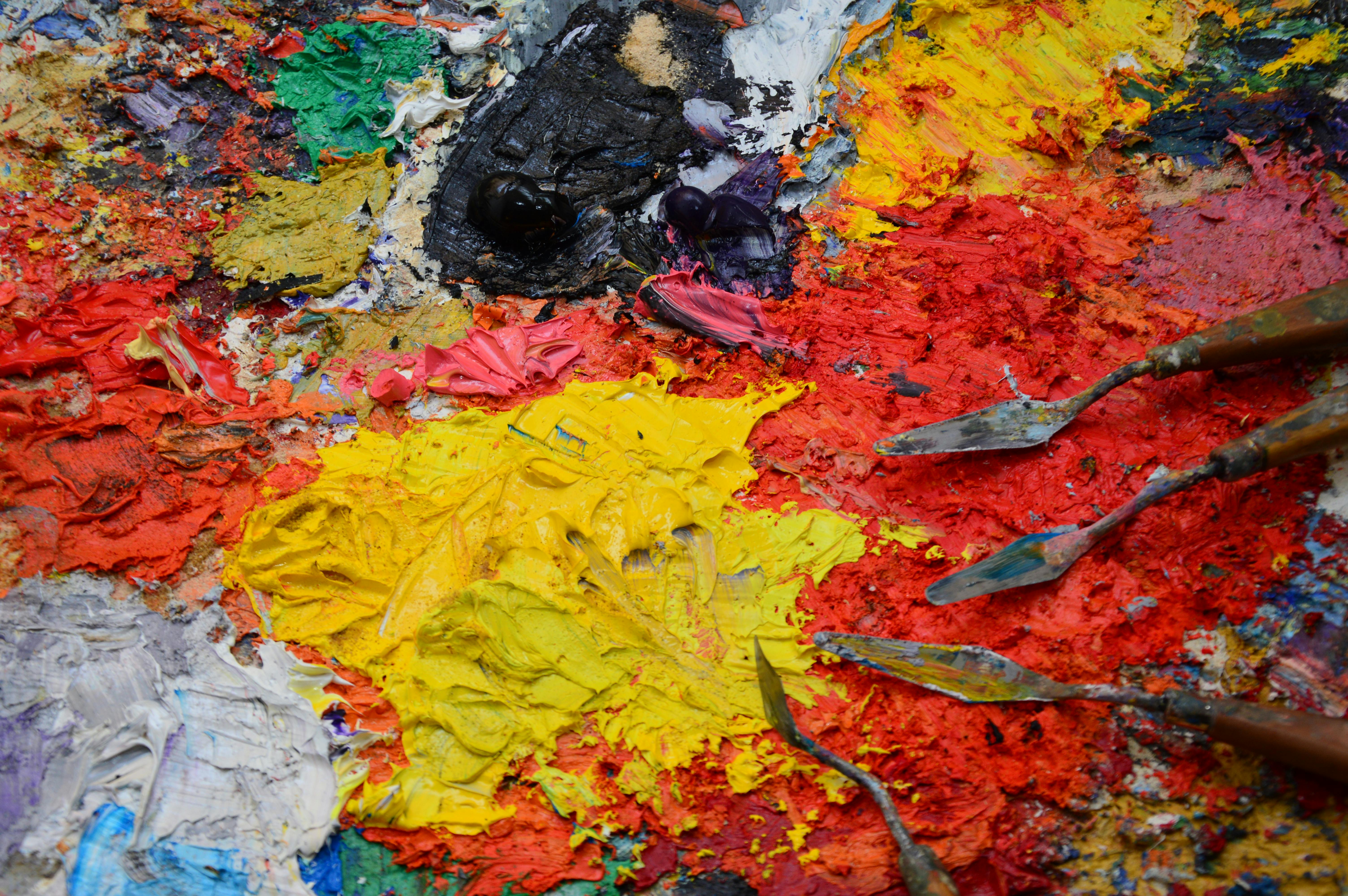
- Embrace the Mess (Seriously): Oil pastels are inherently messy. Your fingers will get colored, your workspace might get a bit smudged. See it as part of the creative process, a sign you're truly engaged. A messy studio is a working studio, right?
- Work in Layers, But Don't Overwork: This is a delicate balance. Build up colors gradually. If you try to blend too many colors or work a single area too much, you'll end up with a muddy, dull mess. Sometimes, less is truly more.
- Start Light, Go Dark (Mostly): While you can apply lighter colors over darker ones (especially white for blending), it's generally easier to build from light to dark. Dark pigments are very dominant!
- Experiment with Pressure: Varying how hard you press makes a huge difference. Light pressure for subtle hues, heavy pressure for bold, opaque color. This is your primary control mechanism.
- Don't Be Afraid of Negative Space: Not every inch of your paper needs to be covered. Sometimes, leaving some areas untouched or lightly colored can create a beautiful contrast and allow your vibrant pastel marks to really sing.
- Consider a Fixative and Framing (Eventually, but Seriously): Because oil pastels never fully dry, they can smudge. For finished pieces you want to preserve, a specialized spray fixative (applied in thin, even coats from a distance in a well-ventilated area) can definitely help 'lock in' those layers. Think of it as a protective shield! But here's the crucial bit, the non-negotiable step for long-term display: always frame oil pastel art behind glass. Use a mat or spacers to ensure the pastel surface doesn't touch the glass, as it can stick and ruin your hard work. This simple step protects your vibrant piece from dust, smudging, and even some environmental factors, keeping it pristine for years to come. For just starting out, though, don't sweat the archival stuff; focus on the art! Just know that when you create something truly special, these steps will be your best friend.
- Explore Different Surfaces: While I mentioned paper, don't limit yourself! Oil pastels can work beautifully on wood, canvas, or even rough-textured boards. Each surface will offer a completely different experience and result, influencing how the pastel blends and layers. Don't be afraid to get weird with it!
- Look for Inspiration, Not Duplication: Browse online, look at other artists' work. See how they use oil pastels, but then find your voice. My own artistic journey has been all about finding what resonates with me, and yours will be too. Let others inspire you, but let your hands create the unique magic.
- Set Up Your Workspace for Success: A clean, organized (or beautifully messy, if that's your vibe!) workspace can make a world of difference. Have all your tools within reach, good lighting (natural light is always best, but a good daylight lamp helps), and plenty of space to spread out. A small, dedicated area can become your creative sanctuary.
- Take Breaks and Step Back: It's easy to get lost in the details and overwork a piece. Step away from your artwork regularly. Come back to it with fresh eyes. You'll be amazed at what you notice – areas that need more blending, colors that clash, or even happy accidents you want to lean into. Sometimes, a short coffee break is the best blending tool you have!
- Don't Be Afraid to Take Risks: Seriously, this isn't brain surgery! It's art. If you're hesitant to try a new technique or apply a bold color, remind yourself it's just paper and pigment. The worst that can happen is you learn what doesn't work, which is still a valuable lesson. Embrace the experimentation, the 'what ifs,' and the unexpected outcomes. That's where genuine growth and truly unique art happens!
Look, I'm not going to pretend I'm some oil pastel guru. Most of what I've learned has come from happy accidents, frustrating "mud" moments, and a lot of quiet time in my studio (which, if you're ever near my museum in 's-Hertogenbosch, you know is rarely quiet!). Here are my unfiltered thoughts:](#my-top-tips-for-oil-pastel-beginners-learned-the-hard-way)
- [## Cleaning and Maintaining Your Tools and Workspace
Look, let's be real: oil pastels are delightfully messy. Your fingers will become a vibrant, swirling palette of colors, and your workspace might resemble a pastel explosion. But a little bit of tidiness goes a long way in keeping your colors pure and your creative flow smooth. Think of it as part of the ritual, not a chore!
1. Cleaning Your Pastel Sticks
It's inevitable: you'll pick up a light yellow stick and accidentally blend it into a dark blue area. Suddenly, your yellow is a muddy green. Don't panic!
- Wipe it clean: The easiest way to clean the tip of a pastel stick is to simply wipe it on a paper towel or a soft cloth. The excess pigment will come right off.
- Scrape it off: For more stubborn color transfers or if you want a really fresh surface, gently scrape a thin layer off the tip with a craft knife or a dedicated razor blade (be super careful!). This exposes fresh, pure pigment.
2. Caring for Your Blending Tools
Your fingers are easy to clean (soap and water work wonders, sometimes a little art soap helps!), but what about those tortillons and silicone shapers?
- Paper Blending Stumps/Tortillons: These absorb pigment. To clean them, rub them vigorously on a piece of sandpaper or a rough cloth. You'll literally sand away the colored tip to reveal a clean surface.
- Silicone Color Shapers: The beauty of silicone is that it doesn't absorb pigment. A quick wipe with a paper towel is usually enough. For dried-on or stubborn bits, a tiny dab of odorless mineral spirits on a cloth will do the trick, followed by a dry wipe.
- Palette Knives: Similar to silicone shapers, wipe them clean with a paper towel. If pastel is really caked on, a gentle scrape with another knife or a rag with solvent will clean it right up.
3. Keeping Your Workspace Tidy
A messy workspace can be a sign of creativity, but a functional messy workspace is even better!
- Protect your surface: Lay down old newspapers, a cutting mat, or even a large sheet of cardboard. This saves your table from becoming a permanent art piece.
- Sweep away crumbs: Oil pastels do produce little crumbs. Use a soft, clean brush (like a dedicated fan brush or a cheap makeup brush) to gently sweep these crumbs off your artwork and workspace before they get pressed into your current layers.
- Ventilation: If you're using solvents, proper ventilation is non-negotiable. Open windows, use a fan, or consider working outdoors if possible. Your lungs will thank you!
Taking a few moments to clean up as you go can make a big difference in the quality of your work and the longevity of your supplies. Plus, a slightly tidier space often leads to a clearer creative mind!
Troubleshooting Oil Pastels: When Things Get Tricky (and they will!)
Even with all the fun, oil pastels can sometimes throw a curveball. Don't worry, it's all part of the learning process. Here are a few common issues and how I tackle them, because trust me, I've seen them all.](/finder/page/a-beginners-guide-to-using-oil-pastels)
- [## Proper Storage and Archiving of Oil Pastel Art
So you've created a masterpiece (or a really fun experiment!) with oil pastels. Now what? Because they never truly dry, oil pastels need a little extra care to ensure your vibrant work lasts. Think of it as giving your art a cozy, protected home!
1. The Magic of Fixatives
While oil pastels never fully harden, a specialized fixative can make a world of difference in preventing smudging and protecting your layers.
- What it does: An oil pastel fixative creates a clear, flexible barrier over your artwork, essentially 'locking in' the pigment without dulling the colors. It acts as a protective shield against dust and light handling.
- How to apply: Always apply in thin, even coats from a distance (about 10-12 inches) in a well-ventilated area. Multiple light coats are always better than one heavy one, which can cause bubbling or a hazy finish. Let each coat dry completely before applying the next.
- Workable vs. Final: Remember the "workable fixative" from our supplies list? That's for between layers. A final fixative is designed for your finished piece. Make sure you get the right kind!
2. Framing: The Non-Negotiable Step
For long-term display and preservation, framing behind glass is absolutely crucial for oil pastels.
- Why glass? It protects the delicate, non-drying surface from dust, physical damage, and environmental factors like humidity.
- The Mat/Spacers Rule: This is key! You must use a mat board or spacers to ensure the oil pastel surface doesn't touch the glass. If it touches, the pastel can stick to the glass over time, potentially ruining your hard work and making removal impossible. A mat provides that essential air gap.
- UV-Protective Glass: Consider investing in UV-protective glass or acrylic. This will further guard your artwork against fading from light exposure, especially important for pieces created with student-grade pastels or those displayed in brightly lit areas.
3. Storing Unframed Artwork
If you're not ready to frame or if you have many practice pieces, proper storage is still vital.
- Glassine paper: This translucent, non-stick paper is your best friend. Place a sheet over your oil pastel work before stacking or storing to prevent smudging and pigment transfer.
- Flat storage: Always store oil pastel pieces flat to prevent gravity from causing any pigment migration over time.
- Stable environment: Avoid extreme temperature fluctuations or high humidity, as these can contribute to "blooming" (a waxy haze) or other issues. A cool, dry place is ideal.
By taking these simple steps, you're not just preserving a piece of art; you're preserving a piece of your creative journey.
Beyond the Basics: Exploring Mixed Media with Oil Pastels
Once you've gotten comfortable with oil pastels on their own, a whole new world of creative possibilities opens up when you start combining them with other art mediums. This is where you can truly push boundaries and discover unique textures and effects that a single medium can't achieve alone. Think of it as inviting other art supplies to your oil pastel party!
1. Oil Pastels with Oil Paints
This is a natural pairing, given their similar oil bases.
- Underpainting: You can use a thin wash of oil pastel (dissolved with mineral spirits) as an initial underpainting, then build up layers with traditional oil paints.
- Finishing Touches: Oil pastels are fantastic for adding final highlights, rich textures, or expressive strokes over dried oil paint. They bring an immediacy and tactile quality that can be difficult to achieve with brushes alone. Remember the 'fat over lean' rule here – ensure your pastel layers are 'leaner' (thinner) than any subsequent oil paint layers to prevent cracking.
2. Oil Pastels and Acrylics
While acrylics are water-based and oil pastels are, well, oil-based, they can coexist beautifully!
- Acrylic Underpainting: Paint an acrylic base layer (or several layers) and let it dry completely. The matte, slightly absorbent surface of dry acrylics provides an excellent ground for oil pastels, allowing for vibrant layering without the pastel slipping.
- Highlights and Texture: Use oil pastels to add bright pops of color, create textural elements, or soften edges over dry acrylic paintings.
3. Oil Pastels with Dry Media (Pencils, Charcoal, Ink)
This is where you can add incredible detail and nuance.
- Colored Pencils: Use colored pencils over oil pastel layers for fine lines, delicate textures, or to intensify small areas of color. The wax in colored pencils can interact beautifully with the oil pastel for subtle blending.
- Graphite/Charcoal Under-sketches: Start with a light graphite or charcoal sketch, then build up your oil pastel layers over it. Be careful not to press too hard with the pastels initially, as they can pick up and smudge the dry media.
- Ink Outlines/Details: Once your oil pastel layers are established (and perhaps fixed with a workable fixative), you can add sharp details or outlines with permanent ink pens.
4. Exploring Textured Grounds
Beyond traditional paper, experiment with surfaces that offer inherent texture:
- Gessoed Panels: A gessoed wood panel or canvas can provide a wonderfully stable and textured ground. You can even add sand or pumice to your gesso for extra grit.
- Collage Elements: Incorporate torn papers, fabrics, or other lightweight materials into your surface with an adhesive, then draw and paint over them with oil pastels for truly unique mixed-media pieces.
The key to successful mixed media is often experimentation and patience. Start small, see how the mediums interact, and don't be afraid to break some traditional rules. The most exciting art often comes from unexpected combinations!
Finding Your Muse: Inspirational Artists and Styles
Sometimes, the best way to kickstart your own creativity is to see how others have danced with oil pastels. While perhaps not as widely championed as oils or acrylics, some incredible artists have wielded these sticks with spectacular results. It's like finding your musical tribe – suddenly, you realize you're not alone in loving this wonderfully messy medium!](/finder/page/ultimate-guide-to-rembrandt-van-rijn)
- [## Why I Keep Coming Back to Oil Pastels
There's something incredibly freeing about oil pastels, isn't there? For me, it boils down to pure, unadulterated joy. There are no brushes to meticulously clean, no water to change, no complex mediums to mix – just pure, buttery pigment ready to leap from stick to paper, unleashed by the simple command of my hand. They allow for such immediate, tactile, and raw expression. The way colors melt into each other with a gentle smudge, the rich, almost sculptural textures you can build, the sheer, unapologetic vibrancy that screams from the paper... it all appeals deeply to my love for bold, expressive, and slightly messy art. They’re a powerful reminder that art doesn't have to be complicated, pristine, or expensive to be deeply satisfying. They're about embracing spontaneity, celebrating happy accidents, and finding profound beauty in the raw, messy process itself.
For me, it's also the intimacy, the almost primal connection to the creation. There's a direct, unfiltered conduit between my hand, my intention, and the paper, almost like sculpting with pure color. Every stroke feels deliberate, yet the incredible blendability means there's always room for unexpected magic – those 'happy accidents' that become integral parts of the narrative. It’s a captivating dance between control and letting go, between planning and surrendering to the medium's will, and that, my friends, is where the real, vibrant magic happens. And yes, the way they never fully dry means your artwork is always a living, breathing thing, subtly shifting, inviting interaction, and feeling just a little bit alive – much like life itself, ever-evolving and beautifully imperfect.](/finder/page/a-beginners-guide-to-using-oil-pastels)
So, What Even Are Oil Pastels? A Quick Chat
Beyond just pigment and binder, the exact ratio of oil to wax can dramatically affect the pastel's texture and behavior. Some brands lean towards a softer, more buttery consistency, allowing for effortless blending, while others are firmer, perfect for sharp details and crisp lines. This variety is part of the charm, offering different feels for different artistic expressions. Think of it like baking – a slight change in ingredients makes a completely different cake!
It’s also important to know that oil pastels come in different grades: student and artist. Student-grade pastels (like Mungyo Gallery or Sakura Cray-Pas Expressionist) are more affordable, often firmer, and have less pigment. They're fantastic for beginners and practice! Artist-grade pastels (Sennelier, Caran d'Ache Neopastel) boast richer pigment concentration, a creamier texture, and superior lightfastness, making them ideal for professional work. Understanding this can help you choose the right pastels for your desired effect, whether you want delicate blending or bold, impasto strokes.
Before we dive into the fun stuff, let's get a basic understanding. You know how there are soft pastels, which are basically pure pigment with a binder, a bit chalky and dusty? Well, oil pastels are their richer, creamier cousins. They’re made with pigment mixed with a non-drying oil and wax binder. This gives them that incredible smooth, almost lipstick-like consistency, allowing for vibrant colors and impressive blending capabilities that are quite different from, say, traditional oil paints or even acrylics. The beauty? They never truly dry, remaining workable and blendable over time. This can be a blessing and a curse, but mostly a blessing for rich, textured work!
Interestingly, oil pastels are a relatively modern invention, emerging in the early 20th century. Pablo Picasso himself, looking for a medium that offered vibrant color and ease of use without the drying time of oil paints, supposedly encouraged Henri Sennelier to develop them. So, you're in good company if you're drawn to their immediate, expressive qualities!
Getting Started: The Bare Necessities (and a Few Luxuries)
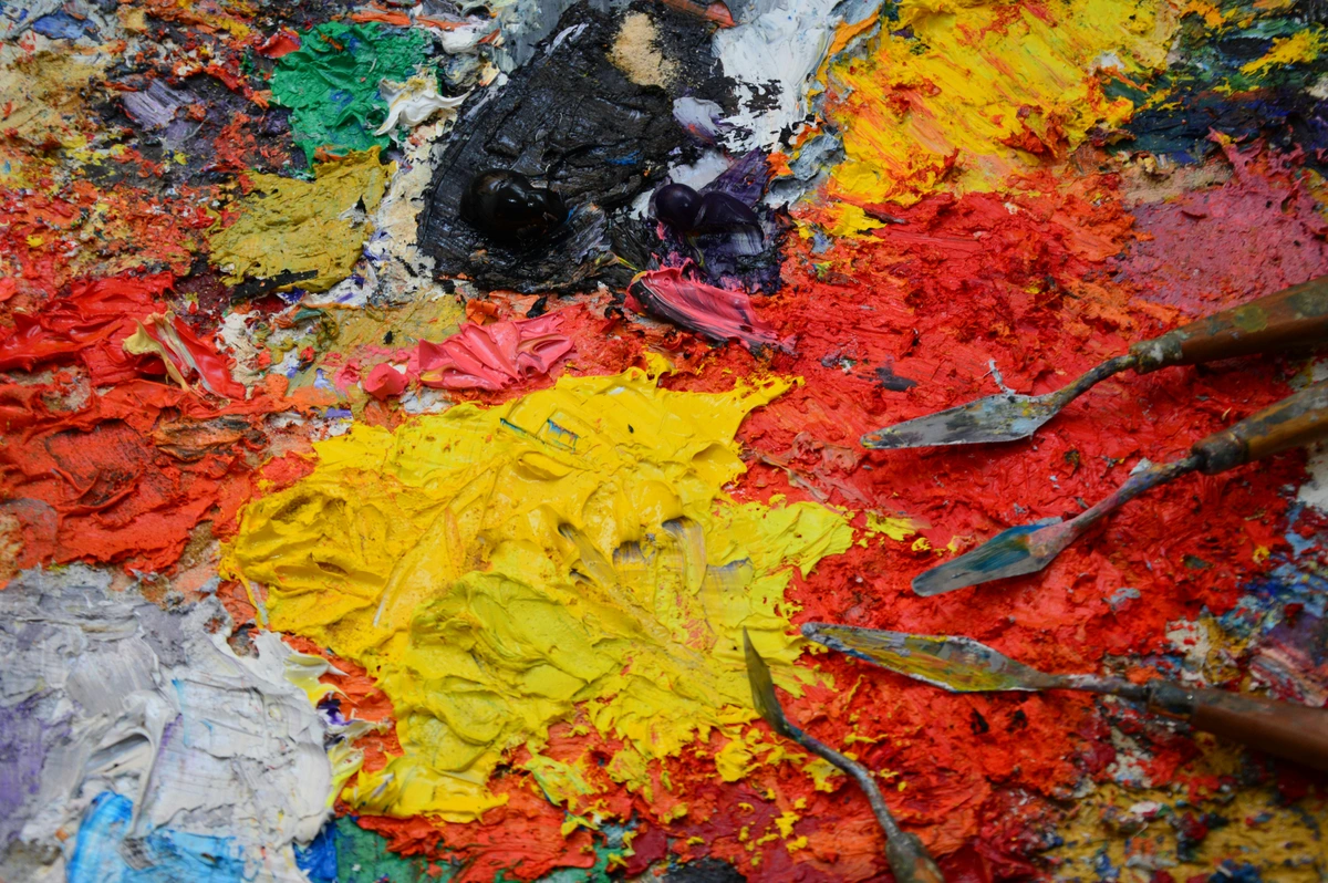
You really don't need much to get going, and that's one of the things I adore about oil pastels. My advice? Don't break the bank on your first set.

Here’s what I’d suggest you grab:
- Oil Pastels: Obviously! For beginners, a decent student-grade set (like Mungyo Gallery or Sakura Cray-Pas Expressionist) will give you a good range of colors and a nice feel without the hefty price tag. They're usually a bit firmer and have less pigment, which is perfect for practice. If you find yourself falling in love, you might then consider investing in artist-grade pastels like Sennelier or Caran d'Ache Neopastel, which boast richer pigment, creamier texture, and better lightfastness. But honestly, start simple!
- Paper: This is critical. Forget your standard printer paper; oil pastels need something with a bit of "tooth" – a textured surface to grab onto the pigment. Think pastel paper, watercolor paper, or even heavy drawing paper. I often use thick multimedia paper. And don't be afraid to experiment with toned papers; they can make your colors pop in unexpected ways! Beyond paper, consider experimenting with sanded pastel paper (which holds even more layers and allows for incredible depth), gessoed wood panels (for a rigid, archival surface), or even primed canvas (offering a flexible, painterly feel). Each surface offers a unique interaction with the pastel, affecting blending, layering, and overall texture. For instance, cold press watercolor paper, with its subtle texture, is a personal favorite for its ability to hold multiple layers without feeling overly rough, while a smooth Bristol board might be perfect for detailed, linear work.
- Blending Tools: Your fingers are your best friends here! Seriously, embrace the mess. But if you want to keep your hands clean or achieve finer blends, cotton swabs, paper tortillons, or even a soft cloth work wonderfully. * Oil Pastel Washes (for later exploration): While I'd generally suggest mastering the dry techniques first, it's good to know that oil pastels can be dissolved with oil-based solvents like odorless mineral spirits or turpentine (always in a well-ventilated area, please!). Applying a solvent with a soft brush over a pastel layer creates a paint-like wash, allowing for incredibly smooth transitions, subtle glazing effects, or quickly blocking in large areas with translucent color. It's a fantastic way to bridge the gap between drawing and painting, giving your work a more fluid, painterly feel without needing to switch mediums entirely.
- Palette Knife / Sgraffito Tool: While traditionally used for paint, a palette knife or even just a toothpick or a blunt pencil can be fantastic for scratching into thick layers of pastel, revealing colors underneath. More on that technique later!
- Wipes/Paper Towels: Because, trust me, you're going to get messy. And that's part of the fun!
- Erasers: Yes, erasers! They're not just for fixing mistakes; they're another creative tool. A kneaded eraser is your best friend for gently lifting pastel without smudging too much, perfect for softening edges or pulling out subtle highlights. A regular rubber eraser (used gently, perhaps cut to a fine point) can create sharper, more defined highlights or clean crisp edges. Experiment with different types – even a vinyl eraser can surprise you with its lifting power!
- Craft Knife/Razor Blade: For sharpening pastel sticks or for precise sgraffito work, a craft knife can be incredibly useful. Just be super careful, okay? Safety first!
- Gloves (Optional but Recommended): If you're not keen on constantly having rainbow-stained fingers, a pair of disposable gloves can be your best friend, especially for blending large areas.
- Workable Fixative: While we'll talk more about final fixatives later, a workable fixative can be sprayed between layers to 'fix' them, allowing you to add more layers without disturbing the ones underneath. It can also add a bit more 'tooth' to your paper if you've really loaded it up with pastel.
- A Dedicated Workspace (Even a Small Nook): Trust me on this one. Having a spot where you can leave your supplies out and your work in progress makes a huge difference. Good lighting (natural light is king, but a daylight lamp works wonders), a surface you don't mind getting a little messy, and all your tools within arm's reach. It becomes your creative sanctuary, even if it's just a corner of your dining table!
Diving In: Essential Techniques You'll Actually Use
This is where the magic happens. Don't overthink it; just play!
1. Laying Down Color: The Foundation of Fun
Think of oil pastels as crayons on steroids, but with a grown-up, buttery soul. The beauty is in the control you have with just your hand – apply them lightly for subtle color, or press down hard for intense, rich pigment. It's all about varying your pressure to tell your color story!
- Scumbling: This technique involves applying color with a light, loose, circular motion, allowing the tooth of the paper and previous layers to peek through. It creates a soft, hazy, or textured effect, fantastic for building atmosphere, suggesting distant foliage, or creating a vibrant, broken color field. Tip: Use this for backgrounds or areas where you want a subtle, ethereal glow.
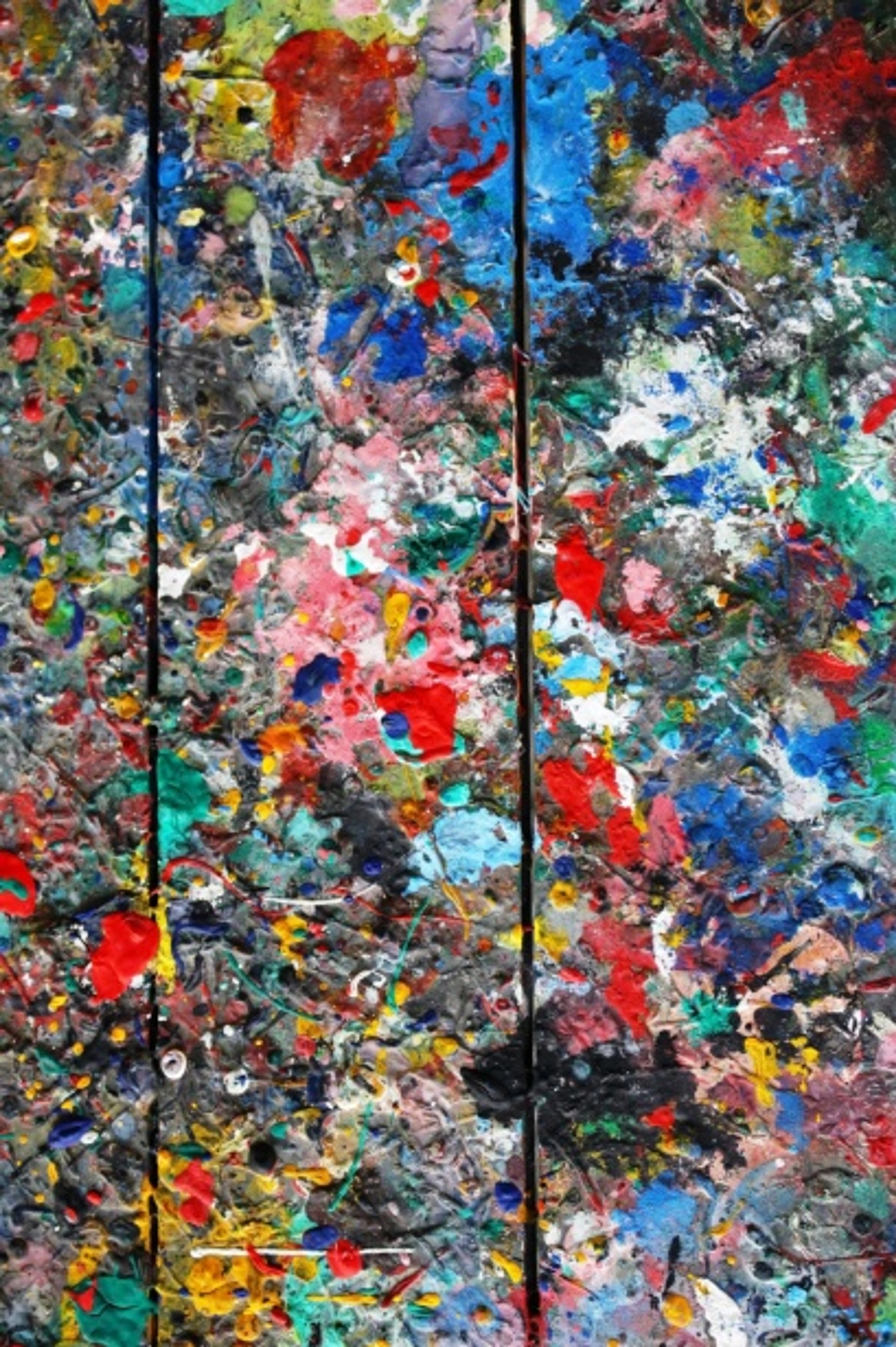
- Impasto: Ah, my personal favorite! This is where you apply the pastel thickly, almost sculpting with pigment. The texture of the stick and your strokes create glorious, sculptural marks, leaving tactile ridges and valleys. If you love texture like I do (and if you've seen my abstract art, you know I do!), you'll adore this. It’s like painting with solid color, bold and unapologetic. Tip: Great for focal points, foreground elements, or simply to add luscious dimension.
- Linear Strokes: Simple, direct lines that vary in pressure and direction are the bread and butter of drawing. Use them for sketching, outlining, or creating directional texture – think flowing hair, rippling water, or textured bark. Tip: Experiment with the side of the pastel for broader lines, and the tip for fine details.
- Cross-hatching: A classic drawing technique that involves building up layers of lines that cross over each other. It works beautifully with oil pastels to create depth, vary tones, and imply form. The overlapping lines allow colors to blend optically. Tip: Try cross-hatching with complementary colors to create exciting vibrations and shadows.
- Stippling: This involves using small dots or dabs of color to build up an image. When different colors are stippled close together, your eye will mix them optically, creating a vibrant, shimmering effect that's full of life. Tip: Excellent for creating light, airy textures, or for adding sparkle to water or light sources.
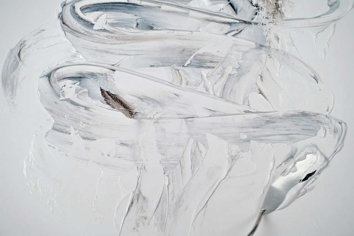
2. Blending: The Art of Happy Accidents and Smooth Moves
Oil pastels are incredibly blendable, which is both a joy and, let's be honest, sometimes a challenge. But that's where the happy accidents live, and where you discover the unique personality of this medium!
- Finger Blending: The most direct and intuitive method, and my personal favorite for larger areas. Just smudge! Your body heat helps melt the wax slightly, allowing colors to mix beautifully and seamlessly. I love how this connects me directly to the medium, a truly tactile experience. Pro: Intuitive, great for broad blends. Con: Can get messy, difficult for fine details.
- Paper Blending Stumps/Tortillons: These tightly rolled paper tools are fantastic for smaller, detailed areas or if you want to keep your hands (relatively) clean. They offer a bit more control and can create lovely smooth transitions without depositing finger oils. Pro: Precision, clean. Con: Can get saturated with pigment, requiring cleaning.
- Silicone Color Shapers: These are fantastic! Available in various shapes and firmness levels, they offer precise blending and sculpting without absorbing any pigment, making them super easy to clean. They're like an extension of your finger, but with superpowers. Pro: Versatile, easy to clean, no pigment absorption. Con: Can be a bit pricey.
- Layering and Optical Blending: Sometimes, you don't even need to physically blend! Layering one color lightly over another can create a new color optically, especially if you're not pressing hard. For instance, a light blue over a light yellow can appear green from a distance, or a series of red and blue strokes might create a vibrant violet. Experiment with how artists use color in general; many principles apply here. This is pure magic when it works, adding a shimmering quality to your work. Pro: Creates luminous effects, avoids mud. Con: Requires practice to control.
- Using a Lighter Pastel: Applying a lighter pastel (especially white, cream, or a very pale color) over darker ones can blend and lighten them beautifully, creating soft, hazy effects, or pushing areas back into the background. It's a great way to soften hard edges or create a luminous glow. Pro: Excellent for highlights and softening. Con: Can sometimes mute underlying colors if overused.
- Colorless Blender Sticks: Some brands offer colorless oil pastel sticks. These are brilliant for moving pigment around without adding more color, helping you achieve smoother transitions, subtle shifts in tone, or pushing pigment into the paper's tooth without fear of muddiness. Pro: Prevents muddiness, enhances blending. Con: Another tool to keep clean.
The Role of Texture: Beyond Smooth Blends
While blending is glorious, don't forget that oil pastels are masters of texture! Embrace the rough, the scraped, the layered. The physical marks you leave can add incredible depth and character to your work, transforming a flat image into something tangible and alive. Whether it's the granular effect of light scumbling, the sculptural ridges of impasto, or the sharp lines of sgraffito, texture is your secret weapon for making your oil pastel art truly sing. Remember, a painting isn't just about color; it's about surface, too!
Color Theory for Oil Pastels: Painting with Pigment
Understanding a bit about color theory can elevate your oil pastel work from just 'coloring' to truly 'painting with pigment.' You don't need to be a color scientist, just a playful explorer! It's less about strict rules and more about understanding how colors interact to create mood and depth.
- Primary, Secondary, Tertiary: Remember those basics from school? Red, Yellow, Blue are your primaries. Mix them to get secondaries (Orange, Green, Violet). Mix a primary and a secondary to get tertiaries. Oil pastels are great for hands-on color mixing directly on the paper, allowing you to see the magic happen right before your eyes.
- Warm and Cool Colors: Reds, oranges, and yellows are generally considered warm, advancing colors (they feel closer). Blues, greens, and purples are cool, receding colors (they feel further away). Using this contrast can add depth and mood to your work. Try a fiery sunset (warm) against a deep blue background (cool) to see the dramatic effect.
- Analogous and Complementary Schemes:
- Analogous: Colors next to each other on the color wheel (e.g., blue, blue-green, green). They create harmonious, calm compositions, perfect for a serene landscape.
- Complementary: Colors opposite each other on the color wheel (e.g., red and green, blue and orange). They create high contrast and vibrancy, making each other 'pop' when placed side-by-side. Just be careful blending them too much, or you might end up with mud – a common beginner's rite of passage!
- Monochromatic Schemes: Using different values (lightness/darkness) and intensities (brightness/dullness) of a single color. It's a fantastic way to practice blending and value without the complexity of multiple hues, forcing you to focus on form and contrast.
- Value and Saturation: Beyond just hue, think about value (how light or dark a color is) and saturation (how intense or dull a color is). Oil pastels excel at building up rich, saturated colors, but don't forget the power of subtle variations in value to create form and dimension.
Ultimately, the best way to learn is to simply swatch, layer, and blend. Grab a scrap piece of paper and just play! See what happens when you combine colors, how pressure changes the intensity, and how optical blends create new hues. Your eyes are your best guide – trust them, and don't be afraid to experiment. The more you play, the more intuitive color mixing will become, and the more confident you'll be in orchestrating your own vibrant masterpieces.
3. Sgraffito: The Art of Scratching Back to Brilliance
This is where you scratch into layers of pastel to reveal the color underneath. It's a fantastic way to add fine lines, texture, or even entire patterns.
- Lay down a solid layer of one color.
- Apply a second, contrasting color thickly over the first.
- Using a sharp tool (like a toothpick, the back of a brush, a paperclip, or a palette knife), scratch away the top layer to expose the color below. This technique always surprises me with its dramatic results. It's truly a way of exploring texture in your work! You can create incredibly fine lines (think wisps of hair, grass blades, or intricate patterns), broader areas of revealed color, or even interesting imprints by pressing and lifting. It's like finding hidden gems within your layers. Tip: Experiment with different tools – a dull pencil for broader marks, a needle for hair-thin details, or a palette knife for bold scrapes.
4. Masking and Resist Techniques: Preserving Purity
Sometimes, you want to preserve certain areas or create crisp, unblemished edges, which can be tricky with a medium as wonderfully blendable as oil pastels. That's where masking comes in – it's like putting up little 'do not touch' signs for your pigment, allowing you to control the chaos!
- Masking Fluid (Use with Caution): For truly sharp, unblemished areas that need to remain pristine, a liquid masking fluid can sometimes be used. This isn't strictly designed for oil pastels and requires extreme caution. Apply it sparingly and precisely to the areas you want to protect. Once the pastel is applied and the fluid is completely dry, it can be gently peeled away to reveal the untouched surface. Crucially, always test this on a scrap piece of your paper first, as some masking fluids can interact unexpectedly with certain surfaces or tear paper upon removal. Tip: Consider a dedicated masking fluid remover for cleaner results.
- Wax Resist (Subtle Magic): This is a bit more intuitive and truly a delight. Use a white oil pastel (or a very light color like a pale yellow or peach) and press firmly onto an area you want to 'protect' from subsequent layers. When you layer a darker color over it, the waxy underlayer will resist the top color, allowing the lighter color to show through subtly. It creates a beautiful, almost ethereal effect, perfect for highlights, distant light, or a shimmering texture. Think of it as painting with invisible wax, and then making it visible! Tip: Use this for creating delicate patterns or textures that seem to glow from within.
- Tape Masking: For clean, straight lines, geometric shapes, or sharp borders, painter's tape (like FrogTape or similar low-tack options) or even washi tape can be applied before you lay down pastel. Just make sure it's low-tack so it doesn't damage your paper when removed. Apply your pastel right up to the edge, then carefully peel the tape away once your pastel layers are complete but before they've fully settled to reveal a crisp, clean line. It's surprisingly satisfying to peel back the tape and see those perfectly defined edges! Tip: Press the tape down firmly along the edges to prevent pastel bleeding underneath, but don't burnish it so hard that it's difficult to remove.
5. Underpainting and Glazing: Building Depth with Solvents
Okay, so this is where oil pastels start to really feel like painting. Remember how I mentioned you could use solvents? This is how you unlock another layer of magic and truly bridge the gap between drawing and painting!
- Underpainting: Begin by laying down a light, thin layer of oil pastel. This can be a monochromatic base (using different shades of a single color to establish values) or a loose color sketch to block in your main areas. Think of this as the 'bones' or the initial map of your painting.
- Apply Solvent: Using a soft brush dampened (and I mean dampened, not drenched!) with an oil-based solvent like odorless mineral spirits (my go-to, as it's less pungent) or turpentine (a stronger option), gently brush over the pastel. The solvent dissolves the pastel pigment, transforming it into a beautiful, translucent, paint-like wash. This technique is incredible for quickly blocking in large areas of color, creating smooth gradients, establishing an initial tone, or softening hard edges.
- Layer on Top: Once your solvent layer is completely dry (which usually happens pretty quickly, but always ensure it's fully evaporated), you can go back in with dry oil pastels, layering and blending as usual. The solvent wash provides a stable, unified base, allowing subsequent layers of dry pastel to pop with vibrancy or blend even more smoothly. This technique adds immense depth, luminosity, and a painterly quality to your work.
A quick word of caution (and it's a serious one!): Always work in a well-ventilated area when using solvents. Open windows, use a fan, or consider working outdoors. Also, be sure to read and follow all safety instructions on your chosen product. Your nose, lungs, and overall well-being will thank you!
My Top Tips for Oil Pastel Beginners (Learned the Hard Way)
Look, I'm not going to pretend I'm some oil pastel guru. Most of what I've learned has come from happy accidents, frustrating "mud" moments, and a lot of quiet time in my studio (which, if you're ever near my museum in 's-Hertogenbosch, you know is rarely quiet!). Here are my unfiltered thoughts:
- Embrace the Mess (Seriously): Oil pastels are inherently messy. Your fingers will get colored, your workspace might get a bit smudged. See it as part of the creative process, a sign you're truly engaged. A messy studio is a working studio, right?
- Work in Layers, But Don't Overwork: This is a delicate balance. Build up colors gradually. If you try to blend too many colors or work a single area too much, you'll end up with a muddy, dull mess. Sometimes, less is truly more.
- Start Light, Go Dark (Mostly): While you can apply lighter colors over darker ones (especially white for blending), it's generally easier to build from light to dark. Dark pigments are very dominant!
- Experiment with Pressure: Varying how hard you press makes a huge difference. Light pressure for subtle hues, heavy pressure for bold, opaque color. This is your primary control mechanism.
- Don't Be Afraid of Negative Space: Not every inch of your paper needs to be covered. Sometimes, leaving some areas untouched or lightly colored can create a beautiful contrast and allow your vibrant pastel marks to really sing.
- Consider a Fixative and Framing (Eventually, but Seriously): Because oil pastels never fully dry, they can smudge. For finished pieces you want to preserve, a specialized spray fixative (applied in thin, even coats from a distance in a well-ventilated area) can definitely help 'lock in' those layers. Think of it as a protective shield! But here's the crucial bit, the non-negotiable step for long-term display: always frame oil pastel art behind glass. Use a mat or spacers to ensure the pastel surface doesn't touch the glass, as it can stick and ruin your hard work. This simple step protects your vibrant piece from dust, smudging, and even some environmental factors, keeping it pristine for years to come. For just starting out, though, don't sweat the archival stuff; focus on the art! Just know that when you create something truly special, these steps will be your best friend.
- Explore Different Surfaces: While I mentioned paper, don't limit yourself! Oil pastels can work beautifully on wood, canvas, or even rough-textured boards. Each surface will offer a completely different experience and result, influencing how the pastel blends and layers. Don't be afraid to get weird with it!
- Look for Inspiration, Not Duplication: Browse online, look at other artists' work. See how they use oil pastels, but then find your voice. My own artistic journey has been all about finding what resonates with me, and yours will be too. Let others inspire you, but let your hands create the unique magic.
- Set Up Your Workspace for Success: A clean, organized (or beautifully messy, if that's your vibe!) workspace can make a world of difference. Have all your tools within reach, good lighting (natural light is always best, but a good daylight lamp helps), and plenty of space to spread out. A small, dedicated area can become your creative sanctuary.
- Take Breaks and Step Back: It's easy to get lost in the details and overwork a piece. Step away from your artwork regularly. Come back to it with fresh eyes. You'll be amazed at what you notice – areas that need more blending, colors that clash, or even happy accidents you want to lean into. Sometimes, a short coffee break is the best blending tool you have!
Troubleshooting Oil Pastels: When Things Get Tricky (and they will!)
Even with all the fun, oil pastels can sometimes throw a curveball. Don't worry, it's all part of the learning process. Here are a few common issues and how I tackle them:
1. How to Correct a Mistake Without Ruining Everything
We all make 'em. That stroke that went wrong, the color that just doesn't work, or the area you overworked. The good news? Oil pastels are surprisingly forgiving.
- Scrape it back: For thick layers, a palette knife or craft knife can be used to gently scrape off unwanted pigment. This is especially effective if you have a solid underlayer you want to reveal. Tip: Scrape lightly, you don't want to damage the paper!
- Lift with an eraser: A kneaded eraser can gently dab and lift pigment from an area, lightening it significantly without smudging too much. For more stubborn areas, a firmer rubber or vinyl eraser can be used with light pressure.
- Cover it up: Sometimes, the easiest fix is to simply apply a fresh layer of opaque pastel over the mistake. This works best with darker, more opaque colors.
- Incorporate it: My favorite 'fix' is to simply lean into the 'mistake.' Can that accidental smudge become a shadow? Can that clashing color be blended into a new, unexpected hue? Often, what we perceive as a mistake can be a doorway to a new, exciting direction for the piece.
2. The Dreaded "Mud"
Ah, the muddy color! This usually happens when you overwork an area, applying too many layers or blending too many different colors (especially complements) into one spot. It's the bane of an oil pastel artist's existence, but totally fixable!
- Solution: Work in fewer layers, especially when you're starting out. Try to build up color gradually and blend with purpose. If an area gets muddy, sometimes it's best to scrape it off with a palette knife or a craft knife (gently!) to reveal the paper or previous layers underneath. You can then reapply fresh color. Another trick is to use a kneaded eraser to gently lift some of the excess pigment. Sometimes, less is truly more, and knowing when to stop is a skill in itself.
2. Pastel Breakage and Crumbling
Those lovely creamy sticks can be fragile. They snap, they crumble, they leave little bits all over your pristine (or already messy) workspace. It's just part of their charm, I swear!
- Solution (Breakage): Handle your precious sticks with care, especially the softer, artist-grade pastels. If a stick breaks, don't despair! Those smaller pieces are actually fantastic for detailed work, getting into tight spaces, or creating unique textures. You can also turn them on their side for broad, sweeping strokes. For larger breaks, some artists carefully use a tiny bit of petroleum jelly to "glue" them back together, though this can subtly alter the pastel's consistency.
- Solution (Crumbling/Dust): While oil pastels are mercifully less dusty than soft pastels, you'll still encounter little crumbs. The key is to address them before they get pressed into your work and cause unwanted smudges or colors. Use a soft, clean brush (like a dedicated fan brush or a soft makeup brush) to gently sweep away crumbs from your artwork and workspace as you go. Placing a sheet of tracing paper or glassine over your work when not in use can also protect it from stray bits and accidental smudges.
3. "Blooming" or Waxy Buildup
Occasionally, a white, hazy film can appear on finished oil pastel work, especially if stored in cool conditions or if there's a rapid temperature change. This is called "bloom" or "fat bloom," and it's essentially the wax binder migrating to the surface. It's not ideal, but also not the end of the world.
- Solution: It's often harmless and can sometimes be gently wiped away with a soft, lint-free cloth. Ensuring your pastels and artwork are stored in a stable temperature environment can help prevent it. For serious collectors, framing behind glass with a mat (to prevent contact with the glass) is absolutely key, as it provides a stable micro-environment for your artwork. If it's a persistent issue, you might consider trying a different brand of pastel, as some formulations are less prone to blooming.
4. Limited Layering Capacity ("Tooth" filled up)
Eventually, your paper's "tooth" (texture) will get filled up with pigment, and it won't accept any more pastel. It's like trying to fit more clothes into an already overflowing closet – something's gotta give!
- Solution: This is why starting with good quality paper (with a good 'tooth') is crucial. The more texture your paper has, the more pigment it can hold. If your paper feels "full," meaning it won't accept any more pastel, you have a few options: you can consider scraping back some layers with a craft knife or palette knife to physically create new tooth on the surface; you can embrace the thick, glorious impasto texture and declare the piece 'done' (often the hardest part!); or, my personal favorite, use a light spray of workable fixative. This creates a new, slightly textured surface over your existing layers, essentially 'resetting' the tooth and allowing you to add even more pastel on top. Just remember to test fixatives first on a scrap piece!
5. Fading (Lack of Lightfastness)
Ever notice how some colors in old artwork look dull or faded? That's often due to a lack of lightfastness – the pigment's ability to resist fading when exposed to light over time. Not all pigments are created equal!
- Solution: For artwork you intend to keep or sell, always choose artist-grade oil pastels, as they typically use higher quality, lightfast pigments. Many brands will label their pastels with a lightfastness rating (often a star system or ASTM rating). For practice pieces, it's not as critical, but for anything archival, pay attention to those labels. Framing behind UV-protective glass also offers an extra layer of defense against fading.
Embrace these challenges as learning opportunities. Every "mistake" is just a step towards understanding your medium better, helping you grow as an artist!
Finding Your Muse: Inspirational Artists and Styles
Sometimes, the best way to kickstart your own creativity is to see how others have danced with oil pastels. While perhaps not as widely championed as oils or acrylics, some incredible artists have wielded these sticks with spectacular results.
- Edgar Degas: Though often associated with soft pastels, Degas also used oil pastels, and his work showcases the incredible capacity for capturing light and movement, particularly in his famous ballet dancers. Look at his layering and subtle blending – truly masterful.
- Pablo Picasso: Yes, the same Picasso often credited with encouraging the creation of Sennelier oil pastels. His works demonstrate the medium's vibrancy and bold expressive potential, often used with incredible gestural freedom.
- George Condo: A contemporary American artist known for his grotesque-yet-playful portraits often uses oil pastels, leveraging their immediacy for raw, emotional expression. His work shows how pastels can be both serious and wonderfully irreverent.
- Wolf Kahn: Famous for his luminous landscapes, Kahn often used soft pastels, but his approach to color and light, which can be beautifully translated with oil pastels, is incredibly inspiring for those aiming for vibrant, atmospheric pieces.
- Wolf Kahn: Famous for his luminous landscapes, Kahn often used soft pastels, but his approach to color and light, which can be beautifully translated with oil pastels, is incredibly inspiring for those aiming for vibrant, atmospheric pieces.
- Alfonse Borysewicz: Known for his religious-themed abstract paintings, Borysewicz often uses oil pastels and wax, building up richly textured surfaces that invite contemplation. His work demonstrates the medium's capacity for serious, profound expression.
- Contemporary Artists: A quick search on platforms like Instagram or Pinterest will reveal a treasure trove of contemporary artists pushing the boundaries of oil pastel art – from hyper-realistic portraits that defy belief to lush abstract landscapes and vibrant street scenes. Don't be afraid to dive down that rabbit hole and see how others are embracing this versatile medium! You'll find incredible diversity, and perhaps even your next artistic hero.
As for styles, oil pastels lend themselves beautifully to:
- Impressionistic and Expressionistic Art: Their immediate nature and blendability make them perfect for capturing fleeting moments, light, and strong emotions. Think bold colors and spontaneous marks. If you're looking for art that screams 'feeling,' this is your medium.
- Abstract Art: The ability to layer, scratch, and blend lends itself to creating rich textures and non-representational forms. If you love my abstract art, you'll find oil pastels a joyful tool for building complex surfaces and unexpected color combinations.
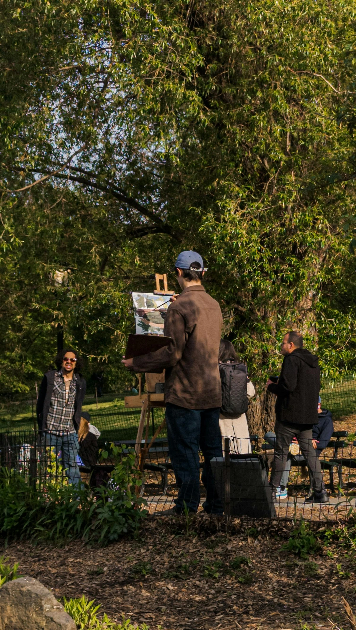
- Sketching and Plein Air: Because they require minimal setup and cleanup (no messy palettes or water!), they're fantastic for quick studies outdoors or spontaneous creative bursts. Just grab your pastels and a sketchpad, and you're ready to capture the world around you. They're the ultimate 'grab and go' art supply!
- Still Life and Portraiture: While often associated with soft pastels for their delicate blending, oil pastels can bring a unique vibrancy and textural quality to still life and portrait work. Their ability to build rich, opaque layers and create expressive marks can result in highly dimensional and impactful pieces. Don't shy away from using them to capture the subtle contours of a face or the gleaming surface of a piece of fruit!
Look for inspiration, but always remember to translate what you see through your unique artistic voice. That's where the real magic happens.
Why I Keep Coming Back to Oil Pastels
There's something incredibly freeing about oil pastels. Maybe it's their directness – no brushes to clean, no water to change, just pigment in your hand, ready to unleash color. They allow for such immediate, tactile expression. The way colors melt into each other, the rich textures you can build, the sheer vibrancy... it all appeals deeply to my love for bold, expressive art. They’re a reminder that art doesn't have to be complicated or expensive to be deeply satisfying. They're about embracing spontaneity and finding beauty in the process, even the messy parts.

Frequently Asked Questions About Oil Pastels
Q: Are oil pastels the same as soft pastels?
A: Not quite! While both fall under the 'pastel' umbrella, they're more like distant cousins than siblings. Soft pastels are drier, chalkier, and use a gum binder, resulting in a dusty finish that often requires a fixative. Oil pastels, on the other hand, use an oil and wax binder, making them creamy, vibrant, and much less dusty. They also never fully dry, remaining workable and blendable over time, which is a major distinction. Think of soft pastels as drawing with colored chalk, and oil pastels as drawing with rich, buttery paint sticks.
Q: What's the best paper for oil pastels?
A: This is absolutely crucial! You need paper with a good "tooth" or texture – that's the surface roughness that grabs onto and holds the pigment. Think of it like tiny hooks for your pastel! My favorites include pastel paper (designed specifically for pastels, often with a subtle texture), cold press watercolor paper (its slightly rough surface is fantastic), or heavy drawing paper (100lb/180gsm or more). For those who love building many layers, sanded pastel paper is a game-changer as it offers even more grip. Don't limit yourself to just paper, though! Gessoed wood panels and primed canvas also offer excellent surfaces, each giving a unique feel and finish. The better the tooth, the more layers you can build without the dreaded "filling up" effect. Don't be afraid to experiment; finding your perfect surface is part of the fun!
Q: Do I need a fixative for oil pastels?
A: For finished work that you want to preserve and prevent smudging, yes, a specialized oil pastel fixative can be very helpful. These are different from fixatives for soft pastels, so make sure you get the right kind! Apply it in thin, even coats in a well-ventilated area. For detailed guidance on application and framing, check out our section on "Proper Storage and Archiving of Oil Pastel Art." For practice pieces, I wouldn't worry too much about it, but for anything you want to display long-term, a fixative (and framing behind glass with a mat!) is a wise investment to protect your vibrant art.
Q: Can I use water with oil pastels?
A: No, oil pastels are not water-soluble at all. They're oil-based, so water just won't mix with them (think oil and water, literally!). However, you can use oil-based solvents like odorless mineral spirits or turpentine with a brush to create beautiful, paint-like washes and glazes. Just remember to work in a well-ventilated area when using solvents.
Q: How do I clean my oil pastels?
A: Great question! You generally don't "clean" the sticks themselves in a traditional sense, but you do clean the tips and your tools. For comprehensive tips on keeping your pastels, blending tools, and workspace pristine, refer to our dedicated section: "Cleaning and Maintaining Your Tools and Workspace." The short version: wipe pastel tips on paper towels, gently scrape for fresh pigment, and clean blending tools with sandpaper or a solvent-dampened cloth. Keeping things clean prevents accidental color transfer and ensures your colors stay vibrant and true – nobody wants muddy greens where they intended a pure yellow!
Q: Are oil pastels permanent?
A: Yes, when properly applied and cared for, oil pastels are considered a permanent medium. However, their permanence depends on the quality of the pastels (artist-grade pigments are more lightfast) and how the artwork is stored and protected (fixative and proper framing are key!). Think of it like a good relationship – it needs a little care to last!
Q: Can I combine oil pastels with other art mediums?
A: Absolutely, and this is where the fun really begins for some artists! Oil pastels are incredibly versatile for mixed media. They play beautifully with oil paints (adhering to the 'fat over lean' rule: fatter, more flexible layers over leaner, less flexible ones), colored pencils (for fine details and layered effects), and even some acrylic underpaintings (once the acrylic is fully dry, it provides a stable, matte surface for the pastels). You can use them to add rich highlights, textured shadows, or vibrant details over other dry mediums like charcoal or graphite. For more inspiration on pushing the boundaries, you might want to explore the "Beyond the Basics: Exploring Mixed Media with Oil Pastels" section we've added! Experimentation is truly your best guide here – see what unexpected harmonies you can create.
Q: What is lightfastness and why does it matter?
A: Lightfastness refers to how resistant a pigment is to fading when exposed to light over time. It matters because you want your artwork to retain its vibrant colors for years, not fade into a sad, dull version of its former self. Artist-grade pastels usually have lightfastness ratings on their wrappers or boxes. Always check these ratings for pieces you intend to keep or sell, especially if they'll be displayed in direct light.
Ready to Make Some Noise?
So, there you have it – my somewhat rambling, entirely personal take on getting started with oil pastels. I hope it demystifies them a little and, more importantly, inspires you to just grab a set and start playing. Don't worry about perfection; worry about expression. Let the colors flow, embrace the happy accidents, and enjoy the incredibly satisfying process of creating something truly your own. Who knows, you might just discover your next favorite medium. And if you do, maybe you'll even consider a piece from my own collection to add to your vibrant space. Happy creating!


