Analogous Colors: The Ultimate Guide to Visual Harmony
Explore analogous colors in depth. Learn their psychology, how to create captivating palettes for art, design, and fashion, and make your visuals sing with effortless harmony.
What Are Analogous Colors? Your Ultimate Guide to Harmonious Palettes, From Nature to Masterpieces!
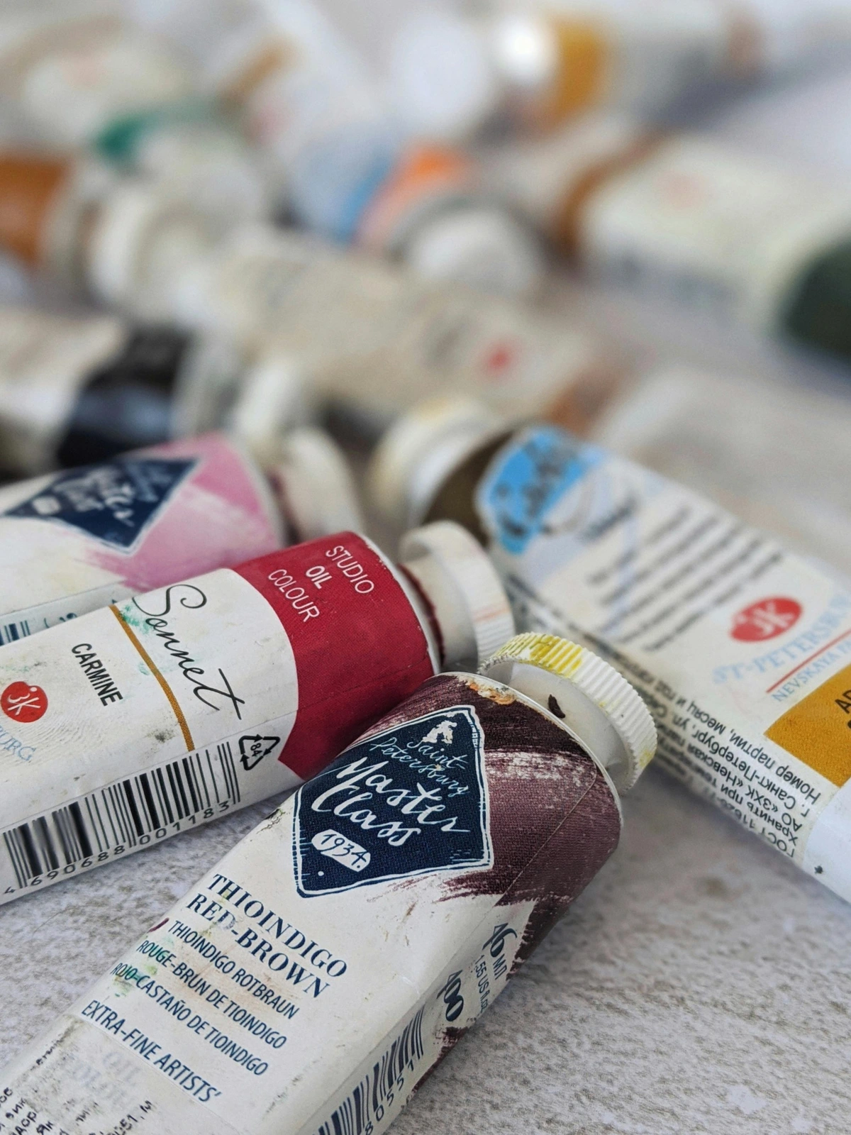
I used to stare at color, thinking it was just... well, color. Red was red, blue was blue. You picked the ones you liked, crossed your fingers, and hoped for some kind of visual magic. It wasn't until I truly stumbled upon the compelling world of color principles that I realized this wasn't a random grab bag; it was a beautifully orchestrated symphony. And one of the most elegant, soothing sections of that symphony? Analogous colors.
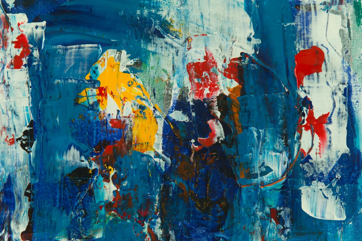
They're the color equivalent of a close-knit family, the friends who live next door to each other, the shades that just get one another. They create a sense of harmony and peace that's incredibly satisfying, both to create and to look at. Think of the gradual shift from crimson to orange in a sunset, or the subtle variations of green across a forest canopy – these are nature's analogous masterpieces, effortlessly soothing and cohesive. I remember trying to capture a particularly vibrant autumn scene once, and struggling until I focused purely on the reds, oranges, and yellow-oranges. It felt like a cheat code to visual bliss, a shortcut to making things just feel right – a perceptual comfort that makes our brains happy, you know? It's like finding the perfect chord progression in music; it just resonates.
This intuitive harmony isn't accidental; it's rooted in fundamental principles. If you're ready to transform your understanding of color and unlock palettes that effortlessly sing together, then you've landed in the right place. What if I told you that you already instinctively use these colors every day, without even realizing it?
Understanding Analogous Colors: The Gentle Art of Harmony on the Color Wheel
At its heart, understanding analogous colors means getting familiar with the color wheel. Simply put, analogous colors are groups of three to five colors that are right next to each other on the color wheel. I like to think of it like this: pick a color, any color you fancy. Now, look at its immediate neighbors on the left and right. That's your core analogous color scheme. For example, yellow, yellow-green, and green are analogous. So are red, red-orange, and orange.
This principle, where colors share a common primary or secondary hue (like how yellow is in both yellow-green and yellow-orange), is precisely why they feel so naturally connected and cohesive. It's like they're all distant cousins, sharing a grandparent hue on the color wheel, which is why they feel so familiar and comforting together. There's no jarring contrast, no visual fight for your attention. Instead, you get a rich, unified look that feels intentional and pleasing. It’s a principle that underpins so much of what we find beautiful.
Warm vs. Cool Analogous Schemes
Not all analogous palettes feel the same, and this is where color temperature comes into play. You can lean into a distinctly warm or cool feel, even within the harmonious flow. A warm analogous scheme would focus on colors from red through yellow-green (like red, red-orange, orange, yellow-orange, yellow). Think of sunsets, campfires, or autumnal leaves – full of energy and passion. A cool analogous scheme, on the other hand, pulls from greens through blue-violet (like green, blue-green, blue, blue-violet, violet). These evoke feelings of tranquility, calm waters, or lush forests. Knowing whether you want to warm things up or cool things down with your palette is a crucial first step.
So, how do you actually find these harmonious groupings? This is the easy part. You don't need any complex formulas. Just picture a standard 12-part color wheel in your mind (or pull one up online, no judgment here).
- Pick a Starting Color: Let's say you're feeling a bit moody, so you pick Blue.
- Look at its Immediate Neighbors: To one side, you have Blue-Violet. To the other, you have Blue-Green.
- There's Your Palette! Blue, Blue-Violet, and Blue-Green form a classic cool analogous color scheme.
To extend this to four or five colors, you simply add the next closest hues on either side. For instance, from Blue-Violet-Blue-Blue Green, you could add Violet or Green to expand the range slightly. It's all about gentle transitions, allowing for a richer, more nuanced story without losing that core unity.
Here’s a quick table to make it even clearer, and to help you envision the mood each palette creates:

Starting Color | Neighbor 1 | Neighbor 2 | Potential Neighbor 3 | Potential Neighbor 4 | Palette Vibe |
|---|---|---|---|---|---|
| Red | Red-Orange | Red-Violet | Orange | Violet | Warm, Fiery, Passionate, Energetic, Bold |
| Yellow | Yellow-Green | Yellow-Orange | Green | Orange | Sunny, Cheery, Optimistic, Fresh, Inviting |
| Blue | Blue-Green | Blue-Violet | Green | Violet | Cool, Calm, Tranquil, Serene, Profound |
| Green | Yellow-Green | Blue-Green | Yellow | Blue | Natural, Lush, Refreshing, Grounding, Vital |
| Orange | Red-Orange | Yellow-Orange | Red | Yellow | Energetic, Earthy, Inviting, Joyful, Vibrant |
| Violet (Purple) | Red-Violet | Blue-Violet | Red | Blue | Regal, Mystic, Sophisticated, Luxurious, Thought-Provoking |
The Science and Soul of Analogous Harmony
Why do these color groupings feel so profoundly right to us? It's not just a matter of taste; there's a fascinating blend of psychology and visual processing at play. Our brains are, quite simply, wired for them, probably thanks to millennia of observing nature's own harmonious designs. It feels safe, you know, like coming home.

- Evolutionary Comfort: Think about nature. Sunsets bleed from red to orange to yellow. Forests transition from deep greens to yellow-greens. Water often shifts from blue-green to deep blue. We've evolved in environments rich with analogous schemes, associating them with natural cycles, growth, and peaceful transitions. My theory? They feel safe because nature designed them that way, signaling predictability and abundance. It's a primal connection.
- Reduced Visual Fatigue: When colors are drastically different (like complementary pairs), our eyes and brain work harder to process the contrast. Analogous colors, with their gentle shifts, allow our visual system to relax. It's like listening to a smooth jazz piece compared to heavy metal – both have their place, but one is undeniably more restful. This makes for a more comfortable and sustained viewing experience, which is key to how long someone engages with an artwork or design.
- Subtle Color Temperature Shifts: Even within an analogous palette, you can introduce tiny nudges in color temperature. A blue-green might lean slightly warmer (more yellow in it) or cooler (more blue). These subtle shifts add depth and prevent monotony without disrupting the overall harmony. It's like adding a quiet bassline to a melody – you feel it more than you consciously notice it, adding a layer of sophisticated visual texture without creating jarring contrast.

Analogous Colors in Nature: Earth's Master Palette
It's impossible to talk about analogous colors without giving a huge nod to the original master: Mother Nature herself. She's been composing analogous masterpieces since the dawn of time, and we've been subconsciously appreciating them ever since. This is why these palettes feel so inherently grounding to me. Have you ever truly stopped to see the world around you with a color theorist's eye? It's a game-changer.
- Forest Canopies: Observe a forest in late spring. You'll see myriad greens, from the bright, almost yellow-green of new leaves to the deep, blue-greens of older, shaded foliage. It's an endless analogous green symphony, dotted with brown (orange's earthy cousin) tree trunks. Pure tranquility, and a masterclass in variation within harmony.
- Sunset & Sunrise Skyscapes: The classic example. The sky transitions from deep violet, through various blues and oranges, to fiery reds and yellows at the horizon. It's a breathtaking, naturally occurring analogous gradient that never ceases to inspire. Every time I see one, I'm reminded of the effortless beauty of these transitions.
- Flower Gardens: Imagine a rose bush with deep red buds, opening into vibrant red-orange blooms, with a hint of red-violet in the shadows of the petals. Or a field of lavender, presenting blue-violets and blues, with distant greens of the surrounding landscape. Nature's way of creating visual poetry, often using analogous schemes to define entire sections of a garden's mood.
- Gemstones and Minerals: Even the earth's treasures showcase this. Think of a geode with internal crystals shifting from deep blues to lighter purples, or a vein of copper showing greens and blue-greens against a more earthy, reddish rock. These natural formations demonstrate how inherent this harmony is to the very fabric of our world.
I find myself constantly looking for these natural palettes when I'm out walking. It's like a secret language nature is speaking, and once you know the rules of analogous colors, you start to understand her whispers, and then you can start speaking that language yourself in your own creative pursuits.
Analogous vs. Other Color Schemes: Your Navigational Compass
So, where do analogous colors fit into the broader world of color schemes? How do they stack up against other common palettes? Understanding their place helps you choose the right tools for your specific intentions. It's like knowing which tool to grab from your toolbox – each has a specific, powerful job. Do you want to shout, or whisper?
Color Scheme | Description | Effect | Best For | When to Avoid | My Take |
|---|---|---|---|---|---|
| Analogous | 3-5 colors next to each other on the color wheel. | Harmonious, soothing, unified, serene. | Creating a specific mood, calm compositions, natural transitions, elegance. | When strong contrast or high energy is desired. | My dependable anchor for consistent beauty and quiet impact. |
| Complementary | 2 colors directly opposite each other on the wheel. | High-contrast, vibrant, energetic, dramatic. | Making elements pop, creating excitement, focal points, strong statements. | When seeking peace, subtlety, or unity without visual tension. | Pure impact and excitement; when I want a visual punch. |
| Triadic | 3 colors evenly spaced around the color wheel. | Balanced, dynamic, versatile, playful. | Playful and vibrant designs, strong visual impact, bold compositions. | When a subdued, sophisticated, or natural feel is paramount. | When I want energy and balance, but less tension than complementary. |
| Monochromatic | Variations (tints, tones, shades) of a single color. | Subtle, sophisticated, minimalist, elegant. | Creating a very cohesive and elegant look, depth within one hue, quiet luxury. | When a wider range of hues or more visual interest is needed. | For ultimate sophistication and depth within a single color's soul. |
| Split-Complementary | A base color and the two colors adjacent to its complement. | High contrast, less tension than complementary, balanced, complex. | Providing strong contrast without being jarring, complex harmony, rich themes. | When the goal is utter simplicity or stark impact. | A more nuanced drama, a less aggressive pop. |
| Tetradic (Rectangular) | Four colors arranged into two complementary pairs. | Rich, complex, varied, dynamic, challenging. | Experienced artists seeking bold, multi-faceted compositions, maximalism. | For beginners, or when simplicity and directness are key. | For when I'm feeling brave and want maximum complexity and richness. |
Analogous colors, for me, are the comfortable middle ground. They offer enough variation to be interesting, but enough similarity to always feel 'right.' If I'm aiming for pure impact, I might reach for a complementary scheme; if I want subtlety, monochromatic. But for sheer, dependable beauty, analogous is my anchor, my visual comfort food, if you will. It’s the reliable friend who always shows up.
Analogous Colors in Action: A Kaleidoscope of Examples
Artists have intuitively used this principle for centuries to create mood and harmony. It’s not some new-fangled idea; it’s a core part of how artists use color to evoke emotion and tell stories. But it's not just the masters of old; this principle plays out in our everyday lives too, often without us even noticing.
In Fine Art: Mastering Mood and Atmosphere

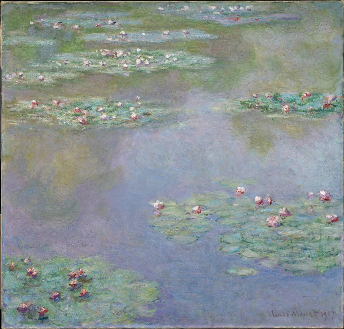
- Georgia O'Keeffe's Soothing Landscapes: Look at Georgia O'Keeffe's paintings of the New Mexico landscape. She was a master of using analogous colors to convey the serene, expansive feeling of the desert, almost making you feel the quiet grandeur of the scene. She truly captured the soul of a place using these gentle harmonies.
In Black Mesa Landscape, New Mexico, for instance, she employs a stunning range of blues, blue-violets, and violets to render the hills. The result is a landscape that feels calm, unified, and incredibly deep. There's no visual noise, just pure, tranquil color harmony. It's almost meditative, isn't it? It's a masterclass in how much emotion can be conveyed without harsh clashes. Similarly, in her Red Hills with Flowers, the subtle shift from deep reds to red-violets creates a warm, inviting, yet powerful desert vista.
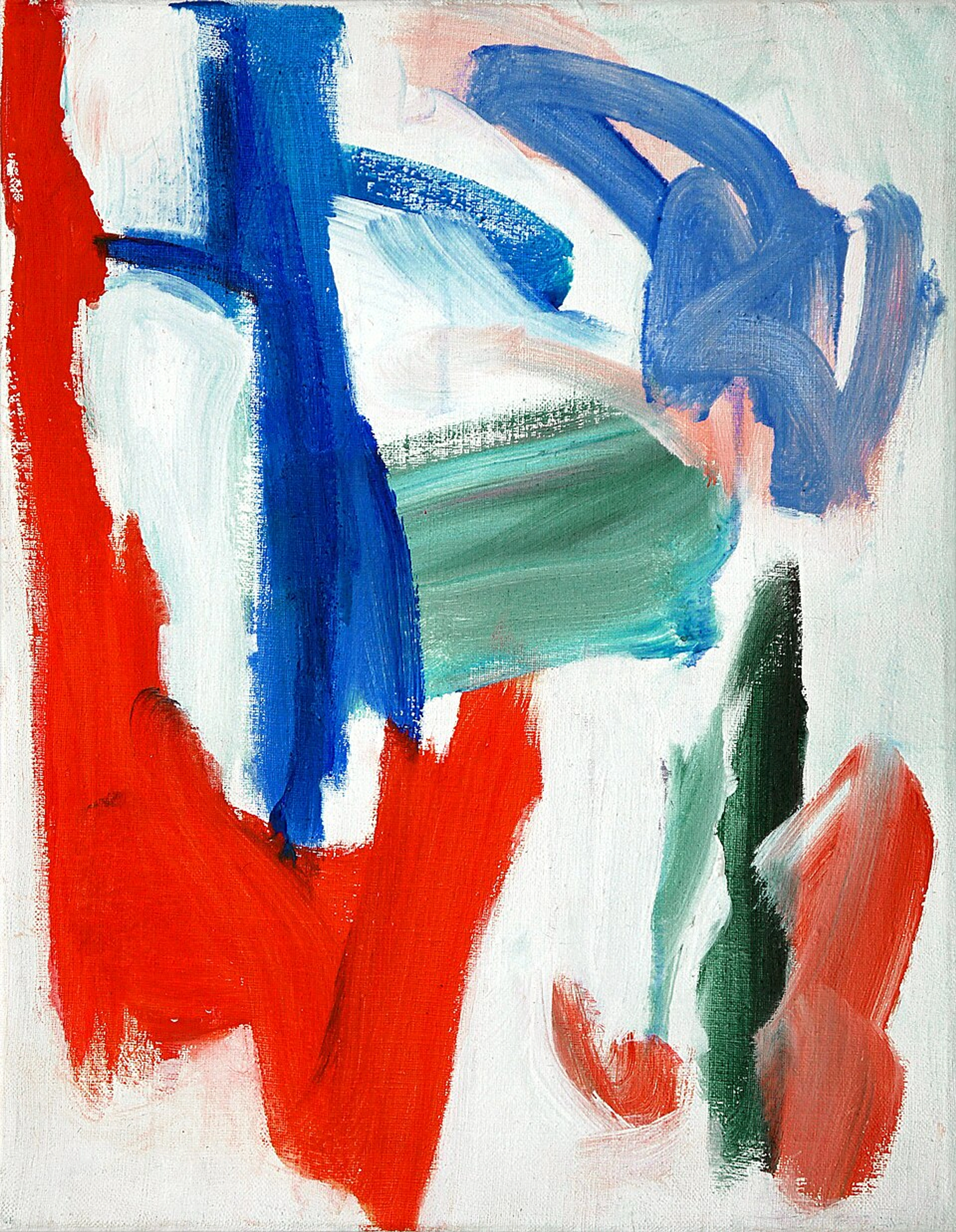
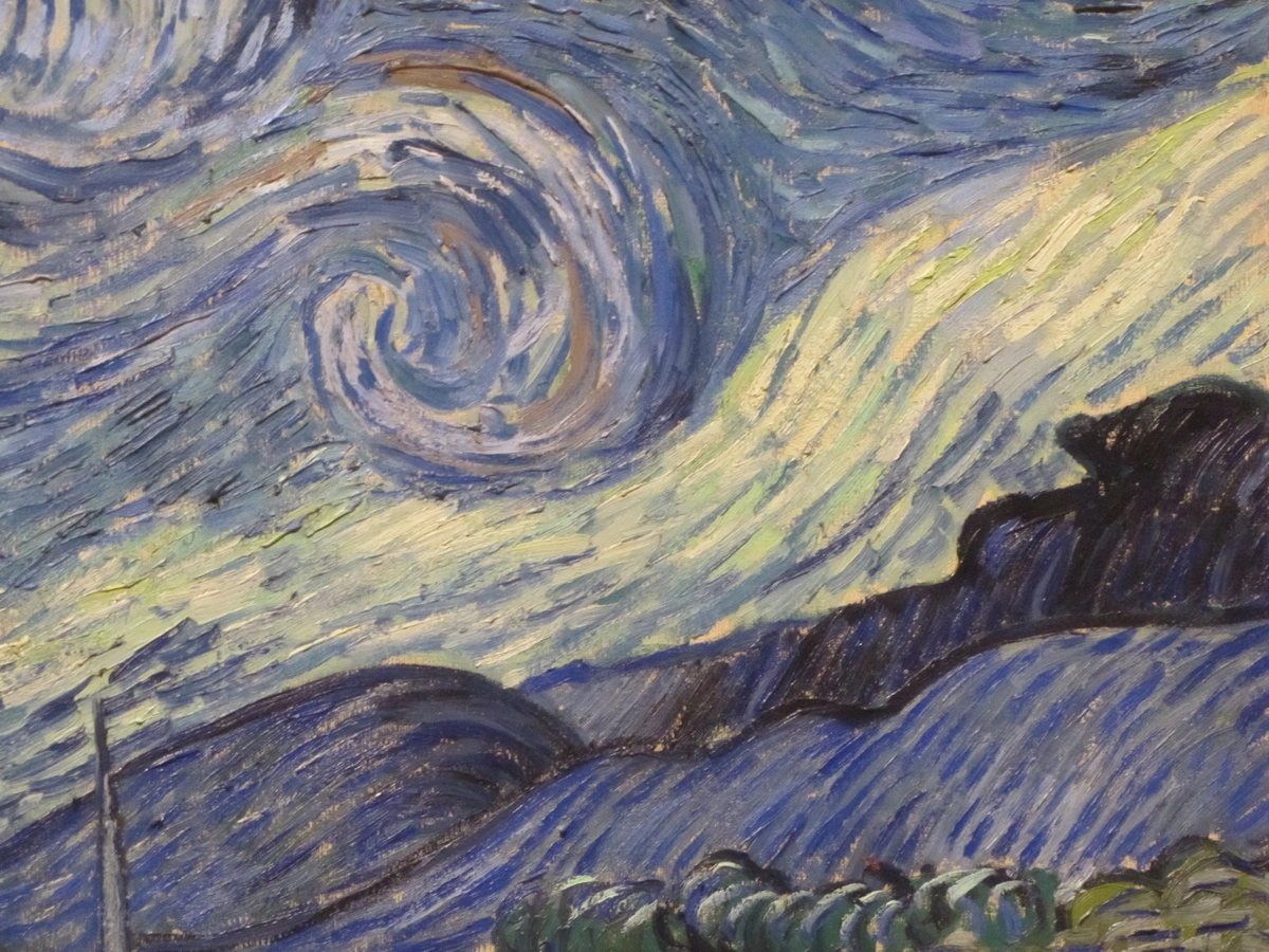
- The Warmth and Emotion of Post-Impressionism: Post-Impressionists like Vincent van Gogh, while famous for his dramatic use of complementary colors (like the yellow and blue in The Starry Night), often leaned into analogous harmony to express emotion and create rich atmospheres. It's a subtlety that's easy to miss if you're only looking for the big contrasts. He knew when to whisper with color and when to shout.
In some of his self-portraits, the background swirls with analogous blues and greens, creating a sense of turbulent but unified thought. The warmth of his orange beard then pops against this cool, analogous backdrop, a masterful touch of contrast that emphasizes his presence without disrupting the overall color story. It's a tension that feels carefully controlled, almost poetic. Consider also the many landscapes where he'd use a range of greens and yellow-greens to depict fields and trees, creating a sense of life and vibrancy.
In Digital Design and Branding: Building Trust and Energy
Beyond traditional art, analogous schemes are a go-to for graphic designers and brands looking to convey a specific, cohesive mood. Websites often use analogous blues and greens for a trustworthy, calm feel (think financial institutions like PayPal or health brands like WebMD), while a tech startup might lean into bright analogous yellows and oranges for energy and innovation (think certain food delivery apps or creative software interfaces). It's a subtle psychology, but incredibly effective in creating a consistent brand identity and user experience. Even the most cutting-edge digital experiences can benefit from color wisdom that's centuries old.
In Interior Design: Creating Inviting and Cohesive Spaces
Want to create a truly cohesive and inviting living space? Analogous colors are your best friend. Imagine a bedroom with soft blue walls, a bedspread featuring blue-green patterns, and decorative pillows in a muted blue-violet. The whole room would exude tranquility without being bland. Or a cozy reading nook with warm orange curtains, golden yellow lampshades, and a touch of red-orange in a throw blanket. It instantly feels unified, comfortable, and sophisticated. The key is to vary the values and saturations within your chosen analogous palette to add depth and interest, preventing the space from feeling flat.
In Fashion: Effortless Chic and Sophistication
Ever wonder why some outfits just look effortlessly chic? Often, it's an analogous color scheme at play. A navy blue suit with a lighter blue shirt and a deep blue-green tie. Or a mustard yellow sweater paired with an olive green skirt and a subtle yellow-orange scarf. The colors flow together, creating a polished, sophisticated, and thoughtful look that avoids clash and feels intentional. It's an easy way to look like you put a lot of thought into your style, even if you just grabbed things that felt 'right' together. This approach is particularly effective for professional settings or when you want to convey calm confidence.
In Photography: Enhancing Mood and Visual Flow
Photographers often use analogous color schemes to enhance the emotional impact and visual unity of their images. Think of a landscape photo taken at golden hour, where the sky transitions from soft yellows to oranges and warm reds, bathing the scene in a consistent, inviting glow. Or a portrait where the subject's blue attire harmonizes with a blue-green background, creating a serene and focused composition. By intentionally composing with analogous colors, photographers can guide the viewer's eye, create depth, and evoke specific feelings without relying on jarring contrasts.

Making Analogous Palettes Pop: Avoiding Monotony & Adding Intrigue
While harmonious, an all-analogous scheme can sometimes risk feeling a little too safe, perhaps even monotonous if not handled with care. The key is to prevent flatness and inject intrigue without losing that inherent unity. How do you keep it interesting without breaking the harmony? Here's my secret:
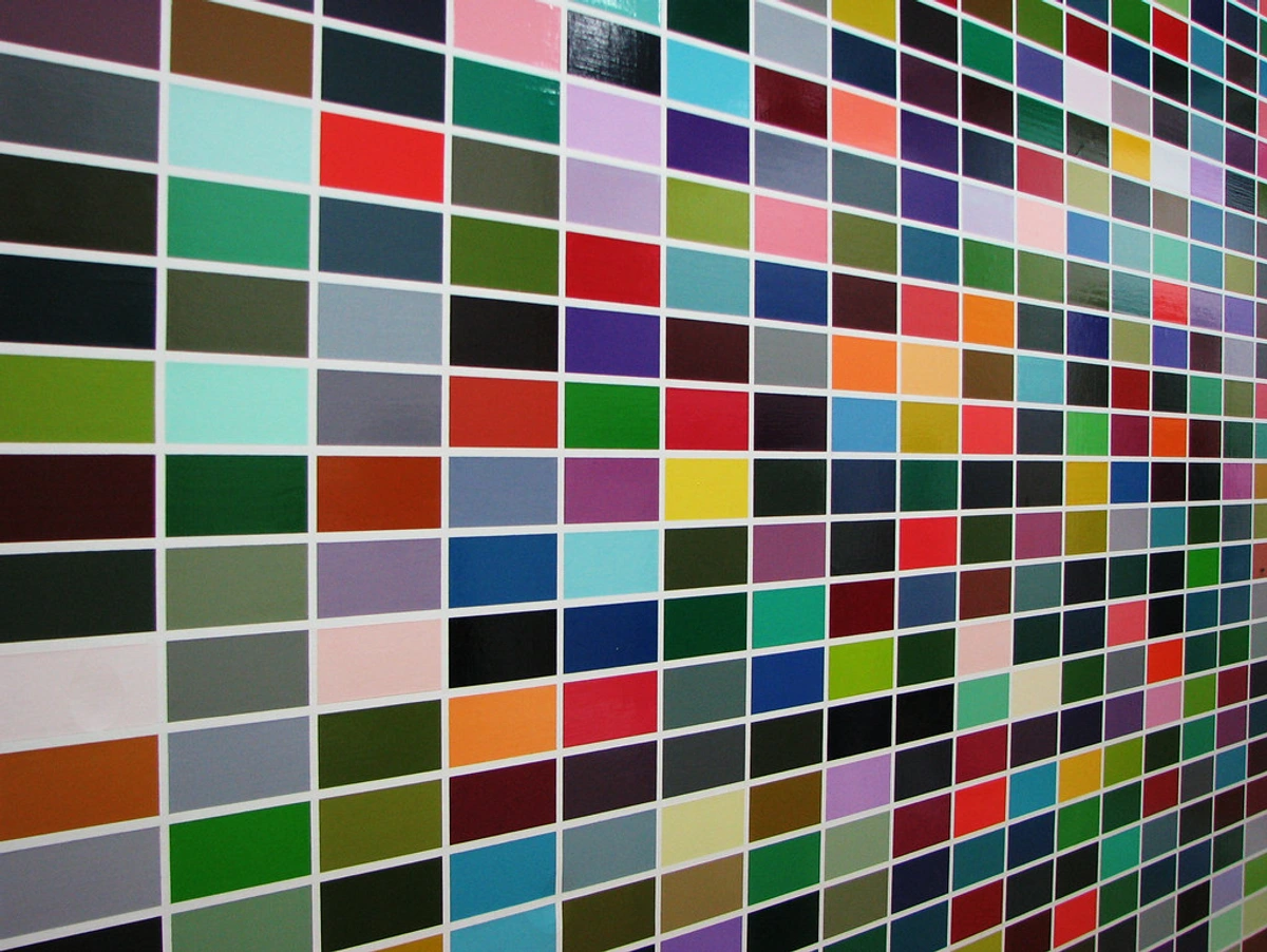
- Vary Value and Saturation: Don't just pick three pure hues. Incorporate lighter tints (hues with white added), darker shades (hues with black added), and desaturated tones (hues with gray added) within your analogous family. A deep forest green next to a bright lime green and a soft sage green is still analogous but far more dynamic than three identical greens. This is where the magic really happens.
- Dominant, Supporting, and Accent: Pick one color to be your dominant hue (about 60-70% of your composition), another one or two as supporting colors (20-30%), and then, for a little sparkle, a very small amount (5-10%) of a color from just outside your analogous family. Sometimes, this accent can be a very subtle, desaturated complementary color, or simply a neutral that holds its own. It's a risk, but a calculated one, and it can truly make an analogous scheme sing without screaming. For example, a blue, blue-green, green palette could have a tiny touch of a warm yellow or even a very muted orange.
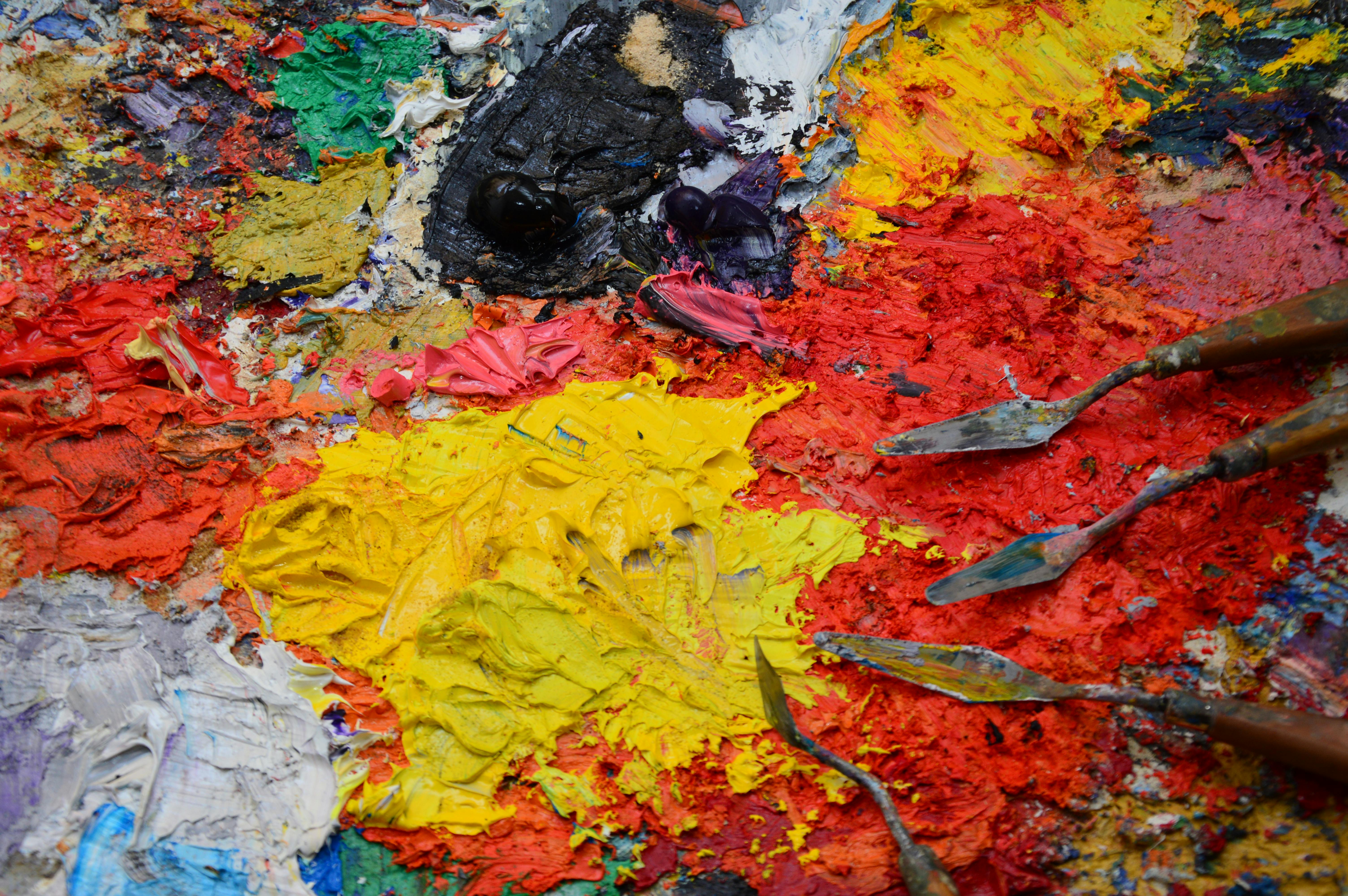
- Embrace Texture: In art or design, texture can add visual interest even when colors are similar. Think of impasto paint strokes, varied fabric textures in a room, or different photographic surfaces. This tactile element provides a subtle contrast that your eyes appreciate, adding depth and preventing a flat appearance.
- Shift Color Temperature Within the Scheme: As mentioned, even within a green-blue-violet scheme, you can have greens that lean yellow (warmer) and blues that lean violet (cooler). These slight temperature shifts create internal movement and prevent the palette from feeling stagnant.
Common Questions About Analogous Colors (FAQ)
It's natural to have questions when diving into color theory. Here are some of the things I often hear people ask, and my thoughts on them:
Q: What exactly are analogous colors? A: Simply put, they are colors that sit side-by-side on the color wheel. They share a common primary or secondary hue, giving them a natural, inherent harmony. Think of them as a color family that gets along beautifully because they're closely related.
Q: How many colors should be in an analogous scheme? A: Typically, an analogous scheme consists of three to five colors. Starting with three is often easiest (your main color and its two immediate neighbors). You can expand to four or five by adding the next closest colors on either side, allowing for more richness and variety while maintaining harmony.
Q: Can analogous colors be warm and cool? A: Absolutely! You can create distinctly warm analogous schemes (e.g., reds, oranges, yellows) or cool analogous schemes (e.g., blues, greens, violets). The choice depends entirely on the mood or feeling you want to evoke. You can even combine a warm analogous scheme with a small touch of a cool analogous color for a subtle accent, or vice-versa.
Q: How do analogous colors differ from monochromatic colors? A: This is a common point of confusion! Monochromatic colors are all variations (tints, tones, shades) of a single hue. Think light blue, medium blue, and dark blue. Analogous colors, however, involve multiple adjacent hues on the color wheel, even if they share an underlying color. So, blue, blue-green, and green is analogous, while light blue, medium blue, and dark blue is monochromatic. Both create harmony, but analogous offers more chromatic variety.
Q: When should I use an analogous color scheme? A: Use analogous schemes when you want to convey a sense of calm, harmony, elegance, peace, or natural beauty. They are fantastic for creating specific moods, soft transitions, and cohesive designs in art, interior design, fashion, and branding. They excel when you want to avoid jarring contrasts and provide a visually comfortable experience.
Q: How do I make an analogous palette more dynamic? A: To prevent an analogous palette from feeling flat, introduce variety in value (lightness/darkness) and saturation (intensity). Use tints, tones, and shades of your chosen hues. Consider having a dominant color, a supporting color, and a small, carefully placed accent color that might be a desaturated complementary or a strong neutral. Incorporating texture also adds significant visual interest.
Why I Love Using Analogous Color Schemes (And You Will Too)
Honestly, sometimes I just want to create something that feels good, without overthinking it. Analogous palettes are my go-to for that. They are forgiving. It's hard to make them look bad because the inherent relationship between the colors makes them naturally compatible. I once accidentally spilled a bit of blue-green paint onto a predominantly blue and blue-violet canvas, and instead of ruining it, it just... blended. Magic! It felt like the colors were saying, "Don't worry, we got this."
- They create an instant, powerful mood: Want something fiery and passionate? Stick to reds, oranges, and yellows – a warm analogous scheme can make a room feel cozy or an artwork explode with energy. Need a calm, meditative piece? Blues, greens, and purples are your friends, evoking tranquility and depth. The mood is built right into their very nature, and you don't have to fight for it.
- They are easy on the eyes: Because there's no harsh contrast, the viewer's eye can move smoothly across the canvas. It makes for a very relaxing viewing experience, which is key to a good composition. It's like a visual sigh of relief, a moment of peace for the optic nerve, allowing your audience to fully immerse themselves without distraction.
- They add sophistication: An analogous scheme looks thoughtful and deliberate. It shows an understanding of color relationships that elevates a piece from just a random collection of colors to a true, curated palette. It says, "I understand harmony, and I'm sharing it with you."
So, go ahead, pick a color. Find its neighbors. Play with values and saturations. You'll quickly discover that analogous colors are more than just a theory; they're a powerful, intuitive tool for creating beauty and evoking emotion. They're a dependable foundation for anyone looking to make their world, or their art, just a little more cohesive, a little more serene, and a whole lot more beautiful. Don't be afraid to experiment, because that's where the real joy of color lies, and who knows what beautiful compositions await you? My own journey as an artist has been profoundly shaped by understanding these gentle giants of the color wheel. Perhaps yours will be too. You can always check out some of my own colorful creations to see how I try to implement these principles, or even visit my museum in Den Bosch to experience them in person. The world is your palette!