
The Fundamental Aspects of Art Composition: A Comprehensive Guide
Explore the core principles of art composition, from balance to rhythm, and learn how these elements create visually compelling artwork.
The Fundamental Aspects of Art Composition: A Comprehensive Guide
I remember the first time I stood in front of a blank canvas, overwhelmed by the sheer possibility of it. Where do I start? How do I make this work? If you've ever felt that way, you're not alone. Art composition is the silent language that turns chaos into harmony, and understanding its fundamental aspects can transform your approach to creating—or even appreciating—art.
Art composition is not just about arranging elements on a canvas; it's about telling a story, evoking emotions, and creating a visual journey for the viewer. Whether you're a seasoned artist or a beginner, mastering these principles will elevate your work and help you connect with your audience on a deeper level.
Art composition is not just about arranging elements on a canvas; it's about telling a story, evoking emotions, and creating a visual journey for the viewer. Whether you're a seasoned artist or a beginner, mastering these principles will elevate your work and help you connect with your audience on a deeper level.
Art composition is the foundation of visual storytelling. It’s the invisible framework that guides the viewer’s eye, evokes emotions, and communicates meaning. Whether you're a seasoned artist or a beginner, mastering these principles will elevate your work and help you connect with your audience on a deeper level.
The Evolution of Composition
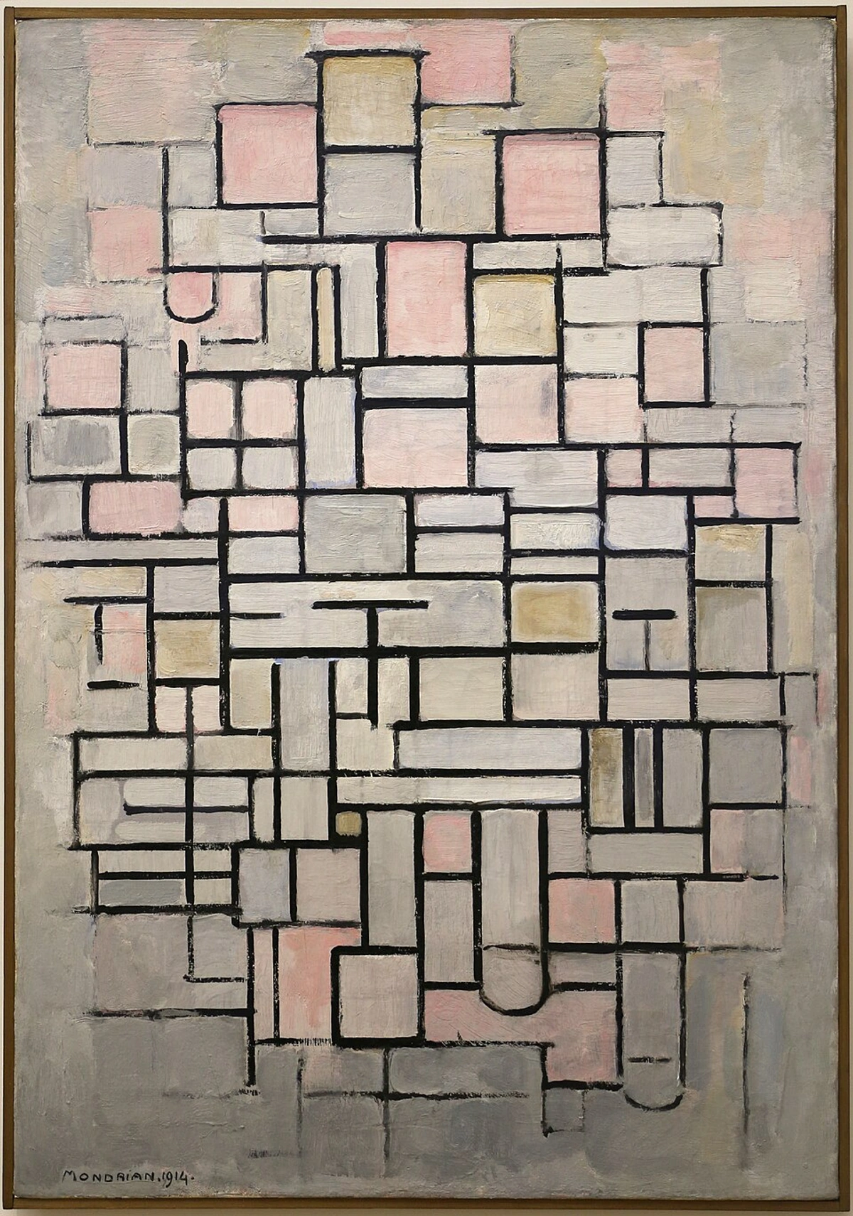
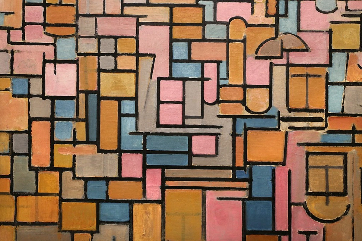
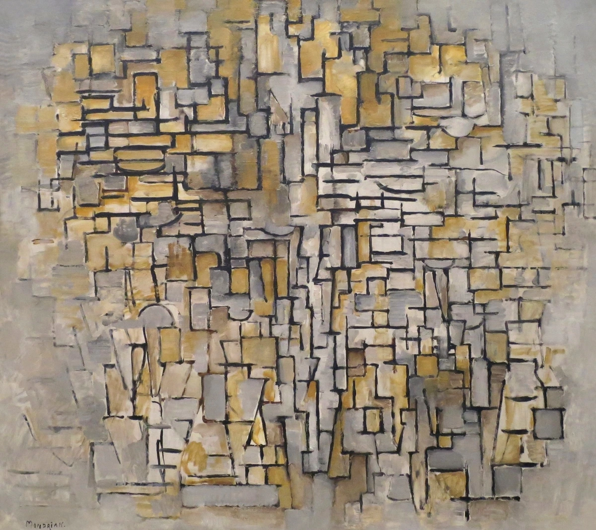
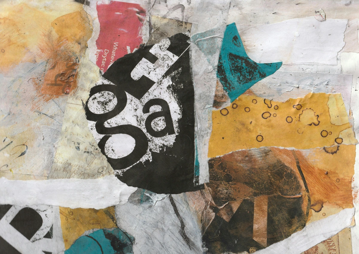
Composition has evolved over centuries, adapting to cultural shifts and artistic movements. From the balanced symmetry of the Renaissance to the bold asymmetry of modern abstract art, each era has contributed to the rich tapestry of compositional techniques. Understanding this evolution provides a deeper appreciation of how composition shapes our perception of art.
Key Movements in Composition
- Renaissance: Emphasized symmetry and balance, often using geometric principles to create harmonious compositions.
- Baroque: Introduced dynamic movement and drama, using diagonal lines and chiaroscuro to guide the viewer's eye.
- Impressionism: Focused on capturing light and atmosphere, often using loose brushstrokes and asymmetrical compositions.
- Cubism: Broke down forms into geometric shapes, challenging traditional notions of perspective and composition.
- Modern Abstract Art: Embraced asymmetry and experimentation, often prioritizing emotional impact over realism.
Why Composition Matters
Composition is the backbone of any artwork. It’s the arrangement of elements that guides the viewer’s eye, evokes emotion, and communicates meaning. Without strong composition, even the most vibrant colors or intricate details can fall flat. Think of it like music: no matter how beautiful the notes, without rhythm and structure, it’s just noise.
The Role of Composition in Visual Storytelling
Composition is not just about aesthetics; it’s about storytelling. A well-composed artwork can convey complex narratives, evoke deep emotions, and create a sense of movement and rhythm. It’s the difference between a snapshot and a masterpiece.
The Psychological Impact of Composition
Composition isn’t just about aesthetics; it’s deeply rooted in psychology. Our brains are wired to seek patterns and equilibrium, and this extends to how we perceive art. A well-composed artwork can evoke feelings of calm and stability, while an imbalanced one can create tension and unease. Understanding this psychological impact can help artists create more emotionally resonant works.
How Composition Affects Emotions
- Symmetry: Often associated with feelings of stability and order.
- Asymmetry: Can create a sense of dynamism and tension.
- Repetition: Evokes familiarity and rhythm.
- Contrast: Highlights focal points and creates visual interest.
The Role of Composition in Art History
Throughout history, artists have used composition to convey powerful messages. From the balanced symmetry of Renaissance paintings to the dynamic asymmetry of modern abstract art, composition has been a tool for storytelling and emotional expression. Understanding these historical contexts can provide deeper insights into how composition shapes our perception of art.
Iconic Examples of Composition in Art
- Leonardo da Vinci's "The Last Supper": Uses symmetry and perspective to draw the viewer into the scene.
- Vincent van Gogh's "Starry Night": Employs swirling lines and contrast to create movement and emotion.
- Pablo Picasso's "Guernica": Utilizes fragmented forms and stark contrast to convey the chaos of war.
The Core Principles of Art Composition
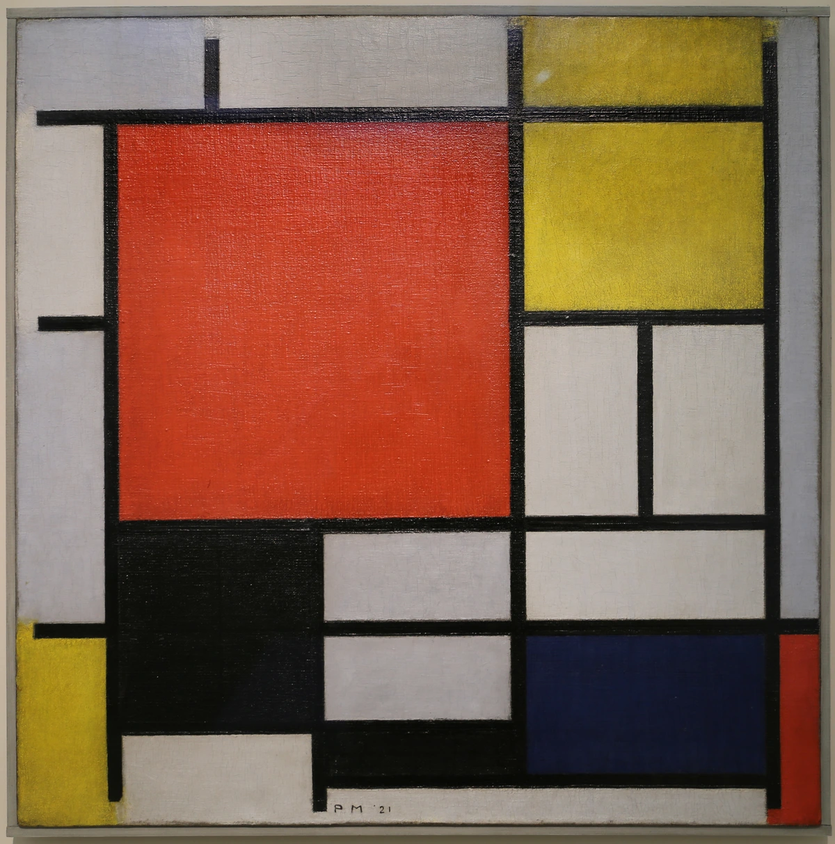
Balance: The Art of Equilibrium
Balance in art isn’t about symmetry—it’s about visual weight. Imagine a seesaw: you want both sides to feel stable, even if they’re not identical. There are three types of balance:
- Symmetrical Balance: Mirror images on either side of a central axis. Think of a butterfly’s wings or a perfectly centered face in a portrait.
- Asymmetrical Balance: Different elements that still feel balanced due to their visual weight. A large, dark shape on one side can balance a smaller, brighter shape on the other.
- Radial Balance: Elements radiate outward from a central point, like the petals of a flower or the spokes of a wheel.
Achieving Balance in Your Artwork
- Experiment with Placement: Try moving elements around to see how their visual weight changes.
- Use Color and Texture: Darker or more textured elements can balance lighter or smoother ones.
- Consider the Overall Composition: Balance is not just about individual elements but how they interact as a whole.
The Psychology of Balance
Balance isn’t just a visual principle; it’s deeply rooted in psychology. Our brains are wired to seek equilibrium, and this extends to how we perceive art. A well-balanced composition can evoke feelings of calm and stability, while an imbalanced one can create tension and unease. Understanding this psychological impact can help artists create more emotionally resonant works.
Why Balance Matters in Art
- Creates Harmony: A balanced composition feels cohesive and complete.
- Guides the Viewer’s Eye: Balance helps direct attention to key elements.
- Evokes Emotions: Different types of balance can evoke different emotional responses.
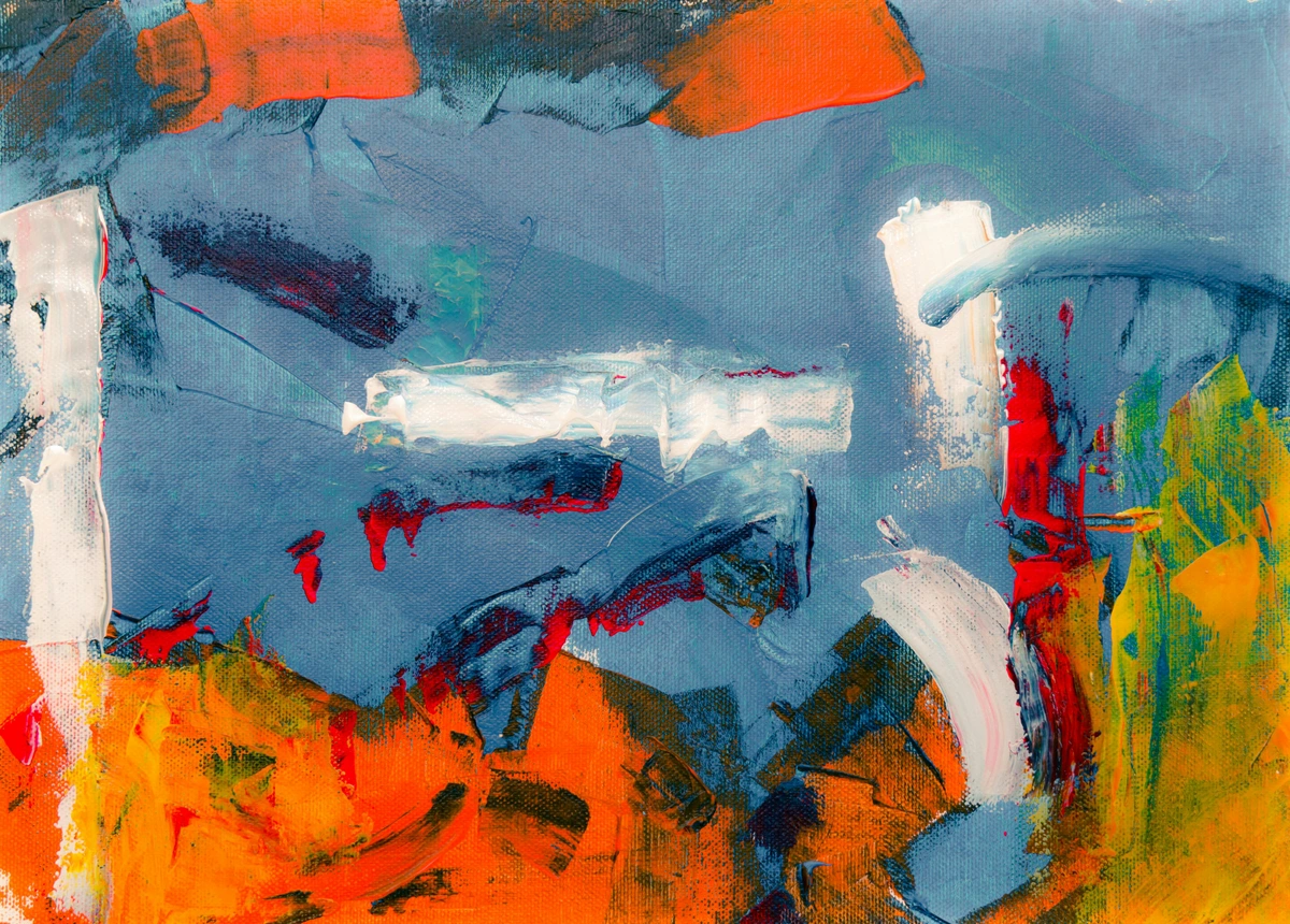
Contrast: Making Elements Pop
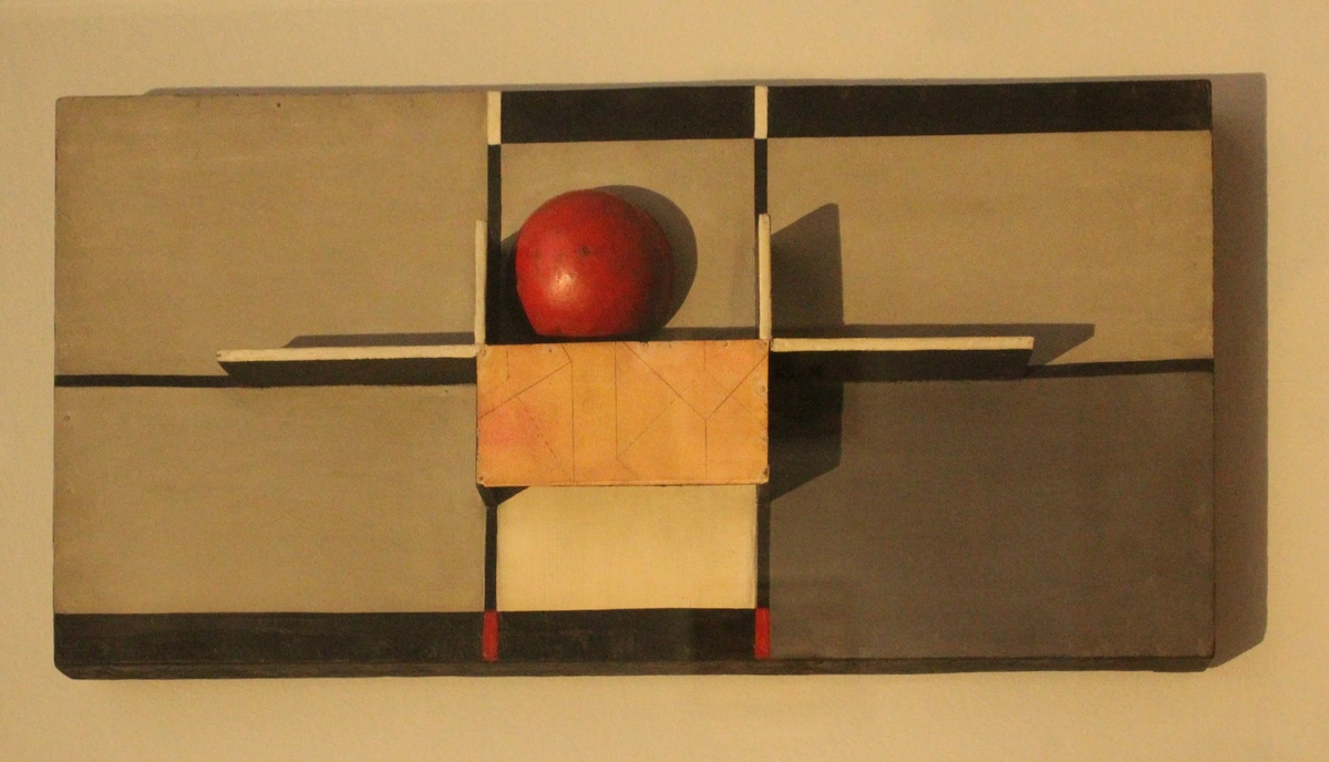
Contrast is what makes elements stand out. It’s the difference between light and dark, rough and smooth, large and small. High contrast draws attention, while low contrast creates subtlety. For example, a bright red apple on a dark tablecloth immediately grabs your eye.
The Role of Contrast in Art
- Creates Focal Points: High contrast areas naturally draw the viewer’s eye.
- Adds Depth: Contrast can create the illusion of depth and dimension.
- Evokes Emotions: Stark contrasts can create drama, while subtle contrasts evoke calmness.
Types of Contrast
Contrast can be achieved in various ways:
- Color Contrast: Using complementary colors to create visual interest.
- Texture Contrast: Combining rough and smooth textures to add depth.
- Size Contrast: Placing large and small elements together to create emphasis.
- Shape Contrast: Mixing geometric and organic shapes for dynamic compositions.
- Value Contrast: Differences in lightness and darkness to create emphasis.
- Conceptual Contrast: Juxtaposing ideas or themes to create intellectual engagement.
The Role of Contrast in Emotional Impact
Contrast isn’t just about aesthetics; it’s a powerful tool for evoking emotions. High contrast can create drama and intensity, while low contrast can evoke calmness and subtlety. Artists can use contrast to guide the viewer’s emotional journey through the artwork.
Using Contrast to Evoke Emotions
- High Contrast: Creates excitement, tension, or drama.
- Low Contrast: Evokes calmness, subtlety, or mystery.
- Balanced Contrast: Achieves harmony and visual interest.
Emphasis: The Focal Point
Every great artwork has a focal point—the area that draws the viewer’s attention first. This can be achieved through contrast, placement, or detail. Without emphasis, the viewer’s eye wanders aimlessly, and the artwork loses impact.
Why Emphasis is Crucial
- Guides the Viewer’s Eye: Emphasis directs attention to the most important elements.
- Creates Hierarchy: Establishes a visual order of importance.
- Enhances Storytelling: Highlights key narrative elements.
Techniques for Creating Emphasis
- Contrast: Using high contrast to draw attention to a specific area.
- Placement: Positioning the focal point along the rule of thirds or at the center.
- Detail: Adding intricate details to a specific area to make it stand out.
- Isolation: Surrounding the focal point with negative space to highlight it.
- Color: Using bold or vibrant colors to create emphasis.
- Lighting: Highlighting specific areas with light to draw attention.
The Importance of Hierarchy
Emphasis is closely tied to visual hierarchy, which is the arrangement of elements in order of importance. A well-defined hierarchy ensures that the viewer’s eye is guided through the artwork in a deliberate and meaningful way.
Creating a Strong Visual Hierarchy
- Size: Larger elements naturally draw more attention.
- Color: Bright or bold colors can emphasize key elements.
- Contrast: High contrast areas stand out more.
- Placement: Elements placed along the rule of thirds or at the center are more noticeable.

Movement: Guiding the Eye
Movement in composition isn’t about literal motion—it’s about how the viewer’s eye travels through the artwork. Lines, shapes, and colors can create pathways that lead the eye from one element to another. For example, a winding river in a landscape painting naturally guides the viewer’s gaze.
The Role of Movement in Art
- Creates Flow: Movement guides the viewer’s eye through the artwork.
- Evokes Emotions: Dynamic movement can create excitement, while subtle movement evokes calmness.
- Enhances Storytelling: Movement can create a sense of progression and narrative.
Types of Movement
- Implied Movement: Using lines and shapes to suggest motion.
- Actual Movement: Creating the illusion of motion through techniques like blurring or repetition.
- Rhythmic Movement: Using repeating elements to create a sense of flow.
- Directional Movement: Using lines or shapes to guide the viewer’s eye in a specific direction.
- Optical Movement: Creating the illusion of movement through patterns or colors.
The Role of Movement in Storytelling
Movement is a powerful tool for storytelling in art. It can guide the viewer’s eye through a narrative, creating a sense of progression and development. Artists can use movement to evoke emotions and convey messages.
Using Movement to Tell a Story
- Guide the Viewer’s Eye: Use movement to lead the viewer through the narrative.
- Create Emotional Impact: Dynamic movement can evoke excitement, while subtle movement creates calmness.
- Enhance Narrative: Movement can create a sense of progression and development in the story.

Rhythm: The Visual Beat
Rhythm in art is like rhythm in music—it’s the repetition or alternation of elements that creates a sense of flow. Regular rhythm (like evenly spaced trees) feels orderly, while irregular rhythm (like scattered leaves) feels dynamic.
The Role of Rhythm in Art
- Creates Flow: Rhythm guides the viewer’s eye through the artwork.
- Evokes Emotions: Regular rhythm creates calmness, while irregular rhythm evokes excitement.
- Enhances Storytelling: Rhythm can create a sense of progression and narrative.
Types of Rhythm
- Regular Rhythm: Repeating elements at consistent intervals.
- Irregular Rhythm: Varying the intervals between repeating elements.
- Progressive Rhythm: Gradually changing the size, shape, or color of repeating elements.
- Alternating Rhythm: Alternating between two or more elements to create a pattern.
- Flowing Rhythm: Using organic, curving lines to create a sense of movement.
The Role of Rhythm in Emotional Impact
Rhythm can evoke a wide range of emotions. Regular rhythm can create a sense of calm and order, while irregular rhythm can evoke excitement and chaos. Artists can use rhythm to guide the viewer’s emotional journey through the artwork.
Using Rhythm to Evoke Emotions
- Regular Rhythm: Creates a sense of calm and order.
- Irregular Rhythm: Evokes excitement and chaos.
- Progressive Rhythm: Creates a sense of progression and development.

Unity: Bringing It All Together
Unity is the harmony of all elements in an artwork. It’s what makes the composition feel cohesive and complete. Without unity, the artwork can feel disjointed or chaotic. Think of a well-designed garden: every plant, path, and ornament works together to create a cohesive whole.
The Role of Unity in Art
- Creates Cohesion: Unity ensures that all elements work together harmoniously.
- Enhances Storytelling: A unified composition conveys a cohesive message or narrative.
- Evokes Emotions: Unity can create a sense of completeness and satisfaction.
Techniques for Achieving Unity
- Consistency: Using similar colors, shapes, and textures throughout the artwork.
- Repetition: Repeating elements to create a sense of cohesion.
- Proximity: Grouping related elements together to create visual connections.
- Alignment: Aligning elements to create a sense of order and harmony.
- Balance: Ensuring that elements are distributed evenly throughout the composition.
- Contrast: Using contrast to create visual interest while maintaining harmony.
The Role of Unity in Storytelling
Unity is essential for storytelling in art. It ensures that all elements work together to convey a cohesive message or narrative. A unified composition can evoke a sense of completeness and satisfaction in the viewer.
Using Unity to Tell a Story
- Create Cohesion: Ensure that all elements work together harmoniously.
- Convey a Message: Use unity to convey a cohesive narrative or theme.
- Evokes Emotions: Unity can create a sense of completeness and satisfaction in the viewer.
Practical Tips for Applying Composition Principles
Rule of Thirds
Divide your canvas into a 3x3 grid. Place key elements along the lines or at the intersections. This creates a more dynamic and engaging composition than centering everything.
Why the Rule of Thirds Works
- Creates Balance: The rule of thirds helps distribute visual weight evenly.
- Guides the Viewer’s Eye: Placing key elements along the lines or intersections naturally draws attention.
- Enhances Storytelling: The rule of thirds can create a sense of movement and narrative.
Golden Ratio
The golden ratio is a mathematical ratio that can be used to create harmonious compositions. It’s often found in nature and can be applied to art to create balanced and visually pleasing layouts.
The Golden Ratio in Art
- Creates Harmony: The golden ratio helps create balanced and visually pleasing compositions.
- Guides the Viewer’s Eye: The golden ratio can guide the viewer’s eye through the artwork.
- Enhances Storytelling: The golden ratio can create a sense of progression and narrative.
Leading Lines
Use lines—whether they’re roads, rivers, or even the direction of a gaze—to lead the viewer’s eye through the artwork. Leading lines create depth and guide the viewer’s journey.
The Role of Leading Lines in Art
- Creates Depth: Leading lines can create the illusion of depth and perspective.
- Guides the Viewer’s Eye: Leading lines naturally draw the viewer’s eye through the artwork.
- Enhances Storytelling: Leading lines can create a sense of progression and narrative.
Types of Leading Lines
- Actual Lines: Physical lines in the artwork, such as roads or rivers.
- Implied Lines: Lines created by the arrangement of elements, such as the direction of a gaze.
- Converging Lines: Lines that converge at a single point, creating a sense of depth and perspective.
- Curved Lines: Lines that curve and flow, creating a sense of movement and rhythm.
- Diagonal Lines: Lines that diagonal across the composition, creating a sense of dynamism.
The Role of Leading Lines in Storytelling
Leading lines can be used to guide the viewer’s eye through a narrative. They can create a sense of progression and development, leading the viewer from one element to another.
Using Leading Lines to Tell a Story
- Guide the Viewer’s Eye: Use leading lines to lead the viewer through the narrative.
- Create Emotional Impact: Leading lines can evoke excitement, calmness, or mystery.
- Enhance Narrative: Leading lines can create a sense of progression and development in the story.
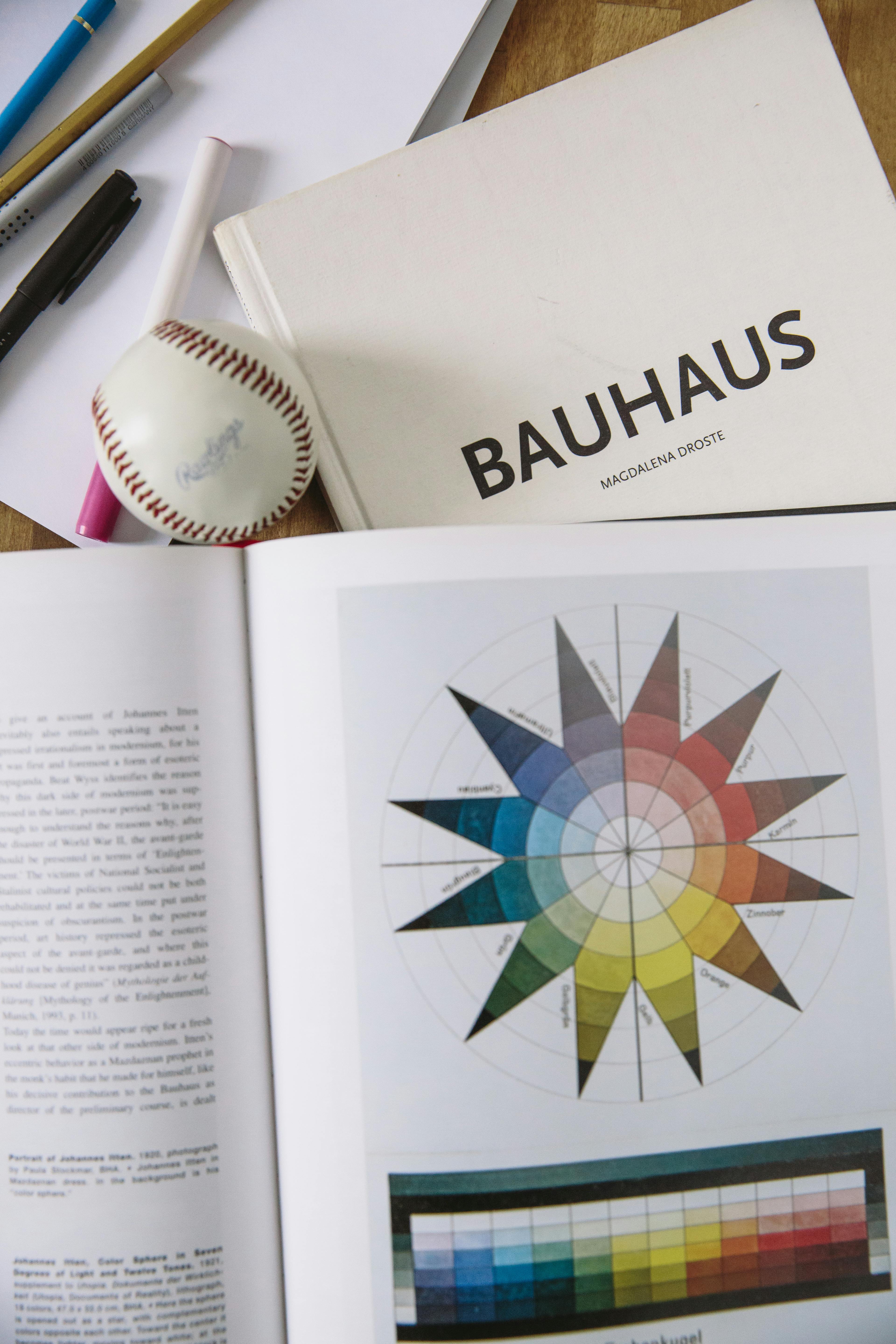
Color Harmony
Colors evoke emotions and set the mood. Use complementary colors (opposites on the color wheel) for high contrast, or analogous colors (next to each other on the color wheel) for a more harmonious feel.
The Role of Color in Art
- Evokes Emotions: Colors can evoke a wide range of emotions, from calmness to excitement.
- Sets the Mood: Colors can set the mood and atmosphere of the artwork.
- Enhances Storytelling: Colors can convey messages and themes, enhancing the narrative.
The Psychology of Color
Colors have a profound impact on our emotions and perceptions. Understanding the psychology of color can help artists create more emotionally resonant works. For example, warm colors like red and orange can evoke feelings of energy and passion, while cool colors like blue and green can evoke calmness and tranquility.
How Colors Affect Emotions
- Warm Colors: Red, orange, and yellow can evoke feelings of energy, passion, and warmth.
- Cool Colors: Blue, green, and purple can evoke feelings of calmness, tranquility, and coolness.
- Neutral Colors: Black, white, and gray can evoke feelings of balance, simplicity, and sophistication.
Color Schemes
- Monochromatic: Using variations of a single color.
- Analogous: Using colors that are next to each other on the color wheel.
- Complementary: Using colors that are opposite each other on the color wheel.
- Triadic: Using three colors that are evenly spaced on the color wheel.
- Split-Complementary: Using a base color and the two colors adjacent to its complementary color.
- Tetradic: Using four colors that are evenly spaced on the color wheel.
The Role of Color in Storytelling
Color can be used to convey messages and evoke emotions in art. It can guide the viewer’s emotional journey and create a sense of harmony and balance in the composition.
Using Color to Tell a Story
- Convey Messages: Use color to convey themes and messages.
- Evokes Emotions: Colors can evoke a wide range of emotions, enhancing the narrative.
- Create Harmony: Use color to create a sense of balance and unity in the composition.
Negative Space
Don’t forget the empty spaces! Negative space is just as important as the objects themselves. It gives the artwork room to breathe and helps define the positive space.
The Role of Negative Space in Art
- Creates Balance: Negative space can balance the composition.
- Guides the Viewer’s Eye: Negative space can lead the viewer’s eye through the artwork.
- Enhances Storytelling: Negative space can create a sense of depth and perspective.
The Role of Negative Space in Composition
Negative space can be used to create balance, emphasis, and harmony in an artwork. It can guide the viewer’s eye and create a sense of depth and perspective. Understanding the role of negative space is essential for creating cohesive and visually pleasing compositions.
Techniques for Using Negative Space
- Framing: Using negative space to frame the positive space.
- Silhouetting: Using negative space to create silhouettes and outlines.
- Layering: Using negative space to create layers and depth in the composition.
- Isolation: Using negative space to isolate and emphasize key elements.
- Pattern: Using negative space to create patterns and textures.
The Role of Negative Space in Storytelling
Negative space can be used to convey messages and evoke emotions in art. It can create a sense of mystery and intrigue, guiding the viewer’s emotional journey through the artwork.
Using Negative Space to Tell a Story
- Create Mystery: Negative space can create a sense of mystery and intrigue.
- Evokes Emotions: Negative space can evoke a wide range of emotions.
- Enhance Narrative: Negative space can create a sense of depth and perspective, enhancing the narrative.
Common Mistakes to Avoid
- Overcrowding: Too many elements can overwhelm the viewer. Less is often more.
- Lack of Focus: Without a clear focal point, the artwork feels scattered.
- Ignoring Balance: An unbalanced composition can feel unstable or chaotic.
- Poor Color Choices: Using too many colors or clashing colors can create visual noise.
- Neglecting Negative Space: Forgetting to use negative space can make the artwork feel cluttered and overwhelming.
- Overcomplicating: Trying to include too many ideas or elements can dilute the impact of the artwork.
- Ignoring the Background: The background is just as important as the foreground in creating a cohesive composition.
How to Avoid Common Mistakes
- Plan Your Composition: Sketch out your ideas before you start creating.
- Use References: Study the works of artists you admire and analyze their compositions.
- Get Feedback: Ask for feedback from other artists or viewers to gain new perspectives.
- Experiment: Don’t be afraid to try new techniques and approaches.
- Simplify: Focus on the essential elements and avoid overcomplicating the composition.
- Consider the Background: Pay attention to the background and how it interacts with the foreground.
FAQ
What is the most important principle of art composition?
There’s no single “most important” principle—it depends on the artwork and the artist’s intent. However, balance and emphasis are often foundational because they create stability and focus.
How can I improve my composition skills?
Practice! Study the works of artists you admire and analyze their compositions. Experiment with different arrangements and ask for feedback. Over time, you’ll develop an intuitive sense of what works.
Can composition principles be broken?
Absolutely! Rules are meant to be broken—once you understand them. Many great artists have defied traditional composition rules to create innovative and impactful works. The key is to break rules intentionally, not out of ignorance.

What is the role of color in art composition?
Color plays a crucial role in art composition. It can evoke emotions, create contrast, and guide the viewer’s eye. Understanding the psychology of color and how to use color schemes can help artists create more visually pleasing and emotionally resonant works.
How can I use negative space effectively?
Negative space can be used to create balance, emphasis, and harmony in an artwork. It can guide the viewer’s eye and create a sense of depth and perspective. Experiment with different techniques, such as framing, silhouetting, and layering, to use negative space effectively.
What are some common mistakes to avoid in art composition?
Some common mistakes to avoid include overcrowding, lack of focus, ignoring balance, poor color choices, and neglecting negative space. Planning your composition, using references, getting feedback, and experimenting with new techniques can help you avoid these mistakes.
Conclusion
Art composition is both a science and an art. It’s about understanding the principles and then using them to express your unique vision. Whether you’re a seasoned artist or just starting out, mastering these fundamental aspects will elevate your work and help you connect with your audience on a deeper level.
The Journey of Mastering Composition
Mastering art composition is a journey of exploration and discovery. It’s about experimenting with different techniques, learning from mistakes, and continuously refining your skills. The more you practice, the more intuitive your understanding of composition will become.
Final Thoughts
Art composition is a powerful tool for storytelling and emotional expression. It’s about creating a visual journey for the viewer, guiding their eye and evoking their emotions. Whether you’re creating abstract art, landscapes, or portraits, understanding and applying these principles will help you create more impactful and meaningful works.
And remember, the best way to learn is by doing. So grab your tools, trust your instincts, and start creating!
For more inspiration, check out our collection of contemporary art or visit the Den Bosch Museum to see these principles in action.