For Your Eyes Only: The Formats for Creating & Saving (Master Files)format for creating master files belongs to one program, like a private diary.
Confused by JPEG, PNG, and AI? Struggling to know which format to send for a print or post online? I’ve been there. This is your friendly, no-nonsense guide to digital art file formats.
Conclusion: From Confusion to Clarity
Here's the simple truth I've learned over the years: mastering file formats isn't about memorizing a bunch of tech specs. It's about understanding that you're not just creating an image; you're building a digital asset. And every asset deserves to be treated with care, from its birth as a messy, layered master file to its final form as a crisp, optimized export.
By now, you should feel less like you're drowning in an alphabet soup and more like you have a reliable toolkit. You know you need a master file in a native, layered format to preserve your work. You know a JPEG is for photos, a PNG is for transparent graphics, a PDF is for professional delivery, and a vector format is for anything that needs to scale. These aren't just rules; they're the secret handshake of the professional digital artist.
Remember the core promise of this guide: the goal isn't to bog you down with technicalities, but to liberate you from them. The time you spent reading this is time you'll save a hundredfold by not having to re-export files, argue with printers about color shifts, or rebuild a logo from a blurry JPEG. You've just equipped yourself with a foundation of knowledge that will protect your creative identity and give you the confidence to share your work with the world exactly as you intend it to be seen. Now, go create something amazing.
The Two Languages of Digital Art: Pixels vs. Paths
Everything you'll ever create on a computer falls into one of two camps. Understanding this split isn't just helpful; it's the key to unlocking the whole mystery.
Imagine a mosaic. You have a grid and thousands of tiny, colored tiles. You place each one by hand. From a distance, it's a beautiful image, but up close, you can see the individual squares. That's raster. It's the language of pixels, the language of photographs and painted textures. Now, imagine a blueprint. There are no tiles. Instead, you have a set of perfect, mathematical instructions: "draw a circle with a 5cm radius here, make its outline 2mm thick, and fill it with Pantone 186 C." That's vector. It's the language of architects and typographers, defined by crisp points and paths.
This fundamental distinction affects everything—from how you start a piece to how you archive it, from the tools you use to the final quality you can achieve. I learned this the hard way, years ago, designing a logo in Photoshop (a raster program). The client loved it, and then asked for it to be put on a massive trade show banner. Well, you can imagine how that turned out. That single, expensive mistake taught me more about file formats than any manual ever could.

Most digital art, especially anything that looks painted or photographic, lives in the raster world. But vectors are your secret weapon for logos, text, and scaling things to any size without losing a shred of quality.
artist, licence

Raster Images: The Good, The Bad, and The Pixelated
A raster image is a grid of tiny squares called pixels. Think of it like a digital photograph or a painting in Photoshop. The quality is determined by two things: resolution (how many pixels you have) and bit depth (how much color information each pixel holds). I made the mistake once, early in my career, of creating a piece at Instagram dimensions and then being asked for a gallery-quality print. The resulting image looked like a mosaic from a bad '90s video game. A hard lesson, but a necessary one.
When you zoom in really close on a raster image, you see the individual squares. That's pixelation. This leads to the golden rule of raster graphics: you can always make an image smaller, but you can't make it larger. Enlarging a pixel-based image is like trying to read a blurry word by moving farther away; the information just isn't there. A rookie mistake I made early on was designing a concert poster at the final print size, only to realize the client also needed a massive billboard version. The result was a pixelated mess. You are forever locked to the resolution you start with.
Understanding Resolution: PPI vs. DPI
This is where so much confusion lives, and the terms PPI (Pixels Per Inch) and DPI (Dots Per Inch) are often used interchangeably, but they mean different things.

- PPI is a digital term. It refers to the pixel density of a digital image. If you have an image that is 3000 pixels wide and you print it at 300 PPI, it will be 10 inches wide. If you print that same file at 72 PPI, it will be over 41 inches wide, but it will look pixelated and blurry because the pixels are physically larger on the paper. It's a direct measure of digital resolution.
- DPI is a physical, print term. It refers to the density of ink dots a printer can lay down on paper. While you can't control a printer's DPI, you can provide a file with a PPI high enough for the printer to create a smooth, high-quality output. For most professional prints, 300 PPI is the magic number. For screen display, 72 PPI is the old standard, though it's becoming less relevant with the advent of high-density 'Retina' displays, where assets often need to be exported at 2x or even 3x the final display size to look sharp.
Bit Depth: The Color of a Single Pixel
If resolution is about quantity, bit depth is about quality—specifically, color quality. It determines how many unique colors a single pixel can be. Think of it like the difference between a box of 8 crayons and a professional artist's set of 10,000 colored pencils.
- 8-bit: This is the most common format for web images (JPEG, PNG) and standard screen displays. An 8-bit image can contain up to 16.7 million colors. Sounds like a lot, right? It is, but it's not enough for the smoothest gradients, especially in dark shadows. If you've ever seen an image with 'banding'—where a smooth gradient looks like distinct stripes—that's an 8-bit limitation.
- 16-bit: This is the standard for high-end photography and professional digital painting. A 16-bit image can contain trillions of colors, allowing for incredibly smooth gradients and giving you much more latitude to adjust exposure and color in post-production without introducing banding or artifacts. If you're serious about print, work in 16-bit.

Pros and Cons of Raster Graphics
To give you a quick mental map, here’s a summary of what you’re working with when you choose raster.
Pros of Raster | Cons of Raster |
|---|---|
| Perfect for complex, organic, and detailed art (like paintings and photo-manipulation). | Not infinitely scalable. Enlarging the image degrades quality. |
| Captures subtle gradients, textures, and light effects beautifully. | File sizes can become enormous at high resolutions (e.g., a 16-bit CMYK TIFF can be multiple gigabytes). |
| The standard for digital art, photography, and the web. | Editing can be destructive if you flatten layers (more on non-destructive editing later). |
| Native format for most digital painting and photo editing software. | Can suffer from compression artifacts if exported poorly (looking at you, low-quality JPEGs). |
Best for: Digital paintings, photo-based art, web graphics, and anything with complex textures like oil or watercolor. It's the canvas of feeling, the pixelated language of light and shadow.
One of the biggest challenges with raster files is how easily a bad export can ruin your work. It's not just about pixels; it's about how those pixels are stored, and that's where compression comes in—a topic we'll dig into soon.
Vector Graphics: The Architects of the Digital World
Vectors don't care about pixels. They are mathematical equations that describe shapes, lines, and colors. They exist as coordinates, paths, and formulas—ideas, not collections of dots. Because they're just instructions, you can tell a vector graphic to be the size of a postage stamp or scaled up to fit on the side of a building, and it will look just as sharp. It's the difference between describing a circle as 'a round thing made of red dots' versus saying 'the set of all points equidistant from a central point.' One is messy and gets blurry when you zoom in; the other is perfect.

artist, licence
Pros and Cons of Vector Graphics
Vectors are the Swiss Army knife for design work, but they have their limits. Here's the breakdown.
Pros of Vector | Cons of Vector |
|---|---|
| Infinitely scalable without any loss of quality. | Poor at creating photorealistic or heavily textured imagery. |
| File sizes are typically very small, even for complex shapes. | Not the right tool for digital painting or detailed photo work. |
| Perfect for logos, typography, icons, and clean illustrations. | Can become computationally heavy with thousands of complex paths, slowing down your software. |
| Editing is non-destructive and precise; you can change a single point without affecting the whole shape. | Sharing files often requires exporting to a raster format, losing editability. |
Best for: Logos, branding, fonts, technical illustrations, UI/UX design, and any design element that needs to look sharp across countless devices and sizes. If you need to send a logo to a client, it should always be a vector format first, with raster exports derived from it. Never the other way around. You can't 're-vectorize' a jumbled JPEG logo and get a clean result.
## The Deliverables: Understanding Export Formats
So, you've finished your masterpiece in its layered, editable glory. Now what? This is where export formats come in. These are the flattened, compressed, and purpose-built files that carry your art out into the world, ready for websites, prints, or client presentations. Choosing the right one is a balancing act between file size, quality, and compatibility.
PSD (Adobe Photoshop Document)
The undisputed heavyweight for raster work. A PSD file is like a digital filing cabinet, storing every layer, mask, adjustment, and filter you've applied. Think of it as your entire creative process in a single, editable package. Adobe calls Photoshop "the world's most powerful image editor" for a reason, and the PSD format is its native language.

- What it is: The native, layered format for Adobe Photoshop.
- When to use it: Anytime you're creating or editing complex raster images. I save every project as a PSD first, and only export other formats from this master file. It's non-negotiable.
- Who it's for: Digital painters, photo-manipulators, collage artists, and designers.
- Crucial Feature (Smart Objects): A PSD can embed "Smart Objects"—essentially containers for other images (even vector ones) that you can scale and transform without losing the original quality. It's one of the most powerful non-destructive features in Photoshop.
- The Gotcha: PSDs were born in the Adobe ecosystem. While many third-party apps can open them now, they often stumble. A complex blend mode, a specific type layer effect, or a fancy adjustment layer can turn into a flattened, uneditable mess. For guaranteed compatibility, it's best to stick with Photoshop for PSDs.
AI (Adobe Illustrator Document)
If Photoshop is your messy, textured canvas, Illustrator is your precision drafting table. The AI format is the native file for vector graphics within the Adobe universe. It handles paths, anchor points, strokes, and fills with an elegance that Photoshop can only dream of.
- What it is: The native, layered format for Adobe Illustrator, built for vectors.
- When to use it: For logos, icons, typography, and illustrations that demand perfect, crisp lines at any scale. I always design my logos in Illustrator first, even if they're destined for a website mockup in Photoshop. The vector master file is sacrosanct.
- Who it's for: Graphic designers, logo artists, typographers, and anyone creating UI/UX elements.
- Crucial Feature (Non-Destructive Editing): Every shape you create in Illustrator is fully and infinitely editable. You can always go back and change the corner radius of a rectangle you drew ten steps ago, without any "undo" hassle. This makes it incredibly powerful for client work where revisions are a given.
- The Gotcha: Creating photorealistic or painterly effects in native AI is a painful exercise. It's possible with gradients and complex meshes, but it fights against the core strengths of the program. It's a scalpel, not a paintbrush.
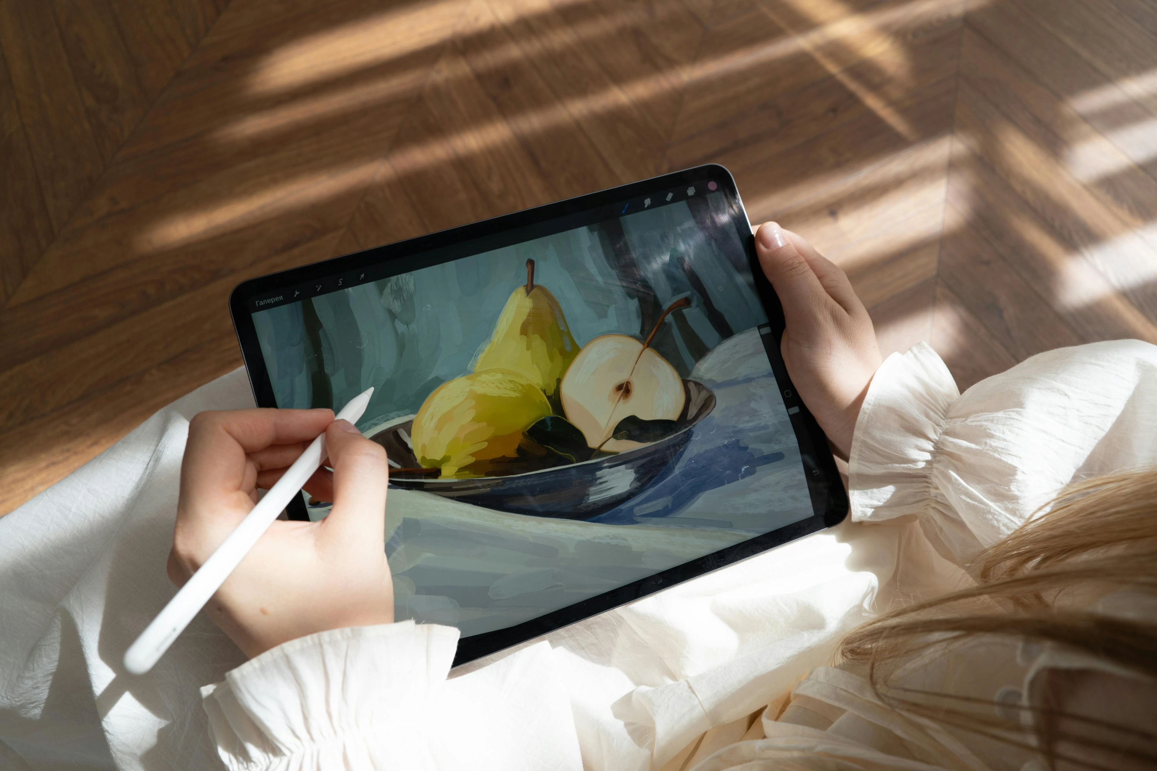
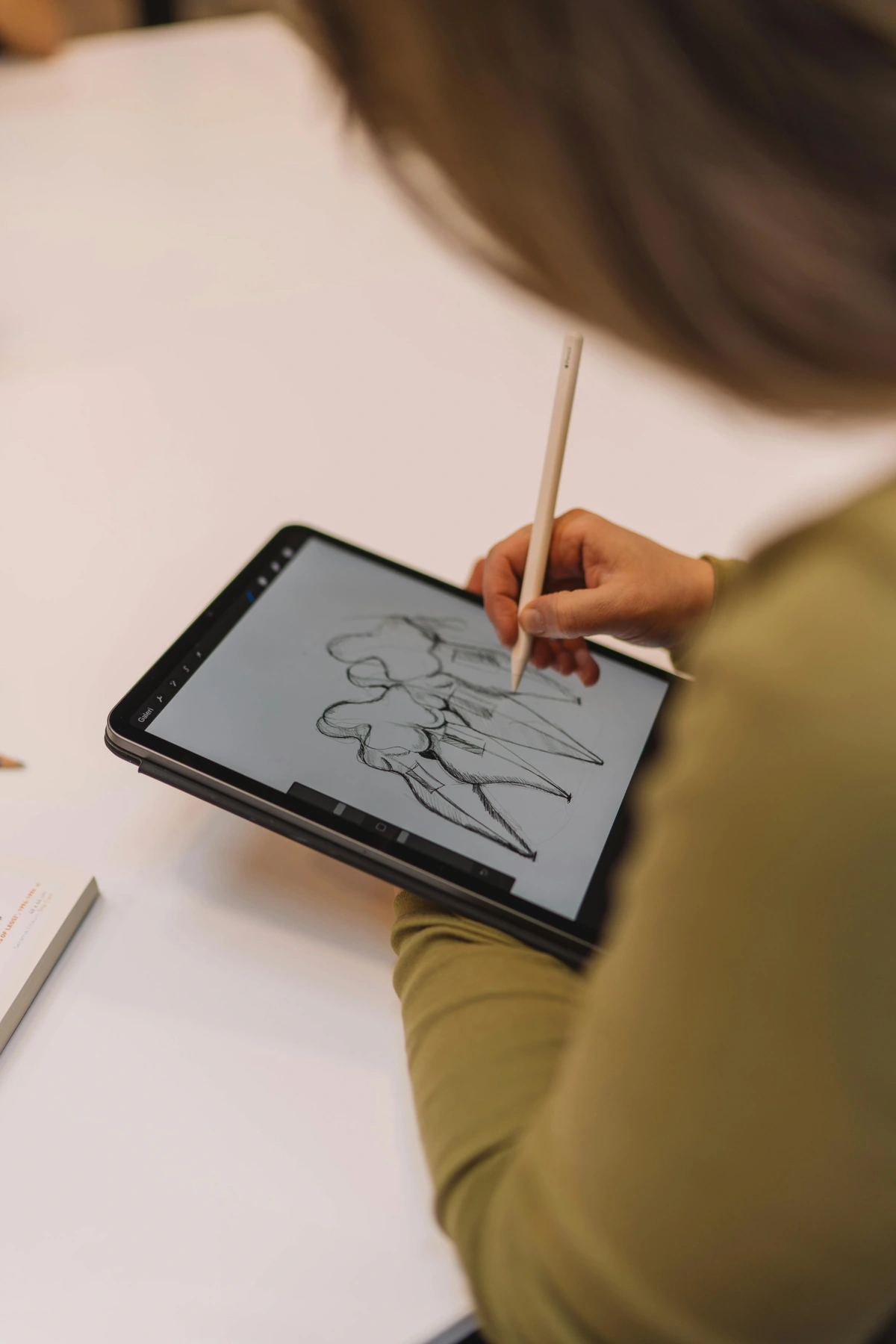
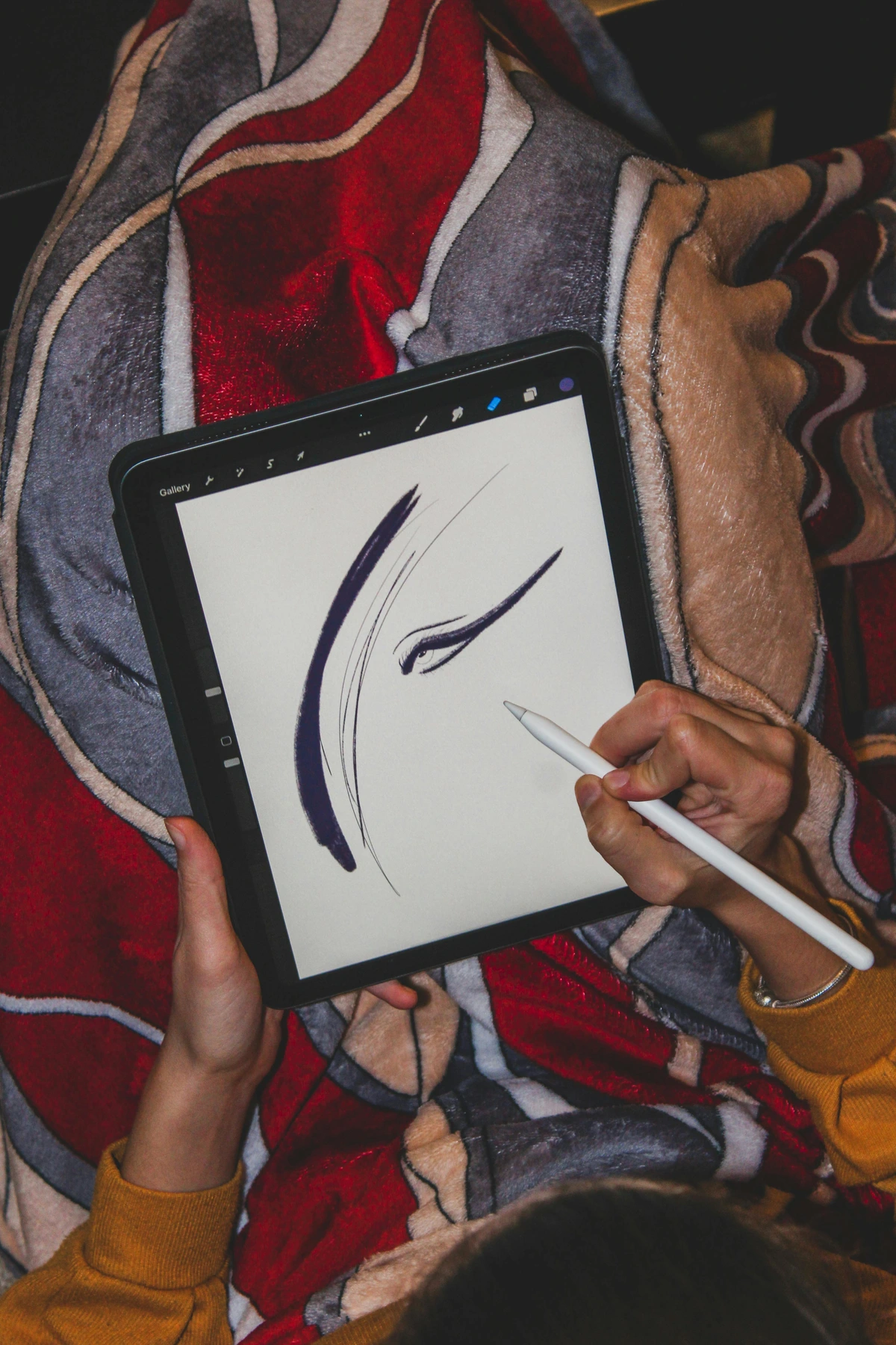
Krita, Procreate, and Affinity: The Modern Challengers
The creative world is no longer a one-company town. Fantastic alternatives have their own powerful native formats that deserve your attention.

- Krita (KRA): This free, open-source powerhouse is a favorite among digital painters for a reason. The .KRA format stores layers, vector shapes, and even animation frames with an efficiency that can put Adobe to shame. I've seen artists create stunningly complex works in Krita, and the file sizes often remain surprisingly svelte.
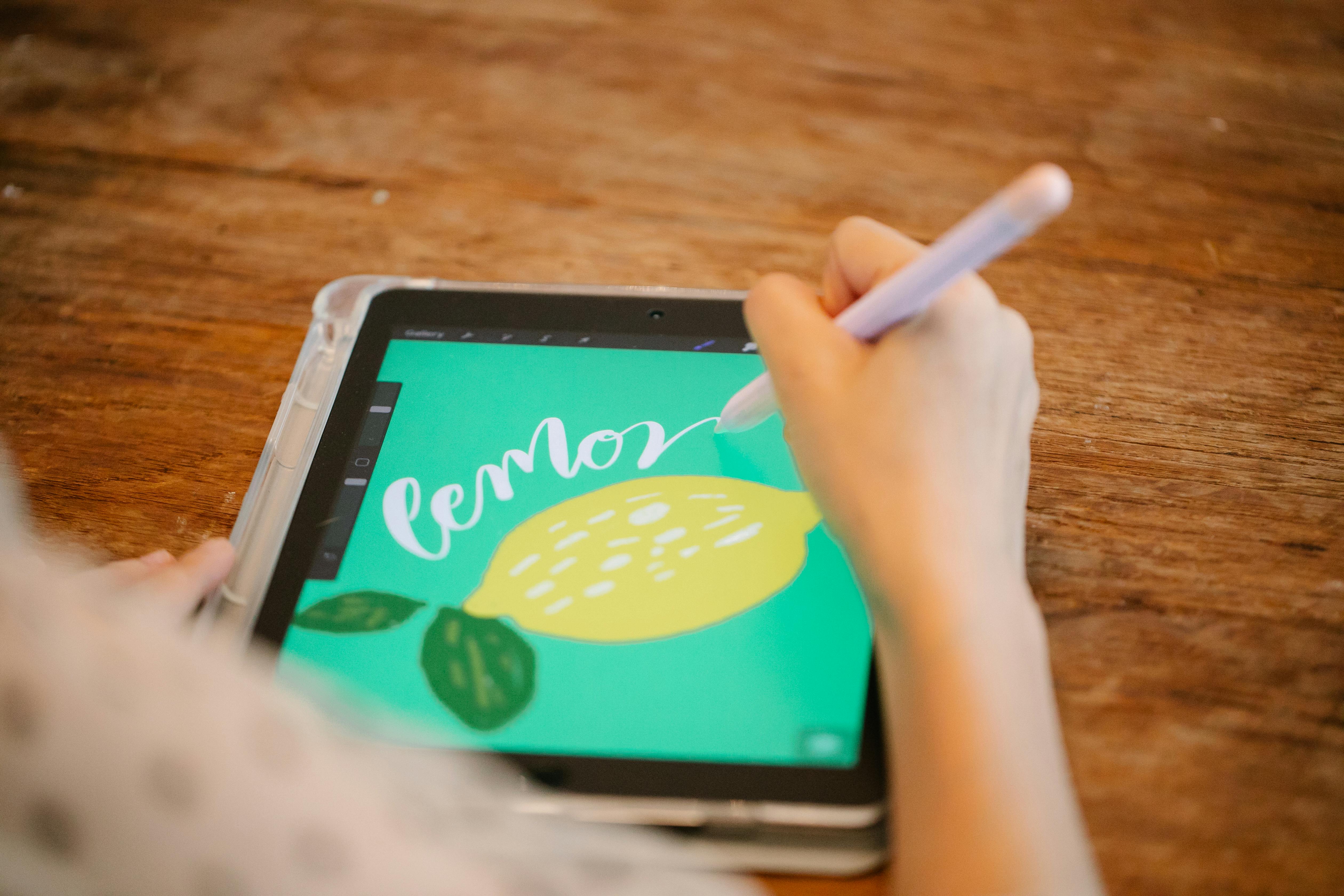
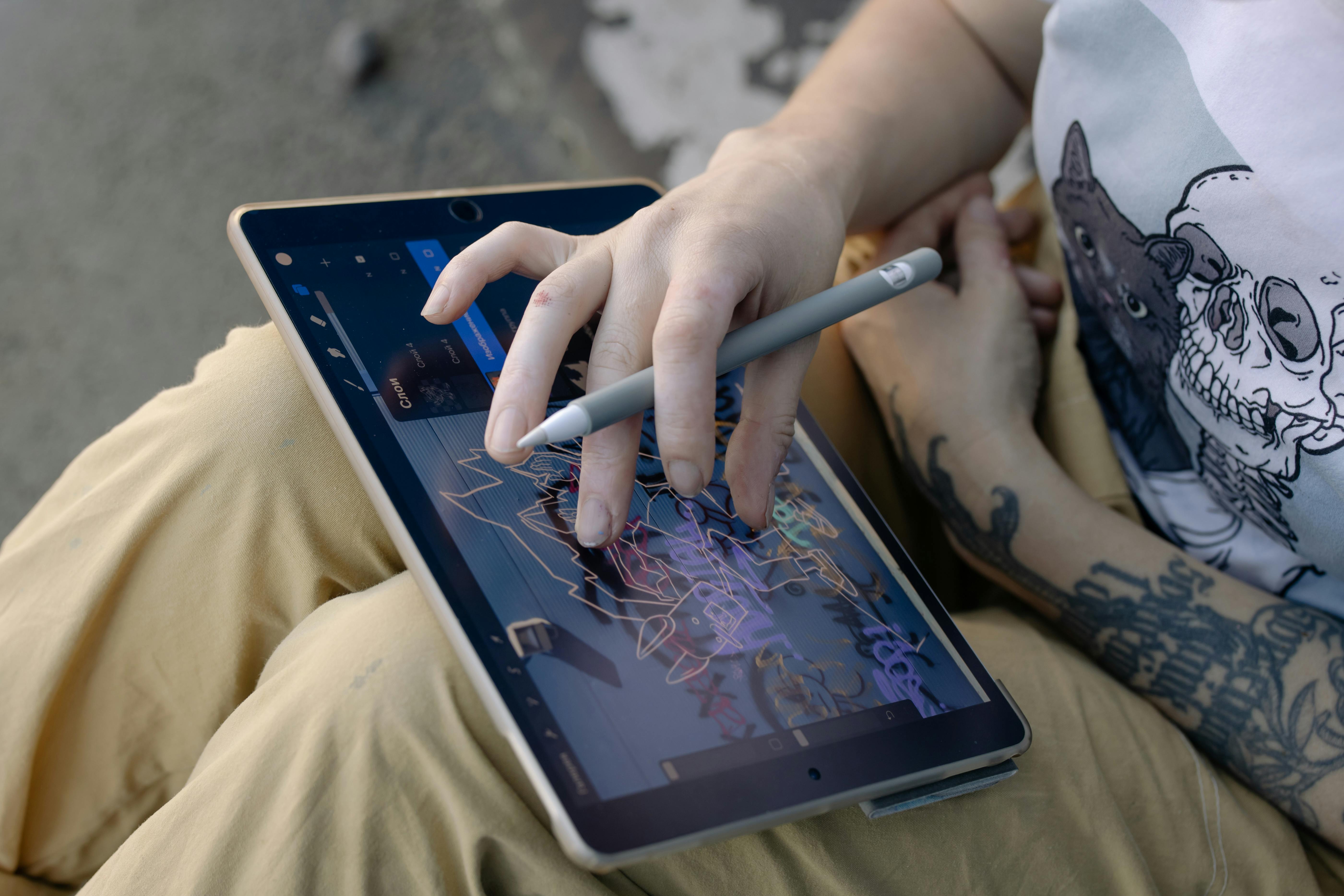
- Procreate (PROCREATE): The king of the iPad. The Procreate file is a brilliant piece of engineering. It holds not just your layers and brushes, but also your entire undo history and even a replay of your entire painting process. It's incredibly optimized for the iPad, which means your 200-layer masterpiece won't bring the device to its knees. The only downside is its proprietary nature. Getting that Procreate file onto a desktop PC for printing took some work for me once, but the seamless "Export to PSD" function is a lifesaver.
- Affinity Suite (AFDESIGN, AFPUBLISHER): Serif's Affinity suite (Photo, Designer, Publisher) created the .afphoto, .afdesign, and .afpub formats as modern, one-file alternatives to Adobe's ecosystem. The big selling point? Speed, stability, and no subscription. These files hold everything - layers, effects, embedded documents - in a single, clean package. I've been impressed by their robustness when moving complex files between the apps. They feel like what Adobe's next-generation formats should have been.
## The Great Export: Sending Your Art into the World
Now we flip the script. If working files are your private studio diaries, exports are your public announcements. These are the flattened, compressed, and purpose-built files you send to a client, upload to a website, or submit to a printer. You need to make the right choices here, because a bad export can make even the most brilliant piece of digital art look amateur.
JPEG (Joint Photographic Experts Group)
If you've ever seen a photo on the internet, you've seen a JPEG. It's the universal language of images, the digital equivalent of a developed photograph. Its superpower is also its greatest weakness: lossy compression.

- What it is: A compressed raster format designed specifically for photographic content.
- The Compression Trade-Off: To create tiny file sizes ideal for websites and sharing, JPEGs permanently discard color data that the human eye is least likely to notice. Think of it as a very smart "good enough" algorithm. This is fantastic for portability, but a disaster if you keep re-saving a JPEG over and over. Each save applies another round of compression, and you'll eventually end up with a blotchy, artifact-riddled mess. This is the origin of "JPEG rot."
- The Golden Rule: Never use JPEG for text, line art, or graphics with sharp edges. Its compression algorithm absolutely butchers hard lines, creating a blurry, indistinct halo. And I cannot stress this enough: Never edit a JPEG master. Edit your PSD/AI file, and then export a new JPEG for sharing.
PNG (Portable Network Graphics)
Where JPEG fails, PNG picks up the slack. If JPEG is a photograph, PNG is a crisp, clean sticker with a transparent background. It was literally created as a patent-free replacement for the old GIF format, and it excels at one thing above all others: lossless compression with transparency.
- What it is: A lossless raster format that supports transparency.
- The Superpower (Transparency): This is why PNG rules the web. It's the only format you should use for logos, icons, watermarks, or any image that needs to be placed over a colored or image background on a website. There's nothing more frustrating than placing a logo and seeing an ugly white box around it; a PNG with a transparent background solves this perfectly.
- When to use it: Web graphics, UI elements, icons, and logos. Any time you need a clean, sharp graphic with no background. For my artist friend who wanted her signature as a watermark on her online portfolio, a transparent PNG was the only answer.
- The Gotcha: File sizes for complex, full-color images like paintings can be significantly larger than a comparable JPEG. For these, JPEG is still the better choice for web display.
GIF (Graphics Interchange Format)
Oh, GIF. The format that refuses to die. Invented in 1987, it's older than many artists using it today. Its technical limitations are severe: it can only contain a maximum of 256 colors. For a digital painting with thousands of subtle hues, this is a disaster. A GIF of your work would look horribly pixelated and posterized.
So why does it still exist? One reason, and one reason only: animation. The GIF format's unique ability to hold a sequence of frames made it the foundational technology of every meme and looping animation you've ever seen on the early web.

- What it is: An ancient, lossless raster format limited to 256 colors and transparency.
- When to use it: Exclusively for short, looping, low-color animations. Think banner ads, simple icons with a bit of movement, or sharing a very short, silent video clip. If your art is a complex, full-color animation, modern formats like MP4 (a video container) are what you should be using.
PDF (Portable Document Format)
Don't think of PDF as just a document for reading text. For artists, it is one of the most powerful and versatile formats in your toolkit. A PDF can be thought of as a "digital envelope" or a container that can hold almost anything: raster images, vector graphics, text, and fonts, all bundled together in a universally readable file.
- What it is: A multi-page, multi-format container from Adobe.
- The Superpower (Universal & Hybrid): A print shop can open a PDF made on a Mac in Windows, view the fonts perfectly, and send it directly to their high-resolution printer. You can embed your raster painting as a full-res TIFF within a PDF, then place your vector logo and business information on top of it, in a single, self-contained file.
- When to use it: This is the professional standard for sending anything to print. It's also how I create and send digital art mockups to clients. I can show them exactly how their new painting will look framed on a wall, all within a single PDF document they can view on any device. It's the ultimate, dependable workhorse for professional presentation and printing.
The Vector Masters: AI, EPS, and SVG
Just as you have master files for your pixel-based art, vectors have their own formats designed to preserve your clean lines and editable shapes.

AI (Adobe Illustrator Artwork)
If PSD is the king of raster, AI is the emperor of the vector world. It's the native format of Adobe Illustrator and the gold standard for logos, typography, and complex illustrations.
- What it is: The native, editable format for Adobe Illustrator.
- When to use it: For all your vector-based design work. Logos, icons, typography, and illustrations that need to scale infinitely should all originate from an AI file.
- Who it's for: Logo designers, typographers, illustrators, and anyone in the branding and UI/UX space.
- Crucial Feature (Live Effects): AI files can store complex, non-destructive effects like drop shadows, blurs, and 3D extrusions that can be edited or removed at any time. This is the vector equivalent of Photoshop's Smart Objects.
- The Gotcha: Like the PSD, AI files are deeply tied to the Adobe ecosystem. While other software can often import them, complex gradients, effects, or specific font settings can get lost in translation.
EPS (Encapsulated PostScript)
EPS is the old reliable workhorse of the vector world. It's a much older format than AI, designed to be a universal container for both vector and raster data. It's a legacy format that refuses to die, mainly because so much professional printing equipment was built to speak its language.

- What it is: A cross-platform standard for saving vector graphics and placed images.
- When to use it: Primarily when sending files to an older print house that specifically requests it, or when you need to place a graphic into a page layout program like Adobe InDesign.
- Who it's for: Designers working in a professional print environment.
- Crucial Feature (Universal Compatibility): Its greatest strength is its age. Almost any design application from the last two decades can read an EPS file.
- The Gotcha: It's a clunky, outdated format that doesn't support modern features like transparency or live effects natively. Avoid it for modern workflows unless you're specifically asked for it.
Beyond the Basics: Building a Professional Workflow
Okay, so you know the formats. But knowing the names of tools isn't the same as knowing how to build a house. A professional workflow is about creating a system that protects your work, saves you time, and ensures the highest quality output, every single time. Let's talk about the non-negotiable habits of a pro.
Habit 1: The Two-Save System (Master & Export)
This is the number one habit that will save you from future headaches. Never, ever work directly on an exported file (like a JPEG). Your workflow should always involve two distinct types of files:
- The Master File: This is your source of truth. It's the editable, layered, high-resolution, high-bit-depth file saved in your software's native format (PSD, KRA, AI, etc.). You never flatten this file or delete layers you might need later.
- The Export File: This is a flattened, compressed, purpose-built copy you create from the master file for a specific reason (e.g., to put on your website, send to a client, or upload to a printer's portal).
The worst feeling in the world is having a client ask for a small change and realizing you only saved the flattened JPEG. Don't be that person.
Habit 2: Consistent and Organized File Naming
Your future self will thank you. Good file naming isn't just tidy; it's a professional practice that makes you look competent and keeps your archives from becoming a digital nightmare. A good system is both descriptive and searchable.

A Professional File Naming Convention:
ProjectName_DocumentType_Version_Deliverable.format
For example:
SunsetPainting_PSD_v01_Master.psd(Your working file)SunsetPainting_Export_v01_Web.jpg(A JPEG for your website)ClientLogo_AI_v03_Final.ai(The final vector master)ClientLogo_Export_v03_Print.pdf(A PDF for the printer)
This simple structure allows you to instantly identify what a file is for, sort them alphabetically, and know which version is the most recent.
Habit 3: Versioning is Your Time Machine
'Final.pdf' is a lie. 'Final_really_final_v2_for-real-this-time.jpg' is the cry of a desperate person. Instead of overwriting your files, use a simple versioning system.
The Pro's Versioning System:
Integrate a version number directly into the filename. Use v01, v02, v03 and so on. This allows you to keep a complete history of your project. It allows you to experiment freely. If you make a change in v05 that the client hates, you can simply go back to v04 without having to start over. It's your own personal time machine.

Habit 4: The 3-2-1 Archiving Rule
Art is your livelihood, and your digital files are your assets. Protect them like you would any other valuable possession. The 3-2-1 rule is the gold standard of digital backup:
- 3: Keep at least 3 copies of your important files.
- 2: Store them on 2 different types of media (e.g., your computer's internal drive and an external hard drive).
- 1: Keep 1 copy offsite (e.g., in the cloud with a service like Backblaze or Dropbox).
Hard drives fail. It's not a question of if, but when. An external drive on your desk protects you from a computer crash. An offsite backup protects you from theft, fire, or any other disaster that could wipe out everything in your studio. Making regular backups isn't just a good idea; it's professional malpractice not to.

TIFF (Tagged Image File Format)
Think of TIFF as the PSD's more mature, platform-agnostic cousin. It's an incredibly robust and versatile format that's the darling of the print and publishing industries. Unlike PSD, which is tied to Adobe, a TIFF file can be read by almost any image application on any operating system, often with full layer support.
- What it is: A highly flexible, lossless raster format known for its high quality and cross-platform compatibility. It can save layers, making it a great working file alternative to PSD.
- When to use it: When you need to send a layered file to a client or printer who might not have Photoshop. It's also the standard for high-quality photo archiving.
- Who it's for: Photographers, digital painters working in a mixed software environment, and anyone preparing files for professional printing.
- Crucial Feature (LZW Compression): TIFF offers lossless compression, meaning it can reduce file size without throwing away a single pixel of image data. This makes it perfect for archiving your master images at a slightly more manageable size.
- The Gotcha: All that quality comes at a price: TIFF files are huge. They're powerful working files, but you'd never use one on a website.
Krita, Clip Studio Paint, Procreate, and Affinity: A New World of Masters
The art world doesn't revolve solely around Adobe anymore. A new generation of powerful, artist-focused software has brought a wave of new native formats. These are your modern masters, and they deserve to be treated with the same respect as a PSD.
- KRA (Krita): This is the native format for the free and open-source powerhouse, Krita. It's incredibly efficient at saving complex brush textures, vector layers, and animation frames. For digital painters, it's a godsend.
- CLIP (Clip Studio Paint): The industry standard for comic and manga artists. CLIP files store everything from your panel layouts to your 3D drawing references, making them indispensable for narrative work.
- Procreate: The beloved format for millions of iPad artists. It's lightning-fast and saves your entire creative history, including every brushstroke and undo step.
- AFPHOTO/AFDESIGN (Affinity Photo/Designer): Affinity's answer to Photoshop and Illustrator. While they can save in PSD format, their native files are often more stable and offer superior performance for complex vector and raster projects within their ecosystem.
The universal rule? Your master file is sacred. Always keep the native, layered format of whatever software you create in, regardless of what it's called.