Chiaroscuro's Enduring Embrace: Why Light and Shadow Still Sculpt My Abstract World
Uncover chiaroscuro's dramatic history & pervasive influence across art and film. I, an abstract artist, reveal how this ancient technique sculpts depth, emotion, and dynamic energy in my vibrant, modern paintings.
Chiaroscuro's Enduring Embrace: Why Light and Shadow Still Sculpt My Abstract World
Have you ever walked into a room, just as the sun dips below the horizon, and watched how a single beam of light slices through the space, painting dramatic, almost solid shadows on the walls? Or stood under a lone street lamp at night, where its stark glow makes everything else recede into profound darkness? That feeling, that undeniable, visceral power of light and shadow, is something artists have wrestled with, celebrated, and used to tell stories for centuries. It's not just a visual trick; it taps into something deep within our psychology, evoking mystery, drama, or even quiet contemplation. And it all boils down to a fancy Italian word that, for a long time, honestly, intimidated me: chiaroscuro (pronounced kee-AR-uh-SKOOR-oh). Derived from the Italian words chiaro (light) and oscuro (dark), it's a technique that has shaped art history, and yet, its spirit—that fierce play between light and dark—is something I wrestle with every single day in my own vibrant, often wildly colorful abstract work. It's a core truth I discovered when I really dug into my own artistic journey, a story you can trace on my artist timeline. In this article, I want to pull back the curtain on chiaroscuro's captivating past, show you its surprisingly pervasive influence today, and finally, share how this ancient magic finds new life in my modern abstract world.
When I first heard the term, I pictured dusty art history books and whispered tones, probably from someone wearing tweed. But really, it's just the art of manipulating light-dark contrast. Think of it not just as highlighting light, but how the absence of light—the shadow—sculpts and defines everything, pulling figures and forms out of the canvas with incredible force. It's less about a literal spotlight and more about the visceral push and pull that happens when light meets its opposite. It's like the way a dense, dark forest edge can make the bright, open sky above feel even more expansive and infinite. If you're curious about how artists harness this fundamental element, you'll love my guide to understanding value in art: light, shadow, and form.
Beyond the Canvas: Chiaroscuro's Pervasive Influence
It's easy to think of chiaroscuro as an old painting technique, a relic of the Renaissance. But its principles are woven into the very fabric of visual storytelling across various mediums, proving its timeless appeal. Take film noir, for instance, where harsh shadows and stark lighting don't just create an atmosphere of mystery and moral ambiguity; they define the characters and their motives through the way light obscures or reveals their faces. Or black and white photography, where the absence of color forces the viewer to confront the raw power of value contrast, making light and shadow the sole protagonists of the image. Think of a beautifully lit digital portrait, or the sharp, dramatic contrasts in a black and white photograph – these are direct descendants of chiaroscuro.
Even in theatre lighting, directors meticulously sculpt scenes with spotlights and gels to create mood, highlight performers, and guide the audience's attention. And this pervasive influence extends deeply into the digital realm: think of a horror video game where atmospheric lighting uses deep shadows and sudden flashes to create tension and define character silhouettes in a cinematic cutscene, guiding the player's focus through immersive virtual worlds. Beyond gaming, think of how CGI uses light and shadow to create hyper-realistic forms in movies or how visual effects (VFX) artists meticulously craft scenes in modern blockbusters, building believable worlds one carefully lit pixel at a time, or how dramatic architectural lighting sculpts modern buildings or historical cathedrals, turning solid structures into breathtaking plays of light and void. Graphic novels, illustration, and product photography all leverage these principles, using value contrast to evoke atmosphere and direct attention. The core idea of dramatic value contrast is everywhere, influencing how we perceive and feel.
This broad influence bridges the gap directly to contemporary art, even highly abstract forms. It was only when I truly began to explore how these ancient principles could be reinterpreted that I really connected with artists like Christopher Wool, who, for me, embodies a modern echo of chiaroscuro's core idea.
Take Christopher Wool's 'Untitled 2012' painting. It's not about a dramatic spotlight on a figure, but the stark black lines and forms against the white background create incredible visual tension and depth. For me, his visceral use of extreme black-and-white forms functions precisely like chiaroscuro, where the sharp contrasts make elements almost leap off the canvas, much like Caravaggio's figures emerge from darkness, commanding attention and creating a powerful presence. His work often evokes a sense of raw energy, urban grit, or even alienation, much like the harsh, revealing contrasts of film noir. If you're fascinated by his work, you'll find more in my ultimate guide to Christopher Wool.
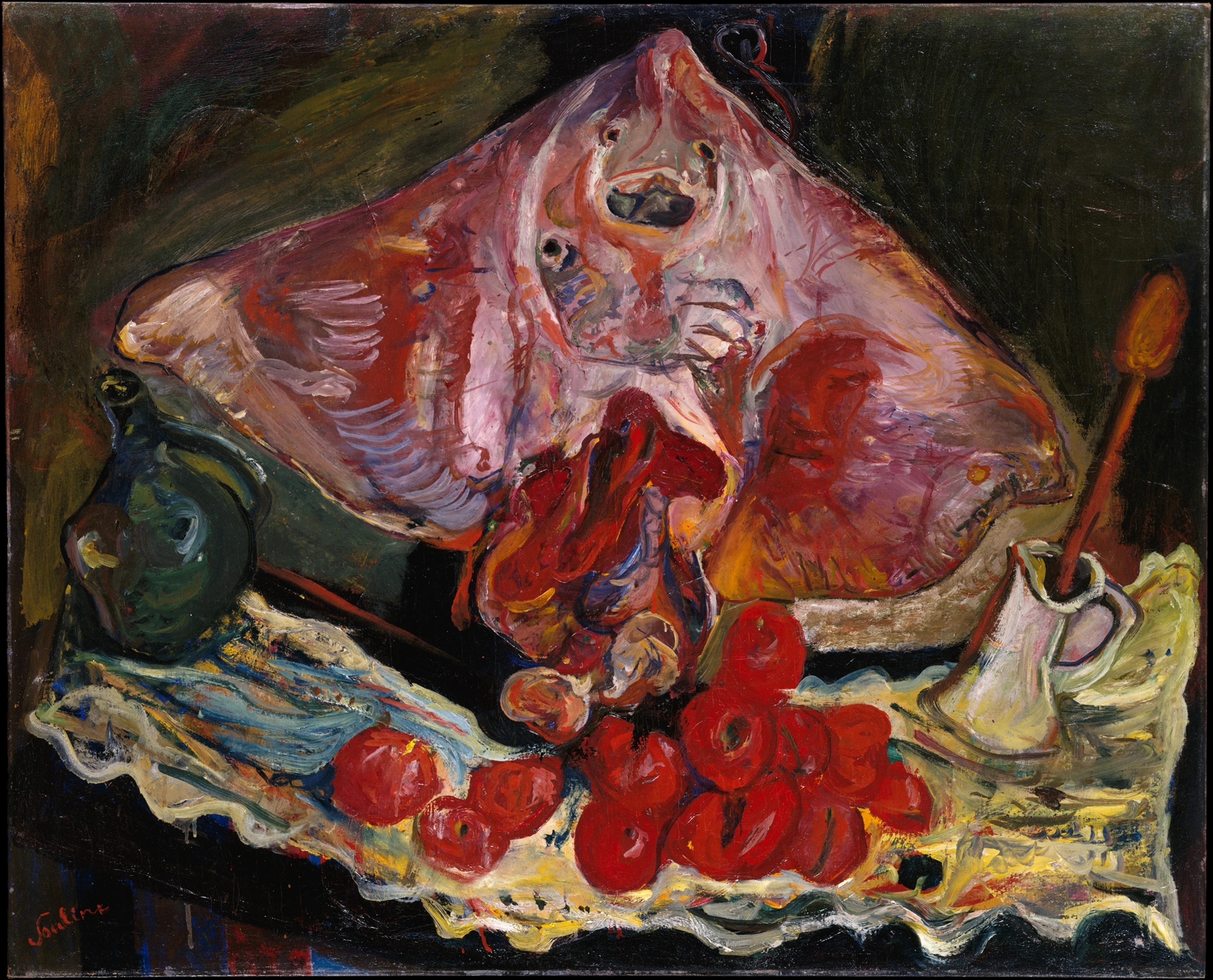
Or consider the French artist Pierre Soulages, whose 'outrenoir' (beyond black) paintings are entirely dedicated to exploring the nuances of light reflected from different textures of black paint – pure drama through the subtle interplay of light on varied surfaces, without a single other color. He's literally sculpting with shadow, using the subtle ways light plays on a textured surface to turn black into a universe of nuance, creating incredible depth and mystery. The varying depths and angles of the paint, sometimes deeply grooved, sometimes smooth and glossy, or built up with thick impasto, catch and absorb light differently, creating an ever-shifting landscape of dark and darker, compelling the viewer to move and experience the work from multiple perspectives. These artists show us that the dance of light and shadow isn't confined to a specific era or style; it's a fundamental language of perception. So, why does this language hold such enduring power?

Why All the Drama? The Purpose and Power of Chiaroscuro
So, beyond just looking cool, what's the point of all this dramatic light and shadow? And why do I, an abstract artist, still care so much about it? Well, it's far more than a visual trick. It’s a profound way to engage with the human experience, and its origins are deeply rooted in a fascinating historical moment.
The Renaissance Roots of Drama
Chiaroscuro emerged strongly during the Renaissance, a time when artists were absolutely captivated by humanism, naturalism, and a deeper understanding of anatomy and perspective. They didn't just want to paint pretty pictures; they wanted to make figures feel real, tangible. This period also saw a renewed interest in classical Greek and Roman sculpture, where the interplay of light and shadow on carved forms was crucial for defining musculature and drapery. It was also a period of incredible scientific curiosity, with advancements in optics—like the groundbreaking work of Alhazen on the principles of light and optics centuries earlier, or later, Leonardo da Vinci's meticulous anatomical studies, which deeply informed how artists understood the human body's structure and how light would fall upon it. This, alongside a growing fascination with theatricality and dramatic stage lighting, made chiaroscuro perfect. It allowed them to sculpt forms with light and shadow, giving a concrete, almost tactile presence to their humanistic ideals, pulling them out of the flat canvas and into our world. This wasn't merely a clever visual effect; it was a profound way to imbue art with psychological depth and emotional resonance. I think of it as unlocking something primal within us. For example, it helps create:
Sculpting Reality: Form and Volume
By carefully manipulating highlights and deep shadows, artists can make a two-dimensional surface appear three-dimensional. It's how a flat canvas suddenly gives the illusion of a sculpted body or a rounded fruit, making the world within the frame feel tactile and real, almost as if you could reach out and touch it. And I'll confess, I personally strive for this same three-dimensional quality in my abstract pieces, even without literal forms. By playing with how values advance and recede, much like a sculptor carves away material to reveal form, I create the illusion of overlapping planes and dynamic spatial relationships that give my flat canvases an undeniable sense of depth and movement. And occasionally, it can even deliberately flatten forms or distort perspective, creating a sense of unease or ambiguity, turning the familiar into something subtly unsettling – a powerful trick artists use to challenge our perception.
The Heart of the Matter: Mood and Emotion
This is where it gets really interesting for me. The dramatic contrasts evoke intensity, mystery, or even a profound sense of introspection. Think of a somber portrait where shadows convey the weight of a person's thoughts, or a brightly lit face emerging from darkness to signify hope or revelation. In Caravaggio's dramatic scenes, a deep shadow cloaking a figure's face can evoke a powerful sense of foreboding or an almost conspiratorial silence, making you feel like an uninvited witness to a private, perhaps illicit, moment. And with Rembrandt, the way warm, soft light caresses a subject's eyes while the rest of their face recedes into a warm, inviting darkness creates an incredible intimacy, pulling you into their thoughts, almost as if you're sharing a quiet, profound secret. It plays on our deeply ingrained psychological responses to light (safety, clarity, the known) and darkness (danger, the unknown, the mysterious). We're hardwired to react to these elemental forces, and artists expertly exploit that to stir something within us. It’s a delicate balance, of course. Too much darkness can become oppressive, too much light can feel bland and without impact. It's in that thoughtful dance between the two that artists, abstract or not, truly find their voice and evoke a specific emotional landscape.
Guiding the Eye: Focus and Narrative
Chiaroscuro acts like a visual magnet, drawing your eye precisely where the artist wants it to go. The areas of brightest light are usually the most important elements of the story, spotlighting characters or key moments with undeniable emphasis. Conversely, it can also obscure elements, creating mystery or suspense, making you lean in to decipher what lies just beyond the light, or even misdirect your attention momentarily before a dramatic reveal. It's like a stage director deciding exactly which part of the scene to illuminate, guiding our gaze and dictating the story's emotional beat.
Beyond Aesthetics: Symbolism and Power
Beyond just aesthetic appeal, chiaroscuro often serves an ideological purpose. It can elevate figures, making them appear divine or heroic (think of a halo effect created by ethereal light), or conversely, create an atmosphere of foreboding, manipulation, or even spiritual revelation (a shadowy figure lurking in the background). The intense contrasts can symbolize the presence of the sacred, or the unseen forces at play, creating an uncanny atmosphere that draws the viewer into the unknown, compelling them to confront profound truths or unsettling mysteries.
Masters of the Dramatic Light: Iconic Examples
But how did these masters actually achieve such breathtaking effects, pushing the boundaries of what paint and other mediums could do? Here are some artists who, for me, truly embodied this mastery:
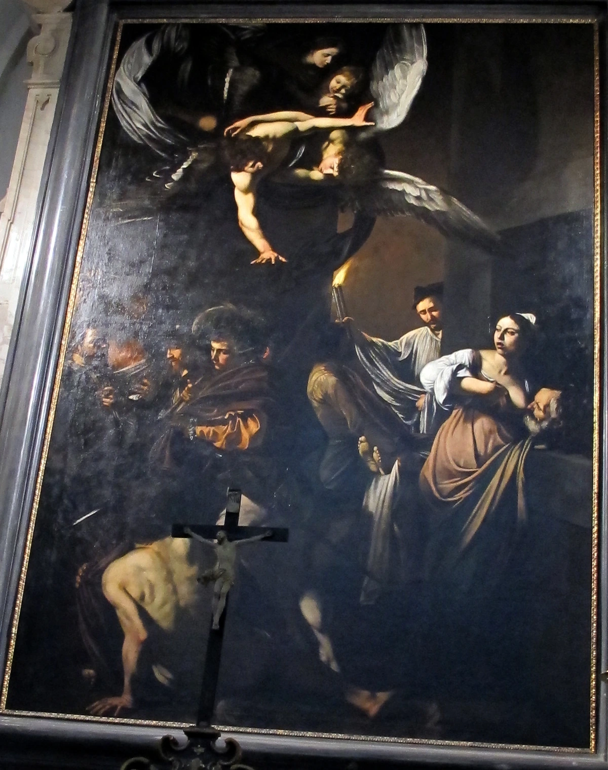
Caravaggio, The Calling of Saint Matthew (c. 1599-1600)

credit, licence
This is perhaps the quintessential example. A beam of light slices across the canvas, illuminating Matthew and his companions in a dim tavern, while others remain in shadow. The contrast is stark, the effect dramatic, pulling the viewer's eye directly to the moment of divine calling. It's not just light; it's a dramatic intervention. Caravaggio, known for his turbulent life, masterfully used these deep shadows to create a sense of unease, of something profound yet potentially dangerous unfolding. He often pushed chiaroscuro to its extreme, a technique known as tenebrism, which truly spotlights figures from oppressive darkness, as we'll explore shortly.
Rembrandt van Rijn, various portraits (17th Century)
credit, licence
Rembrandt was a master of using soft, diffused chiaroscuro to explore the inner lives of his subjects. His portraits often feature a warm, almost spiritual glow on the face, while the background and body recede into rich, earthy shadows. This creates an intimate, psychological depth, making you feel as if you're peering into the soul of the sitter, sharing a quiet, profound moment of introspection. I've always been moved by how he achieved less theatricality and more profound human connection, subtly guiding your eye with gentle light.
Gian Lorenzo Bernini, Ecstasy of Saint Teresa (c. 1647-1652)

While a sculptor, Bernini understood chiaroscuro deeply. The way light floods down from a hidden window (a deliberate architectural element designed to simulate divine intervention) onto the marble figures, creating deep shadows in the drapery and illuminating the ecstatic expressions, is pure chiaroscuro in three dimensions. He uses the architecture and natural light to literally sculpt with light, drawing your eye to the divine intervention. The varied textures of the marble itself, from highly polished skin to the deeply carved folds of drapery, play a crucial role, reflecting and absorbing light differently to create incredible depth and realism, just as a painter would. It's a reminder that this interplay of light and dark transcends specific mediums.
Sculpting with Light: Key Techniques – The "How-To" Behind the Drama
So, we've seen the powerful effects of chiaroscuro, but how exactly did these masters achieve them? Beyond just painting areas dark or light, they literally sculpted with pigment and light, employing specific techniques to build up their dramatic effects. I imagine they felt a similar pull towards this dramatic interplay, perhaps sensing its primal connection to human emotion and perception.
Take impasto, for instance, where paint is applied thickly, often directly from the tube or with a palette knife, creating a tangible texture. In highlights, the raised texture itself literally catches and reflects ambient light, making a painted surface seem to glow with internal energy and physical presence, adding to the illusion of form. I remember the first time I truly understood how impasto could make paint feel alive, catching the light in a way that almost made it breathe. Conversely, glazing—thin, transparent layers of dark paint, built up slowly with oil binders—allowed artists to build up shadows with incredible depth and luminosity. This creates a rich, profound darkness that feels tangible, almost as if you could gaze into an abyss. Those slow, deliberate layers of glazing felt like building a universe of shadow, each coat deepening the mystery. They also used techniques like underpainting, laying down a monochromatic base layer to establish the light and shadow values before applying color, and scumbling, lightly dragging opaque paint over a dry layer to create a broken, hazy effect that could soften edges or add luminosity.
Then there's sfumato, a softer, more subtle form, which Leonardo da Vinci mastered. It's a technique of blending colors or tones so subtly that they melt into one another, creating soft, hazy outlines and a smoky, almost ethereal atmosphere. Unlike chiaroscuro's stark contrasts, sfumato actively reduces those sharp shifts, creating a gentler, more elusive drama. Think of the Mona Lisa's enigmatic smile; that's sfumato. This soft, almost whispered quality makes it captivating, a gentle sibling to chiaroscuro, where drama unfolds subtly rather than with a sudden spotlight, achieving depth and form through a more gradual, atmospheric means. If you're interested in the broader context, my guide to the definitive guide to understanding light in art might illuminate things further.
Chiaroscuro vs. Tenebrism: A Quick Tangent
As these masters explored light's power, some pushed its boundaries even further, leading to a distinction that's worth a quick, albeit academic, tangent. You might hear another term thrown around: tenebrism. While often associated with chiaroscuro, it's actually an extreme form of it. Tenebrism takes the dark-light contrast to another level, plunging most of the composition into oppressive darkness, with only a few elements harshly illuminated by an intense, often theatrical, light source. Think of it as chiaroscuro with the volume turned all the way up, often leaving little to no middle ground between light and dark. It's less about subtle transitions and more about dramatic, almost brutal, spotlights from an unseen source. Caravaggio, as we saw, often leaned into tenebrism, and it became particularly popular during the Baroque era, especially for religious works, as its intense drama perfectly captured the fervor of the Counter-Reformation. It's like the art equivalent of a jump scare, if I'm being honest, and the emotional impact is often one of shock or spiritual awe.
Heres a quick overview of their key differences:
Feature |
|---|
| Chiaroscuro |
| Contrast |
| :-- |
| Strong, but with subtle transitions |
| Light Source |
| :-- |
| Can be natural or implied |
| Composition |
| :-- |
| Figures emerge from shadows, with some middle tones |
| Purpose |
| :-- |
| Volume, depth, mood, emotional resonance |
| Overall Effect |
| :-- |
| Naturalistic depth, psychological nuance |
| Feature |
| :-- |
| Tenebrism |
| Contrast |
| :-- |
| Extreme, often abrupt |
| Light Source |
| :-- |
| Usually a single, intense, often unseen source |
| Composition |
| :-- |
| Most of the scene is plunged into deep, oppressive darkness |
| Purpose |
| :-- |
| Intense drama, theatricality, emotional shock |
| Overall Effect |
| :-- |
| High drama, shock, spiritual awe, moral ambiguity |
Sometimes art terms feel like they're just showing off, trying to be overly academic, but this distinction actually highlights an important nuance in how artists use light. And for me, while I don't typically employ tenebrism's extreme literal darkness, the intensity of contrast and emotional punch I aim for in my abstract pieces shares that same dramatic spirit. It's a good one to keep in your back pocket.
My Abstract Dance with Light and Shadow
So, after all this talk of historical drama and academic distinctions, you might be asking yourself, "Okay, but how on earth does this apply to your wild, colorful abstract paintings?" And trust me, it's a question I've wrestled with for years. This is where things get really interesting for me, and where I had to ask myself: how does this ancient magic translate to my own world of color and abstraction? The answer, for me, is profoundly liberating. It's about taking the essence of that dramatic interplay and making it sing in a new language.
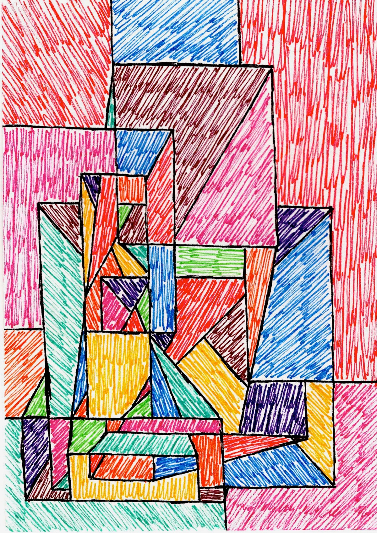
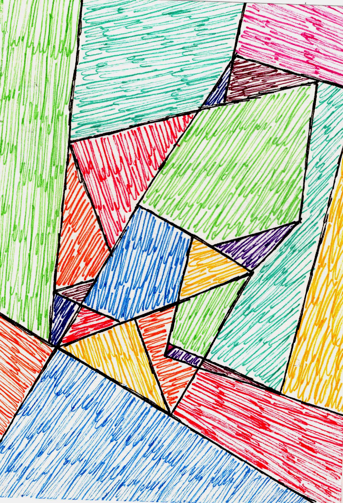
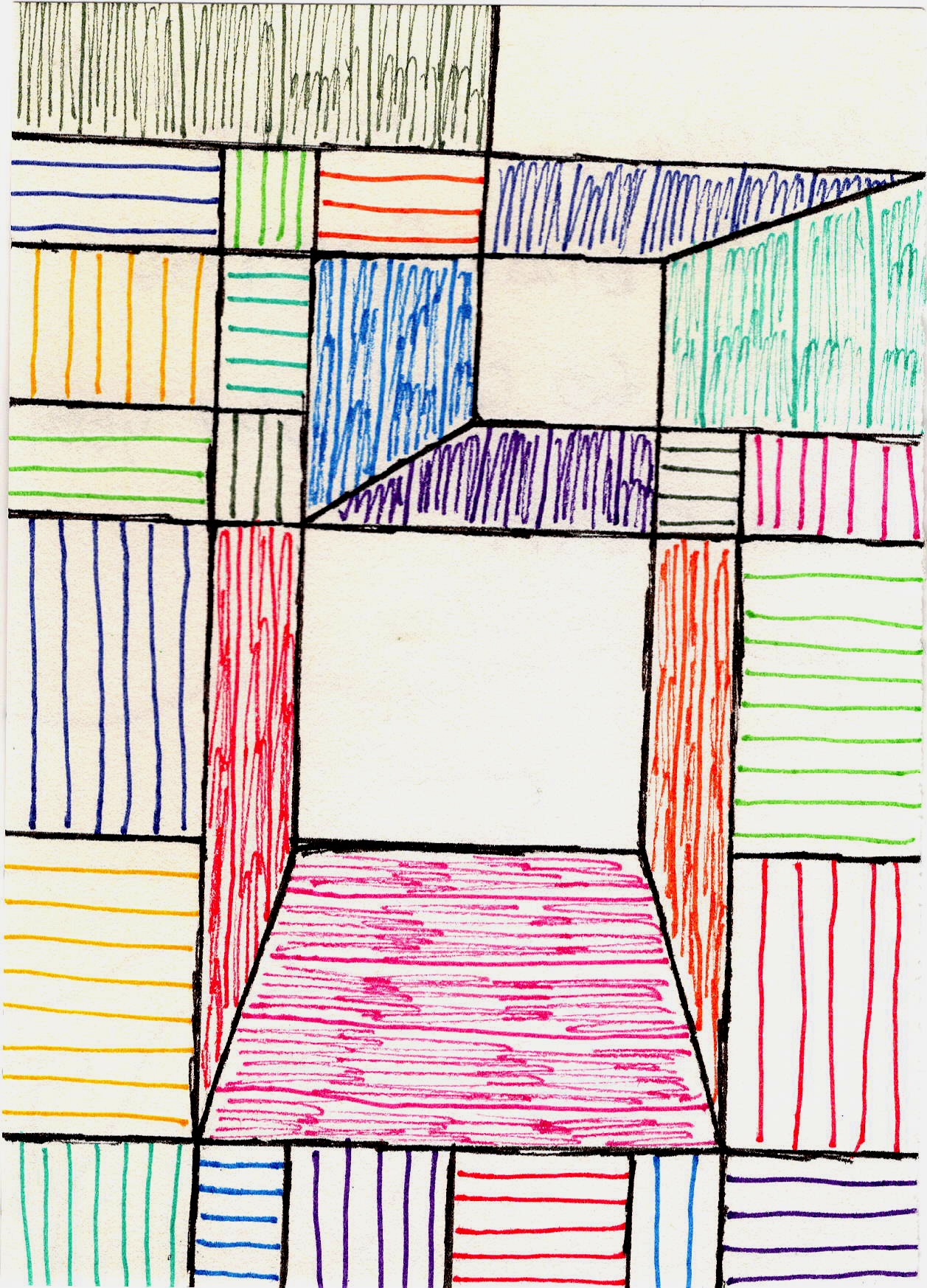
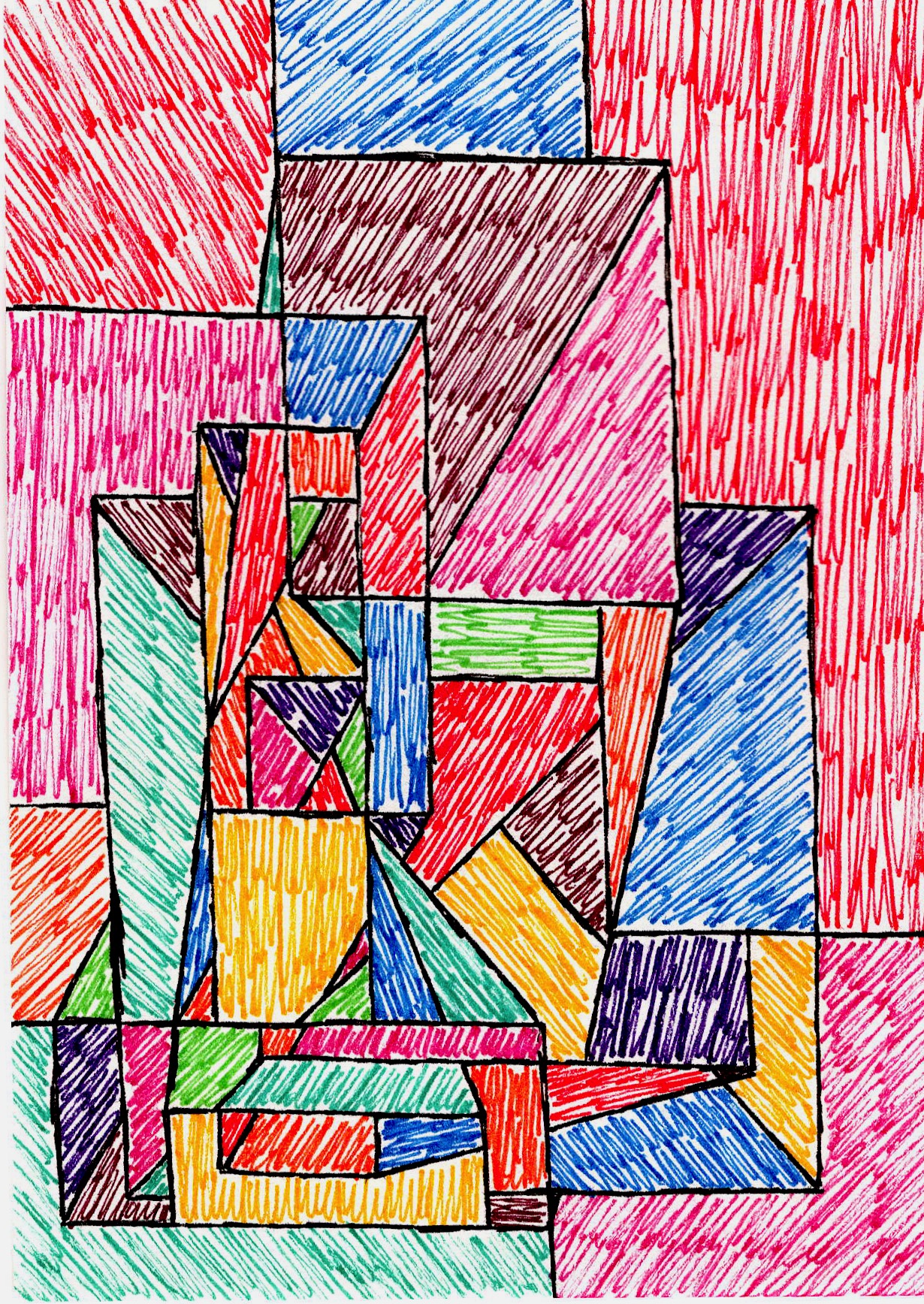
To understand how I connect with chiaroscuro, it's helpful to remember that value in art refers to the relative lightness or darkness of a color, independent of its hue. So, while I'm often working with a riot of colors, I'm constantly manipulating their values. For me, it's about translating the feeling of chiaroscuro—the power of contrast and value—into an abstract language. I might not be painting a Renaissance figure emerging from shadow, but I'm constantly thinking about how a deep indigo next to a vibrant yellow creates a visual pop and pulls the eye, much like a bright highlight in a classical painting. I remember a moment in my studio, years ago, struggling to make a flat canvas breathe. It was when I started thinking less about 'colors' and more about 'values'—the sheer push and pull of light and dark within those colors—that it clicked. Suddenly, my deep indigos weren't just blue; they were vast, receding spaces, and my electric yellows weren't just bright; they were beacons, demanding attention, advancing right off the surface.

Imagine I start with a deep, almost inky indigo. Next to it, I might push a vibrant, almost electric yellow. It's not about depicting a literal light source, but that vibrant yellow, by virtue of its intense value contrast against the dark indigo, feels like it's advancing, almost vibrating forward off the canvas—an illusion of light that feels undeniably emotional. The indigo, conversely, recedes, creating a sense of deep, boundless space. This isn't a figure emerging from shadow, but it's the same visceral 'push and pull' of value creating an illusion of volume and dynamic energy.
For example, in my 'Crimson Tide' series, the strong value contrast of a deep, saturated crimson pushing against a pale, luminous ochre creates a similar sense of visceral depth and drama as a strong highlight on a shadowed face, evoking a powerful surge of emotion. This is the abstract version of light defining form, or the 'psychology' of color, which I talk more about in the psychology of color in abstract art: beyond basic hues.
I also consider how color temperature plays a role – how a warm red or orange can feel like it's advancing and illuminated, while a cool blue or green recedes, creating a sense of natural light and shadow even where none exists literally. Think of a fiery orange exploding forward from a cool, distant blue – that's the abstract play of light and shadow at work through color temperature. It’s the psychology of color, but through the lens of value, making flat surfaces feel emotionally charged and dynamically alive. And it's a similar principle I sometimes ponder when I look at artists like Mark Rothko, whose vast color fields, though not about literal chiaroscuro, use subtle shifts in value and color temperature to create immense depth and emotional resonance, pulling you into a meditative space. It's that underlying power of value, regardless of the artistic language, that fascinates me. And if you're into digital art or illustration, you'll know that software tools offer incredible control over light and shadow, allowing contemporary artists to digitally 'sculpt' with value, creating digital chiaroscuro effects that are just as powerful, if not more so, than traditional methods.
In my abstract compositions, I'm often exploring the interplay of values not just with literal light and shadow, but with the relative lightness and darkness of different hues. A deep, dense shape pushed against a luminous, open one generates incredible energy and focal points. Just as a dramatic shadow can make a nose appear to project from a portrait, a deep, dense indigo in one of my works can make a vibrant yellow next to it feel like it’s pushing forward, creating that visceral illusion of depth. This interplay creates the illusion of overlapping planes, where some elements seem to advance while others recede, giving my flat canvases an undeniable, almost tangible, sense of depth and dynamic movement. It's about making a flat surface feel alive, with forms and spaces that breathe and shift, drawing you into an emotional landscape rather than a literal one. It's a way to guide the viewer's eye through a complex visual narrative, even if that narrative is purely emotional or conceptual. For instance, if you've ever stood before 'Echoes of Depth' in my museum in 's-Hertogenbosch, you'll see how a vibrant yellow is almost consumed by a surrounding indigo, yet pushes forward with an undeniable energy – a visceral, abstract chiaroscuro.
This isn't to say I always think explicitly in terms of chiaroscuro, but its underlying truth—that contrast creates drama, depth, and meaning—is a constant companion in my creative process. Even when working with primarily black and white or muted tones, the principles of chiaroscuro are at play, as the absence of color itself heightens the perception of light and shadow because the eye is forced to focus entirely on the tonal differences. It's a reminder that even in the most vibrant and non-representational art, the fundamental dance between light and dark, presence and absence, remains powerfully relevant. If you're interested in how I specifically use light in my work, you might enjoy the definitive guide to understanding light in art or exploring my abstract art collection available for purchase.
A Final Thought: See the Drama Everywhere
So, what began as a technique to bring realism and spiritual drama to Renaissance paintings continues to resonate deeply, even in a world of digital art and abstract expressionism. Chiaroscuro is a testament to the enduring power of fundamental visual principles. It's a reminder that artists, across centuries and styles, are all, in their own way, wrestling with light. They're asking: How can I use the presence and absence of light to tell a story, to evoke an emotion, to make you feel something? My connection to chiaroscuro isn't just academic; it's a constant, visceral conversation within my studio, guiding my hand in every stroke, a reminder that at its heart, art is about feeling, about experience, and about showing the world how I see it, using these timeless tools of contrast and depth.
My hope is that by understanding chiaroscuro, you don't just see historical paintings differently, but you start seeing the world around you – and perhaps even your own creative potential – through a new lens of light and shadow. Maybe you'll notice the dramatic light spilling across your desk, or the way a dark corner of a room makes a brightly lit object pop, inspiring your own journey, perhaps even to create or discover the perfect abstract piece for your space. Who knows what dramatic contrasts you'll find, or create, next?
Now, go look around you. Notice the dramatic shadows cast by your lamp, the way sunlight carves out forms in your room. The chiaroscuro isn't just in the great museums; it's everywhere, waiting for you to see it, and perhaps, inspire your own creative journey.


