
Roy Lichtenstein: Pop Art, Iconic Dots, & His Questioning Legacy
Dive into Roy Lichtenstein's Pop Art journey. Discover his Ben-Day dots, iconic works like 'Whaam!', and profound impact on mass culture, art's aura, and originality.
Roy Lichtenstein: My Pop Art Journey Through Dots, Whaam!, and a Questioning Legacy
I remember the first time I truly saw a Roy Lichtenstein painting, not just glanced at it. For years, I’d casually flipped past images, mentally filing him under “Oh, the comic book guy.” And if I’m honest, I probably dismissed it as too simple, too obvious, a bit of a cheeky shrug from the art world. I mean, can you really call a blown-up comic panel 'art'? My initial skepticism felt almost dismissive, as if such art didn't demand the visible struggle or intense introspection I’d come to expect from 'serious' painters. Turns out, that initial dismissal was part of the fun – a classic Lichtenstein move, really, inviting you to question your own preconceptions, and making you lean in closer to see the monumental scale he brought to something so ordinary. Before he found this signature style, Lichtenstein actually explored Abstract Expressionism and even Cubism, trying on different artistic languages before landing on his revolutionary approach. This background makes his later subversion of artistic norms even more pointed, doesn't it?
But then, one day, something clicked. Maybe it was the light, or perhaps my mind was finally ready to look beyond the surface. I started to consider the audacious brilliance of taking something so utterly mundane – a single panel from a romance comic, an advertisement – and elevating it to high art. It’s the kind of artistic move that makes you think, "Wait, can you do that?" And Lichtenstein, bless his bold, dotted soul, absolutely could. This wasn't just copying; it was a profound act of recontextualization, a daring subversion of artistic norms that forced a re-evaluation of what art could be. This journey through his art is my exploration of his profound impact and why his work continues to resonate so deeply with me. It’s a bit like the feeling I get when I wander through our own museum in 's-Hertogenbosch – finding a new, unexpected perspective on something I thought I knew so well, making me question what art means. This isn't just my story, though; it's also a deep dive into the audacious vision of a man who irrevocably changed the landscape of modern art.
Unpacking Pop: Why Lichtenstein Matters to Me
Before Pop Art burst onto the scene in the 1960s, the art world often felt... well, pretty grand and serious. For centuries, a clear distinction often separated "high art" – think grand historical paintings, profound religious works, or abstract expressions of inner turmoil – from "low art," which encompassed everything from commercial illustrations to comic strips. This hierarchical view shaped what was considered worthy of the canvas and gallery wall. You had the raw, unbridled emotion of Expressionism, the intellectually fragmented perspectives of Cubism, and then, dominating the post-war American scene, the sheer, unbridled energy and introspective depth of Abstract Expressionists like Jackson Pollock. These were incredible, world-shifting movements, no doubt, often seen as direct, authentic expressions of the artist's inner turmoil or spirit. The art was looking inwards.
Then, Pop Art arrived, a vibrant, sometimes cheeky counter-narrative, asking, "What about this?" – a question that felt like it echoed my own thoughts. "What about the world right outside your window? The soup can, the washing machine, the superhero comic, the advertisements screaming for your attention?" It felt like art finally looked outwards, reflecting a booming post-war economy and a culture increasingly defined by mass production, consumerism, and the rise of a leisure-seeking middle class. This outward gaze was a direct response to a post-war America saturated with new technologies like television and an explosion of advertising. Billboards screamed, magazines glittered, and the everyday object became a symbol of prosperity. Lichtenstein, alongside figures like Andy Warhol, Jasper Johns, Robert Rauschenberg, and even insightful artists like James Rosenquist and Claes Oldenburg, wasn't just painting popular imagery; he was engaging in a profound act of appropriation. He took images from mass culture, plucked them out of their everyday context, and held them up for us to re-evaluate their meaning and their place within art. This move deliberately stripped the original images of their 'aura' – that unique, almost magical quality Walter Benjamin theorized belonged to original, non-reproduced artworks. By painstakingly recreating these images, Lichtenstein gave them a new, challenging aura of their own, forcing us to ask: what truly constitutes originality and value in art? It was explicitly, unapologetically figurative, challenging the very notion of what art should be and democratizing its subjects. Unlike Warhol's mechanical silkscreen repetitions or Rauschenberg's assemblage, Lichtenstein meticulously hand-painted his appropriated images, often with a stark graphic style that elevated the mundane to a monumental scale, forcing viewers to confront them as significant art pieces. For someone like me, who often finds beauty in the unexpected and the everyday, that was a revelation. If you're curious to explore more about this groundbreaking movement, take a look at my guide to Pop Art.
The Magic of the Dot: Deconstructing the Lichtenstein Look
If you're talking Lichtenstein, you're talking Ben-Day dots. It's his absolute calling card, and frankly, I find it fascinating how such a simple, industrial printing technique became so revolutionary in a fine art context. You see, Ben-Day dots were originally a commercial printing technique used to create the illusion of continuous tone (like shading) with a limited number of colors and printing plates. They allowed printers to produce gradients and varied colors from just a few primary inks, often seen in comic books and newspaper advertisements. Lichtenstein, with his famously meticulous process, chose to hand-paint these seemingly mechanical dots, recreating the imperfections and anonymity of mass media, dot by perfect dot. He wasn't just reproducing; he was transforming.
Think about the sheer, painstaking effort: carefully recreating the anonymity of industrial printing with an almost surgical precision that contrasted sharply with the gestural spontaneity of his Abstract Expressionist predecessors. This deliberate, calculated approach was key to his unique commentary, and frankly, it always makes me smirk – the sheer labor involved in making something look so effortlessly mass-produced. This was a clear rejection of the gestural brushwork that was so prized by artists like Willem de Kooning who came before him. Instead of a spontaneous outpouring of the artist's soul, Lichtenstein offered a cool, calculated, and even detached statement. His art pushed you to do the emotional work, questioning the very act of artistic creation. The dots didn't just reproduce; they flattened the image, emphasized its artificiality, and served as a comment on the mediated nature of reality in popular culture – making us see the image as an image, not just a window. It meant the painting wasn't a window into a scene but an object of a scene, a meditation on how images themselves shape our understanding. It's a reminder that sometimes the most profound statements come from the most precise, almost clinical, acts of making. So, what do these dots reveal about the images we consume daily?
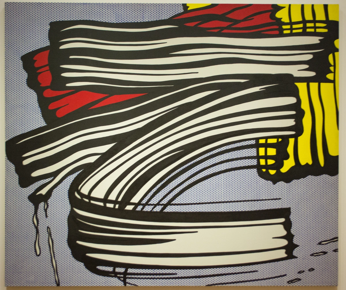
Look closely at "Little Big Painting," for example. It's a brilliant parody, isn't it? Here he is, depicting a monumental, expressive brushstroke – the very symbol of Abstract Expressionist spontaneity and genius – but rendering it not with passionate sweeps, but with his signature, impersonal, almost engineered Ben-Day dots and crisp lines. He’s mimicking the form of the heroic brushstroke, subverting its emotional content by portraying it in a cool, mechanical, detached style. It's a sly jab, a questioning of the supposed authenticity of the "heroic" brushstroke that defined so much post-war art. I love that he could be so playful and profound at the same time, making you chuckle while you contemplate deeper truths about art's illusion – classic Lichtenstein! So, what does this tell us about the power of an image?
Stories on Canvas: Iconic Works and Their Meanings
After mastering his distinctive dotted language, Lichtenstein turned his meticulous eye to subjects that offered rich ground for commentary. He didn't just pick images randomly; he often chose subjects from war comics (like those from DC Comics' All-American Men of War) and romance novels (often inspired by titles like Secret Hearts or Young Romance) for a reason. These genres already dealt in heightened, easily digestible emotional content and often superficial narratives, making them perfect vehicles for his commentary. When most people think of Lichtenstein, two images often spring to mind, powerful examples of his commentary on mass media and emotion:
Whaam!
This diptych (a two-panel painting, for those who, like me, sometimes need a quick art vocab refresh – and let's be honest, who doesn't love a good art history cheat sheet?) is pure cinematic drama frozen in time. A fighter jet firing a rocket, an explosion, and that quintessential comic book sound effect: "WHAAM!" It's visually arresting, full of energy, and, if I'm being honest, incredibly cool. Inspired by a panel from DC Comics' All-American Men of War from 1962, Lichtenstein took something already dramatic and made it monumental. I remember as a kid being utterly mesmerized by these kinds of dramatic panels in actual comic books, but Lichtenstein made me look at them differently.
But it's also a stark commentary on the glamorization of war and violence in popular media. Lichtenstein wasn't celebrating war; he was isolating and presenting its mediated image, forcing us to confront it stripped of its heroic context. It’s a powerful act, taking something disposable and giving it permanence – imbuing it with a weight and critical lens it never had on the pulpy pages of a comic book. It's a thought that often resonates with me when I'm working on a piece – the idea of capturing a fleeting emotion or idea and giving it lasting form, not by replicating, but by reinterpreting, much like he did. What narratives do we blindly accept when presented in a dramatic package?
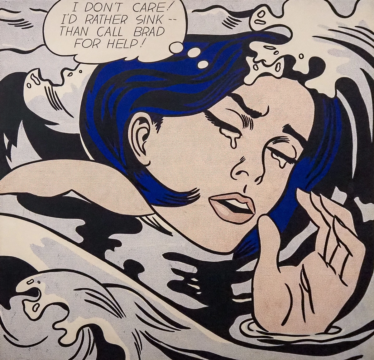
Girl in Mirror
Then there's "Girl in Mirror." We've all seen images of crying women in romance comics, right? The damsel in distress, the heartbroken lover. (Or perhaps it's just me, secretly devouring these melodramatic tales.) Lichtenstein takes this common trope, often found in publications like Secret Hearts or Young Romance, blows it up, and paints it with his signature dots and bold outlines. It’s worth noting that these comics were primarily marketed towards a young female audience, yet often conceived and drawn by men, subtly reinforcing certain narratives about female emotion and vulnerability. The emotion is raw, almost exaggerated, yet it's rendered with that same cool, mechanical precision. It's the kind of image that makes you almost feel the heartache, even as you acknowledge its manufactured nature. He explored this theme repeatedly, with works like Crying Girl and Drowning Girl reinforcing his fascination with heightened, media-driven emotion.
What does it say? Is it a critique of how women were (and often still are) portrayed in media? Is it a reflection on the manufactured nature of emotion in mass culture, where sorrow can be a consumable image? Or is it simply an exploration of how a seemingly simple image, when monumentalized, can provoke complex feelings? I think it's all of that, wrapped up in a visually stunning package. It makes me wonder about the narratives we consume every day without truly questioning them, especially those that define gender roles or emotional responses. And the sheer scale of these works further amplifies the banality, forcing us to confront it as significant art. What hidden messages are woven into the images that surround us?
Beyond the Boom and Blam: Lichtenstein's Broader Artistic Journey
But was Lichtenstein only about the comic book explosions and crying girls? While his comic-inspired works are undoubtedly his most famous, it’s a revelation for many (and certainly was for me!) that Lichtenstein's artistic journey was far more expansive. After all, he was a professor of art who deeply understood art history, and his work was always in dialogue with it. He explored diverse subjects, from his highly stylized Landscapes and Still Lifes – which reimagined traditional genres with his Pop vocabulary – to meticulously crafted Mirrors and even direct recreations and parodies of masterpieces by artists like Pablo Picasso, Piet Mondrian, and Fernand Léger – always through his unique, Ben-Day-dotted lens. He famously parodied the very brushstrokes of the Abstract Expressionists he reacted against, transforming their spontaneous, organic gestures into meticulously planned, almost architectural forms through rigid lines, perfect circles, and bold color fields. This wasn't just playful; it required a deep understanding of art history and immense technical control, a subtle nod to his academic background as a professor. His professorial eye brought a systematic rigor to his "low art" subjects, elevating them with intellectual weight. His early exhibitions, especially at the Leo Castelli Gallery, were commercial successes, attracting significant collectors and demonstrating a public appetite for this new, bold art, despite initial critical skepticism that questioned if it was 'mere copying' or truly 'artistic transformation.' This ongoing debate around his originality and the nature of appropriation became a key part of his questioning legacy. Was he simply lifting images, or was he profoundly re-shaping our perception of them? I lean heavily towards the latter, but the debate itself is part of his genius. If you're curious about the journey of an artist through different phases and influences, perhaps you'd appreciate a look at my own artistic timeline, where I, too, navigate different ideas and expressions.
The Allure of the Mirror Series
Mirrors are tricky things, aren't they? They reflect, but they also flatten, reduce, and sometimes distort. For Lichtenstein, this concept was a perfect fit for his artistic approach. In his "Mirrors" series, he created paintings of mirrors that ironically don't reflect anything specific. Instead, they feature abstract patterns of his signature Ben-Day dots and bold lines, mimicking the way light might catch a mirror's surface without showing a distinct image. It's a brilliant move, forcing us to consider the act of looking and the illusion of depth. These are paintings of mirrors, not actual mirrors, playing with representation and reality, much like his comic book panels were paintings of comics, not the comics themselves. This series further emphasizes his enduring fascination with mediated reality – the idea that we often experience the world through filtered, reproduced, or interpreted images, rather than directly. While perhaps not as instantly celebrated as his comic works, critics saw these pieces as a further, more abstract exploration of his core themes of perception and mediation. It’s another layer to his enduring questioning legacy. How do you think we perceive reality through the lens of mass media today?
His Enduring Legacy and My Take
Roy Lichtenstein didn't just paint pictures; he opened up a whole new way of looking at the world around us. He showed that art could be found in the everyday, in the things we often dismiss as lowbrow or purely commercial. He blurred the lines between high art and popular culture, proving that art could be intelligent, ironic, and accessible all at once. His work sparked debate, too: was he merely a copyist, or a profound innovator? I believe he was absolutely the latter, challenging the very notion of originality and the commodification of images in our society. His flat, mediated aesthetic, once criticized, is now seen as prescient commentary on a world increasingly consumed by mediated realities. While Lichtenstein himself maintained a somewhat detached and analytical stance regarding his art, often stating that he wasn't trying to make a direct social commentary or express deep personal emotion in the traditional sense, the inherent critique of mass culture in his chosen subjects is undeniable. His goal was artistic exploration, but his impact extended far beyond, forcing us to grapple with the meaning embedded in the images that flood our lives.
His influence is still felt everywhere, from contemporary art to graphic design. He taught us to question the images we consume, to look deeper into the seemingly superficial, and to appreciate the artistry in appropriation. And for that, I am eternally grateful. His work, for me, is a reminder that art can be a conversation, a challenge, and a delightful surprise, all at once. It makes me wonder about the everyday images I encounter and how they might be transformed through a different lens – a thought I often carry with me as I develop my own artistic timeline and create the pieces you see in my collection. If his thought-provoking approach to art resonates with you, I invite you to explore pieces available for those who wish to buy art, perhaps finding something that sparks your own revelation about the art that surrounds us. And of course, you can always visit our museum in 's-Hertogenbosch for inspiration and contemplation, where you might find your own "Lichtenstein moment" – a new perspective on something familiar.
Frequently Asked Questions About Roy Lichtenstein
What is Roy Lichtenstein most famous for?
Roy Lichtenstein is most famous for his iconic Pop Art paintings that draw inspiration from comic strips and advertisements. His distinctive style features bold outlines, primary colors, and his signature Ben-Day dots, which mimic the halftone printing process used in commercial comics.
What inspired Roy Lichtenstein's art?
Lichtenstein was inspired by the burgeoning popular culture, mass media, and consumerism of the 1950s and 60s. He wasn't just interested in the subjects themselves, but in the aesthetic of mass-produced imagery – the visual language of comic books, advertisements, and commercial art. He took imagery from these sources (especially war and romance genres known for their heightened, easily digestible emotional content and often superficial narratives), decontextualized them, and transformed them into large-scale artworks. This was a deliberate act to recontextualize and critique. Beyond popular culture, he also engaged in a deep dialogue with art history, often parodying or reinterpreting famous artworks and artistic movements, challenging traditional notions of fine art in the process.
What was Roy Lichtenstein's artistic process like?
Beyond the iconic Ben-Day dots, Lichtenstein's artistic process was incredibly meticulous and analytical. He would often begin by finding source material in comic books or advertisements, then create small drawings and collages to refine the composition. These smaller works would then be projected onto a large canvas, where he would meticulously outline the forms and apply color using a stencil for the Ben-Day dots. This precise, almost industrial method, applied with painterly skill, was a deliberate counterpoint to the gestural spontaneity of Abstract Expressionism, ensuring a clean, anonymous finish that echoed mass-produced imagery.
What is the purpose or meaning behind Lichtenstein's Ben-Day dots?
Beyond simply replicating commercial printing, Lichtenstein's use of Ben-Day dots served multiple artistic purposes. The dots flattened the image, emphasized its artificiality, and highlighted the mechanical nature of mass media. They forced viewers to acknowledge the painting as an object, a representation of reality rather than reality itself, prompting a critical look at how images are consumed and processed in popular culture. They also acted as a deliberate counterpoint to the gestural brushstrokes prized by Abstract Expressionists, making a statement about the detached, intellectual approach to art.
What was the initial reception of Roy Lichtenstein's Pop Art?
When Pop Art first emerged, it was met with a mix of excitement and fierce criticism. Many traditional art critics and audiences dismissed Lichtenstein's work, along with other Pop artists, as being "un-artistic" or merely copying commercial images. They questioned its artistic merit, seeing it as superficial or even a mockery of serious art. Life magazine even famously ran a story in 1964 asking, "Is He the Worst Artist in the U.S.?" However, it quickly gained popularity, especially with younger generations, for its fresh perspective and incisive commentary on modern life, eventually being recognized as a groundbreaking movement, critically embraced by the mainstream art world.
How did Roy Lichtenstein influence contemporary art and design?
Lichtenstein's influence is vast and continues to shape contemporary art and design. He legitimized the use of commercial imagery and popular culture as subjects for fine art, paving the way for future movements like Postmodernism. His graphic style, bold use of color, and iconic Ben-Day dots have become instantly recognizable and are still referenced by artists, illustrators, and designers globally. He also profoundly impacted how we critically view mass media and consumer society, teaching us to question the images that surround us daily.