The Emotional Palette: How I Choose Colors for My Abstract Art
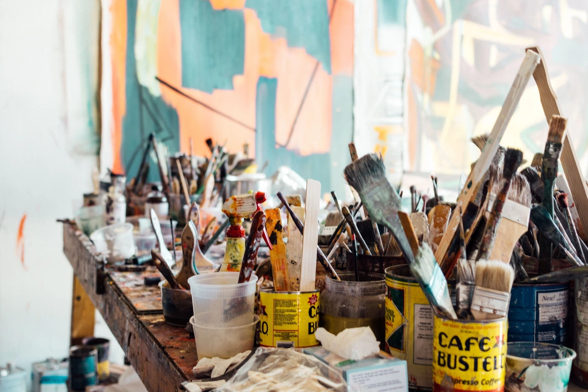
You know, sometimes I sit in my studio, surrounded by tubes of paint, and I feel a bit like a kid in a candy store – overwhelmed, excited, and slightly terrified of making the "wrong" choice. But here’s the thing about abstract art, and especially about my relationship with color: there’s no wrong choice, only a path. It’s a path I walk with my gut, my heart, and sometimes, a completely arbitrary decision that somehow ends up making perfect sense. This isn't a science lecture; it's a peek into my often-messy, always-evolving emotional palette.
More Than Just Hues: My Personal Color Philosophy
For me, color isn't just a visual element; it's a language, a whisper of a feeling, a shout of an experience. It’s how I pour my inner world onto the canvas without relying on recognizable forms. If you've ever felt a pang of nostalgia from a dusty rose or a surge of energy from a fiery orange, you get it. Colors have this incredible power to bypass the logical mind and go straight for the emotional jugular. It’s a concept I explore often, especially in my thoughts on the emotional language of color in abstract art.
I’ve never been one for strict color theory rulebooks. Don’t get me wrong, understanding a color wheel and the basics is like knowing your alphabet – helpful, sure. But true communication happens when you start writing poetry, not just spelling words. My approach is far more about what a color feels like than what it is on a chart. It's about how it talks to its neighbours on the canvas. A deep indigo next to a muted gold, for instance, often whispers of quiet contemplation and hidden depths for me.

The Intuitive Dance: When Colors Choose Me
"So, how do you pick?" people often ask. My honest answer? Sometimes I don't. Sometimes, a color just screams at me from the tube. It might be the vibrant red that echoes a frustrating day, or the serene blue that reminds me of a quiet morning walk. I’ll squeeze it onto my palette and let it lead. This intuitive leap, this gut feeling, is a massive part of my creative process.
There was this one time, I was completely stuck on a piece. Nothing felt right. I walked away, made a cup of tea, and while staring out the window at a particularly dreary, grey sky, a flash of neon pink popped into my head. Pink! For a grey day? It made no sense logically. But I went back, dabbed that shocking pink onto the canvas, and suddenly, the whole piece clicked. It was the jolt it needed, the unexpected rebellion that made the quiet greys sing. It felt like the color chose me, not the other way around. It's a bit like finding your abstract voice - sometimes you just have to listen to the whispers.

Decoding the Rainbow: Conscious Choices and Emotional Impact
While intuition is my co-pilot, there's also a conscious layer to my choices. I do think about the general emotional associations of colors, not as rigid rules, but as starting points for a conversation. For instance, blues often bring a sense of calm or melancholy, while yellows can radiate joy or even a hint of anxiety. This exploration of color's psychological impact isn't new; artists like the Impressionists pioneered how light and color could manipulate mood, paving the way for contemporary masters to push these boundaries further.
My challenge, and my joy, is to push these boundaries. Can I make blue feel agitated? Can yellow feel somber? For example, I might make blue feel agitated by pairing it with a jarring streak of neon green, or make yellow somber by muting it with a touch of raw umber, letting it bleed into shadowy greys. By layering and juxtaposing, by letting colors bleed into each other or stand starkly apart, I manipulate these emotional currents. It's like building a complex chord in music – each note (or color) contributes to the overall feeling. Understanding how artists use color isn't just about mixing paint; it's about mixing emotions. This is truly the essence of the power of color in abstract art for me.

The Happy Accidents and the Ugly Truths
Let's be real: not every color choice is a stroke of genius. Sometimes I mix something that looks like mud. You know, the kind of mud that even a pig wouldn't be proud to wallow in. And sometimes a beautiful color, when placed next to another, just… dies. It’s like when you meet someone lovely, but they just don't have chemistry with your best friend. It happens, and boy, does it humble you.
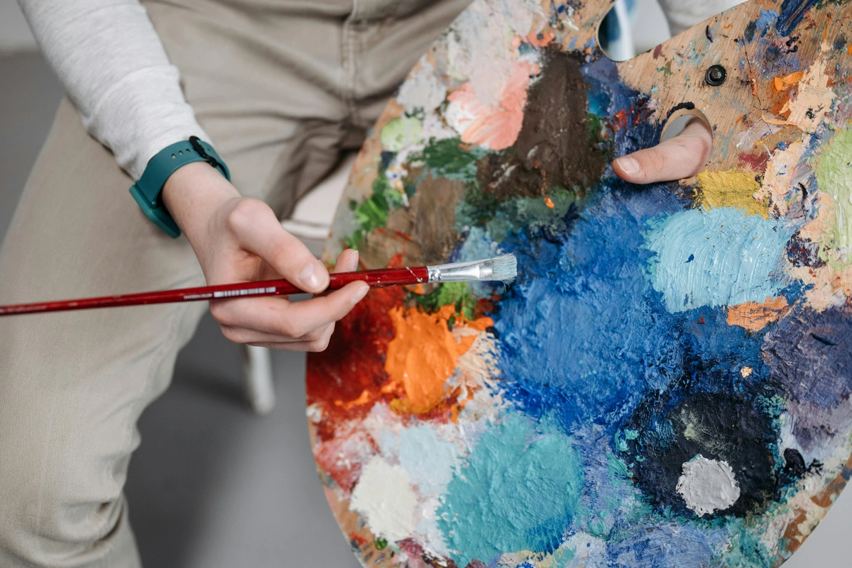
My primary medium, acrylics, allows for rapid layering and bold gestures, which greatly influences how I approach color – sometimes thick and impasto, sometimes thin and watery, each texture adding another layer to the emotional dialogue. I've learned to embrace these "failures" as part of the process. They teach me more about color relationships than any textbook ever could. It’s a constant dance of experimentation, a willingness to scrape off layers or paint over an entire section if it’s just not singing. My studio has seen its share of 'ugly duckling' canvases before they transformed. The journey is messy, but the discoveries are worth it.

My Palette, My Story: Beyond the Canvas
Choosing colors for my abstract art isn’t just about the painting itself; it's a reflection of my philosophy on life. It's about trusting your instincts, being brave enough to make a mess, and knowing that even the "wrong" choice can lead to an unexpected, beautiful discovery. It’s about accepting that some things are beyond logical explanation, and that’s perfectly okay.
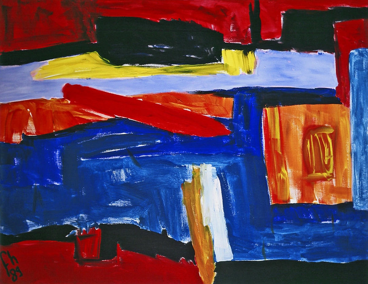
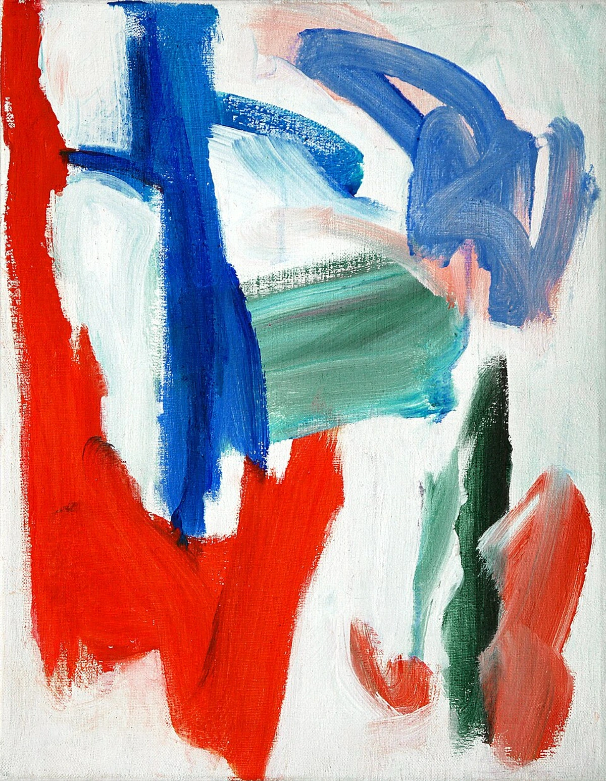
This evolving relationship with color is a huge part of my artistic journey, a timeline that continues to unfold. You can see how my use of color has developed and transformed. And, of course, if you're curious to see how these emotional palettes manifest in actual works, you're always welcome to browse my art for sale or even visit my museum in 's-Hertogenbosch if you're ever in the Netherlands.
Frequently Asked Questions about Color in Abstract Art
As I share my process, I often find myself addressing common curiosities about abstract art and color. So, for those of you with burning questions, I’ve gathered some answers here:
How do you know what colors to use if there's no subject?
For me, it's a mix of intuition, emotional resonance, and experimentation. I often start with a feeling or a mood I want to convey, or sometimes just a single color that calls to me. From there, it's about building a dialogue between colors, seeing how they interact and what emotions they evoke together. It's less about "knowing" and more about "feeling" and "discovering."
Do specific colors always represent the same emotion in abstract art?
Not necessarily. While there are general psychological associations (e.g., red for passion, blue for calm), in abstract art, context is everything. The way a color is applied, its intensity, its texture, and the other colors around it can drastically alter its emotional impact. A vibrant red might feel aggressive in one painting and joyful in another. It's highly subjective and open to interpretation. This is part of what makes abstract art so compelling and personal.
How can I interpret the colors in an abstract painting?
The best way to interpret colors in abstract art is to let go of the need for literal meaning and simply feel. What emotions do the colors evoke in you? Do they make you feel energetic, peaceful, tense, thoughtful? Trust your own emotional response. Pay attention to how the artist uses contrast, harmony, and repetition of color. It's a conversation between the artwork and your own inner world.
Conclusion
My journey with the emotional palette is far from over. Each canvas is a new conversation, a fresh experiment, a deeper dive into the infinite ways colors can speak without words. It’s a beautiful, challenging, and intensely personal process that I wouldn't trade for anything. I hope this peek into my colorful world gives you a new lens through which to view not just abstract art, but perhaps even to explore your own emotional landscapes through color in your daily life. Maybe that dull grey sky outside your window is just waiting for its shocking pink moment.