
Unveiling Art's Soul: Your Guide to Lighting & Preservation from an Artist's Perspective
Deepen your connection with art. Explore an artist's personal journey through optimal lighting, UV protection, CRI, and preserving cherished pieces, ensuring they truly glow.
Unveiling Art's Soul: My Deep Dive into Illuminating & Protecting Your Cherished Art
I've got a confession. For years, I thought hanging art was the end of the story. You buy a piece you love, you find a spot on the wall, and voilà! Instant aesthetic upgrade. Oh, how wonderfully naive I was. It wasn't until I started truly seeing how light—or the lack thereof—could utterly transform a painting that I realized: lighting isn't an afterthought; it's the co-creator of the mood, the silent storyteller that whispers to your art. It's a journey of discovery, really, much like the process of how to abstract art itself—full of experimentation and unexpected revelations. My own journey as an artist has been profoundly shaped by light, from the natural morning sun in my studio that defines early brushstrokes, to the carefully curated illumination of finished pieces. In this guide, I'll share my personal insights and practical tips to help you illuminate and protect your cherished art, blending both aesthetic enhancement and crucial preservation, covering everything from understanding light sources to the nitty-gritty of angles and color temperatures.

[credit](Zen Dageraad), licence
It's a bit like making a perfect cup of coffee. You can have the best beans, but if you brew it wrong, it's just... coffee. Art is similar. You can have the most vibrant abstract piece or a deeply contemplative landscape, but if it's hidden in shadow or blasted by harsh, unforgiving light, it loses its soul. My own art, often bursting with color and texture, lives and dies by how it's illuminated. And let me tell you, I've had my share of "deaths" before I figured out the magic behind the glow. Perhaps it's just another one of those peculiar artist obsessions, but once you truly see it, there's no going back. This is about more than just general room lighting; it's about dedicated attention to each piece. So, how can we truly make our art sing?
The Magic Behind the Glow: Why Lighting Matters (and My Little Obsession)
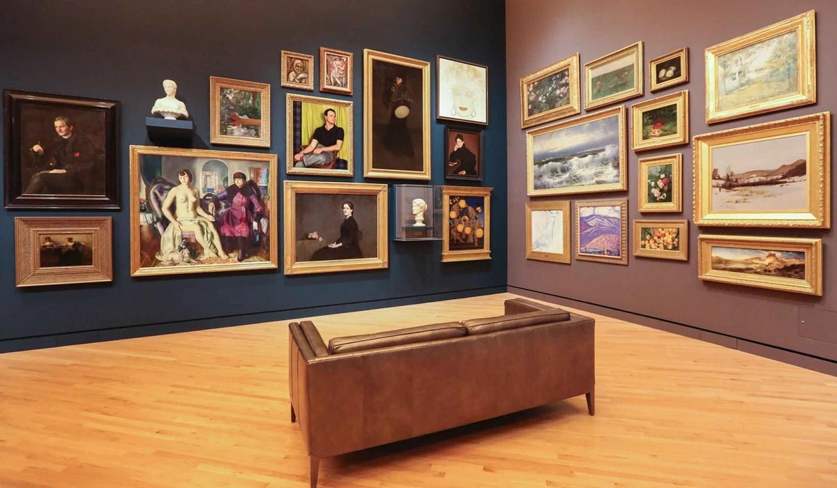
You know that feeling when you walk into a room, and everything just feels right? Often, that feeling is orchestrated by light. For art, it's even more critical. Light can reveal hidden textures, make colors pop, and guide your eye to the very heart of the artist's intention. Without it, a painting can feel flat, lifeless, a mere decoration. With it, it becomes a focal point, a conversation starter, a window to another world. And without dedicated art lighting, your precious pieces can become victims of "light pollution" – where general room illumination washes out their nuances, preventing them from truly shining, and even diminishing their perceived value.
I remember one time, I was admiring a new piece I'd acquired—a textured abstract with layers of vibrant blues and reds. In the daytime, it was lovely. But then, as evening fell and my living room's general lighting took over, it just... faded. The blues became muddy, the reds lost their fire. It was like the painting had gone to sleep. I fiddled with a floor lamp, angled it just so, and suddenly, bam! The textures came alive, casting subtle shadows that added depth I hadn't even noticed. The colors vibrated with newfound energy. It was like the painting had woken up, stretching and yawning. That's when I became obsessed, utterly convinced of light's transformative power.

Protecting Your Precious Pieces: Beyond Just Avoiding Sunlight
But before we get too carried away with the magic of revealing art's soul, there's a crucial, less glamorous side to consider: preservation. Not all light is good light. Natural sunlight, while beautiful, is a notorious art killer. Its UV rays can fade pigments over time, turning your vibrant masterpiece into a pale ghost of its former self. So, while I adore a sun-drenched room, I learned the hard way that direct sunlight on art is a no-go. This is why when I started investing in more valuable pieces, or even just my own works that I wanted to preserve, I began looking into protective glazing. Options like UV-filtering glass or acrylic block a significant percentage of harmful UV rays, offering an invisible shield. And for those pieces prone to reflections, anti-reflective museum glass is a game-changer; it makes the glass practically disappear, allowing the art to be seen without distraction. It's an investment in longevity, often saving you heartache and depreciation in the long run. Beyond light, subtle environmental factors like humidity and temperature fluctuations, and even airborne pollutants like dust and smoke, are silent destroyers, causing canvases to warp, paint to crack, or delicate materials to degrade. The long-term integrity of your art also relies on proper framing choices, such as acid-free mounting materials and sealed backing to prevent moisture and pollutants from entering.
To truly master preservation at home, consider these actionable steps:
- Monitor Conditions: Invest in a digital hygrometer/thermometer to track humidity and temperature. Aim for a stable environment: generally, 40-55% relative humidity and 18-24°C (64-75°F) are ideal for most art forms. Extreme fluctuations are worse than slightly off, but stable, conditions.
- Control Humidity: In dry climates, a humidifier can help. In damp environments, a dehumidifier is essential. Ensure devices are well-maintained and don't introduce excess moisture or dust themselves.
- Avoid External Walls & Vents: These areas are prone to greater temperature and humidity swings. Position art away from direct heat sources (radiators, fireplaces) and air conditioning vents.
- Gentle Cleaning: Dust delicate surfaces with a soft, dry brush. Never use chemical cleaners on artwork unless specifically recommended by a conservator for a particular piece.
Maintaining stable conditions is just as vital for long-term preservation. For more on protecting your art, you might find this guide on abstract art display useful.
Key Takeaway: Art lighting transforms art from mere decoration to a focal point, but protecting pieces from harmful UV rays, heat, and environmental factors like humidity, temperature, and airborne pollutants is paramount. Implementing stable environmental controls and proper framing ensures your art is seen truly and lasts longer, preserving both its aesthetic and intrinsic value.
Know Your Light Sources: A Personal Tour of My Favorites (and Follies)
Stepping into the world of art lighting can feel like wandering into a vast, shimmering showroom, each fixture promising a different kind of magic. It's a bit overwhelming, really, with a dizzying array of options, each with its quirks. Historically, art illumination has evolved dramatically. From the soft, ambient glow of candles and early gaslight in grand salons that transformed viewing experiences, to the less forgiving incandescents and halogens known for their warm glow, their heat output and lack of UV filtering made them less ideal for art. Today, LEDs reign supreme, offering unmatched efficiency, minimal heat, and crucial UV protection. Here are a few LED-based options that have become my trusted companions (and one or two that have taught me valuable lessons).
Recessed Lighting: The Subtle Whisper
Recessed lights, integrated into the ceiling, are fantastic for a clean, minimalist look. They're less about drawing attention to the fixture itself and more about the effect it creates. For art, you'll want "aimable" recessed lights so you can direct the beam. They're subtle, sophisticated, and perfect for creating an ambient glow that subtly highlights your art without being overtly "lit." It's the kind of lighting that works in harmony with the architecture, a silent partner to your curated pieces. I find they're brilliant for creating an overall sense of calm while still giving each piece its moment.
Track Lighting: My Go-To for Flexible Brilliance
If I had to pick one MVP, it would be track lighting. Its versatility is unmatched. You can aim the individual lights precisely, highlighting multiple pieces or even different areas of a single large work. It's like having a little team of spotlights at your command, ready to jump to attention. The beauty of track lighting is its adaptability – it's perfect for when your art collection, much like my own restless creative spirit, is constantly evolving and rearranging.

I particularly love it for a gallery wall or when I'm frequently rearranging my collection (which happens more often than I'd care to admit). The only downside? Installation can be a bit more involved than, say, plugging in a lamp. And yes, I've had my share of track lighting "oops" moments – like the time I proudly installed a new system, only to discover I'd used bulbs with too narrow a beam spread, creating harsh circles of light rather than an even glow. Imagine trying to illuminate a broad landscape with a tiny penlight or a pinpoint laser! It looked like a disco ball effect on a serene canvas – definitely not the mood I was going for. A wide beam spread (e.g., 36-60 degrees) is usually ideal for artwork, allowing the light to gracefully wash over the canvas from a comfortable distance, while a narrow beam (e.g., 10-25 degrees) creates a focused spotlight, better for small, intricate details or sculptures. Lesson learned: always check the beam angle! Also, be aware that some lower-quality LEDs can exhibit a phenomenon called "color shift" over many years, subtly altering the light's temperature. It's another reason to invest in reputable brands.
Picture Lights: The Classic, Sometimes Finicky Choice
Ah, the picture light. The elegant, often brass-finished bar that sits proudly above a painting. It screams sophistication, doesn't it? When done right, they're beautiful. They offer a focused, even wash of light across the canvas. They’re like a perfectly tailored suit for your art, but getting that fit just right can be… a journey. I once bought one that was far too small, making my bold abstract look like it was wearing a tiny, ill-fitting hat. Scale matters, friends!
However, they can be tricky. If the light isn't positioned correctly or the bulb is too bright, you can end up with harsh hot spots or unflattering shadows. I've seen some that just shine a glaring stripe across the top of a painting, leaving the bottom half in relative darkness. Not ideal, and definitely something I learned to avoid through trial and error. It's an easy mistake to make when you're caught up in the excitement of a new piece.
Key Takeaway: For different needs, recessed lighting provides subtle integration, track lighting offers unparalleled flexibility for evolving collections, and picture lights deliver classic elegance with specific positioning challenges. Understanding beam spread and the potential for color shift in LEDs is crucial, along with the historical shift from less art-friendly bulbs to modern LEDs.
The Nitty-Gritty: My Top Tips for Illuminating Your Masterpiece (No Degree Required)
So, you've got your light source. Now, how do you actually make your art sing? Here are the golden rules I've gathered through years of experimentation (and yes, some mild frustration).
1. The Angle of Attack: The Magical 30-Degree Rule
This is probably the most crucial tip. For paintings, aim your light source at a 30-degree angle to the surface of the art. What does this mean? Imagine your art is on a wall, and you're drawing a line from the light source to the art, then another line straight out from the art's surface. The angle between these two lines should be 30 degrees. Or, simply put, position your light source slightly in front and above the artwork, allowing the beam to wash down. Think of it as placing the light about as far in front of the art as it is above the top edge. This angle ensures that the light hits the surface and reflects away from the typical viewer's eye level, minimizing glare and reflections, especially on framed art with glass or highly textured pieces.
This creates a beautiful, even illumination that brings out colors and textures without harsh shadows. I remember the first time I consciously applied this rule to a particularly challenging piece – an abstract oil painting with significant impasto. Suddenly, the deep ridges and valleys of the paint, which had previously looked flat under general room lighting, came alive, casting subtle, dancing shadows that added incredible depth. It was a revelation, and for how to choose the right lighting for your abstract art collection, it's truly a game-changer. My own art for sale, particularly my textured abstract pieces with impasto, often benefits from this approach, where light dances across the peaks and valleys of the paint. Also, consider your typical viewing distance; for closer viewing, a slightly wider beam or more diffused light might be preferred to avoid hot spots.
2. Brightness (Lumens & Dimming): Don't Overdo It
It's tempting to blast your art with as much light as possible, thinking "more light equals more visibility." But often, less is more. Excessive brightness can wash out colors, create an unpleasant glare, and even accelerate fading. The ideal brightness (measured in lumens) depends on the room's ambient light and the art itself. This is where dimmers become your best friend. Being able to adjust the intensity of the light allows you to adapt to different times of day or different moods. It's truly transformative, allowing you to fine-tune the drama and subtlety of a piece.
3. Distance: Not Too Close, Not Too Far (and Mind Your Beam Spread)
Picture lights, especially, need to be positioned correctly relative to their size and the artwork. If too close, you get hot spots and uneven illumination. Too far, and the light disperses too much, losing its impact. A general rule for picture lights is that they should extend approximately two-thirds the width of the painting and be mounted about 5-6 inches above the frame. For track lighting and other accent lights, you'll adjust the distance based on the beam spread (how wide the light beam is) of your chosen bulb. A wider beam spread means you can position the light further away and still get even coverage, whereas a narrow beam needs to be closer to avoid creating a harsh spotlight effect. Think of a wide beam as a soft floodlight and a narrow beam as a pinpoint laser.
4. Color Temperature & Color Rendering Index (CRI): Setting the Mood and Seeing True Colors
Light isn't just bright or dim; it also has a "color" – its temperature, measured in Kelvins (K) – and a quality that determines how accurately it renders colors – its Color Rendering Index (CRI).
- Warm Light (2700K-3000K): Think a cozy, slightly yellowish hue, like candlelight or the glow of a sunset. Great for traditional art, portraits, or creating a warm, inviting atmosphere.
- Neutral to Cool Light (3500K-5000K+): Brighter, whiter light, similar to natural daylight or a bright office. Excellent for modern, abstract, or vibrant pieces where you want colors to appear crisp and true to life. I usually lean towards a neutral to slightly cool white (around 3500K-4000K) for my own abstract works because it really makes the pigments pop without altering their intended hue. I still remember the first time I switched from a low-CRI bulb to one with a CRI of 95 for a new painting – it was like the colors had been asleep, and a high-CRI light had just given them a jolt of espresso! For more on the emotional language of color in abstract art, understanding color temperature and CRI is vital.
Now, about CRI: this is a scale from 0 to 100 that indicates how accurately a light source reveals the true colors of objects compared to natural light. For art, you absolutely want a high CRI, ideally 90 or above. Think of CRI like a camera sensor's ability to capture accurate colors: a high-CRI bulb is like a professional camera, capturing every nuance, while a low-CRI bulb is like a cheap phone camera, washing out or distorting hues. A low CRI bulb can make colors look dull or distorted, even if the Kelvin temperature seems right. It sounds technical, but honestly, it's just about ensuring your vibrant reds look red, not brownish, and your blues look true, not murky. But for a more intimate, cozy setting, a warmer light can be just perfect. Experiment!
5. Medium Matters: Different Art, Different Needs
The type of art you're lighting dictates the best approach. Beyond the general principles, specific mediums have their own quirks. For instance, oil paintings with impasto (thick texture) thrive on angled light that creates subtle shadows, enhancing their three-dimensionality. In contrast, delicate watercolors or pastels require a softer, more diffused light to avoid any harshness or color shift, and they are particularly sensitive to intense light. Here's a quick guide to some common types:
Art Medium | Lighting Considerations | My Personal Tip |
|---|---|---|
| Abstract Paintings | Emphasize texture, color vibrancy. Avoid glare on glossy finishes. Different styles need different focus: Gestural abstracts benefit from light that highlights brushstrokes and movement, revealing the artist's energy. Minimalist abstracts with subtle textures might need a soft, even wash that reveals nuances and delicate shifts. Geometric abstracts with sharp lines and bold colors can handle more direct, crisp light that emphasizes their structure and precision. | Use a neutral to cool white light (3500-4000K) at a 30-degree angle with high CRI (90+). Dimmers are crucial to fine-tune intensity. My own art for sale often benefits from this approach. |
| Sculptures / 3D Art | Highlight form and shadow, emphasizing contours and volume. Multiple light sources from different angles can create dramatic effects, a technique sometimes called "light sculpting." Use focused spotlights or gooseneck lamps to define contours and textures, for instance, highlighting the intricate patinas on a bronze statue or the smooth, cool surface of a marble bust, revealing the sculptor's hand. Consider a combination of top, side, and even bottom lighting for intricate details. | Experiment with side lighting or a combination of overhead and accent lights to define contours. Consider a dedicated plinth light for dramatic upward illumination. Play with shadows to enhance form and create depth. |
| Photography / Prints | Avoid reflections on glass. Use anti-glare glass if possible. UV protection is paramount due to light sensitivity. Lighting should reveal subtle tonal gradations and fine details without washing them out. Be mindful of print surfaces – matte prints absorb light, while glossy ones reflect it, often benefiting from a slightly softer, more diffused light to minimize glare. | Ensure lights are not directly opposite the viewer. Use museum-quality LED lights with low UV output. A soft, even wash can bring out print detail without glare. |
| Textile Art / Tapestries | Gentle, even wash of light. Avoid direct, intense heat, which can damage fibers and cause fading. Diffused light is key to reveal intricate weaves and colors without harshness. | Soft, diffused lighting from a distance. Low-heat LED bulbs are essential. Avoid direct spotlights that might create hot spots or fading over time. |
| Mixed Media Art | Often combines diverse textures and materials (paint, collage, objects). Lighting must enhance varied surfaces without creating harsh shadows or glare. The goal is to illuminate each component respectfully, from delicate paper to thick impasto. | A combination of soft ambient light and a focused, dimmable spotlight (with a wider beam spread) can help bring out different textural elements without overwhelming the piece. Aim for a balanced, nuanced approach, perhaps even using multiple lights at varied angles. |
6. Ambient Room Lighting: The Supporting Cast
While dedicated art lighting focuses on individual pieces, don't forget the ambient room lighting. It's the supporting cast that sets the overall stage. Art lighting should complement, not compete with, the general room light. A harmonious blend ensures your art stands out as a focal point without feeling isolated or over-lit. Consider dimming capabilities for both ambient and accent lights to allow for flexible mood setting.
7. UV, IR, and Heat Protection: The Unsung Heroes (and Ethical Obligation)
I've already touched on this, but it bears repeating. Always, always choose LED bulbs specifically designed for art lighting. They emit virtually no UV radiation and very little heat, and crucially, minimal infrared (IR) radiation, which can also contribute to the degradation of delicate materials over time. These are all enemies of your precious artworks. Spending a little more on proper bulbs is an investment in your art's longevity and visual impact. It's a small price to pay to keep your art vibrant for years to come. Think of it as a long-term relationship with your art – you want to keep it healthy and glowing for as long as possible. Beyond preservation, there's also an ethical consideration here: as custodians of art, we have a responsibility to display pieces in a way that respects their integrity and ensures they can be enjoyed for generations, without unnecessary damage from over-lighting or poor choices that might misrepresent the artist's original intent. We must strive for enhancement, not misrepresentation, letting the art speak for itself, guided by light.
Key Takeaway: Master the 30-degree rule and viewer distance, choose appropriate color temperature and high CRI, use dimmers, mind distance (and beam spread), tailor lighting to the medium (including light sculpting for 3D art), balance with ambient light, and always prioritize UV, IR, and heat protection with LEDs. These steps ensure authenticity and longevity.
Beyond the Basics: The Continuous Journey of Light and Perception
My journey with art lighting hasn't been without its blunders, as I've shared. But the biggest lesson? Don't be afraid to experiment. Move lights around, try different angles, play with color temperatures. What works for one piece might not work for another. The goal is to find what makes your art sing, what brings out its unique personality. Sometimes it takes a bit of tweaking, a bit of stepping back and squinting, but when you get it right, it's incredibly rewarding.
It’s like setting the stage for a performance. You want every detail to enhance the main act, not distract from it. And remember, the viewer's perspective is also crucial. Where do you typically stand or sit when admiring the piece? The optimal lighting should ideally cater to that primary viewing angle, minimizing reflections from your vantage point. It's about crafting an experience, not just illuminating an object.
The Subtle Art of Framing with Light & Its Psychological Echoes
Lighting can also act as an invisible frame, drawing the eye precisely where the artist intended. By strategically directing light, you can emphasize certain colors, highlight textural nuances, or even create a sense of depth that wasn't immediately apparent. It's a dialogue between the art and the light, guiding the viewer's gaze and focus. This subtle framing extends to the psychological impact as well. Just as a spotlight on an actor commands attention, well-lit art can become the emotional anchor of a room, influencing mood and atmosphere. It's this continuous interplay of light, art, and emotion that makes the pursuit so fascinating. The right light can make a room feel more expansive, an artwork more profound, a mood more contemplative.
It's not just about seeing; it's about feeling. The way a piece is lit can make it feel inviting, mysterious, dramatic, or serene, directly impacting how we connect with it and even its perceived value. On the flip side, over-lighting can flatten a piece, make colors appear unnatural, and paradoxically, make the art less engaging by creating a sterile, uninviting look. It's a delicate balance.
Historically, the evolution of art illumination mirrors our changing relationship with art. From the flickering firelight in ancient caves that brought painted figures to life with dancing shadows, to the controlled daylight of an Old Master's studio, then to the transformative glow of gaslight in grand salons, and finally, the precise control of electricity in modern galleries—each advancement has offered new ways to perceive and connect with art. It's a bit like how the very first humans might have understood art in their dimly lit caves, with firelight flickering over painted surfaces, bringing figures to life with dancing shadows – a primal connection. This rich history informs our present choices, reminding us of light's profound influence.
What unexpected discoveries have you made about lighting your own collection? And what ethical lines do you draw between enhancing a piece and potentially over-dramatizing it, or even causing damage?
It's a fantastic way to gather inspiration, and if you're ever in the mood to see how art is professionally displayed and lit, consider a trip to my museum in 's-Hertogenbosch. You might even glimpse a piece from my artist's journey there. This journey of understanding light is truly a continuous one, much like the process of building depth and narrative in my abstract mixed-media works.
FAQ: Answering Your Burning (or Rather, Gently Glowing) Questions
Here are a few common questions I get about art lighting:
Q: Can I just use regular home lights to illuminate my art?
A: You can, but it's not ideal. Regular household bulbs often lack the focused beam control, appropriate color temperature, and crucial UV, IR, and heat protection that dedicated art lighting offers. While general room lighting creates ambiance, it rarely does justice to individual artworks. Think of it like trying to cook a gourmet meal with only a microwave; you can, but it won't be the same.
Q: What about smart lighting systems? Are they good for art?
A: Absolutely! Smart lighting systems (like Philips Hue, for example) can be fantastic. Many offer adjustable color temperature and dimming capabilities, allowing for incredible flexibility and customization. Just ensure you select bulbs with good Color Rendering Index (CRI > 90) and low UV/IR output to ensure accurate color representation and art protection.
Q: How much does professional art lighting cost?
A: It varies wildly! The cost depends on the number of pieces, the type of fixtures, and whether you opt for a DIY installation or professional service. The exact cost depends heavily on factors like fixture type, brand reputation, complexity of installation, and regional pricing. These are rough estimates and can vary significantly.
- DIY Budget-Friendly (e.g., clip-on picture lights, single track fixture with 1-2 LEDs): €50 - €200 per piece.
- Mid-Range Home Setup (e.g., several quality track lights or recessed fixtures, professional-grade LEDs): €200 - €800 per piece, or €500 - €2000+ for a room setup.
- High-End Museum-Grade Systems (e.g., advanced wireless controls, custom architectural lighting, professional installation): €1000+ per piece, often running into many thousands for larger collections or spaces.
Think of it as an investment in your art's longevity and visual impact.
Q: Is LED lighting always the best choice for art?
A: In most modern applications, yes. LEDs are energy-efficient, produce very little heat, and critically, emit almost no harmful UV or IR radiation. They also offer excellent color rendering (especially high CRI LEDs) and a long lifespan, making them superior to older incandescent or halogen options for art preservation and display.
Q: Can light from LEDs cause heat damage to my art?
A: While LEDs produce significantly less heat than traditional bulbs, they do generate some. The risk of heat damage is generally very low, especially if you maintain proper distance between the light source and the artwork (as discussed in tip #3). For very delicate or sensitive pieces, ensure there's good air circulation around the art and avoid placing lights in enclosed spaces without ventilation. Always prioritize safe distances.
Q: Can I use natural light to illuminate my art, and how can I do it safely?
A: Natural light is beautiful, but also the most damaging due to UV and intense visible light. While ideal for general room ambiance, direct natural light on art is a significant risk for fading. If you want to leverage natural light safely, consider: UV-filtering window films, sheer curtains or blinds to diffuse light and reduce intensity, and positioning art on walls that don't receive direct sunlight throughout the day. Always prioritize UV protection, even with indirect natural light.
Q: How should I light framed artwork (especially with glass) or unframed pieces?
A: For framed artwork with glass, the 30-degree rule is paramount to minimize glare. Anti-reflective museum glass is a worthwhile investment. For unframed artwork (like canvas paintings or murals), you have more flexibility, but still aim for even, diffused light to avoid hot spots. Consider the surface finish: highly textured or glossy unframed pieces will still benefit from angled light to enhance depth and prevent glare, while matte surfaces can often handle more direct illumination without issue.
Q: What's the difference between lighting for display and lighting for conservation?
A: This is a great distinction. Lighting for display (which this guide focuses on) aims to enhance aesthetic appeal, reveal details, and create mood, often in a home or gallery setting. Lighting for conservation, typically employed in museums, prioritizes the long-term preservation of the artwork above all else. This means ultra-low light levels, strict UV and IR filtration, minimal exposure times, and extremely stable environmental controls. While some principles overlap (like UV protection), conservation lighting is far more restrictive to prevent any degradation.
Conclusion: Let There Be Light (And Your Art Will Thank You)
Art lighting, for me, has gone from a technical detail to a passionate pursuit. It's about bringing out the soul of a piece, respecting the artist's work, and enhancing your living space in a way that truly connects with you. It's not just about seeing the art; it's about experiencing it. The language of light, as I explore in my abstract compositions, is as powerful as the brushstroke itself.
So, go forth and illuminate! Don't be afraid to experiment, to play, and to discover what makes your favorite pieces truly glow. Your walls, your art, and your inner art enthusiast will thank you. Now, which piece in your collection will be the first to receive your perfected glow this week? Start experimenting with your own art today!


