
The Artful Alliance: Pairing Abstract Art with Wood Furniture
Discover how to harmoniously blend the warmth of wood furniture with the expressive power of abstract art. This guide offers practical tips and inspiring ideas to create a balanced, stylish, and deeply personal interior that truly speaks to you.
The Artful Alliance: Pairing Abstract Art with Wood Furniture
Wherever I look these days, whether it's through the lens of a camera, flipping through a design magazine, or simply walking into a wonderfully curated home, I notice a timeless partnership that just works: the dynamic dialogue between abstract art and wood furniture. It's a pairing that speaks volumes about texture, contrast, and the quiet harmony between nature's raw beauty and human expression.
The Beautiful Tension: Why This Pairing Just Works
I've always been fascinated by how different elements can create something greater than the sum of their parts. Think about it: wood furniture brings a sense of history, grounding, and natural tranquility. It's often where we gather, where we relax. Then you introduce abstract art, which, by its very nature, encourages us to look deeper, to feel rather than just see.
This interplay creates a beautiful tension. The wood anchors the abstract piece, preventing it from feeling adrift, while the art injects energy and a contemporary edge that prevents the wood from feeling too traditional or heavy. It's like finding the perfect dance partner – one leads with structure, the other with free-form grace.
The Core Elements: Texture, Tone, and Form
When you're thinking about combining these two, consider these fundamental aspects:
- Texture: Wood offers tangible texture – smooth, rough, polished, raw. Abstract art, even on a flat canvas, often implies texture through brushstrokes, layering, or impasto. The contrast or harmony here is key.
- Tone/Color: Wood ranges from light birches and maples to rich walnuts and deep mahoganies. The color palette of your art can either complement these tones (warm art with warm wood) or create a striking contrast (cool art with warm wood).
- Form: Wood furniture often has defined, architectural forms. Abstract art, in turn, can introduce organic curves, sharp angles, or fluid shapes, offering a visual counterpoint that invigorates the space.
Your Personal Guide to Harmonious Pairings
Alright, let's get down to the practical magic. You want to make your home feel cohesive, inspired, and uniquely you. And frankly, choosing art for your living room can feel like a big decision. Here's my approach to creating that perfect synergy:
1. Know Your Wood: The Foundation of Your Aesthetic
The type of wood furniture you have sets an immediate tone. Are your pieces light and minimalist, dark and stately, or rustic and weathered?
- Light Woods (Maple, Ash, Birch, Light Oak): These woods bring an airy, often Scandinavian or modern coastal feel. They love vibrant, energetic abstract art with clear, bold colors or soft, ethereal pieces that lean into their lightness.
- Mid-Tone Woods (Cherry, Teak, Walnut): These are versatile and warm, offering a classic or contemporary richness. They pair beautifully with abstract art that has depth – perhaps pieces with nuanced color palettes, mixed media, or subtle textural variations.
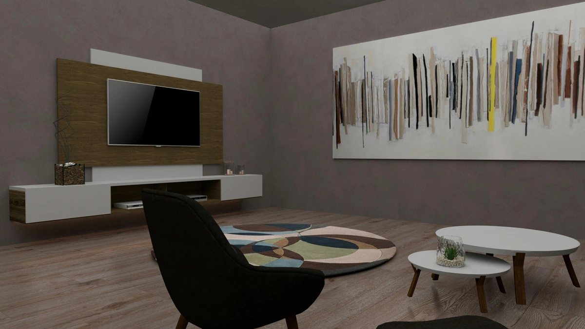
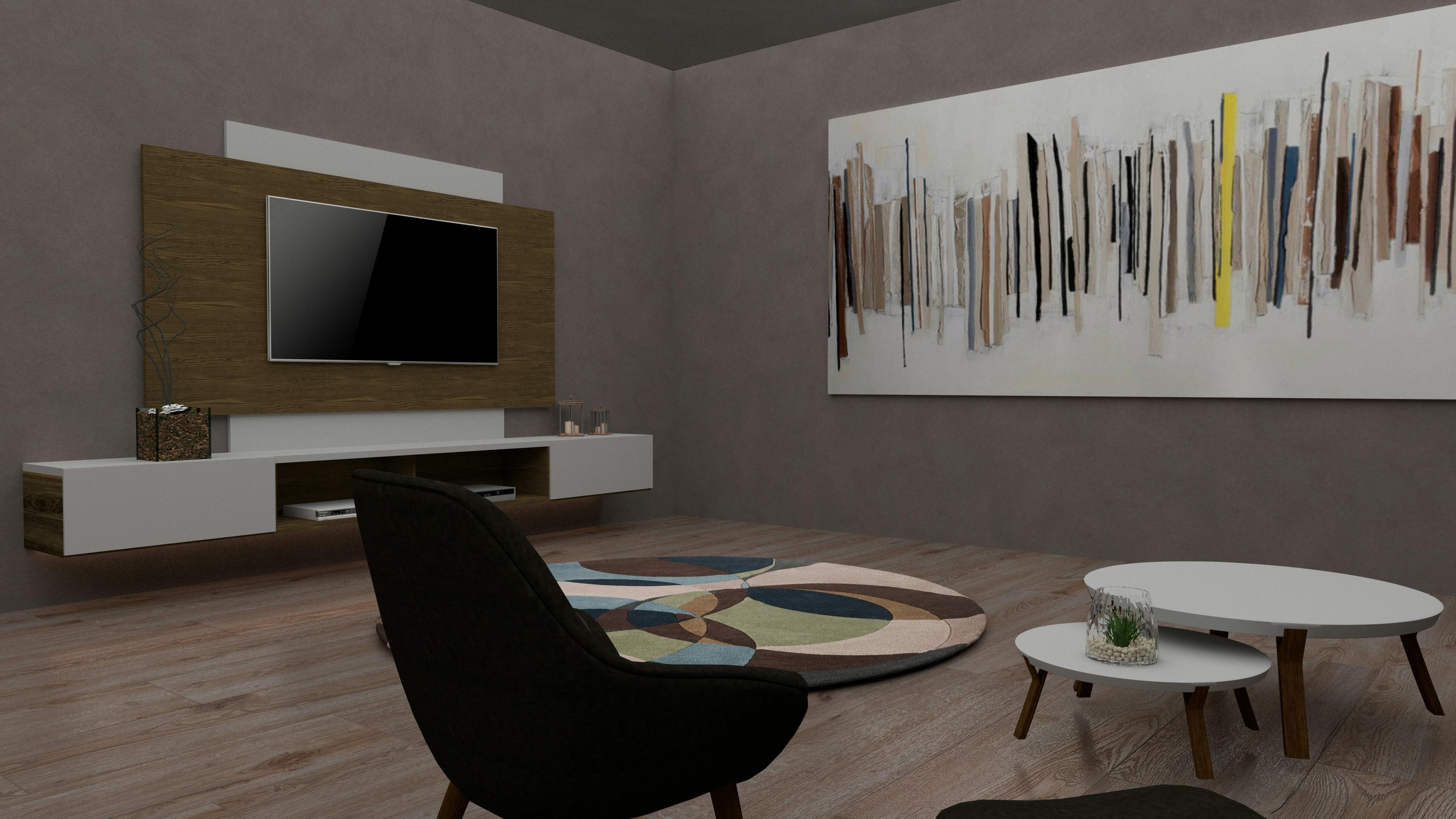
- Dark Woods (Mahogany, Wenge, Dark Oak): Evoking elegance and gravitas, dark woods can make a statement. Here, I often lean towards bold abstracts with strong contrast (think brights against darks) or moody, sophisticated pieces that embrace the wood's inherent drama. Alternatively, a stark black and white abstract can be incredibly powerful.
- Rustic/Weathered Woods (Reclaimed Wood, Distressed Pine): These woods tell a story, with visible imperfections and a raw charm. They are fantastic canvases for abstract art that celebrates texture and organic forms, or even pieces with a slightly bohemian chic or industrial vibe.
2. Understand Your Abstract Art: The Heartbeat of Your Room
Now, let's talk about the art itself. What's its personality?
- Color Palette: Is it bright and multi-colored (like many of my pieces, if I do say so myself!), monochromatic, or earthy? This is crucial for guiding your pairing.
- Dominant Forms: Does it feature sharp geometrics, fluid curves, chaotic splatters, or serene washes?
- Overall Mood: Does it feel energetic, calming, dramatic, playful?
3. The Art of the Match: Strategies for Success
This is where your personal style truly shines! There are a few paths you can take to create a stunning combination.
a. Complementary Colors: The Classic Harmony
If your wood is warm (reddish, yellowish undertones), consider abstract art with cool tones (blues, greens, purples) to create a lively contrast that still feels balanced. Conversely, cool-toned wood (like some grayer oaks) can be warmed up with abstract art featuring reds, oranges, and yellows. This creates a satisfying visual 'pop'.
b. Analogous Colors: The Gentle Flow
Opt for abstract art with colors that are next to your wood's undertones on the color wheel. For example, a reddish-brown cherry wood could look exquisite with abstract art featuring deep oranges, reds, and even some warm yellows or purples. This approach creates a softer, more harmonious transition, often feeling very sophisticated.
c. Contrast is King: Bold and Unapologetic
Sometimes, you want to make a statement. I adore pairing a highly textured, vibrant abstract with a sleek, minimalist wooden console. The juxtaposition of raw, expressive art against refined, polished wood is incredibly dynamic. Think deep, dark wood with a bright, almost neon abstract piece. It's exhilarating!

d. Scale and Placement: The Goldilocks Zone
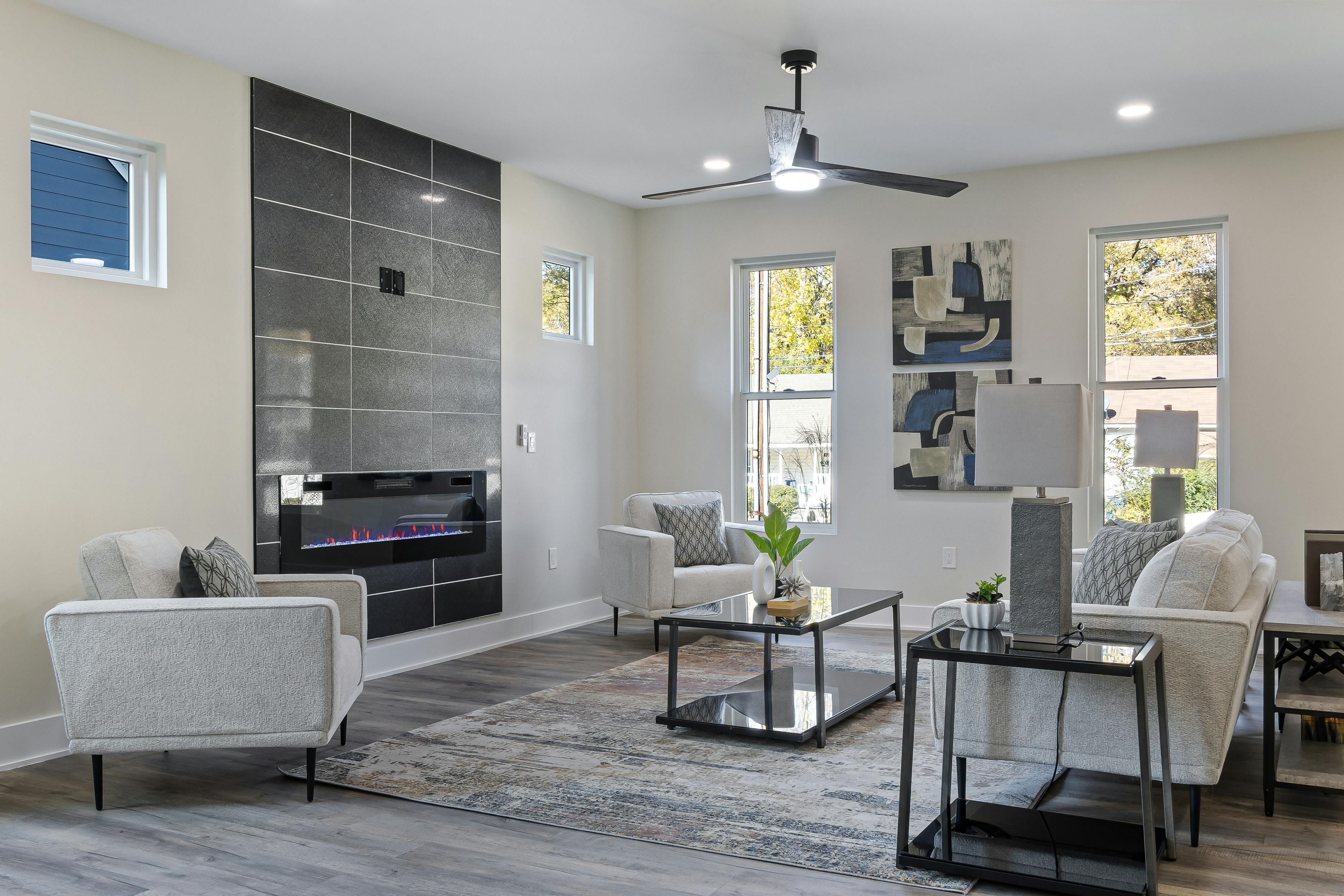
This is often overlooked! For art above the sofa or a console, the art should ideally be about two-thirds the width of the furniture piece. If it's too small, it looks lost; too big, it overwhelms. When hanging, ensure the bottom of the frame is roughly 6-8 inches above the furniture. You want them to feel connected, part of the same visual story.
e. Framing Matters: The Unsung Hero
Don't underestimate the power of a well-chosen frame. A simple, thin black or white frame can modernize a piece and make it pop against any wood. A natural wood frame can echo the furniture, creating cohesion. Or, sometimes, no frame at all lets the art stand boldly on its own, especially with a gallery-wrapped canvas.
f. Textural Dialogue: A Feast for the Eyes
Consider how the textures play off each other. A heavily textured abstract painting with impasto can bring a fantastic tactile quality when placed near a smooth, polished wood table. Conversely, a minimalist abstract print looks striking next to a rough, reclaimed wood bookshelf. It's all about creating interest!
Common Mistakes I've Seen (and Made!) Along the Way
Trust me, we've all been there. Here are a few things to watch out for:
- Ignoring Scale: Hanging a postage stamp-sized abstract above a sprawling wooden buffet. It just doesn't work.
- Matchy-Matchy Overload: Trying too hard to exactly match a color in the art to a specific wood tone. It often falls flat. Seek balance and complement, not identical twins.
- Too Many Wood Tones: If your room already has several different wood tones, adding another one in your art's frame or choosing art that heavily features another wood can make the space feel chaotic.
- Overlooking Lighting: Good lighting can make or break your pairing. Abstract art thrives under proper illumination, especially if it has subtle details or textures.
Let Your Walls Tell Your Story
In the end, your home is an extension of you. It's your sanctuary, your canvas. Pairing abstract art with wood furniture isn't about following rigid rules; it's about understanding the foundational elements and then letting your intuition guide you. It's about creating a space that feels inviting, authentic, and inspiring. Whether you're drawn to the bold brushstrokes of Abstract Expressionism or the serene geometrics of Minimalism, the warmth of wood offers the perfect counterpoint, allowing your chosen pieces to truly resonate. I encourage you to experiment, move things around, and most importantly, choose art that genuinely moves you. Because when you love what you see, that joy radiates throughout your entire home. If you're looking for that perfect piece to start your journey, feel free to browse my collection – I've poured my heart into creating art that brings vibrancy and life into spaces just like yours. Or, if you happen to be in the Netherlands, why not visit the den-bosch-museum for some real-life inspiration?
Frequently Asked Questions
Q1: Can I mix different wood tones in a room when pairing with abstract art?
Absolutely! Mixing wood tones adds depth and character. The key is to ensure there's a cohesive element – perhaps one dominant wood type, or art that helps bridge the different tones through its color palette. Avoid more than three distinct wood tones if possible to maintain a sense of calm.
Q2: What if my abstract art is very colorful? Should my wood furniture be neutral?
Not necessarily! Very colorful abstract art can look stunning with neutral wood furniture (light oaks, natural finishes) as it allows the art to be the undisputed focal point. However, it can also create a rich, vibrant aesthetic when paired with complementary or analogous mid-tone woods. It depends on the overall mood you want to achieve. If you want high energy, don't shy away from vibrant wood!
Q3: How do I choose abstract art for a room with a lot of rustic wood furniture?
For rustic wood, I'd suggest abstract art that embraces texture or organic forms. Think pieces with visible brushstrokes, earthy tones, or even abstract landscapes. You could also go for a high-contrast modern abstract to create a really interesting juxtaposition – raw wood meets sleek art. It’s all about creating an engaging conversation between the pieces.
Q4: What's the best way to hang abstract art above a large wooden credenza or sideboard?
The 'two-thirds rule' is a great starting point: the art should be approximately two-thirds the width of your credenza. Hang it so the bottom of the frame is 6-8 inches above the credenza. If you have a very tall wall, you might consider a gallery wall with multiple abstract pieces to fill the vertical space more effectively.
Q5: Can abstract art work with antique wooden furniture?
Yes, and beautifully so! The contrast between the historical elegance of antique wood and the modern expression of abstract art can be incredibly sophisticated. Choose abstract pieces that pick up on a subtle color in the antique piece, or go for a bold, contrasting abstract to truly make a statement and bridge old and new worlds. It's a wonderful way to give antique pieces a fresh, contemporary context. Don't be afraid to mix eras and styles; that's where the most compelling design stories emerge. Want to explore the history of art movements that inspired these kinds of pairings? Check out my timeline of art history!


