
Craft Your Own Oil Paint: The Ultimate Guide to Unrivaled Control and Pure Expression
Unleash unparalleled artistic control by crafting your own oil paint with Zen Dageraad Visser's ultimate guide. Discover historical techniques, essential materials, a step-by-step process, and advanced insights for vibrant, custom colors with perfect lightfastness and unique textures.
Craft Your Own Oil Paint: The Ultimate Guide to Unrivaled Control and Pure Expression
Imagine feeling the raw power of color, not just from a tube, but born from your own hands. That's the journey I want to take you on, a journey into the very heart of your artistic medium. I get it, you're probably looking at that title, "Make my own oil paint?" and thinking, "Zen, what are you even talking about? Aren't there perfectly good tubes of paint everywhere?" And you're not wrong! We're blessed with an incredible array of high-quality art supplies these days. But for me, after years of pushing pigment around a canvas, a deeper, almost primal urge took hold. I wanted to understand color from its very essence, to touch the raw materials, and to connect with the centuries-old tradition of artists who ground their own colors. That itch? It led me down the rabbit hole of making my own oil paint, and honestly, it changed everything. It also gave me an unparalleled understanding of lightfastness and color purity, which is crucial for art that lasts generations.
It wasn't about saving money (though sometimes it can be a nice bonus, especially with those eye-wateringly expensive pigments like genuine Lapis Lazuli or certain Cadmiums); it was about unlocking a level of control, intimacy, and pure artistic empowerment that a store-bought tube simply can't deliver. Trust me, the journey itself is as transformative as the colors you'll create. In this ultimate guide, we'll demystify the process, explore the profound benefits, and provide a step-by-step walkthrough to empower you to create your own artist-quality oil paints, tailored precisely to your unique vision. We're talking about taking back control of your palette, one glorious, hand-milled batch at a time, unlocking vibrant hues and unique textures that speak to your artistic soul.

Why Even Bother? The Profound Allure of DIY Pigment
Honestly, when I first considered it, a tiny voice in my head screamed, "Too much effort, Zen! Just grab a tube!" But then the other voice, the one that always pushes me to explore, chimed in. And boy, am I glad it did. Making your own paint isn't just about saving a few bucks (though it absolutely can be, especially with those notoriously expensive pigments like Ultramarine, Cadmium Reds, or rare earth pigments where the cost difference is truly staggering); it's about claiming full control, achieving a profound understanding, and forging an unparalleled connection to your materials. It's a bit like a chef making their own pasta from scratch versus buying it—you just know the difference. And trust me, the difference in your painting will be palpable, not just visually, but in the very feel of your craft.
Here's why taking the plunge into DIY pigment might just revolutionize your artistic practice:
- Unrivaled Control & Intentionality: Imagine dictating the consistency, the pigment load, the exact oil type. Want a super-creamy, buttery paint that flows like a dream for mastering glazing techniques in oil painting? You got it. Prefer something stiffer, almost sculptural, for bold impasto with a palette knife? Absolutely within your grasp, perfect for exploring what is a palette knife and how to use it. You're the master alchemist, tailoring every nuance to your artistic vision. This isn't just about technical control; it's about embedding intention into every stroke, knowing that every aspect of your medium is a deliberate choice. It's a stark contrast to the often standardized and uniform qualities of mass-produced paints, which prioritize consistency for a broad market rather than the individual artist's unique needs.
- Pure Pigment Power & Mindfulness: When you're sourcing raw pigment, you're getting the purest form. No fillers, no questionable additives, just vibrant, unadulterated color. This often translates to incredibly vibrant, intensely saturated hues that practically sing on the canvas. It's a stark difference from many student-grade paints, which often contain inert extenders like chalk, barium sulfate, or kaolin clay that dilute the color and leave your canvas feeling a little... flat. With homemade paint, you'll immediately notice the increased tinting strength—meaning a little bit goes a long way in your mixes. Think of it like a potent cup of tea: a tiny amount of high-quality tea can color a whole pot of water, while a weaker tea might struggle with just one cup. The act of grinding, of slowly coaxing color into being, is deeply meditative and brings a profound sense of mindfulness to your creative process, a welcome counterpoint to our often-impatient world.
- Consistent Color & Precise Matching: Ever notice how tubes of the same color from a commercial brand can sometimes vary slightly from batch to batch? When you make your own paint, you control the variables. Once you've found your perfect recipe for, say, a particular shade of "Zen Blue," you can replicate it precisely every single time. This consistency is invaluable for large-scale projects, commissions, or series where exact color matching across multiple canvases is crucial. It's peace of mind, knowing your signature hues will always be your hues.
- Historical Connection & Legacy: Think about the Old Masters. They weren't popping open tubes! They were grinding lapis lazuli, madder roots, and earth pigments with linseed oil, often assisted by a dedicated apprentice. There's a profound sense of continuity, a whisper across centuries, when you engage in the same process. It's like stepping into their studio, if only for an afternoon. I remember feeling a thrilling sense of kinship and understanding the first time I meticulously ground my own Ultramarine. You're not just making paint; you're participating in a living tradition, echoing the likes of Van Eyck and Rembrandt who meticulously crafted their hues for their masterpieces, a history we delve into in the history of oil painting from ancient pigments to modern masterpieces. I often imagine a young apprentice, perhaps named Jan, carefully measuring out raw lapis, his master nearby, sternly instructing: "More oil, boy, but only a drop! Else we lose the sky's true depth!" That's the dialogue with history this process invites.
- Unique Textures and Haptic Control: Pre-made paints often have a uniform texture, designed for broad appeal. When you make your own, you can play with the grind, leaving some pigments coarser for a wonderfully gritty feel (perfect for expressive impasto and textural effects!) or grinding others to an almost glass-like smoothness. I once created a batch of Burnt Sienna with a slightly rougher texture, and it brought a visceral, earthy quality to a landscape I was painting that I couldn't have achieved with a store-bought tube. It was truly my color, an extension of my hand and heart. This level of haptic (tactile) control deeply influences brush drag and knife texture, giving you truly unique artistic effects that sing on the canvas. You'll feel the difference under your brush, and your viewers will see it. This also allows you to control the sheen or gloss of your final paint, with more oil generally leading to a glossier finish.
- Creative Empowerment & Deeper Understanding: There's something deeply empowering about knowing exactly what's in your paint, right down to the microscopic particles. It's an extension of your artistic vision, giving you unparalleled insight into how your materials behave. This deep understanding also opens doors to further experimentation, not just with paint consistency, but with your entire approach to a canvas, much like exploring what are painting mediums: a beginner's guide or understanding paint types for artists. It's a rejection of the disposable, fast-art mentality, choosing instead a slow, deliberate connection to your craft.
A Whisper from the Past: Alchemy & Artistry Through the Ages
Before the convenience of tubes and mass production, artists were true material scientists, alchemists in their own right. From ancient Egypt, where lapis lazuli was painstakingly ground for vibrant blues for sarcophagi and frescoes, to the illuminated manuscripts of the Middle Ages, the quest for pure, stable color has always been central to art. The revolutionary transition from tempera (an egg-based binder) to oil painting in the late Middle Ages and early Renaissance fundamentally changed art, allowing for unprecedented luminosity, depth, and blending. This shift is often largely attributed to masters like Jan van Eyck, whose meticulous refinement of oil techniques in the 15th century opened up entirely new artistic possibilities, pioneering the use of slow-drying oil binders that allowed for seamless blending and rich glazes. His ability to build up translucent layers was directly due to the unique properties of the paint he and his apprentices carefully crafted, controlling both the fineness of the pigment and the specific oil chosen.
But he wasn't alone. Think of Leonardo da Vinci, who meticulously experimented with various binders and pigments, often grinding them himself or with his apprentices to achieve the exact hues and properties he envisioned, exploring everything from a finely ground vermilion to custom-mixed greens. His scientific curiosity extended into the very make-up of his paints, allowing for innovations in sfumato and chiaroscuro. The Venetian painters, like Titian and Giorgione, further pushed the boundaries with their innovative layering and glazing; their famous rich, deep reds (often from madder lake pigments) and luminous golds were a direct result of their understanding and control over their custom-ground materials. Artists across Europe, including Rembrandt in the Dutch Golden Age, were deeply involved in the creation of their materials, known for his masterful use of impasto and transparent glazes, each technique demanding specific paint consistencies and pigment loads that he could only achieve through his own meticulous preparation and the hands of his skilled studio assistants. The knowledge of grinding, oiling, and specific pigment behavior was a closely guarded studio secret, passed down through direct apprenticeship.
Early pigments were sourced from incredibly diverse origins: precious minerals like Lapis Lazuli (for that iconic, astronomically expensive Ultramarine blue, once more valuable than gold, often mined from Afghanistan), plants (like madder root for deep reds, or indigo for blues), and even insects (like cochineal for vibrant carmine). Pigments like Orpiment (a brilliant yellow arsenic sulfide) were prized for their intense color but also known for their extreme toxicity, making the process of pigment preparation a dangerous art in itself. Many earth pigments, such as ochres and siennas, were simply dug from the ground, washed, and then ground. Historically, pigments like Lead White (Flake White or Cremnitz White) were revered for their opacity and smooth consistency but were incredibly toxic, leading to severe health issues for artists, including neurological damage and painter's colic, which is believed to have afflicted masters like Francisco Goya. While many pigments are now synthetically produced (like most modern Ultramarine Blue, or Cadmiums), this ensures greater purity, consistency, and often, safety and superior lightfastness compared to their historical, naturally occurring counterparts. The labor was intense, the materials often rare and costly, and the knowledge of paint formulation was a closely guarded secret, passed down through generations of masters and apprentices. It was a true craft, deeply intertwined with the artistic process.
The 19th century brought radical change with industrialization. The invention of the collapsible metal paint tube in 1841 by American painter John Goffe Rand democratized art, making paint portable and accessible to artists working outdoors (hello, Impressionists!). While this was a monumental step forward, it also, inevitably, separated many artists from this intimate, alchemical process of material creation. For me, making my own paint is a deliberate, joyful reconnection to this rich, hands-on tradition, a way to converse with those who came before.

Your Alchemist's Setup: Gathering the Essentials for Transformation
Alright, let's get down to brass tacks. You don't need a sprawling laboratory or a chemistry degree, but you do need a few key items to start your journey. Think of your workspace as a small, specialized kitchen for your art supplies, where every ingredient plays a vital role in the final "dish" (or rather, your exquisite, custom-made paint!). This journey into paint-making is a conscious decision to connect with your materials on a deeper level, transforming you from a mere painter to a true master of your medium.
Here's a quick checklist before we dive into the details. Safety is paramount, especially when working with dry pigments. Always prioritize your health over a shortcut! For a more detailed look at the health implications, jump to our dedicated Pigment Safety: A Crucial Warning section.
- Artist-grade pigments
- Drying oil (e.g., refined linseed oil, poppy seed oil)
- Glass muller
- Frosted glass or granite grinding slab
- Palette knives
- Measuring spoons or scale
- Empty paint tubes or airtight jars
- Nitrile gloves, N95/P100 dust mask, and excellent ventilation
1. Pigment: The Heartbeat of Your Color
This is where the magic truly begins – the raw material of color itself. Pigments are the finely ground, insoluble particles that give paint its hue and character. You'll find them in powdered form from various specialized art supply stores. My advice? Start with a few basic, reliable pigments that aren't overly toxic for beginners. Always look for pigments labeled as artist-grade; this means they've been specifically manufactured for artistic applications, tested for lightfastness and purity, and are generally safer when handled correctly. This also means a higher pigment concentration and fewer (or no) fillers compared to student-grade paints, ensuring more vibrant, pure hues and excellent tinting strength. It's crucial to understand that many student-grade paints achieve lower costs by using less pigment and more fillers or extenders (such as chalk, barium sulfate, or kaolin clay), which dilute their vibrancy, reduce their tinting strength, and can make them more transparent or gritty.
Crucially, always, always, check the Safety Data Sheets (SDS) for any pigment you buy. Some pigments (like certain Cadmiums or Cobalts, which contain heavy metals) are not meant for home use without serious ventilation and robust personal protective equipment (PPE). Don't compromise your health for a color! This isn't a shortcut to take.

Your Starter Pigment Palette: A Deeper Look
For your first foray into paint making, I recommend these pigments. Why? Because they are relatively stable, less toxic (when handled correctly, as all dry pigments require caution), and offer a fantastic range for learning color mixing and paint making basics. Think of them as your training wheels for becoming a paint alchemist. They are also generally more forgiving in their oil absorption, making the initial grinding process less frustrating.
- Ultramarine Blue: A synthetic version of the historic Lapis Lazuli. It's a vibrant, deep blue with good lightfastness and a moderate oil absorption. It has excellent tinting strength, meaning a little goes a long way. Its luminosity was so prized it graced the works of Old Masters like Vermeer and was reserved for the most important figures in paintings. Its deep, rich quality still makes my heart sing.
- Yellow Ochre: A timeless earth pigment, incredibly stable, opaque, and dries relatively quickly. Its warm, muted yellow is incredibly versatile and has been used since prehistoric times for its enduring quality in cave paintings right up to contemporary landscapes. It's like a warm hug of color, always reliable. (A great starting pigment for its forgiving nature!)
- Burnt Sienna: Another earth pigment, known for its rich, warm reddish-brown. It's semi-transparent and offers beautiful glazing properties, perfect for conveying the warm shadows and earthy tones often seen in Renaissance portraits. It's one of my personal favorites for its versatility and how it makes a canvas feel grounded. (Another excellent beginner pigment.)
- Raw Umber: A natural earth pigment, Raw Umber is a greenish-brown that is invaluable for its fast-drying properties (it contains natural siccatives, chemical agents that accelerate drying!) and versatility in landscapes and portraits. It's generally very stable and low in toxicity.
- Burnt Umber: The roasted version of Raw Umber, resulting in a richer, warmer, darker brown. Also fast-drying and excellent for deep shadows or warm underpaintings. Like all earth pigments, it's a reliable workhorse.
- Titanium White: Our go-to opaque white. It's incredibly strong, covers well, and is absolutely crucial for mixing lighter values and pastels. Be aware, though, that it's often quite 'thirsty' for oil, meaning it requires a good amount of binder to become a workable paste. This pigment largely replaced more toxic whites like lead white, offering superior covering power and safety. It's the workhorse of your palette.
Understanding Pigment Properties: Each One a Character
Each pigment truly is a unique character, bringing its own personality to your paint. Understanding these traits is key to becoming a true paint alchemist, helping you predict not just its hue, but its behavior on the palette and how it feels under your brush. What kind of paint do you want to create? Knowing these characteristics will help you tailor your homemade paint precisely to your artistic needs. This deeper understanding will elevate your craft from simply mixing colors to truly designing your medium.

Property | Description | Why it Matters for You & Your Process | Zen's Take | Texture & Consistency Impact | Final Sheen/Gloss Impact |
|---|---|---|---|---|---|
| Opacity vs. Transparency | Opaque pigments (like Titanium White or Cadmiums) cover underlying layers well, while transparent pigments (like Ultramarine Blue or Alizarin Crimson) allow light to pass through. | Choose based on desired effect: strong coverage for alla prima, or luminous glazes and layered depth. Transparent pigments will often require slightly more oil to appear vibrant. This also impacts drying time, as thicker, opaque paint can dry faster. | Think about light: opaque blocks it, transparent lets it dance through. This is foundational to layering and creating true visual depth in your paintings. It's about how much light your canvas captures. | Opaque paints often feel 'short' and buttery, while transparent ones can be 'long' and fluid, especially for glazes. | Higher opacity pigments can result in a more matte finish due to light scattering, while transparent pigments tend to enhance the gloss of the oil. |
| Tinting Strength | How much a pigment influences the color of another pigment when mixed. High tinting strength means a little goes a long way. | Crucial for color mixing. A high tinting pigment can easily overpower others, so add it cautiously. Can save a lot of expensive pigment too! Knowing this means less waste and more precise color control. | This is where you really see the power of pure pigment. My Ultramarine always surprises me with how much it shifts a mixture with just a speck – a truly potent color. It's like a tiny drop of concentrated dye. | Generally, higher tinting strength pigments can be ground to a finer particle size, contributing to smoother paints. | Indirectly affects sheen, as more pigment usually means more matte, but high tinting strength means less bulk pigment is needed. |
| Lightfastness | A measure of how well a pigment resists fading when exposed to light over time. Artist-grade pigments are rated (ASTM I, II, III). | Absolutely crucial for the longevity of your artwork. Always aim for ASTM I (Excellent) or II (Very Good) for professional, lasting work. No one wants their masterpieces to fade into sad shadows! This is non-negotiable for serious artists. | No one wants their masterpieces to fade into sad shadows! Always prioritize lightfastness for work you intend to last generations. It's a non-negotiable for serious artists. Think of it as painting for eternity. | Doesn't directly affect immediate texture, but impacts long-term paint film integrity and stability. | Does not directly affect sheen, but vital for maintaining color integrity over time. |
| Oil Absorption | How much oil a pigment needs to form a workable paste. This is largely determined by its particle size, shape, and surface area. | Directly affects consistency, drying time, and the "feel" of your paint. 'Thirsty' pigments need more oil and can feel stiffer and require more grinding effort. This also impacts the final texture and how the paint 'handles' on your brush. | This is the unpredictable dance! Some pigments drink oil, others sip. It's a core part of the tactile experience of making paint, and can make or break your initial grind. Each pigment is a unique conversation. I always start with less oil! | High oil absorption can lead to a 'short,' buttery paint if well-dispersed, or a crumbly one if under-oiled. Low absorption often yields a 'long,' fluid paint. | Pigments with higher oil absorption may appear slightly more matte if under-oiled, or can achieve a good gloss if enough oil is incorporated. |
| Particle Size/Shape | The physical characteristics of the individual pigment particles. Fine, irregularly shaped particles have higher surface area, requiring more oil. Coarser particles need less oil but are harder to grind smoothly. | Influences how easily a pigment disperses, its opacity (finer particles often yield more opaque results), and the final paint's texture (smooth vs. gritty). This is key for achieving 'short' or 'long' paint characteristics and influences brush drag. | This isn't just about smooth or gritty; it affects brush drag, knife texture, and the very feel of the paint as you apply it. A wonderfully subtle variable you gain control over, allowing for truly bespoke paint. | Finer particles contribute to smoother, sometimes 'long' paints, often with less brush drag. Coarser particles create a 'short,' textured, or gritty feel, ideal for impasto. | Finer particles can result in a glossier finish due to less light scattering, while coarser particles tend to lead to a more matte appearance. |
| Drying Time (Inherent) | The natural tendency of the pigment itself to accelerate or slow down the drying of the oil. Some pigments contain natural siccatives. | Crucial for planning your painting process and layering. Fast-drying pigments (e.g., Umbers) are great for underpaintings; slow-drying ones (e.g., Cadmiums) allow for extended wet-on-wet work. | This is a secret weapon! Knowing a pigment's natural drying speed lets you orchestrate your painting like a conductor. Umbers are my go-to for quick layering, while Cadmiums demand patience. | Affects how quickly the paint sets on the canvas, influencing blending and layering strategies. | Does not directly affect final sheen, but can influence how quickly a glossy finish sets. |
Common Pigment Types to Know:
Beyond specific names, pigments can generally be grouped by their chemical composition, which often hints at their properties and behavior. Understanding these categories is like having a cheat sheet for predicting how a new pigment might behave on your slab.
Pigment Type | General Characteristics | Example Pigments | Zen's Insight | Texture & Handling | Final Sheen/Gloss Tendency |
|---|---|---|---|---|---|
| Earth Pigments | Naturally occurring minerals, highly stable, excellent lightfastness, generally low toxicity. Often opaque with moderate oil absorption. Used since prehistoric times. | Yellow Ochre, Burnt Sienna, Raw Umber, Burnt Umber, Indian Red, Venetian Red | My reliable friends. These form the backbone of many palettes, offering grounding, natural hues that feel truly ancient. They're forgiving and often fast-drying, a comforting presence on the canvas. | Tend to be 'thirsty,' creating stiffer, often 'short' paints. Can range from very smooth (finely ground ochres) to slightly gritty (some siennas). | Generally leans towards a satin or matte finish due to their irregular particle shapes and moderate oil absorption. |
| Mineral Pigments | Derived from ground minerals or synthetic versions. Properties vary widely based on specific mineral. Can range from low to high toxicity historically. | Lapis Lazuli (natural), Ultramarine Blue (synthetic), Malachite (natural), Azurite (natural) | These are the jewels of the palette. Ultramarine, especially, has a depth that feels almost sacred, almost spiritual. Handle historical ones with care, and synthetics for consistency and ethical sourcing! | Often very fine, leading to smooth, 'long' paints, especially Ultramarine Blue. Some natural minerals might retain a slight grittiness if not fully processed. | Can range from satin to quite glossy, especially fine synthetic ultramarine with adequate oil dispersion. |
| Cadmium Pigments | Synthetic inorganic pigments (Cadmium Yellow, Red, Orange). Known for intense, opaque, lightfast colors. High tinting strength, moderately toxic (heavy metal). | Cadmium Yellow, Cadmium Red, Cadmium Orange | Incredible vibrancy and covering power, but always use with caution and proper ventilation. Their intensity is unmatched, a pure burst of sun or fire, but they demand respect for safety. | Usually quite smooth and buttery, offering a 'short' consistency with high pigment load. Can be quite dense. | Generally produce a semi-gloss to glossy finish due to their dense, opaque nature and often lower oil absorption. |
| Cobalt Pigments | Another range of synthetic inorganic pigments (Cobalt Blue, Green, Violet). Highly stable, lightfast, and beautiful hues. Moderately toxic (heavy metal). | Cobalt Blue, Cobalt Green, Cobalt Violet, Cerulean Blue | Beautiful, serene colors, reminiscent of deep skies or cool waters. Like cadmiums, they're strong but demand respect for their toxicity and good safety practices. | Similar to Cadmiums, often smooth with a 'short' feel, allowing for crisp brushstrokes. | Often yield a semi-gloss to satin finish, similar to cadmiums but can be slightly more matte depending on the specific cobalt. |
| Iron Oxide Pigments | A broad category, often synthetic, including many reds, yellows, browns, and blacks. Very stable, good tinting strength, generally low toxicity, excellent lightfastness. | Mars Red, Mars Yellow, Mars Black, Perylene Red (organic, but similar hue range), various Ochres, Siennas, Umbers | These are the workhorses of color, offering an incredible range of earthy and vibrant tones. Many earth pigments naturally fall into this versatile category, a truly foundational part of any palette. | Can vary widely. Many form smooth, rich paints with good body, while some (like synthetic Mars colors) can be quite 'short' and dense. | Tend to produce a satin to matte finish, especially the earthier varieties, similar to natural earth pigments. |
Always, always consult the Safety Data Sheet (SDS) for any pigment you plan to use, as toxicity levels can vary even within pigment categories. Your health is not something to gamble with for a unique hue.
Specialty Pigments & Effects: Beyond the Standard Palette
Once you're comfortable with the basics, a whole new world of pigments opens up, offering unique optical effects. I've personally experimented with a few to add a touch of magic to specific pieces.
- Mica-Based Pigments: These fine, reflective mineral flakes can create beautiful pearlescent, iridescent, or metallic effects. Think subtle shimmers in a sky or the ethereal glow in an abstract piece. They require careful grinding, as too much pressure can crush the flakes and reduce their reflective quality. A lighter hand and perhaps slightly more oil might be needed. The glowing highlights in some of my more abstract pieces (like my art) often owe their luminosity to a touch of custom-ground mica mixed into a subtle white or a transparent glaze.
- Metallic Powders: Genuine gold, silver, copper, or bronze powders can be mulled into exquisite metallic paints. These offer a richness and depth unmatched by pre-mixed tubes. They are generally heavier and require a specific feel during grinding to avoid scratching your slab or muller, and often benefit from a slower-drying oil to allow the metallic particles to settle evenly. Remember, these are usually best for accents or specific areas, not broad application, due to their cost and unique handling.
These specialty pigments are where you can truly push the boundaries of conventional paint and inject a unique, almost sculptural quality into your work.
2. Binder: The Unifying Embrace
For oil paint, our binder of choice is typically a drying oil. This oil is what envelops the pigment particles, allowing them to adhere to your canvas and, crucially, to dry and form a stable, flexible film over time. The drying process isn't simply evaporation; it's a chemical reaction called oxidation and polymerization, where the oil molecules absorb oxygen and link up, forming a durable, solid paint film—think of it like countless tiny molecular chains locking together, hardening your paint, much like how a freshly baked cookie hardens as it cools and its fats solidify. The choice of oil significantly impacts drying time, flexibility, and yellowing tendencies. Each one has its quirks, much like different types of coffee beans – some are bold, some are subtle, all have an impact on the final product.
Different oils also affect the paint's open time (how long it stays wet and workable on the canvas) and its viscosity (how thick or fluid it is). This gives you immense control over your painting process.
credit, licence
Drying Oil | Drying Time (Thin Layer) | Yellowing Tendency | Viscosity / Handling | Best For | Zen's Quick Take | Paint Film Characteristics |
|---|---|---|---|---|---|---|
| Linseed Oil (Refined) | Fast (2-5 days) | Moderate | Medium, good flow | General use, strong film, darker colors | My go-to workhorse for most colors, but I avoid it for whites to prevent yellowing. Reliable and robust. | Forms a strong, flexible, and durable film; good for most applications. |
| Linseed Oil (Cold-Pressed) | Faster (2-4 days) | Moderate to High | Medium, good flow (less refined) | Traditionalists, purists, can be less predictable | Interesting for its historical connection, but I find refined more consistent. Can have some impurities. | Strong film, but potentially more brittle or prone to yellowing over time due to natural impurities. |
| Linseed Oil (Stand Oil) | Slow (5-10 days) | Low | Very thick, syrupy, self-leveling | Glazes, smooth finishes, long open time, whites and pale colors | Wonderful for those silky glazes, but its thick nature demands patience. Adds a beautiful, almost enamel-like quality. | Forms a very flexible, durable, and non-yellowing film, ideal for glazes. |
| Poppy Seed Oil | Slow (5-7+ days) | Very Low | Medium-thin, smooth | Whites, pale colors, delicate glazes, extended wet-on-wet | Essential for my whites and light blues; I embrace its slow drying for nuanced blending. Keeps those delicate hues pristine. | Forms a softer, less brittle film than linseed, with minimal yellowing. |
| Walnut Oil | Medium (3-6 days) | Low | Medium-thin, fluid, slightly nutty | All-round use, whites and pale colors (less yellowing than linseed) | A great versatile option. Offers a nice balance and beautiful fluidity for smooth transitions. | Forms a durable film with less yellowing than linseed, offering a good balance of properties. |
| Safflower Oil | Slow (5-7+ days) | Very Low | Medium-thin, smooth | Whites, pale colors, non-yellowing, good alternative to poppy seed oil | A solid alternative to poppy for non-yellowing needs. It's a quiet achiever, keeping my brightest colors true. | Very similar to poppy seed oil; forms a flexible, non-yellowing film. |
A Note on Unrefined Oils: While historically used, unrefined oils often contain impurities that can lead to excessive yellowing, cracking, and very slow drying times. For consistent, archival quality, stick to artist-grade refined drying oils available from reputable art suppliers. They're typically quite affordable, a worthwhile investment for the longevity of your art.
Each oil behaves differently, and experimenting with them is part of the fun in customizing your paint. Imagine the difference in texture and drying time you'd get with a fast-drying linseed oil versus a slow-drying poppy oil – how might that influence your brushwork and layering? For more granular control over these variables, exploring paint types for artists and what are painting mediums: a beginner's guide will give you a deeper understanding.

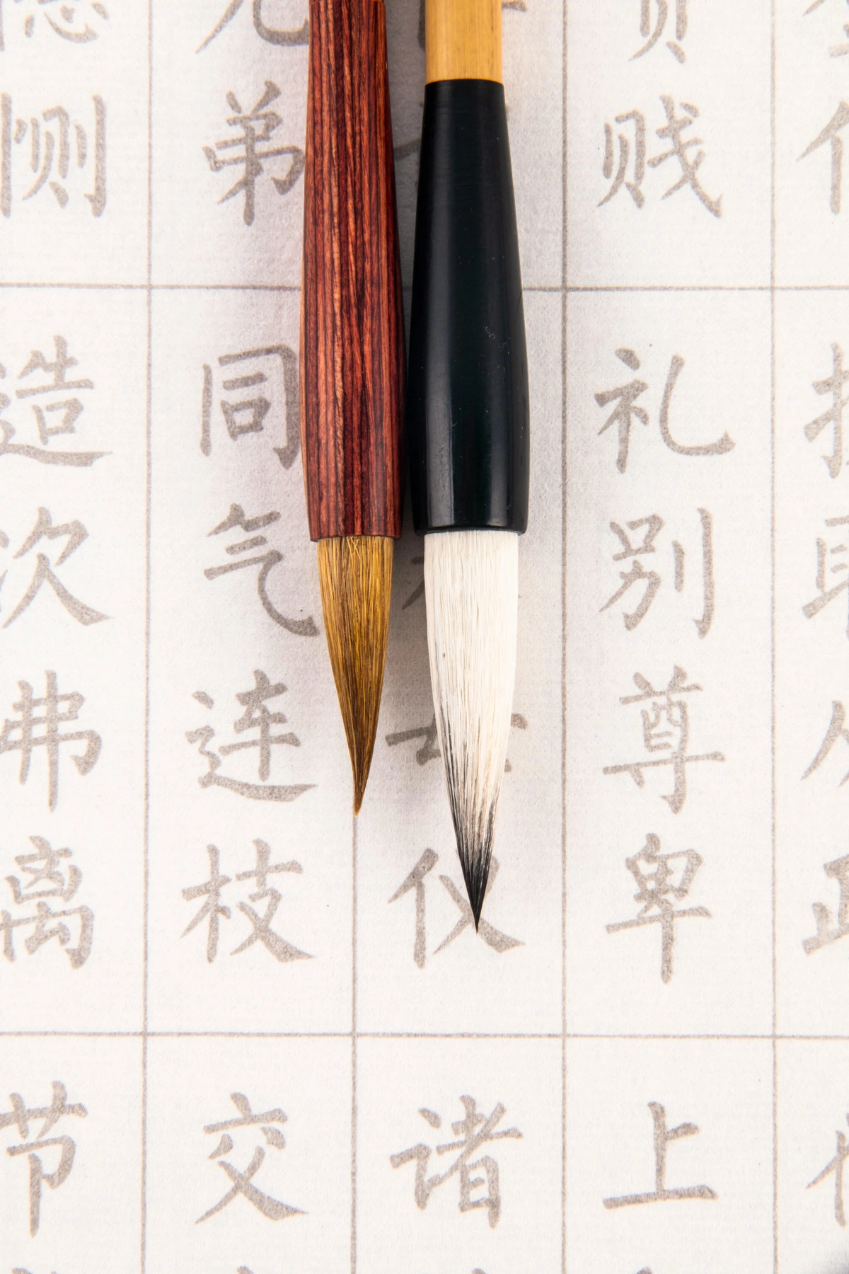
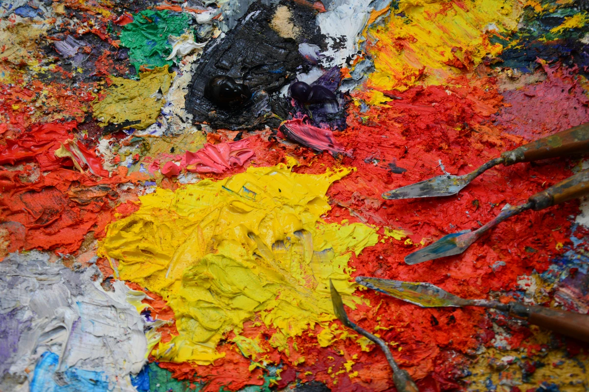
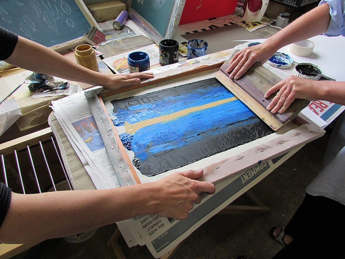
3. Tools for Grinding and Mixing: Your Alchemist's Kit
This is where the satisfying physical labor comes in. Think of these as your extensions, enabling the transformation of powder into luscious paint. The rhythmic motion of mulling can be incredibly meditative, almost like a moving meditation. You'll truly feel a connection to the centuries-old tradition as you work the pigment into the oil.
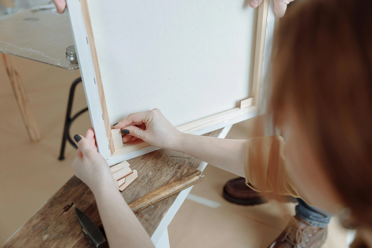
- Muller: This is a heavy, flat-bottomed glass pestle specifically designed for grinding pigments. It's absolutely essential for achieving that smooth, consistent paint consistency. This is your most important tool for dispersion, which means evenly distributing pigment particles throughout the oil, ensuring each particle is fully coated and separated from its neighbors (think of it like making a perfect cake batter: every grain of flour—the pigment—needs to be coated by the batter—the oil—not clinging to dry clumps). You can find high-quality glass mullers at specialized art suppliers like Kremer Pigments, Utrecht, or Blick Art Materials.
- Grinding Surface: A thick pane of frosted glass (like a glass palette) or a granite slab works perfectly. You need a surface with a slight 'tooth' or texture (the frosting) to help the muller grab the pigment particles and efficiently break up any agglomerates (those pesky clumps of pigment particles that stick together, refusing to fully wet). A smooth, polished surface won't provide enough friction to effectively disperse the pigment; it would just slide over the pigment without properly grinding.
- Palette Knives: Multiple sizes are incredibly helpful for scooping, mixing, scraping, and transferring your newly made paint. I find a sturdy, straight-edged metal palette knife indispensable for initial mixing and scraping, while a more flexible, pointed one (like a trowel or diamond shape) is great for finer adjustments and gathering paint efficiently. If you want to dig deeper into these handy tools, check out my thoughts on what is a palette knife and how to use it.
- Small, Soft Brush/Fan Brush: This might seem minor, but I always keep one nearby to gently sweep away any stray pigment dust from around my working area before adding oil. This prevents accidental cross-contamination and keeps your colors pure. Remember, always use your mask when handling dry pigments, even if just sweeping!
- Measuring Spoons/Scale: For consistent batches, especially when you start experimenting with different pigment-to-oil ratios. This is key for reproducibility, allowing you to recreate that perfect "Zen Green" you discovered last week! I keep a small journal for these experiments, noting exact measurements and my observations.
- Empty Paint Tubes or Jars: To store your glorious creations! Airtight containers are crucial to preventing your paint from curing prematurely. You can buy empty tubes (often from the same suppliers as pigments) or repurpose small, clean glass jars with tight-fitting lids. Just be sure they're very clean and dry, as any moisture can cause mold or other issues.
- Protective Gear: This is non-negotiable. Seriously, health first! Nitrile gloves (to protect your hands from pigments and oil, as some can be skin irritants or absorbed), an N95 or P100 dust mask (crucial for handling dry pigments to prevent inhalation of fine particles, which can be highly toxic), and excellent ventilation (open windows, a powerful fan, perhaps even an outdoor workspace) are your best friends. I learned the hard way that a poorly ventilated session with certain earth pigments can leave you feeling quite unwell, even if they're considered "low toxicity." Your lungs are precious, and some heavy metal pigments are no joke. Better safe than sorry, always. For a full breakdown, please refer to the Pigment Safety: A Crucial Warning section.
The Alchemical Process: Step-by-Step Transformation from Powder to Palette
This is the moment of truth! It's less complicated than you might imagine, but it does require patience and a bit of elbow grease. Think of it like making a fine dough or a rich pesto; it needs careful blending and a good workout to become smooth and emulsified. The rhythmic motion of mulling can be incredibly meditative, almost a dance between you and your materials.
Preparing for the Magic: Safety and Setup First!
Before you dive into the colors, a little preparation goes a long way to ensure both safety and a smooth, joyful process. Trust me, a clean and safe workspace makes all the difference.
🛑 SAFETY FIRST! 🛑
This isn't a suggestion, it's a requirement. When dealing with dry pigments, even those considered "low toxicity," inhalation is a significant risk. Your lungs are irreplaceable. My personal experience with even seemingly benign earth pigments in a poorly ventilated room taught me a harsh lesson about headaches and respiratory irritation. It's simply not worth the risk. Always follow these rules:
- Always wear an N95 or P100 dust mask.
- Always wear nitrile gloves.
- Always work in a well-ventilated area (open windows, fan, or outdoors).
- Avoid eating, drinking, or smoking.
- Clean spills with a damp cloth. Never dry dust or sweep.
Now that we've covered the essentials, let's get creative.

Your First Batch Checklist: Quick Start Guide
Ready to get started? Here's a quick overview to get your first batch underway:
- Gather all ingredients and tools. Double-check you have everything, especially your safety gear.
- Set up a well-ventilated workspace (windows open, fan on).
- Don your nitrile gloves and N95/P100 dust mask (seriously!).
- Choose a non-toxic, forgiving pigment like Yellow Ochre or Burnt Sienna for your first attempt. These are excellent for learning the ropes and are less prone to issues.
- Start with a very small amount of pigment (1-2 teaspoons). Less is more for learning and less waste if you make a delightful, oily mess (which, let's be honest, might happen!).
- Have fun! Embrace the process and don't be afraid to get a little messy (safely).
Step 1: Prepare Your Workspace - The Clean Slate
Lay down newspaper or a protective sheet to catch any spills. Don your gloves and, crucially, your N95 dust mask. Ensure you have excellent ventilation – open those windows! Clean your grinding surface and muller thoroughly; I once found a stray speck of green in a fresh batch of red, and trust me, it wasn't a happy discovery! A clean workspace is not just happy, it's essential for preventing cross-contamination and preserving the purity of your colors.
Step 2: Form a Pigment Mound - The Tiny Volcano
Place a small amount of your chosen dry pigment (I recommend starting with just a teaspoon or two for your first experiments) in the center of your grinding surface. Form it into a neat, small mound. Remember, you're learning the ropes here, so small batches are your friend – less waste if you make a delightful, oily mess (which, let's be honest, might happen!). This controlled quantity helps you focus on the individual pigment's characteristics without being overwhelmed.
Step 3: Add the Oil, Drop by Careful Drop - Coaxing the Binder
Create a small well in the center of your pigment mound, like a tiny volcanic crater ready to receive its liquid heart. Add a few drops of your chosen drying oil into this well. This is absolutely crucial: start with less oil than you think you need. You can always add more, but you can't easily take it away! Trust me, I've learned this the hard way more times than I care to admit – too much oil early on makes for a very runny, difficult-to-grind mess that feels more like a puddle than a paste. It's a delicate balance; think of it as coaxing the pigment, not drowning it. Aim for a ratio where the pigment just begins to form a very stiff, almost crumbly paste.
Step 4: Initial Mixing with a Palette Knife - The Wetting Phase
Using a sturdy palette knife, gently fold the oil into the pigment until you have a thick, paste-like consistency. It will look lumpy at first, almost like a crumbly dough or a thick mud. This initial mix isn't about grinding; it's simply to get the pigment thoroughly wetted and begin the crucial process of dispersion (evenly distributing pigment particles so each one is coated in oil, rather than clinging to its dry neighbors). Ensure there are no dry pockets of pigment left – these will be impossible to smooth out later. My rule of thumb: if it looks like damp sand, keep mixing until it's more like a thick, consistent mud.
Step 5: The Grind Begins! Achieving Dispersion with the Muller - The Rhythmic Dance
Now for the main event! Pick up your muller. Begin to grind the paste in a circular motion, applying even pressure. Spread the paint out thinly with the muller, then gather it back into the center with your palette knife, and repeat. This rhythmic spreading and gathering, over and over, is what disperses the pigment particles evenly throughout the oil, breaking up any stubborn clumps or agglomerates (groups of pigment particles stuck together). Think of agglomerates as tiny, unpopped popcorn kernels; our goal with grinding isn't to make the kernels smaller, but to pop them all, ensuring each individual particle is fully exposed and coated in oil. You'll literally see them disappear as the paint becomes smoother, and you'll feel the resistance under the muller gradually lessen.
It's important to understand you're not trying to pulverize the pigment into smaller particles (most artist-grade pigments are already finely ground); rather, your primary goal is to separate the existing pigment particles that are stuck together, ensuring each tiny particle is thoroughly coated with oil. This process is called dispersion, and it's vital for paint stability and brilliance. This process can take anywhere from 5 to 30 minutes per small batch, depending on the pigment's nature. Some, like Carbon Black or Phthalo Blue, are notoriously stubborn and demand extra patience! For me, this is where the meditative aspect truly kicks in, finding that perfect rhythm and feeling the resistance slowly ease, almost like meditating on color itself.
What you're looking for: A smooth, consistent paste without any grittiness or unmixed pigment. Test it by spreading a tiny amount thinly with your palette knife. If you see speckles, streaks, or a grainy texture, keep grinding. You want that luscious, buttery, flowing consistency, almost like thick honey or soft butter, that holds its shape but is easily spreadable. The paint should 'long' or 'string' when touched with a knife, indicating good cohesion (more on this below!). If it's still gritty, just keep going. It takes time, but the reward is worth it.
Step 6: Adjust Consistency - The Intuitive Part of the Dance
As you grind, the paint will likely become smoother and potentially a bit looser as the pigment fully wets. If it's too thick or stiff, add another single drop or two of oil and continue grinding. If it's too runny, alas, you've added too much oil – this is where starting conservatively really pays off. While you can sometimes try adding a tiny bit more dry pigment if your batch is small, it's generally best to avoid this predicament. The existing oil often creates a barrier, making it difficult for new, dry pigment particles to fully wet and disperse evenly, leading to a gritty, inconsistent mess. There's no magic universal ratio; each pigment absorbs oil differently, a concept we explore more deeply below. This is where your intuition as an artist truly comes into play – you'll learn to "feel" the paint, sensing when it's just right. It's a skill developed through practice, much like blending colors on a palette.
Troubleshooting on the fly:
- If your paint is too stiff/crumbly: Simply add one more drop of oil and continue grinding. This is the easiest fix. You'll feel it loosen up quickly.
- If it's too oily/runny: You've overshot. My best advice here is to consider it a learning batch. Trying to add more dry pigment often leads to a gritty, inconsistent mess that never quite disperses right, as the oil has already coated existing particles. Sometimes, it's okay to start again, knowing you've learned a valuable lesson in patience and restraint! Don't beat yourself up; it happens to everyone.
Step 7: Storage - Preserving Your Creation
Once you're completely happy with the consistency and smoothness, scoop your magnificent homemade oil paint into an empty paint tube or an airtight jar. To fill tubes, place the open end over the edge of your grinding slab and use a palette knife to push the paint in, working from the bottom up. Once full, fold and crimp the end securely. Label it clearly with the pigment name, the specific oil used, and the date you made it. You've just created a little piece of art before you've even touched the canvas! What a profound feeling of accomplishment, right? Now, let's look at the entire process at a glance.

Step | Description | Key Tool(s) | Zen's Essential Tip | Key Considerations | Expected Outcome |
|---|---|---|---|---|---|
| 1. Prepare Workspace | Set up, don protective gear, clean tools | Gloves, mask, grinding surface, muller | Ventilation is non-negotiable! Keep your area spotless to avoid cross-contamination and maintain color purity. | Ensure ample space and easy access to all tools for a smooth, safe workflow. Prevents accidental ingestion or inhalation. | Safe, clean, and organized workspace ready for paint making. |
| 2. Pigment Mound | Place dry pigment on grinding surface | Dry pigment | Start with small amounts (1-2 tsp) – easier to control and less waste if things go awry. You're learning the pigment's personality. | Prevents overwhelming the grinding surface and allows for focused work, learning each pigment's unique needs. | Small, neat mound of dry pigment on the slab. |
| 3. Add Oil | Create well, add drying oil sparingly | Drying oil | Always, always add less oil than you think you need. You can always add more, but rarely take it away! Err on the side of stiff. | Too much oil early is the most common beginner mistake and very hard to correct. Patience, my friend, patience. | Pigment slightly dampened, forming a very stiff, almost crumbly paste. |
| 4. Initial Mix | Fold oil into pigment with palette knife until thoroughly wet. | Palette knife | Get the pigment thoroughly wet; it'll look crumbly first, then a thick, consistent paste. No dry spots allowed – this is the crucial wetting phase. | This is about wetting, not grinding. Ensure no dry spots remain; they'll resist dispersion later and lead to grit. | A thick, crumbly to pasty consistency, all pigment wetted, no dry spots. |
| 5. Grind & Disperse | Circular motion with muller, spread & gather, applying even pressure. | Muller, grinding surface, palette knife | Apply even pressure for 5-30 mins. It's about separating particles (dispersion), not pulverizing them further. Feel the grit disappear under the muller. | Patience is key here; a good grind ensures smooth paint and prevents separation later. This is where the magic truly happens. | Smooth, consistent, grit-free paint paste, with no visible agglomerates. |
| 6. Adjust Consistency | Add more oil if too thick, continue grinding, checking frequently. | Drying oil, muller, palette knife | Test frequently with a palette knife for smoothness and flow. Each pigment has unique oil needs – learn to "listen" to the paint! | Aim for a buttery, spreadable consistency that holds its shape, like soft butter or thick honey. It should 'string' or 'long'. | Paint with optimal workability, neither too stiff nor too oily, perfect for your artistic needs. |
| 7. Store & Label | Transfer to tubes/jars, seal, label clearly with details. | Empty tubes/jars, palette knife, label maker | Label clearly with pigment, oil, and date. Store airtight to prevent premature drying and confusion. Your future self (and your artwork's archival integrity) will thank you. | Proper storage prolongs shelf life and maintains paint quality; oxygen is the enemy. Always ensure tubes are completely full to minimize trapped air. | Fresh, stable, clearly labeled homemade oil paint, ready for your palette. |
A good grind is critical for the stability and archival quality of your paint. Don't rush it! It ensures the pigment particles are fully coated, preventing clumping and oil separation over time. For optimal results, aim to minimize trapped air bubbles in your tubes during storage, as air accelerates drying.
Caring for Your Tools: Longevity in the Studio
Your tools are an extension of your artistic hand, and proper care ensures they serve you faithfully for years. A well-maintained muller and grinding slab are not just a joy to use, but essential for consistent paint quality. After all, what good is a master alchemist without clean beakers and mortars?
- Immediate Cleanup is Key: As soon as you're done grinding, use a sturdy palette knife to scrape off as much excess paint as possible from your muller and grinding slab. Don't let paint dry on them – it becomes notoriously difficult to remove.
- Solvent and Scrape: For the remaining residue, I typically wipe it down with a rag or paper towel lightly dampened with odorless mineral spirits. A quick rub, and most of the oil paint comes right off. For stubborn bits, a gentle scrape with a razor blade (on glass, not granite) can work, but be careful not to scratch the frosted surface of your slab.
- Soap and Water Follow-up: After the solvent (or for a completely solvent-free approach), wash your muller and slab with warm water and dish soap. A dedicated scrub brush can be helpful here. Ensure all traces of oil and pigment are removed. Rinse thoroughly and dry completely before storing to prevent water spotting or potential issues with future paint batches.
- Palette Knives: Wipe clean with a rag and solvent, then wash with soap and water. Ensure no paint remains in the joint where the blade meets the handle.
- Safe Disposal: Always dispose of solvent-soaked rags properly. Lay them flat to dry thoroughly outdoors or in a well-ventilated area before bagging and disposing according to local hazardous waste guidelines. This prevents spontaneous combustion.
By giving your tools the attention they deserve, you not only prolong their life but also ensure a pristine, unblemished surface for every new batch of color you create. It's a small ritual that reinforces respect for your craft.
The Dance of Balance: Mastering Pigment-Oil Ratios
As I've mentioned, there's no universal formula for the perfect pigment-to-oil ratio because every pigment behaves differently. This fascinating variability is due to several factors, and understanding them is where your true paint alchemy begins: it's less about strict rules and more about learning the unique character of each pigment and how it interacts with its chosen binder. It's like learning the unique dance steps of each partner; some lead, some follow, but the result is always a beautiful flow.
- Particle Size and Shape: Fine, irregularly shaped particles (like many blacks or Ultramarines) have a much higher surface area than larger, more regular particles. This increased surface area often requires more oil to be fully wetted and dispersed, and a longer mulling time. This also directly influences the haptic quality of the paint—how it feels under your brush or knife – a coarser grind will offer more resistance and a gritty texture, while a finer, more uniform particle size can contribute to a paint that feels 'short' (like butter) or 'long' (like honey, stretching from the knife). Furthermore, finer particle sizes tend to create more opaque paints (as light is scattered more effectively), even if the pigment itself is inherently transparent when coarse. The shape of the particles (e.g., spherical, needle-like, plate-like) also dictates how they pack together and scatter light, influencing both the final sheen and the paint's rheology (how it flows).
- Surface Chemistry: The inherent chemical nature of the pigment's surface dictates how readily it interacts with, or "absorbs," the oil. Some pigments are naturally more lipophilic (oil-loving), affecting how easily they disperse in oil. Some pigments can even have a slight chemical reaction with certain oils over long periods, subtly affecting their properties. My advice? Don't overthink the chemistry initially; just observe how your chosen pigment responds to the oil, like learning a new dance partner. Each one has its own rhythm.
- Desired Consistency & Artistic Intent: "Long" vs. "Short" Paint: Ultimately, your preference for how the paint handles – whether you want it buttery and stiff (short paint) or very fluid and stringy (long paint) – will dictate the final ratio. This is where your artistic vision truly comes into play. For example, a thick, pigment-rich mix with minimal oil yields a short paint, wonderful for bold impasto with a palette knife, offering significant brush drag and holding its peaks. Conversely, a more oil-rich paint creates a long paint that sings in delicate glazes, offering less drag and more flow. This choice dramatically influences brushwork, layering, and overall texture. A paint with a higher oil content also tends to have a glossier finish, while a denser, pigment-rich paint often dries to a more satin or matte appearance.
- Impact on Drying Time: The pigment-to-oil ratio also influences drying time. A higher pigment load means less oil per volume, which can sometimes lead to slightly faster drying (as there's less oil to oxidize). Conversely, a lower pigment load, creating a more oil-rich paint, can extend drying times. This is another variable you gain control over, allowing you to fine-tune your working time for different artistic approaches. Pigments containing natural siccatives (drying agents), like the Umbers, will naturally dry faster regardless of oil content.
Generally, earth pigments (like ochres, siennas, umbers) tend to be 'thirsty' – meaning they require more oil to form a cohesive paste and often feel stiffer. Inorganic pigments like cadmiums or most whites often need less oil and emulsify more quickly. The goal is to reach a point where the pigment is fully enveloped by the oil, forming a cohesive paste without excess oil oozing out or the paint feeling too dry and crumbly. This is where patience and keen observation come into play; you'll develop an intuitive feel over time. It's a delicate dance of balance, really, a conversation between you and your materials. What kind of conversation will you have? My recommendation? Keep a small journal of your experiments – note the pigment, oil type, approximate ratio, and your observations on consistency and handling. It's an invaluable tool for reproducibility and developing your "feel" for the materials! This journal becomes your personal paint alchemy bible.
Troubleshooting & Advanced Insights: Growing Your Mastery
Even with the best intentions, you might run into a snag or two. Don't worry, it's all part of the learning process! Think of it as a dialogue with your materials. What are they trying to tell you? After all your careful work, it's worth understanding how to refine and troubleshoot.
Common Issues and Solutions: When Things Go Sideways
It happens to the best of us! Here's how I tackle the most frequent hiccups:
- Paint is Too Stiff/Crumbly: You haven't added enough oil, or the pigment isn't fully wetted. My advice: always err on the side of too stiff initially. Add another single drop or two of oil and continue grinding vigorously. Ensure the pigment is thoroughly wetted; it should feel less like dry sand and more like a soft, pliable paste. This is a common beginner's mistake, and easily corrected.
- Paint is Too Oily/Runny: Ah, the dreaded over-oiling! You've added too much oil. This is harder to fix than being too stiff, and I speak from personal, messy experience. Your best bet is to try gently scraping off excess oil with a palette knife if it's visibly separating. Adding more dry pigment rarely works well to fix an already wet mix, as the existing oil often creates a barrier around the pigment particles, making it difficult for new, dry pigment to fully wet and disperse evenly. This results in a gritty, inconsistent mess. Consider this batch a valuable learning experience in conservative oil addition, and embrace the lesson! Sometimes, it's okay to start again, knowing you've learned a valuable lesson in patience and restraint! Don't beat yourself up; it happens to everyone.
- Paint is Still Gritty After Grinding: This almost certainly means the pigment particles aren't fully dispersed, or you might have persistent agglomerates. Keep grinding! Some pigments (like Carbon Black, Phthalo Blue, or certain coarsely ground earth pigments) are notoriously stubborn and require significant mulling time. Ensure you're applying even, firm pressure and diligently gathering the paint from the edges back to the center of your grinding slab. Remember, it's a marathon, not a sprint, and thorough dispersion is key to a smooth, stable paint. You should feel the grit disappear under the muller, almost like sanding wood until it's perfectly smooth.
- Paint Separates in Storage: This can happen if the pigment wasn't fully dispersed in the first place, or if there's too much oil relative to the pigment load. Thorough grinding helps prevent this considerably. If it separates a little – a small layer of oil on top – you can usually mix it back on your palette before use, much like a natural peanut butter. If it's a lot, you might need to try decanting some oil and regrinding. Ensure your storage containers are truly airtight and full, minimizing trapped air.
- Unexpected Drying Time: If your paint is drying too fast or too slow, consider two main factors: the specific drying oil you used (linseed is generally faster, poppy/walnut slower) and the inherent properties of the pigment itself. Some pigments, like Umbers, naturally contain siccatives – chemical agents that accelerate the drying process – while others like Cadmiums can be very slow. You're the one in control here! For more granular control over drying times and other variables, exploring paint types for artists and what are painting mediums: a beginner's guide will be invaluable.
- Extremely Stubborn Pigments (e.g., Carbon Black): Some pigments, due to their ultra-fine particle size or surface chemistry, are incredibly resistant to wetting and dispersion. For these, a trick I've learned is to pre-wet them. Before adding your drying oil, mix the dry pigment with a tiny amount of a temporary solvent like pure gum turpentine (not mineral spirits, which are often oily). Just enough to form a very stiff, damp paste. Let it sit for 10-15 minutes, then begin your grinding. The turpentine helps break up the initial clumps, and it will fully evaporate during the mulling process, leaving no residue in your final oil paint. Only do this with proper ventilation and a mask! I've found this particularly useful for deep blues or certain very dense iron oxides.
- Paint Curdling/Flocculating: This is rare with quality artist-grade pigments and oils but can occur, often due to an imbalance in oil-to-pigment ratio, especially if too much oil is added too quickly or if the pigment has unusual surface chemistry. The paint might look clumpy or separated, refusing to become a smooth paste even with extensive grinding. If this happens, trying to salvage it by adding more pigment or oil is often fruitless; it's usually best to discard the batch (safely!) and start fresh, focusing on slower, more controlled oil addition and thorough wetting.
Advanced Considerations: For When You're Ready to Dive Deeper
Once you've mastered the basics, a whole new world of customization and nuanced control opens up. This is where the true artistry of paint making begins, allowing you to fine-tune your medium to an unprecedented degree. You're moving beyond a simple recipe to becoming a true material innovator.
- Pre-dispersing Pigments: As hinted above, for very stubborn or difficult-to-wet pigments (like some Carbon Blacks or intense blues), some artists (myself included, for particularly challenging hues) pre-mix the dry pigment with a small amount of oil a day before the main grinding session. This allows the oil to thoroughly penetrate and wet the individual particles, which can significantly reduce your active grinding time later. It's like letting dough rest before kneading – a little patience upfront saves a lot of elbow grease later.
- Wetting Agents: A tiny amount of a wetting agent (like a drop of water-soluble glycerin in oil, or specific commercial additives designed for oil paints) can sometimes help certain pigments disperse more easily. However, this introduces another variable, and I generally recommend avoiding these initially. Keep it simple until you're confident in the basic process and understand how pure pigment and oil interact. Always research thoroughly before introducing anything new, as some can impact archival quality.
- Impact of Pigment Load & Artistic Effect: The ratio of pigment to oil directly affects the paint's opacity, tinting strength, and handling. A high pigment load creates a denser, more opaque, and often stiffer paint, ideal for impasto or strong, unadulterated color statements (short paint), where it holds brushstrokes beautifully. Conversely, a lower load results in a more transparent, fluid paint (long paint), perfect for delicate glazes and luminous washes, flowing easily from the brush. Knowing this allows you to tailor your paint for specific effects, truly mastering your medium. For example, my intense reds for my art often have a higher pigment load for maximum vibrancy, while my transparent blues for glazing use less pigment.
- Additives and Modifiers: While traditional DIY paint often omits them, some commercial paints use additives like stabilizers (to prevent separation), driers (like cobalt siccative, for controlled drying), or even waxes (to adjust texture and matteness). For DIY, I generally recommend avoiding these initially to understand the pure pigment-oil interaction. If you do venture into them, research extensively and use them sparingly – less is definitely more in this alchemical art. Beeswax, for instance, can add a lovely buttery texture and a slightly matte finish, but too much can make the paint brittle. This is truly venturing into advanced territory! This is also where you gain control over the rheology of your paint – how it flows, holds a brushstroke, and behaves on the canvas.
- Making Your Own Mediums: The knowledge gained from making paint is directly transferable to making your own painting mediums. Artists often mix their drying oils with natural resins (like Dammar or Mastic) or even stand oil (thickened linseed oil) to create custom glazing mediums, impasto gels, or quick-drying varnishes. This is the next frontier of material mastery, allowing for even more granular control over your artistic effects, letting you truly control the rheology (flow and deformation) of your paints.
Pigment Safety: A Crucial Warning
Many beautiful pigments throughout history have been highly toxic – Lead White and Vermilion, though historically significant, are prime examples of paints that posed serious health risks to artists, leading to conditions like "painter's colic" and neurological damage. Historically, artists like Francisco Goya suffered from lead poisoning due to their constant exposure to lead-based paints. While modern artist-grade pigments are generally safer, dry pigment dust can still be hazardous if inhaled or ingested. Cadmium colors (vibrant reds, yellows, oranges), cobalt (rich blues, greens), and certain forms of chromium are examples of pigments that always require extra caution due to their heavy metal content. My own journey, for example, taught me that even the seemingly innocuous earth pigments can cause respiratory irritation if ventilation is poor. Your health is far, far more important than any unique color! This isn't to scare you away, but to empower you with the knowledge to create safely and sustainably.
Here's a practical guide to pigment toxicity, which I find incredibly useful – always check the SDS for your specific pigment, as formulations can vary: (Beginners, I strongly recommend sticking to "Low Toxicity" pigments for your first few batches!)
Toxicity Level | Examples of Pigments | General Precautions | Historical Impact on Artists |
|---|---|---|---|
| High Toxicity (Category 1) | Cadmiums (Yellow, Red, Orange), Cobalts (Blue, Green, Violet), Mercury-based pigments (Vermilion), Lead-based pigments (Flake White, Naples Yellow, Lead-Tin Yellow), Orpiment. | Avoid for home use unless you have professional-grade ventilation (fume hood) and full PPE (respirator, gloves, eye protection). Always consult SDS thoroughly. These are best left to commercial manufacturers with industrial safety measures and strict waste disposal protocols. | Lead White was a common cause of "painter's colic," neurological damage, and reproductive issues, famously affecting artists like Goya. Vermilion's mercury content led to tremors and madness. Cadmiums and Cobalts, while modern, still pose risks if inhaled or ingested due to heavy metals. |
| Moderate Toxicity (Category 2) | Chromium Oxides, Barium Chromate, Manganese Blue, Raw Umber (some batches), some Earth pigments with trace heavy metals. | Requires excellent ventilation, N95/P100 mask, and nitrile gloves. Avoid ingestion. Clean thoroughly and responsibly. Dispose of contaminated materials (rags, residue) in sealed bags, checking local hazardous waste guidelines, especially for pigments containing heavy metals. | Less acute but long-term exposure could contribute to various chronic illnesses, especially respiratory or organ damage, depending on the specific heavy metal trace elements. |
| Low Toxicity (Category 3) | Ultramarine Blue, Yellow Ochre, Burnt Sienna, Raw Umber (most batches), Burnt Umber, Titanium White, Carbon Black, Iron Oxides (most earth colors), Phthalocyanine colors (Phthalo Blue, Phthalo Green). | Generally safer, but still requires an N95/P100 mask when handling dry powder, and nitrile gloves. Practice good hygiene diligently (no eating/drinking in workspace). Clean spills with damp cloths. Dispose of waste responsibly (sealed bags). | Minimal direct historical impact, as these were generally safer options, but any inhaled dust over decades can lead to respiratory issues. |
Always, always remember:
- Wear an N95 or P100 respirator mask when handling any dry pigments, no exceptions. Even seemingly benign earth pigments can irritate lungs. This is non-negotiable for your long-term health.
- Wear nitrile gloves to prevent skin contact and absorption of pigments or solvents. Your skin is permeable!
- Work in a well-ventilated area. If you don't have a dedicated fume hood, use open windows and a powerful fan to direct dust away from you. Consider an outdoor workspace if possible.
- Avoid eating, drinking, or smoking in your workspace. You do not want to ingest pigment particles – accidental contamination is a real risk. I once almost took a sip of water that had pigment dust on the rim – a close call I don't recommend!
- Clean up spills immediately with a damp cloth or wet paper towels, avoiding dry dusting or sweeping which can aerosolize particles into the air. Think wet, not dry, cleanup.
- Dispose of contaminated materials (rags, paper towels, used gloves, pigment residue) safely, ideally sealed in a bag and according to local hazardous waste guidelines if dealing with heavy metals. Check with your local waste management services.
- Wash your hands thoroughly with soap and water after every session, even if you wore gloves. Cross-contamination is subtle but persistent.
- Know your pigments. Read the Safety Data Sheets (SDS) for every pigment you purchase. Understand its specific risks and precautions. This is your personal responsibility and the most important tool in your safety kit. It empowers you to create safely and sustainably.
- Consult a medical professional if you experience any unusual symptoms (e.g., respiratory issues, skin irritation) after working with pigments. Don't self-diagnose.
Let's make art, not health hazards! Seriously, your well-being comes first.
Frequently Asked Questions About Making Your Own Oil Paint
You've got questions, I've got answers! Let's clear up some of the most common curiosities about diving into DIY oil paint.
Q: Is making my own oil paint cheaper than buying it?
A: Often, yes, especially for high-quality, artist-grade pigments. The upfront cost for specialized tools (like a muller and grinding slab) can be an initial investment, but raw artist-grade pigments are typically far more economical per volume than their pre-tubed counterparts. For example, buying raw Cadmium Red pigment and making your own paint can be significantly cheaper than buying the equivalent in a professional tube, which often includes the cost of manufacturing, packaging, and branding. For many artists, however, the primary motivator isn't just cost savings; it's about the unparalleled control, the rich experience, and the deep connection to their materials that this process offers. Think of it as investing in your craft and a deeper understanding of your medium, which is truly priceless. My own experience is that the initial investment pays for itself quickly, especially when you consider the cost of professional-grade blues and reds! You're paying for pure pigment, not fillers and marketing.
Q: How long does homemade oil paint last?
A: Stored properly in airtight tubes or jars, homemade oil paint can last for years, just like commercial paint. The absolute key is to prevent air exposure, which causes the oil to cure and harden. If you've sealed your tubes well (no air bubbles!) and used quality, stable ingredients, your paint should have an excellent shelf life. I've used batches I made years ago with no issues whatsoever – they were still as vibrant and workable as the day I ground them. It's all about diligent storage, much like preserving a fine wine.
Q: Will my homemade oil paint be as archival as commercial paint?
A: Absolutely, and often more so! The archival stability of your paint depends primarily on two factors: the lightfastness of the pigments and the quality and stability of the drying oil binder. By choosing artist-grade pigments rated ASTM I or II, and using high-quality refined drying oils, your homemade paint can be incredibly archival. In fact, because you control the pigment load and avoid fillers often found in commercial paints (even some artist-grade ones), your homemade paints can possess a superior purity and density that enhances their longevity and lightfastness. You're building your art from the ground up, ensuring its lasting legacy.
Q: Can I use any powdered pigment I find?
A: No! This is absolutely critical for both your health and the longevity of your artwork. You must only use artist-grade pigments specifically formulated and tested for paint making. Many industrial or craft pigments are toxic, contain impurities that will degrade your artwork over time, or are simply unsuitable for artistic use. Always, always research the Safety Data Sheet (SDS) for any pigment before use and purchase exclusively from reputable art suppliers. Your health and the archival quality of your artwork depend on this due diligence. Don't compromise for a shortcut here; it's just not worth it.
Q: What's the biggest challenge in making your own paint?
A: In my experience, the biggest challenge lies in achieving the perfect consistency and a perfectly smooth, grit-free grind. It takes practice, patience, and a developing "feel" for the material, as each pigment presents its own unique challenges. Some pigments, like Carbon Black, are notoriously difficult to grind smoothly and demand significant effort to ensure proper dispersion. But honestly, that's part of the reward – overcoming that tactile challenge to create something truly bespoke and perfectly tailored to your needs. It's a conversation you'll have with the pigment, learning its nuances each time.
Q: What's the difference between artist-grade and student-grade pigments?
A: The difference is substantial, primarily in pigment concentration, purity, and the use of fillers. Artist-grade pigments (and paints) contain a much higher concentration of pure pigment, resulting in more vibrant, saturated colors with stronger tinting strength and superior lightfastness. They contain minimal to no fillers. Student-grade pigments (and paints) use less pigment and often incorporate inert fillers or extenders (like chalk or barium sulfate) to reduce cost. While cheaper, this results in duller colors, weaker tinting strength, and sometimes inferior archival properties. When making your own paint, always opt for artist-grade pigments for the best quality and archival results.
Q: What about drying time? Will it be different from store-bought paint?
A: The drying time of your homemade paint will primarily depend on the specific drying oil you choose (linseed oil generally dries faster than poppy seed oil, for example) and the inherent properties of the pigment itself. As discussed, some pigments contain natural siccatives (chemical agents that accelerate drying, like those found in Umber pigments). Homemade paint should be comparable to commercial artist-grade paints made with similar oils and pigments. You'll actually find you have a bit more control over this variable by your precise choice of oil and pigment, allowing you to fine-tune your working time for different artistic approaches, much like an Old Master.

Q: Can I use pigments from watercolors or acrylics to make oil paint?
A: Generally, no. While the raw pigment itself might be similar, pigments intended for watercolors or acrylics are often pre-dispersed in a different medium or treated for different binders. Their particle sizes or coatings might not be ideal for oil, making it difficult to achieve proper dispersion and a stable, archival oil paint. For best results, always use dry, artist-grade pigments specifically meant for oil paint making. Consistency is key! Avoid potential compatibility issues.
Q: How do I clean my tools after making paint?
A: For cleaning your muller and grinding slab, I typically use a palette knife to scrape off as much excess paint as possible, then wipe them down with a rag or paper towel. For the remaining residue, a little bit of solvent (like odorless mineral spirits) can help, followed by soap and water. For a more eco-friendly approach, you can also use vegetable oil to loosen the paint, then wipe it off and follow with soap and water. Always dispose of solvent-soaked rags properly according to local hazardous waste guidelines, letting them dry flat to prevent spontaneous combustion. Safety first, even in cleanup!
Q: Can I mix homemade oil paint with commercial oil paints?
A: Yes, generally you can! As long as both your homemade paint and the commercial paint are artist-grade oil paints using compatible drying oils, they should mix beautifully on your palette. This is one of the joys of understanding your materials – you can blend the best of both worlds, using your custom colors alongside your trusted tube paints. Just be mindful of any unusual additives in commercial paints that might react differently with your pure homemade versions, but for the most part, they play very well together. This hybrid approach often allows for the best of both worlds: bespoke colors where you need them, and reliable convenience where you prefer.
Q: Where can I buy raw pigments and supplies?
A: Specialized fine art supply stores, online pigment retailers, and some high-end craft suppliers are your best bet for artist-grade pigments, drying oils, mullers, and grinding slabs. Companies like Kremer Pigments, Natural Pigments, Utrecht, and Blick Art Materials are excellent starting points. Always ensure you're buying from a reputable source that explicitly provides Safety Data Sheets (SDS) information for their pigments. Doing your homework here is absolutely essential for both safety and quality. Think of them as your trusted purveyors for this alchemical journey.
Q: How does homemade oil paint compare to commercial artist-grade paint?
A: When made correctly and with quality artist-grade materials, homemade oil paint can absolutely rival, and in many ways even surpass, the quality of commercial artist-grade paints. You have complete control over the pigment load (often much higher than in commercial tubes, meaning richer color), the purity (no fillers!), consistency, and the exact oil type, allowing for truly custom paints tailored precisely to your artistic needs. The main "difference" lies in the labor and knowledge required – but that's precisely where the magic happens and your understanding deepens. It's a truly personal connection to your medium, transforming you from a painter to a true master of your materials. Many commercial paints, even artist-grade ones, might use a blend of oils or small amounts of additives you wouldn't necessarily choose; with DIY, you know exactly what's going into your paint. This level of intentionality can result in paints with a superior "handle" (the way it feels under the brush) and a unique luminosity that truly sings.

My Final Thoughts: An Invitation to Explore
I know this deep dive into making your own oil paint might seem like a lot, and honestly, it's not for everyone. The sheer convenience of a ready-made tube is a powerful thing, and sometimes, that's exactly what you need to capture a fleeting inspiration without hesitation. There's no judgment here; convenience has its place in every artist's studio.
But if you've ever felt that undeniable pull towards a deeper understanding of your materials, a desire to connect with the centuries-old tradition of painting, or simply a burning curiosity to get truly hands-on and intimate with your craft, then I wholeheartedly encourage you to give it a try. It's a messy, yes, but incredibly rewarding and profoundly educational process that will undoubtedly enrich your artistic journey in unexpected ways. I remember one particularly challenging commission for a landscape that required a very specific, deeply luminous green-gold for the early morning light. No commercial tube could capture it. It was only by carefully grinding my own raw pigment with a blend of poppy and walnut oil that I achieved that ethereal, glowing hue. That specific batch became the soul of the painting, a testament to the power of bespoke materials. It's about choosing intention over immediacy, and understanding the very essence of your colors. Who knows, you might even discover a new favorite color that's entirely yours – a hue that truly sings on your canvas because you painstakingly coaxed it into being. That's the ultimate control, isn't it? It's the difference between merely applying paint and truly authoring your medium.
Why not start small? Grab a basic, non-toxic pigment like Yellow Ochre (it's forgiving!) or Burnt Sienna, a small bottle of refined linseed oil, and a simple muller. You might be surprised at how quickly you fall in love with the process and the unique quality of your bespoke paints! It's a journey into the heart of color itself, a conversation with the very essence of your art, and I promise, it's worth taking. This isn't just about making paint; it's about making your art, more deeply connected and authentically expressed than ever before.
Your Continued Journey: What's Next?
After you've created your first glorious batch of homemade oil paint, the exploration doesn't stop. You've unlocked a new level of material mastery. Consider:
- Experimenting with different oils: How does poppy seed oil change the feel of your Yellow Ochre compared to linseed?
- Exploring new pigments: Carefully, and with safety in mind, venture into other "Low Toxicity" pigments like Raw Umber or other Iron Oxides.
- Customizing paint properties: Play with varying pigment loads to create both transparent glazes and opaque impasto from the same color, and observe how this impacts the final sheen.
- Making your own mediums: Use your understanding of drying oils to start crafting custom painting mediums that further control your paint's flow, drying time, and finish.
- Considering the environmental impact: By sourcing raw pigments (perhaps even locally available earths) and minimizing pre-packaged materials, you can reduce waste and contribute to a more sustainable art practice.
And when you're ready to put that beautiful, homemade paint to canvas, remember there are always more techniques to explore, whether it's understanding how to prepare a canvas for oil painting or delving into essential oil painting supplies for beginners. Happy creating, my fellow alchemists!
-- Zen
Explore My Art
Curious to see what my brushes have been up to with my own custom paints? Check out my latest pieces available to buy, or delve into the timeline of my artistic journey. If you're ever in the Netherlands, consider visiting the den-bosch-museum to experience my work in person.
Glossary of Key Terms
To help you navigate the fascinating world of paint making, here's a quick reference for some of the key terms we've explored:
Term | Definition | Importance for Paint Making |
|---|---|---|
| Agglomerates | Clumps of pigment particles that stick together, resisting dispersion. | Breaking these up is the primary goal of grinding; crucial for smooth, stable paint. |
| Archival Quality | The ability of art materials to resist degradation over time. | Ensured by using lightfast pigments and stable drying oils. Homemade paint can often surpass commercial quality. |
| Binder | The medium that holds pigment particles together and adheres them to a surface (e.g., drying oil for oil paint). | Determines paint film strength, flexibility, drying time, and yellowing. |
| Dispersion | The process of evenly distributing pigment particles throughout the binder, coating each one individually. | Essential for vibrant color, tinting strength, and preventing oil separation. |
| Drying Oil | An oil (like linseed or poppy seed) that hardens through oxidation and polymerization to form a solid paint film. | Crucial for the longevity and stability of oil paint; influences drying speed and film properties. |
| Haptic | Relating to the sense of touch. | Refers to the tactile feel of paint under the brush or knife, directly influenced by particle size and grind. |
| Lightfastness | A pigment's resistance to fading or color change when exposed to light. | Critical for the longevity of your artwork; rated by ASTM standards (I, II, III). |
| Lipophilic | "Oil-loving"; describes a substance that tends to dissolve in or interact with oils. | Affects how easily a pigment wets and disperses in oil. |
| Long Paint | A fluid, stringy paint consistency, often with higher oil content, that stretches from the palette knife. | Ideal for glazes, smooth blending, and fluid brushwork. |
| Muller | A heavy, flat-bottomed glass tool used for grinding pigments on a slab. | Your primary tool for achieving proper pigment dispersion. |
| Oxidation | A chemical reaction where a substance combines with oxygen; the primary way drying oils cure. | The fundamental process by which oil paint hardens. |
| Pigment | Finely ground, insoluble particles that provide color to paint. | The raw material of color; its properties dictate the paint's characteristics. |
| Polymerization | A chemical reaction where small molecules (monomers) link to form larger chains (polymers); part of oil paint drying. | Contributes to the strength and flexibility of the dried paint film. |
| Rheology | The study of the flow and deformation of matter. | Describes how paint behaves – its flow, viscosity, and how it holds brushstrokes. Fully controllable with DIY paint. |
| Siccatives | Chemical agents that accelerate the drying of oils. | Some pigments (like umbers) naturally contain them, influencing drying time. Can also be added artificially. |
| Short Paint | A stiff, buttery paint consistency, often with a high pigment load, that holds its shape and breaks cleanly from the palette knife. | Excellent for impasto, textural effects, and strong brushwork. |
| Tinting Strength | A pigment's ability to impart color to another when mixed. | High tinting strength means a little goes a long way, crucial for efficient color mixing. |
| Viscosity | A measure of a fluid's resistance to flow (its thickness or thinness). | Influences how easily paint spreads and levels; controlled by oil choice and pigment load. |
| Wetting | The process where a liquid (oil) surrounds and coats solid particles (pigment). | The essential first step in paint making; ensures even dispersion. |


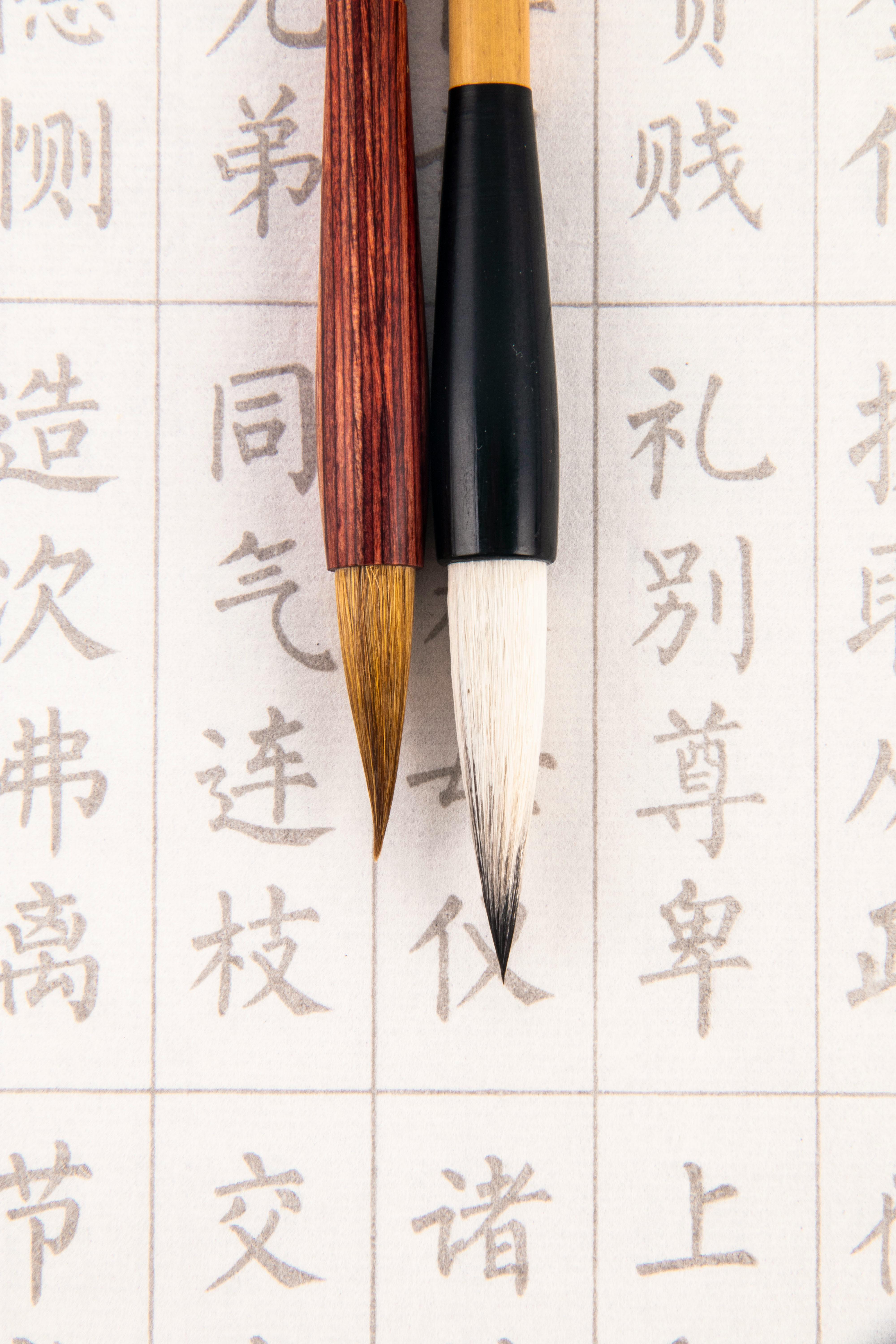
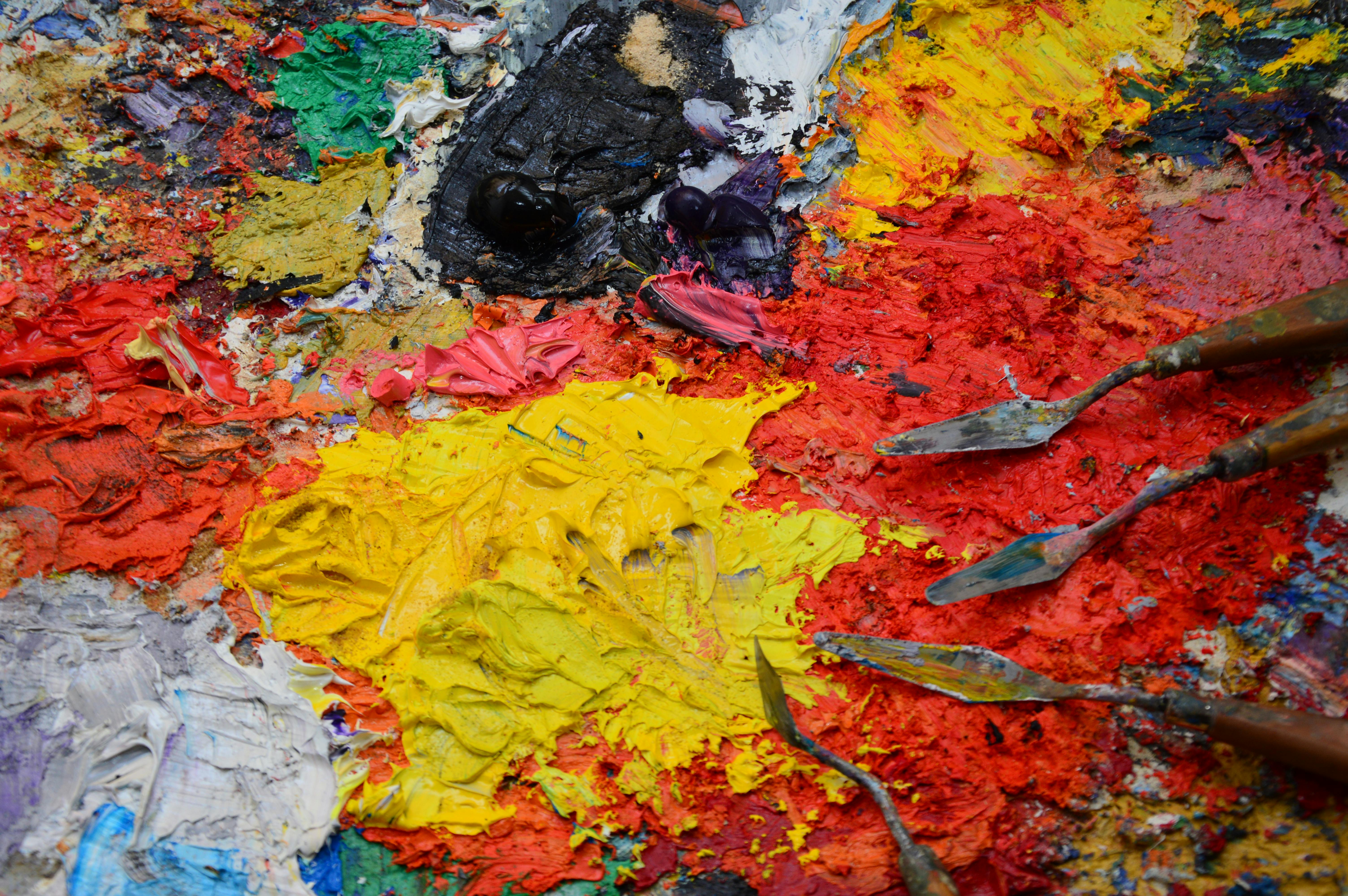
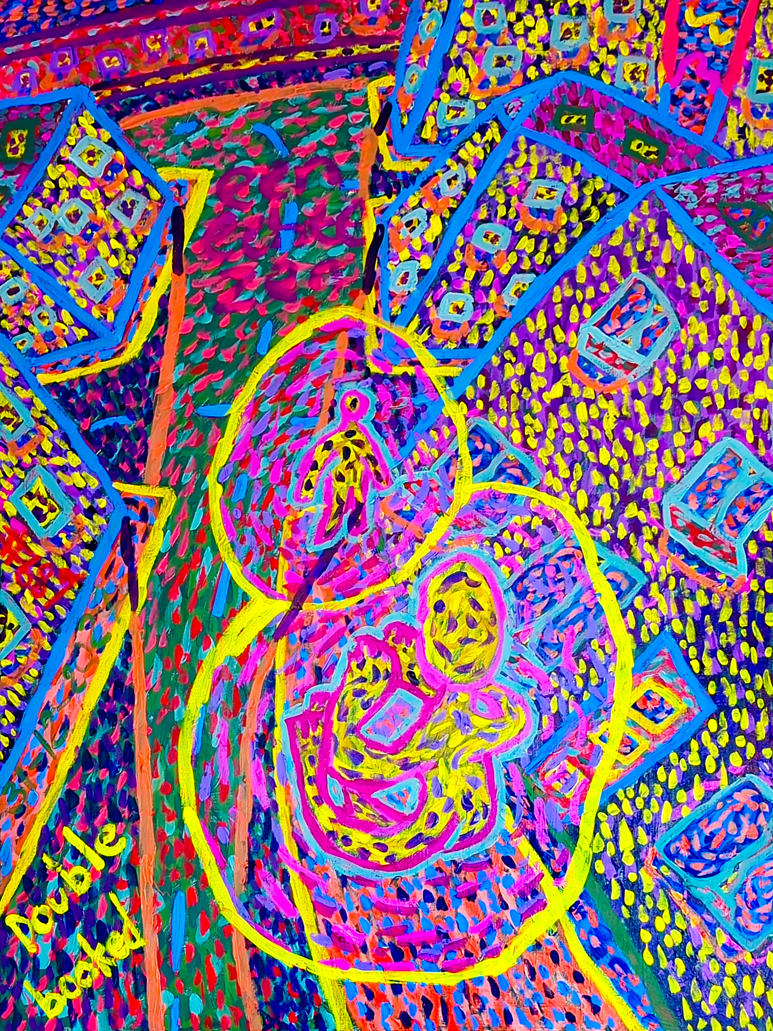