
Giclée vs. Lithograph vs. Screen Print: An Artist's Guide
Dive deep into the world of art prints with an artist's personal guide. Understand the unique processes, history, and feel of Giclée, Lithography, and Screen Printing to choose the perfect piece for your collection.
Giclée vs. Lithograph vs. Screen Print: An Artist's Personal Guide to Understanding Art Prints
Okay, let's talk prints. Not the kind you leave on your fingers after touching a wet surface (though sometimes my studio looks like that), but the kind you hang on your wall. If you've ever dipped a toe into the world of buying art, you've probably stumbled across terms like 'giclée', 'lithograph', and 'screen print'. And if you're anything like I was when I first started out, your eyes might have glazed over a little. I remember standing in a gallery, nodding along, pretending I knew exactly what the gallerist meant by 'a beautiful hand-pulled lithograph'. Inside, my brain was just screaming, 'Is it... printed? Like, on a printer? Why is it so expensive?' What's the difference? Why does it matter? And which one should you care about?
Think of this as our little chat over coffee (or turpentine, depending on my day) about how these beautiful things come into being. We're diving into the fascinating world of printmaking, where art meets technique in some truly magical ways. Printmaking itself is a vast universe, traditionally categorized into four main types based on how the ink is transferred: relief (like woodcuts or linocuts, where the image is raised), intaglio (like etching or engraving, where the image is incised), planographic (like lithography, based on a flat surface), and stencil (like screen printing). While there's a whole universe out there, today, we're focusing on giclée, lithography, and screen printing because they represent key shifts in technology and artistic approach, and they're the types you're most likely to encounter when looking to buy art. It's less about dry definitions and more about the feel, the process, and why an artist (like me!) might choose one over the other. If you're curious about Prints vs Paintings in general, that's a great place to start, but today, we're getting specific about prints.
Giclée: The High-Tech Whisper
So, you've seen 'Giclée' everywhere, right? Let's start with that, because it's probably the most common term you'll encounter for contemporary art reproductions. Pronounced "zhee-clay" (fancy, right?), it comes from the French word for "to spray" or "to squirt." And that's essentially what it is: a high-quality inkjet print.
Now, before you think "Oh, like my home printer?", hold up. Giclée printing is a whole different beast. We're talking professional-grade, large-format inkjet printers, often from brands like Epson or Canon, capable of incredibly high DPI (dots per inch) resolution. This means they can spray microscopic dots of ink onto the surface with astonishing precision, creating incredibly smooth color transitions and sharp details. Think of it like comparing a blurry, pixelated digital photo to a crystal-clear, high-resolution one – the higher the DPI, the more information and detail the printer can lay down. We also use archival inks that resist fading for a hundred years or more, and beautiful, often textured papers or canvases. The process is about making a faithful, high-quality echo of the original work, capturing the subtle nuances, the delicate color shifts, and the texture I worked into the original painting or drawing.
One crucial detail often overlooked is the ink itself. For true archival giclée prints, pigment-based inks are essential. Unlike dye-based inks (common in home printers) which are water-soluble and prone to fading over time, pigment inks use tiny solid particles suspended in a liquid. These particles are much more resistant to environmental factors like UV light and humidity, offering significantly better lightfastness and longevity – we're talking prints that can last for generations without noticeable fading. Paired with acid-free paper (which prevents yellowing and brittleness), you get a print built to stand the test of time.
One thing I love about working with giclée is the control over the final output. Choosing the right paper or canvas is a crucial step – it can dramatically change how the colors look and how the texture feels. It's part of the artistic process, even though the printing itself is done by a machine. It's why many artists, myself included, choose it for creating Limited Edition Prints Explained: Your Ultimate Art Guide of our original work. It makes art more accessible, allowing more people to own a piece they love, even if the original is long gone or costs a fortune. If you're thinking about Buying Art Prints, giclée is often a great entry point.
From my own experience, selecting the perfect paper for a giclée print can be almost as involved as choosing the canvas for the original painting. I remember one particular abstract piece with very subtle color gradients – we did several test prints on different papers, and the difference was astonishing. A matte, textured paper absorbed the ink differently than a smooth, bright white one, completely changing the mood of the piece. And then there's the digital file preparation – getting the colors on screen to match the printed output is a whole other challenge, a dance between calibration and test strips. It's a detail that might seem small, but it's where the artist's hand, even in a digital process, still guides the final outcome. It's not just hitting 'print'; it's about translating the original vision through a new medium. It's also worth noting that giclée can be used for both reproductions of existing physical art and for original digital art created specifically to be printed this way. Both are legitimate forms of art, though the 'original' digital print might hold a different kind of value than a reproduction.

How to Spot a Giclée: Look closely, perhaps with a magnifying glass if you have one handy. You'll see a pattern of tiny, uniform dots. The colors blend smoothly, without visible texture from the ink itself (though the paper might be textured). The detail is usually incredibly sharp.
Pros:
- Excellent color accuracy and detail, perfect for reproducing complex images like paintings or photographs.
- Archival quality (if done correctly with pigment-based inks and acid-free paper), meaning they can last for generations.
- Can be printed on various materials, offering flexibility in presentation.
- More accessible price point than originals, making art ownership achievable.
Cons:
- Lacks the direct "hand of the artist" in the printing process itself, as it's a reproduction method (though artist input in file prep/materials is key).
- Can sometimes be perceived as less valuable than traditional print types (though this is changing rapidly, especially for limited editions by established artists).
Giclée feels like capturing a moment with incredible fidelity, a high-definition echo of the original. So that's the digital precision... now let's step back in time to a more tactile method.
Lithography: The Art of the Stone (or Plate)
Leaving the digital precision of giclée, let's get our hands dirty with lithography. This is a much older printmaking technique, invented in 1796 by Alois Senefelder in Germany. It's based on the simple principle that grease and water don't mix. It feels like stepping into a different era of making things, where the physical interaction with materials is everything.
The artist draws directly onto a stone (traditionally fine-grained limestone) or a metal plate (like aluminum or zinc, which are more common today due to accessibility and weight) using a greasy medium (like a crayon or ink). This is where the artist's hand is directly involved in creating the image on the printing surface. The stone or plate is then treated with a chemical solution (often a mix of nitric acid and gum arabic). This treatment makes the areas with the greasy drawing repel water and attract oil-based ink, while the non-greasy areas attract water and repel the ink. When ink is rolled over the surface, it sticks only to the greasy parts (the drawing) and is repelled by the wet parts. Paper is then pressed onto the stone/plate, transferring the ink.
What I love about lithography is the texture and the subtle tonal variations you can achieve. It has a unique, often soft quality that's distinct from other methods. Unlike the tiny dots of a giclée, the ink in a lithograph can feel like a drawn line or a wash, with a beautiful, almost granular texture depending on the artist's technique and the stone's surface. It feels very much like a drawing that has been transferred, and you can often feel the slight raised texture of the ink on the paper. This reliance on tonal washes and drawn lines, rather than precise dot placement, is why it's generally less suited for reproducing highly detailed photographic images compared to giclée.
It requires a deep understanding of the process, patience (something I sometimes struggle with in the studio!), and a different kind of skill than painting or digital work. It's a truly hands-on process, a dance between the artist, the stone/plate, and the chemicals. Seeing a master lithographer at work is like watching a magician – they coax the image out of the stone with such skill and nuance. While I primarily work digitally for my prints now, I have immense respect for the craft of lithography and the artists who continue this tradition today, bridging centuries of technique with contemporary vision. Think of historical artists like Toulouse-Lautrec, Daumier, or even Picasso and Matisse, who explored lithography to create iconic works, often posters or illustrations, leveraging its unique textural qualities. Contemporary artists like Georg Baselitz and Frank Stella have also utilized lithography in their printmaking, demonstrating its enduring relevance.
I remember trying my hand at a basic lithography workshop once. The sheer weight of the stone was surprising, and the process felt incredibly deliberate. Getting the balance of grease, water, and ink just right felt like a delicate negotiation with the materials. I definitely ruined a few attempts by applying too much pressure or not enough water, watching my carefully drawn lines blur into an inky mess. It taught me a profound appreciation for the skill and patience required for this beautiful, traditional method. It's a process that demands a certain kind of surrender to the materials, a willingness to let the chemistry play its part.
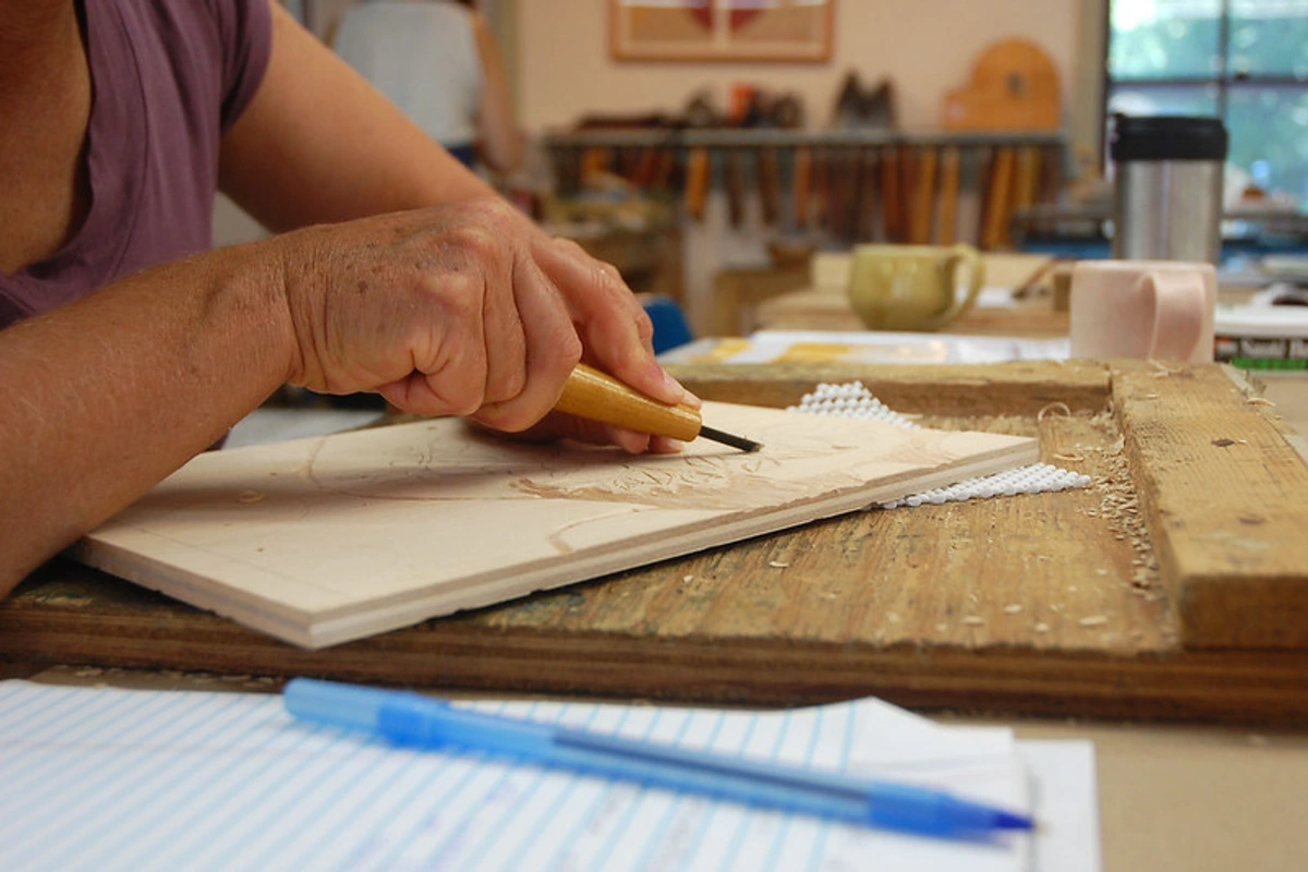
(This image shows woodblock carving, which, while different from lithography, shares that same sense of direct, manual interaction with the printing surface, a tactile process that contrasts with the digital nature of giclée.)
How to Spot a Lithograph: Look for a soft, often slightly granular texture in the ink. You won't see the uniform dot pattern of a giclée. The ink might feel slightly raised on the paper, and the image often has the quality of a drawing or wash rather than a photographic reproduction. Subtle tonal shifts are characteristic.
Pros:
- Allows for subtle tonal gradations and textures that are hard to replicate with other methods. The resulting image often has a unique, organic feel.
- Direct connection to the artist's drawing hand on the printing surface.
- Historical significance and a unique, often classic aesthetic.
- Often produced in smaller, more collectible editions, adding to their appeal.
Cons:
- Complex and labor-intensive process, often requiring specialized equipment and expertise, making it less accessible for many artists.
- Can be expensive to produce, which is reflected in the price.
- Less precise color matching compared to giclée, especially for photographic images.
Lithography feels like a direct conversation between the artist's hand and the surface, a drawn line brought to life through chemistry. Now, let's look at a method known for its bold impact.
Screen Printing: The Bold and the Beautiful
From the stone, we leap to the screen. Screen printing (also known as serigraphy) is probably the most versatile of the bunch, capable of producing everything from fine art prints to t-shirts and posters. You've definitely seen screen prints, even if you didn't know it. Think Andy Warhol - Campbell's Soup Cans or Roy Lichtenstein and Whaam!. It's got this raw, immediate energy that I find really exciting.
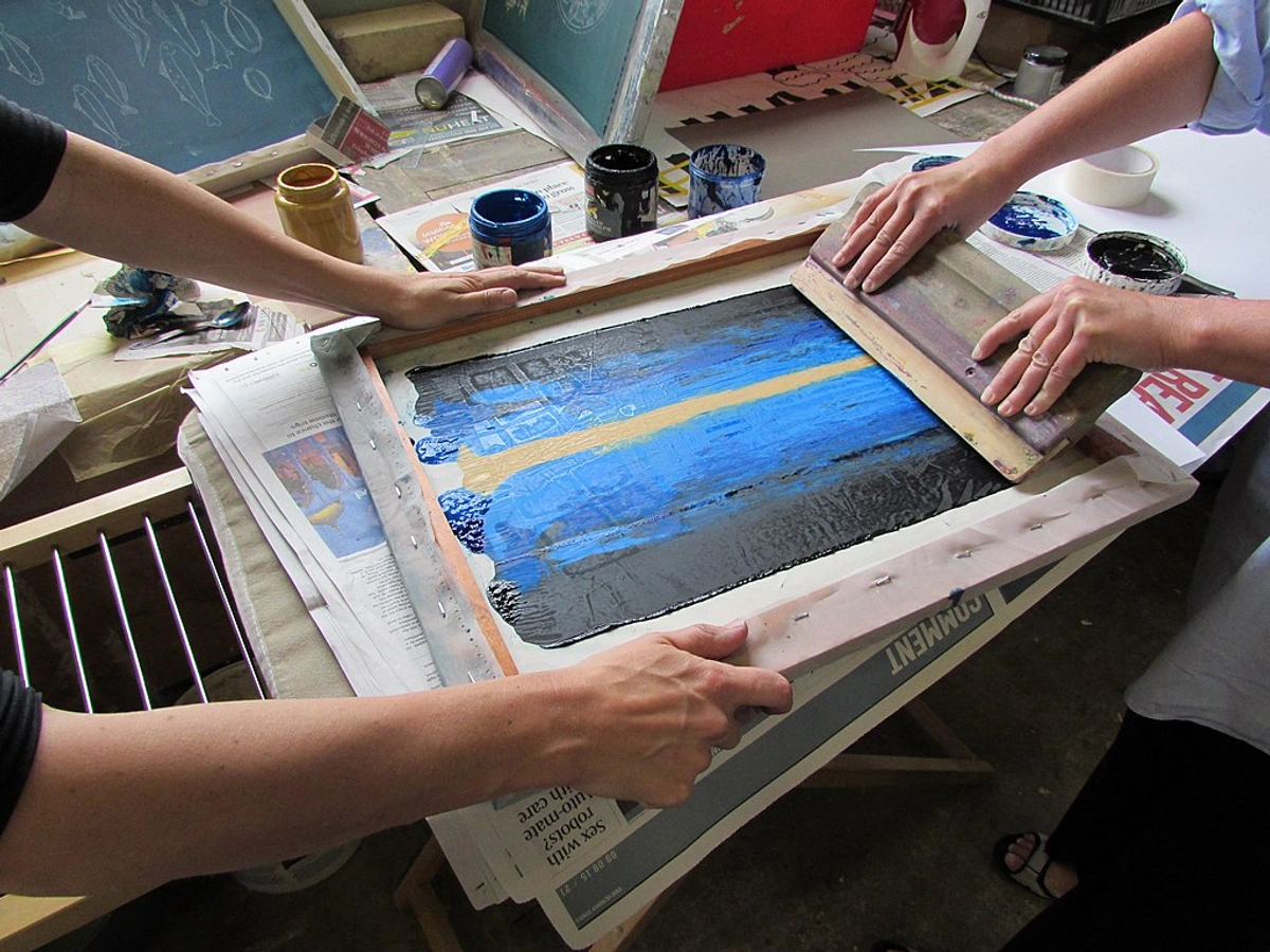
The process involves pushing ink through a mesh screen using a squeegee. Areas where you don't want ink to pass are blocked off with a stencil. These stencils can be created in various ways, from hand-cut paper or film stencils (like the classic paper stencil or rubylith film) to more modern photo emulsion techniques where a light-sensitive material is applied to the screen and hardened by light, leaving the unhardened areas open for ink. Each color requires a separate screen and pass. This layering of ink creates vibrant, often flat areas of color and a distinct tactile quality – you can often feel the layers of ink slightly raised on the surface. Pulling that squeegee, getting the pressure just right, lining up the layers perfectly... it's a physical challenge, but incredibly satisfying when it works. The smell of the ink, the rhythmic pull, the reveal of a new color layer – it's a very sensory experience. Registration, or lining up each color layer precisely, can be particularly tricky; even a slight misalignment can ruin a print, requiring a steady hand and meticulous attention to detail. This reliance on stencils and the mesh screen is also why screen printing is generally less suitable for reproducing highly detailed or photographic images compared to giclée. The mesh count of the screen and the edges of the stencil inherently limit the fineness of detail you can achieve, resulting in a more graphic, less photorealistic look. Think of it like trying to draw a detailed portrait with a thick marker versus a fine-point pen – the tool dictates the level of detail possible.
I love screen printing for its graphic punch. It's fantastic for bold designs, text-based art (Art with Words: Ultimate Guide to Text in Art), and achieving really intense, opaque colors that you can't always get with other methods. It feels very deliberate and graphic, almost like building the image layer by layer. While my own work leans towards the painterly, I admire the graphic artists who master screen printing to create powerful, impactful images. It's a technique that feels very direct and has a strong connection to popular culture and protest art (The History of Protest Art: Why Artists Speak Up Through the Ages). Contemporary artists like Richard Prince and Christopher Wool have famously used screen printing, often incorporating text and found imagery, showcasing its versatility beyond traditional graphic design.
I remember one screen printing project where I was trying to layer several bright, opaque colors. The physical effort of pulling the squeegee evenly across a large screen, print after print, was surprisingly demanding! And the registration... lining up the third color layer perfectly over the first two felt like performing surgery with a blunt instrument. But when I finally pulled that last screen and saw the vibrant, perfectly aligned layers pop off the paper, the satisfaction was immense. It's a process that demands your full physical and mental presence. There's a certain raw energy to it, a feeling of direct, physical creation that's different from the precision of giclée or the chemical dance of lithography.
How to Spot a Screen Print: Look for areas of solid, often opaque color. You'll likely see a distinct texture where the ink sits on top of the paper, sometimes with a slight ridge at the edges of the color areas. You won't see the smooth gradients of giclée or the granular texture of litho. If you look closely, you might even see the faint texture of the mesh screen within the ink.
Pros:
- Produces vibrant, opaque colors with a unique tactile feel. The ink sits on top of the surface, giving it a distinct texture.
- Versatile – can print on many surfaces, including paper, fabric, and wood.
- Distinctive graphic look, great for bold designs and text.
- Can be more affordable for larger editions than lithography.
Cons:
- Less suitable for highly detailed or photographic images compared to giclée due to mesh and stencil limitations.
- Limited color palette per print run (each color is a separate layer, which can increase complexity and cost).
- Registration (lining up layers) can be tricky and requires skill and precision.
Screen printing feels like building an image with layers of pure, bold color, a physical push and pull.
Why an Artist Chooses One Over the Other
As an artist, deciding which printmaking technique to use isn't just about the final look; it's a complex interplay of factors, a bit like choosing the right brush for a painting. Here's what often goes into that decision:
- The Nature of the Original Work: Is it a highly detailed painting with subtle gradients? Giclée is usually the best fit for faithful reproduction. Is it a bold graphic design or a text piece? Screen printing excels here. Is it a drawing or a work with delicate tonal washes? Lithography might capture that feel best.
- Desired Aesthetic: Do I want the smooth, high-fidelity look of a giclée, the hand-drawn texture of a lithograph, or the graphic punch and tactile ink layer of a screen print? The inherent qualities of each medium lend themselves to different artistic visions.
- Edition Size and Cost: Lithography and screen printing often involve significant setup costs (preparing stones/plates/screens), but the cost per print can decrease for larger editions. Giclée has lower setup costs but the cost per print is more consistent regardless of edition size. For small, limited editions of reproductions, giclée is often more practical. For large runs of posters, screen printing might be more economical.
- Accessibility and Expertise: Setting up a lithography or screen printing studio requires significant space, equipment, and specialized knowledge. Giclée printing, while still needing professional equipment for archival quality, is often more accessible through print-on-demand services or specialized print shops, lowering the barrier to entry for artists.
- The Physical Process: Some artists are drawn to the hands-on, physical nature of pulling a screen print or working the stone in lithography. It's part of the art-making experience itself. Others prefer the control and precision offered by the digital workflow of giclée.
- Philosophical or Conceptual Reasons: An artist might choose a traditional method like lithography to connect with art history or for the unique 'aura' of a handmade print. They might choose screen printing for its association with pop culture or its graphic immediacy. Giclée might be chosen for its democratic potential, making art accessible, or for creating original digital works.
It's rarely a simple choice, and many artists experiment with multiple techniques throughout their careers. It's about finding the right tool to translate the idea from my head (or my canvas) into a form that resonates.
Comparing the Trio: A Quick Look
So, we have the high-tech precision of giclée, the historical, hand-drawn feel of lithography, and the bold, layered impact of screen printing. Each has its own personality and strengths. Here's a simplified table to help you see the key differences at a glance:
Feature | Giclée | Lithograph | Screen Print | How to Spot It |
|---|---|---|---|---|
| Process | High-resolution inkjet spray | Drawing on stone/plate (grease/water) | Pushing ink through a stencil on a screen | See details above |
| Look/Feel | Smooth transitions, detailed | Subtle tones, often textured, hand-drawn feel | Bold, flat colors, graphic, tactile ink layer | See details above |
| Detail | Very high | High (like a drawing) | Moderate (depends on mesh/stencil) | Look closely at fine lines and gradients |
| Color | Wide gamut, precise matching | Subtle, tonal, less precise matching | Vibrant, opaque, layered | Observe color blending and opacity |
| "Handmade" | Artist prepares digital file, selects materials | Artist draws directly on stone/plate | Artist creates stencils/separations, pulls print | Consider the process behind the image |
| Cost | Varies, often accessible for reproductions | Can be expensive due to labor/materials | Varies, can be cost-effective for editions | Generally reflected in the final price |
Ultimately, the "best" print isn't about which technique is inherently superior, but which one best serves the artist's vision and resonates with the viewer. It's about the intended outcome and the unique qualities each process brings.
Which Print is Right for You?
So, you're looking to Buy Art for Beginners: Your Simple Guide to Finding and Loving Art and wondering which type of print to choose? It really comes down to what you're looking for and what resonates with you. Understanding the process behind the print can add another layer of appreciation, helping you connect with the artist's intent and the journey the artwork took. If you have the chance, visiting galleries or studios to see and even feel the different print types in person can be incredibly helpful!
- If you want a high-quality, accurate reproduction of a painting or photograph, with lots of detail and a wide range of colors, Giclée is likely your best bet. They offer fantastic quality and longevity, making them a great way to own a piece by an artist you admire without the price tag of an original. They look great framed and displayed in your home (Art at Home: A Personal Guide to Choosing & Displaying Art). When you look closely, you'll see the smooth gradients and fine detail, almost like looking at the original through a magnifying glass. That smooth gradient you see? That's the tiny ink spray at work, building up the image dot by dot. And yes, giclée can be printed on textured papers or canvas to add a tactile dimension, though the texture comes from the substrate, not the ink layers themselves.
- If you appreciate the history of printmaking, the visible hand of the artist in the drawing process, and a unique, often subtle texture, a Lithograph might be calling your name. These often feel more like an original drawing than a reproduction, and running your hand over the surface can reveal the tactile quality of the ink. It's a whisper on the paper, a direct connection to the artist's touch on the stone.
- If you love bold graphics, vibrant colors, and a print that feels a bit more raw and handmade (in a different way than lithography), Screen Printing is fantastic. They have a distinct pop and often work well for graphic or text-based pieces. The layered ink often has a noticeable texture you can feel – ink with attitude, sitting proudly on the surface.
Ultimately, the "right" print is the one you connect with. Don't get too hung up on the technical terms initially. Look at the art, see how it makes you feel, and then maybe peek at the description to understand how that feeling was created. Whether you're Starting an Art Collection on a Budget | Affordable Tips for Beginners or looking for something specific, understanding the medium adds another layer of appreciation.
Caring for Your Art Prints: A Quick Guide
No matter which type of print you choose, proper care is essential to ensure it lasts for generations. Think of it as giving your print a happy, long life. Here are a few key tips:
- Handle with Care: Always handle prints with clean, dry hands. Ideally, wear cotton gloves, especially for delicate or older prints. Avoid touching the printed surface directly, as oils from your skin can cause damage over time. This is particularly important for screen prints where the ink sits on top.
- Framing is Key: Frame your prints using archival-quality materials. This means acid-free matting and backing boards that won't yellow or degrade the paper over time. Use UV-protective glass or acrylic to shield the print from harmful ultraviolet rays, which cause fading (Protecting Your Art from Sunlight: An Artist's Guide to Preservation).
- Location, Location, Location: Avoid hanging prints in direct sunlight, which is the biggest culprit for fading. Also, steer clear of areas with high humidity (like bathrooms, unless specifically framed for it - see Bathroom Art Guide: Style & Survival in Steamy Spaces) or extreme temperature fluctuations, as these can damage the paper and ink.
- Cleaning: For dusting, a soft, dry brush or a microfiber cloth is usually sufficient. Never use liquids or cleaning products directly on the print surface unless specifically advised by a professional conservator for that particular print type.
Taking these simple steps will help preserve the beauty and value of your art prints for years to come.
FAQ: Quick Answers to Your Print Questions
Q: Are art prints considered "real" art? A: Absolutely! Prints are a legitimate and often highly collectible form of art. The artist is involved in the creation process, whether it's making the original image for a giclée, drawing on the stone for a lithograph, or creating the stencils for a screen print. Many famous artists throughout history have been prolific printmakers.
Q: What's the difference between an "Original Print" and a "Reproduction Print"? A: This is a key distinction! An Original Print (like a lithograph, screen print, etching, woodcut) is an image created specifically for that printmaking process. The artist works directly on the plate, stone, or screen, and the resulting prints are considered original works of art, not copies of something else. A Reproduction Print (like a giclée) is a print made to reproduce an existing artwork, such as a painting, drawing, or photograph. Both can be high quality and valuable, and reproductions can also be released as Limited Edition Prints Explained: Your Ultimate Art Guide and signed by the artist, adding to their collectibility.
Q: What's the difference between a "Limited Edition" and an "Open Edition" print? A: A Limited Edition print is produced in a fixed, predetermined number (e.g., an edition of 100). Once all prints in that edition are sold, no more will be made from that specific image and size. These are typically signed and numbered by the artist, and their value can increase over time due to their rarity. An Open Edition print, on the other hand, is not limited in number. Prints can be produced indefinitely as long as there is demand. They are usually less expensive than limited editions and may or may not be signed by the artist.
Q: Which type of print is the most valuable? A: Value in prints is complex and depends more on the artist's reputation, the size of the edition, the condition of the print, and market demand than solely on the printing technique itself. Historically, lithographs and screen prints by famous artists have fetched high prices, but high-quality, limited edition giclées by sought-after contemporary artists can also be very valuable. It's less about the how and more about the who and the rarity. (Are Art Prints a Good Investment? My Personal Take)
Q: Can I frame all these types of prints the same way? A: Generally, yes. All prints should be framed using archival materials (acid-free matting and backing) and UV-protective glass or acrylic to prevent fading and damage. The specific framing style will depend on the artwork and your personal taste. Check out The Ultimate Guide to Framing Your Artwork: Tips & Techniques for more details.
Q: What does it mean if a print is signed and numbered? A: If a print is part of a limited edition, it will typically be signed and numbered by the artist. The numbering usually appears as a fraction, like "15/100". The first number (15) indicates the specific print number within the edition, and the second number (100) indicates the total size of the edition. An artist's signature adds authenticity and value, confirming it was approved by them. For limited editions, the smaller the edition size, generally the higher the value per print, reflecting its rarity. An artist's proof (AP) is another term you might see; these are prints outside the main edition, kept by the artist, and can also be valuable.
Wrapping Up
Navigating the world of art prints can feel a bit like learning a new language, but hopefully, this little guide has made it a bit clearer. Giclée, lithography, and screen printing each offer a unique way to bring an artist's vision to life, with their own distinct textures, colors, and histories. Looking closely at the surface – feeling the raised ink of a screen print, seeing the subtle grain of a lithograph, or admiring the smooth detail of a giclée – can really deepen your connection to the piece.
As an artist, I find beauty in all these processes. They each present different challenges and opportunities. When I create a giclée print of one of my abstract paintings, I'm thrilled by how accurately it captures the original energy and color. It allows my work to find homes with people who connect with it, perhaps through my art for sale page, who might not be able to acquire an original. Exploring different print methods, even just understanding them, feels like adding more tools to the artistic toolbox, or maybe just more ways to see the world. Understanding the nuances of each process, from the digital precision of giclée to the physical demands of screen printing and the chemical dance of lithography, has definitely deepened my appreciation for the incredible range and history of printmaking as an art form.
Understanding the process behind the print can deepen your appreciation for the artwork itself. So next time you see one of these terms, take a moment. Look closely. Feel the surface (if you're allowed!). Think about the journey that piece took to get to you. Happy collecting!


