
Copic Markers Review: An Artist's Deep Dive into Professional Performance & Value
An artist's candid, in-depth review of Copic markers. Explore their unparalleled blendability, refillability, and vast color system to see why they're a top investment for any professional studio.
My Candid Copic Markers Review: A Professional Artist's Perspective For Your Studio
Let’s be brutally honest for a moment: Copic markers? My initial thought was always, 'Oh, those glorified felt-tips. Cute for sketching, perhaps, but hardly a serious contender in my studio.' And believe me, that dismissive attitude lasted for a good, long while. As someone whose artistic world is painted in broad strokes of acrylics and oils, where the palette knife reigns supreme and 'messy joy' is a legitimate technique, precision markers felt… well, a bit like admitting I still occasionally dabble with crayons. (No judgment, just not my professional vibe, right?)
But here's the confession: I fell hard for them. It started subtly, a new fascination with line work and crisp edges, a desire to define certain forms more sharply than a brush sometimes allows. And once you dip your toes into the world of alcohol markers, it’s almost inevitable that you’ll eventually find yourself staring longingly at the Copic display, contemplating the investment. So, after a considerable amount of time spent with these beauties, let me share my unvarnished thoughts. Are they worth the hype for a professional artist? Let's dive in.
The Allure of Alcohol: What Makes Copics Stand Out?
It’s not just the sleek design or the satisfying click of the cap that whispers 'professional tool.' The true alchemy of Copic markers, and frankly, any truly great alcohol-based marker, is etched within their very ink. See, unlike water-based inks – which I've found can sometimes behave like a moody teenager, leaving streaks and demands for immediate attention – alcohol inks are different. They contain a solvent (the alcohol, obviously) that allows the pigments to stay 'open' and workable for longer on the page. This means when you layer colors, they don't just sit on top of each other; they fuse. It’s less about applying layers and more about watching two vibrant liquids perform a graceful, synchronized dance into a single, seamless gradient. It's like pouring two distinct, colorful syrups onto a pancake, only to watch them swirl into an entirely new, unbroken hue right before your eyes. No harsh lines, no muddying chaos – just a beautiful, unbroken stream of color that truly has to be seen to be believed.
Markers themselves have an interesting lineage, evolving from simple felt-tip pens in the mid-20th century to the sophisticated artist's tools we see today. Copic really pushed that evolution, focusing on refillability and blendability, carving out a niche for serious artists who demand performance.
My first real "aha!" moment with Copics was trying to blend two seemingly disparate colors. I expected harsh lines, maybe some muddying. Instead, with a light touch and a bit of practice, they just… flowed. It was like watching two distinct rivers merge into one beautiful, unbroken stream. This blendability is a game-changer, especially for rendering smooth transitions in illustrations, fashion design, or even for adding detailed shadows and highlights to abstract elements. I find myself reaching for them even when sketching out concepts for larger paintings, enjoying the immediate feedback of pure, vibrant color. For more on how artists leverage color in general, you might find this interesting: how artists use color.
Beyond the First Stroke: Why the Investment Makes Sense (Mostly)
This intoxicating blendability, this vibrant purity of color, it's a siren song for any artist craving more control and luminosity in their work. But, and you knew there was a 'but' coming, right? This kind of magic doesn't exactly come free.
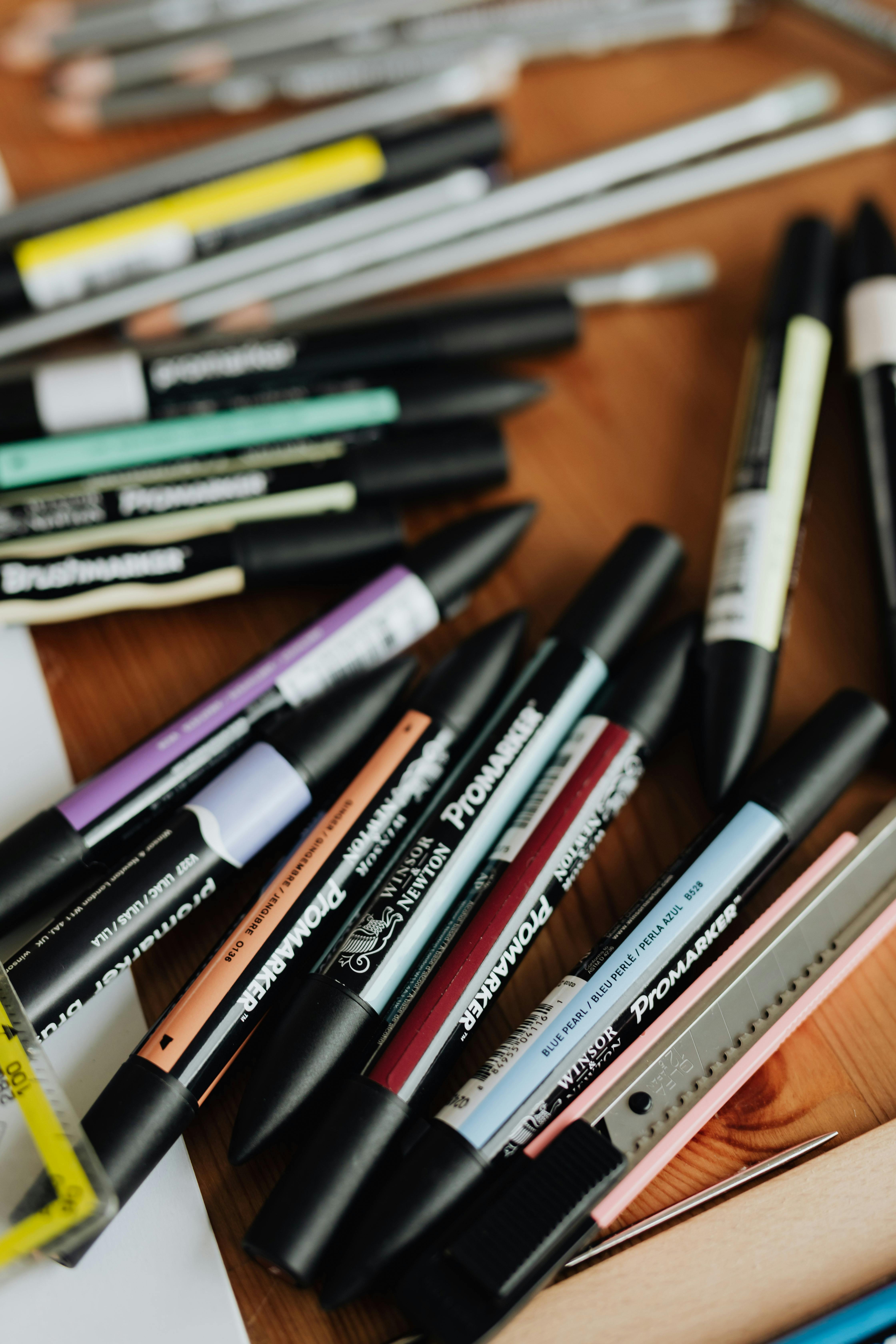
Let’s not mince words: the price tag on Copic markers can feel like a swift, targeted punch to the gut. I remember staring at the display, my internal accountant doing frantic calculations and weeping openly into an imaginary ledger. For hobbyists, bless their hearts, there are genuinely excellent and more wallet-friendly alternatives, like Promarkers – which are fantastic, mind you, and a great entry point into the alcohol marker world as you can see here: 
credit, licence. But for those of us who rely on our tools to translate vision into livelihood, Copics aren't just a purchase; they're an investment in longevity and consistent quality. And that, my friend, is where the 'professional' part of the title truly clicks into place.
The Refillable Nature
This is, arguably, Copic's mic drop moment. Every single Copic marker is designed to be refilled using their Copic Various Ink. This isn't just about saving money in the long run (though fifteen refills from one bottle? Yes, please!). It’s about a commitment, almost a relationship, with your tools. You’re not buying a disposable item; you’re acquiring a durable studio asset, much like a cherished set of paint brushes. Many other brands offer refill inks for some lines, but Copic's system is uniquely comprehensive and easy to navigate. It significantly reduces environmental waste, and honestly, the sheer satisfaction of knowing you can bring a beloved, dried-out marker back to life is immense. So, if you’re looking for sustainability and long-term value, the refillable nature of Copics is a powerful argument for the investment.
Replaceable Nibs
Another stroke of genuine genius, and a feature I appreciate more than I care to admit. The nibs – be it the incredibly versatile brush nib or the broad, workhorse chisel nib – are designed to be easily replaced. I confess, I’m occasionally a bit… enthusiastic with my pressure. There was this one time I was really feeling a piece, and I swear I carved a small divot into my paper, along with completely flattening a brush nib. Instead of tossing a perfectly good marker, I just popped out the old nib and inserted a new one. This extends the life of your markers dramatically and, more importantly for a professional, ensures consistently sharp lines and smooth ink flow, allowing you to maintain that expressive quality I often reflect on in my explorations of line in abstract art. The ability to replace nibs means your tool always performs at its peak, prolonging its life and maintaining your artistic precision.
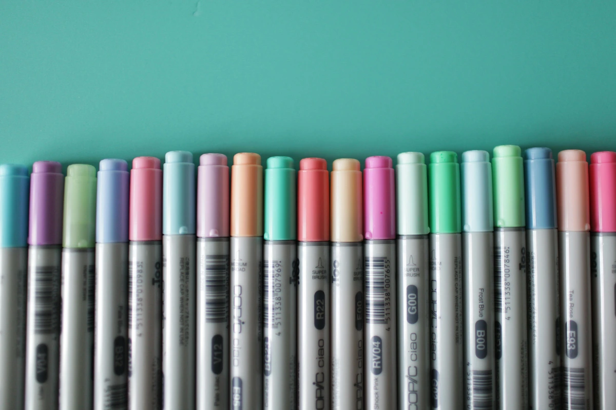
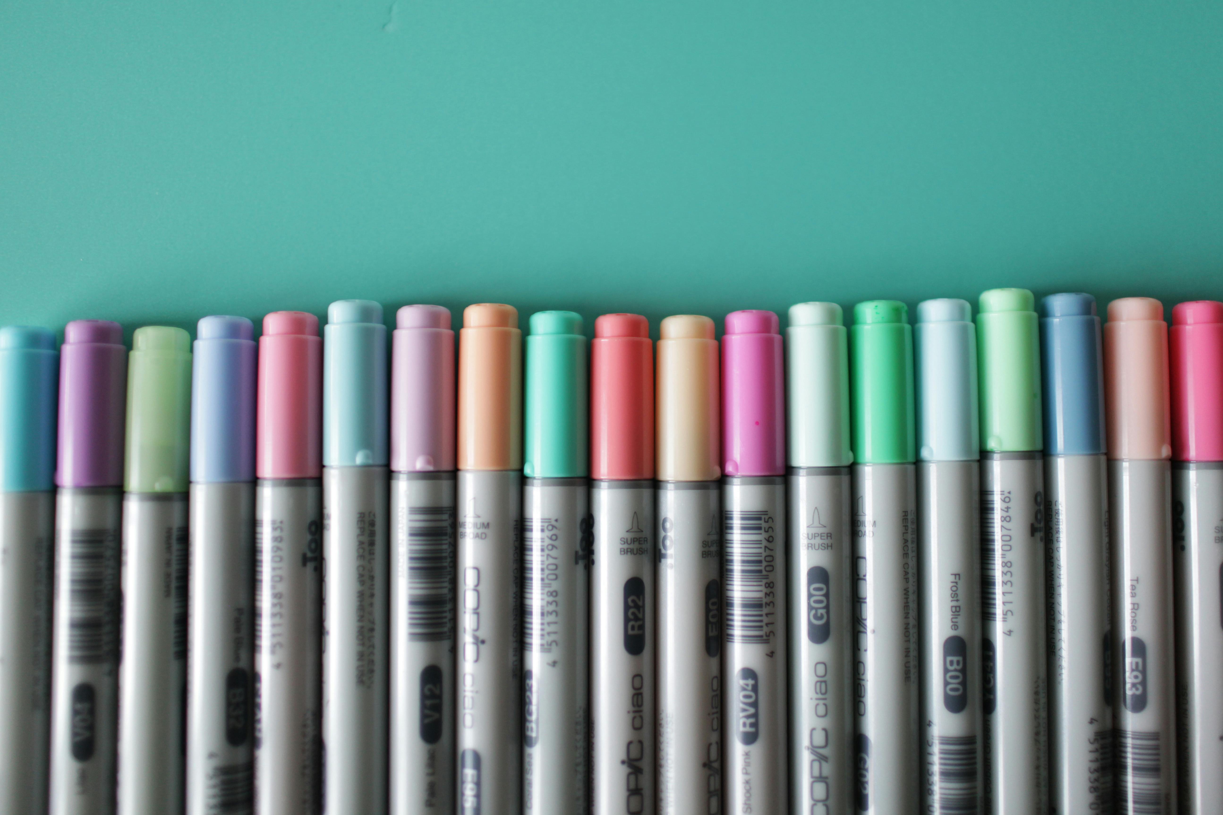
Expansive Color System
Copic's color system is a masterpiece in itself. With over 350 colors (and growing!), the sheer volume can feel a little overwhelming at first, like being dropped into a labyrinth of vibrant possibility. But once you grasp the logic, it's incredibly empowering. Each marker has a code, like B05, R29, or YG07. The letter (e.g., 'B' for Blue, 'R' for Red) indicates the broad color family. The first number ('0' in B05) represents the saturation level (or 'color family' within the hue), while the second number ('5' in B05) indicates the brightness or value, often from lighter to darker. So, a B05 might be a mid-tone, moderately saturated blue. If you pick up a B04, it’ll be slightly lighter; a B06, slightly darker – perfect for effortless gradients. This systematic approach is invaluable for building cohesive palettes, ensuring color harmony across projects, and even communicating color choices with clients. It's a level of organization that truly supports professional-level work, where color consistency is paramount. Just thinking about it makes me want to dive into my approach to color mixing again! The comprehensive and logical color system simplifies complex color choices, fostering consistency and efficiency in your professional workflow.

Where Copics Truly Shine: Specific Artistic Applications
So, where do these magical tools truly shine? Beyond standard illustration and graphic design, Copics are indispensable in fields like fashion design for rendering fabric textures and draping, architectural visualization for quick yet polished conceptual sketches, comic and manga art for dynamic cel-shading effects, and even for custom apparel design where crisp, vibrant color mock-ups are essential. I've even found them surprisingly adept at adding intricate details or sharp contrasting elements to my larger abstract pieces, giving a precision that a brush sometimes can't quite achieve.

Working with Copics: Tips from My Studio
Alright, now for the hard-won wisdom from the trenches of my studio – where things often go gloriously, or hilariously, wrong. These aren’t just tips; they're battle scars and triumphant epiphanies, packaged for you.
Paper Matters, A Lot.
Here’s a non-negotiable truth: alcohol inks bleed. It’s their nature, the very solvent that makes them blend so beautifully also makes them eager to spread through paper fibers. So, always, always use the right paper. Heavy cardstock, dedicated marker paper designed for alcohol inks, or smooth Bristol board are your allies here. I once, in a moment of pure, unadulterated hubris, tried a quick sketch on some standard printer paper without a protective sheet underneath. Let's just say my desk now has a permanent, vibrant blue "abstract" stain that serves as a constant, humbling reminder. If your paper is thin, a protective sheet is non-negotiable.
Layer, Don't Press.
This is crucial for those luminous, seamless gradients. Rather than leaning into the nib with all your might, build up intensity slowly with multiple, lighter layers. Pressing too hard not only risks damaging your precious nibs but also saturates the paper too quickly, leading to uneven drying and often, a muddy, over-worked look rather than the desired smooth blend. Think of it like coaxing a delicate watercolor wash, not scrubbing a stubborn stain.
The Colorless Blender
Oh, the mighty colorless blender! Don’t you dare underestimate this unsung hero. It's not just a fancy eraser (though it's brilliant for softening edges or lifting a bit of excess color). It's a magic wand capable of pushing pigments, lightening areas, creating interesting textures, and even producing faux-watercolor effects. Experiment with it; you'll uncover its versatility like finding hidden treasures in your own studio.
Ventilation is Your Friend
Let's talk fumes. Alcohol markers, by their very nature, release alcohol vapor. While usually mild, in a closed-off space or during extended drawing sessions, these fumes can accumulate. So, please, open a window, turn on a fan, or take regular breaks. Your nose, and frankly, your brain, will thank you. My studio can get a bit cluttered, as you can probably imagine if you've seen my Cluttered Artist's Workbench with Painting Supplies – but I try to keep my Copics organized and the air flowing!
Storage is Key
This is a simple one, but vital. Store your Copic markers horizontally. This ensures the ink is evenly distributed to both nibs, preventing one from drying out faster than the other and maintaining consistent performance over time. A small detail, but one that makes a big difference to the longevity of your investment. These little bits of studio wisdom, hard-won through countless hours (and a few mistakes!), are what truly help unlock the full potential of your Copic collection.
FAQ: Your Burning Copic Questions Answered (My Way)
Q: Are Copic markers truly necessary for a professional artist?
"Necessary" is such a loaded word in art, isn't it? As if anyone can truly dictate what you need. But if your professional practice involves illustration, graphic design, concept art, or intricate studies for larger paintings, then yes, I’d argue they offer a significant professional edge. The precision, the vibrant blendability, the sheer control they afford – it’s a tactile experience that feels like an extension of your artistic hand, allowing a level of detail and luminosity that’s hard to achieve with other mediums. It truly makes the creative flow feel more intuitive, something I value deeply in my creative flow. They empower you to execute ideas with crispness and speed, which, in a professional setting, is priceless.
Q: What's the difference between Copic Sketch and Copic Ciao?
This is a common one! They both share the same fantastic alcohol-based ink and feature the beloved brush nib and a chisel nib. The core differences, however, can guide your choice:
Feature | Copic Sketch | Copic Ciao |
|---|---|---|
| Shape | Oval barrel (prevents rolling) | Round barrel |
| Size | Larger ink capacity | Smaller ink capacity |
| Colors | Full range of 358 colors | 180 colors available |
| Nibs | Super Brush and Medium Broad Chisel (both replaceable) | Super Brush and Medium Broad Chisel (both replaceable) |
| Price | Generally higher | More affordable entry point |
| Best For | Professionals, large projects, extensive color palettes | Students, beginners, smaller projects, travel kits |
For professional work, I lean towards the Sketch for its larger ink capacity and the full spectrum of colors. But Ciao is an absolutely brilliant entry point, perfect for students or for building a travel kit. And while we’re talking types, keep an eye out for Copic Wide (for broad strokes and calligraphy) and Copic Multiliner pens (my go-to for crisp outlines and detailing that won't bleed when colored over with alcohol markers). They all complement each other beautifully.
Q: Can I use Copic markers with other art mediums?
Absolutely! They're surprisingly versatile team players. I often use them for initial conceptual sketches, detailed outlines, or adding vibrant underlayers before bringing in colored pencils, fine-liners, or even light washes of watercolor. The key is to be mindful of the order: alcohol markers can reactivate some water-based mediums, so it’s usually best to apply Copics first, or ensure your other layers are completely, utterly dry. They’re a fantastic addition to mixed media explorations, adding a unique, almost digital-level of polish and vibrancy to traditional art.
Q: What about ink flow problems or dried-out markers?
Ah, the inevitable moment when your beloved marker starts sounding like it's running on fumes, or worse, just… stops. Don't panic! For ink flow issues, often a quick refill with Copic Various Ink is all it takes. If a marker seems truly dried out, it might just be the nibs. Try replacing them first. If the ink itself is truly gone, refilling is straightforward. Just be sure to store your inks properly (cool, dark place) and keep those marker caps clicked tight! It’s like tending to a garden; a little consistent care goes a long way.
Copics vs. Other Pigment Powerhouses: A Brief Comparison
Where do Copics fit alongside other high-end pigment powerhouses, like artist-grade colored pencils or soft pastels? It’s less about 'either/or' and more about 'and.' While colored pencils offer incredible control for fine detail and layering texture, and pastels provide a rich, soft, painterly effect, Copics bring a unique immediacy and vibrant translucency. For smooth, seamless gradients and brilliant, flat washes of color without brushstrokes, they are unmatched. They don't replace pencils for intricate hair textures or pastels for soft atmospheric effects, but they excel in quick rendering, vibrant color blocking, and creating illustrations with a clean, graphic edge. It's about choosing the right tool for the specific effect you're after, and Copics fill a very distinct, powerful niche.
Final Thoughts: My Love-Hate Relationship That Became Just Love
My journey with Copic markers began with skepticism, matured into a begrudging respect, and finally blossomed into genuine affection. They truly did feel like just another expensive tool in a studio already overflowing with brushes and paints – a veritable art supply dragon's hoard, some might say! (Though if you want to glimpse some of my truly beloved traditional tools, check out my favorite art inspirations). But these markers, these vibrant, blendable, endlessly refillable beauties, have utterly surprised me, revealing a depth and versatility I genuinely hadn't anticipated.
For professional artists who demand precision, vibrant color, and tools that not only last but adapt with their practice, Copics are an investment that pays dividends in creative satisfaction. They've nudged me, gently but firmly, to explore new facets of my artistic expression, even influencing the crispness and defined forms I sometimes chase in my abstract pieces. They’re not just markers; they’re a meticulously designed system, a commitment to quality, and dare I say, an absolute joy to work with. If you're serious about your craft, if you crave that crisp line or that perfectly seamless gradient, give them a fair shot. Your artistic world might just get a whole lot more colorful, and who knows, maybe the next time you visit my museum in 's-Hertogenbosch, you'll spot some preliminary Copic sketches on display – a quiet testament to their evolving influence on my artistic journey, which you can read more about in my timeline. You might even find some new pieces, perhaps influenced by a marker or two, for sale on my site someday.


