Beyond the Spectrum: My Intuitive Dance with Complementary and Analogous Colors in Abstract Art
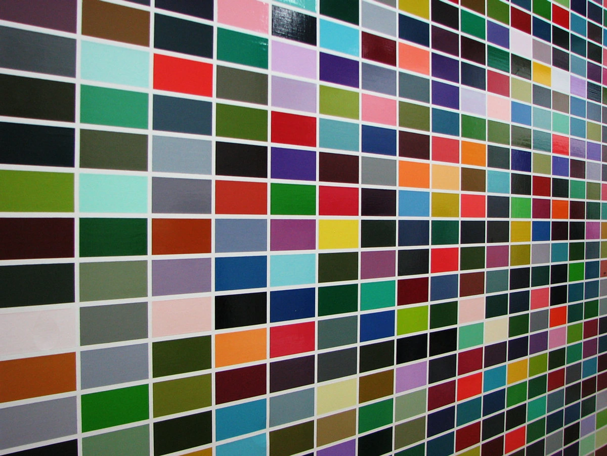
You know, sometimes I look at my early paintings and chuckle. They’re like a brave but slightly misguided first date – full of enthusiasm, but maybe a little too eager to impress, a bit chaotic. I thought I was listening to the colors, but really, I was just letting them shout, sometimes at cross-purposes, bless their little hearts. One of the biggest lessons I’ve learned on this winding road of finding my voice: the evolution of my abstract artistic style has been how to truly listen to color. It’s not just about picking pretty shades; it’s about understanding their relationships, their squabbles, their quiet harmonies, and how they play out on the canvas. It's about moving from simply seeing color to feeling its profound, emotional language, a journey deeply intertwined with the emotional language of color.
For me, abstract art is a dialogue with art, and color is often the loudest voice in the conversation. When I first delved into color theory – the kind of stuff you learn in art school, all very precise and scientific – I felt a bit like a kid in a candy store told to only pick out the green jelly beans. Or maybe like being handed a complex orchestral score and told, "Just play it perfectly!" Overwhelming! While principles from folks like Goethe (who explored the psychological impact of colors and their inherent character) and Itten (who systemized color contrasts and developed the color wheel as we know it) are foundational guideposts, over time, especially with abstract painting, I’ve realized that the 'rules' of complementary and analogous colors are fantastic starting points, but the real magic happens when you move beyond the spectrum and let intuition lead. It's about finding the emotional resonance that works for me, not just what the textbook dictates.
In this exploration, I’ll take you through my personal journey with both complementary colors – those dynamic opposites that spark tension and excitement – and analogous colors – the harmonious neighbors that sing a cohesive song. But more than just the technical aspects, we’ll delve into how intuition, emotion, and the canvas’s own whisper truly guide my hand, transforming theory into profound artistic expression.
https://live.staticflickr.com/3173/2971037978_95f41144d3_b.jpg, https://creativecommons.org/licenses/by/2.0/
My Dance with Complementary Colors: The Beautiful Collision
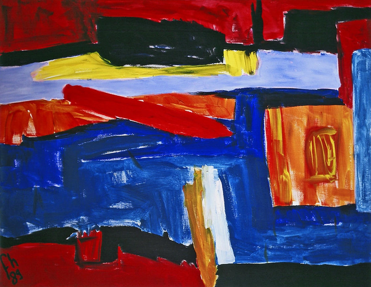
There’s a thrilling, almost rebellious energy in the clash of complementary colors, isn't there? Let's talk about those pairs that sit opposite each other on the color wheel: red and green, blue and orange, yellow and purple. Initially, they felt a bit aggressive to me, like shouting matches on the canvas. My inner peacemaker wanted everything harmonious and calm. I'd try to use them, and sometimes the result was less "vibrant spark" and more "clashing headache." I remember one early piece, a vibrant red and green attempt, that looked less like a festive holiday and more like an argument between two very strong-willed personalities – I think I actually named it 'The Debate' in my head. There was a fear of visual discord, a feeling that these colors were simply too much for a single canvas, but then, a lightbulb moment (probably after one too many coffees and a frustrated scrape of the palette knife): these aren't just opposites; they're partners in intensity.
In my abstract work, I don't use complementary colors to create perfect, jarring contrasts every time. Instead, I use them for that exquisite tension, that vibrant spark that makes a painting truly sing. Think of a vibrant tangerine orange bleeding into a cool, deep ultramarine blue, not covering it, but existing alongside it. It’s not about overpowering; it’s about making each color feel more alive, more itself, because of its counterpart, in the same way a single, sharp, unexpected note can make an entire chord resonate more profoundly.
Sometimes, I'll use a tiny fleck of a complementary color to make an entire dominant hue vibrate. Imagine a vast expanse of emerald green, and then, nestled in a corner, a single, almost imperceptible dot of crimson. It's a subtle trick, a whisper rather than a shout, but it makes a huge difference in the overall energy, making the green feel greener. It’s my way of adding a mischievous twinkle to an otherwise placid composition. It adds that little bit of controlled chaos that makes abstract art so captivating. This subtle accent often serves as a powerful focal point, drawing the eye and evoking a surge of energy.
https://www.flickr.com/photos/abstract-art-fons/30634352376, https://creativecommons.org/licenses/by/2.0/
The Gentle Embrace of Analogous Colors: Harmony and Flow
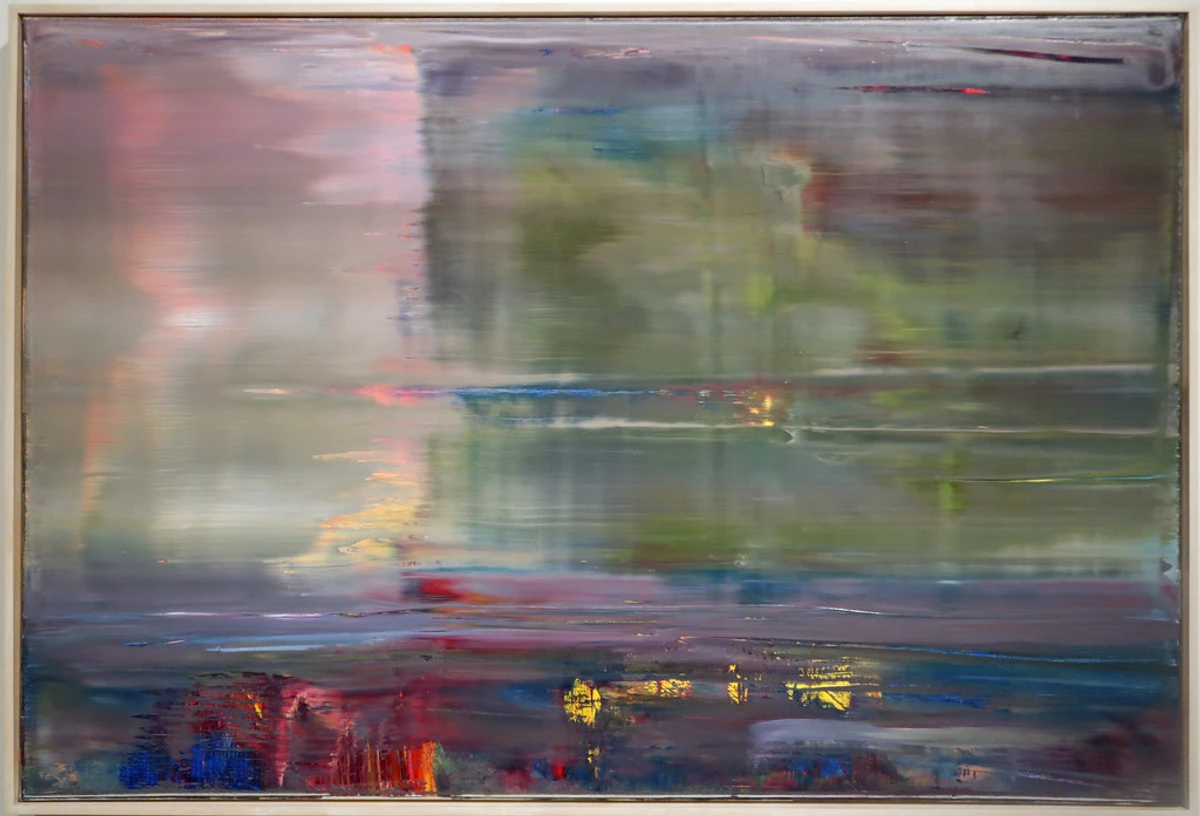
Yet, sometimes the canvas craves a different conversation, a gentle hum rather than a bold declaration. Isn't that often the case in life too? This is where analogous colors step in – those friendly neighbors on the color wheel, usually three to five colors that sit side-by-side, like blue, blue-green, and green. If complementary colors are the dynamic duo, analogous colors are the serene, cohesive choir. They create a sense of unity, flow, and understated elegance.
I often gravitate towards analogous palettes when I want to evoke a specific mood or feeling: a calm evening, a misty morning, or the subtle shift of emotions during a quiet moment of meditation with an abstract painting. They allow for seamless transitions and incredible depth without relying on sharp contrast. It’s less about shouting, more about a gentle hum, a comforting presence.
Using analogous colors in my abstract pieces helps me build layers that feel natural, almost organic. It’s like watching clouds drift across the sky, subtly changing hue as the light shifts. There’s a quiet complexity to it, a rich tapestry woven from closely related shades. This is where the language of layers truly comes alive for me. While they offer harmony, the common misstep is allowing them to become flat or monotonous. To counter this, I focus on varying their value (lightness/darkness) and saturation (intensity). For instance, I might use a deep, almost inky blue as a base, then layer a lighter, slightly desaturated sky blue over it, creating a sense of receding space, like looking into a deep, clear ocean with sunlight filtering through. Or a vibrant lime green bleeding into a muted forest green, suggesting the subtle shifts in a dense canopy. Sometimes, I'll even introduce a very subtle textural variation or a barely-there neutral tone to create movement, like a melody with gentle rises and falls, preventing the palette from becoming flat. But harmony isn't the only story color tells; sometimes, it's the beautiful collision of opposites or unexpected harmonies that truly ignites the canvas, pushing us beyond the conventional rules.
https://live.staticflickr.com/65535/51907566658_1100dbeb2a_b.jpg, https://creativecommons.org/licenses/by-nc-sa/2.0/
Beyond the Rules: Intuition, Emotion, and the Canvas's Whisper
The true magic, I've discovered, lies not in rigidly adhering to these theories, but in letting them become a rich vocabulary for an intuitive dialogue with the canvas. Here’s the thing: while understanding color theory is essential (and yes, it’s covered in more detail on pages like how artists use color), I believe the true mastery in abstract art comes from going beyond the textbook. It was like finally understanding that while the map is invaluable, the real adventure begins when you start exploring off-road, guided by the compass of your own intuition. It's about letting the painting dictate its needs, informed by an understanding of all color relationships. This includes not just hue, but also value (how light or dark a color is) and color temperature (the inherent warmth or coolness of a color). A warm red against a cool blue, for example, intensifies that complementary clash, while varying the value of analogous blues can create incredible depth. Think of how a warm analogous palette (like reds, oranges, and yellows of a sunset) feels different from a cool analogous palette (like blues, greens, and purples of a deep forest), each evoking distinct emotional responses.
And then there’s the broader concept of color harmony, which encompasses more than just complementary and analogous schemes. While these are staples, I occasionally dip into monochromatic schemes (variations of a single hue, like different shades of blue) for deep introspection, or even triadic schemes (three colors evenly spaced on the color wheel, like red, yellow, and blue) when I want a bold, playful energy. And of course, the split-complementary scheme – a wonderful bridge between the drama of complements and the harmony of analogous. Instead of using the direct opposite, you use the two colors adjacent to the direct opposite (e.g., for a vibrant red, instead of its direct opposite green, I might use blue-green and yellow-green). This offers a vibrant contrast, but with less intense visual vibration than a true complementary pair, providing a richer, more nuanced balance without feeling overwhelming. It’s a sophisticated way to add controlled zing to an otherwise calm composition. Understanding these foundational color harmonies, often explored further in how artists use color, equips me with a broader vocabulary to develop my unique artistic style.
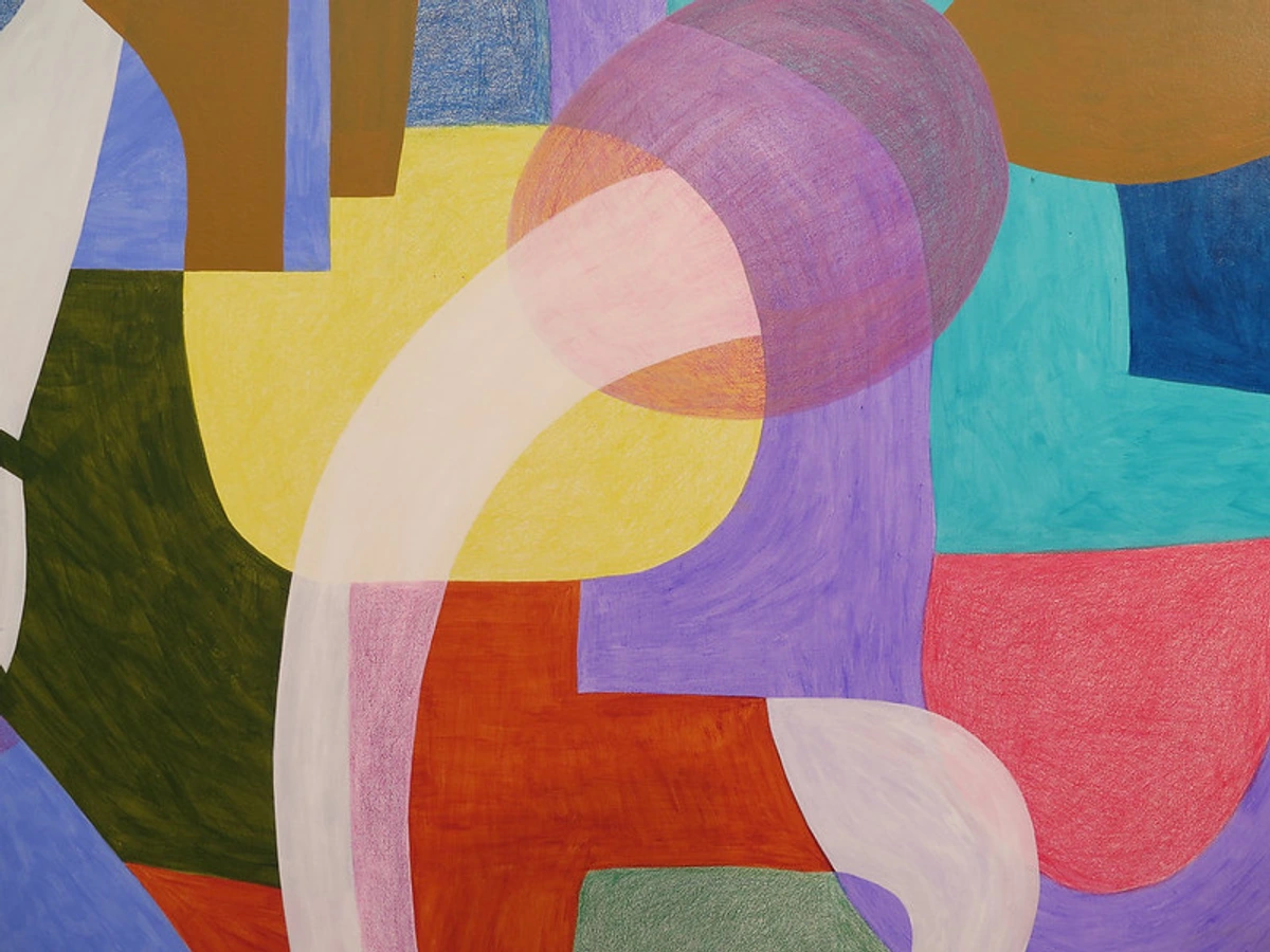
It’s also worth noting how different mediums respond to these color relationships. Oils, with their slow drying time, allow for incredible blending and subtle transitions within analogous palettes, while acrylics, drying faster, demand quicker decisions but can create incredibly crisp, dynamic complementary juxtapositions. Each medium has its own whisper, its own way of guiding the color dance.
https://www.flickr.com/photos/42803050@N00/31171785864, https://creativecommons.org/licenses/by-nd/2.0/
Sometimes, I’ll start with a wild, almost chaotic application of complementary colors, just to see what happens, driven by an initial intent to create energy. Then, I might introduce analogous tones to calm it down, or vice versa. It's a continuous dance of intuition and intent. My intent guides the initial choice – a desire for a vibrant burst of joy might lead me to warm complements like yellow and purple; a contemplative mood might call for cool analogous blues and greens. This is my creative process in a nutshell.
My studio isn't just a place where I mix paints; it’s where I practice the silence and the sound of the canvas. Sometimes the canvas whispers, "Give me blue, but a soft, enveloping blue." Other times it screams, "I need a jarring burst of yellow, right here, now!" My job is to listen and respond, using my understanding of complementary, analogous, and split-complementary relationships, and the nuances of value and temperature, as a rich vocabulary, not a rigid grammar.
This personal journey with color has profoundly shaped my unique artistic style. Whether it's the calming embrace of the psychology of blue, the joyful burst of the psychology of yellow, or the passionate energy of a deep red, every hue is chosen not just for its place on the wheel, but for the emotion it carries and the story it helps me tell.
https://www.flickr.com/photos/gandalfsgallery/24121659925, https://creativecommons.org/licenses/by-nc-sa/2.0/
My Palette, My Story: Complementary vs. Analogous in Practice
To give you a clearer picture, here's a little rundown of how I generally approach these two powerful color relationships in my abstract pieces:
Feature | Complementary Colors | Analogous Colors |
|---|---|---|
| Primary Effect | Contrast, Vibrancy, Energy, Visual Pop | Harmony, Flow, Serenity, Subtle Transitions |
| Emotion Evoked | Excitement, Tension, Drama, Dynamic Balance | Calm, Peace, Unity, Cohesion, Understated Mood |
| Usage in My Art | Focal points, creating depth through contrast, adding "spark," making elements stand out | Building seamless layers, creating atmosphere, conveying quiet emotion, establishing unity |
| Common Misstep | Overuse can lead to harshness or visual chaos | Can lack dynamism if not balanced with enough variation in value, saturation, or a small accent |
| Visual Impact Examples | Draws attention, creates focal points, adds dynamic tension, makes colors 'pop' | Creates cohesive atmosphere, guides eye gently, suggests depth and natural flow, evokes specific moods (e.g., calm, melancholy, vibrant) |
Bringing Color Home: For the Collector
Understanding these principles isn't just for artists; it can significantly enhance your appreciation when decoding abstract art. When you see an abstract painting, ask yourself:
- Are there strong, vibrant contrasts, pulling your eye to a specific point? How does that focal point make you feel?
- Are there subtle, flowing shifts in color, inviting your gaze to wander and discover hidden depths? What overall mood does this create?
- How does the artist use color to guide your eye, to evoke a feeling, and what emotional narrative might they have intended through their palette choices?
- Can you discern the interplay of warm and cool tones, or changes in lightness and darkness, and how they contribute to the overall impact?
- How might the artist's personal journey or emotional state at the time of creation be reflected in their chosen palette?
Recognizing the interplay of complementary and analogous colors, alongside value and temperature, can be a key to unlocking the artist's intention and the painting's impact.
It's all part of the beautiful, personal journey of collecting abstract art. Every piece tells a story, and the colors are often the first words spoken. If you're curious to see how I apply these concepts in my latest works, feel free to explore the art for sale on my site. Perhaps you'll even spot a piece that makes your heart sing, or quiet, just by its unique play of colors.
Frequently Asked Questions
Q: What's the main difference between complementary and analogous colors?
A: Complementary colors are opposite on the color wheel (e.g., red and green) and create high contrast and vibrancy. Analogous colors are next to each other on the color wheel (e.g., blue, blue-green, green) and create harmony, flow, and a sense of unity.
Q: How do you decide which to use in a painting?
A: It's largely intuitive, driven by the emotion or energy I want to convey, as well as the painting's intended scale and viewing distance. For large, bold works meant to be seen from afar, strong complementary contrasts can be incredibly effective, making the piece 'pop' across a room. For smaller, more intimate pieces, or those designed for close contemplation, analogous palettes with subtle shifts in value and saturation might create a more immersive, reflective experience. If I'm aiming for dynamism and bold statements, I lean into complementary colors. If I want a more serene, introspective, or subtly complex piece, analogous colors are my go-to. Often, I use both in different areas or layers of a single painting to create varied effects.
Q: Can you use both complementary and analogous colors in the same abstract painting?
A: Absolutely! In fact, that's often where the most interesting compositions arise. You might have a dominant analogous palette for an overall serene background of blues and greens, with a small, deliberate burst of a complementary orange or yellow in a focal area to draw the eye and create a powerful accent, like a single, vibrant melody note within a calming chord. It’s all about balance and intent, ensuring that each color choice serves the overall emotional narrative of the piece.
So, there you have it – my personal philosophy on complementary and analogous colors. It’s a journey of discovery, a constant push-and-pull between what I know intellectually and what the canvas feels right. It’s less about rigid rules and more about a joyful, intuitive exploration of how colors can sing, whisper, or even shout together. And honestly, isn't that what art is all about? A conversation, a feeling, a journey beyond the predictable, often culminating in a piece that can move you deeply, whether you encounter it in a bustling gallery or perhaps even during a quiet visit to my museum in Den Bosch, my personal space where the spirit of these color explorations lives on, and where you can witness the dialogue between theory and intuition firsthand.