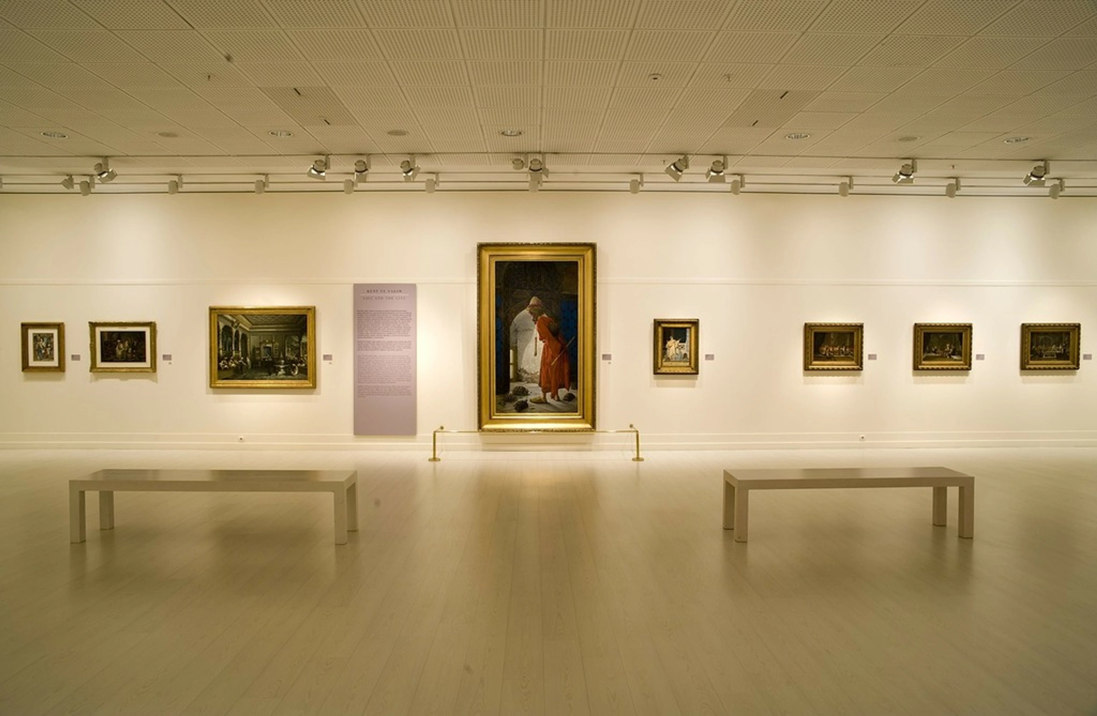
The Ultimate Guide to Lighting Your Artwork Like a Pro
Discover pro tips for transforming your art with perfect lighting. From color temperature to placement strategies, learn how to make your masterpieces pop in any space.

The Ultimate Guide to Lighting Your Artwork Like a Pro
Let me tell you a little secret – I once spent two weeks obsessing over the perfect spot for a painting in my living room, only to realize the real magic was happening on the walls at 3 PM when sunlight poured through the window. Art deserves that spotlight moment, don’t you think? Whether you’re a collector like me or just created your first abstract piece, lighting isn’t just practical – it’s emotional. It tells your art’s story without saying a word. I’ll share everything I’ve learned the hard way about making your creations shine (literally).

Why Lighting is Your Art’s Silent Partner
Lighting is the unsung hero of art display. Get it wrong, and your vibrant masterpiece looks dull. Get it right, and colors dance like they’re alive. I remember hanging a bright, abstract print in a dim hallway – it vanished. Weeks later, I added adjustable LEDs and the yellows literally popped off the wall like fireflies. That’s the power of proper illumination. It’s not just about visibility – it’s about color rendering, contrast, and even the emotional tone of the space. Bad lighting flattens; great lighting creates layers.
Pro tip: Walk around your room at different times. Natural light shifts dramatically, and your art’s mood might change with it!
The Lighting Showdown: LED vs. Traditional Options
When I first started showing art, I defaulted to cheap halogens because "brighter must be better." Spoiler: it wasn’t. Here’s the real deal:
Feature  | LED | Halogen/Incandescent | Fluorescent |
|---|---|---|---|
| Color Accuracy | ★★★★★ (Full spectrum options) | ★★☆☆☆ (Warm but skewed) | ★☆☆☆☆ (Can be unnatural) |
| Heat Output | ❄️ Virtually none | 🔥 High (damages art!) | ❄️ Low-to-moderate |
| Lifespan | ⏰ 25,000+ hours | ⏰ 1,000-2,000 hours | ⏰ 6,000-15,000 hours |
| Energy Use | ⚡ Super efficient | ⚡ High | ⚡ Moderate |
| Dimming | ✅ Excellent | ✅ Good | ⚠️ Often problematic |
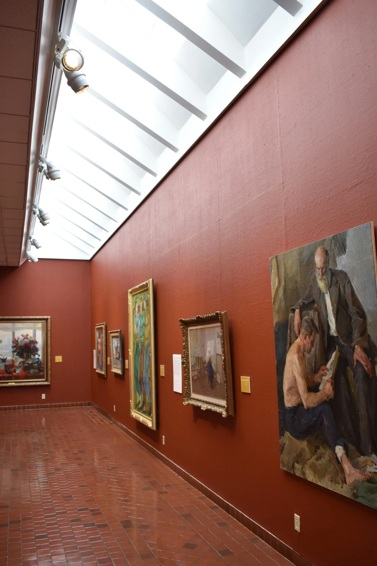
LED wins for art longevity and color fidelity. Modern LEDs even mimic natural daylight. Skip fluorescents – they’ll make your greens look sickly and blues turn gray. Trust me, I learned that one the painful way with a prized blue abstract piece…
Illumination Geometry: Where Light Meets Wall
Placement isn’t just about direction – it’s about physics.
The Golden Rule of Angles
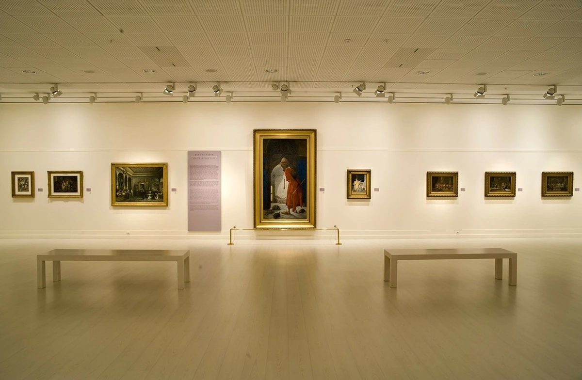
Light should hit artwork at 30-45 degrees from the vertical. Shallow angles create glare; steep angles create shadows. I use this simple trick: point your light source at a spot slightly below the artwork’s center. It washes the surface evenly without those "hot spots" that scream "amateur hour."
Distance and Spread
- Picture lights: 12-18 inches from the art surface. Too close = heat damage. Too far = uneven fade.
- Track lights: Position them so the light cone fully covers the artwork. Aim for 1.5-2x the width of the frame away.
- Recessed lights: These trickier. Use adjustable trims to avoid spotlighting textures (like canvas weaves). You can find options for these setups at your local gallery shop.
Remember to consider ceiling height! Higher ceilings = longer, adjustable arms.
The Color Temperature Tango
Ever noticed how "warm" light feels cozy and "cool" light feels clinical? That’s color temperature, measured in Kelvin (K). For art, stick to 2700K-4000K:
Art Type | Recommended Kelvin | Vibe Effect |
|---|---|---|
| Vibrant Abstracts | 3000-3500K | Amplifies richness |
| Neutral Prints | 3500-4000K | Ensures true colors |
| Vintage Photography | 2700K-3000K | Adds warmth |
| Cool Blues/Greens | 4000K | Enhances depth |
Avoid daylight bulbs (5000K+) unless you’re curating a museum. They’ll make warm yellows and reds look muddy. I once tested this side-by-side – my red abstract looked like it was under cold water above 4000K. Sad!
Lighting Specific Materials
Different art substrates need different approaches. The material your art is made from isn't just aesthetic – it fundamentally changes how light should interact with it. Canvas, paper, metal, glass, and even different types of paint all respond uniquely to illumination.
The Material Light Interaction Spectrum
Each art material has a specific light interaction profile:
- Absorptive materials (canvas, paper): Absorb light, require more illumination
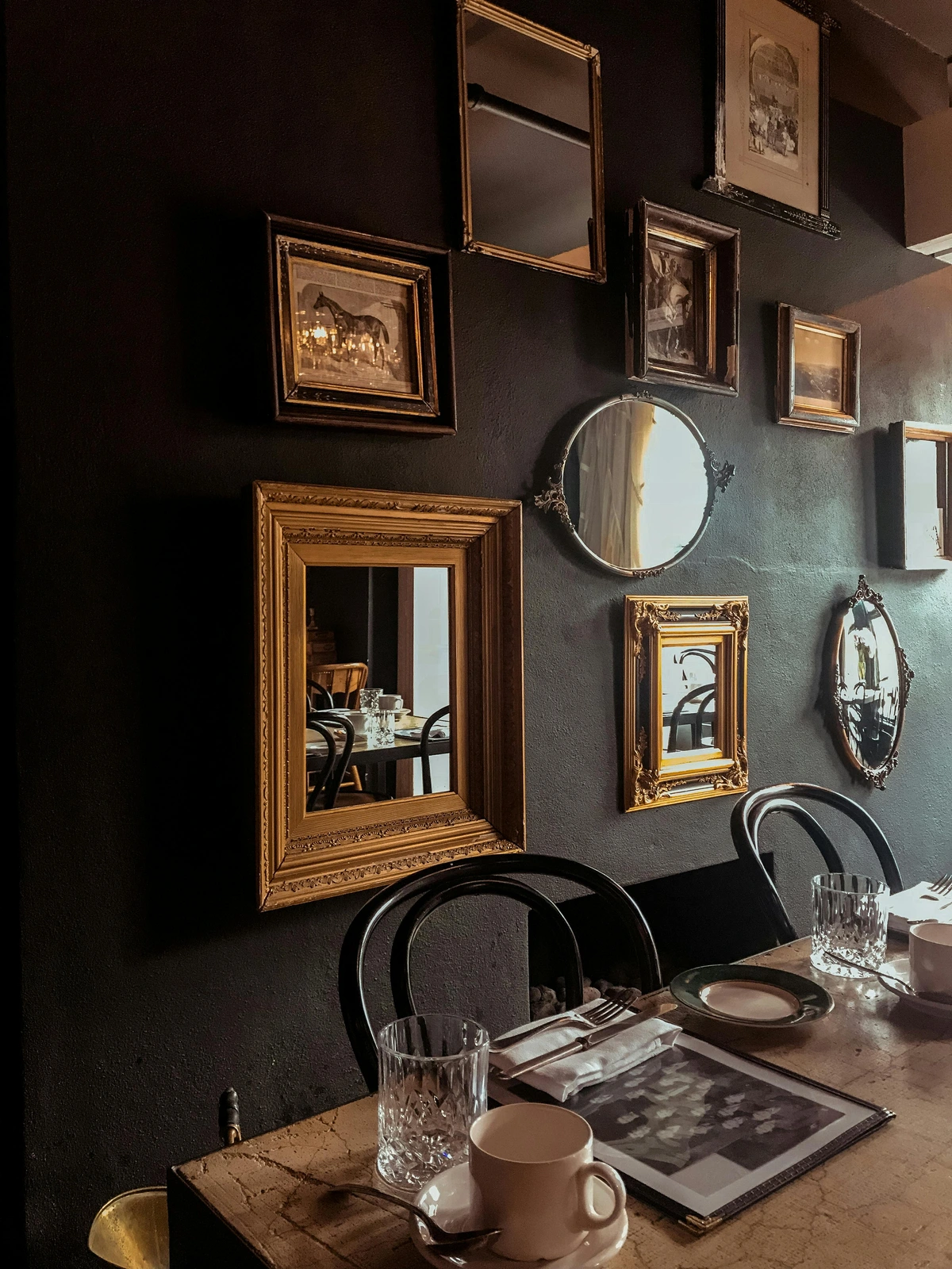
- Reflective materials (metal, glass, acrylic): Reflect light, require careful glare management
- Translucent materials (fabric, some papers): Allow light to pass through, benefit from backlighting
- Textured materials (rough canvas, mixed media): Create complex shadow patterns
Understanding these properties helps you choose lighting that complements rather than fights the artwork's inherent nature.
Canvas & Textured Works
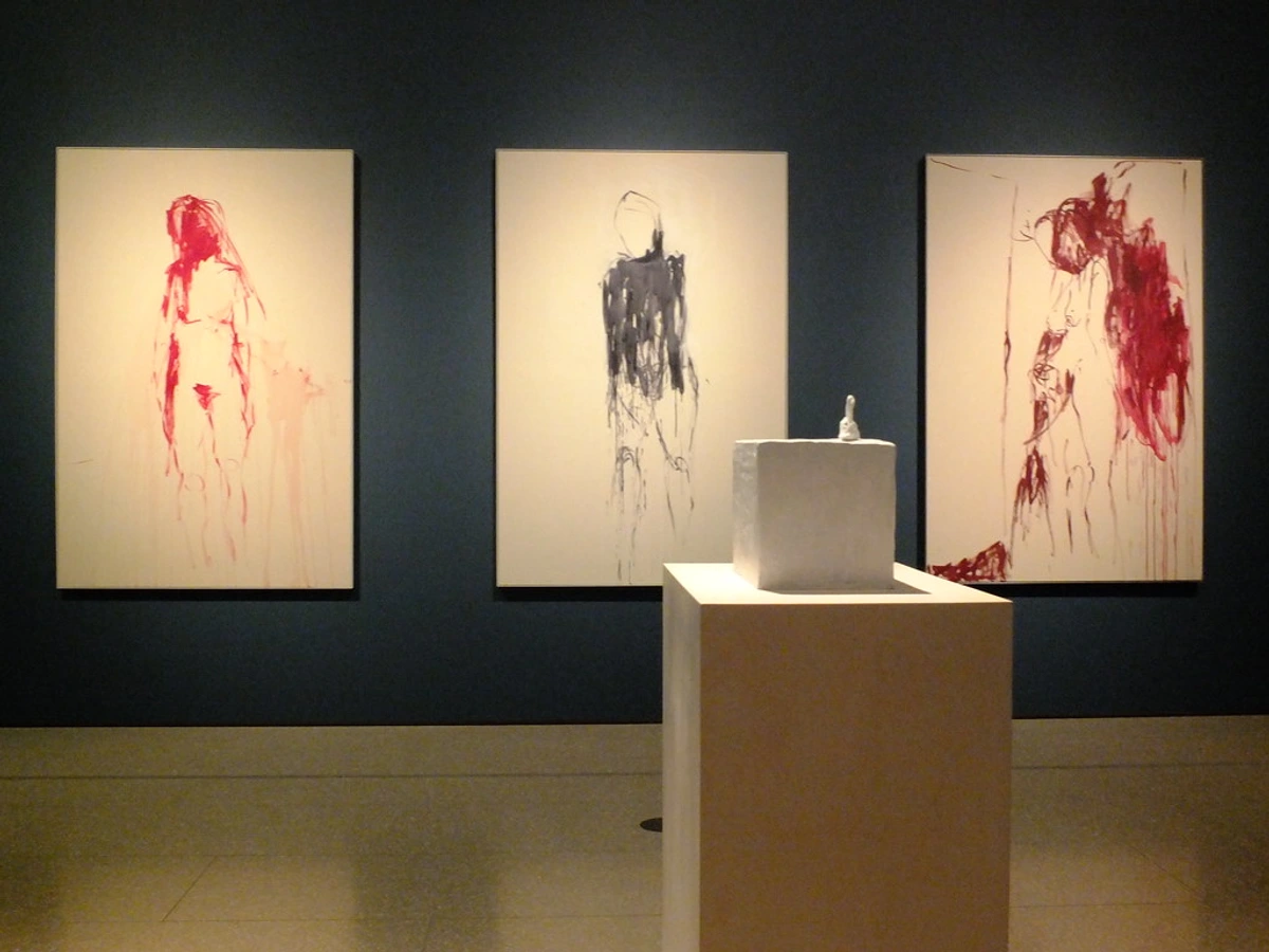
Use angled, diffused light from front or top. Avoid front-facing LEDs – they’ll exaggerate textures unevenly. My textured abstracts look magical under adjustable spotlights with honeycomb grids to spread light cleanly.
Paper Prints
These fade fast. UV-filtered LEDs are non-negotiable. Frame with UV-protective glass, and keep lights 3+ feet away. I store unframed prints in dark boxes – no exceptions.
Photography and Fine Art Prints
Photographic paper has its own specific lighting requirements:
- Black and white photography: Benefits from slightly warmer light (3000K) to enhance tonal depth
- Color photography: Requires precise color temperature matching (3500K-4000K) for accurate reproduction
- Inkjet prints: More susceptible to fading than traditional photographic prints
- Giclée prints: Archival quality but still benefit from UV protection
I use specialized picture lights with CRI 95+ rating for my photography collection – the difference in color accuracy is remarkable.
Textile and Fiber Art
Woven pieces, tapestries, and fabric art require special consideration:
- Backlighting can create stunning silhouette effects
- Side lighting emphasizes texture and weave patterns
- Avoid direct heat which can damage delicate fibers
- Diffuse light evenly to prevent hot spots on specific threads
My woven wall hanging transforms completely under backlighting – the colors become more saturated and the texture practically leaps off the wall.
Glass-Framed Work
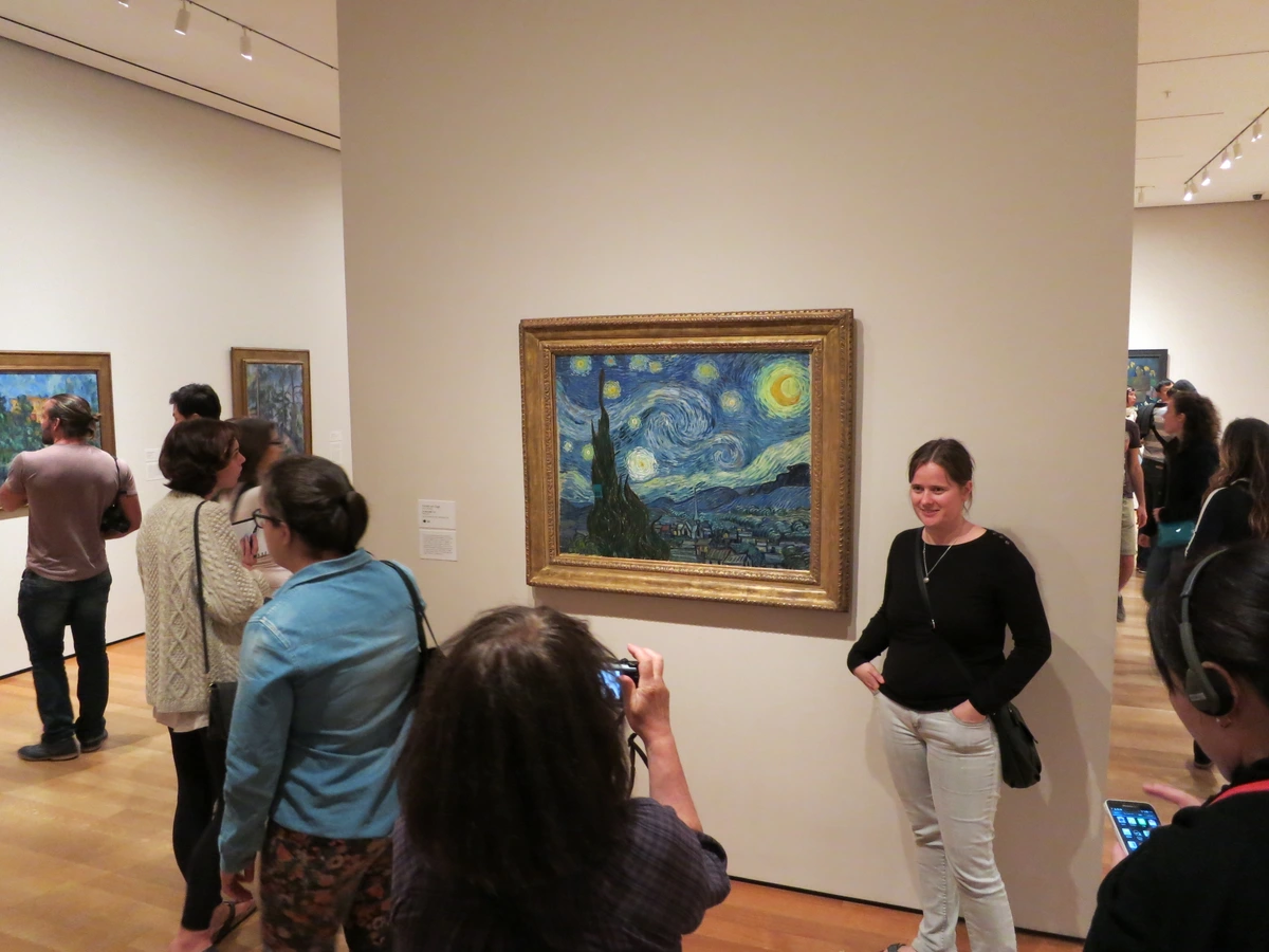
Glare from glass is the enemy. Here’s my bulletproof method:
- Use anti-reflective glass.
- Place lights at a 45-degree angle (not head-on).
- Choose LEDs with low lumen output (under 300 lumens per foot).
Common Lighting Mistakes (And How to Fix Them)
Mistake #1: Over-illuminating everything. If your gallery looks like a surgery theater, dial it back. Museums use 50-200 lux for most art.

Mistake #2: Ignoring UV rays. UV fades everything even in LED form. Look for bulbs marked "UV-filtered" or " museum-grade."
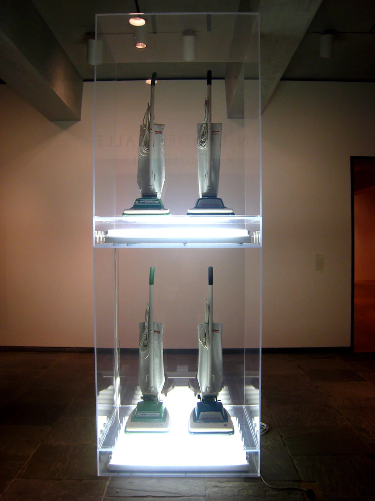
Mistake #3: Using warm light for cool-toned art. It sounds counterintuitive, but 4000K light makes blues and greens pop more than yellow-toned bulbs. Test before committing!
Frequently Asked Questions
Q: Should I use one big light or multiple small ones?
A: For single, centered pieces, one focused light (like a picture light) works. For gallery walls, multiple adjustable sources create more dynamic interest. I’d take 3 well-placed LEDs over 1 harsh floodlight any day.
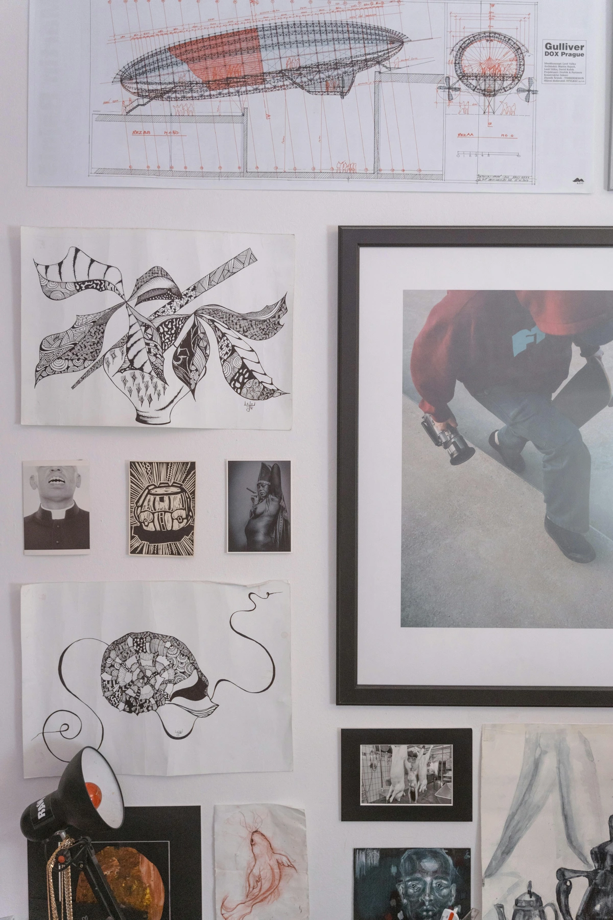
Q: Are expensive lighting brands worth it?
A: Not always. Look for CRI 90+ (Color Rendering Index) first. High CRI means true color accuracy. Brands like Koncept and WAC are great, but budget LEDs from specialty suppliers can do the trick if CRI is high.
Smart Home Integration for Art Lighting
The Connected Gallery Experience
Modern technology has transformed how we approach art lighting. Smart lighting systems can create museum-quality experiences in your home with unprecedented control and flexibility:
Voice Control: Imagine adjusting your art lighting with simple voice commands. "Alexa, dim the picture lights to 70%" or "Hey Google, warm up the gallery lighting." This convenience doesn't just save effort – it encourages more frequent interaction with your collection.
Smart Scheduling: Program your lighting to match natural light cycles throughout the day. Brighter lighting during viewing hours, softer tones during evening relaxation, and complete darkness when you're away. This not only enhances your viewing experience but also protects your art when no one is there to appreciate it.
Motion-Activated Lighting: For pieces in high-traffic areas or hallways, motion sensors can ensure lighting is only on when needed. This saves energy and prevents unnecessary light exposure that could damage sensitive artworks.
Mobile App Control: Most smart lighting systems come with companion apps that let you fine-tune every aspect of your art display from anywhere. Adjust brightness, color temperature, and even create custom lighting scenes for different moods or occasions.
Choosing the Right Smart Lighting System
When selecting smart lighting for your art collection, consider these factors:
Compatibility: Ensure the system works with your existing smart home ecosystem (Amazon Alexa, Google Home, Apple HomeKit, etc.)
Color Range: Look for systems that offer precise color temperature control (2700K-4000K range) and high CRI ratings
Dimming Quality: Smooth, flicker-free dimming is essential for art lighting
Installation: Consider whether you need professional installation or if it's DIY-friendly
Scalability: Choose a system that can grow with your collection
Popular Smart Lighting Options for Art Display
Several brands specialize in museum-quality smart lighting:
Philips Hue: Offers excellent color accuracy and a wide range of smart bulbs and picture lights LIFX: Known for high CRI ratings and easy integration Ketra: Professional-grade lighting used in actual museums WAC Lighting: Specializes in art display lighting with smart controls
The investment in smart lighting pays off not just in convenience, but in the ability to create the perfect viewing experience for your art at any time, under any conditions.
Q: Can I use natural light?
A: Yes – but protect art from direct sun. UV rays are brutal. I use UV-filtering film on windows facing art displays. Morning light is safest – harsh afternoon sun is like a spotlight in a interrogation room.
Q: How do I light 3D sculptures?
A: Highlight texture! Use grazing light from a low angle (30-45°) to cast dramatic shadows that reveal contours. Track lights work beautifully here. For sculptures with complex textures, try multiple light sources from different angles to create depth and dimension.

Q: What about lighting very large artworks?
A: For pieces over 4 feet wide, you'll need multiple light sources. Use track lighting with adjustable heads positioned to create even coverage. The key is to avoid "hot spots" in the center while maintaining consistent brightness across the entire piece. I recommend positioning lights at 45-degree intervals around the artwork perimeter.
Q: How often should I replace my art lighting?
A: LEDs last 25,000+ hours, which is roughly 3 years of continuous use or 10+ years of normal operation. However, brightness can degrade over time. I replace my art lighting every 5-7 years to maintain consistent illumination levels and color accuracy. You'll notice the difference when you compare old vs. new bulbs side by side.
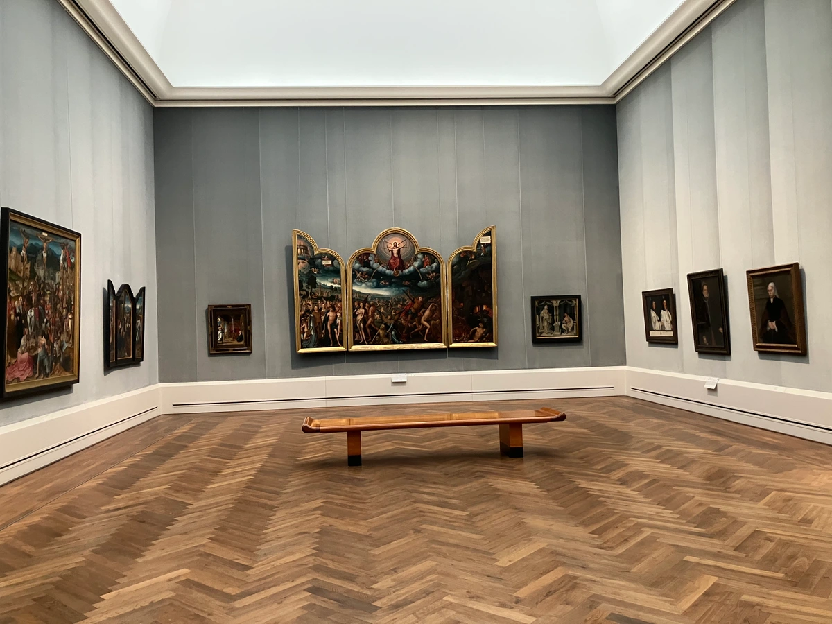






Final Thoughts: Your Art’s Moment in the Sun
Lighting isn’t just technology – it’s curation. It’s about creating that gasp moment when someone rounds the corner and sees your art truly for the first time. I still get chills when my abstracts catch the evening light just right. Start small – replace one bulb, adjust one angle, and watch your art transform. Because the right light doesn’t just illuminate; it tells your story. And isn’t that what art is all about?