From Functional to Fabulous: My Guide to Integrating Art into Your Kitchen
Okay, I have a confession to make. For the longest time, the kitchen was the last place I thought about when it came to hanging art. I mean, it’s a kitchen, right? A place of sizzles and splatters, steam and crumbs. My brain defaulted to the living room, the bedroom, maybe even a hallway – places that felt more traditionally 'gallery-worthy.' The kitchen, for me, felt too utilitarian for the 'finer things' like art, especially as an artist myself. I was often caught in that classic decorator's dilemma: how do you marry the practical demands of a bustling kitchen with the aesthetic aspirations of truly personal art?
But then, something shifted. Maybe it was watching a friend’s tiny, art-filled kitchen become the absolute heart of their home, bursting with personality. Or perhaps it was realizing just how much time I actually spend in my own kitchen, not just cooking, but thinking, planning, and sometimes just staring blankly at the toaster while my coffee brews. It truly hit me how central this space is to our daily lives. And that realization sparked a journey: why wouldn't this room, where so many memories are made over shared meals and quiet mornings, deserve the same thoughtful artistic consideration as any other? This article is my guide to transforming your kitchen into an art-filled, personality-driven space, finding that sweet spot between looking good and handling the heat (and the occasional splatter!). We'll dive into the essential practicalities of protecting your pieces, then explore how to infuse your unique style and artistic voice, and finally, how to choose art that not only looks incredible but also stands up to the unique demands of kitchen life, proving that functionality and aesthetics can truly coexist. It’s about understanding both the 'why' and the 'how' of bringing art into this vibrant heart of your home.
The Kitchen: A Unique Canvas (And a Bit of a Challenge)
Now, let's get real about what we're up against. So, what kind of art can actually survive the culinary chaos? Let's be honest, the kitchen isn't exactly a pristine gallery. It’s a wonderfully chaotic, high-traffic zone that bombards you with challenges: humidity from boiling water, grease from frying, the occasional rogue spaghetti sauce projectile (don't even get me started on the time a rogue blueberry met a freshly hung print!). Trust me, these aren't exactly prime conditions for delicate canvases or unprotected prints, as I’ve learned from a few close calls. Imagine your beautiful watercolor, wilting under the steam from your pasta pot, or a cherished print slowly yellowing from cooking fumes. Moisture can warp paper, grease can stain, and those constant temperature fluctuations from oven to fridge can cause materials to expand and contract, leading to cracking or peeling. It’s like a tiny, domestic battle against the elements!
I used to fret about this constantly. "Will the paint peel? Will it yellow? Will it get splashed with eau de bolognese?" But then I realized that the answer isn't to abstain from art; it's to be smart about it. It’s about understanding the unique environment and choosing pieces that can either withstand it or be easily protected. For instance, oil and acrylic paintings are generally more resilient than watercolors, especially if properly varnished. Look for professional-grade acrylic or resin varnishes that specifically offer UV protection and a durable, non-yellowing finish. These provide an essential barrier, much like a raincoat for your art, making them far less susceptible to water damage and grime. Similarly, prints on durable paper or canvas framed under glass are far safer bets than exposed, untreated works like delicate watercolors without protection, pastels that smudge easily, or charcoal drawings that are susceptible to humidity and grease. Without proper framing and protection, these types of art simply won't last in the average kitchen environment. And speaking of the environment, a good ventilation system acts as your kitchen art's best friend. Proper airflow actively whisks away steam and cooking fumes, drastically reducing the build-up of moisture and grease that can harm your artwork.
Historically, the integration of art into domestic, and specifically culinary, spaces is nothing new. Think of the elaborate Roman frescoes adorning dining halls, or the charming, often functional, folk art pieces that graced early American kitchens. Even masters like Vermeer subtly incorporated art into domestic scenes, often with small, well-protected pieces that became part of the home's fabric, reflecting the simple beauty of everyday life. During the Renaissance, wealthier homes featured still-life paintings in dining areas, celebrating abundance, and even later, during the Dutch Golden Age, similar detailed still lifes often depicted everyday kitchen objects, glorifying domestic life and the bounty it provided. The Arts and Crafts movement, too, emphasized integrating artisanal beauty into everyday objects, including kitchenware and decor, reminding us that functionality doesn't preclude artistry. Consider, for a moment, how kitchens themselves have transformed. From open hearths and rudimentary setups where smoke and soot were constant companions, to the sealed, appliance-driven spaces of today, the environment has shifted dramatically. This evolution, with its reduced soot and more controlled temperatures, has, in turn, opened up new possibilities for art, allowing us to consider more delicate pieces than our ancestors might have dared. This rich tapestry of history proves that art has always found a home in our culinary spaces, even amidst the flour dust and sizzle. Yet, the modern kitchen, with its unique environmental demands, asks us to bridge historical precedent with practical realities. How do we ensure our chosen pieces not only look incredible but also stand the test of time (and dinner!)? This brings us to the crucial practical considerations for safeguarding your artistic investments.
If you're anything like me, you'll want to dive into choosing art for high-traffic areas and durability tips to set your mind at ease. It really is less daunting than it sounds. So, what's the biggest challenge you foresee in bringing art into your kitchen?
Practicalities: Protecting Your Investment (And My Own Artwork)
Now that we've established the kitchen as a viable canvas, and acknowledged its unique challenges, let's get down to the nitty-gritty of keeping your art safe and sound. So, you've found the perfect piece. Now, how do you make sure it survives the culinary gauntlet? Here are my key practical tips, drawn from a fair bit of trial and error (and a few near-misses with flying saucepans!). I've learned these lessons so you don't have to – well, most of them anyway.

- Secure Mounting & Weight Considerations: Before anything else, ensure your artwork is firmly attached to the wall. Kitchen walls, especially near cabinets or often-used areas, can experience vibrations. Use appropriate hanging hardware for your wall type (e.g., drywall anchors, picture hooks for plaster, or even tile-specific hangers). This sounds obvious, but you don't want your beautiful piece crashing down due to a weak nail or an inadequate anchor. Also, consider the weight of your artwork; heavy frames or sculptures require more robust solutions. This is one of those 'measure twice, hang once' scenarios, and trust me, it's worth the extra minute for peace of mind.
- Framing is your ally (and often a necessity!): A good frame with glass or acrylic (especially UV-protective acrylic for sunnier spots) is incredibly important – I'd even call it essential. It creates a physical barrier against moisture, splatters, and dust. UV protection is vital because it significantly slows down the fading of colors over time, keeping your art vibrant for longer. Even my prints benefit from this, ensuring their longevity. For original oil and acrylic paintings, a quality varnish or sealant isn't just for aesthetics; it provides an extra layer of protection against humidity and minor abrasions, much like a shield, making them more resilient in this challenging environment. Consider also the depth of your frame – a deeper frame can create a beautiful shadow box effect, adding dimension, or simply offer more substantial protection, especially for canvases or multi-layered works.
- Consider prints: A durable and versatile choice: While I love original paintings, high-quality art prints are often a fantastic, more affordable, and durable option for the kitchen. Look for archival quality prints, which means they use materials (paper, ink) designed for longevity, resisting fading and discoloration for decades. Think of it like a really good, long-lasting recipe – all the ingredients are chosen for their endurance. Specifically, opt for pigment-based inks over dye-based. Pigments are larger, more stable particles, like tiny flecks of rock that resist chemical breakdown and fading far better than the smaller, soluble dye molecules which are more akin to temporary stains. Similarly, acid-free cotton rag papers offer superior longevity compared to wood pulp options, resisting yellowing and degradation over time—think of it as choosing heirloom-quality paper for your visual stories, ensuring your visual narratives endure. Popular types include giclée prints, known for their high resolution and vibrant color reproduction, and lithographs, which involve a different printing process but can also be archival. When choosing, consider the finish too: matte prints can reduce glare from kitchen lighting and hide minor imperfections more effectively, while glossy prints offer vibrant color saturation but might show smudges more easily. They can be easily replaced if something catastrophic happens (though let's hope it doesn't!). To dive deeper into what makes a print truly archival, check out The Definitive Guide to Archival Printmaking Techniques. You can find some of my own vibrant abstract prints that would fit beautifully into a kitchen over on the art for sale section of my website.
- Beyond the canvas: Exploring diverse art forms & functional art: Don't limit yourself to just framed prints! Decorative ceramic plates arranged as wall art, a sleek metal sculpture, or even small, framed textile pieces can add charm and often possess their own unique durability. Think about how these alternatives can bring texture and three-dimensionality to your kitchen's aesthetic. Even more, consider functional art—pieces that are beautiful and serve a purpose. This could be a custom-designed, hand-painted ceramic backsplash that transforms a utilitarian wall into a vibrant mural, a handcrafted, artfully designed cutting board displayed when not in use, sculptural ceramic bowls or decorative canisters that elevate your storage, unique lighting fixtures that double as art installations, artfully designed utensil holders, or even elegant, hand-painted kitchen textiles (like aprons or tea towels) that are art pieces in themselves when displayed. I've even seen intricate decorative hardware on cabinets, a beautifully crafted pot rack, or even a decorative spice rack become a focal point. These pieces integrate art seamlessly into the kitchen's very purpose, proving that beauty and utility can be perfect partners.

- Placement matters: Seek calmer zones: Avoid hanging art directly above the stove, oven, or sink. Steam, grease, and direct heat are the archenemies of artwork. Consider the 'smell factor' too; porous materials can absorb cooking odors over time. Look for those calmer, less direct impact zones – a side wall, a space above a dry counter, or a breakfast nook. And don't shy away from temporary or seasonal art! Holiday-themed prints or easily swappable arrangements allow you to refresh your kitchen's look without a major commitment, perfect for those who love to redecorate. Sometimes, the best place for art is simply where it feels safest and least likely to meet an unfortunate culinary fate.
What kind of protection measures do you prioritize when choosing art for high-traffic areas?
Finding Your Kitchen's Artistic Voice: Style and Substance
With the practical concerns handled, it’s time to shift gears from protection to passion. The kitchen truly becomes your playground for expression, where we move from the 'how to survive' to the 'how to thrive' aspect of kitchen art. This is where the fun begins! After all the sensible talk about durability, I admit, sometimes I just want to hang something because it feels right, even if it took me three tries to find the 'just right' spot. And trust me, when it comes to style, the rules are pretty much out the window here.
Embracing Vibrancy and Mood: The Psychology of Color
For me, the kitchen needs energy. It's where I start my day, often before I've had enough coffee to fully function. Just last week, I caught myself staring at a blank wall, feeling the pre-caffeine sluggishness, and wishing for a jolt of color. A splash of color, something that invigorates, is usually my go-to. I find that abstract art, with its pure focus on color and form, is a fantastic fit. It doesn't demand a specific interpretation; it simply is. This quiet presence is often exactly what I need while I'm chopping vegetables or waiting for the oven to preheat, offering a wonderful visual respite without distracting from cooking or eating. But it’s not just about color. The right piece can also evoke a profound sense of comfort, stir nostalgia for shared meals, or inspire creativity as you experiment with new recipes. It all contributes to the unique atmosphere you're crafting. And sometimes, let's be honest, art can even be a strategic distraction – a vibrant piece can draw the eye away from that slightly dated appliance you haven't replaced yet, or perhaps a visually 'fresh' abstract can even subconsciously influence the perception of cleanliness, making the space feel less prone to lingering cooking odors. A little visual magic, right?
Think about how your chosen piece will either complement your kitchen's existing palette with harmonious tones, or boldly contrast to create a striking focal point. The psychology of color is a fascinating rabbit hole, and how it impacts a space like a kitchen is profound. Reds and yellows, for instance, are known to stimulate appetite and conversation, perfect for a lively kitchen for entertaining. Cooler blues and greens can bring a sense of calm and freshness – perhaps a serene blue for those quiet morning coffee moments, subtly making the space feel cleaner. Then there's orange, which often signals enthusiasm and warmth, or even purples and deep blues for a touch of unexpected luxury, perhaps ideal for an evening meal. It's amazing how a particular hue can subtly influence how you feel about the room's atmosphere. A vibrant, fresh piece might subconsciously enhance the perception of cleanliness, while a warm, earthy tone might make it feel cozier. And interestingly, lighter, cooler tones can even make a small kitchen feel more expansive, almost tricking the eye into believing there’s more space than there actually is! If you're curious about how hues influence our feelings, you might find my article on the psychology of color in abstract art quite insightful.

Size and Placement: The Goldilocks Zone
Now, with those aesthetic considerations and the subtle psychology of color in mind, let's talk logistics and how to make everything fit just right. This is crucial. Before worrying about the specific size, think about the overall flow of the room and where your eye naturally rests. Kitchens often have limited wall space due to cabinets, windows, and appliances. You're looking for the "just right" spot – perhaps over a small buffet, a blank wall segment between upper and lower cabinets, or even a narrow strip next to a pantry door. Sometimes, a series of smaller pieces works better than one large one.
General Guidelines & Scaling
A good rule of thumb I often consider is that artwork should be roughly two-thirds the width of the furniture it hangs above. This also applies to scaling your art relative to appliances and cabinetry; a piece that's too small above a large fridge can look lost, while one that's too massive next to a narrow cabinet might feel overwhelming. Of course, in a kitchen with open shelving or less traditional layouts, this rule becomes a creative guideline to be adapted!
And don't forget lighting; a well-placed picture light or even recessed lighting can make a huge difference in how a piece feels in a bustling kitchen. Dedicated art lighting, whether a slim track light or a discreet picture light, can truly transform a piece, drawing the eye and making the colors pop even on a cloudy day. I've found that paying attention to how to light and position abstract art for maximum impact can totally transform how a piece feels in a space.
Specific Kitchen Layouts
- L-shaped or Galley Kitchens: These often benefit from a continuous visual line. A series of smaller, complementary pieces hung along one wall can create flow without overwhelming the space. Alternatively, one impactful piece at the far end of a galley kitchen can draw the eye and create depth.
- Kitchens with Islands: If your island is purely functional, consider art on the walls surrounding it. If it has a breakfast bar or a more decorative function, a small sculpture or a carefully placed, durable piece of art on the island itself (perhaps in a display case or integrated into a centerpiece) can work wonders.
- Kitchens with High or Low Ceilings: If your kitchen has towering ceilings, a single, monumental piece, or perhaps a vertically stacked gallery of several smaller works, can draw the eye upwards, celebrating the height. For lower ceilings, horizontal groupings or strategically placed smaller pieces can prevent the space from feeling overwhelmed.
- Limited Wall Space: If wall space is a premium – which it often is in many kitchens – think up! Floating shelves can house small sculptures or framed miniature prints, while the sides of cabinets or even the inside of a pantry door can become unexpected, intimate display areas. Don't be afraid to utilize less obvious spaces; sometimes the most unexpected spots become the most delightful.
If you're working with a smaller kitchen, there are also some fantastic ideas for maximizing impact in compact areas. What’s the trickiest spot in your kitchen you’d like to fill with art?
My Leanings: Abstract vs. Representational (and why they work for me)
Now, while I confess my heart leans towards abstract pieces in the kitchen – perhaps it's the artist in me, always looking for pure form and color, a raw, honest expression – that's not to say a beautifully rendered still life of fruit or a rustic landscape doesn't have its own undeniable charm. They can offer a familiar comfort, a connection to tradition, and certainly have their place. For me though, abstract pieces don't compete with the actual food or the actual view outside the window. They offer a moment of pure aesthetic pleasure without demanding a narrative. They're a quiet hum of color and texture rather than a loud statement, allowing your kitchen to be the star. My own contemporary abstract prints, with their bold, often geometric forms and vivid colors, are particularly well-suited for kitchens. I often think of them as visual recipes, a carefully balanced composition of elements that can bring a sense of dynamic order and compositional harmony to a space, making them versatile for various kitchen styles, from minimalist to industrial. If you've ever wondered how to approach creating or even just appreciating art that doesn't depict a recognizable subject, my exploration of how to abstract art might offer some interesting perspectives.
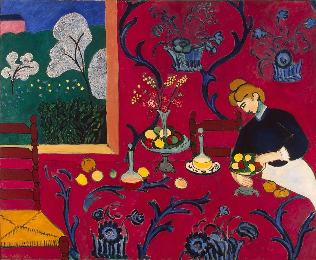
For example, just look at the vibrancy and personal touch in something like Matisse's 'The Red Room' (Harmony in Red). While not a kitchen, it perfectly captures that feeling of a domestic space infused with bold, unapologetic color and life – an energy I absolutely want to bring into my kitchen, even if it's through an abstract lens. It celebrates the everyday with an artistic flourish, a principle I try to embed in my own abstract works, and it shows how a strong aesthetic can define a room's character.
And then there's the quiet contemplation offered by Piet Mondrian's 'Composition No. IV'. Its structured simplicity and thoughtful use of color might seem stark, but in a busy kitchen, it can act as a grounding force, a moment of visual order amidst the everyday bustle. It's a reminder that beauty can be found in pure form and color, an idea I often explore in my own work to bring dynamic order to a space, making it perfect for a contemporary kitchen seeking calm amidst chaos.

Art for Every Kitchen Style: Tailoring Your Choice
So, how do these artistic expressions translate into your kitchen, reflecting its unique character? It's exciting to see how incredibly versatile art can be, with something for truly every aesthetic. Thinking about your kitchen's existing style can help guide your art choices. Remember, the scale of your artwork is just as important as the style; a single, large piece can anchor a minimalist space, while a gallery wall of smaller, varied items might thrive in a rustic setting.
- Minimalist & Modern Kitchens: Here, sleek lines and bold, clean colors work wonders. Think large-scale abstract prints with geometric forms, metal sculptures, or a single, impactful photographic print. The goal is to enhance the clean aesthetic without cluttering it. Contemporary abstract pieces, like my own, often fit this bill perfectly, adding a pop of color without overwhelming the space.
- Farmhouse & Rustic Kitchens: Warmth and texture are key. Consider vintage-inspired botanical prints, framed textile art (like small tapestries or embroidered pieces), decorative ceramic plates arranged as a wall display, or even charming folk art. Pieces that feel handcrafted and tell a story integrate beautifully, creating that sought-after 'hygge' or cozy atmosphere. Imagine a small, hand-painted sign with a whimsical quote, or a collection of antique ceramic dishes; they add soul and a sense of history.
- Bohemian & Eclectic Kitchens: This is where you can truly let your personality shine! Mix and match. Layer framed prints with open shelves adorned with small, sculptural ceramics. Incorporate vibrant patterns, global textiles, or even a collection of artistically arranged cookbooks (yes, they count!). The more unique and personal, the better. Don't be afraid to combine different eras and origins – a truly eclectic space tells a fascinating story.
- Industrial Kitchens: Embrace raw materials. Metal wall art, abstract photography of urban landscapes or machinery, or even framed blueprint-style prints can complement the exposed brick or stainless steel. Artwork with bold, stark contrasts or earthy, muted tones often works well here. The rawness of the materials can be wonderfully balanced by art that highlights structure or offers a subtle pop of color. And for an extra layer of visual interest, consider pieces that play with light and shadow, perhaps a metal relief sculpture or a carefully lit photographic print, adding depth to the often stark industrial aesthetic.
Beyond the major styles, consider the smaller details that tie your kitchen together. Your existing kitchen hardware—from sleek chrome cabinet pulls to a rustic bronze faucet—can subtly influence your art choices. Opt for frames or art pieces with metallic accents that echo your hardware for a cohesive, polished look, or choose contrasting materials for a deliberate, eclectic statement. It’s all about creating a harmonious visual dialogue.
What vibe are you going for in your kitchen?
Making It Your Own: A Reflective Conclusion
Ultimately, bringing art into your kitchen is a deeply personal journey. It’s about making a functional space feel like your space, infused with beauty, color, and perhaps a dash of whimsy. Don't be afraid to experiment! Hang something, live with it for a bit, and if it doesn't feel right, move it. Art is meant to be enjoyed, not just admired from a distance. For me, it’s been a revelation. My kitchen has gone from a utilitarian zone to a place of quiet joy, where a splash of color on the wall can make even doing the dishes a little less mundane. It's another chapter in my artist timeline, seeing my work (or the work of others I admire) in the most unexpected yet welcoming of places. You can follow more of my creative explorations on my timeline. Perhaps you've even considered how to decorate your entire kitchen with a cohesive artistic vision! What unexpected places have you found for art in your home? So, take that leap – your kitchen is waiting for its artistic soul to truly shine! Remember, a truly art-filled kitchen is one that perfectly blends practicality with your unique personality, turning everyday moments into visual delights.
FAQ: Quick Bites on Kitchen Art
Got more questions bubbling up? Here are some quick bites to satisfy your curiosity about kitchen art:
Q: Can I hang valuable original art in the kitchen? A: My strong advice is to generally avoid hanging highly valuable or irreplaceable original art in the kitchen. The environmental challenges (humidity, temperature fluctuations, potential for damage) are simply too high for most precious works. Delicate materials like paper and unvarnished canvas are particularly susceptible to warping, staining, or mold from moisture, and constant temperature shifts can cause expansion and contraction that leads to cracking or peeling in paint layers. While small, robust pieces (like a varnished oil painting on board) might be considered in a very protected zone (far from heat, steam, splashes, and behind UV-protective glass), the risks are significantly higher than in other rooms. For truly valuable pieces, another room is almost always a safer bet. Why risk it?
Q: What about an open-plan kitchen/dining area? A: For open-plan spaces, you have more flexibility! Art can serve as a wonderful visual bridge, tying the two areas together aesthetically, or it can subtly define zones. For example, a large, vibrant piece in the dining area can anchor that space, while a smaller, complementary piece in the kitchen segment helps maintain flow. Here, you can often opt for larger pieces, similar to what you might choose for a dining room or living space, as they're less exposed to direct kitchen hazards.
Q: How do I clean kitchen art? A: For framed art, simply wipe the glass or acrylic with a soft, damp cloth and a mild, non-abrasive cleaner (avoiding harsh chemicals that could damage the frame). For unprotected canvases or prints, regular light dusting with a soft, dry brush is best. Never use water or cleaners directly on unprotected art unless specifically advised by a conservator. When in doubt, less is more.
Q: Does the art need to relate to food or cooking? A: Absolutely not! While food-themed art is a classic choice, don't feel limited. Choose art that genuinely speaks to you, whether it's an abstract piece, a landscape, or a portrait. The goal is to enhance the mood and personality of the space, not to create a themed restaurant. Let your personal taste guide you.
Q: How can I integrate art into kitchens with unique architectural features like open shelving or exposed brick? A: These features offer fantastic opportunities! For open shelving, consider smaller, framed pieces, decorative ceramic sculptures, or even artfully arranged cookbooks placed among your dishes for an eclectic, curated feel. You could also integrate framed botanical prints or small, abstract canvases. Exposed brick provides a wonderful textural backdrop; you might choose art with sleek, modern lines or bold, contrasting colors to create a striking visual dynamic. Metal wall art, large-scale abstract photography, or even minimalist line drawings can look incredibly sophisticated against brick. The key is to see these features as part of your display, not obstacles.
Q: What if I have pets or children? How does that affect my art choices? A: Ah, the delightful chaos of family life! With pets or children, durability and safety become even more critical. I’d lean heavily towards securely framed pieces behind shatter-resistant acrylic rather than glass, just in case. Wall-mounted sculptures should be firmly anchored, and anything delicate should be placed well out of reach. Think about art that can handle a bump or a stray toy. High-quality prints are a fantastic choice here, as they're generally less costly to replace than originals. Also, consider the materials – something easily wiped clean (like a framed print with a smooth surface) is a lifesaver with sticky fingers or wagging tails around! And if all else fails, a fridge covered in their own 'artwork' is always a classic, isn't it?
Q: What if my kitchen is very small and I don't have much wall space? A: Don't despair, every kitchen has potential! Look beyond traditional wall hangings. Consider leaning a small, framed piece against the backsplash (ensure it's protected!). Magnets can turn your refrigerator into a mini-gallery for smaller prints or postcards. You could also place a tiny sculptural object on an open shelf, or even inside a glass-front cabinet door for an unexpected peek of art. Art doesn't always have to be grand; sometimes, the smallest touches make the biggest impact, especially in compact areas. Even an artfully designed pot holder or tea towel can add a subtle artistic touch!
Q: What about art in a kitchen that gets a lot of direct sunlight? A: Direct sunlight is art's arch-nemesis, especially for pigments and papers. If you have a sun-drenched kitchen, prioritize art framed with UV-protective glass or acrylic. For original paintings, ensure they are varnished with a UV-resistant sealant. Alternatively, choose pieces specifically designed for outdoor use (if applicable to your style), or consider swapping out art seasonally to minimize prolonged exposure. High-quality prints are also a good option here, as they're more easily and affordably replaced if fading occurs over time, though UV protection is still highly recommended.