The Archival Promise: Enduring Art Prints & Printmaking Techniques
As an artist, I share my journey into archival printmaking. Explore Giclée, lithography, screenprinting, and more to find art that lasts. Discover what makes prints museum-quality and how to preserve your cherished art.
The Enduring Promise: My Personal Journey Through Archival Printmaking Techniques and Lasting Art
You know that feeling when you find a piece of art that just speaks to you? It could be the vibrant colors, the intricate details, or just an inexplicable connection that makes you think, "Yes, this belongs in my life." But then, a quiet doubt creeps in: Will it last? Will those brilliant colors fade into a sad, muted echo of their former glory, like a forgotten dream? As an artist, that same question haunts my own studio. I pour my soul into creating abstract worlds, and the thought of them dissolving into mere shadows over time... well, it’s a particular kind of heartbreak.
I’ve spent countless hours wrestling with pigments, paper, and the elusive quest for permanence. It's not just about creating something beautiful; it's about crafting something that endures, something that can be cherished for decades, maybe even centuries. This journey into archival printmaking is about ensuring those connections, those vibrant moments, don't just fade away. That's where the magic – and sometimes the bewildering complexity – of archival printmaking techniques comes in. And trust me, it's a rabbit hole worth diving into, a fascinating blend of science, craft, and artistic intention, especially when we talk about Giclée, lithography, and screenprinting.
It's a world filled with jargon: Giclée, lithography, serigraphy, woodblock… it can feel like trying to decipher an ancient language when all you want to know is if your beautiful print will still be beautiful in 20 years. Trust me, I get it. So, let's pull back the curtain and explore what makes a print truly archival, why this enduring promise matters deeply to both artists and collectors, and how you can confidently choose pieces that will stand the test of time.
Why "Archival" Isn't Just a Fancy Word, It's a Sacred Promise for Lasting Art
I once bought a poster – a truly stunning reproduction of a classic abstract piece – from a gift shop. It hung proudly on my wall, a daily dose of inspiration. For about a year. Then, slowly, almost imperceptibly, the edges started to yellow, the blues turned a little greenish, and the vibrant oranges dulled. It was like watching a beloved memory fade right before my eyes. The colors didn't just shift; they died a slow, sad death. It felt like a betrayal. This experience, more than any textbook, etched into my mind the profound difference archival quality makes.
That experience taught me a valuable lesson: quality matters, profoundly. When we talk about "archival," we're not just discussing a marketing buzzword. We're talking about a commitment to longevity, to using materials and processes designed to resist degradation over time. This means prints that won't fade, yellow, or become brittle for a significant period, often measured in decades or even hundreds of years under proper care. For me, as an artist, it's a promise that the emotion and intention poured into the work will persist, allowing my abstract visions to live on. For you, the collector, it’s a promise that your investment in beauty will continue to enrich your life, and potentially the lives of future generations – not just as a visual delight, but as a tangible piece of cultural heritage that holds its value. An art print, when made archivally, isn't just decoration; it's an heirloom, a legacy.
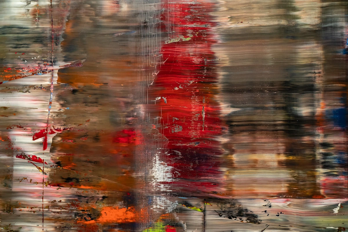
Sometimes, this promise is even backed by "museum-grade" standards or specific ISO certifications (like those from the Fine Art Trade Guild), ensuring that what you invest in today will continue to speak to you tomorrow. "Museum-grade" often implies rigorous testing for lightfastness, color stability, and material purity, meeting the stringent requirements of institutions dedicated to preserving art for centuries. If you're pondering why buy art prints, their archival nature is a huge part of the answer – it's the foundation of lasting value and a testament to the artist's enduring legacy. It's about securing a piece of history, a personal connection, that stands robust against the relentless march of time, transforming a simple purchase into a meaningful investment.
The Fundamentals of Enduring Art: What Makes a Print Archival?
So, how do they do it? What's the secret sauce? Essentially, it boils down to two main components: the materials and the process. It's a bit like baking a perfect cake; you need both excellent ingredients and the right technique. And for artists like myself, choosing these is a meticulous act of care – often a fascinating, sometimes frustrating, journey of research and experimentation. I remember one particular batch of paper that promised acid-free longevity but felt... off. A small test, a quick check, and indeed, it didn't meet my standards. It’s these tiny, unseen battles that ensure the final artwork is truly enduring.
Paper: The Foundation of Forever
Think of paper as the canvas for your print, the very skin of the artwork. Not all papers are created equal. Archival papers are typically:
- Acid-Free: This is crucial. Acidity is the silent killer of paper, causing it to yellow, become brittle, and deteriorate over time. Imagine leaving a freshly cut apple out; it quickly browns. Acidity acts similarly, but much slower, gradually breaking down the paper fibers. Archival papers are pH neutral (or slightly alkaline) to counteract environmental acids.
- Lignin-Free: Lignin is a natural component of wood pulp that breaks down over time, releasing acids. Removing it ensures greater stability and prevents that notorious yellowing. It's important to note that a paper can be labeled "acid-free" but still contain lignin, leading to eventual discoloration. True archival paper must be both.
- Cotton or Alpha Cellulose: These fibers are naturally stronger and more stable than traditional wood pulp, offering superior longevity. Papers made from 100% cotton rag are often considered the gold standard – a truly luxurious and durable base for any artwork.
Inks: The Heart of the Hue
The pigments used are just as important as the paper, the very bloodline of the colors. Archival inks are generally:
- Pigment-Based: Unlike dye-based inks (which are often cheaper and found in standard home printers and are prone to fading quickly), pigment-based inks consist of tiny, solid color particles suspended in a liquid. These particles are much more resistant to UV light, humidity, and environmental pollutants. On a molecular level, they are far more stable and less prone to breaking down or chemically reacting to environmental factors, making them far less prone to fading. It’s like the difference between watercolor (dye) and oil paint (pigment) in terms of lightfastness – one washes away, the other endures.
- UV-Resistant: Direct sunlight is a print's worst enemy. Archival inks are formulated to stand up to light exposure, though it's always best practice to keep prints out of direct, harsh sun. Even the strongest armor has its limits.
When you see a print described as "archival," it implies these considerations have been taken seriously. It's a testament to the artist's and the print studio's dedication to creating lasting work. For my own abstract art prints, which often feature intricate color gradients and vibrant, layered compositions, the archival properties are paramount. I rely heavily on trusted professional printmakers who understand these nuances intimately, ensuring my vision – those subtle shifts and intense hues – is preserved for generations. I once spent weeks perfecting a particular shade of electric blue, a fleeting moment of color. Knowing a printmaker can capture and preserve that exact hue, ensuring its permanence, is truly a collaboration I cherish.
Diving Deep into Printmaking Techniques: Giclée, Lithography, and More
Now that we understand the foundational elements of what makes a print archival, let's explore some of the most popular techniques that bring these principles to life. Each has its own history, charm, and unique characteristics. I've personally seen masterpieces created with all of these, and each offers a distinct experience. If you're trying to choose between giclee vs lithograph vs screenprint explained, this section is your personal guide, a dive into the heart of printmaking itself.
1. Giclée Prints: The Modern Master of Detail
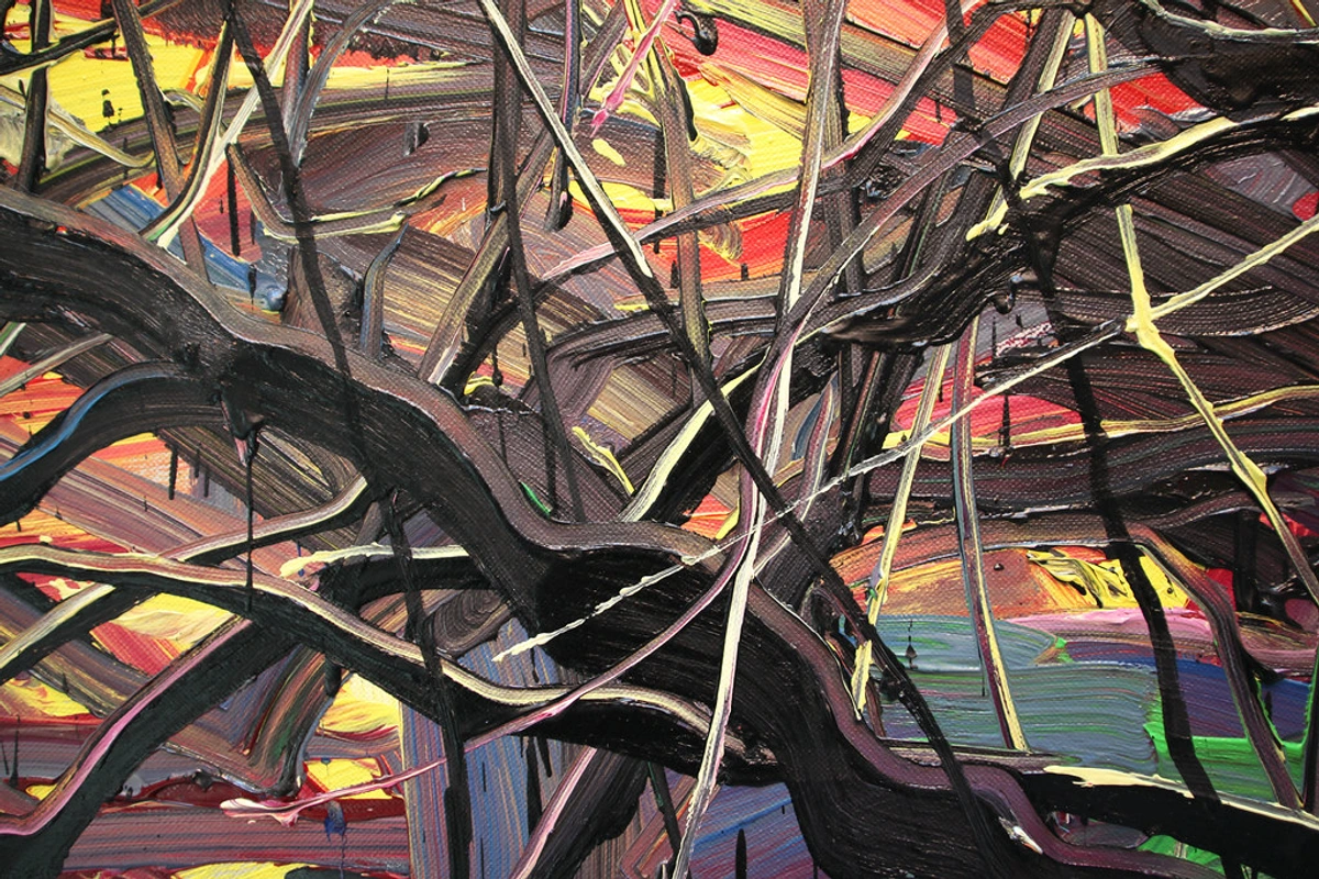
Giclée (pronounced "zhee-clay") is a French term meaning "to spray," and it perfectly describes the process. It's a relatively modern digital printing technique that has revolutionized the art world since the late 20th century, especially for artists like myself who work with contemporary and abstract pieces, offering unprecedented fidelity to original digital or painted works.
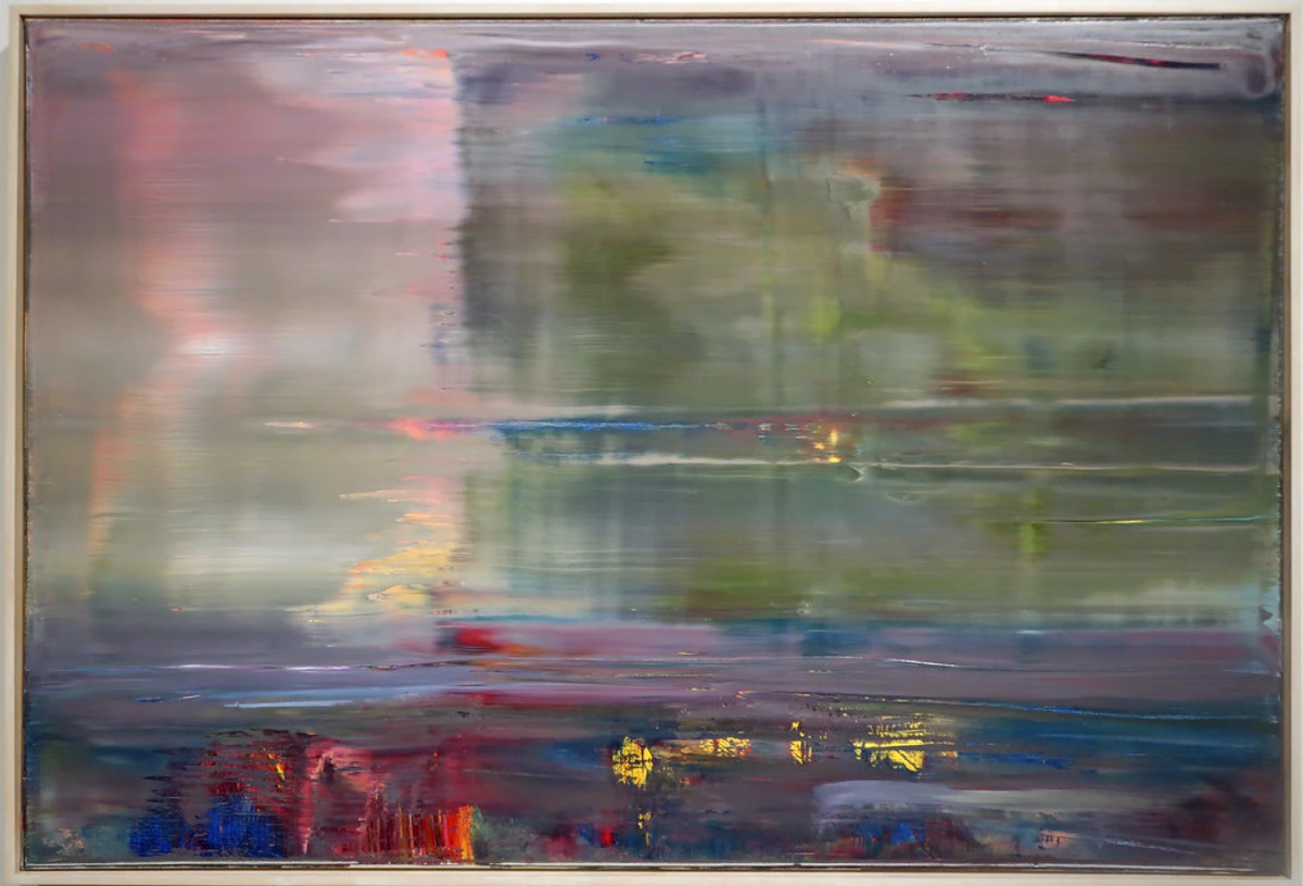
- How it works: High-resolution digital images are printed onto various substrates (like canvas, fine art paper, or photographic paper) using sophisticated large-format inkjet printers. These professional printers use 8 to 12 archival pigment-based inks, capable of reproducing an incredibly wide color gamut and incredibly fine detail. The process ensures incredible accuracy, far beyond what any home printer could achieve, capturing every brushstroke and subtle gradient.
- Why it's archival: When produced with pigment-based inks on acid-free, lignin-free archival substrates, Giclée prints boast exceptional longevity, often rated to last 100-200 years without significant fading. The precision of the inkjet process means incredibly accurate color reproduction and smooth tonal transitions, making it ideal for reproducing original artworks, especially vibrant abstract pieces like those you might find on my art for sale page, where every nuanced color is vital for the emotional impact. The ability to perfectly replicate a specific color field or delicate texture is a triumph of this method.
- My take: Giclée offers unparalleled fidelity to the original. It’s like capturing the very soul of a painting and replicating it with stunning accuracy, a magic trick in its own right. As an artist who works with intricate layers of color and texture in my abstract pieces, the ability of Giclée to translate that depth and vibrancy with such precision is truly a marvel. It's my go-to for ensuring my abstract works are accessible and durable, allowing more people to experience the intensity of the originals.
2. Lithography: The Art of the Stone
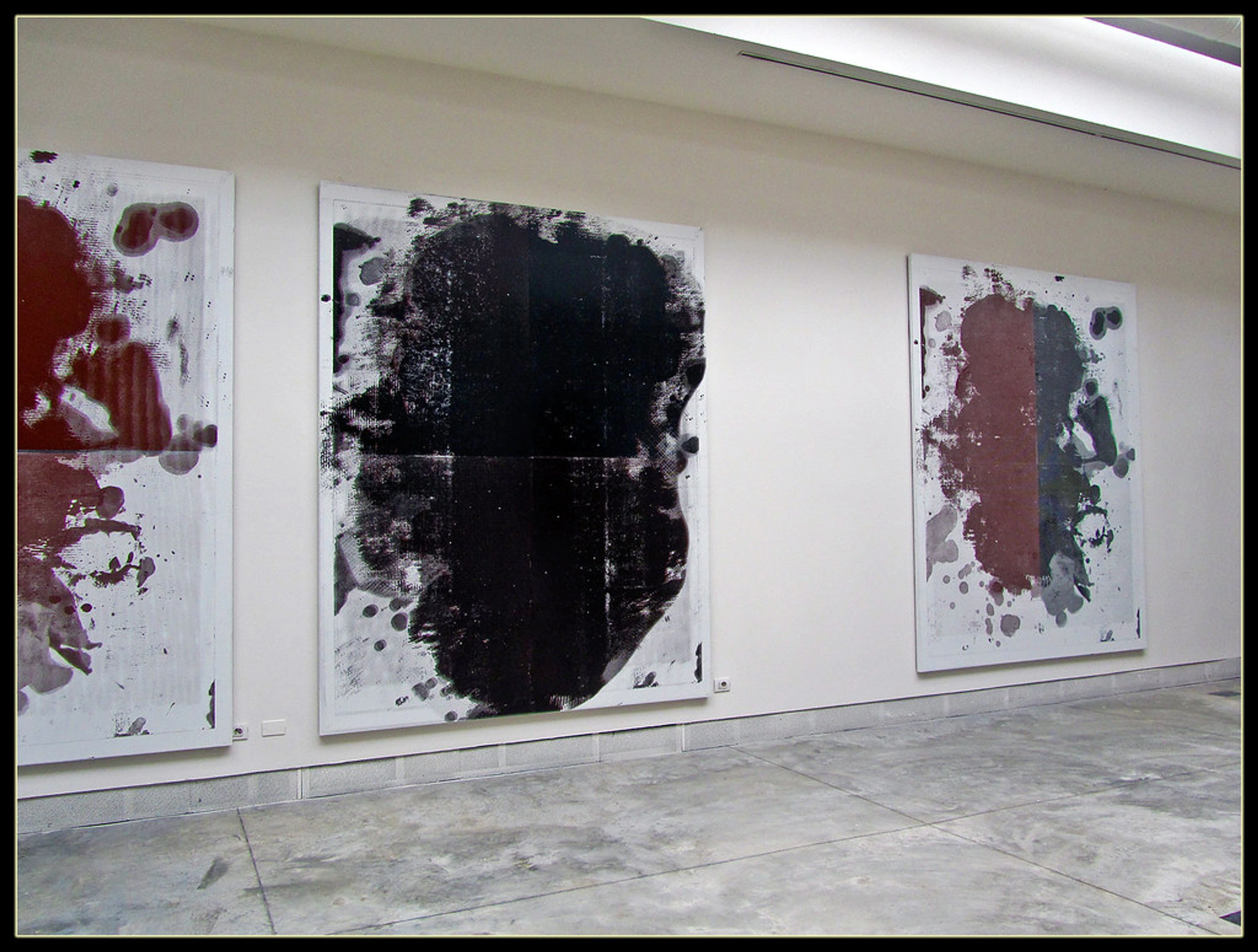
Lithography, meaning "stone writing," is a traditional printmaking method invented in the late 18th century by Alois Senefelder. Initially used for printing sheet music and maps due to its cost-effectiveness, it quickly found its way into fine art, captivating masters with its unique qualities and the direct hand of the artist in the process. Artists like Henri de Toulouse-Lautrec elevated it with his iconic posters, and Edgar Degas explored its painterly potential, showcasing its subtle tonal range. This innovation also democratized art, allowing for wider distribution of images and ushering in a new era of artistic expression.
![]()
- How it works: An image is drawn onto a flat stone (or specially prepared metal plate) with a grease-based medium like a litho crayon or ink. The stone is then chemically treated to make the drawn areas receptive to oily ink and the blank areas receptive to water. When water is applied, it adheres only to the blank areas. Then, oily ink is rolled over the stone; it only sticks to the drawn, greasy areas. Finally, paper is pressed against the stone to transfer the image. Each color typically requires a separate stone or plate, built up in layers, a painstaking dance of precision.
- Why it's archival: When executed by skilled artisans using high-quality, stable pigments and acid-free paper, lithographs are incredibly long-lasting. Their traditional nature and the direct hand of the artist in creating the matrices often give them a unique texture and depth, a tangible connection to history. The subtle shifts in tone and texture are part of their timeless appeal, capable of conveying a painterly quality that endures for centuries.
- My take: There's something undeniably romantic and almost alchemical about lithography. The direct touch of the artist's hand, the weighty stone, the intricate balance of grease and water… it’s a tactile experience that connects you to centuries of printmaking tradition. The subtle variations in each pull are part of its charm, a living reminder of the human element involved. I've often wondered about the almost meditative patience required for multi-color lithographs; it's a profound dance of precision and foresight.
3. Screenprinting (Serigraphy): Bold Colors, Graphic Impact
Ever wondered how those incredibly vibrant, crisp, and graphically impactful art pieces get their punch? Often, it's through screenprinting, also known as serigraphy. This versatile technique, which saw a boom in the mid-20th century with Pop Art – famously championed by artists like Andy Warhol – pushes ink through a woven mesh screen onto a substrate, known for its bold colors and striking visual impact. It continues to be a favorite for contemporary artists due to its versatility and ability to produce intense, flat areas of color, often becoming a powerful tool for social commentary and artistic rebellion.
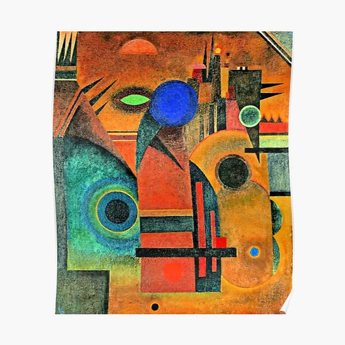
- How it works: A stencil, usually created photographically, is applied to a fine mesh screen. Ink is then placed on the screen, and a squeegee is used to pull the ink across, forcing it through the open, non-stenciled areas of the mesh onto the material below. Each distinct color in the design requires a separate screen and a separate pass, allowing for incredible layering and textural possibilities, building up a rich, opaque image.
- Why it's archival: Like other techniques, the archival quality of a screenprint depends on the materials: artist-grade, lightfast inks (often robust acrylics or solvent-based inks, known for their opacity and vibrancy due to higher pigment loads and stable binders) and acid-free paper. Properly produced screenprints can last for many decades, maintaining their intense color saturation and crisp edges, making them a lasting testament to graphic artistry.
- My take: Screenprinting always makes me think of the raw energy of vibrant pop art and street art. There's an immediacy and graphic impact to it that’s hard to replicate. The layers of color can create incredible depth and texture, even in what looks like a flat image, almost like carving light out of darkness. It’s a technique that feels both ancient in its elegant simplicity and utterly modern in its applications, constantly reinventing itself.
Other Traditional Printmaking Gems: A Legacy of Endurance
While Giclée, Lithography, and Screenprinting are prominent, the world of archival printmaking is vast and rich, a true rabbit hole of historical craftsmanship. These older techniques not only tell a story of artistic evolution but also prove, through their continued existence in museums, their inherent archival quality when executed with care. They offer a tangible link to centuries of human creativity, often utilizing durable plates, stable natural pigments, and robust paper that, by their very nature, were designed to last.

- Woodblock Printing: Famously exemplified by the enduring legacy of Ukiyo-e: Japanese woodblock prints and their global impact, this technique involves carving an image into a wooden block, inking the raised areas, and pressing it onto paper. Japanese Ukiyo-e often utilized multiple blocks for complex color registration, while Western woodcuts traditionally used a single block for bolder, more graphic imagery. The distinctive lines and textures of woodblocks have an organic, handcrafted feel that appeals to many. Their archival nature stems from the durability of the carved block and the use of natural, stable pigments.
- Etching and Engraving: These intaglio (incised) methods involve creating an image in a metal plate. Etching uses acid to bite lines into the plate, allowing for exquisite fine lines and delicate tonal variations, often described as having a spontaneous, drawing-like quality. Engraving involves physically incising lines with a burin (a cutting tool), producing crisp, precise lines that can build intense black tones and detailed textures. Both are known for their rich detail and often intricate compositions, and their archival quality is ensured by the permanence of the metal plates and the robust inks pressed deep into the paper fibers.
- Mezzotint and Aquatint: Even more nuanced techniques like mezzotint, which creates velvety blacks and subtle gradients by roughening the entire plate before burnishing lighter areas, or aquatint, which achieves painterly washes of tone similar to watercolor through controlled acid etching of a porous ground, exist. Each offers its own specific magic for artists seeking particular textural or tonal effects, relying on the inherent stability of the metal plate and lightfast inks.
Their archival nature, when done with care and quality materials, is proven by the countless historical prints we can still admire today in museums around the world – a testament to the dedication of past artisans and the enduring power of these crafts. It’s a bit humbling, really, to think of the centuries of careful labor behind each enduring impression. This rich history reminds us that the quest for permanence in art is as old as art itself.
Quick Comparison: Archival Printmaking Techniques
To help you visualize the differences and appreciate the unique qualities of each, here's a quick comparison:
Technique | Process | Typical Aesthetic / Characteristics | Archival Note |
|---|---|---|---|
| Giclée | Digital inkjet printing with pigment-based inks | High fidelity, wide color gamut, smooth gradients, ideal for reproductions | 100-200+ years with archival inks & paper (often certified) |
| Lithography | Image drawn on stone/plate (oil-based), then inked and pressed | Subtle tonal range, hand-drawn feel, can have delicate textures, historical charm | Centuries with stable pigments & acid-free paper |
| Screenprint | Ink pushed through stenciled mesh screen | Bold colors, crisp edges, graphic impact, strong opacity, layering possible | Many decades with artist-grade lightfast inks & acid-free paper (often robust acrylics) |
| Woodblock | Carved image on wood block, raised areas inked | Distinctive lines, often bold, textured, traditional, organic feel | Centuries (e.g., Ukiyo-e) with natural pigments & stable papers |
| Etching/Engraving | Image incised into metal plate (acid/tool), recessed lines inked | Fine lines, rich blacks, delicate details, classic, often intricate | Centuries with quality paper and stable inks |
The Limited Edition Puzzle: Does It Matter for Archival Quality?
You often hear about "limited edition" prints, and while it adds to their perceived value and collectibility, it's actually distinct from archival quality. A limited edition simply means a finite number of prints are produced from a single matrix or digital file. Once that number is reached, no more are made. This scarcity can drive up value, but it doesn't directly ensure longevity.
However, and this is a big "however," artists who go to the trouble of creating limited editions generally care deeply about the quality and permanence of their work. They are often meticulous about their craft, and that commitment almost invariably extends to archival considerations. So, while not a standalone guarantee, a limited edition often correlates very strongly with archival production methods. If you're understanding limited edition prints, you'll know they're often a mark of an artist committed to excellence – and that commitment usually extends to ensuring their work endures.
Caring for Your Archival Print: A Few Gentle Nudges for Lasting Beauty
Even the most archival print needs a little love and common sense to truly last. My own prints, which I meticulously ensure are of the highest archival quality, still appreciate a good home. Think of it as creating a mini sanctuary for your art, a little fortress against the ravages of time.
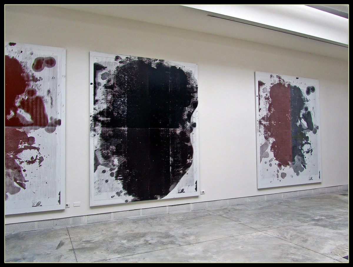
- Mind the Light: Avoid direct sunlight or harsh UV light. Filtered light is best. Even archival inks have their limits against prolonged, intense UV exposure. It's not a superhero, just a very durable friend.
- Frame Wisely: This is critical. Use acid-free mats and backing boards. Opt for UV-protective glass or acrylic to block harmful rays. Regular glass offers little to no UV protection. For truly valuable pieces, consider professional conservation framing – it’s an investment in the print’s future.
- Handle with Care: Always hold prints by the edges with clean hands, or even wear cotton gloves. Oils and acids from your skin can damage surfaces and leave marks that become permanent, a tiny archaeological trace you didn't intend.
- Consistent Environment: Avoid extreme fluctuations in temperature and humidity. A stable environment, typically room temperature with moderate humidity, is ideal. Think about where your print would feel most comfortable, just like I do when considering my own journey as an artist – comfort leads to longevity.
Following these simple steps will give your archival prints the best chance to outlive us all – a comforting thought, isn't it? To know that a piece of beauty you cherish today could still be captivating future generations, perhaps even inspiring new artists who walk through the doors of a cherished space, much like those who visit my beloved Den Bosch studio.
Frequently Asked Questions (FAQ) About Archival Prints
Q: Are all Giclée prints archival?
A: Not necessarily, but most reputable ones are. A true archival Giclée requires both pigment-based inks (not dye-based) and acid-free, lignin-free paper or canvas. Always check the artist's or printer's specifications. If in doubt, ask! A good artist will be transparent about their materials and process, keen to share the integrity of their work.
Q: How can I tell if a print is archival?
A: Look for clear descriptions from the artist or gallery stating "archival pigment inks," "acid-free paper," "100% cotton rag," or "museum quality." Also, look for a Certificate of Authenticity (CoA) which should detail the materials and printing process. If these terms aren't present, it's worth asking for clarification. An artist passionate about their work, like those I admire and who are displayed in places like my Den Bosch Museum, will be transparent about their materials.
Q: What's the typical lifespan of an archival print?
A: With proper care and framing (away from direct sunlight, in a stable environment), a well-produced archival Giclée print can last 100-200 years or even longer without significant fading or degradation. Traditional archival prints like lithographs or etchings, crafted with stable pigments and quality papers, can last for many centuries, a testament to their enduring craft.
Q: Can I frame an archival print myself?
A: You certainly can, but it's crucial to use archival framing materials (acid-free mats, backing, and UV-protective glass/acrylic) and follow proper, damage-free techniques. If unsure, a professional framer specializing in conservation framing is always the safest bet to ensure the print's longevity and presentation. Think of it as giving your print the best possible armor against the ravages of time, a protective cocoon for its beauty.
Q: What's the difference between "archival" and "museum quality"?
A: While often used interchangeably, "archival" generally refers to the longevity of materials (inks, paper) and resistance to degradation over time – it's about the physical resilience. "Museum quality" often encompasses archival materials plus factors like artistic excellence, rarity, provenance, and the overall quality of craftsmanship that makes a piece suitable for a museum collection. So, while all truly museum-quality prints are archival, not all archival prints are necessarily considered "museum quality" in the broader artistic and curatorial sense, though they certainly can be. It's a subtle but important distinction.
Q: Do artists sign and number archival prints?
A: For limited edition archival prints, it is standard practice for the artist to sign and number each print (e.g., "1/50," "AP"). This confirms its authenticity and its place within the edition, adding to its value and collectibility. An artist's signature is a personal stamp, a final, tangible connection to the creator and their promise of quality.
Q: Does a high price or famous artist guarantee archival quality?
A: Not always. While established artists and high-end galleries typically use archival methods, price alone isn't a guarantee. Always look for specific material details (pigment inks, acid-free paper) and a Certificate of Authenticity. Even famous artists can produce non-archival posters or reproductions, so diligent inquiry is always advisable. It's about the production method, not just the name.
My Final Brushstroke: The Enduring Value of Quality and a Lasting Legacy
Choosing art is deeply personal, an intuitive dance between what you see and what you feel. But for me, as an artist who pours my soul into creating abstract worlds – worlds of vibrant color and complex layers – there's a profound satisfaction in knowing that those worlds, when reproduced as prints, can exist for generations. It's like leaving a little piece of yourself behind, meticulously preserved, a message in a bottle for the future. The very nature of abstract art, with its emphasis on pure form and color, demands this permanence; the nuances are too vital to be left to chance.
Understanding archival printmaking techniques isn't just about technicalities; it's about appreciating the craft, the dedication, and the sacred promise of enduring beauty. It's about securing a piece of that artistic connection, knowing it will be there, vibrant and true, for a very long time. It gives me a warm feeling to know that when someone decides to buy art from my collection, they're not just getting a fleeting image, but a lasting legacy. So go forth, explore, and choose art that not only captivates your heart but also promises to stand the test of time – a beautiful journey into forever.


